
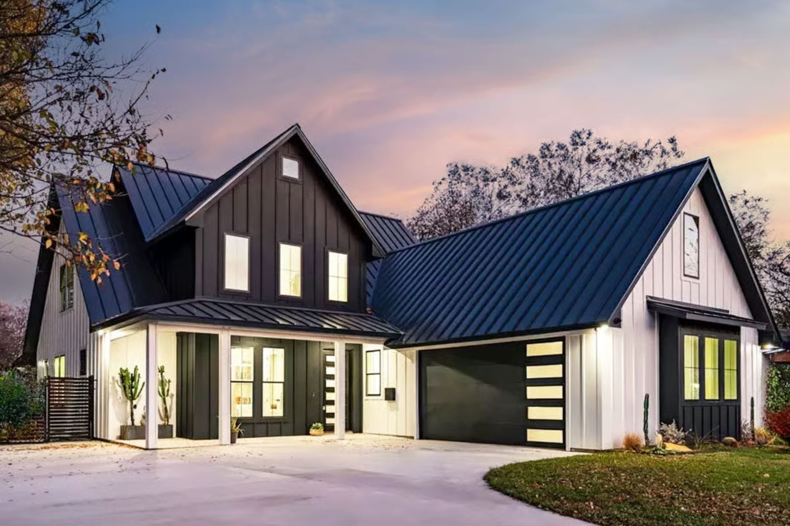
The bonus room is the tell. Families who are done pretending the dining room doubles as a homework station, who need the noise somewhere else while dinner actually gets made, who finally have a kid old enough to disappear upstairs with friends — they are exactly who The Monroe was drawn for. Three floors of real separation, a farmhouse kitchen built for the long end of a Tuesday, and main-level living that stays calm while the second floor handles everything else.
Specifications
- Sq. Ft.: 2,492
- Bedrooms: 3
- Bathrooms: 2.5
Floor Plan – Main Floor
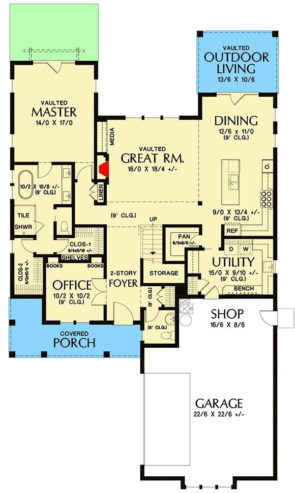
The first floor puts a vaulted master suite opposite a vaulted great room, with a 2-story foyer connecting both. Kitchen, dining, utility, and outdoor living all cluster toward the rear right.
Floor Plan – Second Floor
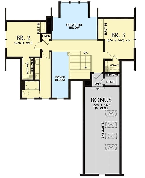
Upstairs, two bedrooms with built-ins share a bath off Bedroom 2, and the open railing gives you sightlines straight down to the great room and foyer. A storage room sits near the staircase. The bonus room is the real story up here — 31 feet long, skylights overhead, 9-foot ceiling — genuinely usable square footage rather than the awkward leftover space that name usually implies.
Floor-to-Ceiling Stone and a Fireplace That Actually Earns Its Wall Space
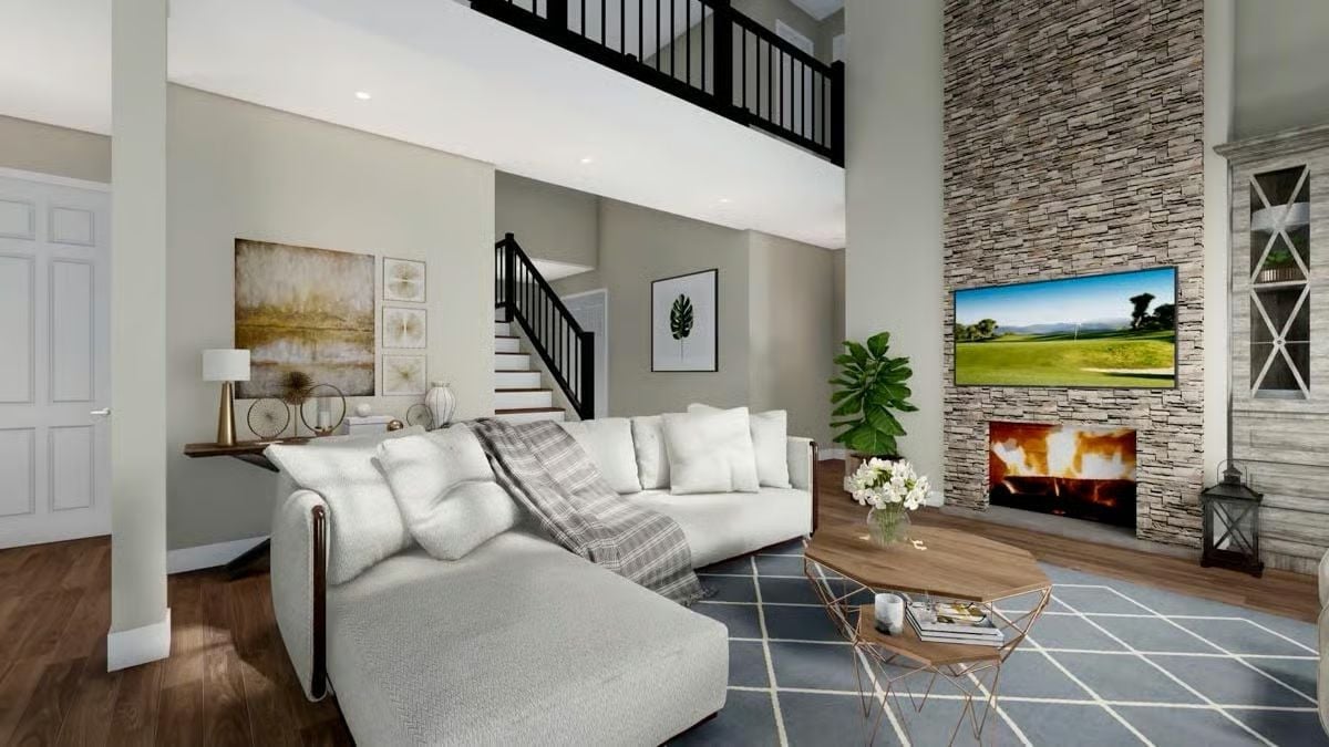
That stacked stone surround runs all the way to the second floor, which is rare enough to stop you mid-step. The sectional is light and low, keeping sightlines open to the loft railing above, and warm hardwood floors ground the space without competing with the blue geometric rug under the coffee table.
History Corner: Stone fireplaces became a defining feature of American farmhouse architecture in the 18th century, when locally quarried fieldstone was simply the most practical material on hand. Modern versions like this one use dry-stacked veneers to get the same texture without the structural demands of full masonry — the look stayed regional for a long time before the craftsman revival of the early 2000s pushed it into the mainstream.
Open-Plan Living Where the Kitchen Island Does Half the Work
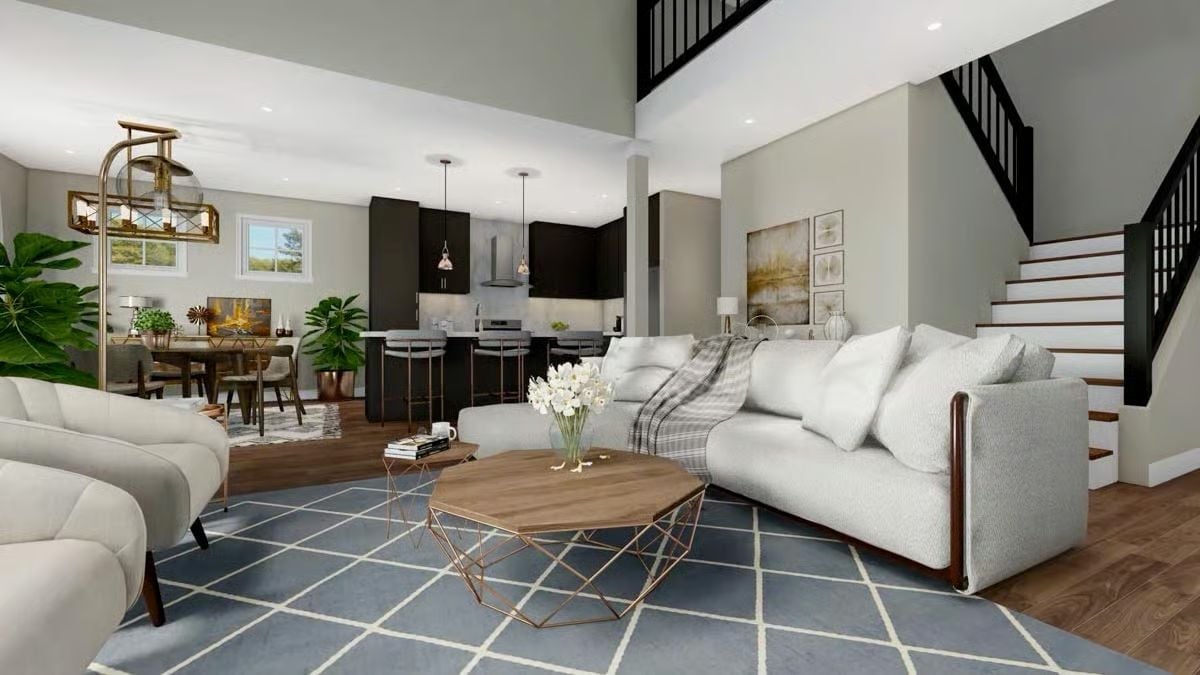
Boucle sofas, a geometric gold-frame coffee table, and a blue grid rug anchor the living area. Behind them, dark cabinetry and pendant lights mark where the kitchen begins — no wall required, no transition that needs explaining. It just flows.
Dark cabinetry and pendant lights mark the kitchen without a wall between them.
Copper Pendants, Dark Cabinets, and a Round Table That Refuses to Rush Dinner
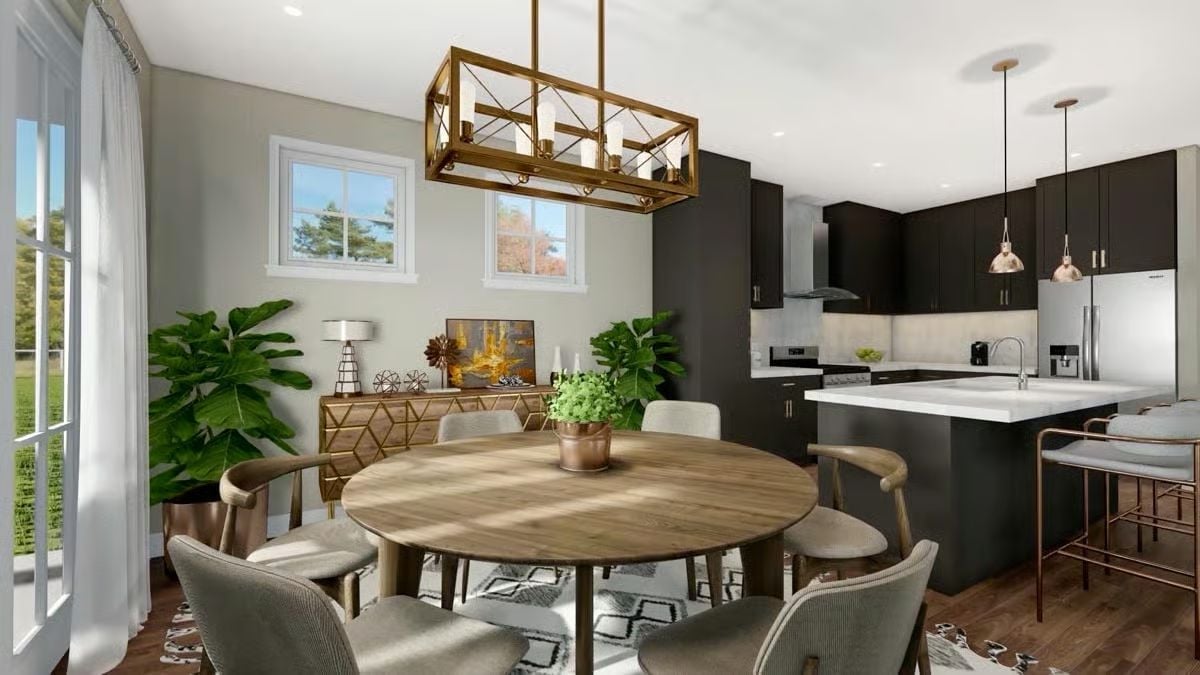
Warm brass on the chandelier ties the dining area back to the copper pendants over the island without tipping into matchy territory — a harder balance to pull off than it looks. Dark flat-front cabinets keep the kitchen grounded, the white countertop lightens it back up, and the potted fiddle-leaf figs are actually earning their floor space rather than just filling a corner.
Why It Works: Round dining tables have a practical social advantage over rectangular ones: nobody gets marooned at the end, and conversation doesn’t have to travel as far. Pair that with an open-plan kitchen layout and the distance between cooking and sitting down shrinks considerably, which makes the whole space feel less segmented on an ordinary weeknight.
Vaulted Ceilings and French Doors Make the Master Bedroom Feel Twice Its Size
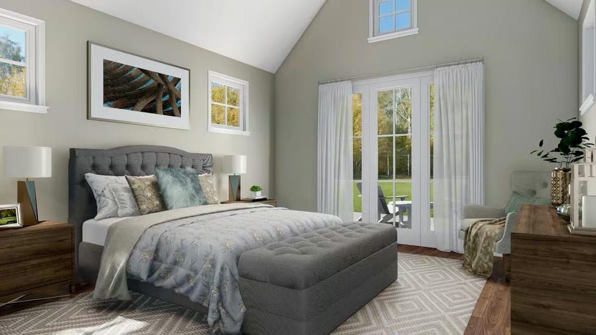
Gray tufted upholstery on the headboard and bench gives the room weight without overwhelming it. Sage walls absorb the natural light coming through the French doors rather than bouncing it harshly around, and the pitched ceiling does the rest — keeps everything from feeling capped and close.
Editor’s Note: Vaulted ceilings in bedrooms aren’t just visual drama. They improve air circulation and cut the stuffy, trapped feeling that flat ceilings create in rooms with limited window placement. If you’re comparing floor plans, a cathedral ceiling in the primary suite is one of the harder features to add after the fact — so if it’s there, it matters.
Freestanding Tub by the Window Is the Whole Point of This Bathroom
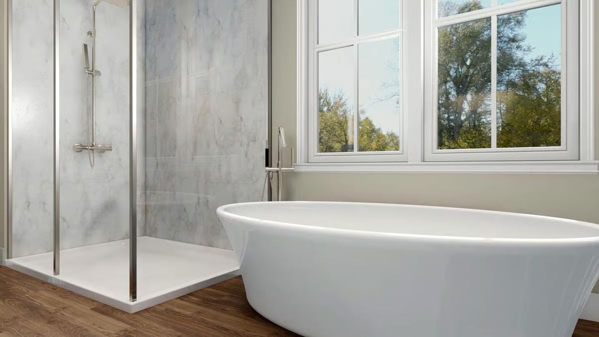
Marble-look panels inside the glass shower keep grout lines out of the equation entirely. But the oval soaking tub positioned directly under that multi-pane window is what the room is actually organized around — everything else is supporting cast.
Designer’s Secret: Positioning a freestanding tub near a window isn’t only about the view. Natural light counters the closed-in feeling most bathrooms can’t shake, and pulling the eye toward an exterior opening makes the room read as considerably larger than its actual footprint.
Dark Vanity Cabinets and a Gold-Framed Mirror That Pull the Room Together
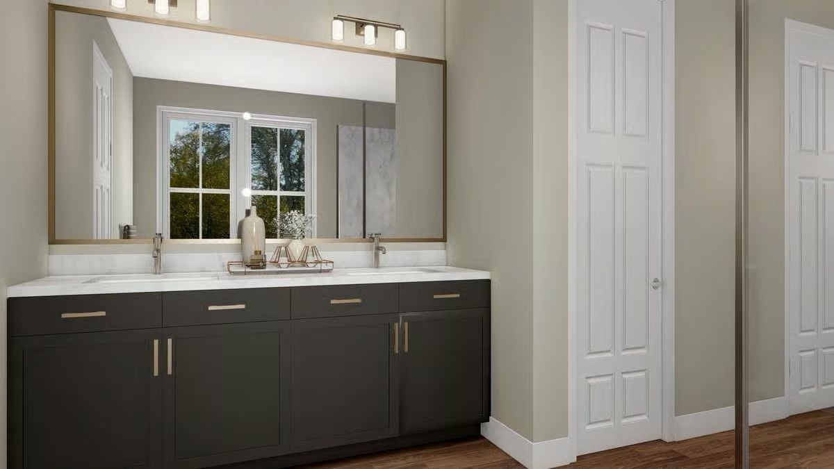
Double sinks, dark shaker cabinets with brass pulls, a wide mirror that throws enough light back into the space to keep it from reading as a cave. Simple, and it works.
CALLOUT: Double-sink vanities became standard in primary bathrooms as homes grew larger in the late 20th century, driven partly by the expectation that two people shouldn’t have to negotiate a single sink every morning. Sounds obvious now — but for most of American residential history, one sink was perfectly normal even in a master bath.
Pin It
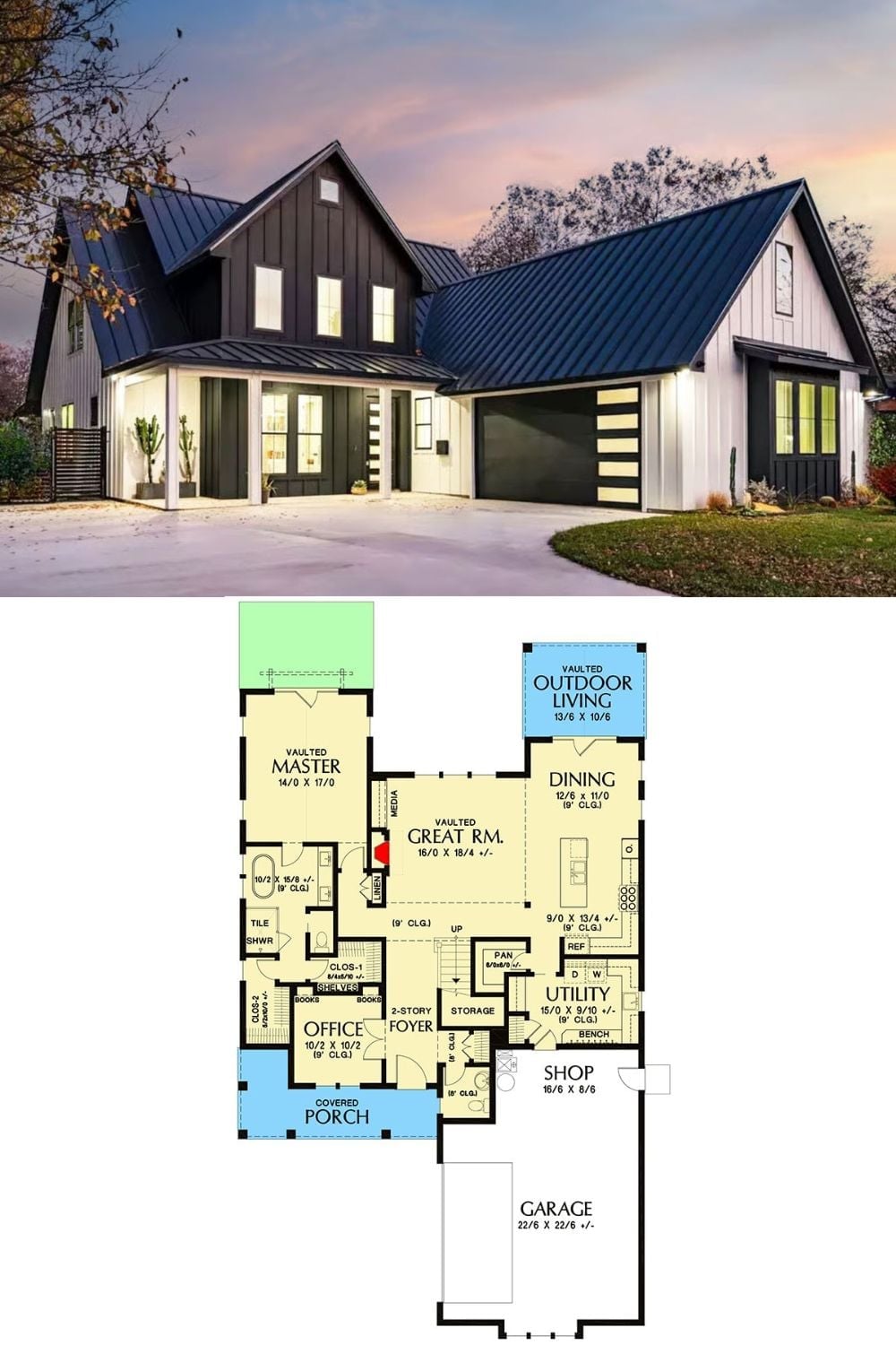
Board-and-batten siding and a dark metal roof on the exterior, and inside, a floor plan built around that vaulted great room at the center — master suite, office, garage, and covered outdoor living all branching off from it in a layout that actually makes spatial sense.
