
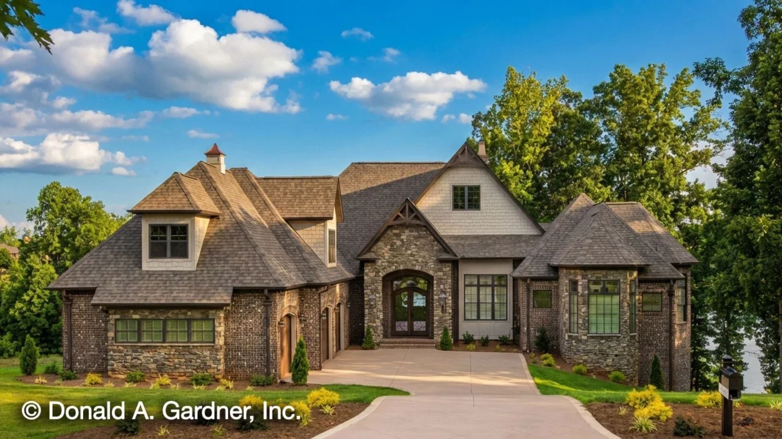
The bonus room is the tell — when a family adds that square of flexible space above the main floor, someone is already doing the math on a parent who needs a bedroom that doesn’t feel like a bedroom, and morning routines splitting across two floors, grandkids running laps between them, one coffeemaker upstairs and one down. The Monarch Manor is built around exactly that: a walkout basement for the in-laws, a bonus room that becomes whatever the moment requires, and Tudor bones that make the whole arrangement feel less like a compromise and more like a plan.
Specifications
- Sq. Ft.: 3,983
- Bedrooms: 4
- Bathrooms: 4.5
Floor Plan – Main Floor
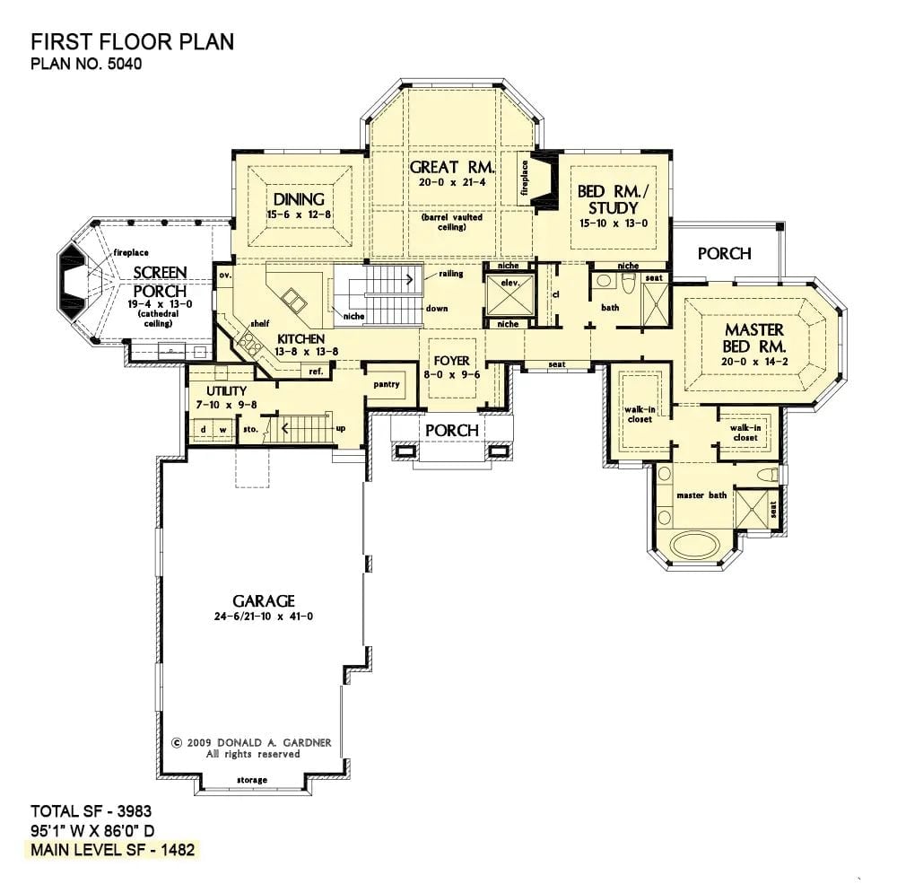
The main level puts the Great Room at the center, a barrel vaulted ceiling and fireplace anchoring the open layout around it. The Master Bedroom suite sits privately to the right with two walk-in closets and a full bath, while a Bed Rm./Study off the Great Room works well for an in-law who wants proximity without zero privacy. The screened porch with its own fireplace is not an afterthought.
Floor Plan – Bonus Room
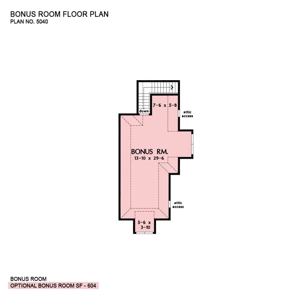
The bonus room runs 13-10 x 29-6 with staircase access, two attic access points on either side, and small landing alcoves at top and bottom — 604 square feet of upper-level space that can be a playroom, a home office, a guest overflow zone, or all three depending on the year.
Floor Plan – Basement
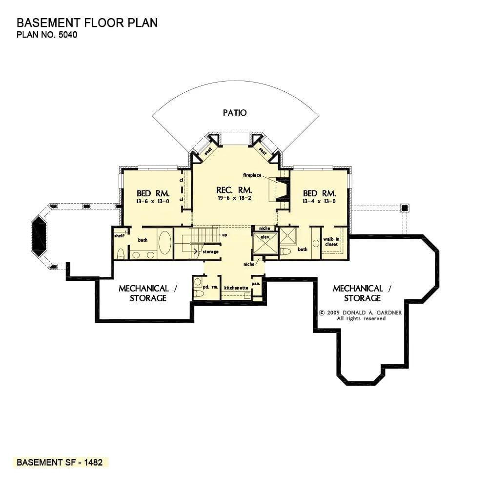
The basement pairs two bedrooms with a rec room and fireplace. Each bedroom has its own bath, and the kitchenette gives whoever is living down there enough independence that the arrangement actually works long-term.
Brick, Black Iron, and a Pool That Makes the Neighbors Quietly Reconsider Their Life Choices
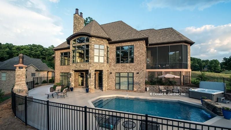
Two stories of brick with floor-to-ceiling glass on the rear facade means you’re watching the sunset from inside year-round.
Black iron fencing wraps the pool deck with more architectural intention than most gates manage. A screened upper porch sits cantilevered over the lower patio, and there’s a hot tub tucked to the right that looks less like an add-on and more like it was always supposed to be there.
Rectangular Iron Chandelier, Dark Wood Table, and a View That’s Doing Most of the Work
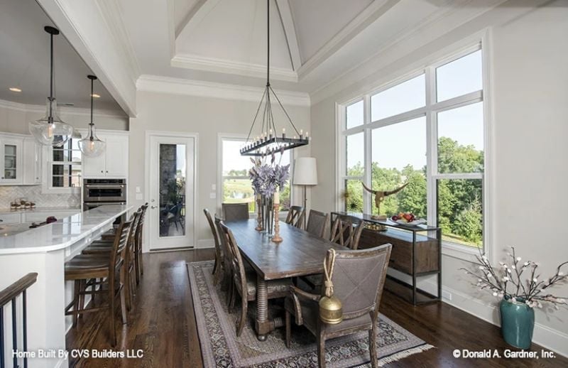
Wraparound windows pull a tree-lined water view straight into the dining room. Dark wood table, cross-back chairs, a rectangular iron candle chandelier overhead — it’s grounded enough that the view doesn’t swallow the room. The kitchen island with bar seating sits just steps away, which matters more than it sounds when you’re feeding multiple generations at once.
By The Numbers: CVS Builders constructed this home from a Donald A. Gardner plan, a partnership where the builder executes someone else’s vision but owns every detail of the result. Gardner’s plans tend to prioritize sightlines between living spaces, and that’s visible here in how the kitchen, dining area, and windows all read as one connected zone. Open-concept flow like this shows up repeatedly in plans marketed to multigenerational households, where shared common areas carry far more daily traffic than they do in single-family layouts.
Wood-Planked Barrel Ceiling and a Wine Rack That Means Business
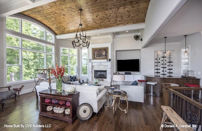
Tongue-and-groove wood planks curve overhead while a wrought iron chandelier anchors the room below. That wine display tower isn’t decorative. It’s load-bearing for your lifestyle.
That wine display tower isn’t decorative. It’s load-bearing for your lifestyle.
Ornate Iron Railings and an Open Layout Built for Controlled Chaos
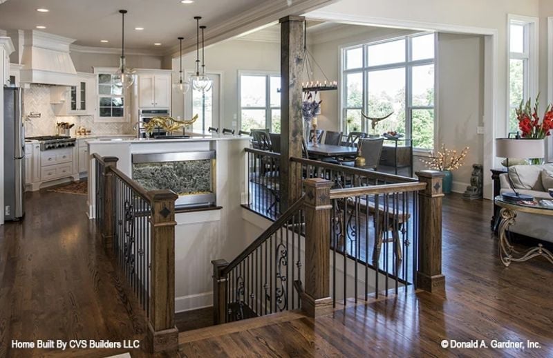
Wrought iron balusters with scroll detailing frame a staircase landing that opens directly into the kitchen and dining areas without a wall in sight. The scroll work isn’t just decorative — it’s doing the visual heavy lifting in a space that could easily feel bare.
Trend Alert: Split-level open layouts are showing up more in family homes because they define zones without closing them off. A railing does the job a wall used to do while keeping sightlines clear across the whole main floor — practical, but it also reads as a deliberate design choice rather than a structural compromise.
Pendant Lights Over a White Island That’s Clearly Running the Whole Kitchen
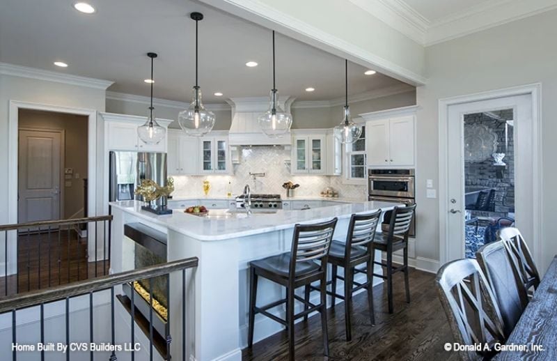
Clear glass pendants hang at staggered heights over a white island with a waterfall edge. Open shelving above the range, a herringbone tile backsplash, bar seating for three — the kitchen is organized without feeling like it was designed by a mood board.
- Glass pendants work better over islands than recessed lighting alone because they define the workspace below
- Waterfall countertop edges protect island corners, which take more daily abuse than any other surface
- Bar-height seating on one side of an island preserves flow without sacrificing casual dining space
Four-Poster Frame, Tray Ceiling, and Direct Balcony Access That Makes Mornings Worth Having
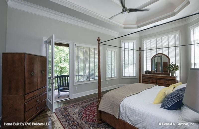
Four tall posts anchor the bed without a canopy panel, keeping sightlines open to the bay window grouping across the room. The tray ceiling adds height without fuss, and the door to the balcony is doing quiet but serious work — Persian rug, warm wood dresser, yellow accent pillow. Grounded. Livable. Not trying too hard.
Pro Tip: Tray ceilings photograph well, but their real job is acoustic. The recessed field breaks up flat drywall and reduces the hollow echo common in larger bedrooms. If you’re planning one, keeping the step depth at least five inches makes the detail readable from floor level — any shallower and it disappears.
Screened Porch with a Stone Fireplace That Earns Its Square Footage Year-Round
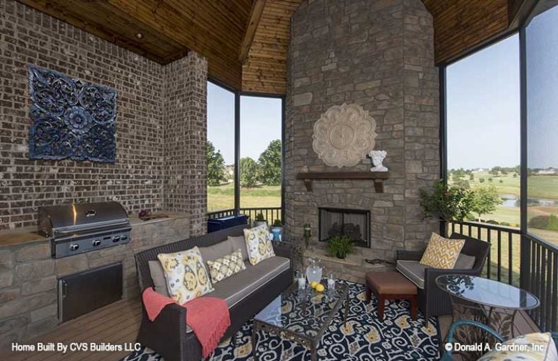
Wicker seating, a bold patterned rug, and a built-in grill share space with a floor-to-ceiling stone fireplace. Outdoor rooms layered like this tend to get used well past October.
Style Math: Screened porches with fireplaces push outdoor living into shoulder-season territory without adding conditioned square footage. Stone surrounds hold and radiate heat longer than brick, which matters on evenings that drop faster than the forecast suggested. The wood-planked ceiling ties the porch back to the interior so it reads as part of the house rather than something bolted on later.
Pin It
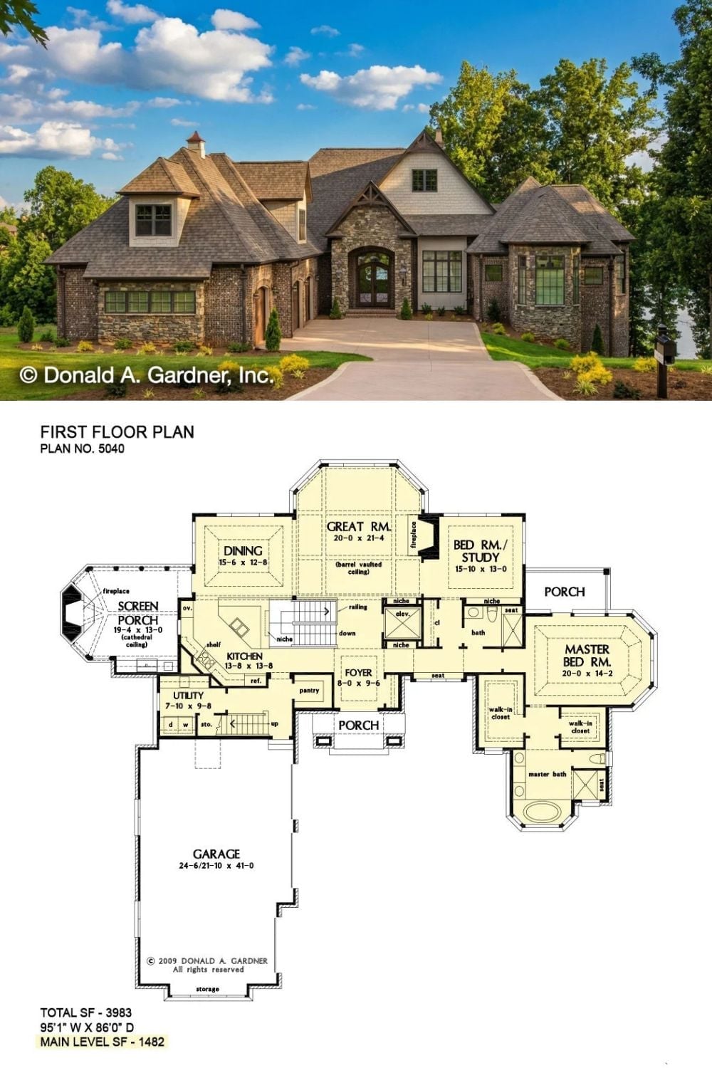
Exterior photo of a stone Tudor home paired with its first-floor plan showing four bedrooms and a three-car garage.
Common Mistake: Designers often place the master suite opposite secondary bedrooms for sound separation, but distance alone doesn’t solve the multigenerational problem. A bedroom with its own bath and a separate entry point — even one accessed through a porch — changes the dynamic entirely. Plan 5040 puts the bed/study near a dedicated bath on the opposite side of the great room from the master, giving everyone a defensible boundary without anyone having to ask for one.
