
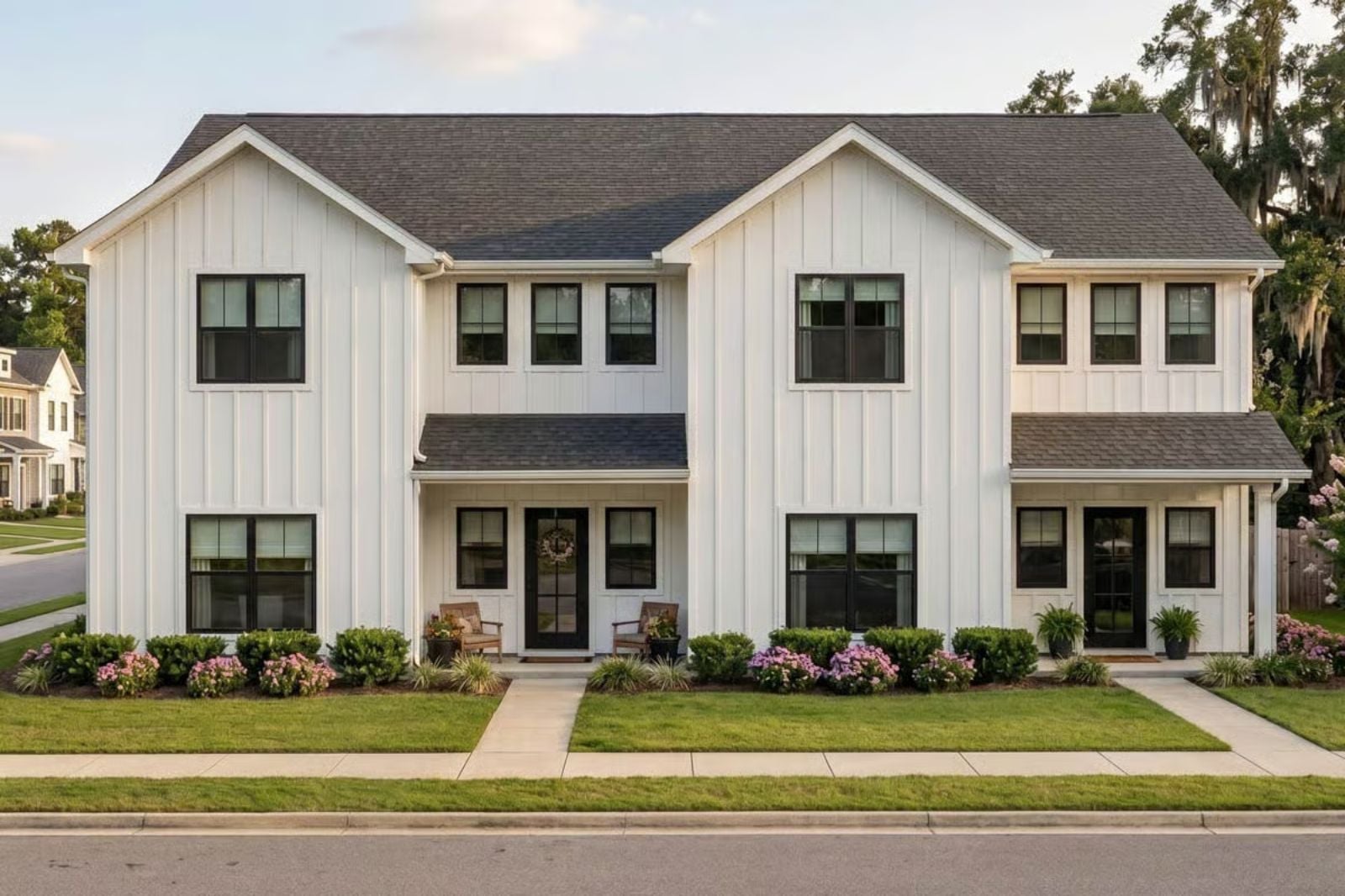
Multigenerational living has been quietly reshaping how people buy and build homes, and the floor plans finally catching up are duplexes, not additions. The Millbrook leans into that reality: two front doors sharing a porch where someone’s dad drinks his morning coffee while the grandkids eat cereal ten feet away, a shared wall that keeps everyone close without the thermostat arguments, and genuinely separate living spaces that make Sunday dinners voluntary rather than unavoidable.
Specifications
- Sq. Ft.: 3,820
- Bedrooms: 3
- Bathrooms: 2.5
Floor Plan – Main Floor
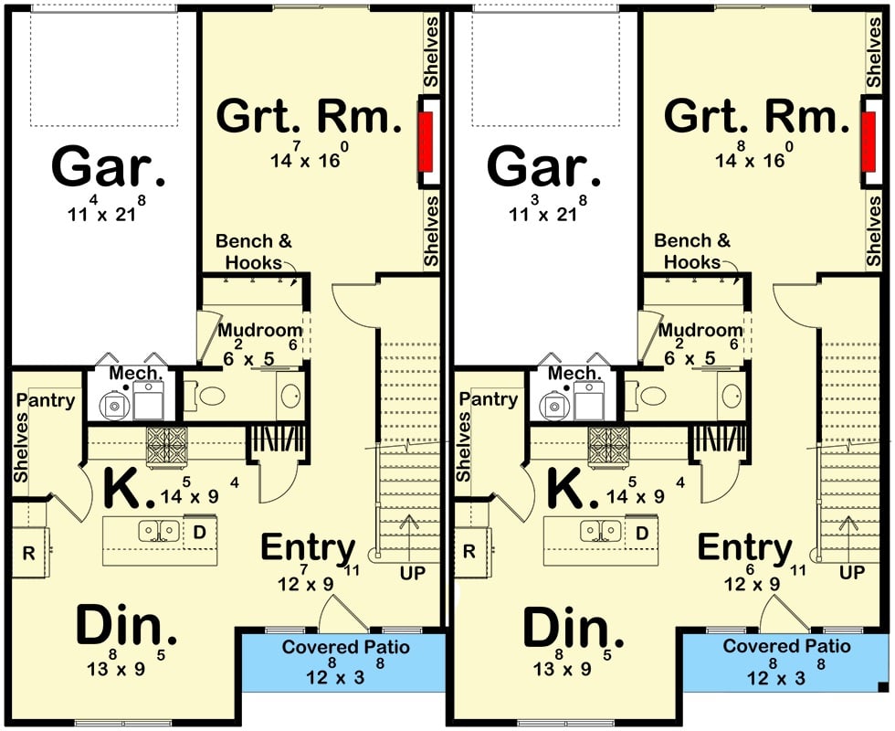
Each unit gets a great room, kitchen, dining area, mudroom with bench and hooks, single-car garage, covered patio, and a staircase heading up. Entry walls on both sides are lined with shelving.
Floor Plan – Second Floor
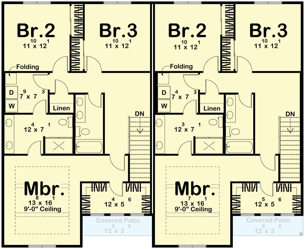
Upstairs, both units run the same layout: three bedrooms, a master with 9-foot ceilings, and a covered patio off the back. Each side handles its own laundry and linen storage, and the staircase placement keeps the mirror intact so neither unit bleeds into the other’s floor plan.
Paired Patios and Dark Garage Doors Give This Duplex Its Farmhouse Edge
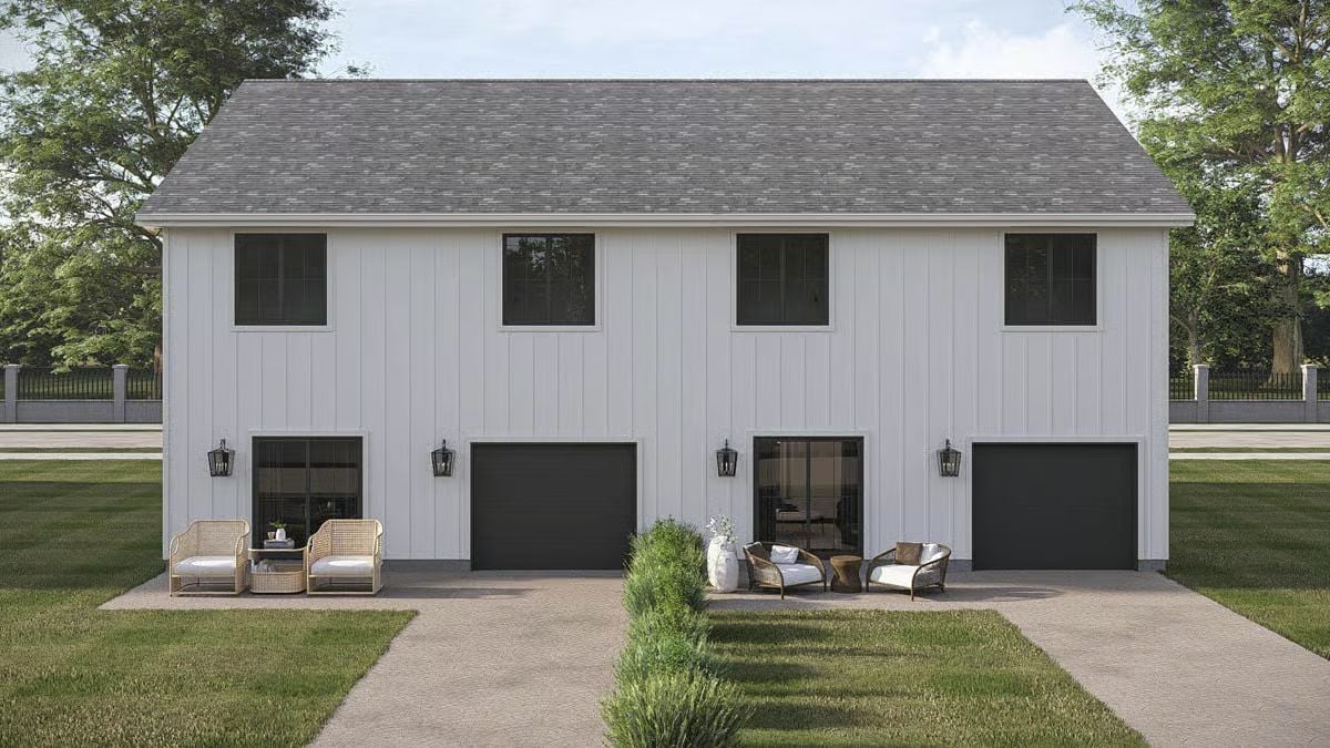
White board-and-batten siding keeps the exterior clean without trying too hard. Each unit gets its own concrete patio with wicker seating, a dark garage door, and a pair of wall lanterns flanking the entry — details that read as farmhouse without tipping into costume. Upstairs windows sit high and wide, pulling in light without eating into wall space below.
Warm Sconces and a Marble Table Keep This Gray Living Room from Feeling Cold
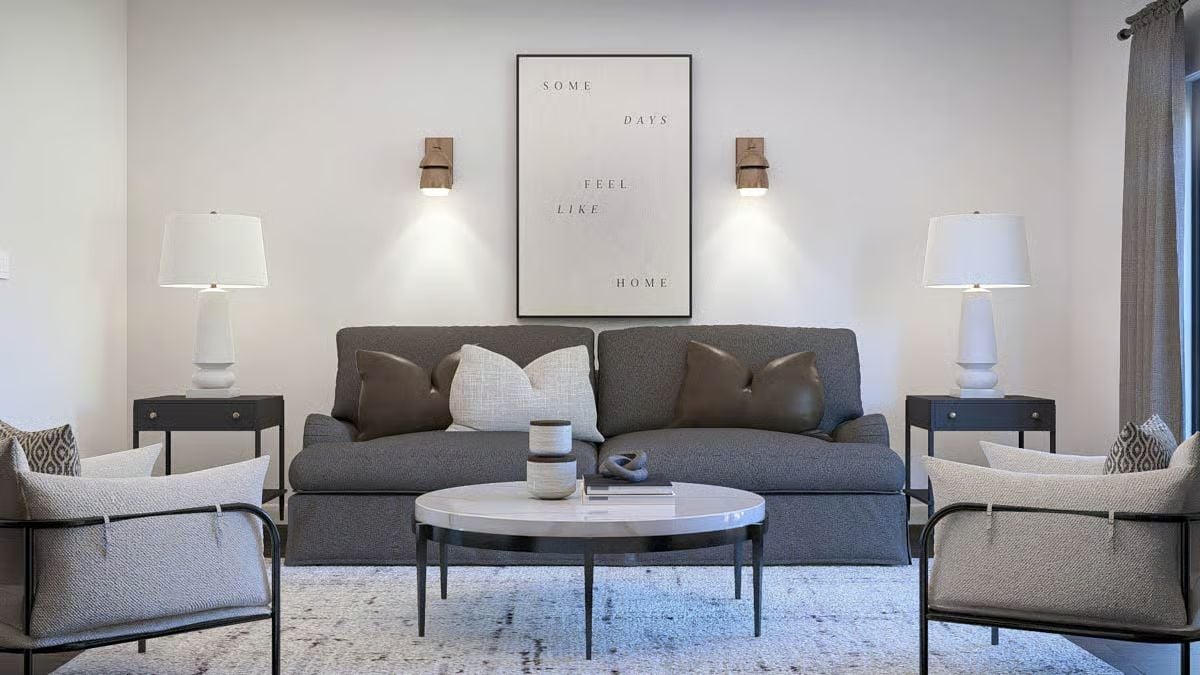
Gray boucle chairs flank a sofa dressed with leather and linen pillows, and the wood sconces are doing real work here — casting warm pools of light that keep the neutral palette from going completely flat. A round marble-top coffee table anchors the seating group without adding visual weight. Framed wall art reads simply: “Some days feel like home.”
Common Mistake: Most people hang wall sconces too high, treating them like art rather than light sources. Flanking a sofa, they should sit around 60 to 65 inches from the floor — roughly seated eye level — so the light actually reaches the people in the room instead of washing an empty wall above their heads.
Dark Backsplash Tiles and Marble Counters Do the Heavy Lifting Here
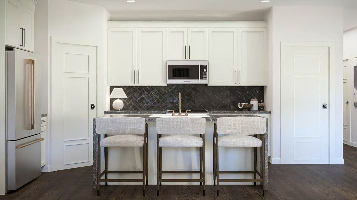
Glossy herringbone backsplash tiles anchor the white cabinetry without competing with it, and the brass faucet earns its place against the dark stone counters below.
Why It Works: Dark lower counters against bright upper cabinets is a reliable way to ground a kitchen without closing it in. It reads especially well in narrow layouts like this one, where an all-dark palette would feel suffocating. The backsplash handles the visual interest that a kitchen island with seating simply can’t in a footprint this tight.
Marble Table, White Slipcovers, and One Very Good Chandelier
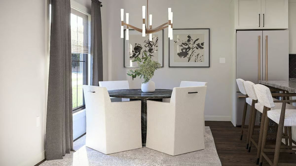
Slipcovered chairs with black pull-handles add an unexpected detail. The round dark marble table grounds the room without competing with the brass chandelier overhead — and honestly, that chandelier is good enough that you don’t want anything fighting it.
Trend Alert: Slipcovered dining chairs are having a genuine moment in modern farmhouse interiors. They look relaxed and pulled-together at once, and unlike upholstered chairs, you can actually wash them. For families sharing a home with in-laws, that practicality matters more than people publicly admit.
Dark Slat Wall, Two Ottomans, and a Bed That Means Business
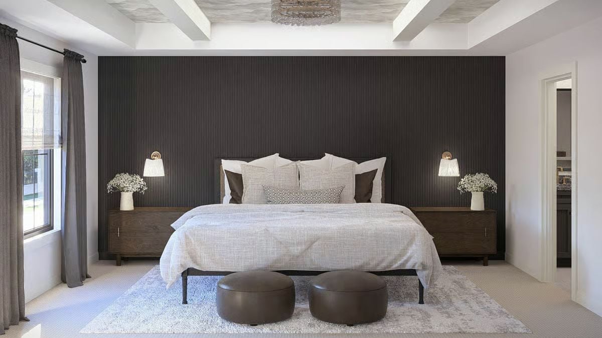
Fluted charcoal panels on the accent wall give the bed something to push against. Walnut nightstands run wide and low, keeping the sightline clean, and two leather ottomans anchor the foot of the bed without crowding it.
Why Fluted Panels Work Better Than Paint Here
Flat dark paint absorbs light and can make a wall feel like it’s collapsing inward. Fluted or ribbed paneling catches light differently across each groove, so the wall reads dark but still has dimension — a small distinction that keeps the room from feeling like a cave.
Scallop-Frame Mirrors and Bronze Hardware Pull This Vanity Together
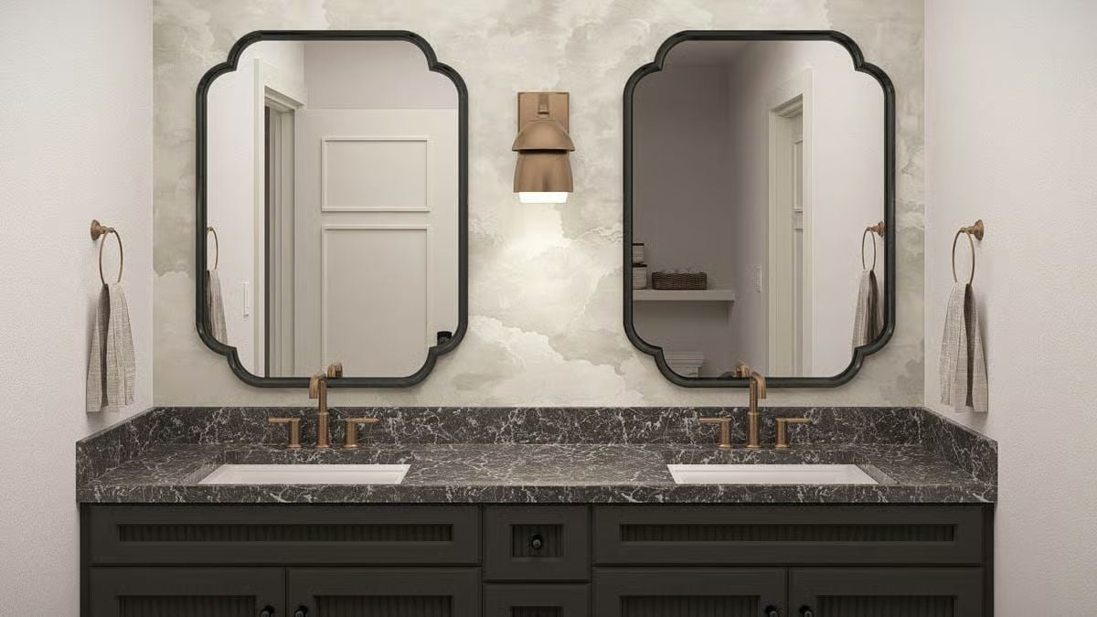
Dark marble on a dark cabinet should feel heavy, but it doesn’t here.
The scallop-edged mirrors break up what could’ve been a flat, forgettable wall, and the unlacquered bronze faucets will patina over time. That’s not a flaw — it’s the whole idea.
Bold Hook: Double sinks get all the attention, but countertop depth matters just as much. A shallow vanity top leaves almost no usable surface beside the basins. If you’re speccing a double vanity, prioritize depth over width so there’s actual room to set things down without knocking them into the sink.
Pin It
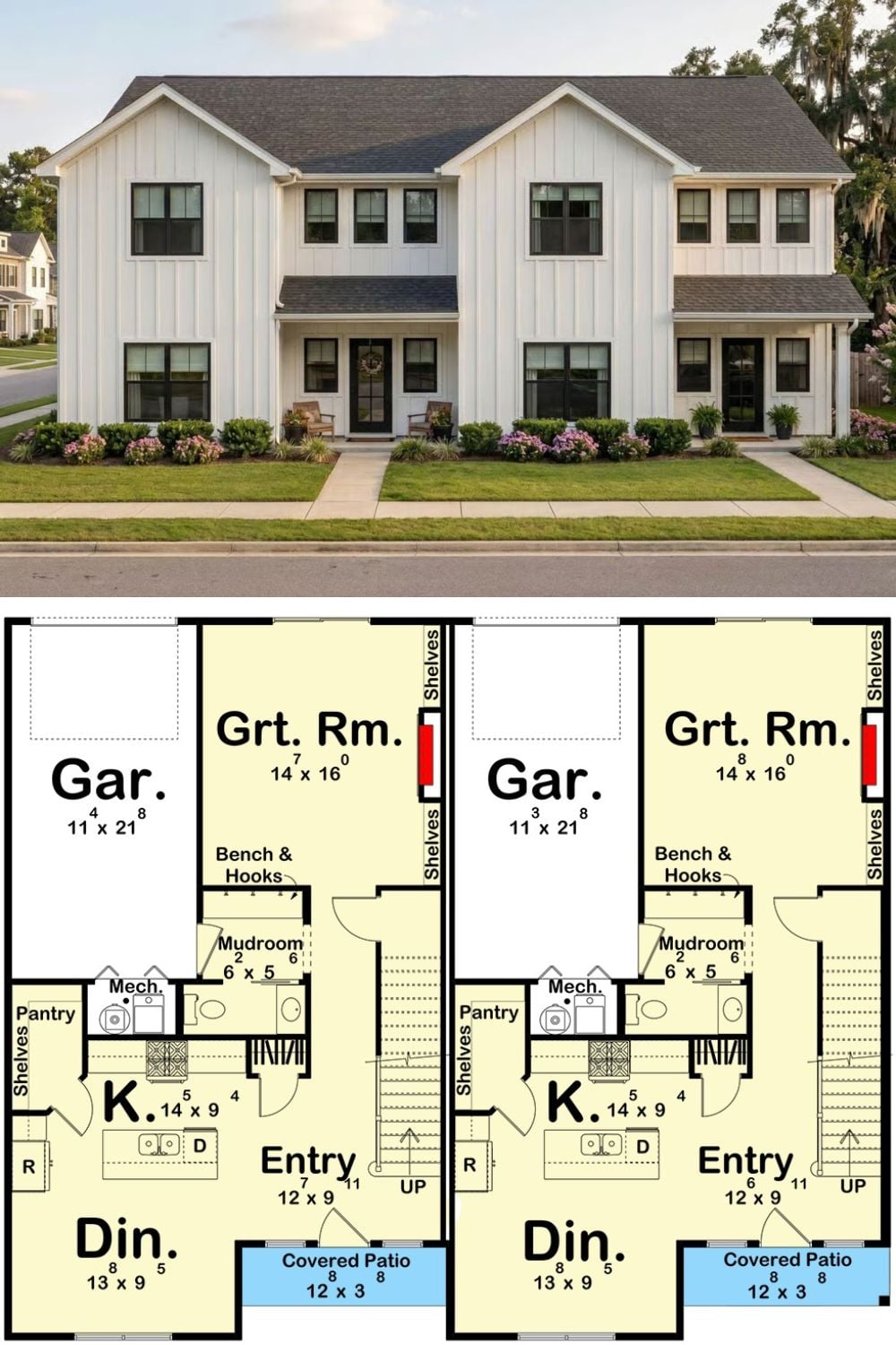
Exterior photo shows a two-story modern farmhouse duplex with board-and-batten siding. The floor plan below reveals mirrored units with great rooms, mudrooms, and covered patios on both sides.
Style Math: Mirrored duplex layouts tend to cost less to build than asymmetrical ones because framing, plumbing stacks, and mechanical runs can be shared along the center wall. That wall is doing a lot of structural work you’d otherwise pay for twice. It’s one of the quieter financial arguments for building a duplex rather than two separate structures on the same lot.
