
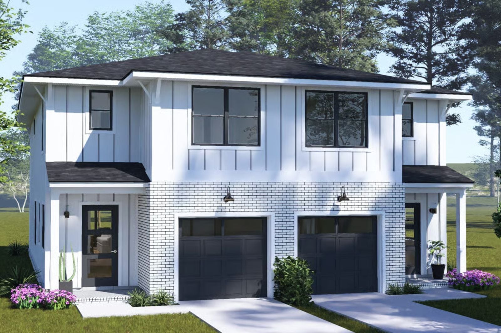
Multigenerational households are reshaping American housing faster than builders can keep up, and the options on offer — cramped in-law suite or fully separate property — still miss the point entirely. The Mirror Twins lands somewhere more honest: mirrored floor plans, private entries, a dedicated TV alcove per unit, and enough shared infrastructure that two coffeemakers can run at 7 a.m. without anyone feeling like a houseguest in their own home.
Specifications
- Sq. Ft.: 3,230
- Bedrooms: 3
- Bathrooms: 2.5
Floor Plan – Main Floor
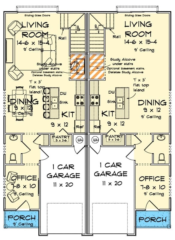
Both units are mirror images of each other, each with a living room and sliding glass doors, a 9×12 kitchen and dining area, one-car garage, office, and a study alcove tucked under the stairs. A shared entry and stairwell run down the center.
Floor Plan – Second Floor
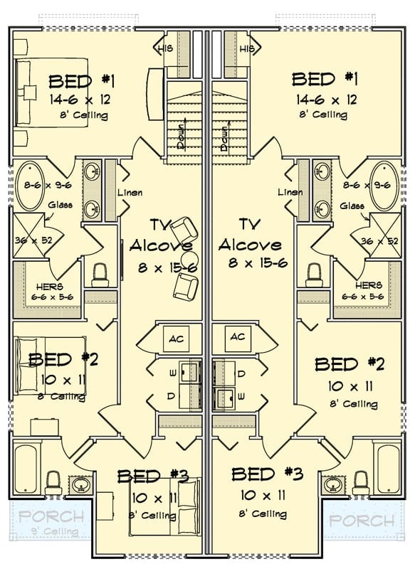
Upstairs, each unit carries three bedrooms, a TV alcove, shared bath, and a private porch. Bed #1 sits closest to the stairwell. Laundry and AC units are consolidated in the center core, which keeps the mechanical side of the building clean and out of everyone’s way.
Designer’s Secret: The TV alcove is the quiet genius of this layout. At 8 x 15-6, it’s large enough for a proper sectional without eating into bedroom square footage — so bedrooms stay restful instead of pulling double duty as media rooms. Multigenerational households tend to fight over noise more than anything else, and this plan actually addresses that rather than hoping for the best.
Sunlight Does the Heavy Lifting in This Living Room
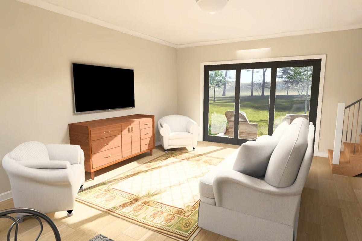
Warm oak flooring, a walnut credenza, and sliding glass doors flood this room with afternoon light that no overhead fixture could replicate. The whole thing reads as larger than it is because of it.
Pro Tip: Sliding glass doors borrow outdoor square footage visually, which keeps a shared living space from feeling sealed off. If you’re sizing furniture for a room like this, orient seating toward the view first and the TV second. Natural light wins that argument every time.
Step out of the floor plan and into the kitchen-dining combo where the layout actually lives.
Marble-Look Island, Wood Table, Zero Design Confusion
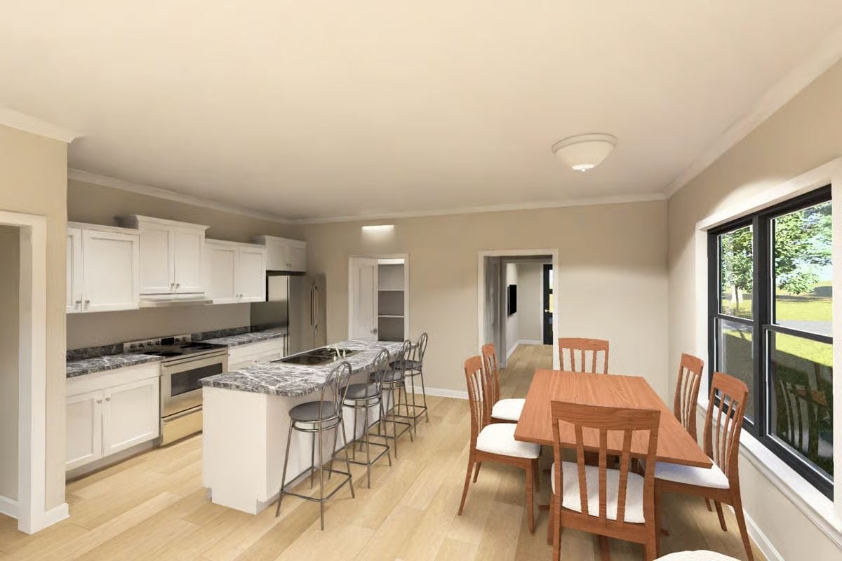
Light floors keep the space from reading heavy. Bar stools at the island handle quick breakfasts and school-morning chaos; the dining table nearby handles everyone else, at a pace that actually allows for conversation.
Gray Marble Countertops That Pull Double Duty as a Kitchen Island and Breakfast Bar
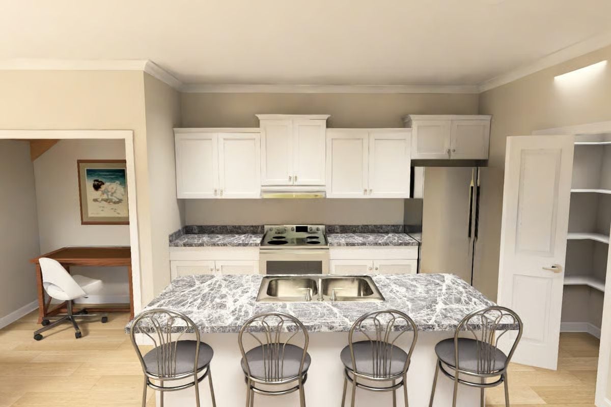
Four metal barstools line a double-sink island with marble-look countertops. White shaker cabinets and an electric range keep the back wall tidy and uncluttered.
Why the Sink Placement Actually Makes Sense Here
Dropping the sink into the island rather than against the back wall means whoever’s doing dishes faces the room. In a duplex built around shared family life, that’s not a trivial call. It keeps the cook folded into whatever’s happening at the bar, which makes a compact kitchen feel less like a work zone and more like somewhere people actually want to stand around. Small shift, real difference.
Black Frames, White Chairs, and a Round Table Doing Real Work
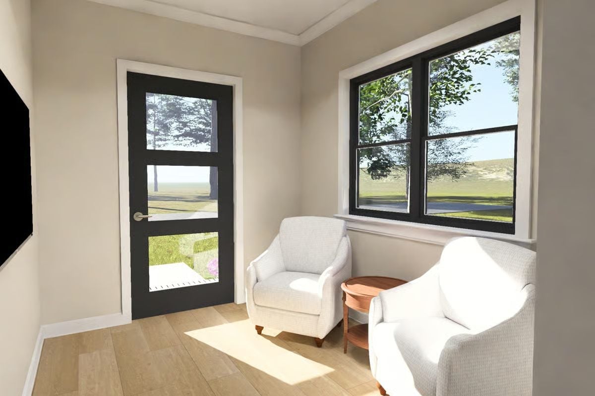
Black door and window frames anchor the neutral walls without tipping into dramatic. A round side table between two chairs keeps the corner useful without crowding it — the kind of detail that reads as intentional rather than afterthought.
Try This: Black window frames paired with warm white upholstery is a combination that holds up over time and doesn’t ask much of you decoratively. If you’re furnishing a sitting nook like this one, keep the table low enough to clear the armrests so the chairs can actually relate to each other rather than facing the same direction in silence.
Green Floral Bedding That Actually Earns Its Place in a Neutral Room
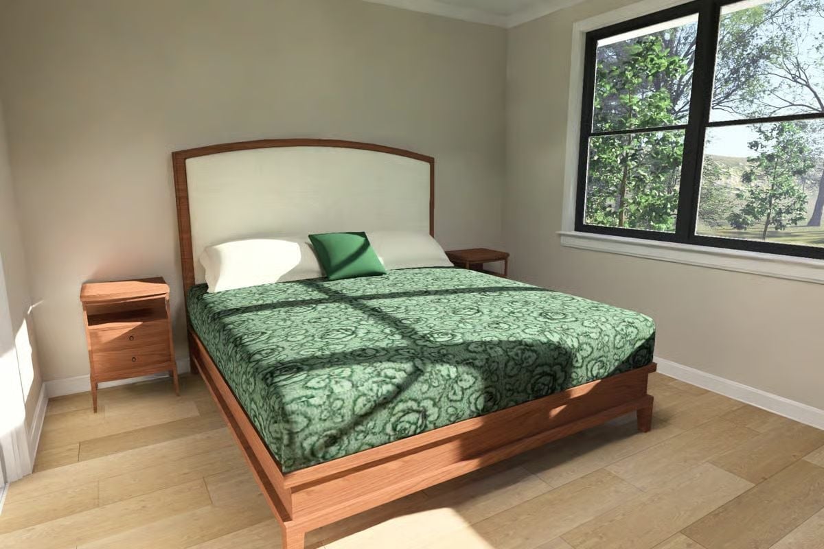
Rose-patterned green bedding against warm wood tones and a cream upholstered headboard keeps the palette grounded without going flat. It’s a lot, on paper. It works.
In The Details: Patterned bedding earns its place in a neutral room when the furniture around it stays quiet. Here, the wood bed frame and nightstands share the same finish, which stops the green from reading as an accent that got away from someone. Building a bedroom around a bold textile means the casework needs to be disciplined — same tone, same finish, no competing for attention.
Clawfoot Tub Parked Next to a Walk-In Shower That Doesn’t Need a Door
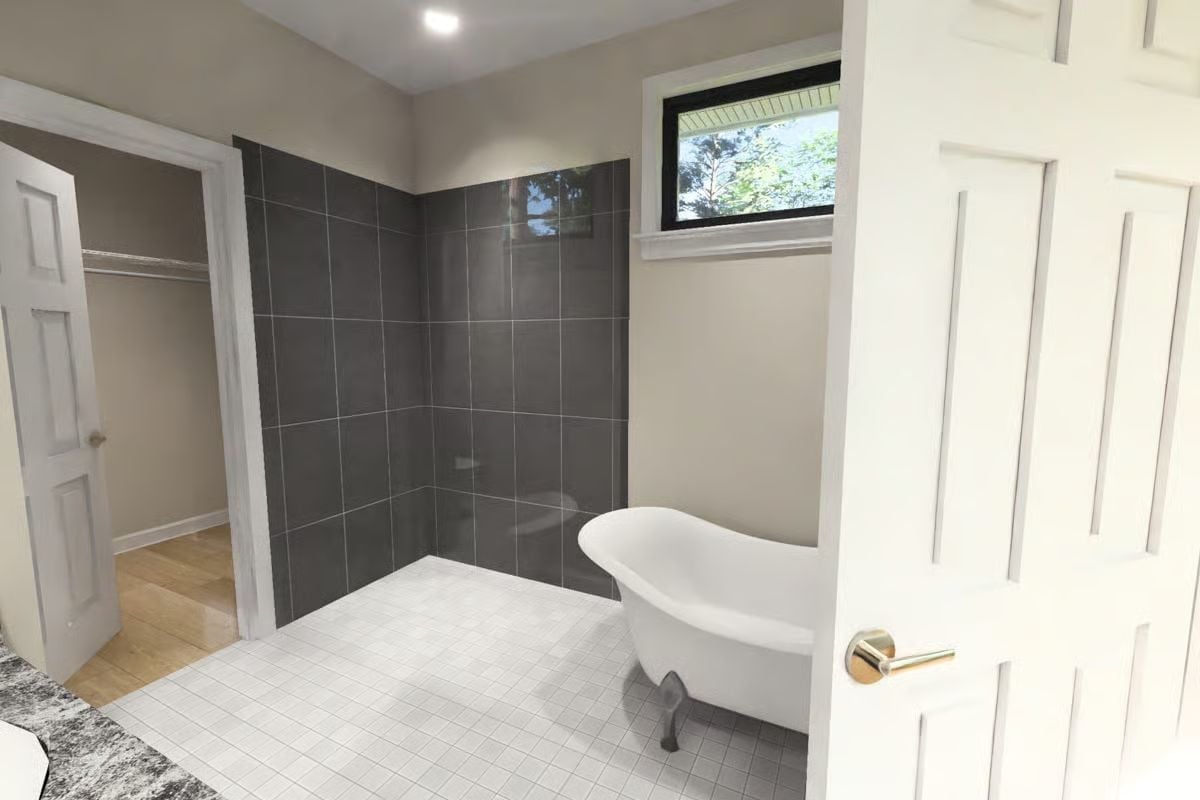
Gray tile climbs high on the shower walls while small white floor tiles keep things grounded at eye level. The clawfoot tub sits close enough to the window to catch real light, which is the only reason a clawfoot tub makes sense in a bathroom this size.
Pin It
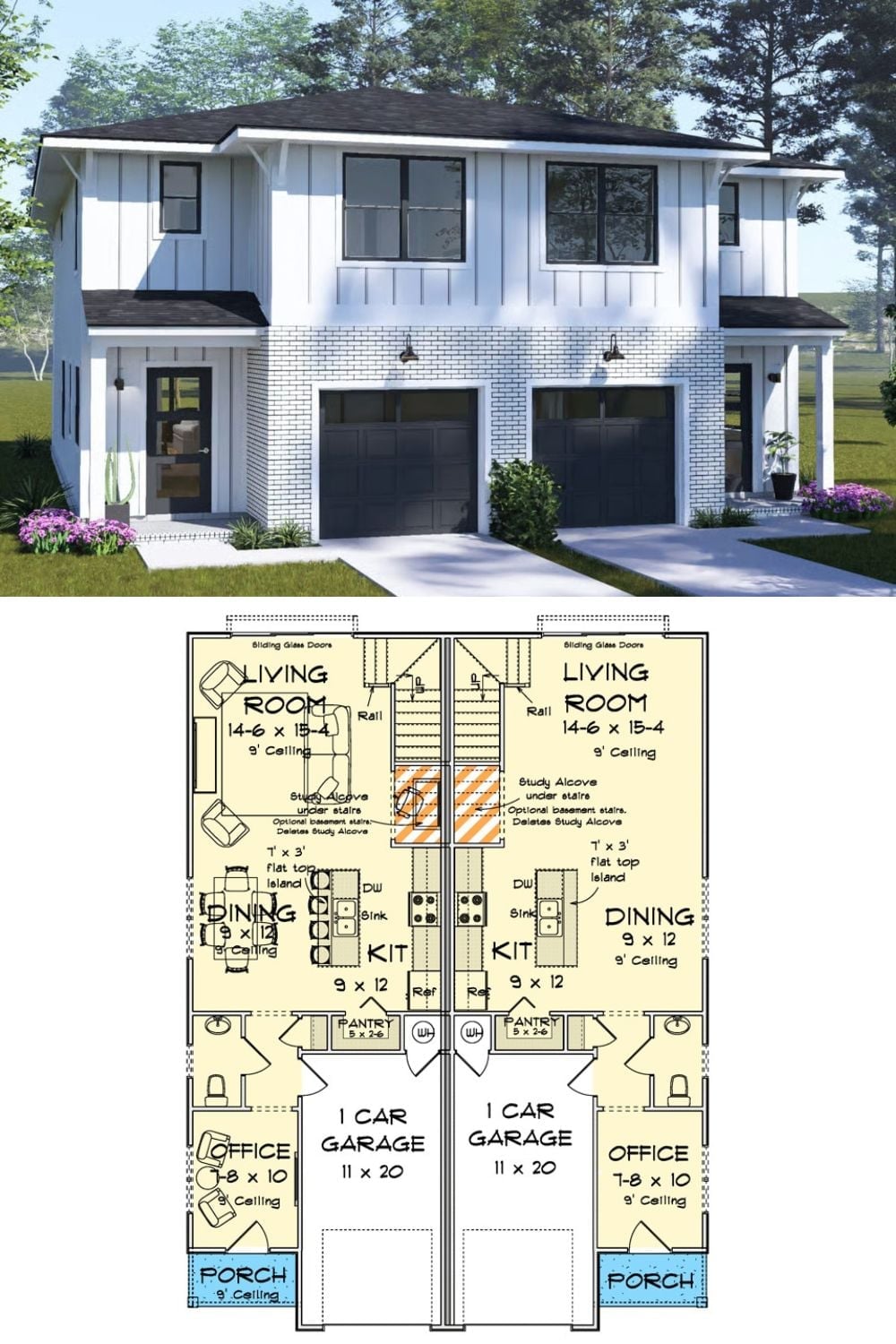
The exterior rendering shows a modern farmhouse duplex with a shared two-car garage and mirrored footprint below, each unit with its own living room, kitchen, dining area, office, and single-car garage access.
