
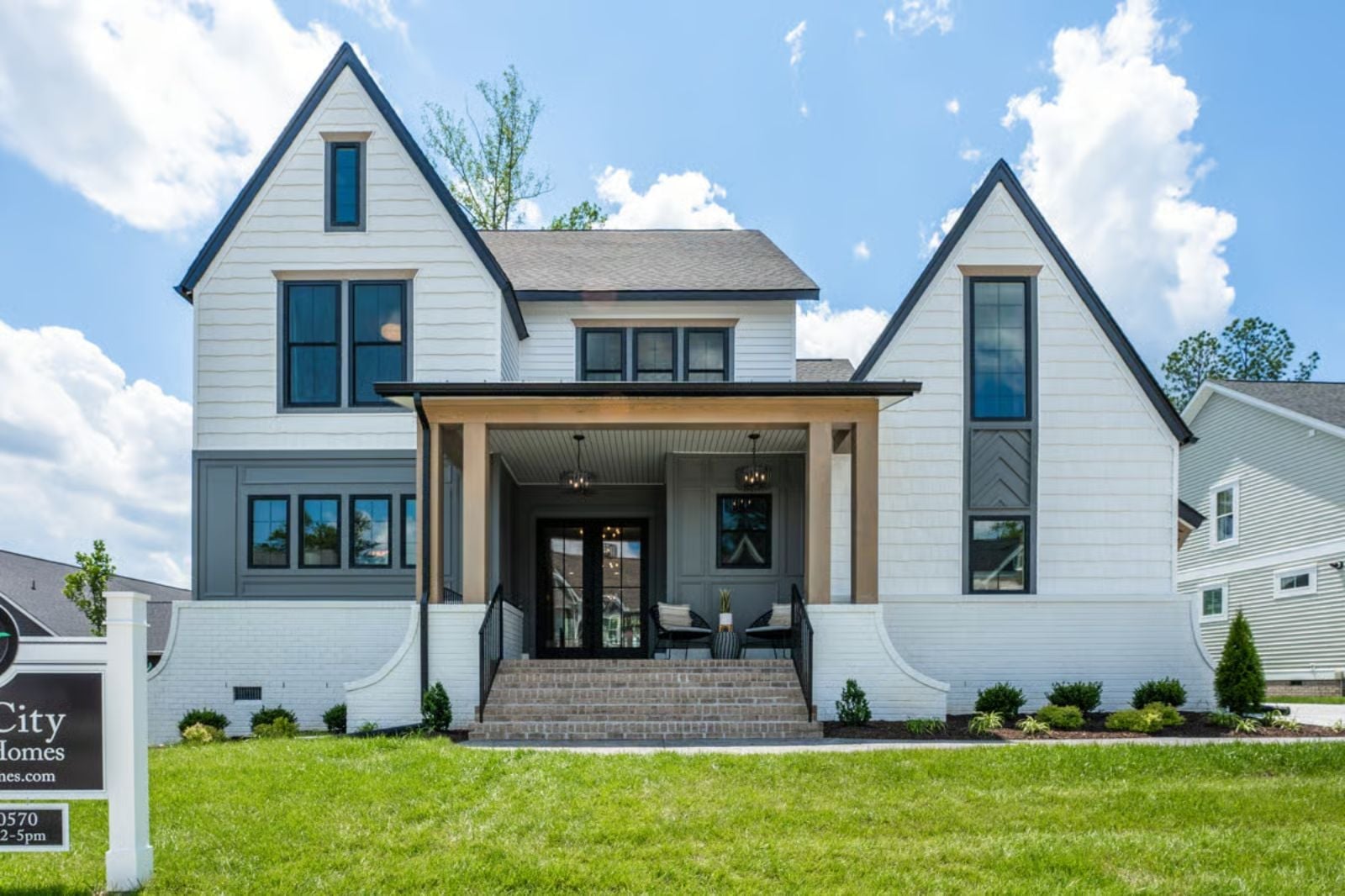
Keeping kids close and keeping them contained are two different problems, and most floor plans only bother solving one. The Marlowe handles both — a dedicated kids loft pulls the noise upstairs, the open main level keeps everyone visible, and the primary suite actually closes off.
Specifications
- Sq. Ft.: 3,569
- Bedrooms: 5-6
- Bathrooms: 4-5
Floor Plan – Main Floor
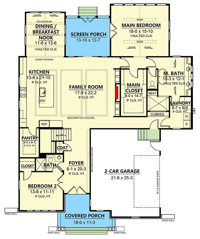
Single-level layout connects family room, kitchen, and main bedroom suite with screened porch access.
Floor Plan – Second Floor
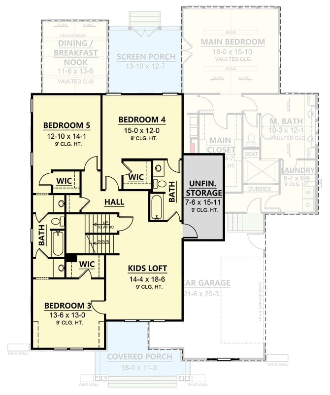
Bedrooms 3, 4, and 5 share the upper level, each with a walk-in closet and shared bath access off a central hall. The Kids Loft opens up at 14×18 — no door, no ceiling, just space. Unfinished storage tucks beside the stairwell, and the Main Bedroom stays on the opposite wing where it belongs.
Floor Plan – Third Floor
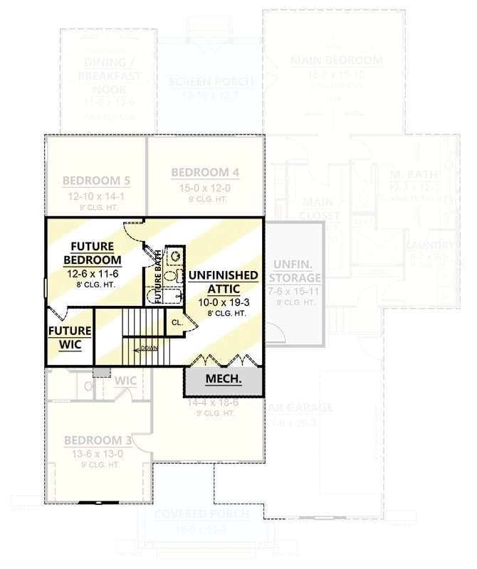
The bonus level converts unfinished attic into a future bedroom, walk-in closet, and bath. Bedrooms 3, 4, and 5 occupy the finished portion, keeping the kids grouped on the same floor rather than scattered through the house.
Gallery Wall Does Double Duty as a Builder’s Portfolio in This Foyer
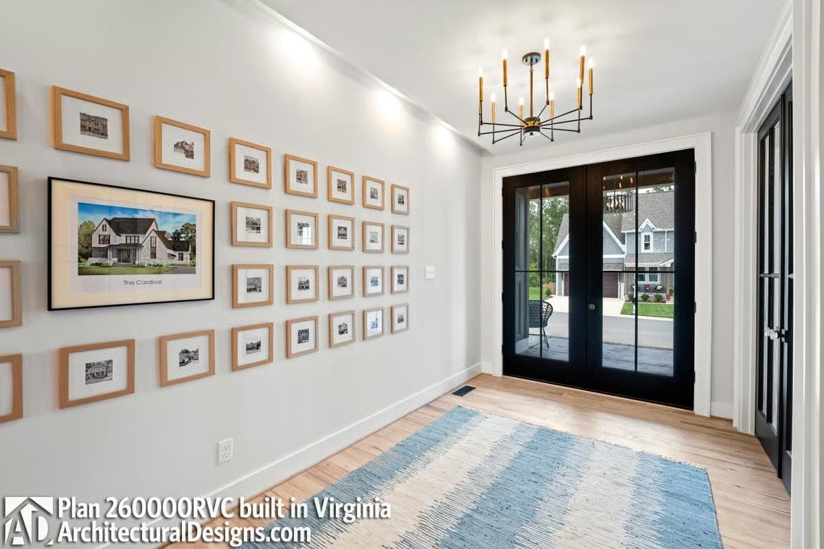
Dozens of wood-framed house renderings climb the wall in a tight grid, with one oversized black-framed print labeled “The Cardinal” anchoring the left side. It’s a good use of entryway space that would otherwise just sit there looking purposeless. Underfoot, light hardwood runs toward a pair of black French doors with glass panels that frame the neighborhood outside.
Editor’s Note: Builders and architects sometimes use model home foyers as working showrooms, displaying available plans where visitors can browse while they wait. Dead square footage becomes a sales tool, and it doesn’t feel like one — which is probably the point.
Coffered Ceiling, Open Plan, and a Glass Wall That Pulls the Outside In
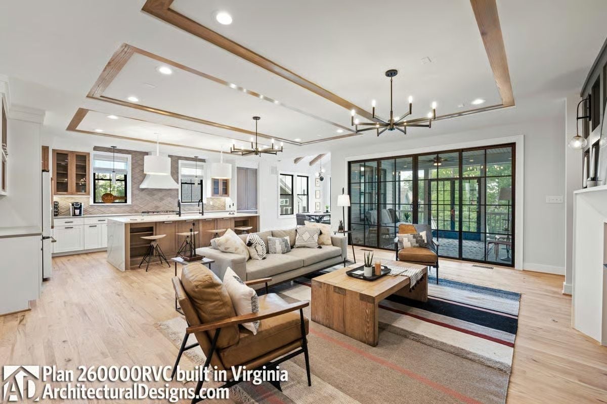
Wood-trimmed coffered ceiling anchors the great room while a Sputnik chandelier cuts against it. A leather chair, striped rug, and chunky wood coffee table keep the whole thing from floating away into showroom territory.
Style Tip: Open-plan living looks effortless until the noise starts. With kids in the house, a kitchen island positioned between the cooking zone and the seating area gives you just enough visual separation that the chaos reads as organized — not that it actually is, but the room stops broadcasting it.
Warm Wood Beams and a Gray Built-In Make This Living Room Work Hard
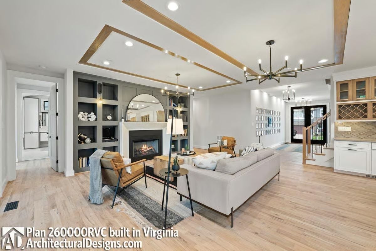
Gray built-ins flank a lit fireplace with a clean white surround, and an arched mirror above keeps the wall from turning heavy. Two Sputnik-style chandeliers anchor the ceiling, where inset wood beams add warmth without fighting the white for attention. Light hardwood floors run throughout. It all holds together without trying too hard.
Try This: Built-in shelving around a fireplace only stays polished if you plan storage before construction begins. Decide what’s actually going on those shelves before the contractor finalizes depths and heights — shallow niches that can’t hold a record player or a row of books end up holding decorative spheres forever, and nobody’s happy about that.
Marble Island, Two Cabinet Finishes, and a Ceiling That Earns Its Keep
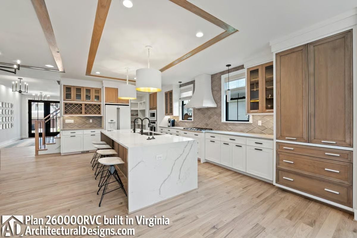
White lower cabinets pair with warm walnut uppers, and the island’s veined quartz countertop is thick enough to read as furniture. Drum pendants with gold interiors keep the light from going cold.
The island’s veined quartz countertop is thick enough to read as furniture.
Black-Frame Windows and Exposed Beams Turn a Dining Room Into Something Worth Sitting In
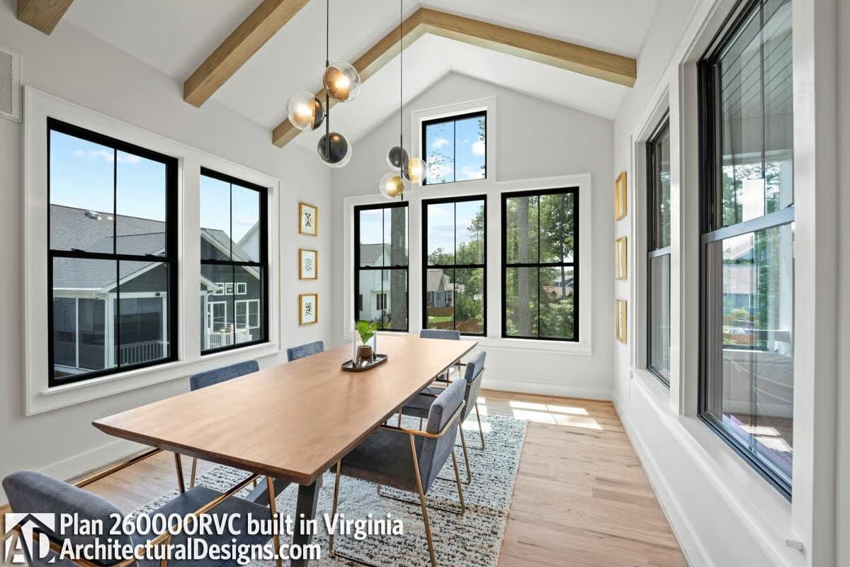
A vaulted ceiling with wood beams keeps this dining room from collapsing into a box. Globe pendants in smoked and clear glass hang at staggered heights over a live-edge walnut table, and blue-gray chairs with brass legs add contrast without fighting the natural light flooding in from every wall.
Why Black Window Frames Work Here
Black window frames put a hard edge around each opening — and in a room this bright, that edge does real work. Soft trim would dissolve into all that white, leaving the windows looking unfinished. The dark frames give each one a defined boundary that reads almost like artwork, the kind of thing most people don’t consciously register until they see a room without it.
Cathedral Ceiling and Black-Frame Windows Give This Primary Bedroom Nowhere to Hide
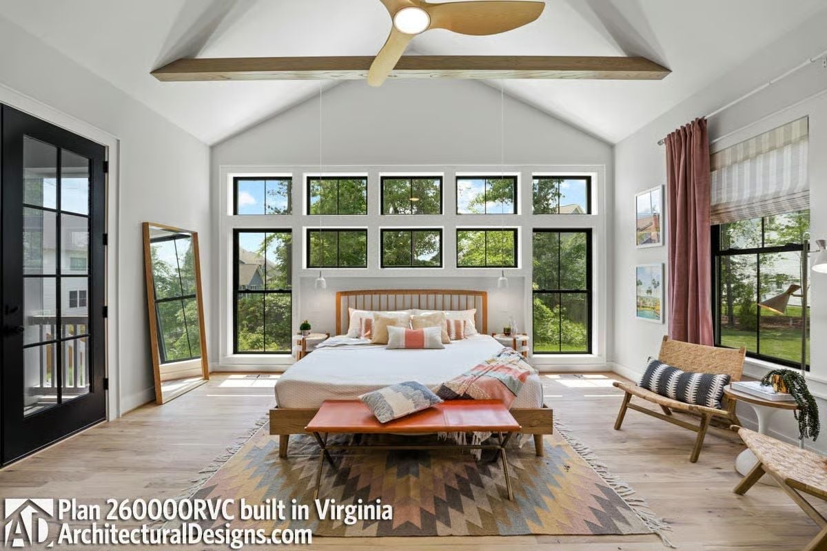
Exposed wood beams cross the vaulted ceiling without crowding it, and the grid of black-frame windows behind the bed pulls in enough tree canopy to make curtains feel optional. Pendant lights hang low on either side of the bed instead of the usual hardwired sconces. That leather bench at the foot of the bed does real work — it’s not decorative.
- Pendant lights on long cords are easier to position over nightstands than hardwired sconces
- A full-length mirror leaned against the wall reads less formal than a hung one and won’t require patching if you move
- Layering a flat woven rug under a patterned one defines the bed zone without committing to a single style
mini_list: Ceiling fans in primary bedrooms get skipped during the design phase more often than they should. You’re in that room every night. A fan that wobbles or throws uneven airflow at low speed becomes the thing you notice right before you fall asleep and right after you wake up. Spend more here than anywhere else in the house.
Double Vanity, Freestanding Tub, and a Walk-In Shower That Doesn’t Apologize for Taking Up Space
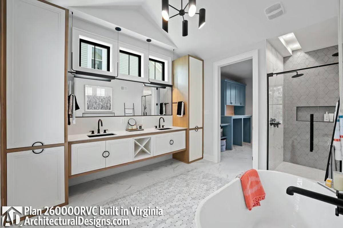
Black matte fixtures against white cabinetry create contrast without demanding attention. The X-detail drawer front and warm wood tower cabinet break up what would otherwise be a straight run of white from wall to wall. Geometric tile in the shower and a freestanding tub anchored by a coral towel keep it from reading as a hospital.
The Psychology Behind This: Splitting a double vanity with a wood tower cabinet instead of a shared mirror gives each person a defined zone. Anyone who has shared one long mirror with another person for more than six months already knows exactly why that matters.
Pin It
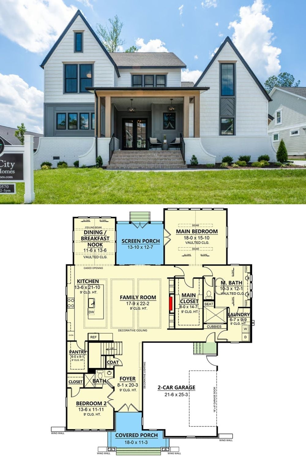
Exterior photo shows a modern farmhouse with dramatic peaked gables and dark-trimmed windows. The floor plan below reveals a main-level layout with primary suite, family room, second bedroom, and screened porch.
Fun Fact: Screened porches often get treated as an afterthought — tacked on, underused, eventually full of lawn furniture that should be in the garage. Positioning one directly off the dining area changes that. It becomes a three-season room that actually gets used, and framing it in during new construction rather than adding it as a retrofit typically produces better structural integration and fewer headaches down the road.
