
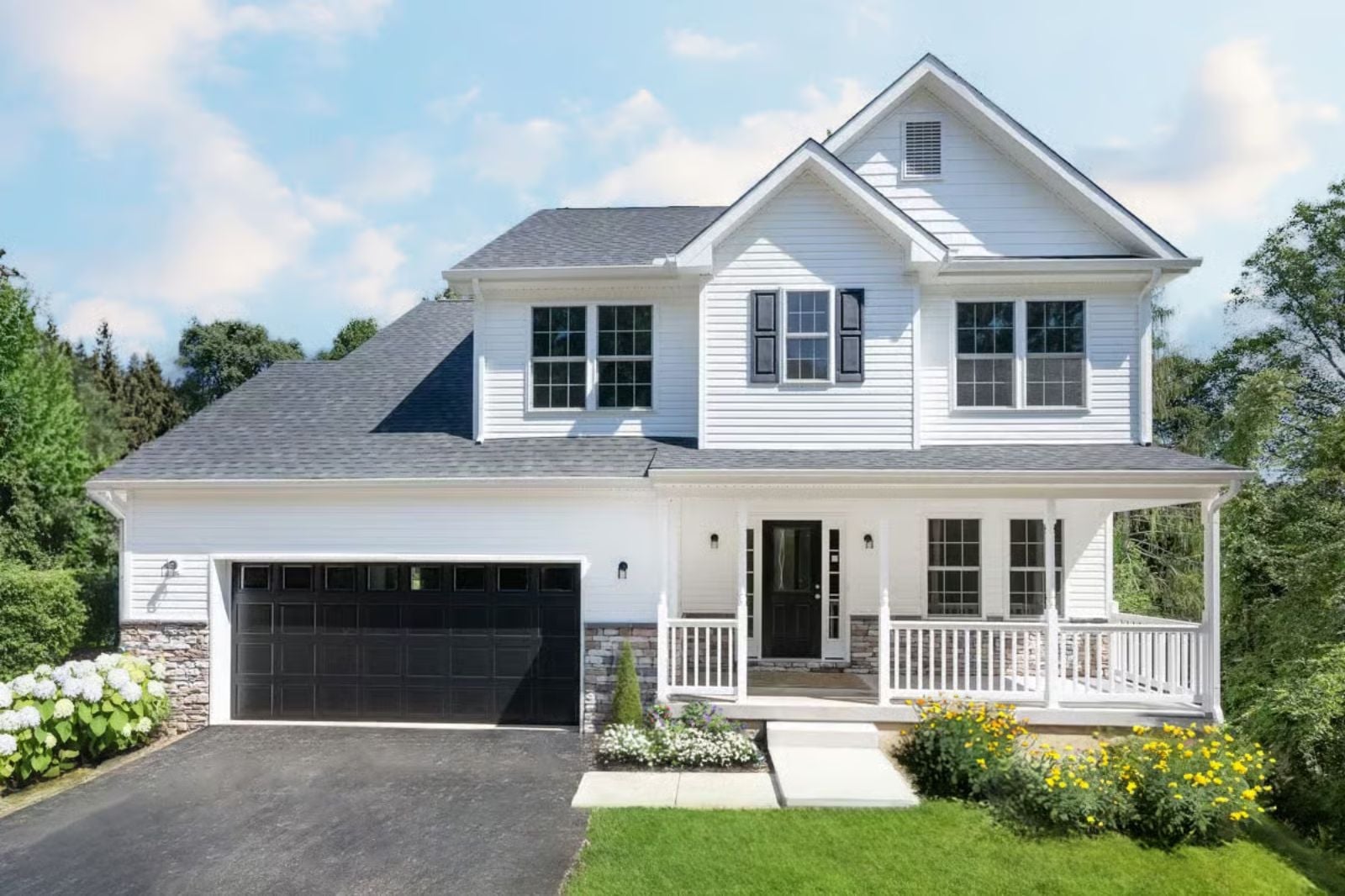
The house everyone remembers from childhood had a covered porch, a room that changed its purpose twice a year, and a staircase worth coming home to. The Magnolia Ridge is built around exactly that: a covered porch for slow mornings and late homework, a flex room that shifts from playroom to study hall as the kids do, and a traditional layout with enough breathing room that dinner conversations actually finish.
Specifications
- Sq. Ft.: 1,995
- Bedrooms: 3-4
- Bathrooms: 2.5
Floor Plan – Main Floor
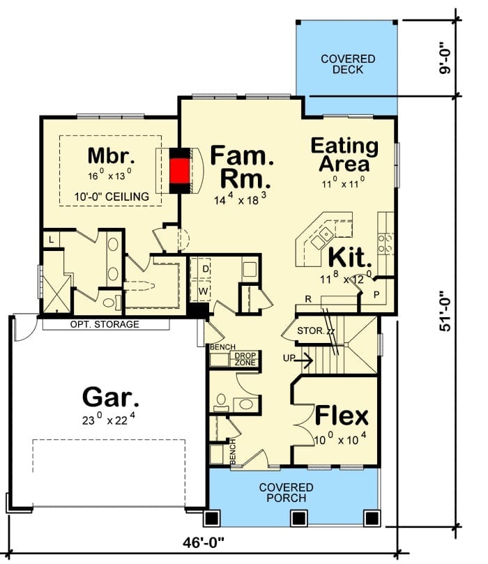
The main floor puts the master bedroom off the family room, with the kitchen and eating area opening to a covered deck. A flex room sits near the entry, and the garage connects through a drop zone with bench storage.
Floor Plan – Second Floor
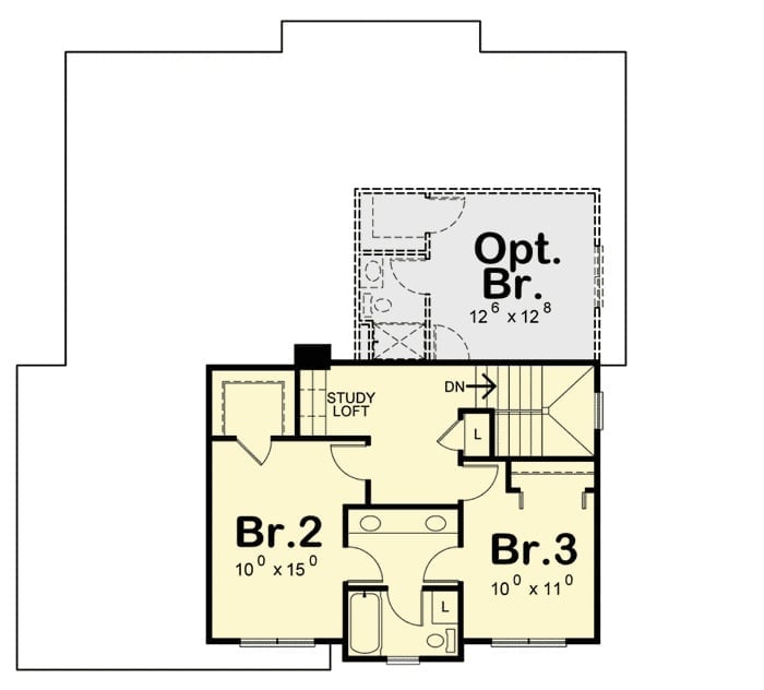
The second floor puts two bedrooms on a jack-and-jill bath, adds a study loft, and tucks an optional third bedroom above the garage — accessed separately, which matters more than it sounds once you have teenagers.
Reclaimed Wood Bench Seating Pulls This Open-Plan Dining Area Back to Earth
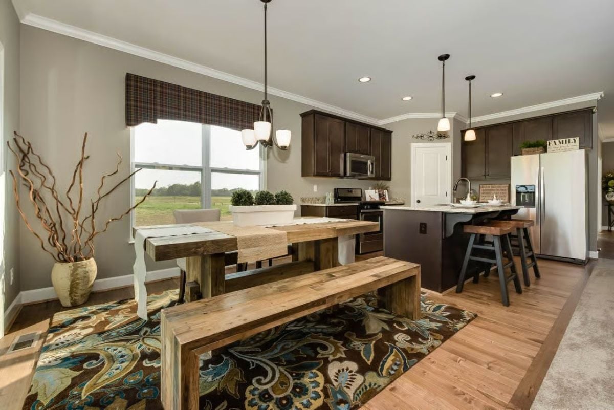
Rough-sawn pine benches anchor the dining area without pretense — no cushions, no fuss, just wood that looks like it meant to be there. The floral area rug does the harder job: bridging deep brown cabinetry to the lighter hardwood floors running through both spaces without calling attention to itself. Pendant lights above the island and a chandelier over the table keep each zone distinct while the whole room still reads as one.
Trend Alert: Reclaimed and rough-sawn wood furniture is showing up in new construction at a real clip right now, partly as a reaction to all those sleek, handle-free kitchens that dominated the last decade. Pairing it with dark stained cabinetry works because the contrast reads as intentional rather than mismatched — warmth without a renovation.
Cream Sofa, Stone Fireplace, Open Kitchen — Three Zones That Actually Work Together
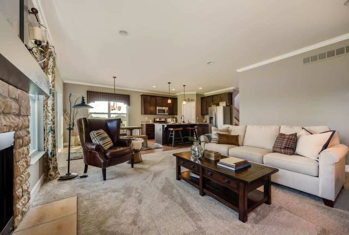
Carpet in the living zone gives way to hard flooring near the kitchen island, quietly drawing a boundary without any wall to do it. That leather wingback chair earns its keep as a solo reading spot — the kind of seat that actually gets used rather than just photographed. Dark cabinetry in the background keeps the open layout from washing out under all that natural light.
Common Mistake: Buyers often push all living room furniture against the walls to maximize floor space, but it usually backfires. Floating the sofa and chair toward the center, as done here, creates a conversation area that feels settled rather than sparse. Don’t wait until the room feels wrong to try it.
Dark Cabinetry and Granite Do the Heavy Lifting in This Open-Plan Kitchen
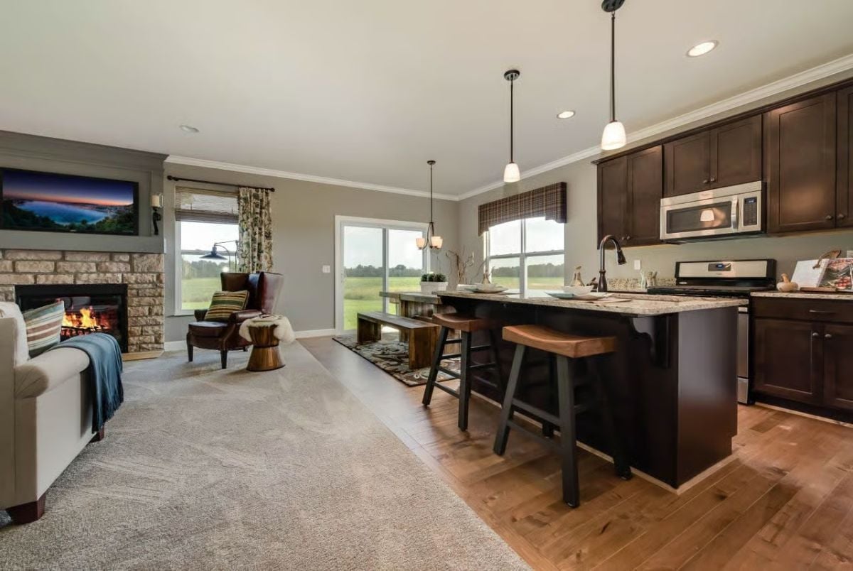
Espresso cabinetry and granite countertops keep the kitchen grounded while pendant lights pull focus over the island. Bar stools with leather seats sit at the counter’s edge, bridging cooking and casual dining without requiring a separate space for either. The stone fireplace holds the far wall without competing for attention.
Try This: Pendant lights over a kitchen island look best when hung at different heights only if the pendants are identical. Mix heights with different fixtures and it reads as clutter rather than intention. Matching pendants at a consistent drop height almost always win.
Oak Handrail, Iron Balusters, and Carpet Treads That Hold Up to Real Family Traffic
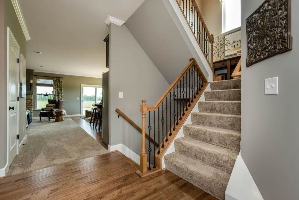
Wrought iron balusters with scroll detailing and a warm oak handrail show up in traditional builds for good reason: the combination ages well, and it photographs well while doing it. Carpet treads in a mid-tone greige absorb sound on the climb. Hardwood picks back up at the foyer floor below, tying both levels together without making a production of it.
Carpet treads in a mid-tone greige absorb sound on the climb.
Crown Molding, Chandelier, and a View Worth Waking Up For
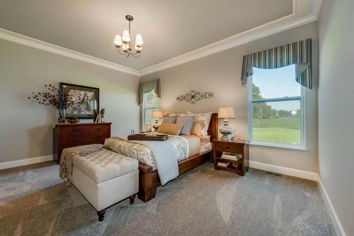
A tufted bench at the foot of the bed earns its place without crowding the room, which is harder to pull off than it looks. Warm wood nightstands and a dresser keep the gray walls from reading cold — same trick as before, different room, still works.
Pro Tip: Bedside lamps that match in silhouette but vary slightly in finish can tie together furniture from different collections without forcing a matchy-matchy look. If you’re mixing wood tones in a bedroom, keep them within the same warm or cool family so they read as a decision rather than an accident.
Dark Vanity, White Orchids, and an En Suite That Earns Its Keep
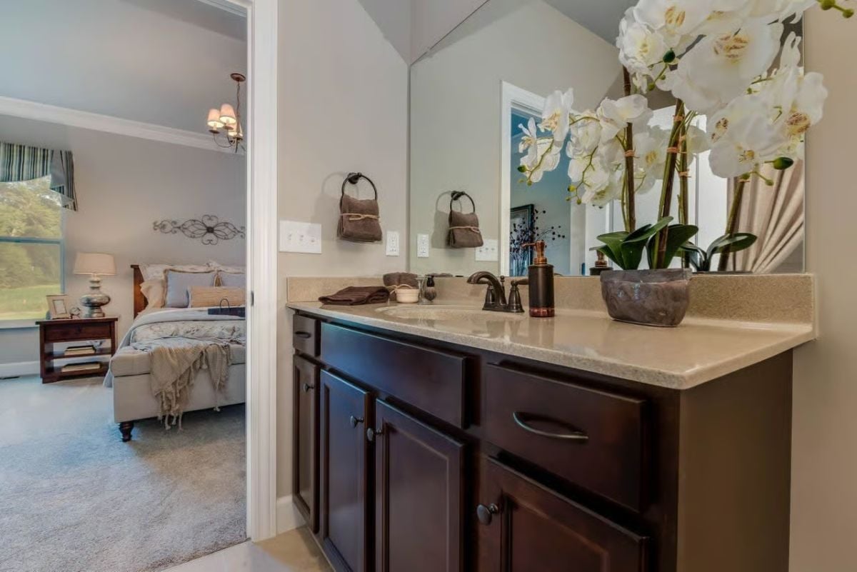
Orchids on a bathroom vanity aren’t just decorative — they tell you how much storage is underneath.
Dark wood cabinetry with oil-rubbed bronze hardware pairs with a light quartz countertop in a contrast that doesn’t fight itself. Folded hand towels and a pump dispenser keep the counter from feeling staged — small details, but they’re the ones that make a bathroom feel lived-in rather than listed.
Mudroom Bench With Wicker Baskets That Actually Gets Used Every Single Day
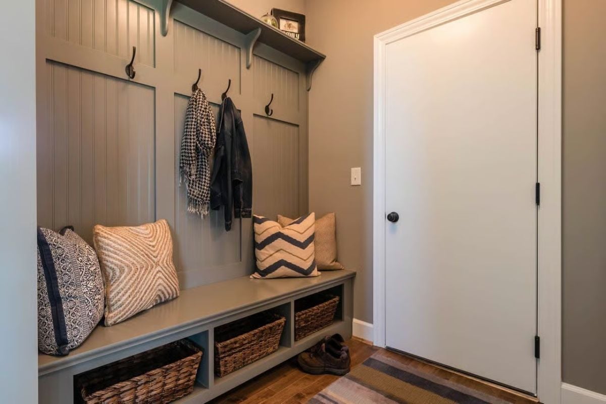
Beadboard panels, a built-in bench, and wicker storage baskets keep gear off the floor without making the entry feel like a locker room.
Did You Know: Mudrooms added during new construction consistently rank among the features buyers say they wish they’d prioritized sooner. Wicker and seagrass baskets hold up better in high-traffic entries than fabric bins because they don’t collapse under boots and sports gear. And painting built-ins the same color as the walls makes a tight entry read as one cohesive space rather than furniture someone crammed in after the fact.
Pin It
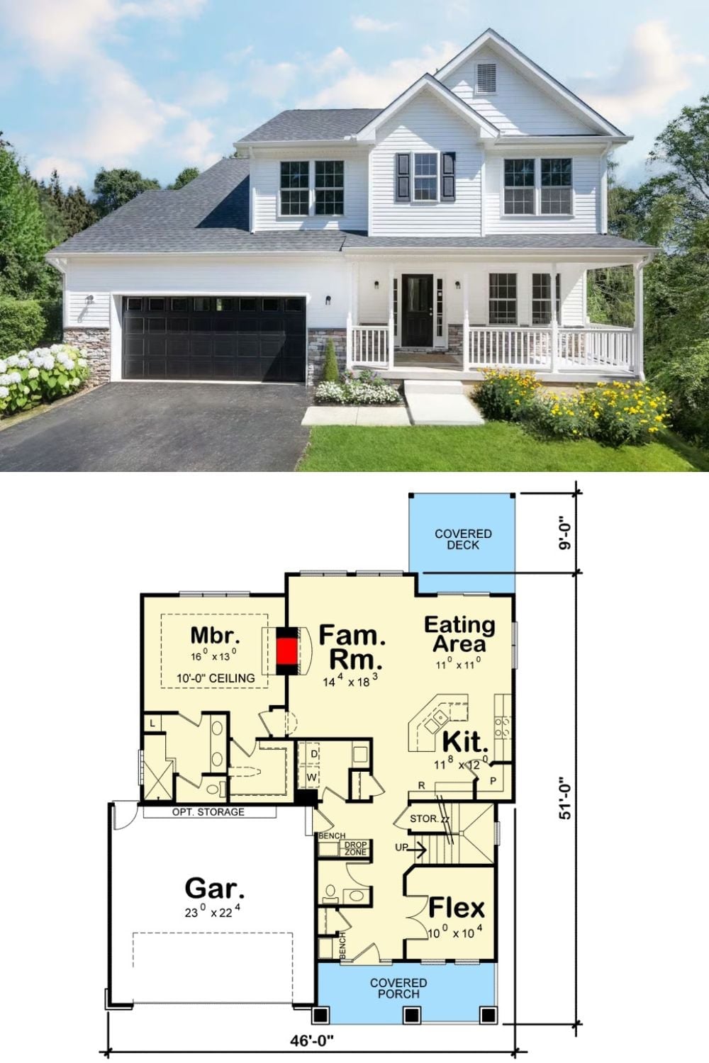
Exterior photo shows a white two-story traditional home with covered porch and two-car garage. Below, the first-floor plan lays out a master bedroom, family room, kitchen, flex room, and garage across a 46-by-51-foot footprint.
