
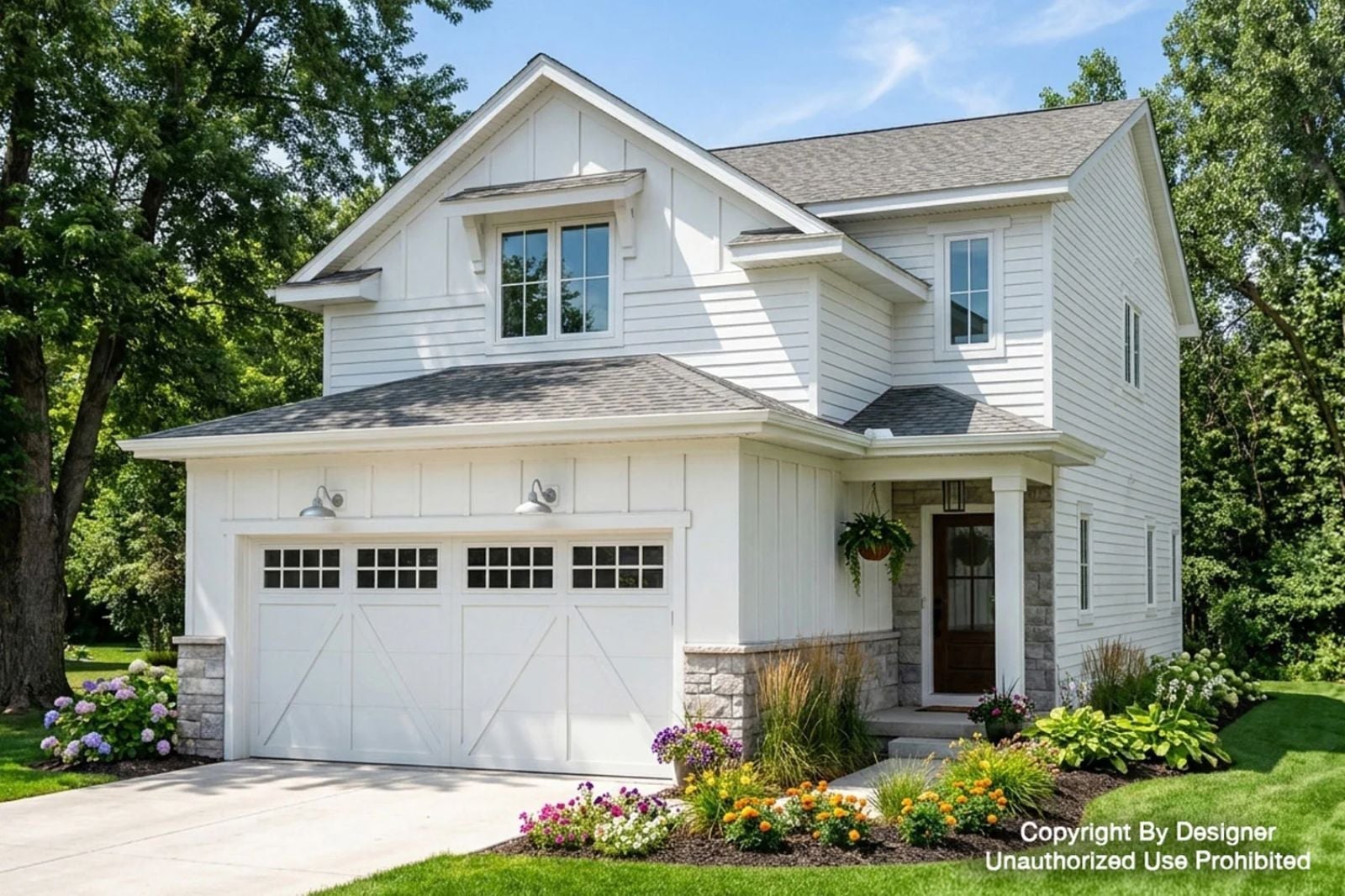
Families who have already blown past one house know exactly which room gives out first: the kitchen, the moment two people are trying to cook and a third has spread homework across the only available counter. The Magnolia Ridge is designed around that specific chaos — an open-concept kitchen that spills into the main living area, a farmhouse layout that keeps the noise contained where the family actually is, bedrooms pulled to the upper floor away from all of it, and enough counter space that dinner prep and algebra stop being the same problem.
Specifications
- Sq. Ft.: 1,900
- Bedrooms: 3
- Bathrooms: 2.5
Floor Plan – Main Floor
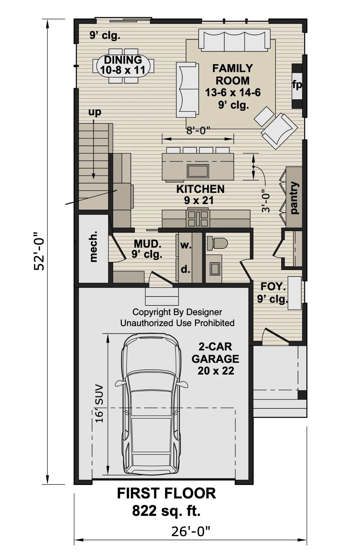
The open first floor connects dining, family room, and kitchen in one run, with a pantry, mudroom, foyer, and two-car garage rounding out the footprint below.
Floor Plan – Second Floor
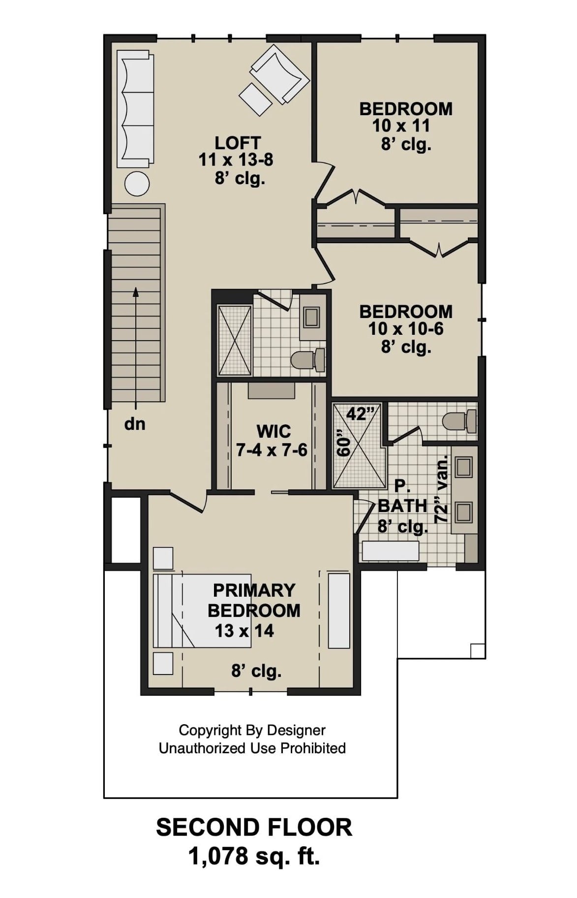
Second floor delivers three bedrooms, a loft, walk-in closet, and primary bath across 1,078 square feet.
Warm Entry Hall with Geometric Chandelier Leads Straight Into the Living Room
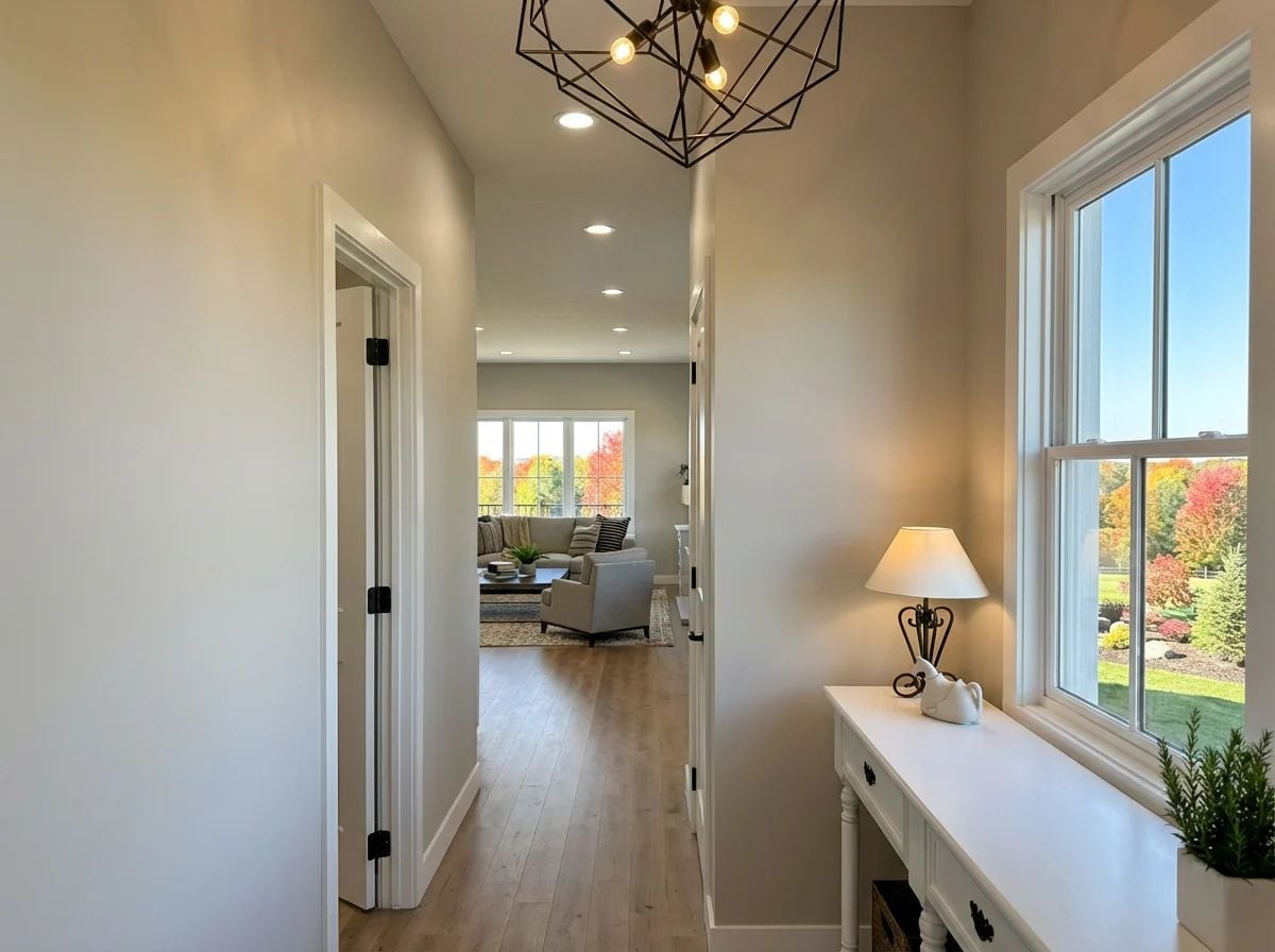
Black iron barn-door hardware against light oak floors gives the hallway a quiet farmhouse character — nothing overdone, nothing forcing the theme.
Stone Fireplace Wall Anchors an Open Living Space with Kitchen Views
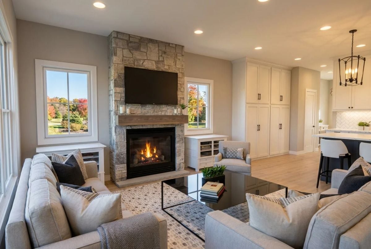
Floor-to-ceiling stacked stone grounds the room without overwhelming it. Gray upholstery, a glass coffee table, and recessed lighting keep the palette restrained — present enough to feel intentional, spare enough to not feel cold.
Common Mistake: Mounting a TV directly above a fireplace looks fine in photos but puts the screen too high for comfortable viewing from a sofa. That upward neck angle compounds over an evening. If the layout gives you any flexibility, offsetting the TV to one side of the fireplace is almost always the better call.
Candle-Style Chandelier Over a Dark Dining Table That Actually Seats Eight
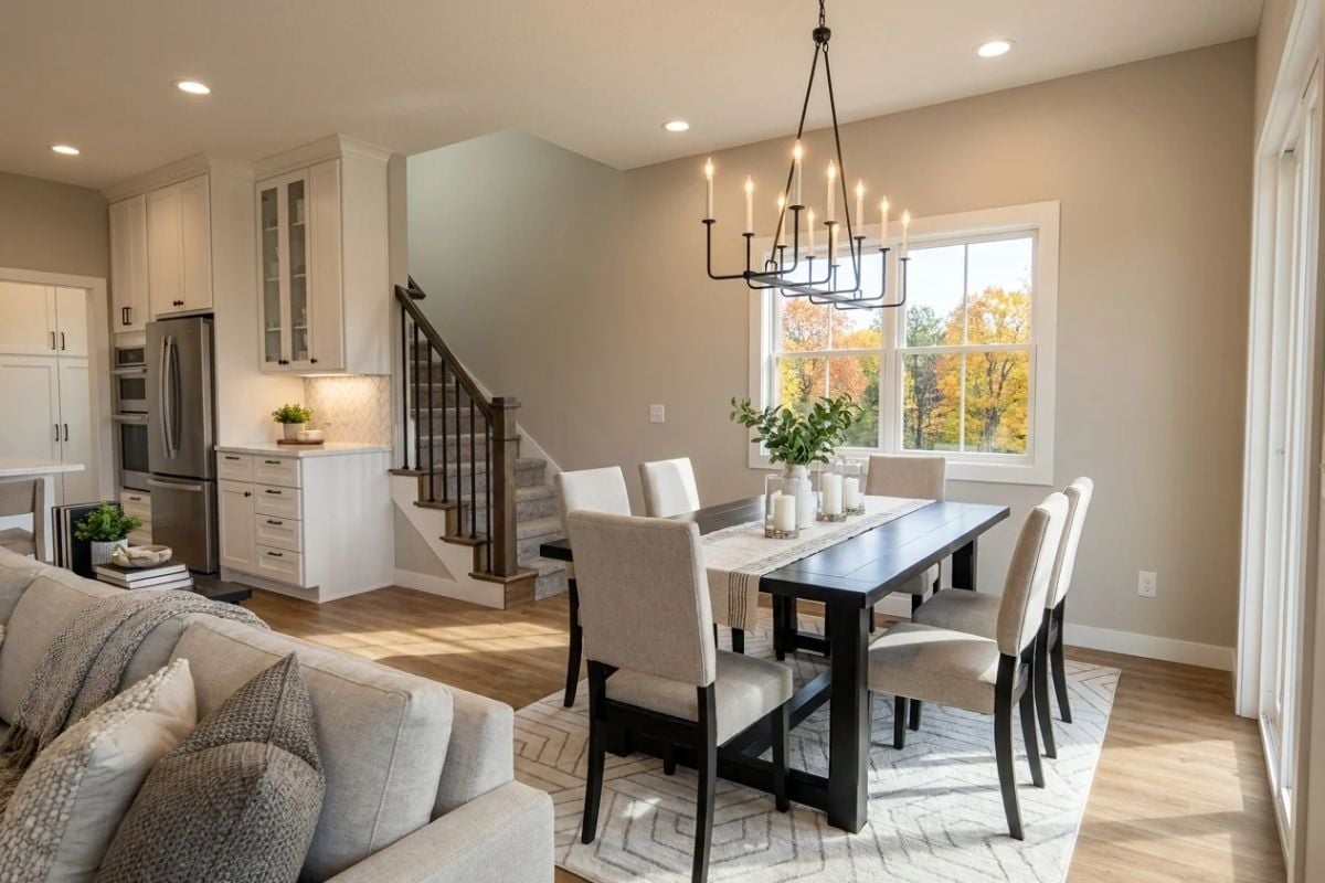
Taupe walls, light hardwood, and linen chairs keep the contrast quiet while the iron chandelier handles the visual interest on its own.
Style Math: Pairing a dark table with light upholstered chairs is one of the smarter moves in an open-concept space. The chairs visually lighten the furniture’s footprint so the dining area doesn’t compete with the kitchen or living room for visual weight. One strong anchor piece, everything else neutral — that’s the whole equation.
Navy Island Base Against White Cabinetry Is a Two-Tone Move That Holds Up
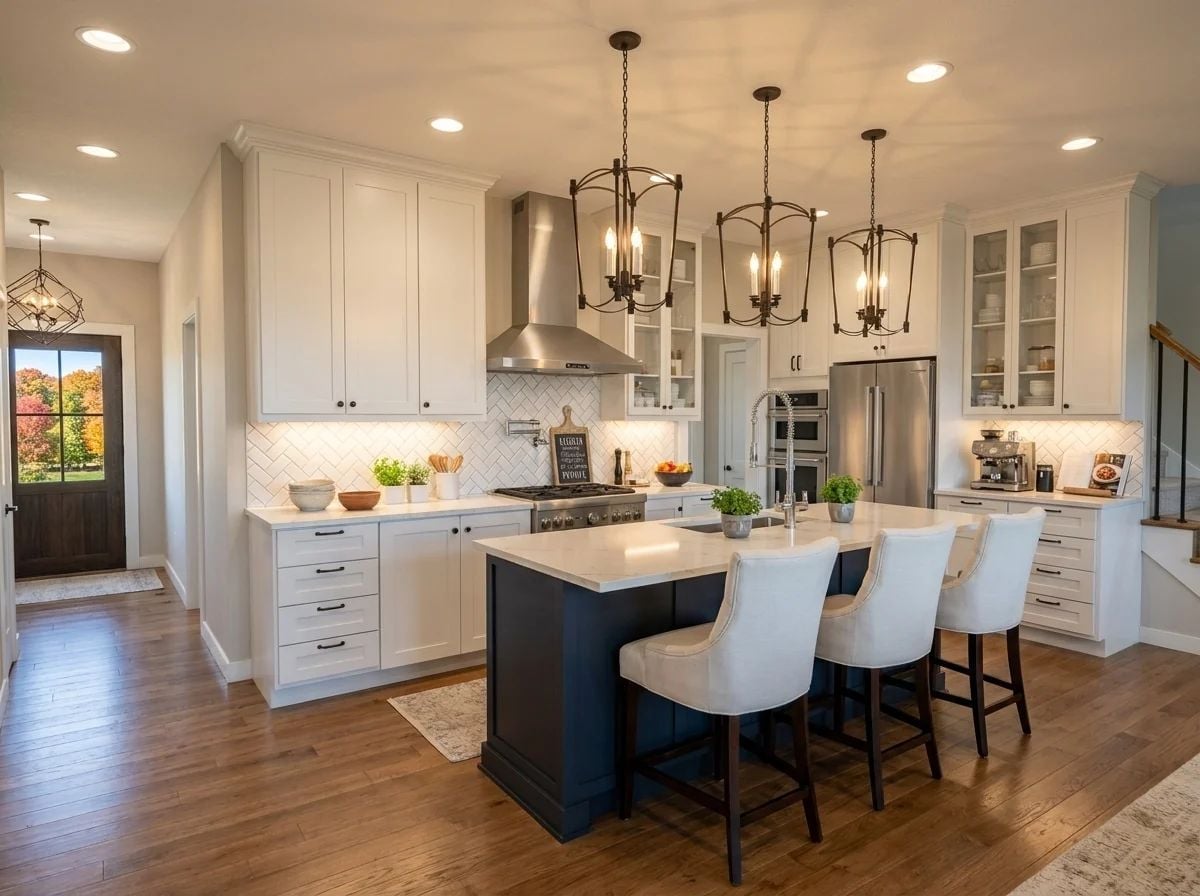
White shaker cabinets wrap the perimeter while the navy island base anchors the center without competing. Three lantern pendants with candle bulbs hang low enough to actually light the workspace — not just hover decoratively overhead. Under-cabinet lighting does real work here too. A herringbone tile backsplash adds texture without introducing another color into the mix.
Why the Island Sink Placement Matters More Than It Looks
Positioning the sink toward one end of the island rather than dead center carves out a dedicated prep zone that doesn’t block sightlines to guests seated at the opposite end. Small shift on a floor plan. Big difference every time someone’s washing vegetables while holding a conversation. Most people don’t fully appreciate it until they’ve lived with a centered sink that crowds out everything else happening on the island.
Upper-Level Loft with Bedroom Access Keeps Kids and Parents on the Same Floor
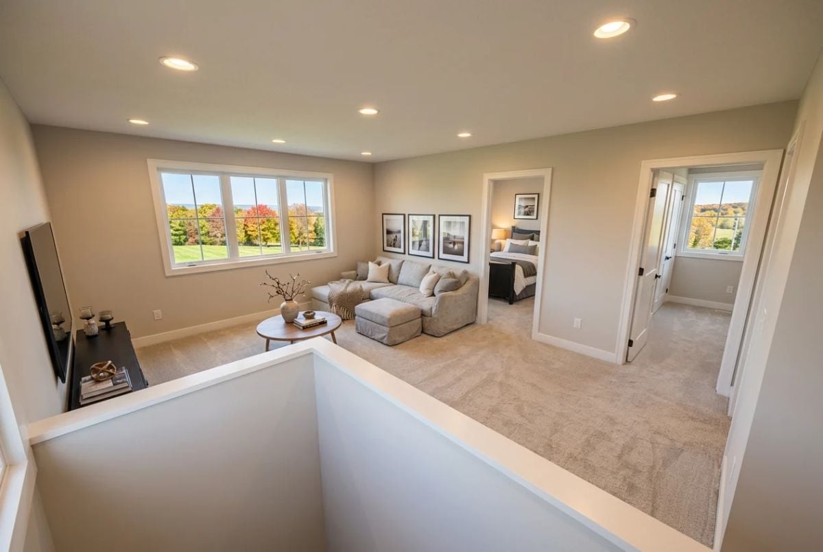
Wall-to-wall carpet, a sectional facing a mounted TV, and two bedroom doorways within easy reach of each other — it reads like a layout someone actually thought through rather than filled in.
In The Details: Loft spaces work best when bedroom doors are positioned so you’re not cutting through the seating area to reach them. Here, both entries sit along the same wall, which keeps foot traffic from slicing across the room every time someone heads to bed. Worth asking about specifically before you commit to a plan.
Walk-In Closet, En Suite, and a Hallway Exit All Off One Bedroom
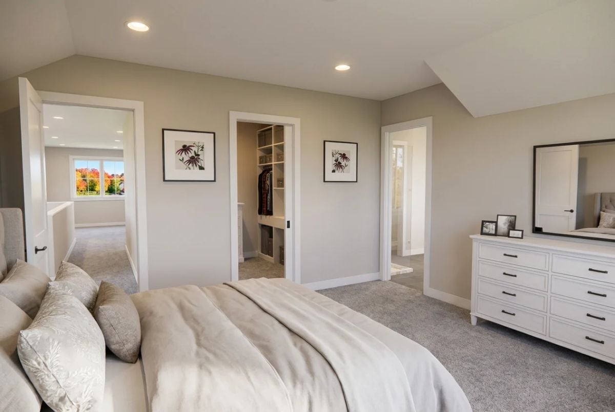
Three doorways visible from the bed means genuine separation between sleeping, dressing, and bathing — not just the suggestion of it. Gray carpet keeps things quiet underfoot while a white dresser handles storage without dominating the room.
Ask Yourself: A closet positioned between the sleeping area and the bathroom creates a natural buffer — muffles sound, blocks light, keeps the two zones from bleeding into each other. When you’re comparing floor plans, check whether the closet is doing that job or whether the bathroom door opens directly beside the bed.
Beyond the bedroom suite, the en suite bathroom is where the material choices really start to pay off.
Marble-Tiled Walk-In Shower Paired With a Double Vanity That Has Actual Counter Space
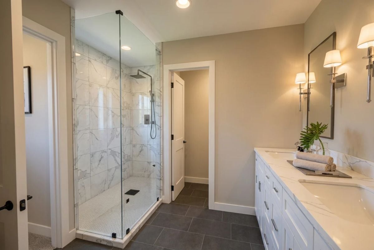
Calcutta-style tile runs floor to ceiling inside the glass enclosure; the vanity countertop carries the same veining without the whole room tipping into excess.
Transition: Frameless glass shower enclosures don’t just photograph better than framed ones — they’re genuinely easier to maintain because there’s no metal track at the bottom collecting soap scum and standing water. The dark floor tile throughout the rest of the bathroom is a practical call for similar reasons. Light grout shows every splash and footprint within days of cleaning. Going dark buys meaningful time between scrubs without giving anything up visually.
Pin It
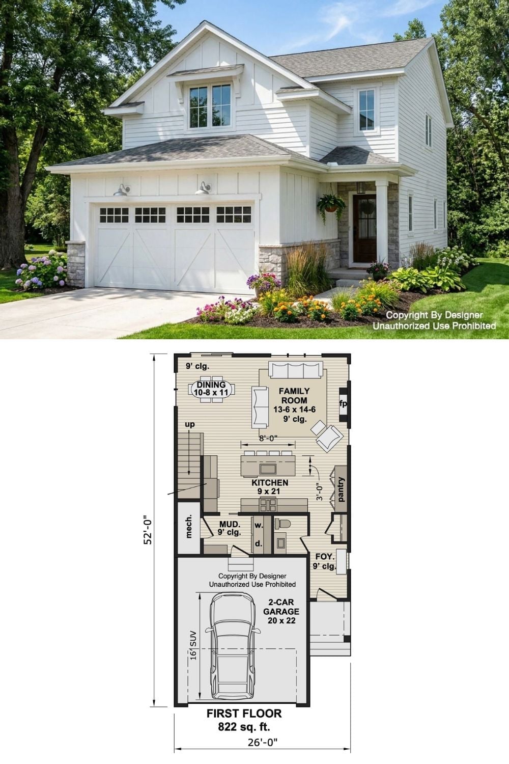
The exterior shows a two-story modern farmhouse with board-and-batten siding, a two-car garage, and stone accents at the base. Below it, the first-floor plan lays out 822 square feet across a family room, open kitchen, dining area, mudroom, and foyer, with the garage occupying roughly half the footprint.
Style Tip: A mudroom positioned between the garage and the kitchen is one of those layout features that’s invisible when it’s working and maddening when it isn’t. That direct path means outdoor mess — boots, wet dogs, backpacks — gets intercepted before it reaches the main living area. If you have kids or pets, prioritize it. You won’t regret it.
