
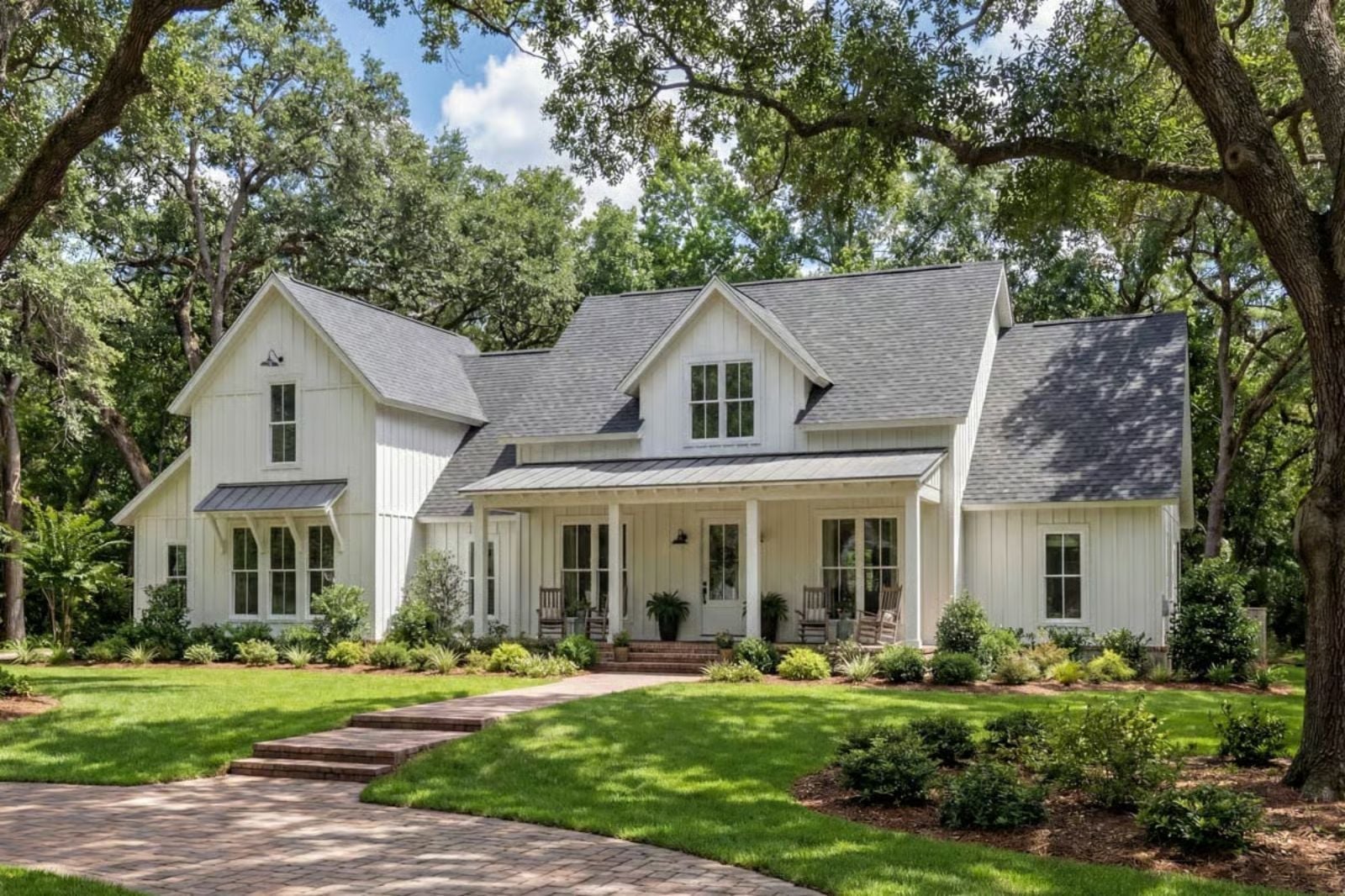
Friday night in March, all four kids home at once for the first time in a month — dinner runs long, someone pulls out a board game, the younger two eventually drift upstairs while the older ones stay at the table. The Magnolia Grove is built around exactly that kind of evening: an open main living area that keeps everyone within earshot, a kitchen scaled for actual cooking, a bonus room above the garage to absorb the overflow, and a single-story layout that never splits the family across two floors.
Specifications
- Sq. Ft.: 2,742
- Bedrooms: 4-5
- Bathrooms: 3.5-4.5
Floor Plan – Main Floor
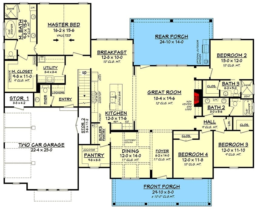
Single-story layout with four bedrooms, three baths, a vaulted master suite, open great room, rear porch, and a butler’s pantry connecting kitchen to dining.
Floor Plan – Bonus Room
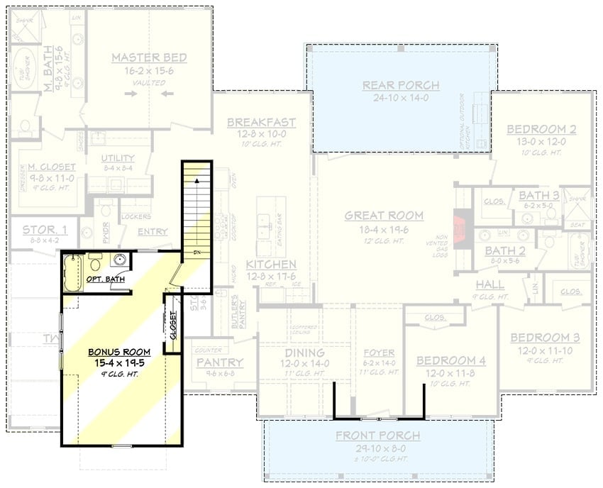
Open great room anchors the layout, with a master suite wing opposite three bedrooms, plus a bonus room above the garage.
Weathered French Doors Pull Double Duty as Art in This Texas Home Office
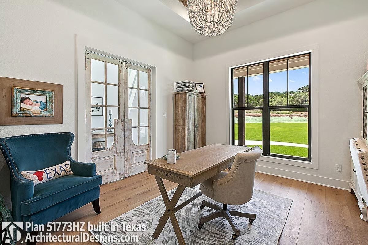
Salvaged French doors with layers of chipped paint earn their keep here. Paired with a trestle desk and a blue wingback bearing a Texas longhorn pillow, the room walks a confident line between rustic character and clean modern trim — the kind of combination that looks effortless and is actually pretty hard to pull off.
The Psychology Behind This: Mixing intentionally worn pieces with crisp white walls satisfies two competing instincts at once — the comfort of something lived-in alongside the calm of something ordered. Offices put together this way tend to feel less like workspaces and more like rooms people actually want to sit in, which turns out to matter quite a bit for focus.
Brick Fireplace, Skirted Chairs, and Ceiling Beams Walk Into a Living Room
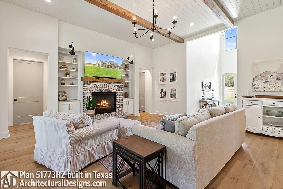
Exposed wood beams cut across a white shiplap ceiling while a whitewashed brick fireplace holds down the far wall. The skirted armchair’s ticking stripe does real work here, keeping the cream sectional from reading as too polished. Low nesting tables earn their spot.
Style Math: Ticking stripe is one of the few patterns that reads as both casual and structured depending on what surrounds it. Pair it with a neutral sofa and you get visual interest without committing to a bold color story — a quiet choice that does more than it looks like it’s doing.
Industrial Pendants and Shiplap Island Make This Kitchen Worth Gathering Around
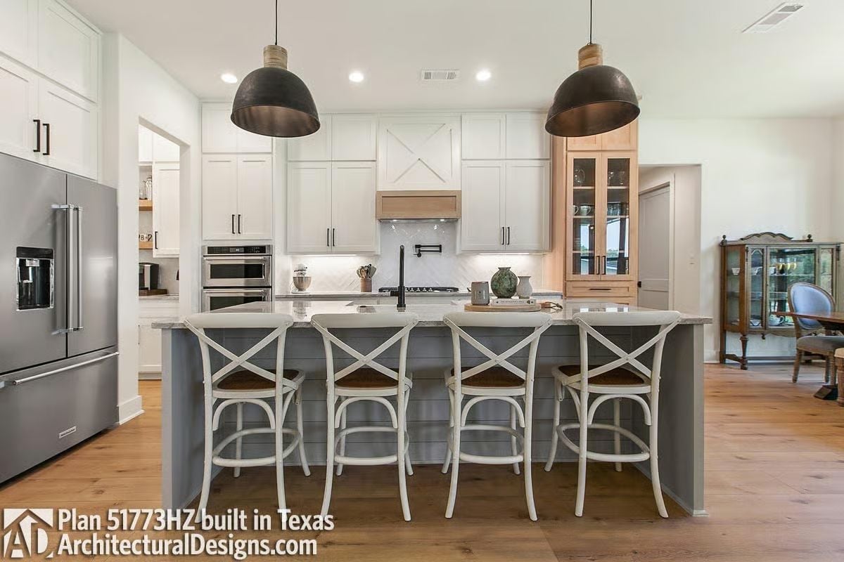
Four cross-back barstools line a gray shiplap island topped with what looks like quartz. Overhead, two aged metal dome pendants do more visual work than a chandelier ever could in this space. The light wood range hood breaks up all that white cabinetry without fighting it, and the pot filler over the range is a small luxury that earns its place on an actual weeknight.
Did You Know: White shaker cabinets became the dominant kitchen choice partly because they photograph well and resell reliably, but designers often recommend keeping at least one element in a contrasting material — like the natural wood hood here — to prevent the space from reading as a showroom rather than a home.
Bench Seating and a Steel-Framed Window Turn Dinner Into Something Worth Sitting Down For
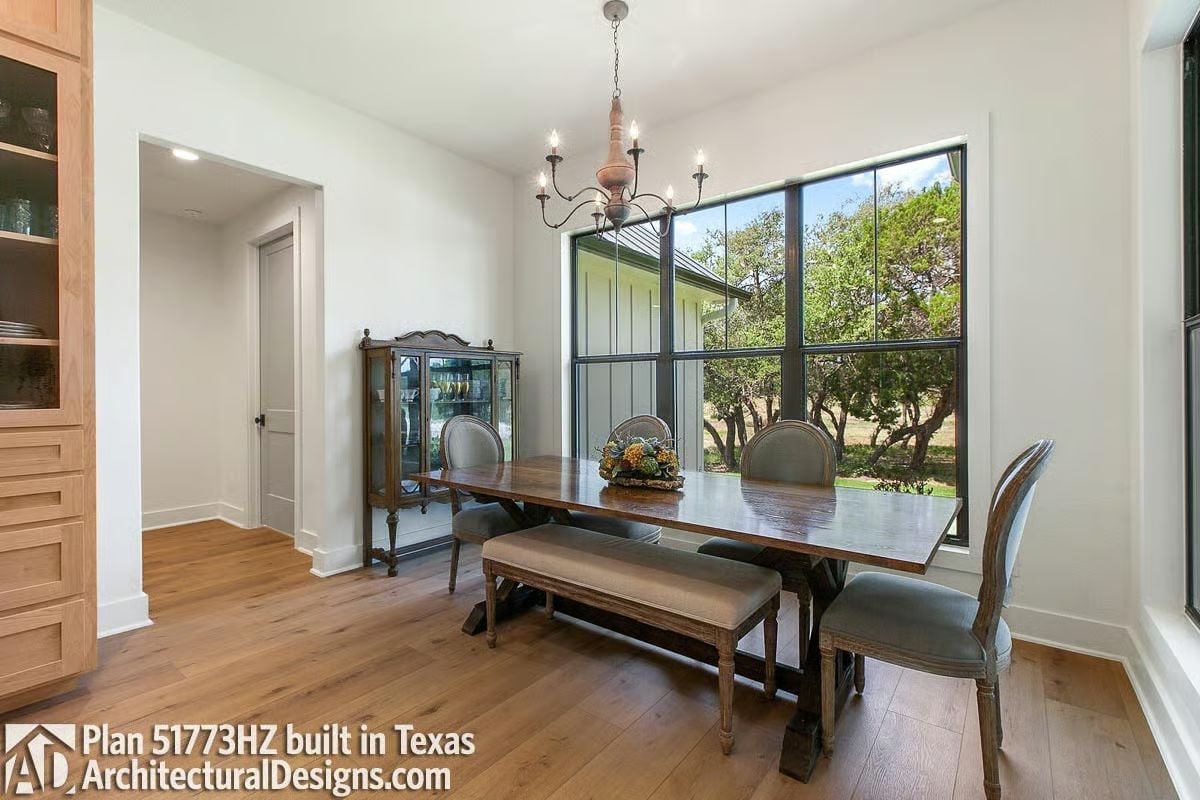
Pairing a bench with chairs at the same table is one of those moves that sounds casual until you see it done well.
Here it reads as intentional. The trestle base keeps the whole setup grounded without going full rustic, and the steel-framed window pulls in enough natural light that the chandelier feels like atmosphere rather than necessity. That china cabinet in the corner earns its keep too.
Mudroom Hooks and a Half Bath Solve Two Problems Without Stealing Square Footage
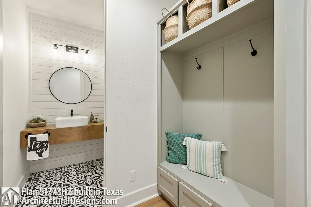
Built-in bench seating with drawers underneath keeps mudroom clutter from spreading before it starts. Black coat hooks and woven storage baskets handle the rest. Through the doorway, a vessel sink on a floating wood shelf and patterned cement tile floor give the powder room actual personality — practical spaces don’t have to feel like afterthoughts, and this one proves it.
Why It Works: Placing a powder room directly off the mudroom entry is a layout decision that pays off every single day — guests never cut through living areas, and wet boots stay near the door. The floating wood vanity shelf skips the cabinet box entirely, which keeps a compact room from feeling closed in.
Moving into the primary bedroom, the design keeps the same grounded palette without repeating a single trick.
Nail-Head Trim and a Chandelier That Belongs in a Ranch House, Not a Ballroom
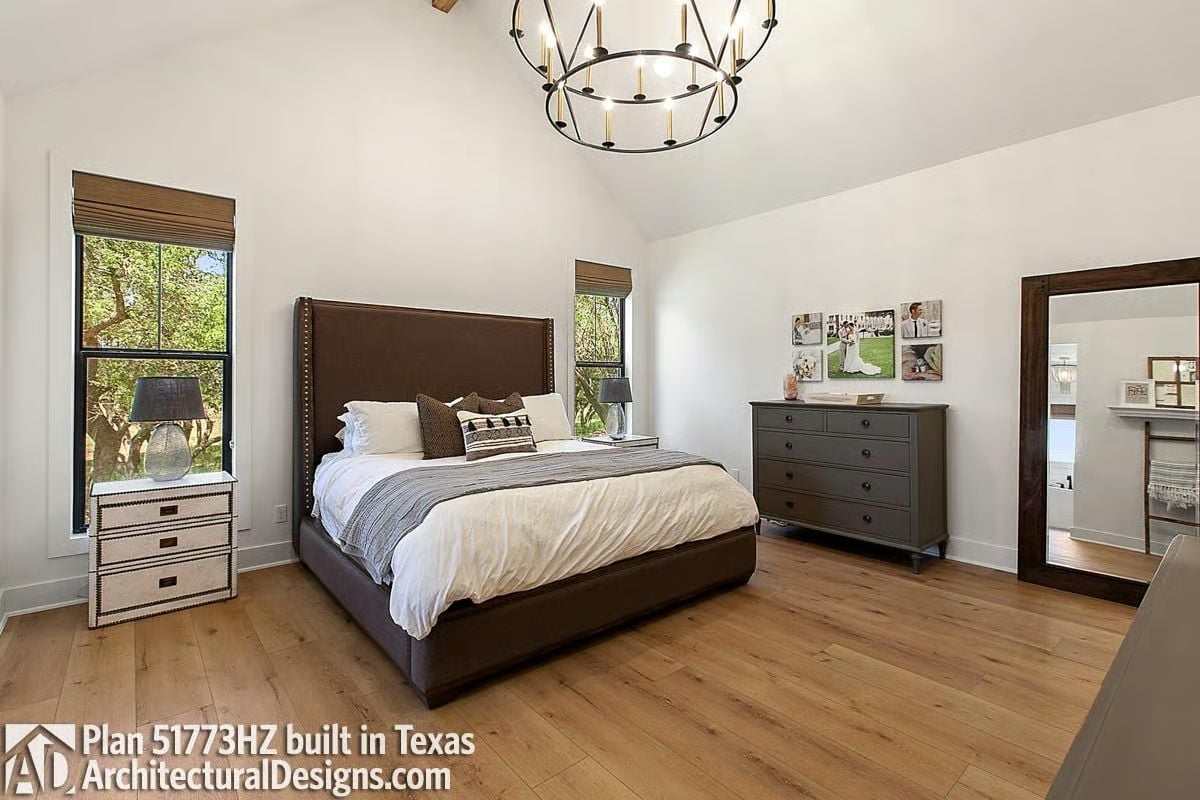
Dark upholstered headboard anchors the room; the wrought-iron chandelier keeps scale without going precious.
Transition: Tall ceilings can work against a bedroom if the lighting doesn’t meet the room halfway. That chandelier does — large enough to hold the vertical space, stripped down enough that it doesn’t compete with the warm wood floors below. The headboard’s nail-head detail gives the bed structure without needing pattern anywhere else in the room. Restraint like that is harder than it looks.
Shiplap Nook and a Freestanding Tub Framed by Nothing but Texas Sky
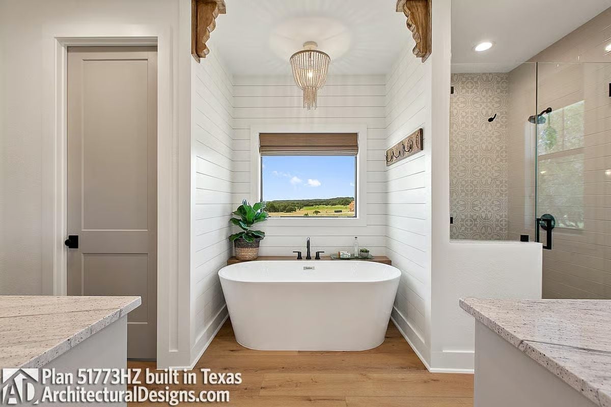
Decorative wood corbels mark the entrance to the tub alcove like a small architectural ceremony. Inside, shiplap walls and a beaded pendant keep things quiet. The fiddle-leaf fig earns its spot.
Worth Knowing: Freestanding tubs sit away from the wall on all sides, which means cleaning around the base is entirely your problem. Tubs set against a platform or wood ledge, like this one, cut that maintenance down without giving up the look — a practical trade-off most showrooms won’t bring up.
Pin It
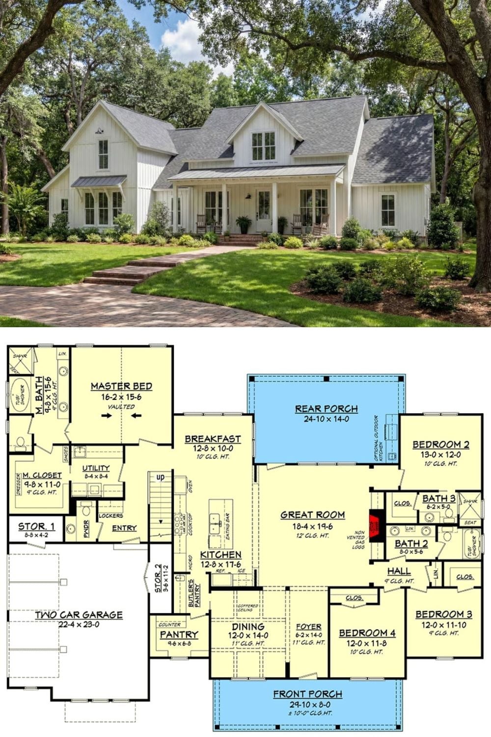
Exterior photo shows a white board-and-batten farmhouse surrounded by mature oaks. Floor plan below reveals four bedrooms, a rear porch, and a vaulted master suite.
