
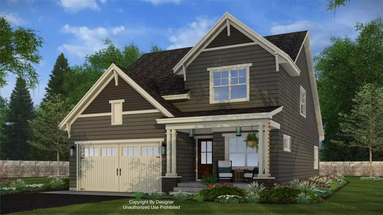
Saturday in March, both cars in the garage, the mudroom loud with returned cleats and dropped backpacks, someone already with a pot on the stove. The Lucerne Knoll is built around exactly that: a main-floor primary suite that keeps parents close without putting them in the middle of everything, an open kitchen where dinner gets made while homework gets argued over, and a farmhouse layout that keeps the whole family within earshot but never underfoot.
Specifications
- Sq. Ft.: 2,185
- Bedrooms: 4
- Bathrooms: 3.5
Floor Plan – Main Floor
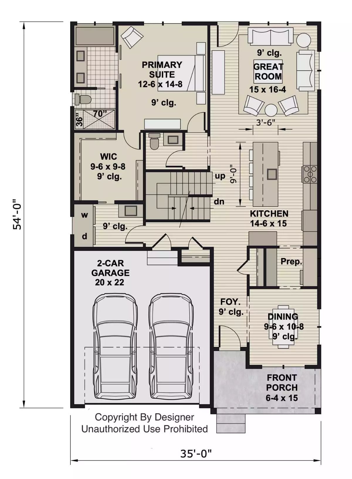
The primary suite and walk-in closet sit at the back left, well away from the great room and kitchen noise, with a central stair doing the work of separating private from shared space. Out front, the porch opens into a foyer flanked by the dining area on one side and a prep zone on the other.
Floor Plan – Second Floor
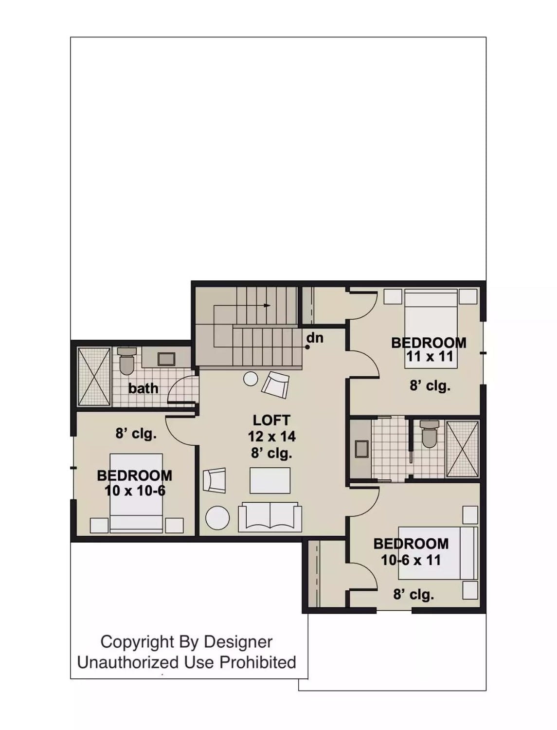
Upstairs, three bedrooms and a loft share the floor, with one shared bath and a private bath serving the right-side rooms.
Light Floods In and the Furniture Doesn’t Fight It
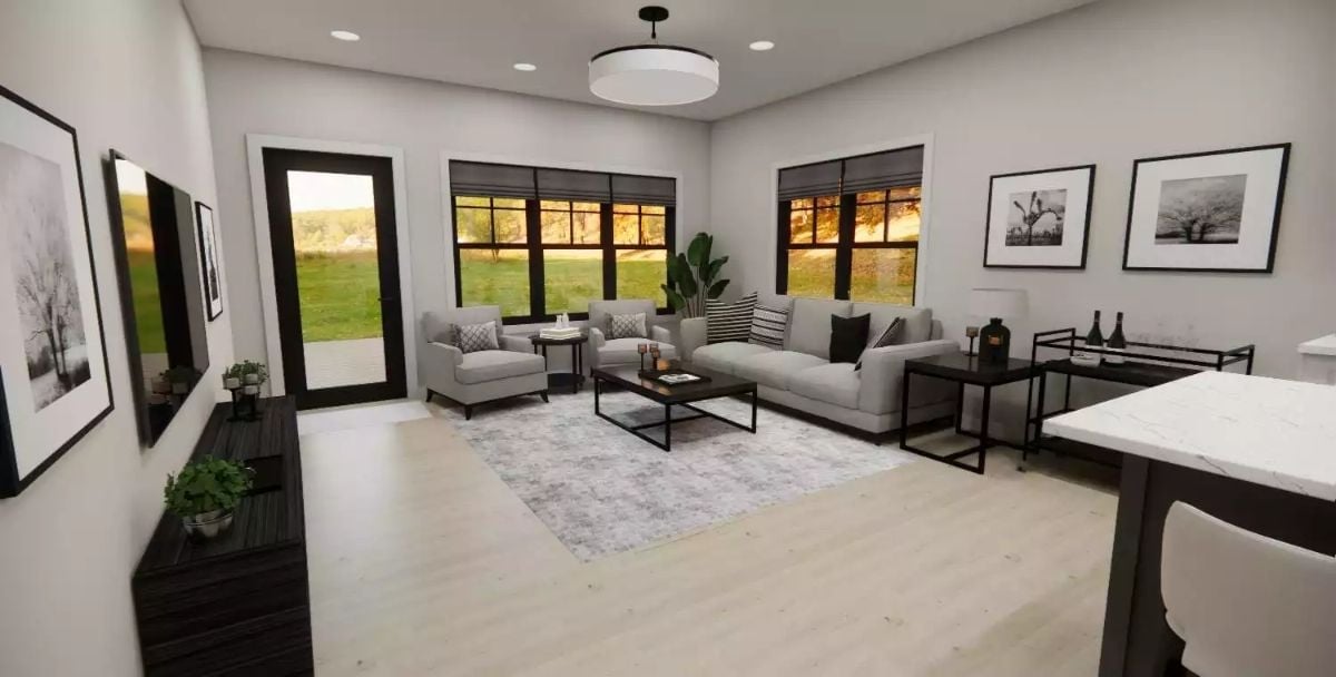
Gray upholstered seating, dark-framed windows, light wood floors — it’s a combination that could easily tip heavy, but it doesn’t. The floors are doing a lot of the work there. Roman shades pull it together without making too much of a statement, which is exactly what they should do.
History Corner: Farmhouse architecture in America grew out of 18th-century practicality — settlers built what they needed first and sorted out aesthetics later. The open gathering room you see here carries that same logic forward, putting family life ahead of formality. It’s a design tradition that has lasted because it was never really about style to begin with.
Candlelight Without the Candles, Farmhouse Without the Clutter
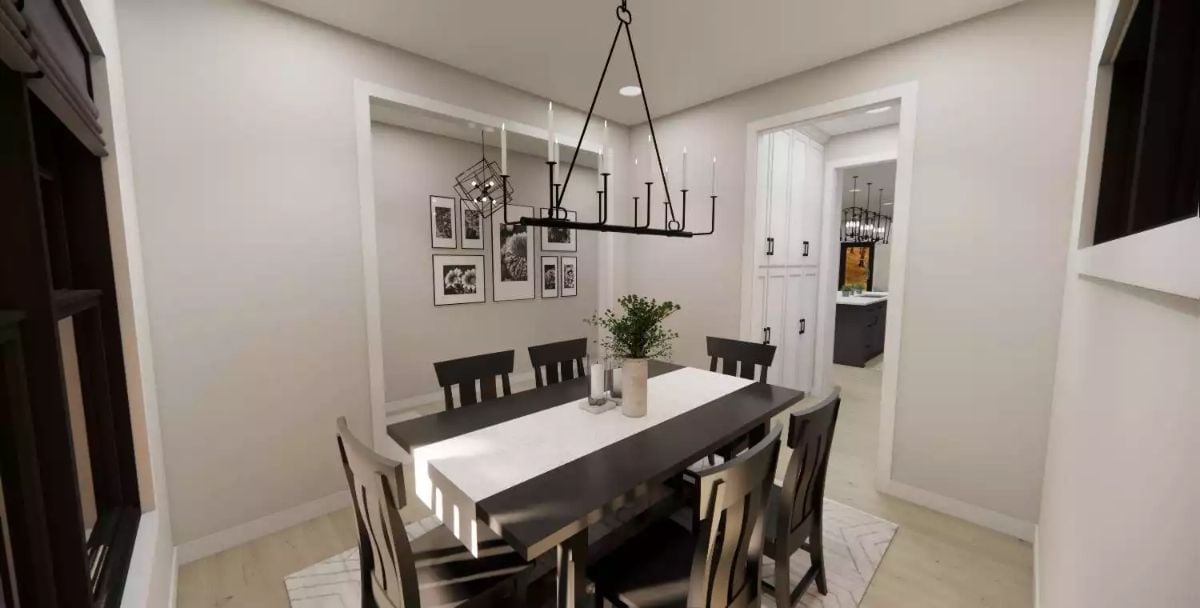
A long rectangular table with dark wood chairs anchors the room, and the wrought-iron linear chandelier overhead earns its keep without being showy about it. Black-and-white botanical prints on the back wall add something personal without tipping into precious territory.
The Psychology Behind This: Dining rooms with one strong focal point — a bold chandelier centered over the table — tend to feel more settled than rooms where several elements compete for attention. Humans process spaces faster when there’s a clear visual hierarchy, which is part of why you tend to relax sooner in a room like this one.
Where the Kitchen Earns Its Square Footage and the Living Room Doesn’t Compete
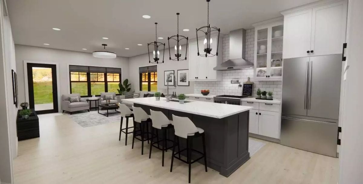
Charcoal island base against white quartz counters, cage pendants overhead, white bar stools at the island — the open layout holds together because nothing in it is trying to be the loudest thing in the room.
Color Story: White cabinetry with a charcoal island base holds up because neither finish is trying to disappear. The subway tile backsplash runs floor-to-hood rather than stopping short, which saves the wall from looking like a half-finished thought. Stainless steel appliances read as neutral here rather than industrial because everything else stays so close to the same tonal range.
Bedroom That Knows Black Furniture Doesn’t Need to Be Loud
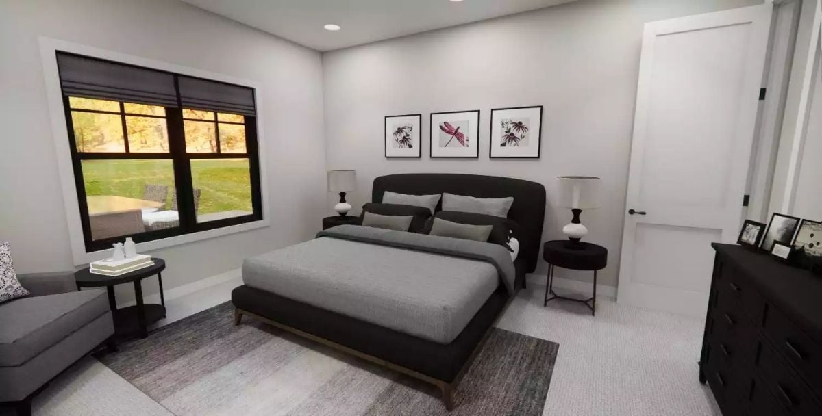
A rounded headboard, layered gray bedding, and three botanical prints — it’s a grounded palette that never feels cold, which is harder to pull off than it looks.
In The Details: Rounded upholstered headboards have quietly replaced the traditional tufted square as the default choice in modern bedroom design. The curved silhouette softens a room without requiring anything else to change around it. Pair one with flat-front nightstands and the contrast does the work on its own.
Double Vanity Done Right, With a Soaking Tub That Doesn’t Feel Like an Afterthought
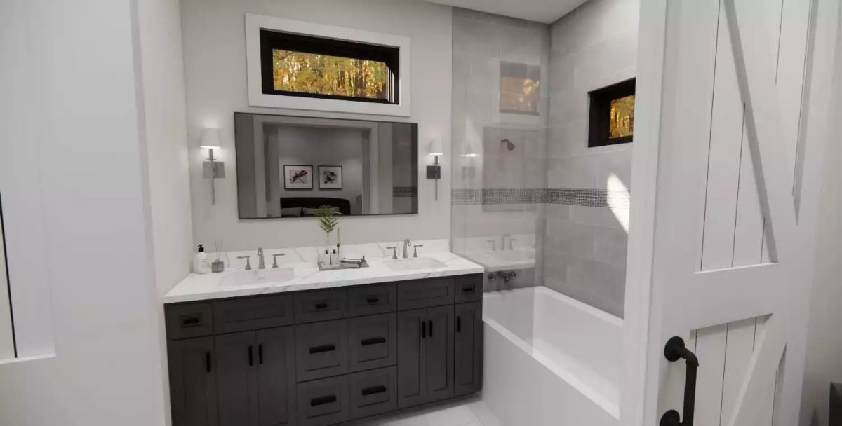
Dark cabinet bases keep the vanity anchored without fighting the white quartz countertop above them. Two sinks, wall sconces, and a wide mirror handle the functional side of things. The soaking tub tucks beside a glass-enclosed shower with a built-in niche — a placement that frees up floor space instead of sacrificing it.
Did You Know: Soaking tubs have made a strong comeback in primary bathrooms, but where you put one matters more than most people realize. Tucking it beside a walk-in shower rather than centering it in the room can open up a mid-sized bathroom considerably — the footprint doesn’t change, but the floor stops feeling like an obstacle course.
Laundry Rooms Work Harder When the Layout Stops Fighting the Routine
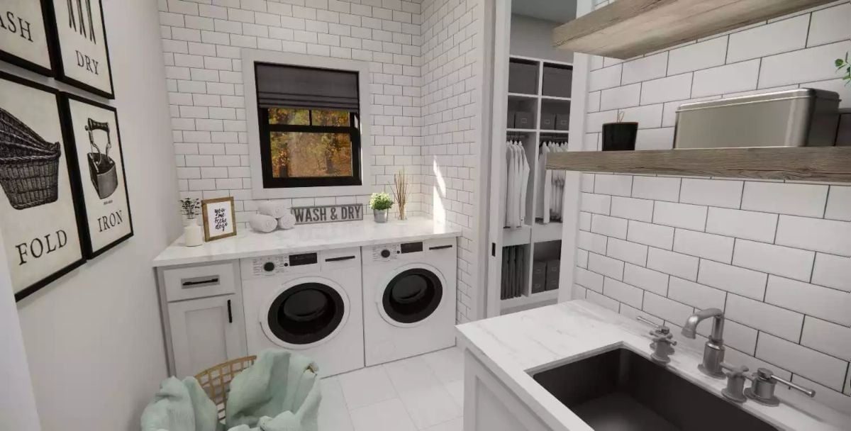
Subway tile running floor to ceiling draws the eye upward and makes the room read taller than the square footage suggests. The folding counter above the machines is wide enough to actually use — not just wide enough to exist. At the far end, the utility sink has faucet hardware scaled to real work rather than decoration.
- Hanging rod in the adjacent closet means clothes go from dryer to hanger without leaving the room
- Framed wash-dry-fold-iron prints give blank wall space a purpose beyond decoration
- Open shelving above the sink keeps supplies visible so you’re not hunting for detergent mid-cycle
Upstairs Landing That Pulls Triple Duty Without Feeling Crowded
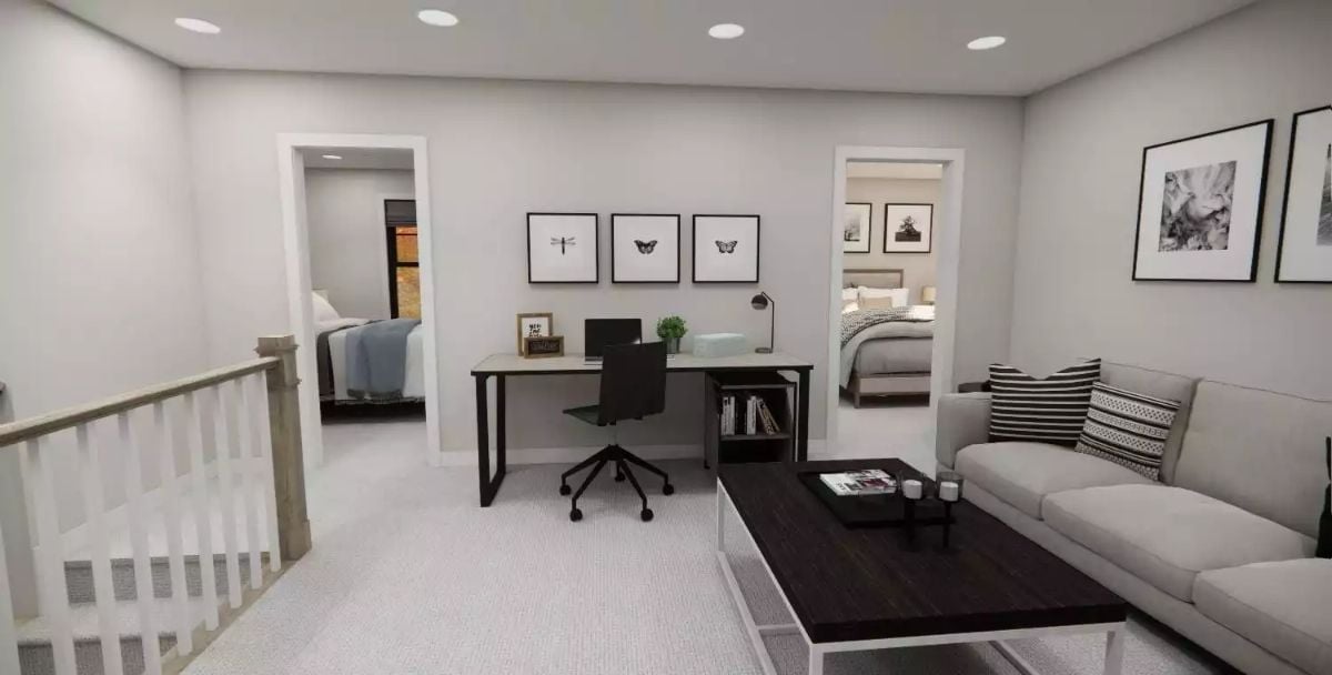
Recessed lighting keeps the ceiling clean above a workspace tucked between two bedroom doors. The desk setup is compact but honest about what it’s for. And the sofa arrangement off to the right makes it clear this landing was planned as actual living space — not just whatever square footage was left over after the bedrooms got their walls.
Pin It
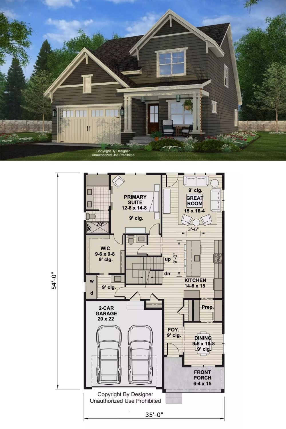
The top half shows a craftsman-style exterior with dark lap siding, a covered front porch, and an attached two-car garage. Below, the floor plan lays out a 35-by-54-foot footprint with the main-floor primary suite, walk-in closet, great room, kitchen, and a staircase leading to the additional bedrooms above.
