
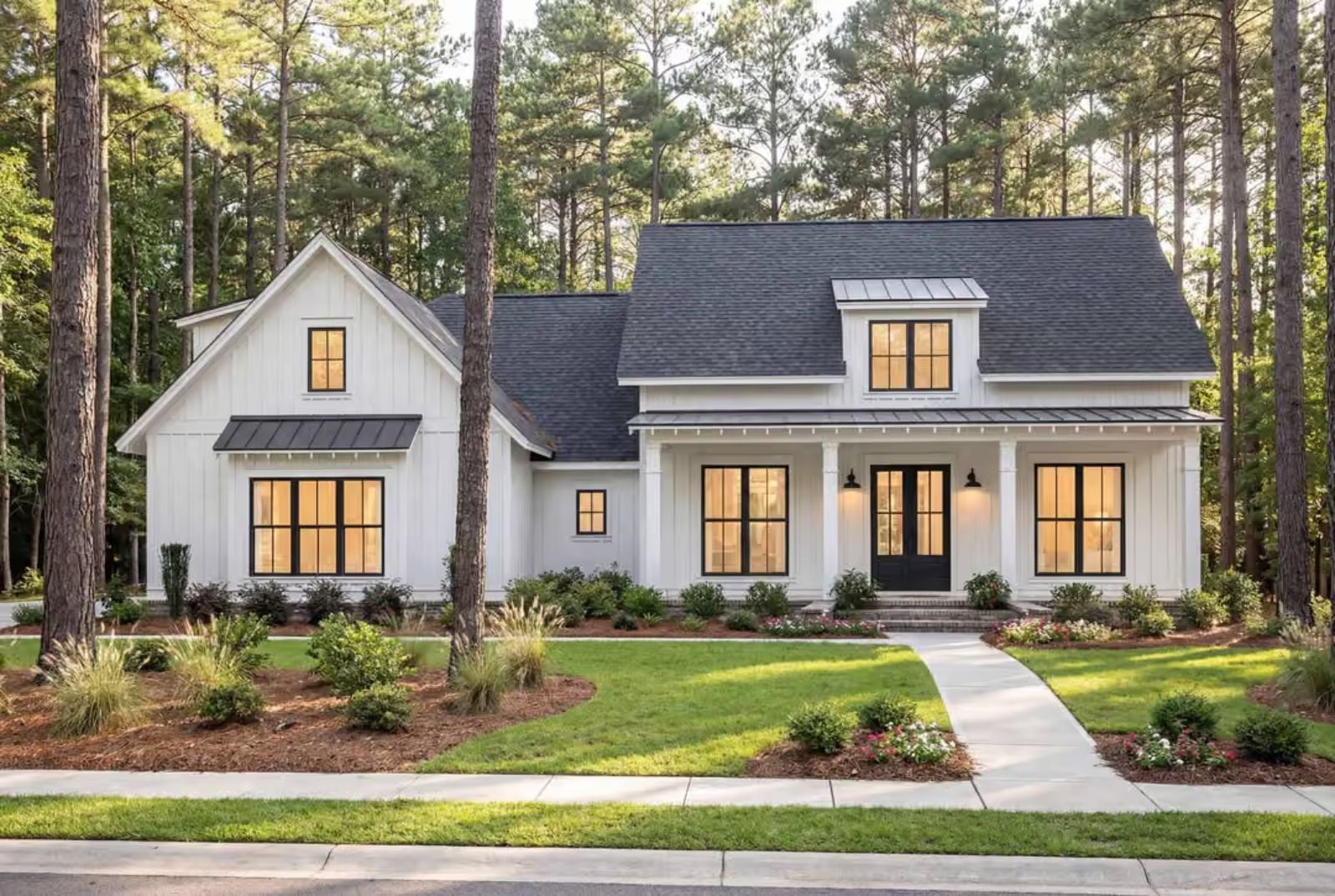
The bonus room stopped being optional around the time the kitchen island became the default homework desk, the backpacks claimed the hallway permanently, and dinner was still unfinished at six-thirty most nights. The Longleaf is designed around that reality: a dedicated bonus room that absorbs the overflow, an open main living area that keeps everyone in earshot, and a farmhouse exterior that still looks like someone lives there on purpose.
Specifications
- Sq. Ft.: 2,077
- Bedrooms: 3
- Bathrooms: 2
Floor Plan – Main Floor
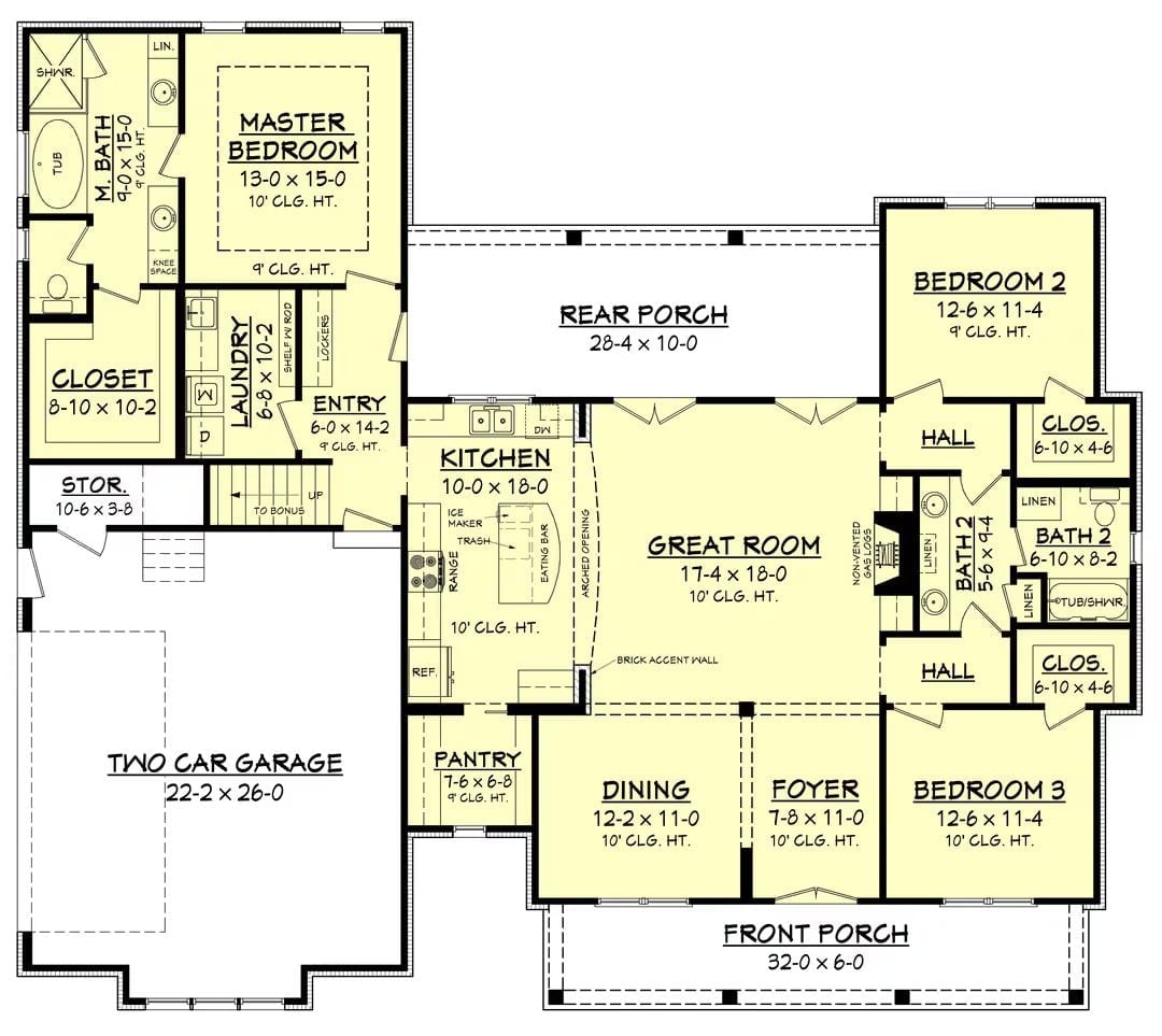
Three bedrooms split across two wings, with a central great room connecting the kitchen, dining, and rear porch in an open layout.
Floor Plan – Bonus Room
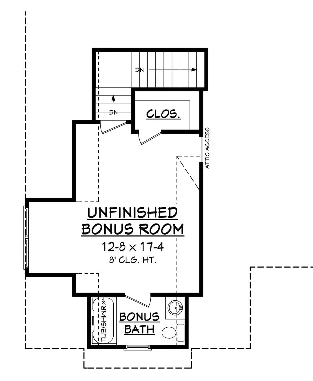
The bonus floor sits above the main level and centers on an unfinished room measuring 12’8″ x 17’4″ with an 8-foot ceiling — roomy enough to finish as a playroom, media room, or fifth bedroom without feeling cramped. A closet and full bath with tub/shower combo are already in place, so converting it later doesn’t require a gut job. Two stairwells serve the space, and attic access runs along the right wall.
Brick Column, Wood Beam, Open Plan — Farmhouse Character Without the Fuss
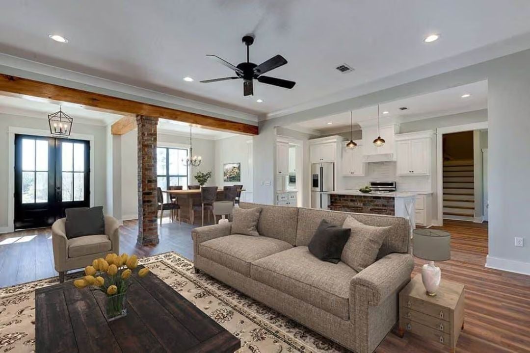
An exposed brick column and rough-hewn ceiling beam do most of the character work here, anchoring the open layout so the gray sofa and dark coffee table can stay grounded without competing for attention.
Brick Island Base, Industrial Stools, White Cabinets That Don’t Compete
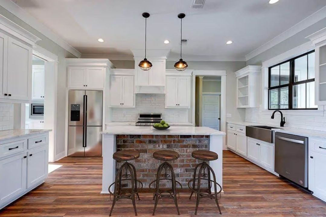
Reclaimed brick wraps the island base, white marble countertops sit above it, and four adjustable metal stools bridge the industrial and farmhouse details without either one taking over. The white cabinetry runs quietly in the background — which is exactly what it’s supposed to do.
Try This: Brick veneer panels can replicate this island look without the structural weight of full brick. Ask your tile supplier about thin brick options, which install cleanly over standard cabinetry and skip the mess of traditional masonry. And don’t overlook grout color — it changes the whole read of the finished surface, so pull a sample against your cabinet finish before you commit.
Built-In Microwave, Open Shelving, and Counter Space for the Pantry That Works Overtime
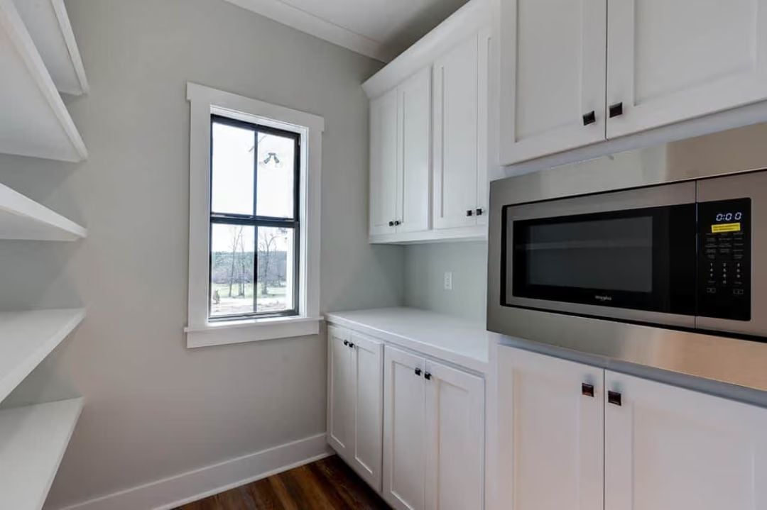
White shaker cabinets with square black pulls keep the palette clean without going cold. The built-in stainless microwave sits flush with the upper cabinet run, freeing up the counter below for actual prep rather than appliance storage. Open shelving on the left wall handles overflow without closing the room in — a useful call in a secondary space that could easily feel like a closet with ambitions.
By The Numbers: Routing the microwave to a butler’s pantry or secondary prep zone like this one keeps the primary kitchen cleaner during daily use — less counter competition, fewer things to move when you actually need the surface. If your layout has room for it, the placement decision is worth making early in the design process rather than retrofitting later.
Gray Cabinetry and a Folding Counter Built for Laundry That Actually Piles Up
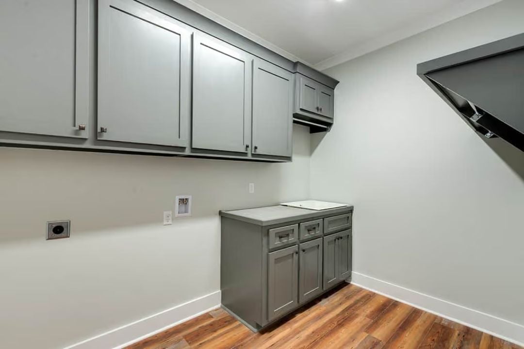
Gray shaker cabinets run floor-to-ceiling and wall-to-wall, giving this laundry room more storage than most people expect to find here. The base cabinet countertop is sized for actual folding, not just a place to drop things temporarily. A hanging rod tucks under the upper cabinet in the corner. It’s a small detail that most laundry room layouts skip, and it shouldn’t be.
Did You Know: Laundry rooms with a dedicated folding surface get used more consistently than those without one — even a shallow 18-inch counter makes the space function differently on a daily basis. Utility room cabinetry also doesn’t need to match the kitchen finish to look intentional; a coordinated but distinct palette reads just fine.
Tray Ceiling, Quilted Headboard, Soft Blue Walls Built for Winding Down
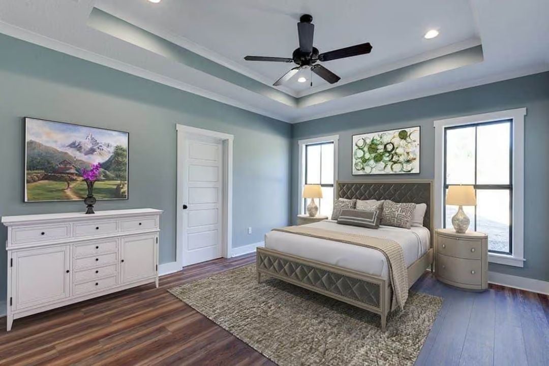
Dusty blue-green walls keep the room calm without reading cold — a distinction that matters more in a bedroom than anywhere else in the house. The quilted headboard gives the bed some visual weight, and the white dresser on the opposite wall pulls it back before things tip heavy. Hardwood floors run beneath a textured area rug, and two lamps flank the bed symmetrically. Balanced, not rigid.
Why a Tray Ceiling Works Especially Well in a Master Bedroom
Tray ceilings add perceived height without requiring cathedral proportions, which makes them practical in standard two-story homes where floor-to-floor height is fixed. In this room, the recessed center section draws the eye upward and gives the ceiling fan a natural visual anchor rather than letting it float awkwardly in the middle of a flat plane. If you’re weighing crown molding against a tray ceiling for a master suite, the tray tends to feel more architectural from inside the room itself — crown reads better from the doorway.
Moving into the primary bathroom, the design shifts toward something quieter and more personal.
Arabesque Tile Surround and Frameless Glass Where the Spa Comparison Actually Earns Out
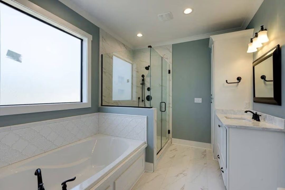
Arabesque tilework wraps the soaking tub surround with real texture, and matte black fixtures pull the room together without making a scene about it. The frameless glass enclosure keeps the shower visually open without borrowing square footage from the rest of the bathroom. This is the rare room where “spa-like” is an accurate description rather than wishful listing copy.
Pin It
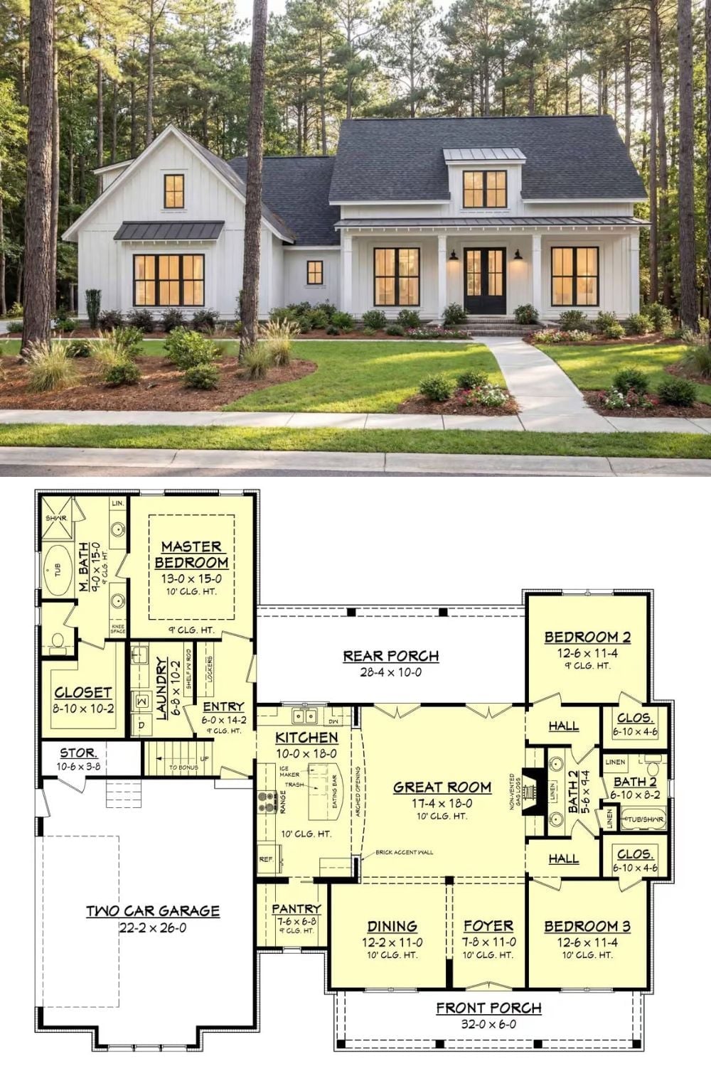
The exterior photo shows a white board-and-batten farmhouse with a dark shingle roof, metal porch awning, and black-framed windows set among tall pines. Below it, the floor plan reveals a 3-bedroom layout with a great room at center, master suite wing to the left, rear porch spanning nearly 30 feet, and a two-car garage.
Color Story: Board-and-batten exteriors read cleanly against dark rooflines because the vertical lines pull the eye upward rather than across, so the roofscape doesn’t compete. For a wooded setting like this one, warm whites with a slight yellow undertone tend to hold better under tree canopy shade than bright, blue-based whites, which can look washed out and stark once the light changes.
