
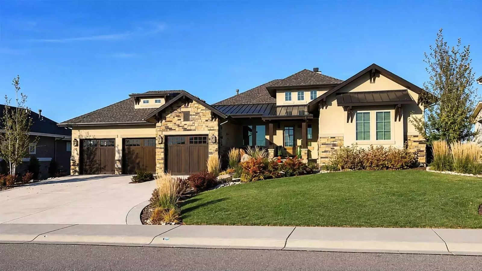
Empty nesters are quietly becoming one of the most active entertaining demographics out there, and the floor plan market is only beginning to catch up. The Littleton Close is built around that reality — coffee on the covered porch before anyone else is awake, an October evening with the fireplace going and old friends filling the living room, and a wet bar that stays stocked between visits rather than getting dismantled into a craft room.
Specifications
- Sq. Ft.: 2,615
- Bedrooms: 2
- Bathrooms: 2.5
Floor Plan – Main Floor
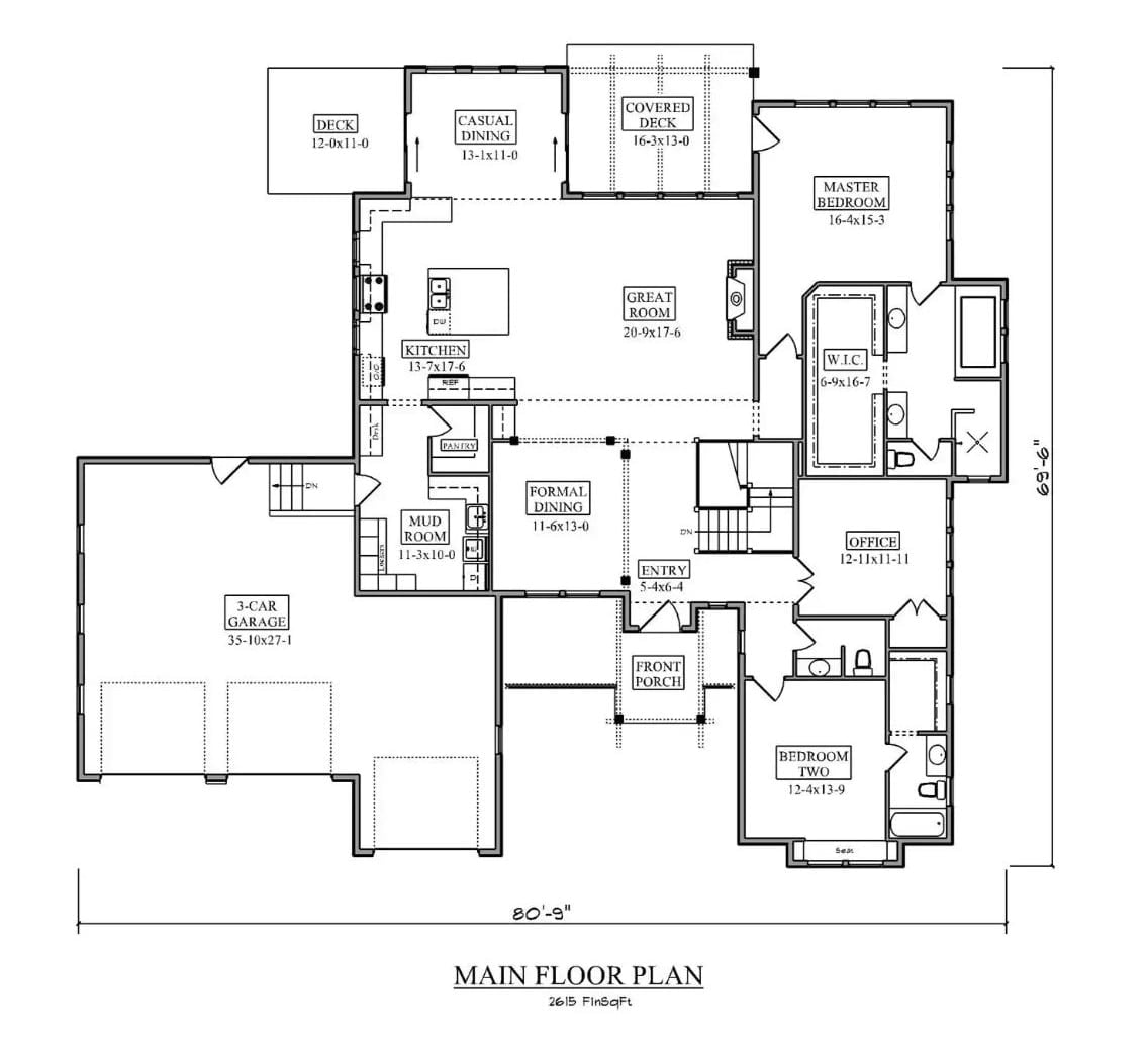
The main floor puts the master suite and office on one side, the great room at center, with casual dining and a covered deck pulling the living space outward toward the yard.
Floor Plan – Basement
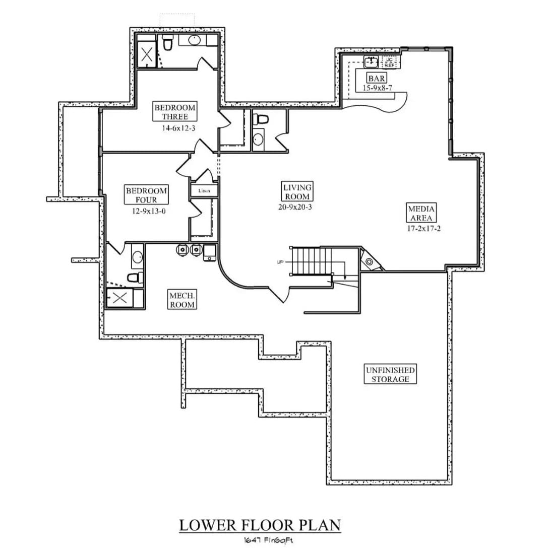
The lower level delivers 1,647 finished square feet with two bedrooms, a full bath, and a wet bar tucked near the media area. A central living room anchors the space, with mechanical and unfinished storage toward the back.
Pro Tip: Putting the wet bar next to the media area keeps the party contained in one zone — noise stays where the action is instead of drifting toward the bedrooms. In a lower-level finish like this, that kind of acoustic separation is worth more than an extra few feet of storage.
Stone Columns and Exposed Beams Anchor an Open Plan Built for Crowds
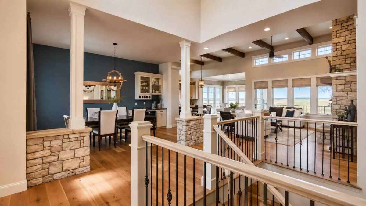
Stacked stone base columns transition up to white-painted wood, a detail that grounds the open layout without chopping it into separate rooms. Dark walnut chairs pull against the dining table just steps from the kitchen, while that orb chandelier overhead reads more sculptural than practical — which is fine, because the transom windows are doing the real lighting work anyway.
Why the Railing Placement Works Harder Than It Looks
Wrought iron balusters with scroll feet on a light wood rail aren’t purely decorative. Positioned at the stairwell landing, the railing draws a visual boundary between the dining zone and the lower living area without closing off sight lines — a subtle way to give each space its own identity when the square footage is otherwise wide open.
Limestone Fireplace Tower Pulls Every Seat in the Room Toward It
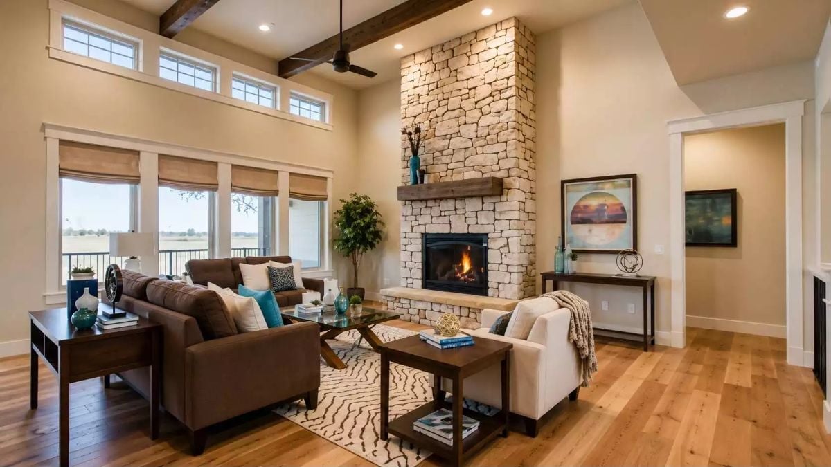
Rough-cut limestone runs floor to ceiling beside a wood beam mantel, and the scale of it earns its place. Brown sofas face the lit firebox. Cream chairs anchor the opposite side. A few teal accents keep the whole thing from sliding too far into lodge territory.
Style Math: Brown and cream furniture reads as safe until teal shows up. A few well-placed pieces in a single bold color do more work than a fully coordinated palette — pick one color to break the neutrals and commit to it rather than scattering three different accents around and hoping they gel.
Pendant Lanterns and Exposed Beams Do the Heavy Lifting in This Open Kitchen
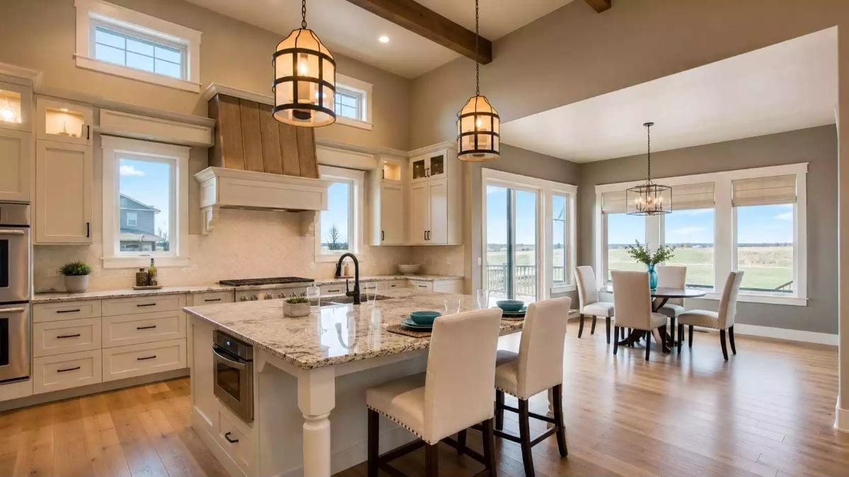
Craftsman pendant lanterns hang low over the island, pulling warmth down into the workspace without competing with the wood range hood above. Granite with warm veining ties the kitchen to the dining nook just beyond, and hardwood floors run the full length of both spaces without interruption.
Why It Works: Keeping kitchen and dining on the same flooring plane makes them read as one connected zone rather than two rooms that happen to share a wall. In open layouts, a material change on the floor is often enough to make a large space feel fragmented — continuity here prevents that.
Slate Blue Walls and Bamboo Blinds Give This Home Office a Grounded, Quiet Authority
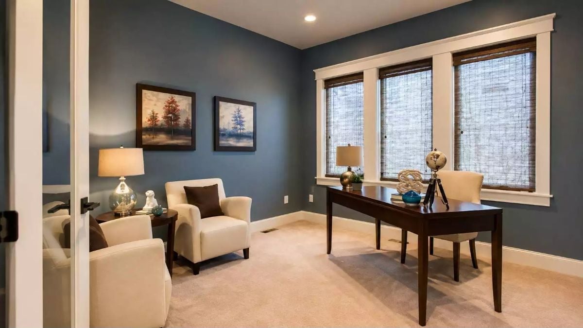
Blue-gray paint this deep could easily feel heavy, but cream carpet and white trim keep the room from closing in on itself. The dark wood desk anchors the window wall without blocking light through the bamboo shades. Two armchairs across the room signal that this office gets used for actual conversations — not just solo work with the door shut.
Fun Fact: Blue is one of the most commonly chosen colors for home offices because it reads as calm and focused. If you’re drawn to a shade this saturated, test it on all four walls before committing — north-facing rooms can pull it noticeably cooler than the paint chip suggests, which is either exactly what you want or a problem you’d rather not discover after two gallons are on the wall.
Gray Walls and a Prairie View Make This Master Bedroom Feel Twice Its Size
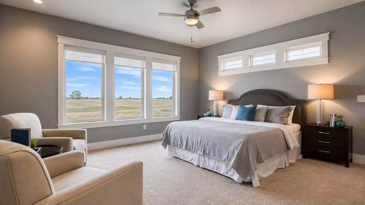
Carpet this light reads warmer in person than it photographs. The dark wood headboard holds the bed against gray walls without competing with the teal accent pillows, which are doing a surprising amount of work for their size. Clerestory windows above the bed pull in daylight without surrendering wall space to a window that would crowd out art or furniture placement.
Clerestory windows above the bed bring in light without sacrificing wall space for art or furniture.
Gold Vessels and Mosaic Tile Give This Double Vanity Serious Visual Weight
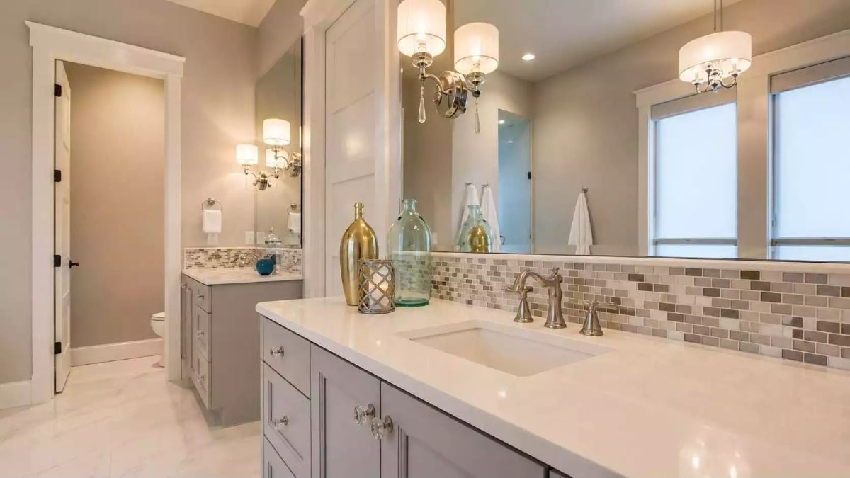
Brushed nickel faucets sit against white quartz countertops, while a mixed-material mosaic backsplash adds texture without fighting the decorative glassware for attention. Simple combination, but it holds up.
Quick Fix: Quartz holds up better than marble in high-humidity spaces because it’s non-porous and won’t absorb moisture or stain from spilled products. If you’re deciding between the two for a master bath, quartz is usually the lower-maintenance call — and in a room you use twice a day, that matters.
Wall-Mounted Wine Racks and a Wet Bar Keep the Party Where It Belongs
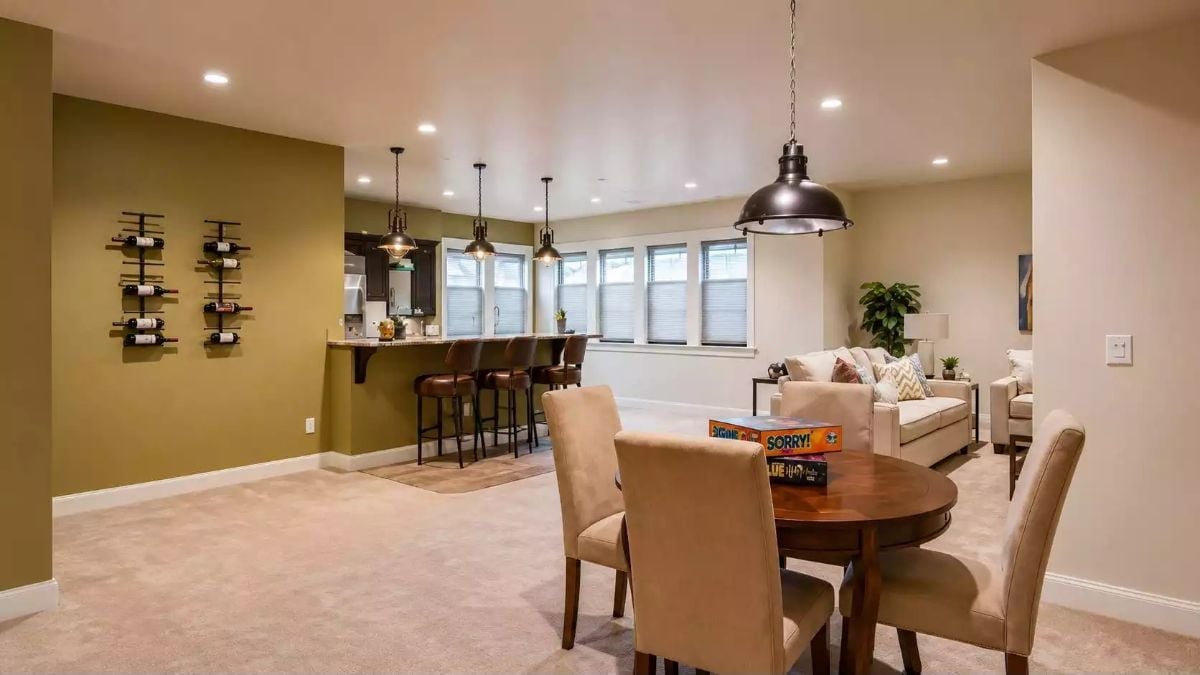
Olive green accent walls anchor the bar side of the room while carpet keeps the game table area soft underfoot. Sorry! on the table says everything you need to know about how this space actually gets used — and that’s the whole point of the lower level.
Pin It
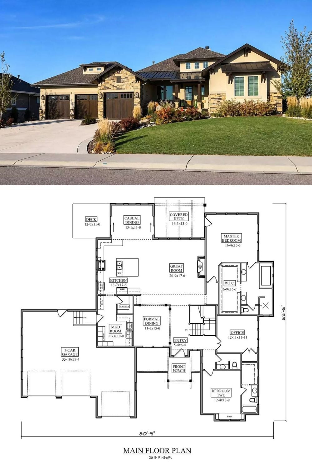
The top photo shows the exterior: a Craftsman-style ranch with stone columns, wood garage doors, and a metal roof accent over the entry. Below, the floor plan lays out 2,615 square feet with the great room at center, master suite tucked to the rear, and a three-car garage anchoring the left wing.
