
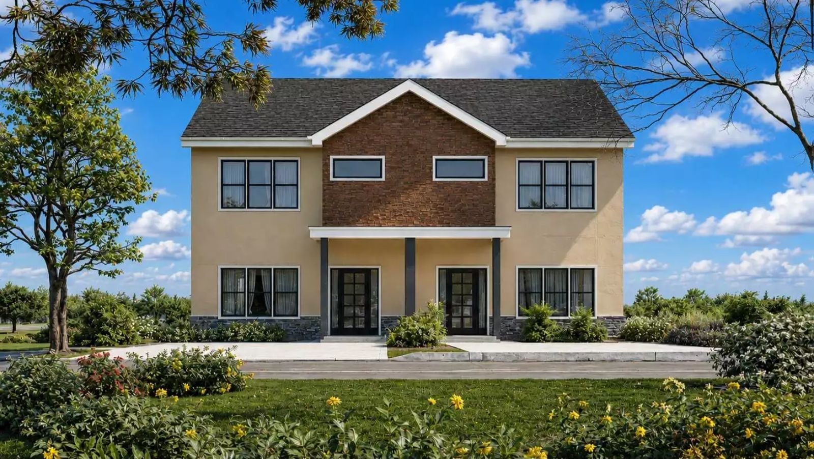
The house everyone actually wanted to be in was never the biggest one on the block — it was the one where the kitchen spilled into everything else, where grandparents held court at one end of a long table while kids disappeared upstairs and came back hungry. The Lawnswood Close is built around that dynamic: an open-concept main level that keeps generations in earshot, a dedicated second unit for parents or adult children, and enough separation that everyone still gets a door to close.
Specifications
- Sq. Ft.: 3,084
- Bedrooms: 6
- Bathrooms: 4.5
Floor Plan – Main Floor
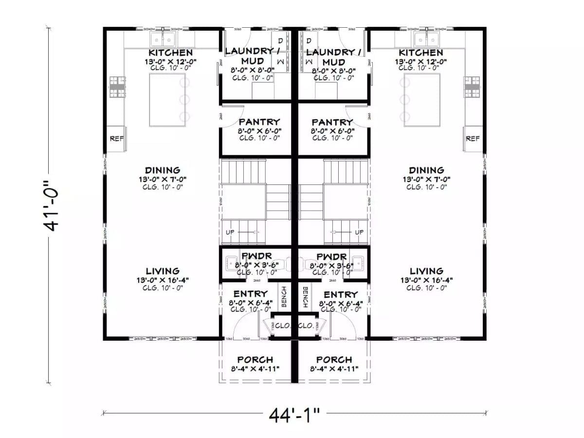
A mirrored duplex layout shares a central stair core, with each unit delivering living, dining, kitchen, pantry, laundry/mud room, powder room, and entry porch across a 44 by 41 foot footprint.
Floor Plan – Second Floor
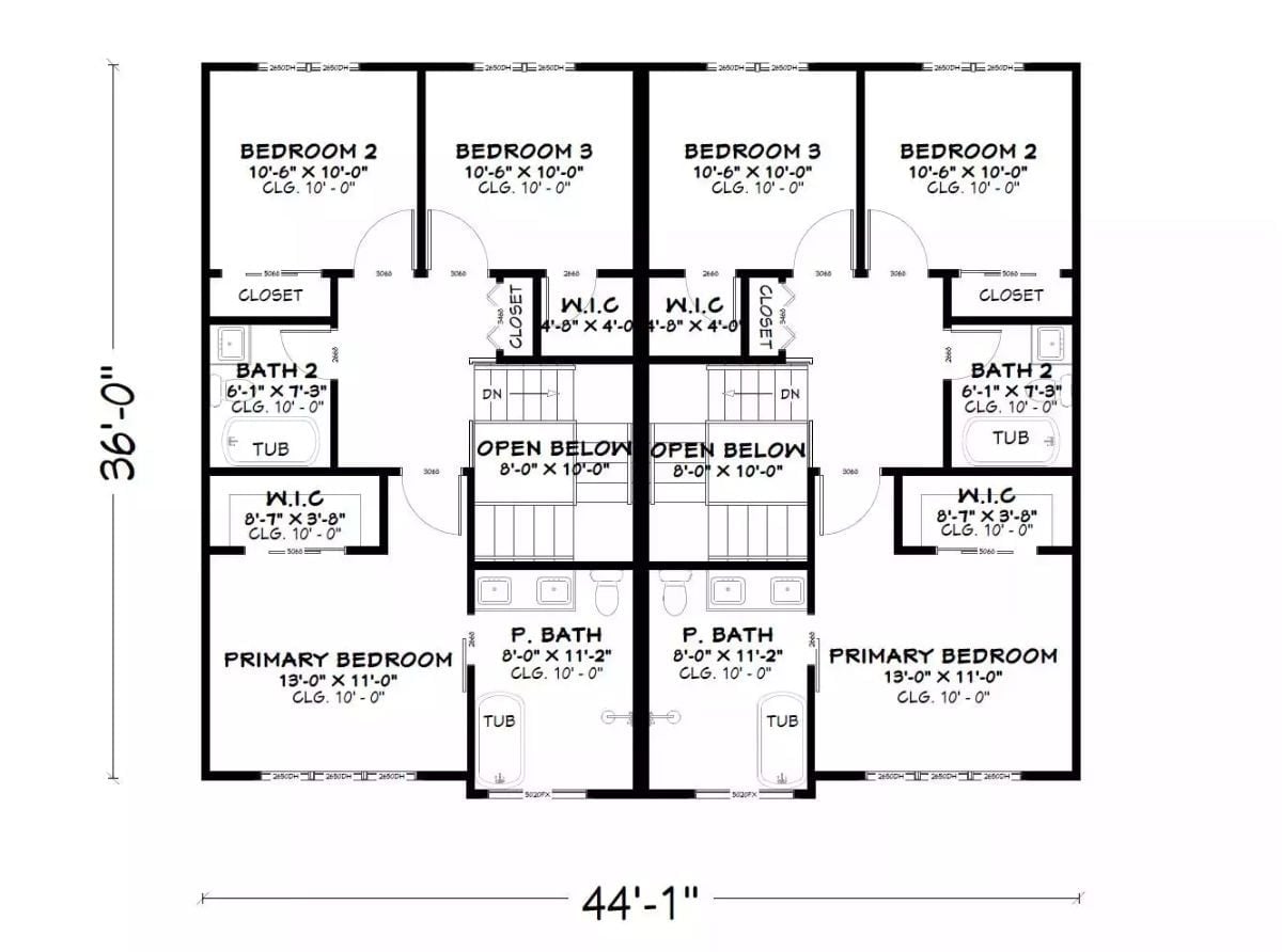
Both units share a center wall and are otherwise identical upstairs: three bedrooms, two baths, walk-in closets throughout.
Beige Panels and Stone Base Give This Two-Story Dual Unit Its No-Nonsense Charm
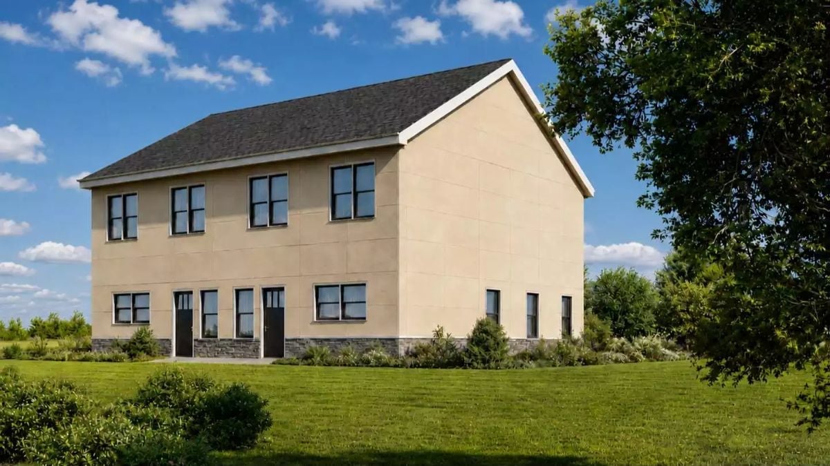
Flat-panel cladding on a farmhouse silhouette shouldn’t work this well, but it does.
Stone banding at the base keeps the structure planted, and black window frames pull the palette back from the edge of too-soft before it ever gets there.
Olive Walls and a Brass Chandelier Make This Open Kitchen-Dining Feel Collected
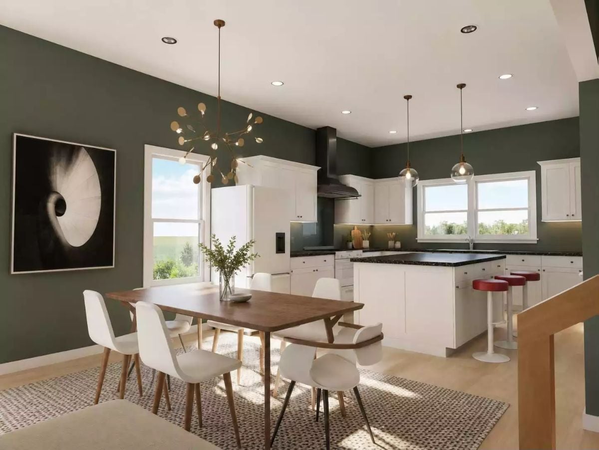
Dark olive paint wraps the dining and kitchen zones into one cohesive space, and it earns its keep. The walnut dining table anchors the room without fighting the white shaker cabinetry, and the globe pendants over the island plus that branching brass fixture above the table do a remarkable amount of heavy lifting for two light sources.
The Psychology Behind This: Carrying a single wall color across both cooking and dining zones tends to read as more deliberate than relying on furniture alone to carve up an open plan. The olive here is dark enough to ground the room without picking a fight with the white cabinetry. Rooms where color does the organizing tend to feel calmer — people linger in them longer without quite knowing why.
Warm Wood and Slate Walls Pull This Open-Plan Dining Space Together
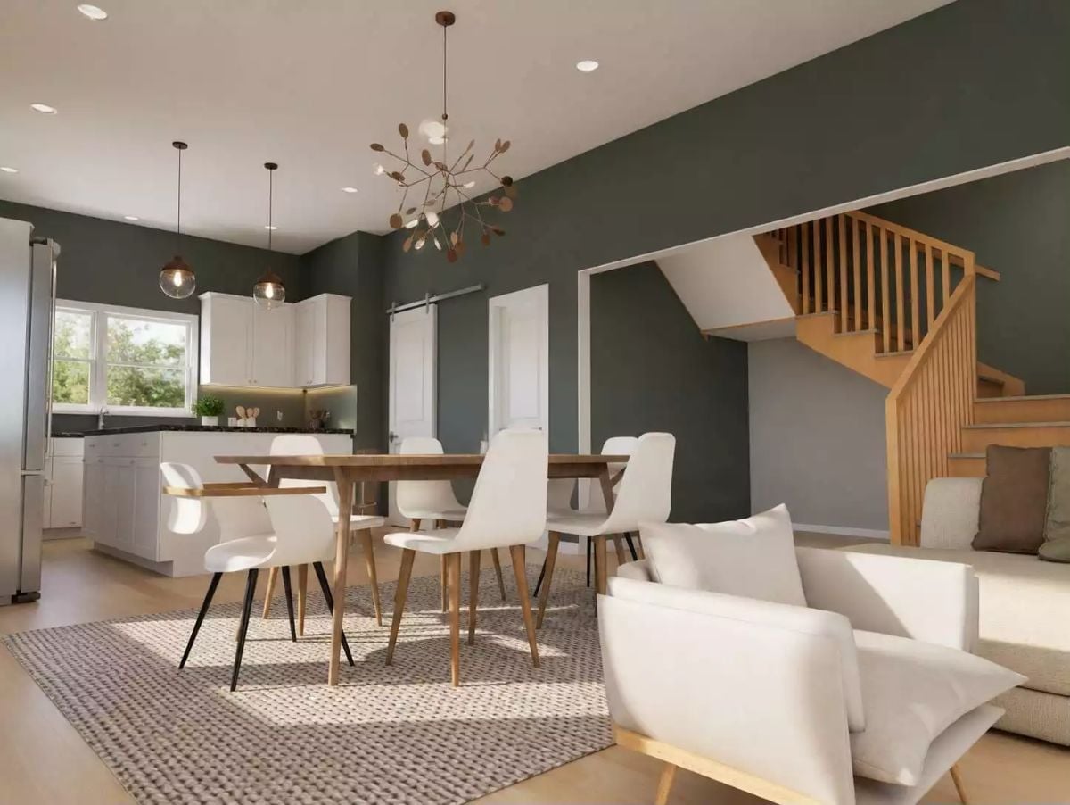
Pendant lights with amber-tinted glass hang at staggered heights over the dining table, keeping the kitchen visible but distinct. White shell chairs sit alongside wood-leg seating without looking like a mistake. The barn door behind the table earns its place — it’s not decorative filler, it’s closing off something. Light floors are what stop the slate walls from reading as a cave.
Try This: White cabinetry against a dark accent wall works best when a third material bridges the gap rather than leaving the contrast to fend for itself. Here, natural wood does that job — the stair railing touches both zones and keeps the palette from feeling split. Before committing to a two-tone kitchen, find one warm-toned element that can make the crossing.
Sage Walls and Beige Upholstery Make This Open Living Space Feel Quietly Confident
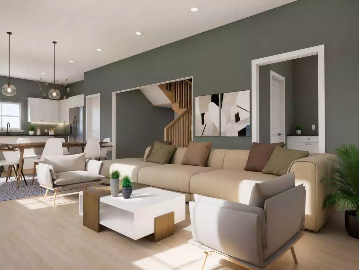
Sage-green runs the full length of the open plan, grounding both the living and kitchen zones without crowding either. The beige sectional, white coffee table with a raw wood base, and light hardwood floors keep the palette from going heavy — each one pulling its weight without announcing itself. A few small potted plants on the table add life without demanding a second glance.
Why the Coffee Table Works So Hard Here
That white-top, wood-base coffee table is doing structural work for the room’s entire color story. The white top picks up the trim around the doorframes; the raw wood base echoes the staircase railing visible through the opening. Rooms where furniture materials quietly repeat architectural finishes feel pulled together without feeling staged — and that’s a harder trick to pull off than it looks.
Warm Linen Bedding and a Low-Profile Frame Keep This Bedroom Grounded
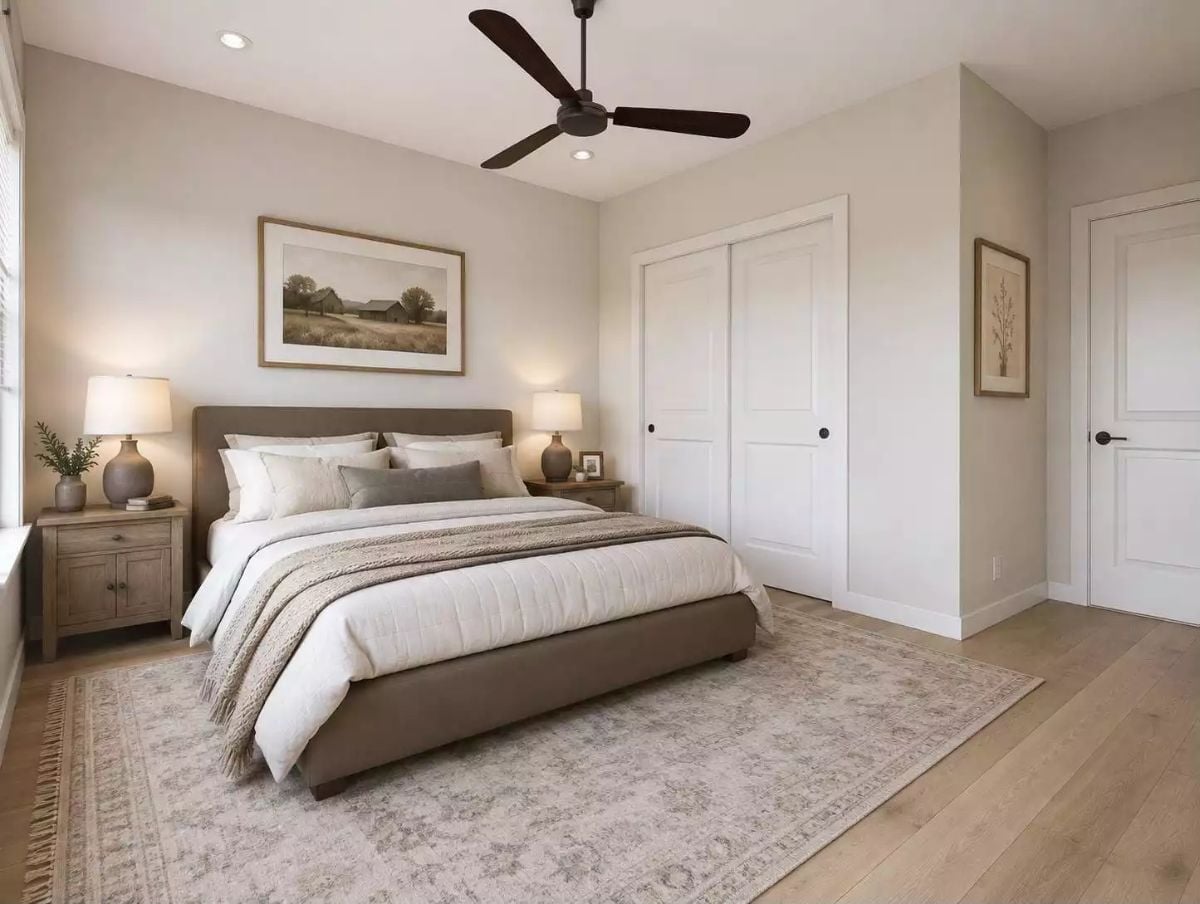
Layered neutral bedding pulls focus, but the oversized vintage rug is what actually anchors the room. Matching ceramic lamps on wood nightstands add quiet symmetry without trying too hard. The dark ceiling fan reads as deliberate contrast against walls that sit somewhere between greige and cream — and it works better than the usual white blade default would.
Trend Alert: Ceiling fans are back in primary bedrooms, and designers are reaching for dark-finished blades over white to add visual weight overhead. It’s a practical call that also stops the ceiling from feeling like an afterthought — which, in a room this considered, would be a shame.
Pin It
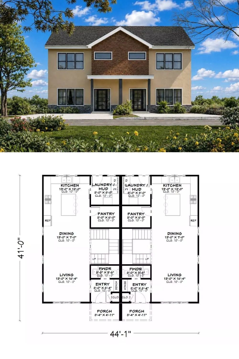
Exterior rendering paired with the first-floor plan shows the dual-unit layout with its mirrored kitchens, entries, and porches side by side.
