
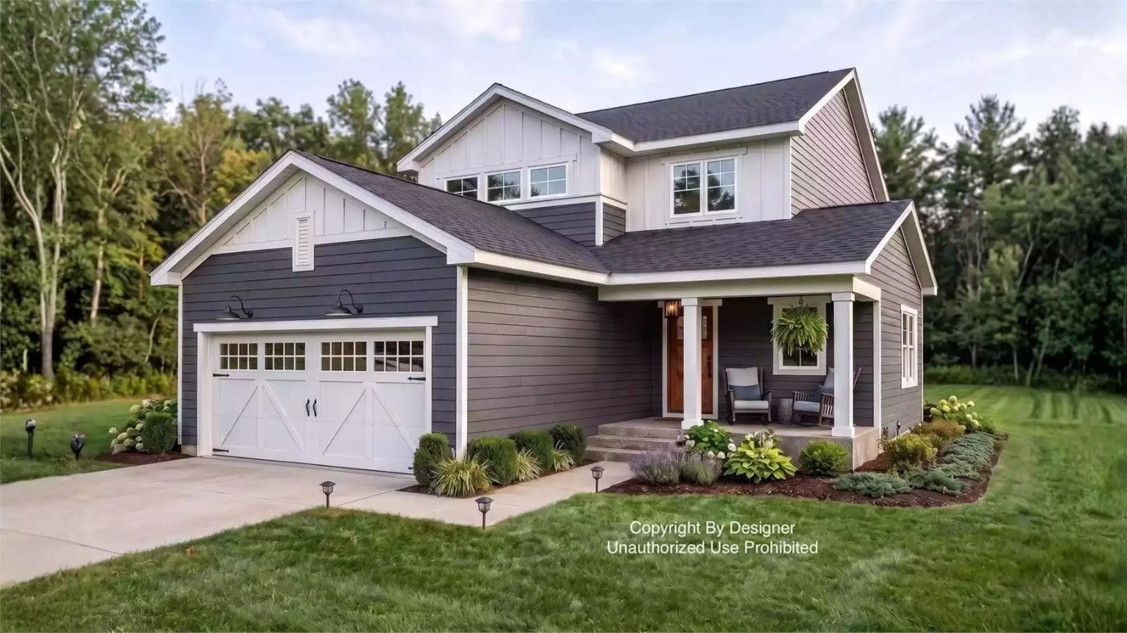
Anyone who has refereed a bathroom standoff between two teenagers on a school morning knows exactly which line item to look for first on a floor plan. The Laburnum Crest is built around that reality: a Jack and Jill bath keeping the peace between shared bedrooms, a second floor that gives older kids genuine distance from the dinner table, and a farmhouse layout roomy enough for homework at the island while you finish the third load of laundry.
Specifications
- Sq. Ft.: 2,060
- Bedrooms: 4
- Bathrooms: 3.5
Floor Plan – Main Floor
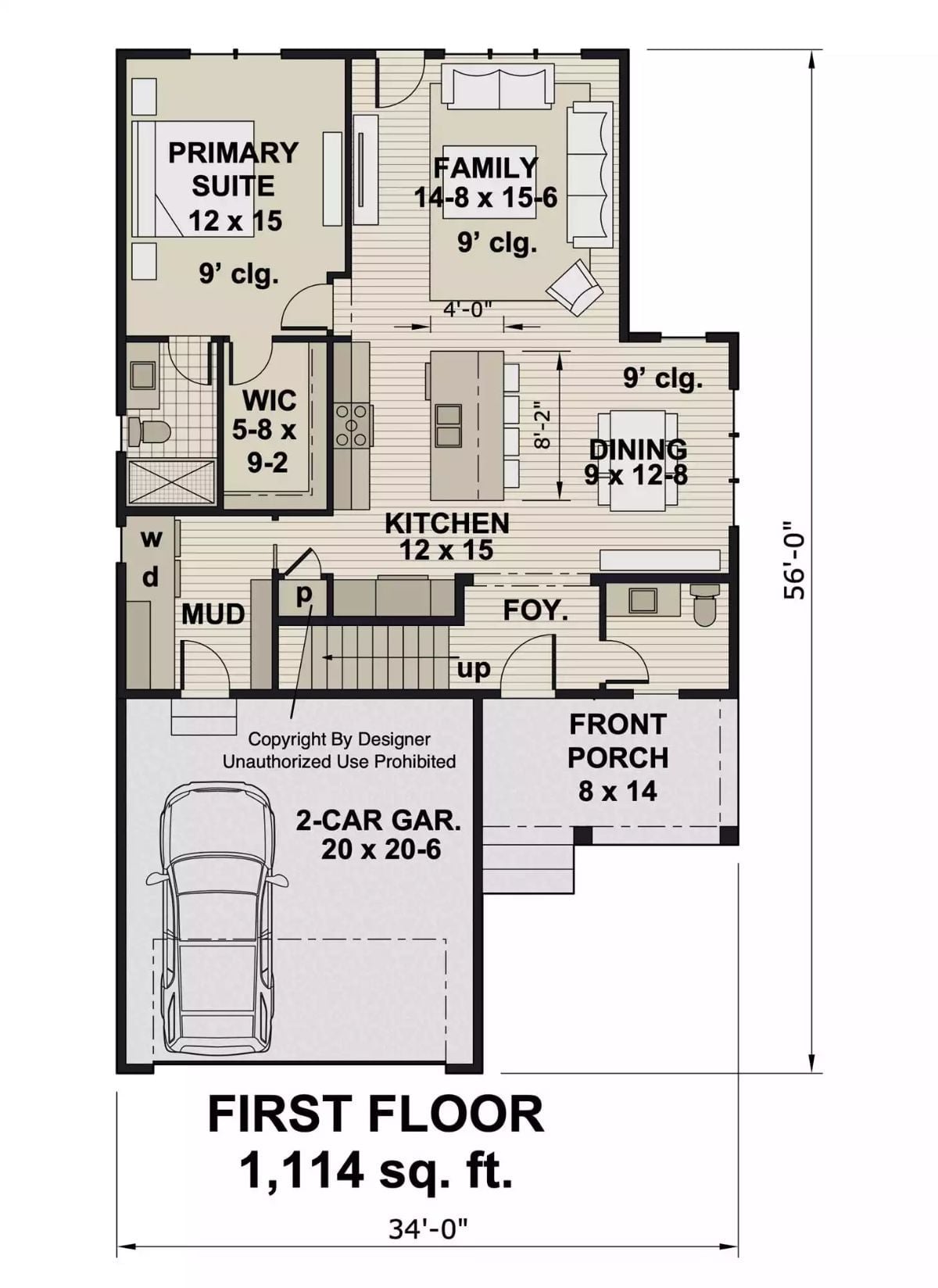
The primary suite sits beside the kitchen on the first floor, with the family room, dining area, foyer, mud room, and a 2-car garage — accessed through the laundry area — filling out the rest of the level.
Floor Plan – Second Floor
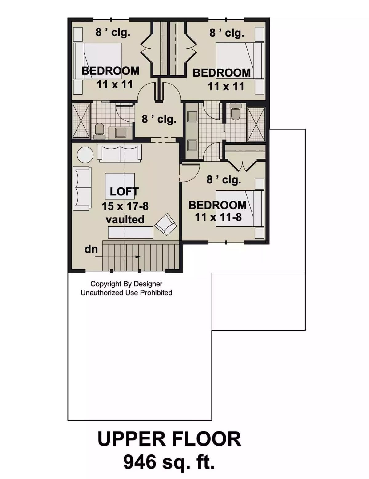
Upstairs, three bedrooms share a floor with a loft, and a Jack and Jill bath connects two of them. The third bedroom is tucked into its own corner with a private bath — a small detail that matters enormously once your kids hit a certain age. Stair access drops down from the loft area.
Dark Island Base, White Quartz Top, and Two Chandeliers That Actually Work Together
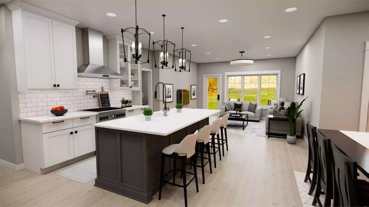
The island’s charcoal base hits hard against white shaker cabinets, the kind of contrast that looks deliberate rather than default. Bar stools sit low enough to feel casual rather than perched, and beyond the island the living area opens up without a single wall breaking the sight line.
Pendant Lights, Dark Chairs, and a View Worth Sitting Down For
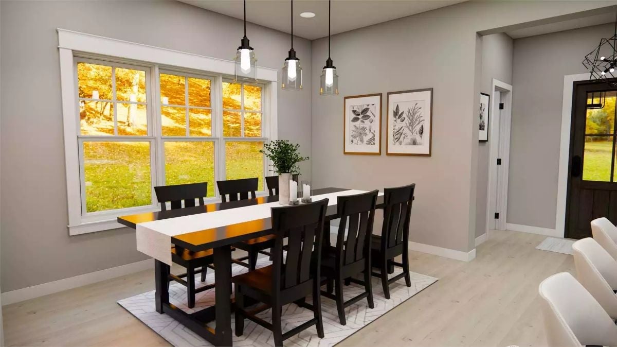
Warm autumn color floods through double-hung windows and washes across light wood floors and a dark-stained dining table that seats eight. Three pendants hang low over the table — low enough to feel intimate rather than architectural. Botanical prints on gray walls keep things from floating off into the scenery.
Color Story: Gray walls read cooler in isolation but pull warm here, balanced against all that amber light coming through the windows. It’s not a color most people reach for in a farmhouse dining room, and that’s precisely what saves this room from looking like a catalog page.
Light Gray Sofas, a Black Coffee Table, and Autumn Doing All the Heavy Lifting Outside
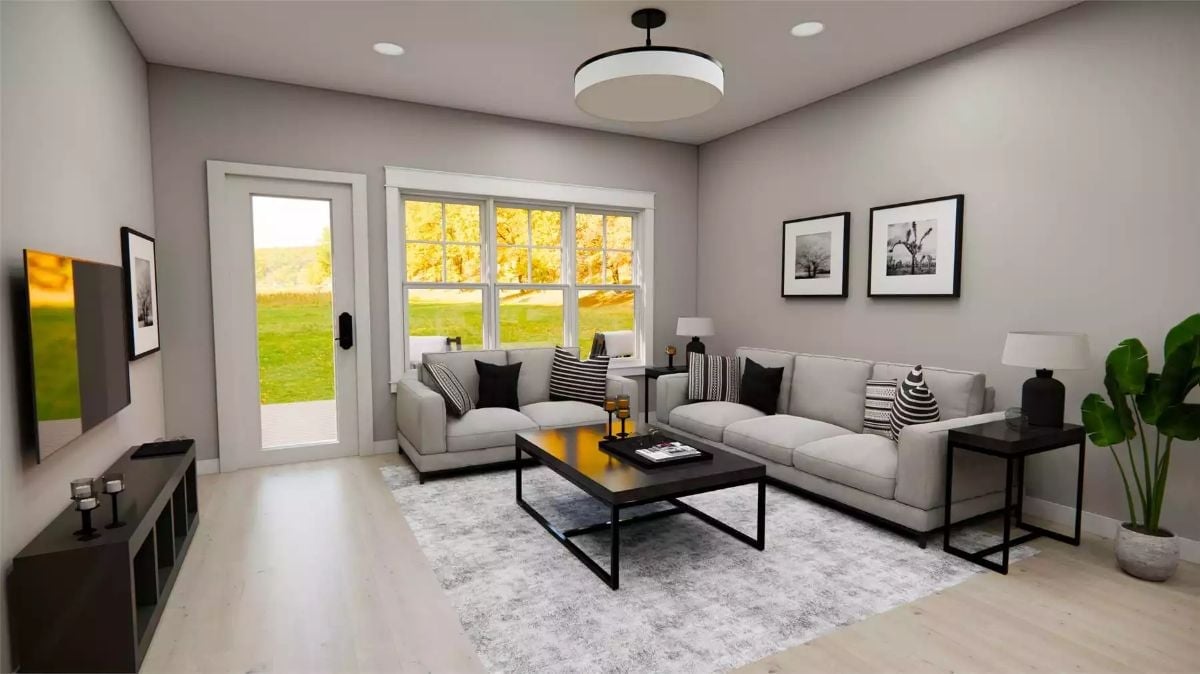
Gray and black shouldn’t feel this inviting, but here we are.
Two light gray sofas face each other across a dark-framed coffee table, and the room would be perfectly fine on that merit alone. But the windows behind them are doing the real work — fall foliage pouring in amber light that no pendant fixture, no matter how well chosen, could come close to replicating.
Black Headboard, Gray Layers, and a Window That Earns Its Place on the Wall
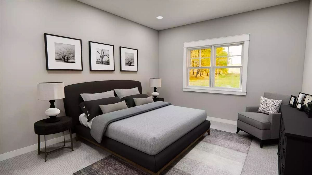
Charcoal upholstery grounds the bed while gray bedding builds depth through texture rather than color contrast. Black nightstands keep the flanking symmetry from feeling too composed. The window does the rest — fall foliage framed behind the headboard in a way that no interior finish could manufacture.
Trend Alert: Low-profile platform beds are holding strong in primary bedroom design, partly because they make standard ceiling heights feel taller without any architectural changes. Pair one with an oversized upholstered headboard, and you get something grounded rather than sparse — which matters most in rooms where the window is meant to be the focal point, not the furniture.
Marble Countertop, Matte Black Fixtures, and Tile That Knows Its Role
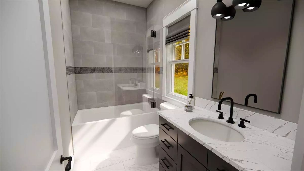
Black widespread faucets sit slightly wide for a single-basin vanity, which gives the counter a grounded, intentional feel rather than an afterthought. The quartz veining draws the eye without competing with the mosaic accent strip running across the tub surround — those two elements could easily fight each other, and they don’t. Natural light handles the rest. No wasted moves in here.
History Corner: Mosaic tile borders like the one running across this tub surround trace back to ancient Roman bath culture, where small cut tesserae delineated zones within large communal bathing spaces. By the early 20th century, American tile manufacturers had adapted the format for residential use, typically placing decorative bands at shoulder height in standard tub enclosures. It’s one of the few bath details that survived a century of shifting design trends with almost no modification.
Laundry rooms don’t always get this kind of attention, but this one makes a case for taking the space seriously.
Floating Wood Shelves, Subway Tile, and Front-Loaders Built Into the Cabinetry
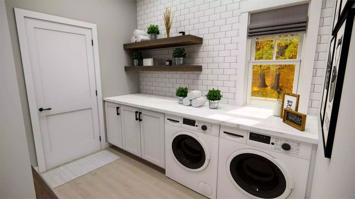
The countertop runs the full wall length, with both machines tucked beneath white shaker cabinets and matte black hardware tying it back to the finishes elsewhere in the house.
Loft Landing Area With Stair Rail, Accent Chair, and a Tree Line Doing the Decorating
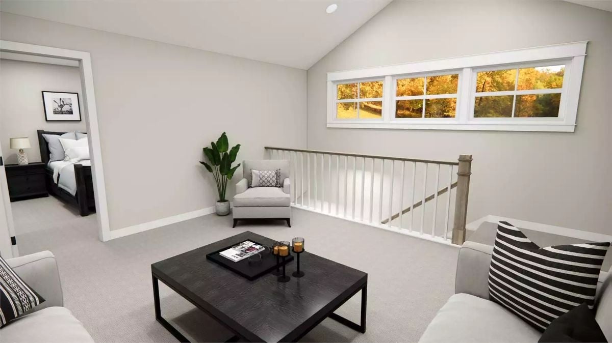
Vaulted ceiling, carpet underfoot, a horizontal window framing fall foliage. Simple furniture steps aside and lets the view lead — which is the right call when the view is actually worth something.
Worth Knowing: A loft that opens to a stair rail like this one creates natural sightlines between floors, helping a smaller home feel connected without forcing an open-concept layout on the ground level below. For families who want the kids upstairs but not entirely out of earshot, it’s a layout that earns its square footage.
Pin It
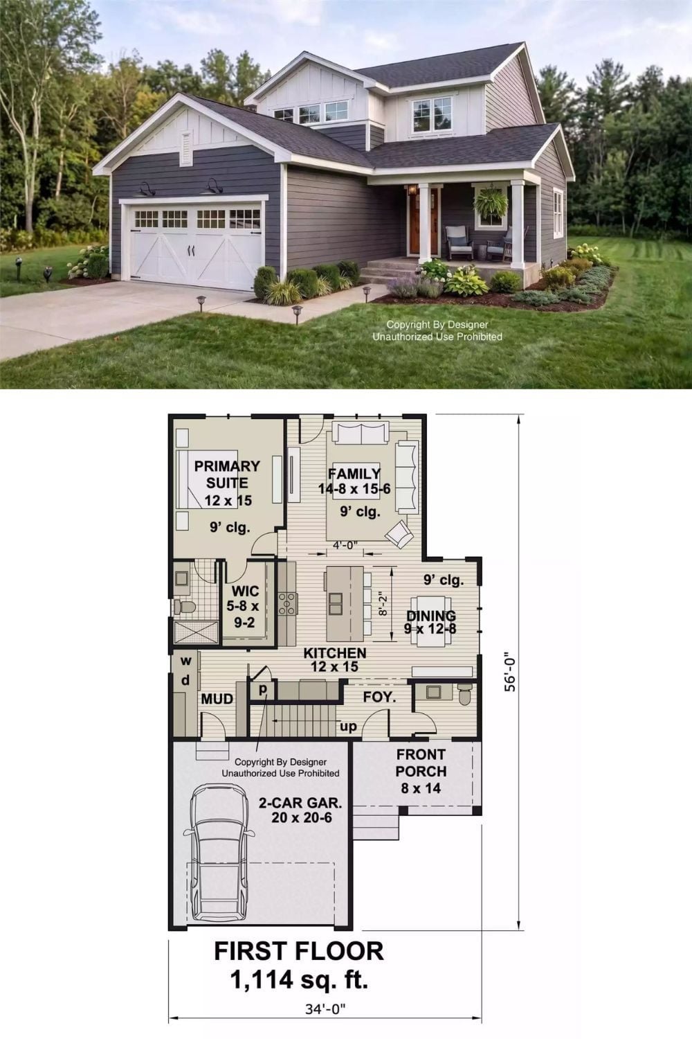
The exterior shows a gray board-and-batten farmhouse with a covered front porch and an attached two-car garage. The first-floor plan puts roughly 1,114 square feet to work around a central kitchen, with the primary suite tucked privately opposite the family room and stairs climbing toward the upper level.
The Psychology Behind This: Positioning the kitchen between the family room and dining area keeps the cook inside the conversation rather than behind a wall. Designers tend to treat kitchen sightlines as seriously as kitchen storage — the social geometry of a floor plan matters as much as the cabinet count.
