
Two-tone kitchen cabinets used to mean one color above, another below, or an island painted to stand apart. That formula hasn’t disappeared. It’s become considerably more ambitious. Color now climbs onto ceilings, slips inside oak-lined coffee cabinets, and plays against timber, stone, and lacquer. The interesting question isn’t whether two finishes can share a kitchen. It’s what happens when each has a distinct architectural purpose.
In order to come up with the very specific design ideas, we create most designs with the assistance of state-of-the-art AI interior design software. Also, assume links that take you off the site are affiliate links such as links to Amazon. this means we may earn a commission if you buy something.
A forest-green ceiling turns pantry doors into part of the architecture. Burgundy lacquer stands against extravagant marble; matte charcoal disappears beneath blonde oak; walnut fluting picks up the curve of a built-in banquette. Grain matters as much as color. So do sheen, proportion, and the precise point where one material stops and another takes over. Even the ceiling, once content to stay white and mind its business, has developed opinions.
Some kitchens make their case with dramatic contrasts. Others rely on differences so subtle that the eye registers texture before color. The best combinations change how a room feels: where its visual weight settles, how far its walls seem to extend, and which architectural details command attention. The difference between a kitchen with two cabinet colors and one designed around them can be measured in inches, undertones, and the occasional ceiling that refuses to behave.
36. A Forest-Green Ceiling Turns the Pantry Into Architecture
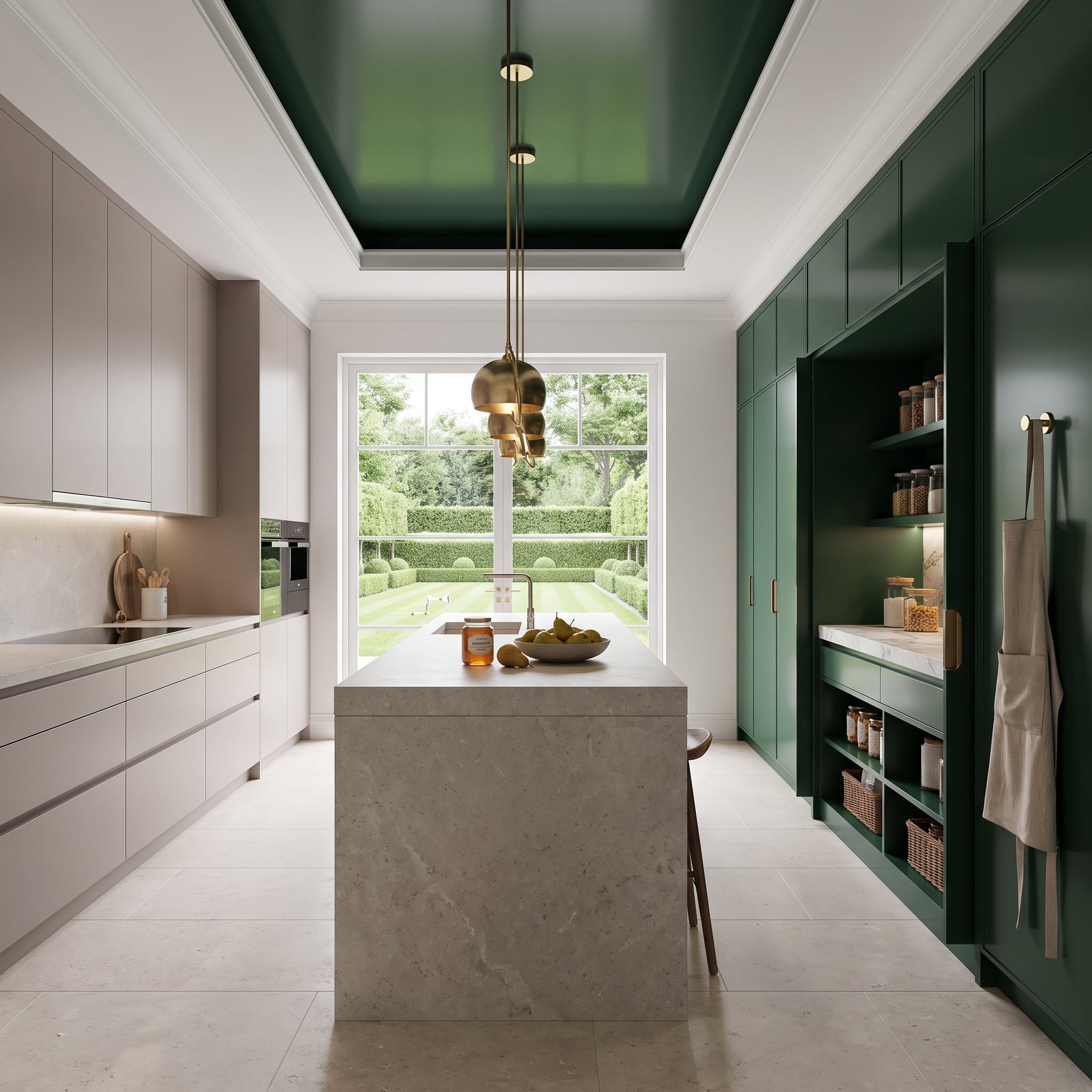
Forest green climbs from the tall pantry doors onto the ceiling, creating a continuous band of color that pulls the eye toward the garden window. White, handleless perimeter cabinets interrupt the saturation; without that pale counterpoint, the green would dominate every surface.
The veined waterfall island adds another material without another painted cabinet color. Brass pendant clusters and pantry hardware catch light against the dark finish, while white coffer trim gives the ceiling a crisp boundary.
35. Terracotta Base Cabinets Meet Blonde Oak and Rough-Hewn Beams
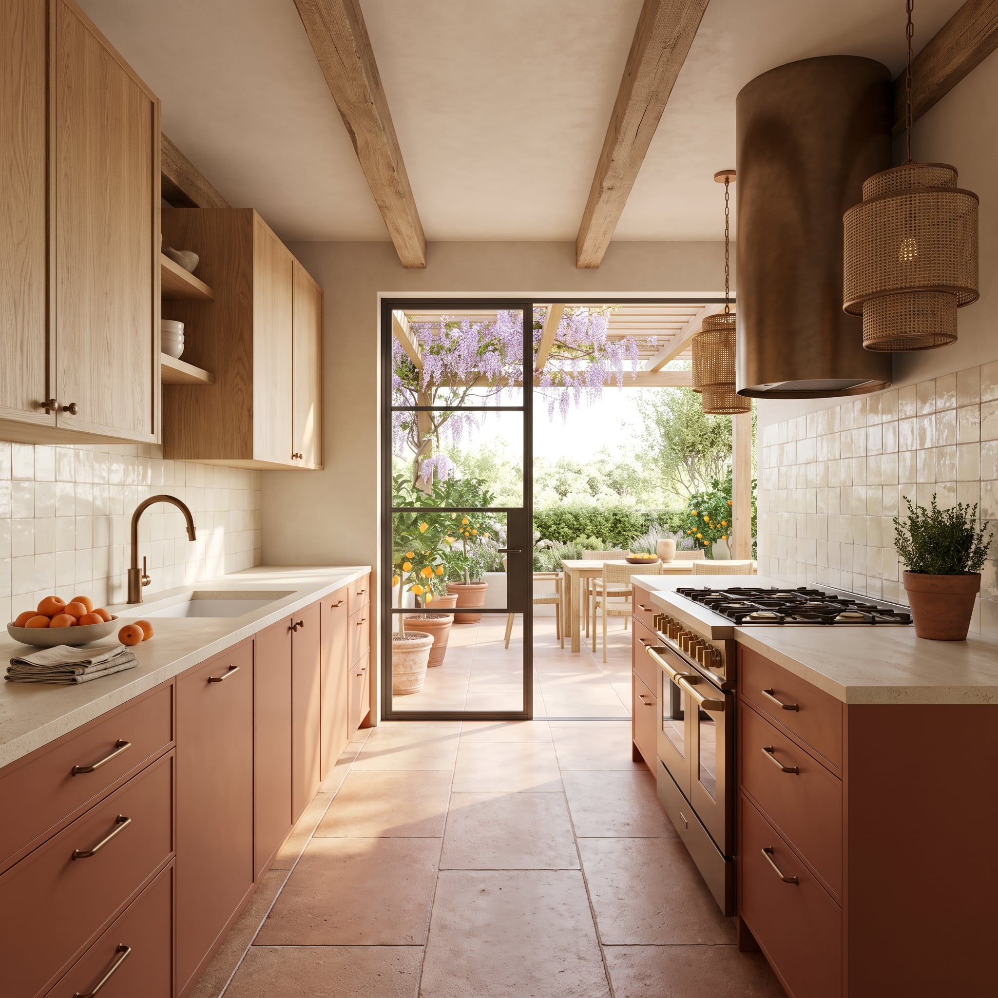
Terracotta lowers and blonde oak uppers share a warm, earthy palette, yet their surfaces behave differently. The painted bases form a continuous band of color; the wood grain above introduces variation without a competing hue.
Cream zellige-style backsplash tile marks the transition. Overhead beams and limestone flooring extend the natural-material palette beyond the cabinets, making the color split part of the architecture rather than a decorative stripe.
34. Sage Cabinets, Walnut Bases, and a Ceiling Dipped in Gold
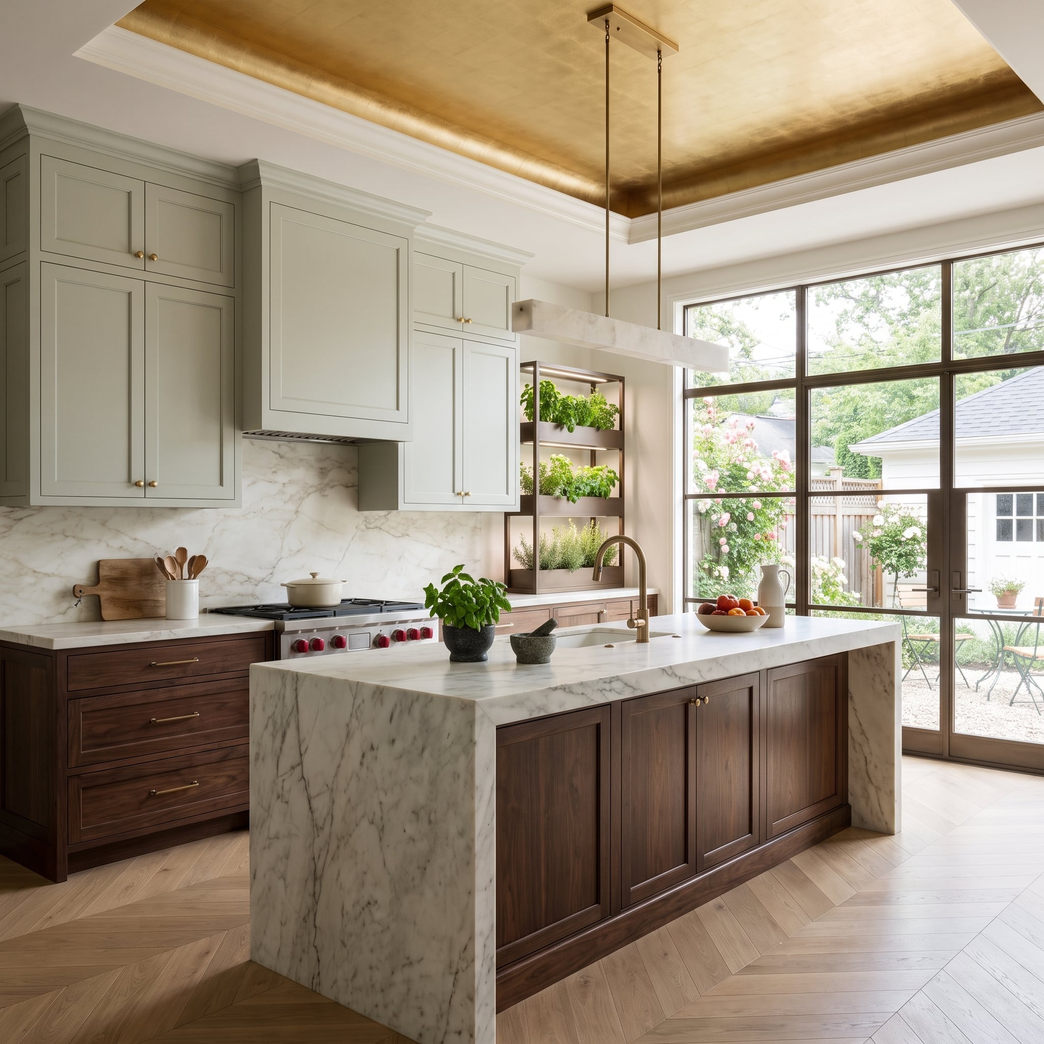
Sage uppers meet walnut lowers beneath a gilded tray ceiling. The pairing has a quiet natural logic—soft green against dark wood—although the ceiling refuses to let the room become rustic.
A full-height marble backsplash and waterfall island introduce broad pale surfaces between the richer finishes. Brass details echo the ceiling’s metallic warmth; the chevron oak floor supplies a smaller, more rhythmic grain beneath the island.
33. Matte Black Below, Blonde Oak Above, Travertine Between
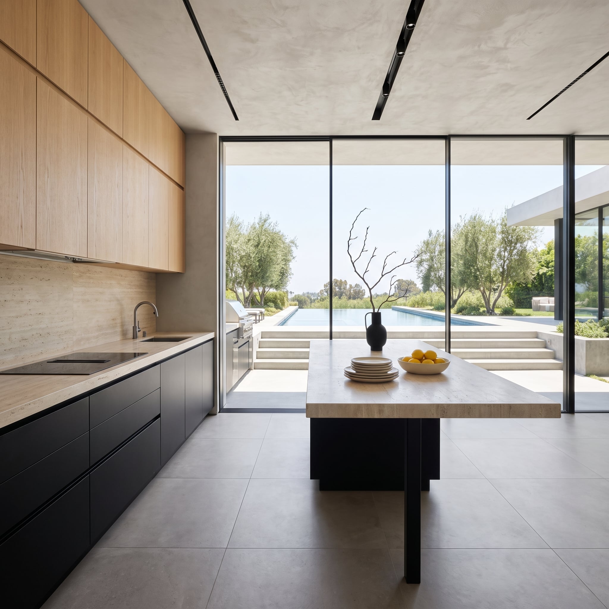
Matte black base cabinets establish a deep, uninterrupted foundation for pale oak uppers. Travertine travels across the backsplash and island, its creamy movement bridging the hard contrast without adding another paint color.
Flat-front joinery keeps the composition spare. Beyond the glazing, the pool and olive trees extend the sightline, while the stone’s natural texture prevents the minimalist cabinetry from feeling clinical.
32. Walnut Drawers Interrupt a Marble Island With a Living Herb Garden
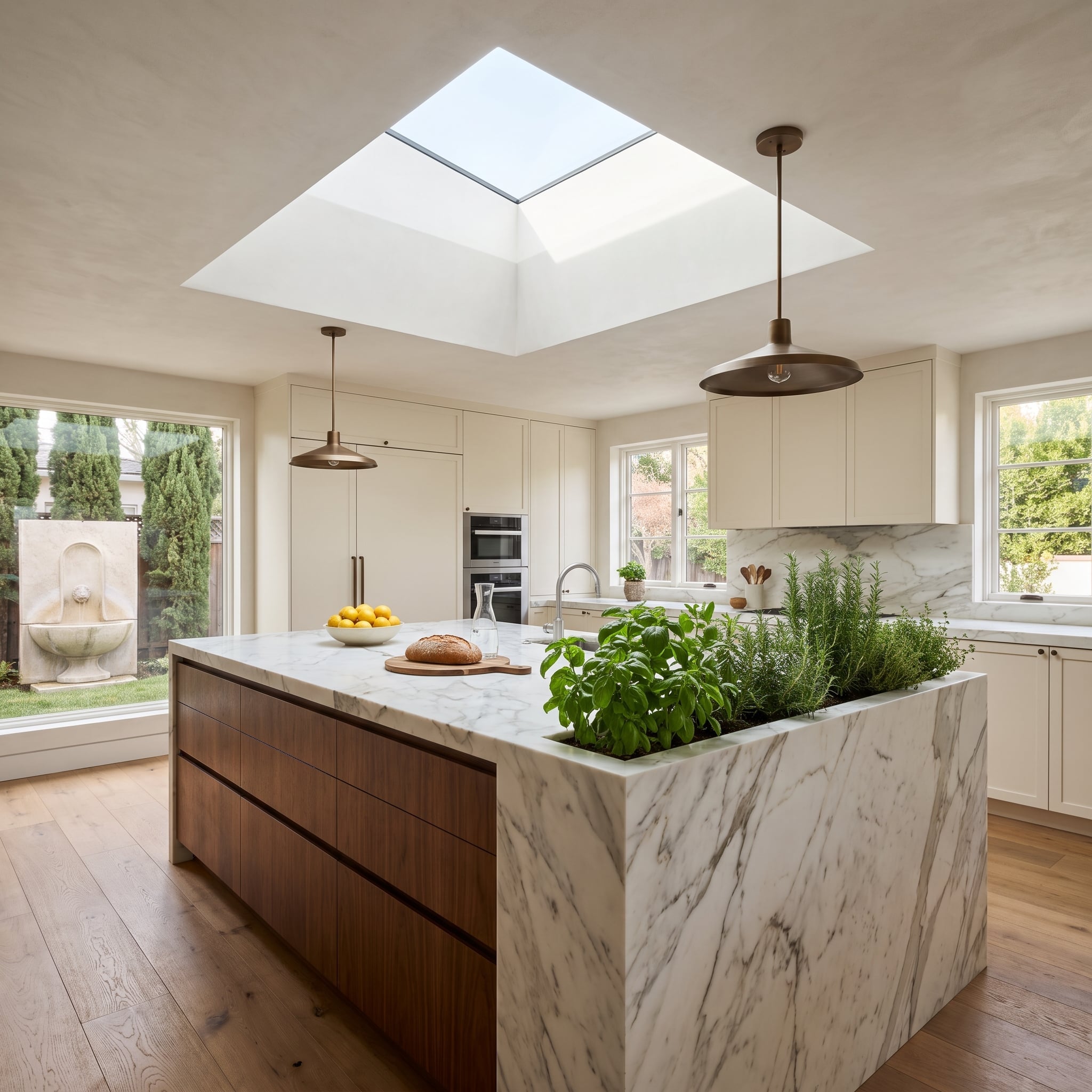
Cream cabinetry and pale marble could make this kitchen feel almost weightless. Walnut drawer fronts across the island bring the eye down to furniture height, introducing grain and warmth precisely where the stone is most expansive.
A planted recess at the island end brings greenery into the composition. Daylight from the skylight picks up the stone’s veining, while bronze pendants give the pale upper half a darker punctuation mark.
31. Navy Lower Cabinets and a Lacquered Ceiling Make a Coastal Statement
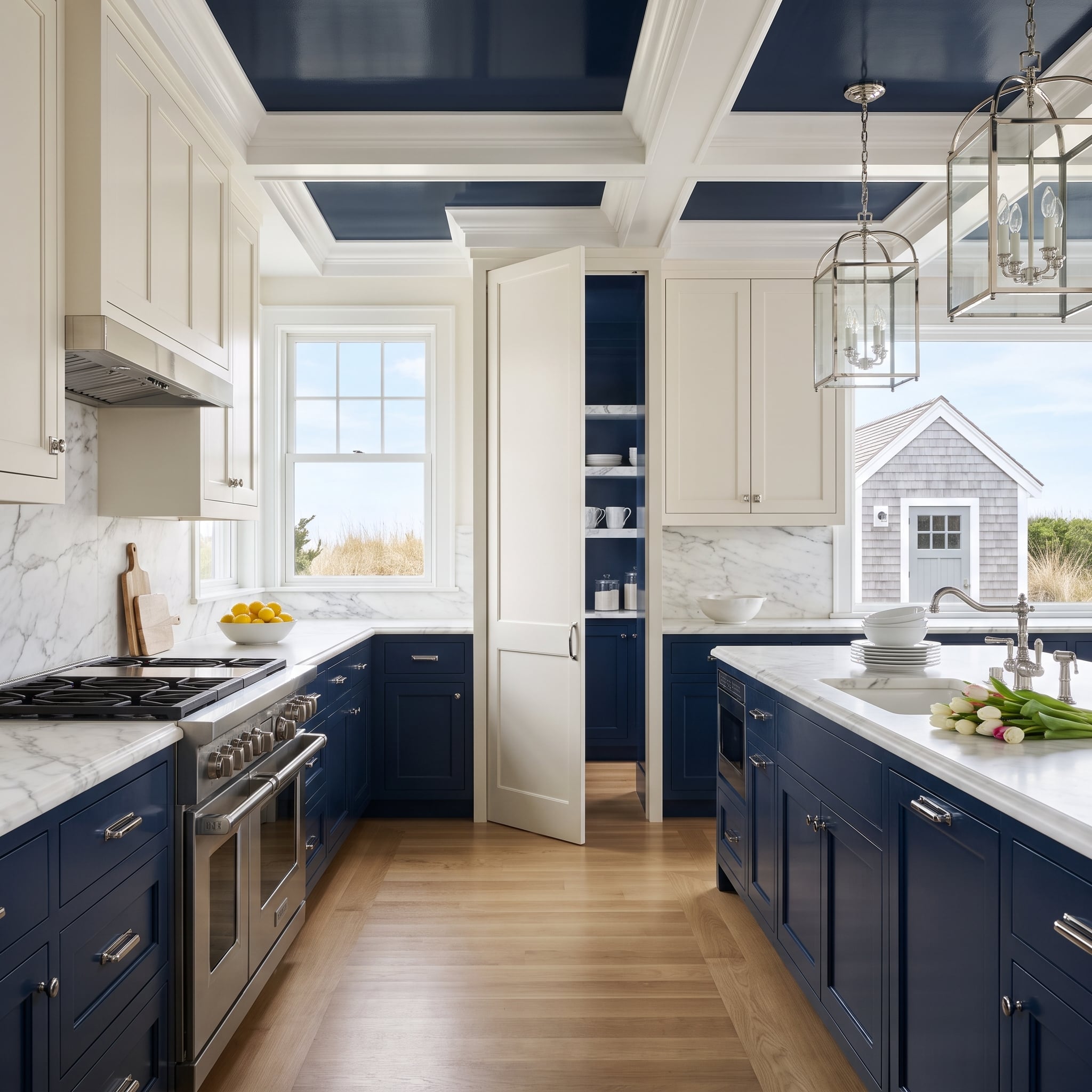
Navy Shaker bases and cream uppers are familiar coastal ingredients. The unexpected move is overhead: a glossy coffered ceiling repeats the blue, so the color occupies two distinct planes instead of sitting only below the countertop.
Marble surfaces separate those planes with pale veining. Polished nickel hardware and lantern pendants introduce glints of metal without turning the room into a nautical costume.
30. Two Wood Tones, One Travertine Island, and an Open Pantry
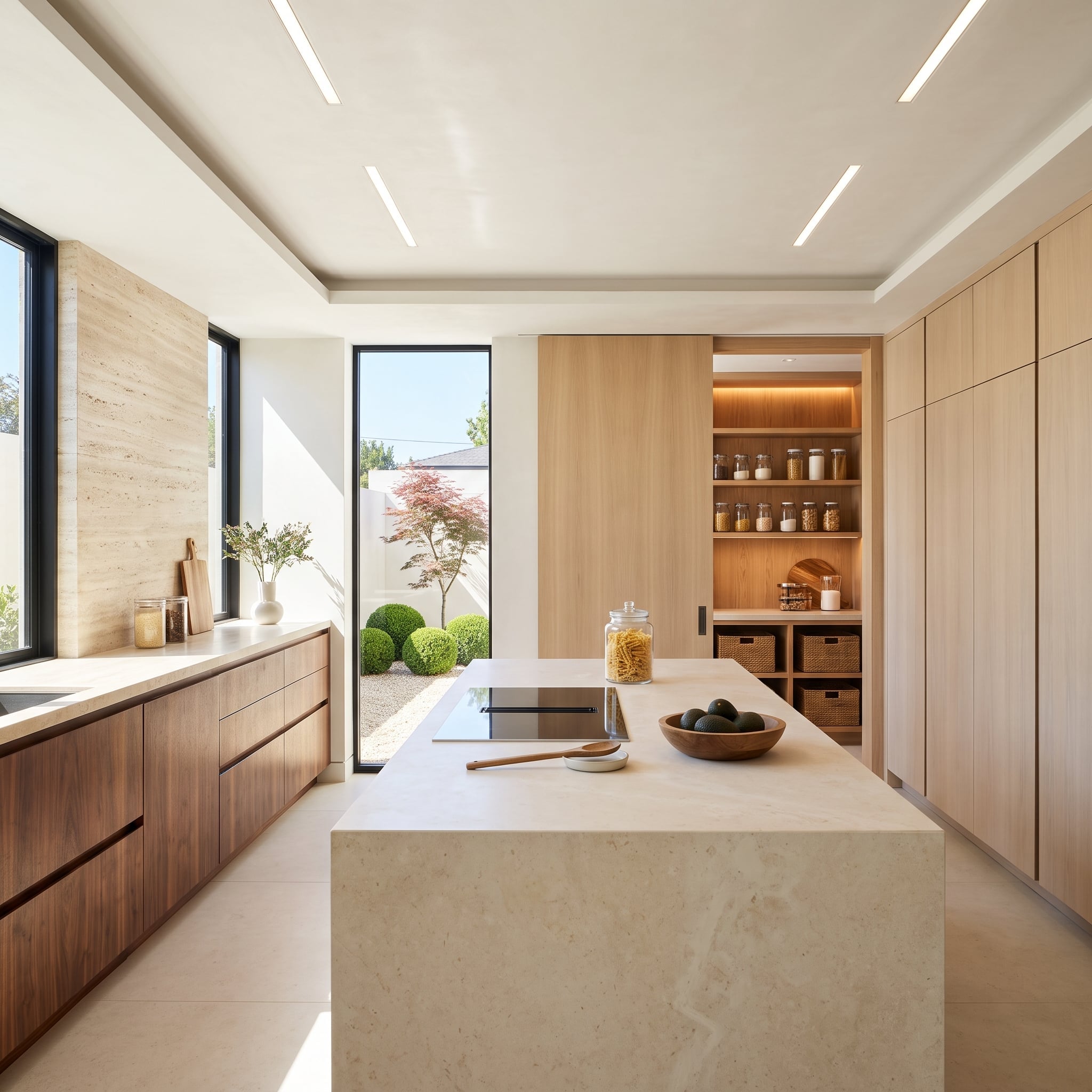
Dark walnut drawers line the window wall; lighter oak frames the pantry. Rather than pretending the woods match, the design gives each a separate job: walnut defines the working perimeter, and oak makes the open storage feel lighter.
The travertine island stands between them as a broad mineral surface. Glass jars, woven baskets, and warm shelf lighting add a finer scale to the pantry without disguising its open construction.
29. Burgundy Below, Greige Above, With a Bar Worth Noticing
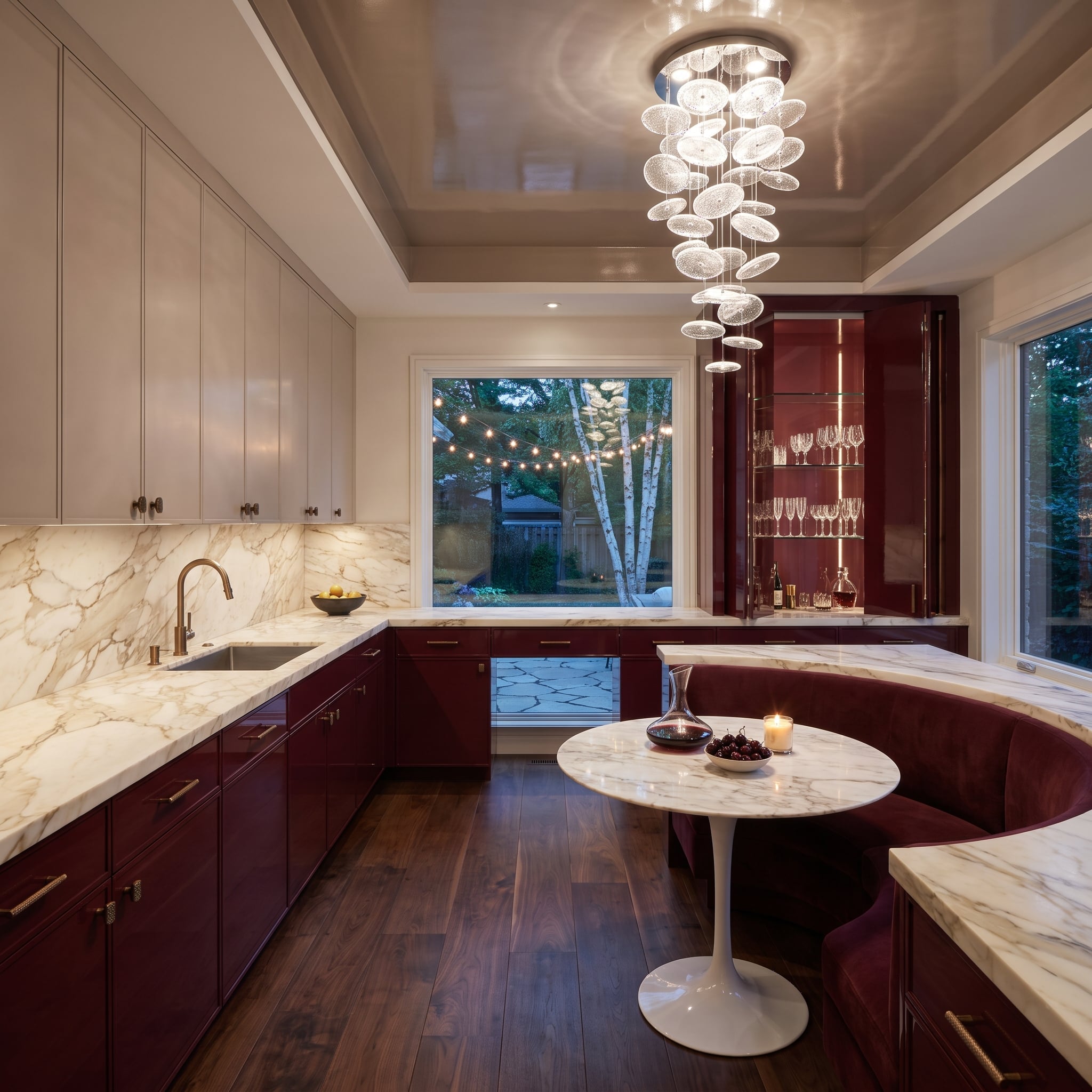
Glossy burgundy base cabinets establish a saturated lower register beneath quieter greige uppers. Warm-veined marble runs across the counters and backsplash, making the transition feel intentional without diluting either cabinet color.
The matching burgundy bar cabinet and velvet banquette carry the hue beyond the cooking zone. A tulip-base table provides a lighter silhouette beside the substantial cabinetry, while brass details catch the gold in the stone.
28. Steel-Blue Cabinets Beneath a Long, Warm Wood Ceiling
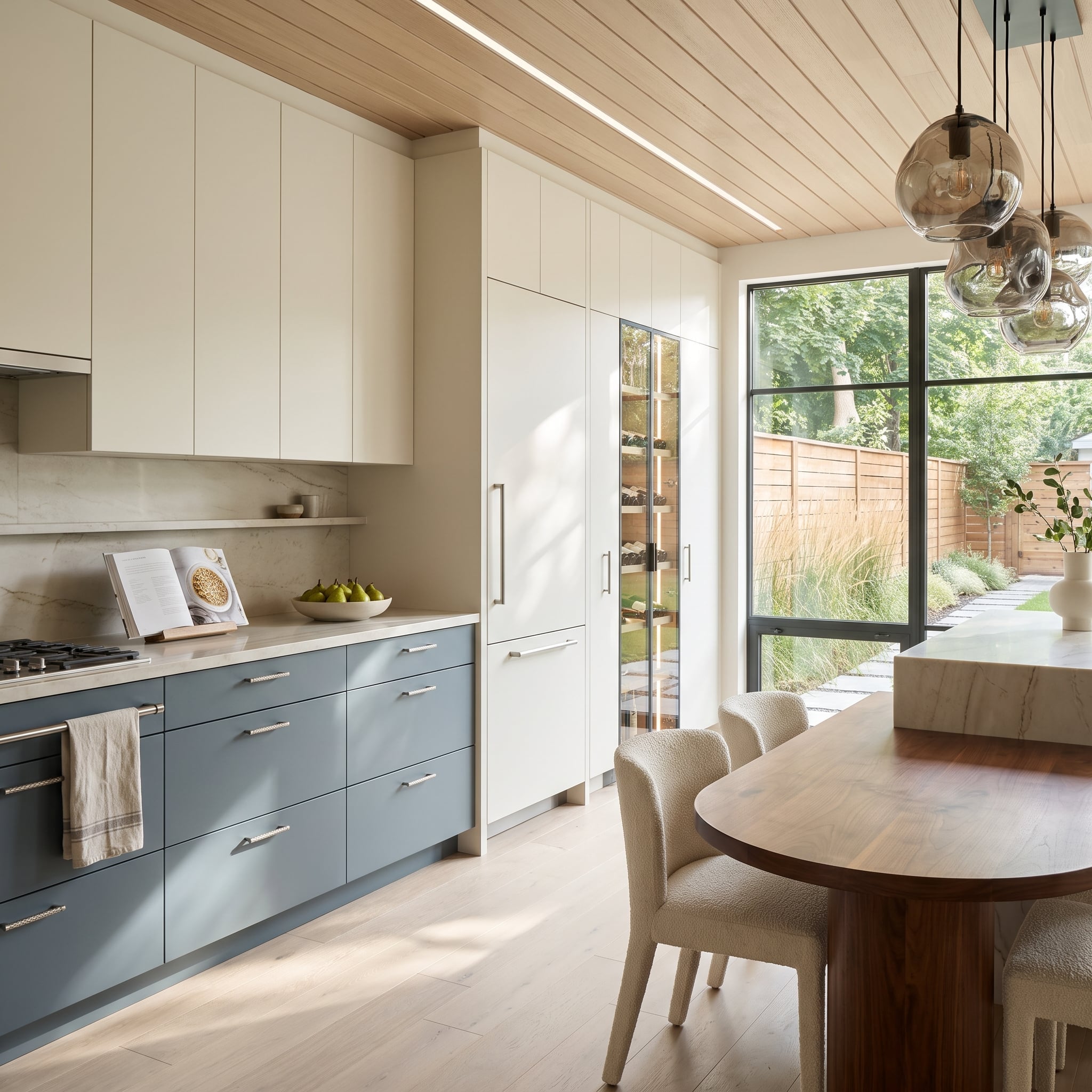
Steel-blue lower cabinets and cream uppers might have read as a straightforward cool-and-warm contrast. The plank ceiling changes the proportions: its long wood grain draws the eye across the kitchen and dining area as one continuous space.
Integrated linear lighting follows that direction. Smoked-glass globes, a walnut dining table, and soft bouclé seating bring different textures into the composition without repeating the cabinet finishes.
27. A Black Island Faces a Wine Column and Cured-Meat Display
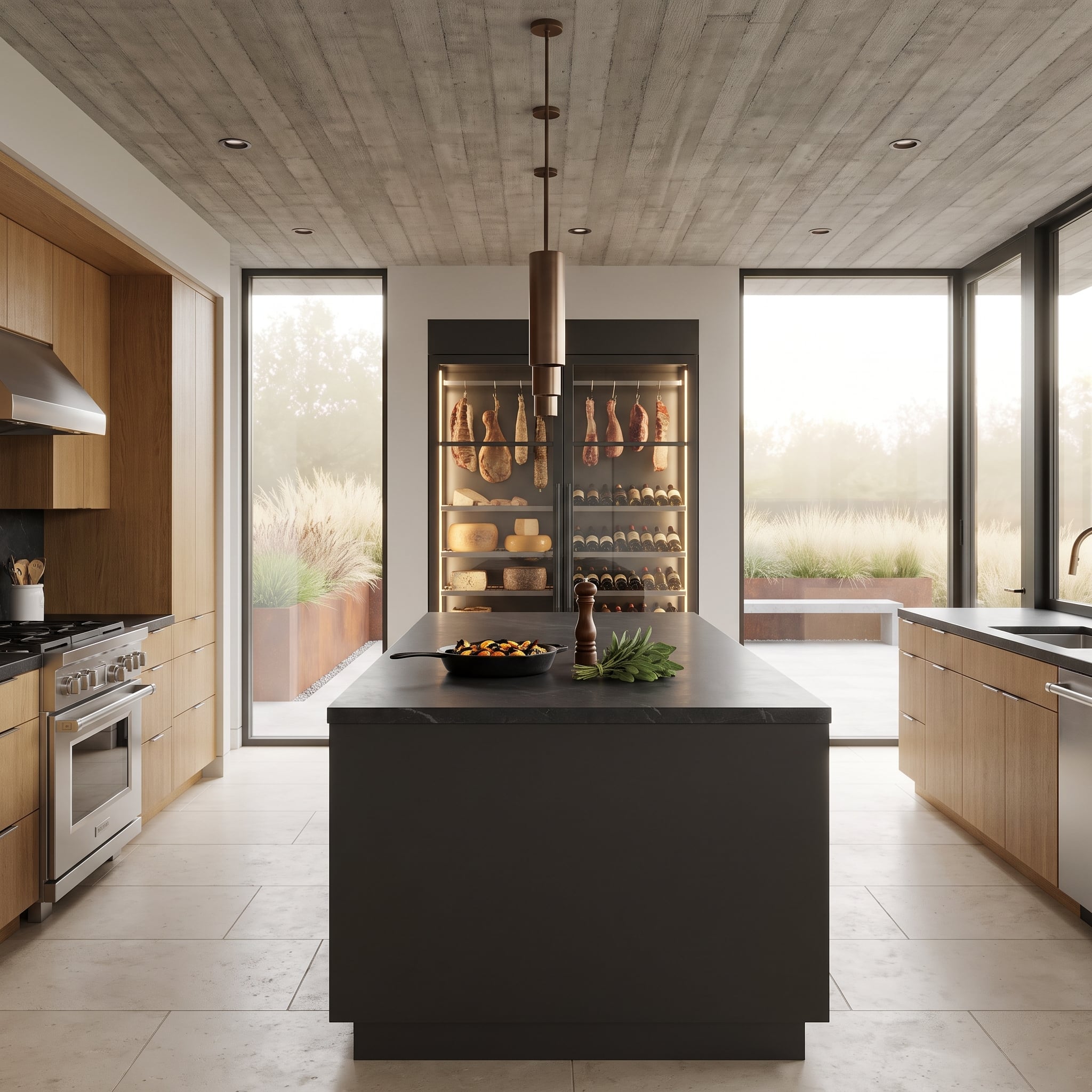
Concrete ceiling planks, oak cabinetry, and a black island establish a deliberately robust palette. The most unusual wall combines an illuminated display of hanging cured meats and cheese wheels with a tall wine column, turning specialty storage into a prominent architectural feature.
The glass-fronted display creates a vertical showcase behind the island, its warm interior lighting contrasting with the cooler concrete overhead. Oak cabinetry softens the industrial materials, while the black island supplies a strong visual anchor. The kitchen has the atmosphere of a specialist food shop without surrendering its residential scale.
26. Slate-Blue Upper Cabinets Reverse the Usual Color Hierarchy
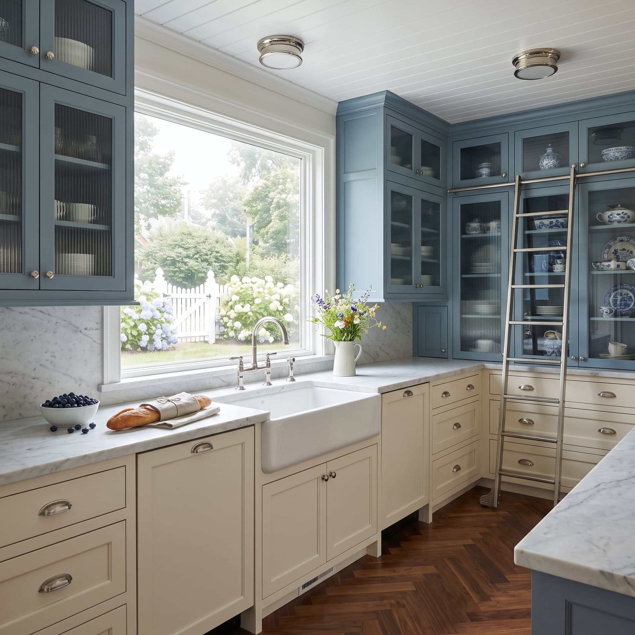
Here the stronger cabinet color sits above the countertop. Slate-blue upper doors command the wall, while cream lowers make the work surface feel lighter and more open.
Reeded glass breaks up the solid blue without exposing every stored item. A rail-mounted library ladder emphasizes the height of the storage, and Carrara marble supplies a pale transition between the two finishes.
25. Walnut Fluting Connects an Island to a Curved Banquette
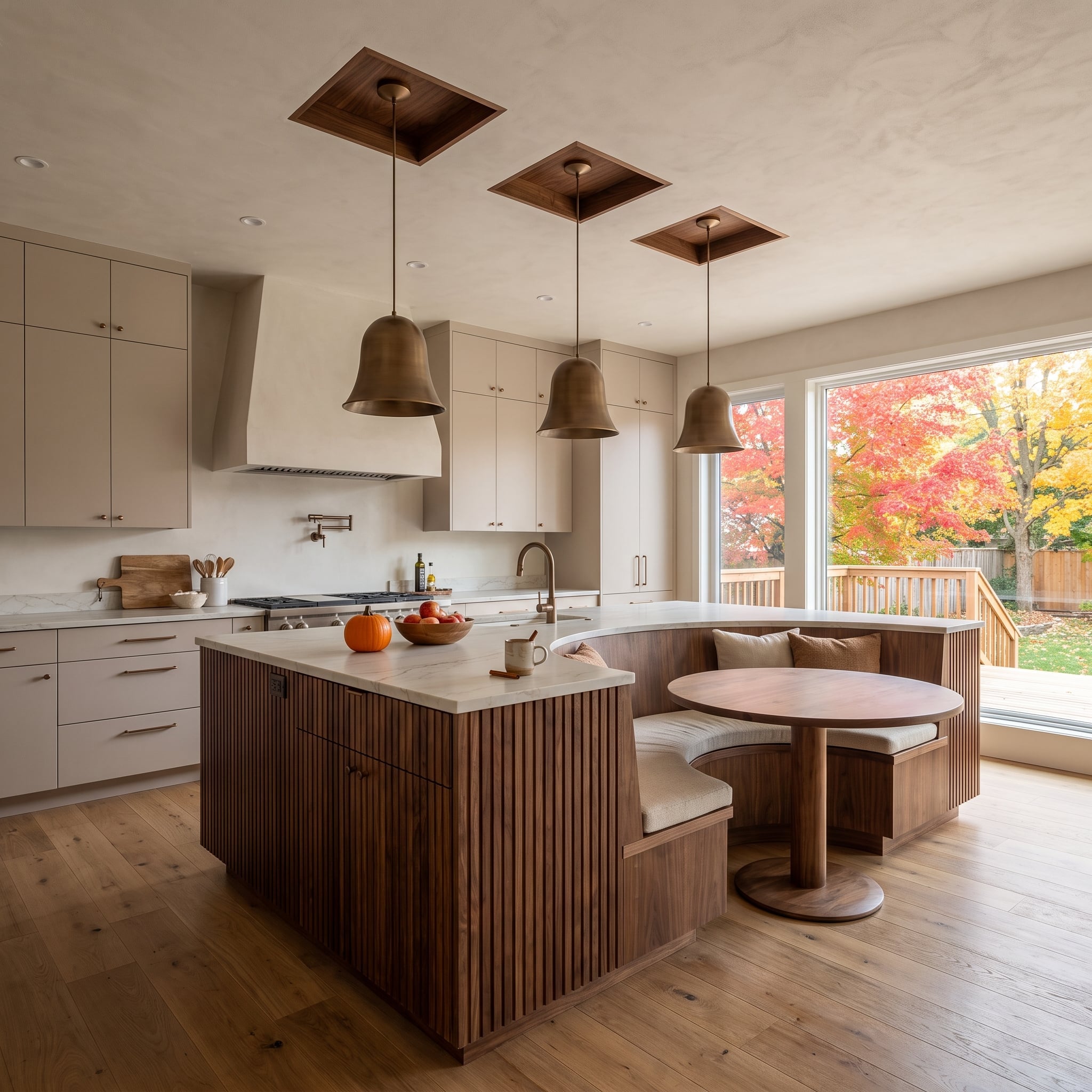
Reeded walnut cabinetry on the island echoes the wood used in the curved banquette. That shared grain makes two separate pieces of millwork read as part of one furniture arrangement, even though they serve different functions.
Cream cabinetry stays in the background. Three bronze bell pendants descend from walnut ceiling accents, carrying the darker material upward and giving the dining corner a stronger architectural identity.
24. A Teal Island Holds Its Own Beneath a Skylight
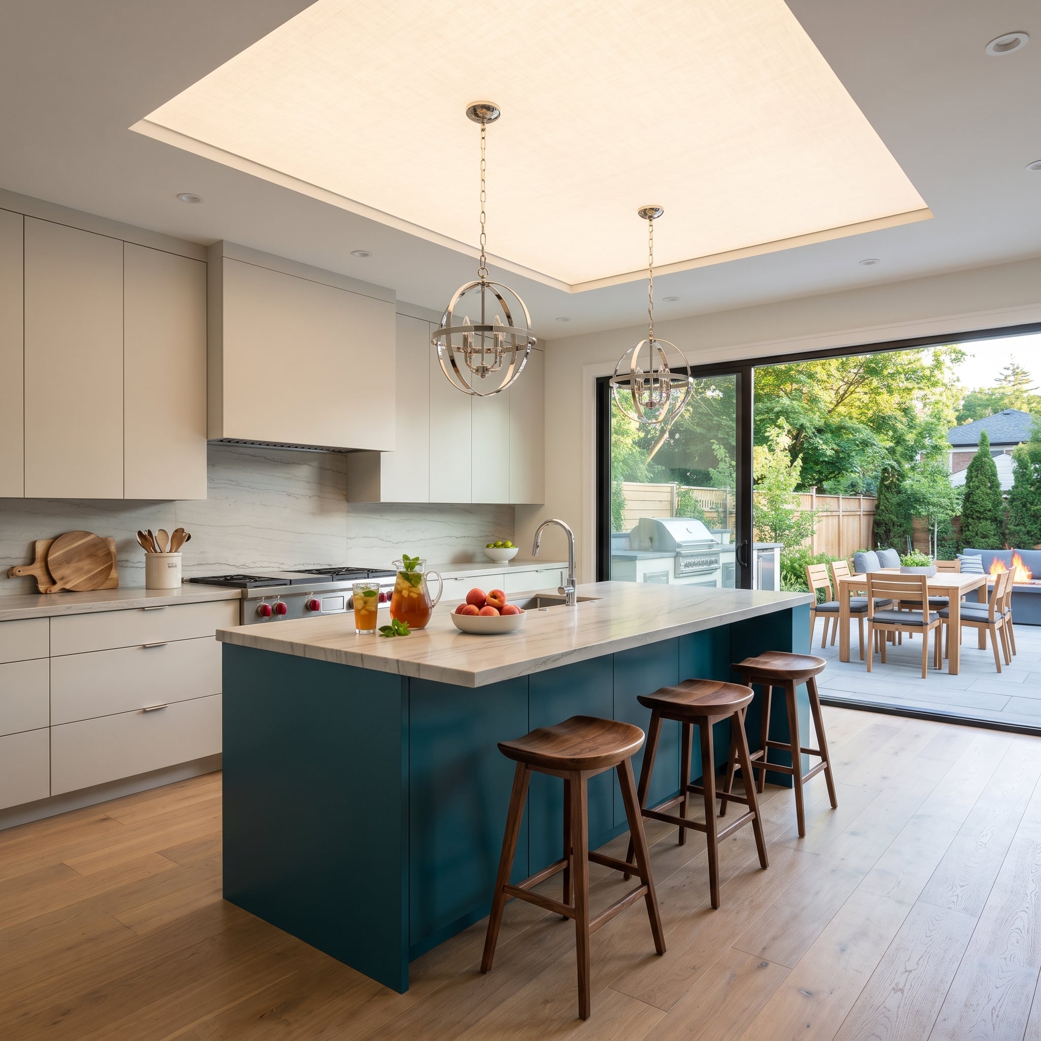
Saturated teal on the island would command attention in almost any kitchen. Here the skylight changes how the color is perceived throughout the day, bringing daylight directly onto the cabinet faces and the pale surfaces around them.
Cream perimeter cabinets create a quiet backdrop. Walnut stools and flooring introduce warmth at seat height, while polished-nickel orb pendants add rounded forms against the island’s crisp edges.
23. An Olive Galley Opens Toward the Garden
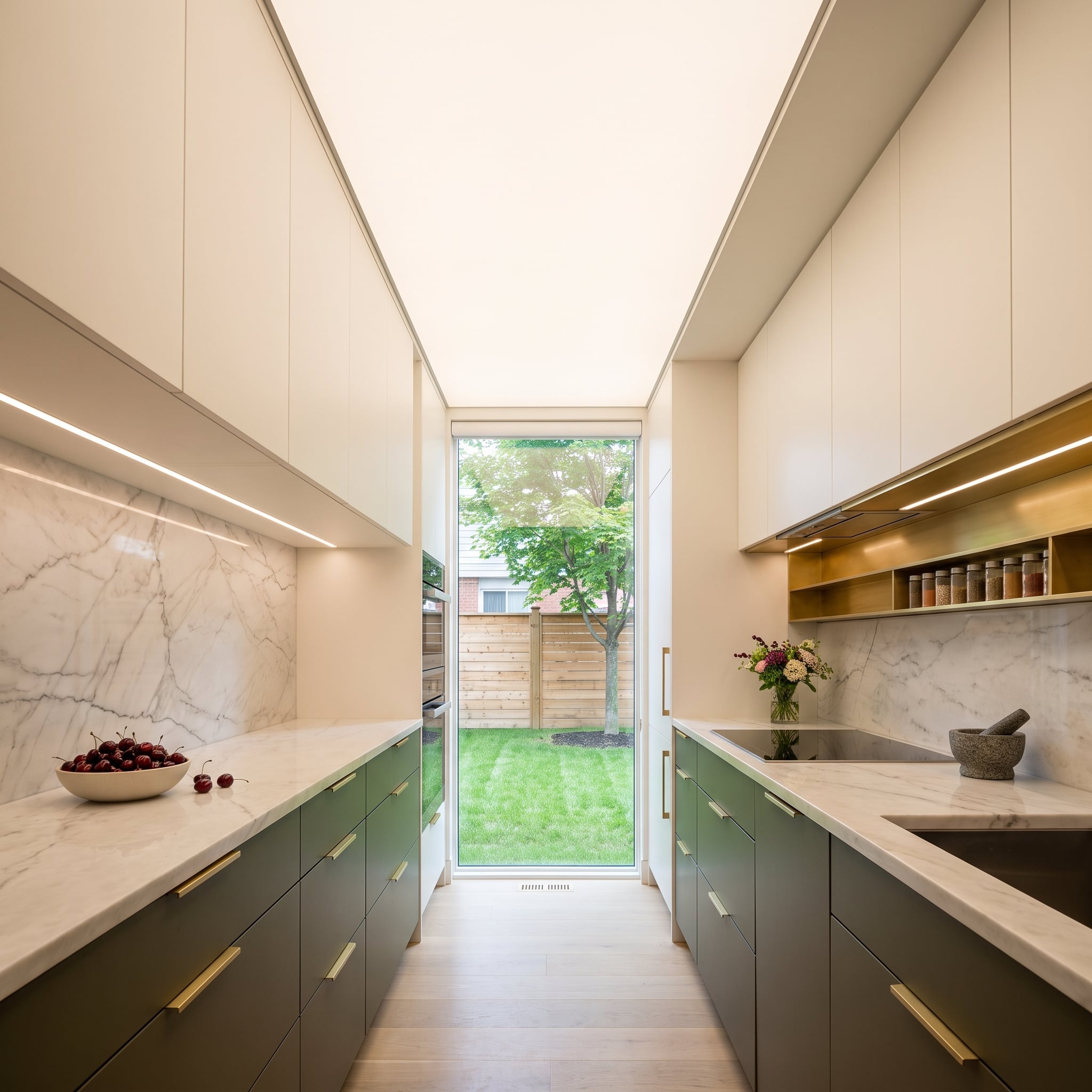
Olive lower cabinets run beneath cream uppers in a narrow galley, where the darker band gives the cabinetry definition without darkening the entire wall. Long brass pulls accentuate the horizontal drawers.
The full-height window at the far end is the real spatial release. Its view of lawn and trees extends the green palette beyond the kitchen and draws the eye through the room instead of across its narrow width.
22. Espresso Island, Cream Cabinets, and a Ceiling That Frames the Center
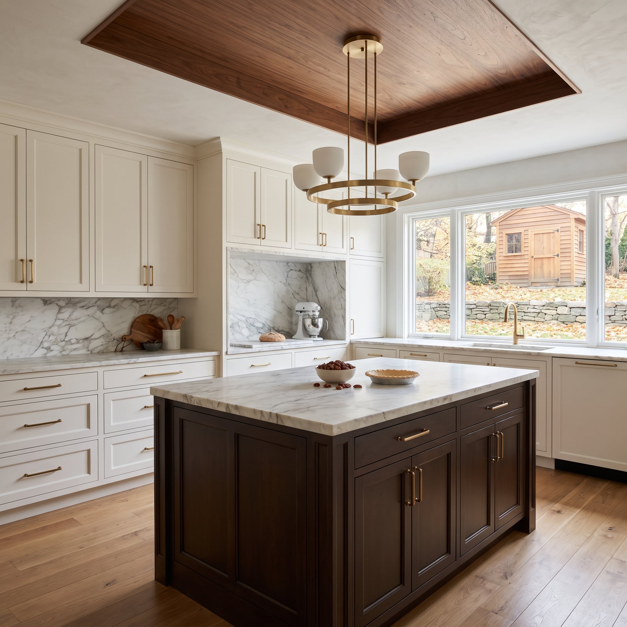
The espresso island has visual weight, while the cream perimeter prevents it from becoming a dark block in the middle of the room. Marble counters provide a pale, continuous working surface.
A walnut inset in the ceiling repeats the island’s depth of color on a different plane. The brass ring chandelier sits within that frame, making the island feel connected to the room’s architecture rather than dropped into the floor plan.
21. Brass-Framed Glass Doors Make a Coffee Station Part of the Room
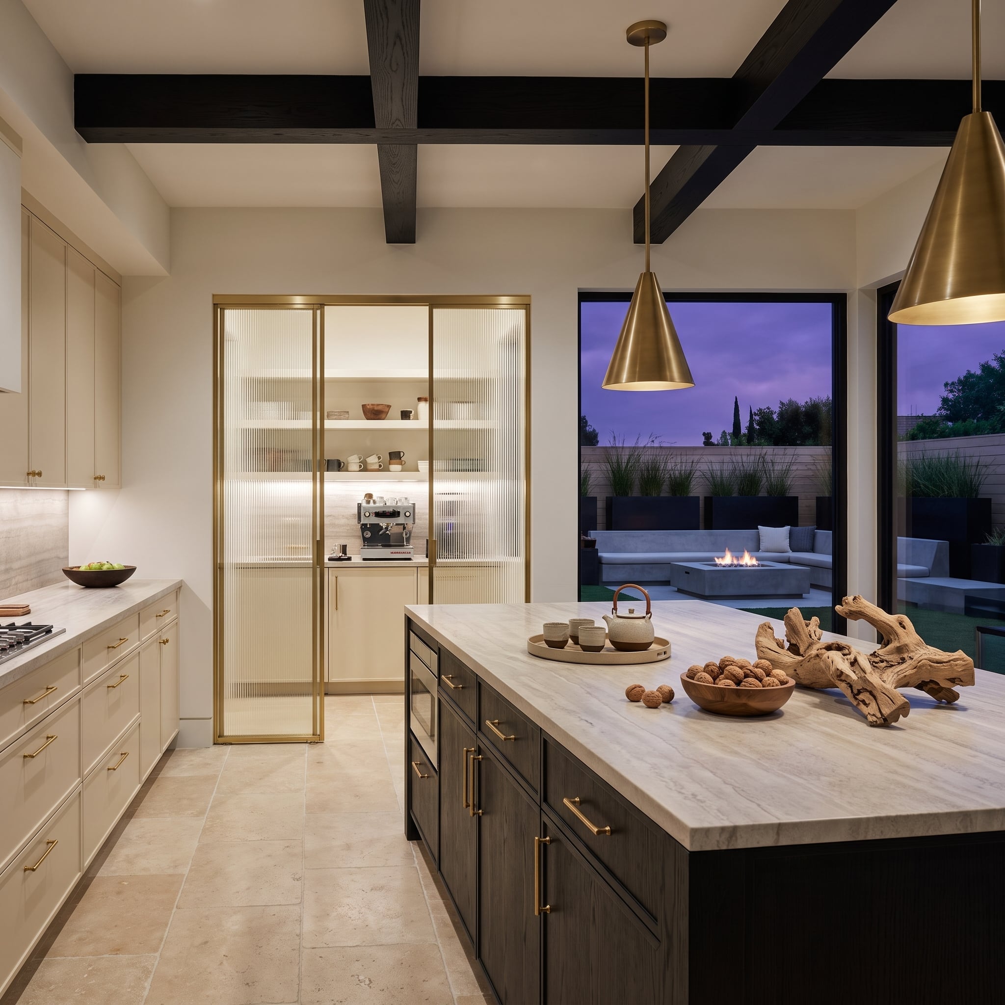
Fluted glass set in brass frames gives the coffee station visibility without exposing every detail behind the doors. Its translucent texture catches light differently from the solid cream cabinets nearby, turning an appliance-storage wall into a decorative architectural feature.
Dark oak on the island provides the second cabinet tone. Black ceiling beams sharpen the composition, and marble counters balance the brass and wood. Against those dark beams, the slender brass frames bring a distinctly tailored finish to an otherwise practical storage wall.
20. Charcoal and Greige Find Warmth Under Exposed Timber
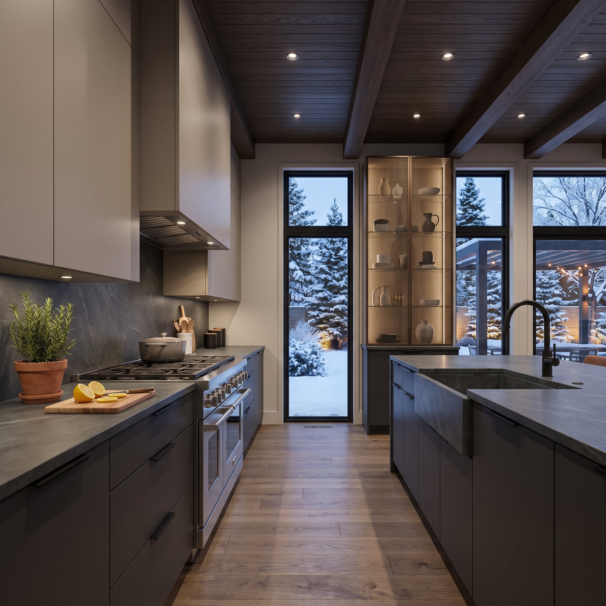
Charcoal lowers and greige uppers sit close enough in value to risk looking flat. Rich stained ceiling beams supply the contrast the cabinet colors deliberately avoid: visible grain, deeper warmth, and a strong overhead rhythm.
An illuminated glass cabinet interrupts the solid wall of storage. Blue-gray stone countertops connect to the darker bases, while black fixtures add precise outlines rather than another decorative color.
19. A Burgundy Island Beneath Antiqued Mirror Coffers
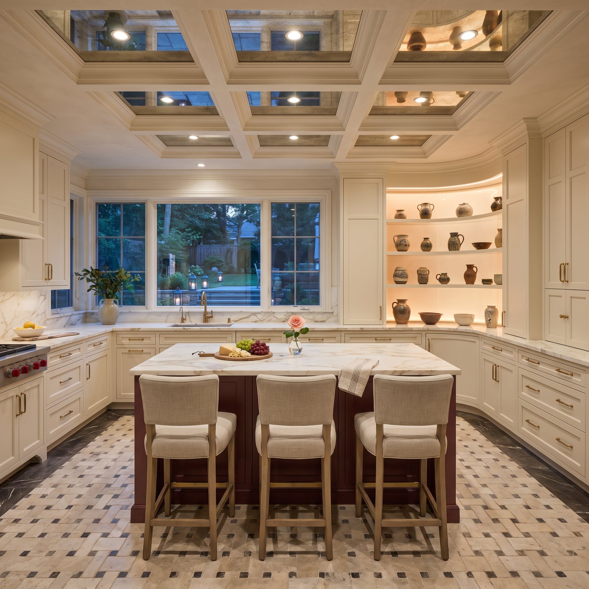
The burgundy island gives this pale kitchen its strongest block of color. Overhead, antiqued mirror panels set within ceiling coffers fragment reflections into softer, darker tones than ordinary clear mirror would produce.
That reflected movement makes the ceiling an active part of the design rather than a neutral lid. Cream cabinetry and open pottery shelving balance the saturated island; the mirrored coffers bring visual complexity without another patterned backsplash.
18. Forest-Green Fluting Gives a Cream Kitchen Its Focal Point
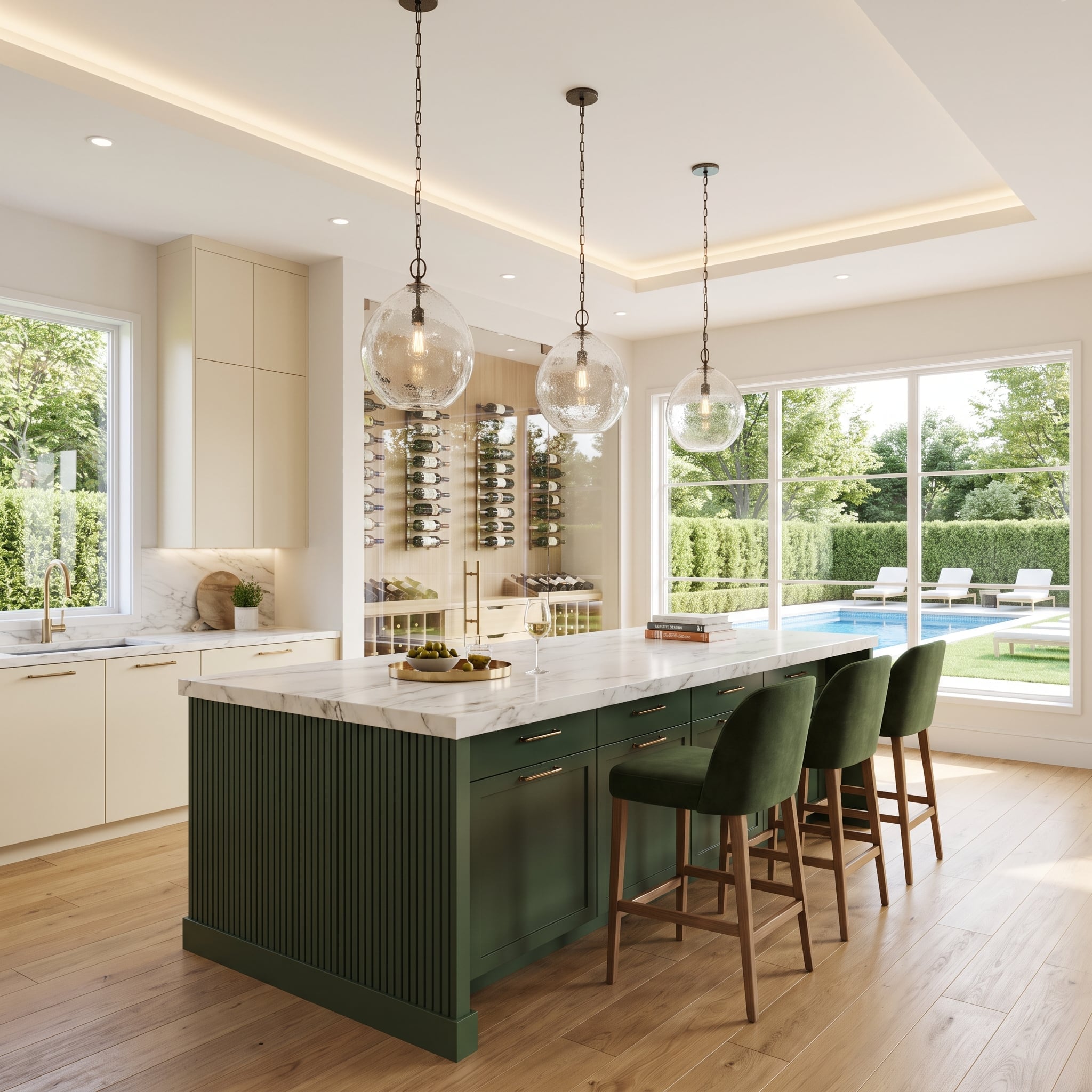
A forest-green island with fluted fronts establishes two kinds of contrast at once: dark against light and ribbed against smooth. Cream perimeter cabinetry concentrates attention on the stronger color in the room’s center.
Soft-veined marble and brass hardware establish a quieter material language. Seeded-glass globe pendants repeat the island’s sense of texture overhead, their transparent forms preserving a lighter upper silhouette.
17. A French Range Takes the Spotlight Between Walnut Panels
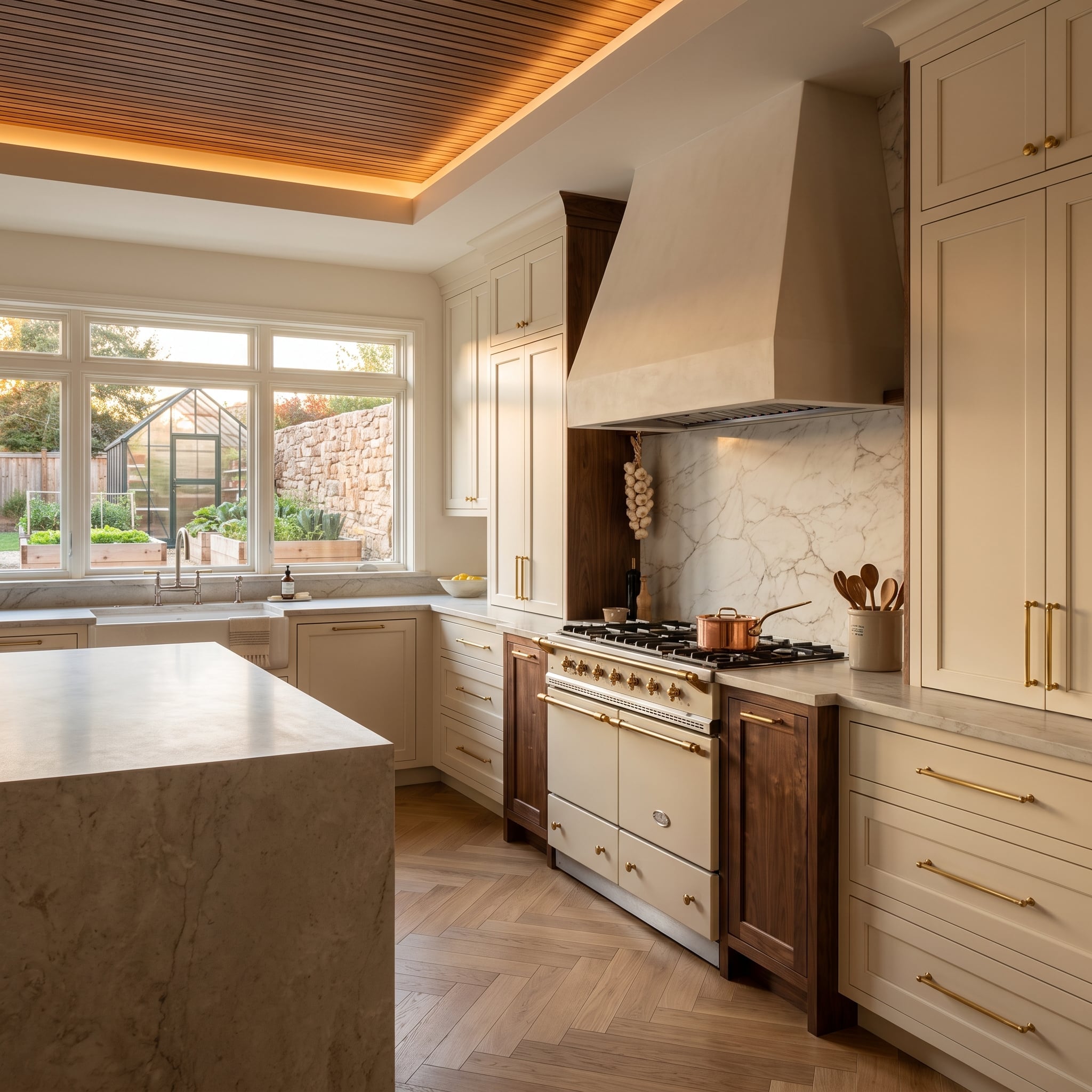
Walnut panels flank the cream-and-brass range, creating a strong central frame. Above it, marble climbs the backsplash and hood surround, giving the cooking alcove a continuous stone backdrop.
Cream Shaker cabinets extend across the remaining wall, with brass pulls picking up the range hardware. Herringbone oak floors bring another wood pattern into the room, their smaller scale distinguishing them from the larger walnut panels.
16. Navy Cabinetry Meets a Banquette in Patterned Blue
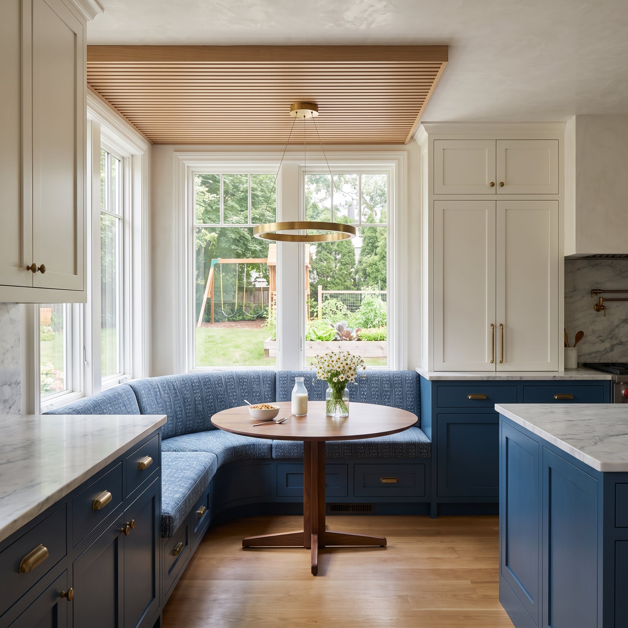
Navy lower cabinets establish the kitchen’s main color, then the banquette upholstery repeats it in a softer, patterned form. The connection is recognizable without making the seating look like another bank of cupboards.
Storage beneath the wraparound seat makes use of the corner. A slatted wood ceiling treatment distinguishes the dining area from the working kitchen without adding a wall or introducing another painted cabinet color.
15. A Midnight-Blue Island Against Pale Rift-Cut Oak
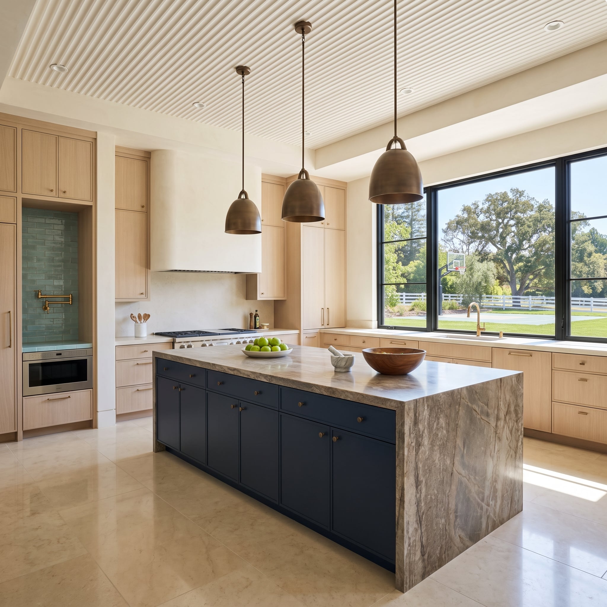
Rift-cut oak wraps the perimeter in a calm, linear grain. The midnight-blue island interrupts that pale field with a solid block of color, its brass knobs small enough to preserve the cabinet faces’ simplicity.
Warm gray veining in the stone top sits between the blue and the oak. The result depends less on matching colors than on the difference between a tactile wood surface and a smooth painted finish.
14. A Sage Cabinet Wall Opens to an Oak-Lined Coffee Nook
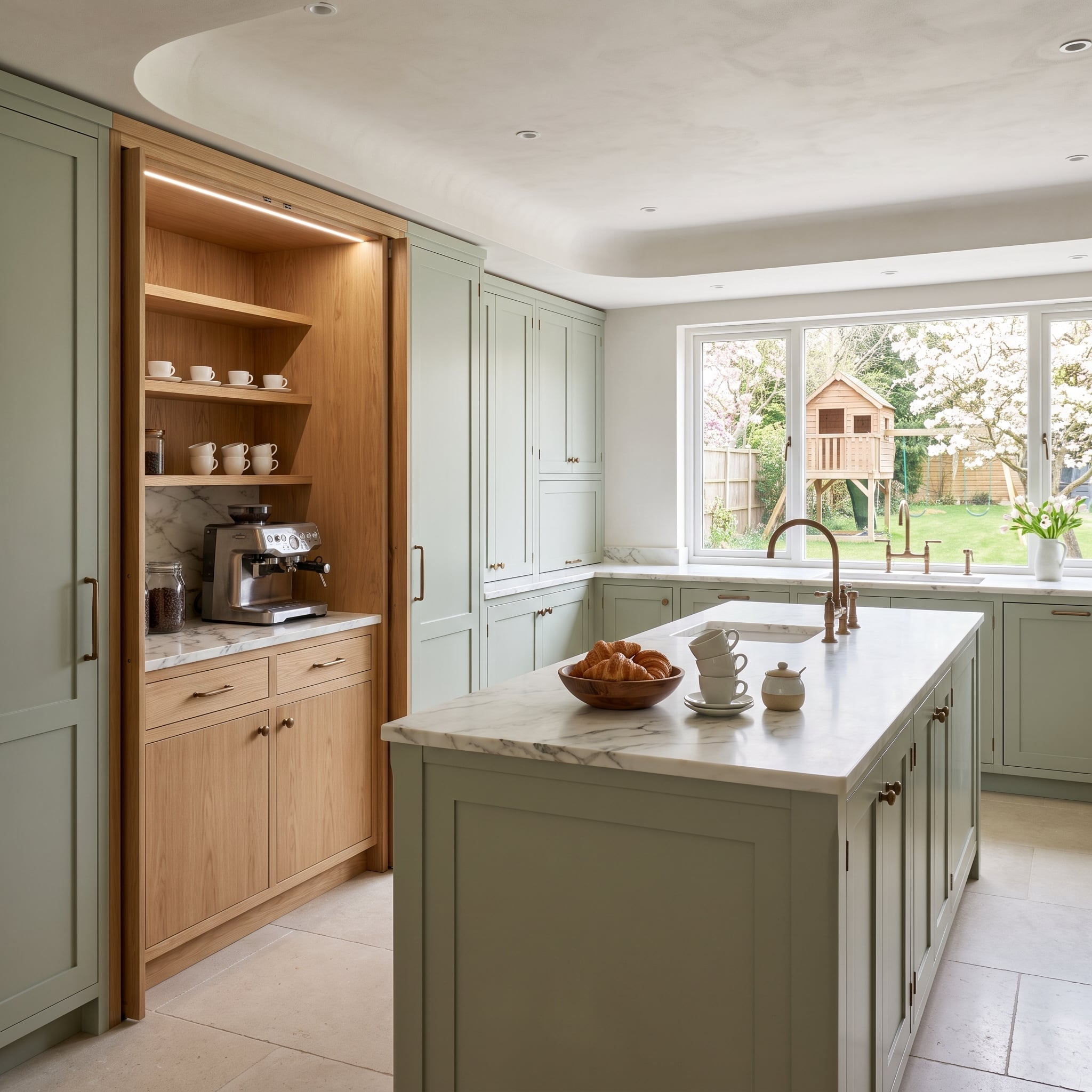
Sage Shaker cabinetry conceals a coffee station whose natural-oak interior provides a second, warmer finish. With the doors open, the contrast appears inside the storage rather than across a conventional row of upper and lower cabinets.
White cups and a marble worktop stand out against the oak lining. Under-cabinet lighting illuminates the espresso setup, while the surrounding sage doors allow the station to recede when closed.
13. Forest-Green Bases Stand Up to Dramatic Viola Marble
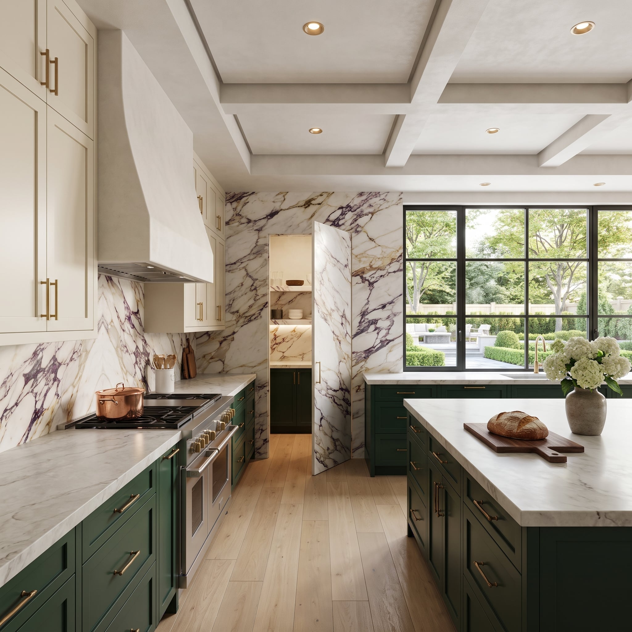
The Calacatta Viola backsplash commands the back wall with purple and gold veining. Forest-green lower cabinets are strong enough to hold their own beneath it; cream uppers prevent the composition from becoming a contest of saturated surfaces.
Brass hardware picks up the warmer notes in the stone. A coffered ceiling adds structure without another dominant hue, and dark window frames give the wall a crisp edge.
12. An Olive Island Ends in a Bookshelf, Not Another Cabinet Door
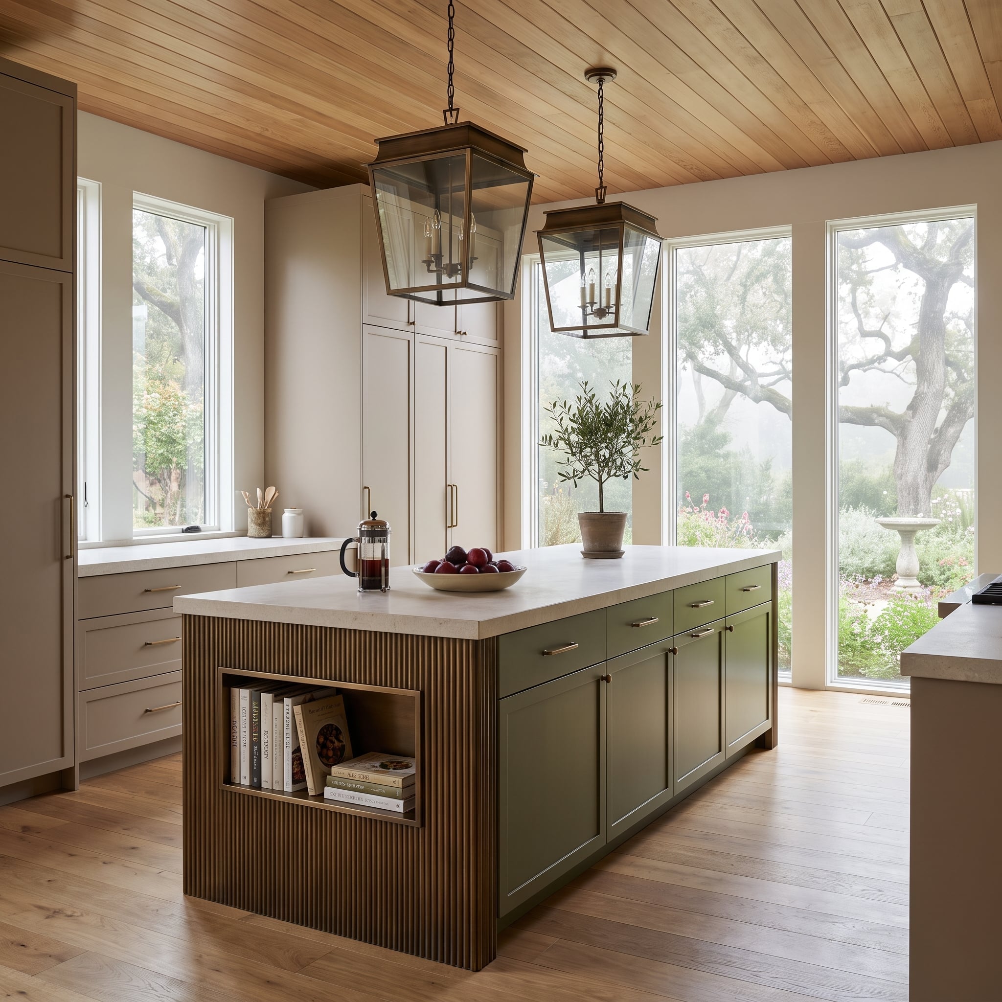
The olive-green island is fluted at the ends, where one side opens into a bookshelf. That small change in joinery turns a solid block of cabinetry into something closer to a freestanding piece of furniture.
Cream perimeter cabinets give the walls a calmer finish. Two bronze lantern pendants establish a clear overhead rhythm, while warm-metal hardware carries the palette across both painted surfaces.
11. A Plaster Island Softens a Wall of Walnut Cabinetry
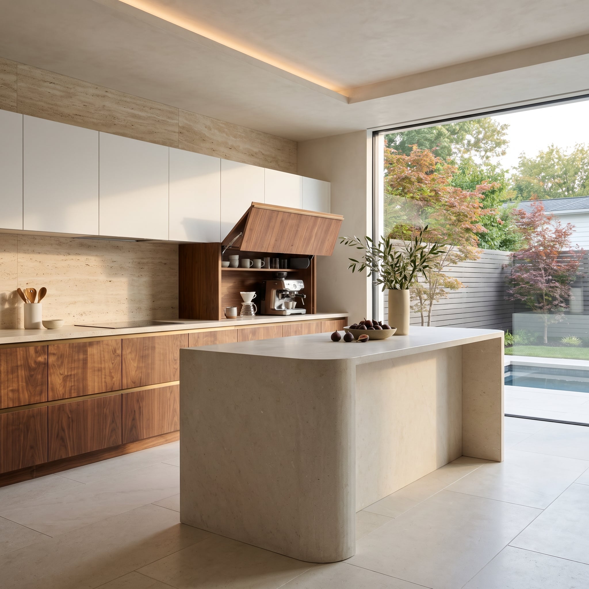
Walnut lower cabinets and white uppers establish the two-tone perimeter, although the rounded plaster island changes the mood of the room. Its pale, sculptural corners contrast with the precise lines of the wood cabinetry.
A walnut tambour-front appliance cabinet conceals the coffee equipment when closed, reducing visual clutter along the counter. Travertine surfaces add grain and warmth without introducing a third painted cabinet color.
10. Sage and Cream Find a Third Dimension at the Greenhouse Window
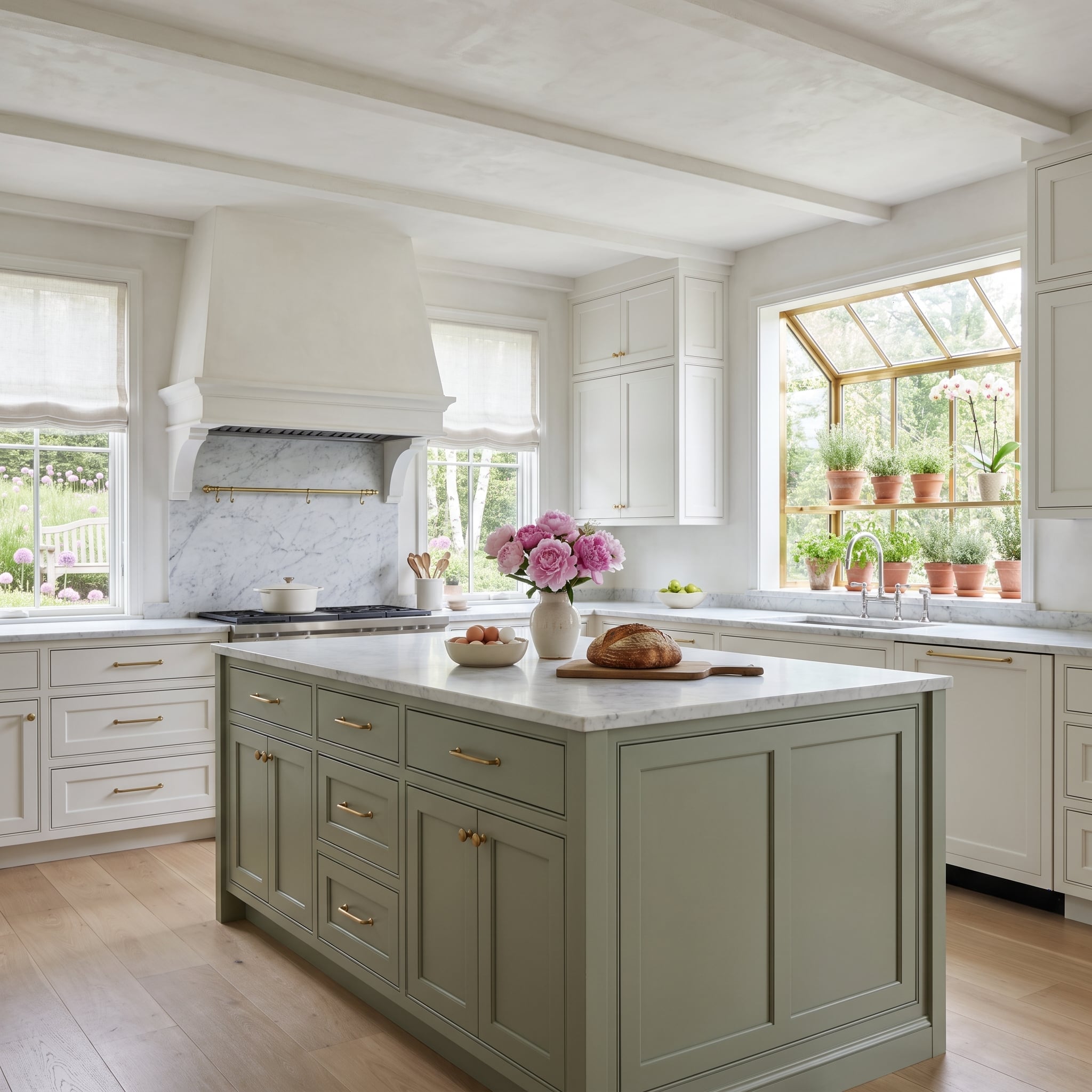
Soft sage on the island sits against off-white perimeter cabinetry, a subtle contrast that relies on undertones rather than drama. Brass pulls add a narrow metallic accent across both finishes.
The greenhouse window above the sink brings potted herbs and trailing plants into view, repeating the green in a living, irregular form. Marble and timber beams establish the architectural framework; the plants introduce a less controlled texture.
9. A Brass-Inlaid Coffered Ceiling Echoes the Walnut Island
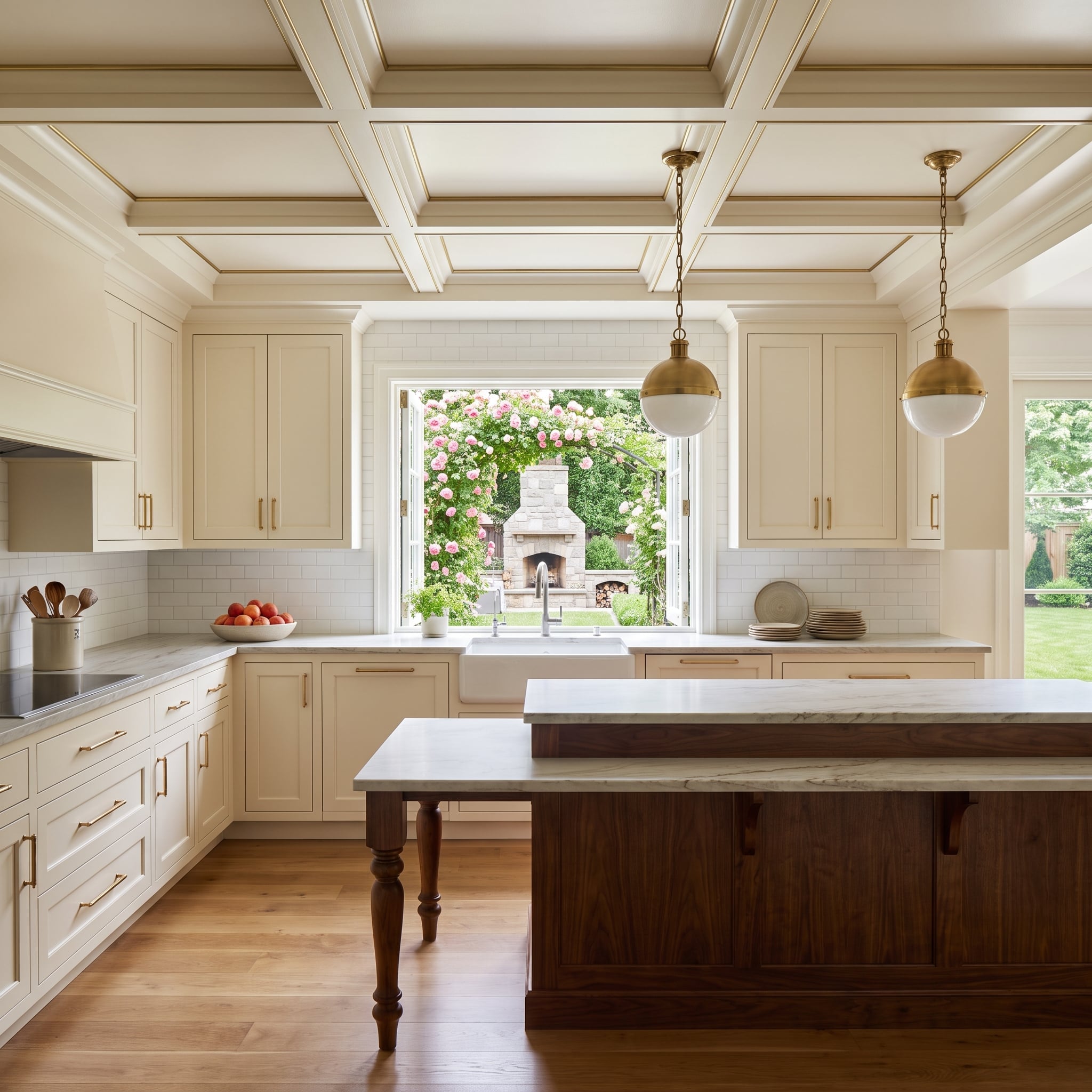
Cream perimeter cabinets and a dark walnut island establish the main contrast. The coffered ceiling adds a more elaborate layer, with brass inlay tracing each panel and linking the overhead geometry to the cabinet hardware.
Turned island legs introduce a furniture-like silhouette beneath the crisp ceiling grid. Brass details repeat across the pendants, pulls, and ceiling trim, creating a visual rhythm that connects the walnut island to the architecture overhead.
8. A Charcoal Cabinet Wall Reveals a Mirrored Bar
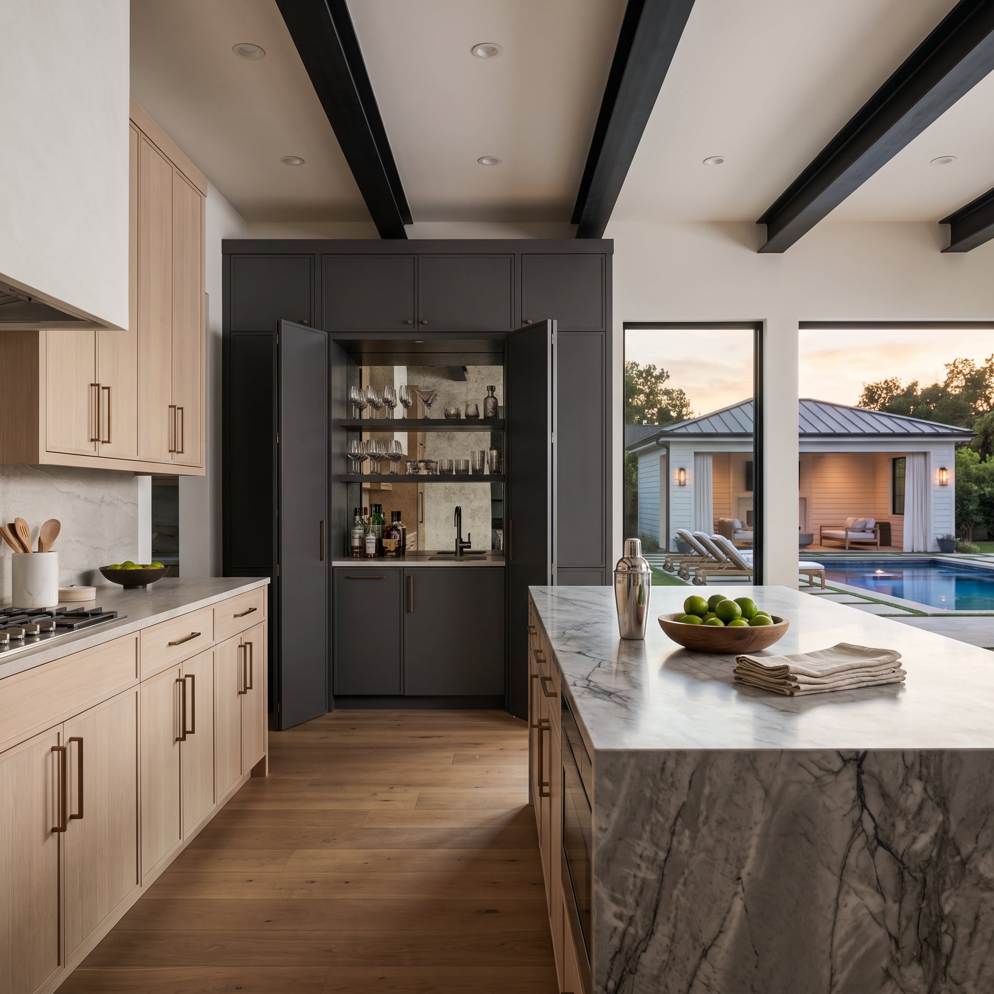
Matte charcoal cabinetry opens to a bar with mirrored shelves and glassware. The reflective interior contrasts sharply with the dark exterior, turning the open cabinet into a luminous interruption in the wall.
Light-oak cabinets elsewhere prevent the palette from becoming monochromatic. Inside the bar, mirrored surfaces multiply the glassware and catch surrounding light, transforming a compact storage compartment into something with the visual depth of a much larger display.
7. Olive Cabinets and Plaster-Tone Uppers Follow the Timber Beams
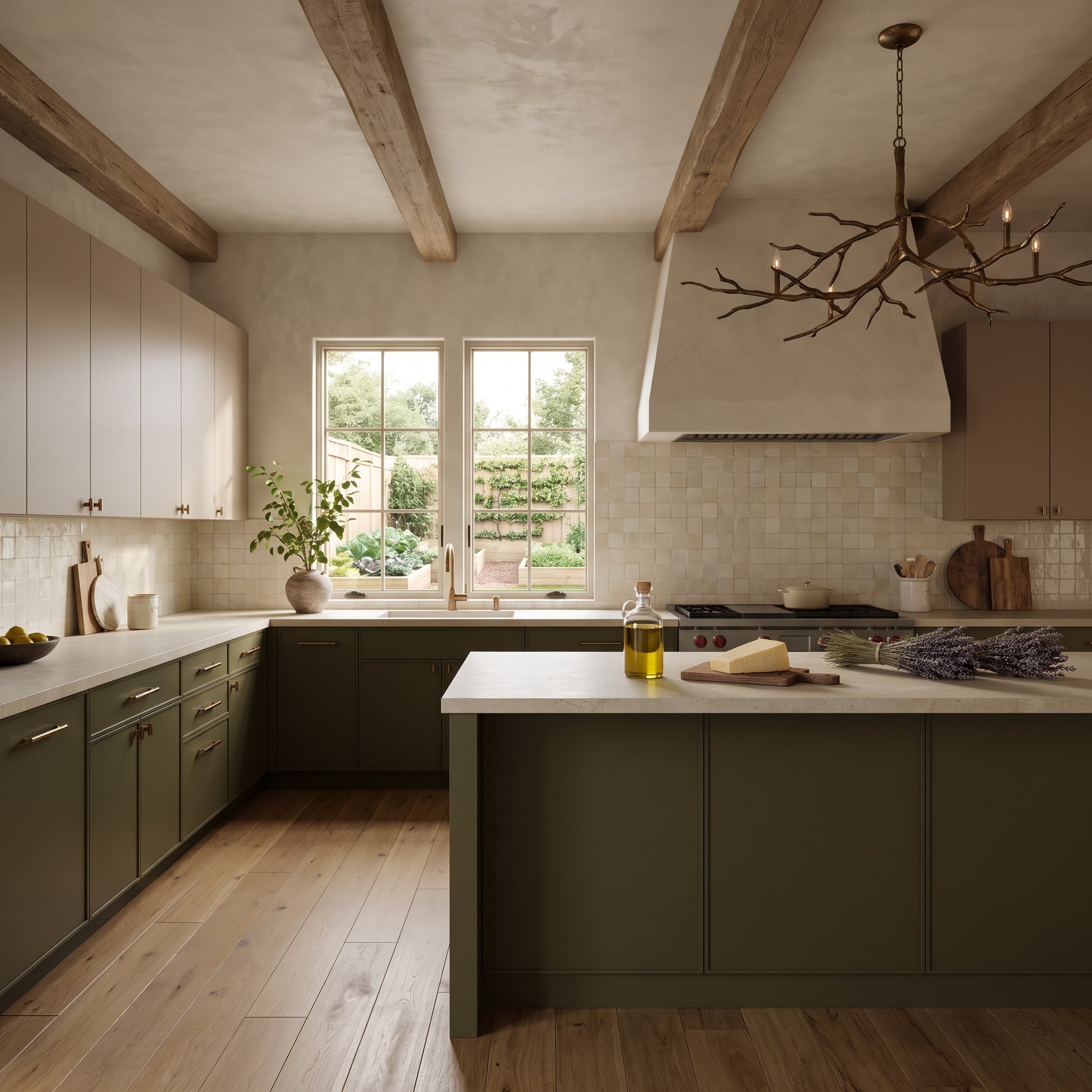
Muted olive lower cabinets extend around the island, while warm plaster-toned uppers give the tall surfaces a subdued finish. Exposed timber beams carry the same earthy warmth across the ceiling without copying either cabinet color.
Off-white zellige-style tile adds an irregular sheen behind the worktop. A branching brass chandelier brings a sculptural counterpoint to the straight cabinetry, and light oak floors complete the natural-material palette.
6. Slate-Blue Island, Cream Cabinets, and a Window Seat in Blue
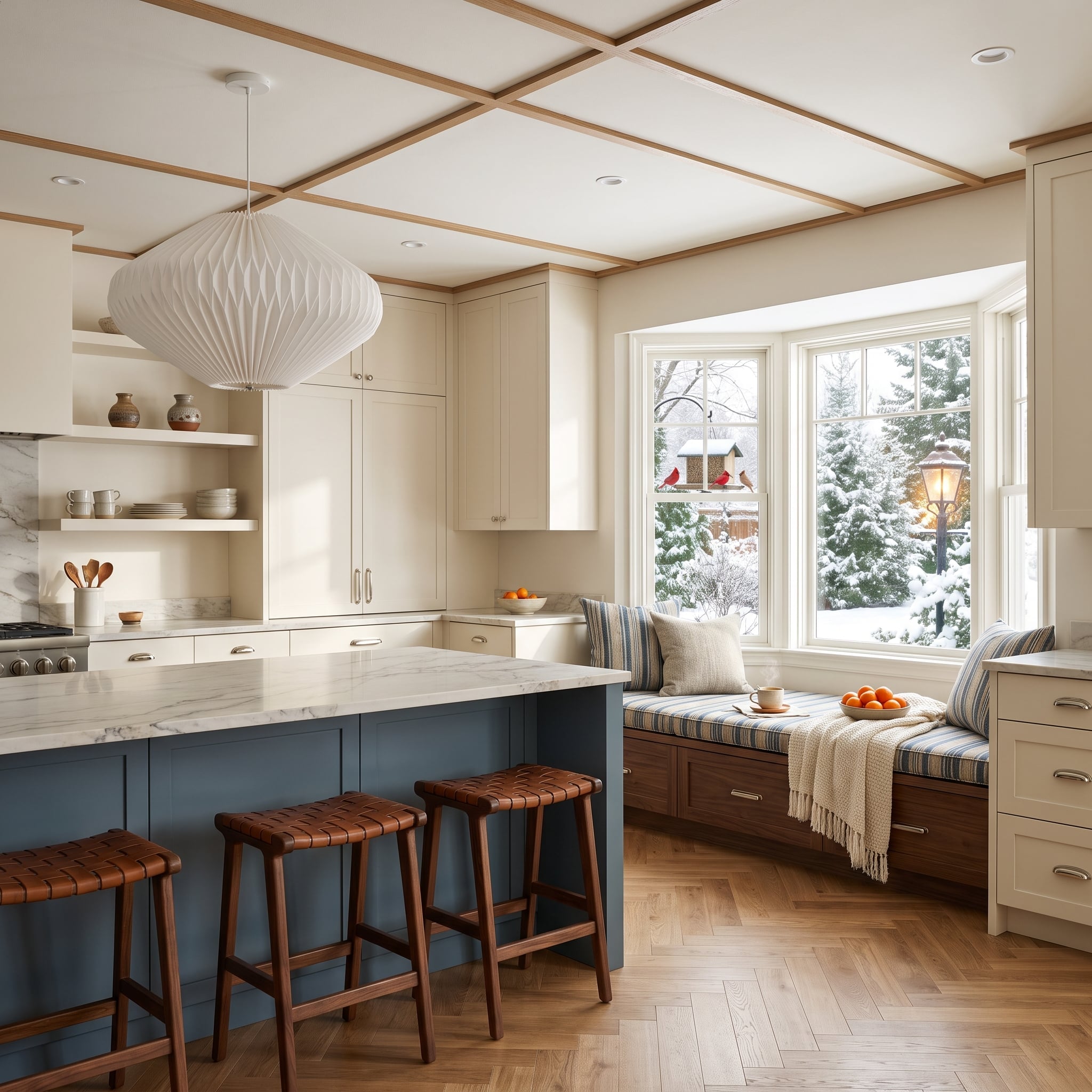
Slate blue on the island meets cream Shaker cabinetry around the perimeter. The adjacent window seat repeats the blue through striped cushions rather than more painted millwork, giving the color a second, softer appearance.
A dark walnut storage base anchors the seating, while woven leather stools and herringbone oak floors add warmth. The window and its garden view provide a bright counterpoint to the substantial island.
5. Fluted Olive Cabinets Beneath a Timber-Lined Tray Ceiling
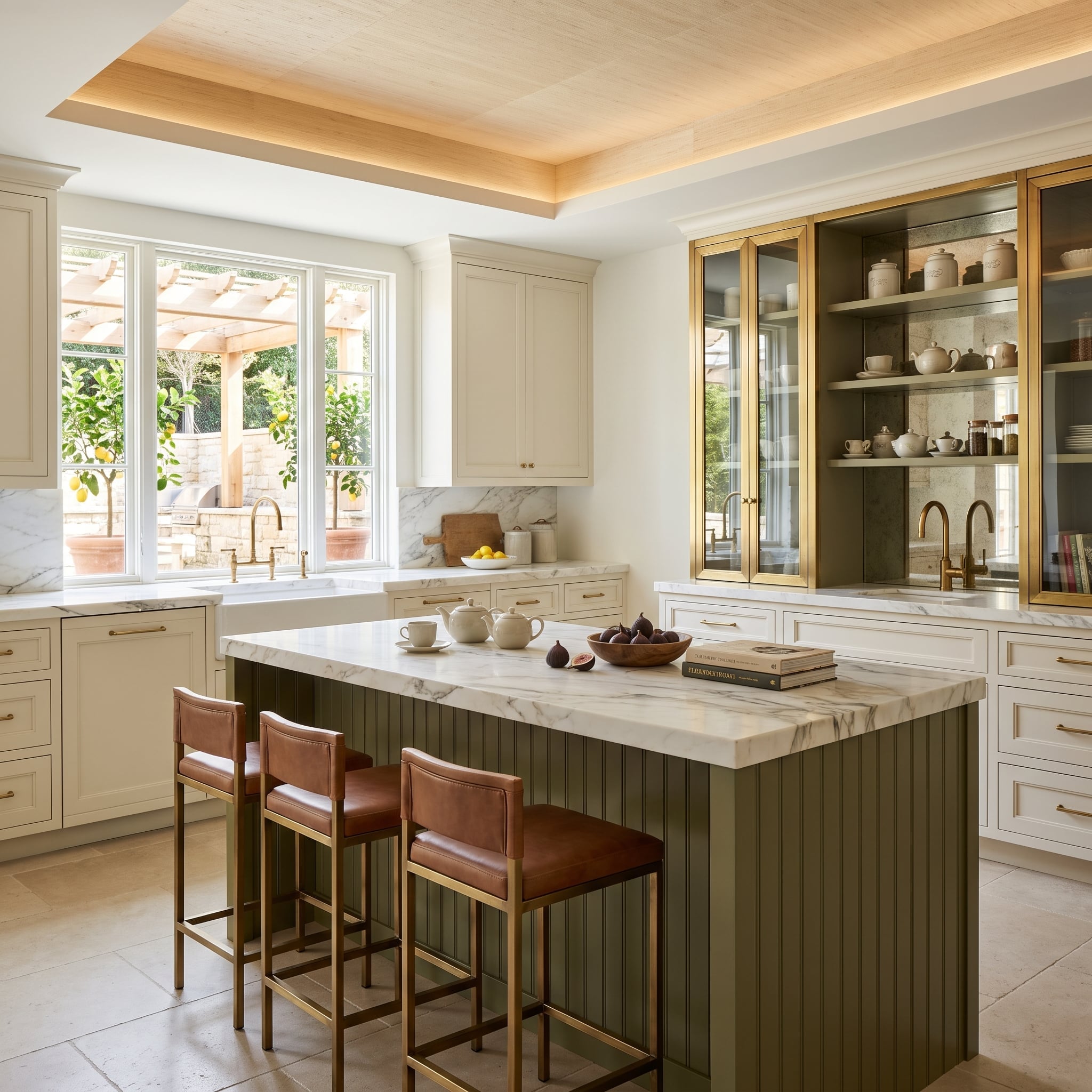
Olive fluting gives the island a pronounced vertical rhythm. Cream perimeter cabinets offer a smooth counter-surface, and marble runs across both work areas to connect the finishes.
The tray ceiling’s warm wood inset draws attention upward, echoing leather stools and brass hardware below. Its recessed geometry defines the central area without requiring another wall or a more dramatic cabinet color.
4. Illuminated Walnut Shelves Cut Through a Wall of Marble
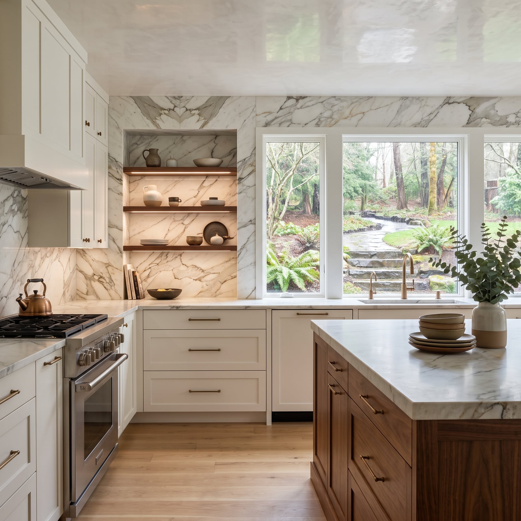
Full-height marble cladding forms the backdrop for illuminated walnut shelves, turning a stone wall into a working display surface. The wood introduces warmth and a clear horizontal rhythm against the marble’s irregular veining.
A walnut island repeats that timber tone at floor level, while cream perimeter cabinetry stays visually quiet. The contrast extends beyond light cabinets versus dark cabinets: opaque paint, open wood shelving, and continuous stone occupy distinct architectural roles.
3. Twin Walnut Islands Face a Wine-Storage Wall
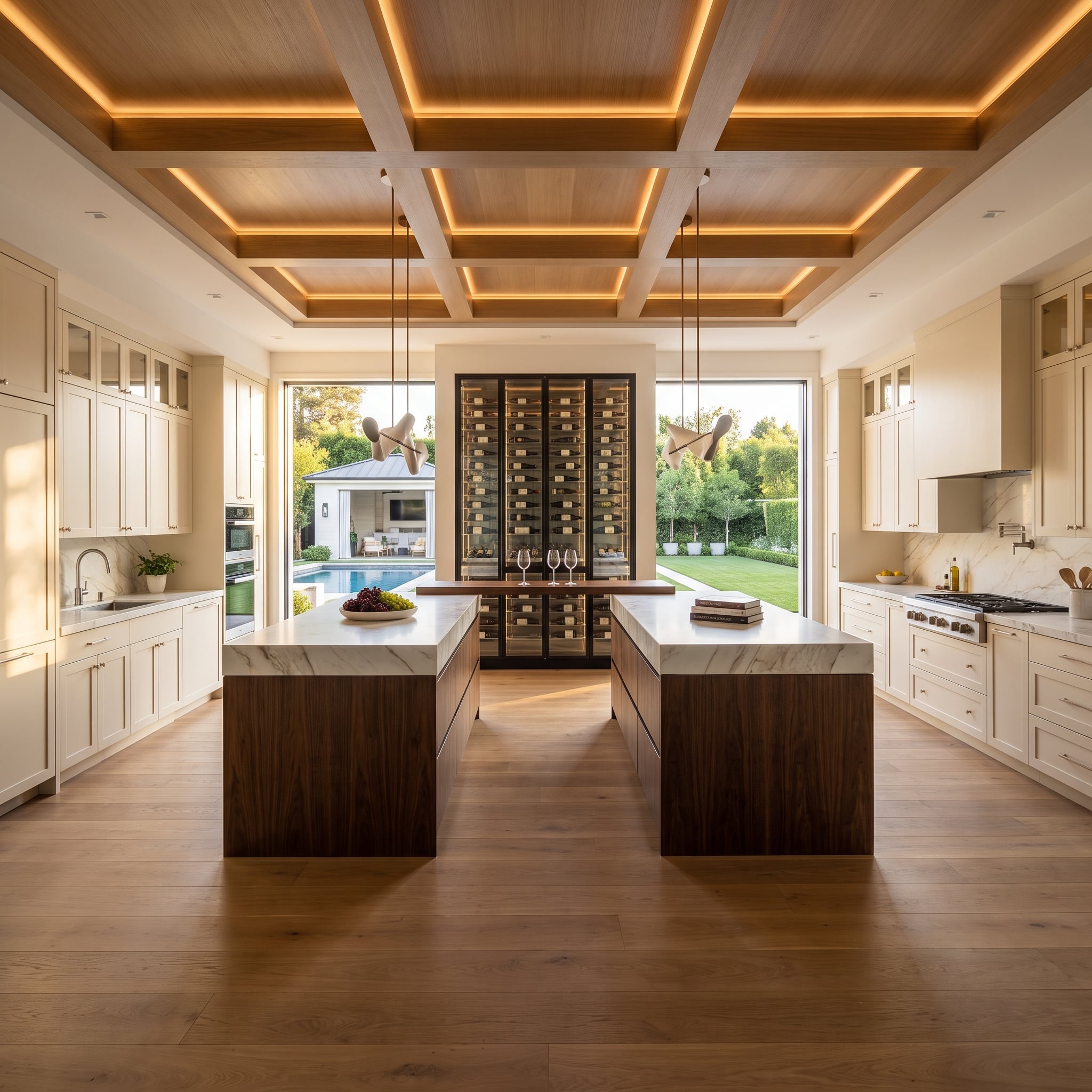
Two walnut islands give this large cream kitchen a strong center of gravity. Marble counters keep their tops bright, while oak-paneled ceiling coffers and integrated lighting repeat the warmth above.
The wine-storage tower on the back wall reads as a tall furniture piece among the fitted cabinets. Its vertical display contrasts with the long island forms, adding a distinct focal point without another cabinet color.
2. Greige Cabinets, Black Island, and a Fireplace Beside the Garden
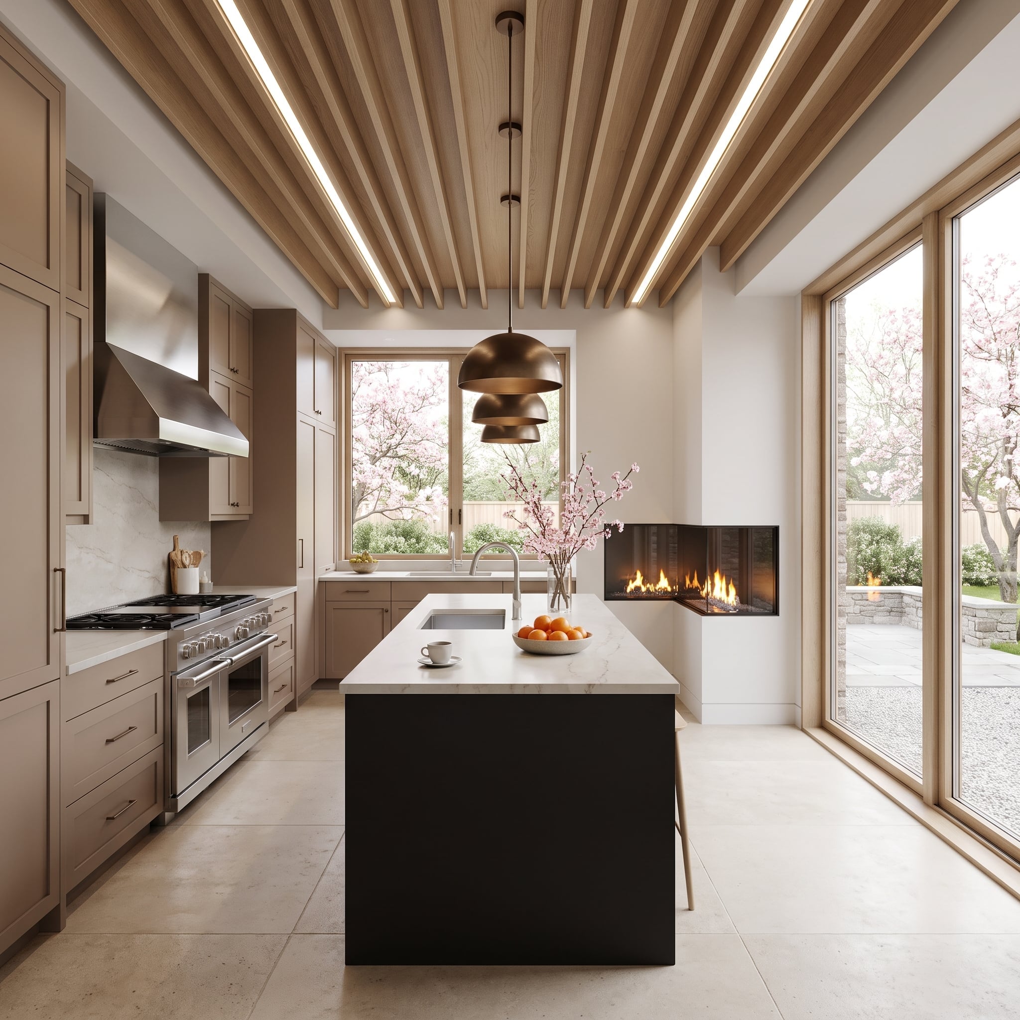
Greige Shaker cabinets establish a soft perimeter around a black island, a contrast that feels more architectural than graphic. Marble continues from island to sink wall, while the slatted wood ceiling introduces fine texture and warm linear lighting.
The corner fireplace adds a different kind of focal point, pulling attention away from the work surfaces toward the room’s edge. Bronze pendants repeat the hardware’s warmth. Beyond the tall glazing, cherry blossoms provide a fleeting burst of color that no cabinet finish needs to imitate.
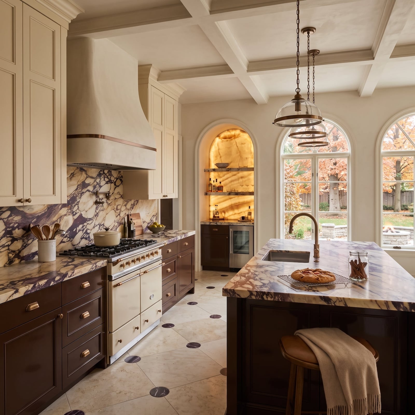
1. Chocolate Cabinets Let Calacatta Viola Marble Take Center Stage
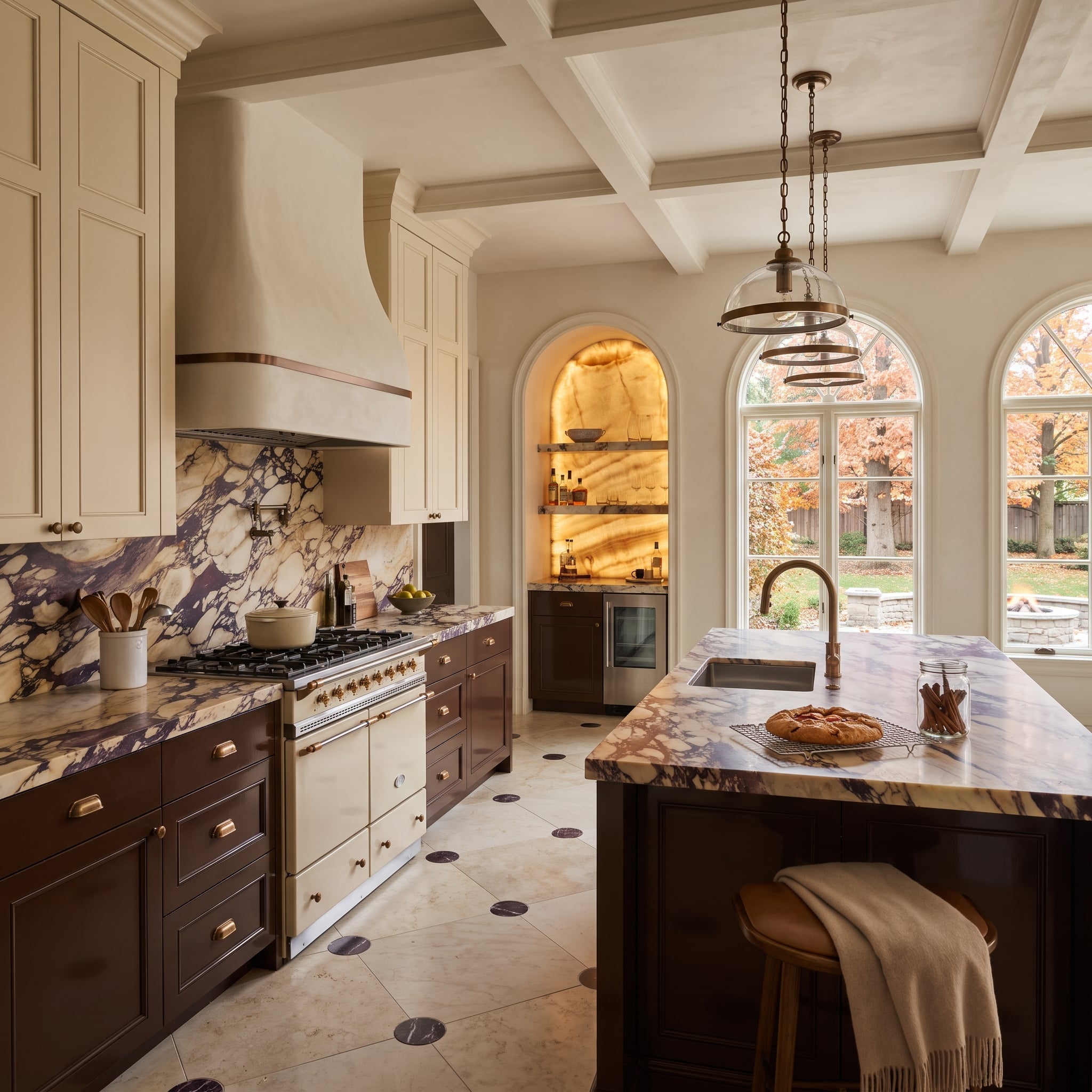
Cream uppers and chocolate-stained lowers establish a restrained frame for Calacatta Viola marble. Its purple and gold veining is emphatically not a background texture, particularly where the stone rises from countertop to backsplash.
The dark cabinet bases give the marble’s pale ground a stronger presence, while the cream uppers pick up its lighter tones. Extending the stone across adjoining surfaces allows the veining to become a continuous decorative feature. Here, the cabinetry supplies the frame; the marble gets the starring role.