🔥 Would you like to save this?
Somewhere along the way, kitchen hardware became a loyalty test. Pick brass and stick with brass. Choose polished nickel and make sure the faucet, cabinet pulls, pendants, and pot filler all fall into line. The result? Plenty of kitchens where every fixture agrees and absolutely nothing interesting happens between them.
In order to come up with the very specific design ideas, we create most designs with the assistance of state-of-the-art AI interior design software. Also, assume links that take you off the site are affiliate links such as links to Amazon. this means we may earn a commission if you buy something.
But a hammered copper range hood against polished nickel can be spectacular. So can bronze sconces above brushed steel, or matte black lighting against warm brass hardware. The difference between a considered mix and a jumble of finishes isn’t some rigid rule about matching. It’s the relationship between scale, color, sheen, and placement. A copper hood can command an entire wall while nickel quietly handles the details. A black pendant can sharpen a pale kitchen without requiring every drawer pull to follow suit.
These 33 kitchens make the case through walnut and travertine, lacquer and marble, sculptural range hoods, unexpected lighting, and enough metal combinations to give the matching-hardware rule a serious credibility problem. Some use contrast sparingly. Others make a spectacle of it. The interesting part is seeing exactly where the balance shifts.
33. A Glossy Blue Ceiling Makes Copper and Brass Look Even More Extravagant
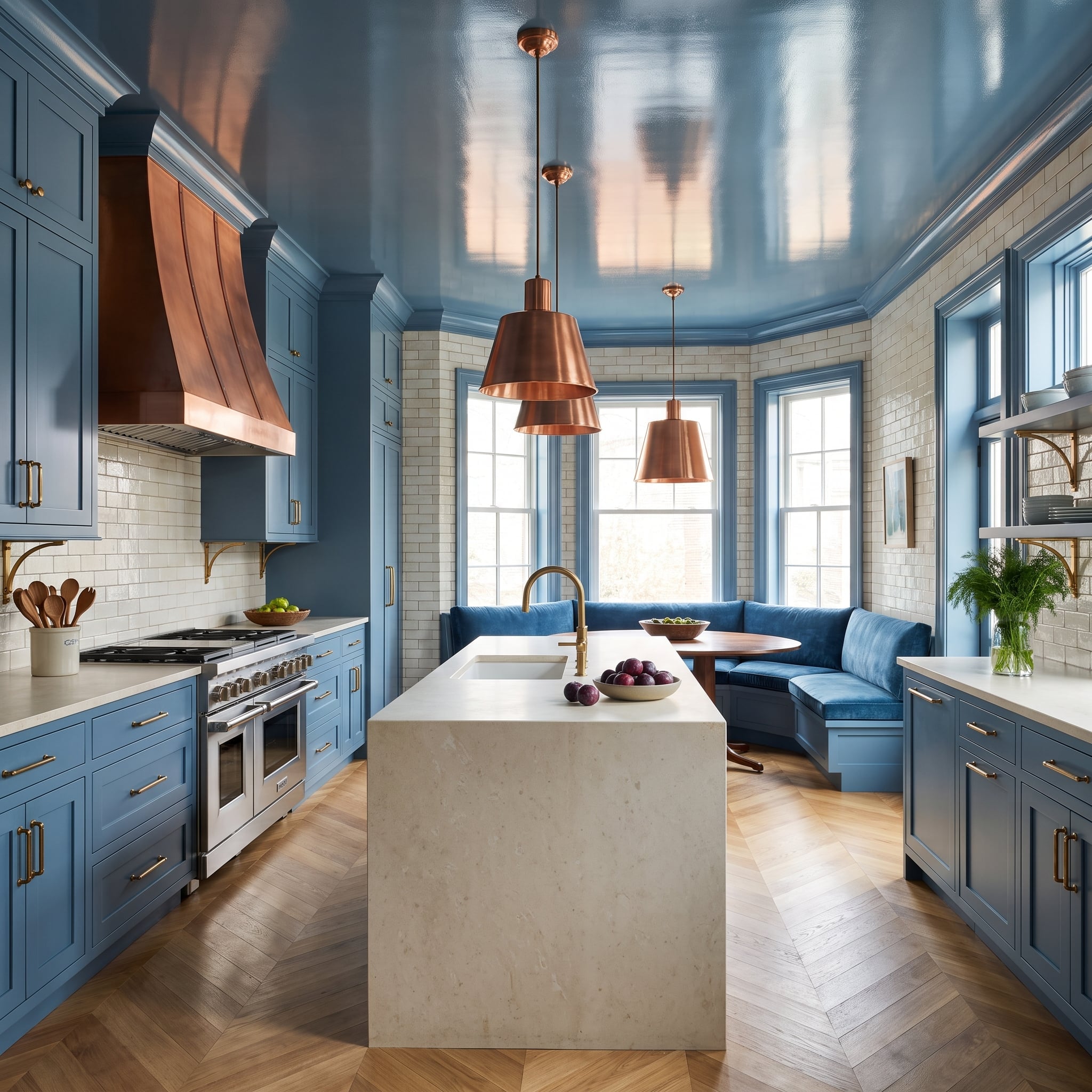
A copper range hood and matching pendants bring warm metallic color into a kitchen dominated by blue cabinetry. Brass hardware adds a yellower accent, but the glossy blue ceiling is the more surprising decision.
Its reflective surface catches highlights from the room below, giving the upper part of the kitchen a sense of movement. The combination of blue lacquer, copper, and brass is bold enough already; the ceiling makes the finish itself part of the spectacle.
32. Oxblood Cabinets Give Brass and Matte Black a Dramatic Backdrop
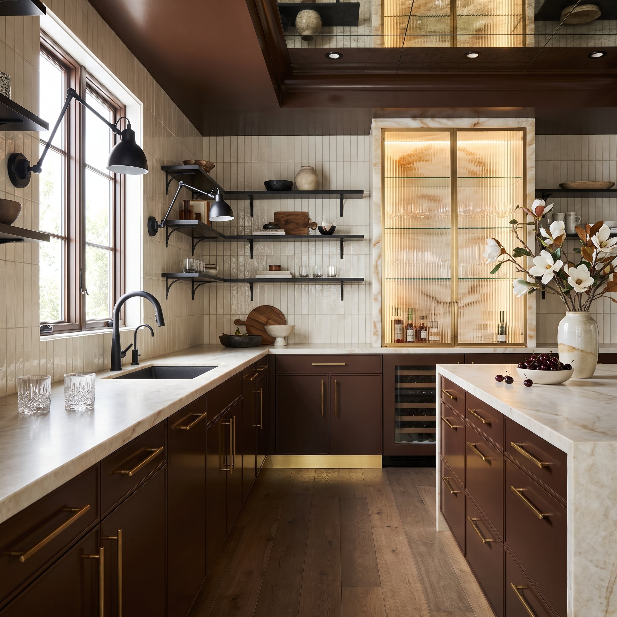
Oxblood cabinetry is hardly a neutral choice, and that’s precisely why the brass hardware looks so rich against it. A matte black faucet introduces a sharper, less reflective detail at the sink, preventing the gold-toned accents from becoming the only metal presence.
Reeded glass cabinetry and interior lighting add depth to the saturated color. Rather than relying on an all-purpose neutral to accommodate the finishes, the kitchen uses a strong cabinet color to give each one a distinctive appearance.
31. A Mirrored Ceiling Sends Copper Beyond the Range Hood
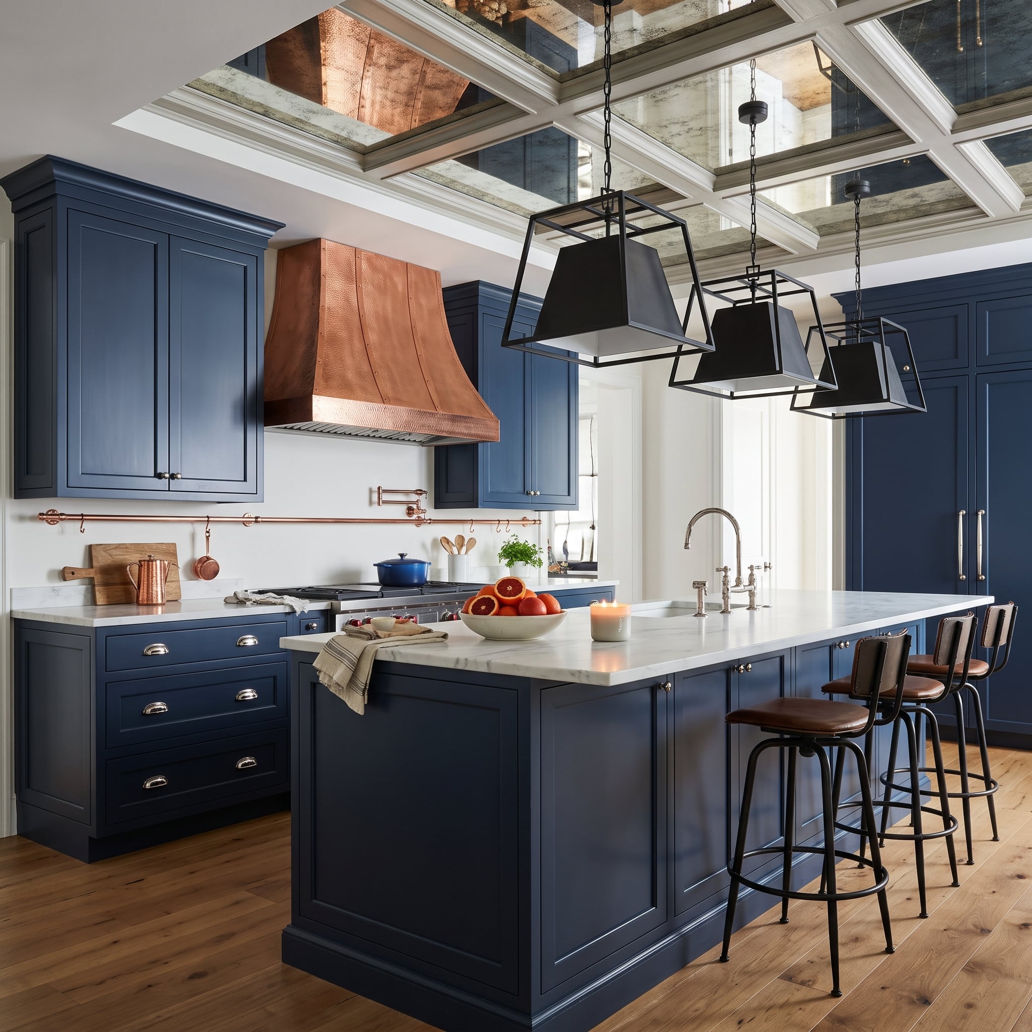
The hammered copper range hood commands the navy cooking wall, while brushed nickel cabinet hardware offers a cooler counterpoint. Above, antique mirrored panels set into a coffered ceiling reflect portions of the room, multiplying the visual presence of the copper.
Black cage pendants and steel-framed stools give the island a separate, darker identity. The mirrored ceiling is the surprise: instead of introducing another dominant material color, it changes how the existing finishes appear as light moves through the space.
30. A Copper Hood and Calacatta Viola Marble Make a Butler’s Pantry Part of the Composition
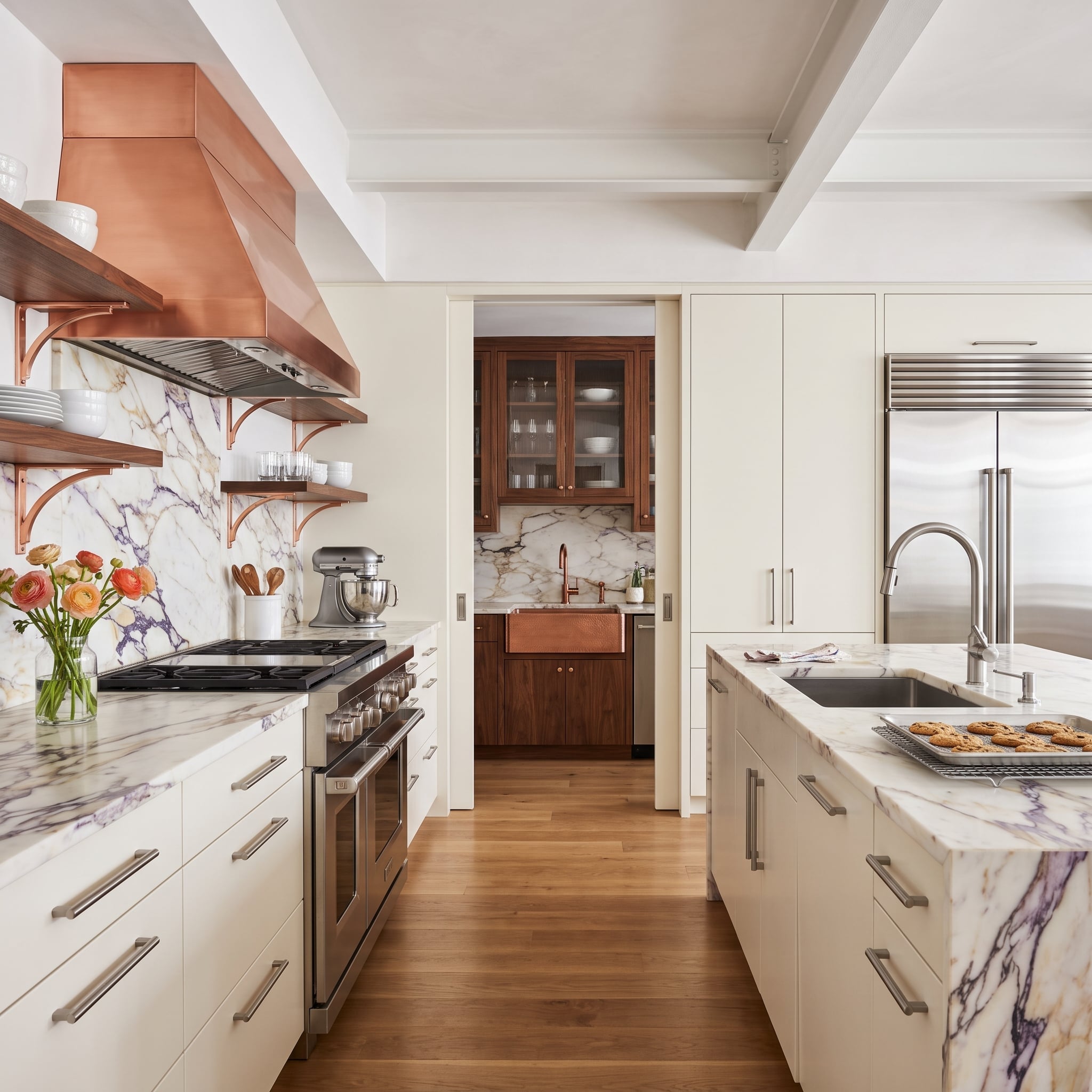
Calacatta Viola marble brings expressive burgundy-toned veining across the backsplash, countertops, and waterfall island. A copper hood introduces another warm surface, while brushed nickel hardware adds a cooler, quieter detail.
Through the sliding door, the butler’s pantry extends the material story with walnut cabinetry and a copper farmhouse sink. The secondary room doesn’t duplicate the kitchen’s finishes exactly. Its darker wood and repeated copper establish continuity while giving the pantry a distinct identity.
29. Black Shelving Suspended From the Ceiling Turns Storage Into Architecture
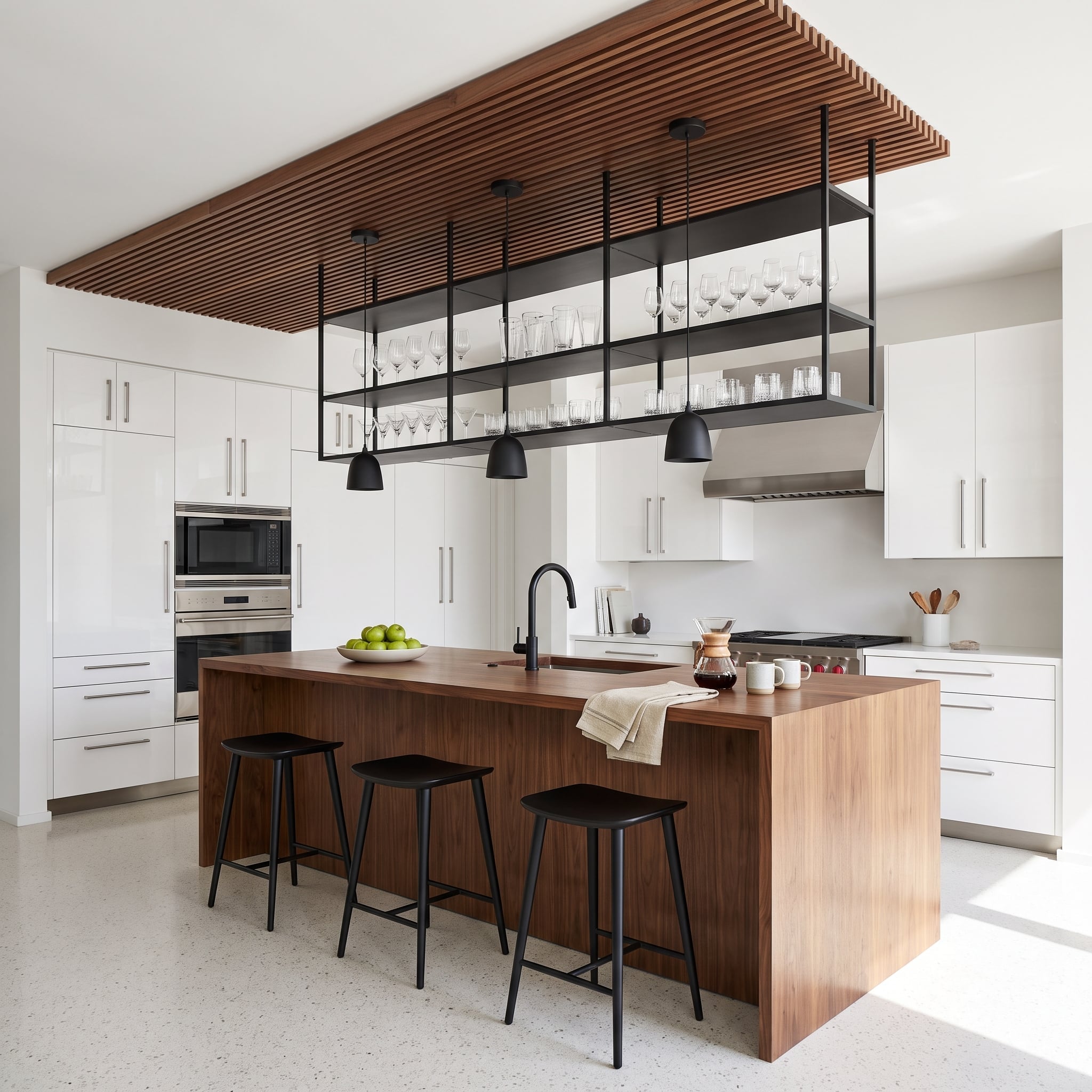
Matte black pendants, ceiling-hung shelving, and barstools establish a striking framework of dark horizontal and vertical lines. A substantial walnut island introduces warmth beneath the overhead shelving, while a slatted wood ceiling feature repeats the grain above.
White cabinetry and terrazzo flooring keep the background light. The suspended shelves are the most distinctive feature: they divide the kitchen visually without creating a solid wall, allowing light and sightlines to pass through the storage structure.
28. Two Copper Hoods Meet a Living Wall in a Sage Green Kitchen
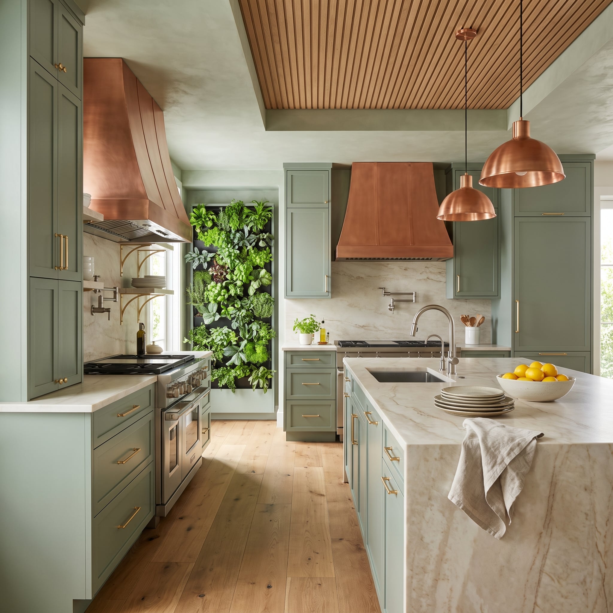
Two copper range hoods are a considerable statement, especially when matching pendant lights extend the finish across the ceiling. Sage green cabinetry gives that copper a muted background, while the living wall introduces a completely different kind of texture.
The greenery matters as much as the metal. Broad leaves, painted cabinet fronts, and reflective copper create three distinct surface qualities. Without the plants, the copper might dominate the entire composition; with them, the eye has somewhere softer to travel.
27. Slate Blue Cabinets Give a Matte Black Hood the Strongest Silhouette in the Room
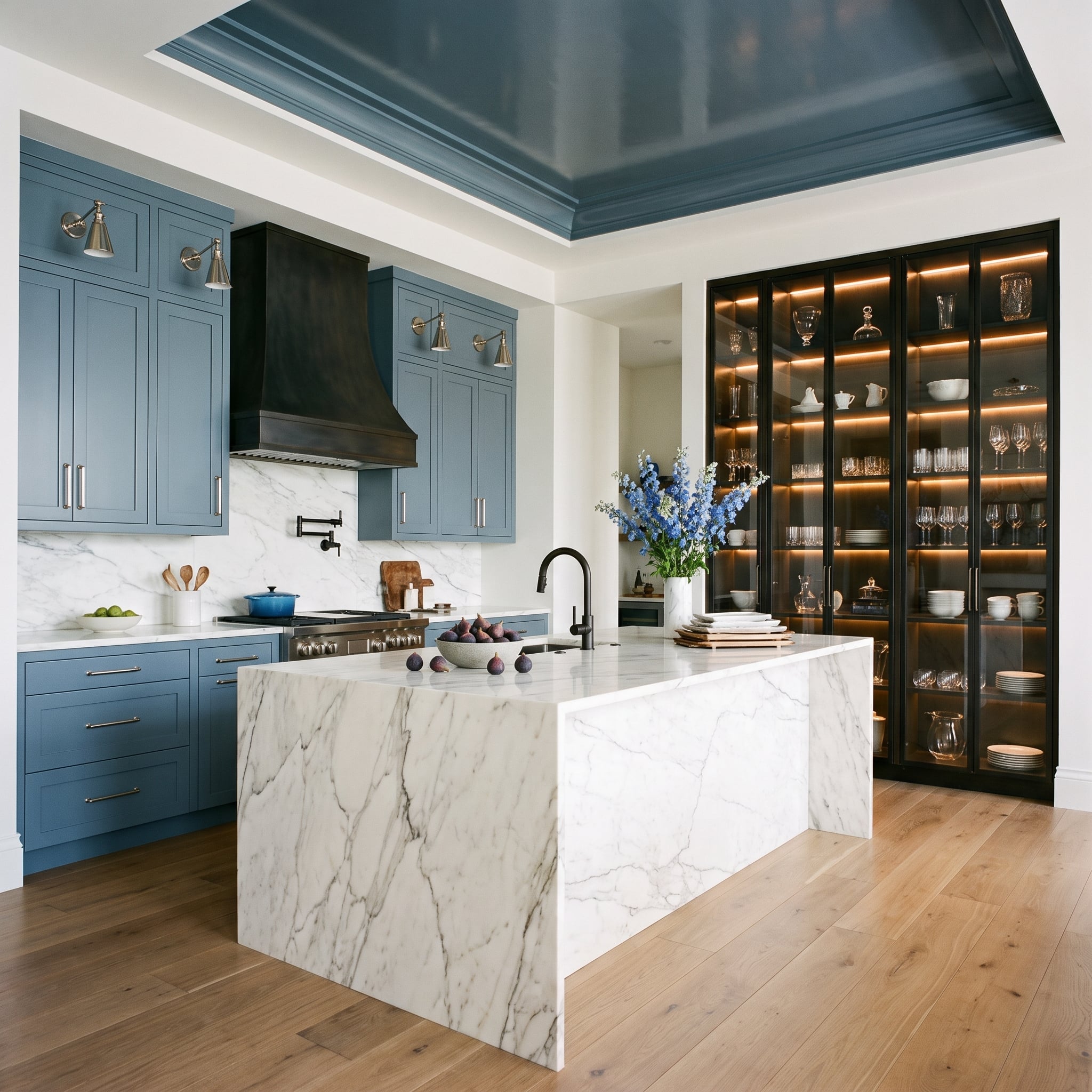
The matte black range hood reads as a solid architectural shape against slate blue cabinetry. Brushed nickel sconces on either side introduce smaller, brighter points of contrast, drawing attention to the cooking wall without diminishing the hood’s outline.
Scale is the crucial distinction. Black occupies the largest metal-clad surface, while nickel appears in compact fixtures. The result feels more deliberate than repeating the same finish across every element simply for consistency.
26. A Brass-Framed Wine Cellar Gives This Walnut Kitchen an Unexpected Finale
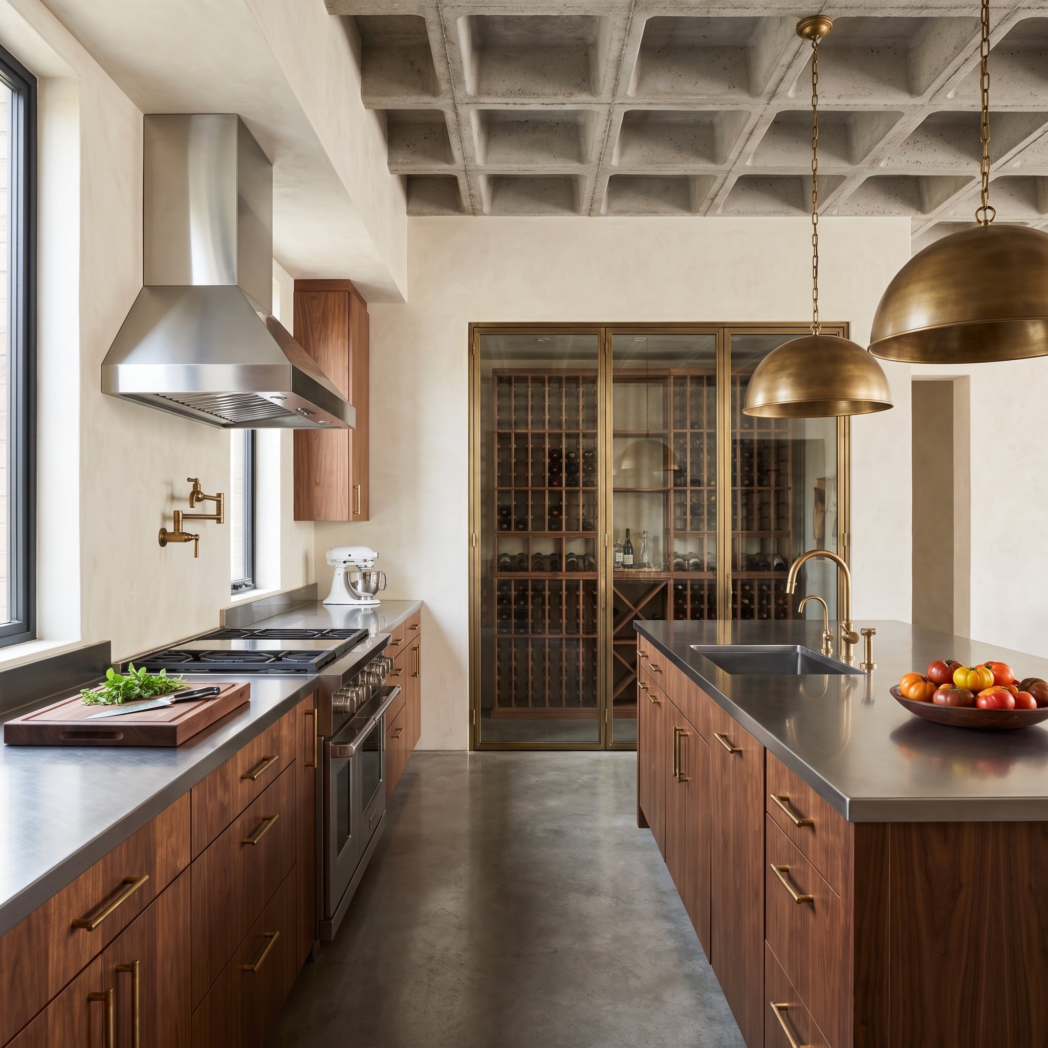
Gold-toned dome pendants and a brass pot filler warm the walnut kitchen, while the zinc-toned island and exposed concrete ceiling establish a cooler industrial character. The contrast becomes more interesting at the far end of the room, where a glass wine cellar is framed in brass.
That distant frame repeats the warmth of the lighting without adding more decorative fixtures to the cooking area. The waffle-grid concrete ceiling provides a rougher architectural counterpoint to the polished metal and smooth cabinet fronts.
25. A Glass-Roofed Kitchen Gives Copper a Very Different Kind of Light
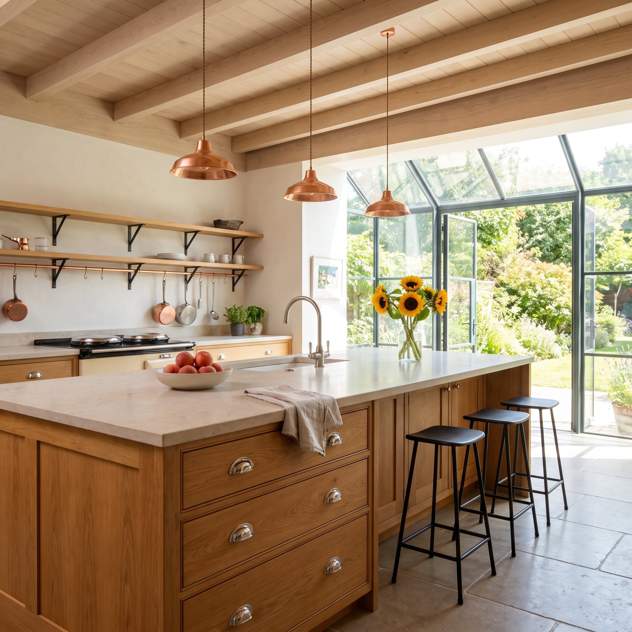
Three copper pendants descend over the island beneath a glass-roofed extension. Their warm surfaces stand out against the black steel glazing bars, while hanging copper cookware reinforces the color at a lower level.
Oak cabinetry and a tongue-and-groove ceiling keep the interior warm, but the steel-framed glass prevents the kitchen from feeling enclosed by wood and copper. The architecture supplies a strong dark outline around the lighter, more reflective materials.
24. A Charcoal Kitchen Finds Its Bright Spots in Brass
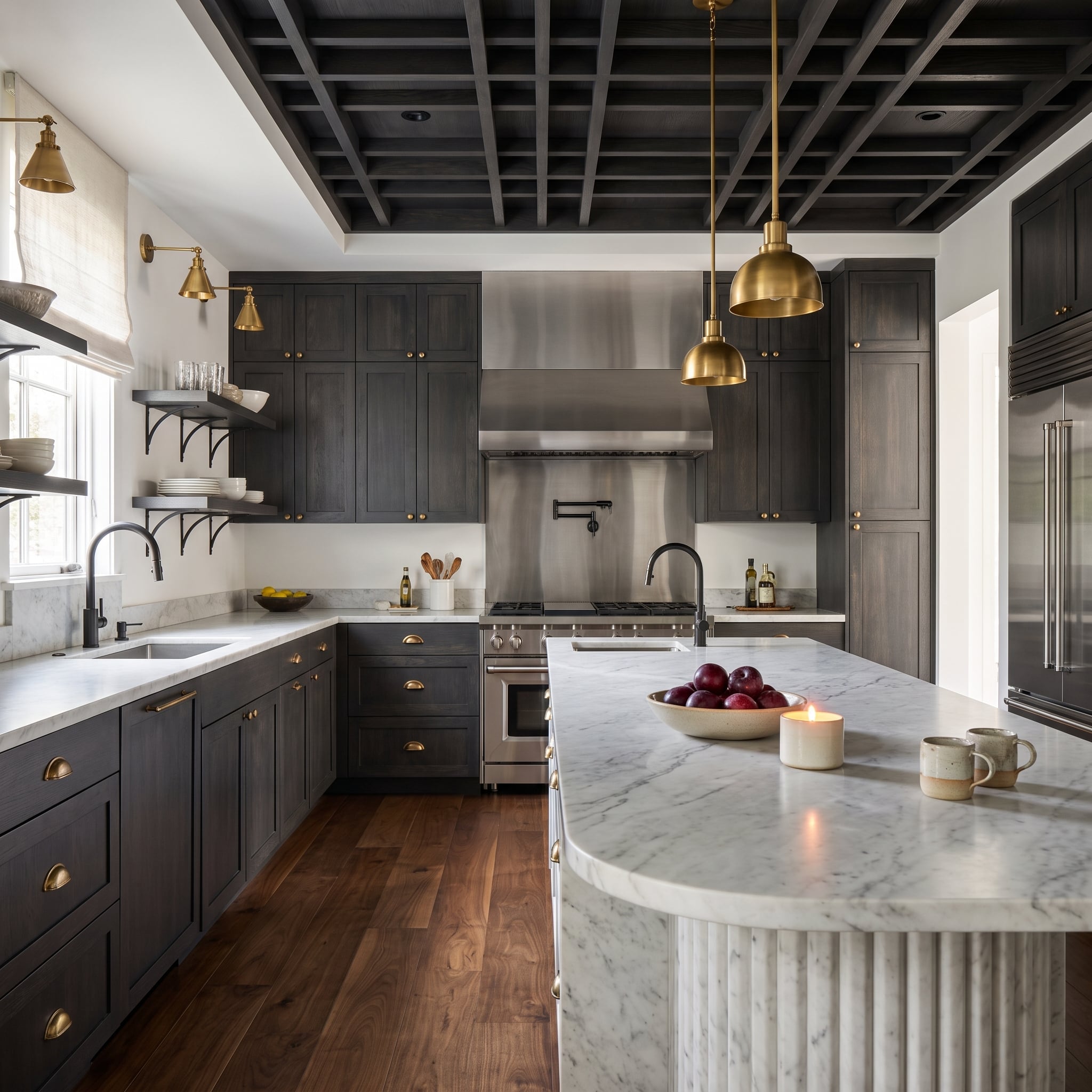
Charcoal shaker cabinetry and a near-black coffered ceiling create a dark, enveloping interior. Brass cup pulls, pendants, and sconces punctuate those surfaces with warm highlights, while black faucets remain closely integrated with the cabinetry.
The ceiling gives this kitchen much of its authority. Its grid of recessed panels adds depth overhead, and the brass lighting becomes especially prominent against the dark finish. The metals aren’t distributed evenly, which is exactly why the brass accents register so clearly.
23. A Steel-Framed Greenhouse Window Gives This Sage Kitchen an Unexpected Edge
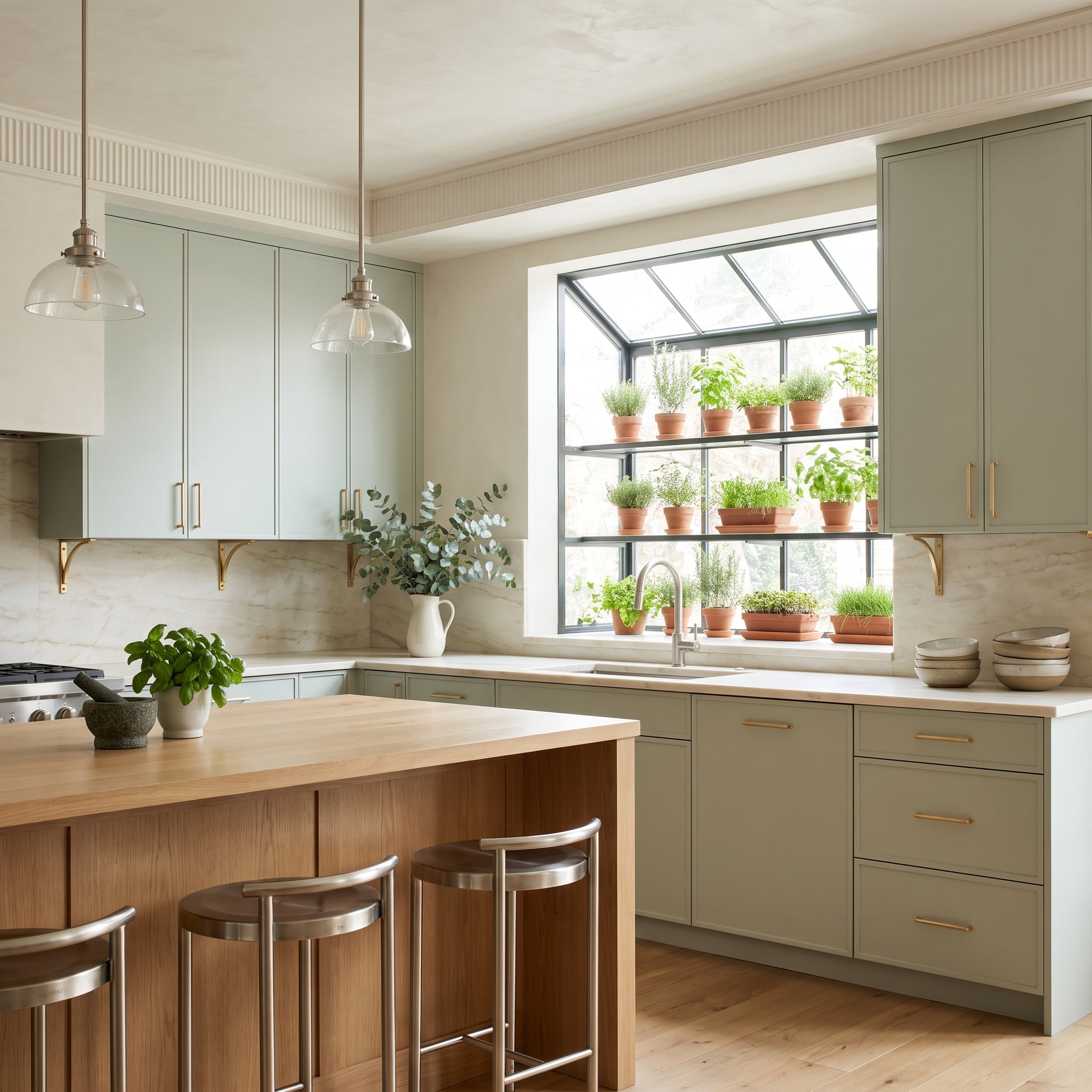
Sage cabinetry and brass bar pulls establish a soft, warm palette, interrupted by the strong lines of a steel-framed greenhouse window above the sink. A brushed nickel faucet provides a smaller silver-toned accent beneath the glazing.
The window is the decisive architectural detail. Its projecting form and dark framing give the sink wall more depth than a conventional flat opening, while the oak island adds natural warmth. Brass and nickel remain secondary to that relationship between cabinetry, glass, and steel.
22. A Forest Green Kitchen Uses Copper and Brass Without Losing Its Depth
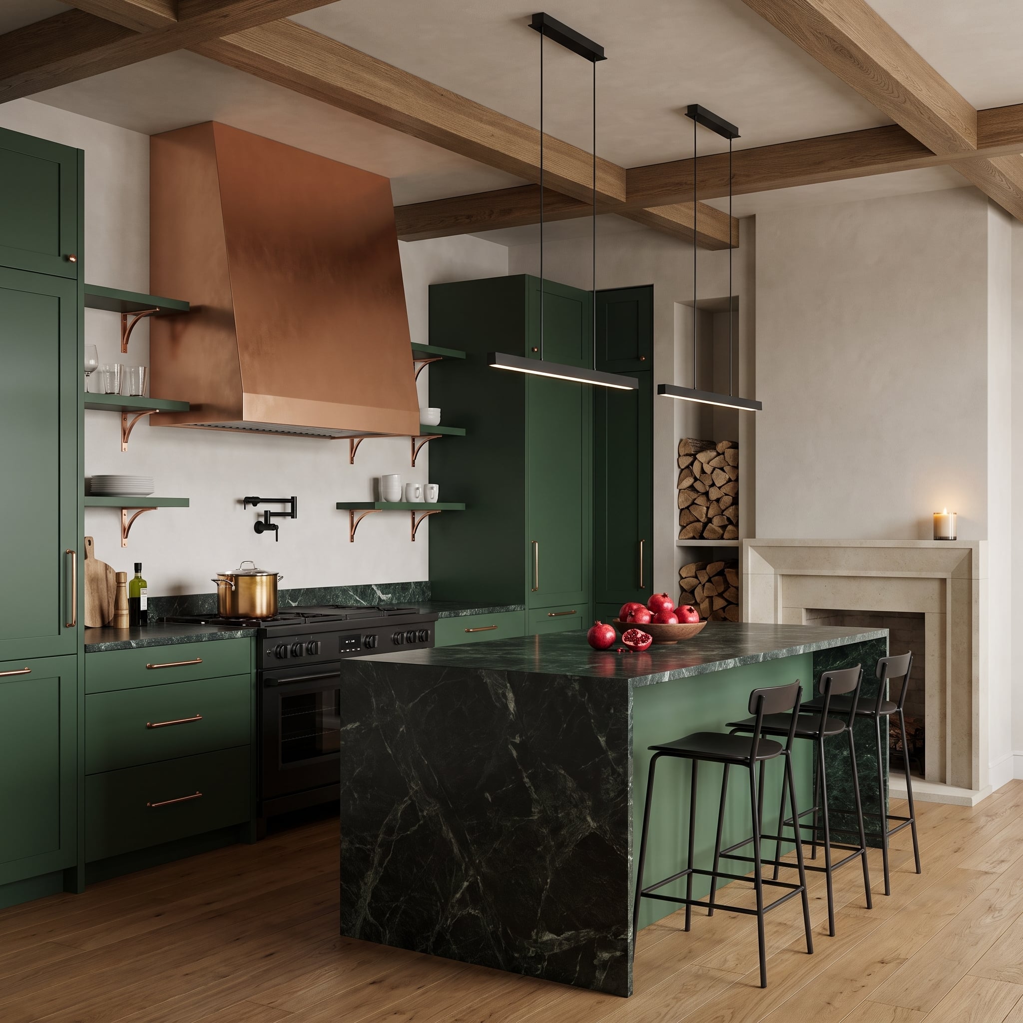
Deep green shaker cabinets form a saturated backdrop for the copper range hood and warm brass drawer pulls. Copper shelf brackets extend the reddish metal across the open shelving, while the island introduces black marble with striking white veining.
The black waterfall panel is a crucial change of pace. Against the green, copper, and brass, its cooler surface gives the kitchen a stronger contemporary edge. Light oak flooring and ceiling beams prevent the darker finishes from closing in.
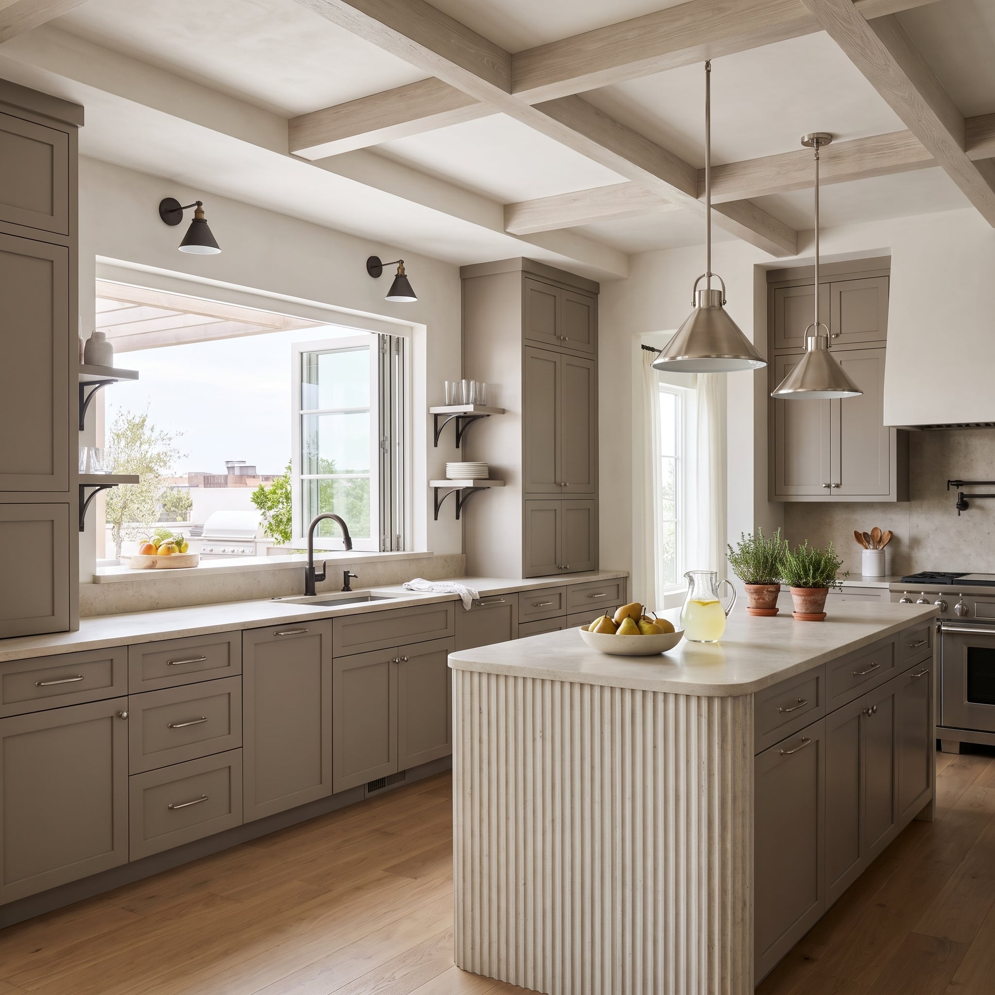
21. Greige Cabinets and Bronze Sconces Bring Warmth to Brushed Nickel
🔥 Would you like to save this?
Brushed nickel pendants hang over a fluted stone island, while bronze sconces frame the window beyond. Their difference is subtle compared with the copper-and-black combinations elsewhere, but the contrasting sheens become more apparent against the pale greige cabinetry.
The bronze sconces bring decorative richness to the perimeter, while the brushed nickel pendants take on a cooler, more utilitarian character. The fluted island adds a finely textured surface beneath both, giving this otherwise restrained kitchen a stronger architectural identity.
20. A Slatted Walnut Ceiling Makes Three Copper Pendants Look Almost Sculptural
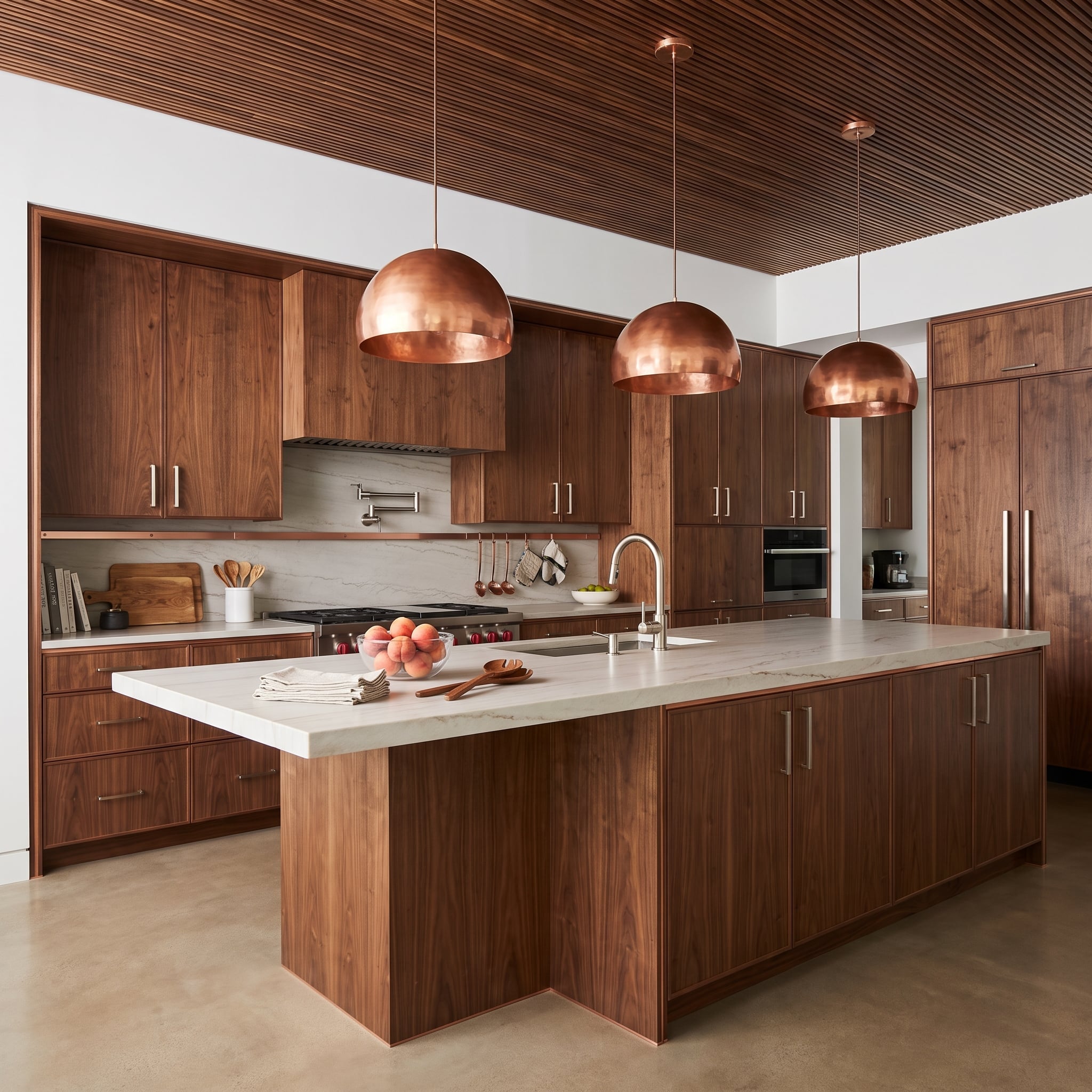
Walnut runs across the cabinetry, island base, and slatted ceiling, creating a richly grained interior with very little interruption. Three hammered copper dome pendants stand out through their rounded silhouettes and reflective surfaces, while brushed nickel cabinet hardware remains comparatively restrained.
The ceiling is particularly effective. Its parallel slats introduce a strong linear rhythm above the curved pendants, setting up a contrast between architectural precision and the softer shapes of the lighting.
19. A Marble Cooking Wall Gives Brass and Black Separate Stages
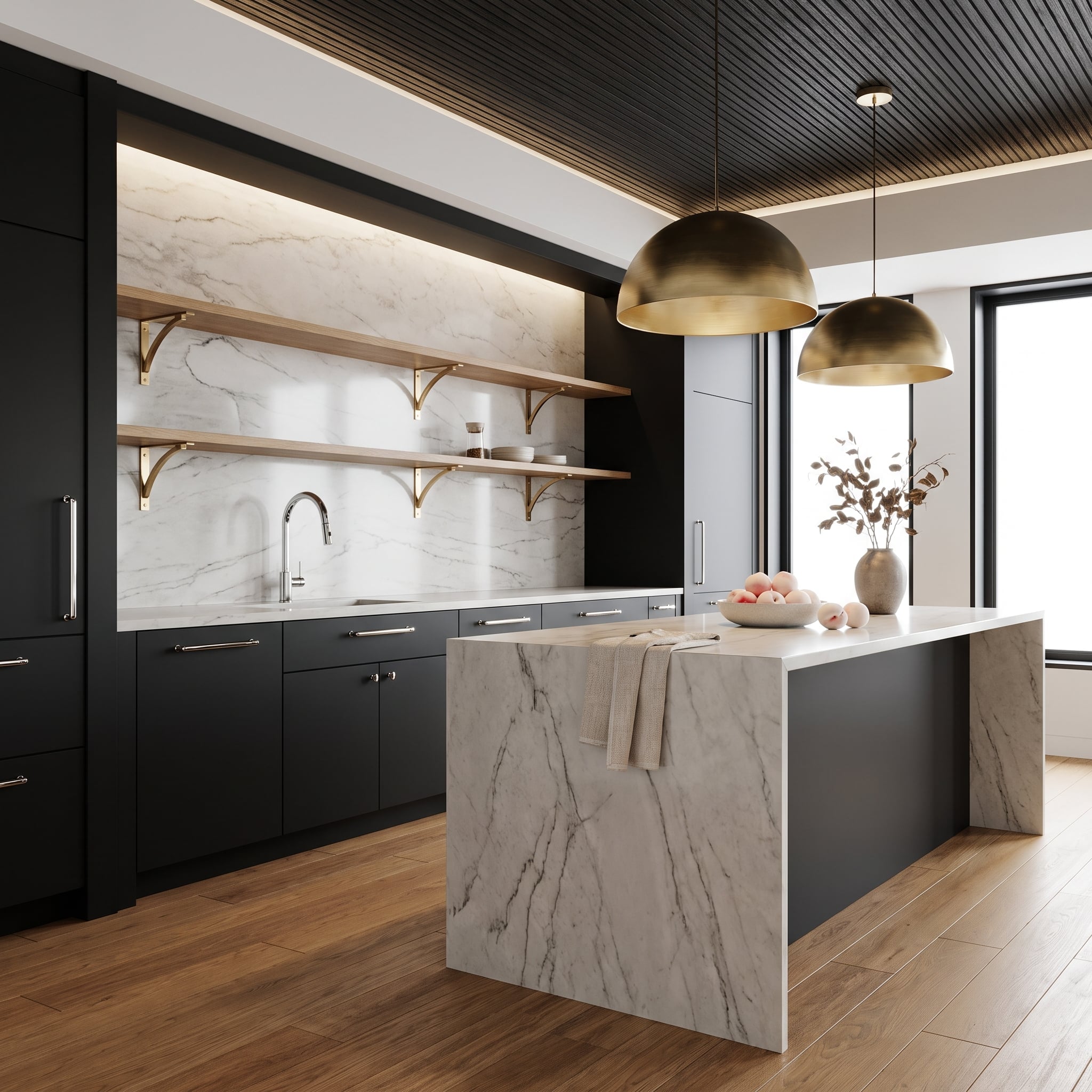
Matte black cabinetry establishes the background, chrome handles the sink fixtures, and two brass dome pendants create warm focal points over the island. The three finishes are readily distinguishable because each appears against a different surrounding surface.
White marble with dark veining covers the waterfall island and connects visually to the cooking wall. Brass shelf brackets repeat the pendant color on a smaller scale, while the chrome faucet remains a restrained detail against the dramatic stone.
18. Forest Green Cabinets Turn Brass Hardware Into Part of the Architecture
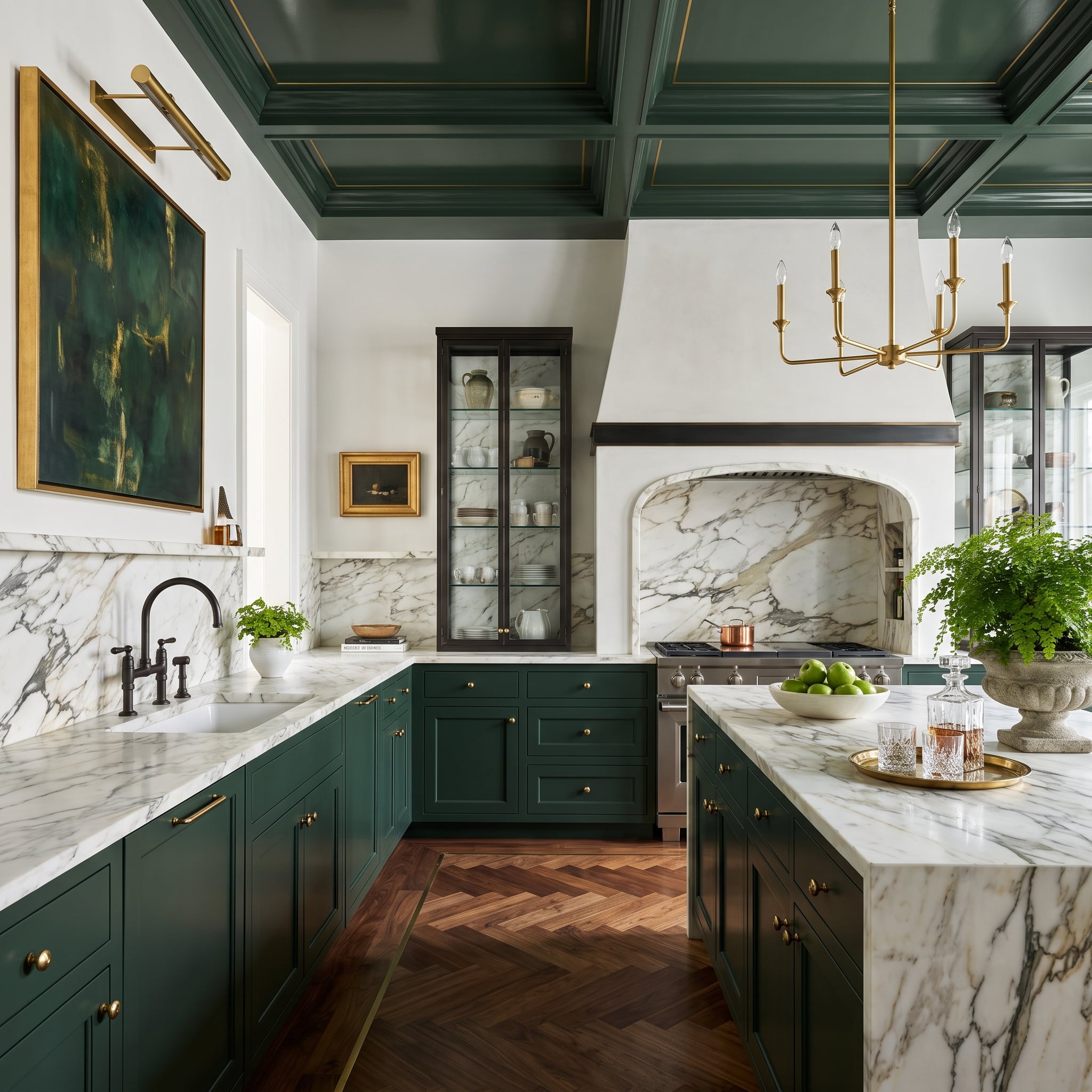
Deep forest green covers the cabinetry and coffered ceiling, creating a continuous envelope around the room. Brass hardware, ceiling trim, and a chandelier introduce warm highlights at several heights, while a matte black bridge faucet remains visually quieter at the sink.
The marble cooking wall provides a broad pale interruption in the dark palette. Below, herringbone walnut flooring introduces movement and a different grain pattern, giving this formal composition some welcome texture.
17. An Apron-Front Sink Gives Chrome a Foil in Matte Black
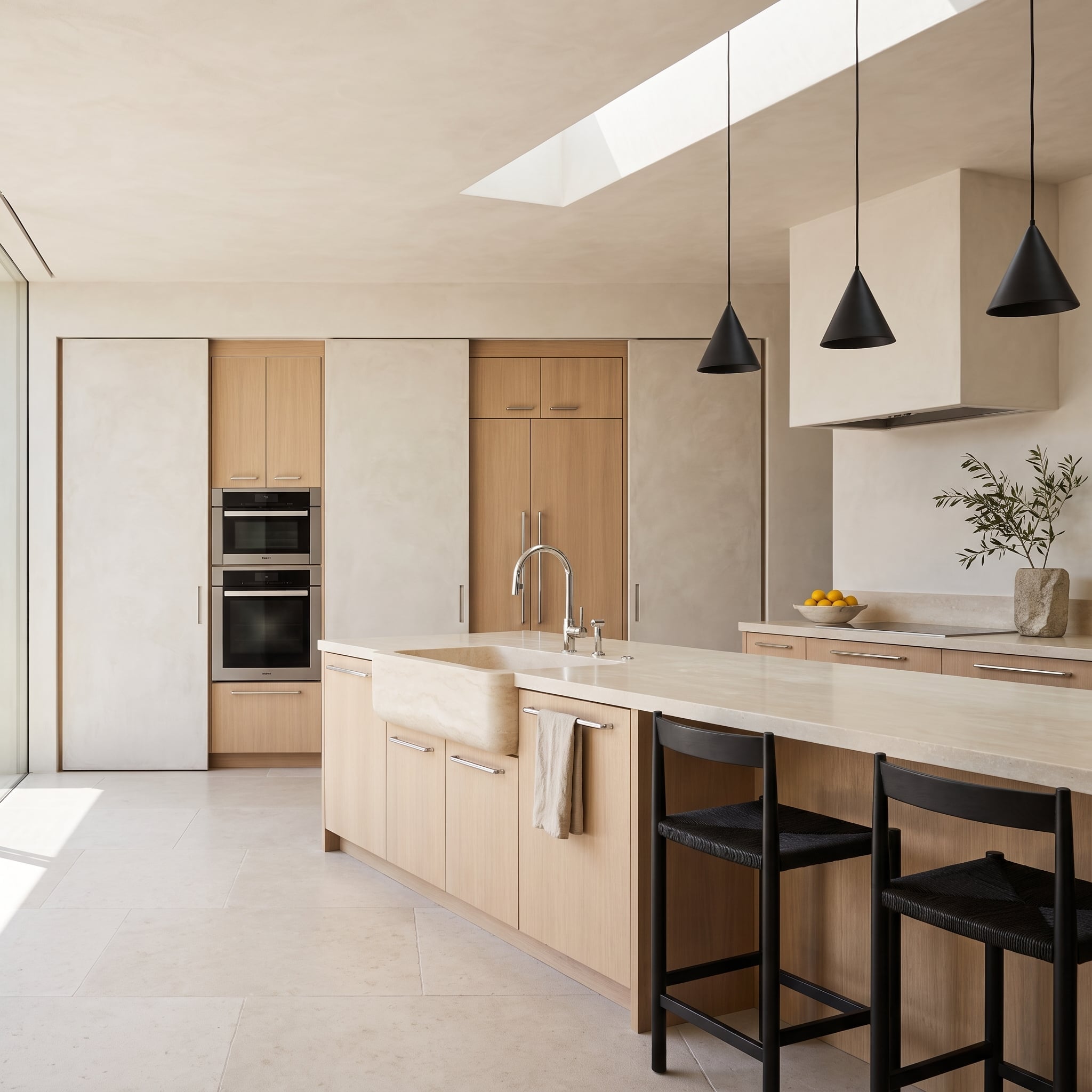
Pale oak cabinets bring an almost linen-like softness to this kitchen. Against them, chrome pulls and a chrome faucet look crisp without turning clinical. Three black cone pendants above the island supply a much stronger silhouette, echoed by dark barstools with woven seats.
The apron-front sink anchors the pale cabinetry with a substantial white form. Above the island, the black pendants introduce a completely different visual weight. Neither finish needs to imitate the other.
16. A Copper Hood Brings Warmth to Slate Cabinets and a Wall of Glass
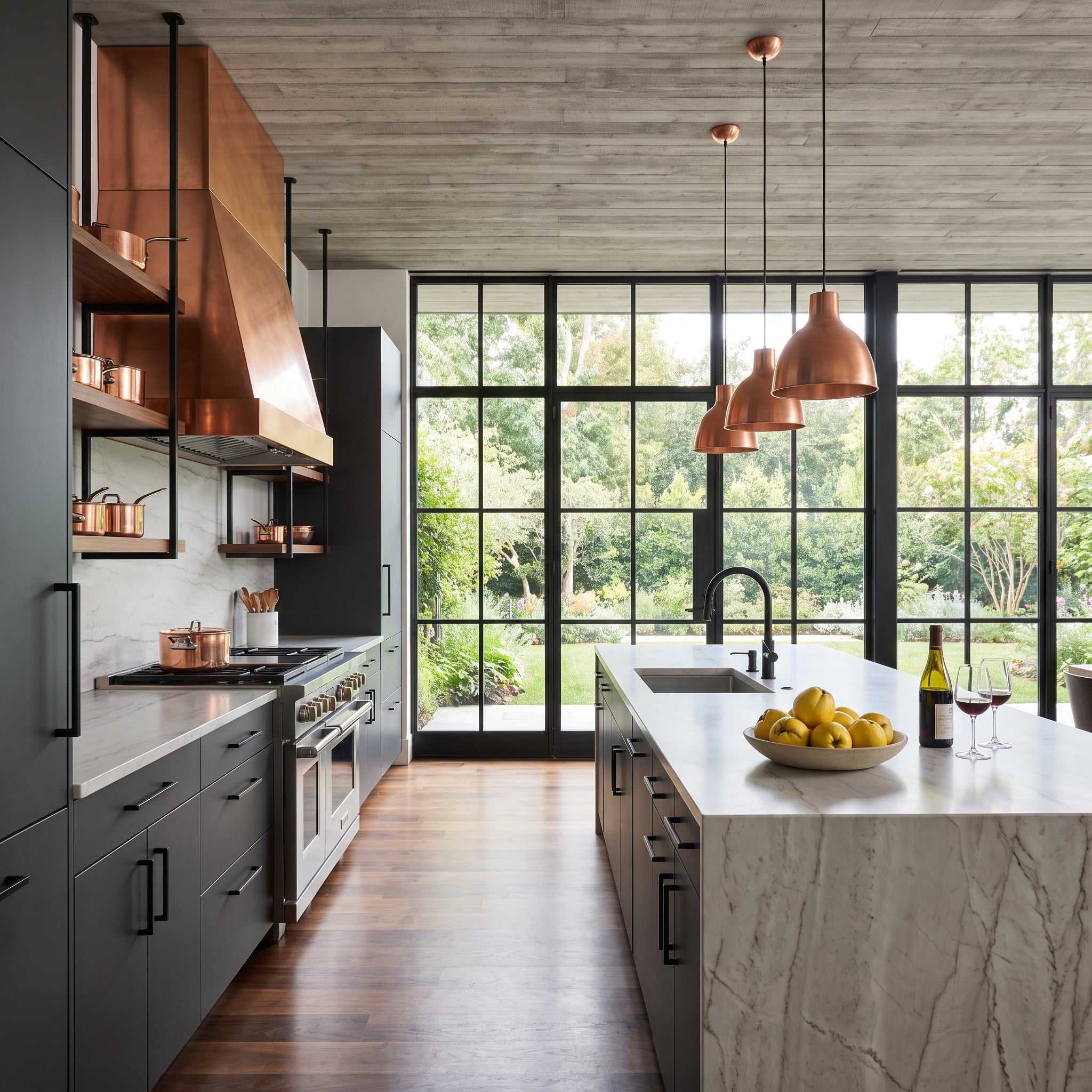
Matte slate cabinetry gives the copper range hood a strong, cool backdrop. Three copper pendants repeat the warm finish above the island, while black hardware introduces smaller dark accents along the cabinetry.
The floor-to-ceiling glazing changes the room’s character. Natural light catches the copper and brightens the marble waterfall island, while the steel window frames reinforce the dark cabinet palette. The copper is dramatic, but the glass keeps the composition open.
15. A Walnut Island Softens the Geometry of Black Cage Pendants
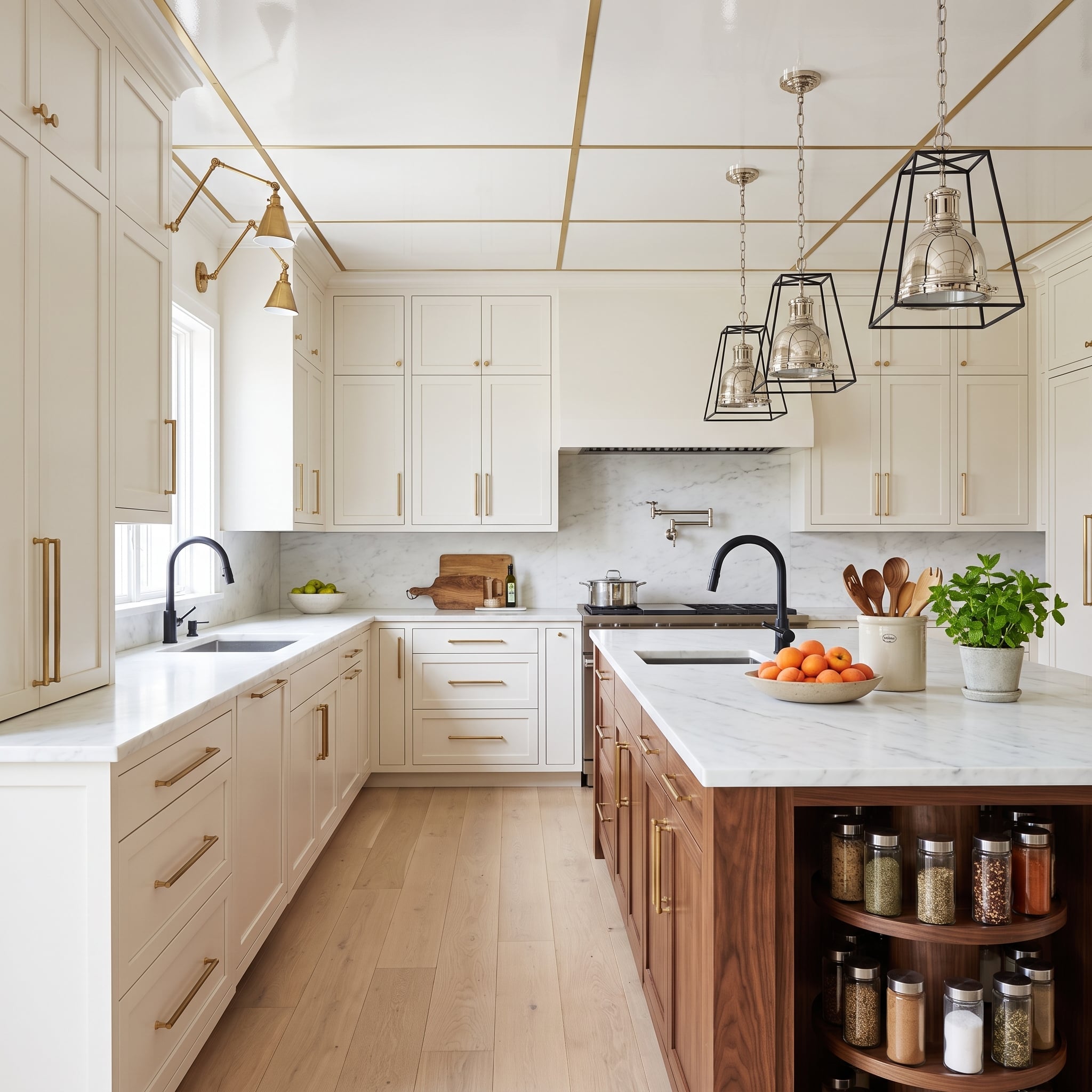
Black geometric pendant frames surround silver-toned shades, creating two contrasting finishes within the lighting itself. Brass cabinet pulls add a warmer accent, while black faucets repeat the pendants’ darker outline elsewhere in the kitchen.
The walnut island is more than a background material. Its substantial grain and color establish a strong horizontal element beneath the open pendant frames. Ivory cabinetry keeps the perimeter light, allowing the island and fixtures to provide most of the visual structure.
14. Copper and Brass Find Common Ground Against Olive Cabinets
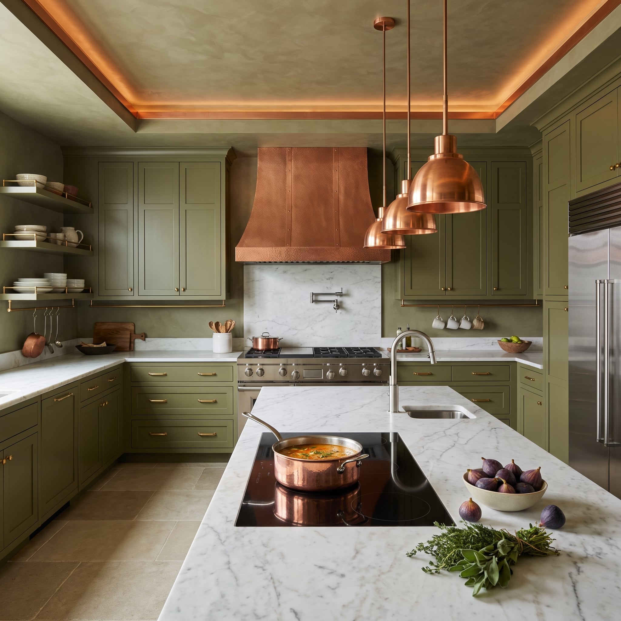
A hammered copper range hood, copper pendants, and cookware establish a pronounced reddish warmth. Brass cabinet pulls sit close to that palette without duplicating it, their yellower tone registering against the olive cabinetry.
The marble countertops keep the arrangement from becoming overwhelmingly earthy. White stone provides a clean horizontal break between the cabinets, the island, and the overhead fixtures. Copper and brass may be related metals, but their different colors are clearly visible here.
13. Polished Nickel Pendants Bring a Cooler Edge to Greige and Brass
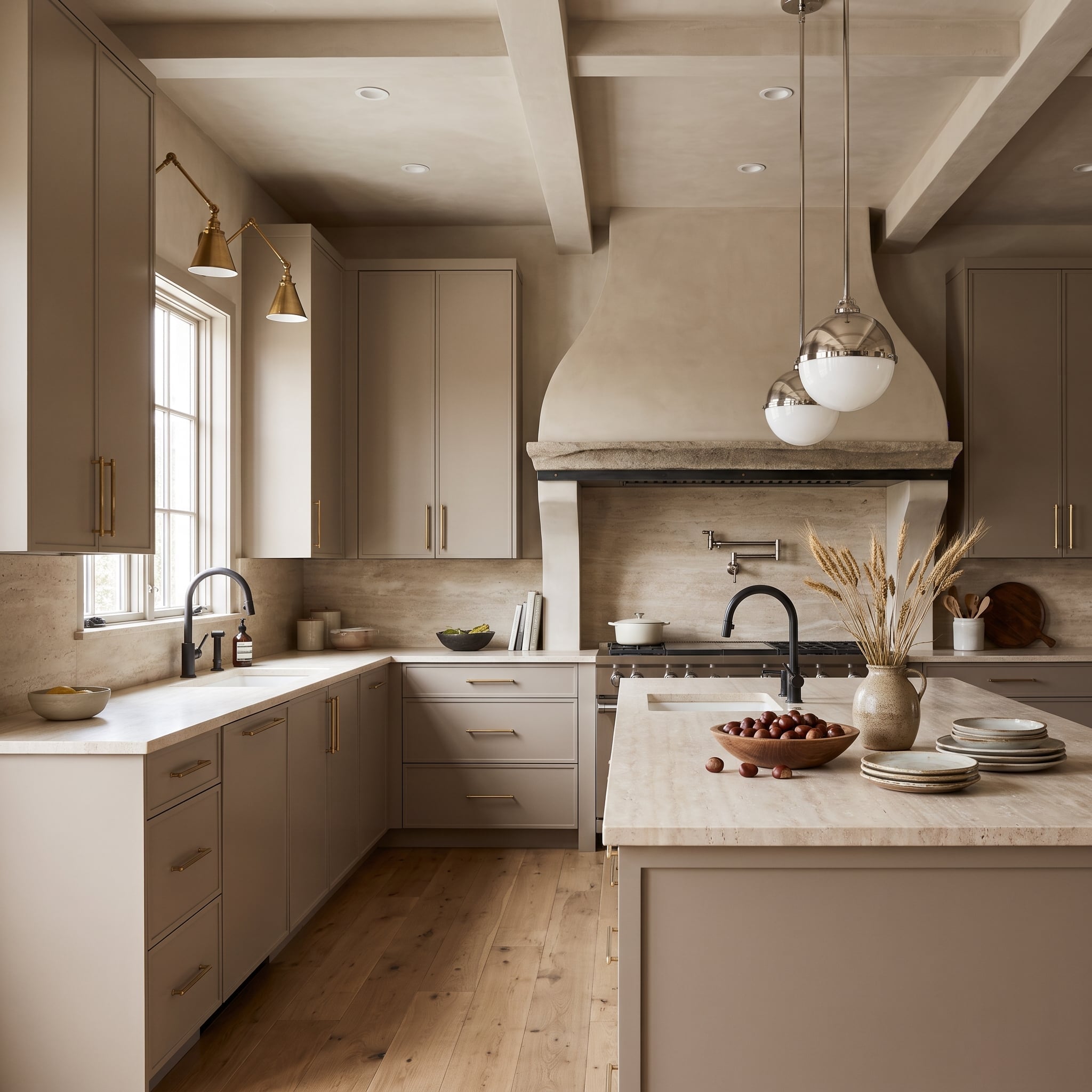
Brass sconces and cabinet pulls warm the greige cabinetry, while polished nickel globe pendants create brighter reflections above the island. Matte black faucets add a third, less reflective finish at the work surfaces.
The plaster hood, with its substantial stone ledge, provides a welcome contrast to the smooth metal fixtures. Rather than making every element decorative, the kitchen lets the hood’s mass and texture balance the lighter pendants and sconces.
12. A Cream-and-Walnut Kitchen Lets Brass and Stainless Steel Divide the Work
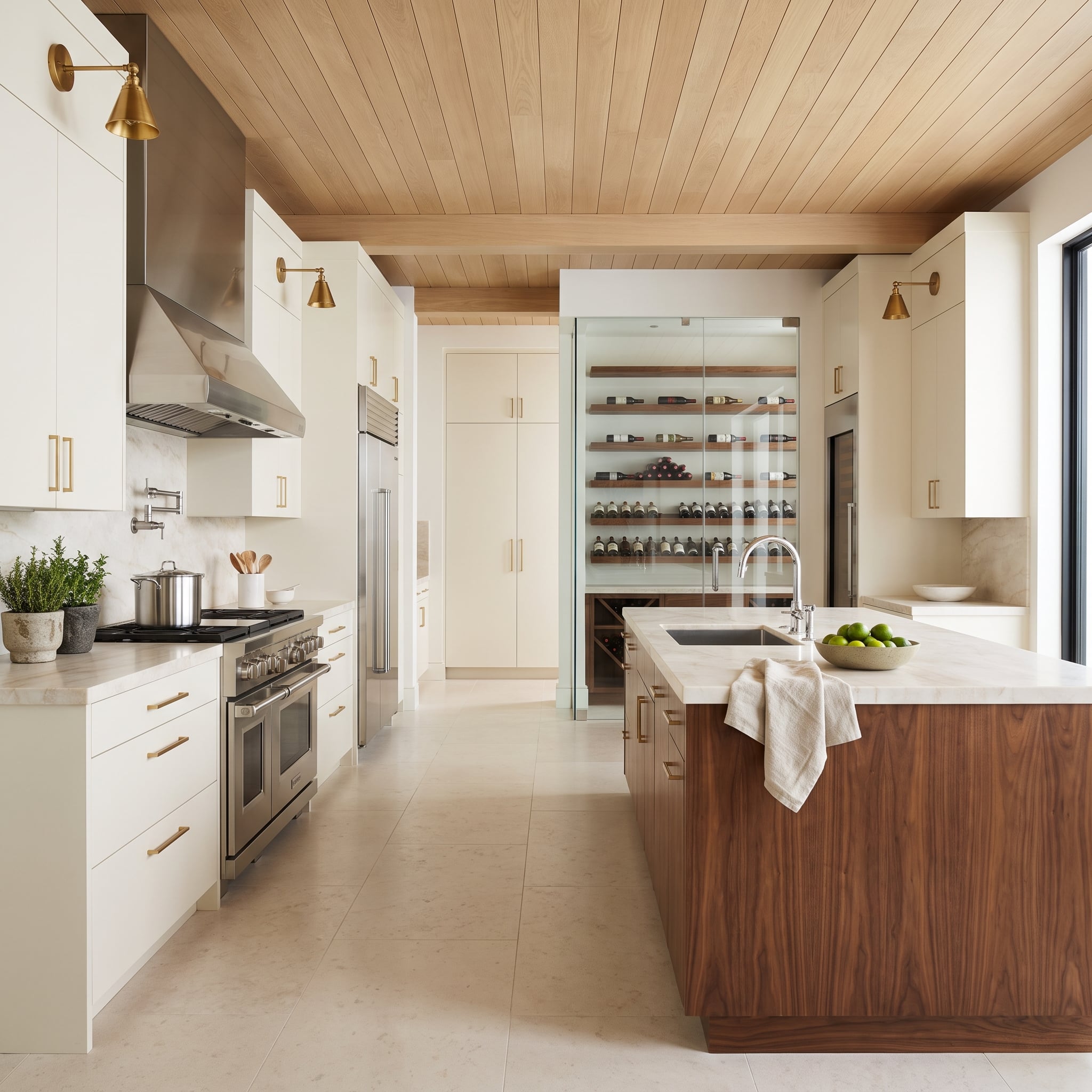
Cream shaker cabinets with brushed brass pulls surround a professional-style stainless steel range and hood. Walnut on the island and ceiling introduces a deeper wood tone, giving the pale cabinetry and silver-toned appliances a warmer architectural setting.
Brass sconces reinforce the hardware, while the chrome faucet adds a smaller polished detail. At the far end, a glass-enclosed wine cellar with walnut shelving extends the wood palette. The result balances substantial appliances with softer cabinetry and carefully repeated warm accents.
11. A Navy Kitchen Lets Matte Black Lead and Brass Follow
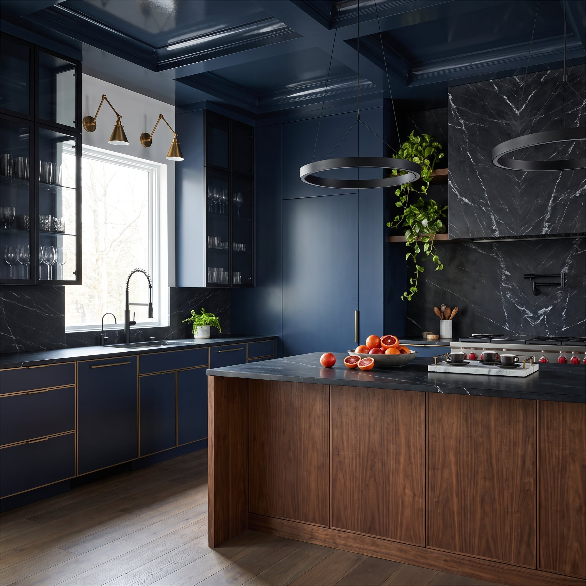
Matte black ring pendants establish a strong graphic presence above the walnut island, while brass sconces appear across the room near the window. Navy cabinetry and black marble create a dark architectural backdrop, leaving the walnut grain to supply much of the warmth.
Here, the metals aren’t asked to provide the entire color story. The brass has a modest decorative role, and the black fixtures connect directly to the darker surfaces. The island’s warm brown tone prevents the palette from becoming severe.
10. Copper Pendants Bring a Different Kind of Warmth to White Oak
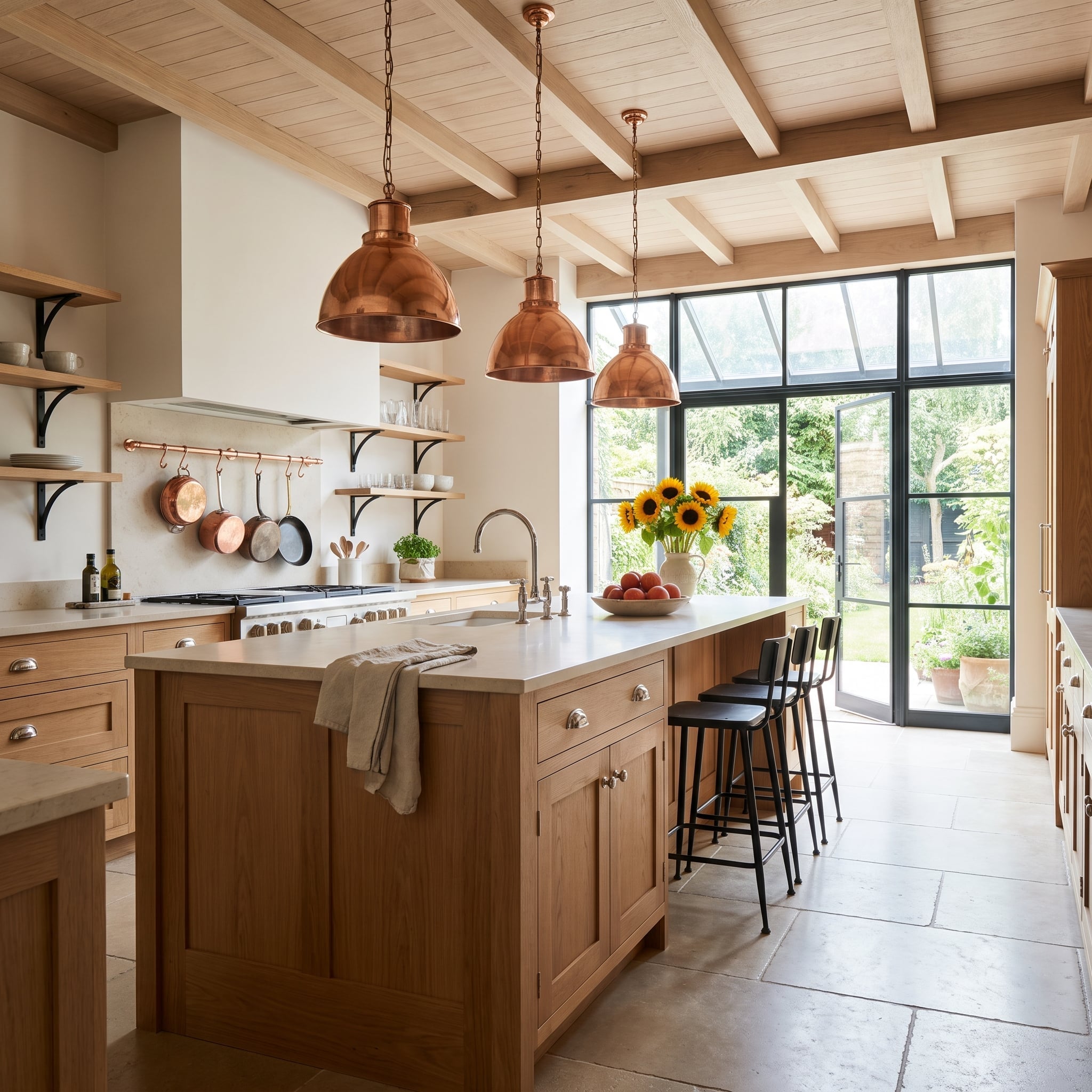
Three copper pendants bring a pronounced warm glow above the white oak island. Black steel window frames establish a contrasting outline, while cooler nickel hardware and a bridge faucet prevent the fixtures from following a single-metal scheme.
The oak’s pale grain is important here. Against darker wood, the copper might blend into the cabinetry; against white oak, its reddish color remains distinct. The black window framing adds enough definition to keep the overall composition from becoming too soft.
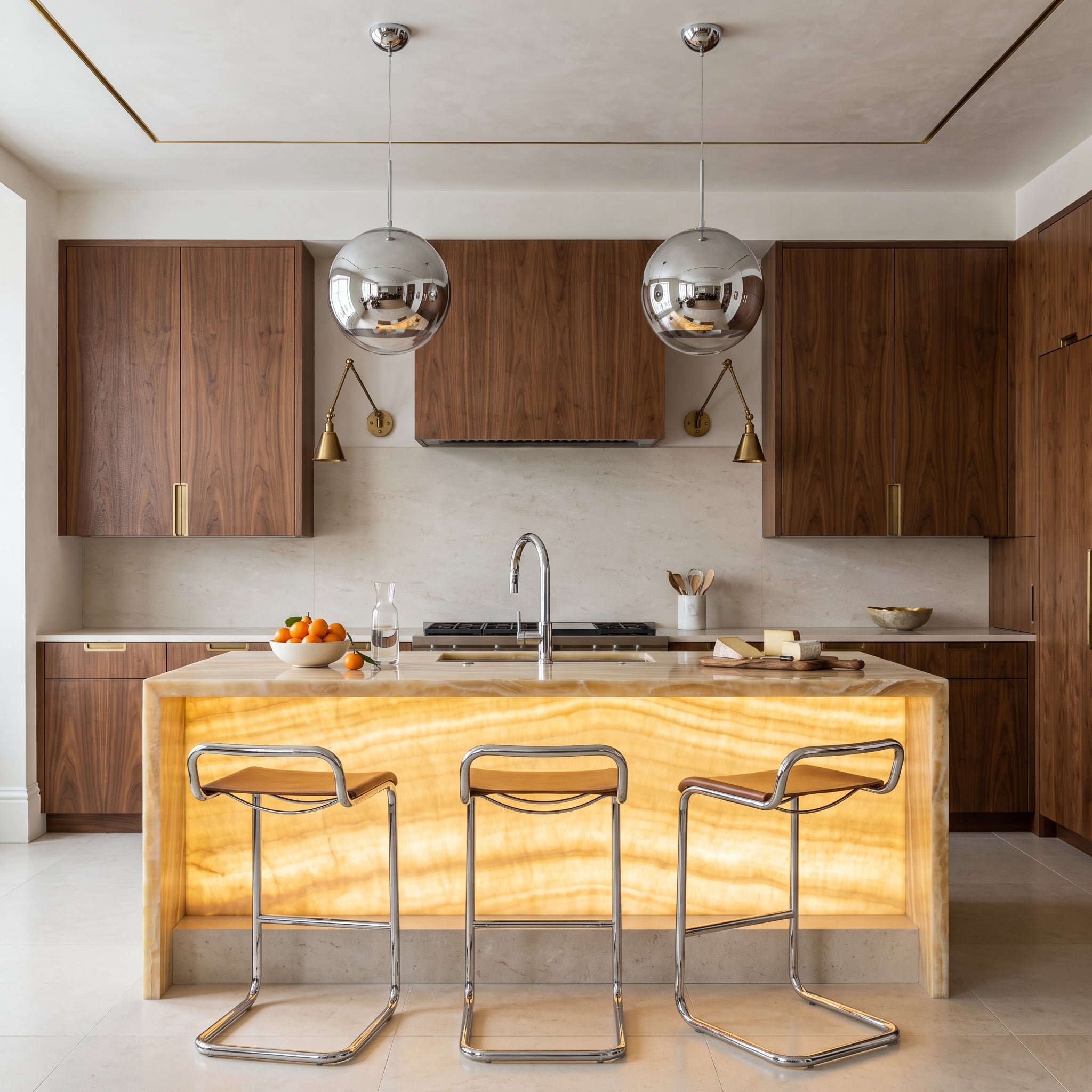
9. A Backlit Onyx Island Turns Chrome and Brass Into Supporting Players
🔥 Would you like to save this?
A honey-colored onyx island, illuminated from within, throws an amber glow across the kitchen. Walnut cabinetry and brass sconces pick up that warmth, while mirror-finish globe pendants and tubular chrome barstools introduce a cooler, harder edge. The glowing onyx becomes the unmistakable centerpiece, allowing the contrasting metals to play smaller but equally important roles.
Silver-toned fixtures catch and reflect the light, while brass remains comparatively understated against the walnut. The illuminated island supplies the drama; the metals sharpen its effect without competing for the spotlight.
8. An Olive Kitchen Puts Fluted Walnut Beneath Matte Black Pendants
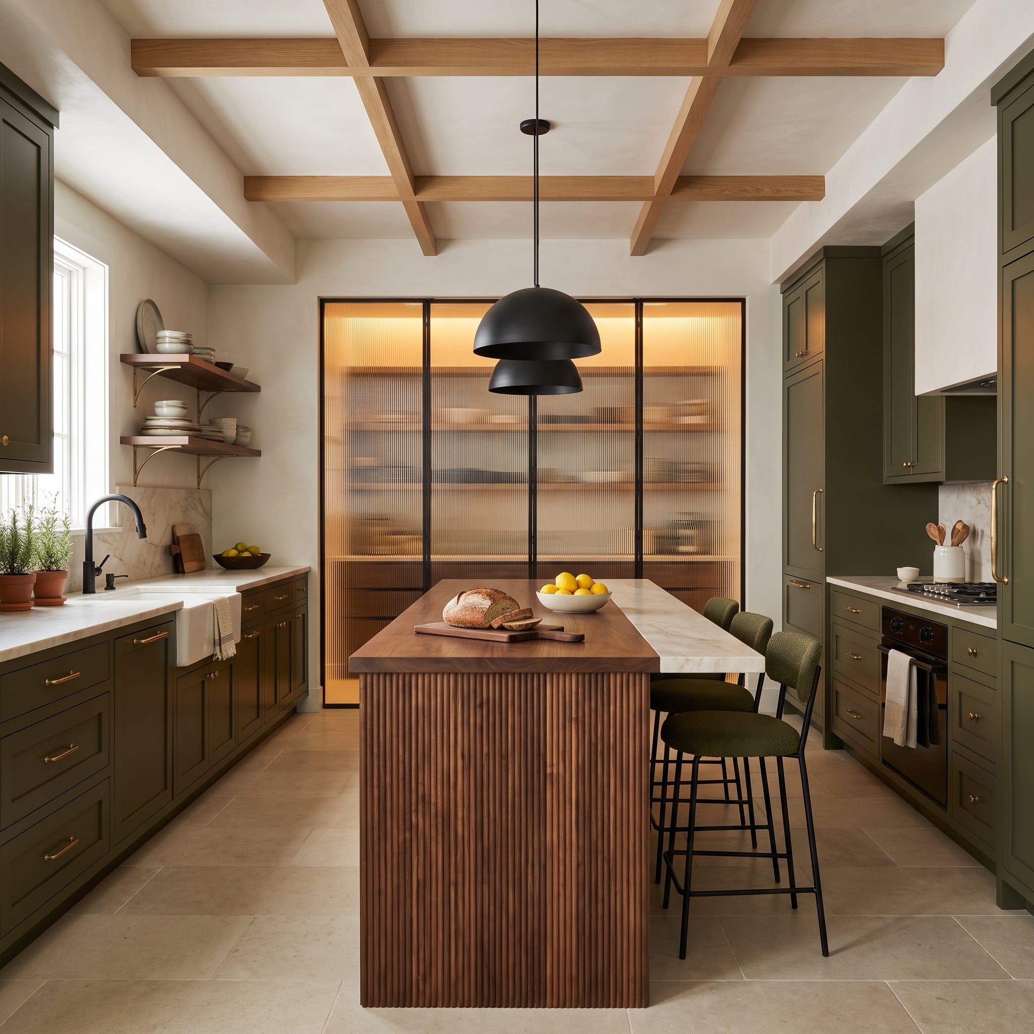
Dark olive cabinetry with brass hardware surrounds a walnut island whose fluted base introduces a fine vertical texture. Matte black dome pendants hang overhead, their smooth, simple shapes contrasting with the detailed woodwork below.
The island combines marble and butcher block surfaces, creating distinct areas for preparation and serving. With that much material variation concentrated in one piece, the restrained black pendants are a smart counterweight to the busier textures.
7. Espresso Oak Makes Room for Chrome Pendants and Brass Pulls
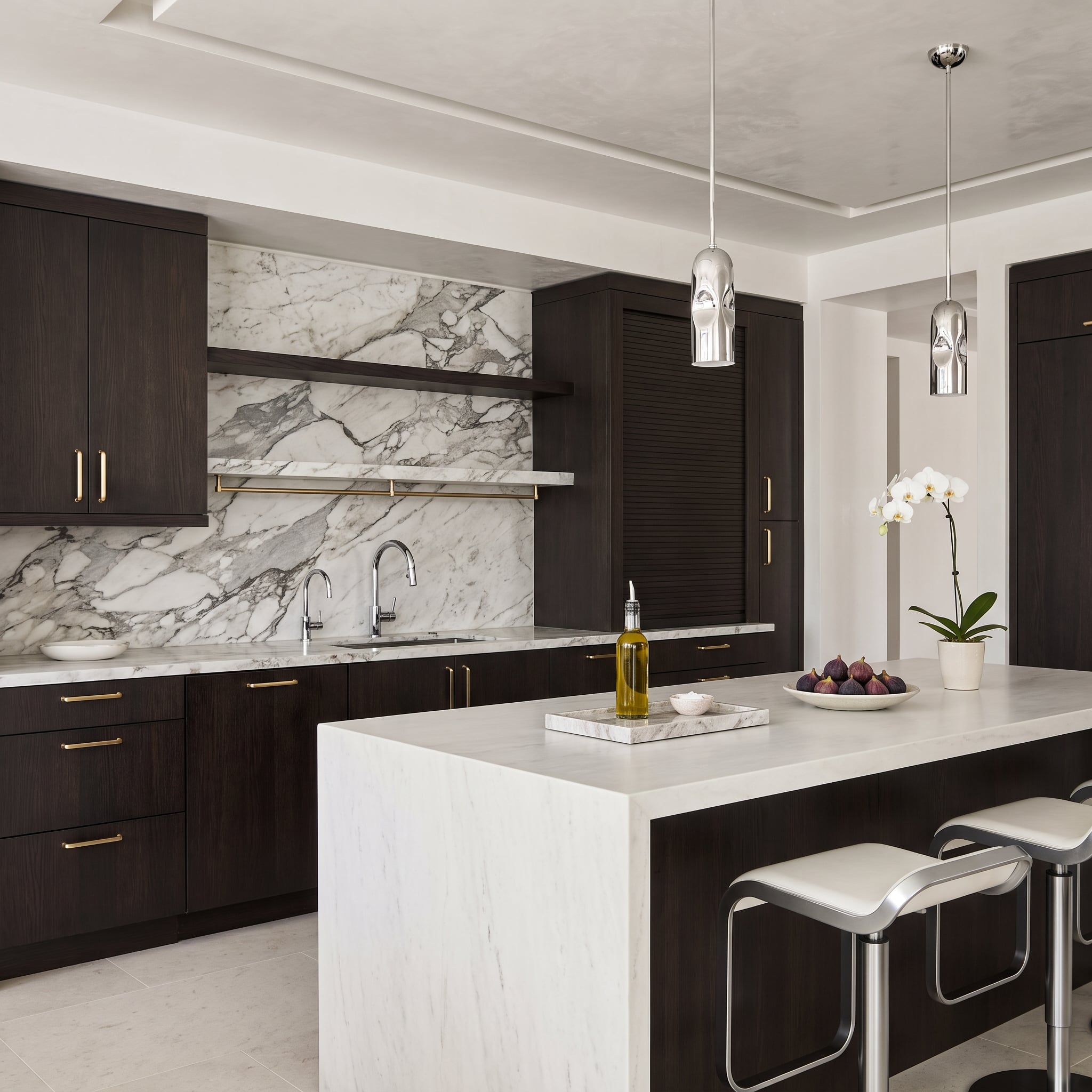
Dark espresso oak cabinets carry warm brass pulls, but the island lighting heads in another direction entirely. Polished silver-toned pendants have the reflective presence of small sculptures, reinforced by the cool metal of the faucet and barstool frames.
Calacatta marble stretches across the backsplash and waterfall island, introducing broad white surfaces and expressive gray veining. That pale stone is essential to the composition: without it, the dark wood and multiple reflective surfaces could make the room feel considerably heavier.
6. Cream Cabinets and a Black Hood Give Brass Room to Shine
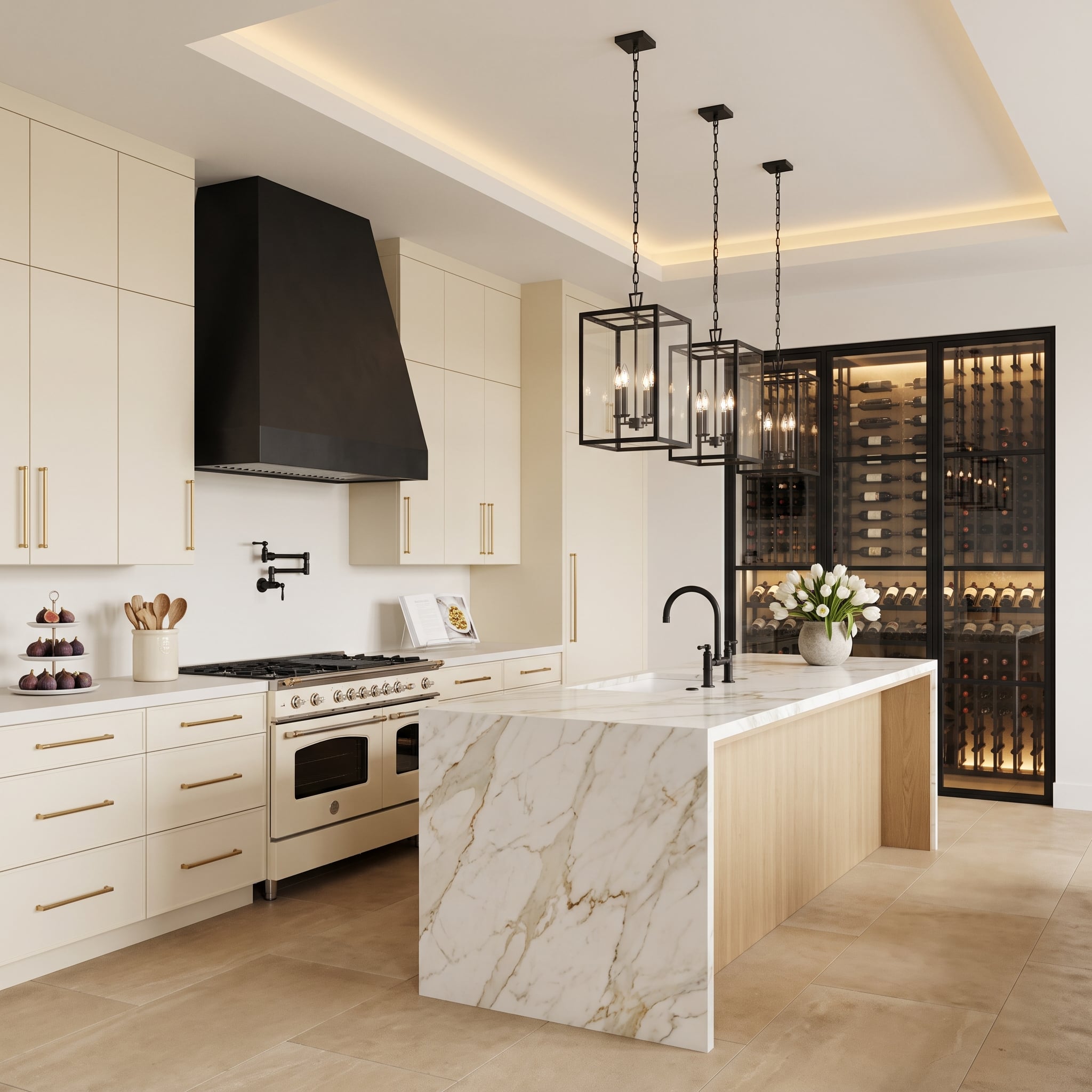
Brass pulls bring warmth to cream cabinetry, while a matte black range hood and matching lantern-style pendants create a sharper contrast above. The marble waterfall island introduces a broad pale surface between the darker overhead fixtures and the warm cabinetry.
The arrangement demonstrates how a light kitchen can accommodate black metal without becoming stark. Brass remains visible at hand level, black defines the larger overhead shapes, and the stone provides enough visual space between them.
5. A Slate-and-Walnut Kitchen Uses Brushed Steel for Its Sharpest Contrast
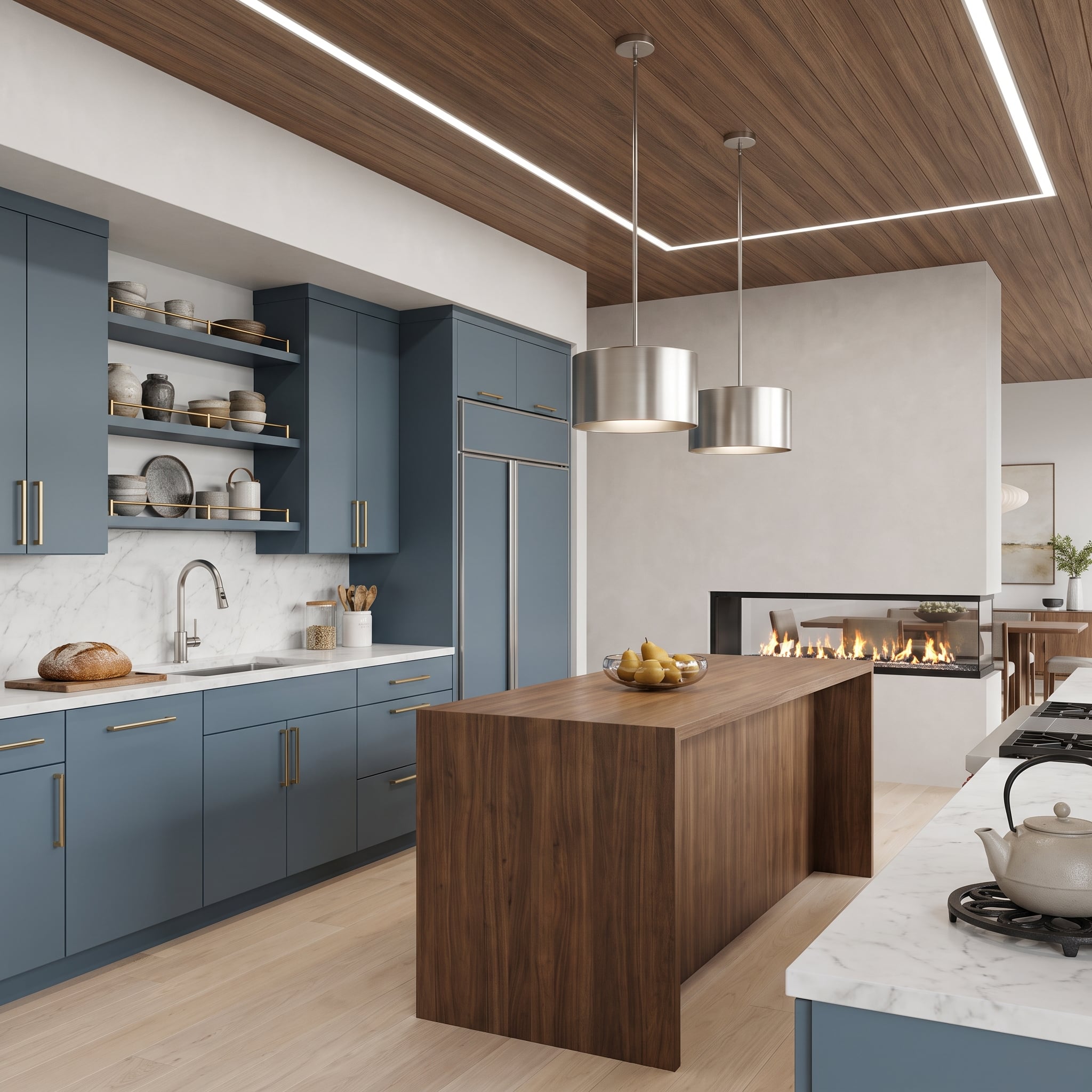
Slate blue cabinetry with brass pulls surrounds a walnut island, while brushed steel pendants introduce a cooler metallic surface overhead. The wood-planked ceiling repeats the island’s warmth, and linear lighting emphasizes its long, clean geometry.
There’s a useful distinction between the two metals. Brass appears in small, regularly spaced cabinet details; brushed steel occupies the larger pendant shades. The contrast comes from both color and scale, not merely the decision to mix finishes.
4. A Sculptural Plaster Hood Gives Black and Brass Some Breathing Room
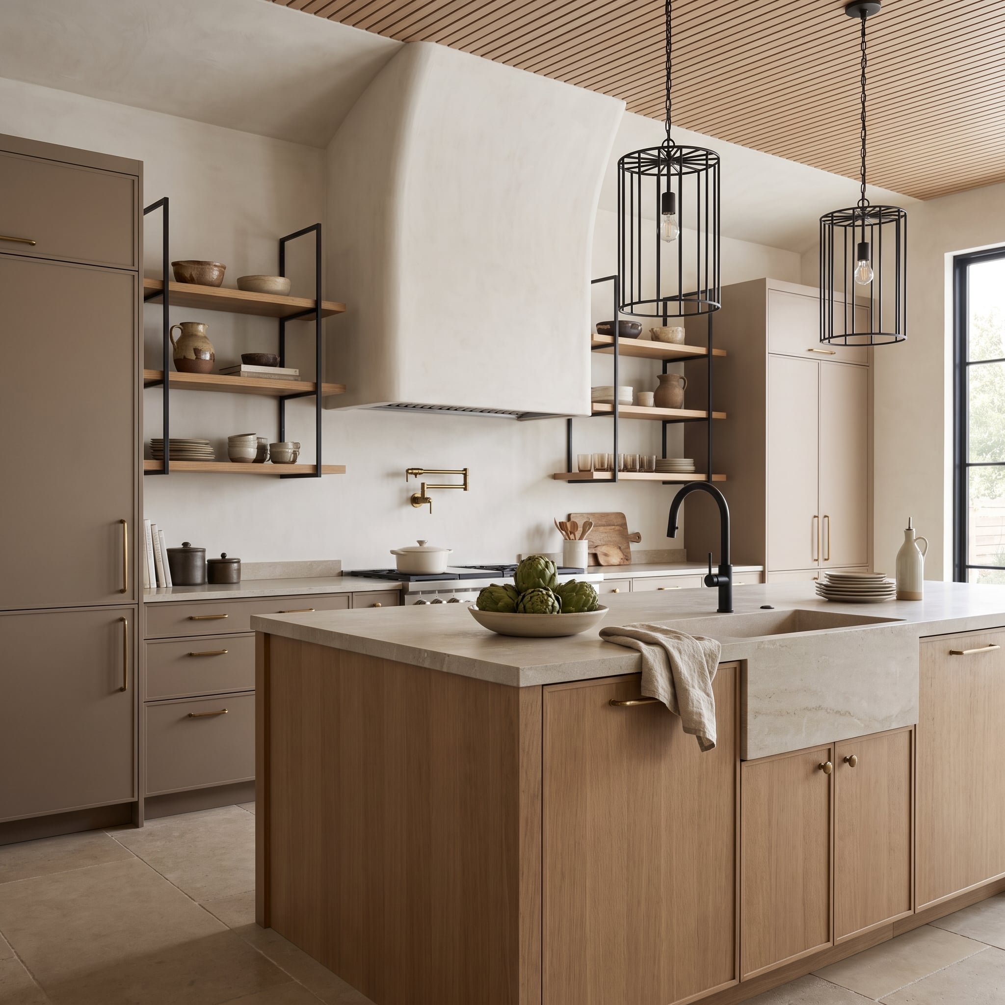
Black cage pendants, a black faucet, and steel shelf brackets establish a crisp graphic rhythm throughout the kitchen. Brass appears more sparingly at the cooking wall, where the pot filler stands out against a broad plaster surface.
That plaster hood is the room’s most effective interruption. Its sculptural shape and uninterrupted finish provide relief from the smaller metal details. Natural oak and warm greige cabinetry reinforce the softer side of the composition without diminishing the black fixtures.
3. Polished Nickel Takes the Lead While Brass Handles the Details
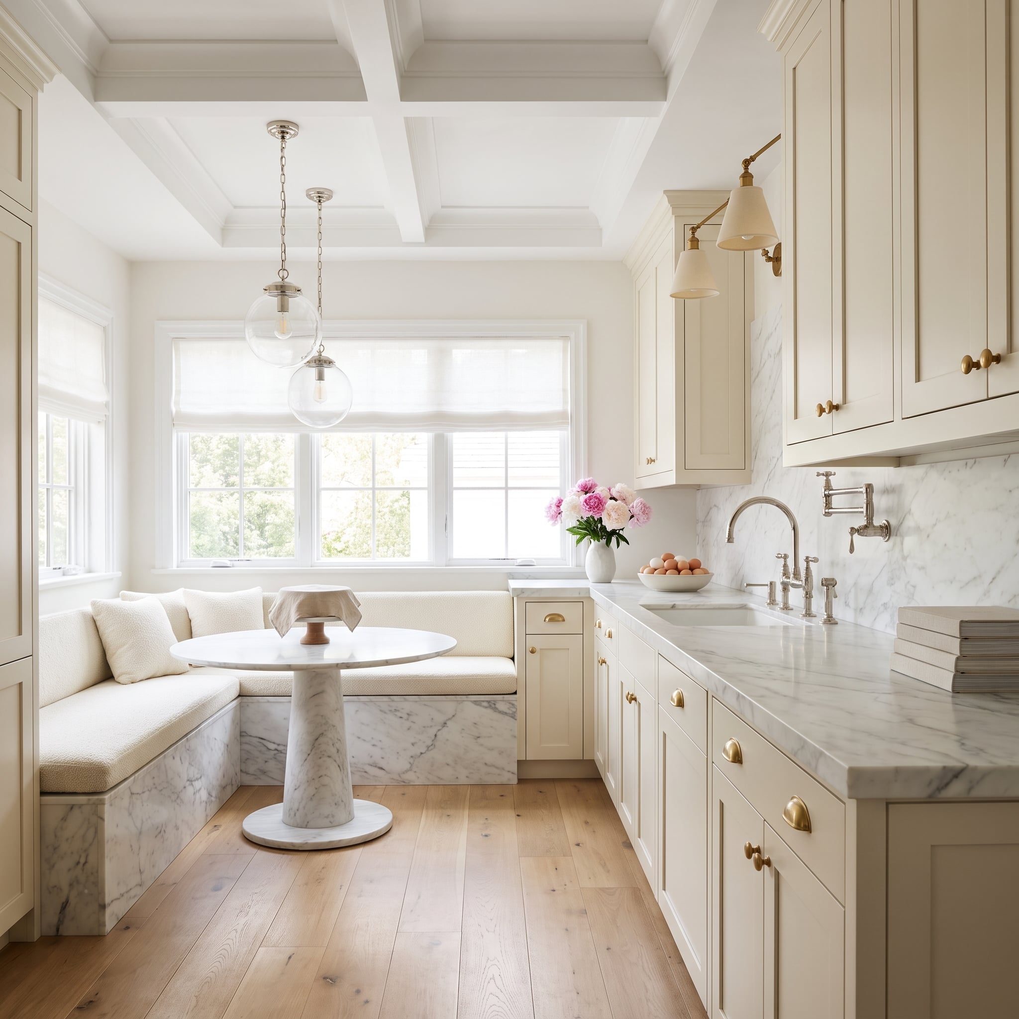
Polished nickel appears on the globe pendants, bridge faucet, pot filler, and wall sconces, establishing a consistent silver-toned presence. Brass is confined primarily to the cabinet hardware, where it warms the ivory fronts without challenging the larger fixtures.
Marble with gray veining reinforces the nickel’s cooler appearance, while the cream cabinetry gives the brass a sympathetic background. Brass stays close to the ivory cabinetry, where its warmth is most apparent, leaving the larger nickel fixtures to define the room’s cooler character.
2. Matte Black, Brass, and Travertine Find Their Balance in Texture
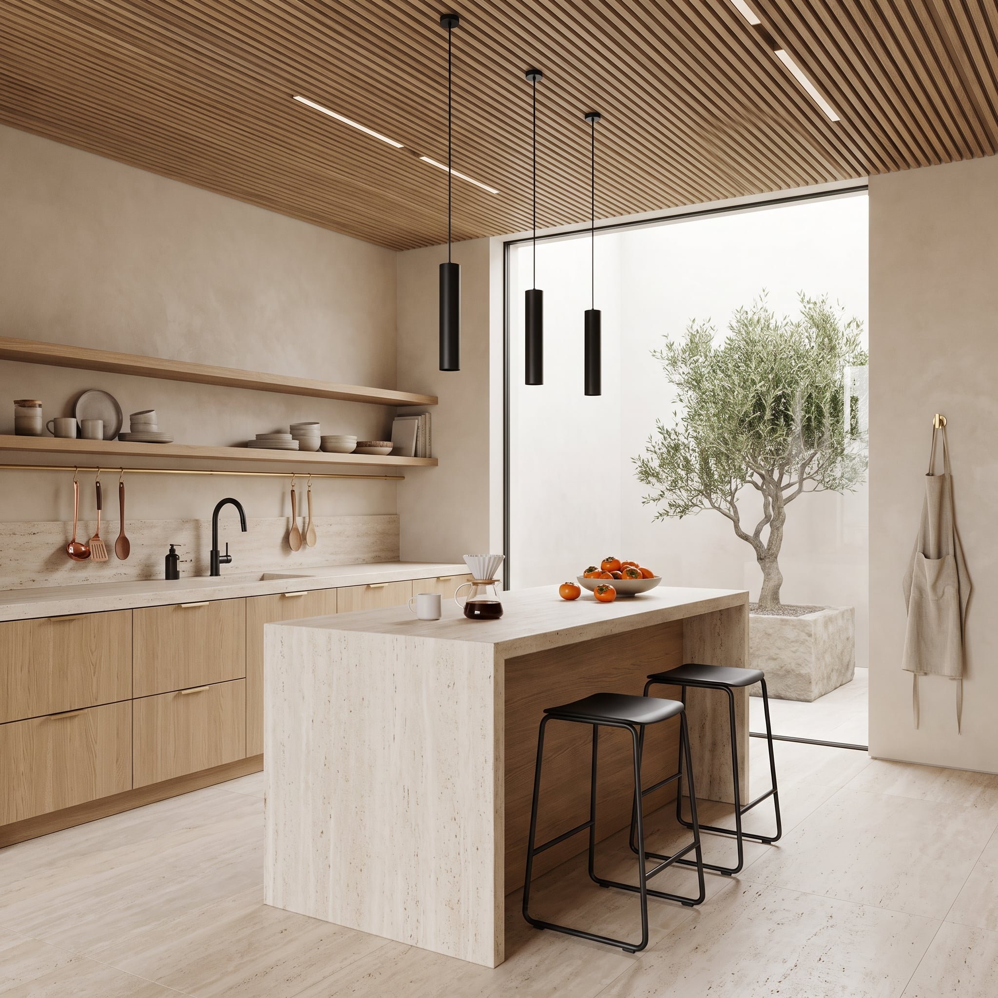
Matte black pendants hang beneath a slatted wood ceiling, while copper utensils and brass cabinet pulls introduce smaller warm metallic details below. The island’s travertine slab sides supply a substantial natural-stone presence, their varied surface contrasting with the smooth black fixtures.
The combination succeeds through differences in texture as much as color. Travertine has a softly patterned, mineral-rich surface; black metal is crisp and uniform; copper and brass catch the light in warmer tones. Together, they create a kitchen with considerably more depth than a single-finish scheme.
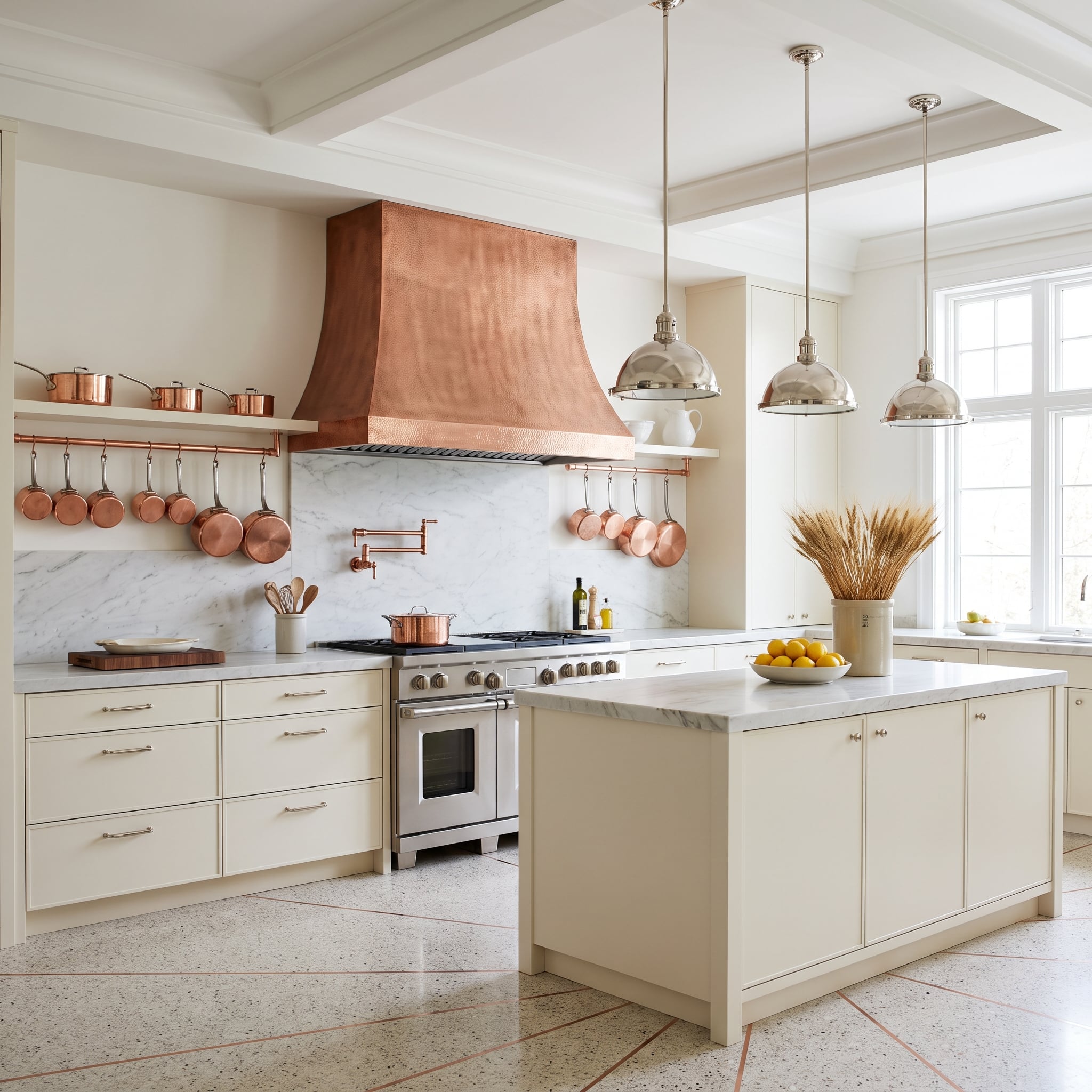
1. Cream Cabinets, a Hammered Copper Hood, and Polished Nickel That Held Its Own
Hammered copper dominates the cooking wall, its textured surface catching light differently from the smooth polished nickel pendants above the island. Cream cabinetry and a Carrara marble backsplash provide a pale setting for both, allowing the copper’s reddish warmth and the nickel’s silvery reflection to remain distinct.
Copper cookware hanging from a pot rail extends the hood’s color across the wall without requiring matching cabinet hardware or lighting. The composition makes a persuasive case for mixing metals because the differences are impossible to miss: hammered against polished, warm against cool, sculptural against restrained. Matching every fixture would remove precisely the contrast that gives this kitchen its character.