
🔥 Would you like to save this?
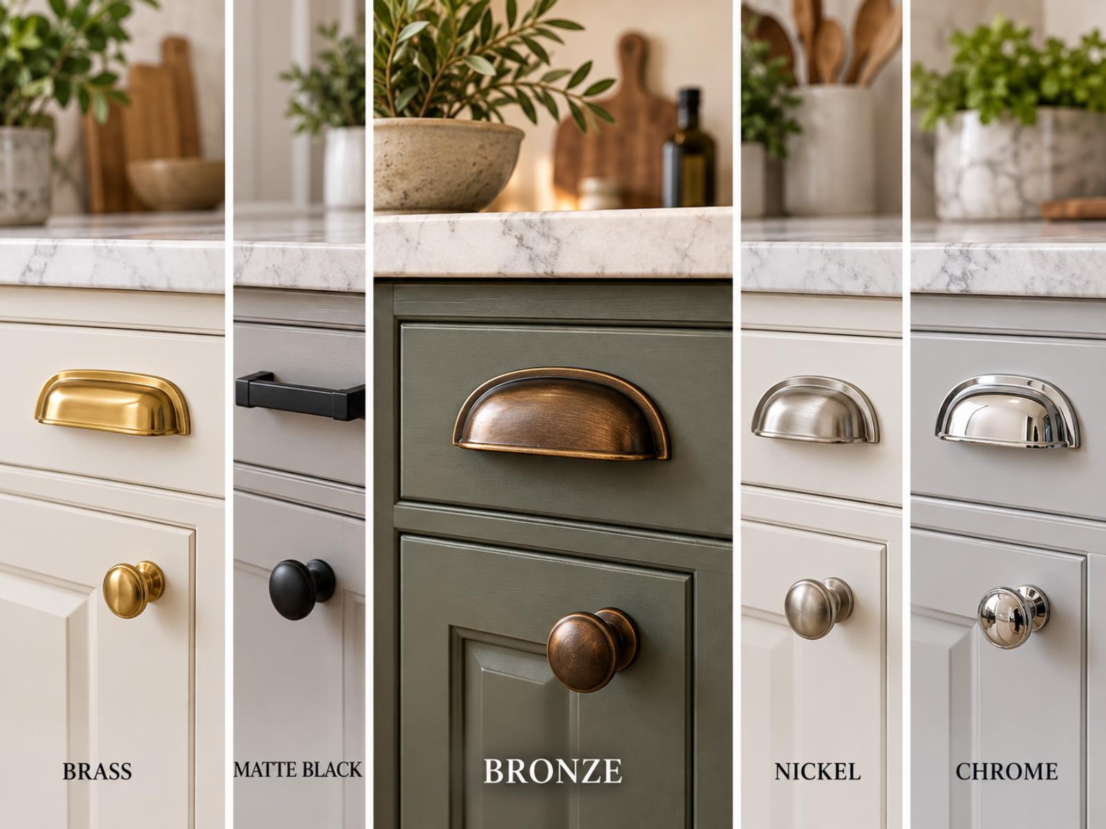
Brass gets a ton of attention in kitchen design. Matte black has been everywhere for years.
But neither one came out on top in our kitchen hardware data.
Bronze did.
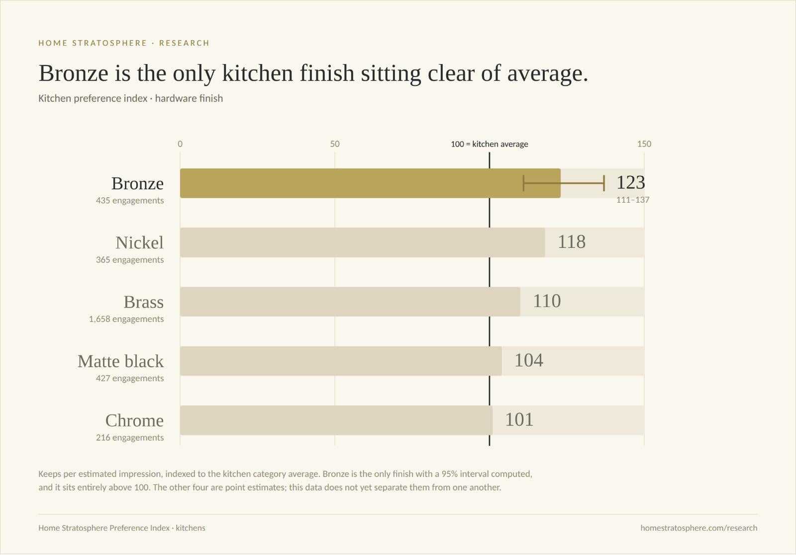
Across the kitchen images we’ve measured on Home Stratosphere, bronze hardware recorded a Preference Index of 123. Nickel wasn’t far behind at 118, followed by brass at 110.
Matte black scored 104. Chrome came in at 101.
So this isn’t a story about readers hating matte black. It’s something more subtle. Three of these five finishes sit clear of the kitchen average once you account for uncertainty. Two don’t. And the two that don’t are the two polished, high-contrast finishes.
Three Finishes Clear the Average
Our Preference Index measures reader keeps—love and save actions relative to estimated image exposure—against the average for the kitchen category.
An index of 100 represents the category average.
| Hardware finish | Preference Index | 95% CI | Engagements |
|---|---|---|---|
| Bronze | 123 | 111–135 | 435 |
| Nickel | 118 | 106–130 | 365 |
| Brass | 110 | 105–115 | 1,658 |
| Matte black | 104 | 94–114 | 427 |
| Chrome | 101 | 88–114 | 216 |
The confidence intervals are what make this readable.
Bronze runs 111 to 135. Nickel runs 106 to 130. Brass runs 105 to 115. All three sit entirely above 100, which means all three drew keeps at a rate the category average doesn’t explain.
Matte black runs 94 to 114. Chrome runs 88 to 114. Both cross 100. Our data doesn’t establish that either finish performs differently from average in either direction.
One thing I want to be clear about, because it matters for how you read the ranking: no two finishes here separate from each other. Every interval overlaps every other interval. Bronze’s 123 is the highest number in the table, but I can’t tell you bronze beats nickel, or nickel beats brass. What the data supports is the split between the three that clear the average and the two that don’t—not the order within either group.
Brass Has the Biggest Sample and the Tightest Interval
Brass is clearly important in our dataset.
With 1,658 engagements, we have considerably more interaction data associated with brass than any of the other finishes in this comparison.
That sample size buys precision. Brass’s interval runs 105 to 115—a ten-point spread, against bronze’s twenty-four and chrome’s twenty-six. It’s the finish we know the most about, and what we know is that it sits modestly but reliably above average.
Bronze’s point estimate is higher. Its interval is also more than twice as wide, and it overlaps brass throughout. So the honest read isn’t that bronze beats brass. It’s that bronze reaches a number brass doesn’t—on a quarter of the evidence.
A finish doesn’t have to dominate Pinterest boards or product catalogs to generate a strong response when people actually encounter it. But it does need enough exposure before I’ll call it a winner.
Matte Black and Chrome Are the Two That Don’t Clear
Matte black is another interesting result.
Few hardware finishes have been as visible in kitchen design over the last several years. Black faucets, pulls and knobs became an easy way to add contrast to white and light-wood kitchens.
In our data, though, matte black scored 104 with an interval of 94 to 114.
That interval straddles the average. Chrome’s 101, running 88 to 114, does the same.
That doesn’t mean readers dislike either finish—the data doesn’t establish that they underperform either. It means we have no evidence that either one is doing anything the category average doesn’t already account for.
Which is the more interesting result, given how much kitchen imagery over the past five years has leaned on black hardware for contrast.
How the finishes compare
| Finish | Index vs. kitchen average | Difference from 100 |
|---|---|---|
| Bronze | 123 | +23% |
| Nickel | 118 | +18% |
| Brass | 110 | +10% |
| Matte black | 104 | +4% |
| Chrome | 101 | +1% |
The progression looks orderly, and that orderliness is exactly what the intervals warn you not to trust. Bronze at 123 and nickel at 118 are five points apart on intervals twenty-four points wide. Read the groups, not the ranking.
There Could Be a Broader Shift Toward Warmer, Less Polished Finishes
Here’s where I have to separate the data from my interpretation of it.
The data tells us three finishes cleared the kitchen average and two didn’t. The three that cleared—bronze, nickel, brass—are warm or brushed. The two that didn’t are the polished, high-contrast ones.
It doesn’t tell us why.
But bronze does fit neatly into a broader design aesthetic that’s become increasingly visible: warmer materials, aged finishes, natural woods and rooms that feel less pristine and more collected.
Bronze has some character to it.
It can look old without looking dated. It works with wood. It doesn’t create the hard contrast of matte black or the shinier appearance associated with some chrome finishes.
Maybe that’s part of what’s driving the response.
Or maybe the warm finishes happen to appear more frequently in kitchens containing other attributes our readers like.
That’s one of the limitations of observational data like this—and something we can investigate as the dataset gets larger.
This Is More Interesting as a Product Signal Than a Trend Prediction
I wouldn’t look at these numbers and announce that bronze is about to replace brass.
That’s way beyond what the data supports.
If I were a cabinet hardware manufacturer, retailer or kitchen brand, though, I’d want to know why my matte black photography isn’t earning anything above average—and I’d make sure bronze wasn’t buried on page six of the catalog.
I’d test it.
I’d test bronze against brass in otherwise similar kitchen photography. I’d look at whether bronze performs particularly well with natural wood, cream or painted cabinetry. I’d test aged bronze separately from darker oil-rubbed finishes.
And I’d watch whether the gap grows as we collect more data.
That’s the value of this kind of behavioral data. It doesn’t have to predict the entire kitchen industry.
It just has to point toward something worth testing.
Right now, bronze looks worth testing.
The Takeaway
There isn’t a loser in this comparison. Nothing here indexes below average.
But there is a split.
Bronze at 123, nickel at 118 and brass at 110 all sit clear of the kitchen average. Matte black at 104 and chrome at 101 don’t—their intervals cross it.
I can’t rank the three winners against each other. Every interval overlaps. What I can say is that the finishes doing something measurable are the warm and brushed ones, and the two that aren’t are the polished, high-contrast ones.
For an industry that has spent five years putting black hardware in every kitchen photograph, that’s the part worth sitting with.
About the Data
Home Stratosphere measures reader interactions with individual images across our published design content. The Preference Index compares keeps—love and save actions relative to estimated image exposure—for an attribute value against the average for its category. An index of 100 represents the category average.
This is observational image-preference data, not sales or purchase-intent data. Impressions are sampled and scaled estimates, and results are most useful for comparisons within the same category. Where two intervals overlap, no difference between those values is claimed.












