
Somewhere along the way, kitchen design decided that backsplashes should behave themselves. White subway tile, pale stone, a tasteful suggestion of texture. Nothing that might frighten the cabinets. Nothing that might make the room feel smaller. Apparently, the wall behind the stove was expected to apologize for existing.
In order to come up with the very specific design ideas, we create most designs with the assistance of state-of-the-art AI interior design software. Also, assume links that take you off the site are affiliate links such as links to Amazon. this means we may earn a commission if you buy something.
These kitchens have a different idea. Black marble rises behind butter-yellow cabinets. Oxblood tile turns a cooking alcove into something approaching a jewel box. Green stone absorbs entire range hoods, while bronze mirrors borrow the skyline and copper walls make a virtue of their irregular patina.
The trick isn’t simply putting something dark behind something light. A shadowed wall can sharpen the outline of pale oak, make cream lacquer appear brighter and give a kitchen depth without closing it in. Sometimes the backsplash works like a picture frame; elsewhere, it becomes part of the architecture. Across these 32 kitchens, shade turns out to be an unexpectedly effective way of bringing everything else into the light.
32. Olive Tile Turns a Kitchen Window Into an Architectural Feature
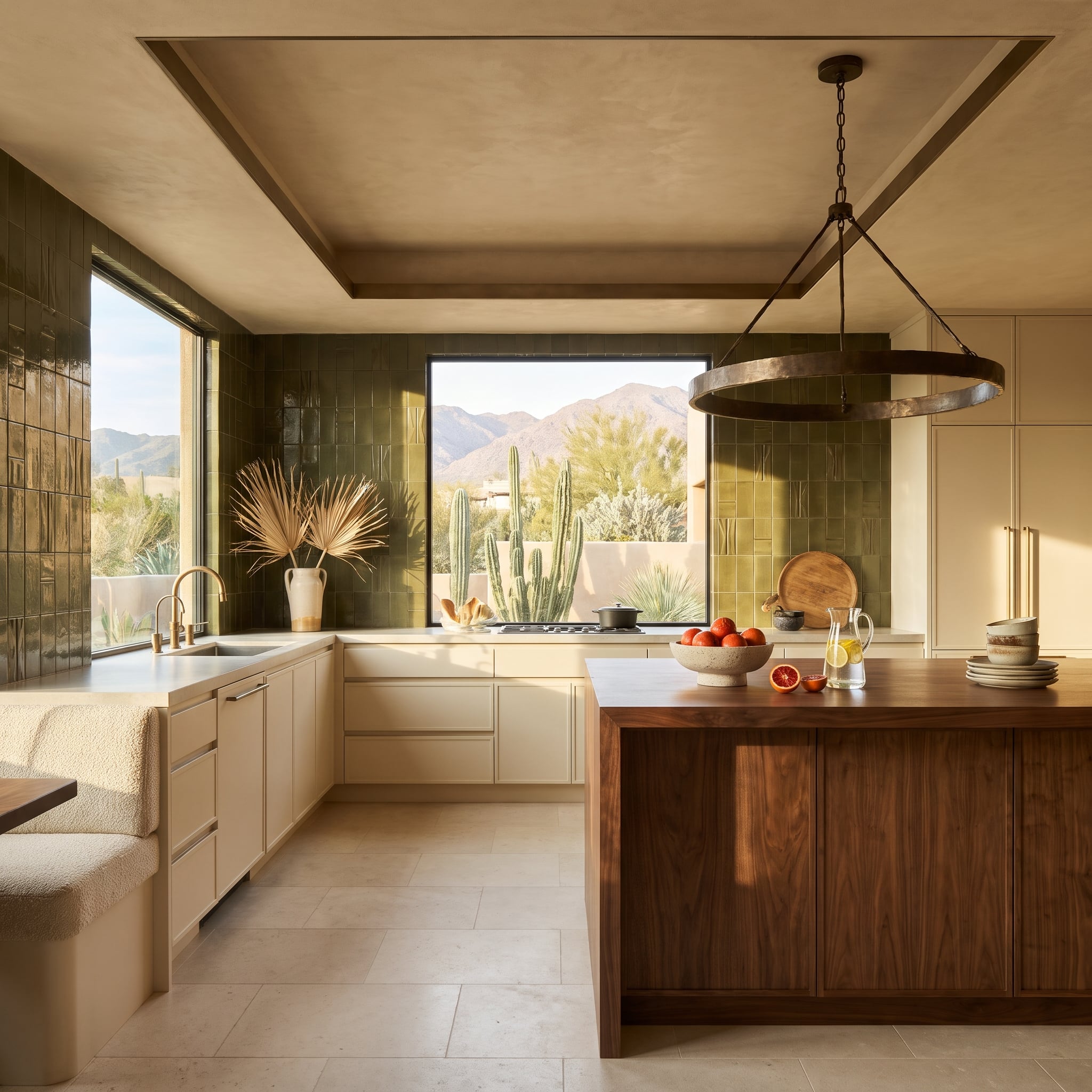
The usual range-hood silhouette has been replaced by a picture window, and the saguaro outside makes a more memorable centerpiece than another stainless-steel canopy. Olive-green glazed tile surrounds the glass, its varied surface catching the light while cream cabinets establish a restrained lower edge.
Instead of stopping at the countertop, the tile treats the window like a framed landscape. Relief-patterned pieces introduce small changes in texture among the smoother tiles, particularly where daylight crosses the surface at an angle. The cactus occupies the position usually reserved for the appliance, while the olive glaze draws its color from the desert without attempting to reproduce its textures.
Practical Detail: No range hood is visible above the cooktop. Any working installation would need a code-compliant ventilation arrangement suited to the equipment and local requirements.
31. Gold Veining Flashes Across Black Marble Above the City
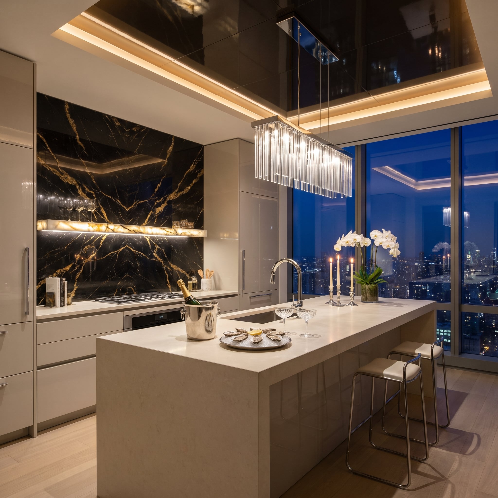
Black marble streaked with gold has little interest in being a supporting material. The veining gathers into dramatic angled formations above the cooktop, creating an almost mirrored composition that competes with the city lights beyond the windows.
An illuminated onyx shelf introduces another layer of light across the stone. Rather than illuminating the marble from within, the glowing shelf forms a separate luminous band against its dark surface. Pale lacquer cabinetry keeps the surrounding architecture from becoming equally assertive. This is a kitchen where the backsplash has all the visual energy of a chandelier, without hanging anything from the ceiling.
30. A Copper Wall Gives Cream Cabinets Something to Grow Old With
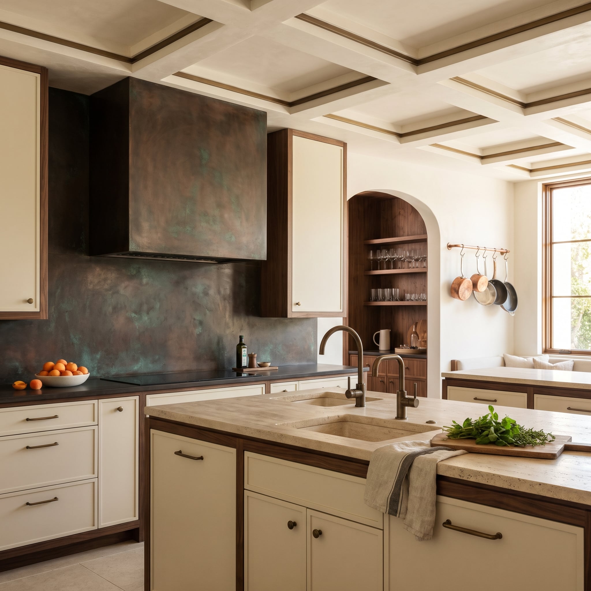
Copper covers the backsplash and hood in one expansive sweep, its mottled brown surface interrupted by greenish verdigris. Whether naturally developed or deliberately applied, the patinated finish has an irregularity that polished copper could never manage. Darker patches absorb more light, while the warmer metallic areas catch it, giving the wall a varied appearance as the light shifts.
Cream cabinet doors acquire walnut frames that repeat the copper’s darker tones without copying its texture. Below, a honed travertine island introduces a much paler surface, while bronze faucets and hanging copper pans extend the metallic palette into the foreground. The temptation would be to add more copper. The better decision is knowing when the collection is complete.
29. Emerald Stone Disappears Into the Range Hood Beneath a Timber Ceiling
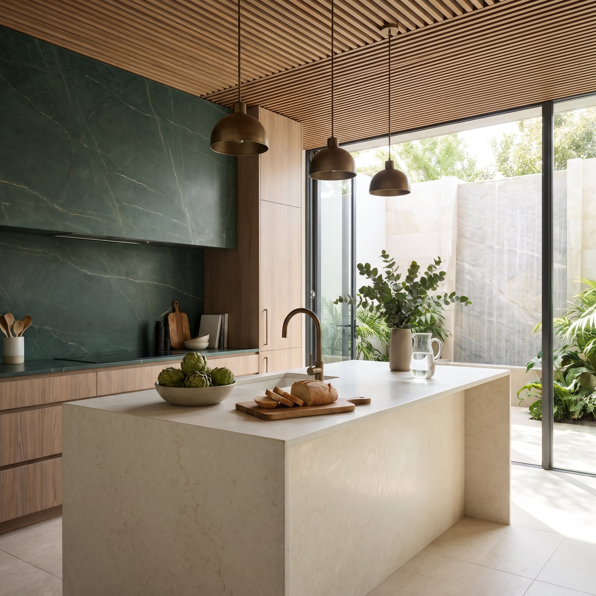
Emerald stone rises from the countertop to the ceiling, then continues across the hood enclosure. The cooking zone becomes one uninterrupted composition of green and gold veining, with the appliance concealed inside the same material rather than interrupting it with a conventional metal canopy.
Honey-toned wood establishes a striking architectural counterpoint. Flat-front cabinetry and a tall pantry wall share a consistent grain, while ceiling slats repeat the warmth overhead. A cream waterfall island occupies the pale foreground, and bronze dome pendants introduce smaller points of metallic color. The room balances two very different kinds of richness: the movement of stone and the regularity of timber.
Material Matters: Cladding a hood enclosure in the same stone as the backsplash can create a continuous architectural feature. The effect depends on careful joint placement, suitable support and proper accommodation of the ventilation equipment.
What Our Readers Say
- Asked which backsplash they would install themselves, Home Stratosphere readers most often chose a slab at 36%, ahead of subway tile at 30% and zellige at 22%.
From Home Stratosphere reader polls and votes.
28. Powder-Blue Cabinets Make Espresso Marble Look Unexpectedly Fresh
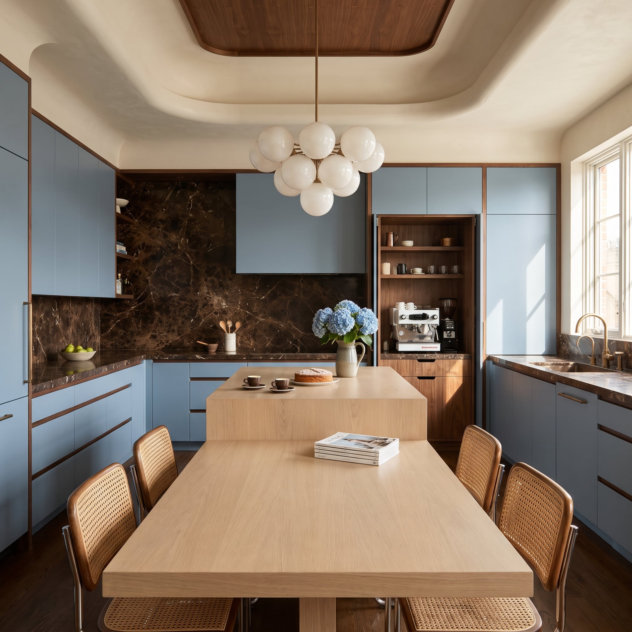
Espresso marble has found an unlikely companion in powder-blue cabinetry. The cool slab-front doors sharpen the contrast with the dark stone, while walnut edging traces the cabinetry and connects the two colors without trying to match either one.
Those timber outlines are particularly important around the coffee nook, where they turn an otherwise flat arrangement of doors into a more deliberate composition. The marble’s dark veining gains definition beside the blue, and the walnut prevents the palette from splitting into unrelated warm and cool halves. Three colors that might look disconnected on a sample board become convincing once their proportions and boundaries are carefully established.
27. Slate Turns a Range Hood Into Something Closer to a Stone Chimney
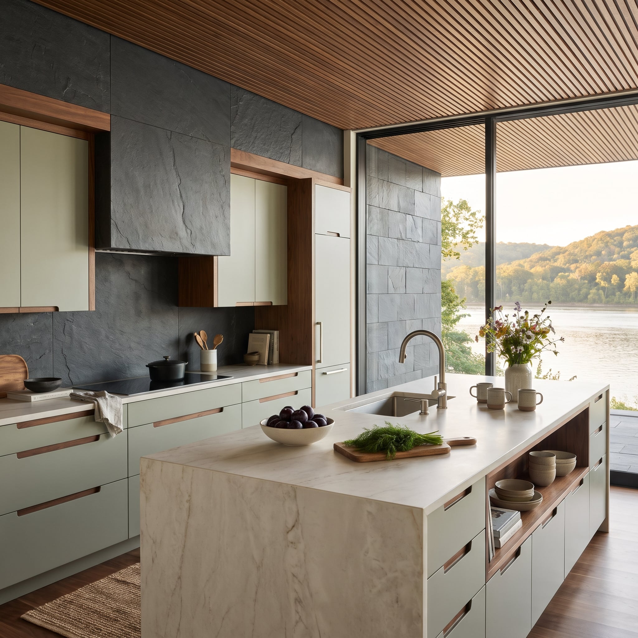
Cleft slate panels climb from the work surface and cover the hood until the cooking zone resembles a piece of masonry. The same dark material continues past the window onto the exterior wall, creating a visual connection between the kitchen and the architecture beyond its glass.
Sage cabinetry looks especially pale beside the rough slate. Walnut appears in recessed pulls, upper-cabinet framing and an open shelf within the island, bringing a more refined wood texture into the composition. The river view could easily dominate the room, yet the slate gives the interior enough substance to hold its own against the landscape.
26. Plum Tile Takes the Curves While Butter-Yellow Cabinets Hold the Line
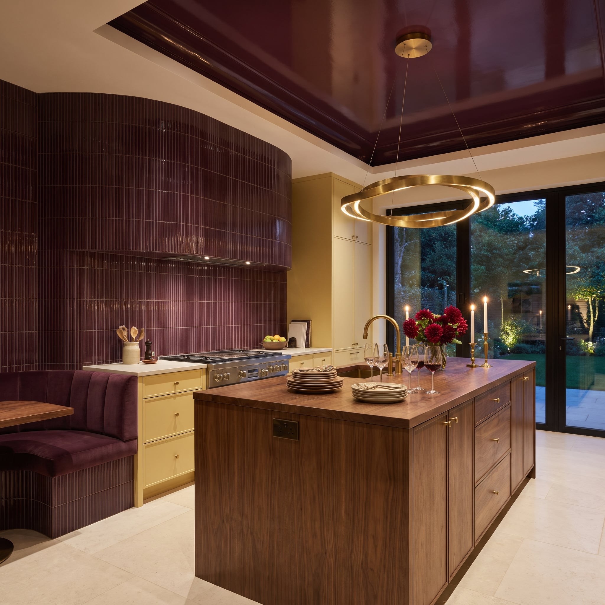
Plum tile travels vertically around the curved hood and continues beneath the banquette, making the wall treatment feel like part of the room’s construction rather than a decorative panel behind the stove. The glossy finish accentuates the curvature, with narrow joints providing a fine rhythm across the rounded surfaces.
Below, butter-yellow cabinetry introduces a clean horizontal boundary. Above, a lacquered ceiling extends the plum color across the room, creating an enveloping effect without requiring the lower cabinets to follow suit. The most interesting contrast isn’t simply yellow against purple; it’s the disciplined cabinet geometry beneath the soft, continuous curves.
25. A Blackened Steel Wall Turns Kitchen Storage Into Part of the Architecture
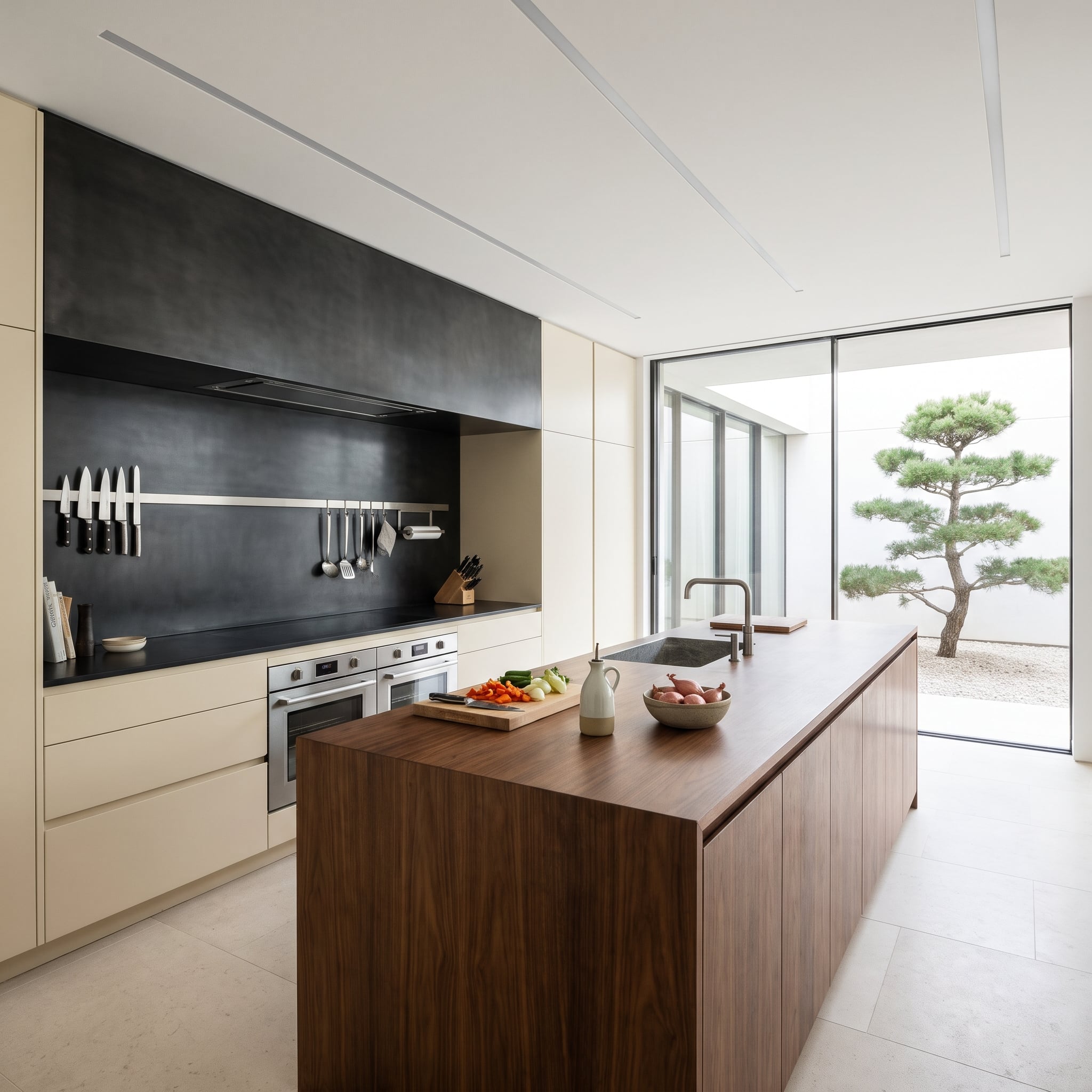
Blackened steel covers the cooking wall and conceals the hood within the same dark plane. A stainless rail crosses the surface at working height, giving utensils a place to hang without cluttering the countertop. The contrast between the two metal finishes makes the practical hardware part of the visual design.
A long walnut island directs attention toward the courtyard pine beyond the glass. Its warm grain offsets the industrial wall, while the open view prevents the kitchen from feeling enclosed by its dark materials. The backsplash is more than an attractive surface here. It is also a working piece of storage infrastructure.
Not everyone is sold on dark metal, though: kitchen images featuring black metal got hearts 51% of the time from our readers, slightly fewer than the 57% for other kitchens in the same articles.
24. Wine-Red Marble Makes a Floating Shelf Look Almost Weightless
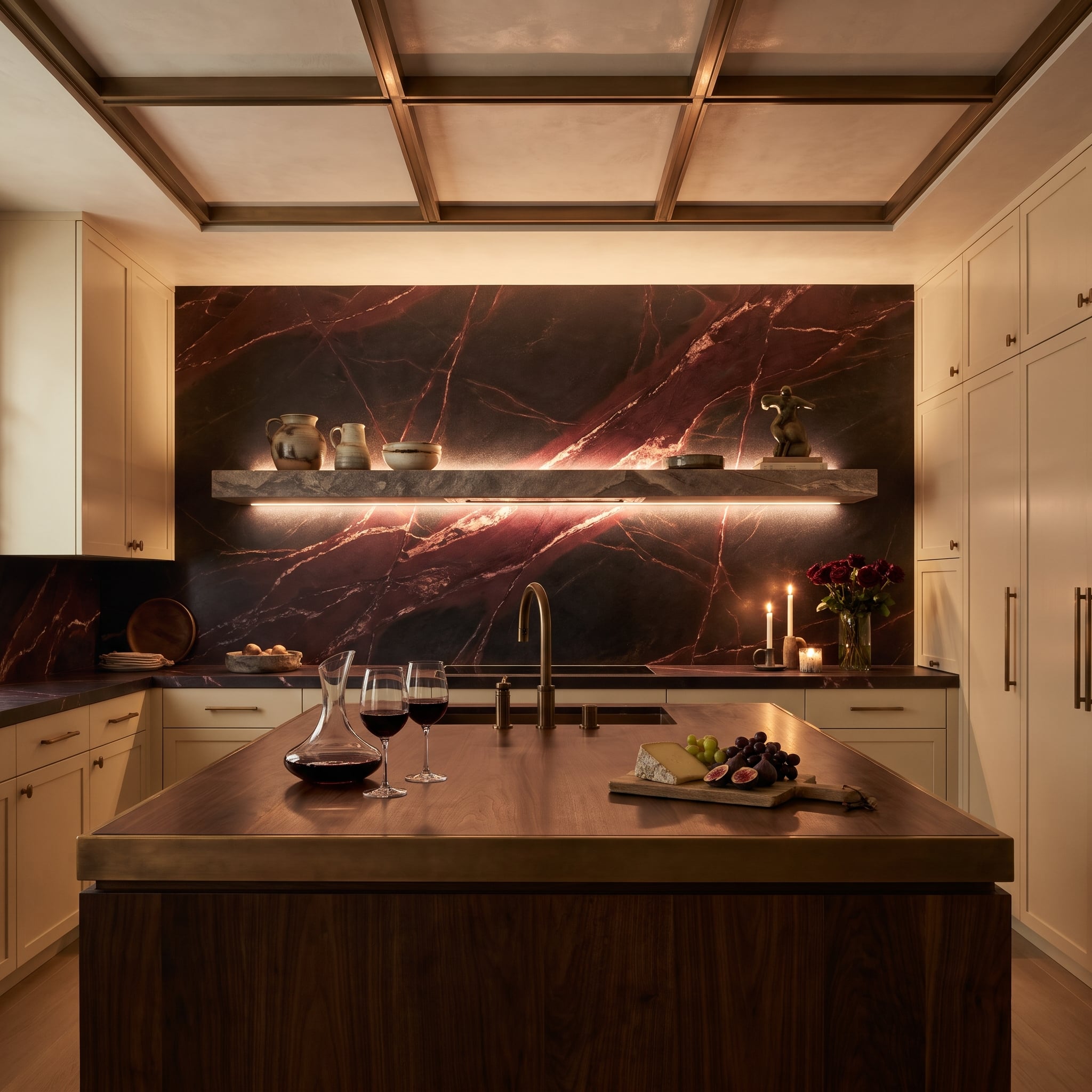
Burgundy veins travel across near-black stone behind a substantial floating shelf. Lighting concealed beneath the shelf grazes the surface, drawing attention to the red streaks and the subtle changes in the slab’s finish. Cream Shaker cabinetry on either side frames the darker centerpiece.
A walnut island introduces another warm material in the foreground, its bronze detailing echoed by the faucet, cabinet hardware and ceiling grid. Those repeated metallic accents connect the different parts of the kitchen without requiring every surface to share the same color. The illuminated shelf is the cleverest element: a heavy piece of stone that appears to hover against an even heavier wall.
23. A Greenhouse Window Turns Bottle-Green Zellige Into an Indoor Landscape
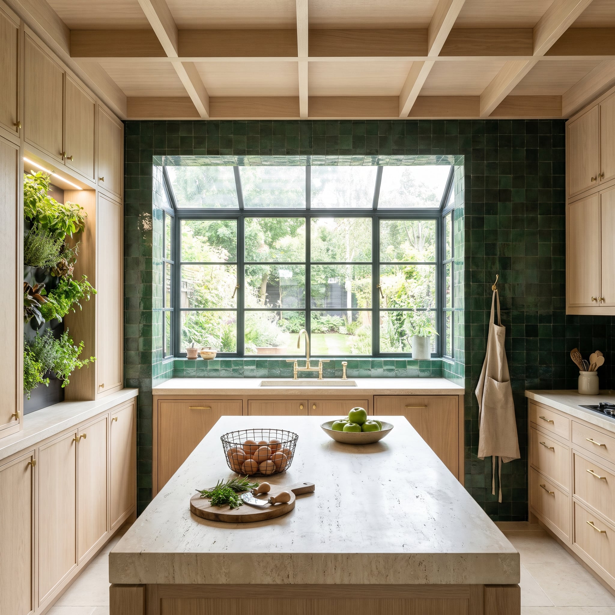
Bottle-green zellige refuses to stop at the edge of the window. The tiles continue across the reveals, sill and overhead surface of the greenhouse-like bay, making the steel-framed glazing appear recessed into a continuous green enclosure. Daylight shifts the glossy surface toward jade in places, creating variations that a uniform painted wall would struggle to reproduce.
Pale oak Shaker cabinets, brass hardware and a substantial travertine island introduce quieter textures around the saturated tile. A planted niche adds another layer of green, echoing the vegetation outside the window. The zellige borrows its color from the garden, while its glazed surface transforms that color into something distinctly architectural.
Construction Note: Extending backsplash tile into a window reveal creates a more continuous appearance, but a tiled sill near a sink needs appropriate waterproofing, sound grout joints and careful detailing at the window frame.
22. A Bronze Mirror Borrows the Skyline Instead of Competing With It
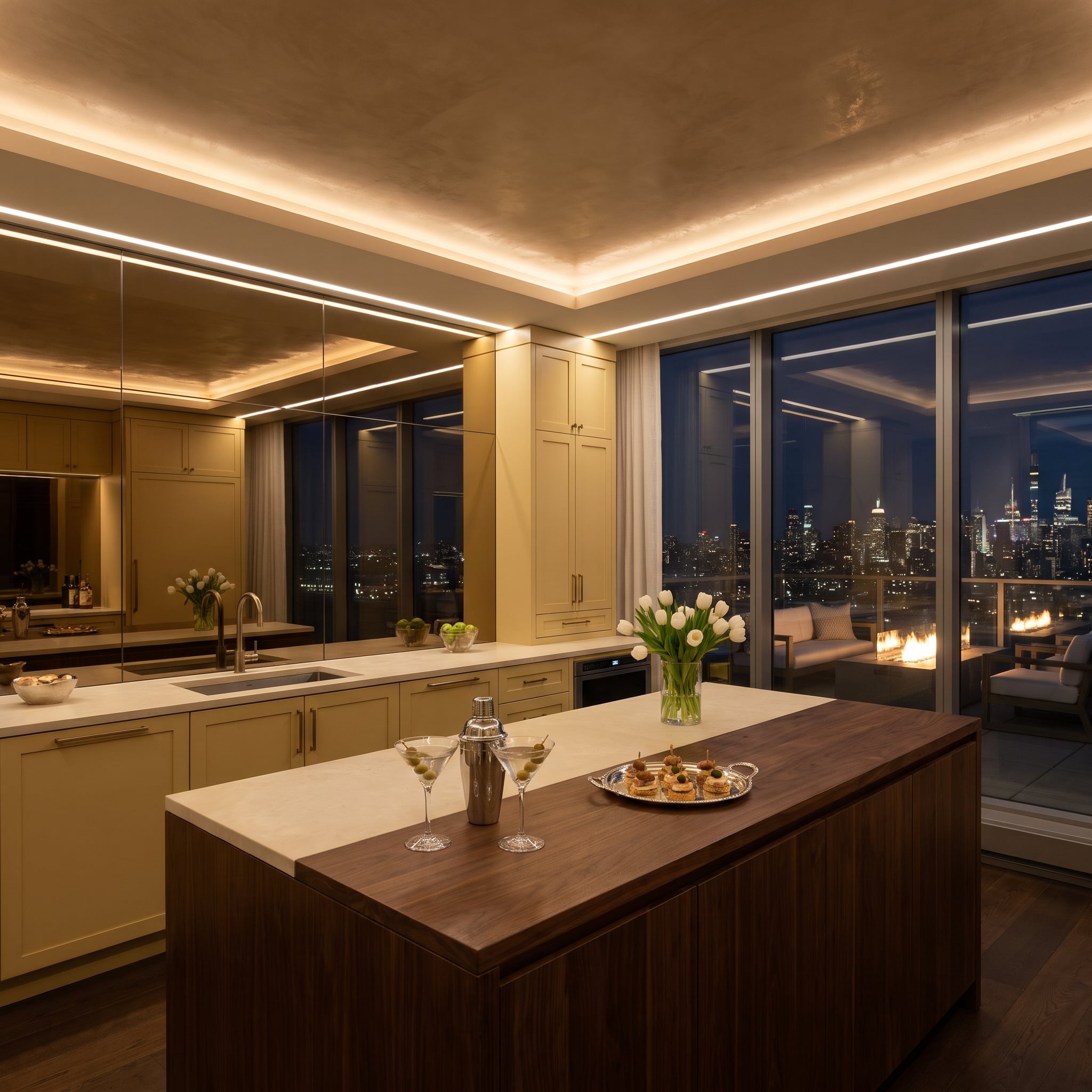
Most backsplashes stop the view at the wall. Bronze-tinted mirror does the opposite, catching the skyline and repeating fragments of the room across the cooking area. The warm tint softens the reflections, turning what could have been a sharp, commercial-looking surface into something more atmospheric.
Walnut cabinetry and the island anchor the composition against the shifting images in the glass. As the light changes, the backsplash changes character along with the city outside. Reflections of the room mingle with the distant buildings, creating a second, slightly elusive version of the view where a conventional tiled wall would have offered a fixed pattern.
21. Merlot Zellige Meets a Limestone Island With the Manners of a Quarry
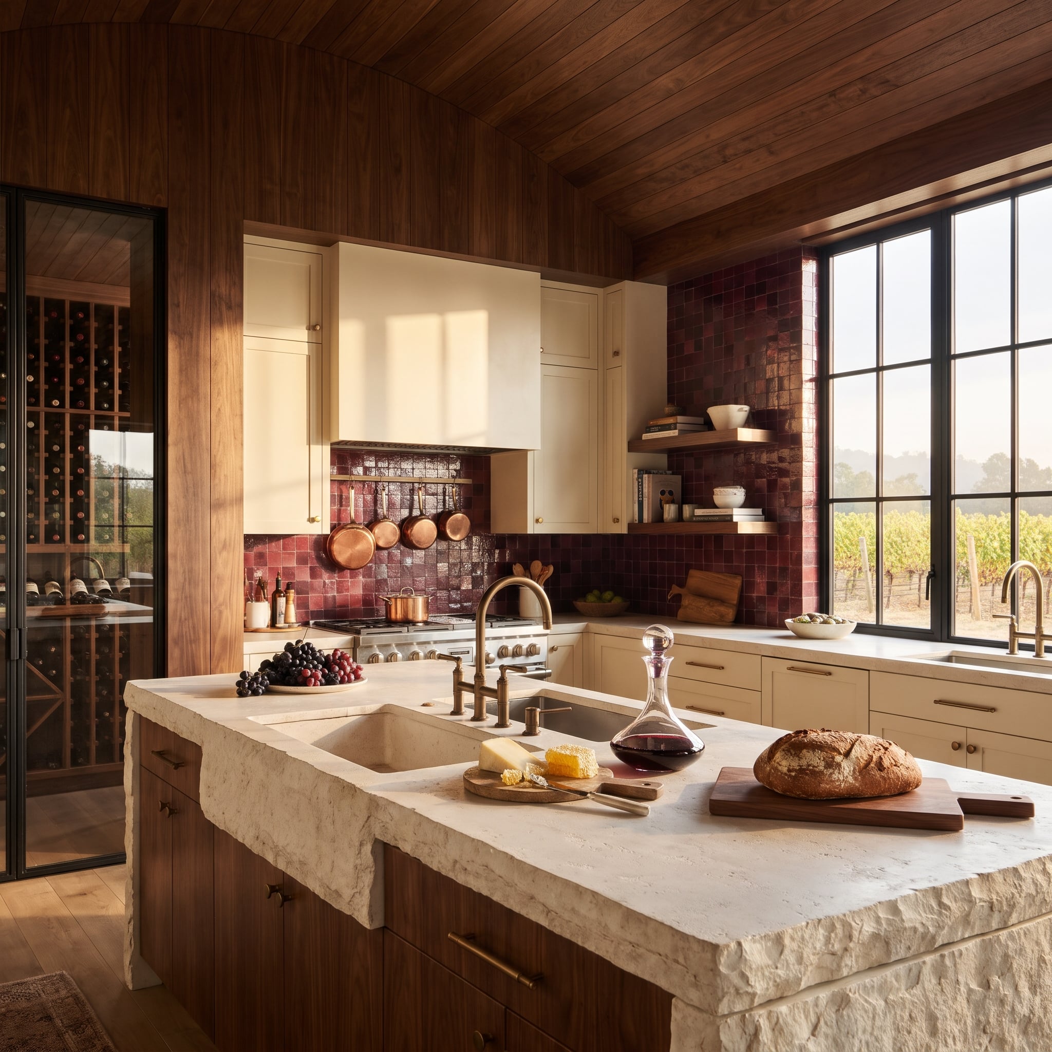
Walnut planks curve across the ceiling and continue down the walls, giving the room an enclosure reminiscent of a barrel vault. Against all that warm timber, merlot-colored zellige brings a darker, glossier surface to the cooking zone. Each tile catches the light differently, so the red reads as a collection of tones rather than one flat block of color.
The limestone island contributes the roughest texture in the room. Its chiseled edges and apron retain a quarried appearance, while the working surface is honed smooth enough for everyday use. A carved stone sink continues the material treatment. Cream Shaker cabinetry and a plaster hood leave the strongest textures to the island and backsplash, where they can be appreciated without fighting for attention.
Practical Detail: Rough-chiseled stone can be effective on an island’s vertical faces, while a honed worktop is easier to use and clean. Limestone remains porous, so finish selection, sealing and maintenance still matter.
20. Pale Oak and Travertine Give Green Glaze the Entire Upper Wall
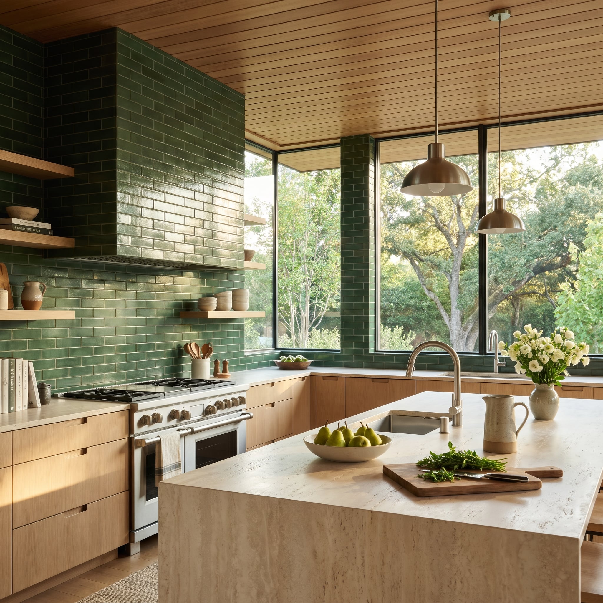
Green glazed tile climbs well beyond the usual backsplash boundary. It covers the hood enclosure and reappears on the narrow column between the corner windows, turning the saturated color into a recurring architectural feature. Uneven reflections give the glossy surface movement, particularly where the late light strikes it.
Below, pale oak drawers use recessed finger pulls rather than applied hardware. A travertine island drops to the floor in a waterfall end, adding a substantial pale form to the center of the kitchen. The slatted timber ceiling repeats the cabinetry’s warmth overhead. Rather than treating the green as an accent, the design lets it occupy the room’s strongest vertical elements.
19. Dark Plaster Displays the Ceramics While Stainless Steel Handles the Cooking
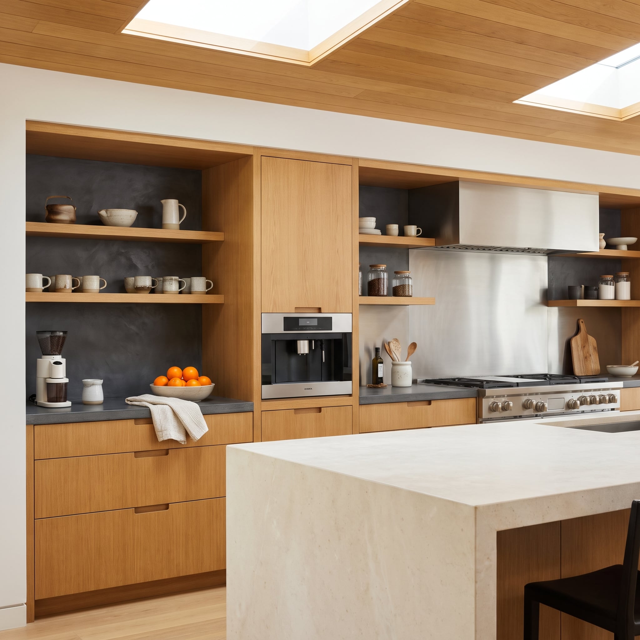
Charcoal plaster lines the oak shelving niches, providing a dark background for pale mugs, bowls and stoneware. The ceramics read almost like objects in a small gallery, with their shapes made clearer by the contrast. Behind the burners, the material changes to stainless steel, a smoother and more practical choice for a surface exposed to frequent cooking splatter.
Routed finger pulls keep the lower oak drawers free of projecting hardware, preserving the clean horizontal lines beneath the contrasting backsplash materials. Pale oak keeps the charcoal recesses from becoming oppressive, while the stainless panel handles the splashes. Different zones can demand different surfaces without sacrificing the overall composition.
Quick Fix: Reserve textured plaster for lower-splash areas such as display niches. Behind a frequently used cooktop, a suitable smooth, cleanable surface will generally be easier to maintain.
18. Oxblood Brick Gives an Industrial Loft a Very Modern Glaze
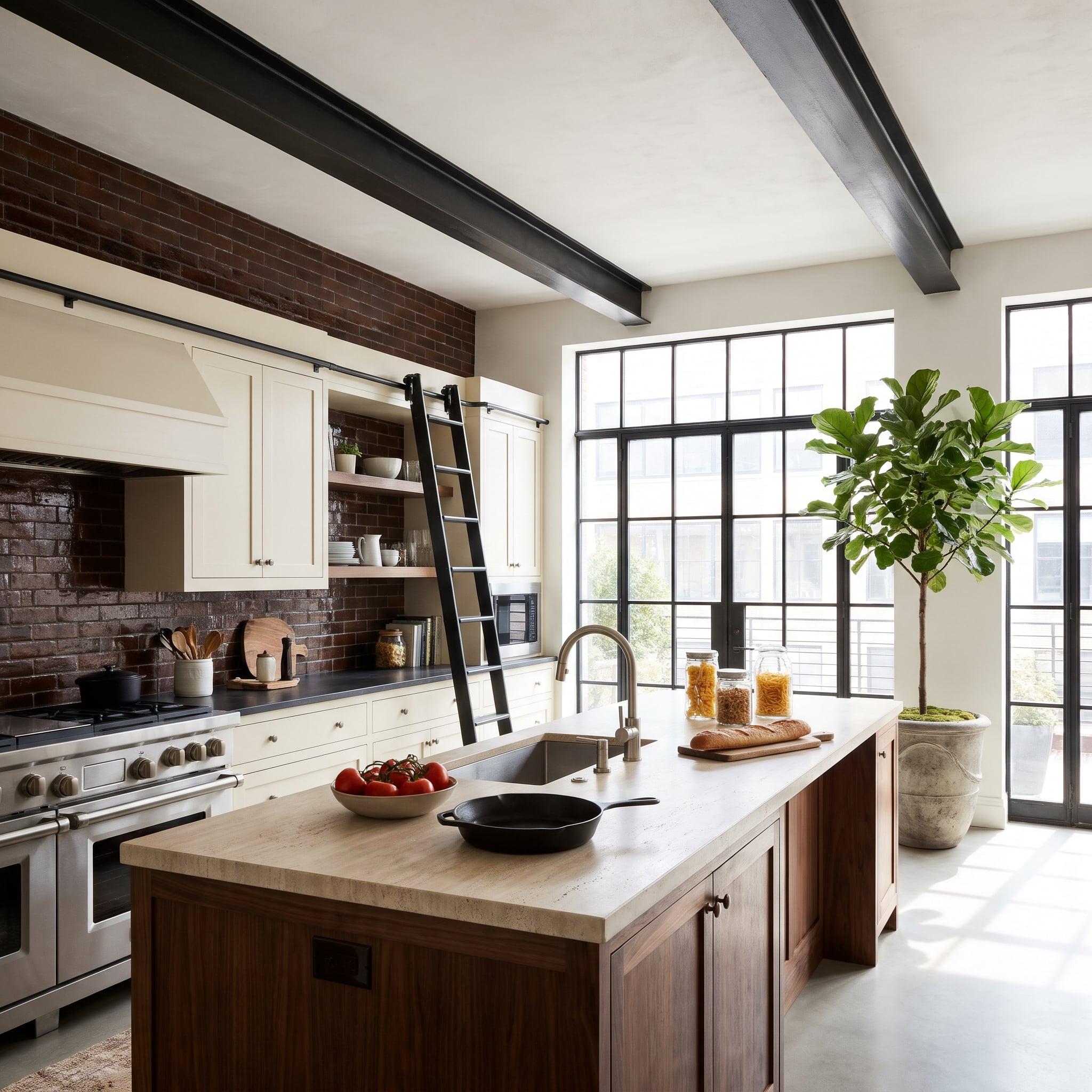
Oxblood glazed brick brings color and texture into a loft kitchen already rich with industrial details. The brick catches window light across its uneven surface, while cream Shaker cabinetry and a pale plaster hood establish a softer architectural framework. Above, the rolling ladder’s black rail echoes the steel beams.
A walnut island topped with honed travertine adds another warm material without introducing a competing pattern. The brick’s glossy finish gives the dark backsplash a reflective quality, while grout close to the tile’s color helps the wall read as one continuous field rather than a grid of individual pieces. The result feels less like an exposed old wall and more like a deliberate collision between industrial architecture and polished cabinetry.
Worth Knowing: Grout color changes the visual weight of glazed brick. A close match emphasizes the continuous color field; contrasting grout makes the individual brick pattern more prominent.
Red remains a bolder bet: in our readers’ heart votes, red-dominant kitchens got hearts 48% of the time, compared with 58% for the other kitchens in the same articles.
17. Cobalt Glaze Climbs Toward Walnut Coffers and a See-Through Fireplace
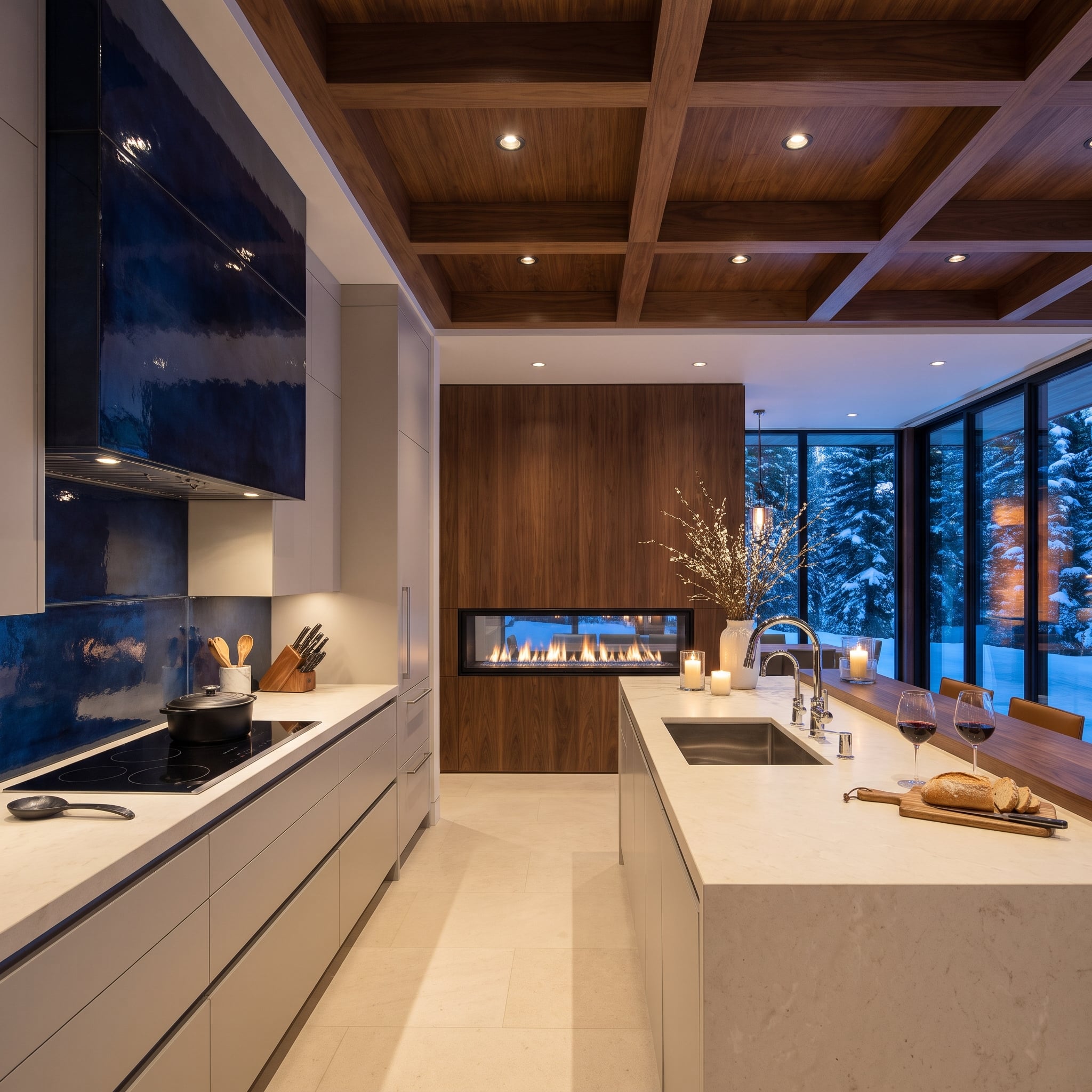
Cobalt-glazed tile rises from the countertop to the hood, concentrating the room’s strongest color around the cooking area. The glossy surface reflects under-cabinet and hood lighting, producing small variations in brightness across the dark blue. Pale slab-front cabinetry establishes a crisp boundary around the saturated tile.
Overhead, walnut coffers introduce a grid of warm wood that changes the room’s scale and character. A see-through fireplace adds another architectural opening, connecting the kitchen visually with the adjoining space. The contrast is unusually effective: cool, reflective tile below; warm, structured timber above. The backsplash supplies intensity, while the ceiling gives that intensity somewhere to belong.
Material Matters: Glossy tile reflects more direct light than a matte surface, although it can also reveal unevenness, splashes and glare. The lighting arrangement is as important as the tile color.
16. Fluted Dark Stone Conceals a Pantry Door Without Hiding the Design
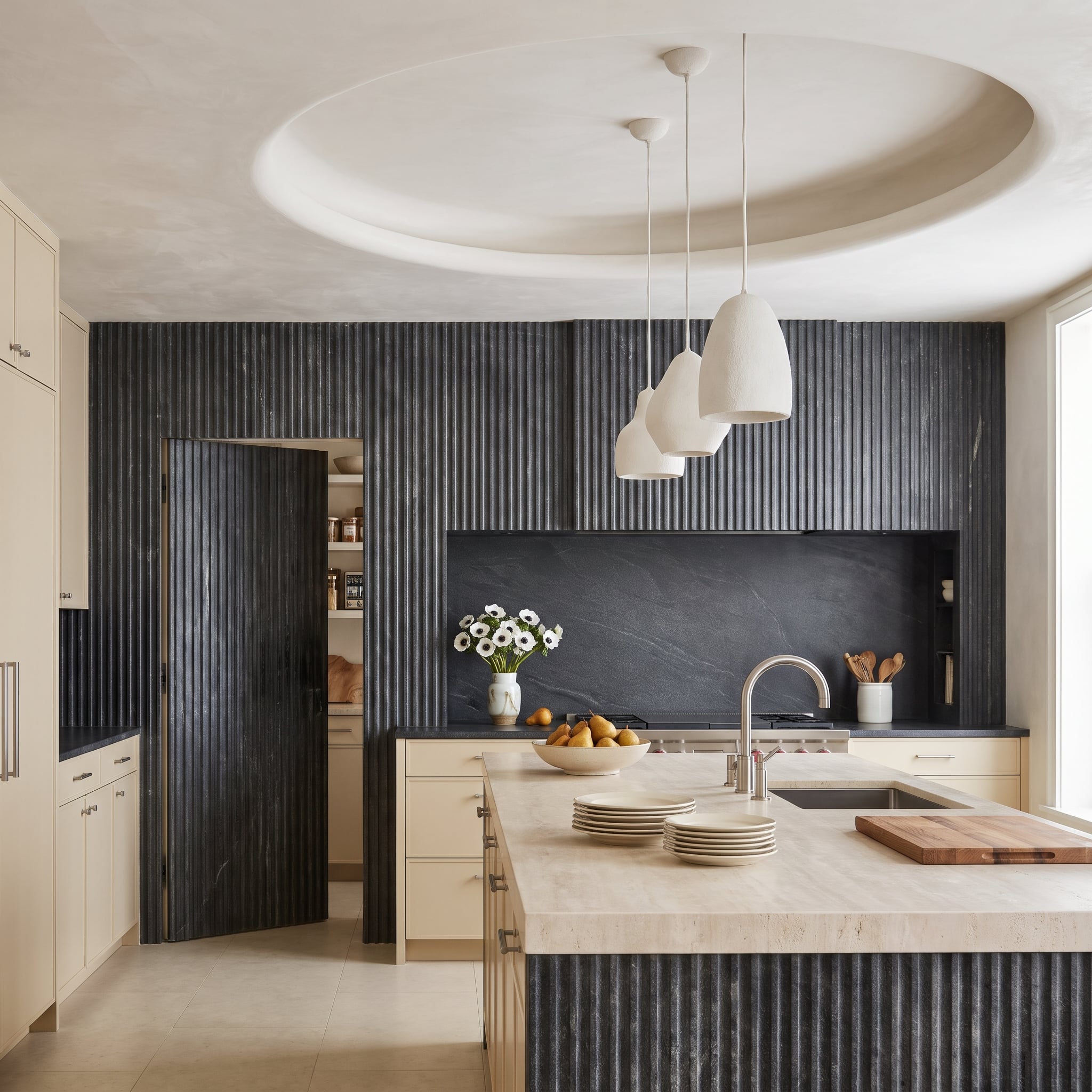
Dark fluted stone covers the rear wall, its vertical grooves continuing across a concealed pantry door. The opening is almost lost in the repeated pattern, with the door’s swing providing the clearest clue that the wall contains more than stone cladding.
Behind the range, the ribbed surface gives way to a smooth slab. That change matters in a working kitchen, where grease and splatter are easier to remove from a flat face than from a series of narrow grooves. The island repeats the fluting beneath a thick travertine top, linking the two sides of the room. Concealment, texture and practicality each get a role without requiring a separate design gesture.
Pro Tip: Aligning flutes across a concealed door helps disguise its edges. Hardware, clearances and the door’s opening mechanism still need to be planned carefully so the continuous pattern remains convincing.
15. Blush Cabinets Meet Teal Scallops, and Brass Negotiates the Peace
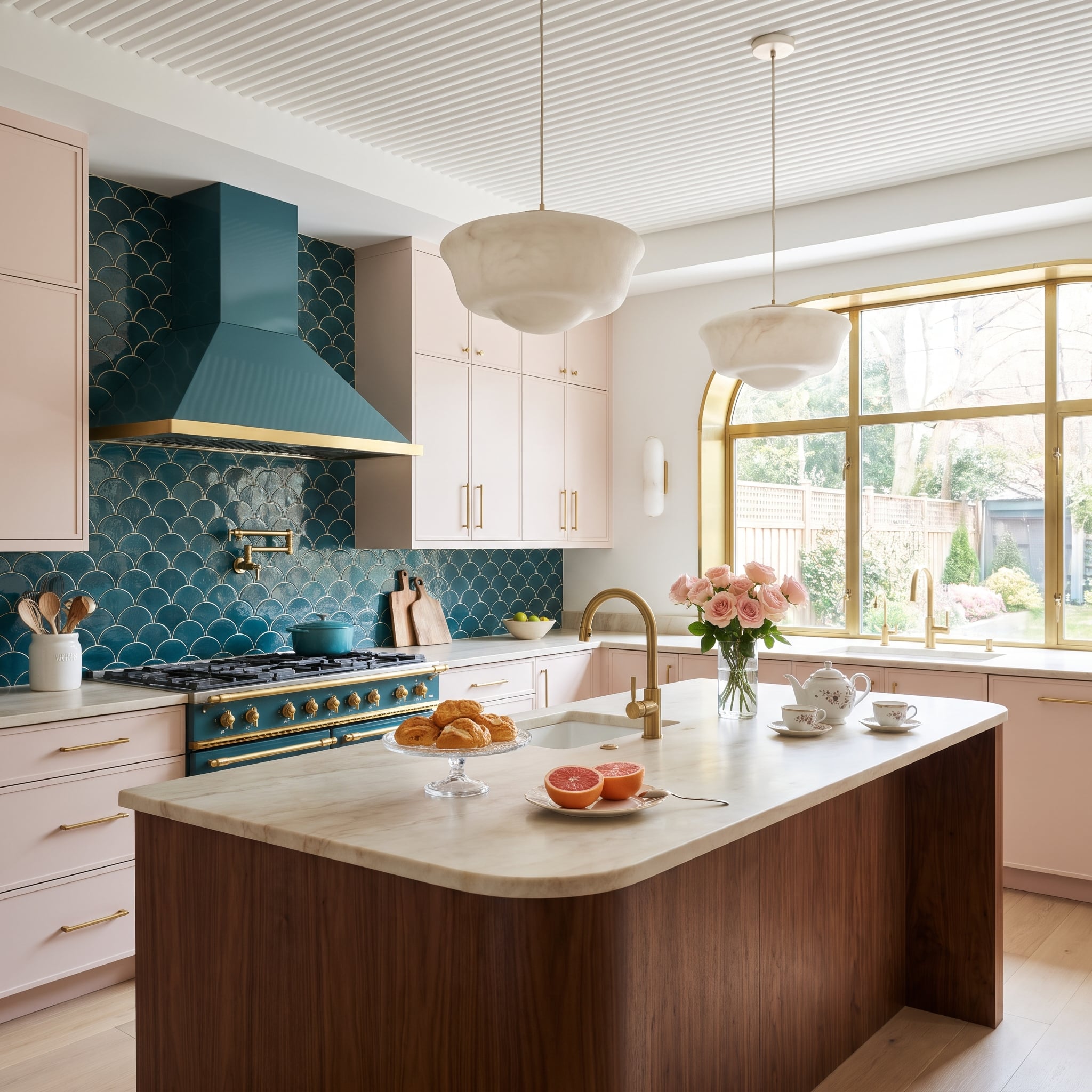
Blush and teal sound like an argument waiting to happen. The scalloped tile, painted hood and matching range make a persuasive case for the pairing by concentrating the darker color in one cooking zone. The pale cabinets remain distinct, with their flat surfaces contrasting against the lively tile pattern.
Brass provides the connecting thread. A narrow band trims the hood, and the warm metal reappears in the range rails, pot filler, cabinet pulls and arched window frame. Walnut wraps the island, whose rounded stone corner softens the transition into the walkway. The palette works because the different colors have clear jobs: teal supplies drama, blush introduces lightness, and walnut and brass connect the two.
14. Dark Terrazzo Travels From Backsplash to Island to Sink Apron
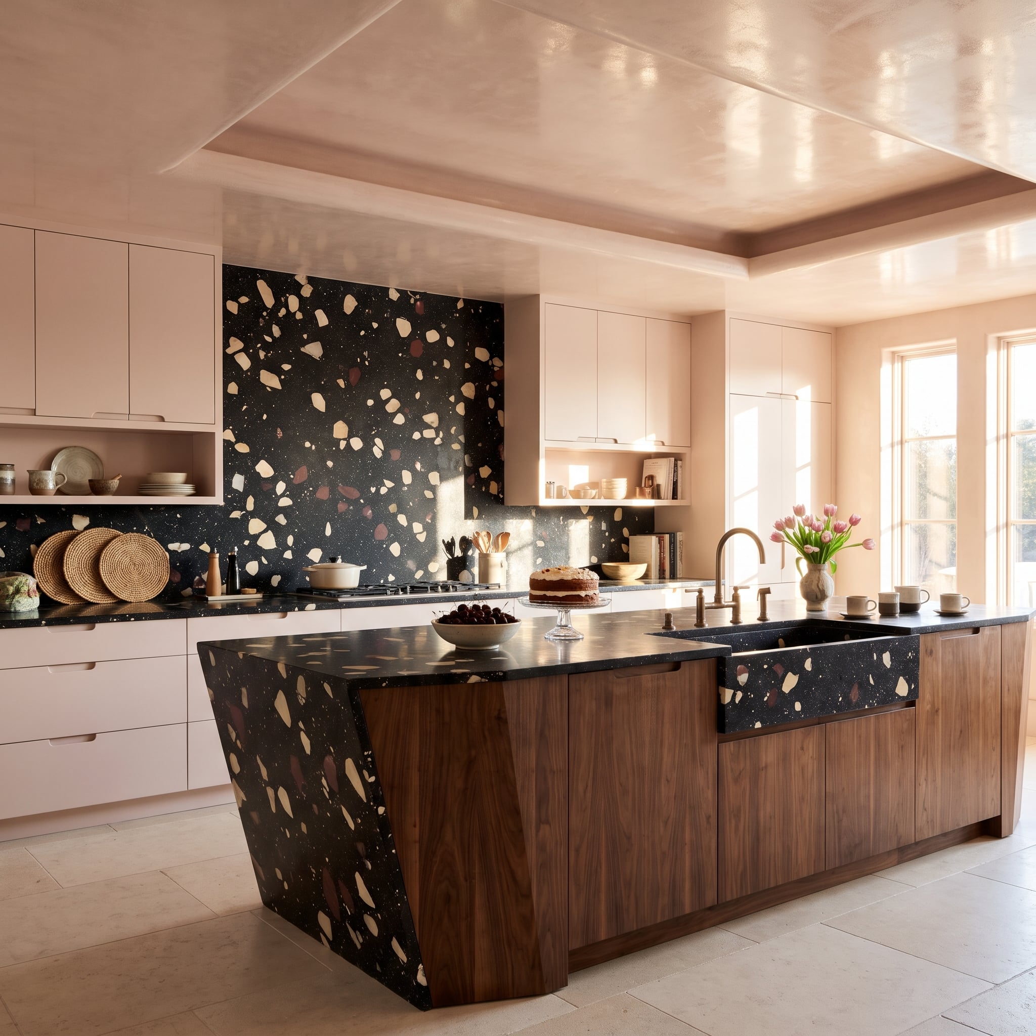
Dark terrazzo doesn’t stop after covering the backsplash. The speckled material continues across the worktop, down the island’s slanted end and onto the sink apron. What could have been a busy decorative accent becomes a recurring architectural surface, its aggregate pattern connecting elements separated by several feet.
Pink upper cabinets and walnut lower doors introduce two very different backgrounds for the terrazzo. The pink draws out its lighter chips, while the wood emphasizes its warmer flecks. Repeating such a visually active material takes discipline; the relatively plain cabinet faces establish intervals of calm between the patterned surfaces.
13. Ink-Blue Tile Finds an Unexpected Partner in the Maple Outside
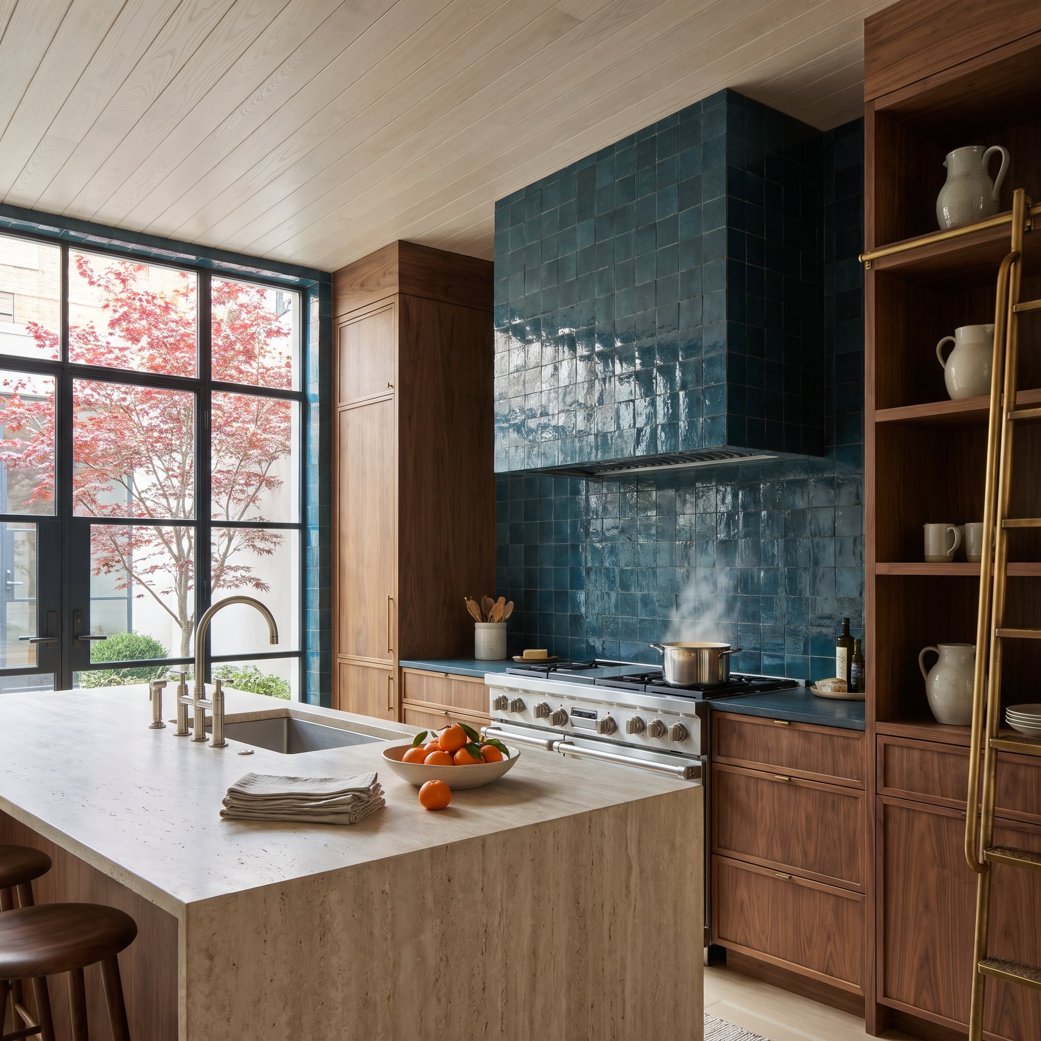
Ink-blue zellige rises from the counter to the plank ceiling, covering the hood enclosure and continuing around the steel window jamb. The deep blue becomes a frame for the red maple beyond the glass, giving the outdoor color an unusually prominent role in the interior palette.
Walnut cabinetry brings warmth to either side, while a travertine island introduces a pale, substantial centerpiece. The brass library ladder catches light against the dark tile. A bowl of oranges offers a direct complementary contrast to the blue; the maple’s red foliage adds another warm accent without following the same exact color relationship. The window is doing as much color work as any painted surface.
12. Chocolate Tile Answers the Walnut Beams Above Sage Shaker Cabinets
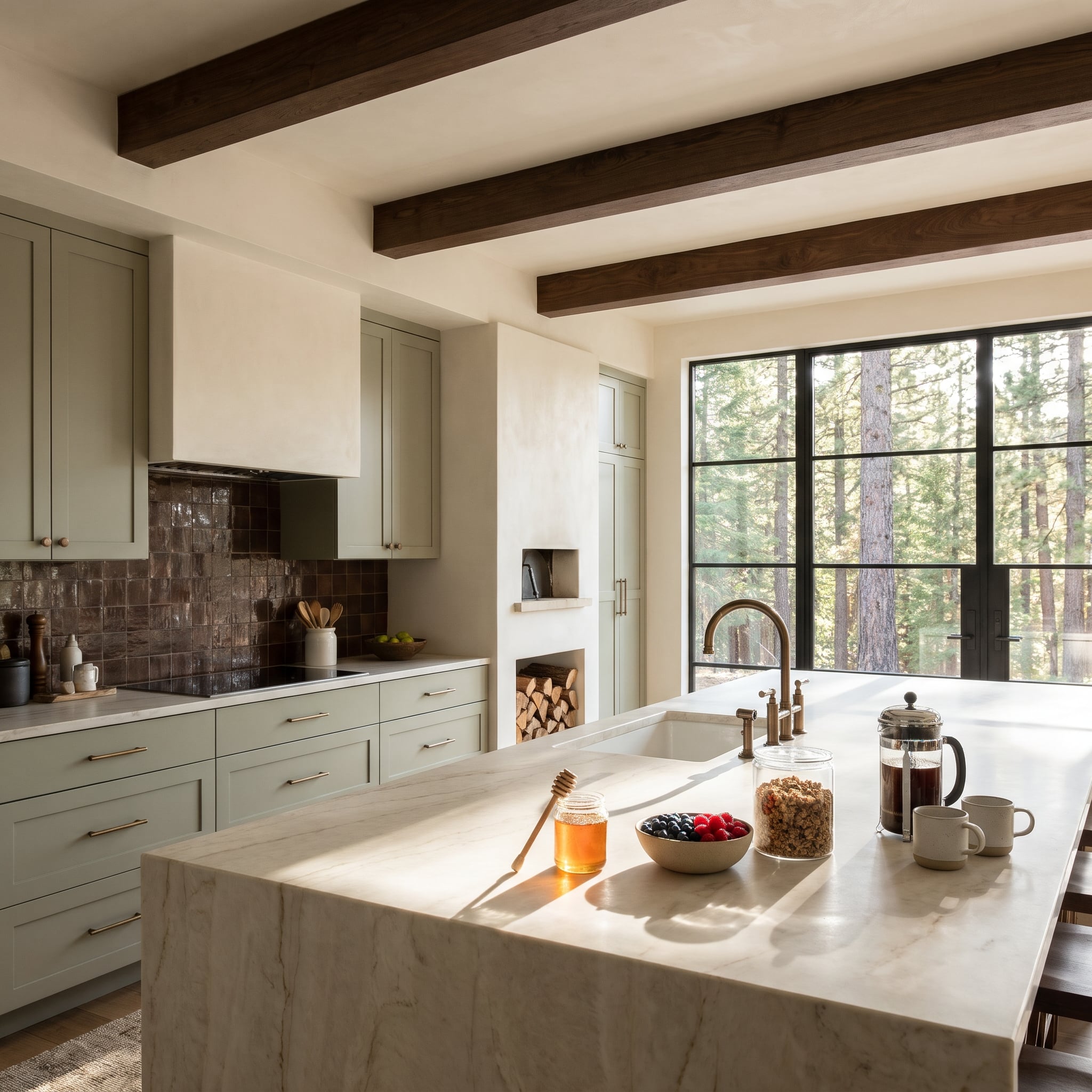
Sage Shaker cabinets usually find themselves paired with something pale and predictable. Here, glossy chocolate-brown square tile changes the mood entirely. Its uneven glaze catches the light, while three walnut beams overhead repeat the dark warmth at a larger architectural scale.
Brass bar pulls and an aged-brass bridge faucet add smaller metallic accents. A pale plaster hood interrupts the tile, giving the cooking area a clear upper boundary. Nearby, a plaster-finished oven feature and firewood niche contribute another layer of texture. The kitchen has several substantial details, but their materials belong to a coherent palette rather than competing for attention.
The island offers the strongest contrast. Veined stone wraps around the corner and continues to the floor in a waterfall end, creating a pale mass opposite the dark backsplash. Its smooth surface and broad proportions counter the smaller tile grid and overhead timber beams. Morning light strengthens that relationship, revealing the sage cabinetry’s softer tone between the two.
11. Burgundy Squares Reach the Skylight While Travertine Takes the Floor
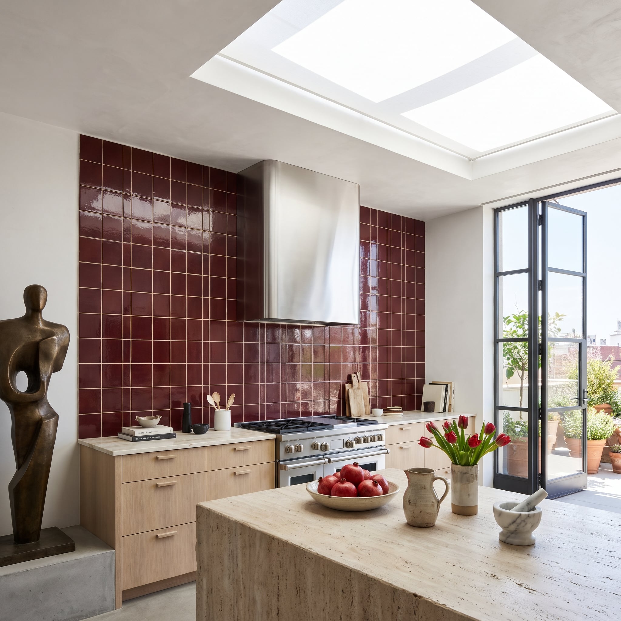
Under the skylight, burgundy square tiles acquire an almost liquid shine. Their glossy surface reflects the changing light, while the tight grid gives the saturated color a disciplined rhythm. Pale oak drawers and a substantial travertine island prevent the red from occupying every visual plane.
The island’s raw-edged waterfall treatment introduces a rugged texture against the polished tile. Pomegranates and tulips repeat the backsplash’s wine-red tones on a smaller scale, bringing color into the center of the room without extending the tile there. The contrast between glossy wall and rough pale stone is the real attraction; the fruit and flowers are the finishing punctuation.
10. A Stone-Clad Cabinet Wall Catches Light Above a Limestone Island
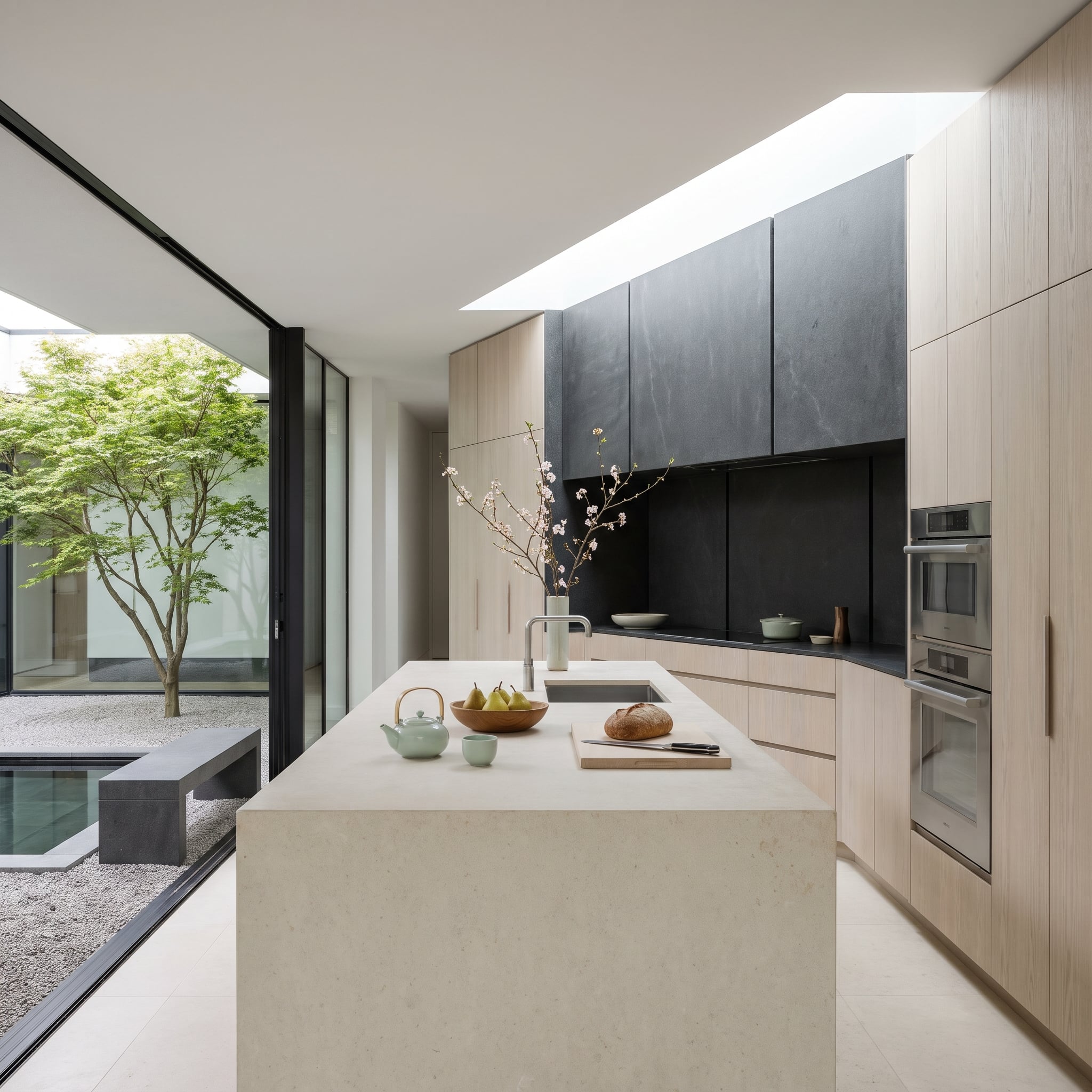
A narrow ceiling light slot grazes the stone-clad upper doors, revealing the veining across a surface that might otherwise read as a solid dark mass. The lighting is unusually important here: it makes the stone’s texture visible without relying on a glossy finish or elaborate decorative hardware.
Pale oak cabinetry frames the darker run, giving the stone a warmer context. In the foreground, a limestone island extends toward the courtyard maple, connecting the kitchen’s substantial interior materials with the landscape outside. The upper cabinetry is the surprise. Although this is less a conventional backsplash than an extension of the dark-stone palette, the same contrast principle applies: pale wood becomes more distinct beside a deep, veined surface.
9. Darkened Steel Behind the Range, Bright Stainless at the Island
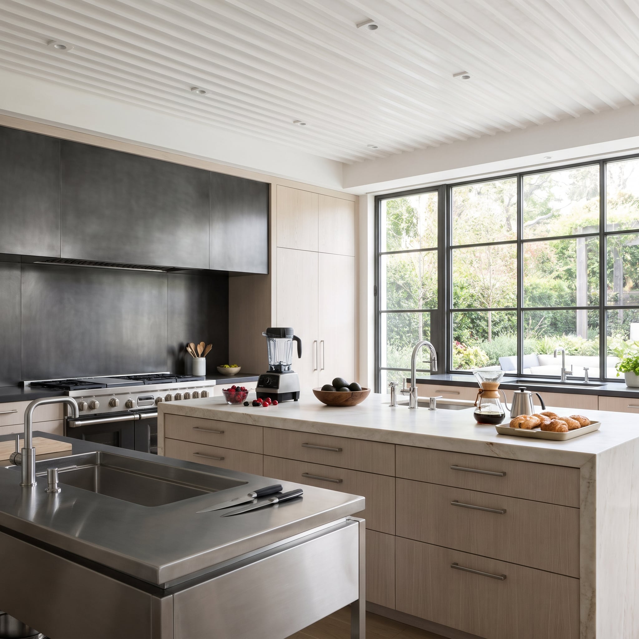
Dark metal sheets cover the range wall and hood, forming a single shadowed cooking zone between bleached-oak cabinet towers. The restrained detailing allows the dark surface to establish the room’s strongest vertical element without additional trim.
Across the kitchen, a stainless preparation island repeats the metal in a brighter, more reflective finish. Its integral sink emphasizes the working character of the surface, while a marble waterfall island and pale oak drawers introduce softer materials between the two metallic zones. The composition succeeds through contrast within one material family: blackened and reflective, architectural and utilitarian.
8. Emerald Tile Curves Around the Range While a Marble Island Points Toward the Dock
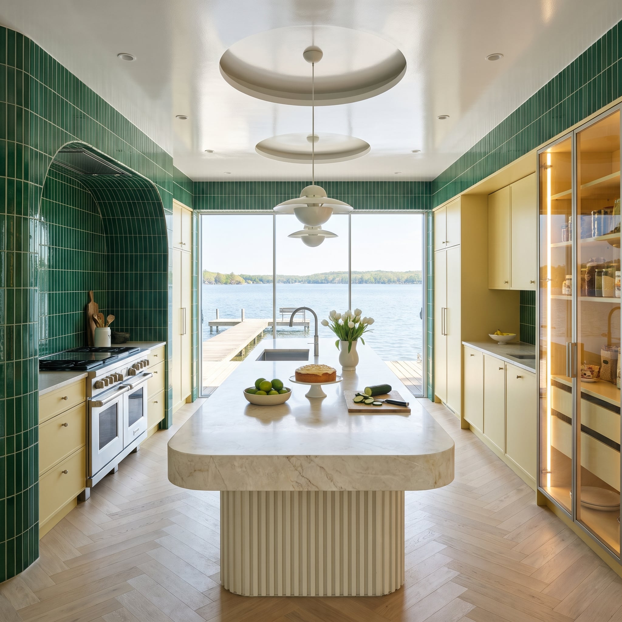
Emerald stick tile follows the curved surface of a range alcove, giving the hood a deeply recessed architectural setting. Thin white grout lines reveal the tile arrangement and emphasize the arch rather than allowing the green to become a featureless mass.
Pale lemon cabinets establish a softer lower boundary, while the marble island introduces another kind of curve. Its thick rounded edge sits above a fluted pedestal, echoing the arch across the aisle without copying it. Beyond the island, the room opens toward a dock through a broad wall of glass. The eye travels from green tile to pale stone to water, following a carefully staged sequence of shapes and surfaces.
7. Soapstone Takes Over the Sink, Shelf and Bread-Oven Surround
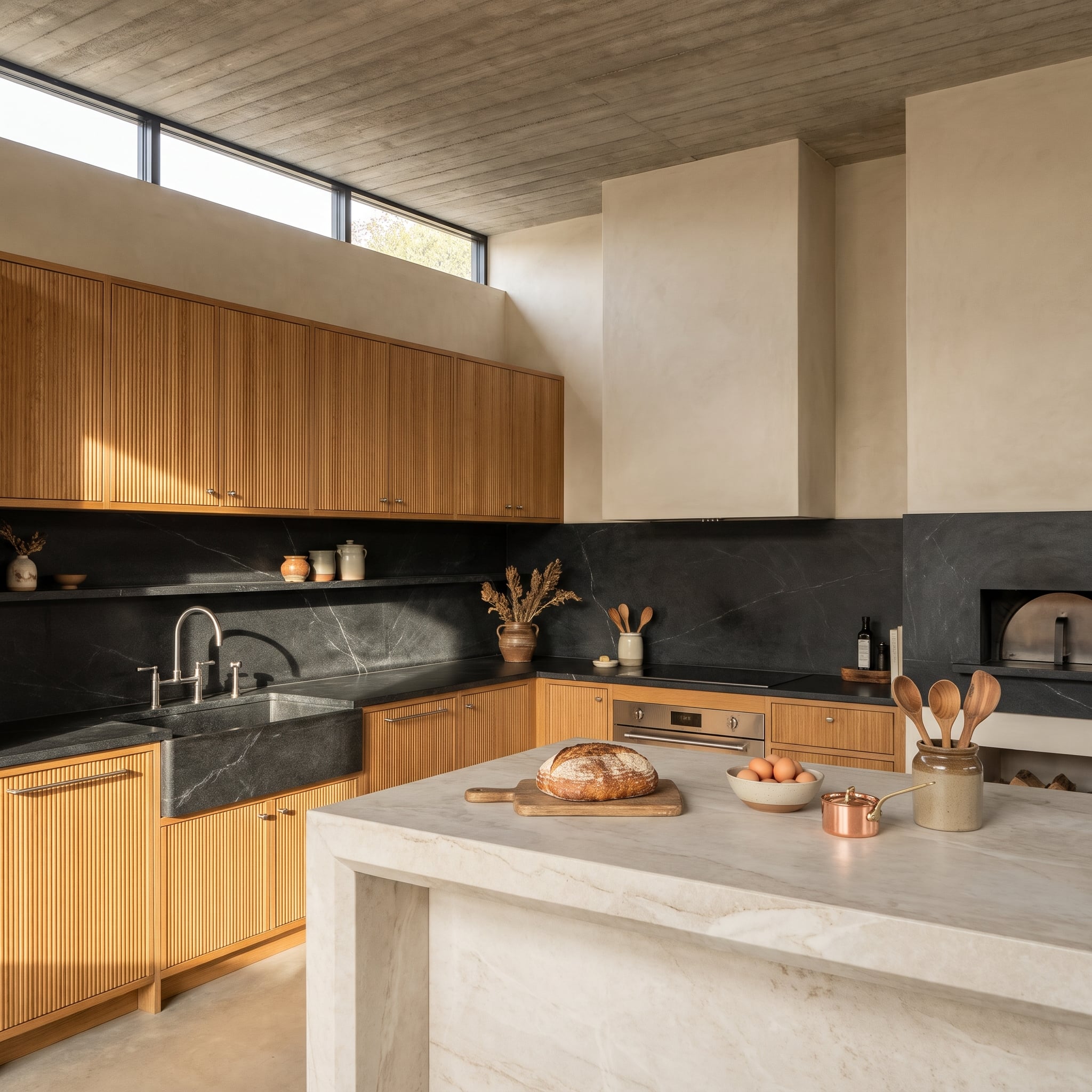
Charcoal soapstone extends beyond the conventional backsplash, forming the apron sink area, a narrow shelf for kitchen crocks and the dark surround of a domed bread oven. Its relatively uniform color allows these separate functions to read as parts of one substantial architectural installation.
Reeded oak cabinetry introduces a finer texture beside the broad stone surfaces. Narrow vertical grooves catch clerestory light, giving the wood a delicate rhythm that contrasts with the soapstone’s visual weight. Neither material depends on elaborate ornament: the stone contributes mass and depth, while the oak introduces warmth and detail.
The most interesting relationship occurs where those two textures meet. The stone reads almost as masonry, with the sink and oven absorbed into its dark surface. The oak, by contrast, retains the scale and precision of cabinetmaking. Together they create a kitchen that feels both substantial and carefully detailed, without requiring an additional decorative finish.
6. A Blue Stone Hood Borrows Its Palette From the Ocean
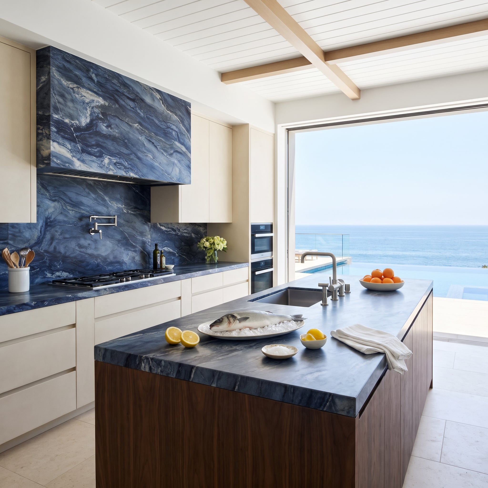
Blue stone covers the cooking wall and hood enclosure, its veining creating an irregular pattern that recalls the water beyond the windows. Cream cabinetry remains comparatively simple, allowing the stone to establish the kitchen’s dominant color and movement.
The island repeats blue stone across its thick top, while a walnut base introduces warmth beneath. That contrast is particularly useful in a room with such a cool-toned backsplash and expansive ocean view. The kitchen borrows its palette from the landscape without surrendering every surface to blue.
At the hood’s corners, the veining appears to continue around the return. Achieving that visual continuity requires careful slab selection and layout, often combined with precisely detailed joints. The result makes a clad enclosure appear more monolithic, even though the stone is assembled from separate pieces.
5. Oxblood Marble Gives Blush Lacquer a Dramatic Architectural Partner
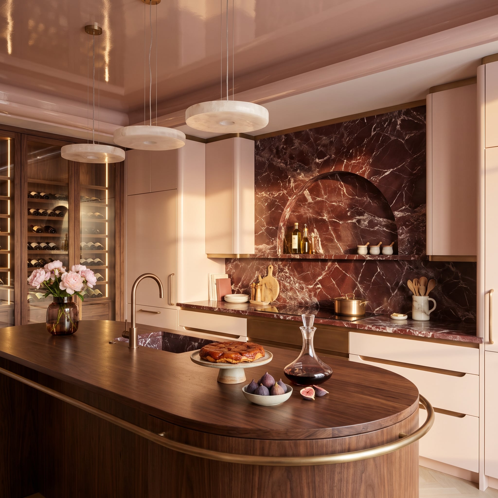
Oxblood marble climbs from the countertop toward a brass-trimmed upper boundary, surrounding an arched display niche that gives ordinary oil bottles an unexpectedly ceremonial setting. The dark stone’s veining supplies movement, while the recess breaks up what might otherwise have been an imposing uninterrupted slab.
Blush lacquer cabinetry introduces a pale, warm counterpoint. Its smooth doors offer a deliberate contrast to the marble’s busy surface, allowing the deep red to remain intense without dominating the entire room. Below, a pill-shaped walnut island with brass detailing replaces sharp corners with a softer, more furniture-like form.
The arch is the key architectural move. Rather than treating the backsplash as a flat panel, the design gives it depth and a place to display objects. The effect is closer to a built-in alcove than a conventional splash zone.
4. Forest-Green Marble Meets the Actual Forest Beyond the Glass
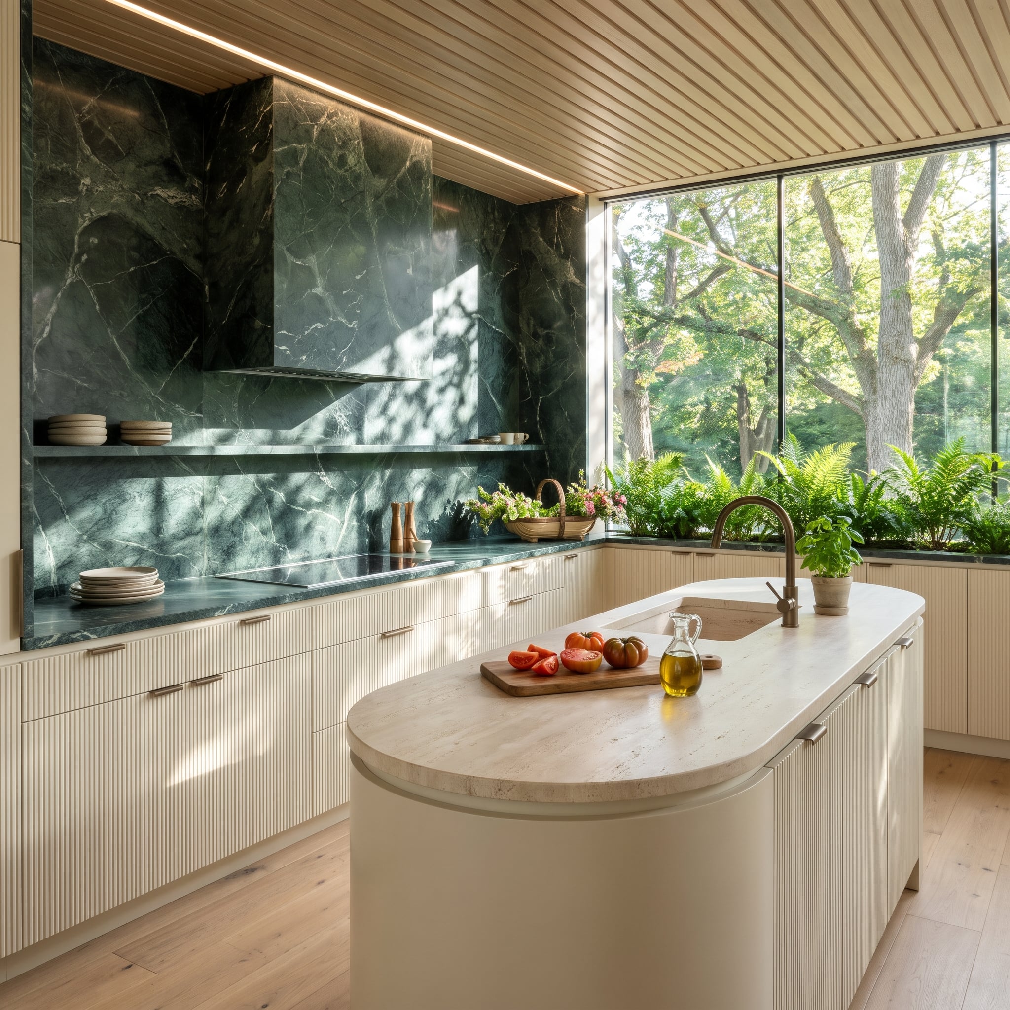
Forest-green marble covers the cooking wall and wraps the hood, its pale veins running through the dark stone like branches against dense foliage. Outside the glass, the real forest provides an almost literal continuation of the palette.
A rounded travertine island offers a pale, substantial form in the foreground, separating the kitchen’s interior stonework from the wooded landscape beyond. Ferns planted near the corner window strengthen the connection without requiring another decorative material.
The marble and forest share a color family but not a texture. One is polished and veined, the other irregular and alive. That distinction makes the pairing more interesting than a simple attempt to match the outdoors. The kitchen doesn’t imitate the landscape so much as borrow its strongest color and give it a completely different surface.
3. Black Marble Gets the Last Word Against Butter-Yellow Cabinets
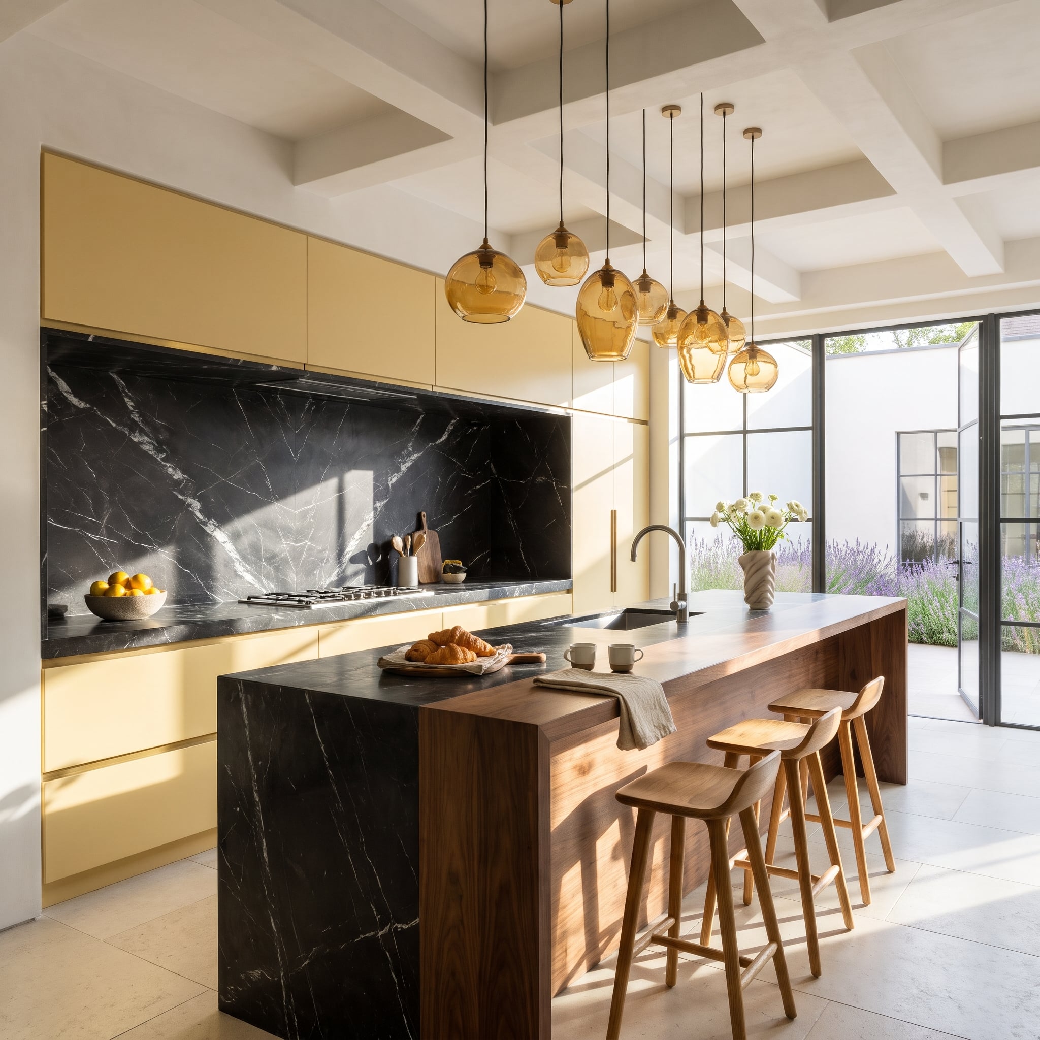
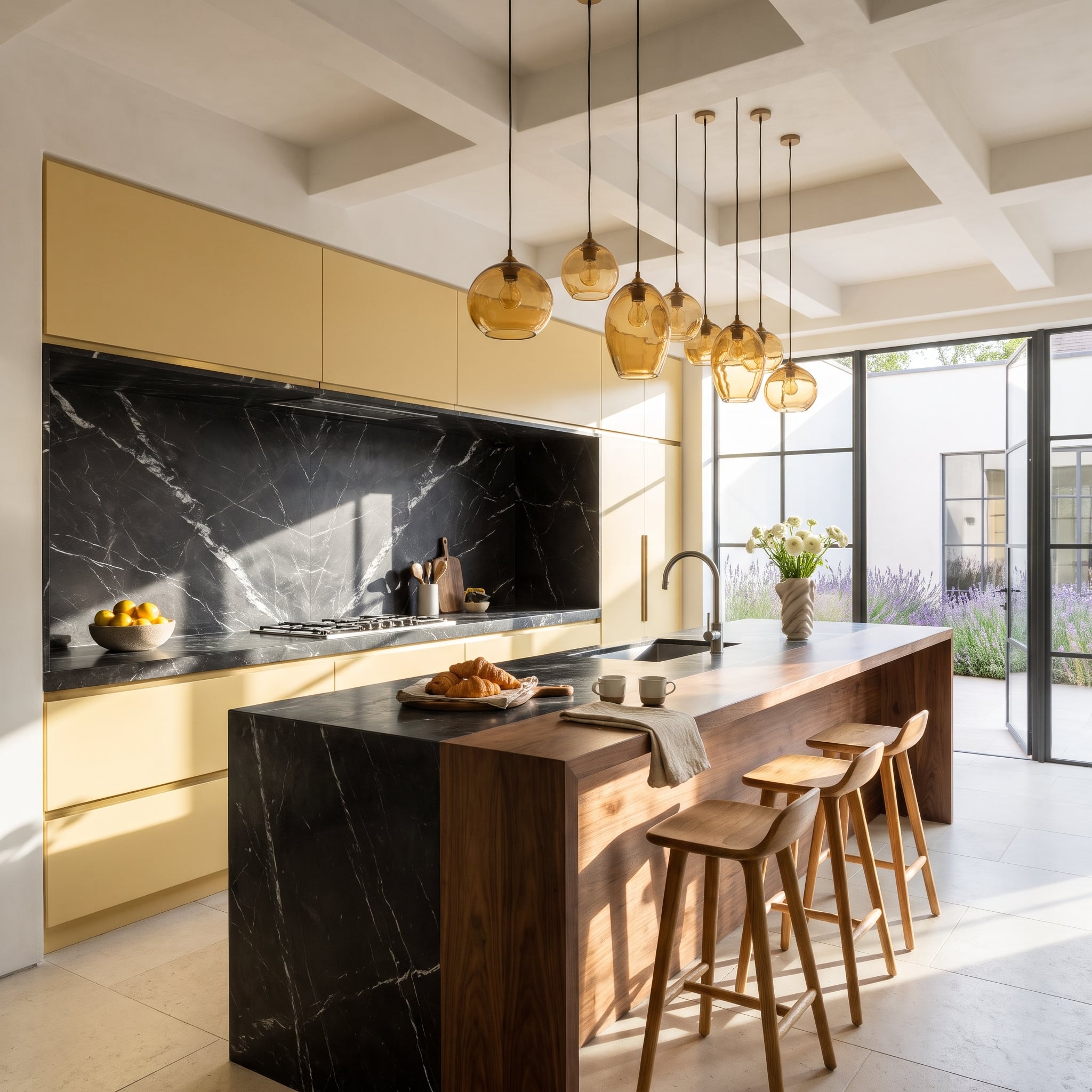
Butter-yellow cabinetry could easily send a kitchen toward the confectionery department. Here, black marble intervenes before things get too sweet. The recessed backsplash forms a dark rectangle between the pale doors, with white veining cutting through the stone like cracks of lightning. The contrast is bold, yet the cabinetry retains its warmth rather than disappearing beside it.
The island has an equally interesting split personality. Black marble wraps the working end, while walnut takes over around the seating area, giving the stools a warmer, more furniture-like setting. Staggered amber glass pendants pick up the yellow cabinets and the brown wood without matching either. Three materials, three temperatures, and not a bland surface among them.
2. Black Marble Frames the Range Like a Painting in a Walnut Gallery
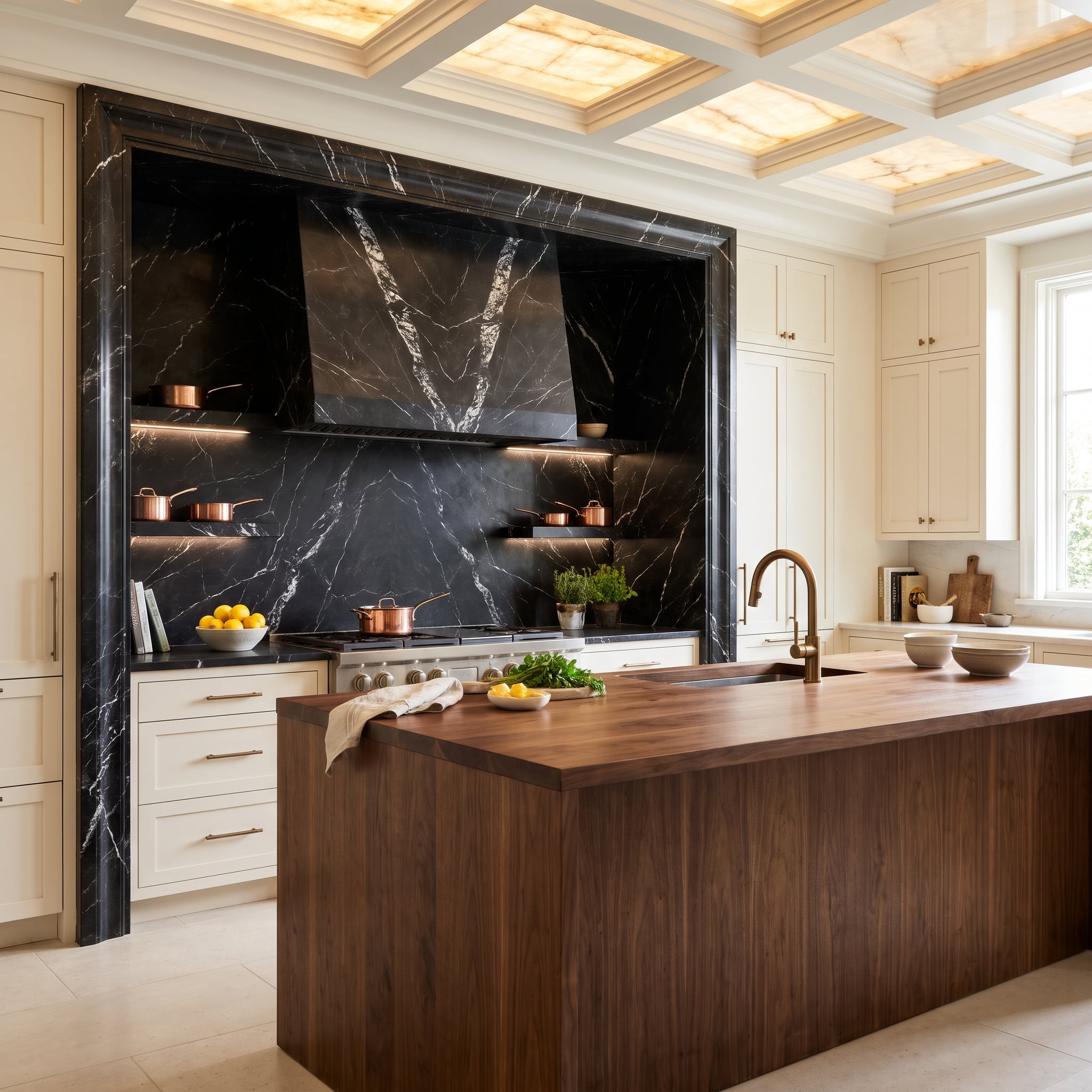
Black marble covers the range alcove, hood and molded surround, turning the cooking area into a framed architectural composition. Two pale veins form a dramatic V across the hood, introducing a sense of movement within the otherwise dark stone.
Illuminated shelves display copper cookware against the black background. In front, a walnut island with a waterfall end brings a warmer, more tactile material into the foreground, while brass fixtures repeat the copper’s metallic notes. The backlit ceiling panels add another layer of illumination, although the range alcove is compelling enough to command attention without them.
The most successful feature is the clear division of roles. The marble defines the focal point, the cabinetry establishes its boundaries, and the walnut island creates a contrasting centerpiece. Dark material doesn’t make the cooking zone disappear; it gives the room a much stronger sense of hierarchy.
1. Aged Brass and Pale Rift Oak Give the Dark Backsplash a Different Kind of Luxury
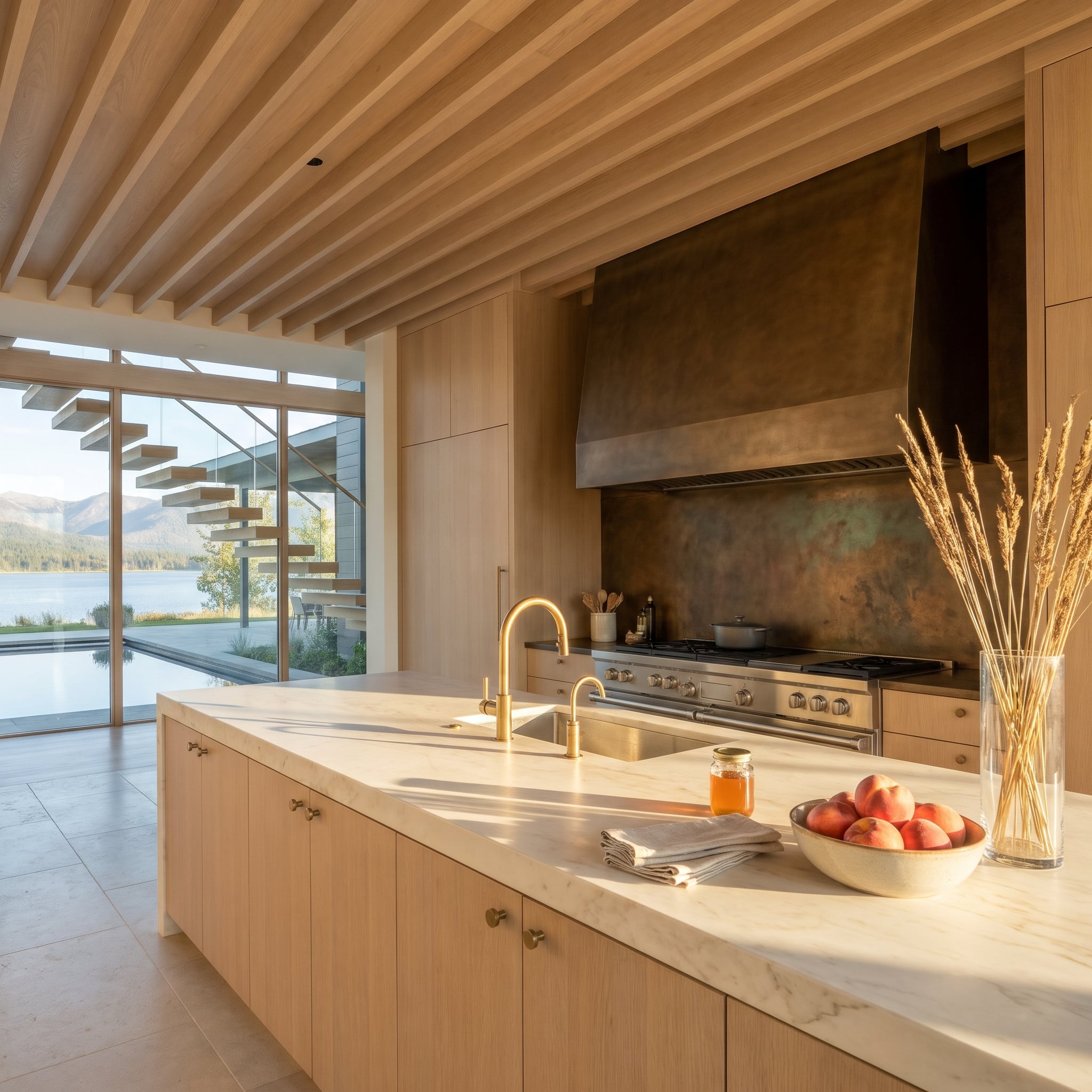
Verdigris spreads across the brass-toned hood and backsplash in irregular green and brown patches, giving the metal a richly aged appearance. The finish has none of the uniformity of polished brass. Against pale rift-oak cabinetry, those variations become the room’s most distinctive decorative feature.
Worth Considering: Patinated metal backsplashes may be sealed to preserve their appearance or left with a finish that changes over time. Confirm the intended maintenance, heat suitability and cleaning requirements before choosing one for a cooking wall.
Polished brass faucets on the marble island repeat the metal in a brighter finish, establishing a connection between the patinated cooking wall and the foreground. The pale oak introduces a disciplined architectural setting, its straight grain contrasting with the mottled metal.
Stone has its veining, tile its repeated pattern and wood its grain. Patinated metal offers something different: a surface whose irregular colors and shifting reflections refuse to settle into a predictable design. Against the precise lines of rift oak and the smooth marble island, that unpredictability is exactly what makes the kitchen memorable.