
🔥 Would you like to save this?
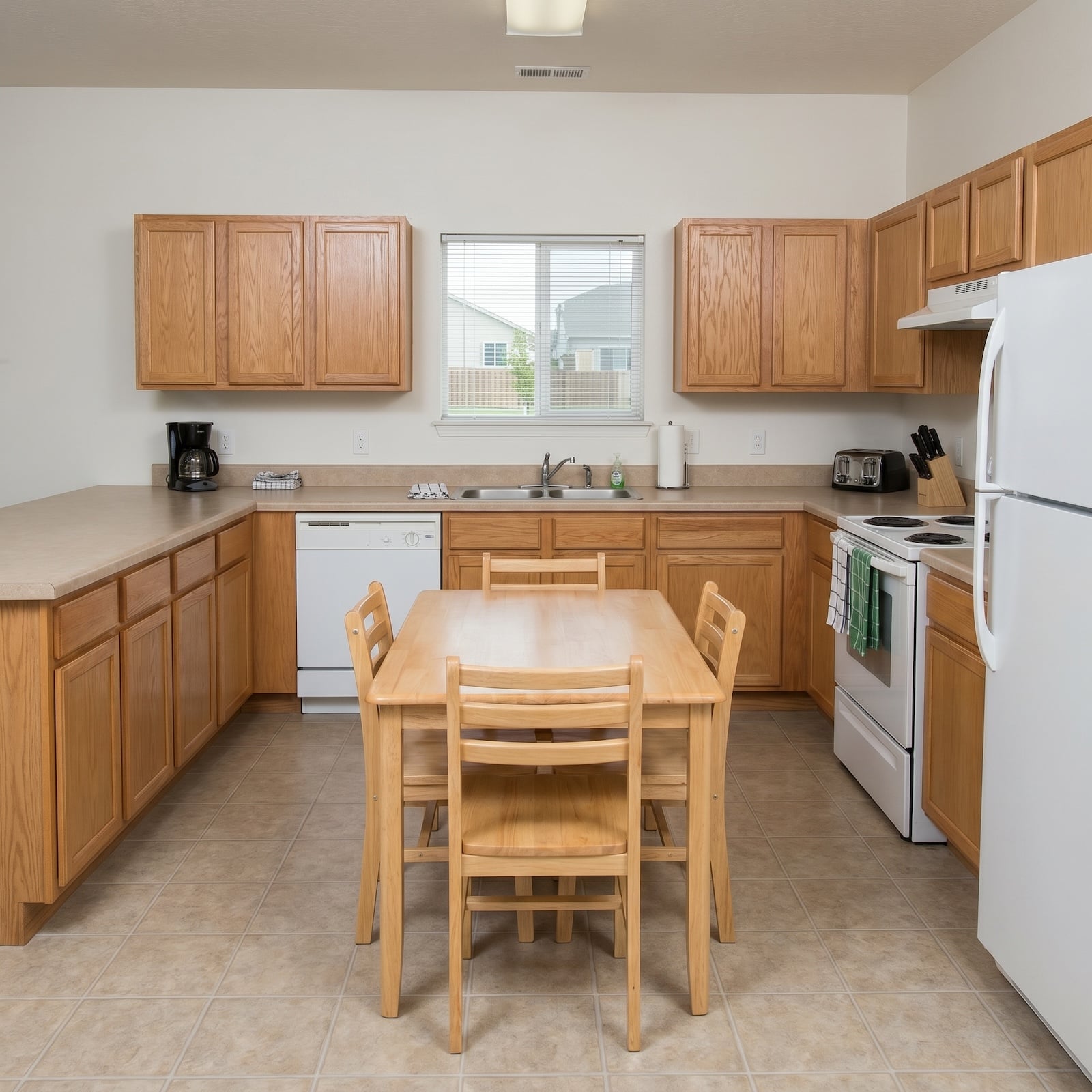
She treats Sunday meal prep with total devotion — every ingredient chopped, measured, and lined up like soldiers, stock simmering since dawn, the spice drawer organized by region and heat level. Her kitchen, however, looked like it was designed by someone who never cooked an intentional meal in their life. These 30 before-and-afters fix that, from $250,000 to well over a million.
In order to come up with the very specific design ideas, we create most designs with the assistance of state-of-the-art AI interior design software. Also, assume links that take you off the site are affiliate links such as links to Amazon. this means we may earn a commission if you buy something.
Every one of them started in the same deflating place: laminate counters, cabinets hung slightly too high, lighting that flattens everything. Every one ended up somewhere its owner actually wants to be at 7 a.m. with a cutting board and a podcast. The common thread isn’t budget — it’s that the “after” finally matches how the room gets used.
30. Dark Cabinets, Exposed Beams, and a Pendant Light That Changes Everything
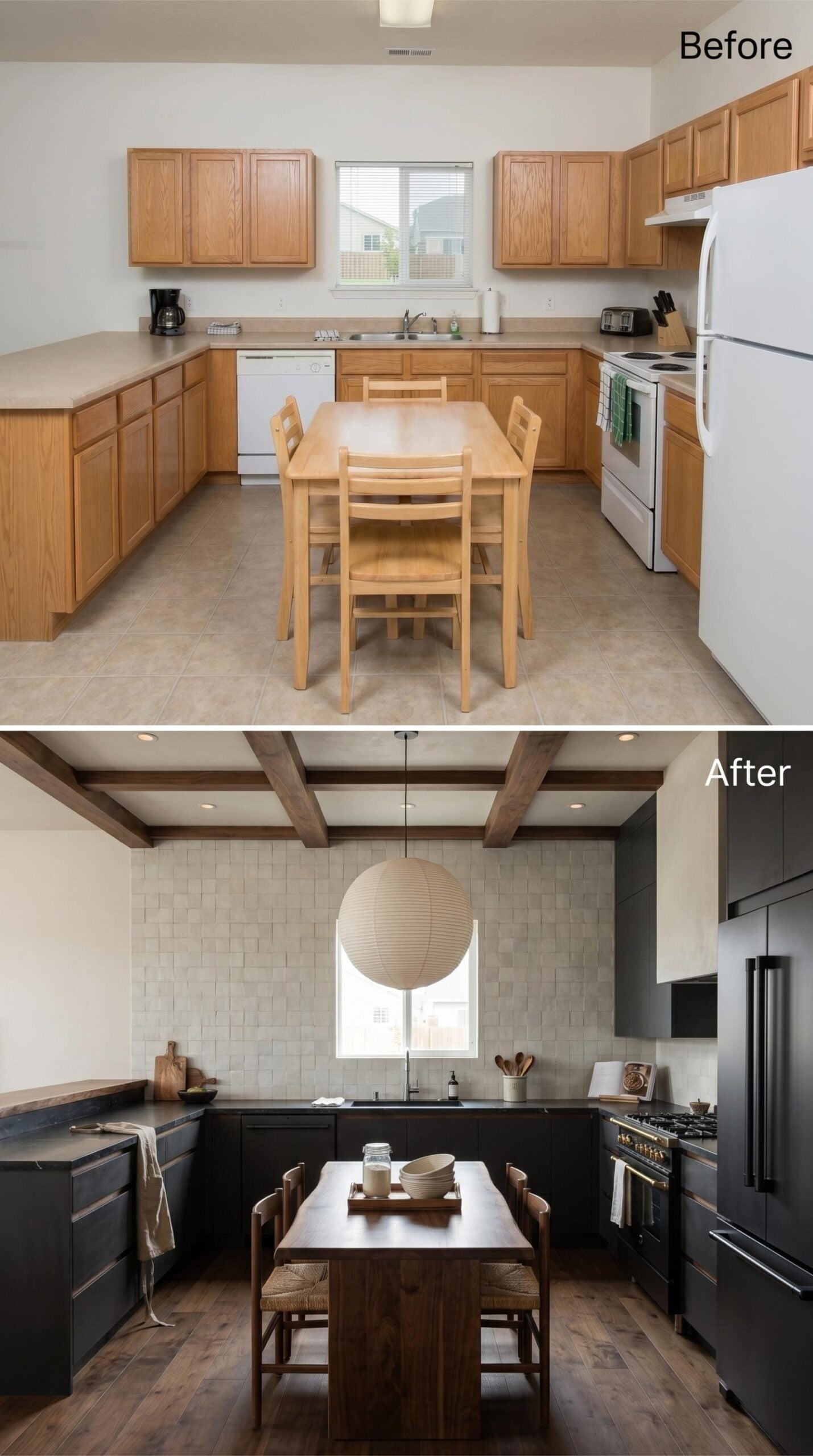
Matte black shaker cabinets run the full perimeter, and the dark countertops keep the palette consistent rather than contrasted. The backsplash is a grid of small-format stone tile in warm greige — quiet, but doing real work holding the room together.
Exposed wood ceiling beams add structure overhead. A woven paper globe pendant drops over the walnut island, rush-seat counter stools beneath it. Wide-plank dark hardwood floors, a black range with brass accents. This is a serious kitchen, and it knows it.
29. Navy Blue Shaker Cabinets With Brass Hardware Are Doing the Heavy Lifting Here
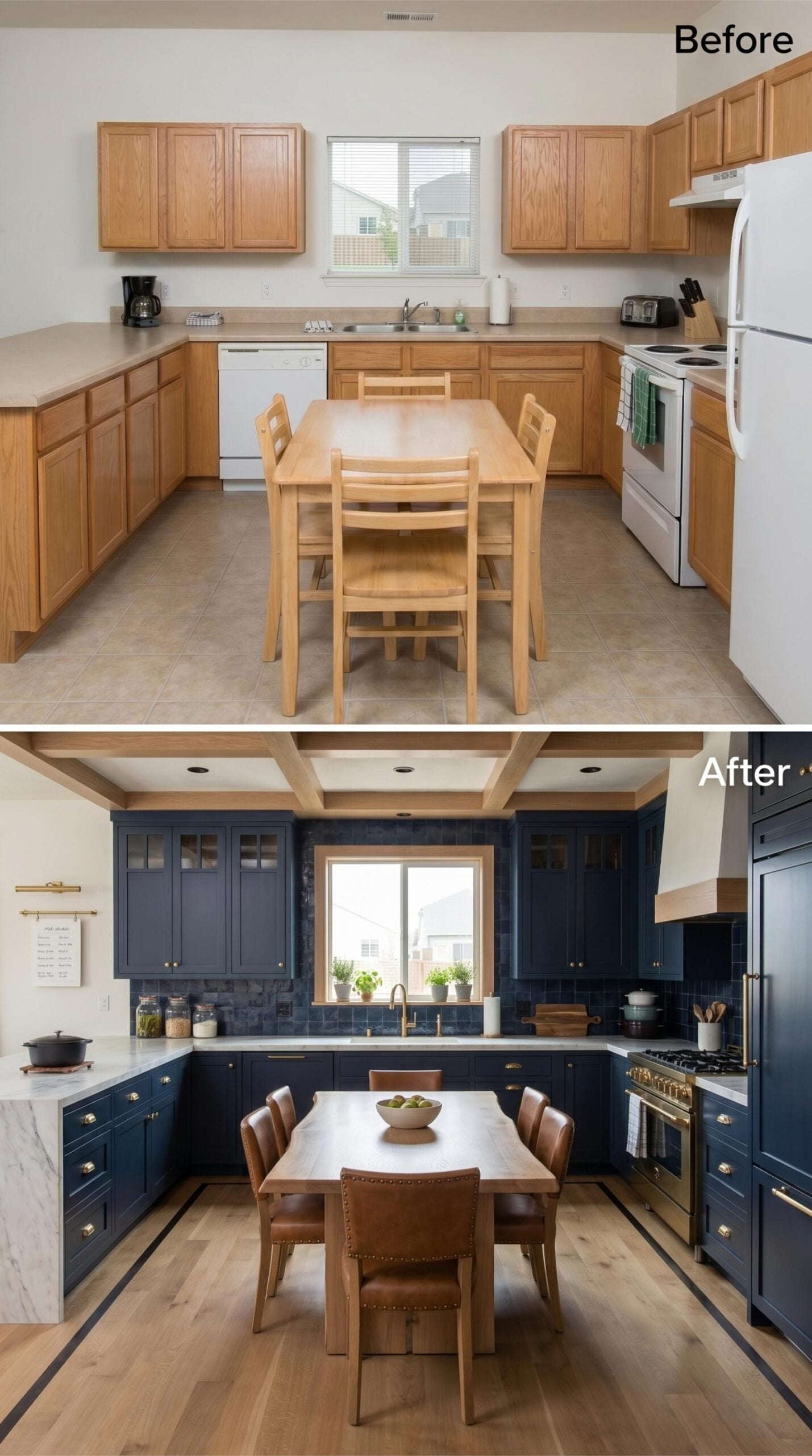
Inky navy shaker cabinets run floor to ceiling on three walls, paired with brass cup pulls that add just enough warmth to keep the palette from feeling cold. The marble countertops have enough movement in them to break up all that solid color, and a wood-framed range hood with exposed ceiling beams pulls the whole room back toward something organic.
The leather dining chairs with brass nail-head trim echo the hardware without being obvious about it. Light hardwood floors keep the space from closing in. A smart call, overall.
28. Burgundy Cabinets and Chevron Backsplash for the Cook Who Means Business
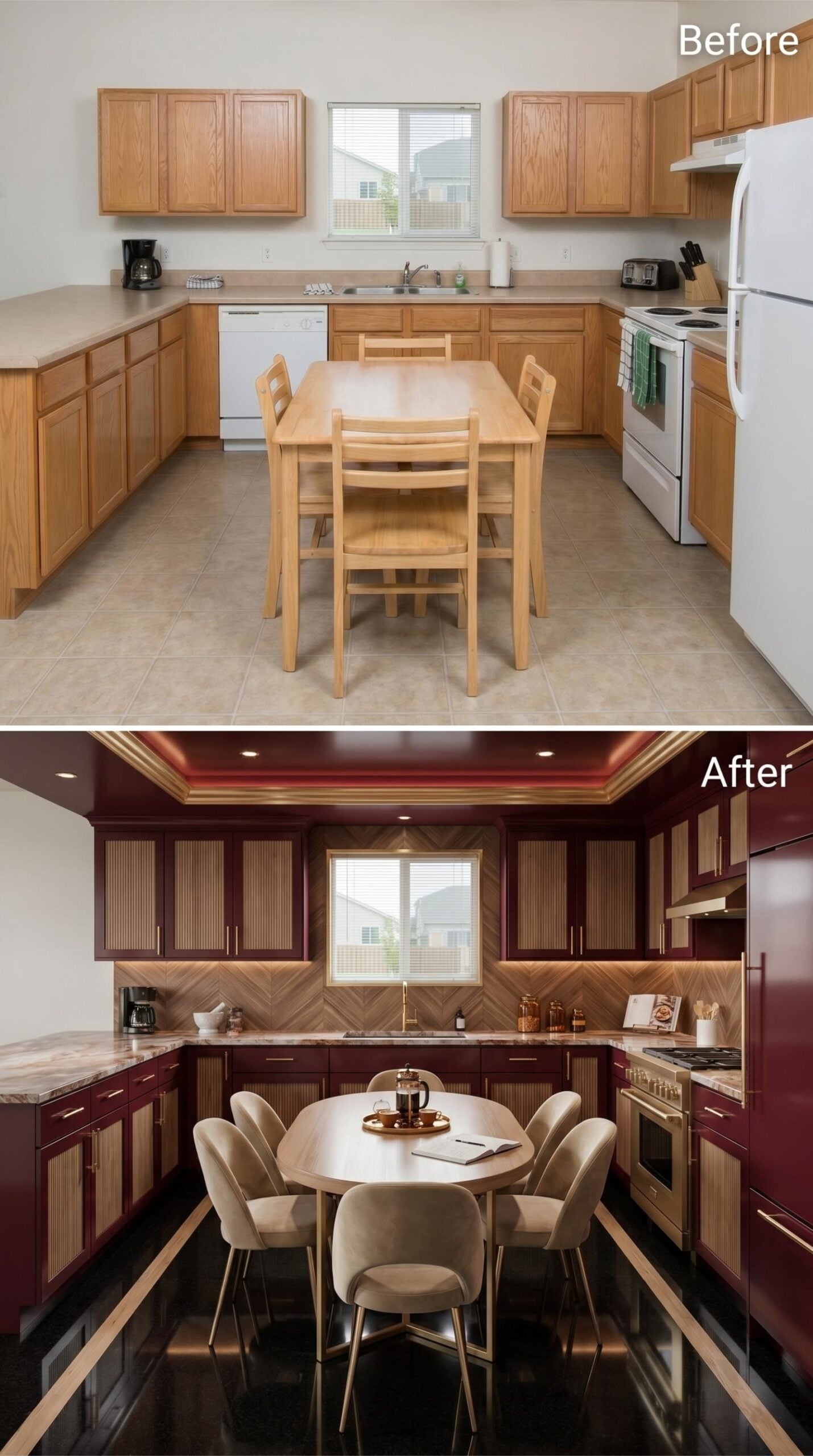
Deep burgundy lacquer runs floor to ceiling on every cabinet, with ribbed wood insets breaking up the gloss and adding warmth that solid color alone can’t deliver. Gold pulls run thin and long, consistent across every door. The chevron backsplash behind the sink earns its complexity.
Veined marble countertops read light enough to keep the room from going fully dark. Recessed lighting sits inside a tray ceiling trimmed in the same burgundy, and the black high-gloss floor reflects it all back. Center of the room: a round table, velvet chairs on gold legs. Practical for meal prep, a little glamorous too.
27. Sage Green Flat-Fronts and Marble Counters Built for the Long Haul
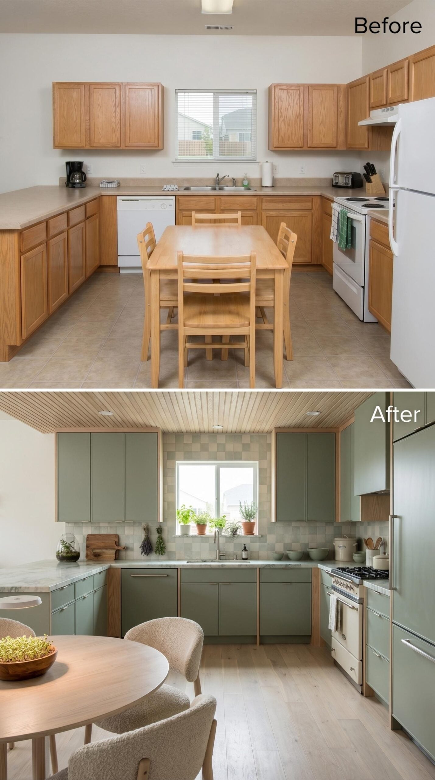
Flat-front cabinets in sage green sit against a checkerboard backsplash tile that reads almost neutral in this light. The marble counters do their job without announcing it. Wood-trimmed uppers and a slatted ceiling keep the room from going cold, which is the only real risk with a palette this restrained.
Where the last kitchen played it cool with neutrality, this one commits fully to color.
26. Teal Lacquer Cabinets and a Sputnik Chandelier for the Cook Who Doesn’t Apologize
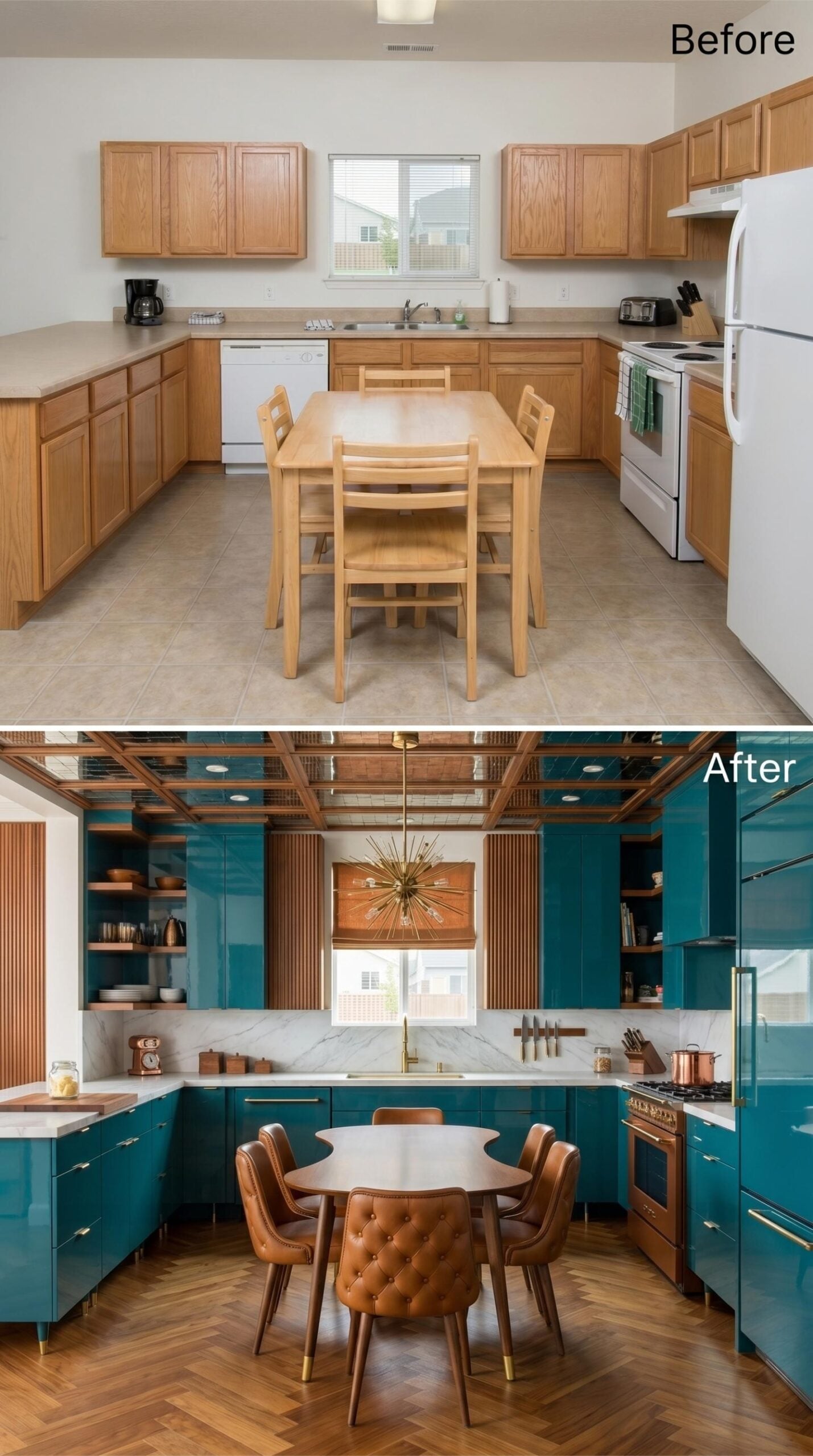
Glossy teal cabinets run floor to ceiling on every wall, and the lacquer finish catches light differently depending on where you’re standing. Brass hardware keeps it grounded rather than cold. Herringbone hardwood floors pull warmth up from the ground to balance all that saturated blue-green above. The round dining table with tufted cognac leather chairs reads unmistakably mid-century, and that Sputnik chandelier overhead is not a decorative afterthought. It’s the whole thesis. Marble counters and open shelving break the cabinet mass just enough to keep the room from feeling like a vault.
25. Terracotta Cabinets and Exposed Beams for the Cook Who Takes Sunday Seriously
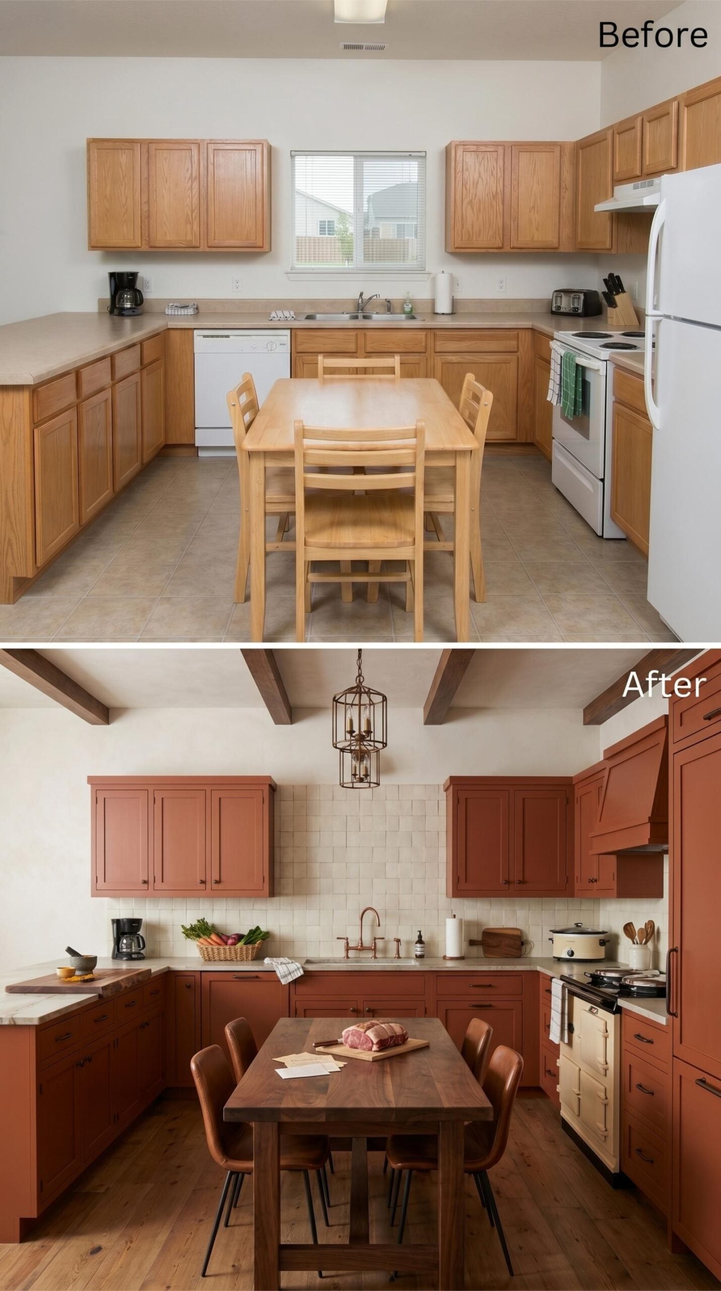
Terracotta paint on shaker-style cabinets is doing something most kitchens won’t dare try.
Warm russet-red cabinets run the full perimeter, paired with a cage-style pendant in aged bronze that pulls the whole room into focus. Exposed wood beams overhead and wide-plank flooring keep it grounded. The cream zellige-style backsplash and copper bridge faucet earn their place without competing with each other or with the cabinets.
24. Charcoal Cabinets, an Amber Tray Ceiling, and Zero Apologies
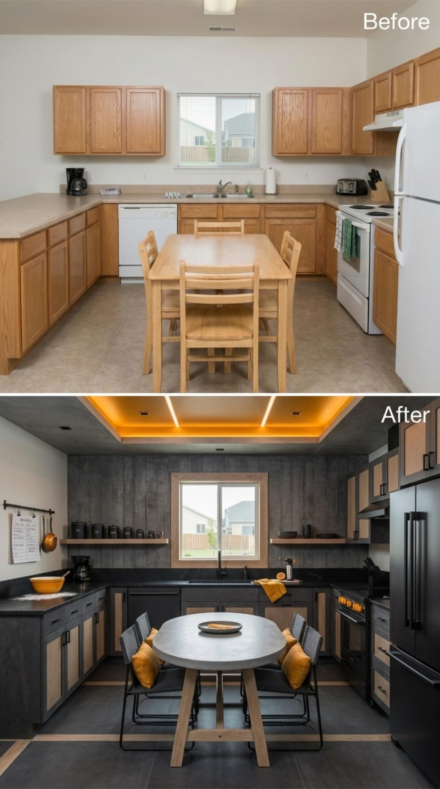
Slate-toned lower cabinets with natural wood panel inserts run the full perimeter, anchored by black countertops that don’t ask for attention. Upper cabinets are gone entirely, replaced by open shelving that keeps the sightlines clear from the dining area to the window. The tray ceiling is the real move: recessed amber LED strips cast a warm glow that feels less like lighting and more like mood.
The round concrete dining table seats four without crowding the floor plan. Mustard cushions on the chairs pull the ceiling color down to eye level, tying the palette together without forcing it. Dark slate floor tiles finish the room at ground level, and the matte black appliances disappear into the cabinetry rather than competing with it.
History Corner: Black stainless steel appliances gained popularity in the mid-2010s as an alternative to traditional stainless, offering a fingerprint-resistant finish that reads darker in low-light kitchens. The finish pairs particularly well with concrete and wood because it absorbs rather than reflects ambient light. Most appliance manufacturers still treat it as a premium finish option today.
23. Forest Green Cabinets With Natural Wood Insets for the Cook Who Goes All In
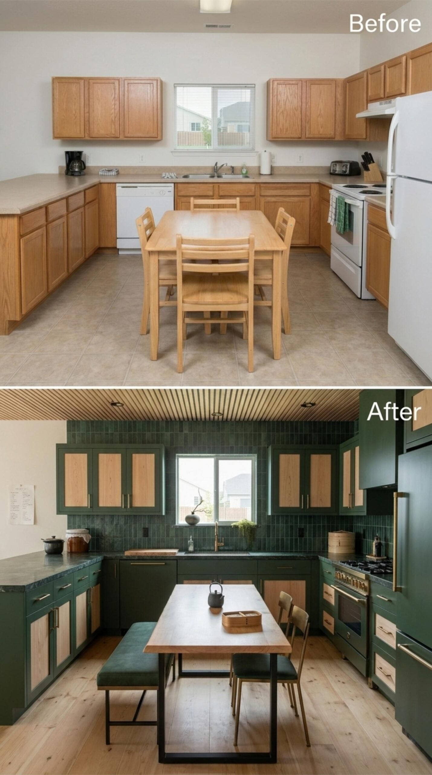
Hunter green cabinet frames with raw wood inset panels give this kitchen a tension that actually works. The dark zellige-style tile backsplash runs floor to upper cabinet — bold, and it pays off. Brass hardware and a matching faucet keep the room from going too moody. Hardwood floors lighten everything from the ground up.
Style Tip: Green is one of the harder cabinet colors to commit to because it reads differently under natural versus artificial light. Test paint or finish samples at multiple times of day before ordering — it’s worth the extra week. Forest greens with yellow undertones tend to hold up better under warm kitchen lighting than cooler blue-greens do.
22. Cobalt Lacquer Cabinets, Gold Hardware, and a Ceiling That Demands Attention
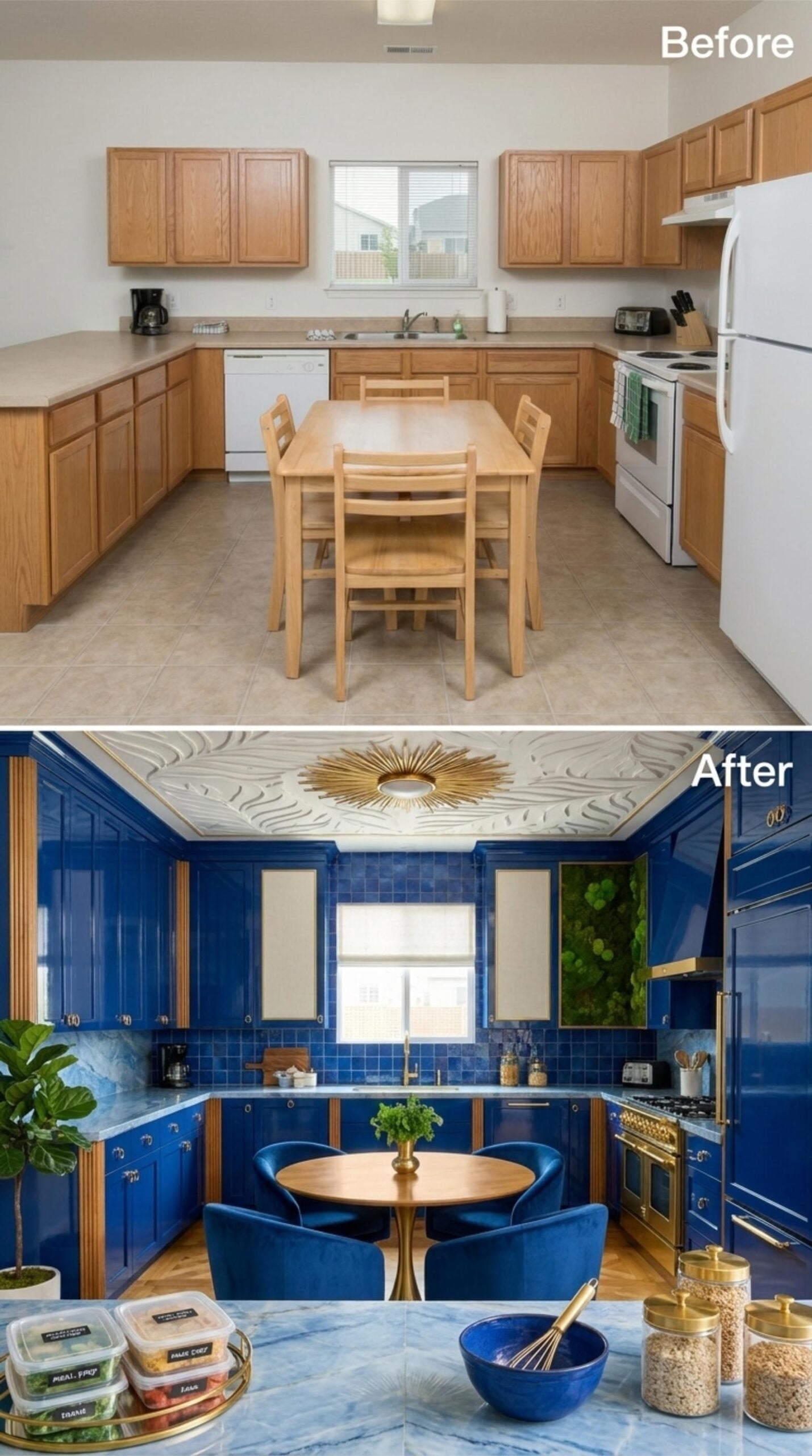
Saturated royal blue high-gloss cabinets run floor to ceiling, paired with brass pulls that earn their keep. The real surprise is overhead: a sculpted relief ceiling with a sunburst medallion at center, which most renovators wouldn’t dare attempt and fewer would pull off.
Designer’s Secret: Lacquer finishes reflect light differently than paint, and in a bold color like cobalt, that sheen actually keeps the room from feeling heavy. You need to pair it with a matte or textured element nearby so the eye has somewhere to land. That sculpted ceiling does exactly that job here.
21. Steel Blue Cabinets and Brick That Make Sunday Prep Feel Like a Ritual
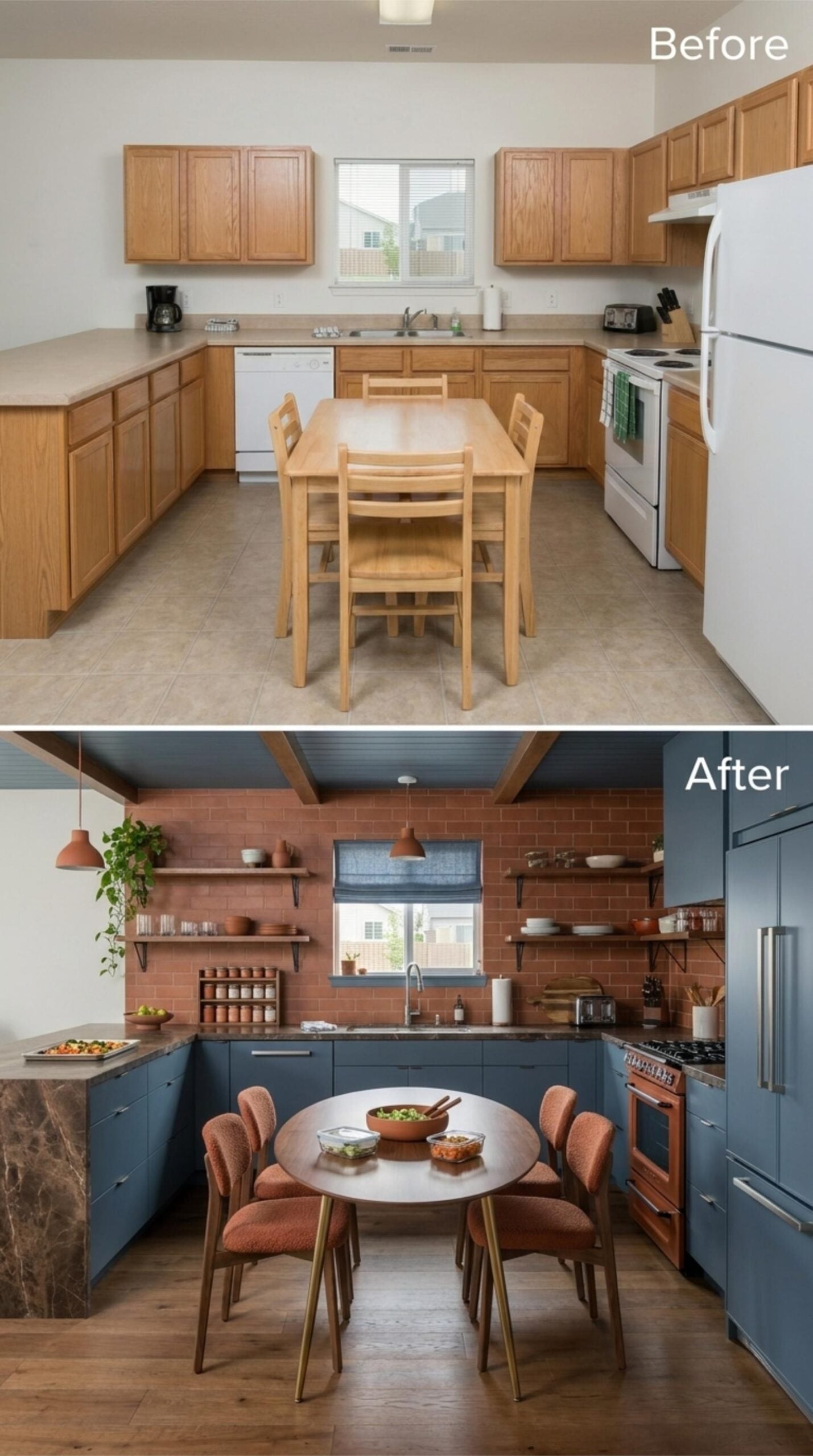
Brick running floor to ceiling behind open shelving is a commitment most kitchens won’t make.
Steel blue flat-front lowers anchor the space without competing with the terracotta brick backdrop, and that balance is harder to pull off than it looks. Open shelving replaces upper cabinets entirely, keeping the sightlines clear while putting everyday ceramics on display. Pendant lights in a burnt orange finish echo the brick tones without copying them.
The round dining table fits four with room to breathe. Upholstered chairs in a rust-toned boucle fabric make it clear this kitchen gets used well past the cooking part, and hardwood floors bring the whole palette back down to earth.
20. Crimson Lacquer Cabinets and a Wallpapered Ceiling Built for Someone Who Cooks with Conviction
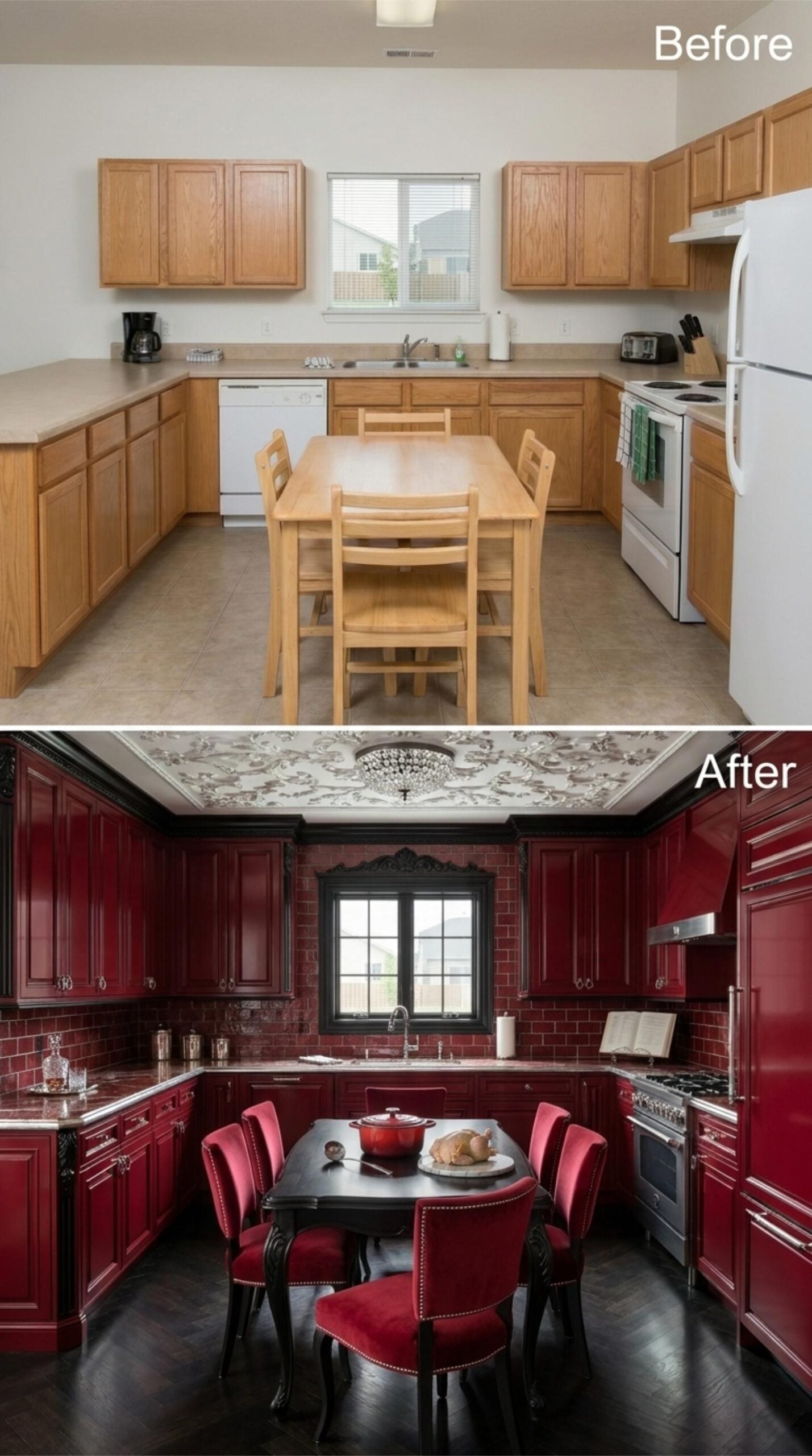
Crimson-lacquered cabinets run floor to ceiling on every wall, and the sheen on those doors keeps the space from reading as heavy despite the dark palette. Red brick tile on the walls ties directly to the cabinet color without feeling redundant. A committed choice, and it holds.
The ceiling is the unexpected move. Botanical-patterned wallpaper fills the entire tray ceiling, anchored by a crystal flush-mount that earns its place. Velvet dining chairs with nail-head trim pull the room into full gothic-adjacent territory. Nothing in this kitchen is accidental.
Try This: Wallpapered ceilings work especially well in kitchens with defined tray or coffered structure because the molding gives the pattern a natural border. Without that frame, busy ceiling patterns can feel unfinished. If the bones are there, don’t overlook the fifth wall as a design surface.
19. Slate Blue Cabinets and Exposed Brick for the Cook Who Builds a Kitchen Like a Sanctuary
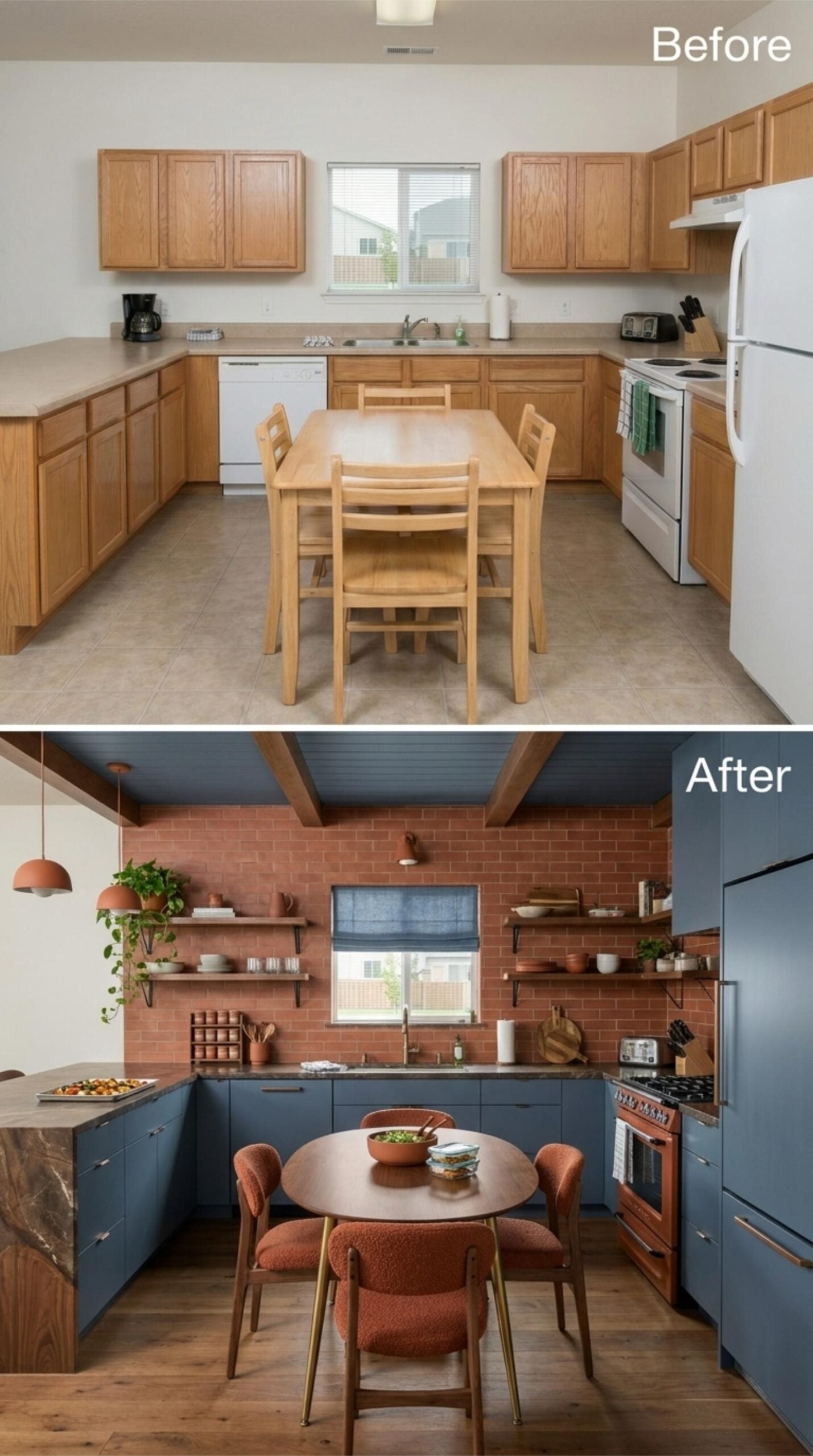
Slate blue flat-front cabinets run the full perimeter, paired with hardware in a brushed bronze finish that reads warm against the cooler cabinet tone. The backsplash is full brick, floor to ceiling, in a clay red that holds its own without competing. Open shelving on black iron brackets replaces uppers entirely, keeping the wall breathing while still holding serious prep gear.
Pendant lights in a terracotta glaze repeat the brick tone overhead — not accidental. A round dining table with boucle chairs pulls the space away from purely utilitarian territory, and wood floors anchor everything without drawing attention to themselves.
- Open shelving collects grease and dust faster than closed cabinets, so kitchens that commit to it need a weekly wipe-down habit
- Boucle fabric is textured enough to add warmth visually, but it’s not a practical choice near a high-splatter cooking zone
- Brick backsplashes, whether real or tile, need a penetrating sealer to prevent staining from oil and steam over time
18. Gothic Arches and Stacked Stone for the Cook Who Treats the Kitchen Like a Cathedral
🔥 Would you like to save this?
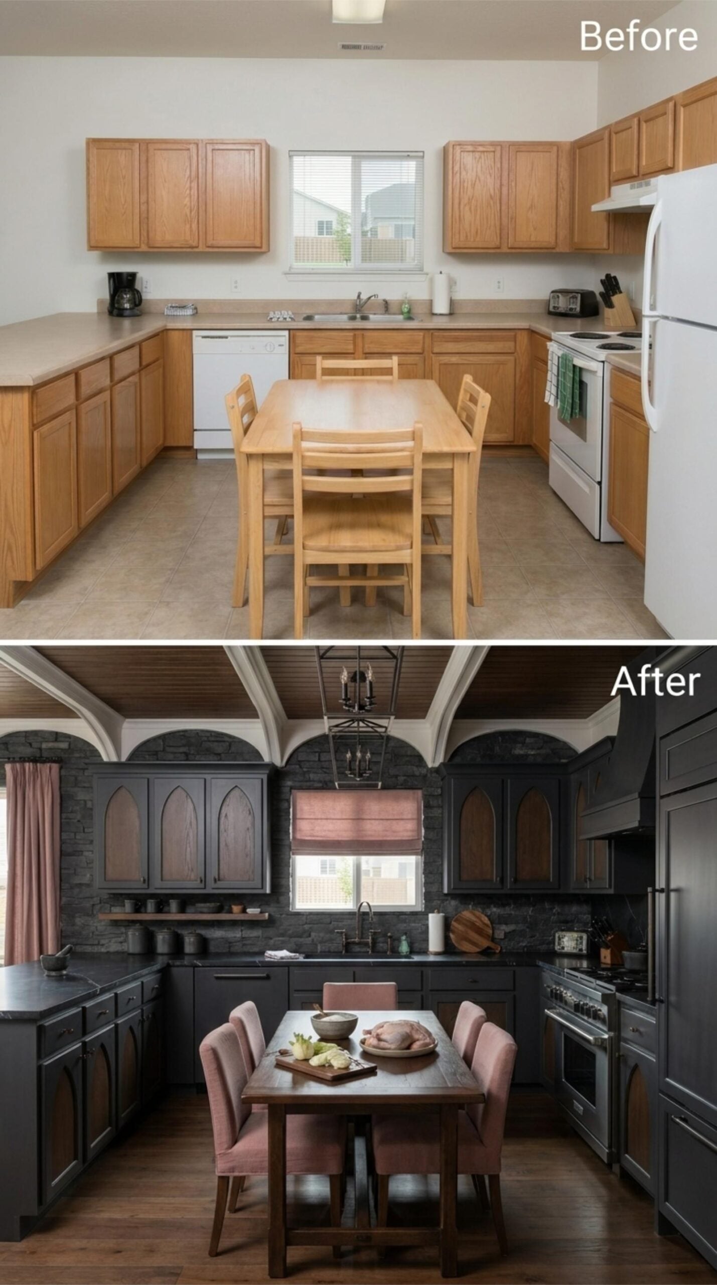
Charcoal cabinets with pointed Gothic arch detailing anchor a kitchen that takes drama seriously. Stacked slate backsplash covers nearly every wall surface. The ceiling switches to wood planks edged with painted beam work, and then the pink upholstered dining chairs arrive as the counterpoint that keeps the whole thing human.
The Psychology Behind This: Dark, enclosed spaces with strong architectural repetition trigger a sense of ritual and ceremony. Kitchens designed this way often feel less like utility rooms and more like dedicated spaces for intentional work, which changes how people actually use them.
17. Deep Green Tile, Open Shelves, and a Ceiling That Finally Does Something
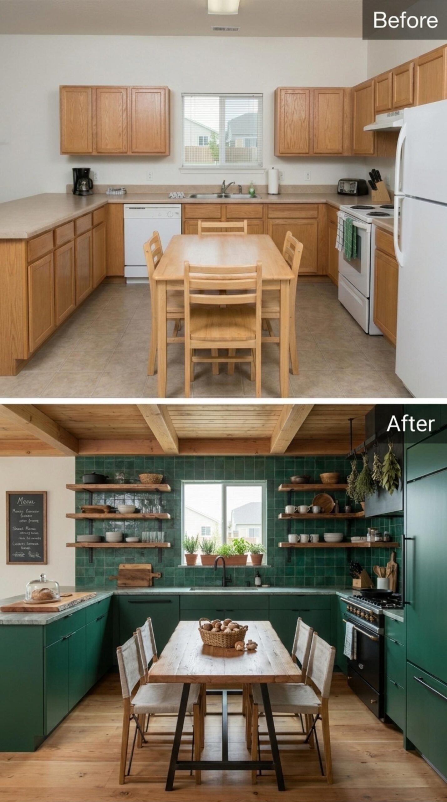
Emerald zellige-style tile runs floor to ceiling across the backsplash, giving the wall a handmade texture that flat subway tile could never pull off. Floating shelves in raw wood replace upper cabinets entirely, and the open storage works here because the dishware is part of the design. Lower cabinets are matte forest green with no visible hardware — clean, but not cold.
Exposed wooden beams cross the ceiling in a grid, and the tongue-and-groove planking between them adds warmth that paint alone wouldn’t deliver. A stainless range with black trim anchors the cooking wall. Dried herbs hang above it, which sounds precious but reads as genuinely functional in this context.
Zellige-style tile runs floor to ceiling across the backsplash, giving the wall a handmade texture that flat subway tile could never pull off.
16. Mustard Cabinets, Graphite Walls, and a Slatted Ceiling That Earns Its Place
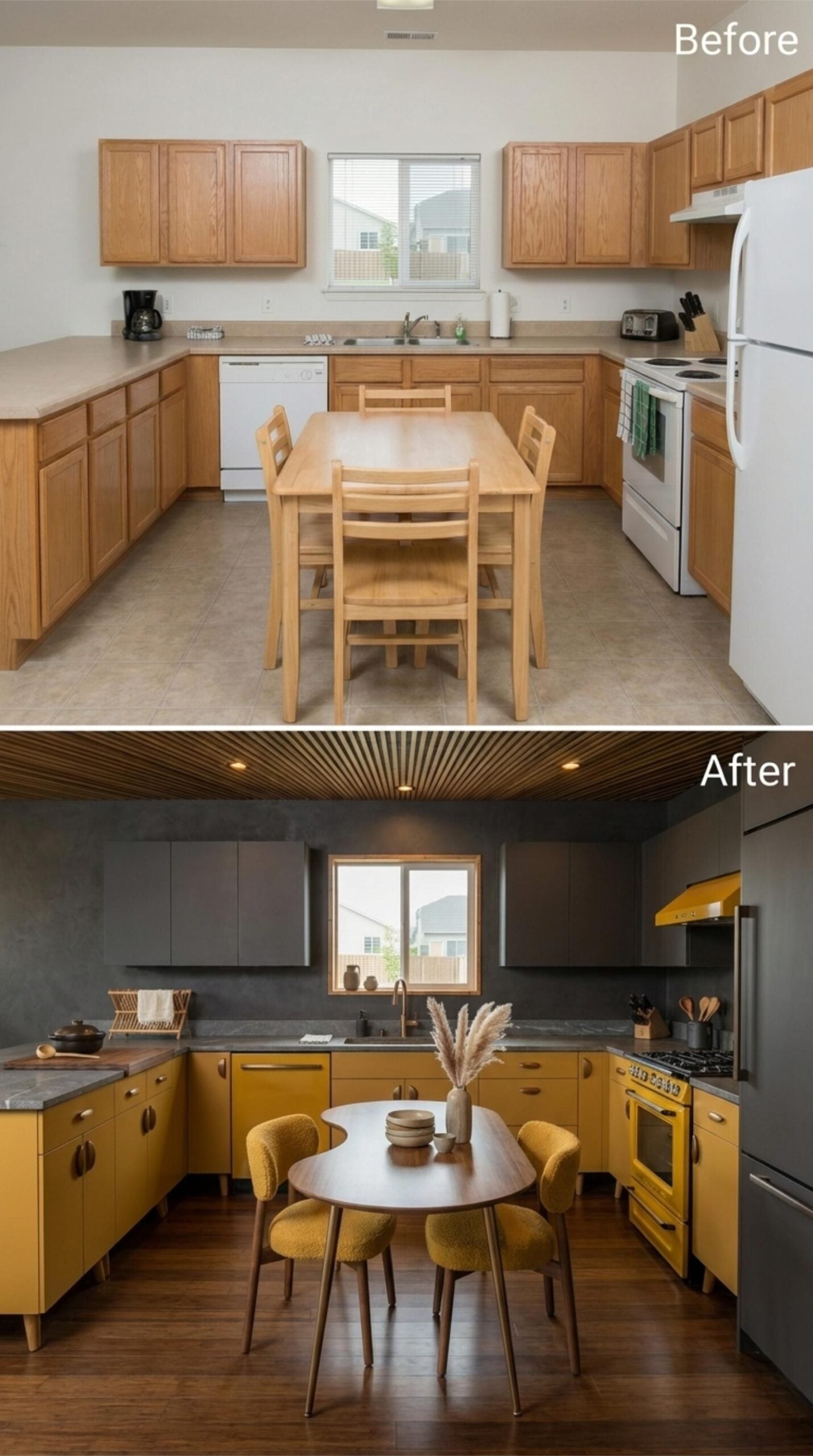
Bold mustard lower cabinets run the full perimeter, paired with dark graphite uppers and walls that absorb light rather than reflect it. Slab counters in a veined gray sit quietly on top, letting the yellow do the talking. High-contrast palette, easily tipped into harsh. It doesn’t tip.
The ceiling is where the room commits. Slatted wood runs edge to edge, adding overhead warmth the dark walls would otherwise miss. A round dining table with boucle chairs in a matching mustard keeps the center of the room from competing with the perimeter. Range hood, oven, even the range itself: all yellow. That level of coordination takes nerve.
Why Matching the Appliances to the Cabinets Actually Works Here
Yellow appliances usually read as retro novelty — a single statement piece dropped into an otherwise neutral room. Here, the range and hood share the same mustard finish as the cabinetry, which removes the “accent” quality entirely. Instead of one quirky appliance, the color reads as a material system, something deliberate rather than decorative. It’s a subtle but meaningful distinction, and it’s what keeps the room from feeling like a costume.
15. Teal Lacquer Cabinets, Brass Hardware, and a Ceiling That Commits Completely
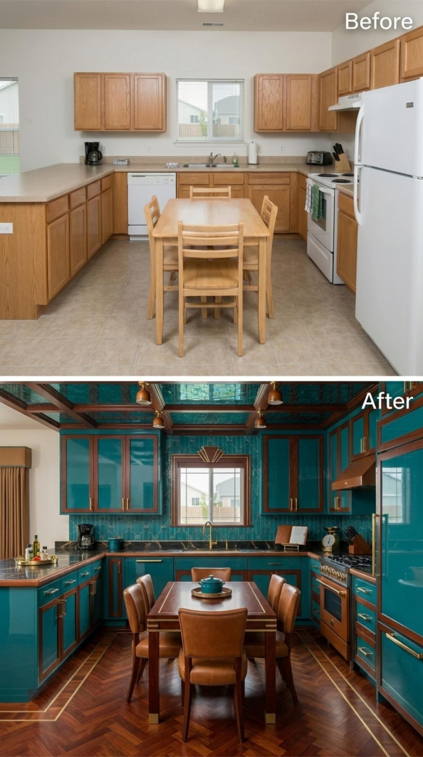
Jewel-toned teal runs floor to ceiling, with high-gloss lacquer cabinets framed in dark walnut trim and brass pulls that read gold under the pendant lighting. The backsplash carries a geometric Art Deco pattern in the same teal family, and the ceiling tiles follow suit. Nothing backs down anywhere in this room.
The dining table is walnut with leather upholstered chairs and brass nail-head trim. Parquet flooring with brass inlay strips runs beneath it all. Every surface is working. Hard to argue with the result.
Trend Alert: Brass hardware has cycled back decisively after years of chrome and brushed nickel dominance, and it pairs especially well with saturated jewel tones because the warmth of the metal keeps the color from reading cold. If you’re choosing brass for a high-gloss cabinet finish, opt for unlacquered brass over coated versions so the hardware develops a patina that softens over time rather than staying flat.
14. Navy Cabinets with Wood Insets and a Tray Ceiling That Pulls the Room Together
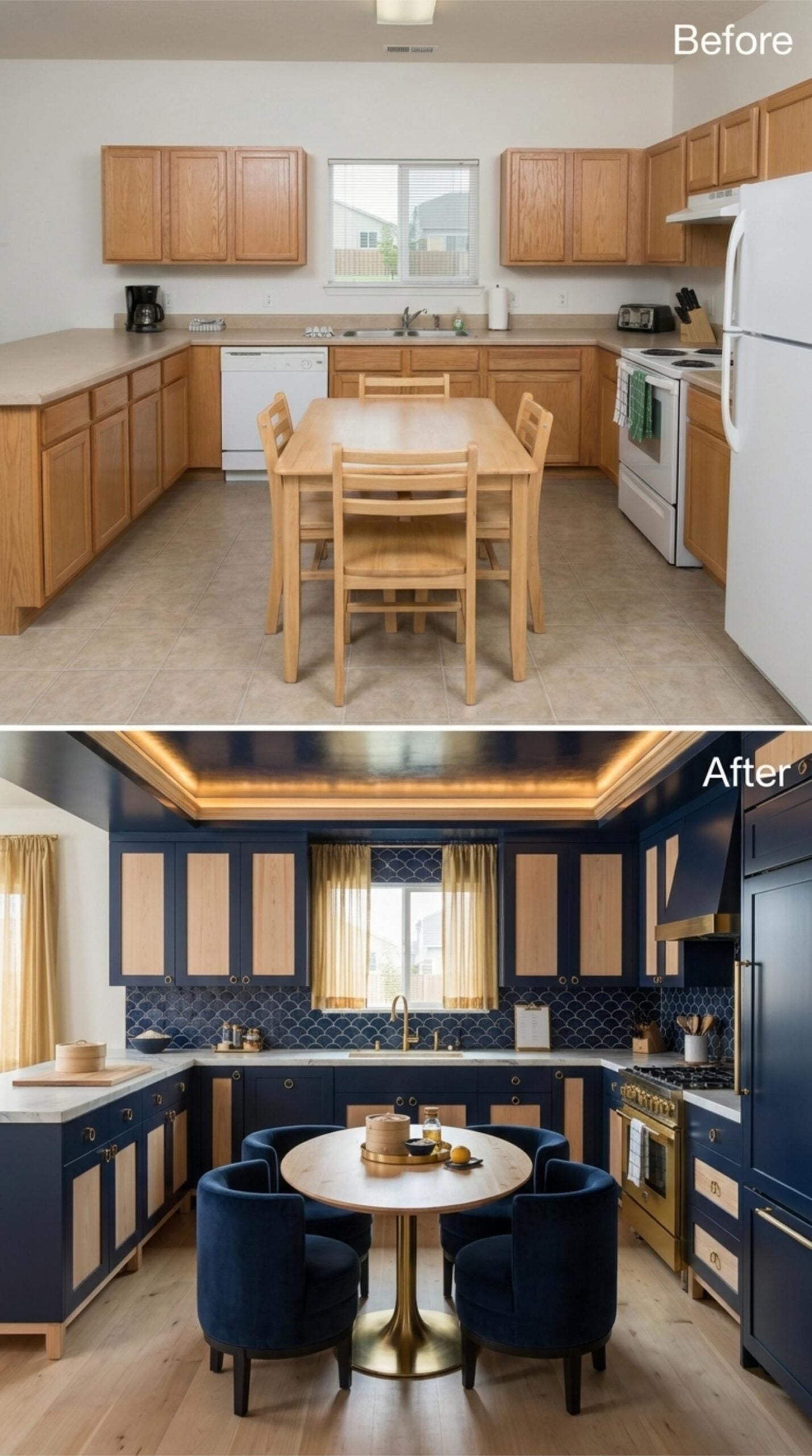
Midnight navy cabinets with natural wood inset panels cover every wall, and the contrast between the two finishes keeps the palette from going too dark. A coffered tray ceiling with recessed amber lighting anchors the room without dropping its height. The round marble-top dining table on a brass pedestal base swaps out the expected rectangular format, making the center of the kitchen feel intentional rather than leftover. Navy velvet barrel chairs complete the seating with a hotel-lounge confidence that most kitchens don’t dare to match.
Editor’s Note: Rattan and cane inset panels have gained traction as cabinet inserts because they break up solid color without requiring glass, which can feel high-maintenance in a working kitchen. They also introduce texture at eye level, which matters more than most people realize when a room is dominated by a single strong color.
13. Burgundy Burl Cabinets, Marble Counters, and a Plaster Ceiling Worth Every Penny
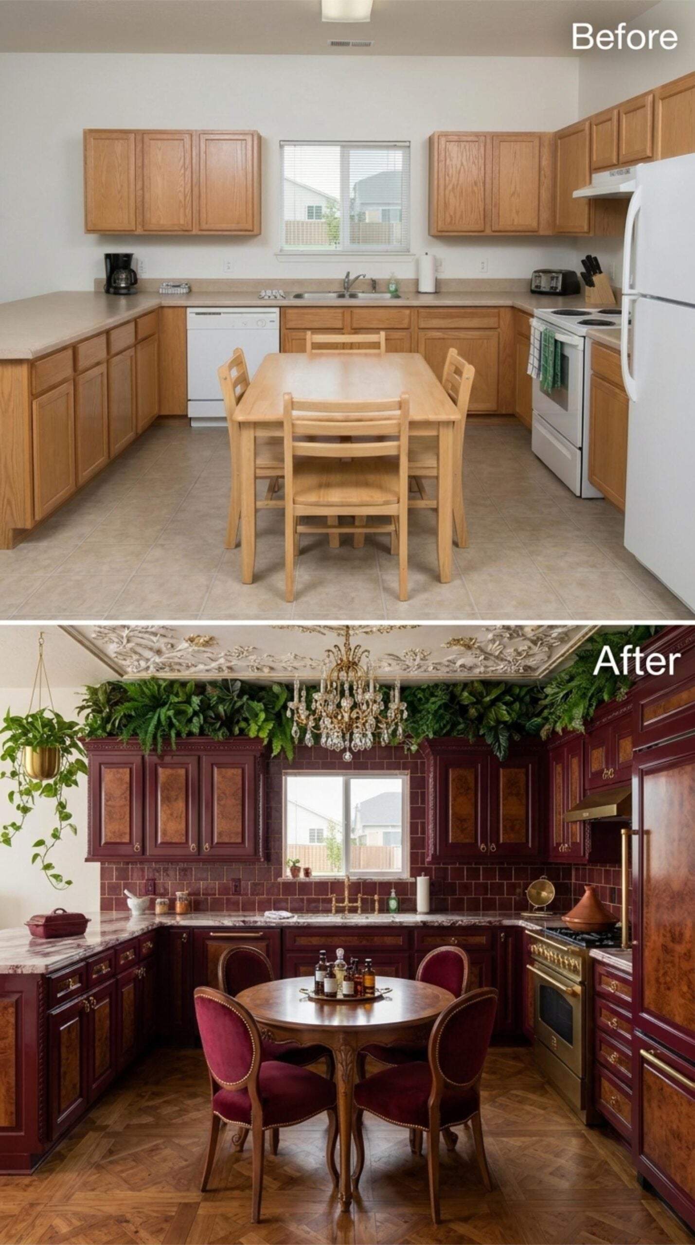
Burl wood panels set into deep burgundy cabinet frames give this kitchen a richness that painted finishes can’t replicate. Brass hardware and a gold chandelier keep the warm tones cohesive. Lush ferns line the top of the cabinetry, and an ornate plaster ceiling pulls focus upward in a room that earns every inch of its drama. Sometimes a kitchen just goes for it.
Budget Tip: Burl wood veneer panels are often available as ready-to-apply sheets, making them a practical way to add visual texture to existing cabinet doors without a full replacement. Sourcing veneer separately and applying it yourself can cut material costs significantly compared to ordering custom burl cabinetry.
12. Sage Green Cabinets, Gothic Arch Insets, and a Beadboard Ceiling That Means Business
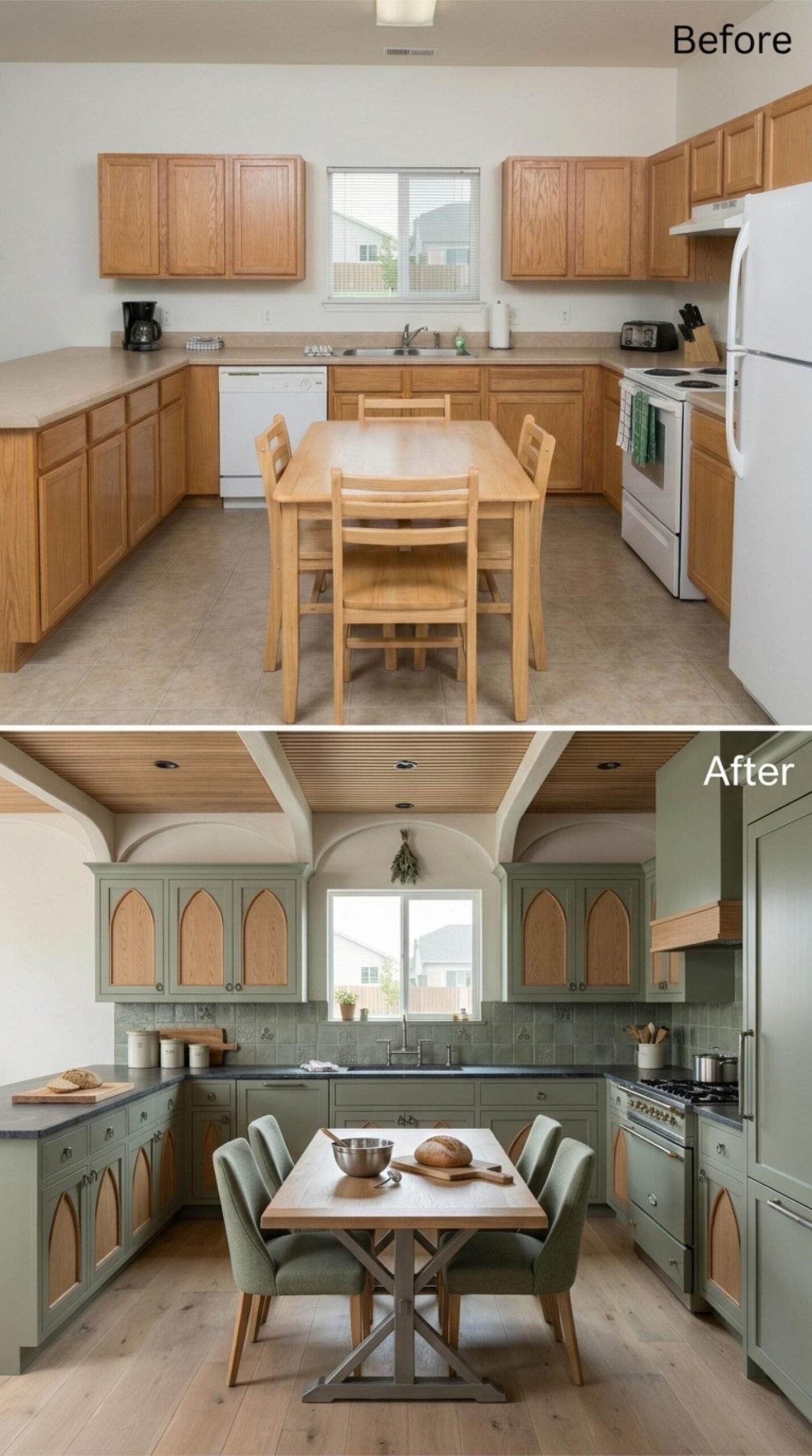
Sage green cabinets with pointed arch cutouts filled with natural wood panels run the full perimeter, giving the room an architectural rhythm that makes prep work feel unhurried. The arched detailing repeats overhead in the ceiling’s framed structure, and a beadboard inset keeps the upper plane warm rather than institutional.
Dark slate countertops ground the palette without competing with the cabinetry. Wide-plank flooring in a pale oak finish carries the light forward, and upholstered dining chairs in a matching sage fabric tie the eating area back to the cabinetry without looking contrived.
Did You Know: Pointed arch motifs in cabinetry trace back to Gothic Revival furniture popular in the 19th century, where the form was used to signal craftsmanship and permanence. Bringing that silhouette into a modern kitchen works because arches read as architectural rather than decorative, which keeps the look from feeling like a costume. Pairing them with a muted green and natural wood insets pulls the reference forward without making the room feel like a history lesson.
Not every bold kitchen leans on darkness alone — some build drama through contrast instead.
11. Cobalt Cabinets, Gold Insets, and a Coffered Ceiling That Knows What It’s Doing
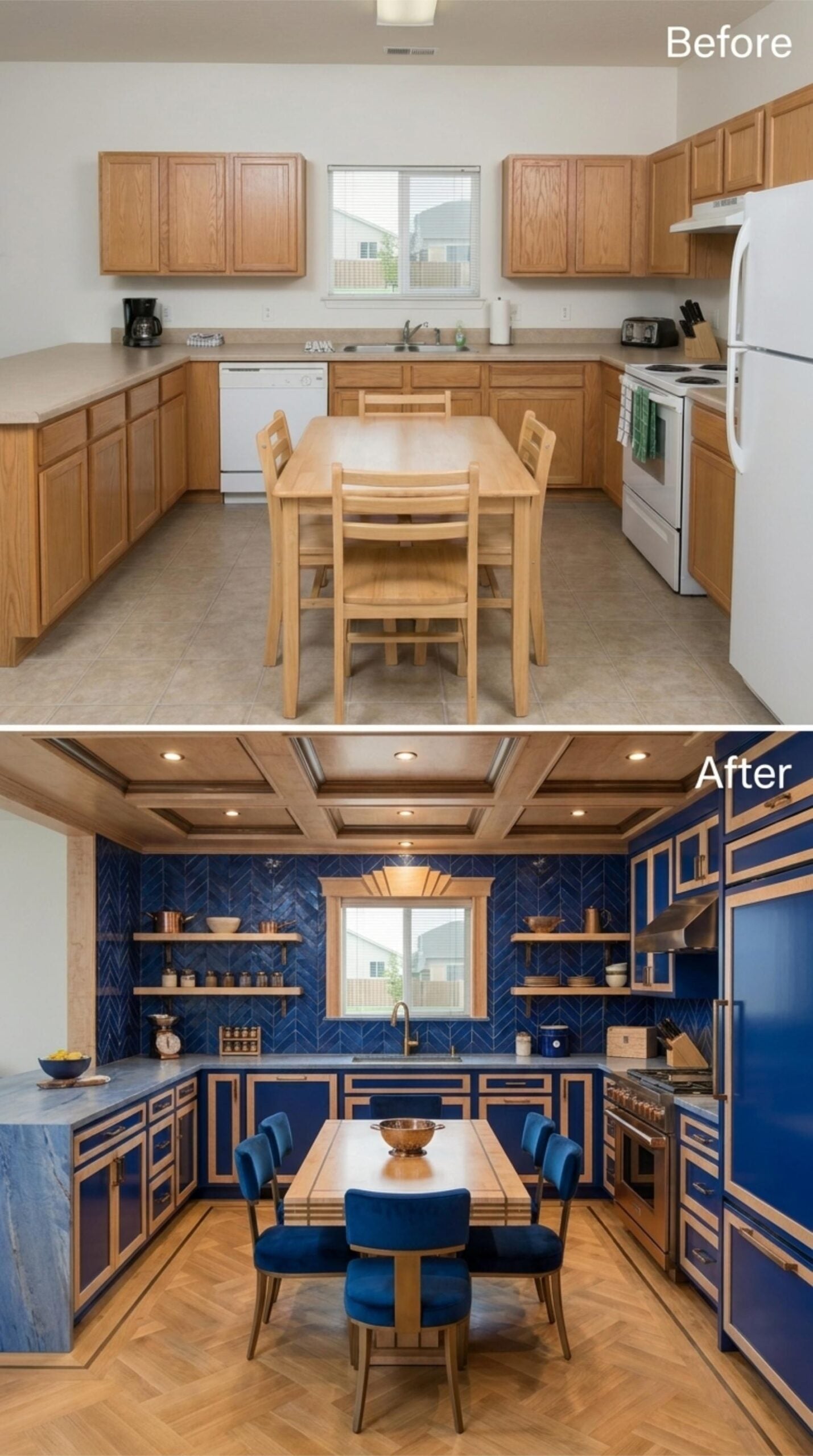
Royal blue lacquer cabinet fronts get framed by natural wood insets on every door and drawer, and that combination does real work. It keeps the cobalt from reading flat while giving the whole room a geometric rhythm that carries up into the coffered ceiling overhead. Recessed lighting drops into each coffered panel, so illumination feels structural rather than retrofitted.
The chevron tile backsplash in the same royal blue runs floor to ceiling behind the window, treating the wall as a single surface rather than separate zones. Open wood shelves float in front of it without apology. Blue velvet dining chairs anchor the island seating, and the parquet floor grounds all of it with warmth the upper half of the room genuinely needs.
10. Gray Cabinets with Wood Insets and Plaster Walls That Actually Earn the Warmth
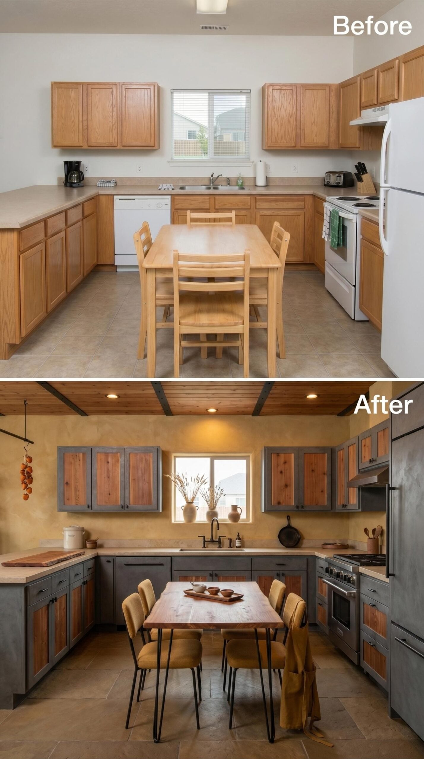
Weathered gray cabinet frames hold reclaimed-looking wood panel inserts that keep the kitchen from reading cold, which is the real risk with gray. The plaster walls in a warm ochre tone carry most of the weight, pulling the whole palette toward something that feels aged and intentional rather than recently assembled.
Mustard upholstered chairs on hairpin legs sit around a butcher block table. That combination is doing more work than it looks like. Overhead, a wood-planked ceiling with recessed lighting skips any decorative flourish and just delivers warmth, while matte black faucet and hardware give the room its edges.
Style Math: Two-tone cabinets, where the frame and the panel are different materials, work especially well in gray schemes because the wood insert adds warmth without changing the dominant color. It’s a way to keep a cool palette from feeling sterile. The wood species matters more than most people expect — a red-toned wood reads entirely differently than a pale ash.
9. Plum Lacquer Cabinets, Wood Insets, and a Coffered Ceiling That Commands the Room
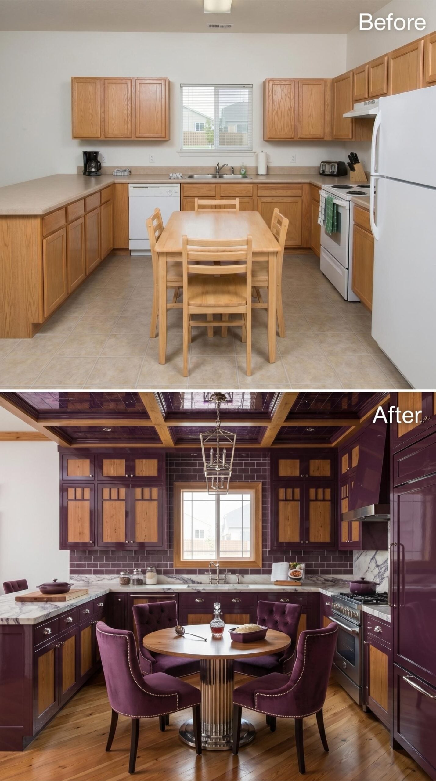
Deep plum lacquer covers every cabinet frame, while natural wood panels inset into each door keep the color from overwhelming the space. Marble counters run the perimeter. A brass lantern pendant drops from a coffered ceiling that mirrors the kitchen’s U-shape below it, tying the whole volume together. Four velvet dining chairs in matching plum sit around a round pedestal table, and the nailhead trim on each chair connects back to the chrome cabinet hardware.
Why It Works: Coffered ceilings work hardest when the room already has strong vertical elements like tall upper cabinets, because the grid above creates a visual echo of the structure below. In a room this saturated, that repetition is what keeps the design from feeling chaotic rather than intentional.
8. Forest Green Cabinets, Burl Insets, and a Plaster Ceiling That Earns Every Glance
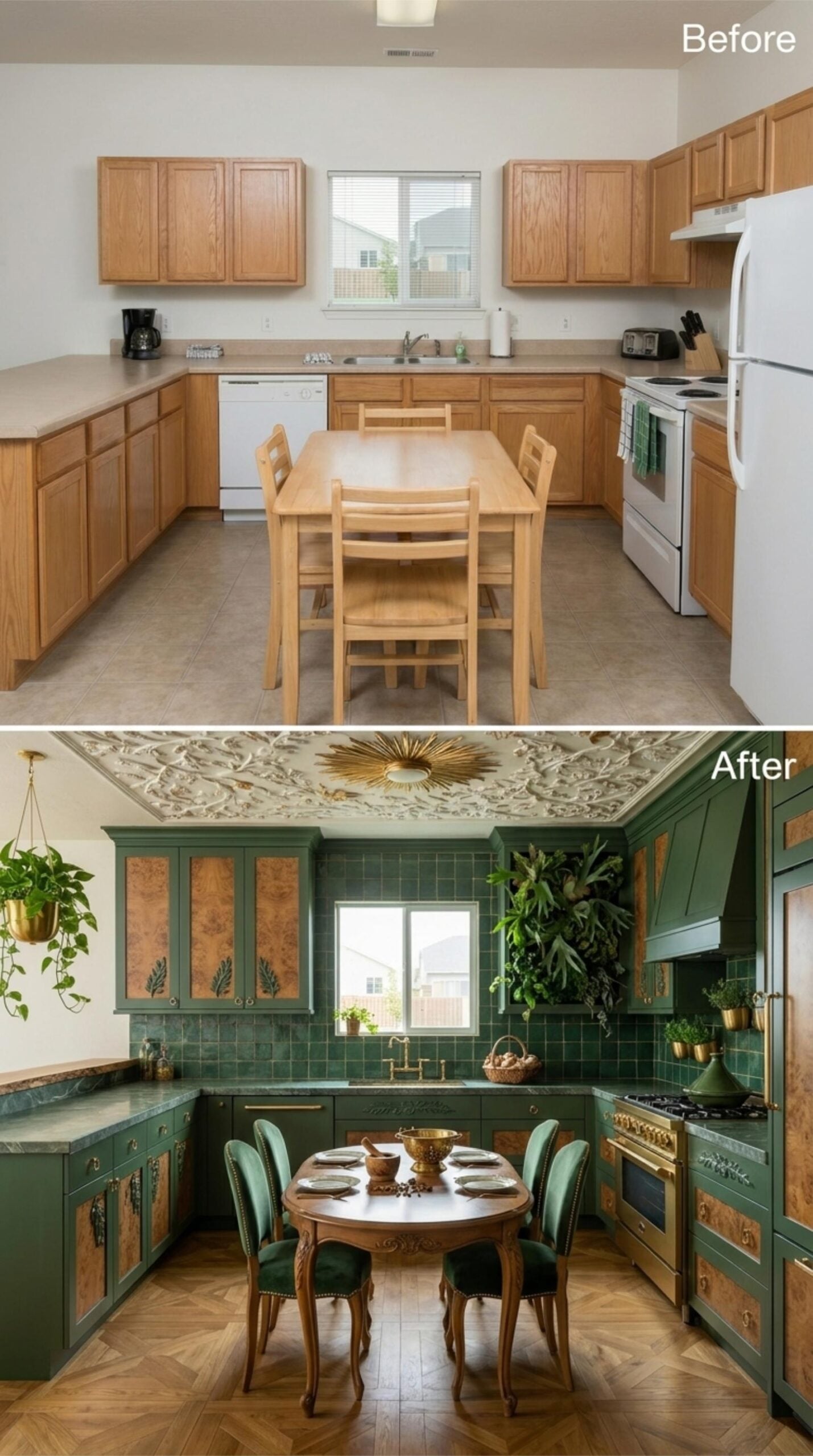
Hunter green cabinetry with burl wood panel inserts runs the full perimeter, and the warm amber grain against the matte green finish is what keeps the palette from reading cold. Green zellige tile covers the backsplash in a grid that catches light unevenly, which is exactly the point. Overhead, a plaster ceiling with botanical relief work and a sunburst medallion gives the room genuine architectural weight. The dining set doesn’t pretend to be anything other than antique: carved cabriole legs, an oval top, velvet upholstered chairs in a tone that mirrors the cabinets exactly.
7. Terracotta Cabinets, Concrete Walls, and Open Shelving That Actually Earns the Wall Space
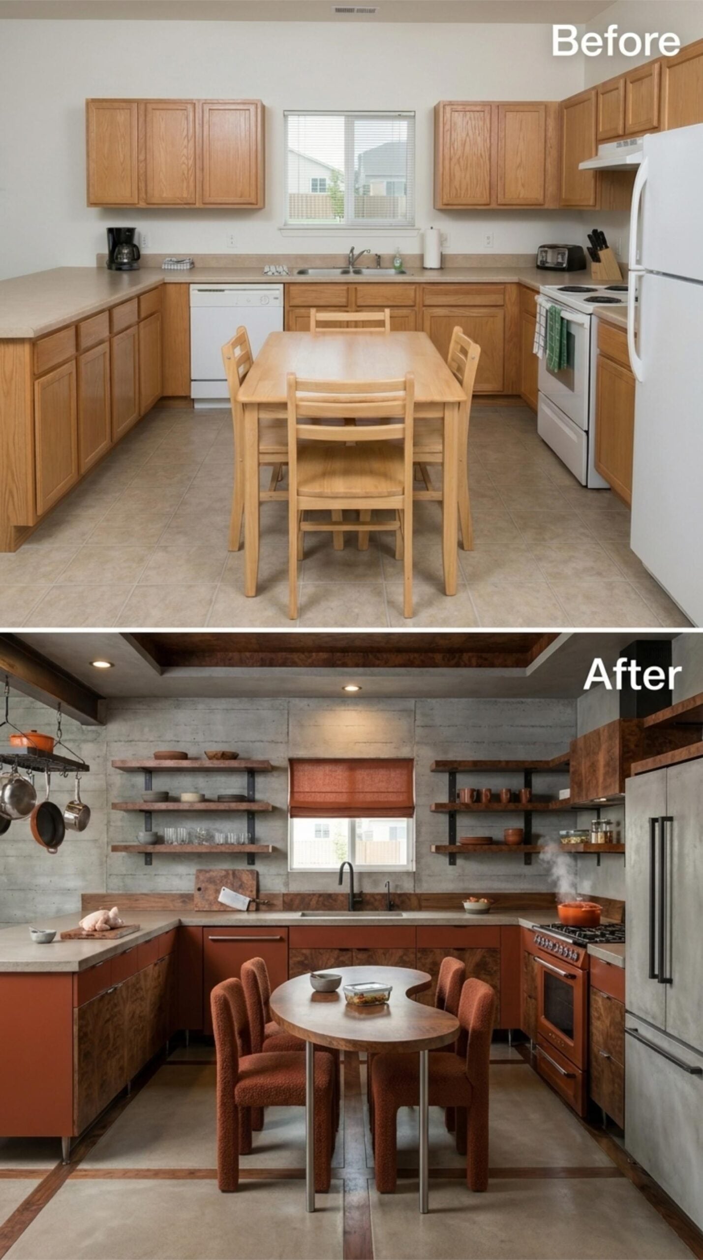
Concrete-finish walls set a raw, almost industrial backdrop, but the terracotta-lacquered lower cabinets keep the room from reading cold. Open walnut shelves replace upper cabinets entirely, and they work because the styling is restrained — no overcrowding, no decorative clutter. A round bistro table with rust boucle chairs pulls the dining area inward, making the kitchen feel gathered rather than sprawling.
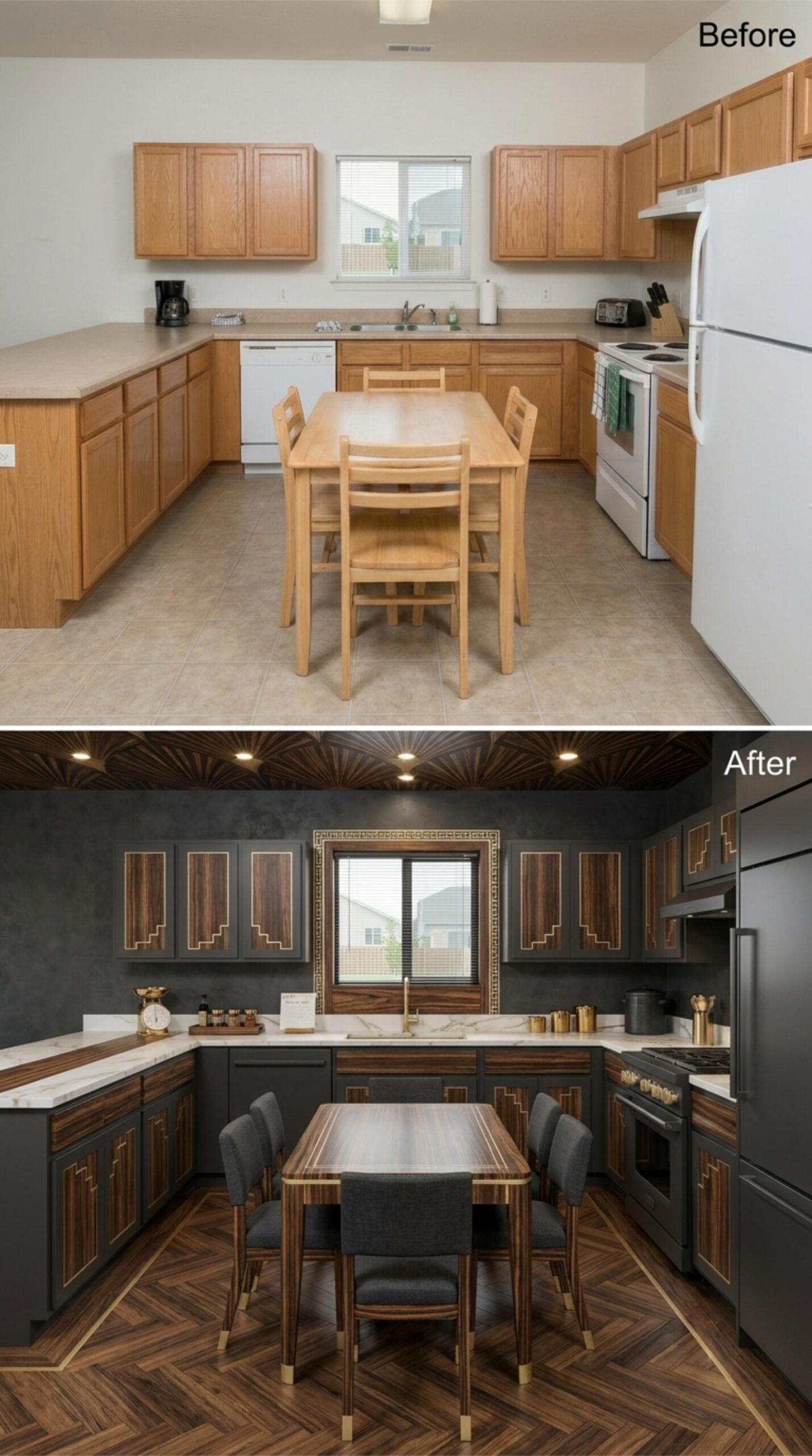
6. Dark Walnut Insets, Gold Trim Lines, and a Patterned Ceiling That Earns the Drama
🔥 Would you like to save this?
Charcoal cabinets with walnut veneer inset panels set the tone, and the gold-trim geometric detailing on every door keeps it from reading as flat or heavy. Marble countertops run the full perimeter, and the brass faucet is the one element that bridges the warm wood tones with the cooler slab above.
The herringbone wood floor with inlaid gold strip borders does real work in a room this dark. Recessed ceiling lights are set into a fan-burst plaster pattern that most kitchens don’t attempt. It’s a lot, honestly. But it holds together because every element speaks the same Art Deco dialect.
5. Emerald Lacquer, Zellige Tile, and Open Shelving That Actually Earns the Wall Space
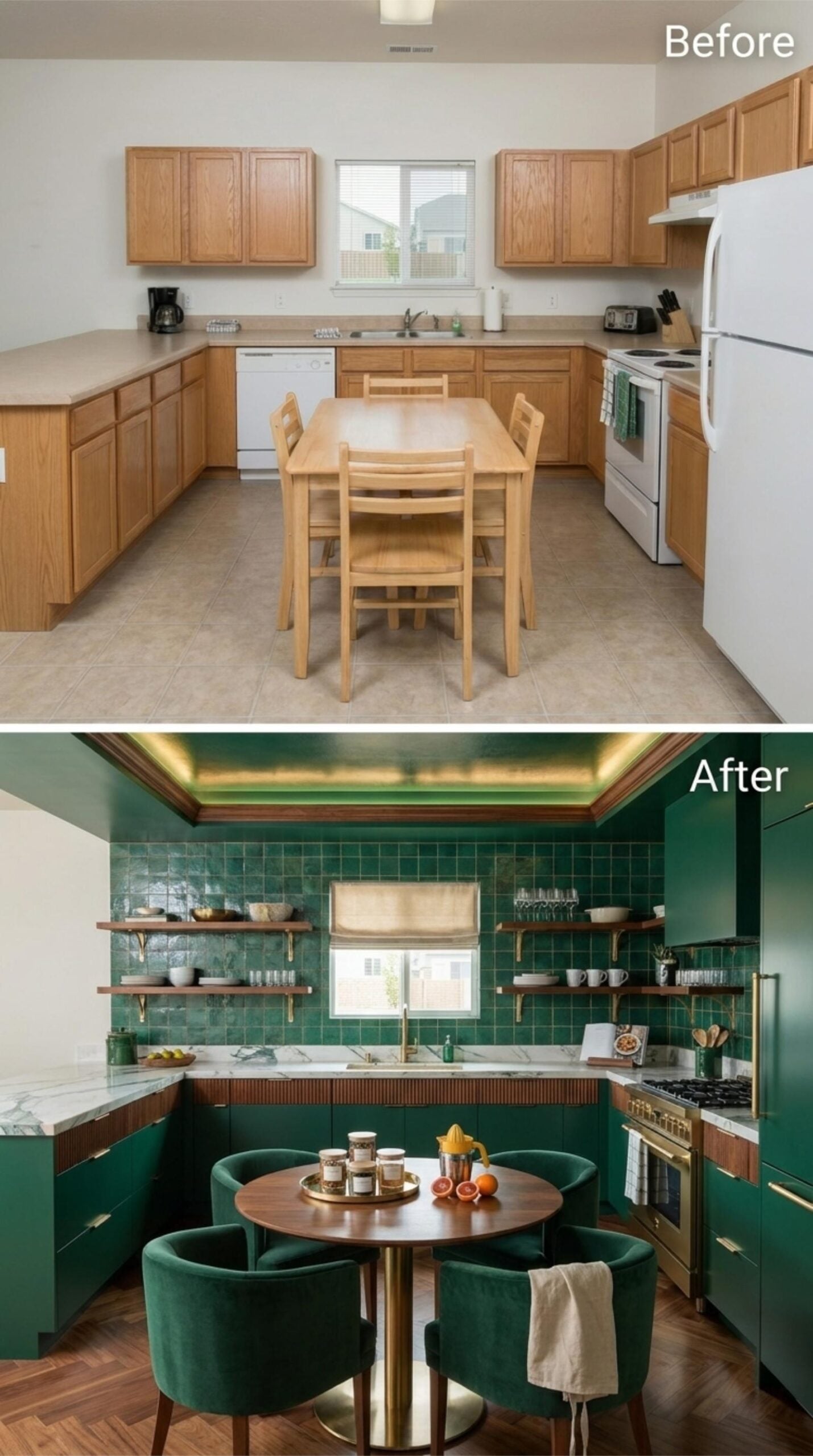
Emerald lacquer cabinets run floor to ceiling on every wall, paired with brass pulls that hit the right note without overselling the glamour. The upper cabinets are gone entirely, replaced by walnut floating shelves on brass brackets, which opens the wall enough that the zellige tile backsplash gets room to breathe. That tile does serious work. Its handmade surface catches light unevenly, so the green shifts slightly across the wall rather than sitting flat.
Marble counters in white and gray ground the lower half without competing. A round walnut bistro table with a brass pedestal base sits center-floor, surrounded by velvet barrel chairs in the same emerald as the cabinets. The ceiling detail, a stepped tray with warm LED cove lighting, pulls the eye up just enough to make the room feel considered rather than enclosed.
4. Slate Blue Cabinets, Wood Insets, and a Plank Ceiling That Actually Does the Work
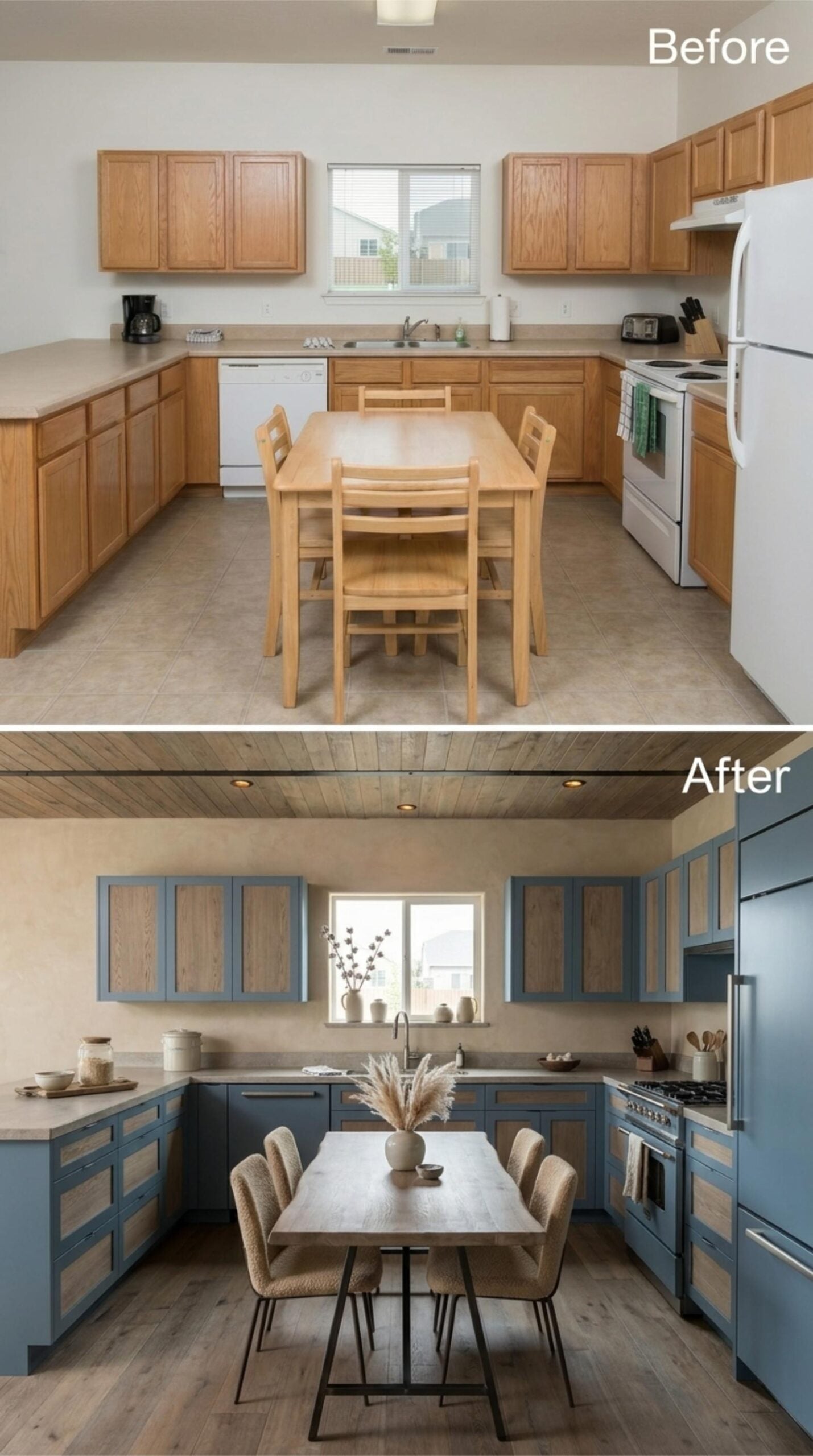
Muted slate blue frames with raw oak insets keep the upper cabinets from reading as heavy, and the wood-planked ceiling carries that warmth all the way up. Stainless appliances and a pampas grass centerpiece finish the room without straining to do so. Sometimes restraint is the whole point.
3. Cream Cabinets with Wood Insets, Terracotta Tile, and Exposed Beams That Pull Everything Down to Earth
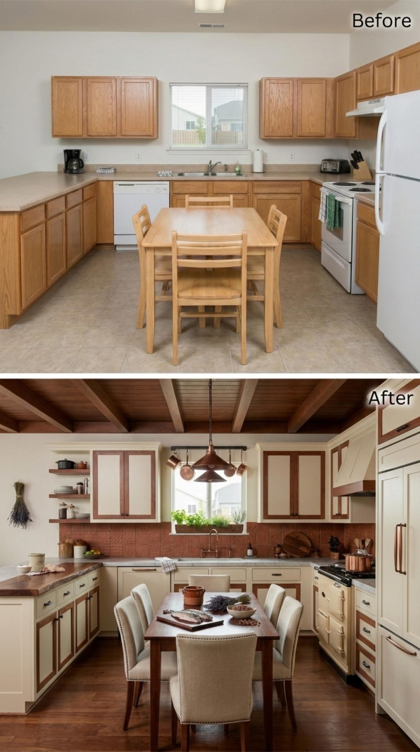
Cream cabinet frames with warm wood inset panels run the full perimeter, and the terracotta tile backsplash keeps the palette grounded rather than precious. Exposed ceiling beams in matching wood tie the upper half of the room together. A copper pendant hangs over the dining table, and the upholstered chairs with nailhead trim signal that Sunday prep here runs long and nobody minds.
2. Midnight Navy Lacquer, Copper Hardware, and Gothic Arches That Actually Mean Something
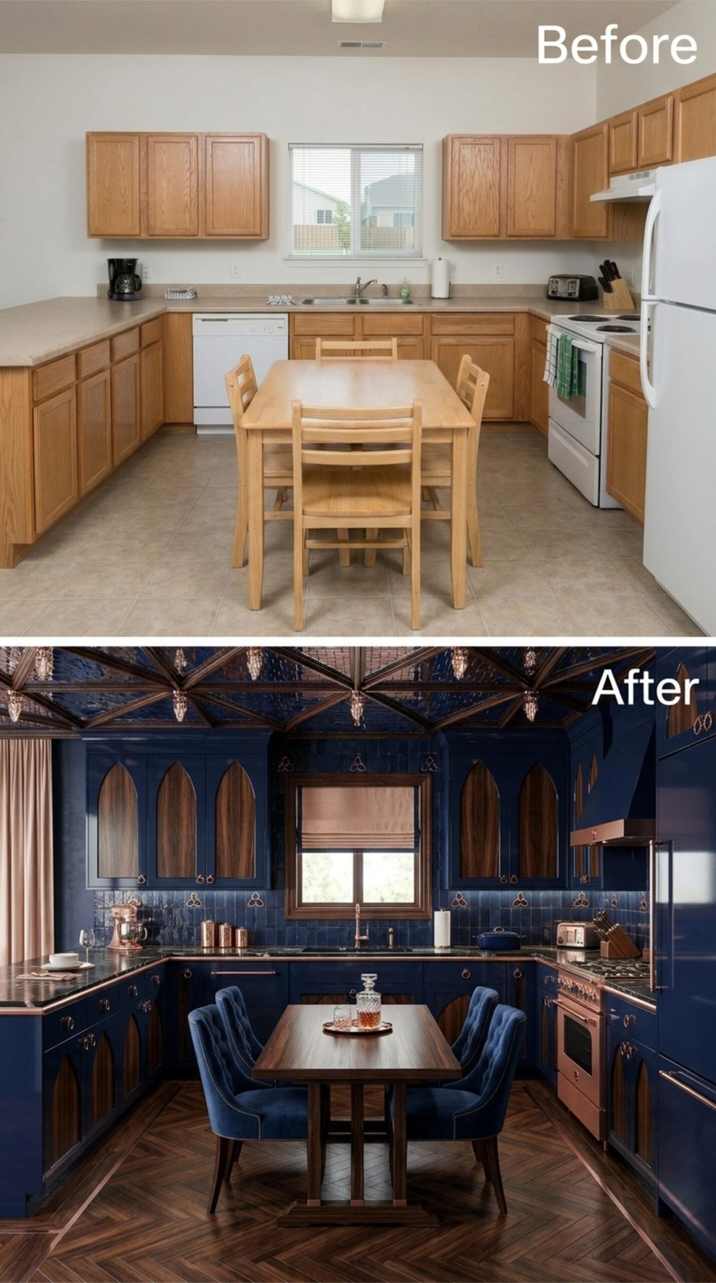
Navy lacquer cabinets with Gothic arch insets set the tone immediately. The arches aren’t decorative softening — they’re structural repetition, running across both upper and lower cabinets until the room reads more like a chapel than a kitchen. Copper hardware pulls the whole scheme warm, and the vaulted ceiling with its dark wood ribs and copper pendant drops is doing serious architectural work overhead.
The parquet herringbone floor grounds everything without competing. Velvet tufted chairs in matching navy sit at a walnut dining table, and the copper range hood ties the appliances back to the hardware. Fully, unapologetically committed.
1. Midnight Blue Lacquer, Gothic Arches, and Copper That Earns Every Square Inch
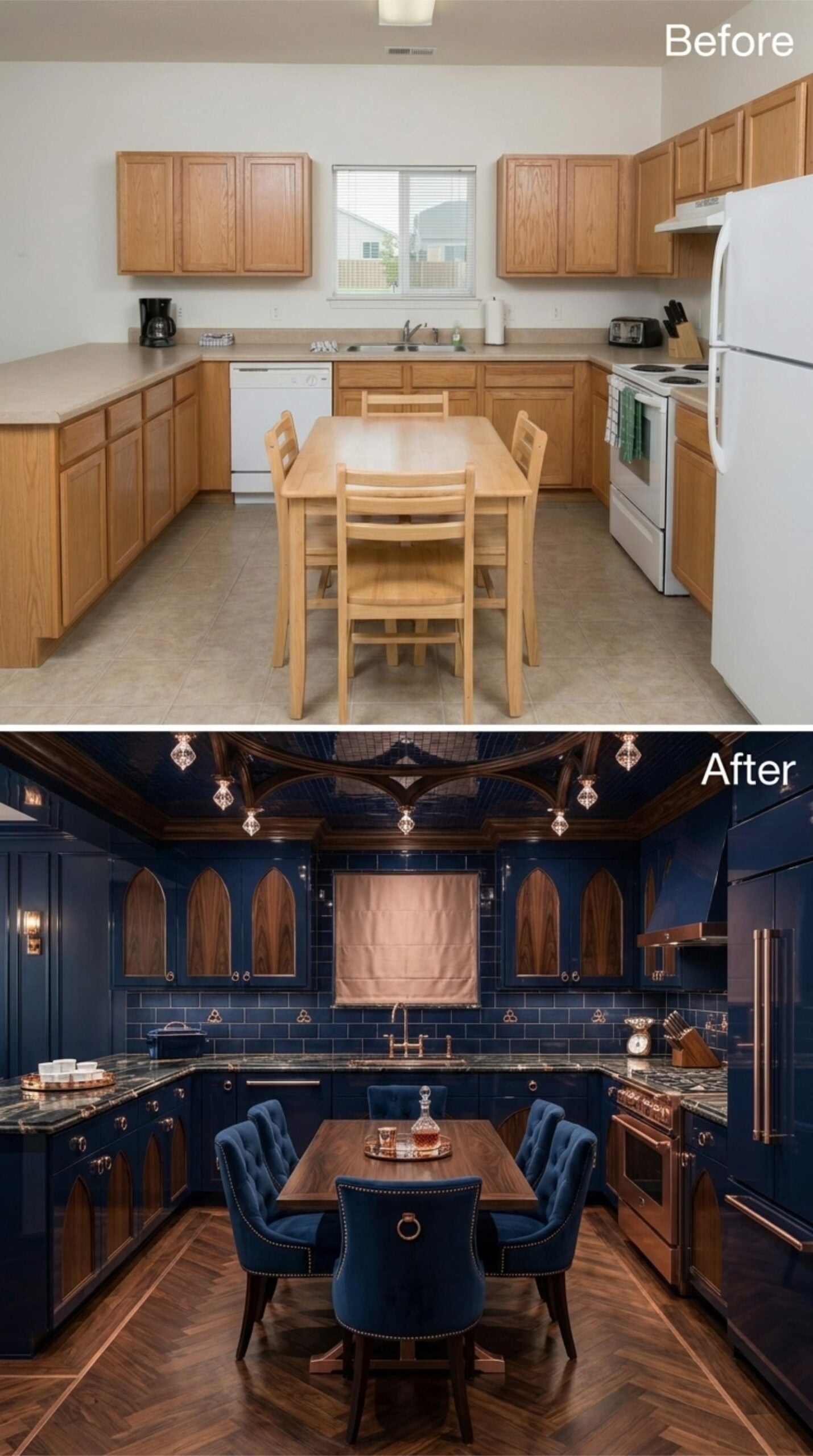
Glossy navy lacquer cabinets run floor to ceiling, with pointed arch cutouts revealing walnut panels that keep the drama from tipping into cold. Copper hardware and a matching range hood pull the warmth back in. The herringbone floor closes out the room without needing to say anything else.












