
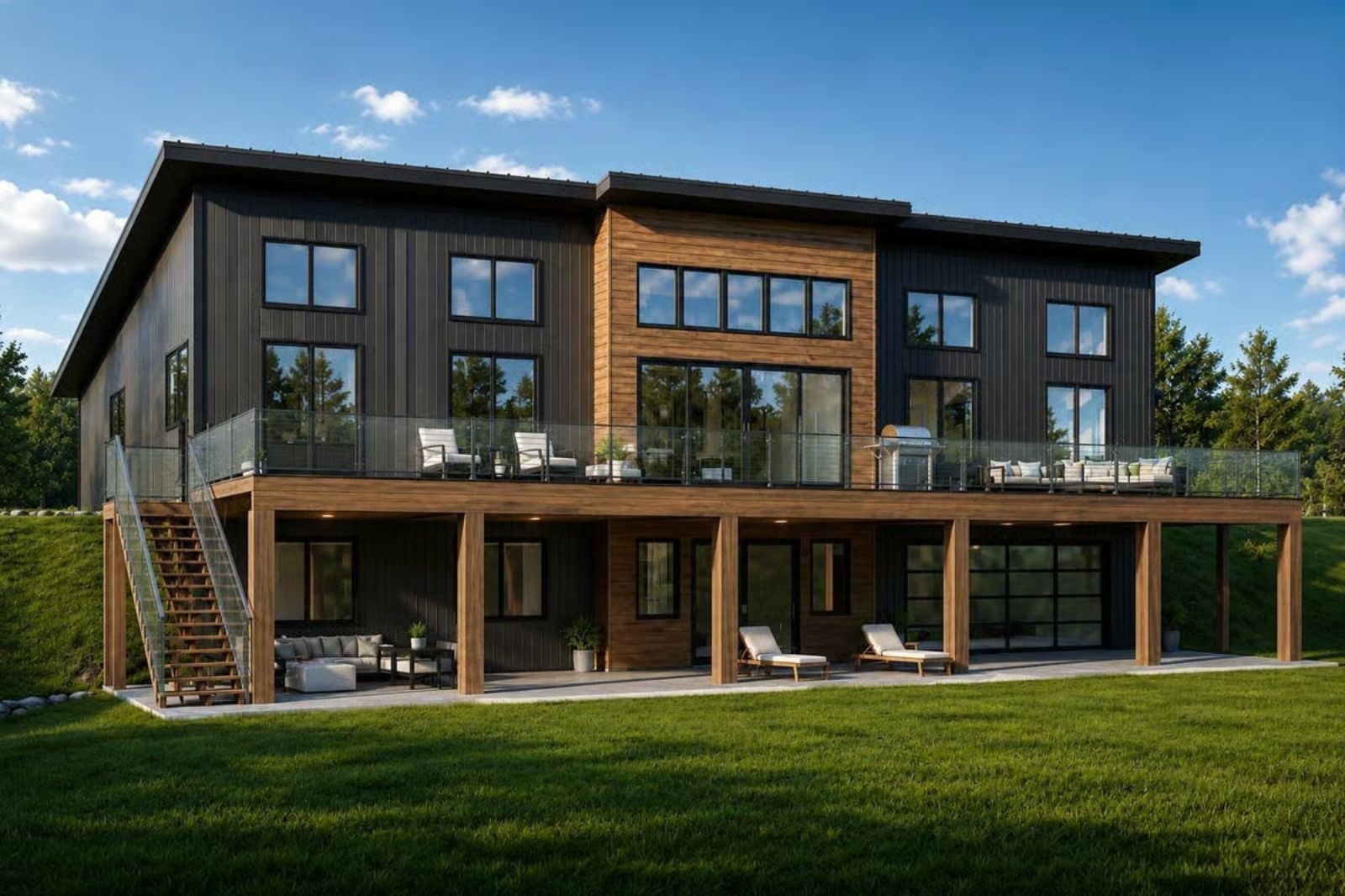
In-law suites done wrong are just guest rooms with a passive-aggressive energy, and the Kessler has clearly been designed by someone who understood that problem firsthand. This one earns it: a walkout basement suite with its own kitchenette, a main-level primary wing tucked well away from the chaos, and enough shared common space that two households can coexist without staging a cold war over the coffee maker.
Specifications
- Sq. Ft.: 3,640
- Bedrooms: 6
- Bathrooms: 5
Floor Plan – Main Floor
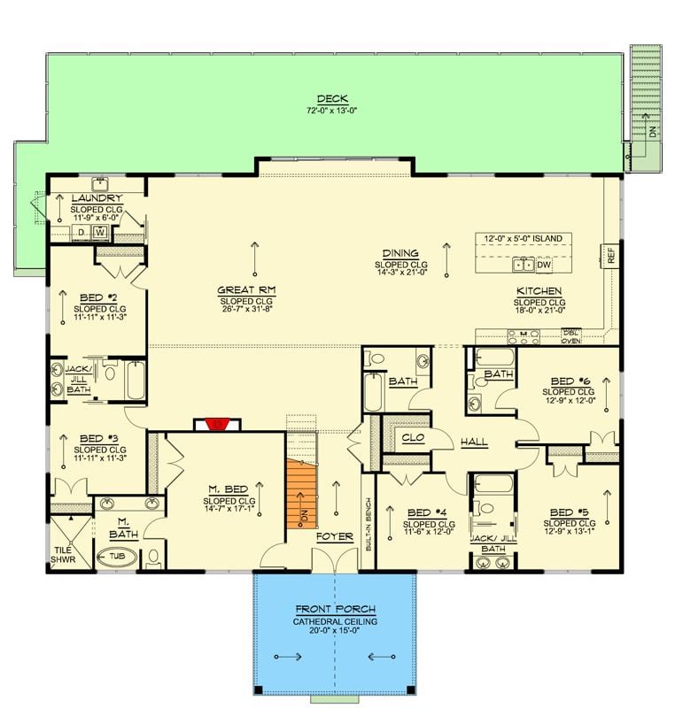
Single-level layout with six bedrooms, a central great room, and an open kitchen-dining zone. Two Jack-and-Jill baths serve four of those bedrooms, while the master suite sits near the foyer, quietly separated from everything else going on in the house.
Floor Plan – Basement
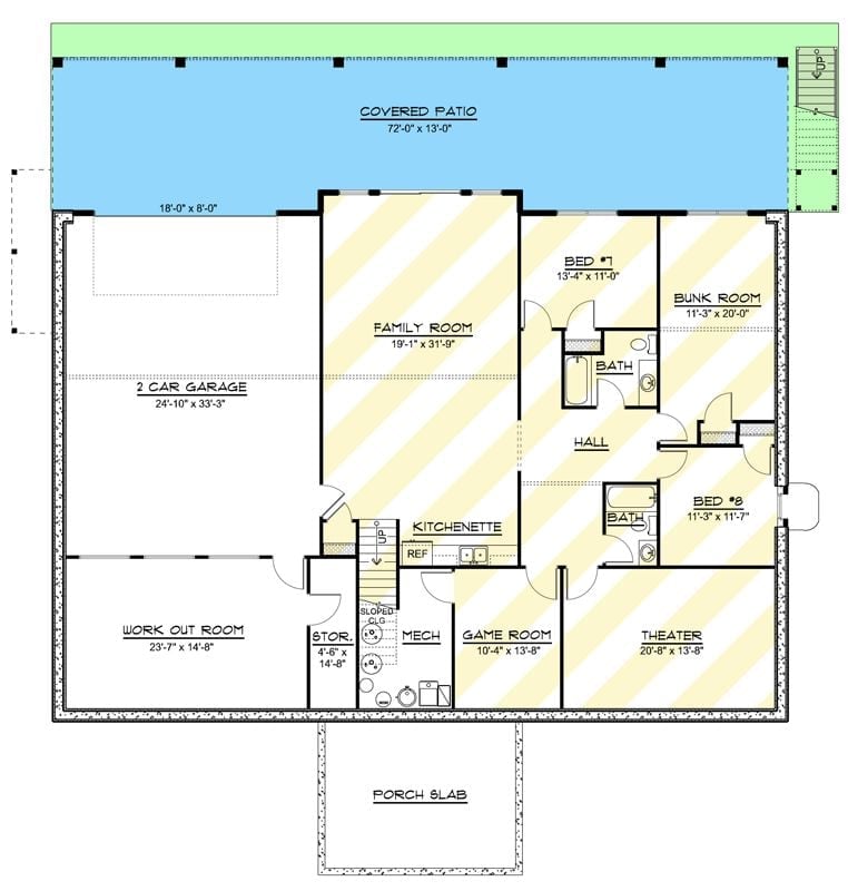
The basement level packs in a family room, kitchenette, two bedrooms, bunk room, theater, game room, and two-car garage — with a covered patio running the full rear width.
Dark Vertical Siding and Raw Timber Posts Make This Porch Worth Sitting In
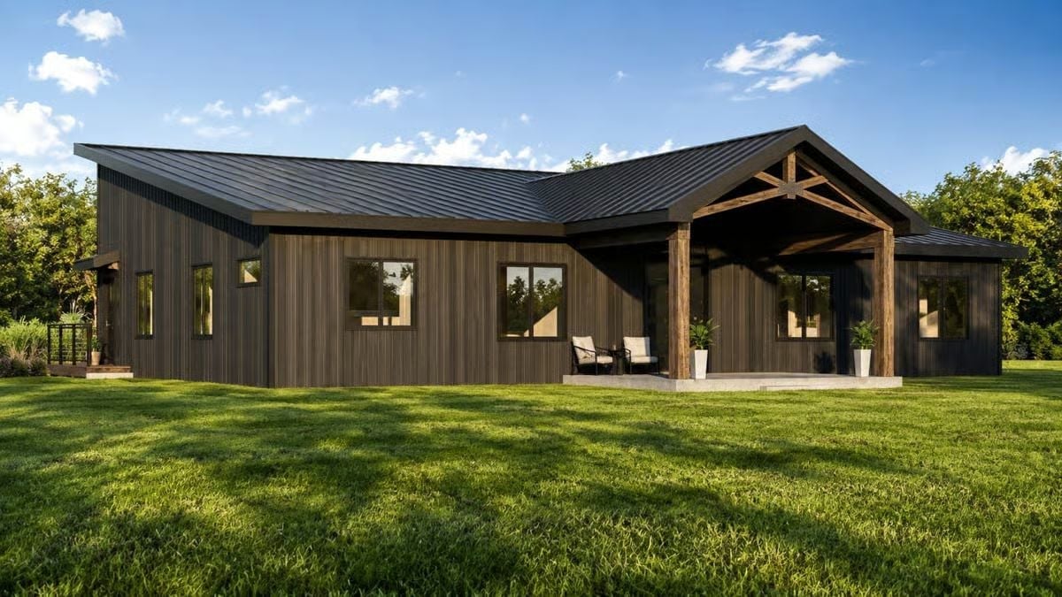
Charcoal board-and-batten siding meets a standing-seam metal roof, anchored by rough-sawn timber posts framing a covered rear patio. It reads rugged without trying too hard — which is exactly where modern farmhouse exteriors tend to go wrong.
By The Numbers: Board-and-batten siding has surged on modern farmhouse and barndominium builds because it handles moisture better than traditional lap siding and needs repainting less often. The vertical lines draw the eye upward too, making a single-story structure read taller than it actually is. Pair that with a black metal roof and you’ve got an exterior that can hold up for decades with minimal fuss.
Vaulted Upper Hallway Pulls Off the Built-In Bench Better Than Most
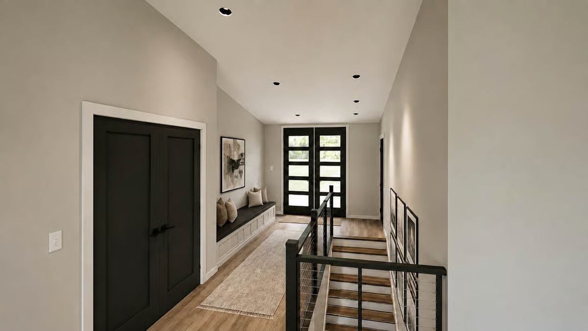
Black double doors anchor the left wall while a low built-in bench with shiplap paneling runs beneath abstract art. The cable railing staircase keeps sightlines open, and the warm wood floors tie it together without the whole thing feeling staged.
Common Mistake: Builders often center recessed lighting down a hallway without accounting for vaulted ceiling geometry, which pushes fixtures too close to the high wall and leaves the lower end underlit. Map your can lights to the floor plan first, not the ceiling slope.
Cream Sectional and a Wood Mantel Shelf That Actually Earns Its Keep
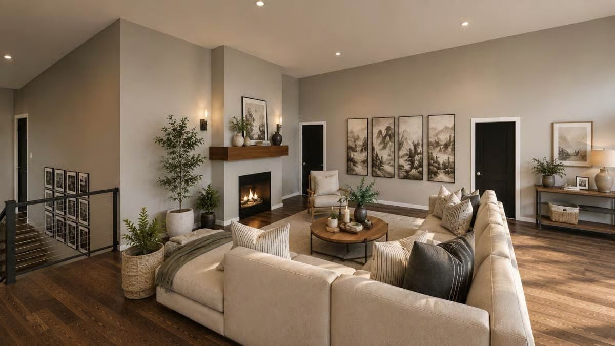
No surround, no built-ins flanking it, no decorative mantel crowded with objects — just a walnut shelf above the firebox and the fire itself doing the work. Sometimes restraint is the move.
The walnut mantel shelf grounds the fireplace without a surround, letting the warm fire do the heavy lifting.
Clerestory Windows and a Glass Dining Table Pull the Outside In Without Trying
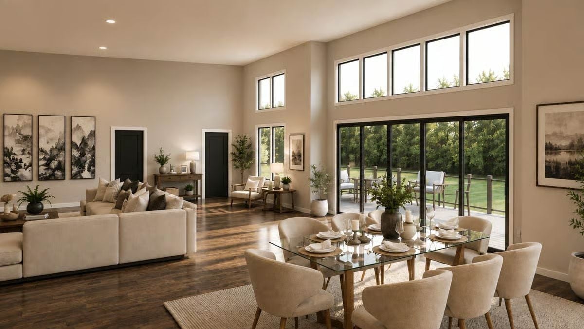
Those clerestory windows above the sliding glass wall do real work here, keeping the upper portion from feeling like a blank drop. The glass-top dining table reflects the greenery outside, which softens what could’ve been a heavy beige room. Cream bouclé chairs and dark hardwood floors carry the contrast without competing — and none of it feels like it was sourced from the same mood board.
Try This: Glass dining tables get dismissed as high-maintenance, but they’re genuinely easier to keep than wood after family dinners. A damp cloth handles almost anything, and you won’t spend years chasing water rings or stressing over heat marks from serving dishes.
Marble Waterfall Island With Four Barstools and Zero Apologies
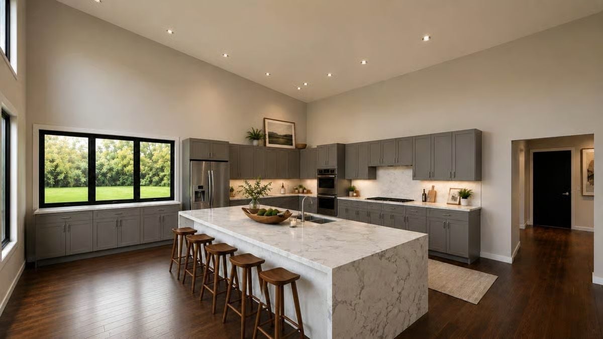
Gray shaker cabinets run the full perimeter, but the island is the thing you notice first. That waterfall edge in white-and-gray marble is thick enough to read as furniture rather than just countertop, and four wood barstools keep it from feeling precious. Under-cabinet lighting pulls the backsplash forward without any pendants competing for attention overhead.
The Psychology Behind This: Kitchens with islands long enough to seat four tend to shift how families actually use the space. People gravitate there for homework, coffee, and conversation well before a meal is even started — which is why open kitchen layouts consistently rank among the features buyers say they didn’t know they needed until they had one.
Laundry Room Humor on the Wall Won’t Fold Your Clothes, But the Layout Helps
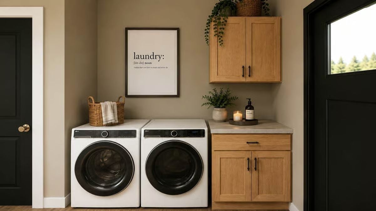
LG front-loaders side by side beneath a framed print, oak cabinetry above, a candle tray on the counter. It’s a laundry room that doesn’t apologize for existing.
Did You Know: Front-loading washers use noticeably less water per cycle than top-loaders because they tumble clothes through a shallow pool rather than submerging a full drum — efficiency that adds up fast in a household running multiple loads a week. A built-in folding counter like the one shown here also reduces back strain compared to sorting off the floor or a nearby chair.
Bedrooms tell you a lot about how seriously a builder took the rest of the house.
Wavy Gold Mirror and Botanical Wallpaper Pull This Bedroom Away From Safe
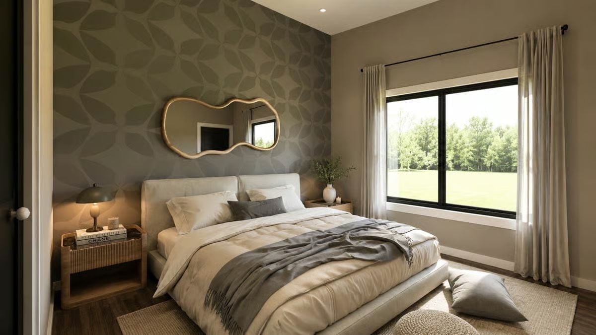
Sage leaf wallpaper on the accent wall carries most of the personality in this room. The irregular gold mirror keeps it from tipping into catalog territory — one of those details that’s easy to overlook in a rendering and harder to replicate once you’re standing in the space.
transition: Accent wall wallpaper is having a real moment in new builds, and the appeal is practical as much as aesthetic. It commits to a design direction without locking you into a full repaint if your taste shifts in five years. Peel-and-stick options have improved enough that some installers now prefer them over traditional paste for single-wall applications.
Freestanding Tub Centered on a Window View That Does All the Work
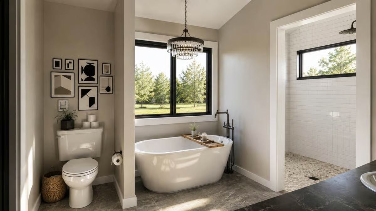
A crystal chandelier above a soaker tub is a combination that has no business working as well as it does. Pebble tile on the shower floor, white subway walls, and a bamboo tray resting across the tub’s rim pull the room back from formal without losing any of the drama.
Pin It
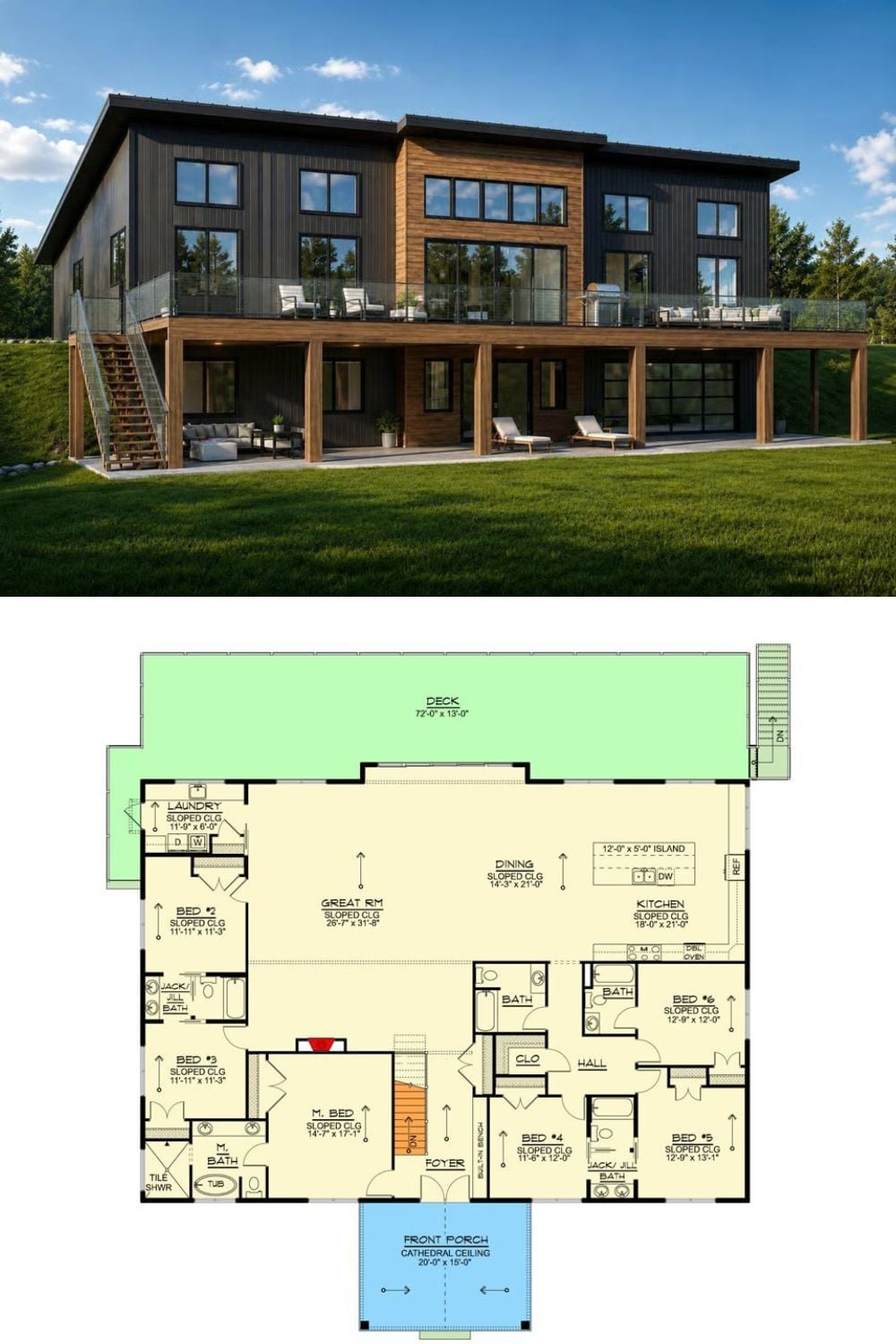
Exterior rendering shows a three-story modern home with dark vertical siding and wood accents. Floor plan below reveals six bedrooms, great room, and a 72-foot rear deck.
