🔥 Would you like to save this?
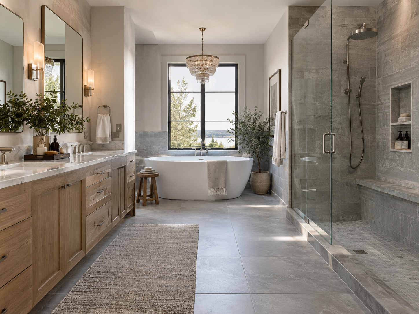
Grey was the bathroom for about ten years. Grey floor tile, grey shower walls, grey vanity, chrome everything, and a white towel folded just so. Every design site on the internet has since announced that it’s over, usually in a headline with “outdated” in it. I’ve never seen anyone show the numbers, though, and I happen to have some.
Home Stratosphere runs what I call the Reader Preference Lab. Readers react to the images they come across while reading the site. They can hit a heart, a flame or an “inspired” reaction, give it a thumbs-down, or save it. Every image is tagged against a fixed list of attributes, including tile colour. For this one I pulled every tagged bathroom image from August 30 to September 28, which comes to 831 bathrooms across 56 articles, 290,720 views, 963 positive reactions, 969 thumbs-downs and 414 saves.
The short answer is no, grey isn’t done. At least not with these readers. It’s losing to white, cream and beige, but a different tile colour is in far more trouble, and it took me a second pass to see it.
The first pass said grey was finished
The Preference Index is the same one I used for the coffee table report. It’s positive reactions per view for a feature, divided by the average for all the bathroom images with that attribute tagged, times 100. So 100 is average, above 100 is better than average and below is worse.
On the first pass, grey tile came in at 30. White, cream and beige together were at 123. Black tile was at 58, and colourful or patterned tile was at 86. If I’d written this article off that pass the headline would have written itself, and it would have said grey was dead.
It bothered me though, because 30 is an extreme number, and extreme numbers from a few dozen images usually have a boring explanation. So I went looking at where the grey tile actually was.
Then I looked at where the grey tile was
Nearly two thirds of all the views that grey-tile bathrooms got (64%) came from two articles, one about bathroom renovation mistakes and one called “double vanity design disasters.” Those are articles where the whole point is that the bathroom is wrong. The door swings into the vanity drawers, the vanity is mounted at the wrong height, the shower is too small because somebody wanted a bigger vanity. Readers were thumbing those images down, and I’m pretty sure it wasn’t about the tile. The double-vanity article alone gave its four grey-tile images 5,240 views, zero positive reactions and 19 thumbs-downs.
It goes past those two articles, too. 94% of the views grey tile got were in articles that drew fewer reactions than average overall. For white, cream and beige tile that figure is 60%. Grey just happened to show up in the low-reaction articles and the mistake articles, and light tile happened to show up in the big before-and-after makeover pieces that readers love.
So I changed the comparison. Instead of comparing every bathroom image with the site average, I compared each image with the other bathroom images in its own article. Same writer, same page, same readers, same day’s mood. If grey-tile images do worse than the white-tile images sitting right next to them, that’s a tile problem. If they only do worse than images in other articles, that’s an article problem.
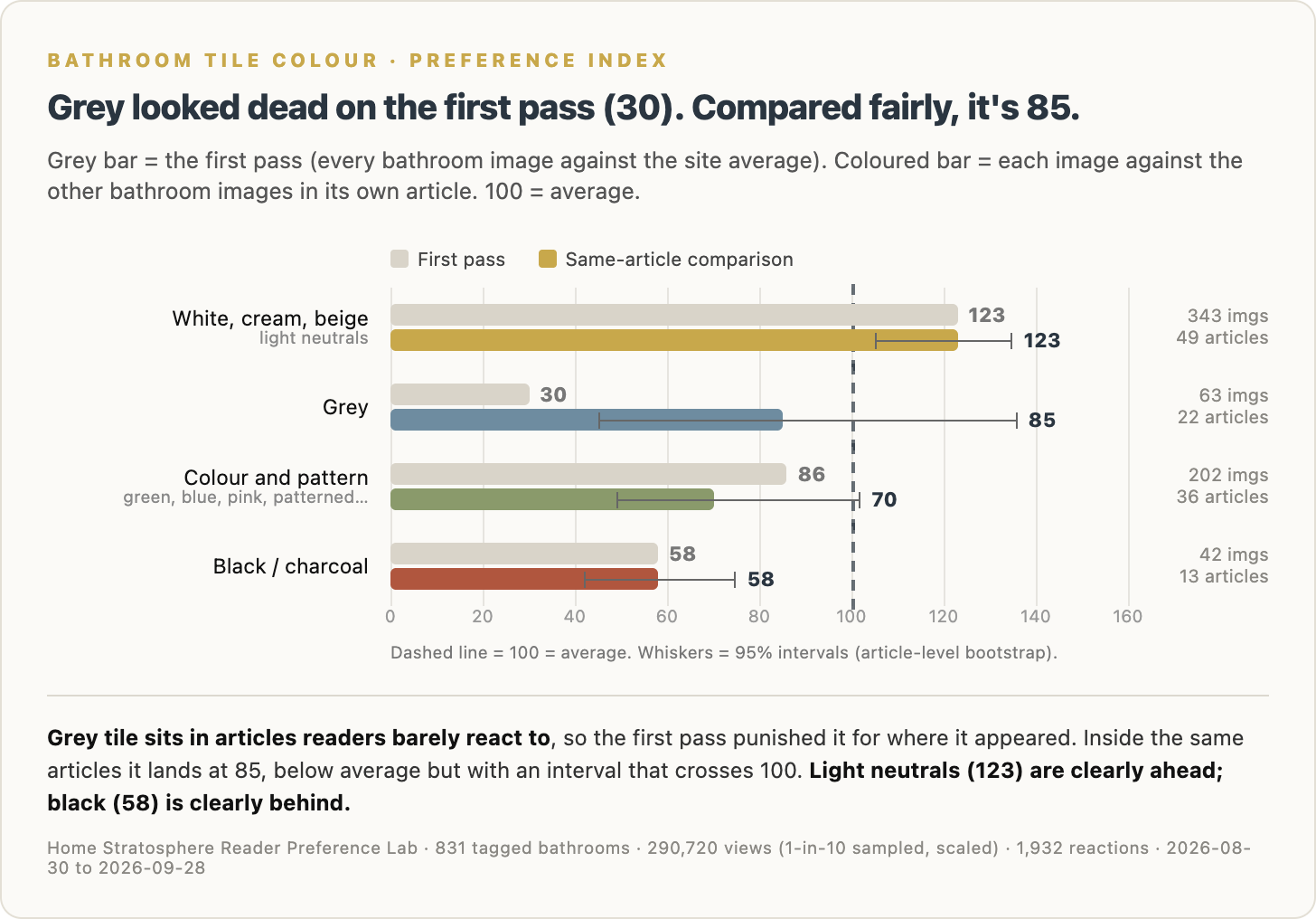
Compared that way, grey goes from 30 to 85. Light neutrals stay at 123. Colourful and patterned tile drops to 70, and black stays at 58.
The intervals are what matter here. Grey’s runs from 45 to 136, which crosses 100, so I can’t tell you grey is below average with any confidence. Black’s runs from 42 to 75, well below 100. White, cream and beige together run from 105 to 135, well above it.
So, is grey done?
Grey is a slightly-below-average tile that readers mostly scroll past. That’s a long way from dead. The tile that readers are actually rejecting is black and charcoal, and the busy colourful and patterned stuff isn’t doing much better.
I want to be straight about the sample, because grey tile turned out to be less common in these articles than I expected. Grey on its own is 63 images and 18,030 views. My reporting threshold is at least 30 images and 20,000 views, or at least 300 reactions, and grey doesn’t quite get there. Black doesn’t either, at 42 images and 18,610 views. Put grey and black together as the dark neutrals and they clear it easily, with 105 images and 36,640 views, and as a pair they index 65 against 123 for the light neutrals. That’s the result I’d defend in front of anybody. The split between grey and black inside that pair is the part I’d keep an eye on as more data comes in.
Did it hold?
Same test I always run. Split the 30 days in half and see whether the second half tells the same story as the first.
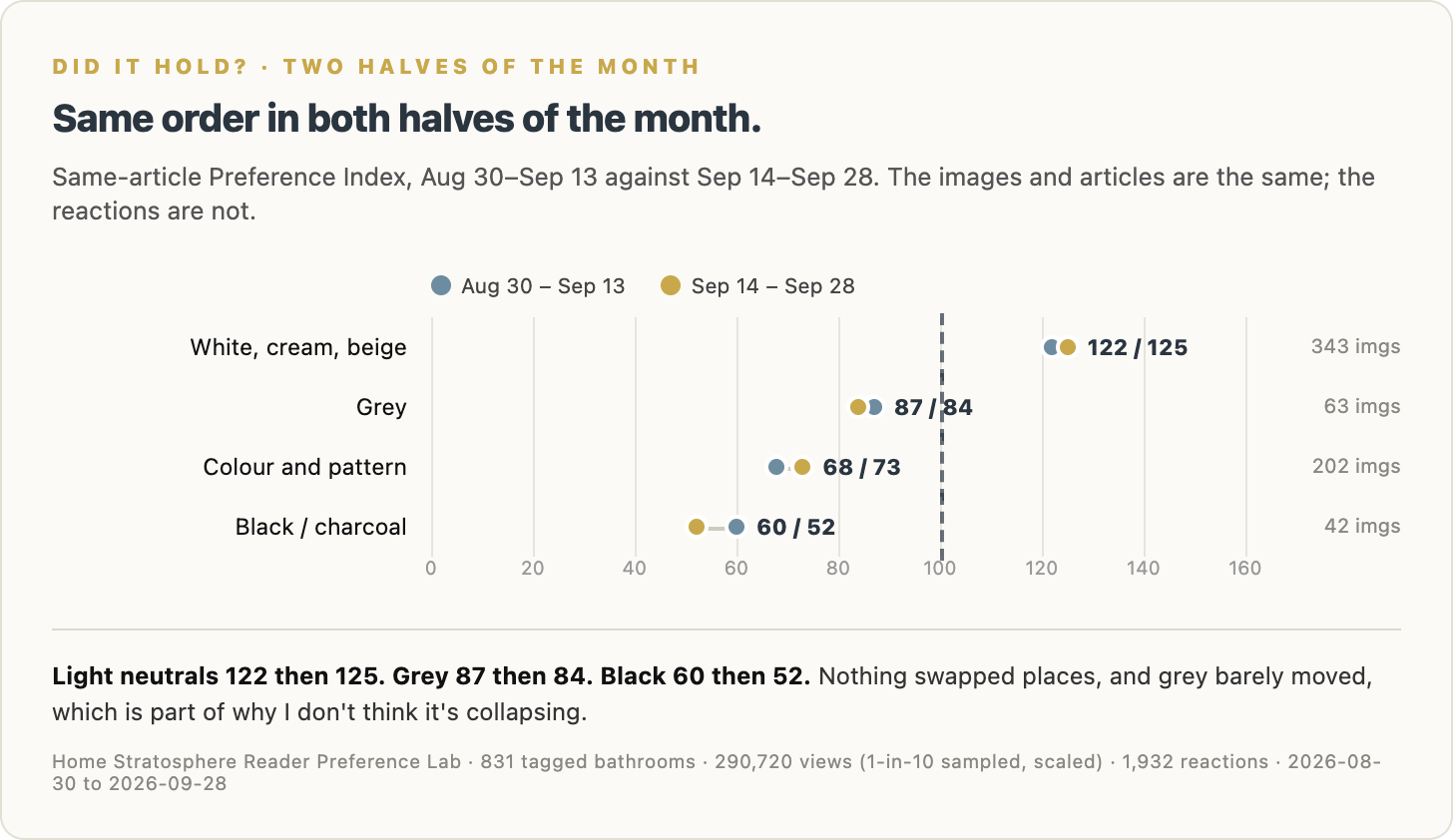
It did. Light neutrals went 122 then 125, grey went 87 then 84, colourful and patterned went 68 then 73, and black went 60 then 52. Nothing swapped places.
I also ran it two more ways, because I didn’t trust myself after the first pass. With the mistake and disaster articles removed entirely, grey comes in at 93, black at 58 and light neutrals at 122. Then I split the data into before-and-after makeover articles and everything else, since a lot of the bathroom images on the site are before-and-after composites. Light tile beat dark tile in both, 124 to 64 in the makeover articles and 116 to 72 in the rest.
Readers shrug at grey and thumb black down
The Preference Index only counts approval. I also record thumbs-downs and saves, and those tell you something approval alone can’t.
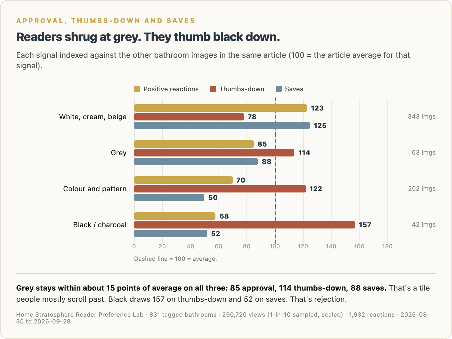
Grey sits within about 15 points of average on all three, at 85 for approval, 114 for thumbs-downs and 88 for saves. Readers aren’t reacting to grey tile much in either direction. Black is a different animal. It gets 157 on thumbs-downs and 52 on saves, which means readers stop on black-tile bathrooms and then vote them down. White, cream and beige get fewer thumbs-downs than average (78) and more saves (125), which is what a genuinely liked feature looks like.
Same article, same readers
Here’s the simplest version of the comparison. I took every article that had both light-tile and dark-tile bathrooms in it, with at least ten reactions to work with, and looked at positive reactions per 1,000 views for each.
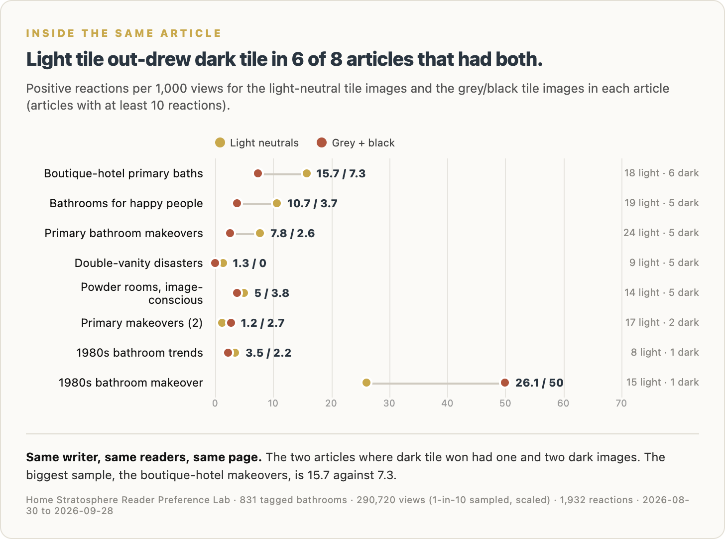
Light tile out-drew dark tile in six of the eight. The two exceptions had one dark-tile image and two dark-tile images, so I wouldn’t read anything into them. The biggest sample on the list is the boutique-hotel primary bathroom makeovers, where light tile drew 15.7 positive reactions per 1,000 views and dark tile drew 7.3.
Maybe it’s the room, not the tile
This is the part I find most interesting. Grey tile doesn’t show up alone. 73% of the grey-tile bathrooms in the set read as neutral or cool in colour temperature, against 23% of the light-tile ones. More than half of the grey-tile bathrooms are tagged modern.
And cool-toned bathrooms are the single worst thing I measured. They index 36 on the same-article comparison, the lowest of any feature in the bathroom set that clears the threshold. Modern bathrooms index 79 against 135 for transitional ones.
So I suspect a good chunk of grey’s problem is the company it keeps. A grey tile in a cold, modern, flatly lit bathroom is the combination readers pass on. I tried to test grey tile in warm bathrooms specifically, but there are only 14 of them, which isn’t enough to say anything. Grey with warm wood and warm light is the version I’d want to see measured properly, and I don’t have the data for it yet.
What else readers reward in a bathroom
While I was in there I ran the same comparison on every other bathroom feature that has enough data.
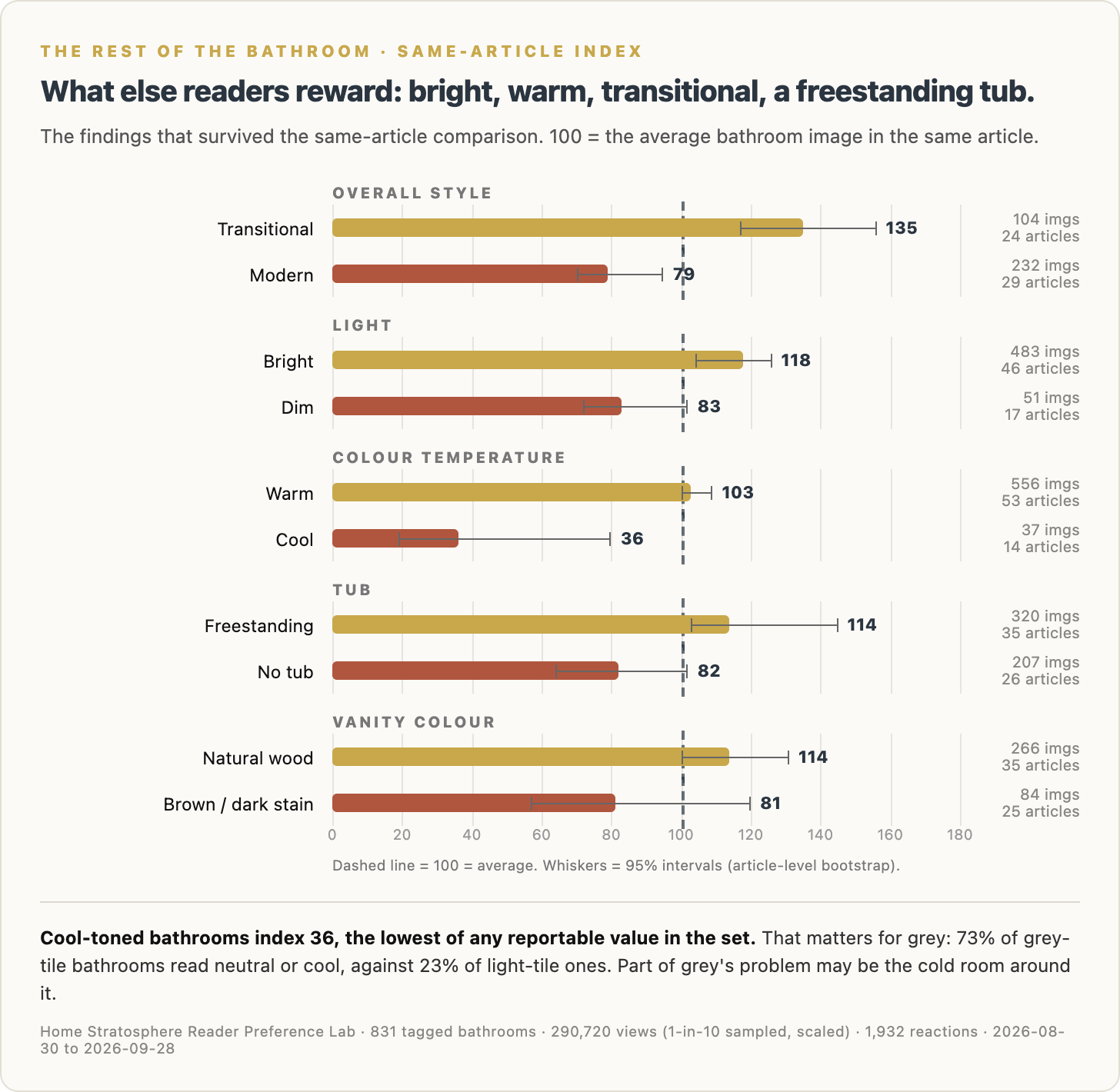
Bright bathrooms index 118 against 83 for dim ones and 73 for medium light. Warm beats cool by a mile, 103 to 36. Transitional beats modern, 135 to 79. A freestanding tub indexes 114 against 82 for a bathroom with no tub at all. Natural wood vanities come in at 114, and brown or dark-stained ones at 81.
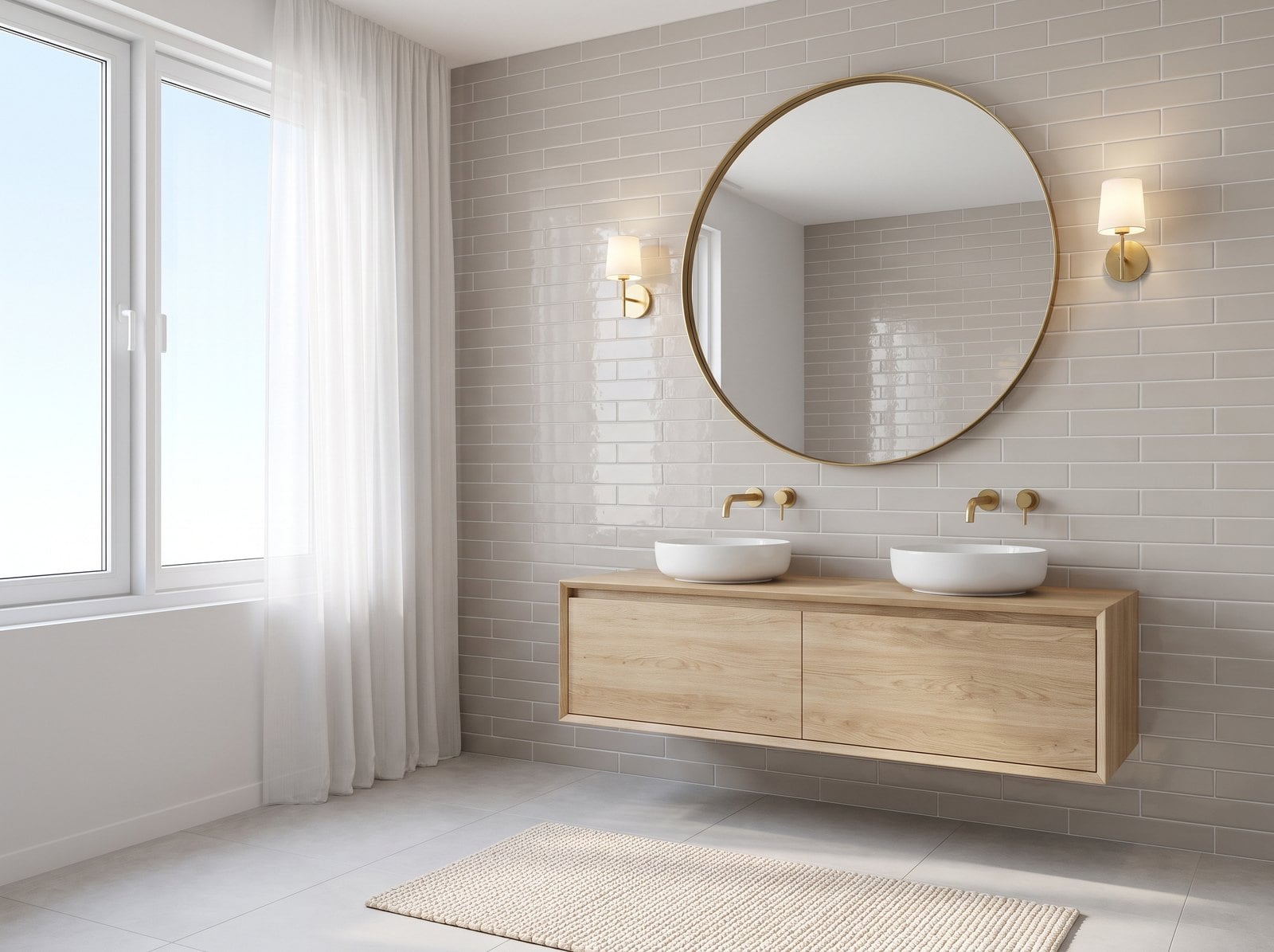
Put all of that together and the bathroom these readers are rewarding is bright, warm, transitional, with a natural wood vanity, a freestanding tub and light neutral tile. That’s hardly a bold room, but it’s pretty much the opposite of the cold grey spa bathroom of 2015, which may be the real answer to the question in the title.
And some findings that fell apart
This part matters as much as the rest. Several features looked like big results on the first pass and turned out to be about which articles they appeared in.
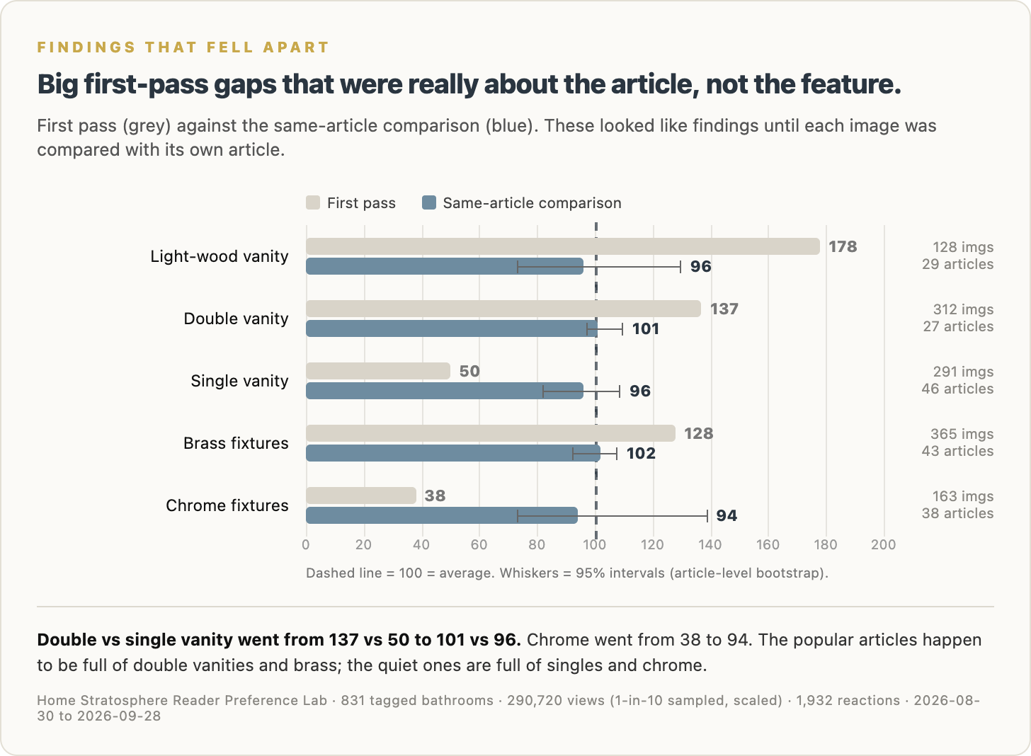
Double vanities indexed 137 on the first pass and single vanities 50. That looks like a slam dunk for doubles. Compared within the same articles, it’s 101 against 96, basically a tie. Brass fixtures went from 128 to 102, and chrome went from 38 to 94. Light-wood vanities went from 178 to 96. What happened is that the popular before-and-after makeover articles are full of double vanities, brass and pale wood, and the lower-reaction articles are full of single vanities and chrome. The first pass was measuring the articles, not the fixtures.
I’m showing you these on purpose. If I’d only run the first pass, I’d have told you readers love double vanities and hate chrome, and I’d have been wrong twice.
What readers say versus what they react to
There are also ten bathroom polls running on the site, so I can compare what readers say they’d pick with how they react to the pictures. Nobody’s been asked about tile colour in a poll, so this is about the rest of the bathroom.
Most of it lines up. Natural wood was the most popular vanity colour in the poll at 42%, and natural wood vanities index 114 in the images. Double vanities won their poll 60 to 40 and the images call it a tie, which is close enough.
The tub is where the two disagree. In the poll, 42% of readers said they’d skip the tub altogether, and only 25% picked freestanding. In the images, bathrooms with freestanding tubs index 114 and bathrooms with no tub index 82. People say they’d rather have the space, then they react to the tub. Fixtures went the same way. 46% of readers picked brushed nickel in the poll, but there are too few nickel images to score, and brass, which only 26% picked, is holding its own in the pictures at 102.
What I’d do with this if I sold tile
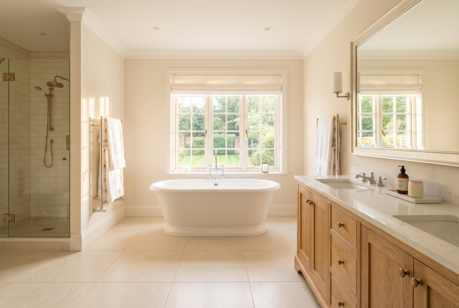
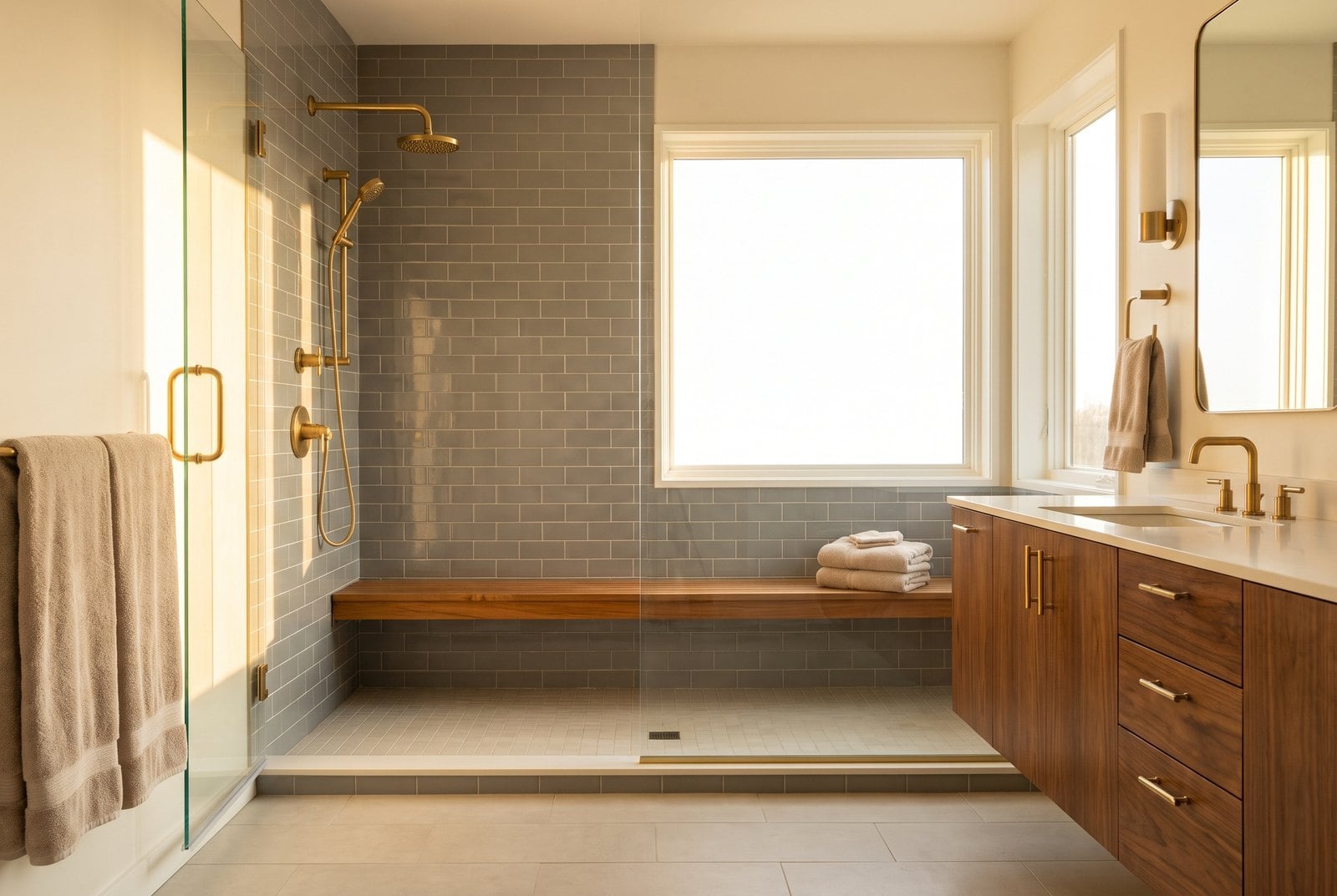
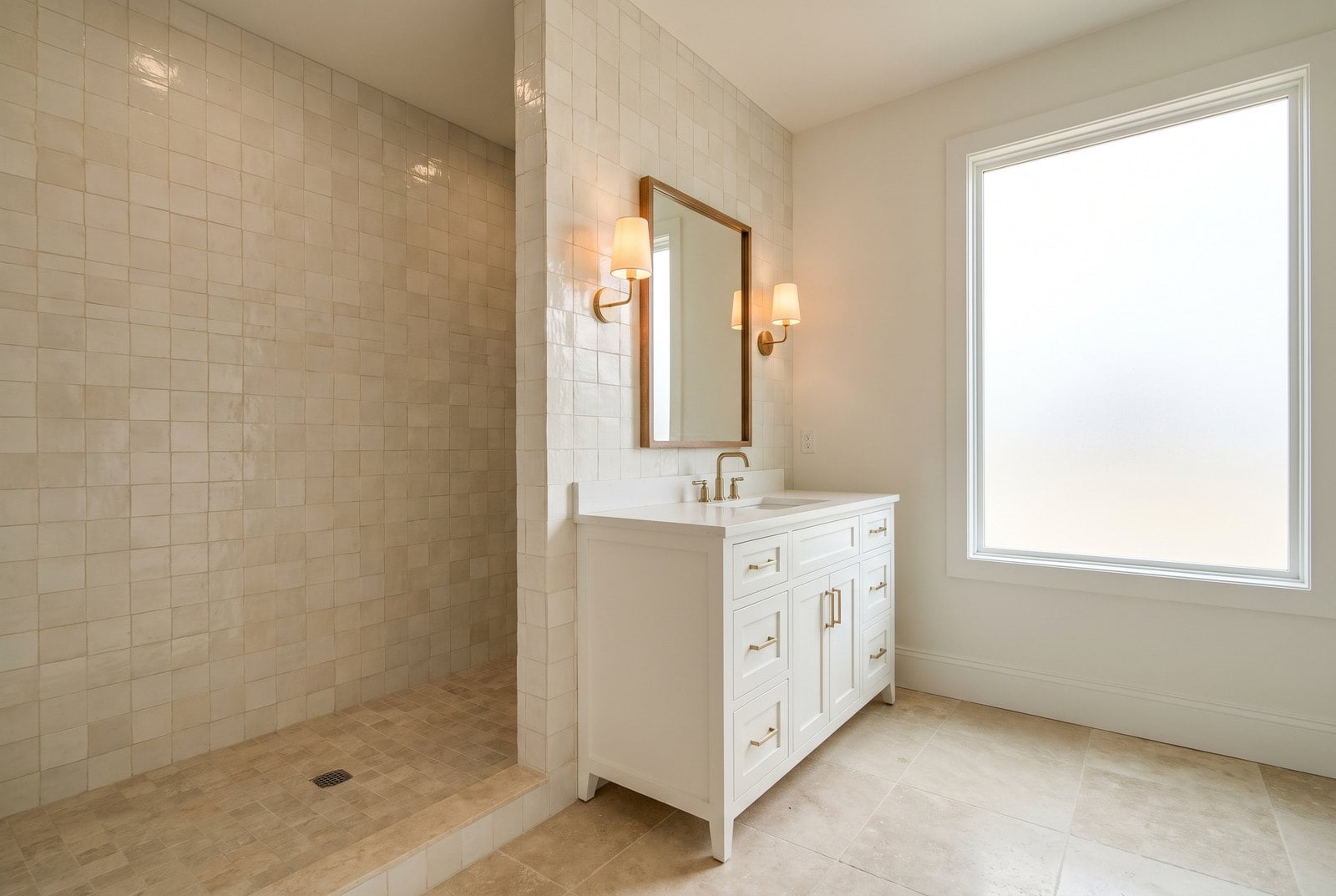
I wouldn’t pull grey. Nothing here says grey is a liability. I’d stop leading with it, though, especially in hero images and ads, and I’d shoot it in warm light with wood around it instead of in the cold modern setting it’s usually shown in. That’s the test I’d run first.
Black tile is the one I’d be careful with. It pulls attention and then gets voted down, and it gets saved at about half the rate of everything else. Maybe it needs different styling, maybe it’s a niche product that some readers love and most don’t. Either way I wouldn’t make it the face of a bathroom campaign without testing it.
And if I were choosing imagery for a bathroom product of any kind, I’d lean on white, cream and beige tile, bright warm light and a transitional look. That’s the room this audience keeps rewarding.
The caveats
These are rooms, not tile samples. When someone hearts a bathroom image I can’t tell whether it was the tile, the tub or the light fixture. A lot of the bathroom images on the site are before-and-after composites tagged as a single image, so I can’t always tell which half a reaction was for, and most of black tile’s evidence comes from those makeover articles. Thirty days is still early. And this is reader reactions, not sales. Nobody bought any tile.
What I can say is narrower. Among the bathroom images on Home Stratosphere between August 30 and September 28, compared with the other bathroom images in the same article, grey tile landed a bit below average and within the range of average, light neutral tile landed clearly above it, and black tile landed clearly below. That held in both halves of the month and with the mistake articles taken out.
So grey isn’t done. It’s just not winning.
This report first appeared in Home Stratosphere on Substack, where Pro members get the full PDF report and the raw data behind it.
Want the Full Report and Raw Data?
Upgrade to Pro and you’ll get:
- The complete 19-page PDF report with the full tile colour table (all 19 colours), every bathroom feature scored both ways, the robustness checks, the cold-room analysis and all ten bathroom polls answer by answer.
- Instant access to all PDF reports and raw data for archived articles.
- The raw data behind the report in one spreadsheet (all 831 bathroom images with their tags and reactions, the full feature index, tile colour by article and the poll results) so you can sort it, filter it, run your own analysis and build your own charts/
- Permission to use the research in your own marketing and business materials — including client presentations, blog posts, newsletters, social media, videos, sales materials, branded reports and product research/
The free article gives you the headline findings.
Pro gives you the full report, the data behind it and the right to put it to work.
Get the Full Report on Substack →