

Most people have eaten a meal at a table that belonged to someone older than them, in a house where two generations moved around each other without anyone getting in the way — grandkids through the back door, a parent’s coffee already going in the other room, Sunday dinner lasting until dark. The Ironhill is built around exactly that: a full attached apartment, an open main living area, a farmhouse kitchen wide enough for two cooks, and a layout where everyone still has a door to close.
Specifications
- Sq. Ft.: 4,741
- Bedrooms: 3-5
- Bathrooms: 4-6
Floor Plan – Main Floor
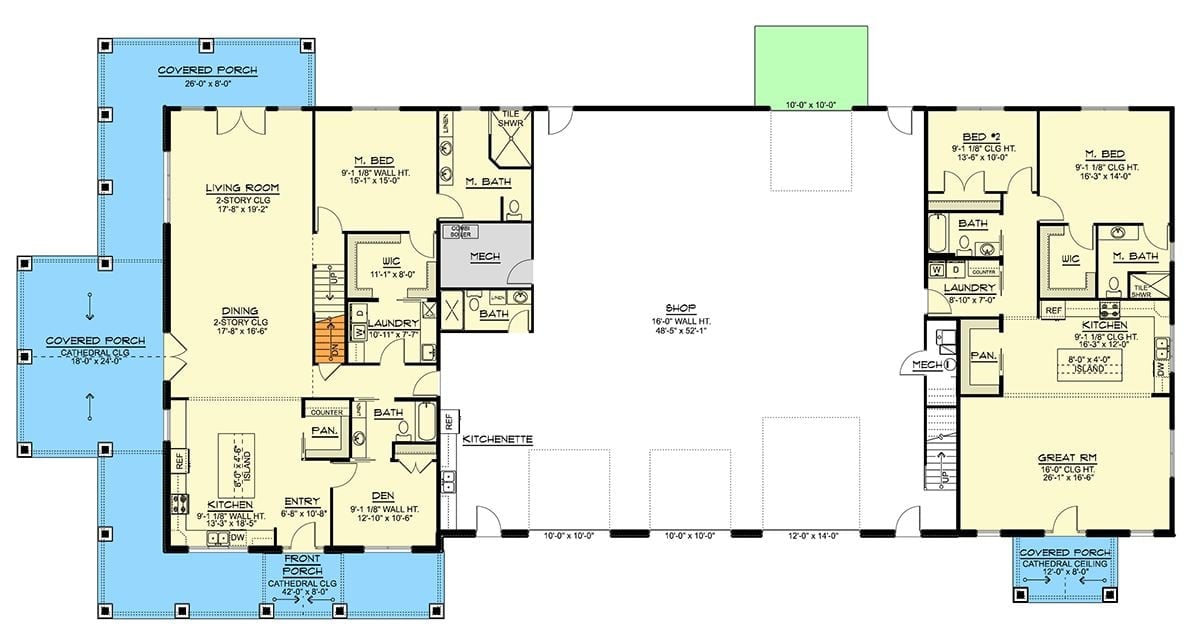
Two separate living wings flank a large central shop. The left holds the main residence — living, dining, kitchen, master suite, and den — while the right contains a full apartment with its own kitchen, great room, two bedrooms, and laundry.
Floor Plan – Second Floor
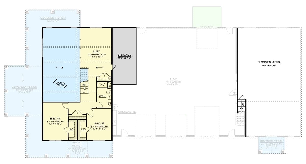
The upper level holds a loft, two bedrooms with walk-in closets, a shared bath, storage room, and an open-to-below gallery that looks out over the covered porches below.
Floor Plan – Basement
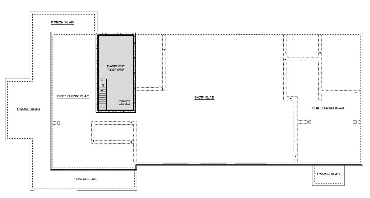
The foundation plan shows a partial basement (14’x30′) with stair access, a large shop slab at center, first-floor slabs on both wings, and porch slabs wrapping three sides of the structure.
Wagon Wheel Chandelier Anchors a Double-Height Dining Room Built for Gathering
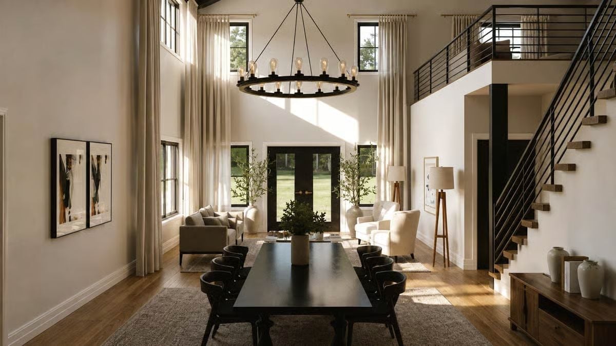
Black dining table, iron ring chandelier with exposed Edison bulbs, floating staircase with black metal railings — those three elements give this room its backbone. The double-height ceiling does the rest.
Material Matters: Wide-plank wood floors running through the entire open space connect the dining area to the living room without a transition strip or visual break anywhere in between. That kind of continuity is far easier to plan at the build stage than to fix later. If you’re selecting hardwood for a barndominium with tall ceilings, warm honey tones like these keep all that volume from reading as cold.
Open-Tread Staircase Steals the Room Without Trying
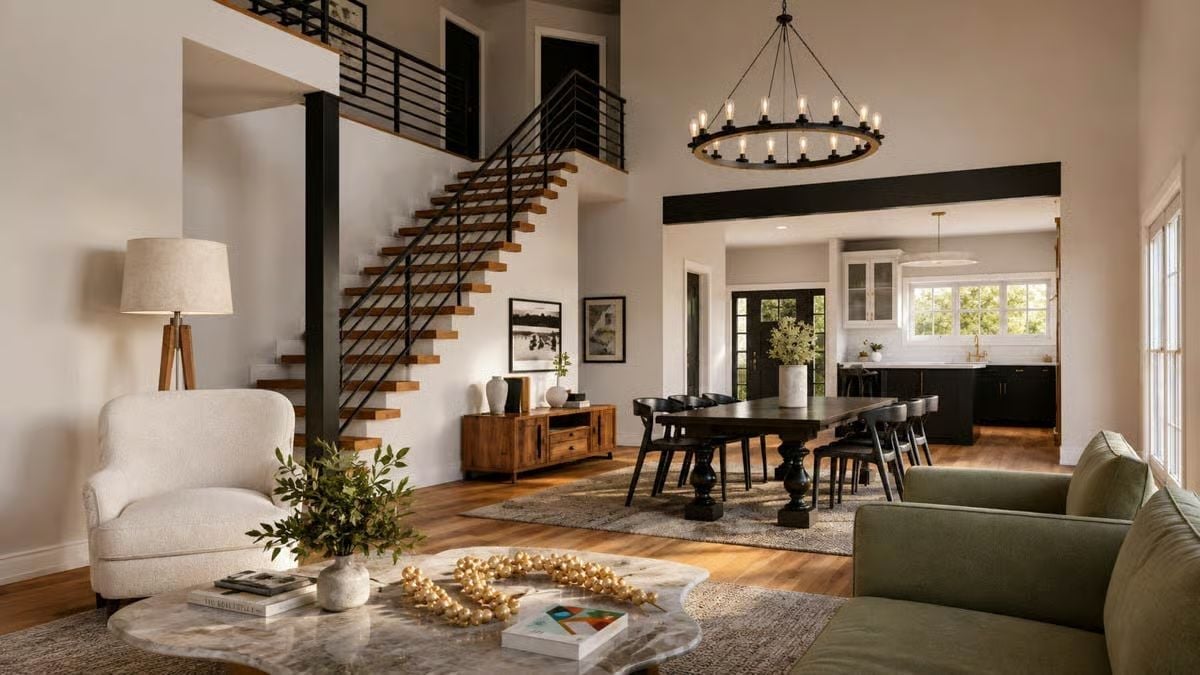
Floating wood treads on a steel frame pull your eye straight up to the second-floor landing.
Green velvet sofa, boucle armchair, marble coffee table — three very different textures sitting together without competing. The dark kitchen cabinets visible through the doorway recede just enough that the dining area doesn’t feel crowded despite that oversized pedestal table anchoring the center of the room.
Brass Fixtures and Dark Cabinetry Make a Kitchen That Doesn’t Apologize for Itself
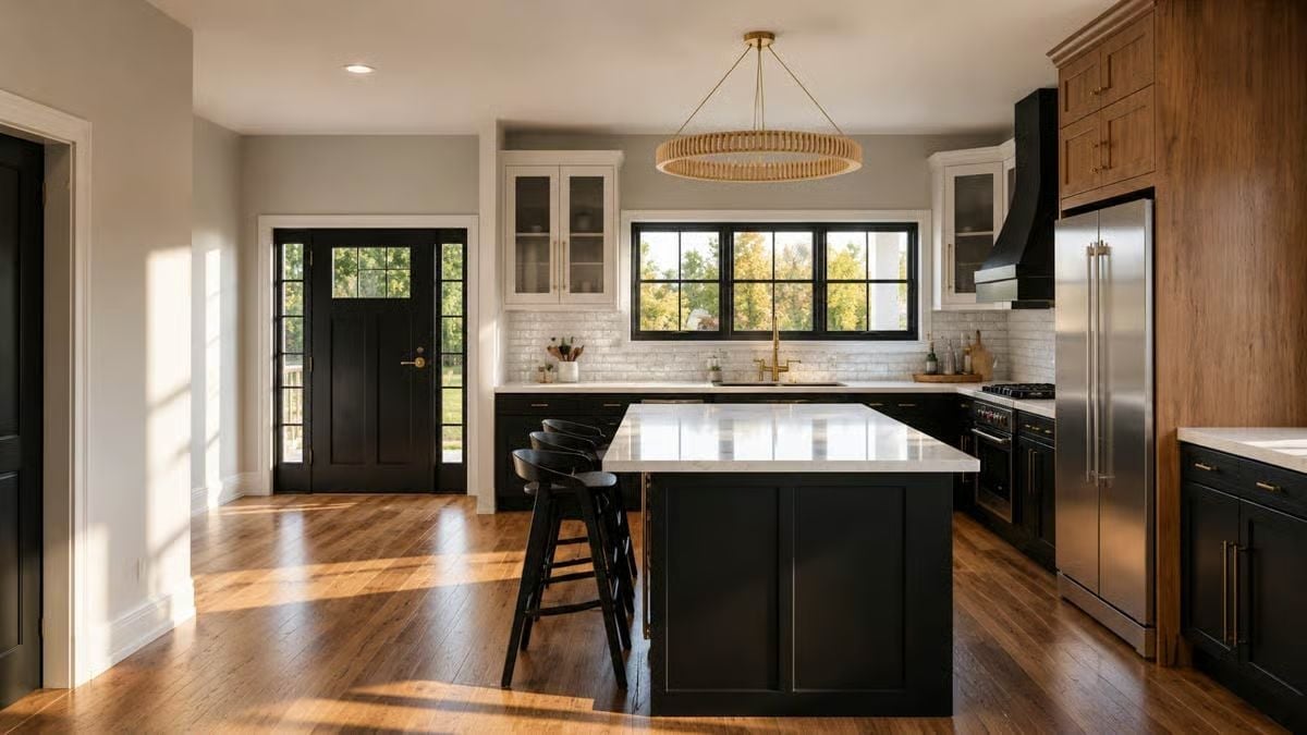
Warm wood floors draw natural light toward the island, and the white marble countertop holds its own against the dark lower cabinets without any visible effort. That rattan pendant overhead is doing quiet, confident work.
Worth Knowing: Dark lower cabinets paired with white uppers aren’t just an aesthetic choice. Lower cabinets hide everyday scuffs and grease splatter far better than light finishes, so they hold their look longer between repaints or refinishes — which matters more than most people expect once a kitchen is actually in use.
Dusty Blue Walls and a Wood Panel Headboard That Actually Earns Its Square Footage
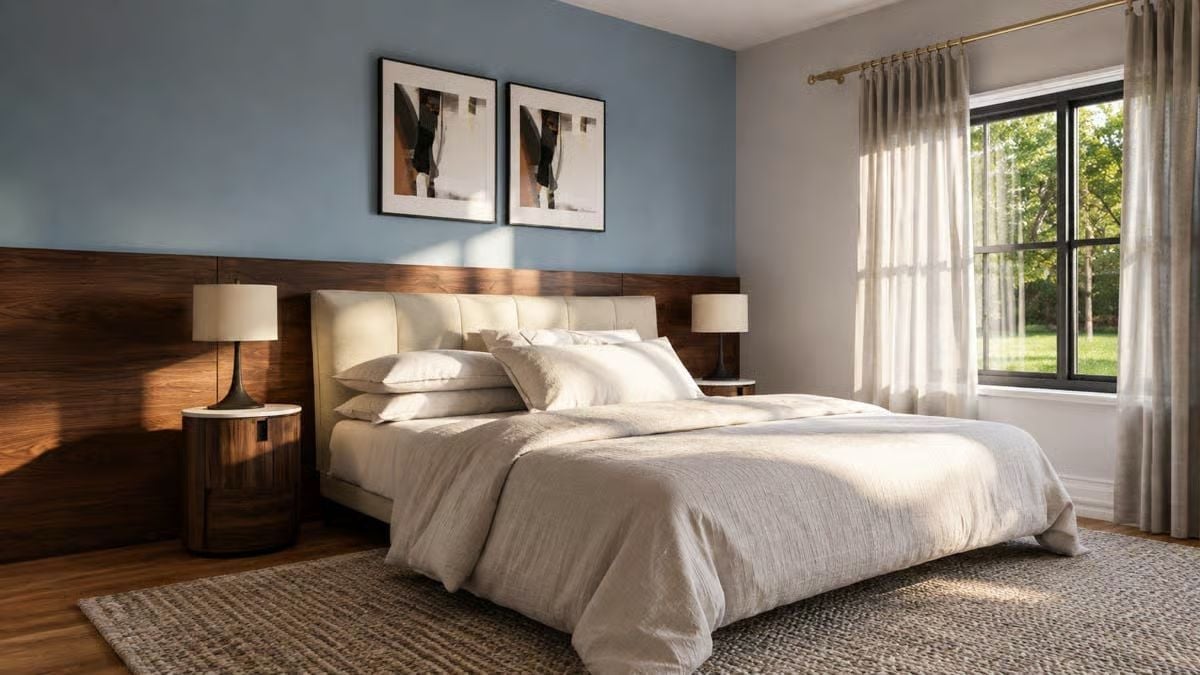
Muted blue on the accent wall keeps the room calm without pushing it cold. The dark walnut panel behind the bed runs nearly wall to wall, grounding the cream upholstered headboard and giving the nightstands somewhere logical to land. Natural light handles everything else.
Why That Wood Panel Works Harder Than a Standard Headboard
Running a full wood panel across the wall behind the bed isn’t just a style move. It creates a built-in sense of structure that freestanding furniture rarely achieves — visually pulling the ceiling line down and making the room feel more enclosed and restful. The nightstands tucking against it reinforce the effect, collapsing the whole sleeping area into one cohesive mass rather than a loose arrangement of separate pieces.
Vessel Sinks and Painted Brick Pull a Bathroom Out of Generic Territory
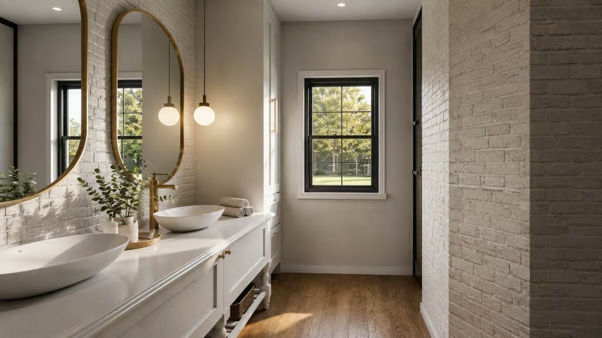
Gold faucets paired with vessel sinks sit against whitewashed brick, and pendant globes add warmth overhead without competing with any of it.
Why It Works: Vessel sinks look intentional here because the countertop has enough depth to support them without feeling crowded. The painted brick brings texture to a room that could easily have gone sterile, and it earns that without a single tile in sight.
Vaulted Ceilings and Sheer Curtains Keep a Loft Living Room From Feeling Closed In
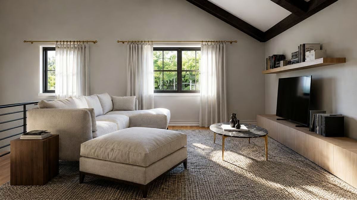
Exposed dark wood beams trace the roofline overhead, giving the vaulted ceiling structure without adding visual weight. The sectional and ottoman share the same linen-toned fabric, keeping the seating area quiet. Small detail, but the brass curtain rods against black window frames punch well above their size.
Common Mistake: Sectionals with separate ottomans get pushed too close to the coffee table more often than not. You need enough clearance to walk comfortably between them — roughly enough for two people to pass without turning sideways. If the ottoman already feels cramped before anyone sits down, the whole arrangement will.
Pin It
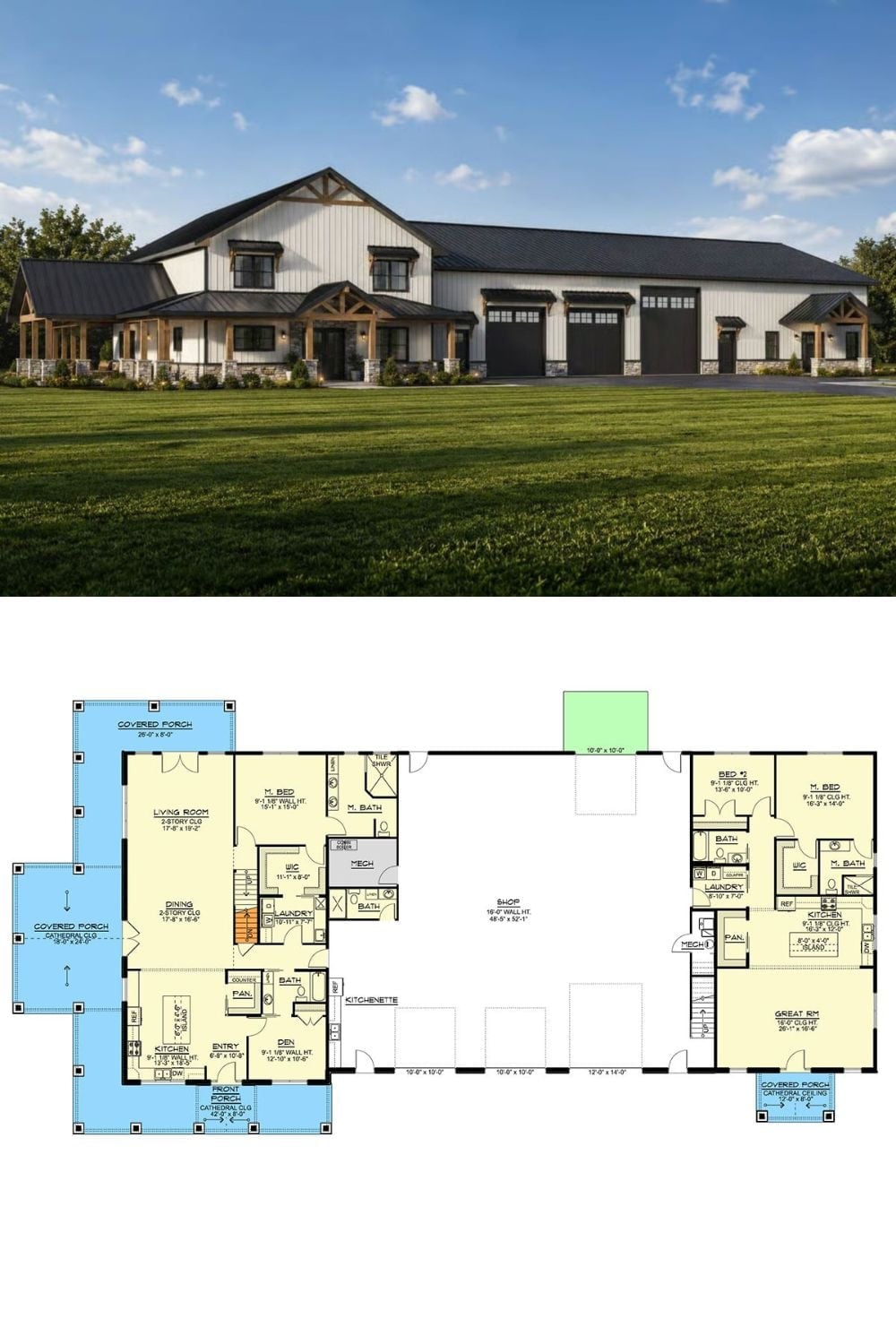
Exterior rendering of the Ironhill sits above the first-floor plan, showing dual living quarters, a large shop bay, covered porches wrapping three sides, and separate master suites on each wing.
The Psychology Behind This: Multi-generational floor plans work best when each unit has its own entry point. Shared walls without shared doors preserve the kind of boundary that keeps family relationships from fraying under daily proximity. Separate kitchens, it turns out, matter more than extra square footage.
