
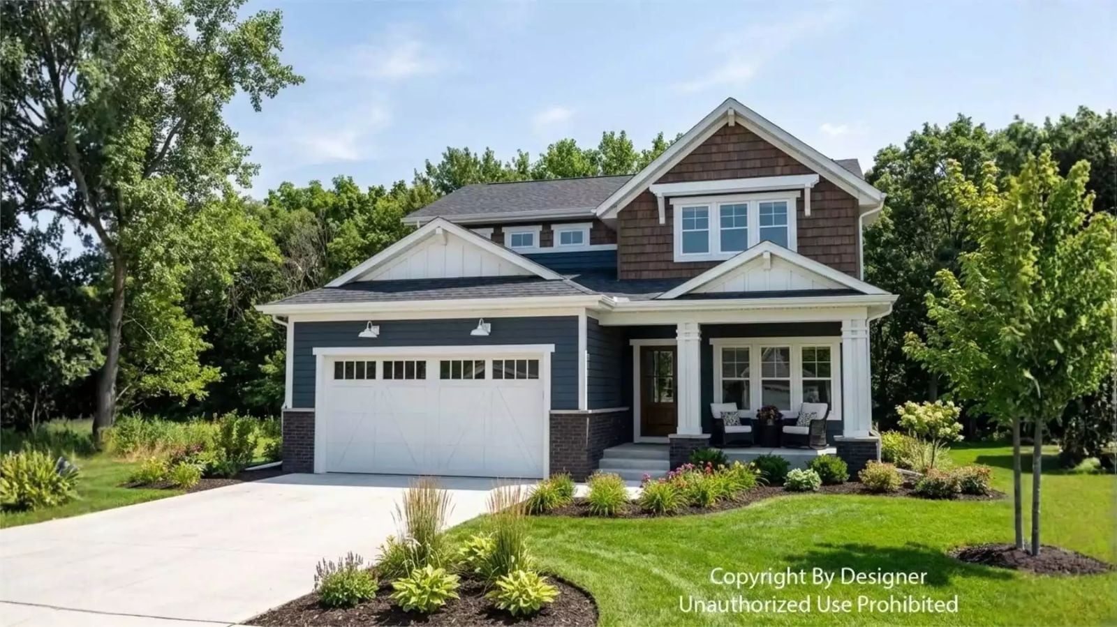
Families who outgrew their starter home three years ago already know exactly what they need — they just need someone to build it. The Holtwood Row is set up for that life: an open main floor that keeps everyone connected without tripping over each other, a loft that gives older kids somewhere to land, and a modern farmhouse exterior that looks like it belongs wherever you put it.
Specifications
- Sq. Ft.: 2,295
- Bedrooms: 3
- Bathrooms: 2.5
Floor Plan – Main Floor
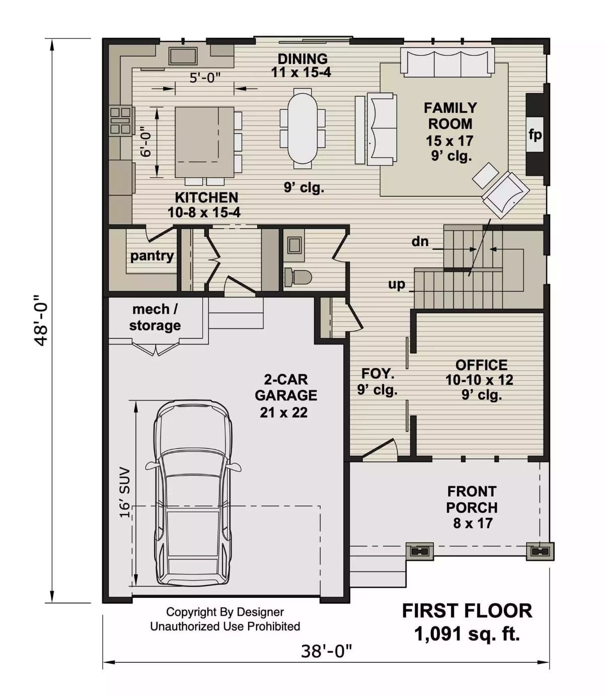
The first floor runs the kitchen, dining, and family room across the back in one open arrangement, with a fireplace anchoring the family room end. A half bath, pantry, and mech/storage sit off the garage, and up front, the foyer leads to a dedicated office and covered porch.
Floor Plan – Second Floor
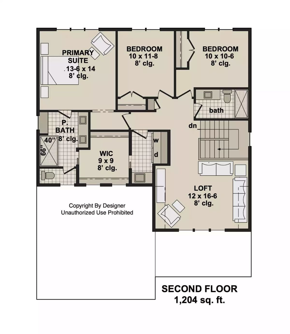
Upstairs, the primary suite gets a private bath and walk-in closet, two additional bedrooms share a full bath, and the open loft sits at the center — big enough to work as a playroom, a homework zone, or a home office depending on the year.
Dark Navy Siding That Actually Works Against a Treeline
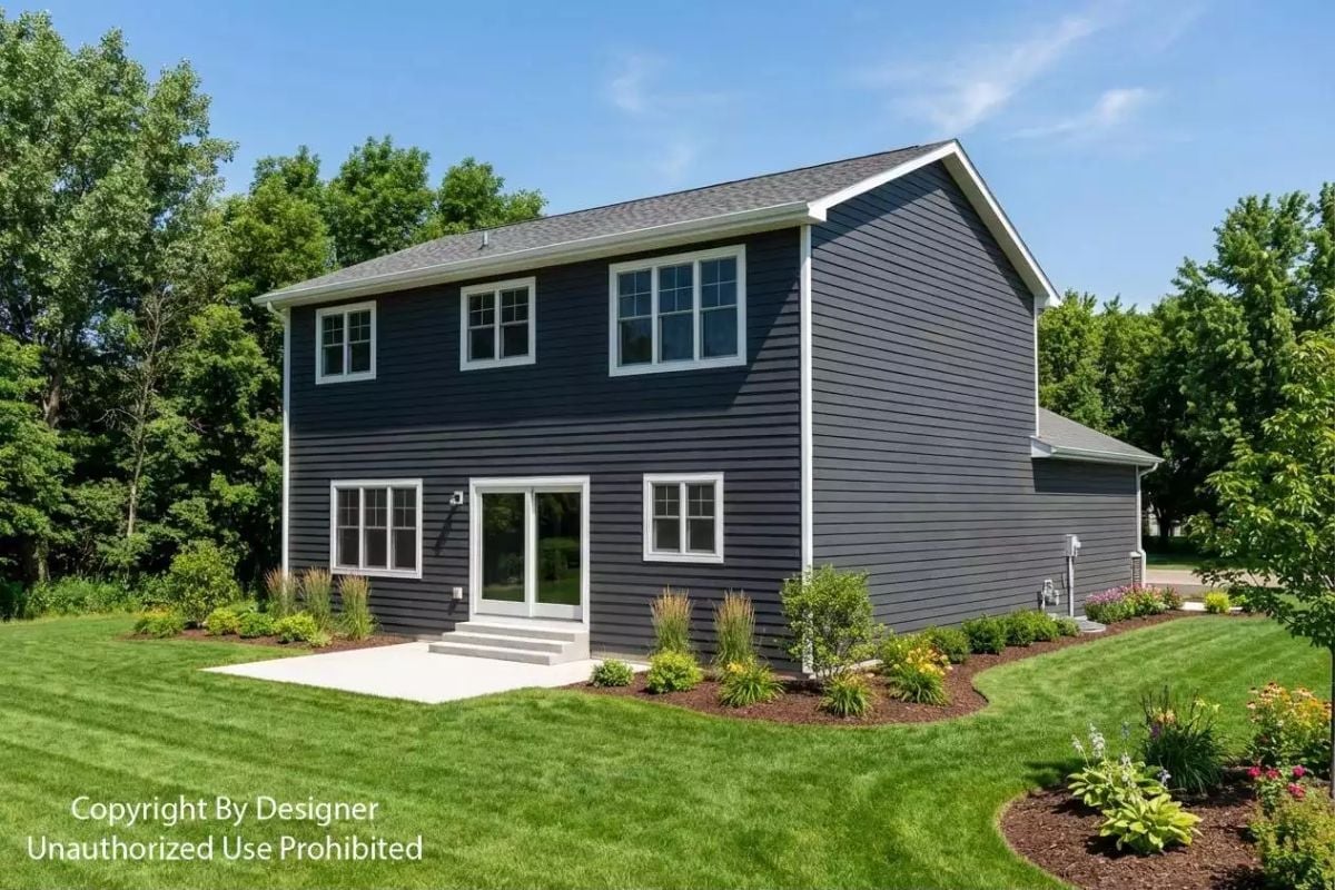
Charcoal-blue lap siding reads almost slate in full sun, grounded by white trim that stops it from going too heavy. Stepped concrete leads from a modest patio to sliding glass doors, and the foundation plantings — ornamental grasses breaking up tidy mulch beds — give the base some texture without overcomplicating it.
Material Matters: Lap siding in deep navy holds up well through significant temperature swings because horizontal profiles allow for natural expansion without visible gapping. The bright white trim isn’t just there for contrast — on overcast days it keeps the facade from pulling inward and reading as flat.
Stone Fireplace Wall That Earns Every Square Foot It Takes Up
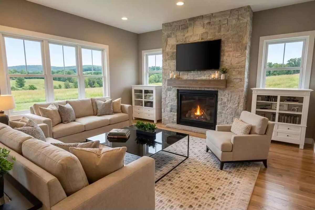
Floor-to-ceiling stacked stone anchors the room without competing with the view outside. Beige upholstered seating keeps the palette calm, the wood mantel shelf adds warmth between the firebox and wall-mounted TV, and three windows handle most of the light. It’s a lot of elements sharing the same wall, and somehow none of them fight.
Budget Tip: Stacked stone veneer costs significantly less than full-thickness natural stone and installs over standard framing, so you get the same visual presence at a fraction of the material cost. If the budget is tight, concentrate real stone on the chimney face and use a painted drywall return on the sides where it’s rarely noticed anyway.
Open Kitchen-Dining Layout Built Around How Families Actually Move Through a Home
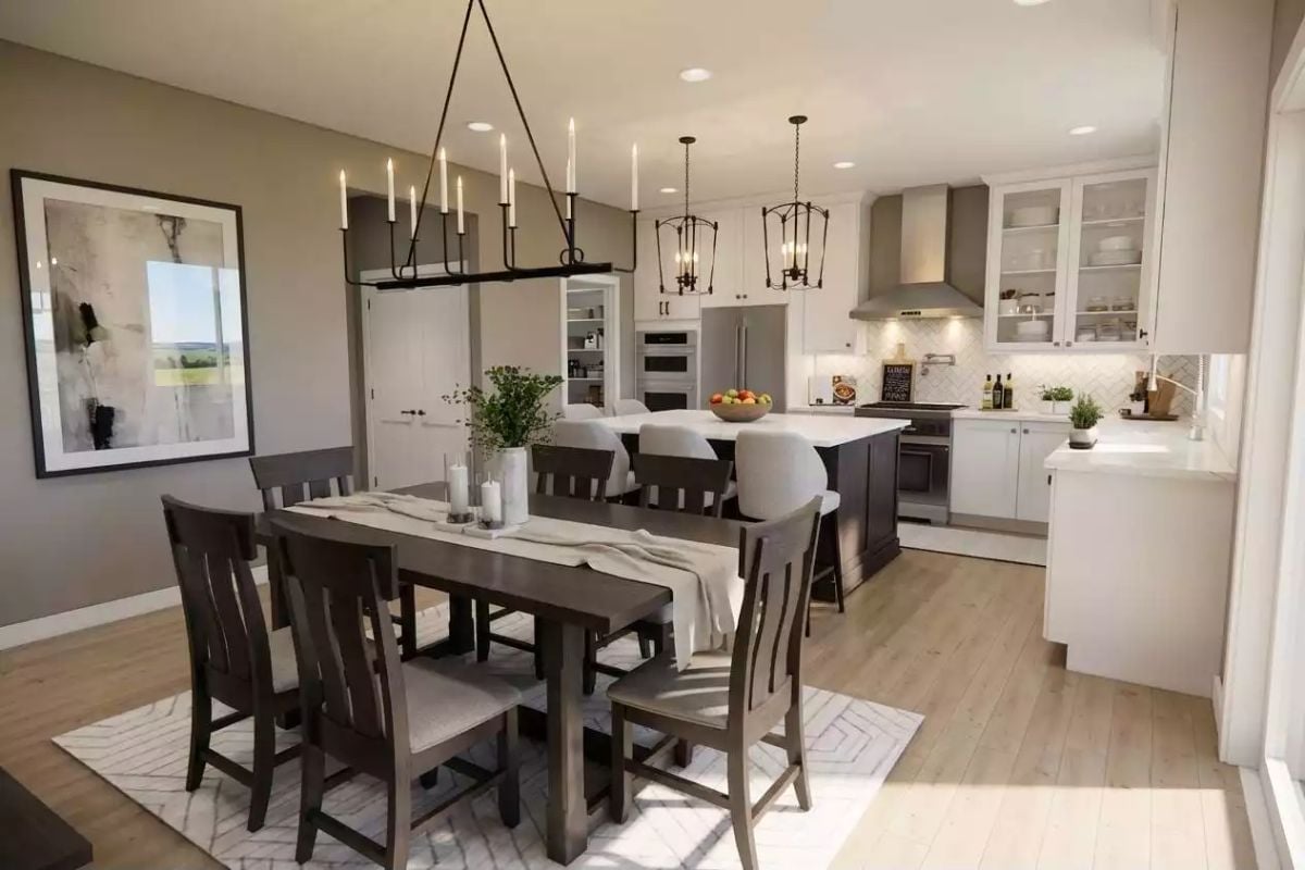
Dark-stained dining chairs pull the kitchen island’s color into the dining area without any deliberate styling effort — it just works because the tones are close enough that the eye reads the two zones as one. Candle-style chandeliers over both spaces keep the ceiling active without competing with each other. White perimeter cabinets against a herringbone tile backsplash give the kitchen its structure, and light hardwood floors run underneath all of it without demanding any attention.
Style Tip: Matching your dining furniture stain to your kitchen island finish is one of the lowest-cost ways to make an open floor plan feel like it was designed rather than assembled. You don’t need identical pieces — just a close enough tone that the two zones read as connected. It works especially well when the island sits right at the boundary between spaces, as it does here.
Quartz Island with a Dark Base That Pulls the Whole Kitchen Together
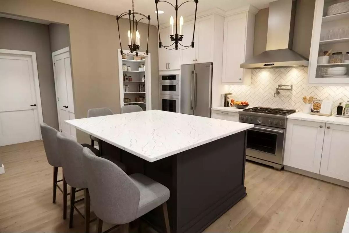
White quartz veining against a near-black island base is doing real work here — that contrast is what gives this kitchen its backbone. Gray upholstered stools keep the seating quiet, the herringbone tile behind the range adds pattern without adding color, and open shelving on the far right lets everyday items stay reachable without piling on cabinet bulk.
History Corner: Kitchen islands with contrasting base colors became widely popular in American homes during the early 2000s, as cabinet manufacturers began offering two-tone finishes as a standard option rather than a custom upgrade. Before that shift, most kitchens ran a single finish throughout — a convention carried over from earlier decades when cabinetry was treated more like furniture than architecture.
Warm Greige Walls and a Low-Profile Bed Frame That Make a Big Room Feel Intentional
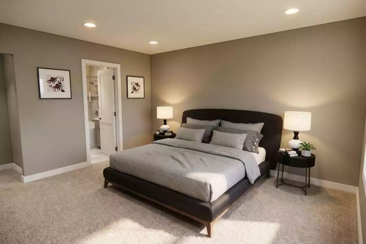
Carpet in a master bedroom gets a bad reputation it doesn’t always deserve.
Cut well and kept neutral, it softens acoustics and feels genuinely comfortable underfoot — which is not nothing at six in the morning. The greige wall color earns its place too, keeping the dark upholstered headboard from reading as heavy in a room this size. Matching table lamps on each nightstand aren’t a shortcut; they’re just right for a layout this symmetrical.
Greige and Glass: How a Tub-Shower Combo Pulls Off Two Jobs Without Looking Cheap
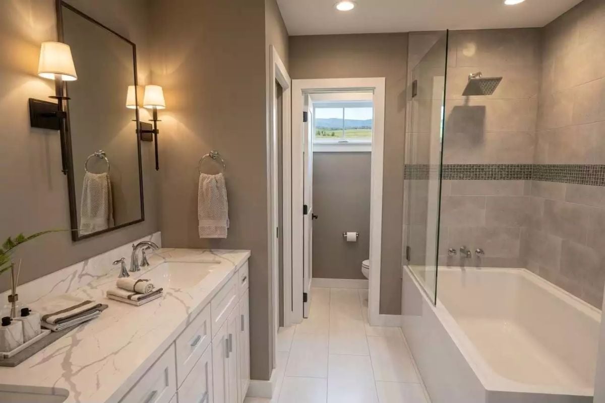
Marble-look quartz on the vanity and large-format gray tile in the shower share enough visual language to feel coordinated without being matchy. The glass panel over the soaking tub is pulling its weight — it keeps the layout open while containing splash, which is a harder balance to land than it looks.
- Frameless glass panels make narrow bathrooms read wider than framed enclosures do
- A rainhead mounted at ceiling height requires a dedicated pressure line, so plan plumbing rough-in early
- Quartz countertops outperform marble in bathrooms because they don’t require annual sealing
Upstairs Loft With Enough Floor Space to Actually Furnish It
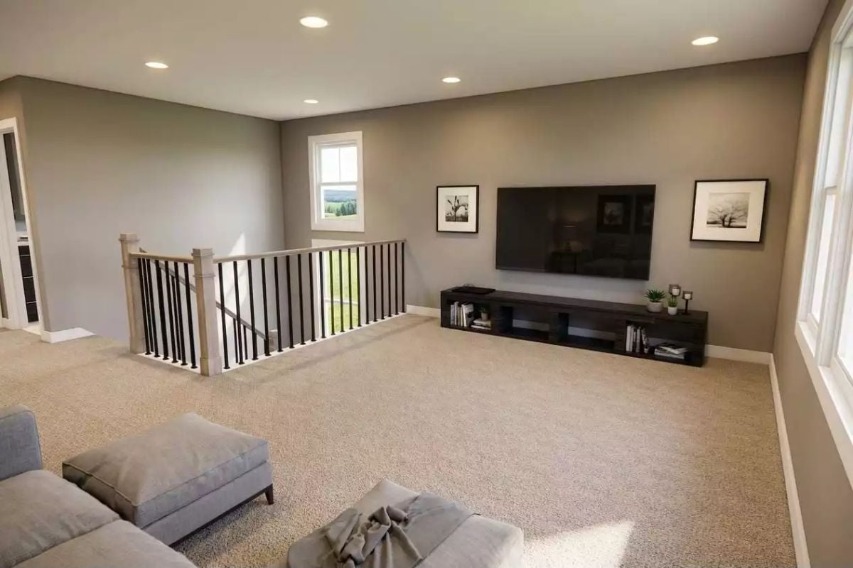
Greige walls and low-pile carpet keep the palette neutral without feeling unfinished. The open railing along the staircase — wood posts mixed with black iron balusters — gives the space some personality without trying too hard. Down at the far wall, the floating media console sits low enough that the TV doesn’t crowd the wall art flanking it.
In The Details: Upper-floor lofts often end up with awkward proportions that make them feel like oversized hallways rather than actual rooms. A low-profile media console helps keep sightlines open and the space feeling wider. If you’re adding seating, orient it toward the TV wall rather than the railing — that one decision gives the room a defined purpose instead of a waiting-area feel.
Floating Shelves and a View That Make a Home Office Worth Sitting In
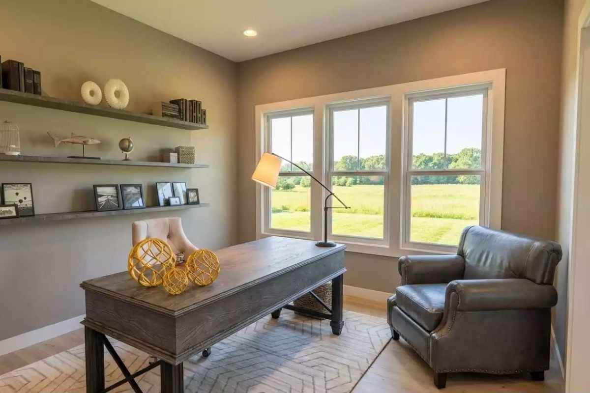
Woven gold orbs on the desk keep the room from reading too cool — a small detail that does more than it should. Layered floating shelves hold books, frames, and small objects without tipping into clutter. And outside those three windows, open farmland pulls your eye clean through the room before you’ve even sat down.
Pin It
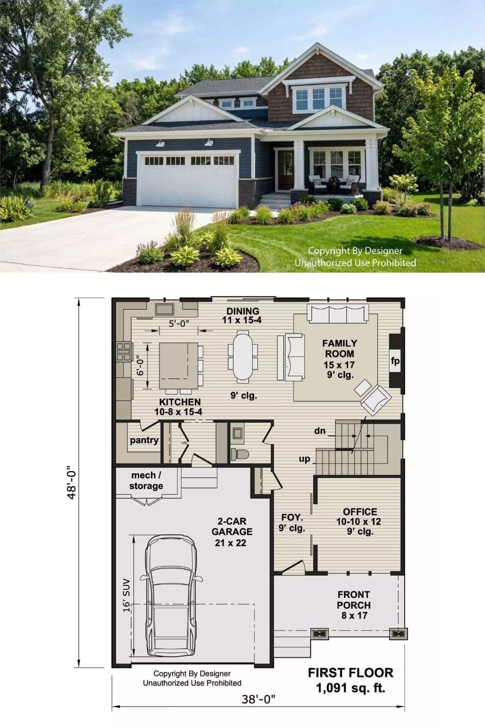
A modern farmhouse exterior in deep navy lap siding sits above the first-floor plan for this main level. The layout fits a 38-by-48-foot footprint and includes a family room, open kitchen-dining area, dedicated office, two-car garage, and covered front porch.