
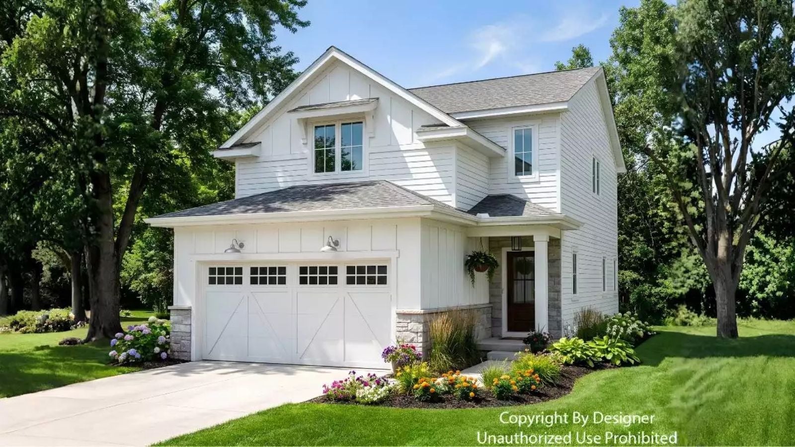
Friday night in March, and everyone lands at once: backpacks on the bench, cleats at the door, two kids asking about dinner before the car is even off. The Hollyhock is built around that exact hour, with an open-concept kitchen that keeps the cook in the conversation, a farmhouse layout that moves traffic without bottlenecks, and enough breathing room upstairs that teenagers can disappear when they need to.
Specifications
- Sq. Ft.: 1,900
- Bedrooms: 3
- Bathrooms: 2.5
Floor Plan – Main Floor
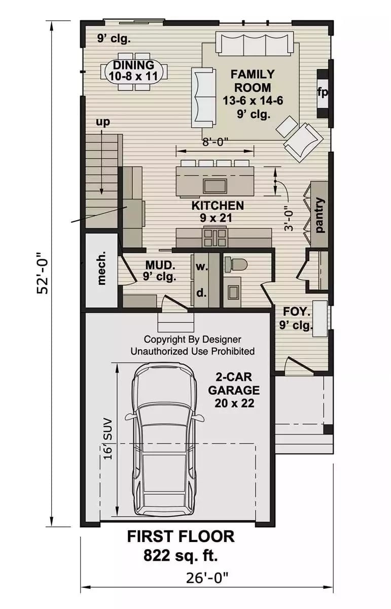
The first floor puts the family room, open kitchen, and dining area across the back half of the plan, with a mudroom, half bath, and pantry buffering the garage entry. Stairs tuck beside the mechanical room, out of the way.
Floor Plan – Second Floor
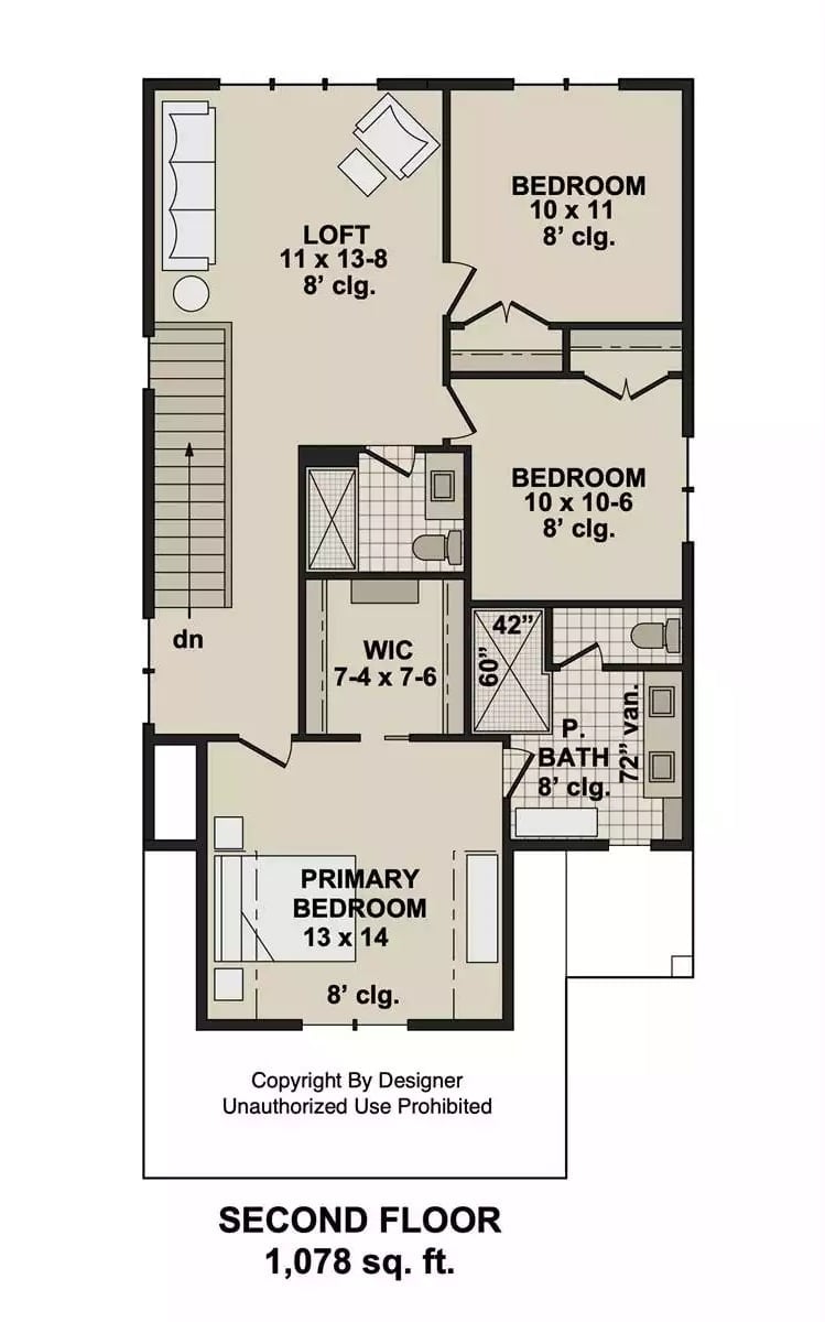
Upstairs: three bedrooms, a loft, walk-in closet, and a primary bath with a 72″ vanity. The staircase opens onto shared loft space flanked by the two secondary bedrooms.
Step inside and the open layout does exactly what it promises for a family that needs room to spread out.
Navy Island, White Cabinets, and Three Pendant Lights That Anchor Everything
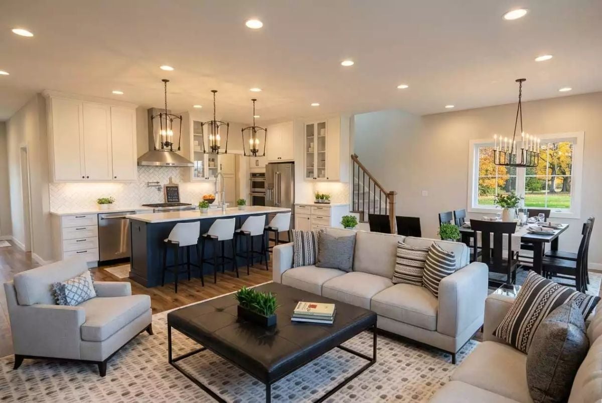
Dark navy on the island pulls focus while white shaker cabinets run wall to wall behind it. Bar stools line one side for casual meals — the kind where nobody bothers setting the table. Out in the living area, a leather ottoman coffee table holds its own against the patterned rug beneath it.
White Cabinets Do the Heavy Lifting So the Navy Island Doesn’t Have To
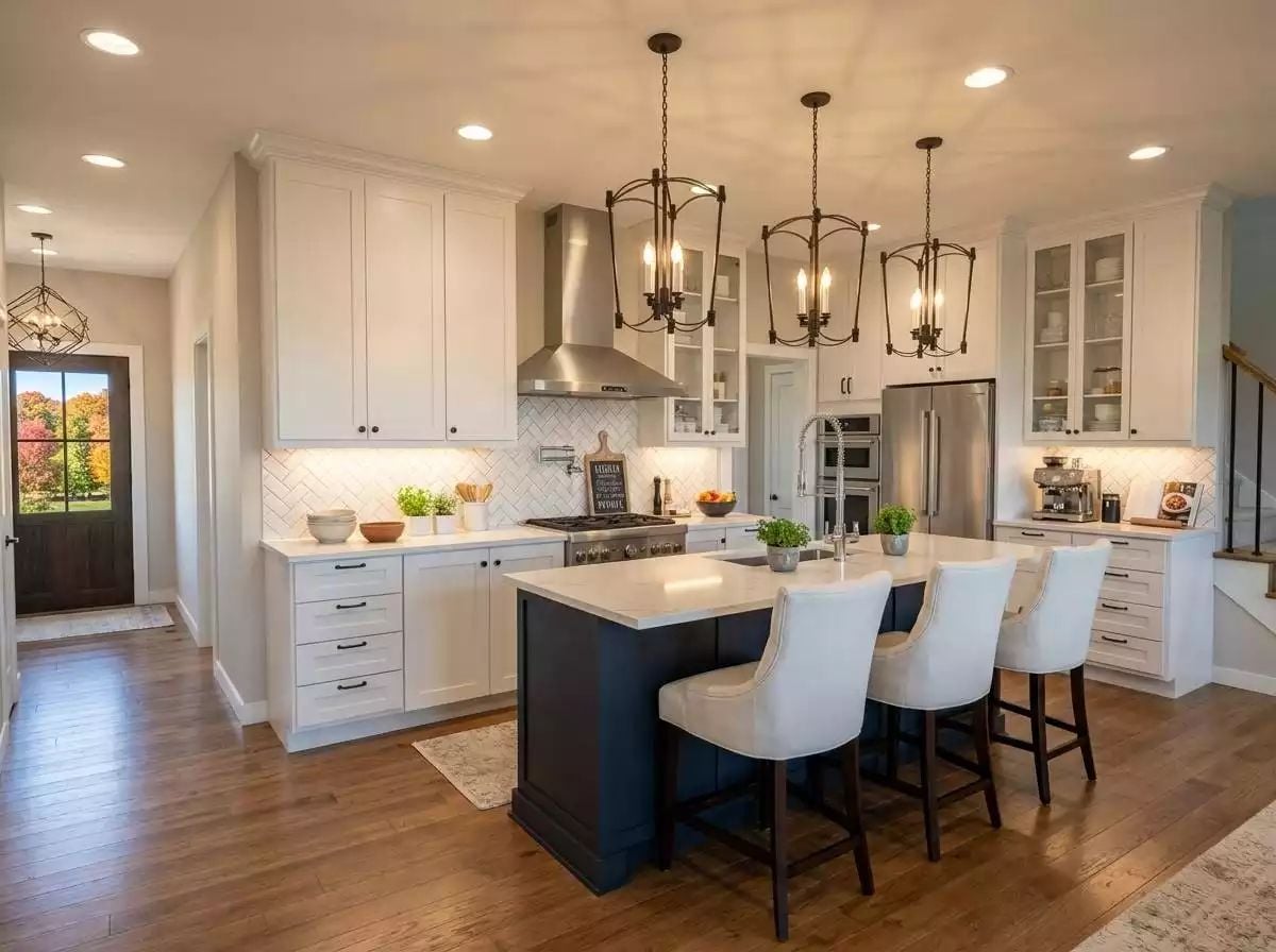
Cream upholstered counter stools pull up to a navy island topped with light quartz, and iron lantern pendants hang overhead at staggered heights. Under-cabinet lighting keeps the herringbone backsplash readable even when the room is packed.
Color Story: Navy on the island base and dark bronze on the pendant hardware echo each other just enough to feel considered without tipping into matchy. White cabinetry running wall to wall lets those two deeper tones carry all the contrast. It’s a palette with some staying power.
Marble Countertops Over a Washer-Dryer Pair Nobody Expected to Look This Good
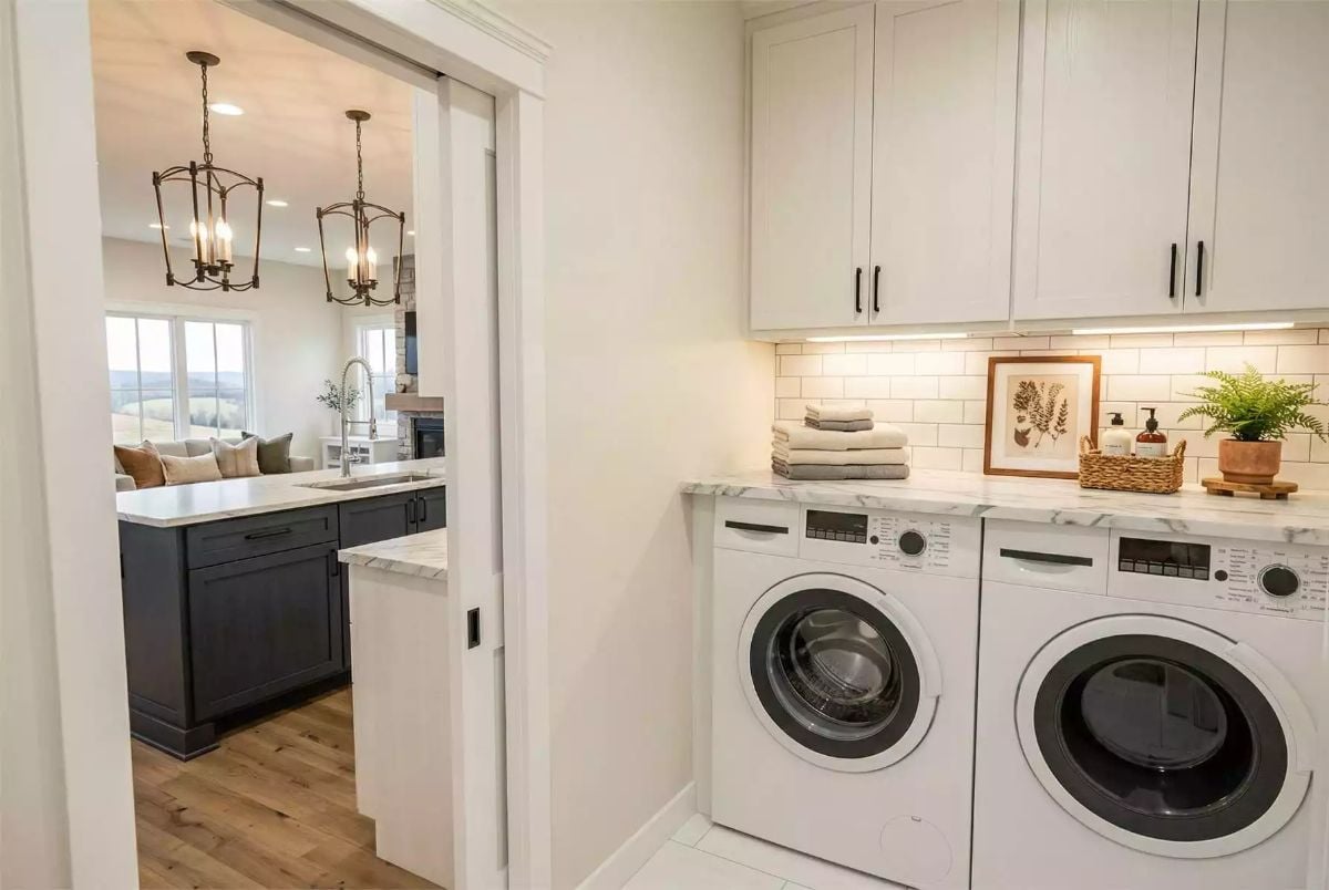
Front-load machines sit beneath a marble slab with enough depth to fold a full load, and subway tile with under-cabinet lighting makes the whole space feel less like a utility closet that got lucky.
Why Front-Load Machines Make Sense Under a Counter
Front-load washers and dryers vent differently than top-loaders, which is what makes a countertop installation possible without dead airspace wasted above the drums. The marble overhang here gives you a genuine folding surface rather than a decorative ledge. Most utility rooms never bother, and you feel it every laundry day.
Candle-Style Chandelier Over a Dark Table That Actually Works at Scale
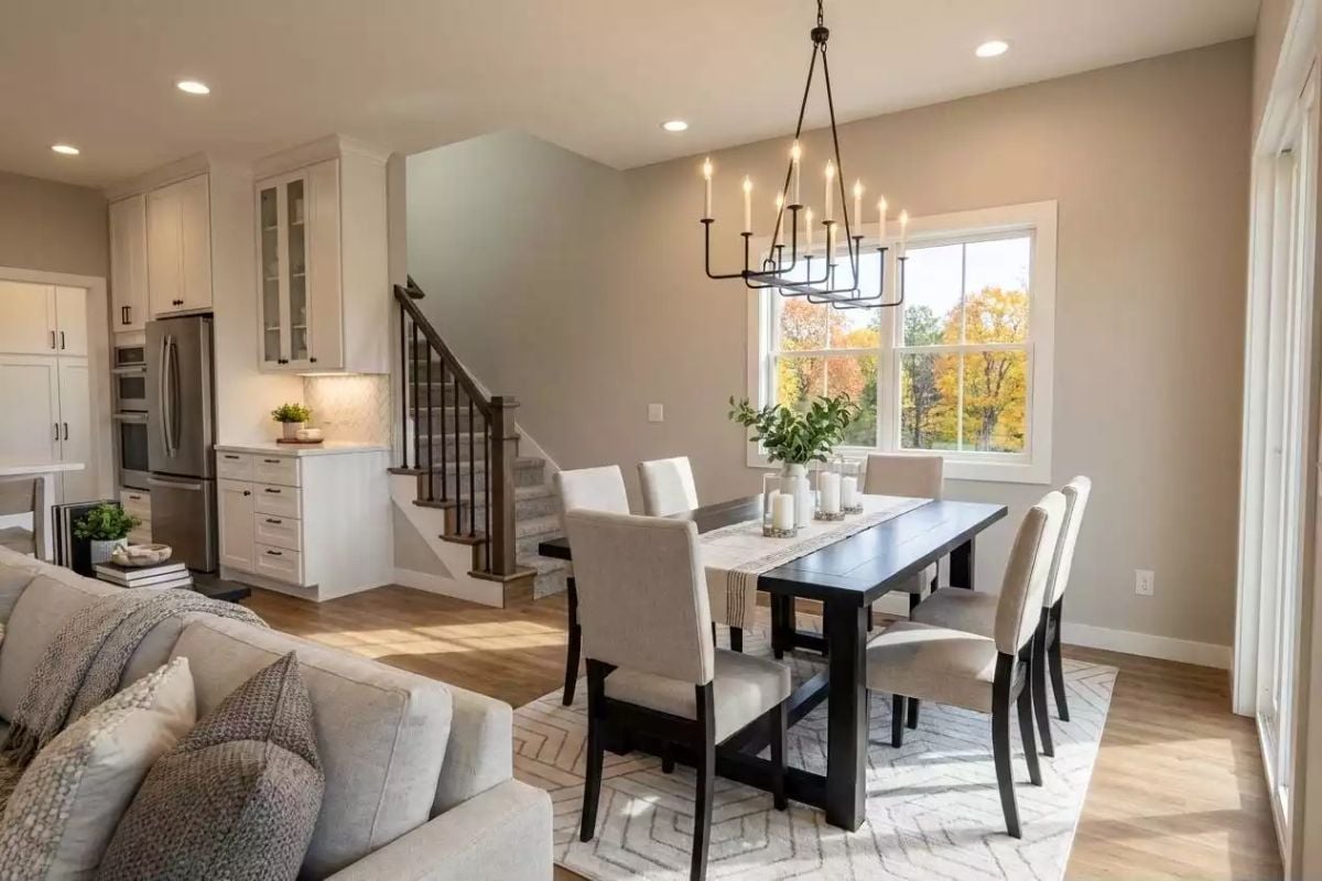
A black iron chandelier earns its size against the dark dining table below, and upholstered chairs in warm linen keep the pairing from feeling like a waiting room at a steakhouse. Fall color through the window does real work here.
By The Numbers: Open-concept layouts where the dining area flows directly into the kitchen tend to get used more often than formal dining rooms kept behind a wall. Families eat together more frequently when the spaces connect naturally, and fewer walls also means natural light from one window can reach multiple zones at once.
Loft Landing With Bedroom Access and Views That Make It Worth Lingering
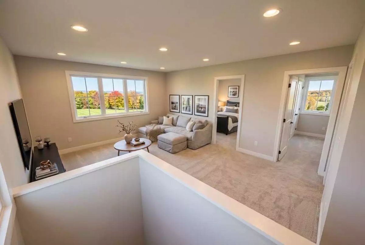
Carpet runs wall to wall through a loft that connects two bedrooms without a dedicated hallway. A gray sectional, round coffee table, and recessed lighting keep it genuinely livable rather than something you just walk through.
Ask Yourself: Upstairs loft spaces have a way of becoming overflow storage within six months if nobody decides what they’re actually for. Pick a function before you furnish it — media room, homework zone, reading corner, whatever fits your household — and commit. A clear purpose is the only thing that keeps a loft from feeling perpetually unfinished.
Walk-In Closet, En Suite, and Enough Dresser Drawers to Actually Stay Organized
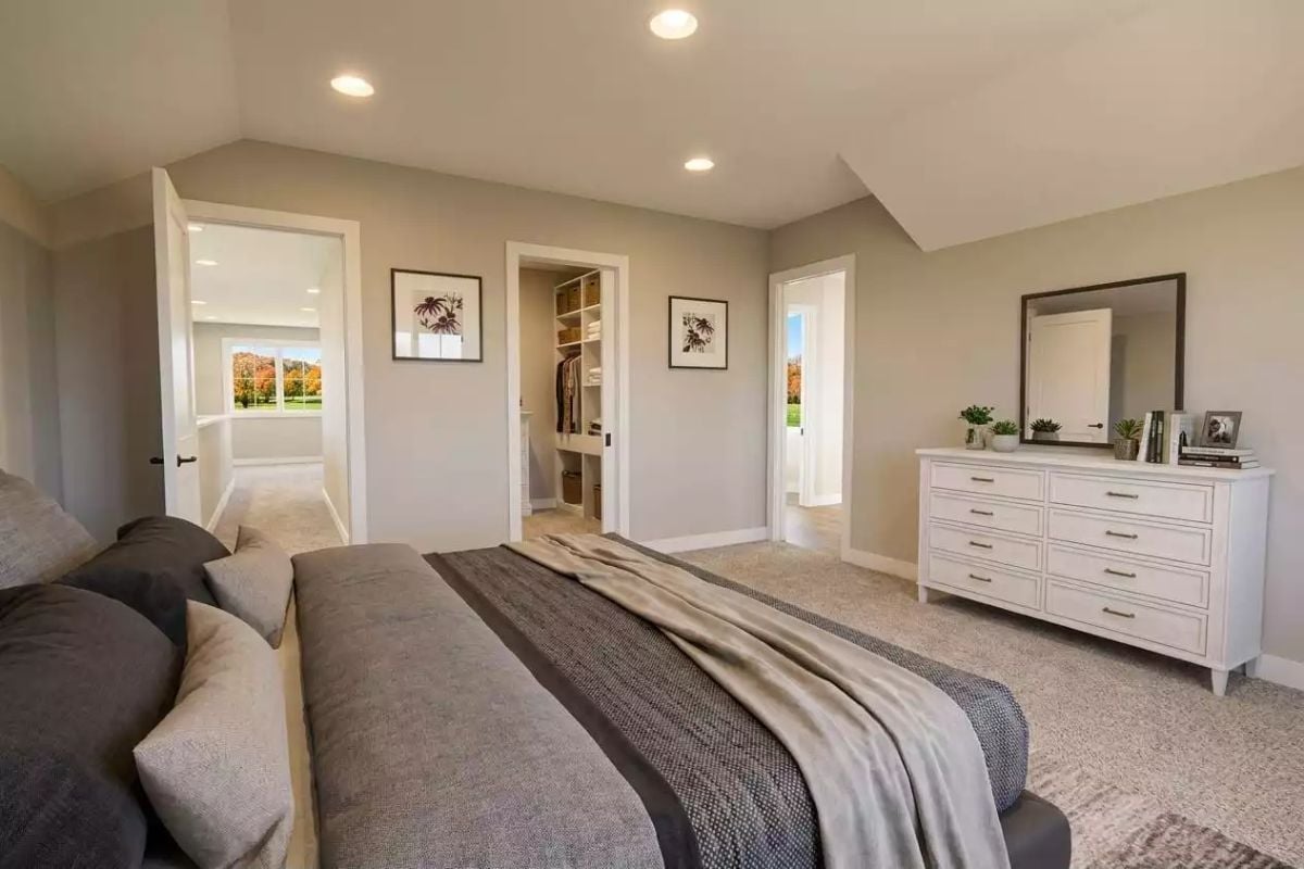
Greige walls keep everything calm, and gray bedding layers in texture without demanding attention. Two separate doorways off the back wall — one to the walk-in closet, one to the en suite — do more for the feel of this room than any finish choice. The white six-drawer dresser earns its footprint.
The Psychology Behind This: Bedrooms with multiple exits tend to feel less like a room and more like a suite, which changes how restful the space actually feels. Giving storage, bathing, and sleeping each its own door quietly reduces the mental clutter that comes with funneling every function through one cramped entry point.
Marble Shower Tile, Glass Enclosure, and a Vanity Long Enough to Share
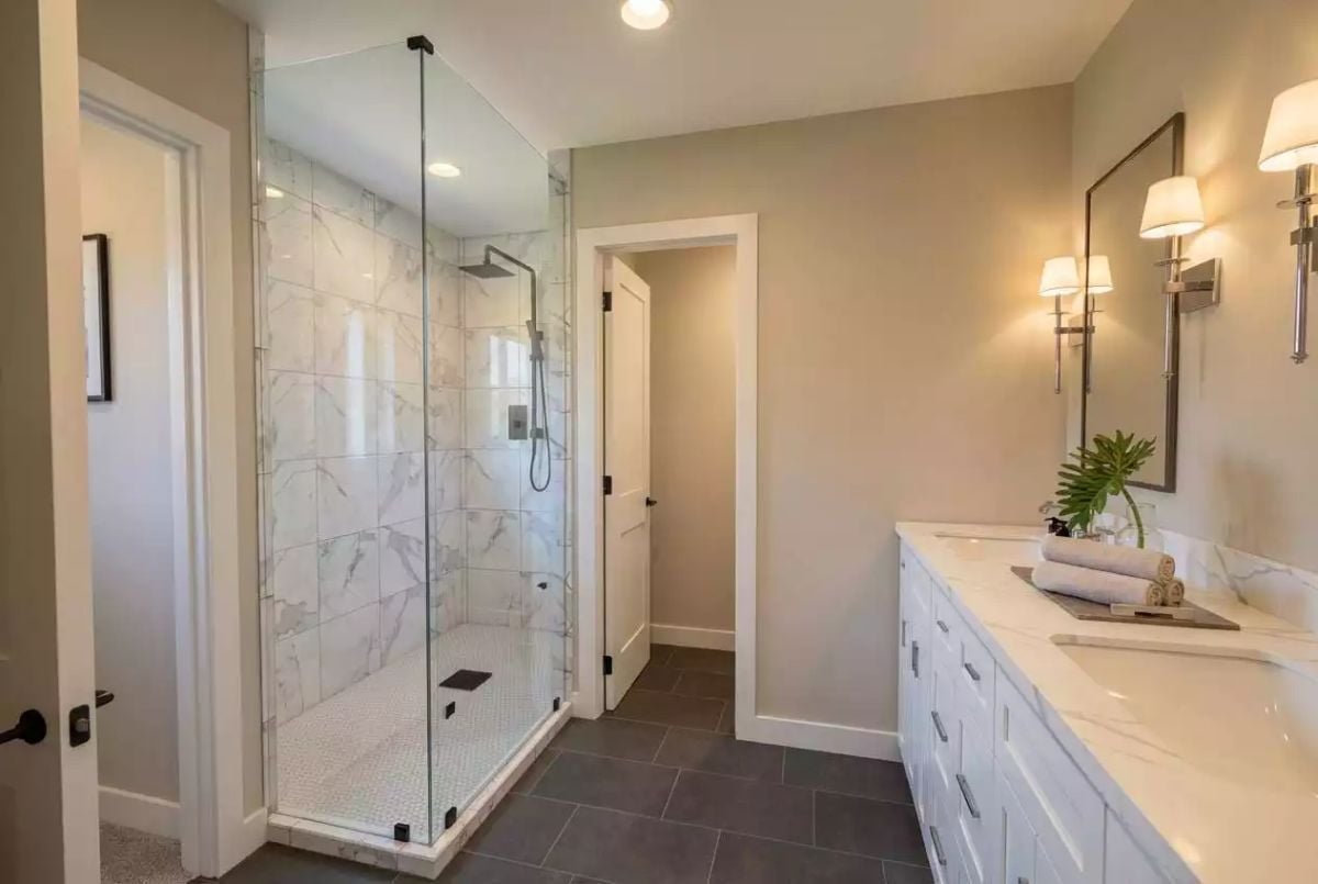
Calacatta-style tile runs floor to ceiling inside the frameless glass enclosure, with a rain head and handheld mounted on the same wall. White vanity cabinetry pairs with a matching marble-look countertop, and wall sconces flank the mirror at eye level — exactly where they need to be to actually be useful.
Pin It
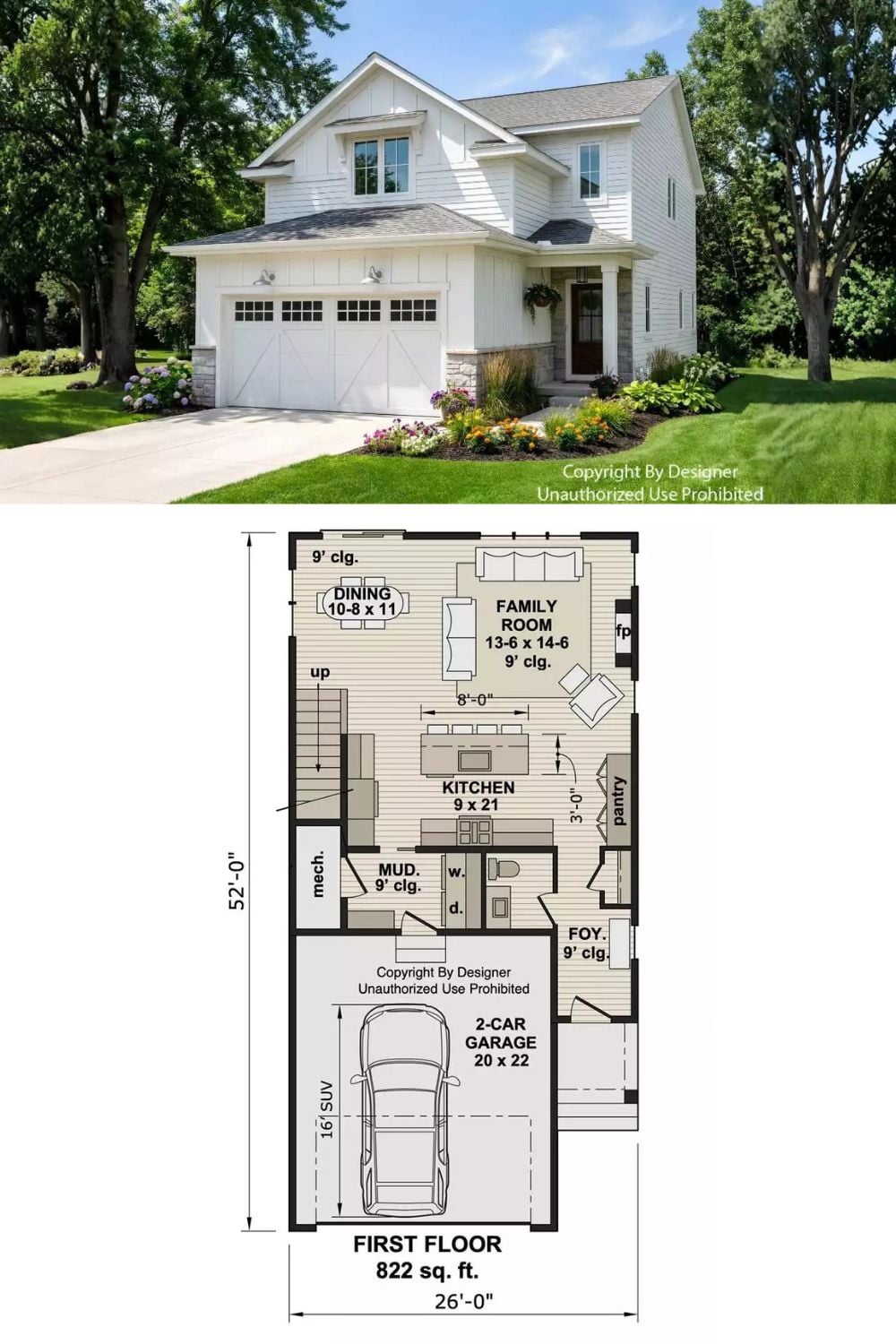
Board-and-batten siding and a two-car garage give the exterior its farmhouse footing. The first-floor footprint — 26 by 52 feet — fits a family room with fireplace, open kitchen, dining area, mudroom, and foyer without anything feeling squeezed.
