
The exercise room is built into the floor plan, not bolted on as an afterthought, and that one decision tells you exactly who this house was designed for. Families who meal-prep on Sunday, run at six before the kids wake up, argue about whose turn it is to wipe down the equipment, and still want dinner on the table by seven will recognize the Highridge Manor’s logic immediately — a dedicated exercise room, an open main living area, a kitchen that can take a real cooking session, and a single-story layout that keeps everyone on the same floor.
Specifications
- Sq. Ft.: 2,284
- Bedrooms: 3
- Bathrooms: 2-3
Floor Plan – Main Floor
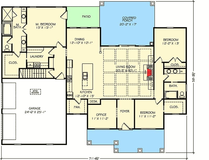
Single-story layout with a central living room anchoring three bedrooms, a home office, kitchen with pantry, and an attached garage. The covered porch and rear patio extend livable space outdoors.
Floor Plan – Basement
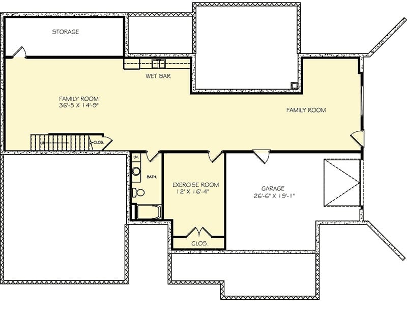
The lower level splits between a sprawling family room with wet bar, a separate exercise room with its own closet, and a two-car garage. A bathroom and laundry sit tucked between the active zones, and storage occupies the far corner. What’s notable is how deliberately the flow is managed — utility spaces stay contained rather than bleeding into the areas meant for relaxing or working out.
Crystal Chandelier and Warm Wood Door Set the Tone Before You’re Inside
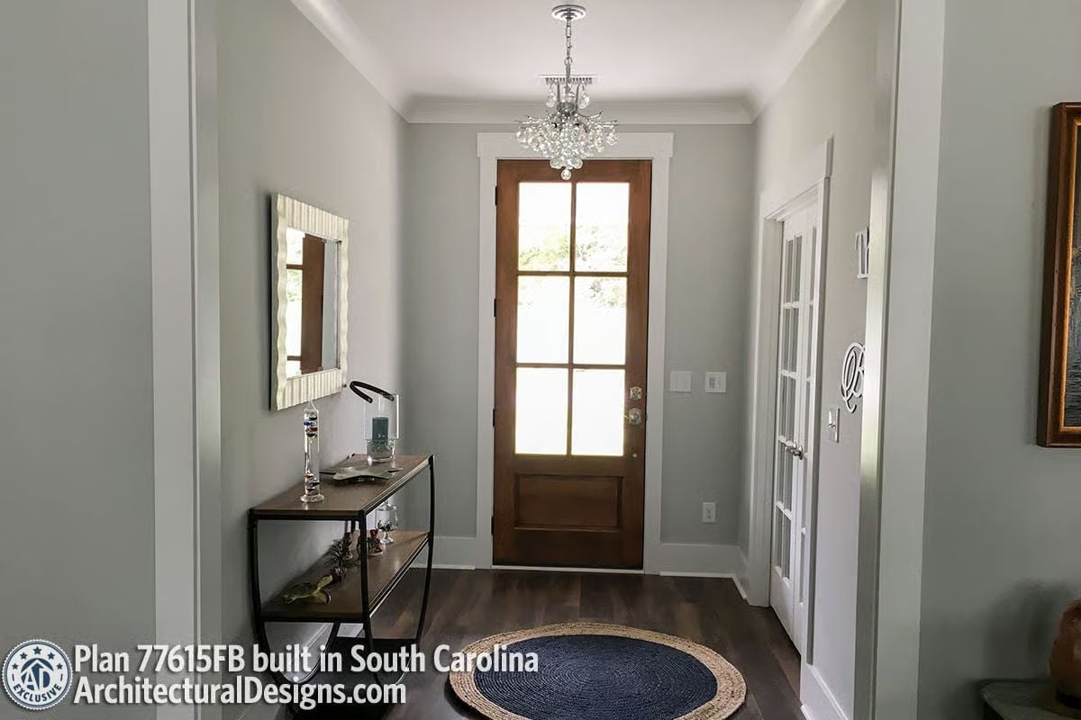
The foyer does a lot of work here. Dark hardwood floors run the length of the entry hall, grounded by a layered jute-and-navy rug, and the wood front door with frosted glass panels pulls natural light in without sacrificing privacy. That crystal chandelier, though — unexpectedly glamorous for a foyer this size, and it earns its spot.
The Front Door’s Frosted Glass Strategy
Frosted glass on an entry door is a specific choice. It lets in daylight while keeping passersby from seeing directly into the home, which matters more in a front-facing foyer than almost anywhere else. The six-lite configuration breaks the glass into smaller panels so the door reads as substantial rather than see-through — a meaningful difference when the foyer is the first thing guests encounter.
Coffered Ceiling and French Doors Make This Living Room Feel Twice Its Size
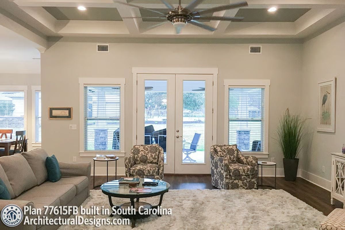
Painted coffered beams overhead draw the eye up without adding visual clutter, and the French doors flood the space with natural light. Flanking the doors, two matching armchairs in a floral print hold their own against the neutral walls without overwhelming them. That shag rug anchors everything. Simple, but it works.
Editor’s Note: Coffered ceilings like this one are typically reserved for formal spaces, but pairing them with casual furniture keeps the room from feeling stiff. If you’re building new, budget for the ceiling detail early — framing it in during construction costs a fraction of what it runs as a retrofit.
Pendant Lights Hung This Low Over an Island Change How the Whole Kitchen Feels
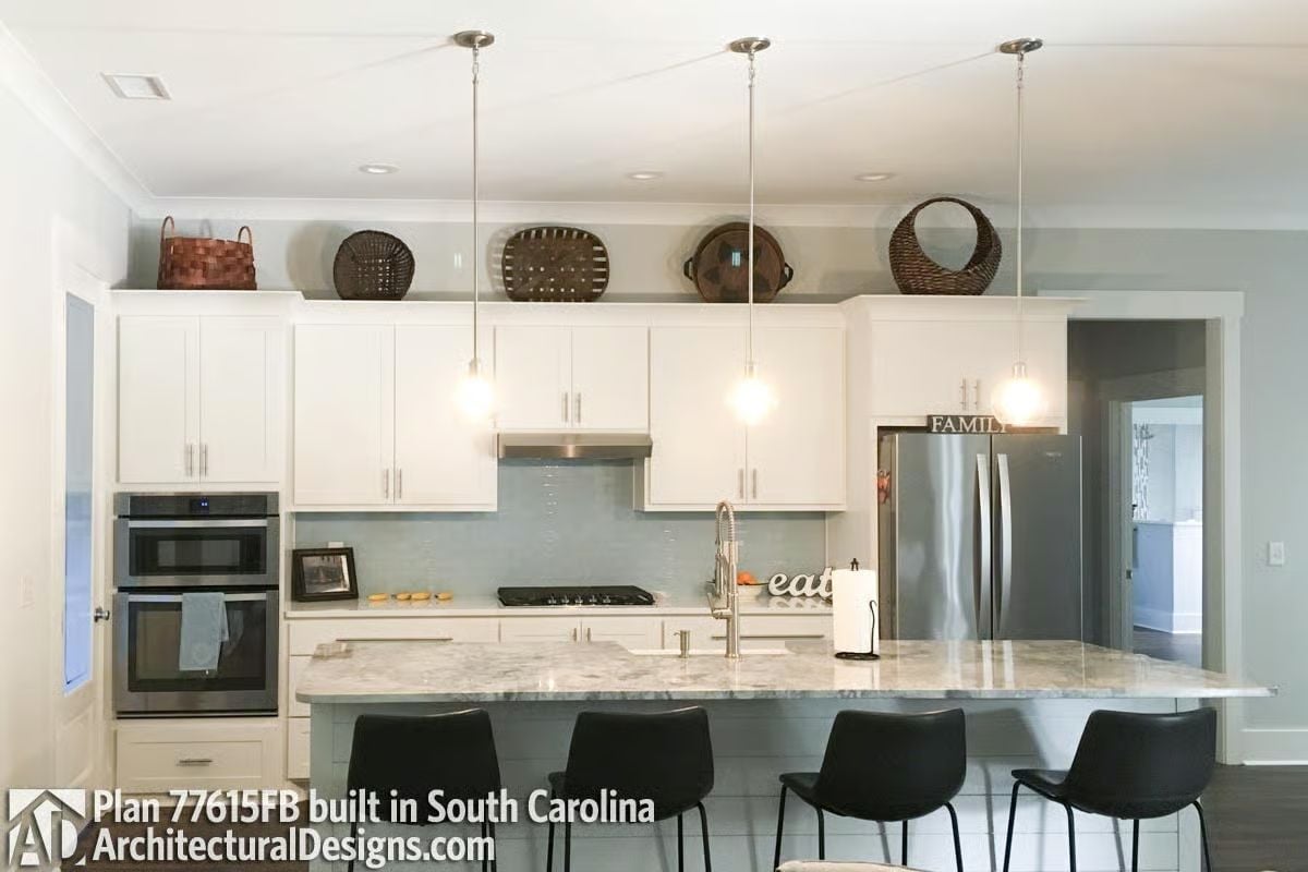
Three bare-bulb pendants drop unusually close to the island surface, pulling the eye down and making the space feel more intimate than a typical open kitchen. Marble counters, a subway tile backsplash, and stainless appliances keep things clean and consistent. Baskets lined up above the cabinets add warmth without asking for much attention.
The Psychology Behind This: Dropping pendants close to the surface creates a sense of enclosure in open-plan kitchens — it gives people a reason to linger at the island rather than pass through. Restaurants have used the same principle for years to make large dining rooms feel like smaller, more personal spaces.
Globe Pendants at Dinner-Table Height Make This Dining Room Feel Intentional
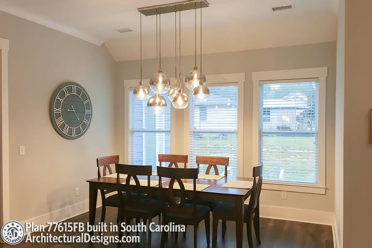
Clear glass globes hung low over a dark wood table pull the eye down and create a gathered, settled quality to the room. The wall clock’s Roman numerals add contrast without competing with the fixtures overhead — a small detail that’s easy to overlook and harder to replace if you skip it.
Trend Alert: Cluster pendant lighting over dining tables is edging out traditional chandeliers in new builds. Mixing clear and smoked glass within the same fixture grouping — as shown here — adds depth without requiring different light sources, and it’s a relatively low-cost decision to make during construction before furniture is even selected.
Sleigh Bed and Wall Script Make This Master Bedroom Feel Like It Was Planned Together
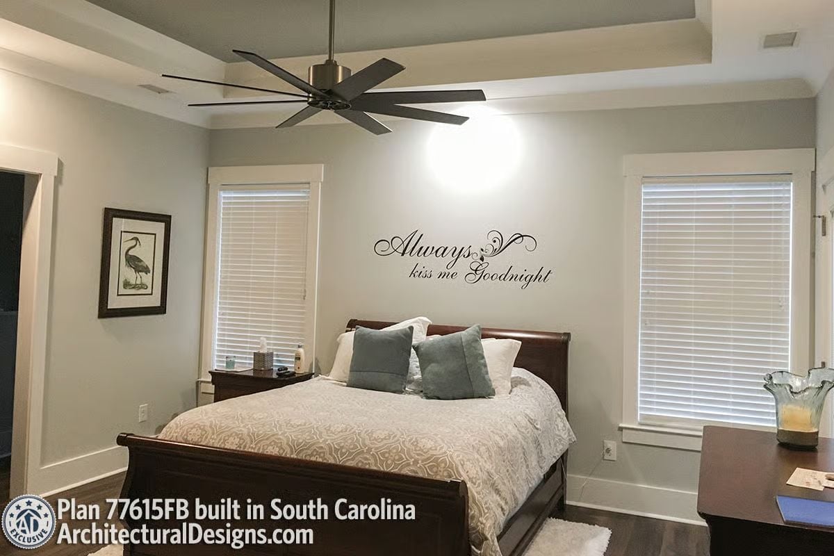
A dark wood sleigh bed anchors the room while blue-gray pillows pull the wall color forward. Wall decals tend to get dismissed as a DIY shortcut, but vinyl lettering applied above a headboard can do real compositional work — it fills vertical space without adding visual weight, which matters in a room where the ceiling fan is already competing for attention up top. Size it so the text spans roughly the width of the bed frame beneath it. Go wider than that and it starts to read like signage.
Half-Wall Between Vanity and Shower Pulls Double Duty Without Dividing the Room
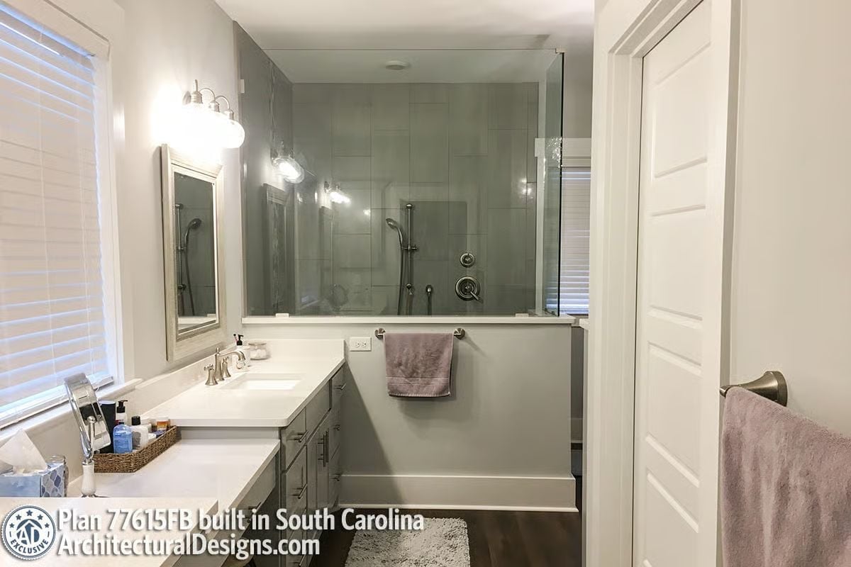
Gray large-format tile runs floor to ceiling inside the shower, keeping the palette cohesive with the cabinet finish outside it. The half-wall doubles as a towel bar mount while letting natural light from the shower window reach the vanity — two problems solved by one decision. Frameless glass handles the rest without making the room feel carved up.
Pin It
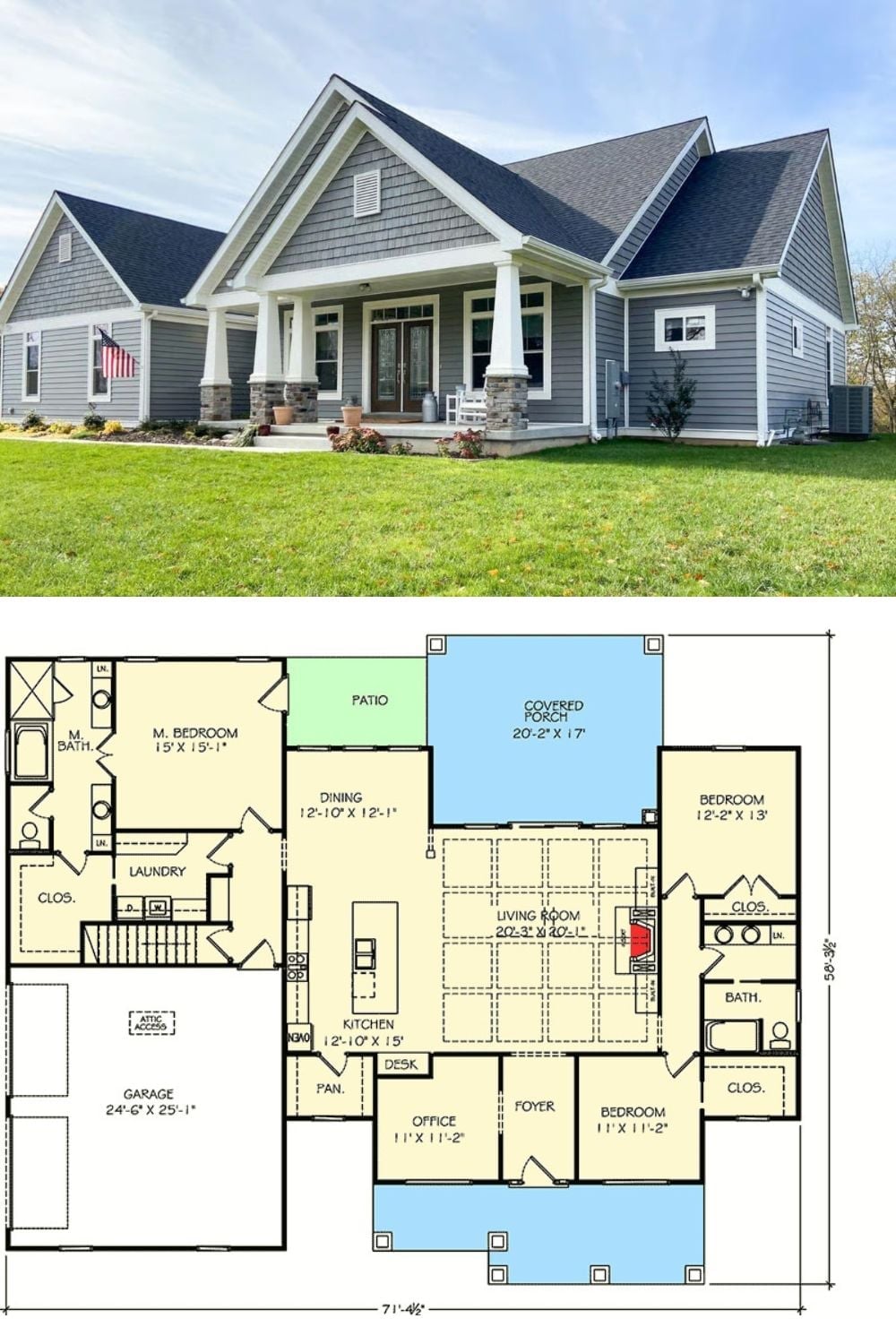
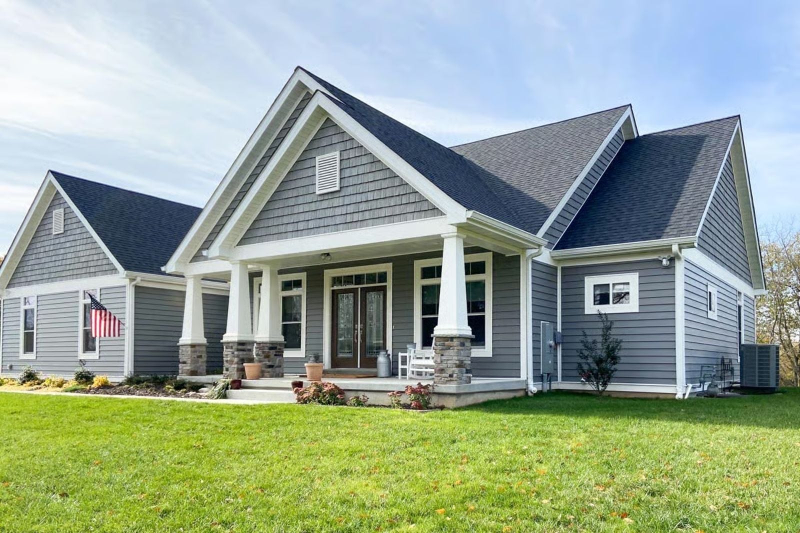
Exterior photo shows a Craftsman-style ranch with gray lap siding, tapered columns, and a wide covered front porch. The floor plan below reveals three bedrooms, an office, and a living room at the center of the layout, with the master suite and garage anchoring opposite ends of a 71-foot-wide footprint.
