
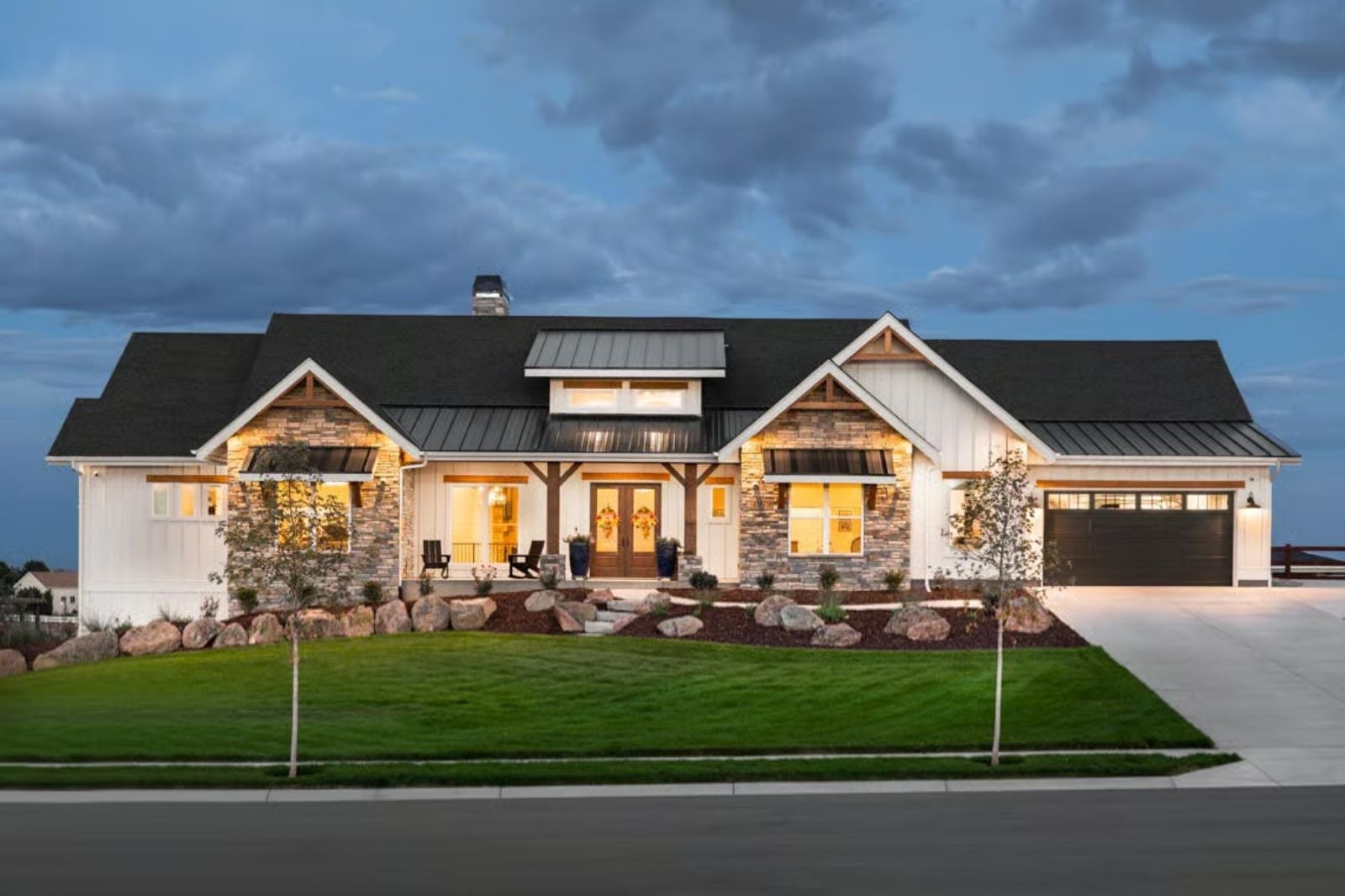
Ask any builder what feature families fight hardest to keep when value-engineering kicks in, and on a lake or mountain lot, the indoor pool wins every time. The Hearthglen is built around that instinct: a year-round pool that means swim season never ends, a great room big enough for wet towels and board games at nine o’clock, a kitchen that handles Saturday breakfast for ten, and a covered outdoor space where the grill stays hot long after the sun drops behind the ridge.
Specifications
- Sq. Ft.: 2,987
- Bedrooms: 3-6
- Bathrooms: 3.5-5.5
Floor Plan – Main Floor
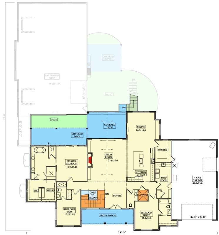
The main level holds the master suite, two additional bedrooms, great room, kitchen, dining, foyer, elevator, mud room, pantry, covered decks, and a four-car garage.
Floor Plan – Basement
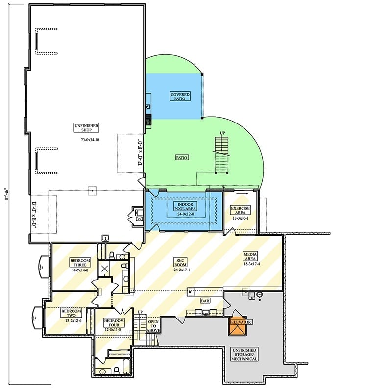
The lower level packs a serious amount into one footprint. An indoor pool anchors the center, flanked by an exercise area and a rec room with a bar, and three bedrooms, a media area, and an elevator fill out the rest. The unfinished shop at the edge is the rare kind of flex space that actually stays flexible.
Clerestory Windows and Black Iron Rails Define a Foyer Built for First Impressions
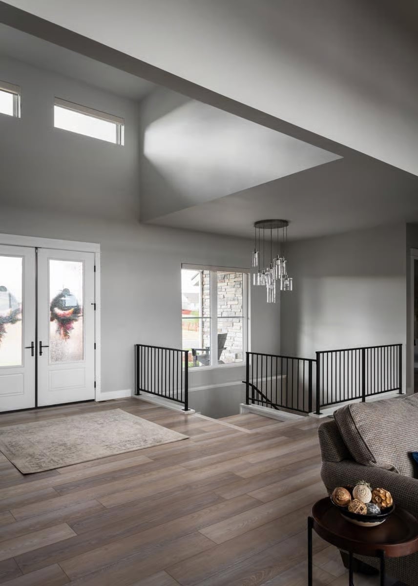
High clerestory windows pull natural light deep into the entry, and the stairwell’s black iron railings anchor the space without competing for attention. Pale hardwood floors run throughout. A cluster pendant with glass cylinders hangs right where two ceiling planes meet — which is exactly where it should be. Spare, but deliberate.
Common Mistake: Placing a large area rug too close to the stairwell opening visually compresses the space, which is the opposite of what you want in a double-height foyer. Pull the rug toward the front door and leave the transition to the stair landing open. That breathing room is what makes the height actually register.
Stone Fireplace Wall with Built-Ins That Pull the Whole Room Together
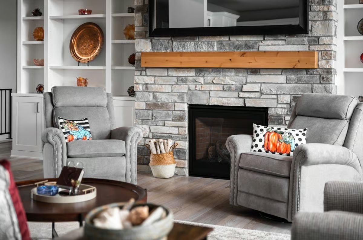
Two gray recliners face a floor-to-ceiling stacked stone fireplace flanked by white built-in shelves. Pumpkin-print pillows and a woven basket of birch logs bring in fall warmth, and the natural wood mantel keeps the stone from reading cold — which it absolutely would without it.
Style Math: Pairing warm wood with cool stone is one of the oldest tricks in fireplace design, and it still works because each material makes the other look better. Built-ins painted the same white as the trim read as architecture rather than furniture, which keeps the eye moving toward the fireplace instead of getting snagged on the shelving.
Slatted Wood Chairs and a Lantern Pendant That Know Exactly What They’re Doing
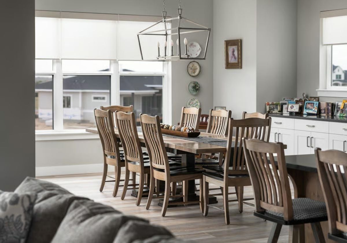
Ladder-back chairs in mixed wood tones keep the dining room grounded without feeling matchy. A metal lantern pendant pulls the eye upward. Decorative plates climb the wall in a tight cluster above the credenza, which holds what looks like years’ worth of framed family photos — the kind of thing you actually want guests to notice.
Material Matters: Mixing wood finishes at the dining table — lighter chair frames against a darker tabletop — works because the eye reads it as intentional rather than a mismatch. Slat-back chairs have staying power for a reason: they’re light visually but sturdy structurally, which makes them a practical pick for a large family table that sees real daily use.
Light Blue Pendants and a Wood Island That Earn Their Place in a White Kitchen
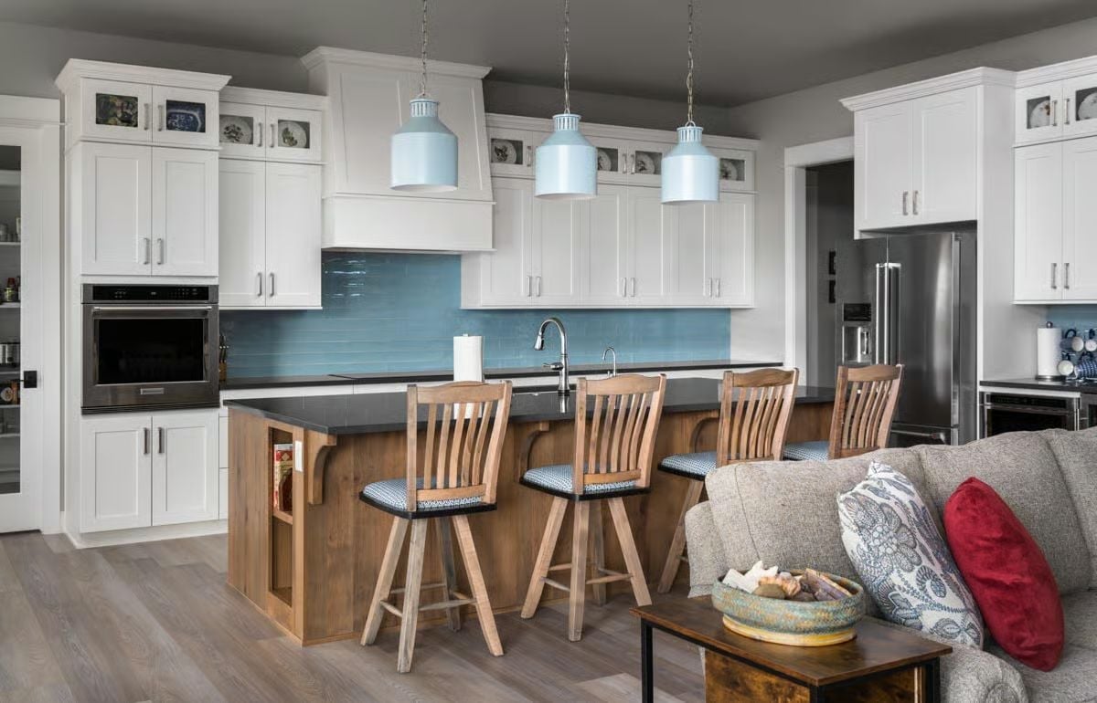
Those three pale blue pendants do a lot of work here, tying directly to the subway tile backsplash so the color reads as intentional rather than accidental. The island base uses raw wood against a dark countertop, which keeps the all-white cabinetry from feeling clinical. It’s a small decision that changes how the whole room feels.
By The Numbers: Blue is one of the harder accent colors to pull off in a kitchen because it can skew cold fast. Grounding it in warm wood gives the eye somewhere to rest, and the pendant-to-backsplash color echo is what keeps the whole scheme from feeling scattered across the room.
Knotty Wood Cabinetry and Rolled Towels That Make Storage Look Intentional
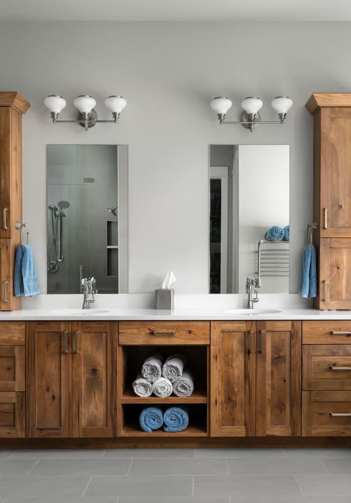
Natural wood grain carries most of the character here. Double sinks sit under matching vanity lights with globe shades, open cubbies below keep rolled towels visible and within reach, and white countertops stop the warm wood from tipping heavy. It’s a bathroom that looks pulled together without trying to look designed.
Why open shelving works better than doors in this spot
Closed cabinet doors running the full length of a double vanity tend to read as one unbroken wall — fine in some bathrooms, suffocating in others. Breaking it up with open cubbies gives the eye somewhere to land and turns towels into part of the design rather than something you’re hiding. Practically speaking, you’re also never hunting for a fresh one mid-shower.
Covered Patio With Lounge Chairs and a Dining Set Built for the Long Haul
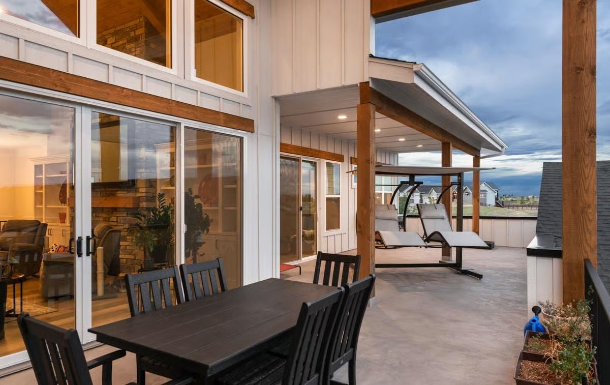
Black wood furniture on a concrete slab keeps things grounded and easy to maintain. Sliding glass doors blur the line between the living room and the outdoor space, and recessed lighting under the covered section means evenings out here don’t get cut short just because the sun went down.
History Corner: Covered patios became a standard feature in American residential design after post-WWII suburban housing boomed and families started treating outdoor space as a genuine extension of the home rather than an afterthought. Concrete slabs replaced wood decking in many regions because they hold up better under fluctuating temperatures and don’t need sealing every few years.
Curved Concrete Paths and Dark Mulch Beds Doing the Heavy Lifting Outside
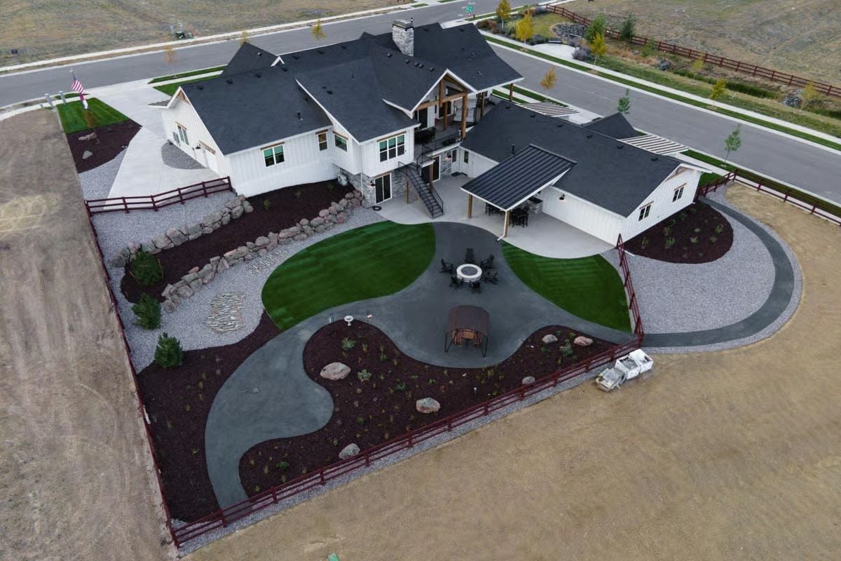
Sweeping concrete walkways carve out lawn islands and frame a central fire pit seating area, with dark mulch handling the edging work cleanly throughout.
Pin It
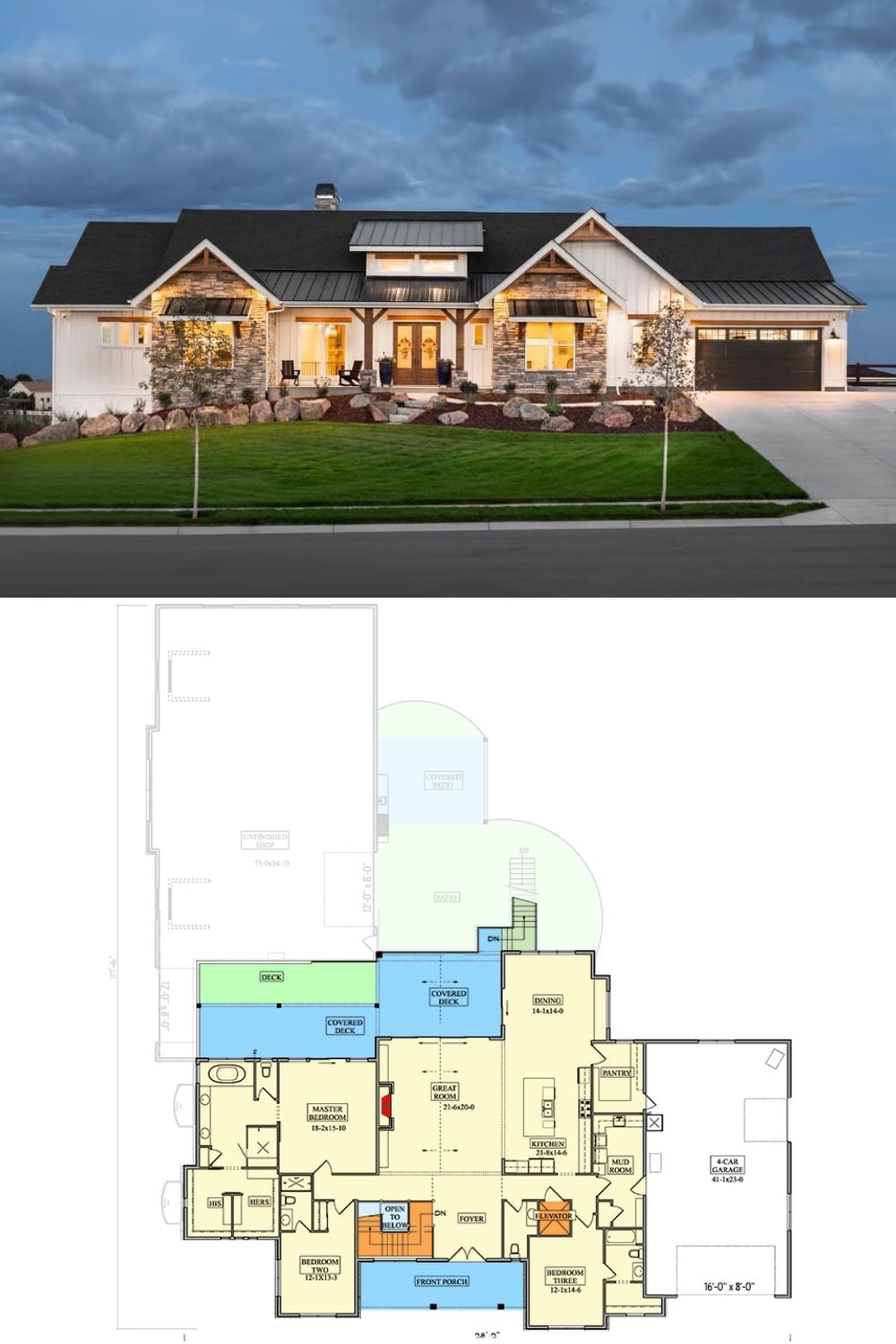
The exterior shot shows board-and-batten siding, stone accents, and a covered front porch lit at dusk. The floor plan below lays out a single-story arrangement with a 4-car garage, master suite with his-and-hers closets, great room, kitchen with pantry, mudroom, and two additional bedrooms flanking the front entry.
