
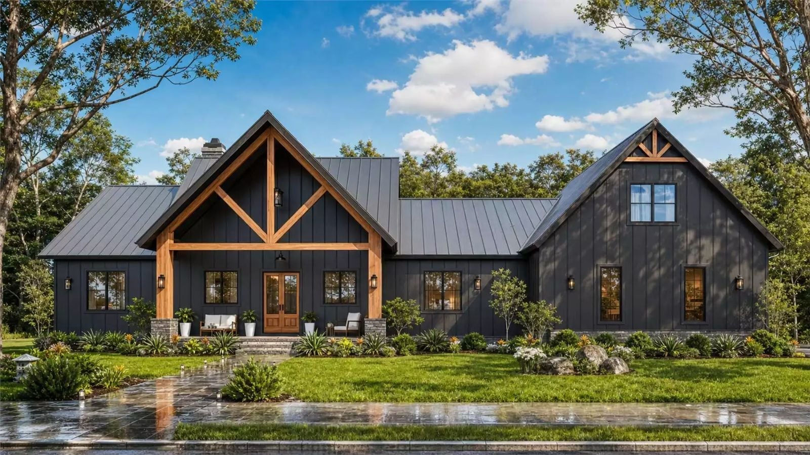
Ask anyone who has spent three years in a house that stopped fitting by year two, and the bonus room is almost always the thing they wish they had bought the first time — not a bigger garage, not an extra half bath, but a room that could absorb the homework sprawl and the weekend guests and the gear that never found a permanent home. The Haystack Ledge is built around that exact frustration, with a dedicated second-floor bonus room that pulls the chaos off the main level, a farmhouse kitchen designed so you can watch the backyard while finishing dinner, and a two-story layout that actually gives each person somewhere to go.
Specifications
- Sq. Ft.: 1,960
- Bedrooms: 3
- Bathrooms: 3.5
Floor Plan – Main Floor
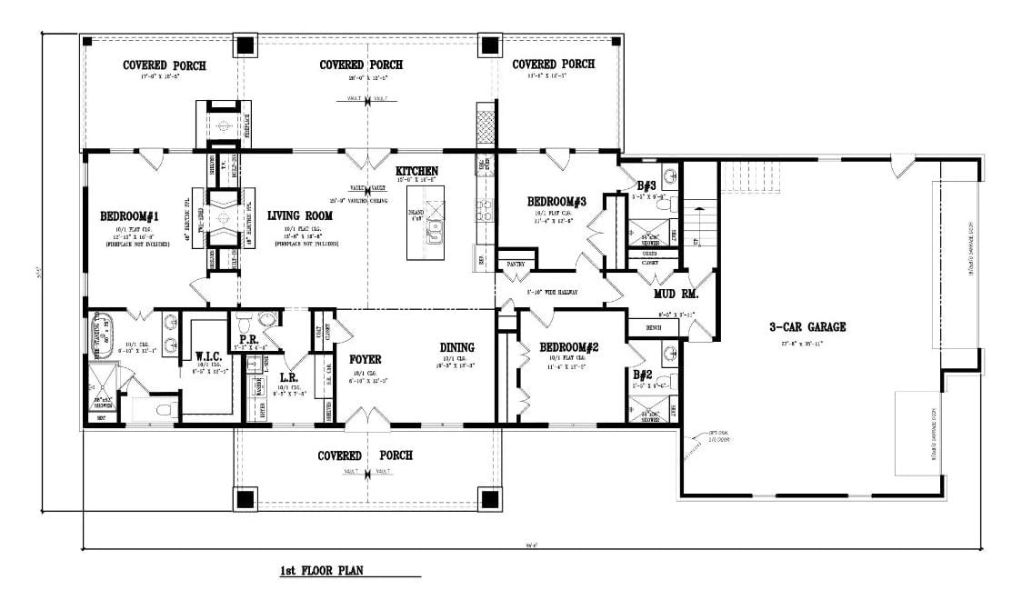
Three bedrooms run along the perimeter of the first floor, with the primary suite tucked far left behind a walk-in closet and the laundry area. A central living room and dining space anchor the middle of the plan, while the kitchen connects back to a pantry and mud room near the garage entry. Covered porches wrap three sides.
Floor Plan – Bonus Room
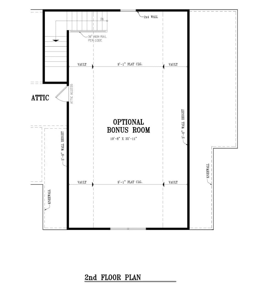
The second floor is essentially one big open bonus room — nearly 20 by 36 feet — with vaulted ceiling sections flanking a flat 9-foot-1-inch center span. Attic access sits just off the stair landing, and kneewall storage runs along both side walls, which keeps the usable square footage from being overstated on paper.
In The Details: Ceiling height shifts matter here. The vault sections angle down toward the kneewalls, so anything you push toward the perimeter needs to clear that slope — tall bookshelves and floor lamps are the usual casualties. The flat center span is where the room actually lives; that’s where you’d anchor a sectional or a game table without fighting the geometry.
Vaulted Ceilings and a Live Fire Make the Living Room Feel Worth Coming Home To
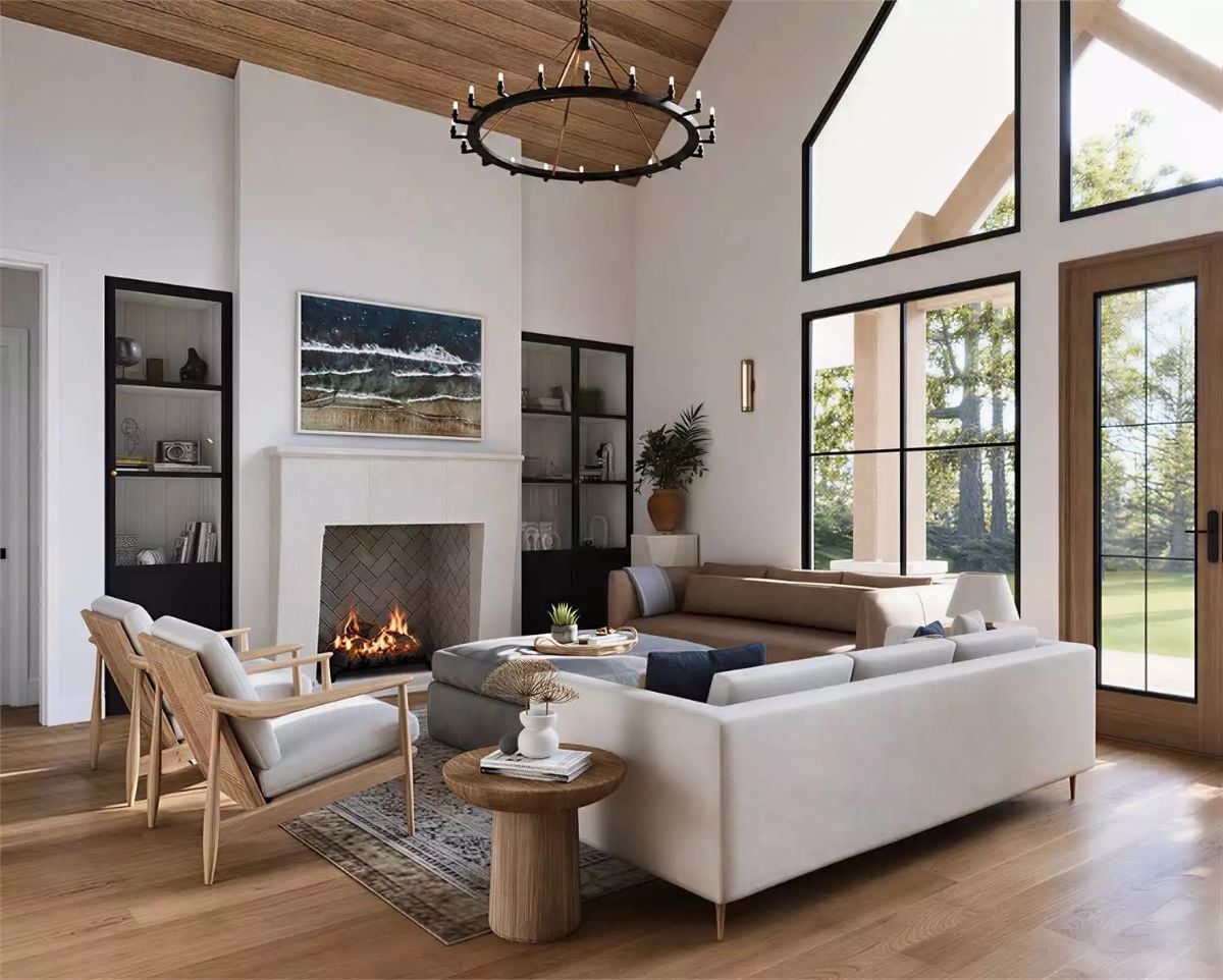
Warm oak planks run ceiling to floor, and the herringbone tile inside the firebox gives the surround real texture without needing a dramatic mantel to do the work. Two rattan-frame chairs face a low sectional without crowding it. Black steel window frames carry a surprising amount of the design weight in this room — they define the view and sharpen the whole composition against white plaster walls without competing with either.
Why That Chandelier Actually Works at This Scale
Most round chandeliers get swallowed by vaulted ceilings. This candle-style iron ring avoids that because the frame has enough visual mass to hold its own against the wood overhead, and it hangs low enough to anchor the seating area without blocking the clerestory windows above. Scale made this fixture the right call. Style was secondary.
Copper Pendants and a Dark Island Base Anchor This Kitchen Without Competing
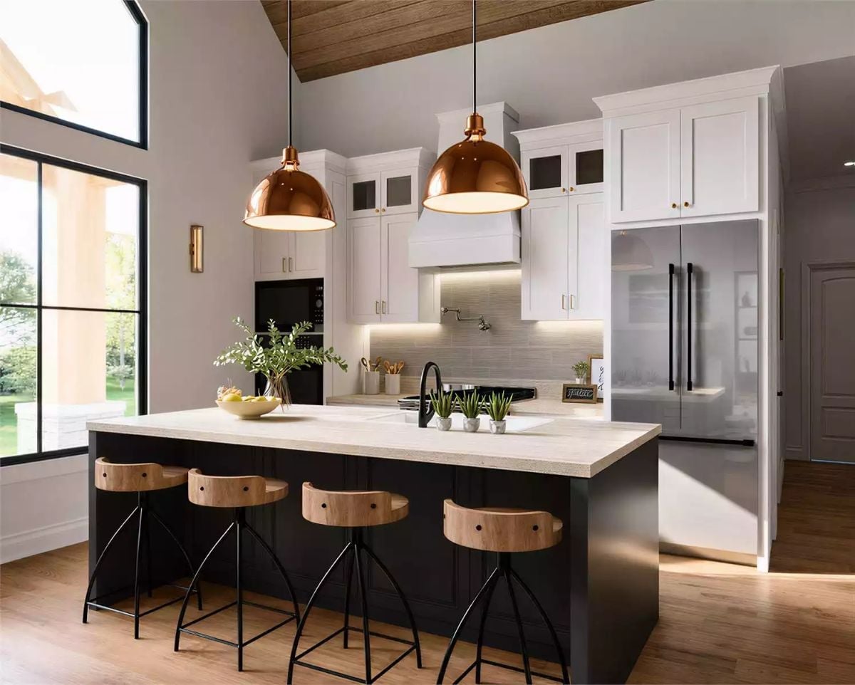
Copper dome pendants pull focus while wood bar stools soften the island’s near-black base. It’s a combination that could easily tip into trying too hard — but doesn’t, mostly because everything else in the room stays quiet.
Designer’s Secret: Painting an island dramatically darker than the perimeter cabinets works best when the countertop runs light and continuous across both zones — it keeps the contrast from feeling fractured. Here, the light quartz top ties the black base back to the white shaker uppers without any visual whiplash. Pull that thread and the whole kitchen holds together.
Rattan Backs and Black Frames Turn a Simple Dining Set Into Something Worth Keeping
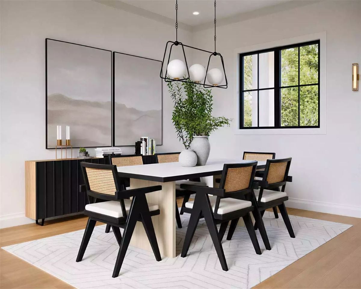
Cane-back chairs with black wood frames do a lot of work in a room this size. Against a white tabletop and a light stone pedestal base, they read bold without going heavy — and the globe pendant cluster keeps the overhead moment soft where a linear fixture might’ve felt too rigid and expected.
Pro Tip: Cane webbing adds visual texture without the bulk of solid upholstery, which matters in dining rooms short on square footage. Worth knowing before you buy: check that the weave is properly tensioned. Loose cane sags faster than most people expect, and it’s not a straightforward fix once it goes.
Crystal Chandelier and Pendant Lights Prove One Statement Fixture Was Never Enough
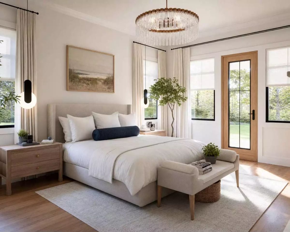
Linen upholstery on the headboard and bench keeps the palette quiet while the crystal chandelier handles the drama overhead. Natural wood nightstands and black window frames pull the room back before it tips too soft.
Color Story: Layering a chandelier with flanking bed pendants works when the fixtures share at least one finish. Bronze hardware ties the chandelier’s frame to the pendants’ matte casing here, so the ceiling reads as intentional rather than busy. Separately: hang curtains floor-to-ceiling even when the windows don’t reach that high. It makes the walls read taller without touching the floor plan.
Brushed Brass and Frameless Glass Make This Shower-Tub Pairing Feel Like a Spa Upgrade
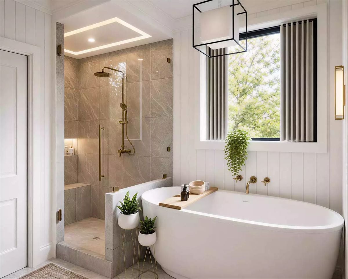
Brass fixtures carry through from the shower column to the wall-mount tub filler, tying both zones together without forcing them to share materials exactly. That kind of finish continuity is usually what separates a bathroom that looks designed from one that just looks decorated.
Quick Fix: Pull a freestanding tub slightly away from the wall rather than pushing it flush. That gap lets the wall-mount filler read as deliberate rather than squeezed in — and it makes cleaning behind the tub considerably less miserable.
Wall-Mounted Drying Rack and a Gold Faucet Make Laundry Feel Less Like a Chore
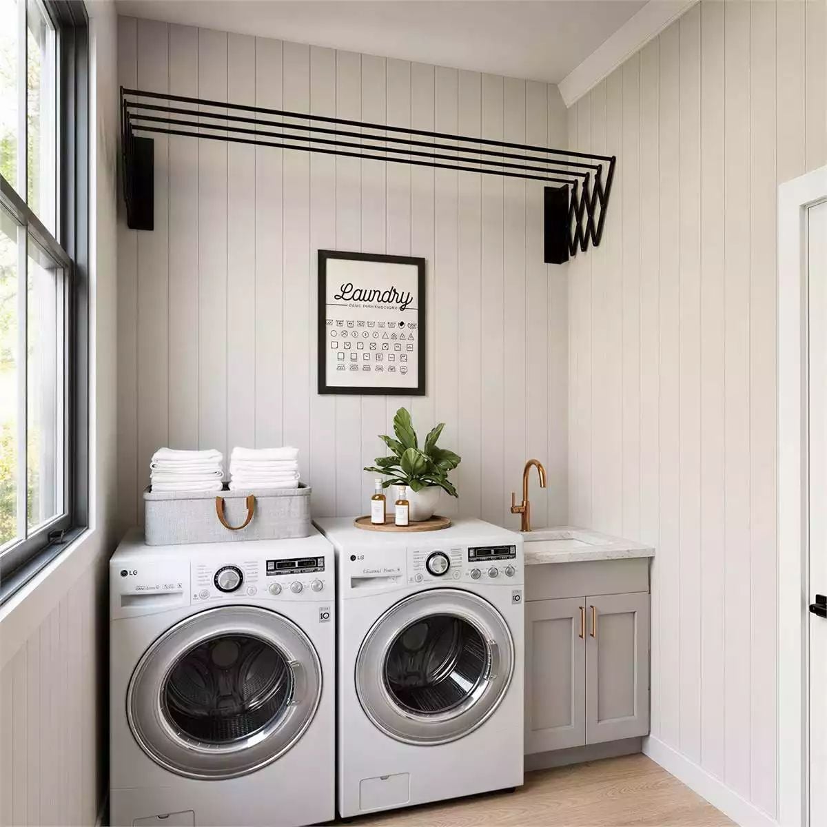
Shiplap paneling runs floor to ceiling, giving the room texture without demanding attention. Gold hardware on the utility sink cabinet reads warmer than chrome would against all that white — a small call that keeps the space from feeling clinical. And that accordion-style wall rack is genuinely the smarter choice over a floor-standing version; folded flat, it disappears, and nobody is navigating around it on their way to the garage.
That accordion-style wall rack folds flat when not in use, a smarter call than a floor-standing drying rack competing with foot traffic.
Exposed Timber Framing and a Metal Roof Give This Farmhouse Exterior Its Backbone
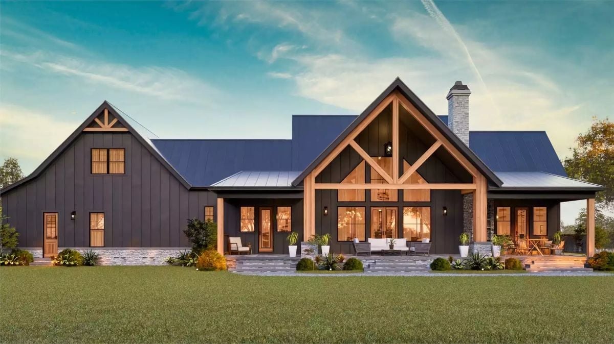
Natural timber posts frame the central gable without apology. That contrast against dark board-and-batten siding is what earns the whole facade — stone base coursing grounds the structure below it, and outdoor seating sits recessed under the covered porch, lit from inside by warm window glow that holds even at dusk. This exterior isn’t performing rustic. It just is.
Pin It
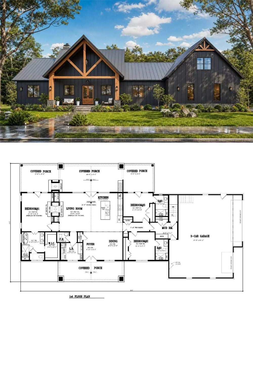
The exterior rendering at the top shows dark board-and-batten siding and exposed timber gable framing. Below it, the first-floor plan lays out three bedrooms, three bathrooms, a connected living and kitchen zone, a mud room with garage access, and covered porches on three sides. The 3-car garage sits flush to the right wing.
