
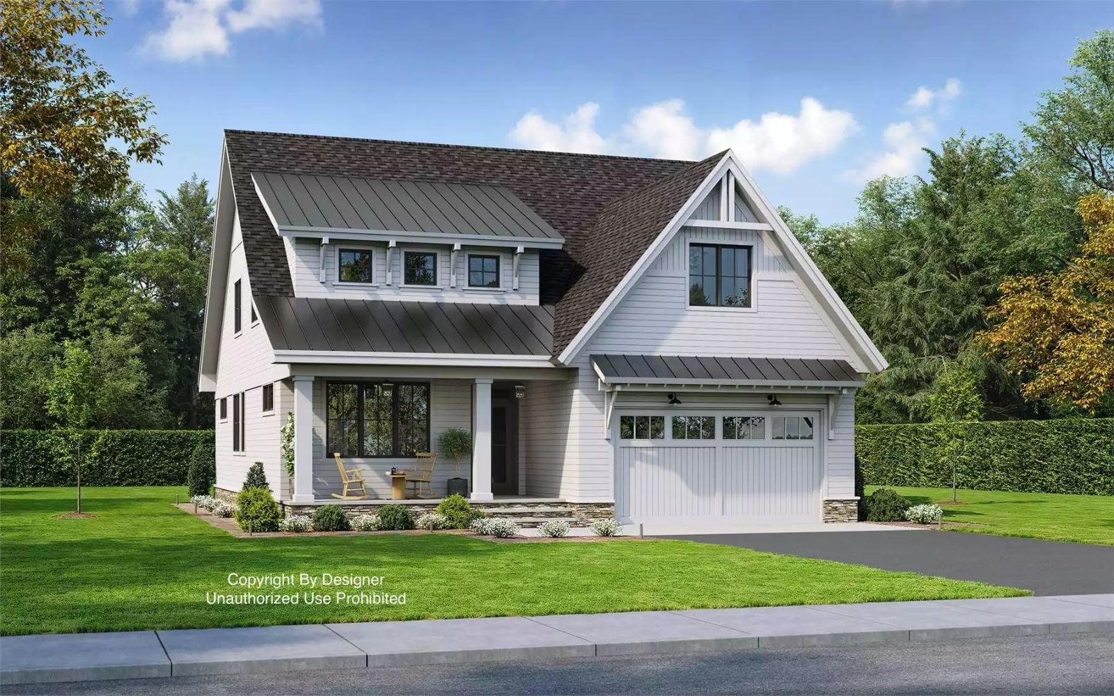
Every family has a room they keep gravitating back to — usually open to the floor below, where voices carry and someone can always be heard: kids doing homework while dinner cooks, a Saturday morning that stretches past ten, someone hollering down from the landing because they cannot find their shoes. The Greystoke Drive is built around exactly that pull, with a main-floor primary suite, an open gathering layout, and a loft that keeps the upstairs connected without surrendering anyone’s space.
Specifications
- Sq. Ft.: 2,889
- Bedrooms: 4
- Bathrooms: 3.5
Floor Plan – Main Floor
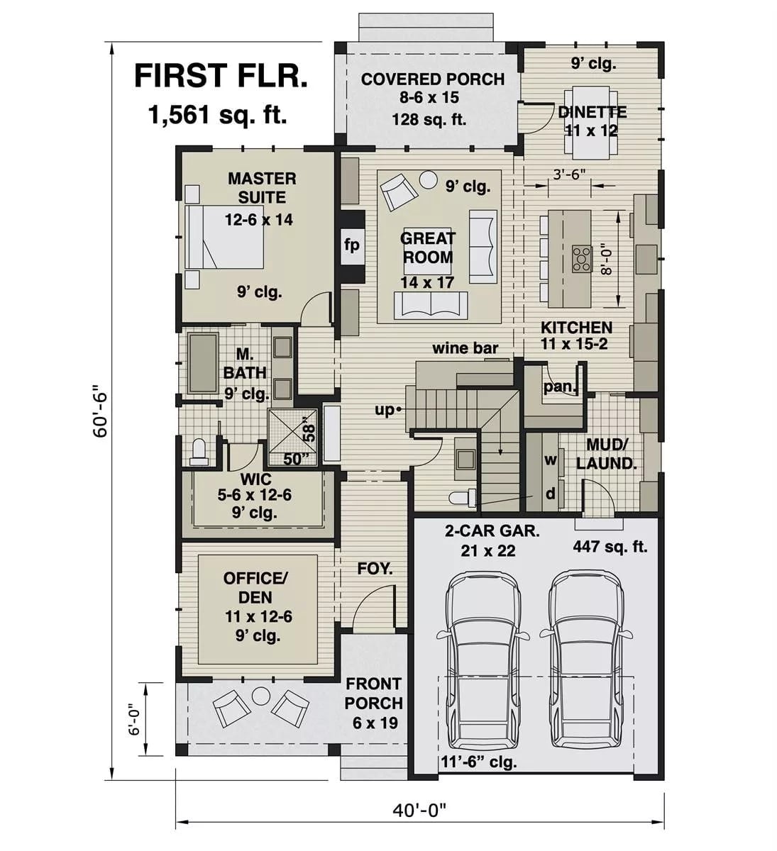
Main-floor primary suite anchors the left wing while the great room connects kitchen, dinette, and covered porch.
Floor Plan – Second Floor
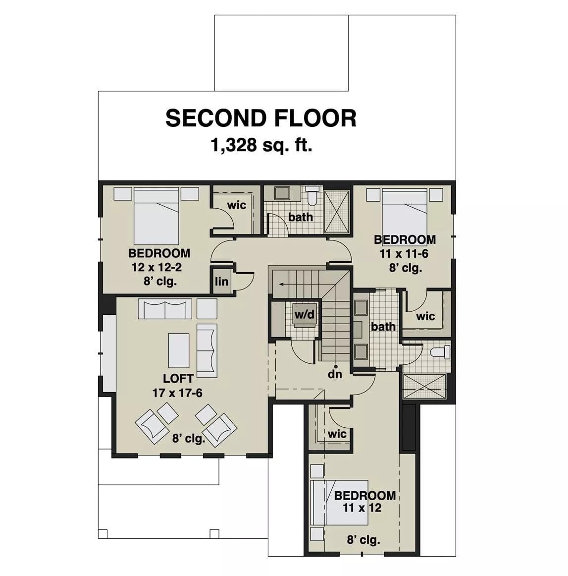
Three bedrooms, a loft, and two full baths share the second floor, with laundry tucked near the staircase.
Designer’s Secret: Putting the washer and dryer at the top of the stairs rather than on the ground floor cuts down on how far laundry actually travels — and it’s one of those decisions that sounds minor until you’ve hauled a basket up a full flight for the hundredth time. The open loft sitting between the bedrooms gives kids a shared hangout zone without requiring anyone to trek all the way downstairs.
Stone Fireplace Wall That Earns Every Square Foot It Takes Up
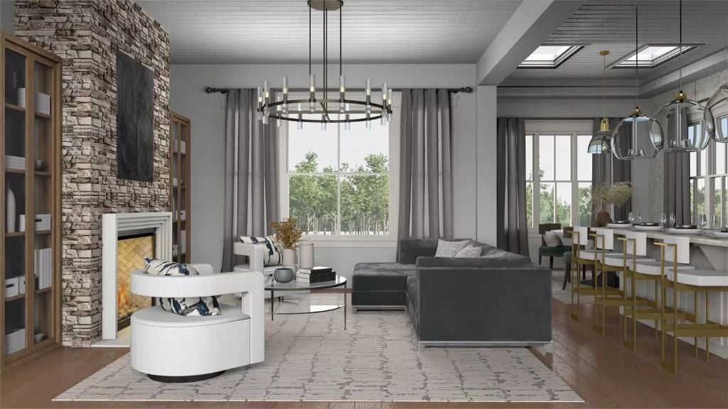
Floor-to-ceiling stacked stone anchors the room with real weight. White curved chairs contrast the charcoal sectional without competing, warm wood shelving runs up both flanking sides, and a round brass chandelier does the work of tying the dining area’s pendant cluster back to the living space. A lot going on, but none of it fighting.
History Corner: Stone fireplaces predate central heating by centuries — the hearth was the literal center of household life, and many early American farmhouses were built around it first, with rooms added outward from there. That logic still shows up in layouts like this one, even if the furnace is doing most of the actual work now.
Gold Hardware and Dark Ceilings Do the Heavy Lifting Here
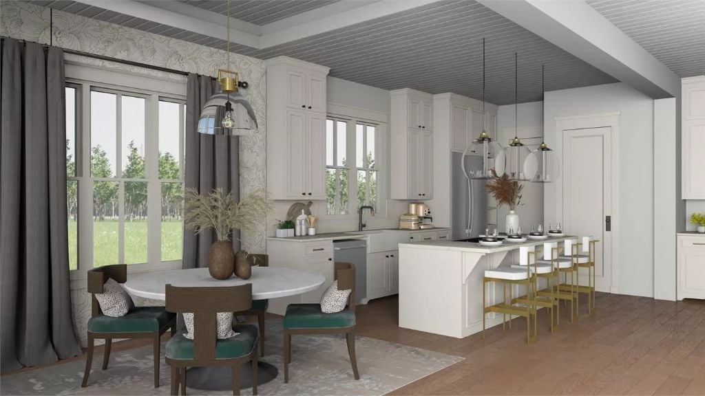
Painted shiplap on the ceiling pulls the kitchen and dining area together without a single wall doing the work. Bar stools with brass legs echo the pendant hardware above the island, and green velvet seat cushions at the round dining table are genuinely unexpected — and commit fully. It’s a space that doesn’t feel decorated so much as decided.
Why the Ceiling Color Changes Everything
Painting a ceiling darker than the walls lowers the perceived height of a room, making it feel warmer and more enclosed rather than cavernous. That darker shiplap also creates a visual boundary between the kitchen zone and the rest of the open plan — doing the work a wall would have done, without blocking light or sightlines. Two birds, one coat of paint.
Charcoal Walls and a Dark Desk That Don’t Apologize for Being Moody
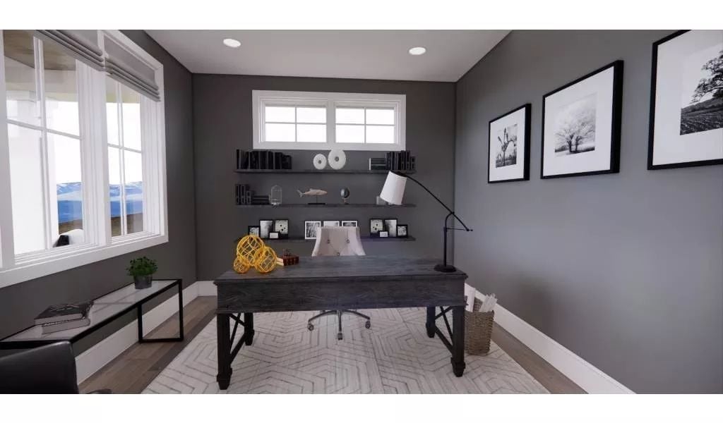
Warm gray walls read almost slate under recessed lighting. The reclaimed-style desk anchors the room without overwhelming it, floating shelves keep books and objects off the floor, and that yellow rope sphere is doing a surprising amount of heavy lifting against all the charcoal. Good contrast instinct.
Color Story: Dark gray walls absorb light rather than bounce it, so designers often compensate with high-contrast whites on trim and window casings — which you can see clearly here. The white rug pulls the same duty underfoot, keeping the room from collapsing into shadow.
Laundry Room Wall Art That Actually Earns Its Place on the Wall
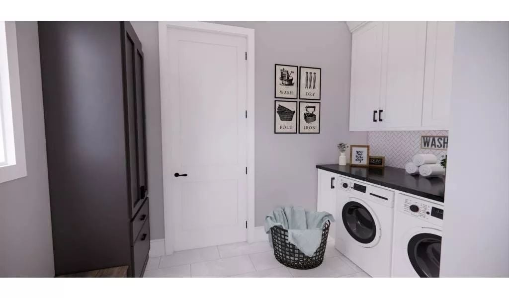
Four framed prints spelling out wash, dry, fold, iron keep the wall from feeling bare without pretending to be a gallery. The real design work happens below: a dark wire basket on the floor, black countertop over white cabinetry, and a herringbone tile backsplash that gives the room something to look at while you wait for the spin cycle.
Dark wire basket on the floor, black countertop over white cabinetry, and a herringbone tile backsplash do the real design work here.
White Bed Frame, Mountain View, Zero Apologies for Being Restful
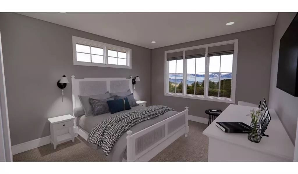
Gray walls keep the room quiet without feeling cold, and the white bed frame’s cane panel detailing gives it texture without fuss. The Roman shade pulls back just enough to frame a tree-lined mountain view that no piece of purchased art could compete with. Some rooms get lucky with their windows. This is one of them.
Style Math: Cane furniture had a major resurgence partly because it photographs well and crosses styles easily, from coastal to cottage to modern farmhouse. It’s also lighter than solid wood construction, which matters whenever you actually need to move a piece. Pairing it with a white painted frame keeps the look grounded rather than chasing a trend.
Black Countertops and a Lantern Pendant That Pull the Whole Room Together
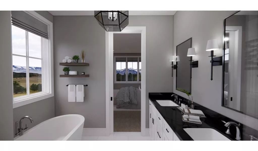
Dual undermount sinks sit in a white vanity with black granite counters, and the geometric pendant light echoes the black hardware throughout without feeling like it’s trying too hard. Clean palette, consistent logic.
Common Mistake: Homeowners often choose double vanities and then install one large mirror spanning both sinks. It works visually, but two separate mirrors let each person angle their reflection independently — a small change that gets noticed every single morning.
Bean Bag Chairs and a Built-In Entertainment Wall That Keep Everyone in the Same Room
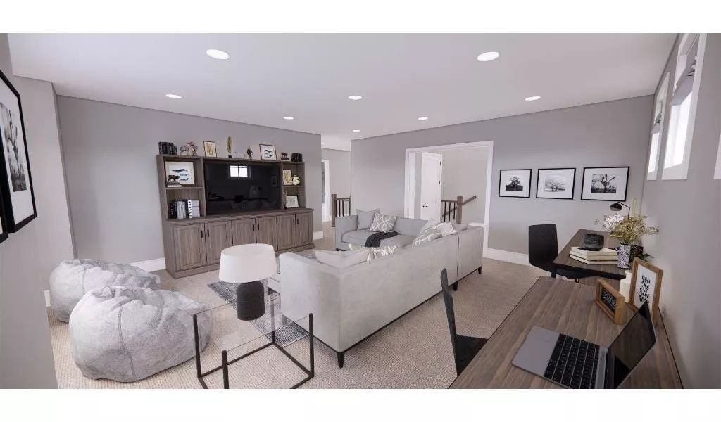
Sectional sofa, bean bag seating, and a wood entertainment unit share the space with a desk tucked just far enough away to feel like its own corner. Close enough to be together. Far enough to actually get something done.
Pin It
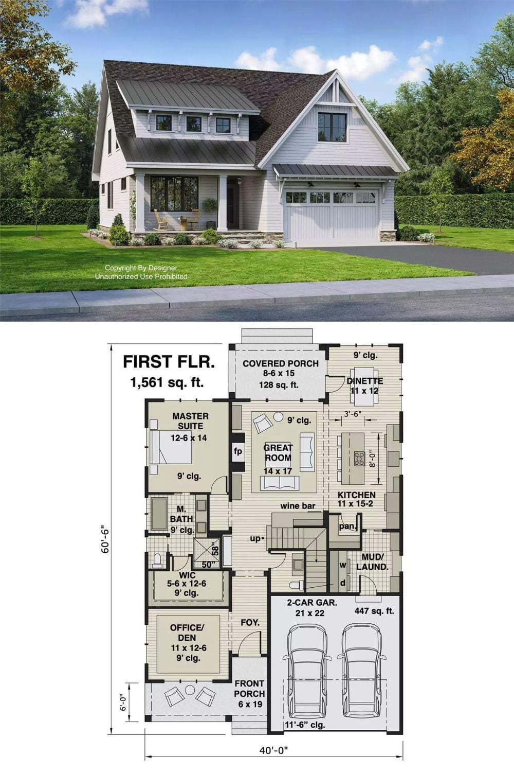
The exterior rendering shows a modern farmhouse with board-and-batten siding, a metal roof accent, and an attached two-car garage. The first-floor plan below lays out 1,561 square feet that includes a main-floor master suite, great room, office/den, covered porch, and a mud/laundry room tucked near the garage entry.
