

Saturday afternoon in late July, and both front doors are open at the same time, one propped with a sandal, one with a cooler, grandkids cycling between floors while someone’s dad grills on his side and someone’s mom naps on hers. The Goldhour is built around exactly that: a two-unit contemporary layout that keeps two households genuinely separate, a loft that absorbs the overflow, and shared walls that carry laughter without carrying arguments.
Specifications
- Sq. Ft.: 3,558
- Bedrooms: 3
- Bathrooms: 2.5
Floor Plan – Main Floor
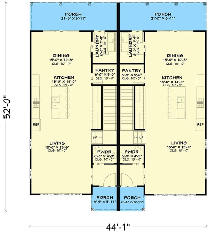
The first floor mirrors two identical units side by side, each with living, kitchen, dining, pantry, laundry, and powder room. Shared stairwells run through the center spine, which keeps circulation efficient without eating into either unit’s private square footage. Both sides get a front porch and a smaller entry porch, and 10-foot ceilings throughout give each unit a generous feel despite a footprint that’s tighter than you might expect at first glance.
Floor Plan – Second Floor
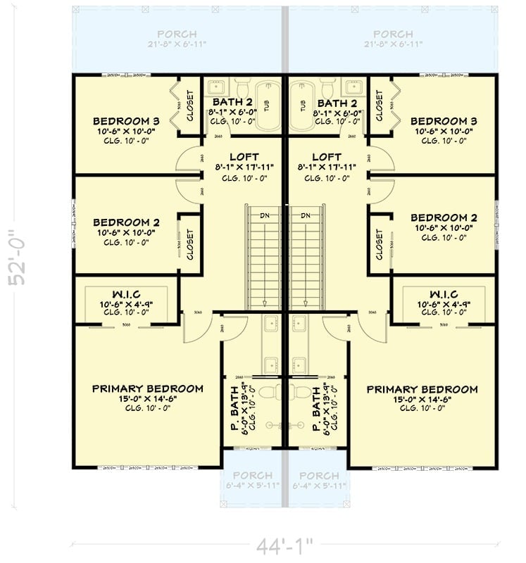
Upstairs, each unit gets three bedrooms, a loft, a walk-in closet, and a private primary bath — same footprint, same autonomy, both directions.
Golden Hour Hits Different When Your Porch Has Six Wood Columns
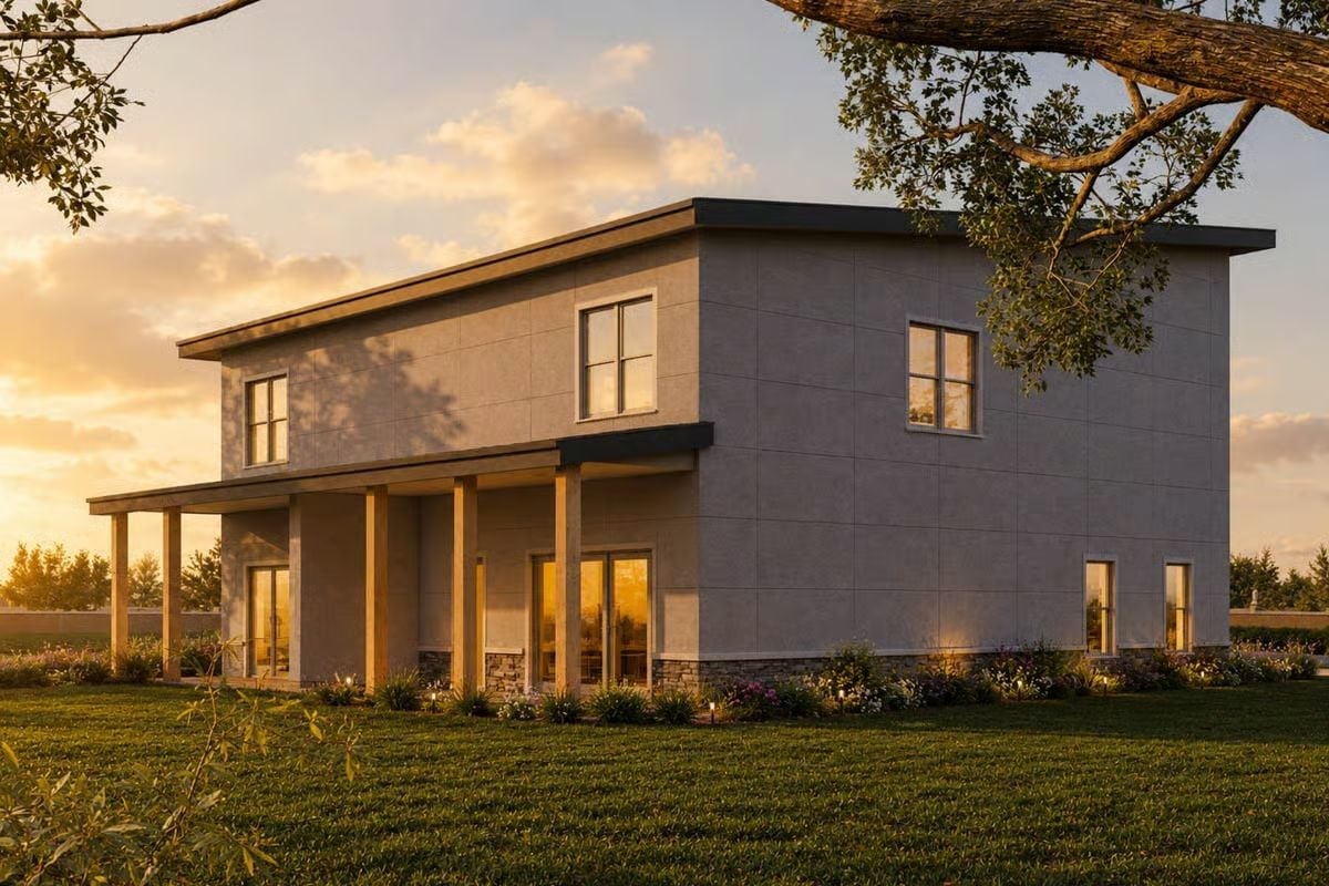
At dusk, warm interior light pushes through floor-to-ceiling glass doors and spills across the stone base below. Smooth stucco panels rise above it, the flat roofline cutting a clean horizontal against the sky. It’s a quietly confident exterior — nothing is shouting for attention, and that’s exactly what makes it work.
Navy Accent Walls and Dark Wood Frames Make a Case for Bold Choices
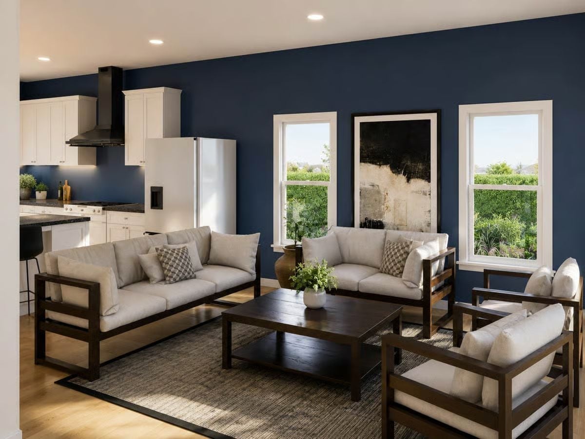
Linen cushions on dark wood frames sit against a deep navy wall with a black abstract print hung above. Simple combination. Somehow it still looks expensive.
History Corner: Open-plan living became standard in American home design through the mid-20th century, driven partly by the postwar shift toward informal family life. Navy as a wall color surged after decades of all-white interiors dominating design publications, and pairing it with natural wood furniture is one of the older tricks in the book. It keeps working because the contrast is just obvious enough to feel intentional without requiring much else from the room.
Navy Walls Bold Enough to Make White Cabinetry Work Harder
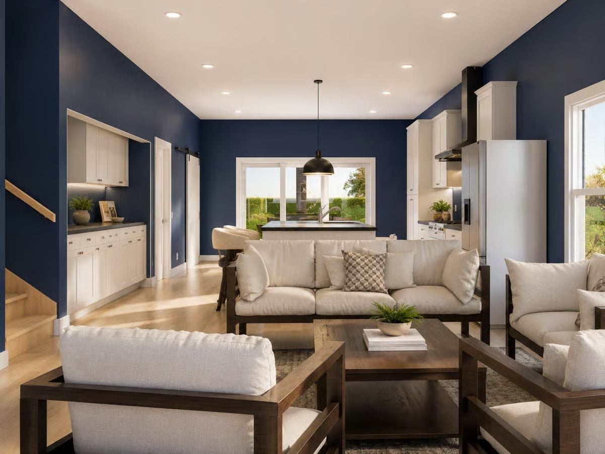
Deep navy on every wall could’ve felt like a cave. It doesn’t.
Cream upholstery and dark wood frames on the seating group hold their own against the color, and light hardwood floors keep the lower half of the room from going too heavy. The pendant over the kitchen island is a matte black dome — no fuss, no decorative ambition, just a fixture doing its job. That restraint is what lets the navy breathe.
Navy, Black Granite, and One Gold Leaf That Earns Its Place on the Wall
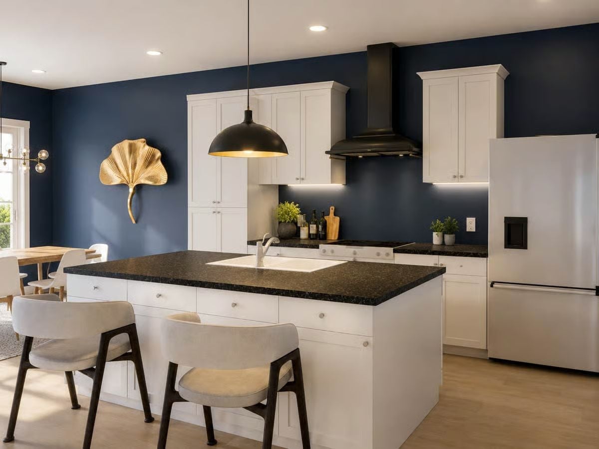
Dark granite countertops anchor the island without competing with white shaker cabinetry above. The black dome pendant and matte range hood pull the eye upward. And that gold ginkgo wall sculpture — it’s not decorative filler. Against all this navy, it actually holds its ground.
Style Math: Black hardware and fixtures work here because they show up in at least three places — the pendant, the hood, and the chair legs — giving the eye a path to follow rather than a single jarring focal point. Repeating an accent finish across a room is one of the simplest ways to make a bold choice read as deliberate rather than accidental.
Gold Leaf Wall Sculpture Pulls Navy and Oak Into the Same Conversation
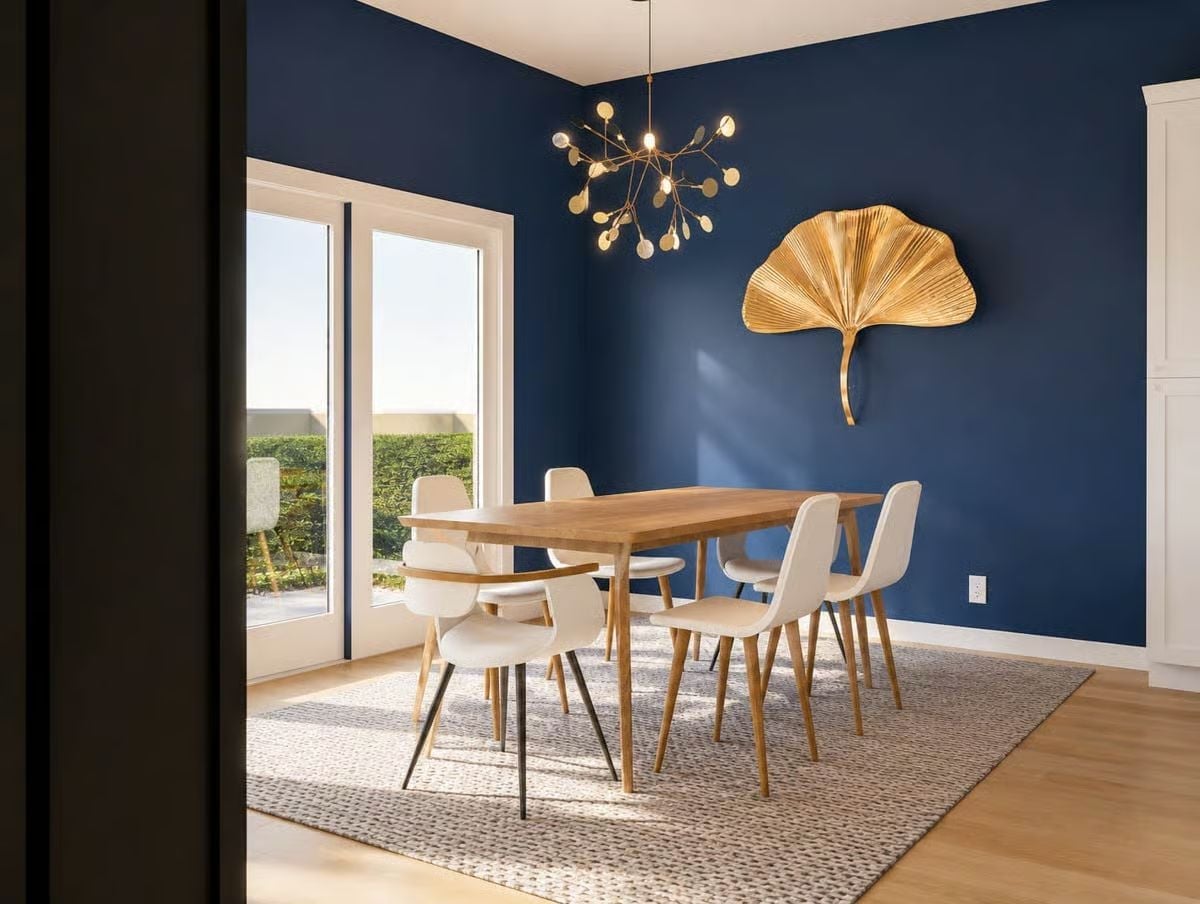
Blue this saturated could easily feel oppressive. Light wood flooring and a matching table keep the room from closing in, and the gold ginkgo sculpture on the back wall anchors the corner while giving the branching pendant fixture something to echo overhead. Two elements doing double duty, which is a better reason to include art than most people admit.
Editor’s Note: Navy absorbs light rather than reflects it, so artificial lighting placement matters more here than it would in a lighter room. Pendants positioned over the table rather than centered on the ceiling correct for this, keeping the functional zone bright without washing out the wall color.
Chartreuse Walls and a Woven Pendant That Actually Belong Together
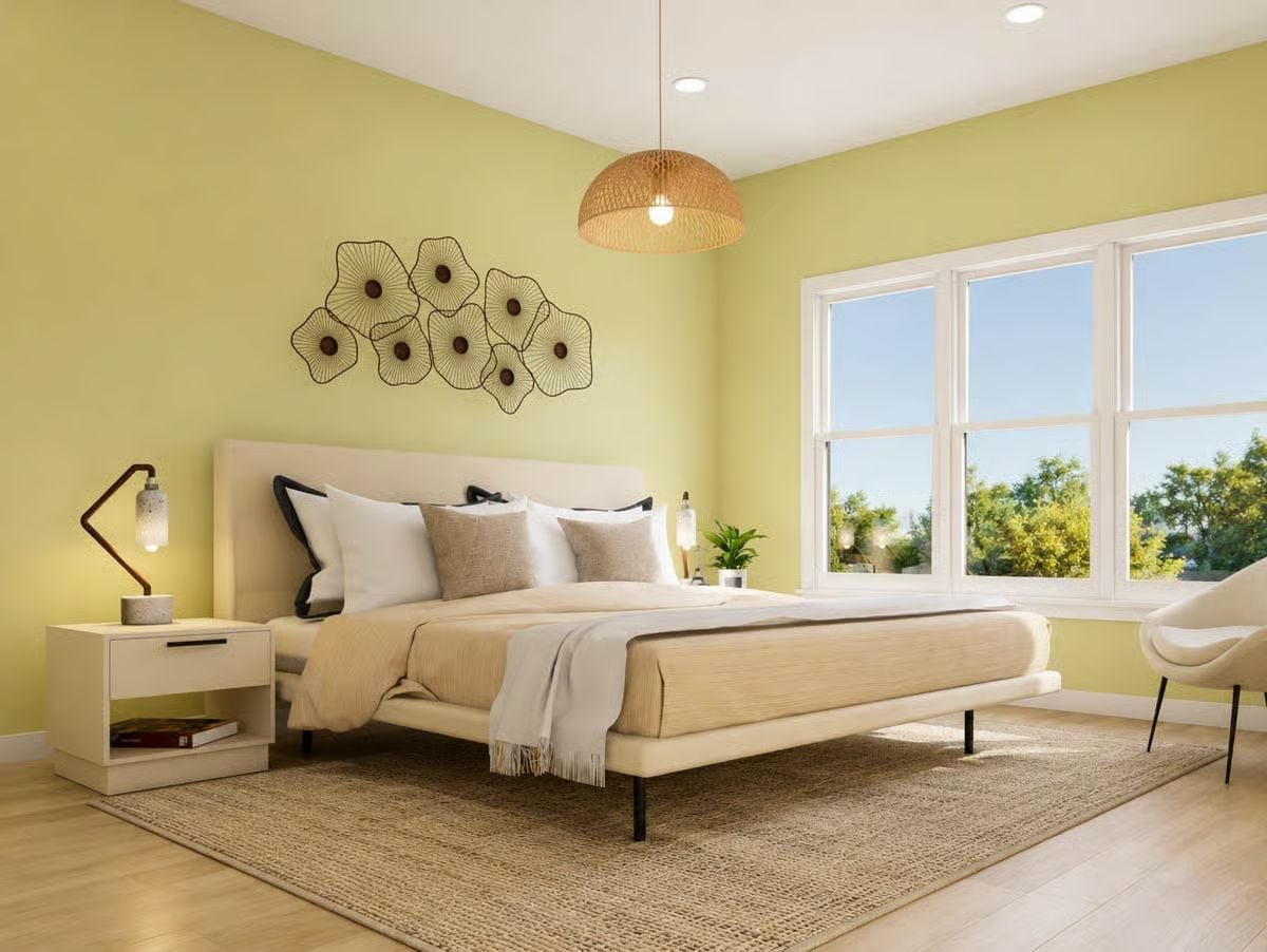
Yellow-green paint and natural rattan overhead — grounded without feeling flat, lively without tipping into loud.
Did You Know: Yellow-green tones like chartreuse sit at the edge of warm and cool on the color wheel, which makes them unusually forgiving next to both natural wood floors and white trim. Designers sometimes call this quality “chromatic flexibility.” It’s why these shades have stayed in circulation through multiple design cycles — not because they’re safe, but because they’re genuinely adaptable.
Pin It
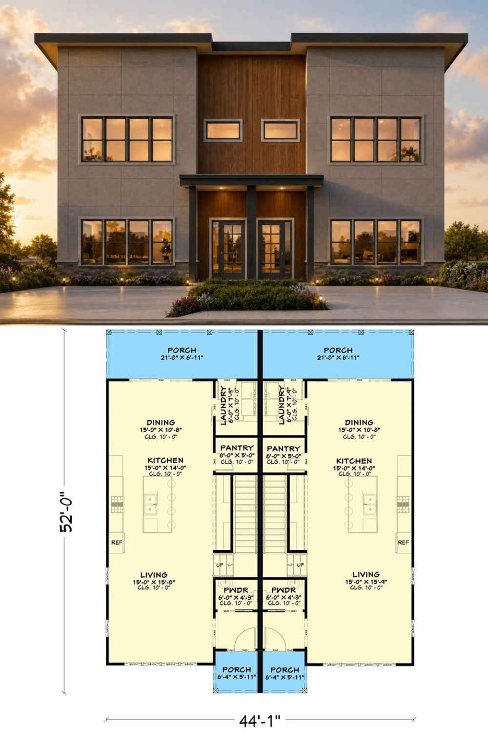
The exterior rendering shows a two-story contemporary duplex with wood cladding at the center entry and large grouped windows on each unit. Below it, the first-floor plan lays out the mirror-image logic clearly: living, dining, kitchen, pantry, laundry, and powder room on each side, front and rear porches, stairwells sharing the central spine.
