
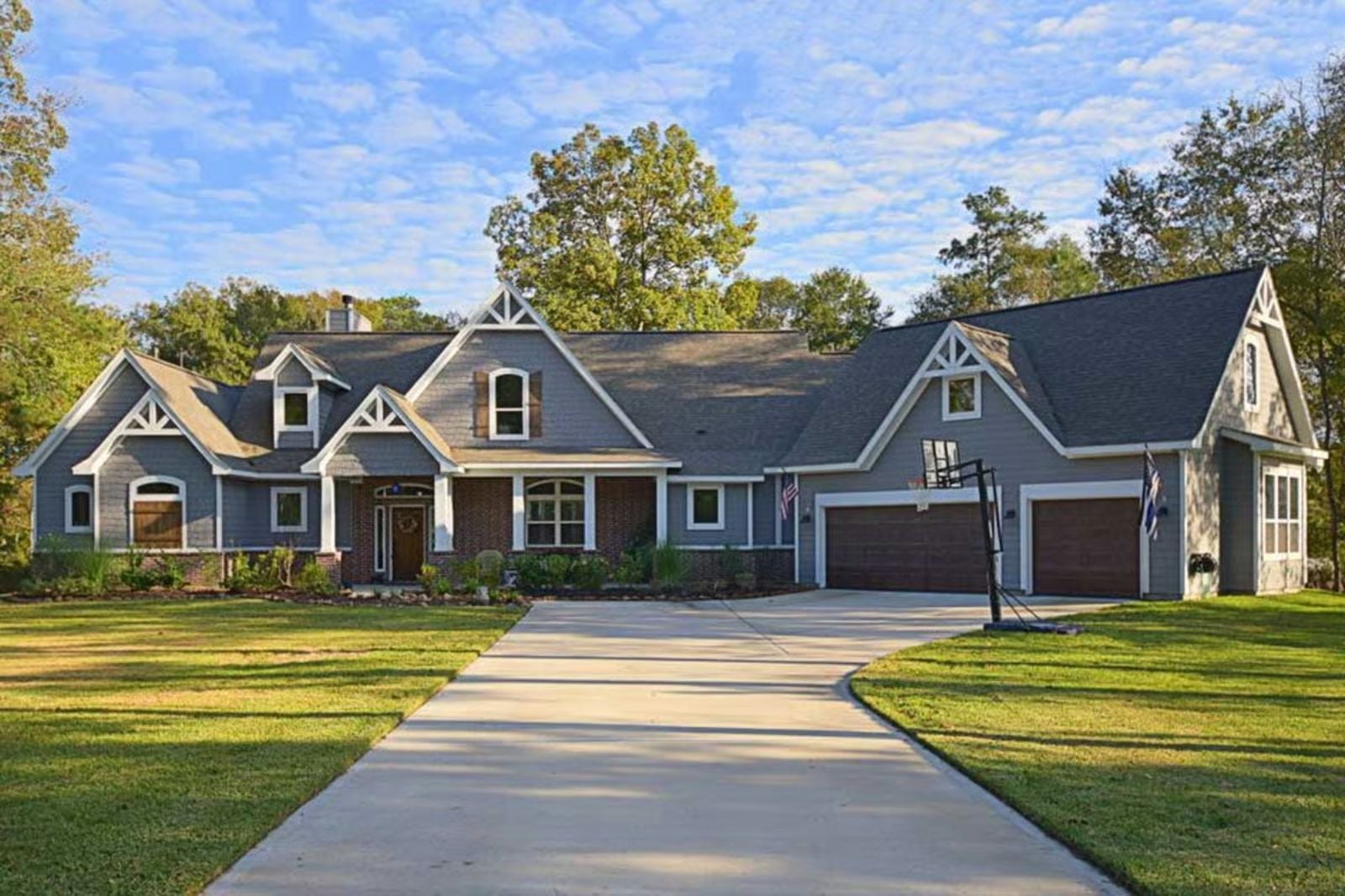
Nobody invites their in-laws to move in — they just arrive at a point where pretending otherwise isn’t honest anymore, usually somewhere between a hard phone call and a quiet drive home, and suddenly what you need from a house is two coffeemakers running at seven, grandkids tracking mud through the living room, and dinner eaten in shifts by people on completely different schedules. The Gabletrim is built around exactly that reality: a private in-law suite, a bonus room that absorbs the overflow, and a rustic ranch layout that keeps everyone close without putting them on top of each other.
Specifications
- Sq. Ft.: 2,499
- Bedrooms: 3-5
- Bathrooms: 3.5-5.5
Floor Plan – Main Floor
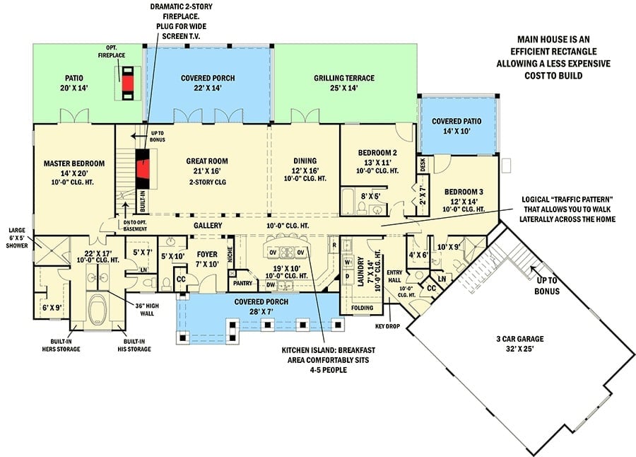
The main level stretches across a wide rectangle anchored by a two-story great room that opens onto a covered porch and grilling terrace. Far left is where the master suite sits, well away from the noise. Three bedrooms cluster on the right near a dedicated entry hall and laundry room, connected to the rest of the house by a gallery corridor running the full length — and a three-car garage locks down the corner.
Floor Plan – Second Floor
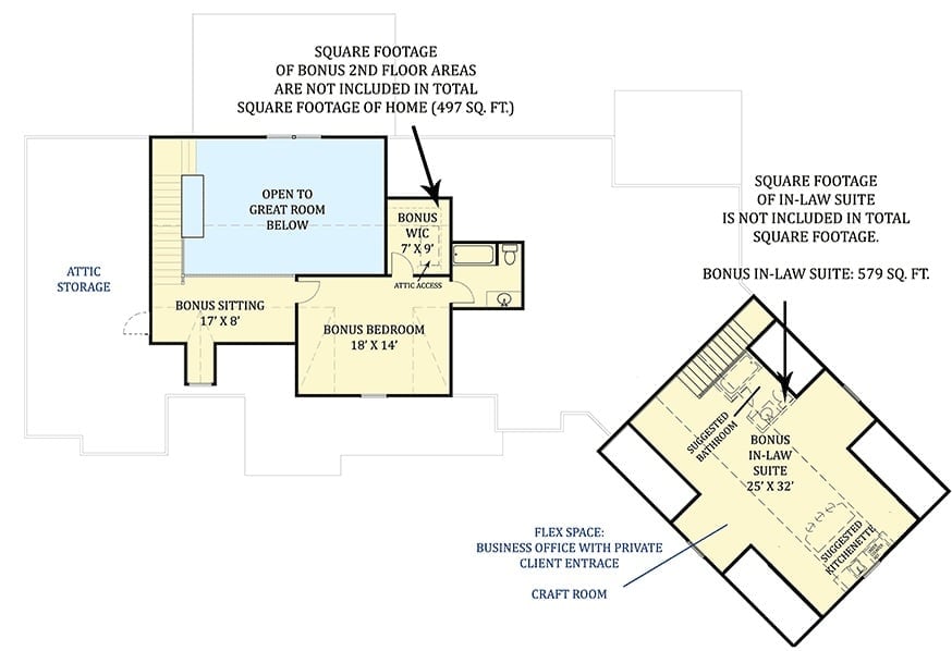
The second floor adds an 18×14 bonus bedroom, a sitting area, walk-in closet, and an open loft looking down into the great room. The in-law suite — the whole reason most people are here — comes in at 579 sq. ft. with space for a kitchenette, a bathroom, and a flex office off the entry.
Floor Plan – Basement
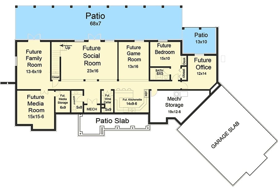
The lower level is drawn as future-ready space: social room, game room, media room, bedroom, office, wine cellar, and kitchenette, all oriented toward a long rear patio. Build it out now or leave it for later — the bones are already there.
Vaulted Ceilings and a Blue Accent Wall That Actually Earns Its Place
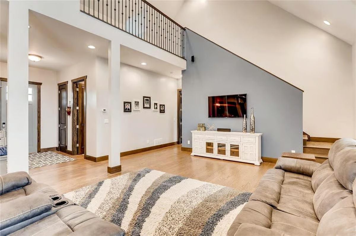
That slate-blue wall beneath the staircase anchors the TV without competing with the warm hardwood floors — which is harder to pull off than it sounds. The sectional is oversized, but the room’s scale absorbs it easily. A striped area rug ties the grays together, and the tall ceilings keep everything breathing, with the upper balcony railing adding architectural interest without boxing in the space below.
Fun Fact: Accent walls land better when they follow a natural boundary — like the wall beneath a staircase — rather than appearing arbitrarily mid-room. The blue-gray here reads cooler in photos than it probably does in person, where those warm wood floors would pull it toward neutral and keep the whole thing from feeling cold.
Dark Walnut Cabinets and Granite That Pulls Its Weight
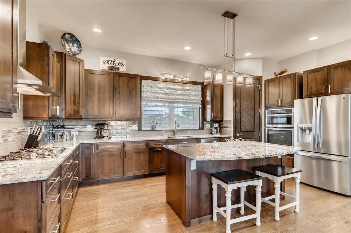
Warm-toned cabinetry runs floor to ceiling with simple recessed pulls keeping the look grounded. The island’s granite countertop has enough veining to feel natural without fighting the backsplash for attention. Two stools tuck under cleanly. Stainless appliances and a range hood hold down both ends of the room.
Why It Works: Dark cabinetry can drag a kitchen down if the countertops and flooring don’t compensate. Here, the light granite and blonde hardwood floors do that work without forcing anything bright or trendy into the mix. It’s a quieter kind of contrast — and it tends to hold up a lot better over time than two-tone finishes do.
Open-Plan Living Where the Piano Gets Its Own Address
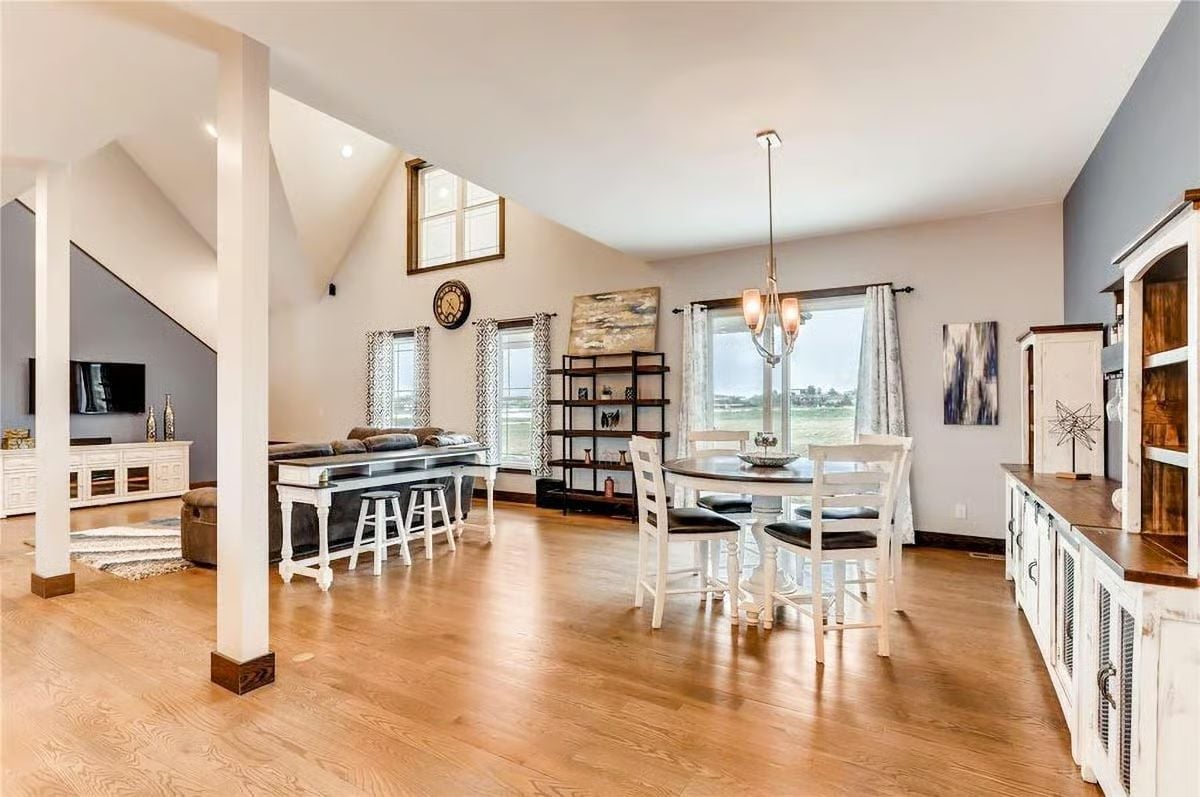
Hardwood floors run uninterrupted from the dining area through to the living room, with white-painted columns doing structural work without closing off the view.
In The Details: Structural columns in open-concept rooms tend to feel awkward unless the furniture arrangement acknowledges them. Treating a column as a natural zone divider — the way this layout does between dining and living — gives it a reason to be there. Leave a column stranded in the middle of a seating arrangement and it just chops the room up.
Loft Landing With Vaulted Geometry That Actually Has Somewhere to Go
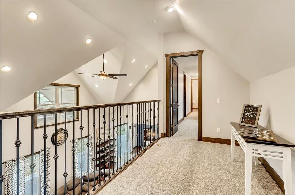
Wrought iron balusters and sharp cathedral ceiling angles carry the visual weight up here. Carpet underfoot keeps it quiet, and the dark wood door trim grounds an otherwise all-white palette that could easily feel clinical without it.
Editor’s Note: Open loft railings overlooking a lower level are easy to treat as dead square footage. A small desk or console — like the white table here — signals that the space has a purpose without walling anything off. It’s a minor move, but it’s the difference between a landing that feels designed and one that just feels leftover.
Vaulted Attic Bonus Room With Enough Floor Space to Actually Use It
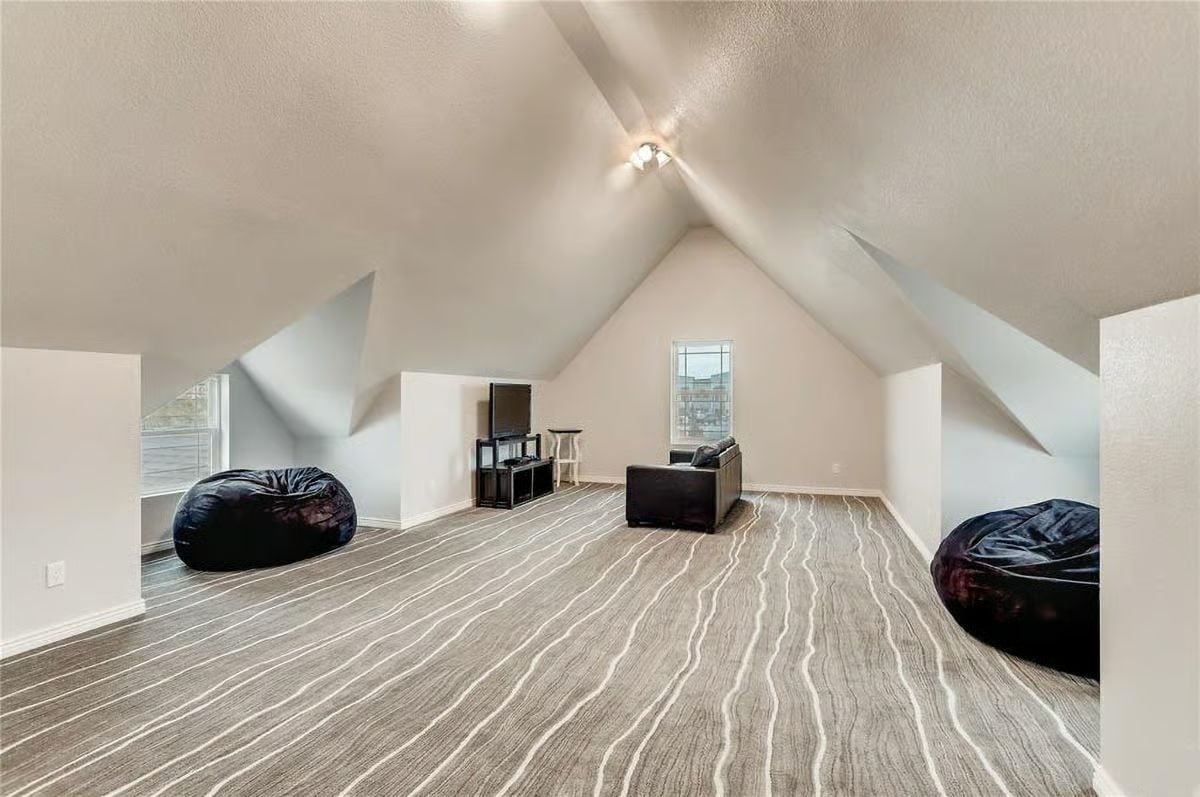
Bean bag chairs aren’t ironic here. Cathedral ceilings and a striped low-pile carpet that visually stretches the floor give this room genuine square footage to fill, and the modest TV setup is the right call — the geometry is already doing the work, and layering in a massive screen would only fight it.
The TV setup stays modest, because the room’s geometry is already doing the heavy lifting.
Covered Porch With a Brick Fireplace That Actually Earns Year-Round Use
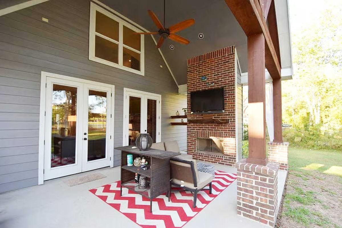
A red-and-white chevron rug anchors the wicker seating without picking a fight with the brick fireplace column. The ceiling fan makes the covered space genuinely livable in the heat rather than just scenic. French doors on both sides give the porch real access — not just a window dressed up to look like an entrance.
History Corner: Outdoor fireplaces became a standard feature in American porch design during the mid-20th century, largely popularized through the postwar housing boom when patios replaced formal parlors as the main social space. Brick held on as the preferred material because it absorbs heat and keeps radiating it long after the fire dies down — practical first, decorative second.
Pin It
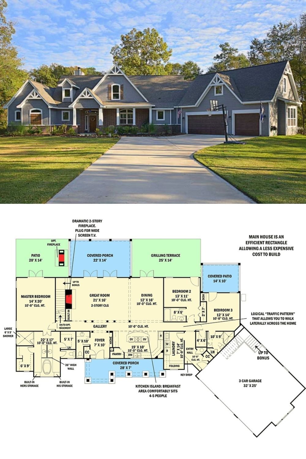
The exterior photo shows a craftsman-style ranch with board-and-batten siding, decorative gable brackets, and a three-car garage. Below it, the floor plan lays out the full picture: a 21×16 great room, master suite with his-and-hers storage, three additional bedrooms, covered porch, grilling terrace, and a separate garage wing with bonus room access above.
