🔥 Would you like to save this?
A front door can rescue an ordinary facade or make a beautiful house look as though two architects stopped speaking halfway through the project. The wrong red against brick, the wrong blue beneath a terracotta roof, a fashionable black that swallows an already shadowed entrance. One painted rectangle can throw an entire elevation out of balance.
And the problem rarely begins with the color itself. It begins with everything around it. Roof pitch, masonry undertones, window proportions, timber grain, the depth of the doorway, even the color of the planting. A front door occupies remarkably little of a house’s exterior, yet it can determine how the whole composition reads from the street.
In order to come up with the very specific design ideas, we create most designs with the assistance of state-of-the-art AI interior design software. Also, assume links that take you off the site are affiliate links such as links to Amazon. this means we may earn a commission if you buy something.
Then there are the houses that refuse to play politely. Chartreuse against creamy California stucco. Lacquered black against weathered Georgian brick. Lavender in a landscape of heather. A brilliant yellow entrance cut into charcoal timber. Some of these choices repeat a color already hiding in the architecture. Others introduce a deliberate collision, with spectacular results.
These 35 entrances reveal why choosing a front door is less about finding a favorite color than understanding contrast, proportion, texture, and visual hierarchy. The surprises aren’t always the brightest doors. Sometimes the boldest move is natural wood. Sometimes it’s glass. And sometimes the entire house changes because one small patch of color finally gives the eye somewhere to land.
35. Chartreuse Turns a Southern California Entrance Into Architecture
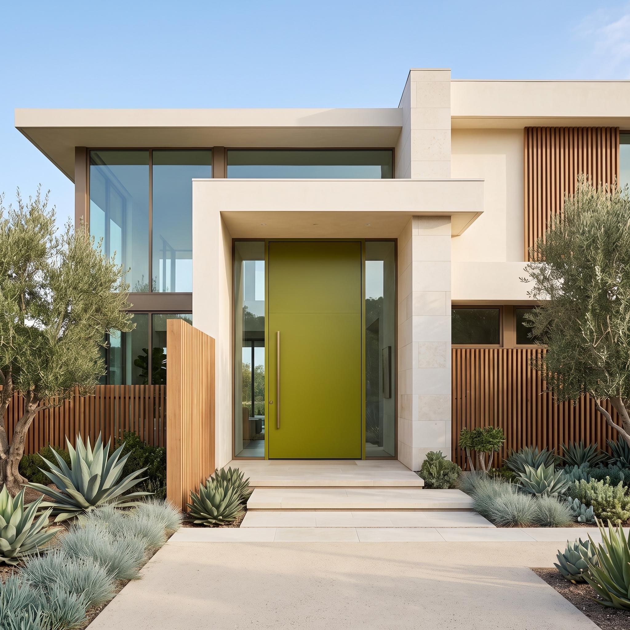
Chartreuse is not a color inclined to negotiate. Against warm ivory stucco, pale paving, and vertical timber screens, this oversized pivot door makes its intentions clear from the sidewalk. The surprise is how comfortably it sits within such restrained architecture. Everything surrounding the entrance is quiet enough to accommodate one extraordinarily confident gesture.
The door’s monumental proportions matter as much as its color. A smaller chartreuse panel might have looked like an accessory; this one becomes part of the building’s geometry. Slim glazing, a long metal pull, and disciplined landscaping sharpen the effect. The agaves contribute sculptural texture, while the olive trees soften the composition without diluting its modernist edge.
34. Oxblood Gives Pale Limestone a Rich, Warm Anchor
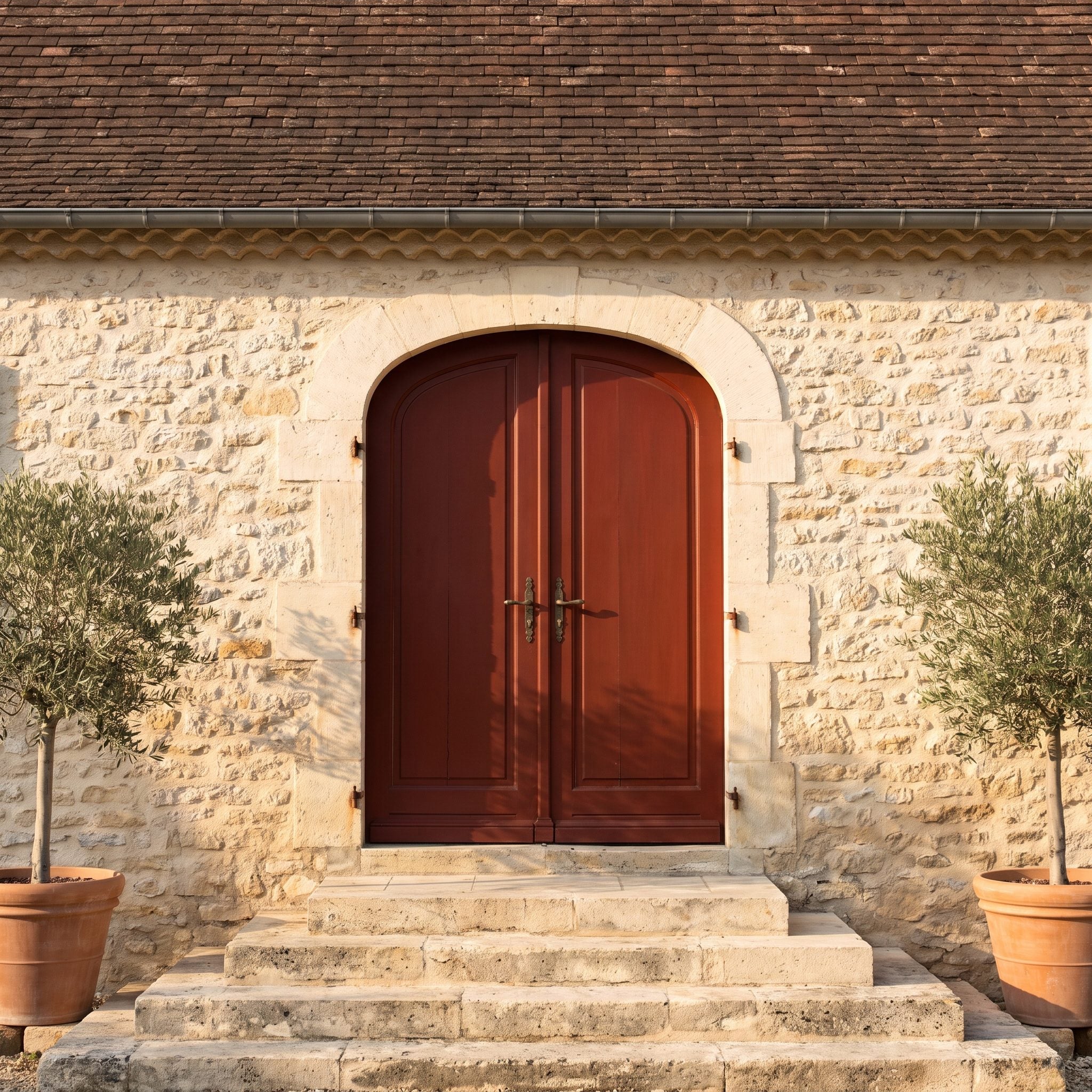
Oxblood has a depth that ordinary red cannot quite manage. Its brown undertone gives the pale limestone a concentrated point of warmth, while its richness stands up to the substantial masonry without demanding decorative trim. The door feels appropriately weighty for the architecture.
Clay roof tiles introduce another reddish note, but at a different intensity. That variation keeps the palette from becoming overly coordinated. Silvery olive foliage breaks up the warm surfaces, and aged bronze hardware adds a subdued metallic finish. Nothing here needs a brighter accent.
33. Powder Blue Keeps a White Cape Cod Light and Cohesive
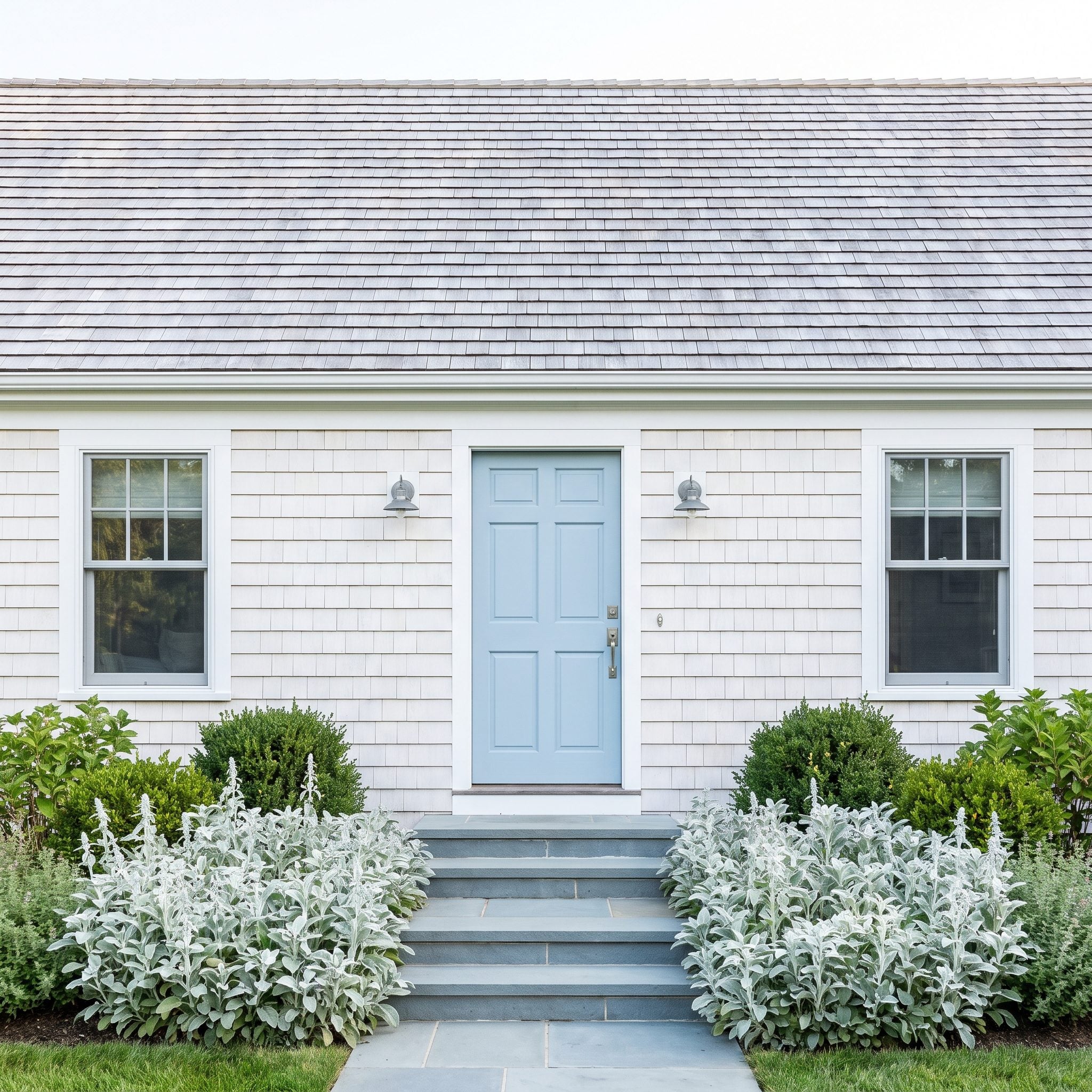
After the richness of oxblood, this Cape Cod offers an entirely different proposition. Powder blue barely raises its voice against the white shingles, yet the entrance remains distinct. The color introduces just enough contrast to prevent the doorway from disappearing into the siding.
The silver-gray roof and blue-gray steps establish a cool palette that makes the choice feel natural. Pewter hardware maintains the delicate tonal range, while silvery planting provides a softer transition to the garden. The charm comes from subtle differences rather than a single dramatic accent.
32. Glossy Black Gives Georgian Brick a Different Kind of Contrast
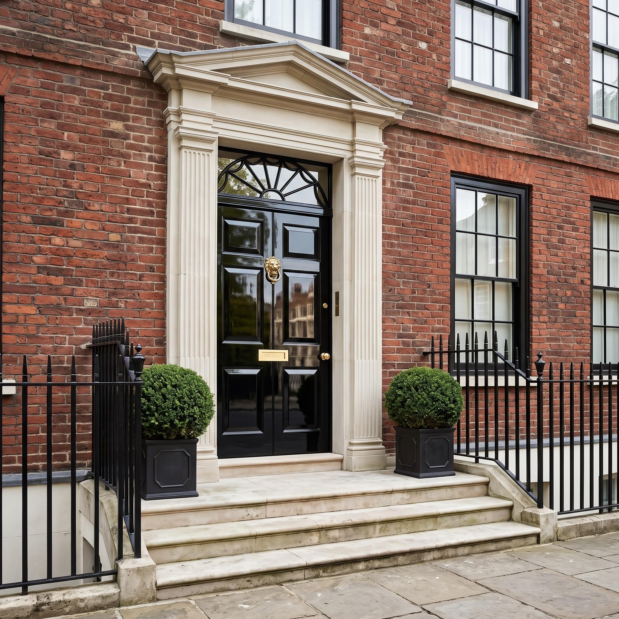
A black door on a Georgian townhouse is hardly revolutionary. A black door polished to an almost mirror-like finish is another matter. Against weathered red brick and pale limestone, the reflective lacquer introduces a degree of glamour that flat black would never achieve.
The classical surround supplies all the ornament the entrance requires: pilasters, a substantial pediment, carefully proportioned panels. Brass hardware catches the light in small, controlled flashes. The door is traditional in color and construction, but the finish makes the entire composition feel more assertive.
31. Burnt Orange Picks Up a Desert Home’s Sandstone
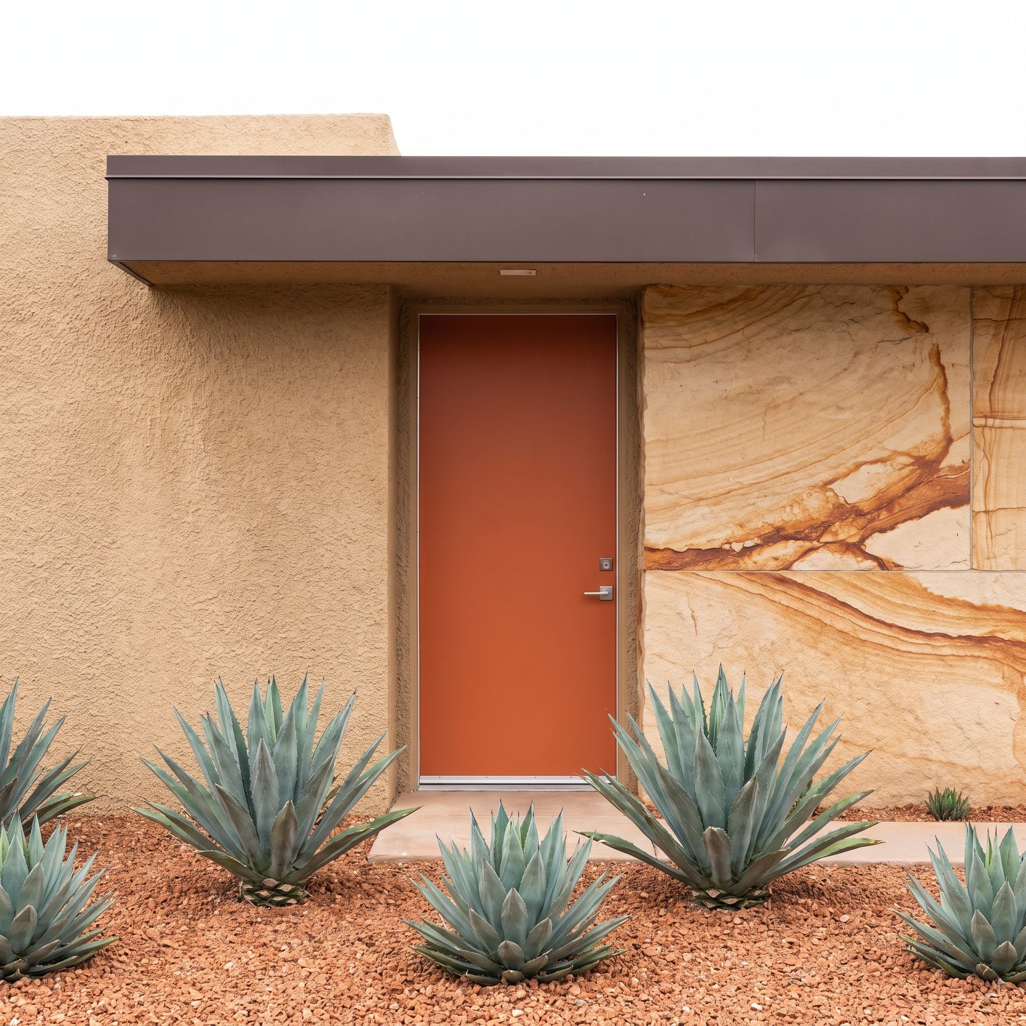
The sandstone does much of the color selection here. Its mineral bands contain rusty orange tones that become more noticeable when concentrated on the front door. Rather than introducing a foreign accent, the entrance brings one of the stone’s most interesting colors into sharper focus.
Blue-green agaves provide the necessary temperature shift. Their cool, spiky forms contrast with the warm masonry and the flat plane of the door, while dark bronze fascia adds definition. The resulting palette is unmistakably desert-inspired without relying on an exaggerated Southwestern theme.
30. Midnight Navy Grounds a Bright Coastal Facade
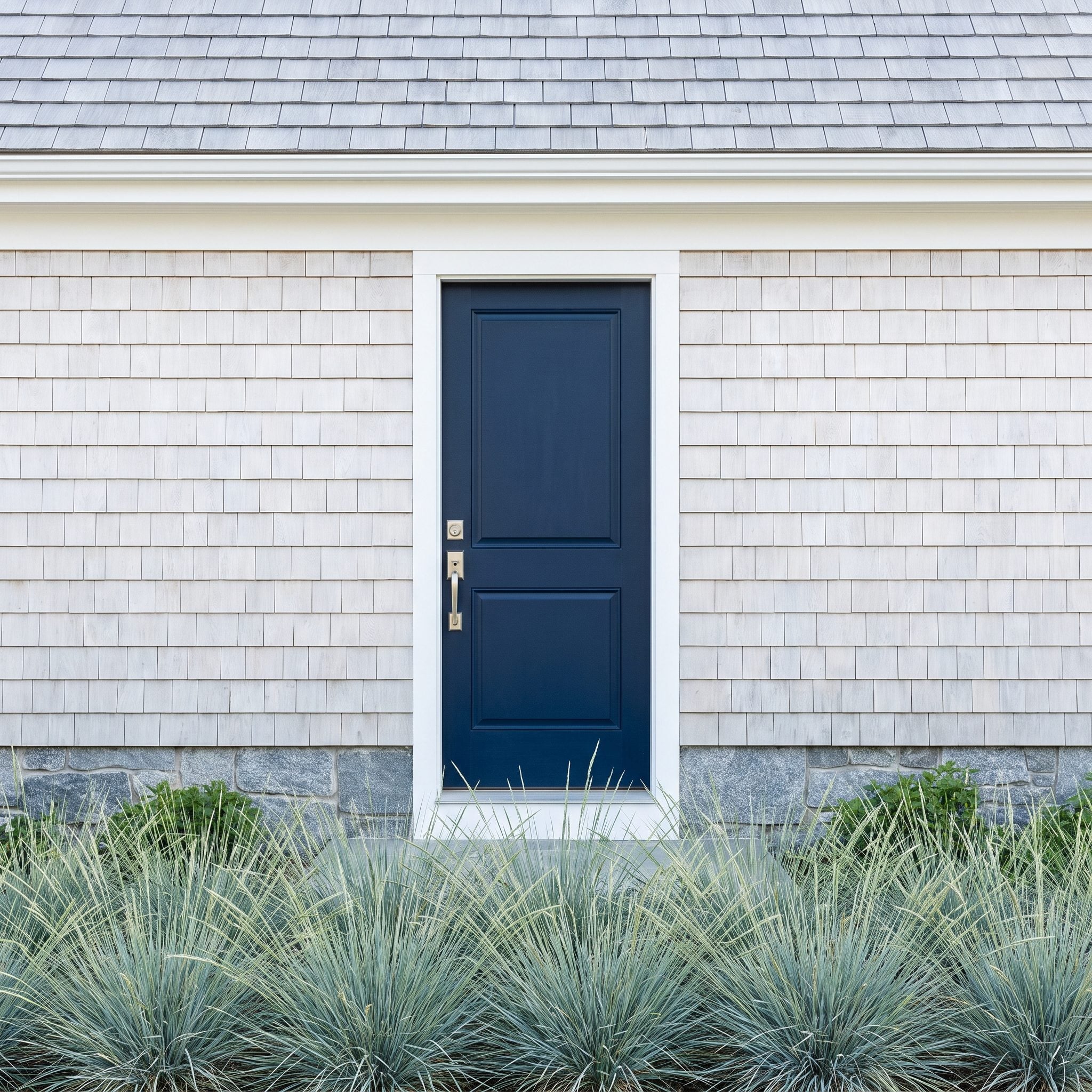
Coastal architecture often depends on pale surfaces, reflected daylight, and a sense of openness. Midnight navy gives those qualities something substantial to work against. The door creates a decisive focal point without abandoning the cool palette that defines the exterior.
Its nearly black depth relates to the roof’s darker values, while the blue undertone connects with the softer gray and blue-green notes around the house. Coastal grasses make that relationship feel less formal. The entrance has weight, but the building retains its airy character.
29. Natural Timber Holds Its Own Against a Saturated Pink Courtyard
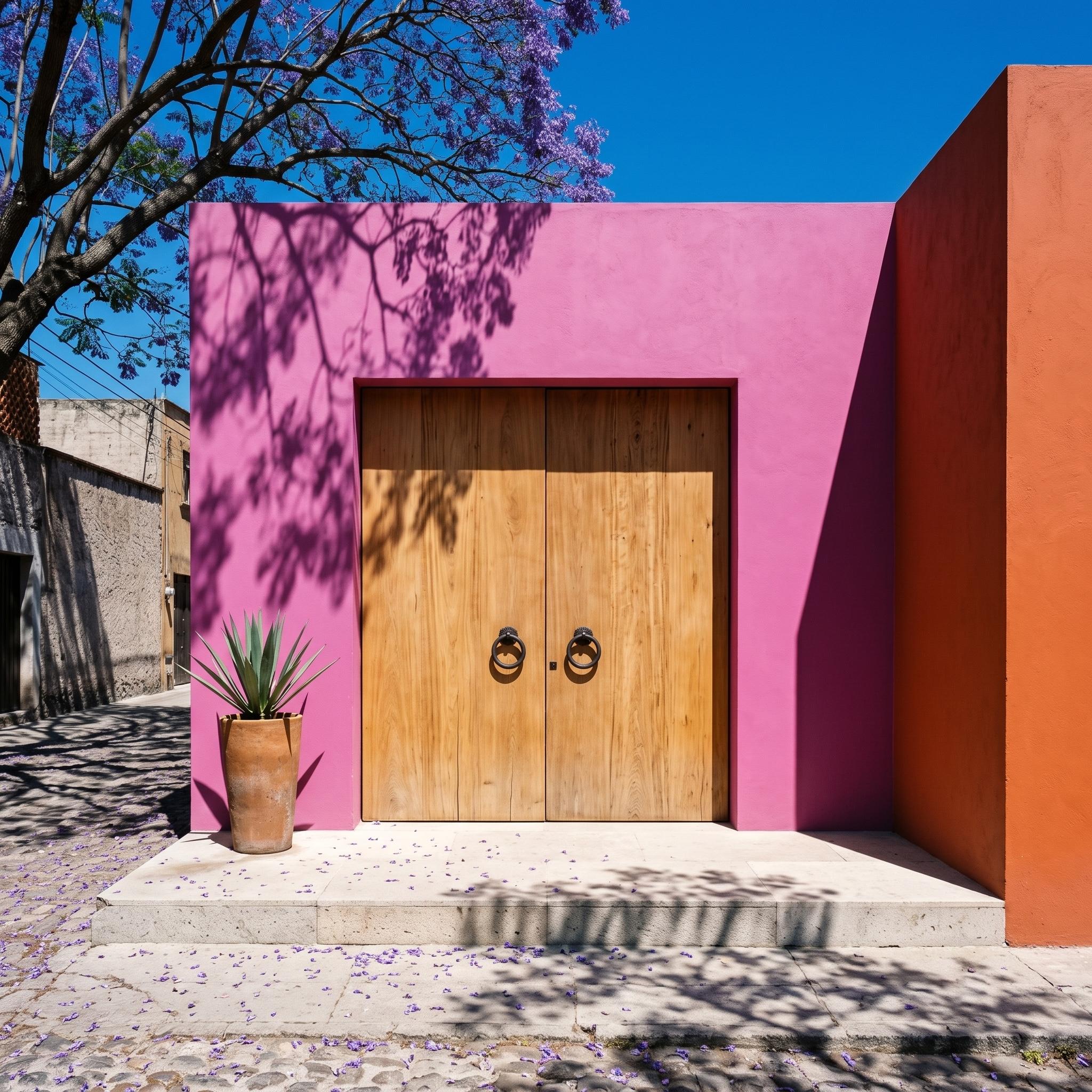
Most front-door color advice assumes the door should provide the excitement. This courtyard reverses the arrangement. Saturated pink stucco dominates the entrance, an orange return adds another powerful hue, and the double doors remain beautifully natural.
Honey-toned timber supplies warmth without introducing a third painted color. Its grain gives the composition texture, while oversized dark circular pulls provide graphic punctuation. The strong rectangular opening holds its own against the exuberant walls. Restraint, in this case, means knowing which surface not to paint.
28. Bottle Green Gives Buff Brick a Strong Focal Point
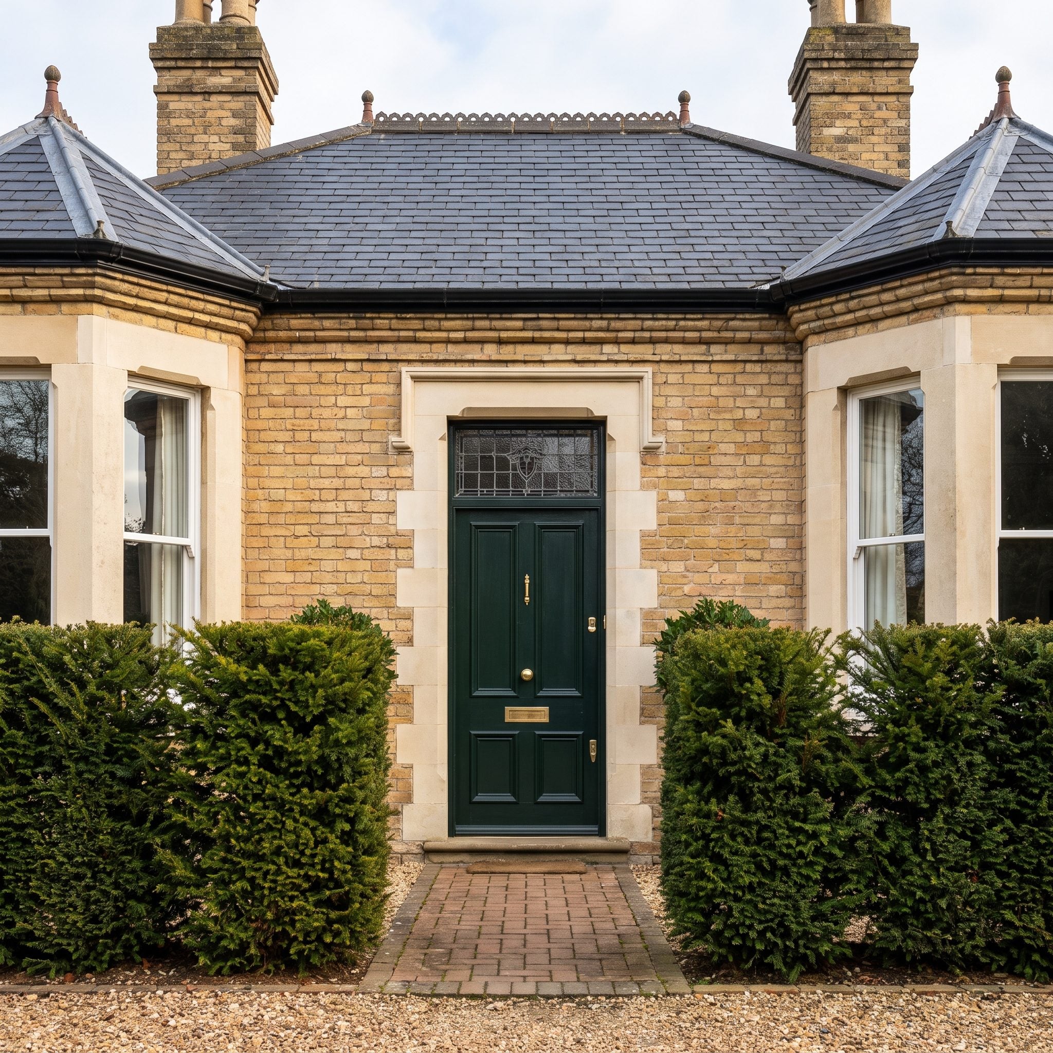
Bottle green has enough depth to give buff brick a serious architectural counterweight. The yellow warmth of the masonry becomes more apparent beside the dark green, while the entrance gains definition without needing a conspicuous surround.
A glazed transom prevents the doorway from becoming too heavy. The clipped hedges contribute another, more natural shade of green, and the brass door hardware supplies a small highlight. This is a traditional combination with considerable presence, especially because the green is deep rather than pastel.
27. A Golden Door Cuts Through Charred Cedar and Coastal Fog
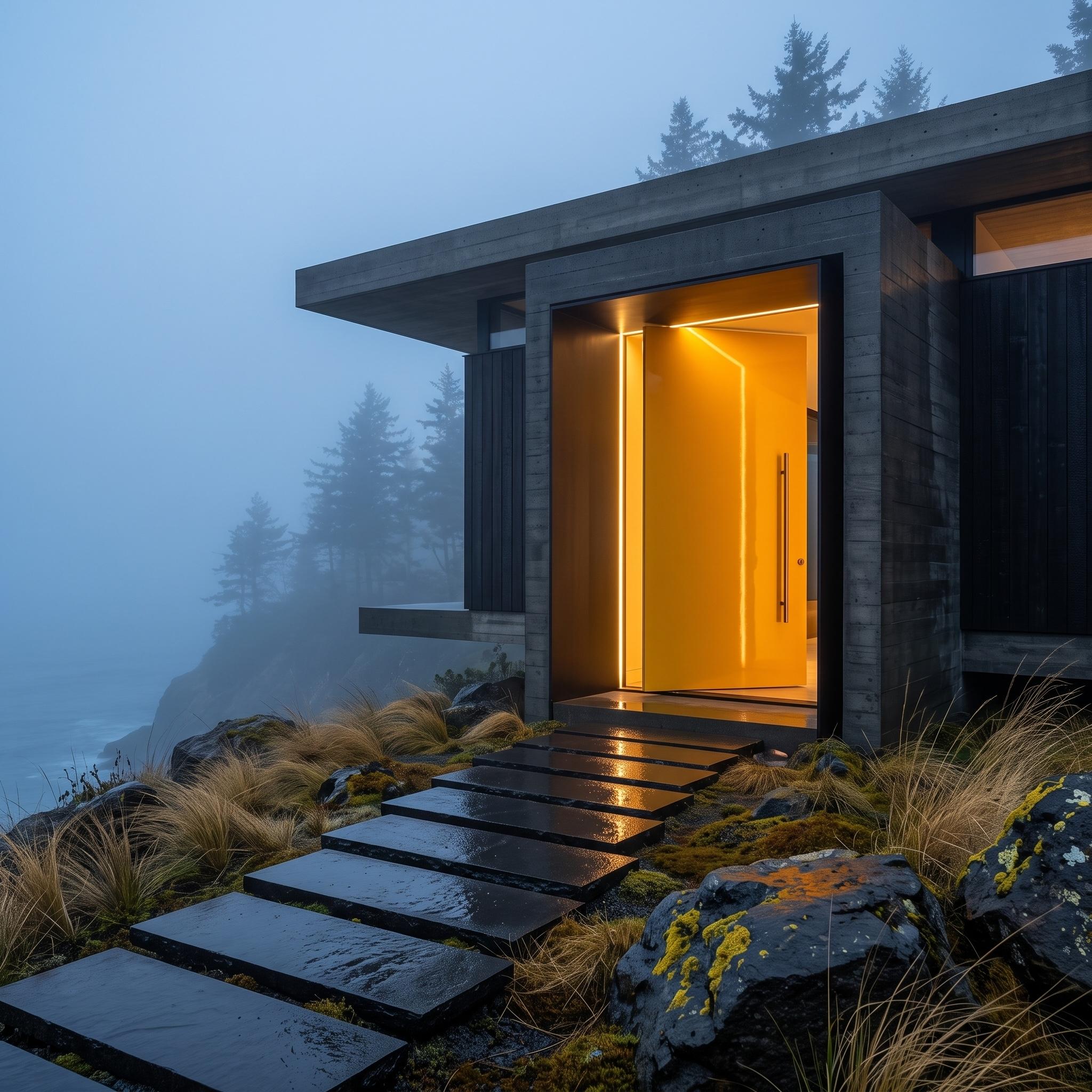
Here, the front door behaves almost like a piece of lighting design. A vivid golden-yellow opening interrupts a facade of dark timber and concrete, creating an intense point of warmth against the cool, misty landscape. The contrast is unmistakable even from a distance.
Linear illumination around the recess exaggerates its depth and strengthens the yellow against the nearly black exterior. Wet stepping stones reflect fragments of light, extending the composition into the approach. There is no need for elaborate door furniture when color, darkness, and a sharply defined opening are doing this much work.
26. Sage Softens Honey-Colored Stone and Clay Tile
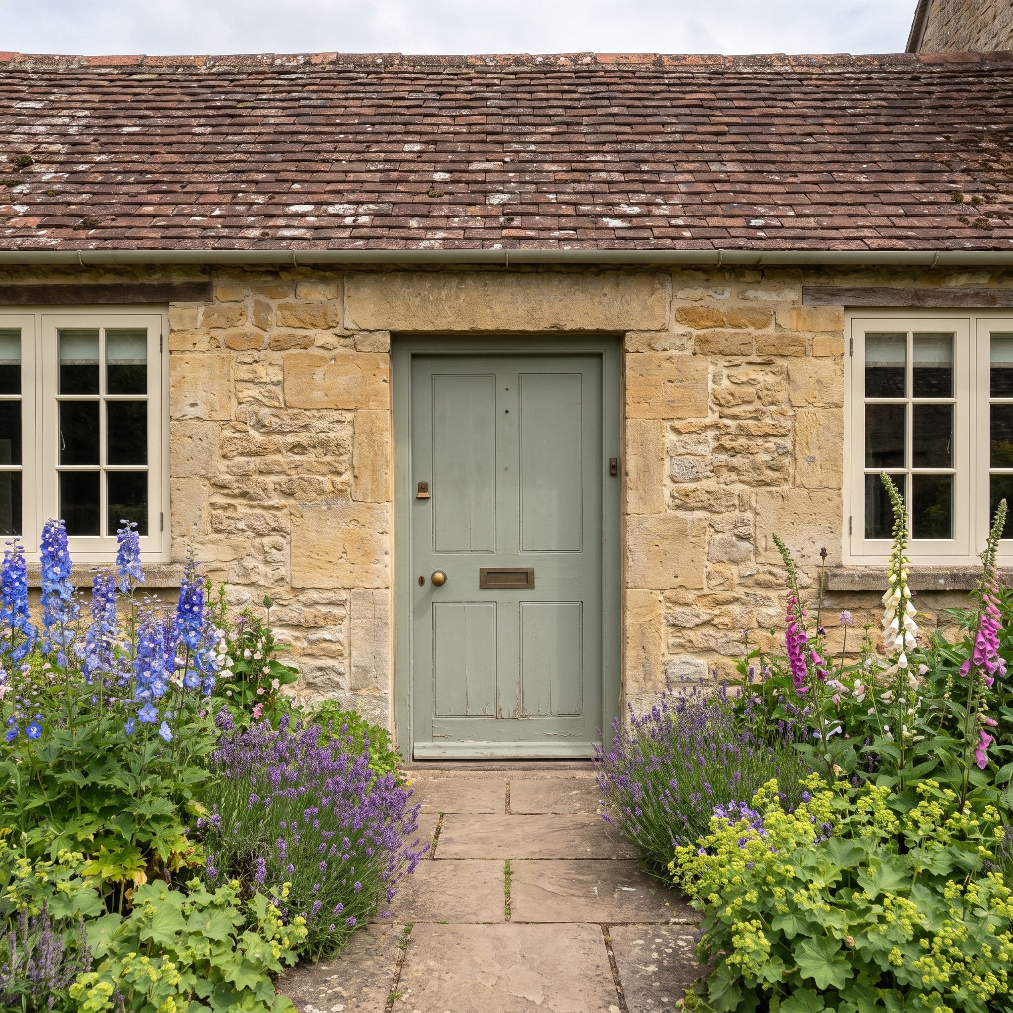
Honey-colored stone and reddish clay tiles establish a thoroughly warm exterior. A stronger green might have created too much contrast, but sage has enough gray in it to sit comfortably beside both materials. The doorway offers relief without disrupting the cottage’s character.
Herbaceous planting carries related greens into the foreground, softening the transition from stone to garden. A simple plank door and aged-brass details suit the modest scale. The result depends on restraint rather than decoration, allowing the varied textures of the masonry to remain prominent.
25. Coral Animates a Pale-Aqua Tropical Cottage
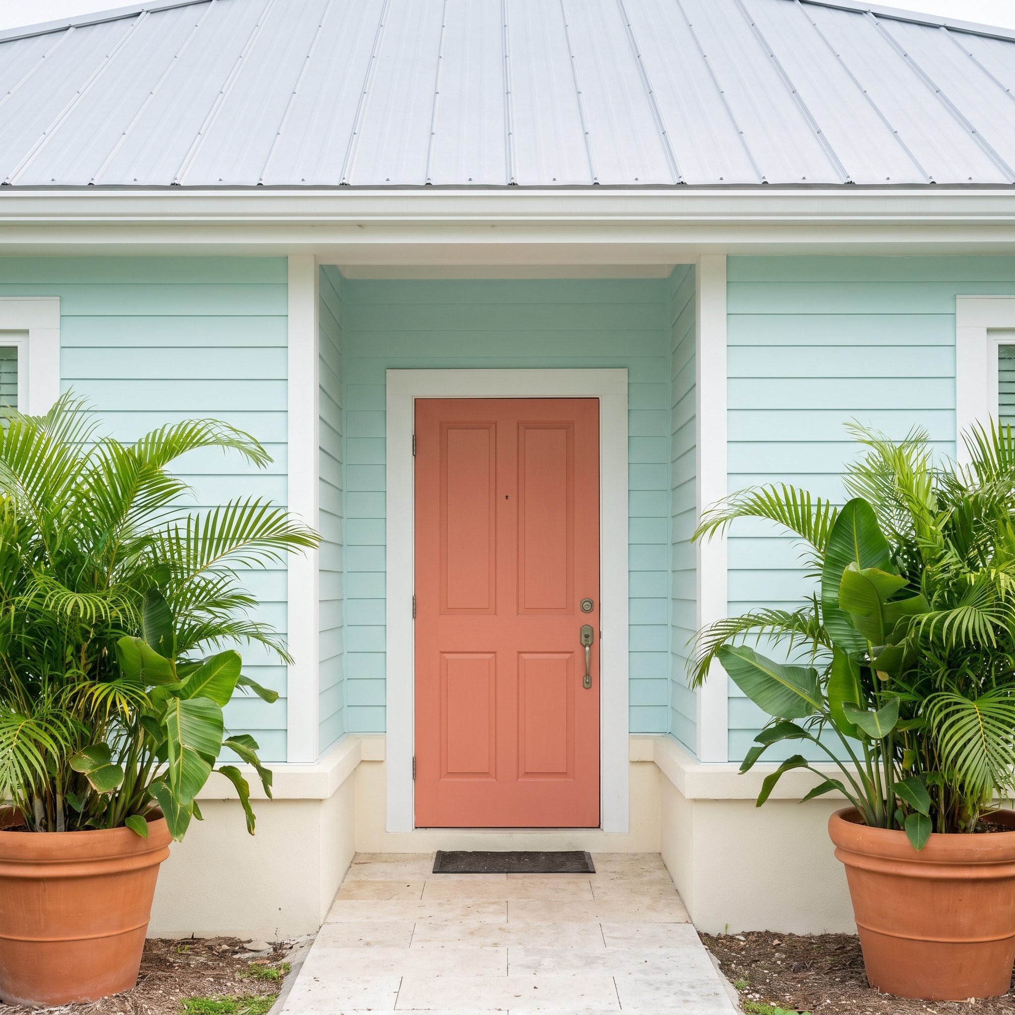
Coral and pale aqua could easily become a seaside caricature. Here, the slightly muted door color and soft siding keep the contrast lively without becoming sugary. The warm entrance advances visually against the cooler walls, giving the cottage a clear center.
The terracotta planters reinforce the coral’s earthy undertone, while palms and surrounding greenery introduce irregular shapes against the simple facade. It’s an effective approach to a tropical front porch: enough color to feel exuberant, with sufficient restraint to let the architecture remain visible.
24. Natural Walnut Warms a Travertine Contemporary Home
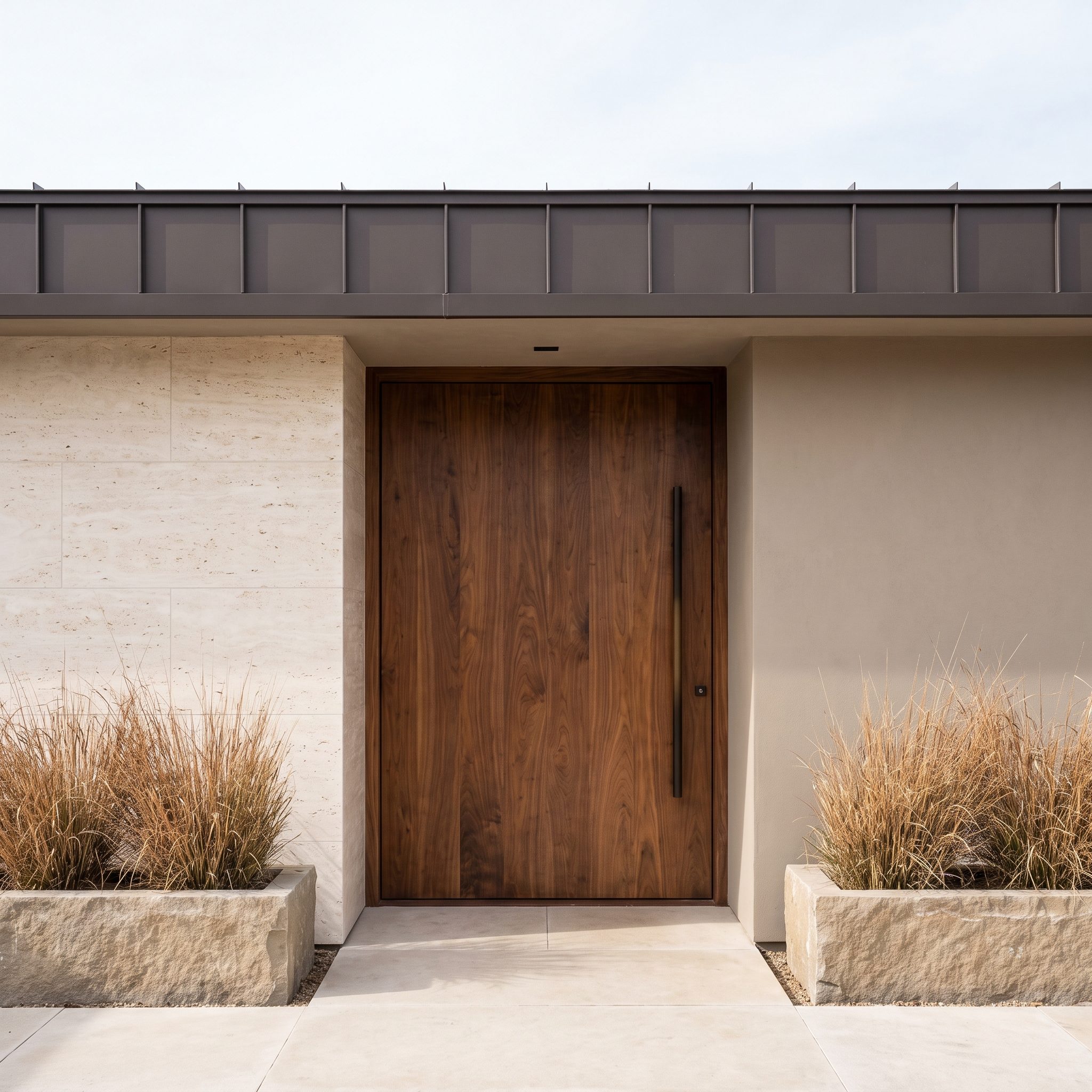
Walnut brings something that paint cannot reproduce: a changing pattern of grain, figure, and reflected light. Against pale travertine and dark bronze architectural details, the wood introduces a material richness that suits the home’s otherwise restrained geometry.
The door remains a simple slab, allowing its natural surface to carry the interest. Tawny grasses repeat some of the warmer tones at ground level, and a bronze door pull provides a clean vertical accent. The combination is sophisticated without depending on an unusually bold color.
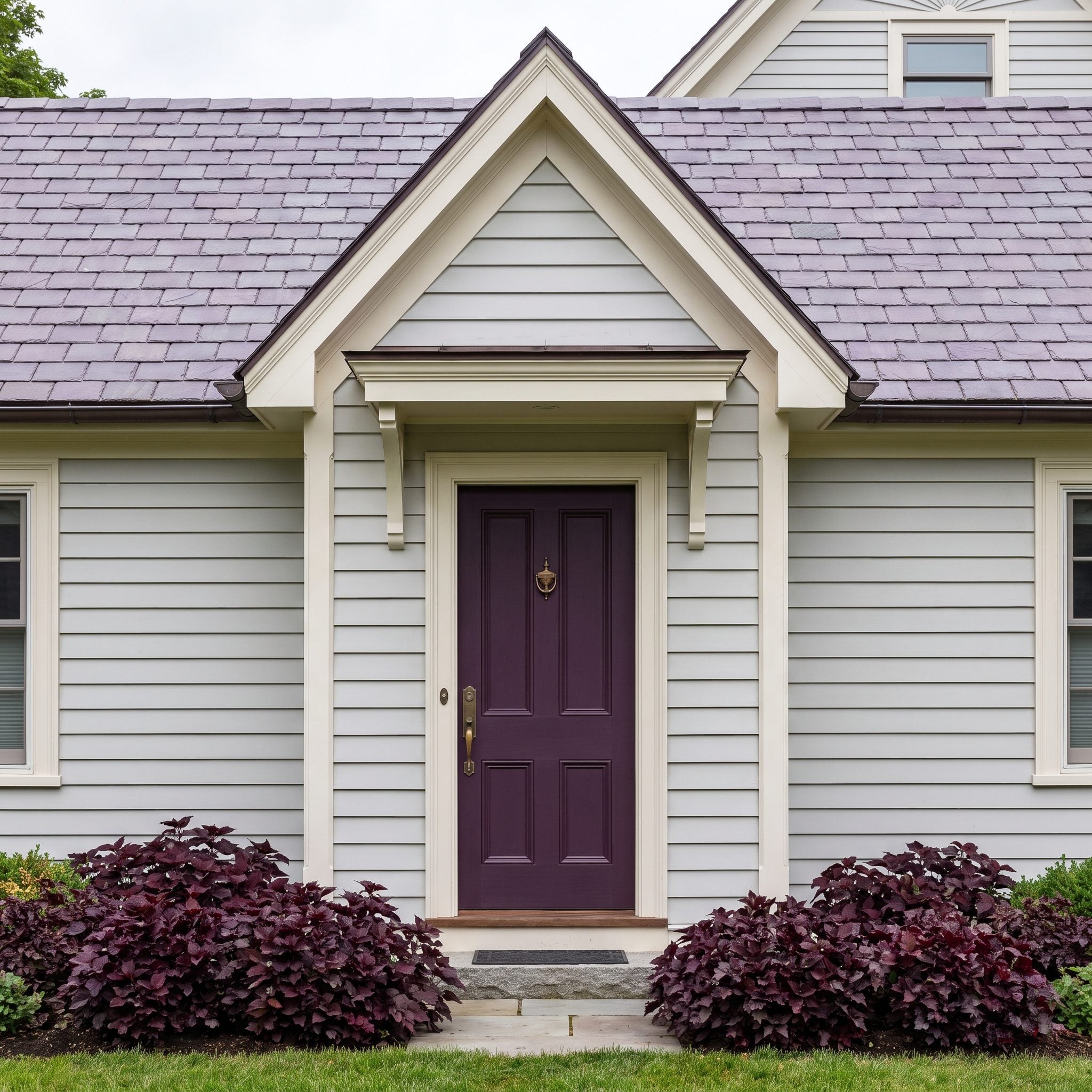
23. Aubergine Adds Depth to a Silvery Victorian Exterior
🔥 Would you like to save this?
Aubergine brings a welcome complexity to this Victorian palette. Against pale-gray clapboard and ivory trim, its deep violet tone reads as substantial rather than ornamental. The color has enough darkness to define the entrance while offering something more unexpected than black or navy.
Subtle violet notes in slate can become more apparent beside a purple door, and the burgundy planting introduces a richer variation at ground level. Antique brass provides warmth without excessive shine. The combination respects the house’s detailing while giving the entrance a distinctly individual character.
22. Ochre Creates Warmth Against Charcoal Timber
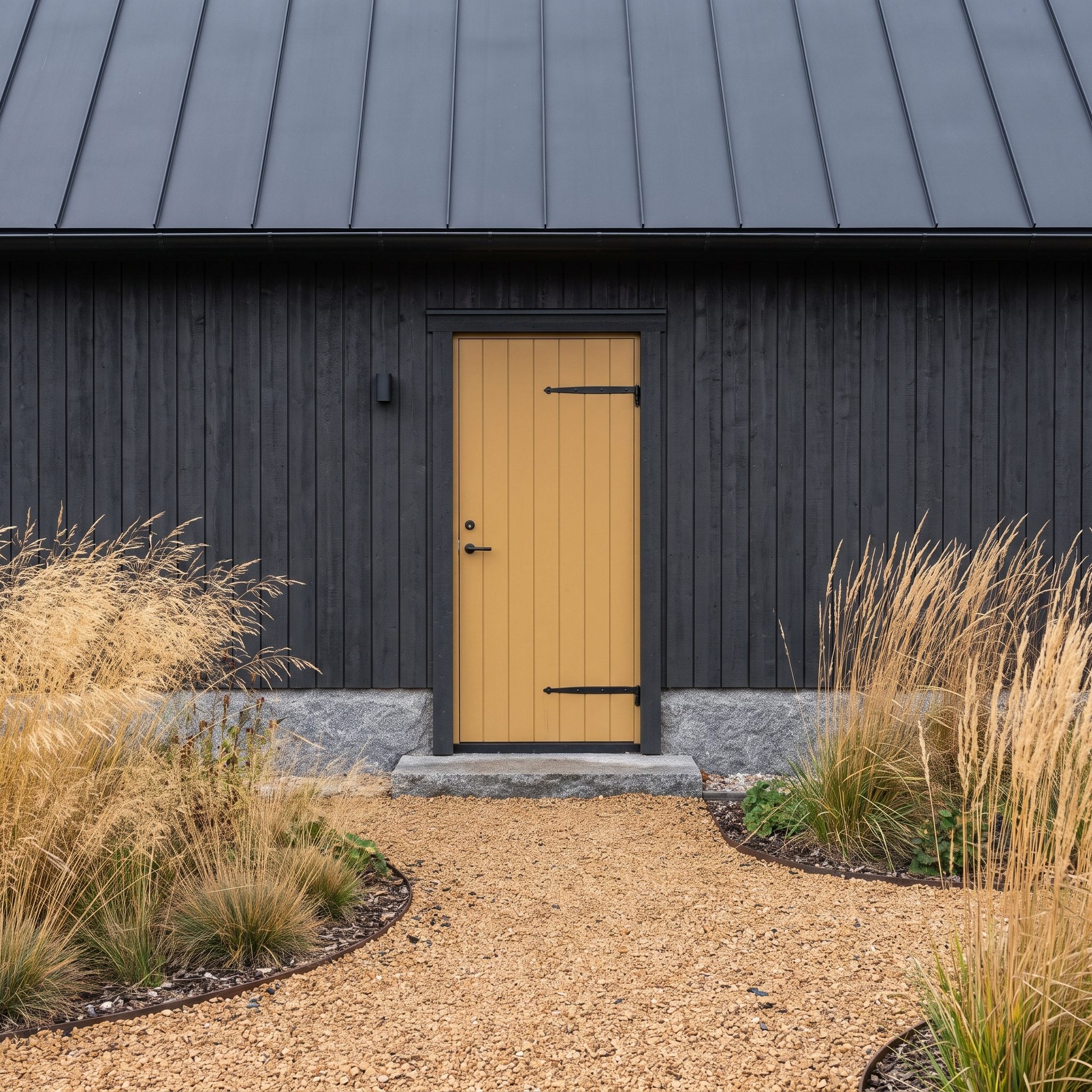
Charcoal timber absorbs visual detail, making a warm-colored entrance particularly effective. Ochre offers a softer alternative to bright yellow: earthy enough to relate to natural materials, yet sufficiently luminous to stand apart from the dark walls.
Golden grasses and warm gravel extend the palette into the approach. Their irregular textures offset the disciplined timber cladding, while dark trim and hardware keep the door itself relatively simple. The composition relies on one strong temperature contrast rather than a collection of competing accents.
21. Dusty Teal Balances a Craftsman’s Warm Materials
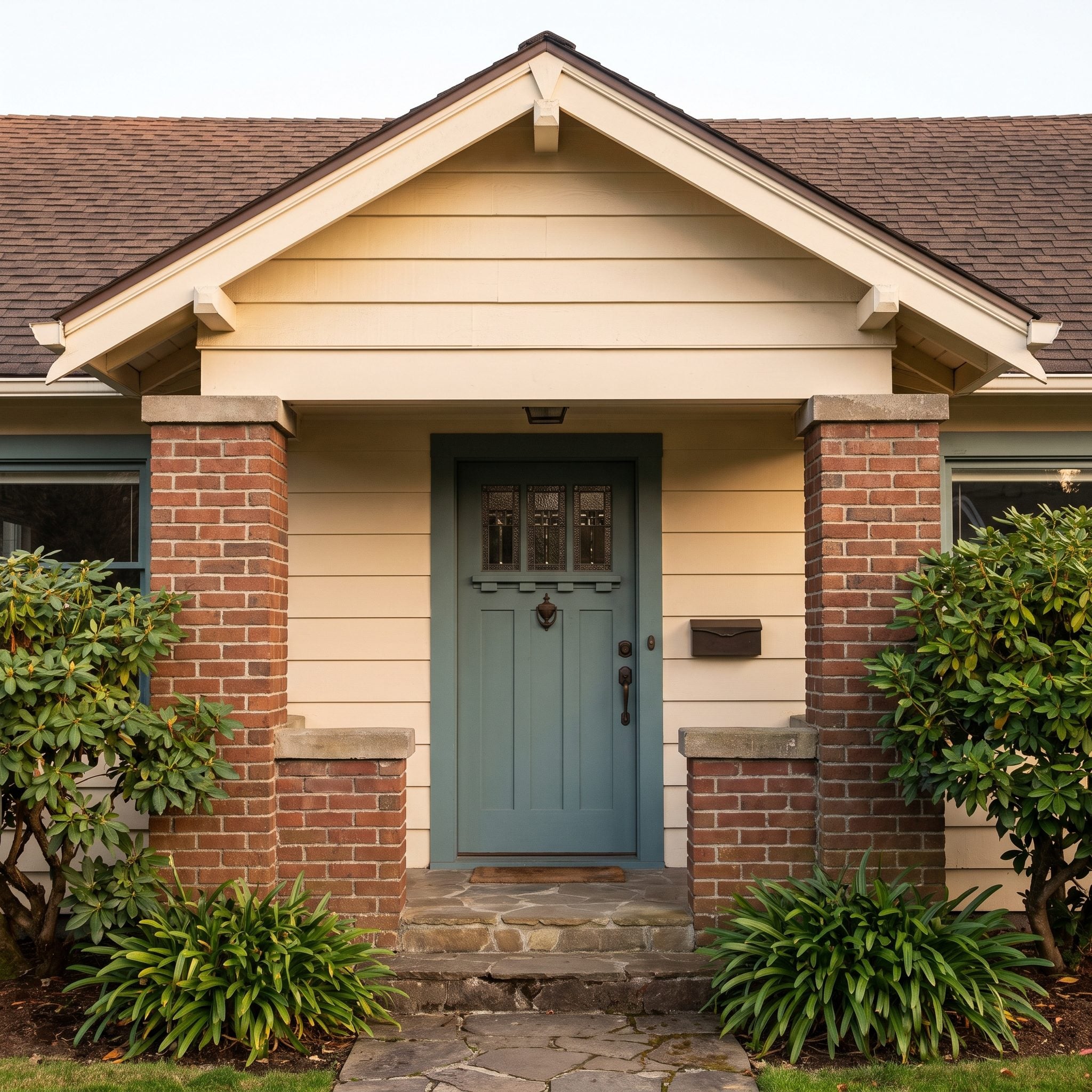
Russet brick, chocolate shingles, and cream siding give this Craftsman a substantial collection of warm materials. Dusty teal introduces a different register. Its blue-green undertone brings freshness to the entrance, while the gray mixed into the color prevents an overly sharp contrast.
The broad-leaved evergreens add a botanical counterpart, but the real success lies in the door’s muted finish. A brighter turquoise would pull attention away from the masonry and woodwork. This quieter teal allows the craftsmanship of the facade to remain the main event.
20. Butter-Yellow Doors Echo a Lakeside Cottage’s Small Details
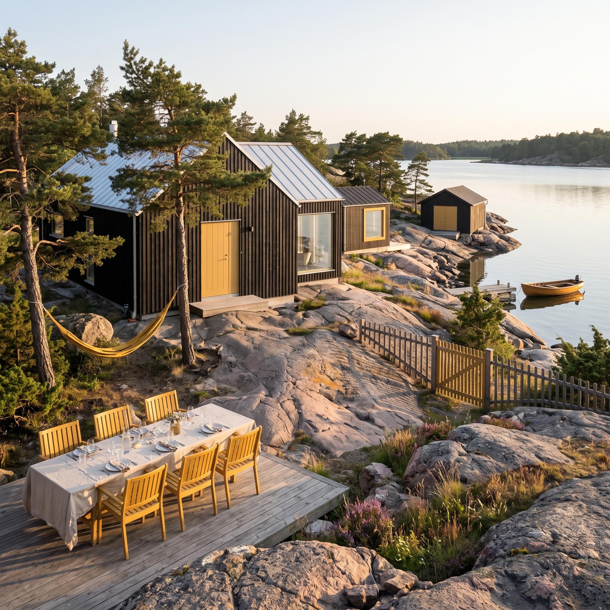
Against black timber, butter yellow becomes a cheerful architectural signature. The color appears not only at the entrance but also in smaller details across the lakeside buildings, creating a visual rhythm that links the separate structures.
The yellow is warm without becoming aggressively bright, a useful distinction in a landscape dominated by pale rock, water, and dark wood. Its repetition in window details and outdoor furnishings feels informal rather than rigidly coordinated. The architecture remains simple, but the palette gives the collection of cottages a recognizable identity.
19. Dusty Rose Draws Its Color Straight Out of an Art Deco Entrance
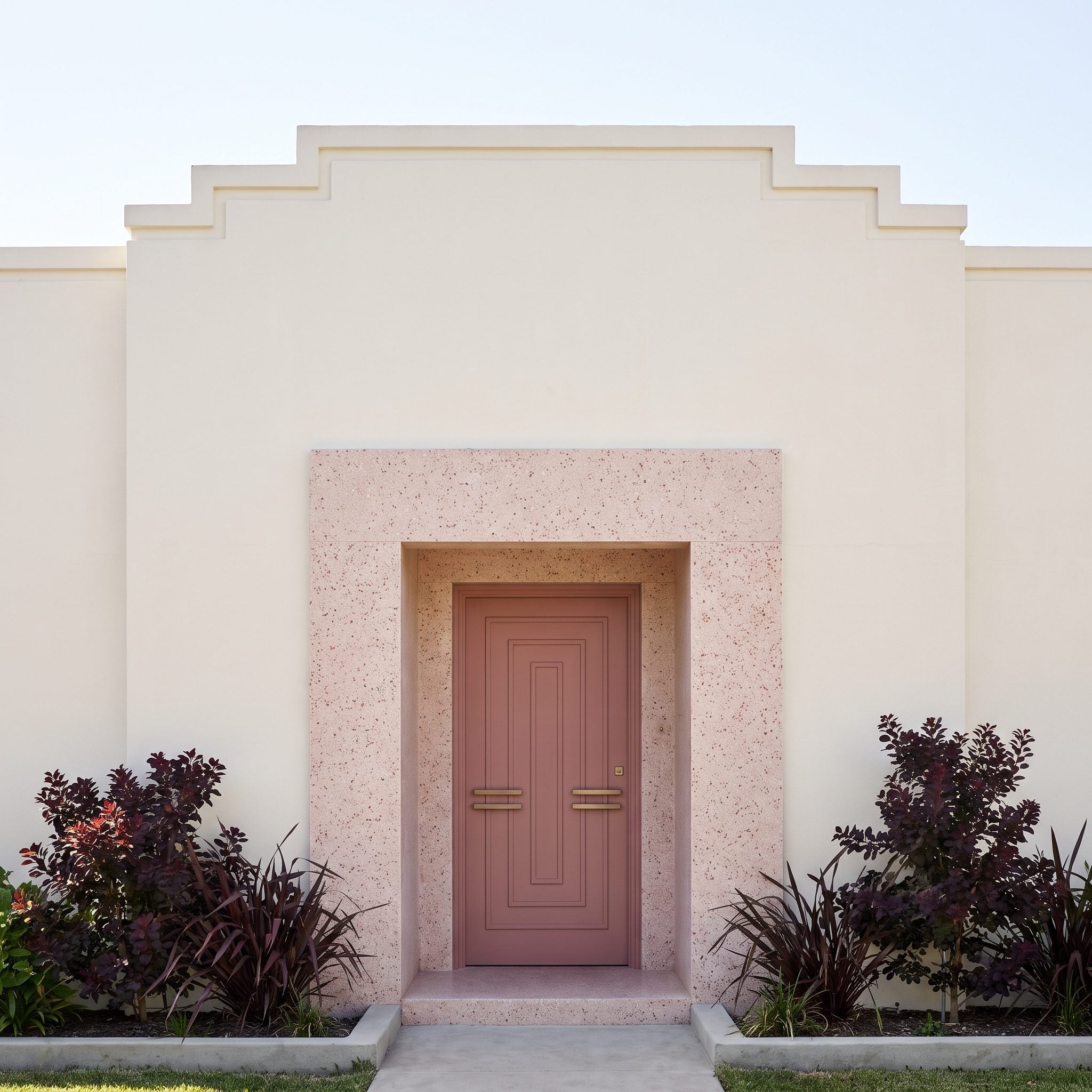
The most interesting color reference in this Art Deco entrance is underfoot. Rose-toned pieces within the terrazzo paving establish a subtle connection to the dusty-pink door, allowing the color to feel integrated with the architecture rather than applied as an afterthought.
Geometric detailing, pale render, and carefully controlled proportions provide the Deco character. Burgundy foliage adds a deeper version of the door’s warmth, but the terrazzo is the crucial link. The palette has sophistication because its colors appear in different materials and at different scales.
18. Soft Black Connects a Farmhouse Door to Its Roof
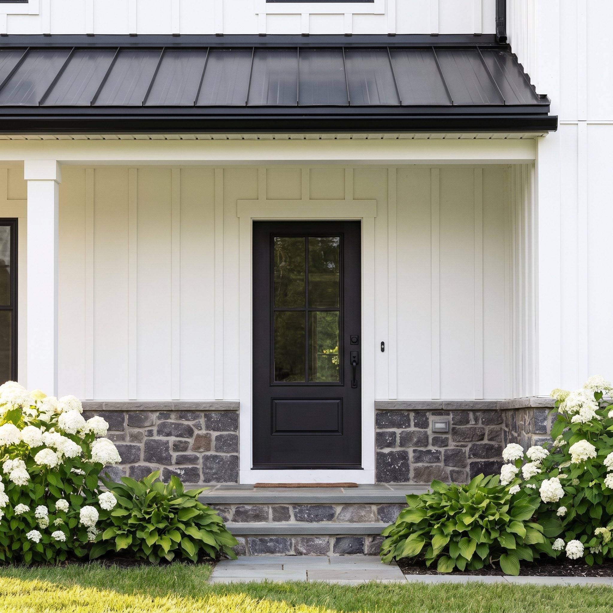
Black and white may be familiar farmhouse territory, but the proportions make the difference. The soft-black door provides a concentrated dark accent beneath the larger expanse of black metal roofing, giving the white siding a clear visual structure.
Charcoal fieldstone strengthens the lower part of the composition, while white hydrangeas soften the contrast. The door doesn’t need an unusual color to be effective. Its success comes from how carefully the dark elements are distributed across the elevation.
17. Petrol Blue Bridges Cool Stone and Evergreen Planting
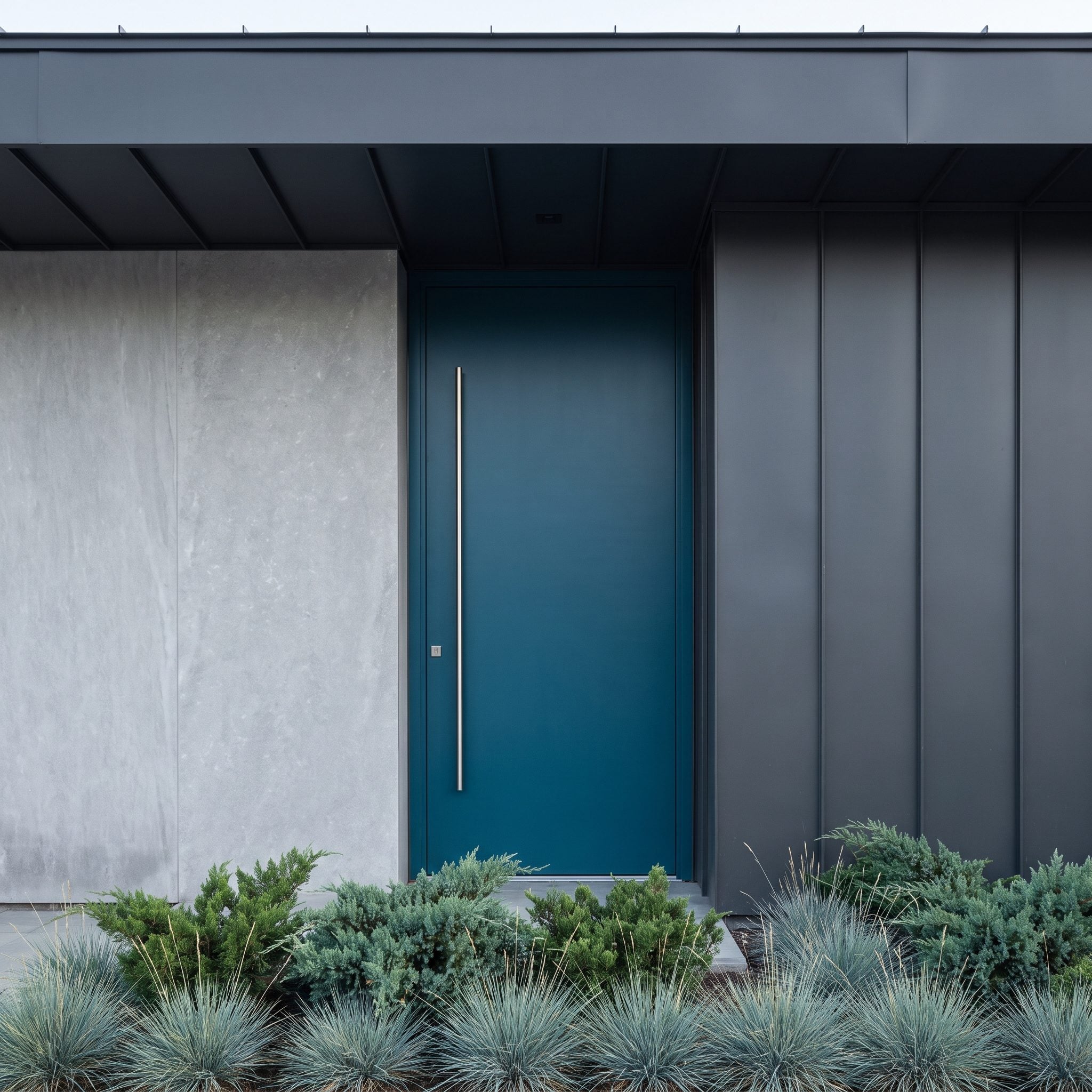
Petrol blue refuses to settle neatly into one color family. Beside silver-gray limestone it appears distinctly blue; against juniper and blue-green grasses, its green undertone becomes more apparent. That ambiguity makes it especially useful on a facade combining several cool materials.
Graphite cladding gives the entrance a darker architectural frame, while a stainless steel door pull reinforces the contemporary detailing. The color has enough complexity to hold its own against stone, metal, and planting without becoming visually restless.
16. Terracotta Connects a Sage Ranch to Its Stonework
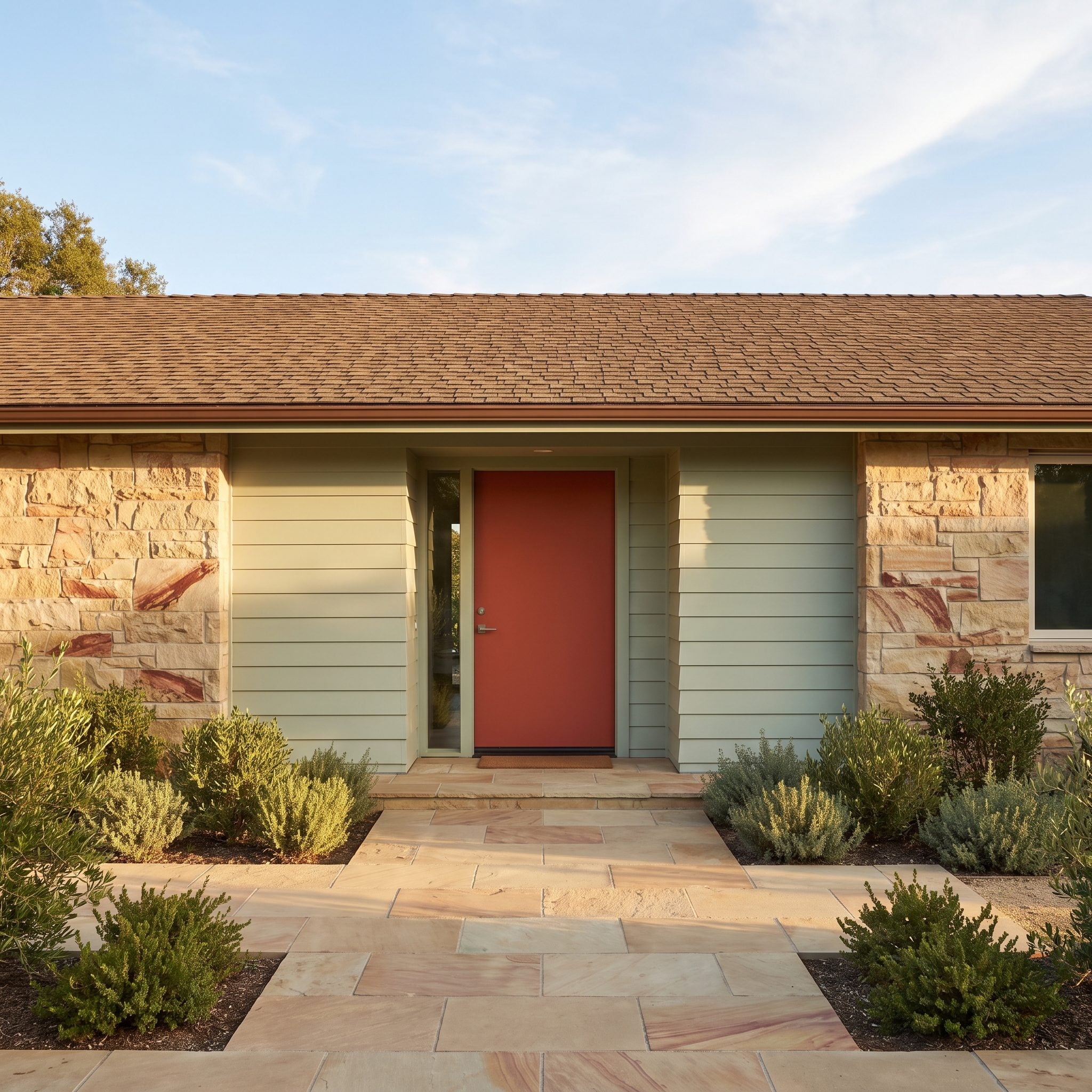
Terracotta gives this ranch-style entrance a strong earthy center. Reddish mineral tones in the sandstone provide a natural counterpart, while sage siding keeps the surrounding walls cool and subdued. The result has considerably more depth than a straightforward brown-and-green palette.
Broad stone paving establishes a substantial approach, and olive-toned shrubs soften the transition between house and garden. The door’s warmth feels particularly effective because the rest of the facade avoids competing saturated colors. One concentrated accent is enough.
15. Pale Celadon Lifts a Dark Bronze Facade Out of Shadow
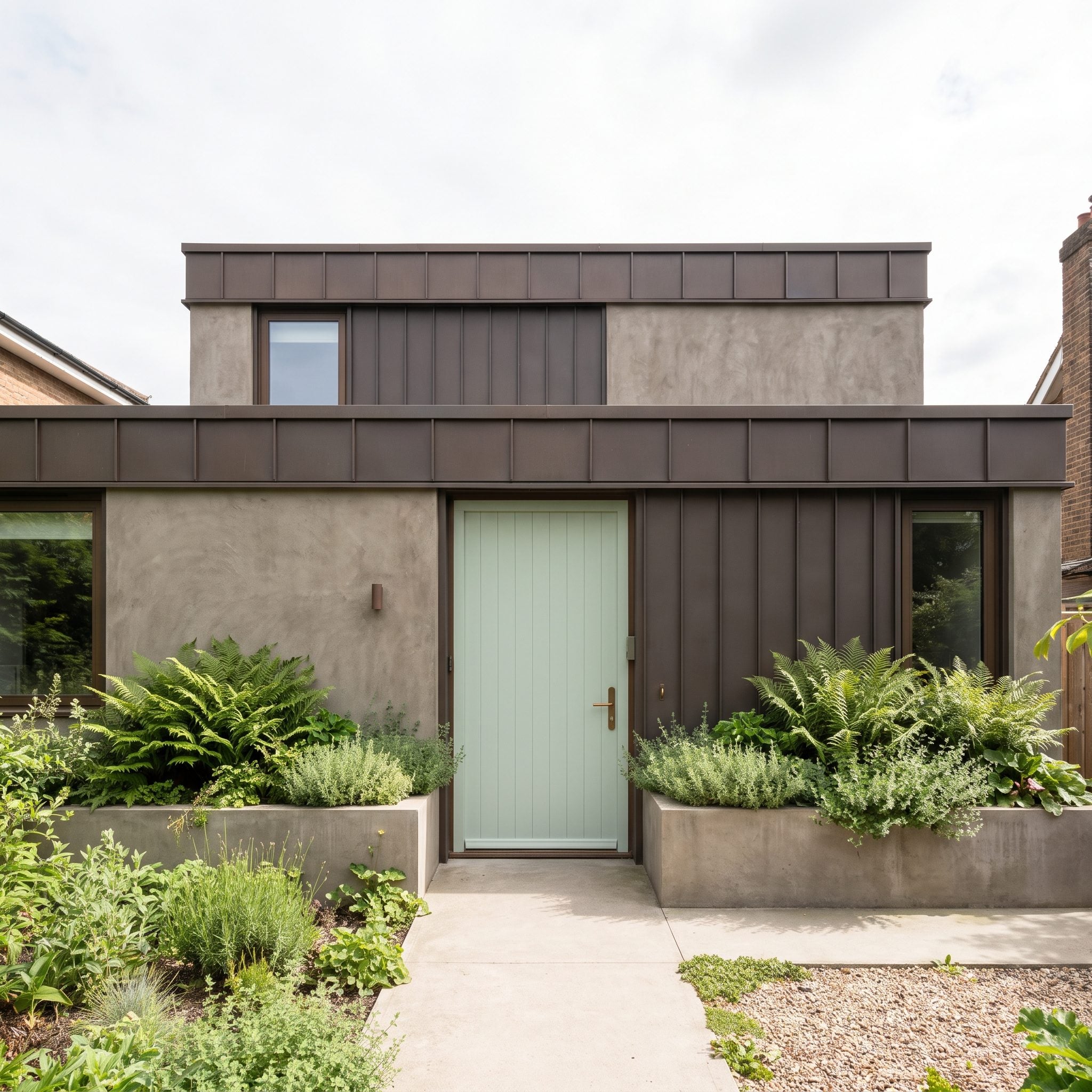
Dark bronze cladding can give a contemporary house an imposing presence. Pale celadon changes the atmosphere of this entrance immediately. Its light green surface stands apart from the surrounding metal, making the doorway visible without relying on a saturated primary color.
The contrast works on two levels: light against dark, and a delicate botanical hue against an industrial material. Ferns introduce related greens at ground level, while bronze hardware prevents the door from feeling disconnected from the facade. The effect is unexpectedly gentle for such a substantial building.
14. Espresso Wood Reinforces a Spanish Revival’s Dark Details
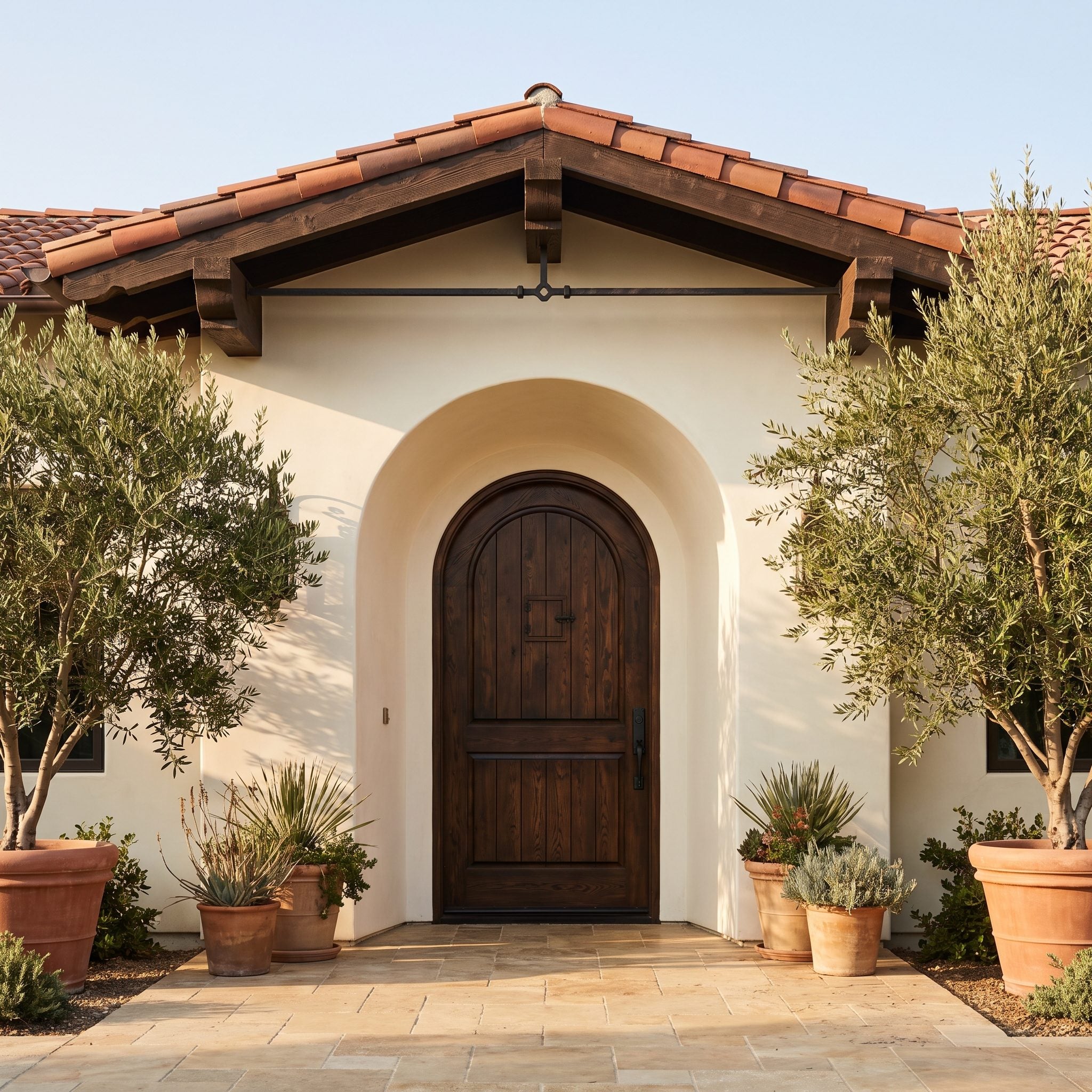
The arched entrance already supplies a strong architectural statement, so the espresso-colored door doesn’t need to compete with it. Deep brown timber gives the opening visual weight and relates to the exposed beams and dark ironwork elsewhere on the facade.
Cream stucco makes those elements especially legible, while warm stone paving and olive planting keep the composition earthy. Visible wood grain prevents the door from becoming a flat dark shape. The restrained hardware suits the architecture’s substantial, handcrafted character.
13. Mustard Gold Extends a Prairie Home’s Buff-Brick Palette
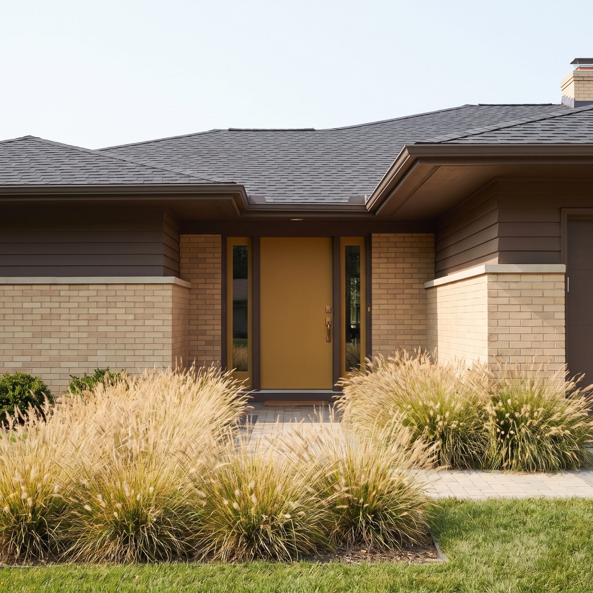
Mustard gold is a surprisingly persuasive choice beside buff brick. Rather than fighting the masonry, the door intensifies its golden undertones and gives the low, horizontal facade a concentrated point of color.
Dark brown siding and charcoal roofing provide the necessary counterweight. Bronze hardware keeps the metallic detailing understated, and tawny grasses carry the warmer tones into the landscape. The door adds energy without undermining the building’s strong horizontal emphasis.
12. Steel Blue Cools Down a Peach Italianate Without Freezing It
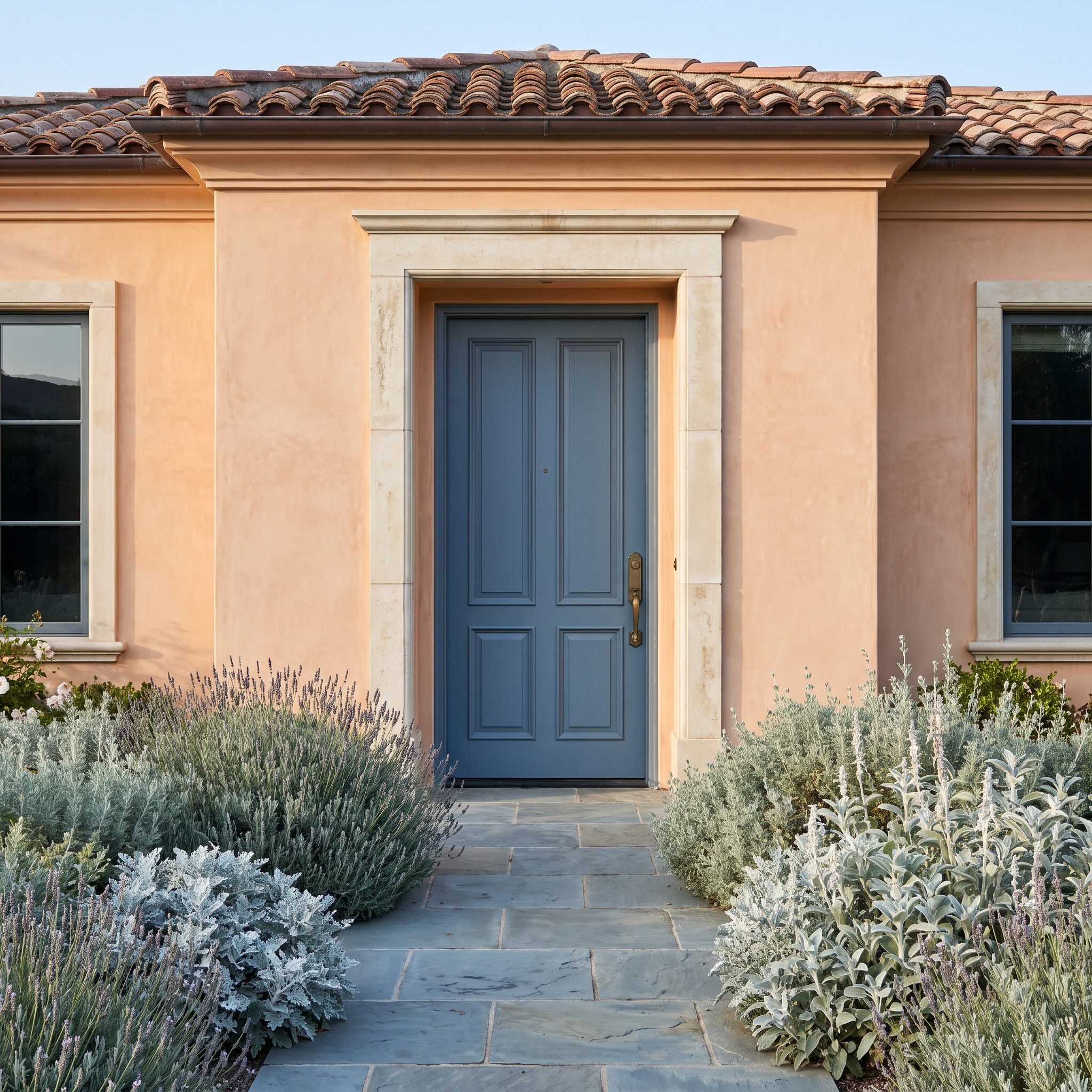
Peach walls and terracotta roofing establish a distinctly warm Italianate exterior. Steel blue introduces a cooler, more reserved color that gives the entrance definition without disturbing the facade’s elegance.
The tall door proportions and antique-brass hardware maintain the formality of the architecture. Blue-gray paving and silvery foliage offer quieter versions of the same cool palette. The door is unmistakable, yet its muted finish prevents the contrast from becoming too theatrical.
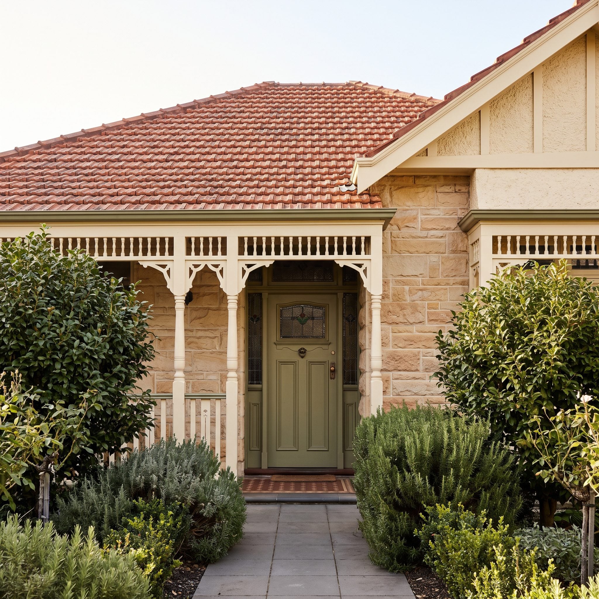
11. Olive Green Settles the Argument Between Sandstone and a Red-Tiled Roof
🔥 Would you like to save this?
Golden sandstone and a red clay roof already give this exterior a generous helping of warmth. Olive green introduces an earthier, more subdued note, allowing the entrance to stand apart without adding another reddish or yellowish surface.
The color works particularly well with the evergreen planting along the path. Leaded glass and aged-brass fittings reinforce the traditional character, while the door’s relatively quiet finish keeps the stone and roof tile in command. It’s a good example of contrast achieved through subtlety rather than brightness.
10. Amber Cedar Stands Out Against a Black Woodland Home
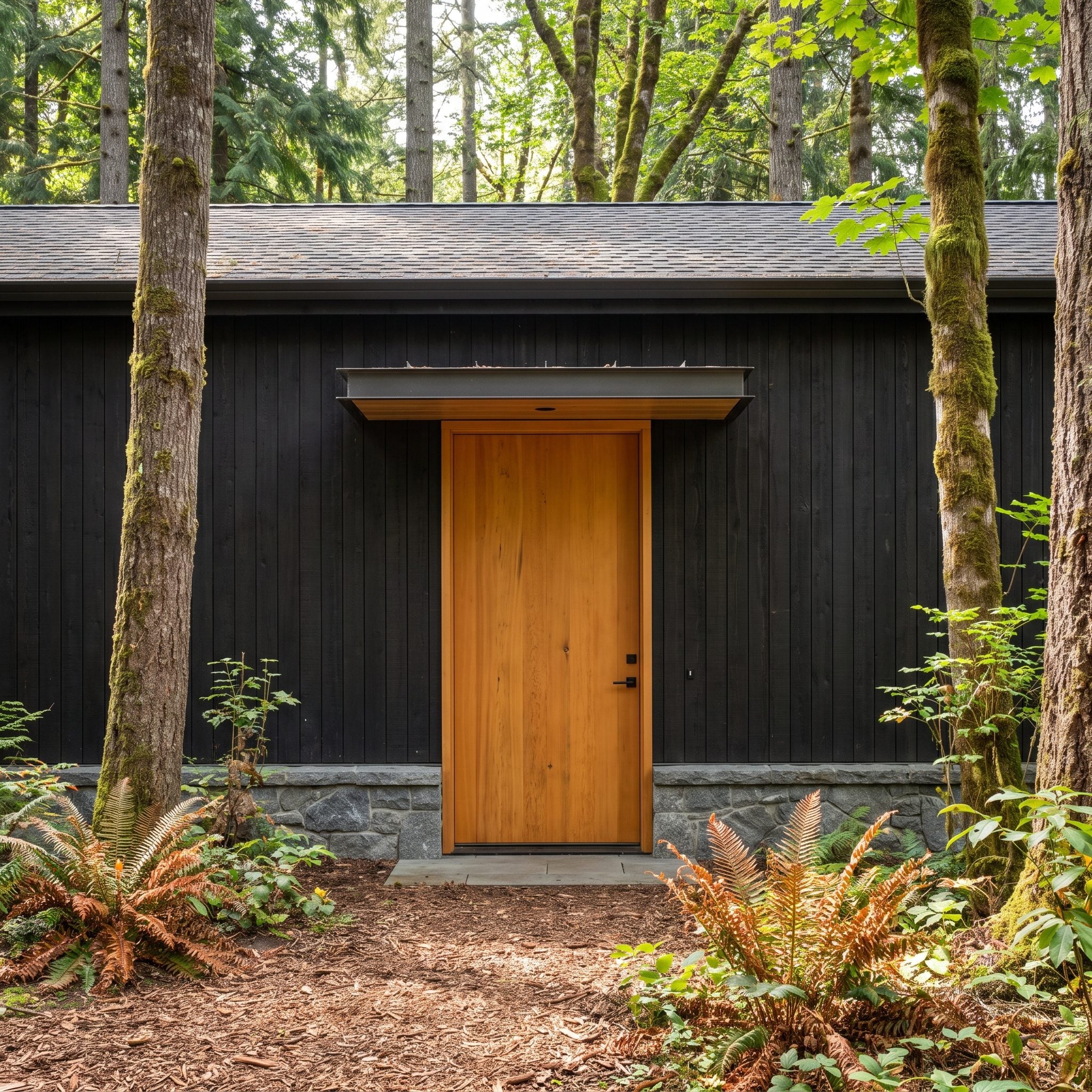
Against black-stained timber, a natural cedar door has an almost luminous quality. The amber grain becomes the brightest warm surface on the facade, drawing attention to the entrance without relying on painted color.
Tree bark, mulch, and copper-toned ferns provide a landscape full of related textures and hues. Black hardware disappears into the surrounding cladding, leaving the cedar to carry the composition. The effect is particularly satisfying because the wood looks at home in the setting rather than artificially contrasted against it.
9. Lavender Makes a Whitewashed Highland Cottage Part of the Heather
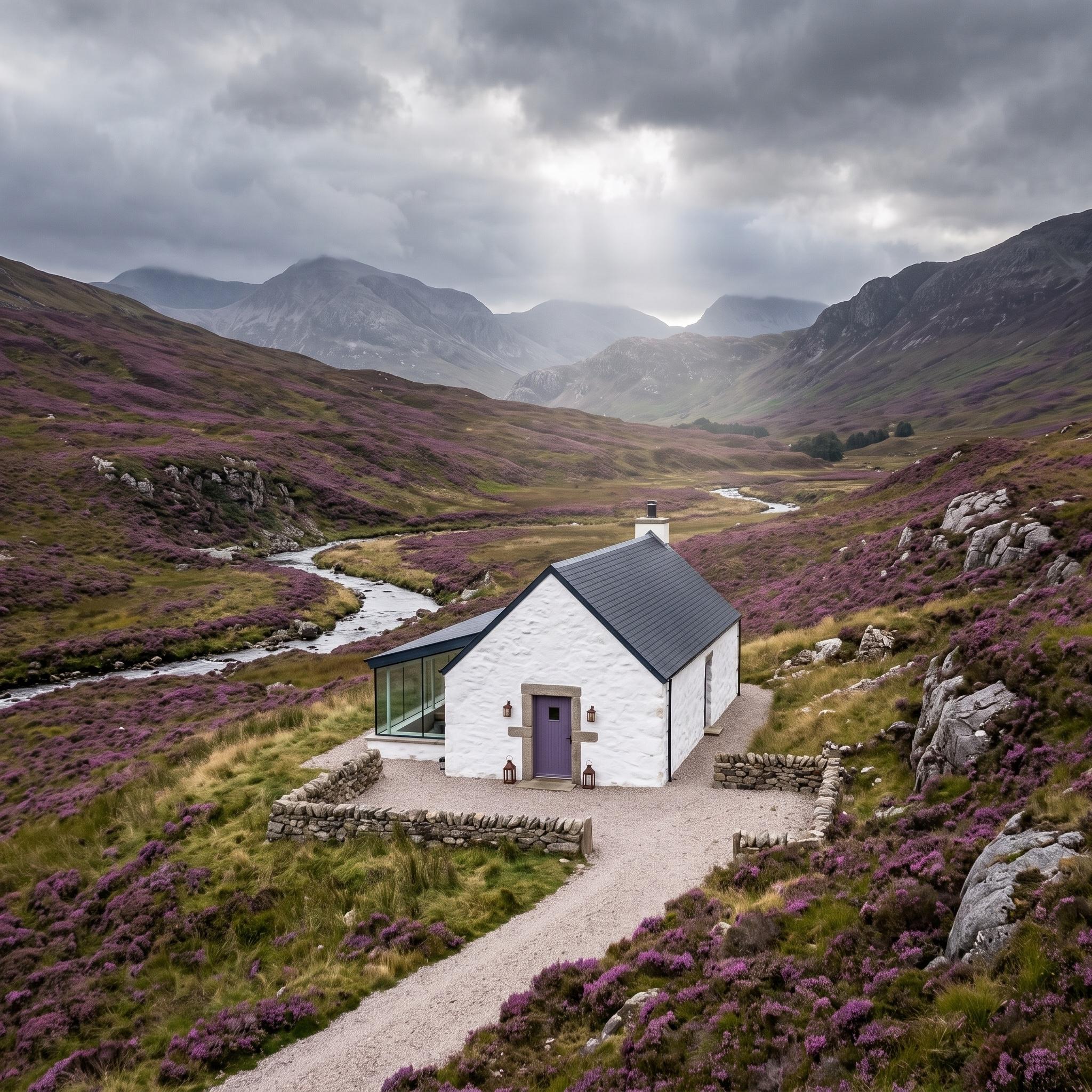
A lavender door is a delicate intervention on this whitewashed stone cottage. Against the pale walls, its color becomes clearly visible; against the purple heather in the surrounding landscape, the choice feels wonderfully appropriate.
The dark roof and traditional stone surround provide enough architectural weight to keep the pastel from becoming overly sweet. What makes the entrance memorable is its relationship to the wider view. The door doesn’t simply coordinate with the house. It draws a small piece of the landscape into the architecture.
8. Forest Green Draws Together Red Brick and Charcoal Slate
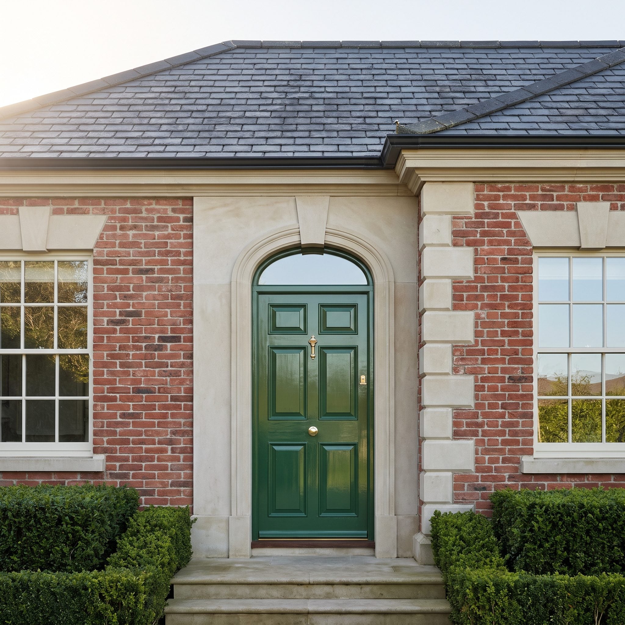
Forest green gives this red-brick entrance a sense of composure without diminishing the richness of the masonry. The door has sufficient darkness to relate to the charcoal slate roof, while its cooler green tone provides a measured contrast to the warm brick.
Clipped hedges bring the same color family into the garden, and the brass door knocker introduces a small, warm metallic highlight. The arrangement feels balanced because each material retains its character rather than being forced into an overly matched palette.
7. Copper Brown Bridges Cold Concrete and Warm Bronze
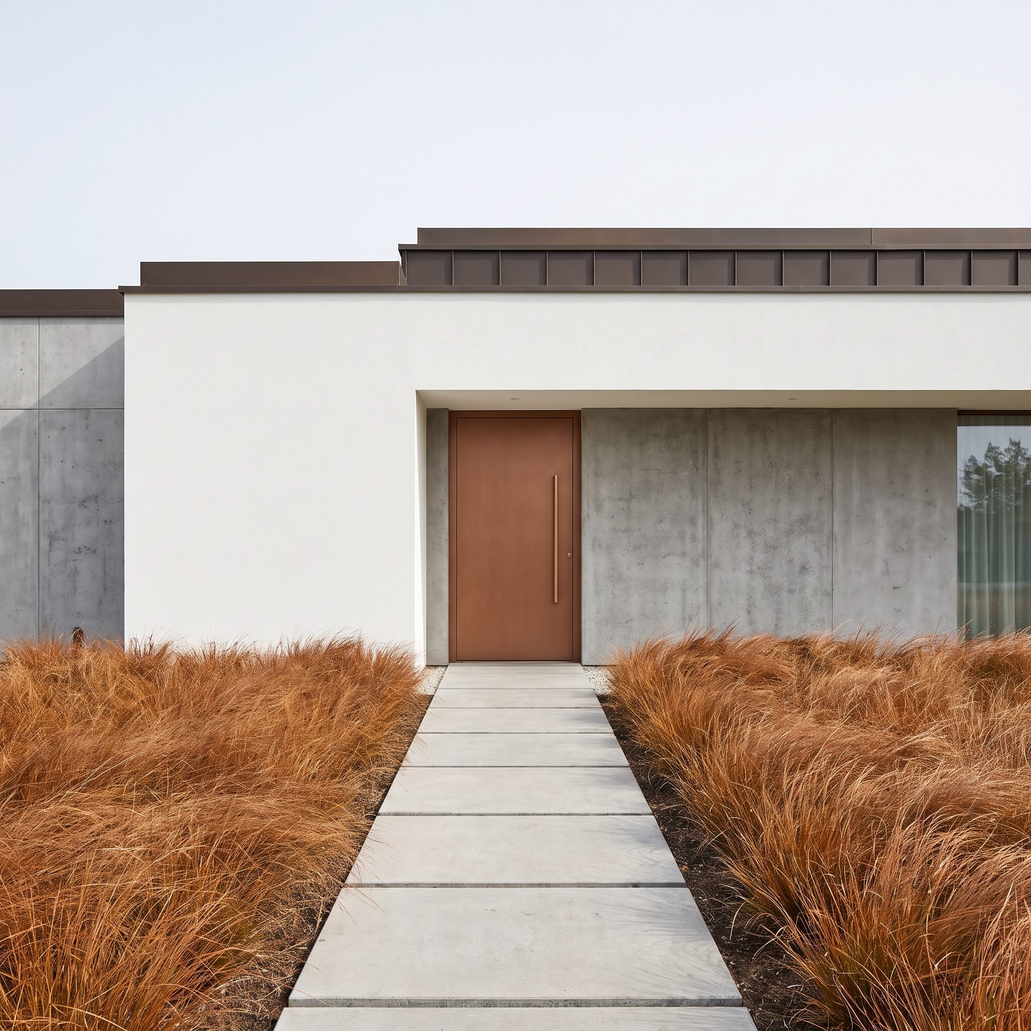
Exposed concrete and bronze metalwork occupy opposite ends of the temperature spectrum. The copper-brown door provides a middle ground, introducing enough warmth to soften the concrete without becoming as reflective as the surrounding metal.
Its flush design keeps the geometry clean, while the bronze handle adds a precise vertical accent. Copper-toned grasses extend the warm palette into the foreground. The building retains its modernist severity, but the entrance feels more approachable because of that carefully controlled material contrast.
6. An All-Glass Pivot Door Lets the Courtyard Supply the Color
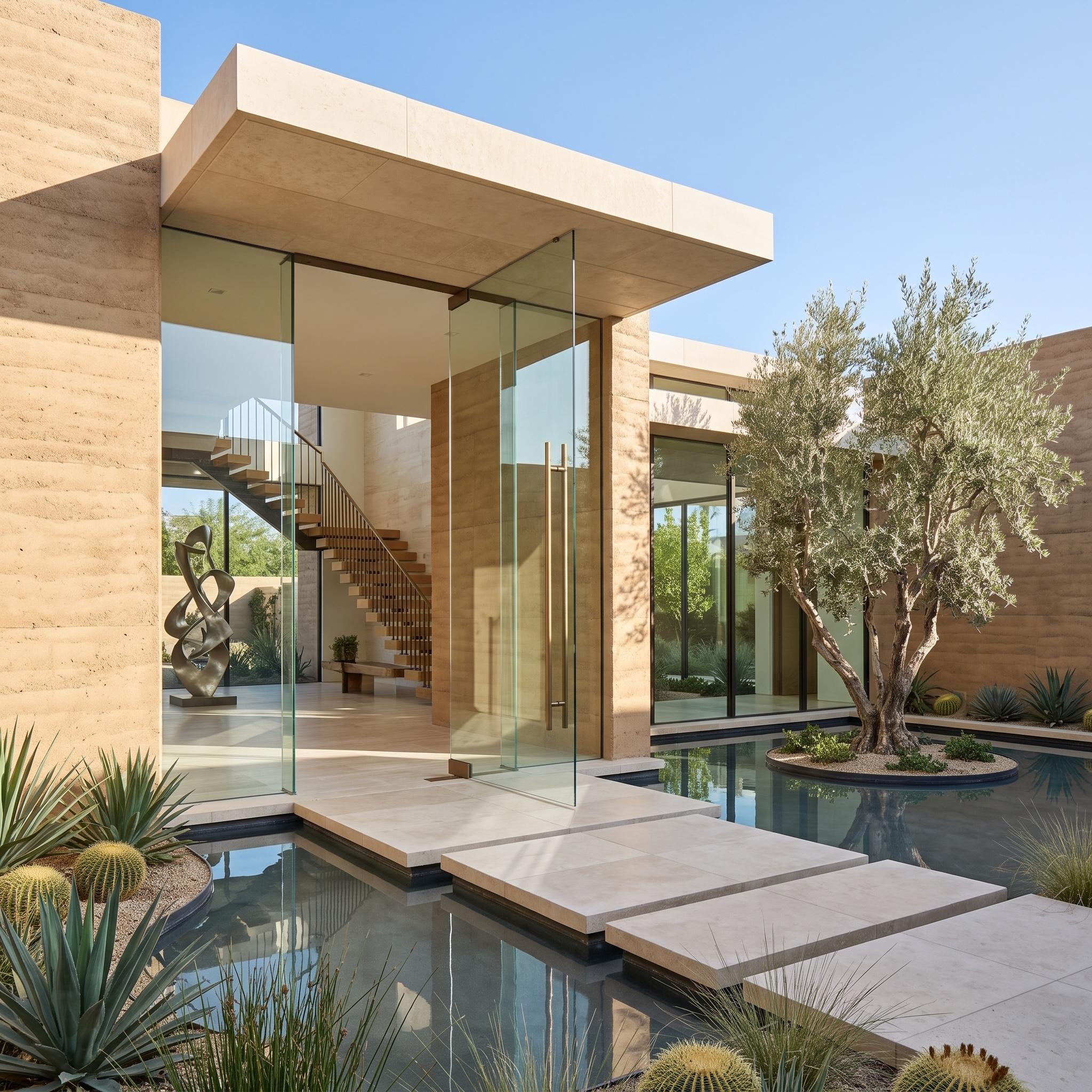
After so many examples of color doing the architectural work, this entrance offers a radical alternative: almost no visible door color at all. A full-height glass pivot panel allows the warm rammed-earth walls, pale stone, reflecting pool, and sculptural olive tree to dominate the view.
The slender handle and glass edges quietly establish the functioning entrance, while the transparent surface preserves the visual connection between exterior and interior. Floating stone pavers carry the approach across the water. The door’s achievement is not that it disappears completely, but that it allows the architecture beyond it to become part of the arrival.
5. Pine Green Ties an Alpine Home to the Trees It Sits Among
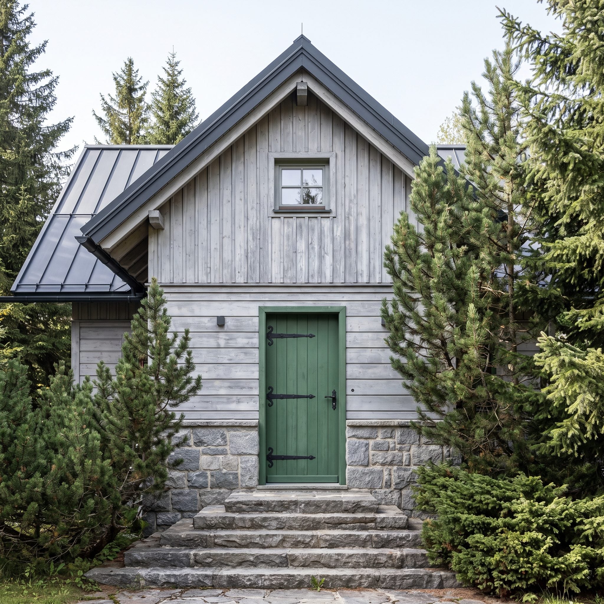
The strongest color reference for this Alpine entrance comes from the surrounding conifers. Pine green gives the door a direct relationship to the landscape, making the house feel visually connected to the trees rather than isolated from them.
The deep green also relates to the dark metal roof, while broad stone steps and iron fittings contribute a rugged material character. Nothing about the entrance depends on decorative flourishes. The door is substantial, dark, and closely attuned to the mountain setting.
4. Cherry Red Gives Weathered Cedar the One Thing It Was Missing
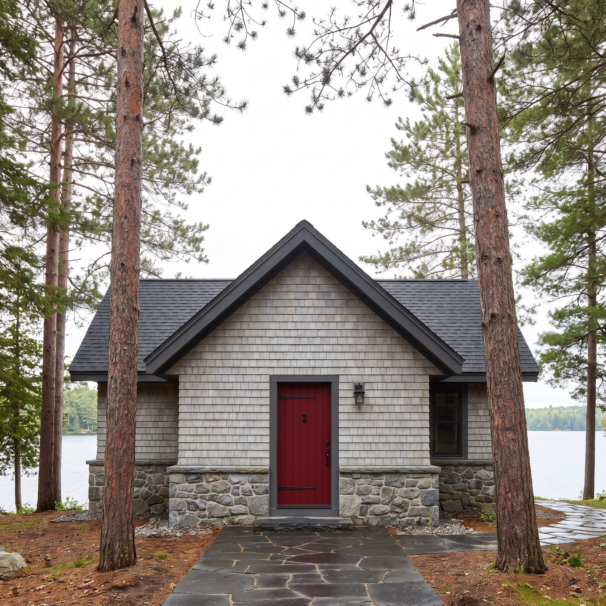
Weathered cedar has an understated beauty, but an entire facade of silver-gray timber can leave the entrance visually indistinct. Cherry red changes that instantly. The door becomes a concentrated burst of color against the subdued siding, establishing a clear focal point without altering the architecture.
The saturation is what makes the move so effective. A muted brick red would have softened into the surroundings; this brighter shade refuses to disappear. Dark paving and hardware keep the supporting details quiet, while reddish-brown tree bark offers a natural counterpart. The entrance is simple, emphatic, and impossible to overlook.
3. Natural White Oak Makes an Entrance Out of Almost Nothing
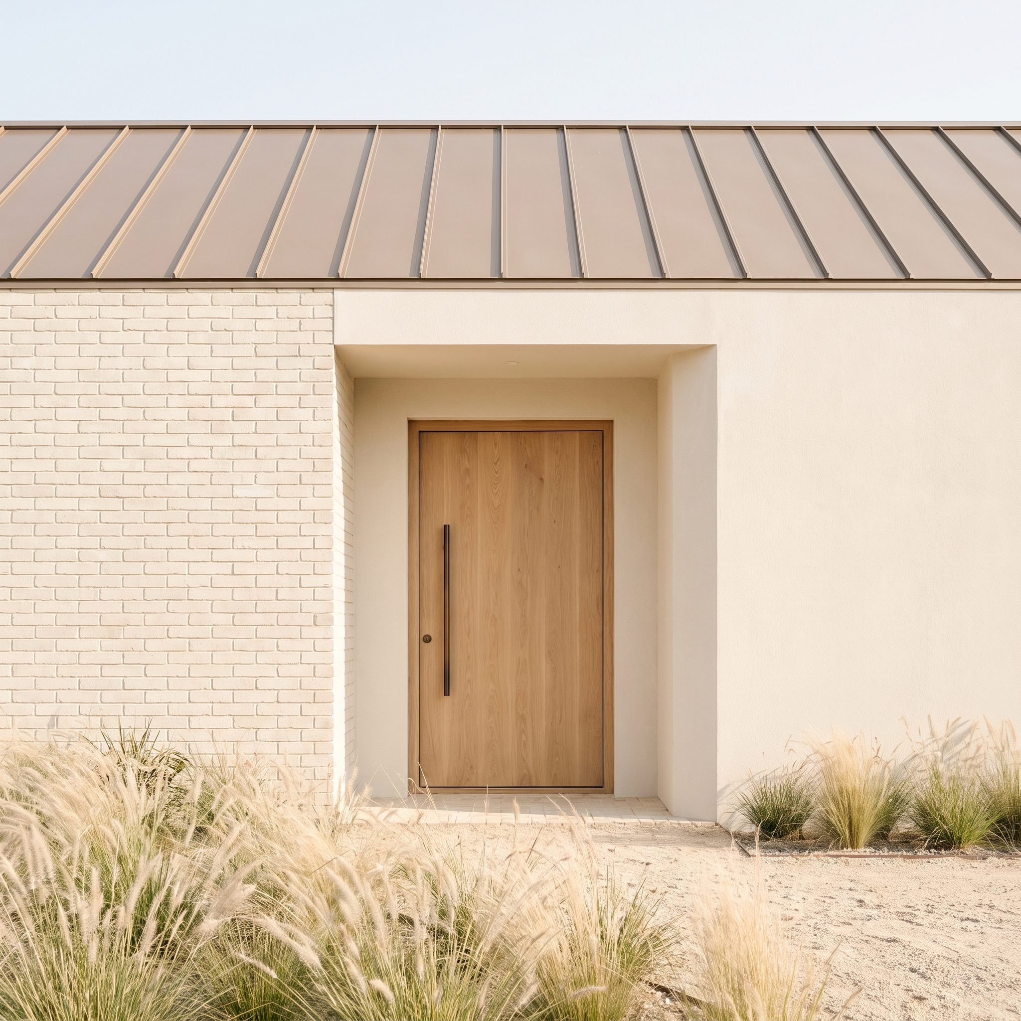
No saturated paint, no sharp color contrast, no decorative spectacle. This entrance relies on the subtle warmth of white oak against cream brick and bronze architectural details. The beauty lies in the close tonal relationships rather than a dramatic departure from the surrounding palette.
A deep reveal gives the door a strong shadow line, separating the oak from the masonry without introducing another color. Pale grasses and sandy gravel reinforce the restrained atmosphere. Grain, proportion, and surface texture provide the interest that a brighter entrance might have supplied through paint.
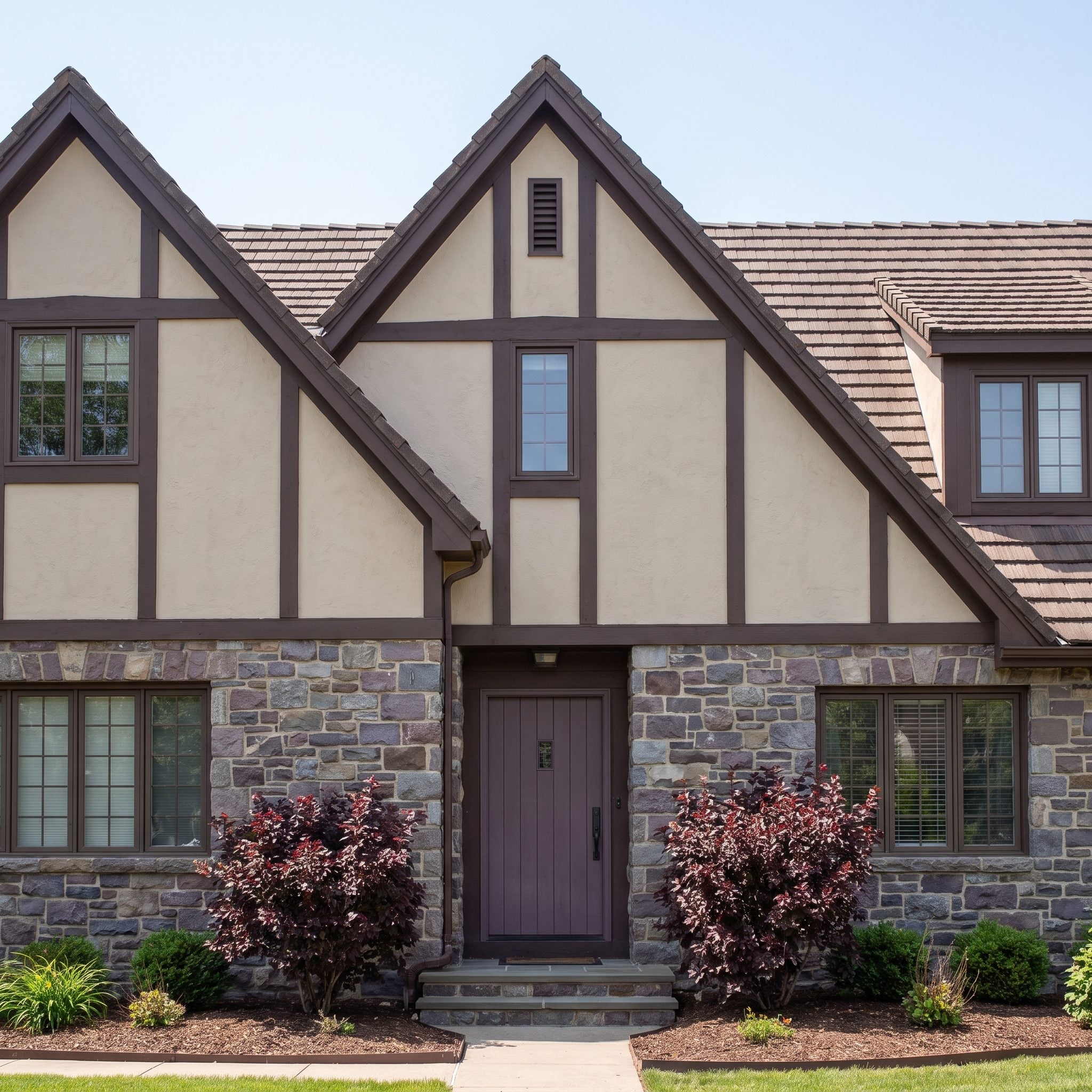
2. Smoky Plum Finds the One Color Hiding in Tudor Stone
🔥 Would you like to save this?
Tudor-style architecture already brings several materials into conversation: timber, plaster, and varied masonry. Smoky plum adds an unexpected color without turning that complexity into confusion. Its gray undertone gives the purple enough restraint to sit comfortably among the traditional surfaces.
Muted violet notes within the stonework provide a subtle connection, while burgundy shrubs deepen the color at ground level. The door gives the mixed materials a focal point, demonstrating how an unusual hue can feel entirely appropriate when its intensity is carefully judged.
1. Deep Ink Blue Grounds a Warm-Yellow Colonial
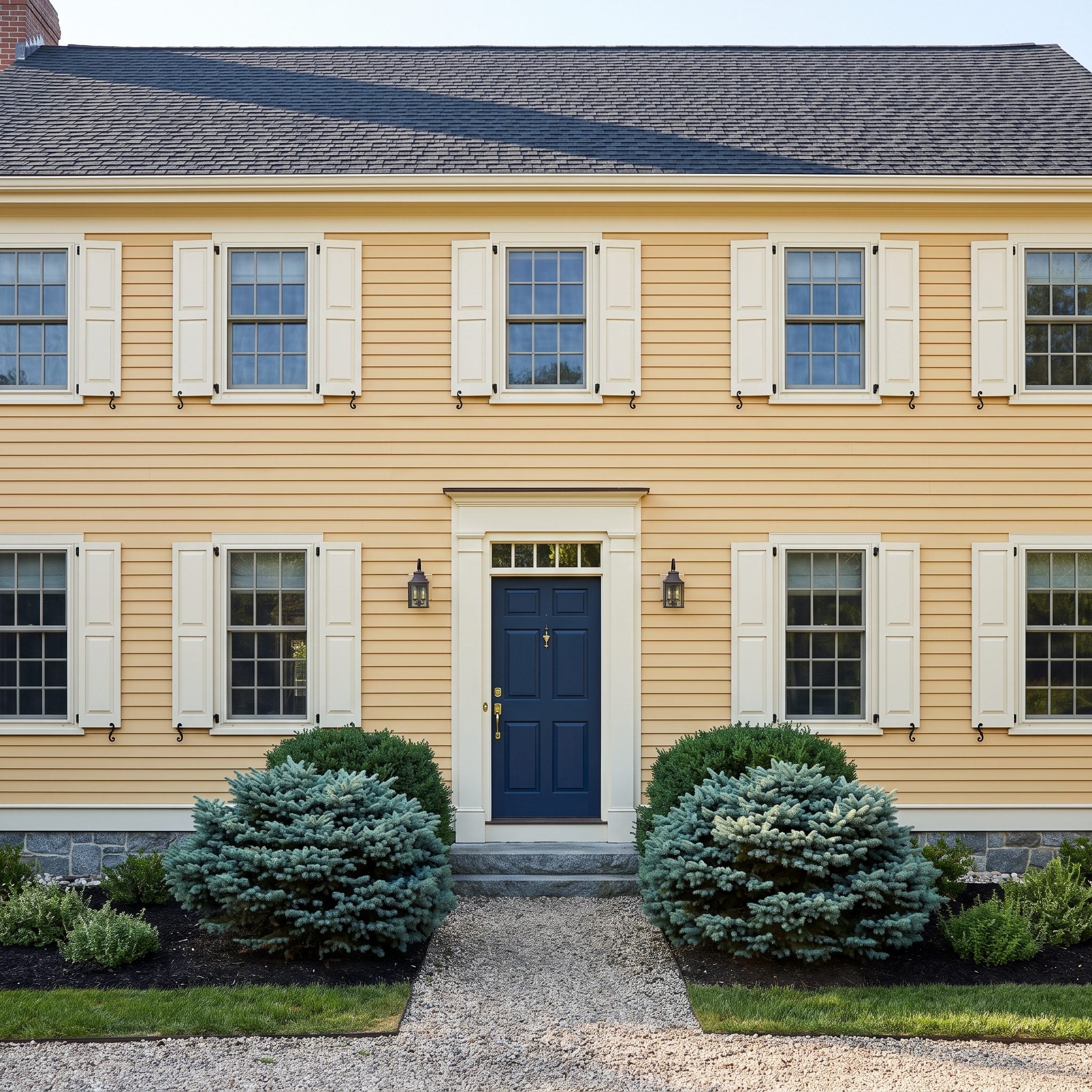
Deep ink blue brings definition to this warm-yellow Colonial without upsetting its formal symmetry. The door’s nearly black depth gives the cheerful siding a substantial focal point, while its blue undertone provides a crisp contrast to the yellow walls.
The charcoal roof establishes a darker architectural boundary above, and blue-green shrubs soften the entrance at ground level. Brass hardware introduces a small return of warmth. The composition is conventional in its basic ingredients, but the balance of color and proportion makes it convincing.