
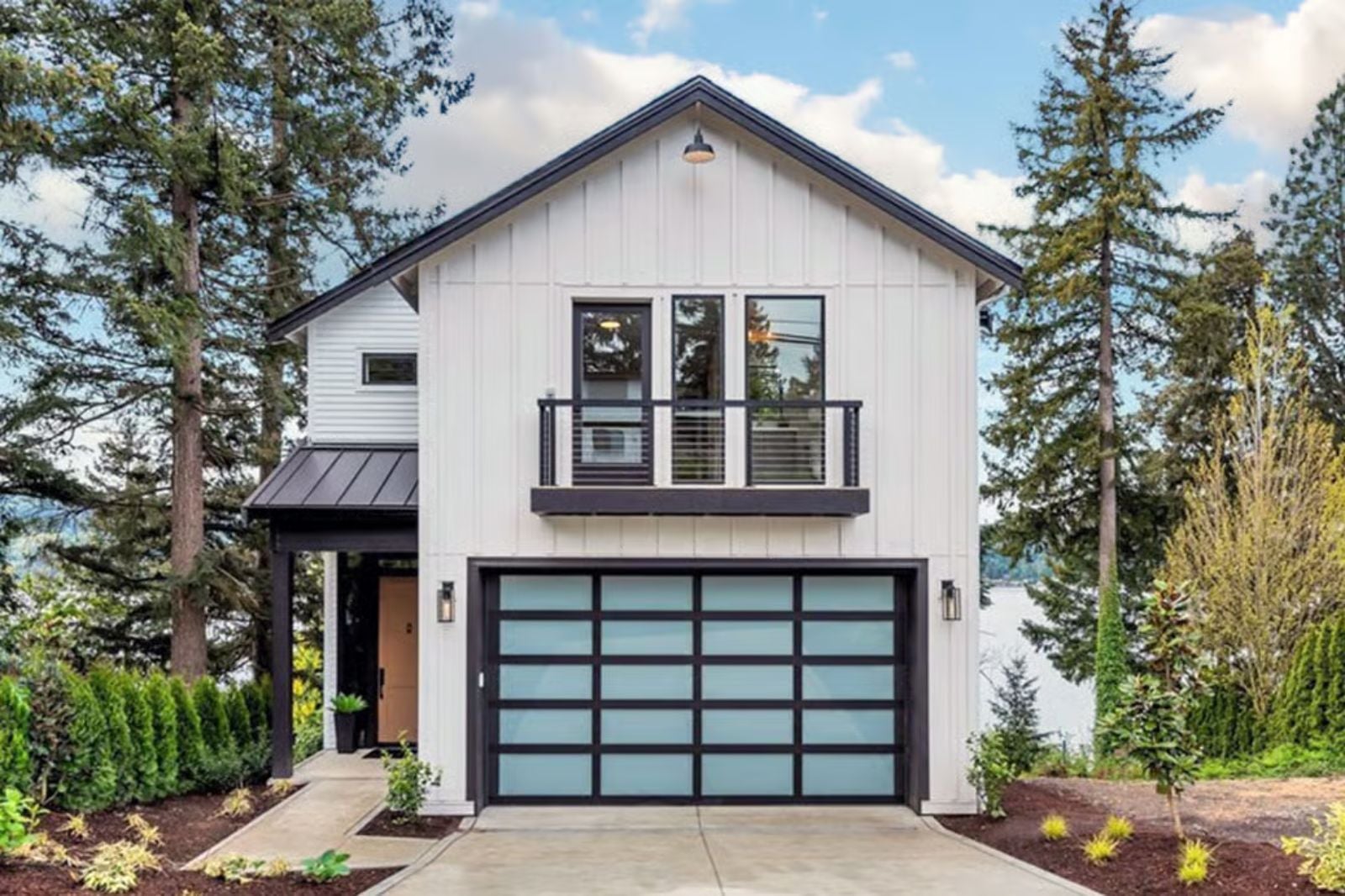
Most hobby workshops get squeezed into half a garage and called a compromise — this one gets its own dedicated unheated space, separate from the double garage, so the cedar shavings and the cars finally stop sharing square footage. The Fir & Frost is built around two people who still genuinely like each other: a two-story Northwest exterior that weathers the region honestly, room to disappear into your own thing, and room to come back.
Specifications
- Sq. Ft.: 2,490
- Bedrooms: 3
- Bathrooms: 3.5-4.5
Floor Plan – Main Floor
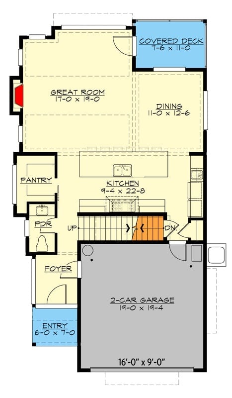
The main level keeps the great room and dining area open to each other, with the kitchen running perpendicular between them. A covered deck sits off the dining space, which is the right call for a Northwest climate. Daily traffic — pantry runs, powder room, coming in from the garage — stays bundled near the entry so it doesn’t bleed through the living areas. Stairs rise from the center of the plan.
Floor Plan – Second Floor
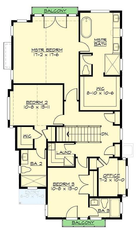
The master suite sits at 17-2 x 17-6 in the far corner of the upper level, with balcony access, a walk-in closet, and a full bath. Two additional bedrooms share the second bath. A compact office and laundry round out the floor, and the stair placement means bedroom traffic never crosses the master wing to get anywhere.
Floor Plan – Basement
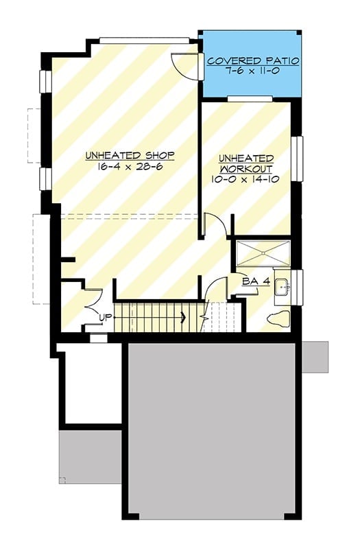
The lower level holds an unheated shop, a workout room, and a fourth bathroom, with stair access up and a covered patio tucked into the northeast corner.
Color Story: Unheated spaces like the shop and workout room tend to show up in yellows and warm neutrals on floor plans for a reason — those tones communicate “functional, not precious,” which is exactly the right mood for anything garage-adjacent. Carry that palette into actual paint choices and the space reads as deliberate rather than just unfinished.
White Siding, Black Trim, and Three Levels of Trees in Every Direction
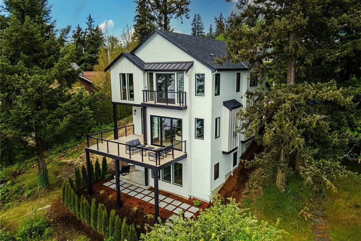
Vertical board-and-batten in white, dark window frames, and cable rail balconies across three stories. That mid-level deck with its low-profile seating gets serious mileage out of what looks like a genuine view corridor through the firs. Stone pavers below hint at the covered patio underneath — the one that actually gets used in October.
Ask Yourself: Before you fall for the upper balcony, think honestly about how many months of the year you’ll use an open-air view platform versus a covered lower patio. In the Pacific Northwest, covered outdoor space wins more seasons. Both serve a purpose here, but one of them needs furniture that can stay outside year-round without suffering for it.
Gray Walls That Actually Work, Thanks to Light Wood and a Tall Olive Tree
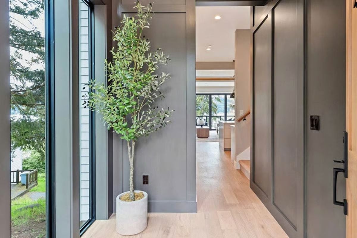
Most entryways apologize for themselves. This one doesn’t.
Slim floor-to-ceiling windows pull enough Pacific Northwest green into the space that the gray walls read as intentional rather than just cold. The potted olive tree isn’t decorating against the room — it’s echoing what’s already happening on the other side of the glass.
Sliding Glass the Full Width of the Wall, and Trees on the Other Side
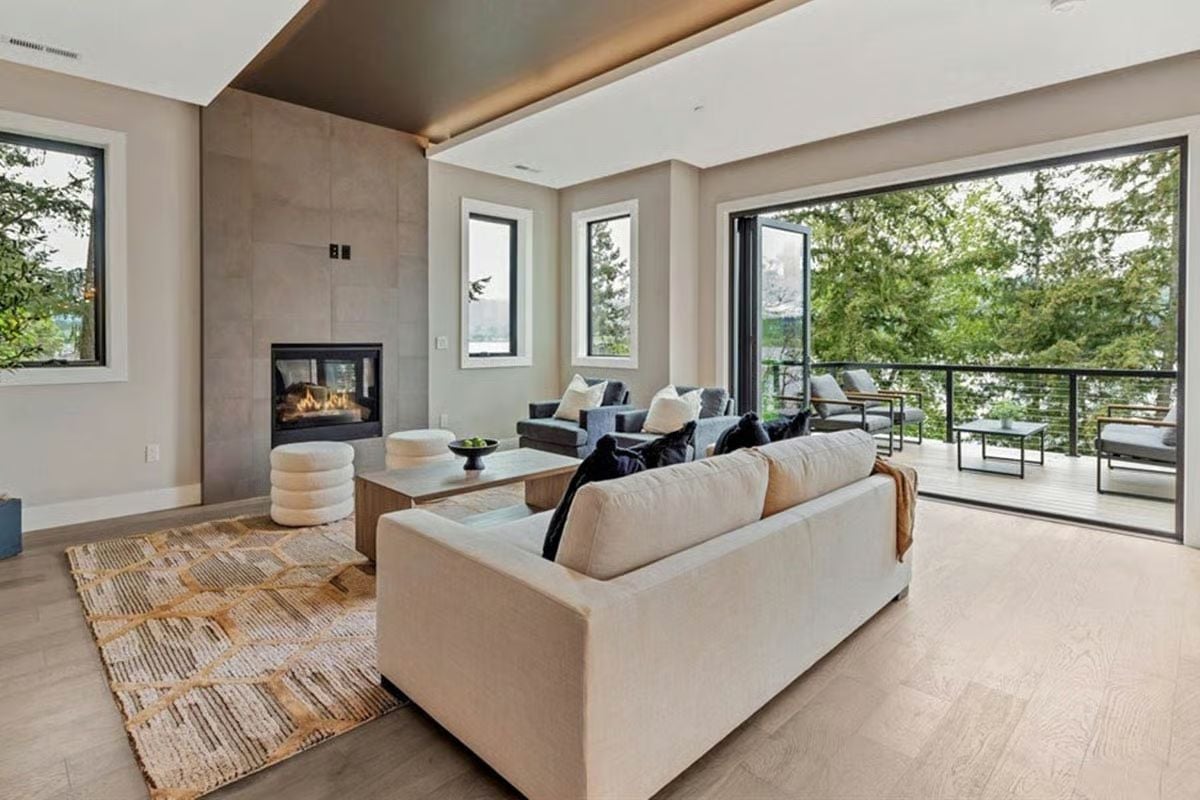
Cream sofa, a wood-frame coffee table, two poufs — all oriented toward a see-through fireplace set flush into large-format gray tile. The full-width sliding door opening behind it isn’t a detail. It’s the whole point of the room.
Budget Tip: Concrete tile surrounds like the one on this fireplace wall look sharp, but they hold heat differently than drywall — which can affect how a gas fireplace performs. Before you finalize your surround material, ask your installer whether the unit’s output settings need any adjustment to account for it.
Woven Leather Barstools and a Kitchen Island That’s Actually Big Enough
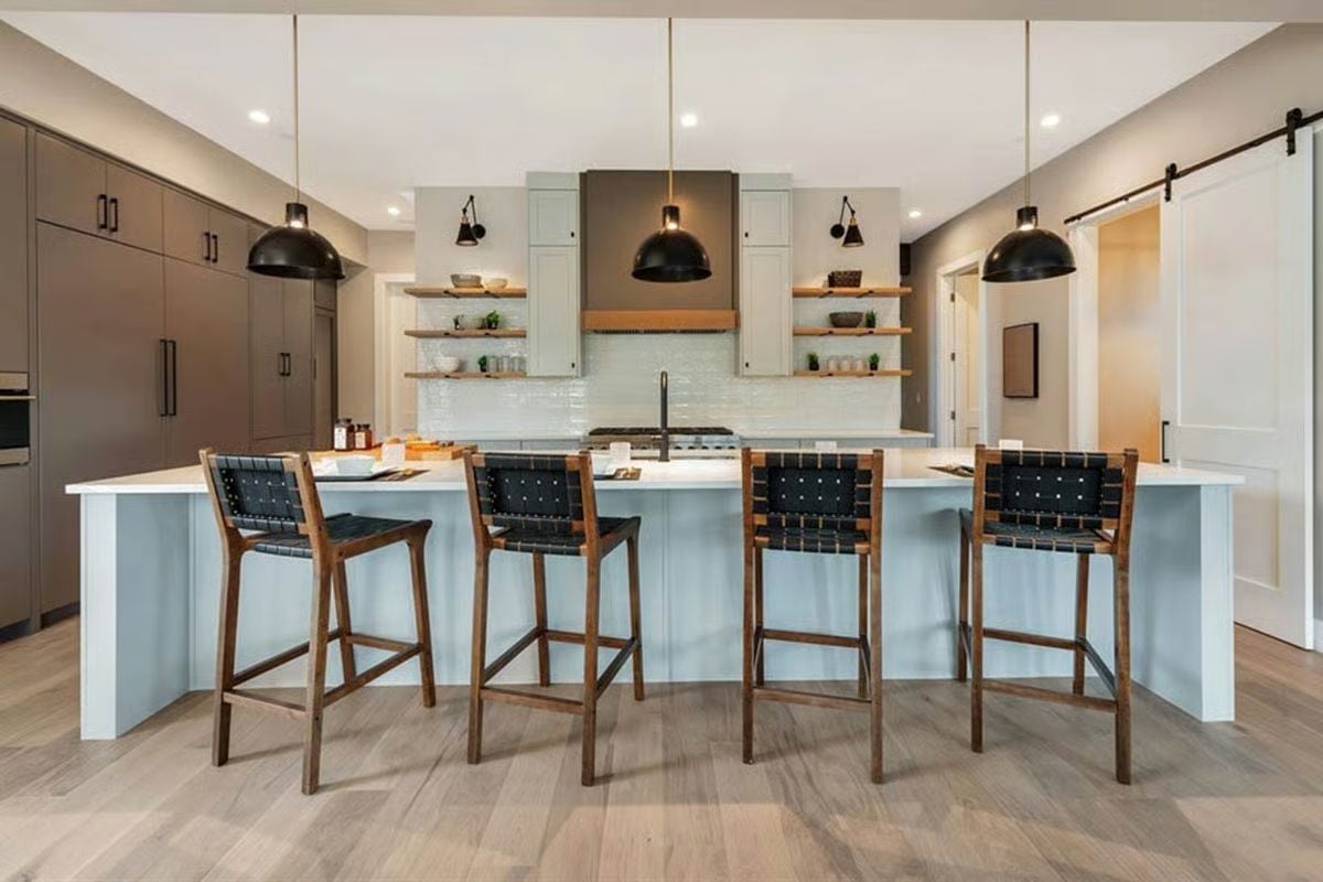
Four barstools with woven black leather seats pull up to a light blue island under a pair of black dome pendants hung low enough to actually feel intentional. Open shelves flank the range hood on both sides — functional ones, not the kind staged with things nobody touches.
- Pendant height matters more than pendant size — too high and they read as an afterthought
- Open shelves near a cooking zone work when they hold what you actually reach for, not what photographs well
- Island color contrast (blue base, white top) carves out the prep zone without needing a physical divider
Gold Orbital Chandelier, Round Table, and a Water View Nobody Warned You About
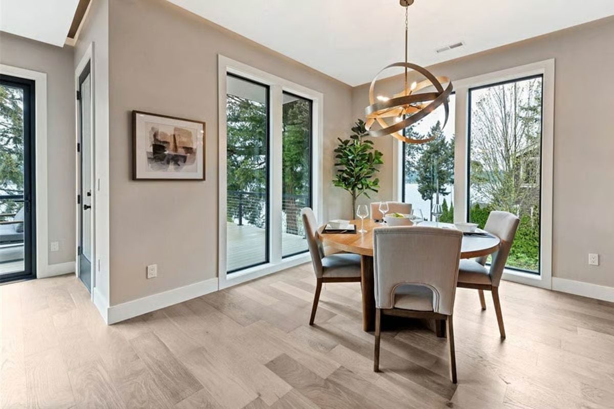
A brushed gold orb chandelier anchors a dining nook wrapped in floor-to-ceiling black-framed windows. Open water on the other side.
Trend Alert: Round dining tables have become the go-to choice for rooms with corner window arrangements like this one — they don’t fight the geometry the way a rectangular table does. It’s a pairing that rewards restraint everywhere else, which is exactly what’s happening here: bare walls, minimal table dressing, nothing competing with what’s outside the glass.
Geometric Wall Paneling, a Balcony Door That’s Actually Open, and Trees for Miles
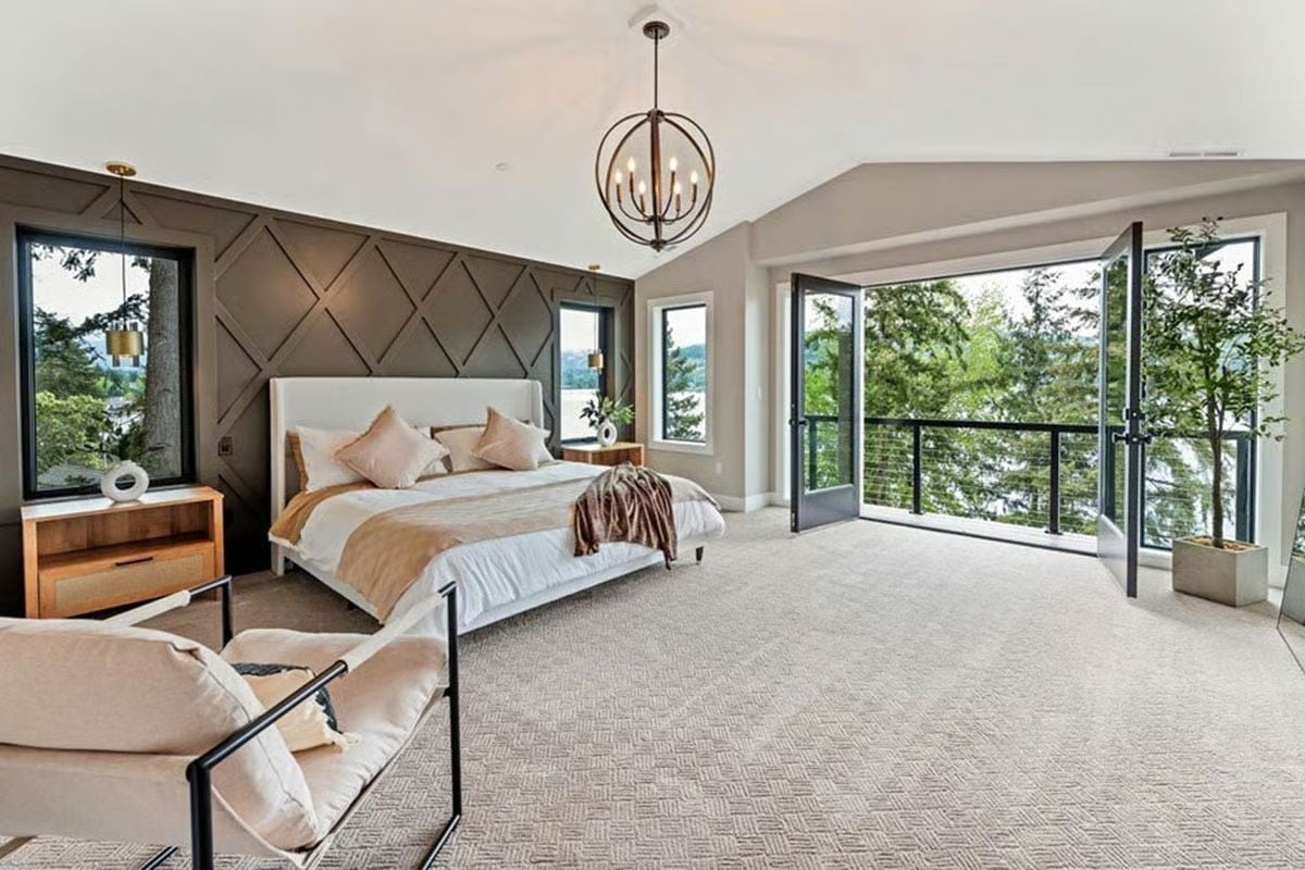
Dark paneling in a diamond grid anchors the bed wall without competing with the water view through the open French doors. Soft carpet, warm linen bedding, an orb chandelier — nothing here is fighting for attention, which is the whole reason the paneling can be as bold as it is.
The Psychology Behind This: Designers often put the most visually complex surface directly behind the bed because it gives the eye a place to land without having to scan the whole room. That diamond paneling does exactly that job. Pair it with soft textiles and a neutral floor and the drama stays in one place, which is where you want it in a bedroom.
Freestanding Tub, Bamboo Bath Caddy, and a View Nobody Earns Without the Right Lot
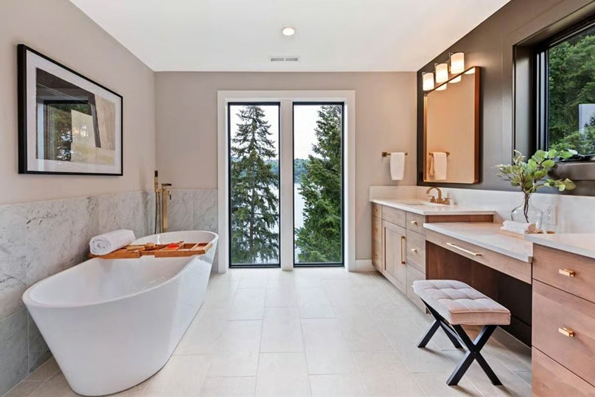
Marble wainscoting runs halfway up the wall behind a freestanding soaker tub. Gold fixtures, light wood cabinetry, tall firs through floor-to-ceiling glass. Simple lineup, hard to argue with.
Material Matters: Freestanding tubs have no deck or surround, so the plumbing roughs in through the floor instead of a wall. That changes where the drain lands and can throw off your tile layout if it isn’t accounted for early in the process. The bamboo bath caddy earns its place here for practical reasons too — with no ledge anywhere on the tub, you need somewhere to put things.
Geometric Wall Paneling in Taupe and a Wet Bar Nobody Saw Coming
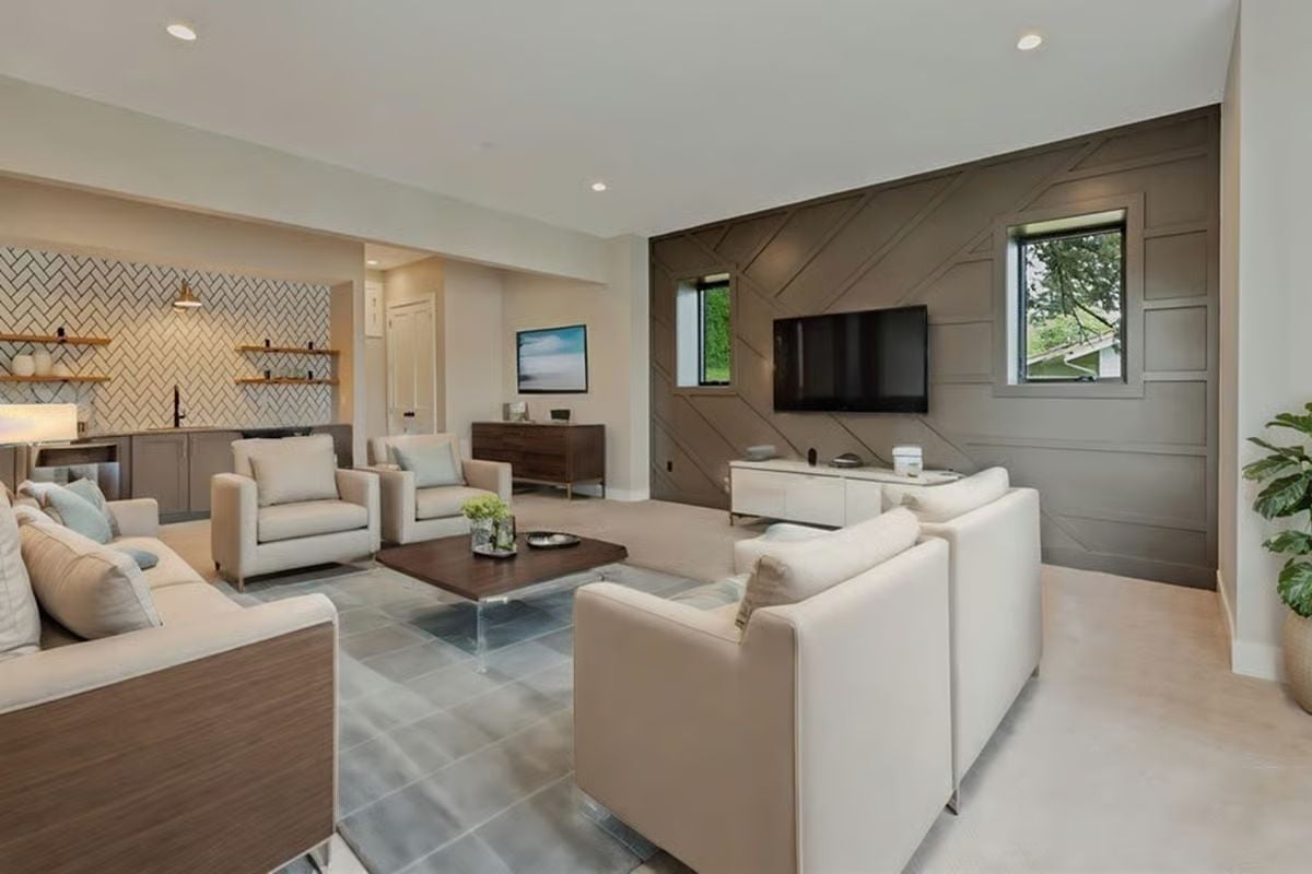
The diagonal trim work on the accent wall grounds a flat-screen without floating shelves or built-ins cluttering the space around it.
Why That Accent Wall Reads as Heavy Without Feeling Dark
Diagonal lines pull the eye sideways across a surface instead of upward — and in a lower-level room, that distinction is worth paying attention to. Vertical panels in the same space would push the proportions in the wrong direction, making a standard ceiling height feel shorter than it is. The diagonal pattern sidesteps that entirely. Taupe keeps the whole thing from crossing into feature-wall territory that announces itself too loudly, which is the easy mistake to make with a treatment this graphic.
Pin It
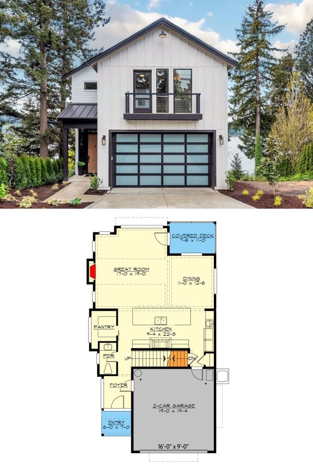
The exterior shows a modern farmhouse with white board-and-batten siding, a glass-panel garage door, and an upper balcony. The floor plan below reveals a main level with a great room, open kitchen, dining area, and covered deck, plus a two-car garage with stairwell connecting to upper floors.
