
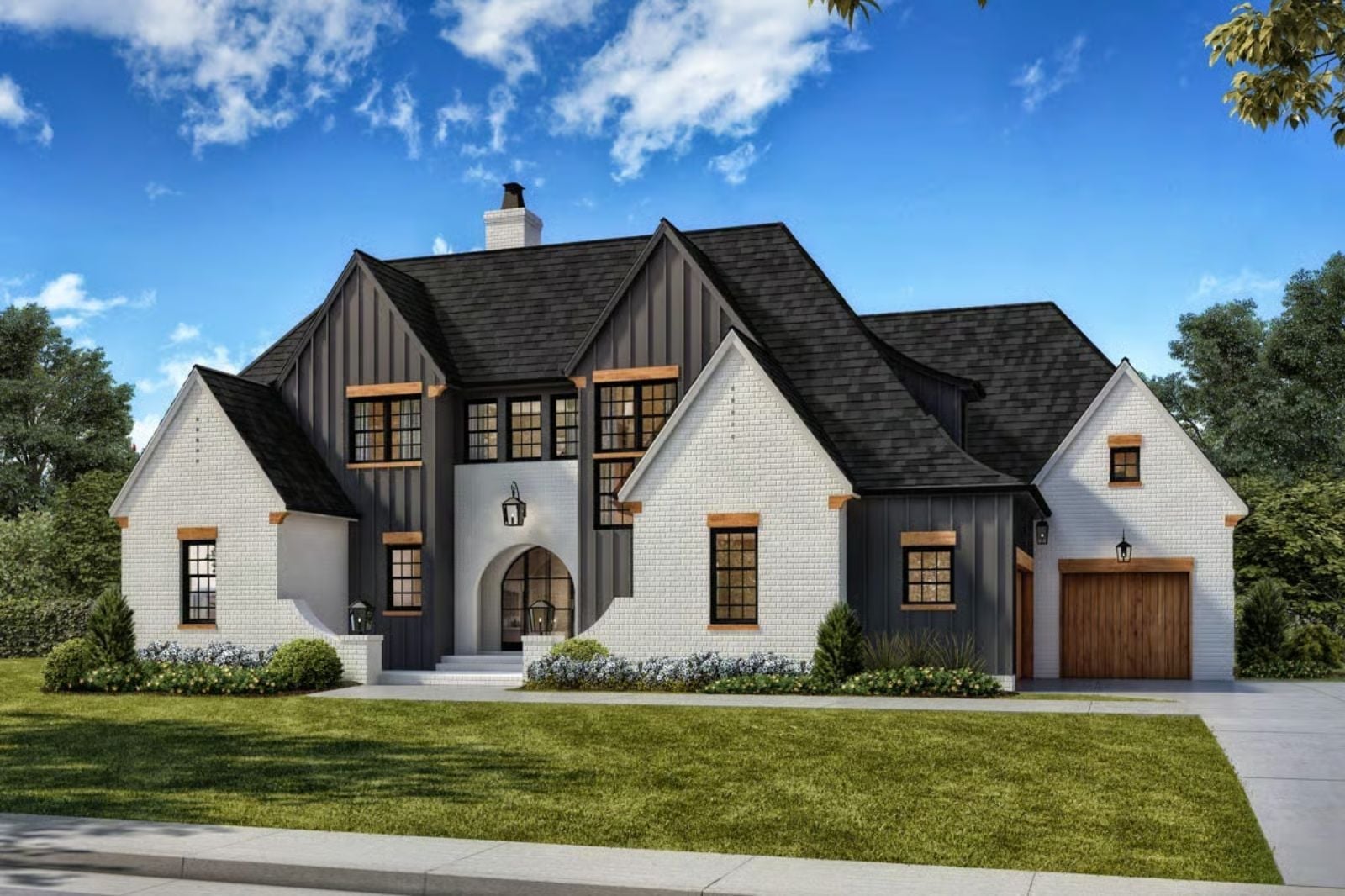
Anyone who has watched a holiday dinner splinter into four separate rooms knows the particular defeat of a house that can’t hold the people you love in one place. The Evangeline is built around the opposite of that: a lanai that pulls the whole crowd outside after dessert, a game room that keeps teenagers from disappearing entirely, a great room wide enough for the table with all the leaves in, and a kitchen designed for two people cooking at full volume.
If you’re considering refinancing, compare current mortgage offers here.
Specifications
- Sq. Ft.: 3,717
- Bedrooms: 4-5
- Bathrooms: 4.5
Floor Plan – Main Floor
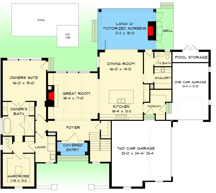
The main floor organizes the great room, dining room, and kitchen into an open central core, with the owner’s suite tucked privately to the left. A lanai with motorized screens sits just off the dining room, and the garage handles three cars total.
Floor Plan – Second Floor
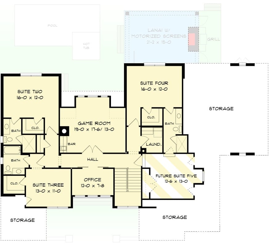
The upper level holds four suites, a game room with bar, a home office, laundry, and a second lanai with motorized screens. Suites Two and Three share the left wing, while Suite Four anchors the right near a roughed-in fifth suite.
White Brick and Raw Timber Pull Off Something Quietly Rare Out Back
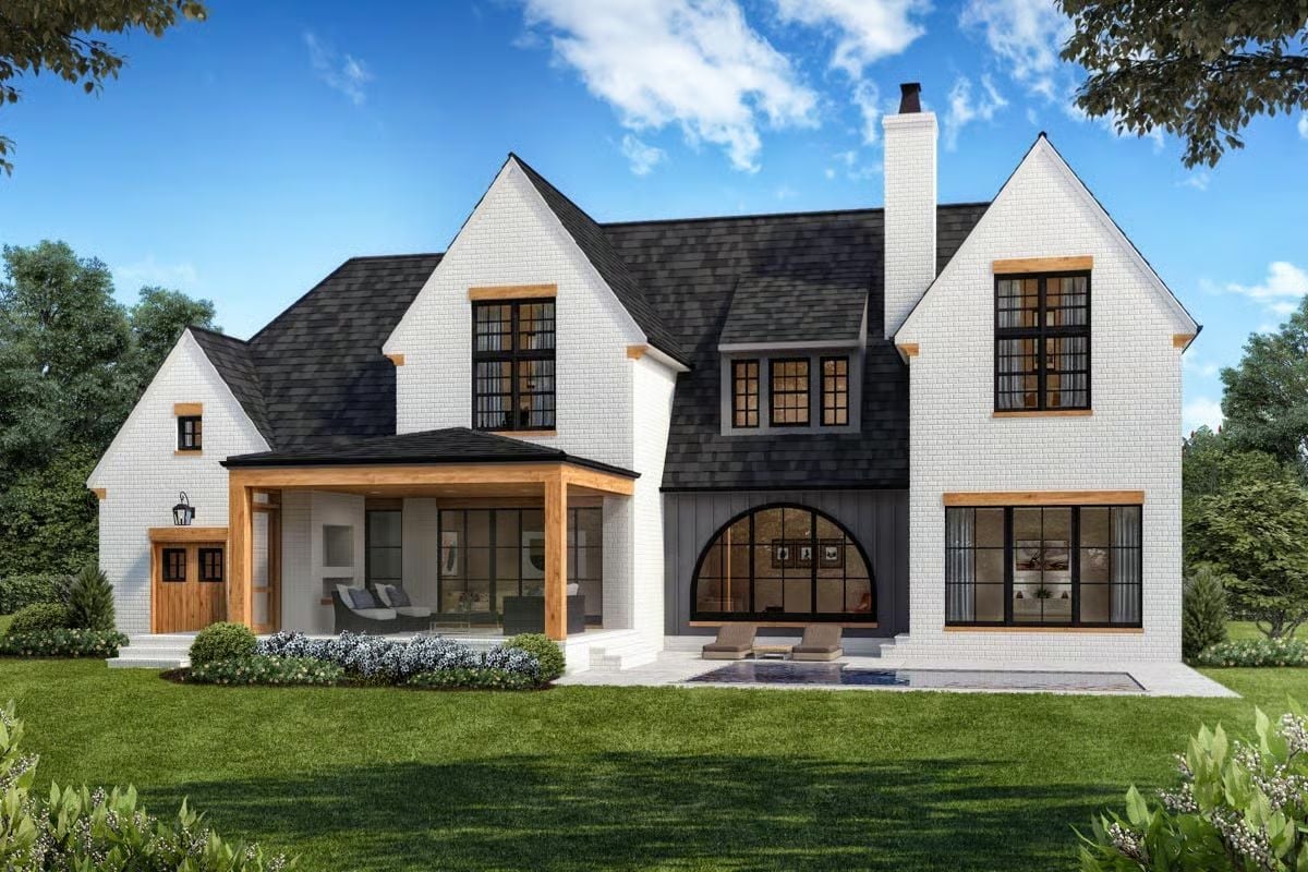
An arched picture window anchors the rear facade, warm wood framing set against painted brick in a combination that reads calmer in person than it sounds on paper.
Exposed Beams, a Black Fireplace Surround, and That Arch Window Do the Heavy Lifting
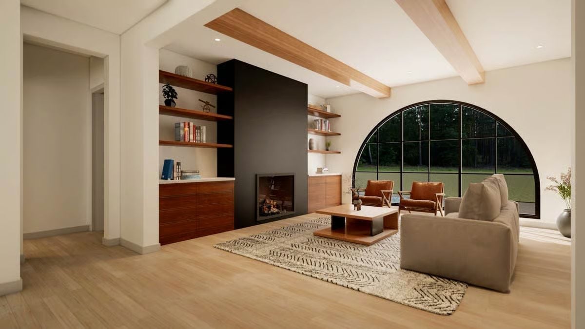
Warm wood ceiling beams run parallel overhead, grounding a room that could easily feel unmoored at this scale. Built-in shelving flanks a matte black fireplace surround, and behind the seating, a steel-framed arch window frames the tree line like a painting nobody hung — which is exactly the point of it.
Common Mistake: Homeowners often center a sofa directly in front of the fireplace, then wonder why the room feels cramped for conversation. Offsetting the seating group slightly, as shown here, lets a second chair cluster form naturally near the window without crowding the coffee table. The breathing room between those zones is what makes a large room actually function like one.
Dark Timber Cabinets Run Wall-to-Wall and Somehow Don’t Crowd the Room
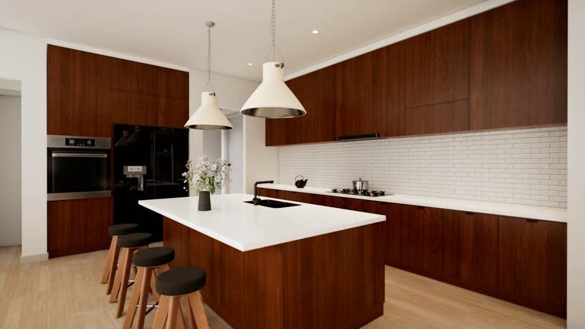
Floor-to-ceiling cabinetry in deep walnut wraps the perimeter without hardware, keeping the wall surface clean and continuous. White subway tile on the backsplash earns its keep by breaking up all that dark wood before the eye gets tired of it. Two cream pendants hang low over an island with a black undermount sink, its faucet placed noticeably off-center from the basin.
Two cream pendants hang low over an island with a black undermount sink, its faucet placed noticeably off-center from the basin.
Dark Chairs, a Mismatched White Wingback, and a Table Built for Ten
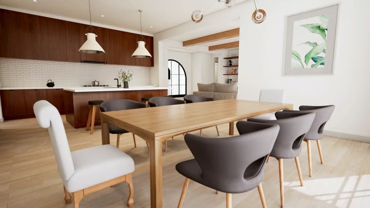
Light oak flooring runs underfoot while rich walnut cabinetry anchors the kitchen behind. That lone white wingback at the head of the table breaks the gray chair set deliberately. It works.
Did You Know: Mixing one contrasting chair at the head of a dining table is a classic designer move for making a room feel collected over time rather than ordered from a catalog in one afternoon. It also quietly signals where the host sits without anyone having to say so. Furniture sets that match too perfectly tend to read as sterile in homes where people actually live.
Walnut Platform Bed, Leaf Art, and an En Suite Door Left Open on Purpose
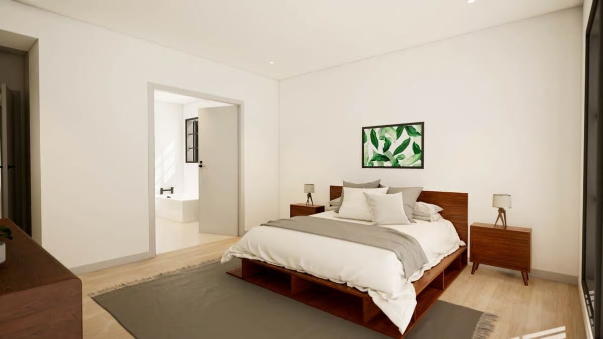
That platform bed frame does a lot of work here. Its slatted base reads almost like something you’d find in a boutique hotel, and the matching nightstands keep the wood consistent without tipping into matched-set territory. A single framed leaf print above the headboard earns its place — no gallery wall, no layered throw pillows stacked to the ceiling. Just simple choices, held together well.
- Platform beds with open bases visually lighten a room more than box frames do
- Matching nightstands in the same wood tone as the headboard creates continuity without requiring a matched set
- Leaving an en suite door open in a rendering signals usable square footage, not just floor area
Dual Vanities, a Soaking Tub, and a Shower Tucked Behind Black Steel
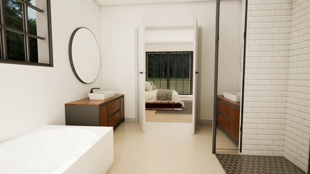
Two vessel sinks sit on wood-fronted vanities, each with its own round mirror. White subway tile lines the shower wall behind black steel framing. Through the open door, the sightline runs straight into the bedroom — not accidental.
Why It Works: Positioning the bathroom door so it frames the bedroom window beyond creates a visual axis that makes both rooms read larger than they are. It’s a small planning decision with an outsized payoff, and it costs nothing to ask your designer about it early in the process before walls get locked in.
Wicker Baskets on a Dark Counter, Subway Tile Behind, and It Works
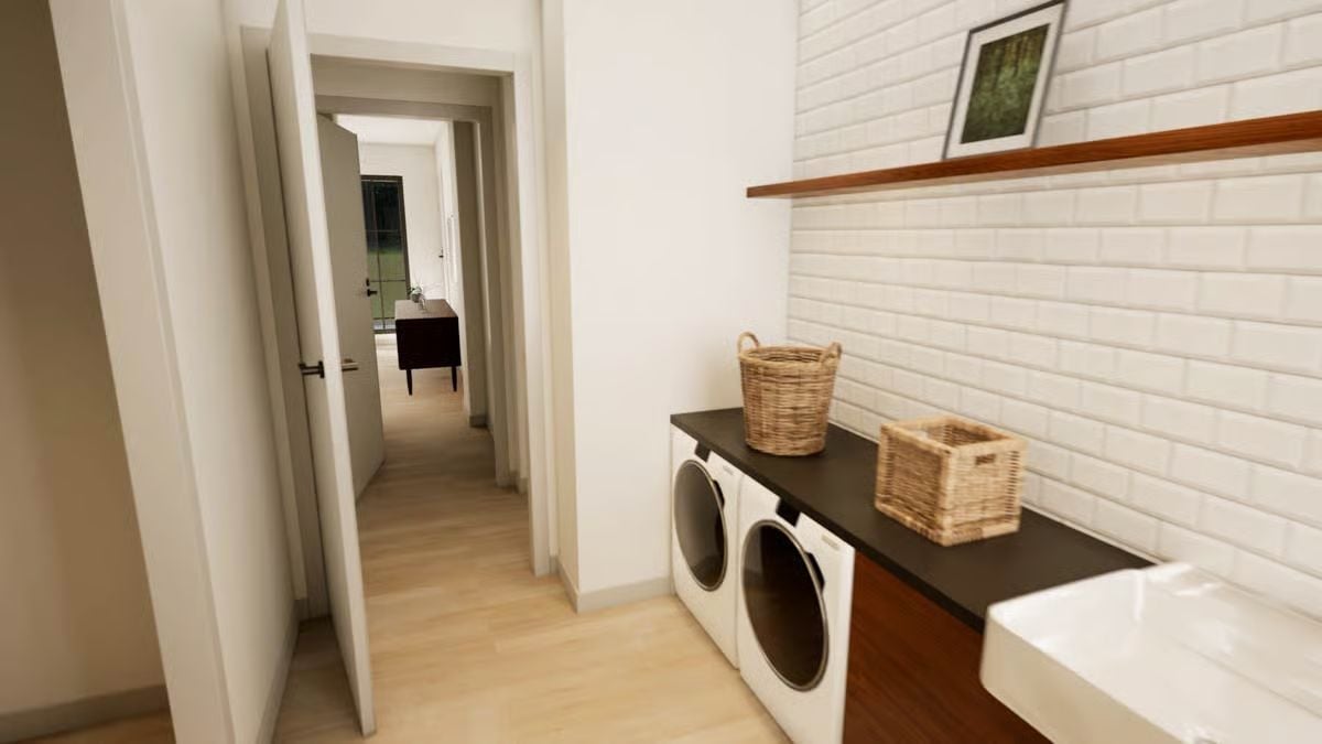
Side-by-side washer and dryer sit below a dark countertop lined with wicker storage baskets. Unglamorous room. Does its job.
By The Numbers: Stacking a washer and dryer saves floor space, but side-by-side placement like this allows for a continuous countertop above — folding surface that stacked units simply can’t offer. If you’re designing a laundry room from scratch, that counter real estate is consistently the feature homeowners wish they’d prioritized before the plumber showed up.
Pin It
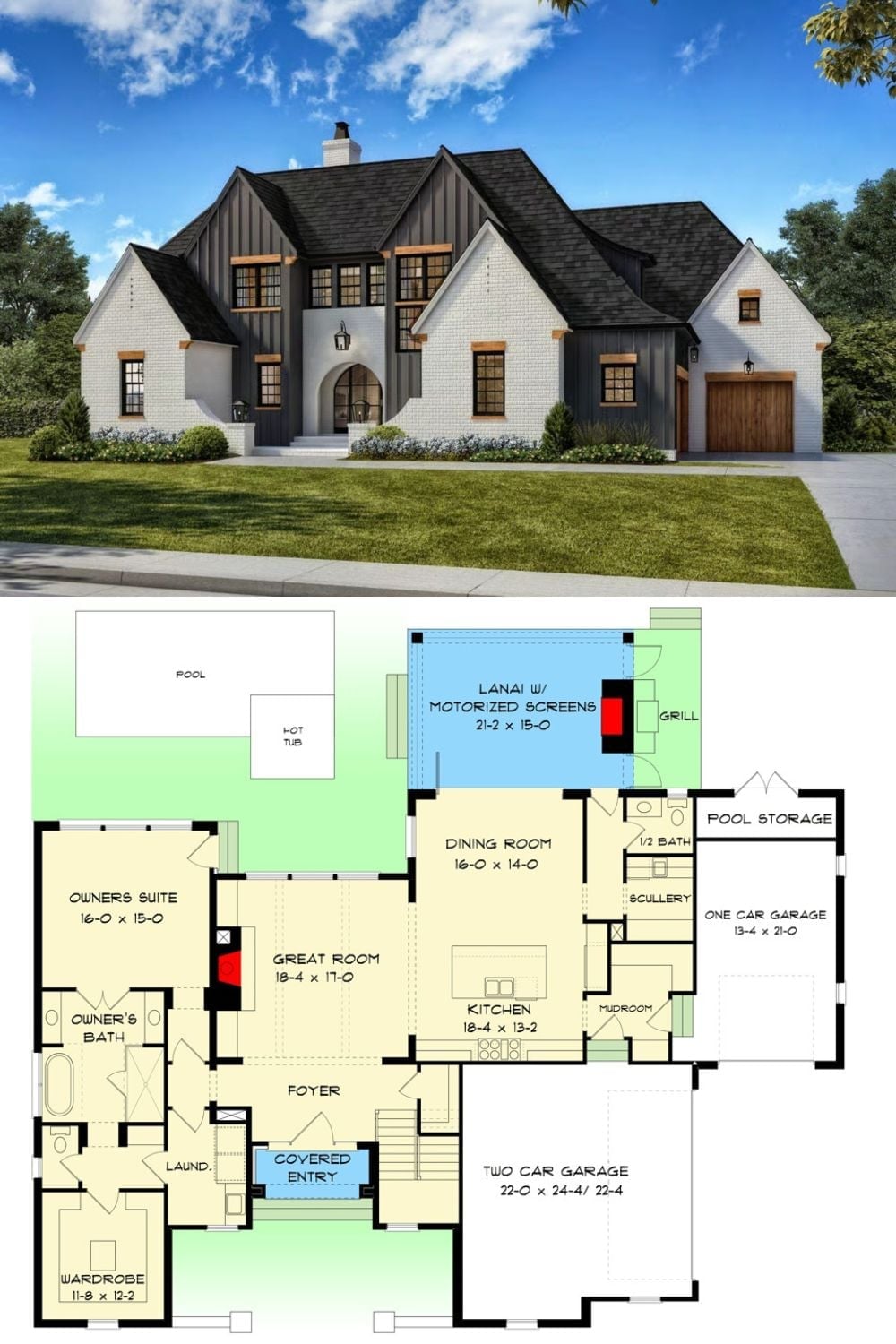
Exterior rendering shows a white brick European transitional with board-and-batten accents above; floor plan below reveals an owner’s suite, lanai, and two-car garage on the main level.
Worth Knowing: Scullery spaces are having a genuine comeback in family homes. Tucked between the kitchen and mudroom here, it hides prep mess from the dining room — which matters more than people expect once they’ve hosted a dinner party and realized guests can see every dish they own piled in the sink. Essentially a second working kitchen, without the footprint of one.
