
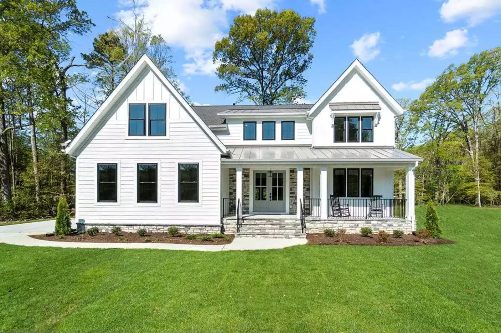
The bonus room every family had in the nineties — the one above the garage with the beanbag chairs and the old television nobody cared about — was where kids actually disappeared for hours. The Ensley is built around that logic: a main-floor primary for parents who are done with stairs at midnight, an open kitchen where dinner conversations stretch past dessert, and a bonus room that gives teenagers somewhere to be without leaving home.
Specifications
- Sq. Ft.: 3,135
- Bedrooms: 4
- Bathrooms: 3
Floor Plan – Main Floor
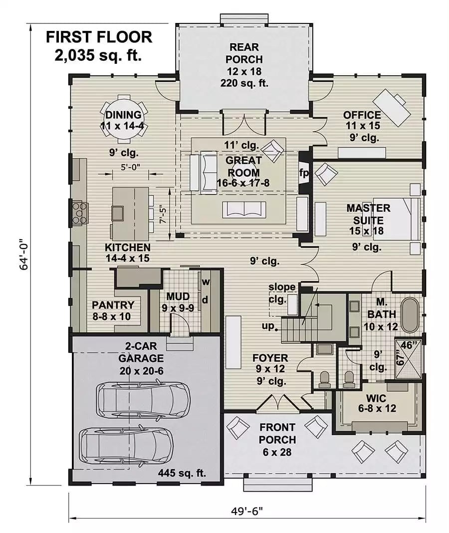
The first floor puts the primary suite on the main level, tucked beside the great room with its own bath and walk-in closet. A mudroom connects the garage to the kitchen, keeping traffic organized and the rest of the house insulated from whatever comes in through that door. The rear porch opens off the great room. At 2,035 square feet, it lives larger than it looks.
Floor Plan – Second Floor
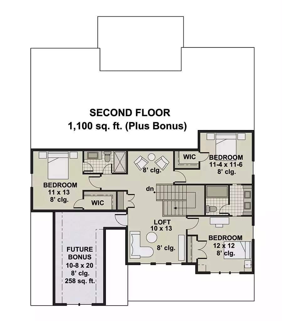
Upstairs, three bedrooms cluster around a central loft, with a shared bath serving two of them. Two bedrooms get walk-in closets. The future bonus room tacks on 258 square feet of unfinished space — leave it rough or finish it out later when you actually know how you live.
Rustic Cabinet, Wine Storage, and French Doors That Actually Earn Their Keep
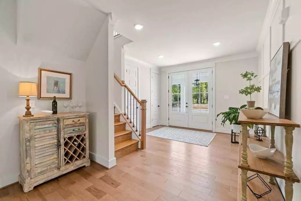
The distressed shutter-door cabinet pulls double duty as wine rack and bar station, stemware already staged and ready. Hardwood floors run straight to the French door entry, drawing natural light deep into the foyer, while wrought-iron stair balusters anchor the space without crowding it. Lived-in and light at the same time.
The Psychology Behind This: Foyers that combine storage with display cues tell arriving family members there’s a place for everything, which quietly takes the edge off entry-point chaos. The wine rack at eye level sends a social signal too — guests read it as a relaxed house rather than a formal one, and that first impression tends to shape how everyone behaves for the rest of the visit.
Exposed Beams, a Live Fire, and Sight Lines That Pull the Room Together
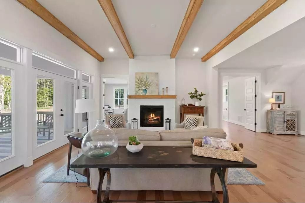
Warm oak ceiling beams draw the eye straight to a brick fireplace with a wood mantel. The low-profile sofa, dark coffee table, and oversized glass vessel keep the scale honest — nothing here is trying too hard, which is exactly why it works.
Common Mistake: Homeowners often hang artwork too high above a fireplace mantel, leaving a visual gap that makes both pieces feel unanchored. Keep the bottom edge of the art within six to eight inches of the mantel surface. If it feels cramped at that distance, the piece is probably too large for the wall — not too close to the mantel.
Navy Cabinets, a Wood Island, and Pendant Lights That Know Their Scale
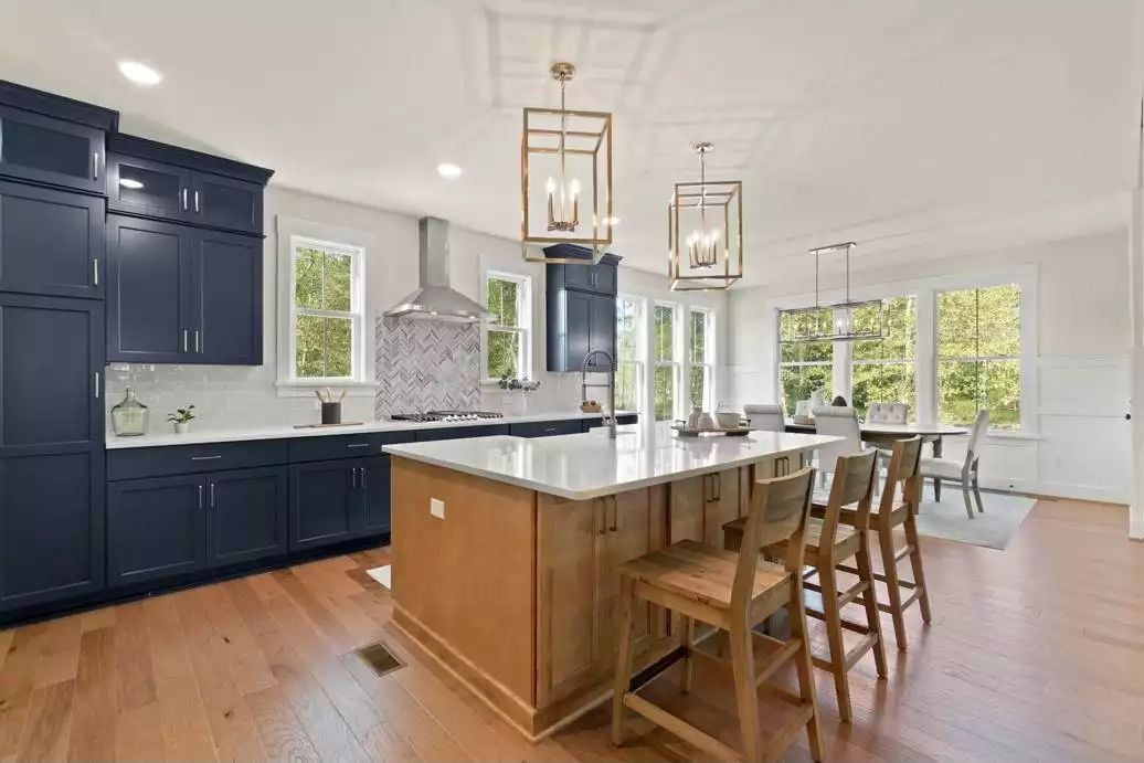
Navy perimeter cabinets paired with a natural wood island is a deliberate contrast — one that keeps the kitchen from reading as too heavy on one end or too cold on the other. Lantern pendants sized generously enough to anchor the island without competing with the range hood behind them. That balance is harder to pull off than it looks.
Why It Works: Two-tone cabinet kitchens succeed when only one surface carries the color. Here the island stays neutral, so the navy reads as a choice rather than an accident. It adds visual depth without committing every surface to the same finish — a straightforward move that a lot of kitchen renovations overcomplicate.
Gold-Frame Chandelier, Tufted Linen Chairs, and Windows That Do the Heavy Lifting
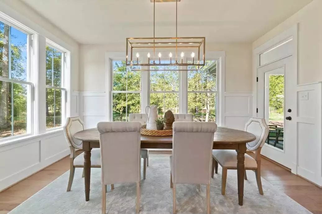
The candle-style chandelier hangs low enough over the oval table that it actually feels connected to the room rather than floating somewhere near the ceiling.
Candle-style chandelier sits low enough over the oval table that it actually feels connected to the room below it.
Blue Nightstands, Transom Windows, and an En Suite That Earns Its Slide
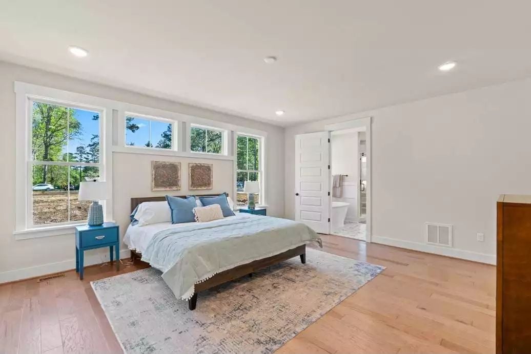
Teal nightstands against light hardwood floors keep the palette grounded without going cold. Transom windows above the bed pull in treetop light while leaving the headboard wall free to stay furnished. And the pocket door to the en suite is the kind of quiet, practical detail you don’t appreciate until you’ve lived with a swinging door in a tight space.
Color Story: Soft blue-gray bedding shifts depending on the light source — cooler under recessed LEDs, warmer near a window at midday. If you’re committing to a blue accent in a bedroom, a wood-toned bed frame keeps it from drifting into cold territory. Natural wood pulls the whole palette back toward something that actually feels like a room you want to sleep in.
Freestanding Tub, Patterned Tile, and a Vanity That Gets the Hardware Right
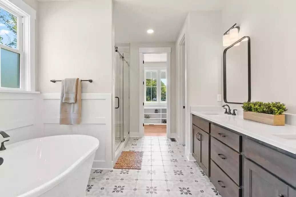
Dark cabinet hardware pulls the eye toward the sink side, giving the freestanding tub a counterweight so it doesn’t dominate the room. Geometric floor tile anchors the space without competing with the white board-and-batten walls behind it. Simple instincts, executed cleanly.
- Matte black fixtures read more cohesive than mixed metal finishes in small bathrooms
- Freestanding tubs need at least 6 inches of clearance on all sides for comfortable use
- Board-and-batten wainscoting protects walls from moisture while adding architectural weight at eye level
Covered Porch, French Doors, and a Striped Rug That Anchors the Whole Thing
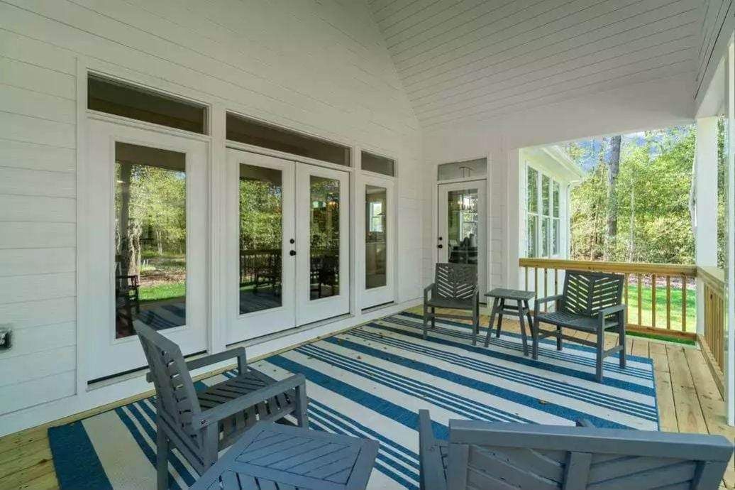
Gray wood chairs on a blue-and-white striped outdoor rug, French doors lining the wall behind them, natural wood railings framing the open side. It’s a covered porch that actually gets used — not just one that looks good in listing photos.
By The Numbers: Covered porches add usable square footage without the cost of fully conditioned space. A roof overhang over the deck surface keeps wood decking noticeably cooler underfoot on summer afternoons — something most buyers don’t think about until they’ve spent a July without one.
Pin It
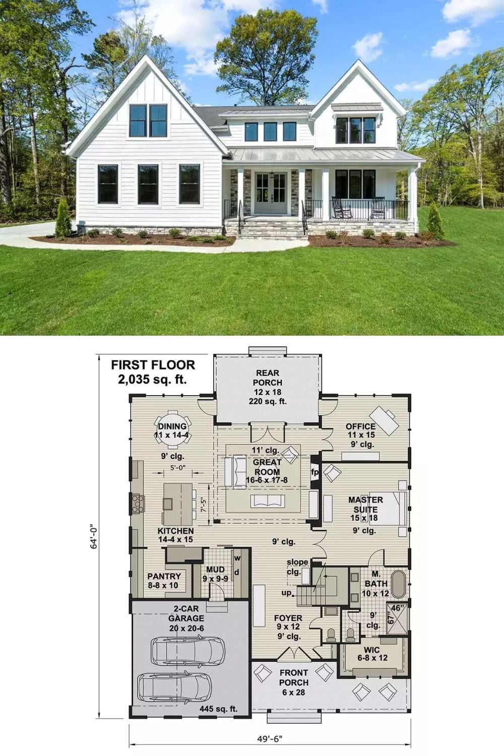
Outside, a white board-and-batten farmhouse with a covered front porch and stone accents sits on a wide lawn. Below it, the first-floor plan lays out 2,035 square feet organized around a central great room, the primary suite, office, and rear porch all accessible without cutting through secondary spaces.
