
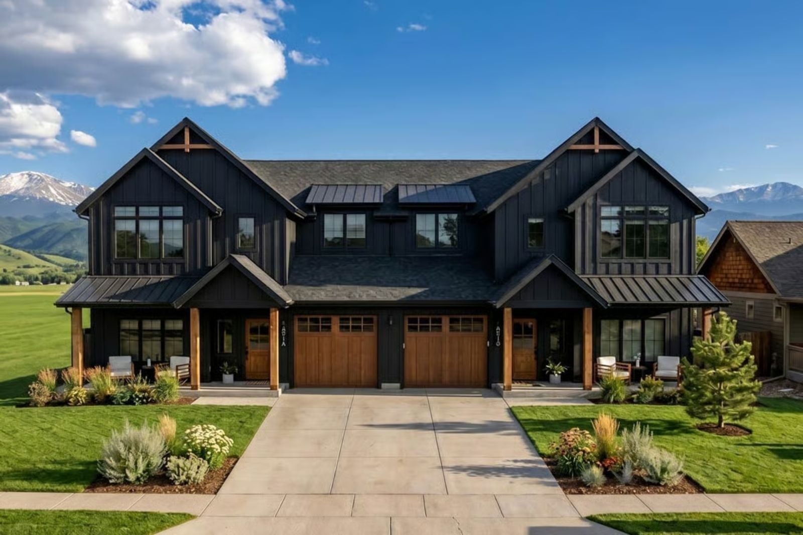
Flex rooms tell you exactly who this house is built for: families that need space to shift as the people inside it shift — grandma’s craft room this year, a teenager’s homework retreat next year, a guest suite when everyone comes for Thanksgiving, and two coffeemakers are already running by seven in the morning. The Emmett Ridge is built around that kind of living, with dual-unit separation, shared circulation that keeps the peace, flex rooms on each side, and a farmhouse frame that makes all of it feel like one home instead of two.
Specifications
- Sq. Ft.: 4,354
- Bedrooms: 6
- Bathrooms: 6
Floor Plan – Main Floor
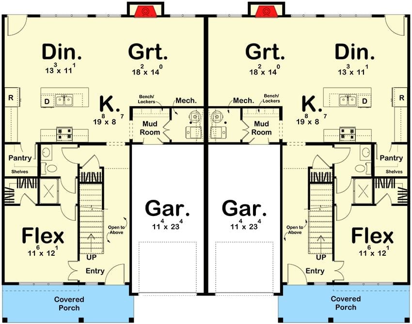
Each mirrored unit on this duplex first floor runs from a covered porch entry through a flex room and staircase, past a garage with mud room access, into an open kitchen, dining, and great room layout. Pantry and half bath tuck neatly beside the kitchen. The symmetry is nearly perfect — either unit feels complete on its own, which is kind of the whole point.
Floor Plan – Second Floor
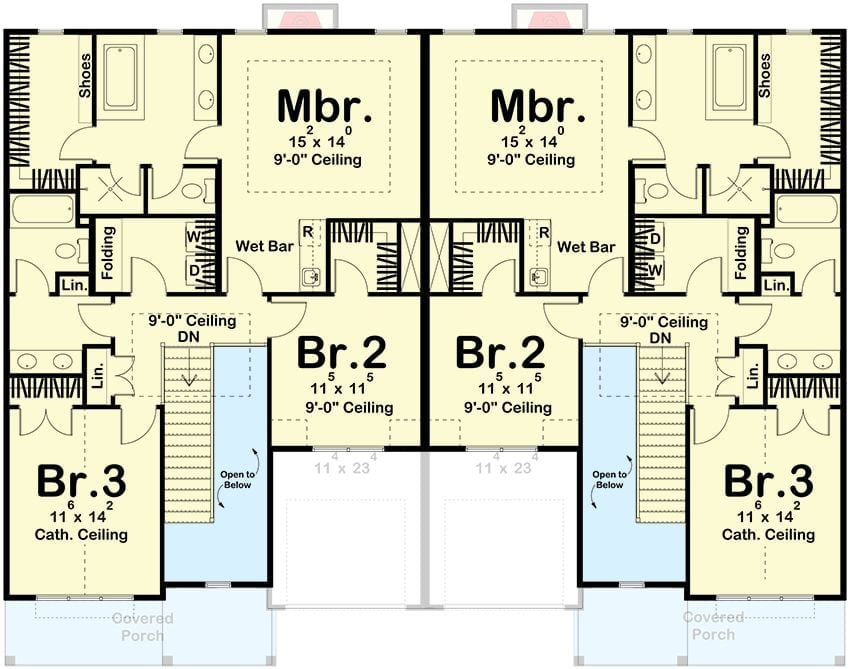
The upper level mirrors the same logic: each unit gets a master suite, two additional bedrooms, a wet bar, and an open stairwell connecting it all.
Dark Siding, White Fence, and a Backyard That Actually Gets Used
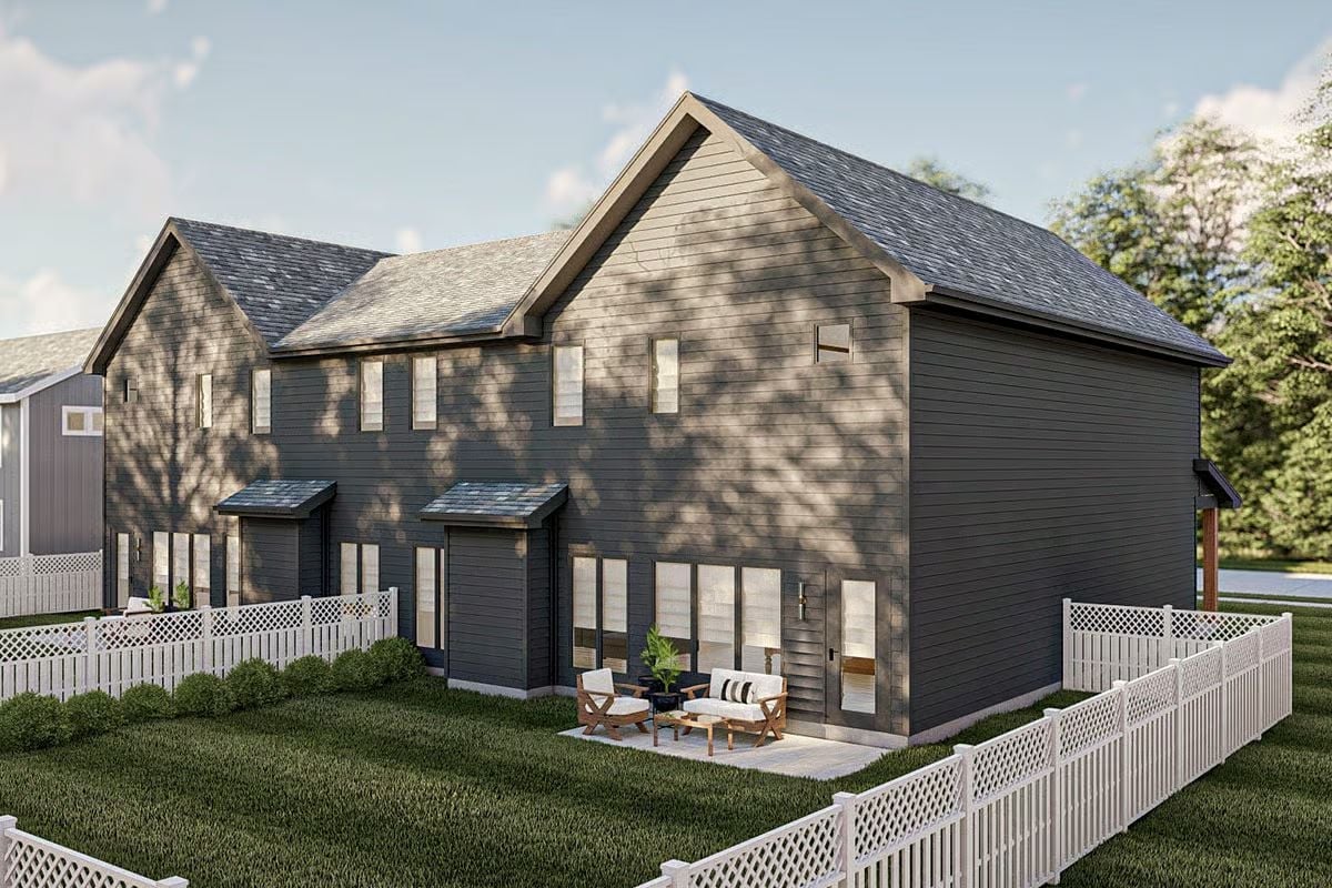
Charcoal lap siding dominates the rear elevation, paired with a small patio where wood-framed chairs sit ready for actual use rather than staging. Gabled rooflines signal two separate units sharing one structure without advertising the fact.
Style Math: Dark gray siding plus crisp white lattice fencing is the whole formula here. It reads modern farmhouse without straining for it. The outdoor seating area confirms this plan was drawn by someone who actually wanted people to go outside, not just admire the elevation from the driveway.
Shiplap, Soft Linen, and a Fireplace That Does the Heavy Lifting
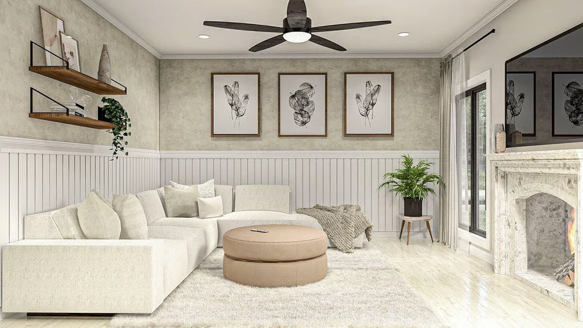
Wainscoting this crisp earns its place in a room.
Board-and-batten paneling runs halfway up the wall, letting the textured upper finish breathe above it. Three leaf-print frames keep things from going blank without cluttering. The round ottoman gathers the seating area without locking it down, and the whole thing holds together on restrained choices rather than bold ones.
Warm Oak, Sculptural Light, and Windows That Earn Their Square Footage
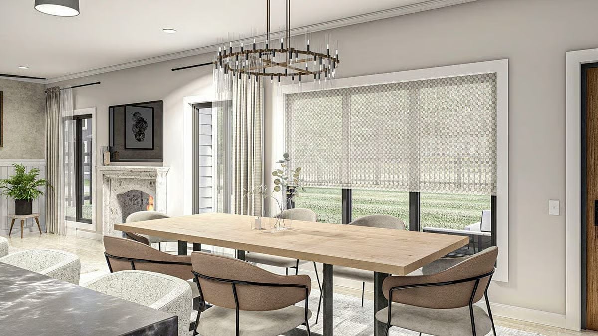
That chandelier does real work — brass ring and cascading stems pulling the eye upward without competing with the oak tabletop below. Sheer roller shades diffuse the backyard light rather than block it. Taupe chairs with slim black frames keep everything grounded without flattening the room.
Why It Works: Pairing a light wood tabletop with dark metal legs is one of those combinations that photographs well and holds up in daily life. It won’t show every scratch. It won’t feel precious. In a dining room built for a household that genuinely eats together, that kind of durability matters more than it gets credit for.
Gold Hardware, Two-Tone Cabinets, and an Island Built for Actual Cooking
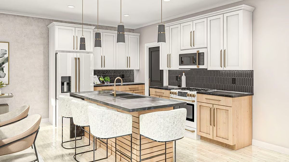
Black hexagonal tile backsplash anchors the whole kitchen. Natural wood lowers pair with white uppers, and the dark waterfall island countertop keeps things grounded without going heavy. Gold hardware ties both cabinet tones together without having to work very hard at it.
Quick Fix: Black tile backsplash is having a moment, but grout color is what most people overlook. Dark grout on dark tile hides staining and cuts down on resealing — a low-maintenance choice that reads intentional rather than accidental.
Built-In Shelving, Woven Baskets, and a Chandelier That Commands the Room
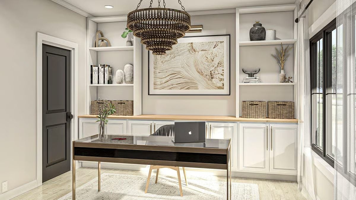
A bronze beaded chandelier pulls focus while a warm butcher block countertop anchors the built-in shelving below. The woven baskets do the actual storage work and happen to look good doing it.
Material Matters: Butcher block gets written off as a kitchen-only surface, but it works just as well on office built-ins, where the warmth of wood softens what could easily read as sterile cabinetry. It’s also easier to refinish than most people assume — a light sand and a fresh coat of oil brings it back without pulling everything apart.
Faux Fur, Leather Bench, and Roman Shades Doing Exactly What They Should
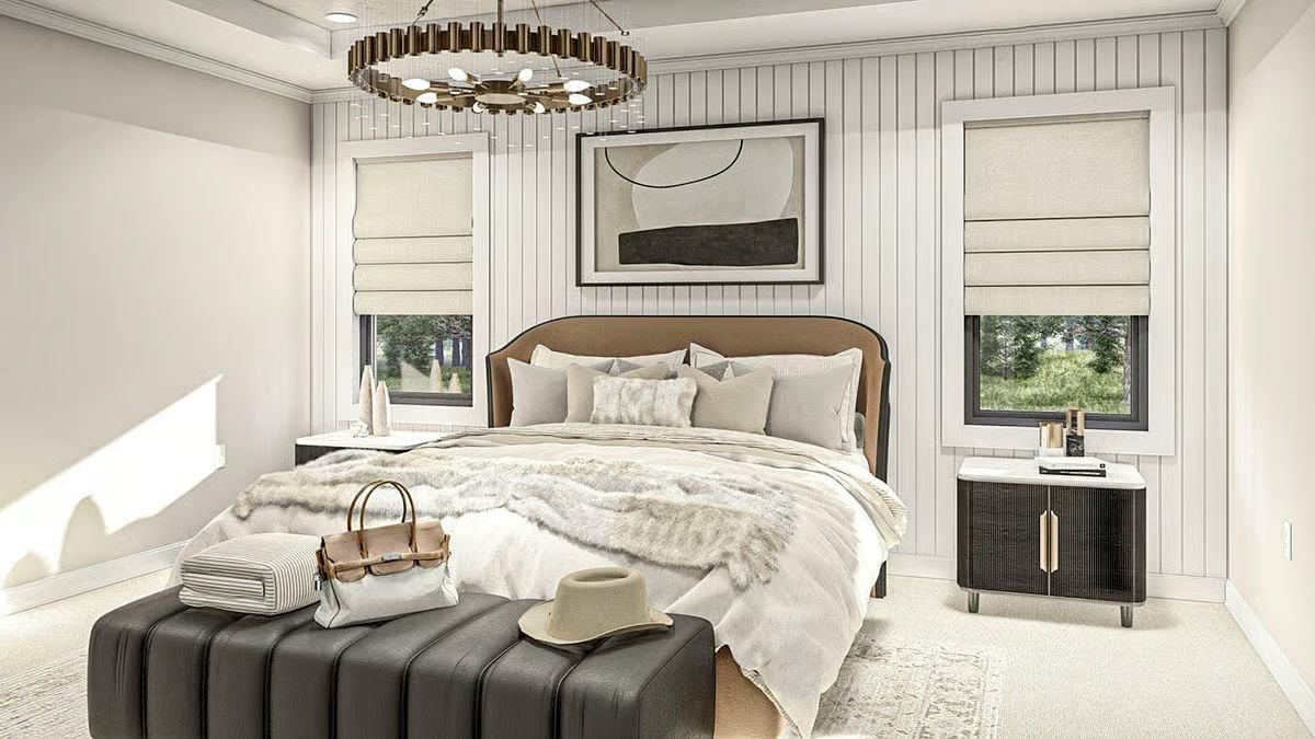
Roman shades in a linen weave keep the light soft without sacrificing the garden views. The curved caramel headboard anchors the neutral bedding without fighting it, and the faux fur throw adds texture where the bed actually needs it. Striped shiplap on the accent wall does its job quietly — which is exactly what an accent wall should do.
Trend Alert: Curved headboards keep showing up in bedrooms that otherwise lean minimal. The arc softens a room full of hard lines without requiring a pile of additional décor to do the same job — one of the more practical ways to add visual interest at the focal wall.
Tiered Crystal, Matte Black Fixtures, and a Soaking Tub That Earns Its Square Footage
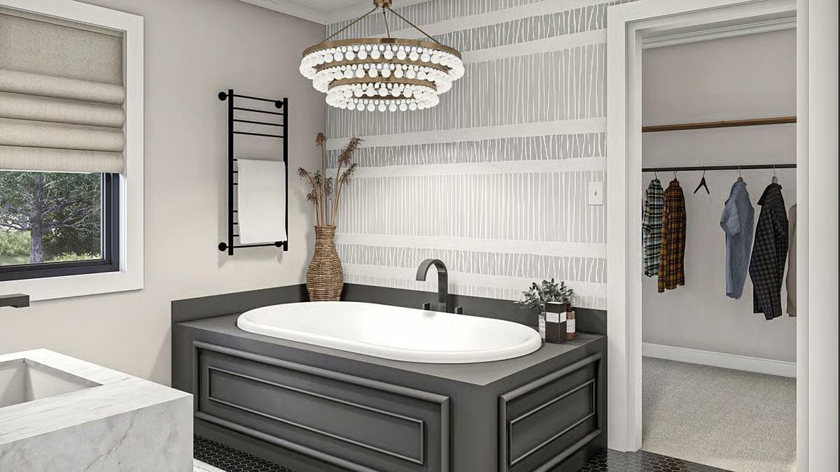
Drop-in tub sits inside a dark cabinet surround, with a beaded chandelier overhead and textured tile climbing the wall behind it.
Why That Freestanding Tub Surround Works Harder Than You’d Think
Most drop-in tubs sit flush with tile or stone, but framing one inside a painted cabinet surround changes how the whole room reads. It gives the tub a furniture-like presence instead of making it look like a hole cut into a deck. The matte black faucet mounts directly on the surround, keeping the plumbing visible without hiding it under a platform — which also makes future repairs far less painful than they’d otherwise be.
Pin It
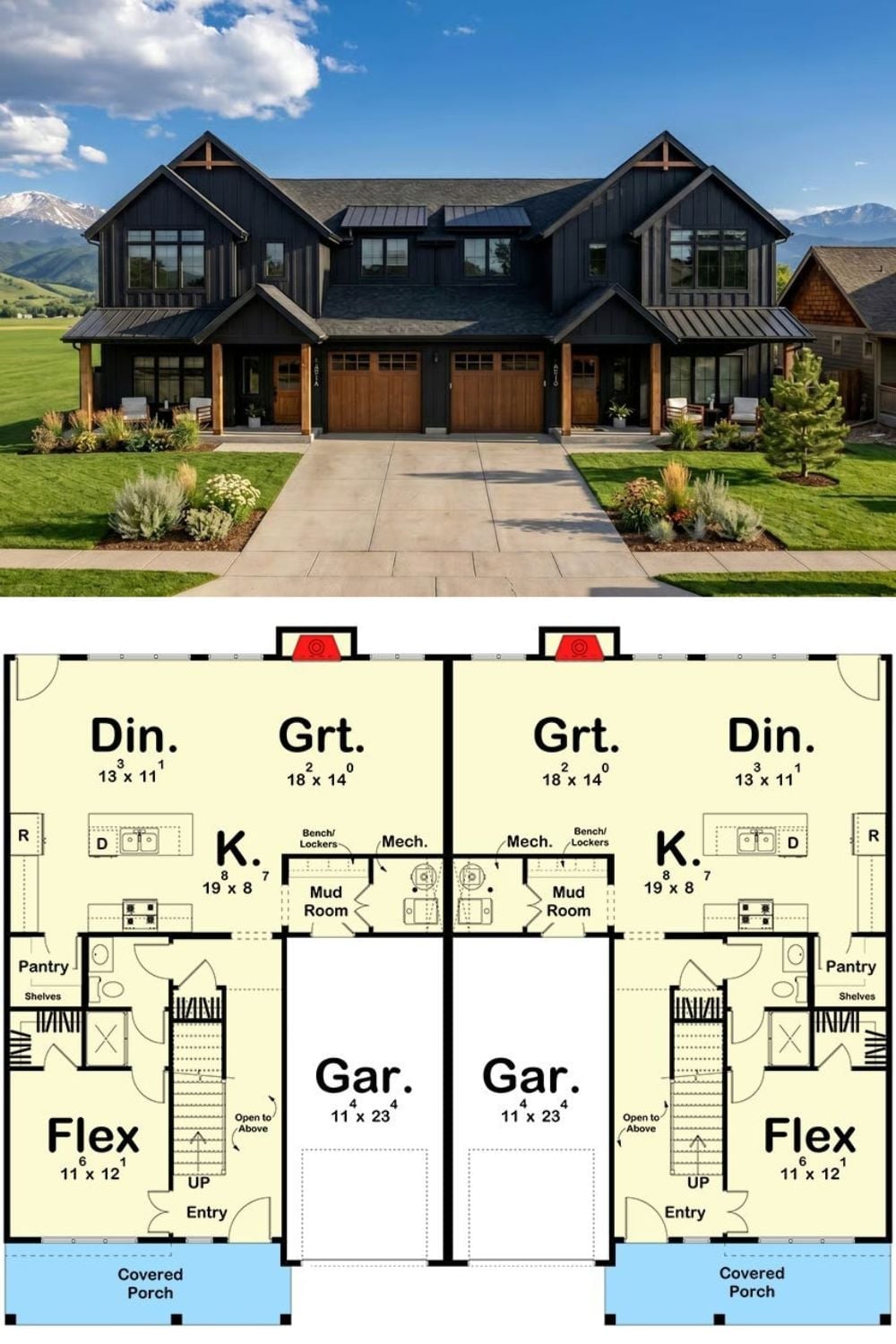
Exterior rendering of a symmetrical duplex paired with its mirrored first-floor plan below.