
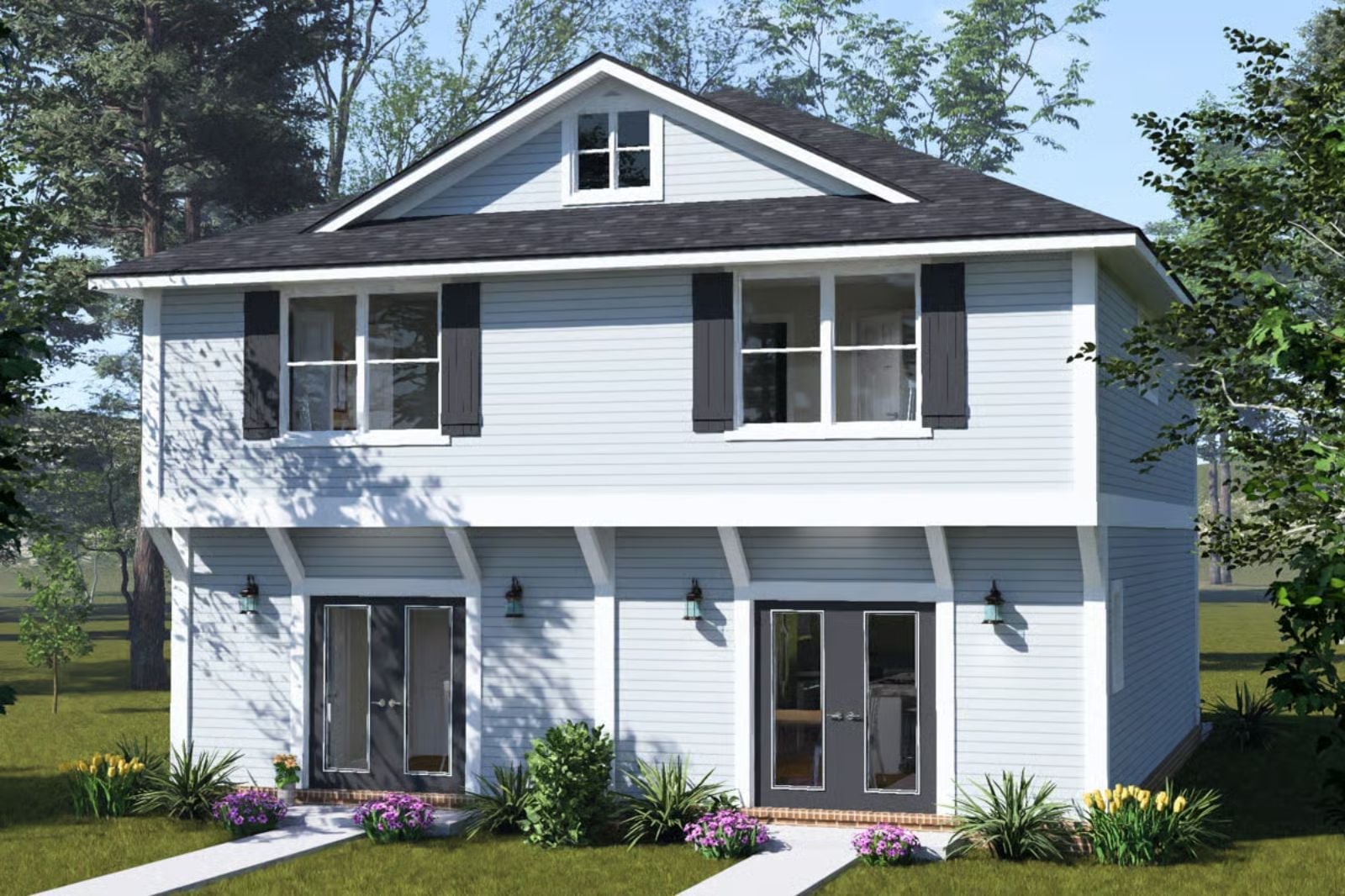
Sharing a roof does not require sharing a life — Grandma’s coffee at six, yours at seven, her shows on low while you debrief the school morning in your own kitchen, and that study alcove quietly absorbing whatever work followed you home. The Ellery is built around exactly that: two distinct units under Craftsman bones, a dedicated study alcove, and separate entrances that make the whole arrangement feel chosen rather than tolerated.
Deciding between renovating and moving? Check today’s mortgage rates as you compare the two options.
Specifications
- Sq. Ft.: 1,152
- Bedrooms: 2
- Bathrooms: 2.5
Floor Plan – Main Floor
Have a saved folder full of home improvement ideas? See today’s home equity rates when you’re ready to explore financing.
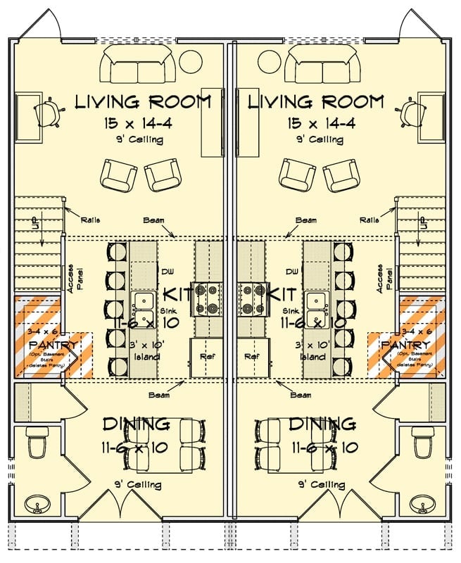
The main level mirrors two identical units side by side, each with a 15×14-4 living room up front and a dining area at the rear. Kitchens share a central wall, with islands and pantry options tucked beside stair access, and nine-foot ceilings run throughout both units. Compact, yes. But each one functions completely independently.
Floor Plan – Second Floor
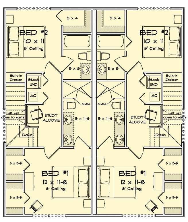
Upstairs, each mirrored unit stacks two bedrooms under 8-foot ceilings, with a study alcove tucked beside the stair and two full baths. A built-in dresser, stacked washer/dryer, and AC share a utility nook. Bedroom 1 runs a generous 12 by 11-8.
Matching Patios Out Back Make Sharing a Yard Feel Less Like a Compromise
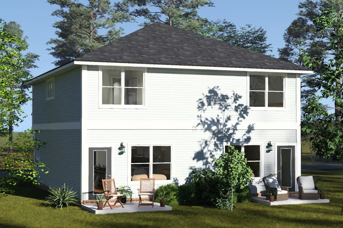
White lap siding, two separate back entries, and independently furnished patios do most of the privacy work before anyone even steps inside.
Cream Tufted Loveseat Does a Lot of Heavy Lifting in a Small Shared Space
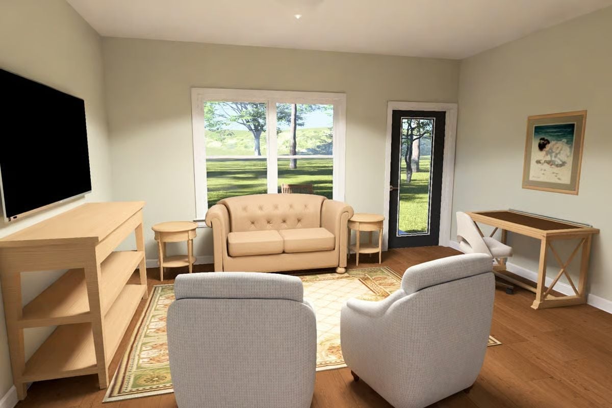
Two gray armchairs face a tufted cream loveseat across a patterned rug, keeping conversation central rather than TV-forward. Sliding glass doors pour natural light across the hardwood floors, which does a fair amount to keep the room from feeling as small as the square footage actually is. Furniture scale is doing real work in here.
- Loveseat’s rolled arms and button tufting add visual weight without crowding the floor
- Side tables flanking the sofa keep lamps and remotes off the floor
- Light wood TV console and desk match, so the room doesn’t feel furnished in shifts
Granite Island Long Enough to Seat the Whole Family Plus the In-Laws
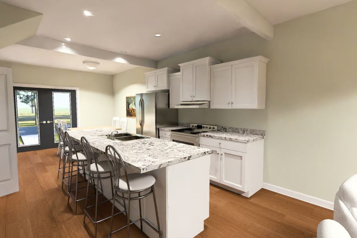
Bar stools line a generous island topped in veined white granite that continues across the perimeter counters. Stainless appliances and recessed lighting sit against warm hardwood floors — a palette that holds together without looking like a showroom.
History Corner: Kitchen islands became a staple of American home design in the late 20th century, driven largely by the open floor plan movement that picked up steam in the 1980s and 1990s. Before that, most kitchens were closed-off rooms meant strictly for cooking — not lingering. Seating at the island reflected a broader shift in how families actually spend time together at home, and that shift stuck.
Maple Dining Table Earns Its Place Between the Eating and the Cooking
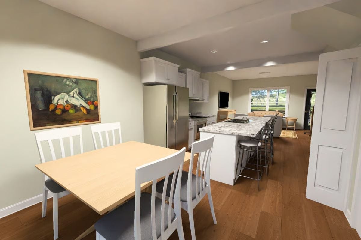
The maple dining table sits close enough to the granite island that passing dishes requires no effort at all. White cabinetry, a stainless fridge, and warm hardwood floors keep the palette grounded, while a framed still-life on the wall provides the one note of color the room was quietly waiting for.
By The Numbers: Stainless steel appliances first took hold in residential kitchens during the 1990s, borrowing their look from commercial cooking spaces, and they’ve stayed dominant ever since — partly because they read as neutral against almost any cabinet color. Medium-tone oak hardwood remains among the most requested finishes in open-plan renovations.
Rocking Chair by the Door Says Someone Already Claimed Their Corner
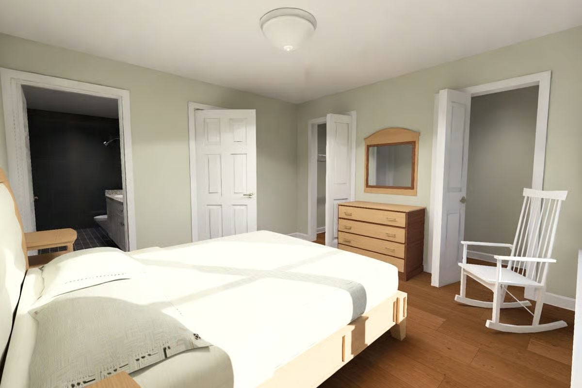
Warm wood tones carry through the bed frame, dresser, and mirror without tipping into matchy territory. Soft sage walls keep the light from feeling cold even on a gray morning. And that rocking chair positioned right by the door — it belongs to whoever’s moving in. You know who.
Did You Know: Rocking chairs have been part of American bedroom furniture tradition since the 18th century, long favored for their calming motion. The spindle-back style shown here traces its form to Windsor chair designs common in Colonial-era homes — a shape that’s changed remarkably little in three hundred years.
Slate Tile and White Cabinetry Pull in Opposite Directions and Both Win
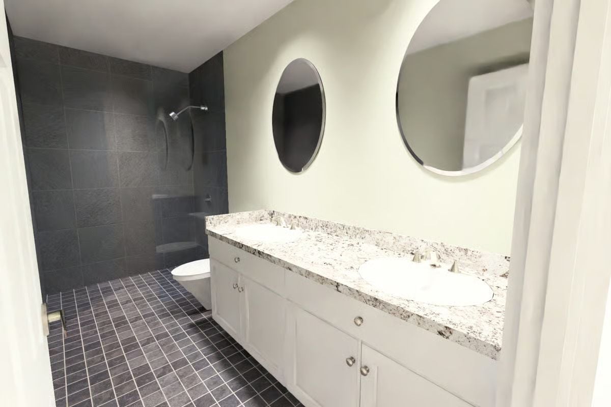
White and charcoal granite runs the full length of the double vanity, grounding the room before your eye reaches the walk-in shower. Dark slate wall tile gives the shower its own weight. Round backlit mirrors keep it from going heavy.
Style Tip: Matte mosaic floor tile, like the small-format slate used here, grips better when wet than large-format polished stone — a practical reason to go smaller underfoot in wet areas that has nothing to do with aesthetics. The grout lines add visual texture that larger tiles simply can’t replicate, so the practical choice ends up being the better-looking one too.
Natural Light Does the Work in a Study Alcove Built for Actually Getting Things Done
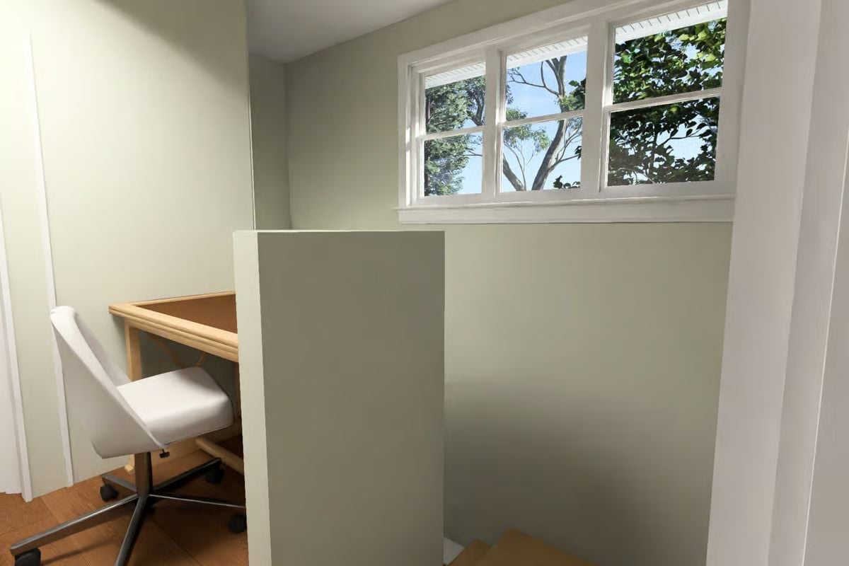
Tucking a desk into a dedicated alcove above the stairwell is one of those decisions that sounds odd until you use it daily.
Daylight from the triple window lands right on the work surface. Rolling chair, no overhead clutter, no door to close. Quiet by design — which is the whole point of an alcove.
Pin It
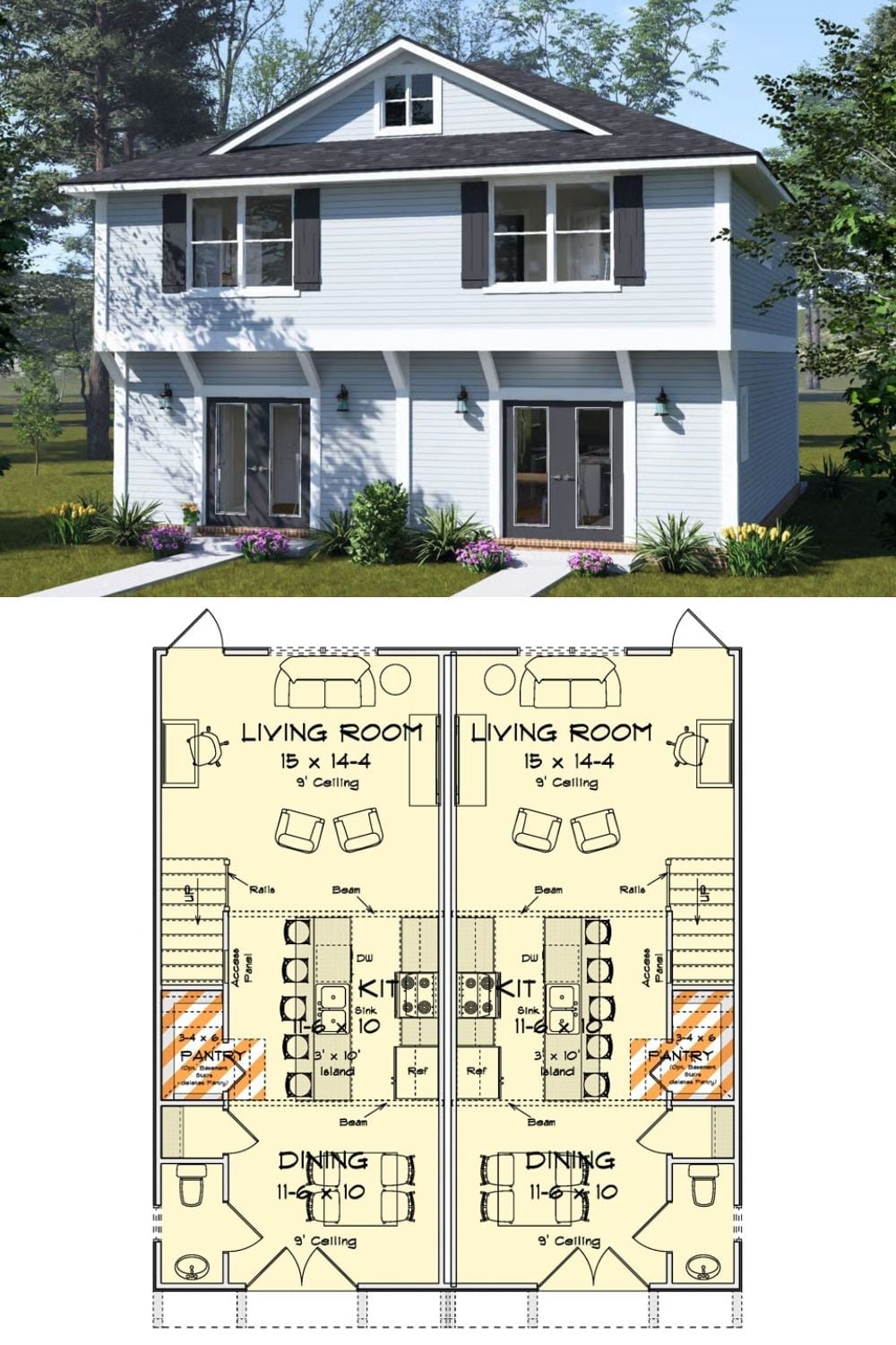
The exterior rendering shows a two-story Craftsman duplex with matching entries. Below it, the first-floor plan reveals mirrored units, each with a living room, kitchen with island, dining area, and pantry.
Ask Yourself: Mirrored floor plans look simple on paper, but plumbing placement matters more than most buyers initially realize. Shared interior walls let both units run water lines back-to-back, which keeps construction costs lower than fully independent layouts. Worth understanding before you fall in love with a plan.
