🔥 Would you like to save this?
The formal dining room once had a job description: holidays, company, the good dishes, the table nobody was supposed to scratch. Then everyday life moved elsewhere. Kitchens got bigger, entertaining got looser, and an entire room in plenty of 1970s houses was left defending its square footage on tradition alone.
That makes the old dining room unusually valuable real estate. Give those feet back to the kitchen and suddenly the choices get interesting. The reclaimed space can become a serious prep zone, a hidden pantry, a wall of appliances, two islands doing completely different jobs, or one spectacular architectural gesture that makes the old dividing line disappear.
In order to come up with the very specific design ideas, we create most designs with the assistance of state-of-the-art AI interior design software. Also, assume links that take you off the site are affiliate links such as links to Amazon. this means we may earn a commission if you buy something.
More space isn’t automatically better design, though. A giant island can become an obstacle. An open plan can turn shapeless. Extra cabinetry can make a generous room feel like a showroom with nowhere to breathe. The smartest transformations don’t merely erase a wall; they decide exactly what the newly available space is supposed to accomplish.
These 35 kitchens take that argument in wildly different directions. Dark oak gives way to pale limestone, sculptural curves interrupt strict grids, working kitchens collide with social ones, and occasionally the most sophisticated move is refusing another island altogether. The dining room may be surrendering its territory, but the square footage is finally being asked to earn its keep.
35. Ultra-Modern Bronze Kitchen With a Cantilevered Stone Island
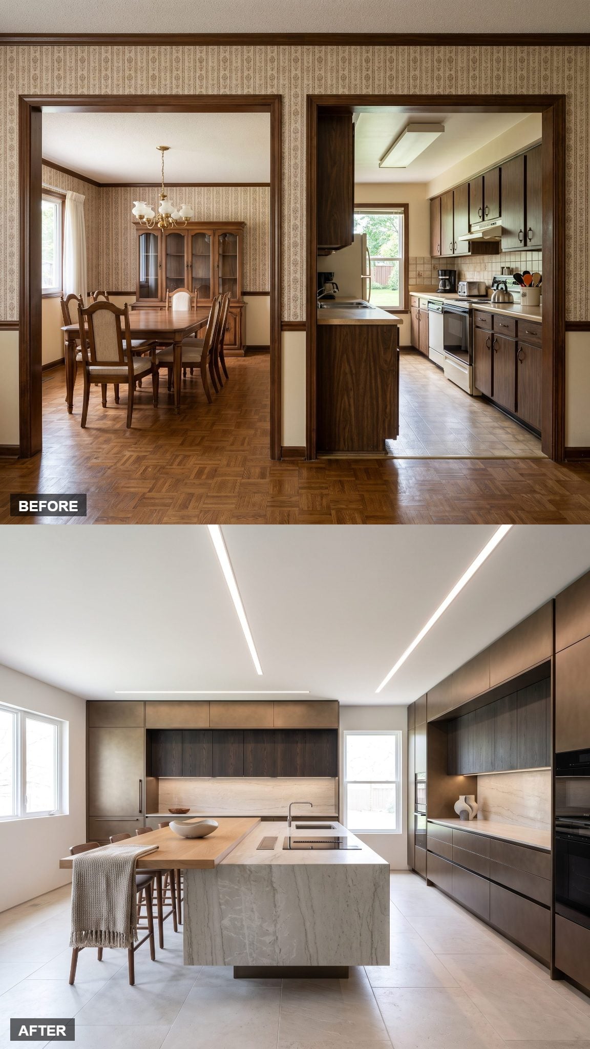
Bronze metal cabinetry. It sounds cold on paper and looks warm in the room, which is the whole point.
That cantilevered stone bar is the flex most people won’t consciously clock — a slab that appears to float with no visible support, reading as expensive and technically precise at once. Smoked oak keeps the metal from drifting anywhere near bank-lobby territory. The reclaimed dining footprint gives the composition enough room to be dramatic without becoming congested.
34. The Floor-to-Ceiling Storage Wall That Ends the Clutter
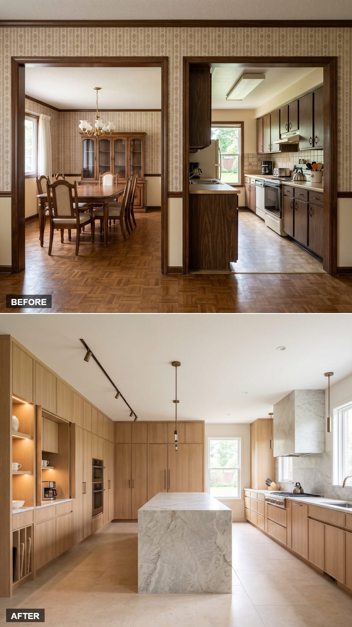
Here’s the practical version of what a dining room can be worth: a wall of storage that makes everything else work. Floor-to-ceiling cabinetry in matte greige runs the full reclaimed width — integrated appliances behind panels, a tall pantry tower with pullouts, a built-in coffee station at counter height.
No island theatrics. No monumental slab demanding applause. Just an enormous amount of useful storage moved out of the working kitchen’s way, leaving the counters to behave like counters instead of overflow parking.
33. Dramatic Burgundy and Walnut Kitchen With a Brass Hood
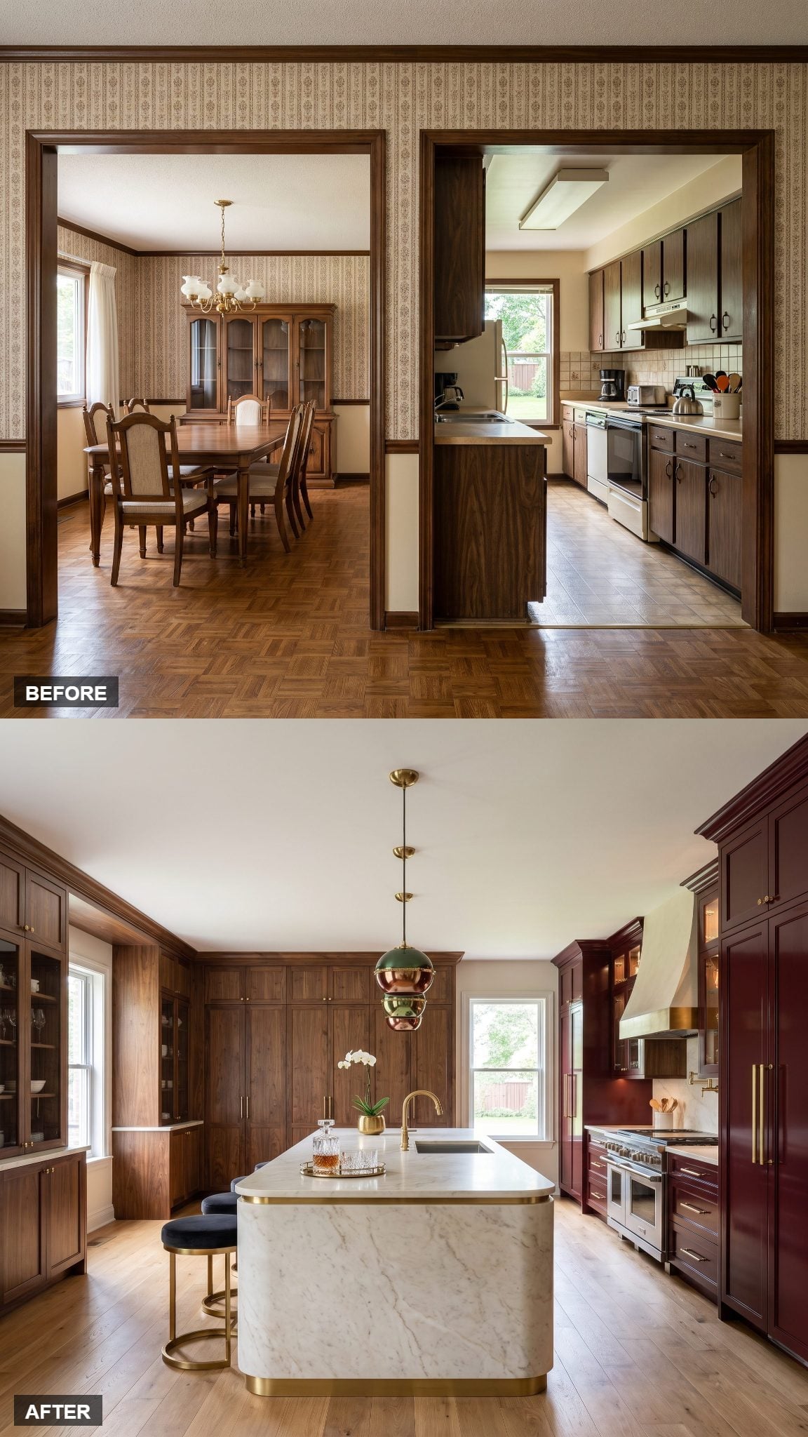
Oxblood lacquer. There’s no shy way to do it, so don’t try.
That burgundy cooking wall is the gamble that makes this kitchen memorable. Walnut settles the color, ivory marble lifts it, and the brass hood sits in the middle like the room’s one piece of jewelry. For a glam kitchen makeover that refuses the usual gray-and-white script, this is how color earns architectural authority instead of becoming decoration.
32. Oversized U-Shaped Kitchen With a Walnut Worktable Center
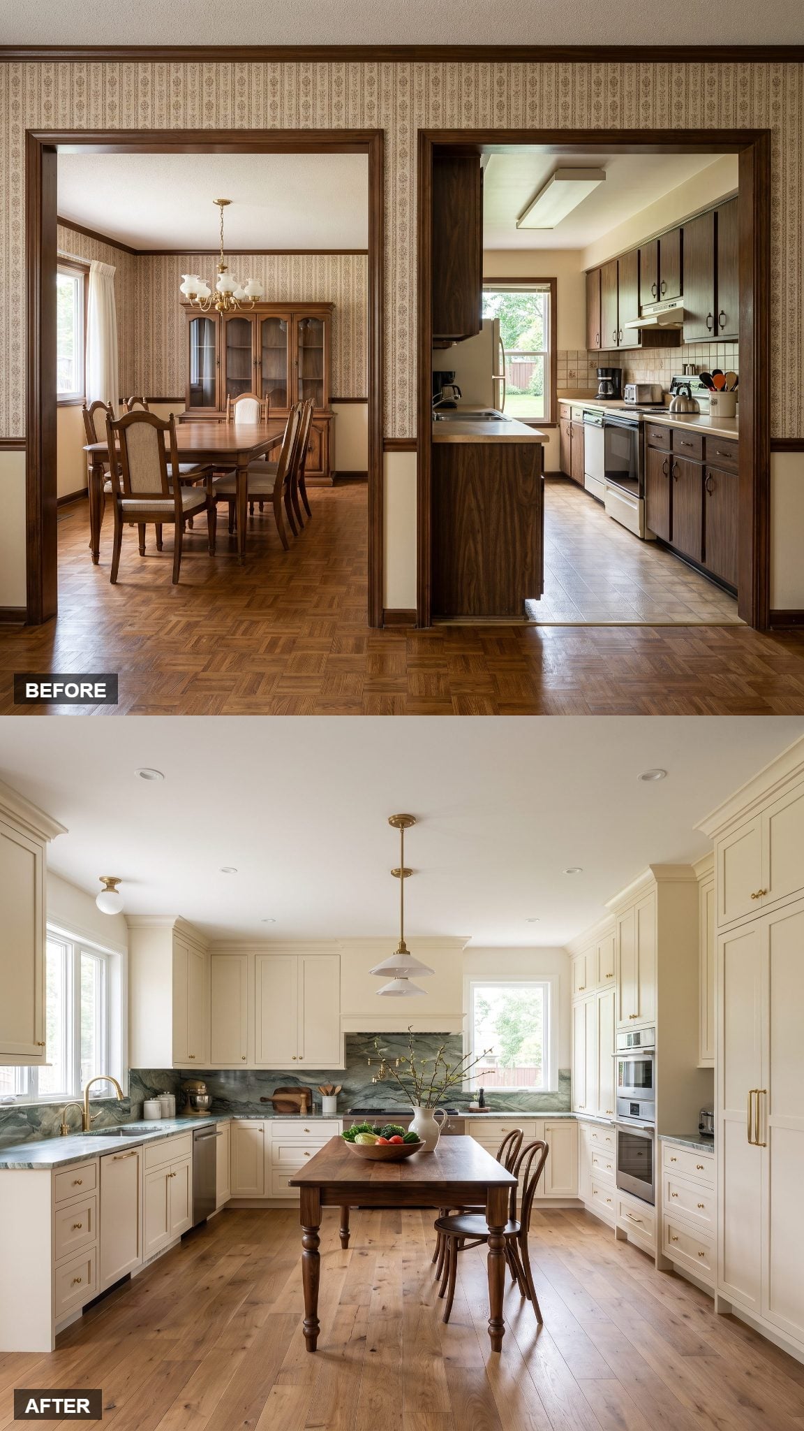
No island. A worktable instead, and the difference matters more than it sounds.
A built-in island is cabinetry. A freestanding walnut table is furniture. One announces kitchen infrastructure; the other makes the room feel looser and more adaptable. The U-shape puts appliances and storage around the perimeter while the center stays visually open, and green-veined marble provides the one loud material note in an otherwise quiet cream room.
31. The Sculptural Curved Island That Breaks the Rectangle
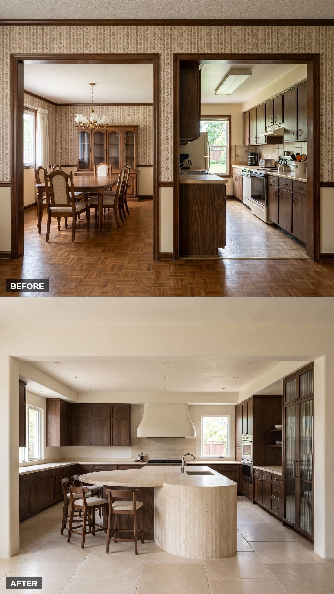
Most kitchen geometry begins with rectangles. This one refuses the assignment, and that single decision changes the circulation and the view.
A sweeping island anchors the reclaimed space, wrapped in fluted white oak with a honed limestone top following the arc. The curve opens the route around the island rather than terminating the sightline at a hard corner. Pale plaster walls and a linen upholstered stool or two soften the composition further. Sculpted rather than assembled — that’s the difference.
30. Dark Rift-Oak Architectural Kitchen
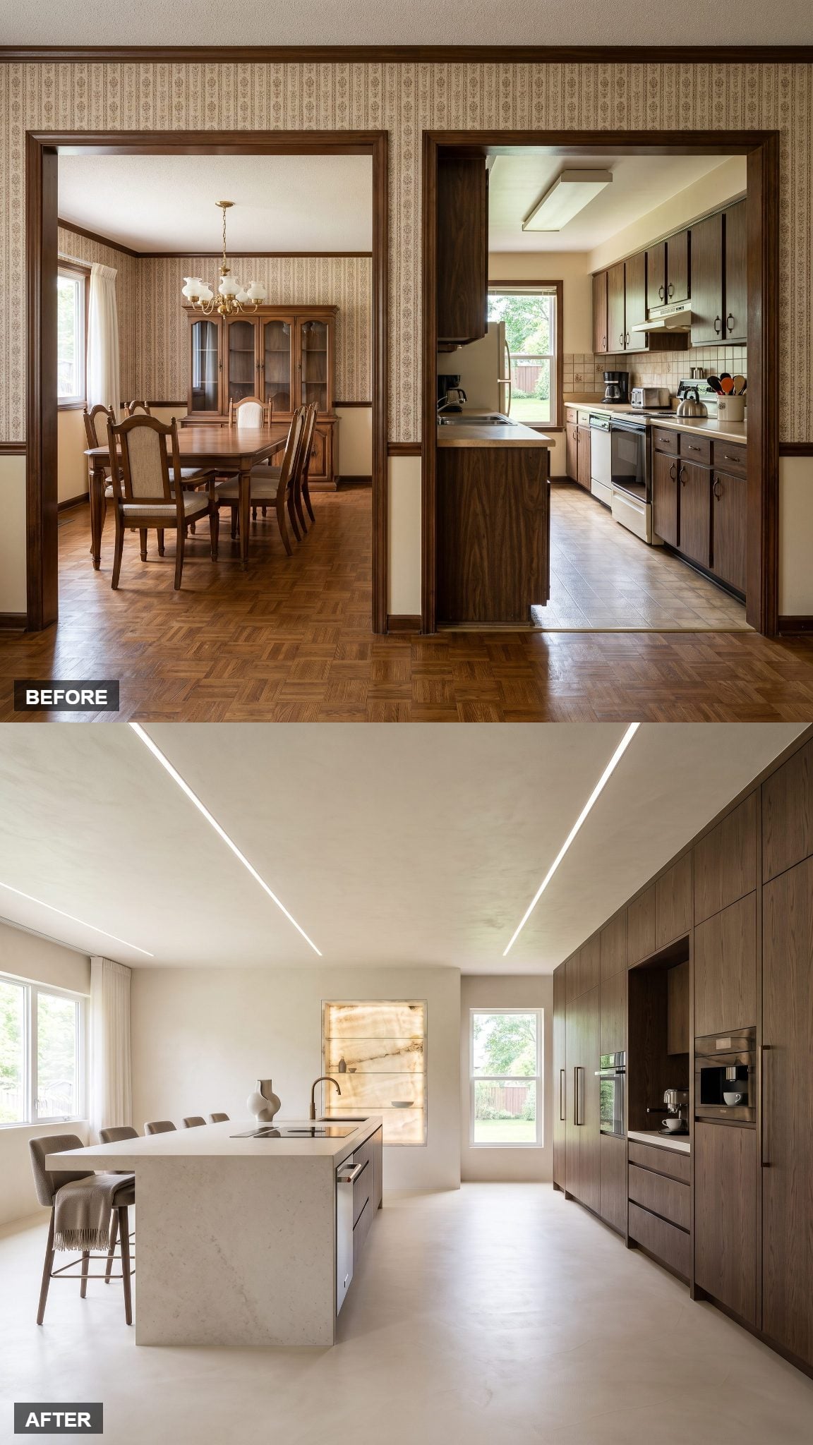
That dark rift-oak wall swallows the fridge, ovens, pantry and most of the working apparatus of the kitchen. From across the room, individual appliances disappear and one continuous plane of grain takes over.
The backlit stone niche is the exhale in an otherwise disciplined scheme. Rift-cut oak emphasizes straighter, more consistent grain, which is precisely why so much dark wood can read as deliberate rather than busy. This is modern kitchen design trusting one architectural surface to do the work of a dozen smaller gestures.
29. Luxury Kitchen Built Around an Oversized Prep Zone
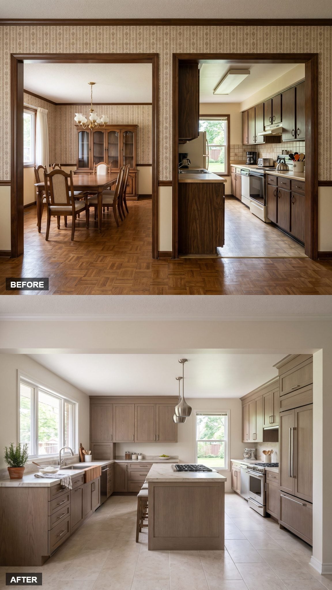
Most reclaimed square footage gets spent on more seating. This kitchen does something more interesting with it: it builds a serious prep station that the original footprint could never comfortably accommodate.
The marble pastry slab beneath the window is the detail a cook notices. Stone provides a cool work surface for pastry, the window brings direct natural light to the task, and the expanded layout gives preparation its own territory instead of forcing every job onto the island. The former dining room isn’t merely making the kitchen bigger. It’s making the kitchen work differently.
28. A Harvest Table Where the Dining Room Used To Be
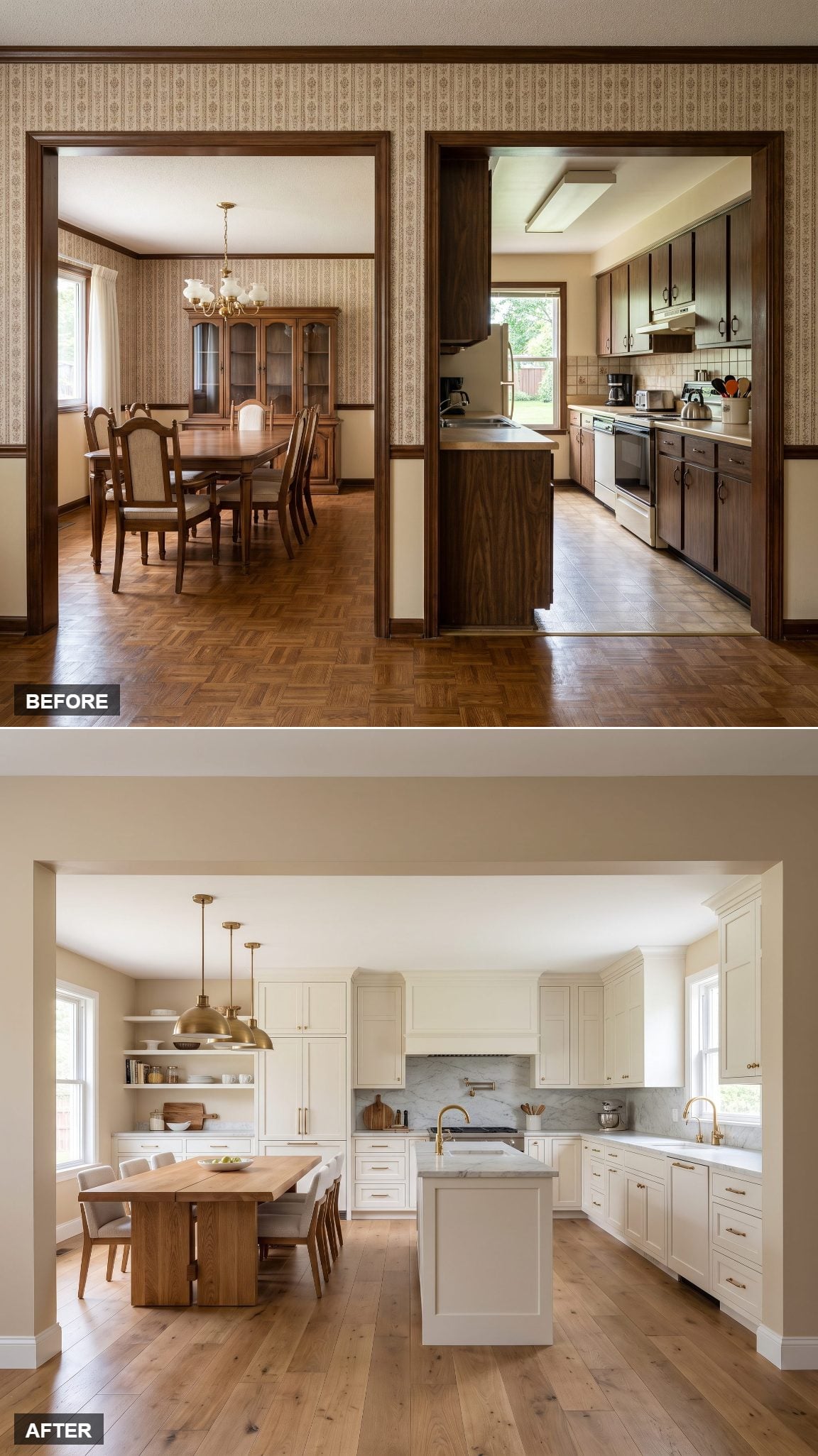
Here’s the quiet rebellion: remove the formal dining room and keep the table.
Rather than cramming the reclaimed footprint with more cabinets, a long reclaimed wood harvest table sits directly inside the expanded kitchen. Cabinetry wraps the cooking end while the eating end gets a bench and rush-seat chairs. Dining hasn’t disappeared; the ceremony around it has. The result is a compact dining room folded into the kitchen instead of isolated beyond a wall.
27. The Double-Island Chef’s Kitchen That Takes Entertaining Seriously
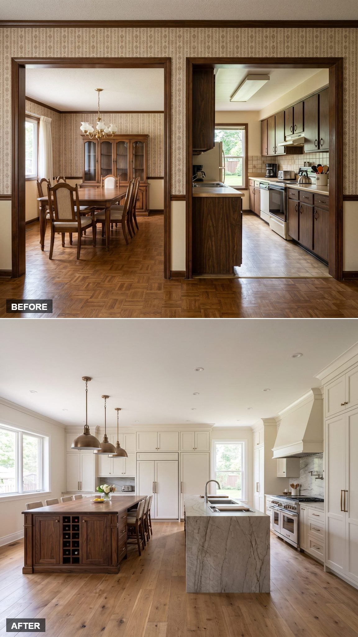
Two islands, two jobs. One is pure prep: stainless top, deep sink, a wall of drawers. The other is social, topped in warm quartzite with leather counter stools along one side. The reclaimed dining footprint is what gives the arrangement enough breathing room to work.
Muted clay cabinetry with brushed nickel pulls keeps the whole thing from reading like a restaurant. The cook gets a protected work surface, guests get their own landing zone, and neither group has to colonize the other’s territory.
26. The Pantry That Pretends It Isn’t There
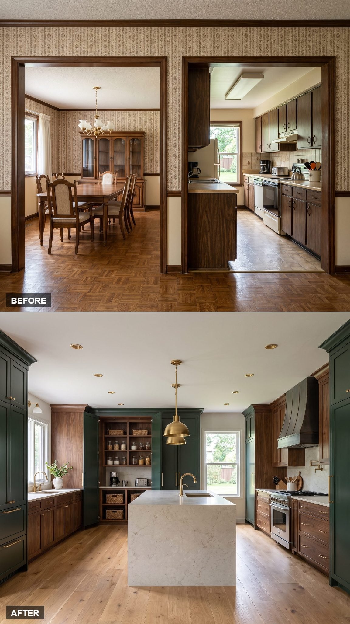
Here’s the trick. A walk-in pantry disappears behind flush cabinetry doors that read as part of the wall. Open one and the restrained exterior gives way to deep shelving, a second sink and small-appliance storage safely out of the main kitchen’s sightline.
The effect lives or dies on restraint. Floor-to-ceiling cabinetry stretches across the former dining area without handles interrupting the plane, allowing a substantial amount of utility to hide behind an unusually quiet elevation.
25. Green Marble Showpiece Kitchen in Verde Alpi and Pale Oak
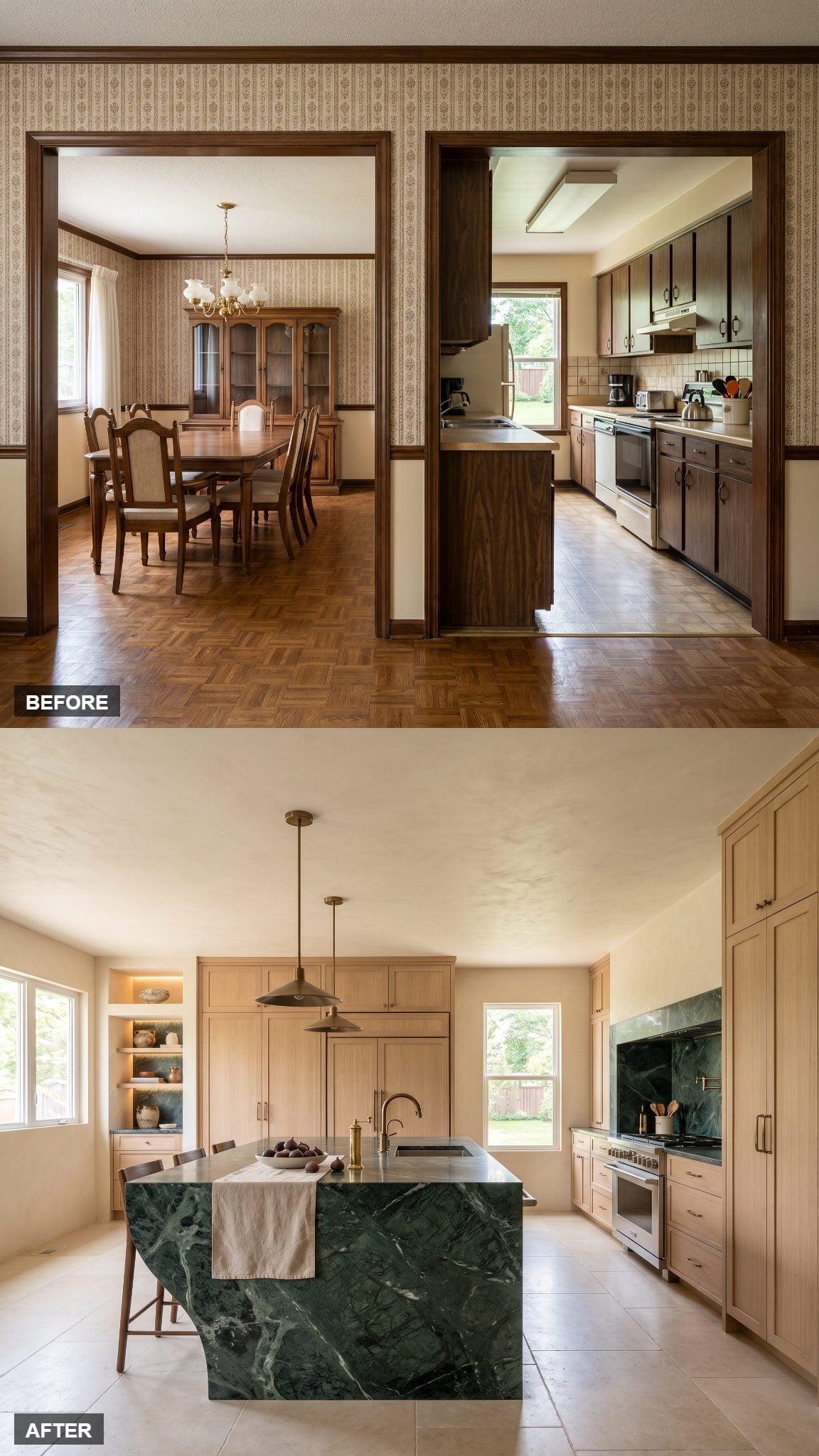
Verde Alpi marble is a gamble, and this room wins it. Deep green against pale oak is the loudest material decision in the scheme, which is exactly why everything surrounding it knows when to be quiet.
24. The Appliance Gallery That Solves the Congestion Problem
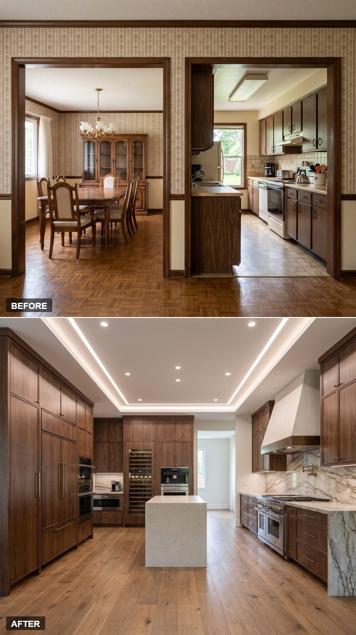
Some kitchens aren’t short on counters. They’re short on wall. This transformation spends the reclaimed dining area on appliances: integrated refrigerator and freezer columns, double wall ovens, a warming drawer and a built-in espresso unit, all organized into a continuous run of pale oak cabinetry with a slim stone surround.
Everything lines up. Nothing has to fight for the same few feet of elevation. Moving the tall equipment outward gives the working kitchen more uninterrupted counter space and turns former dining-room territory into infrastructure rather than another seating area.
23. Curved Travertine Statement Kitchen in Smoked Oak
🔥 Would you like to save this?
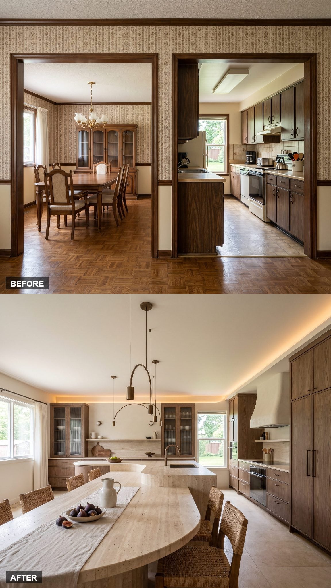
Straight lines everywhere else. Let the island curve.
The serpentine travertine form earns its space by doing more than looking sculptural. Its changing edge softens the circulation path through the expanded footprint while giving a large room a center that isn’t another giant rectangle. Smoked oak adds depth and a plaster hood keeps the stone from tipping into hotel-lobby grandeur.
22. Three Zones, Zero Walls
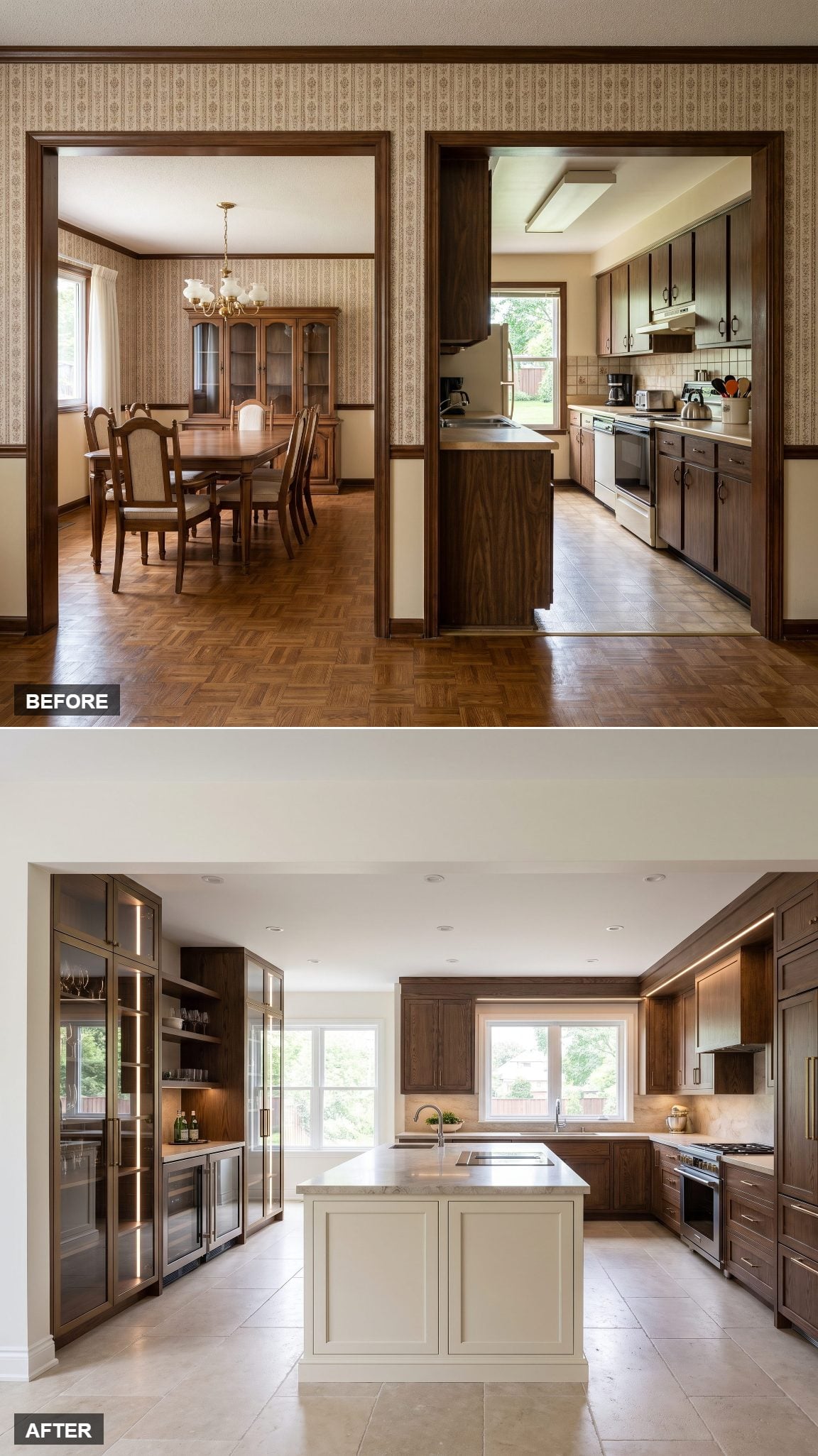
Open plan gets interesting when openness doesn’t mean shapelessness. Cooking stays in the original kitchen. Prep moves to a stone-topped island in the middle. The far end of the former dining room becomes a cleanup and storage run.
Three jobs, three territories, one continuous floor. The stone-topped island does some of the organizing that a wall once handled, but sightlines and movement remain open from end to end.
21. Black Marble Entertainer’s Kitchen Where the Dining Room Surrendered
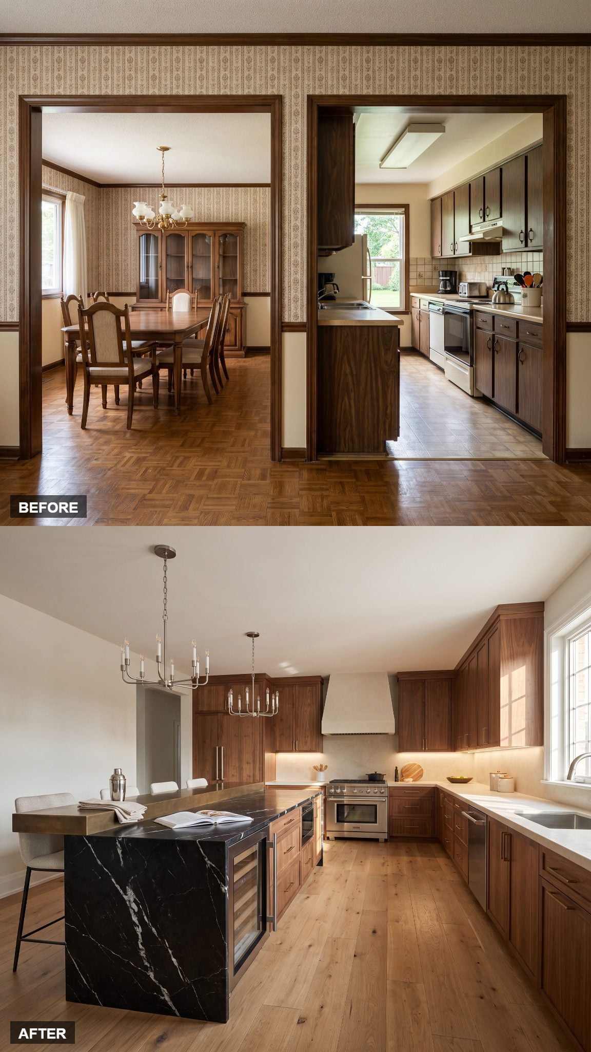
The old divided footprint becomes one continuous entertaining kitchen, with the former dining end taking on the social work. A black-marble island anchors that territory, white veining running through the stone like lightning.
The raised bronze ledge is the smarter detail. It creates a visual screen between the working surface and the seating side, allowing glasses and guests to occupy one level while the practical business of making drinks happens just below.
20. Contemporary English Kitchen in Putty and Dark Oak
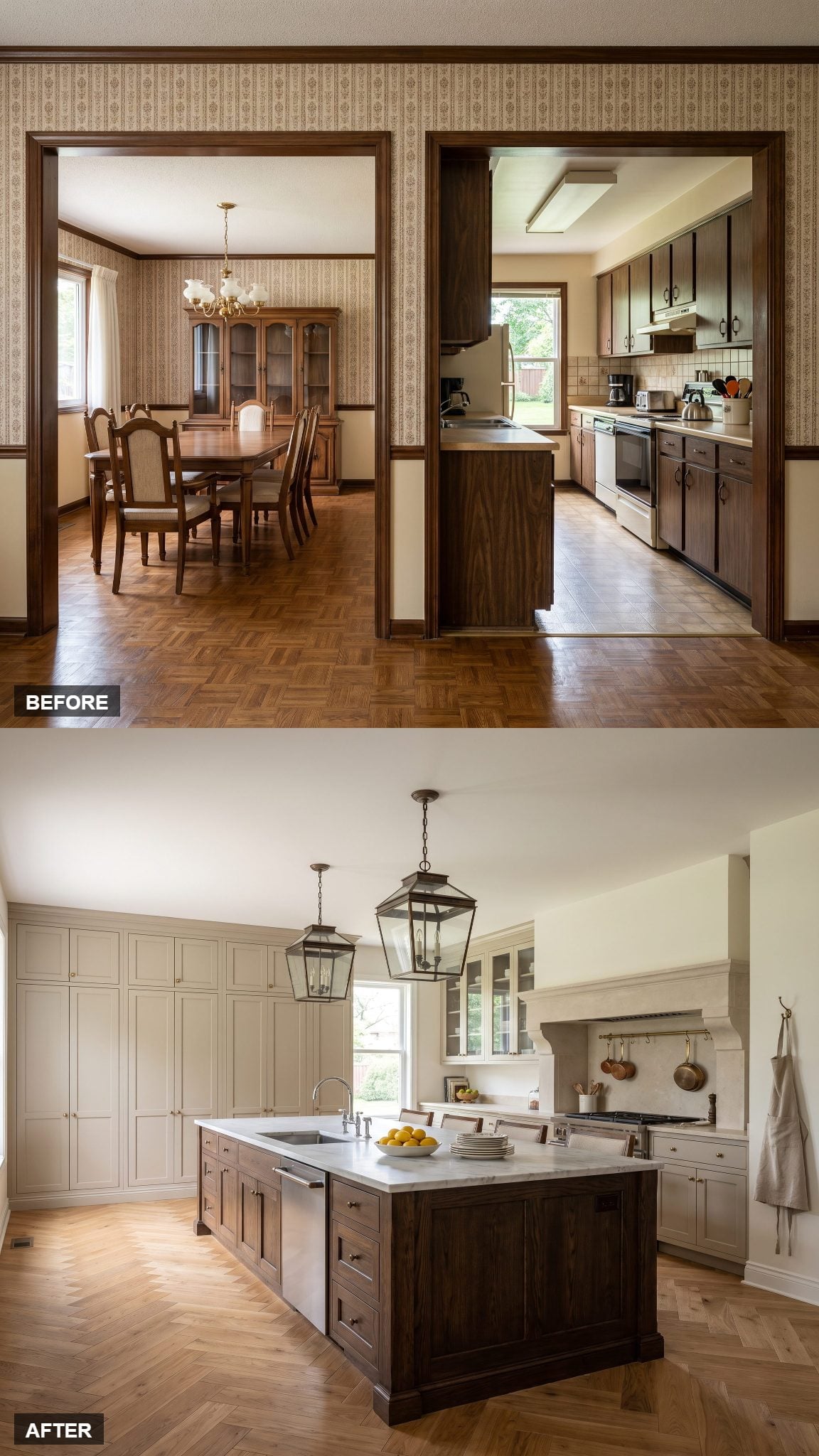
Inset cabinetry is the detail you feel before you name it. Doors sit flush within their face frames rather than overlaying them, giving the cabinetry a more furniture-like depth and precision.
Putty is doing quiet work here: warmer than gray, less overtly yellow than many beiges, and restrained enough to let the dark oak island and brass pot rail take the foreground. The former compact dining room has been absorbed so completely that the kitchen reads as one composed room rather than two spaces stitched together.
19. One Island, Two Jobs, Zero Wasted Steps
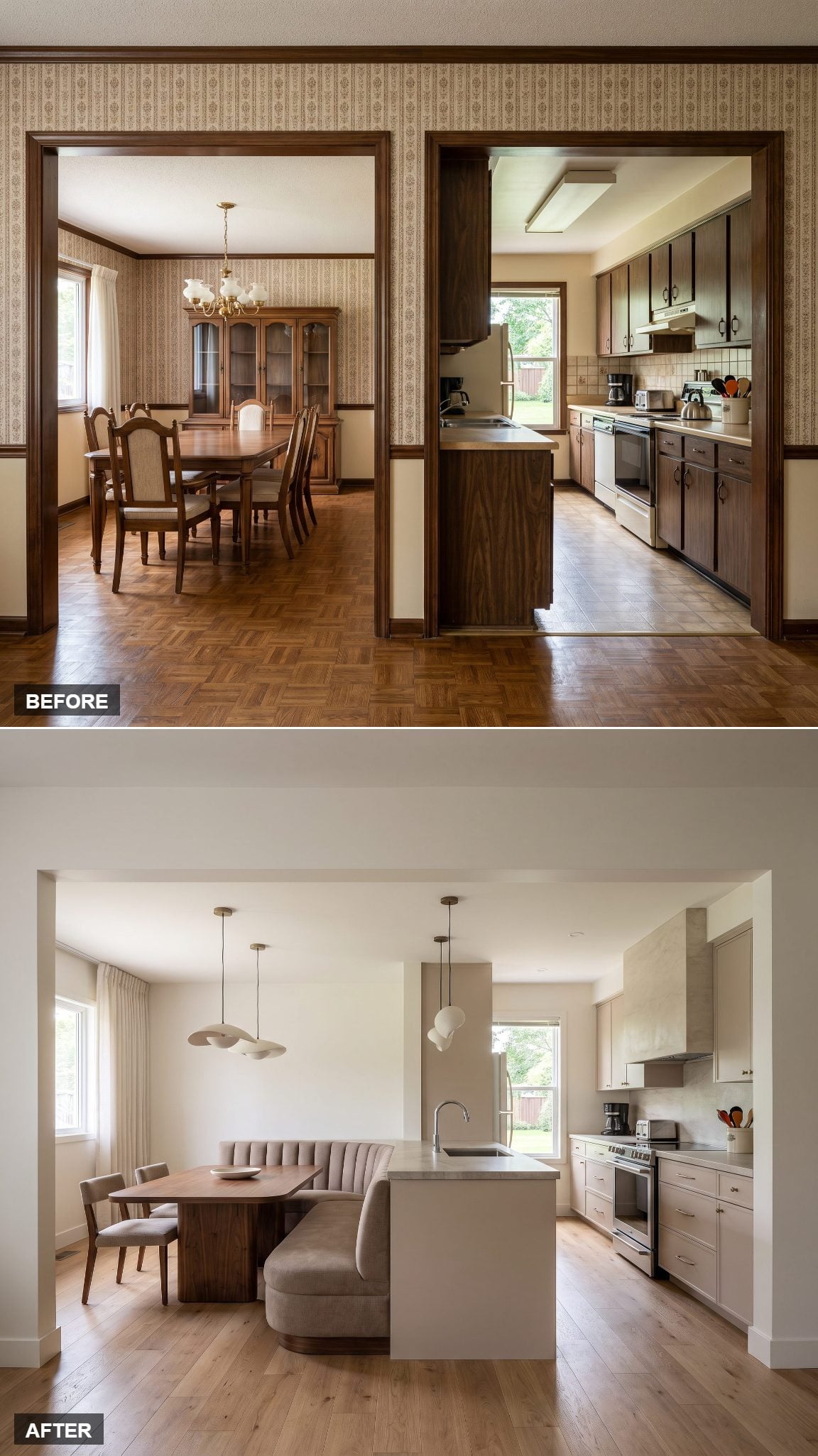
This island refuses to pick a lane, so the design gives it two. The kitchen-facing half handles storage, a deep sink and drawers. Then the form turns into an upholstered dining booth, wrapping the eating space directly into the working kitchen.
This is the move when removing a formal dining room shouldn’t mean losing a comfortable place to sit down. Prep and dining occupy one continuous piece of architecture, but their functions remain legible. The reclaimed square footage earns its keep twice.
18. Full-Width Chef’s Kitchen in Charcoal Oak and Brass
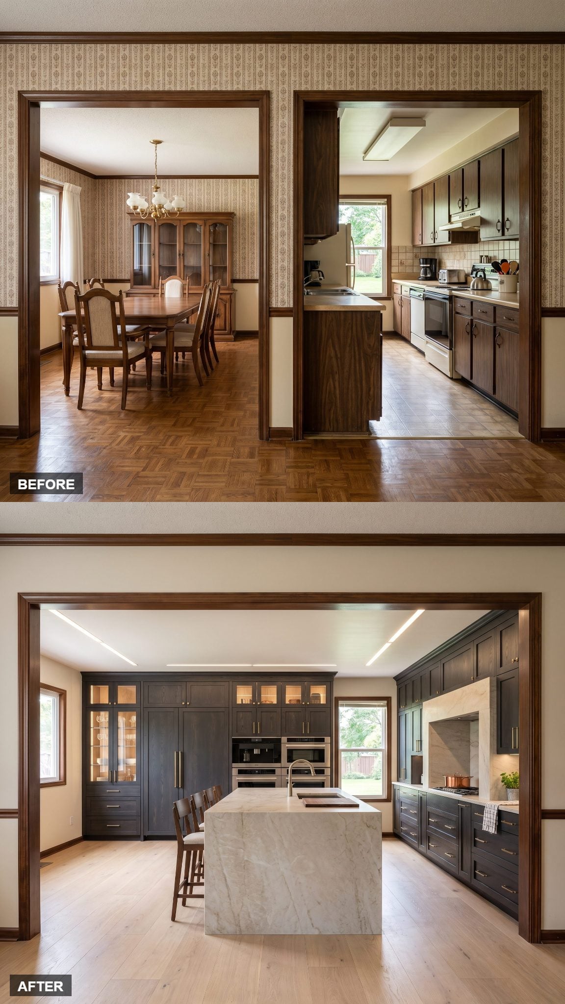
Charcoal oak goes nearly black in the corners, then brass hardware catches the light and wakes up the entire elevation. That contrast is doing more work than another decorative layer ever could.
Dark cabinetry can carry this much visual weight because the expanded room gives it distance. Against it, the pale quartzite island appears almost weightless. This is modern kitchen design using the extra footprint not to add more objects, but to give a few large ones room to register.
17. The Waterfall Peninsula That Reaches Across the Room
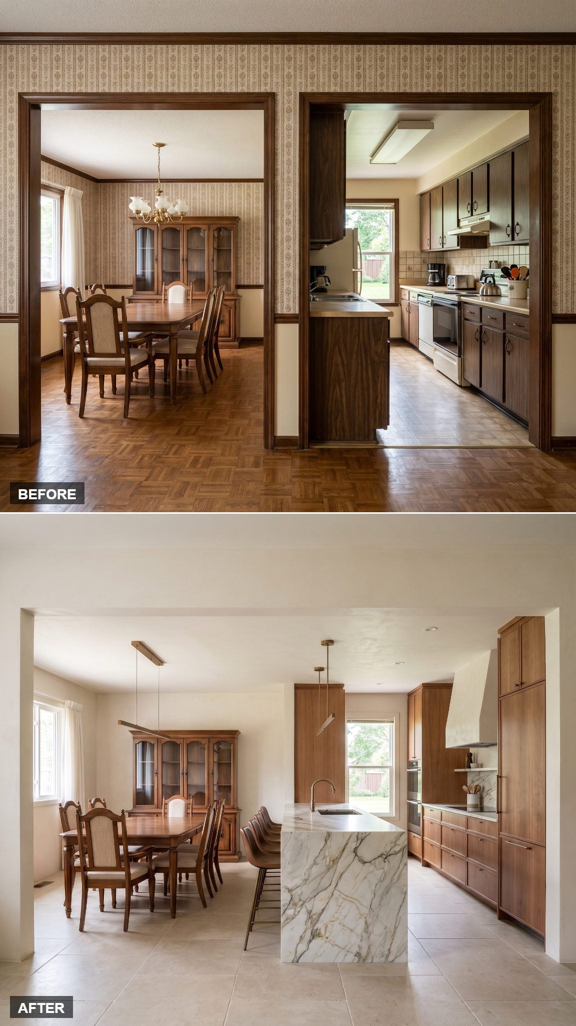
Skip the freestanding island entirely. An extra-long peninsula extends from one wall deep into the old dining footprint, finished with a waterfall edge where the stone continues vertically to the floor.
That uninterrupted material is the visual trick. Instead of reading as countertop plus cabinet plus end panel, the peninsula reads as one deliberate object stretching across the expanded room. The attached form also leaves one side of the kitchen completely free of island circulation.
16. Japandi Calm in Pale Oak and Limestone
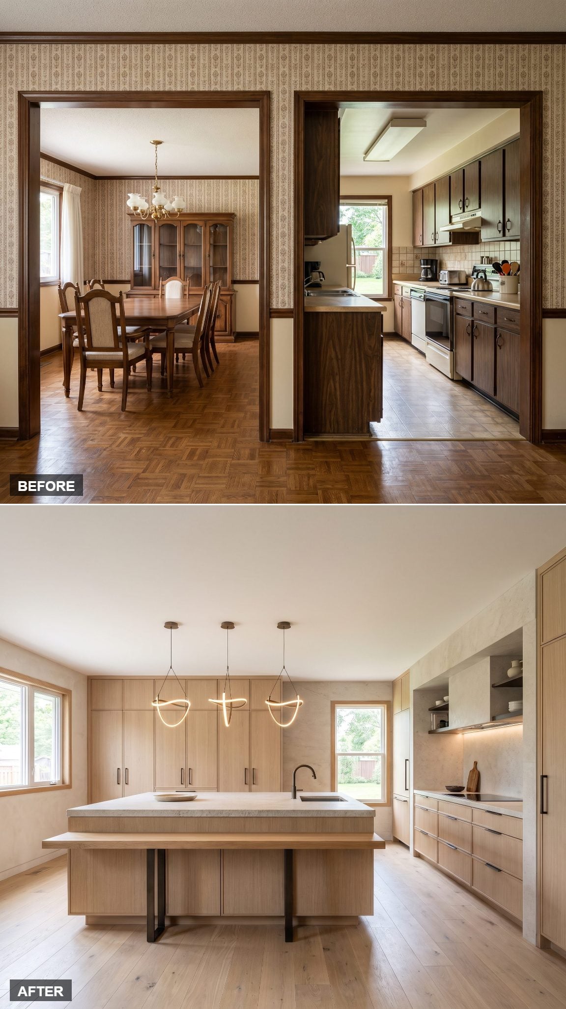
The luxury here isn’t more. It’s enough room to stop adding.
Pale natural oak runs across the cabinetry, paired with limestone surfaces and sparing dark-metal details. A low-profile island occupies the center without swallowing it. Absorbing the old dining room allows generous clearances and long, quiet planes of material — exactly the breathing room this kind of restrained kitchen needs. Expansion becomes negative space rather than an excuse for more cabinetry.
15. The Range Becomes the Reason You Walk In
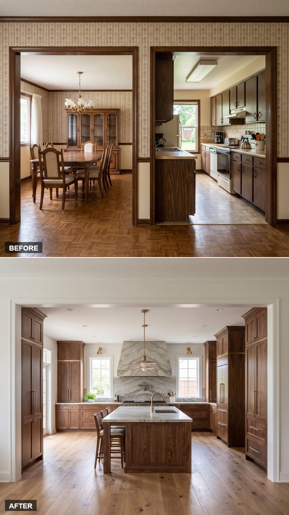
Put the range where the eye lands first and the whole room reorganizes itself around it. A monumental range and stone hood establish the center, with cabinetry marching outward in controlled symmetry on both sides. The dining room gives up its square footage, and the kitchen spends it on one dramatic axis.
This reads as architecture rather than decorating. The carved stone hood does the heavy lifting while matching cabinet runs keep the larger room from becoming visually restless.
14. Luxe Limestone Island Kitchen in Pale Oak and Aged Bronze
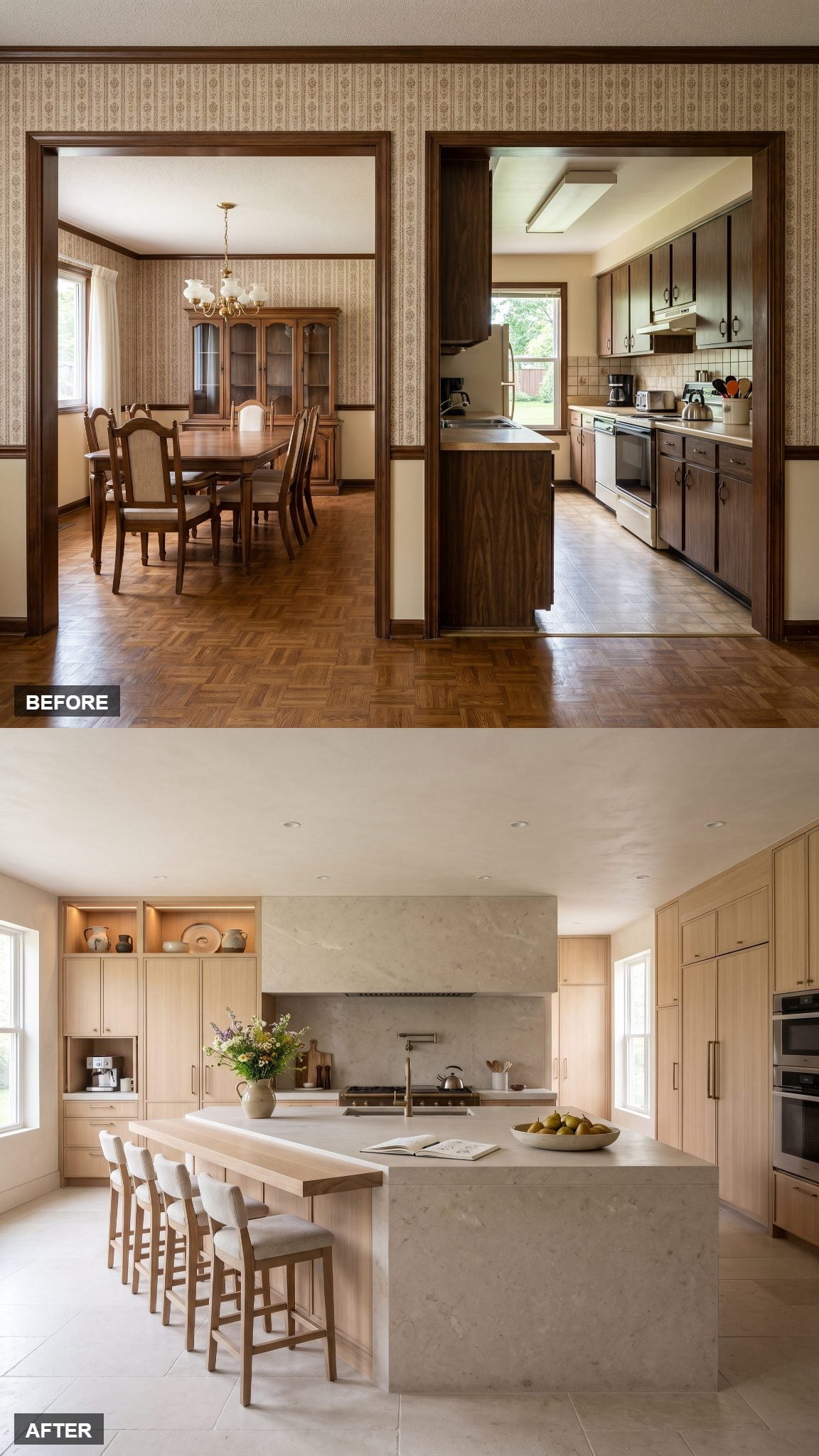
Everything sits in the same pale family — limestone floor, limestone wall, limestone island. Tone on tone, so almost nothing shouts and the aged bronze gets to.
The monolithic island is the trick. Reading as one substantial block rather than a collection of cabinets and panels, it gives the expanded room a center with real visual gravity. The oak seating ledge introduces warmth exactly where stone could otherwise become austere.
13. One Wall to Rule the Whole Footprint
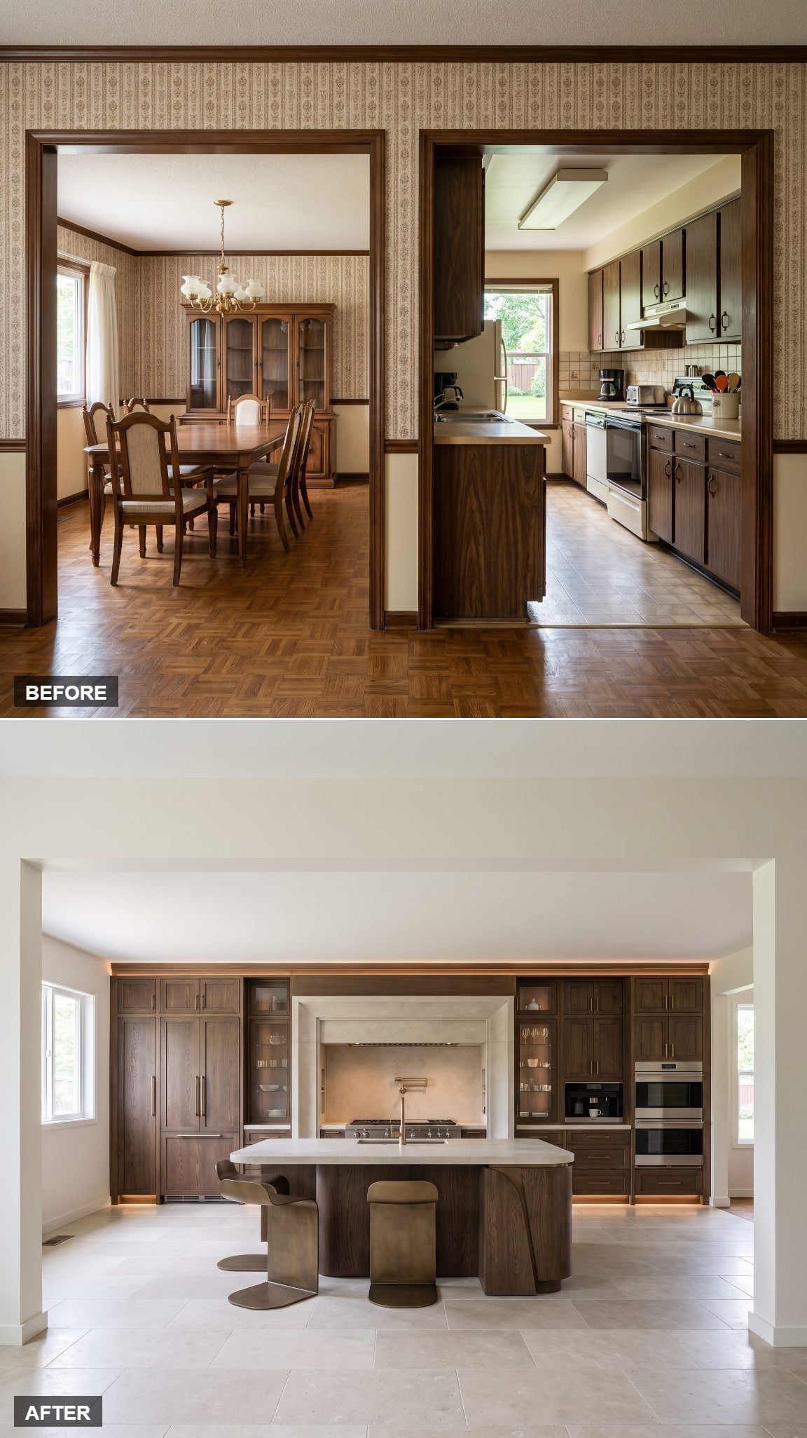
This is the bold version of restraint. Both former rooms surrender to a single uninterrupted wall running the full width — pantry towers, concealed refrigeration, stacked ovens, every function tucked behind matched cabinet fronts that read as one plane.
No visual stutter. No collection of tall boxes announcing themselves one by one. Just a long run of millwork that makes the expanded room feel as though it was conceived at this scale from the beginning.
It’s the kind of move in a glam kitchen renovation that needs serious wall length to work. Reclaiming the dining-room footprint provides exactly that.
12. The Enormous Square Social Island
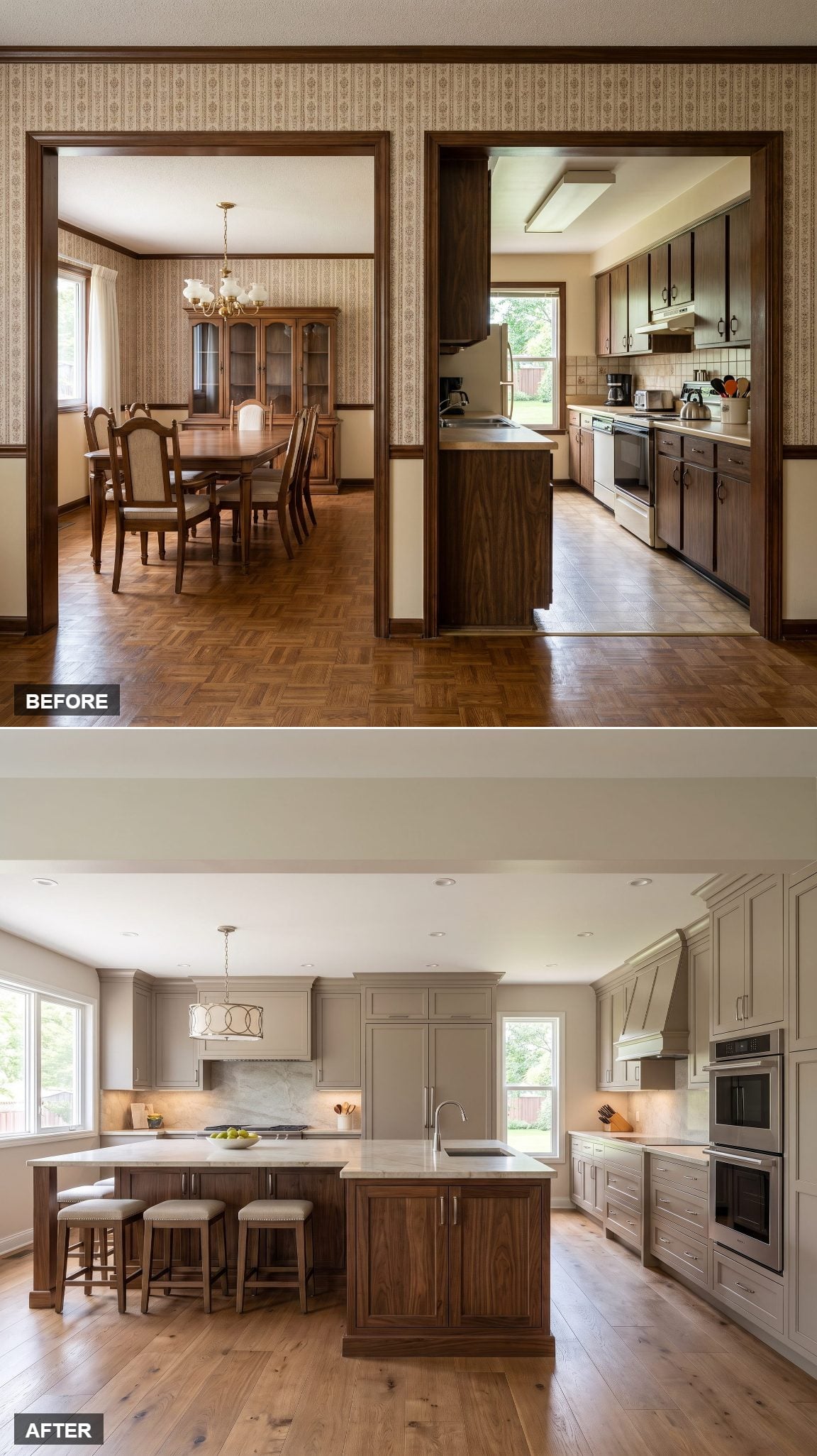
Forget the long rectangle everyone defaults to. This island is square and unapologetically large, occupying the reclaimed dining-room footprint in warm wood beneath a thick stone top.
The square changes the social geometry. Seating can turn corners instead of forming one long cafeteria line, making conversation easier across adjacent sides. Done at this scale, though, clearance becomes nonnegotiable: the island only earns its size when people can move comfortably around the entire perimeter.
11. Coastal Kitchen in White Oak and Blue-Gray Quartzite
🔥 Would you like to save this?
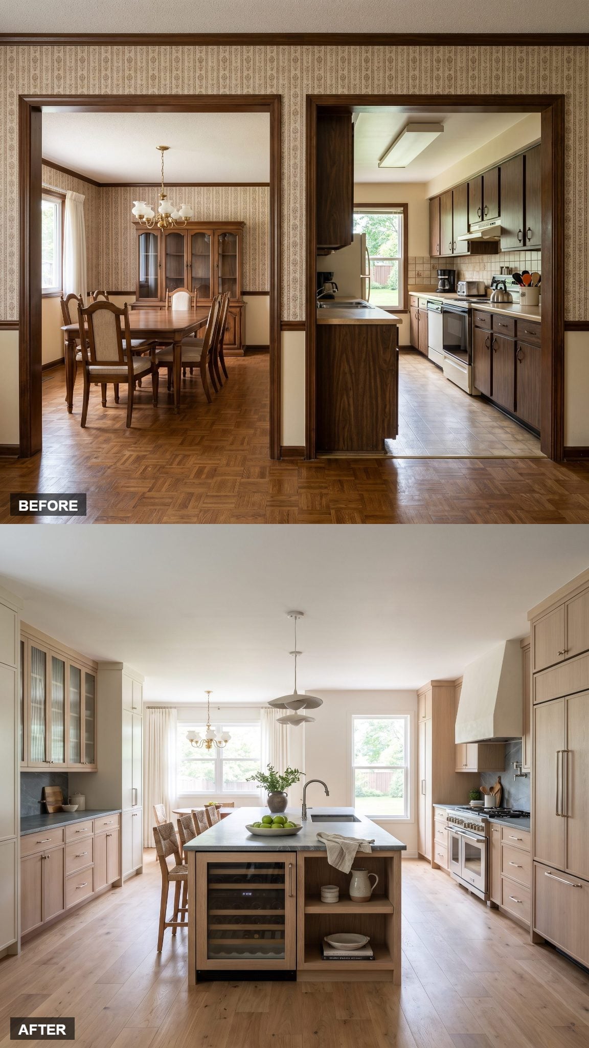
Coastal done right means borrowing the color of water rather than buying a gift-shop version of the beach. Honed blue-gray quartzite handles that assignment almost single-handedly.
Fluted glass on the upper cabinets catches daylight from the existing windows while obscuring enough of what’s behind it to keep the elevation calm. Against white oak, the stone supplies color without requiring a single nautical prop. The larger footprint gives those pale materials room to register instead of piling one beach reference on top of another.
10. From Separate Rooms to One Black-Oak Culinary Machine
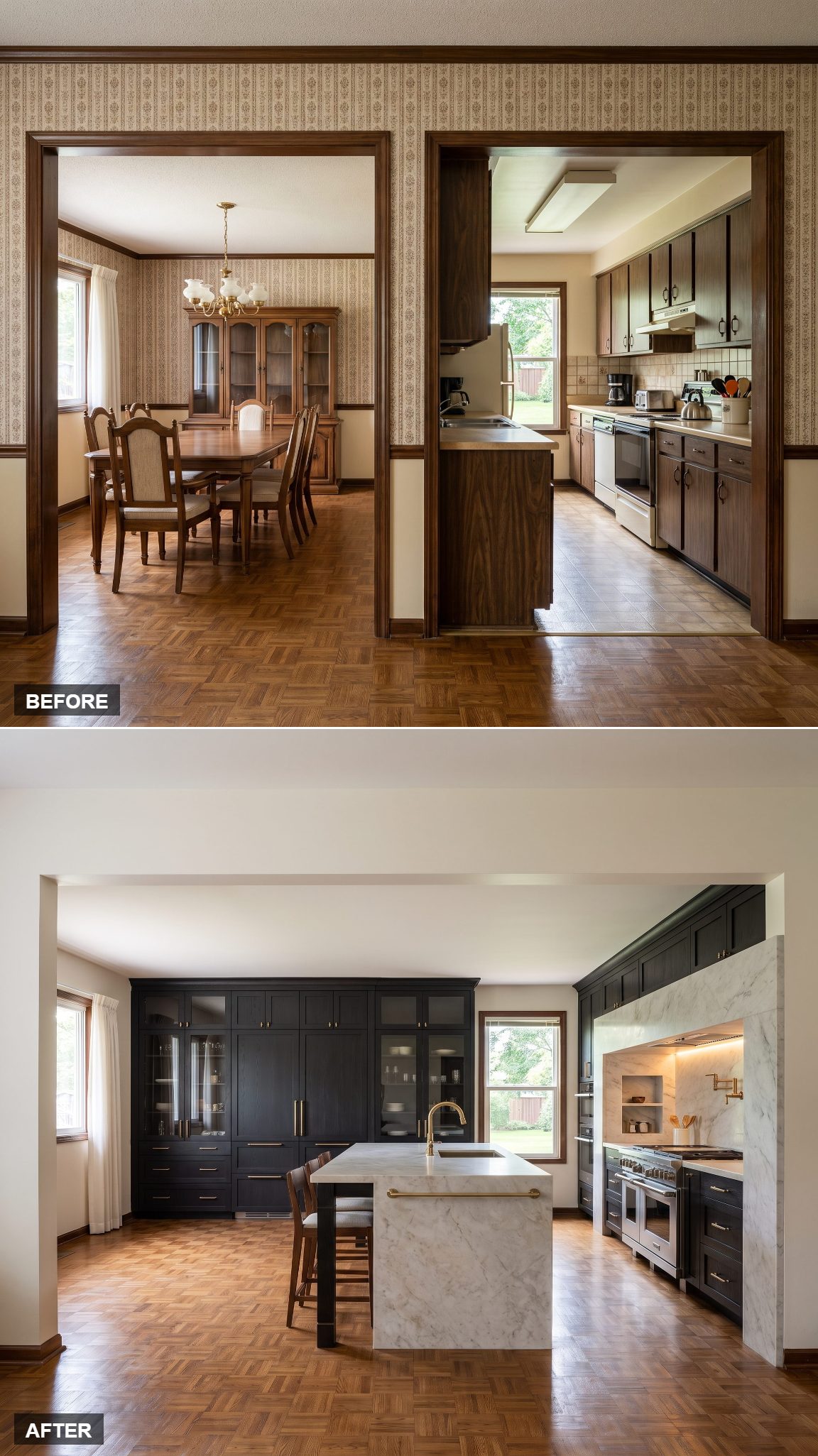
Remove the dividing wall and the whole personality of the footprint changes. Blackened oak cabinetry runs the full length, deep and grainy, anchored by pale marble veined like cracked ice. Aged brushed brass faucet fixtures catch the light and keep the dark wood from reading cold.
Scale is the leverage point: one long run of cabinetry replaces the visual interruption of two separate rooms, while a professional range occupies square footage once reserved for dining. The kitchen doesn’t merely spread out. Its architecture finally gets a long enough sentence.
9. Two-Tone Double-Island Kitchen, Walnut Meeting Pale Marble
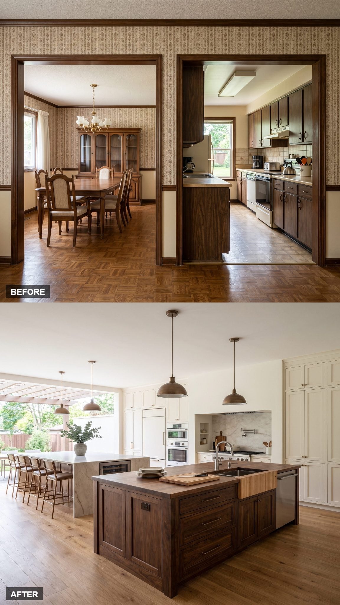
Two islands can easily look like excess. Here the materials stop that from happening by making the division of labor visible before anybody opens a drawer.
Walnut marks the working island — warmer, darker, visually connected to the business end of the kitchen. Pale marble marks the social island and keeps the seating zone visually lighter. The gap between them becomes a circulation lane, while the material contrast prevents two large objects from reading as one enormous obstruction.
8. Resort-Style Kitchen in Bleached Oak and Taj Mahal Quartzite
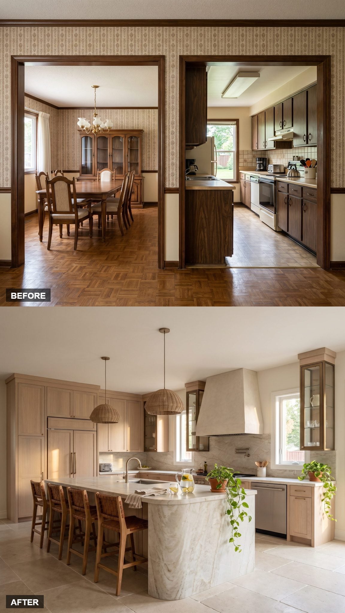
Resort style usually gets into trouble the second the theme becomes more obvious than the room. This one avoids the trap with restraint.
Bleached oak and Taj Mahal quartzite carry almost the entire mood. Rounded island corners soften the central mass, while waterfall stone keeps the shape crisp enough to avoid drifting into beach-house sweetness. The expanded footprint contributes something essential: distance between the pale materials, allowing them to feel serene rather than washed out.
7. The L-Shaped Island That Refuses to Behave
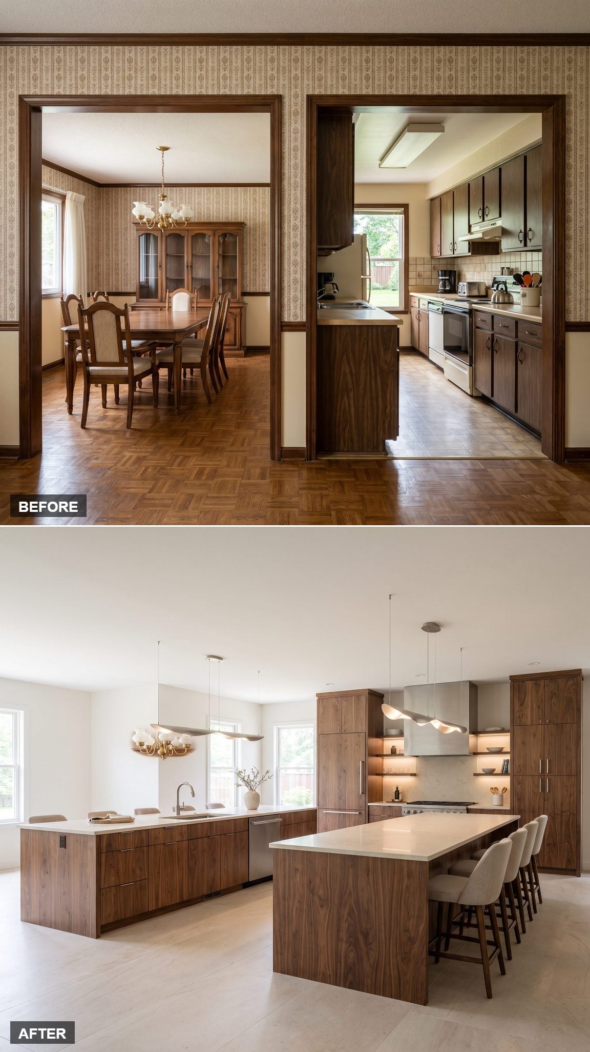
Most islands know how to behave: one rectangle, one direction, one obvious traffic pattern. This one turns a corner.
One leg handles prep and the sink while the other stretches into the former dining footprint for seating and conversation. The unusual geometry lets working and social surfaces meet without simply making the island longer and longer. The reward is a kitchen that wraps around its activity instead of lining everything up in a row.
6. French Contemporary Kitchen in Warm Gray and Marble
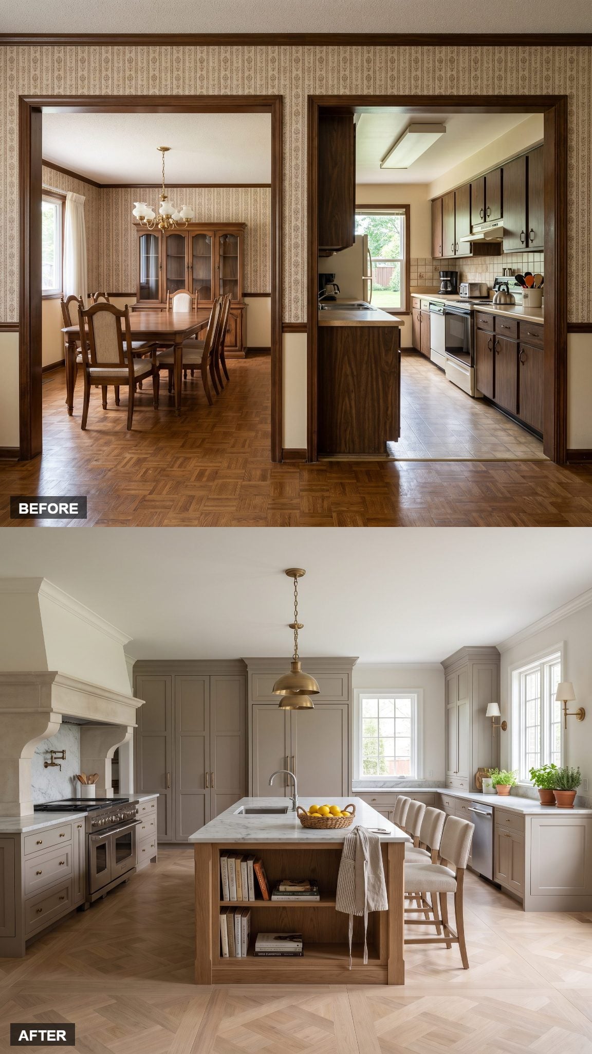
The important move isn’t the inset cabinetry, handsome as it is. It’s the oak island planted directly across the old boundary line.
That placement stitches two former rooms into one idea. Instead of leaving the old division legible in the furniture arrangement, the island deliberately crosses it, making the expanded footprint feel continuous. Pair that with a limestone range surround and restrained warm-gray cabinetry, and the result has the polish of a glam kitchen makeover without losing architectural calm.
5. The Kitchen That Does Everything at Once
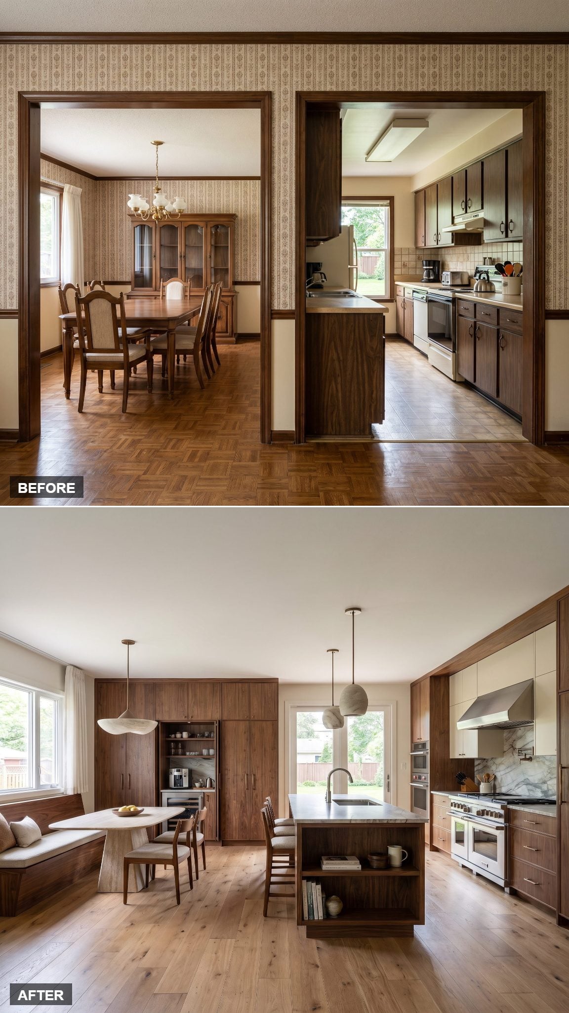
This is the full inheritance, spent carefully. A walk-in pantry claims one stretch, a breakfast nook occupies the brightest corner, and the working kitchen finally has enough space between functions that the major functions no longer need to crowd one another.
A banquette with linen bench cushions, a round pedestal table and a brass pendant light give everyday dining its own destination without rebuilding the formal room that was removed.
This is where the 1970s division of space gets turned completely inside out. Instead of reserving an entire room for one function, the expanded kitchen supports cooking, storage, casual dining and circulation simultaneously — and gives each enough territory to work.
4. Grand Calacatta Kitchen Hall in Warm Oak and Gold-Veined Marble
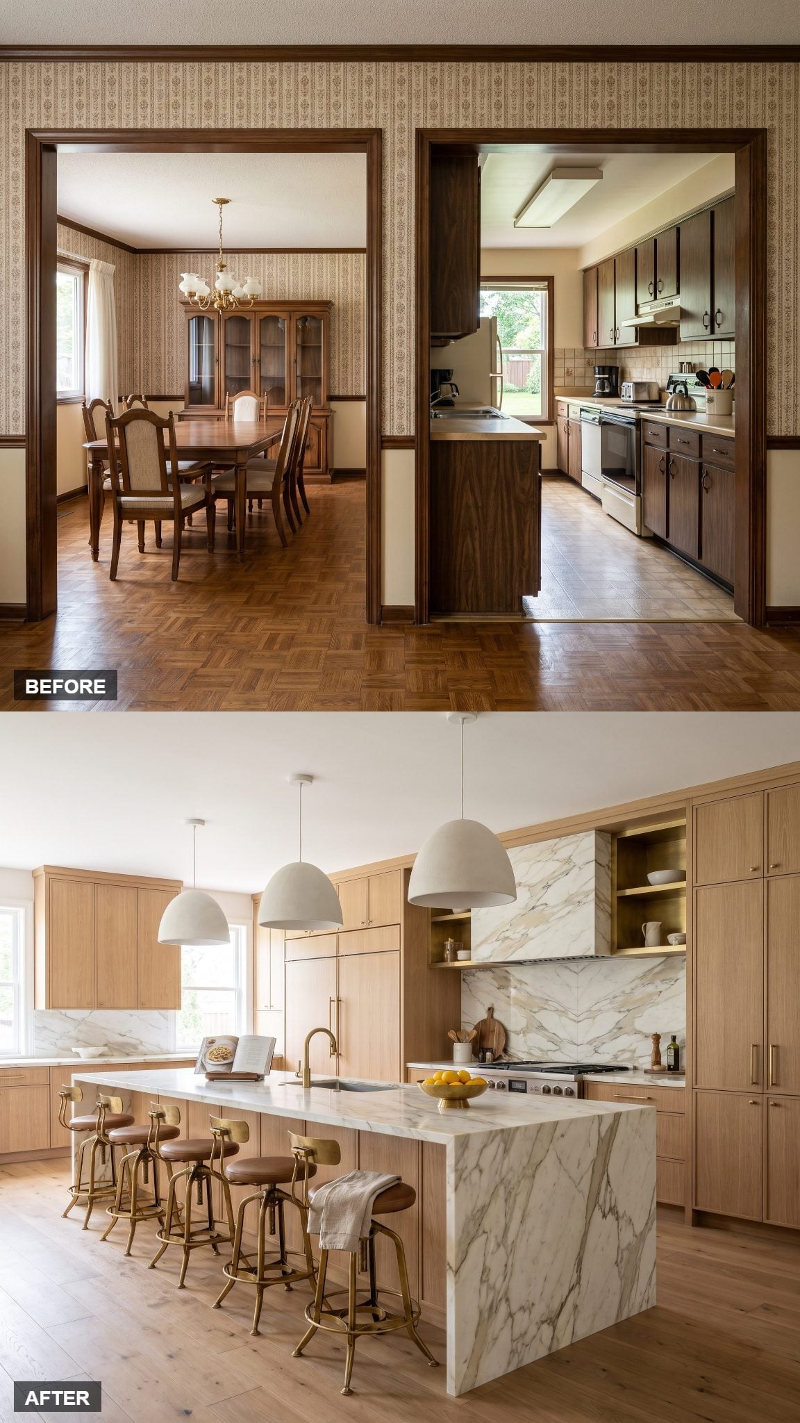
Once the dividing wall is removed, the kitchen gets to operate across both footprints — and this one uses the opportunity for scale.
A 12-foot Calacatta island becomes the central gesture, gold veining running along a surface long enough to pull the eye through the room. Warm oak keeps all that marble from turning chilly. Grandeur from the stone, comfort from the wood — that’s the bargain.
3. Walnut Culinary Gallery With Vein-Matched Quartzite
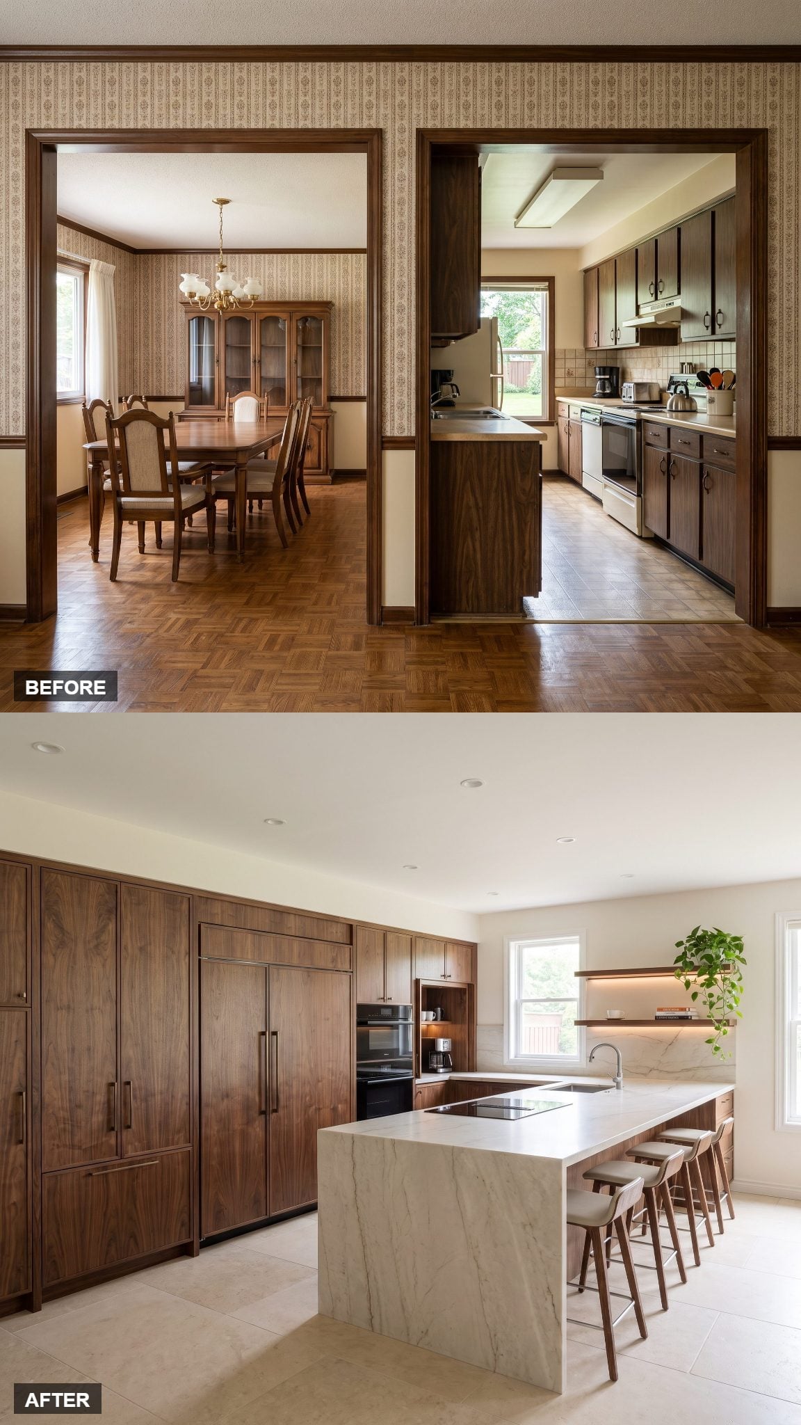
Figured walnut is the whole move — grain that looks like water caught mid-ripple, running along a wall that once belonged to two separate rooms.
The quartzite backsplash supplies the precision. Carefully laid slabs allow the veining to continue across adjoining sections, turning individual pieces of stone into one larger composition. Against the animated walnut, that continuity matters: two expressive natural materials get to coexist without the wall dissolving into visual noise.
2. Organic Modern With a Stone Island That Dominates
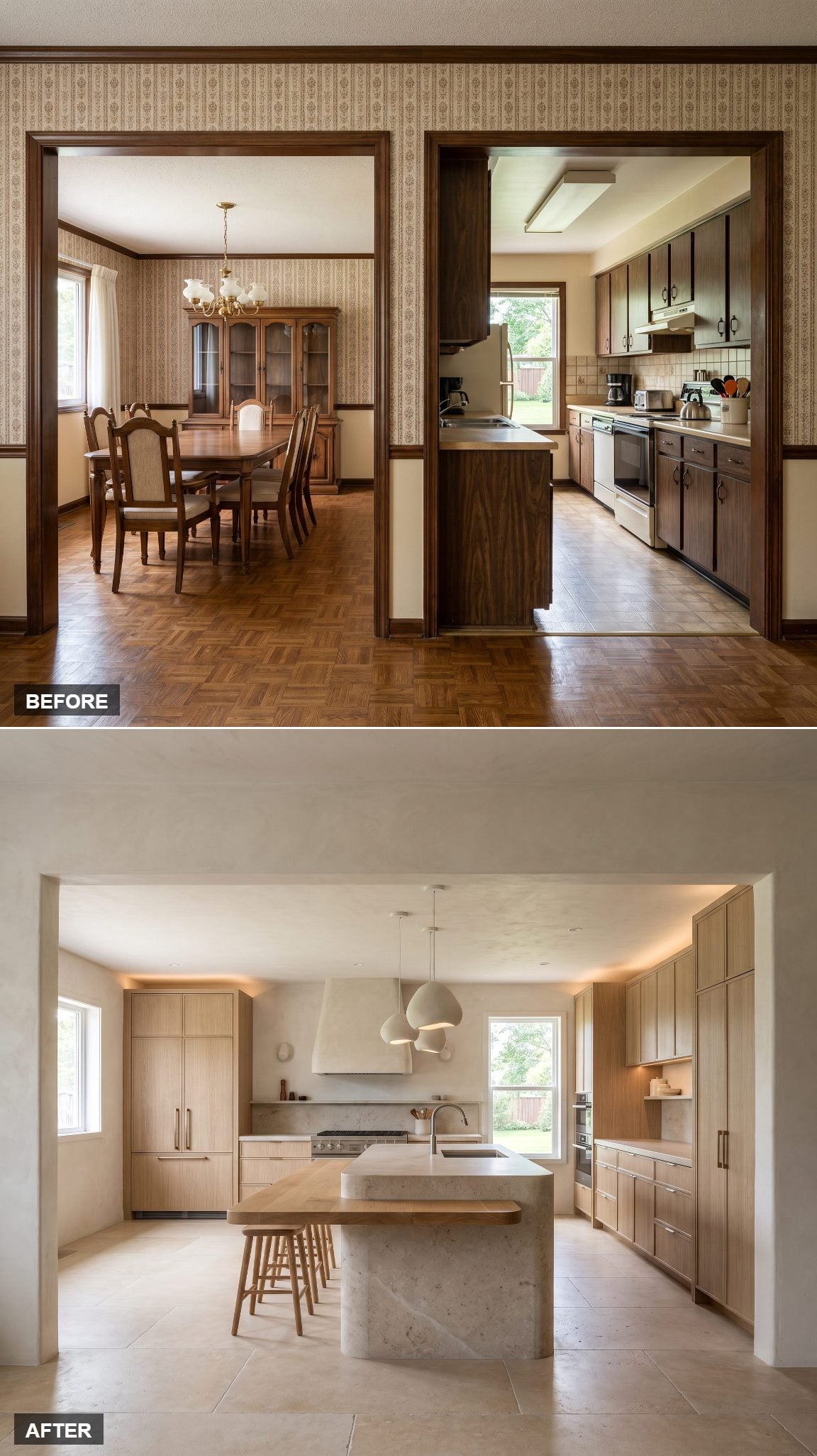
🔥 Would you like to save this?
The island here is the event: a massive asymmetrical block of natural stone, rounded rather than sharply cornered, topped with a thick cantilevered oak breakfast shelf that interrupts all that mineral weight.
Textured plaster walls and matte finishes keep the composition grounded instead of slick. More importantly, the expanded dining-room footprint gives this enormous centerpiece enough empty space around it to remain sculptural rather than obstructive. That’s the lesson behind the spectacle: a statement island needs room to be seen, approached and walked around, not merely room to fit.
1. Stone Arch Cooking Feature Kitchen in Mushroom and Walnut
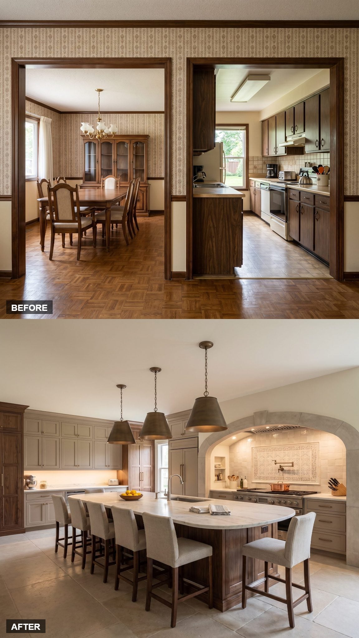
The stone arch is the entire argument of this room. It frames the range like a fireplace, turning the working heart of the kitchen into the architectural feature you see first.
Mushroom cabinetry gives the arch room to dominate without disappearing into white or competing through color. Walnut towers bring depth to the perimeter, while the oval marble island answers the arch with another softened form in the center. Nothing here treats the reclaimed dining room as leftover square footage.
The strongest transformation isn’t necessarily the kitchen with the most cabinets, the biggest island or the longest appliance list. Sometimes giving the dining room back to the kitchen means using the extra space to restore something older and more elemental: a room with a center, a hierarchy and one unmistakable reason to look up when you walk in.