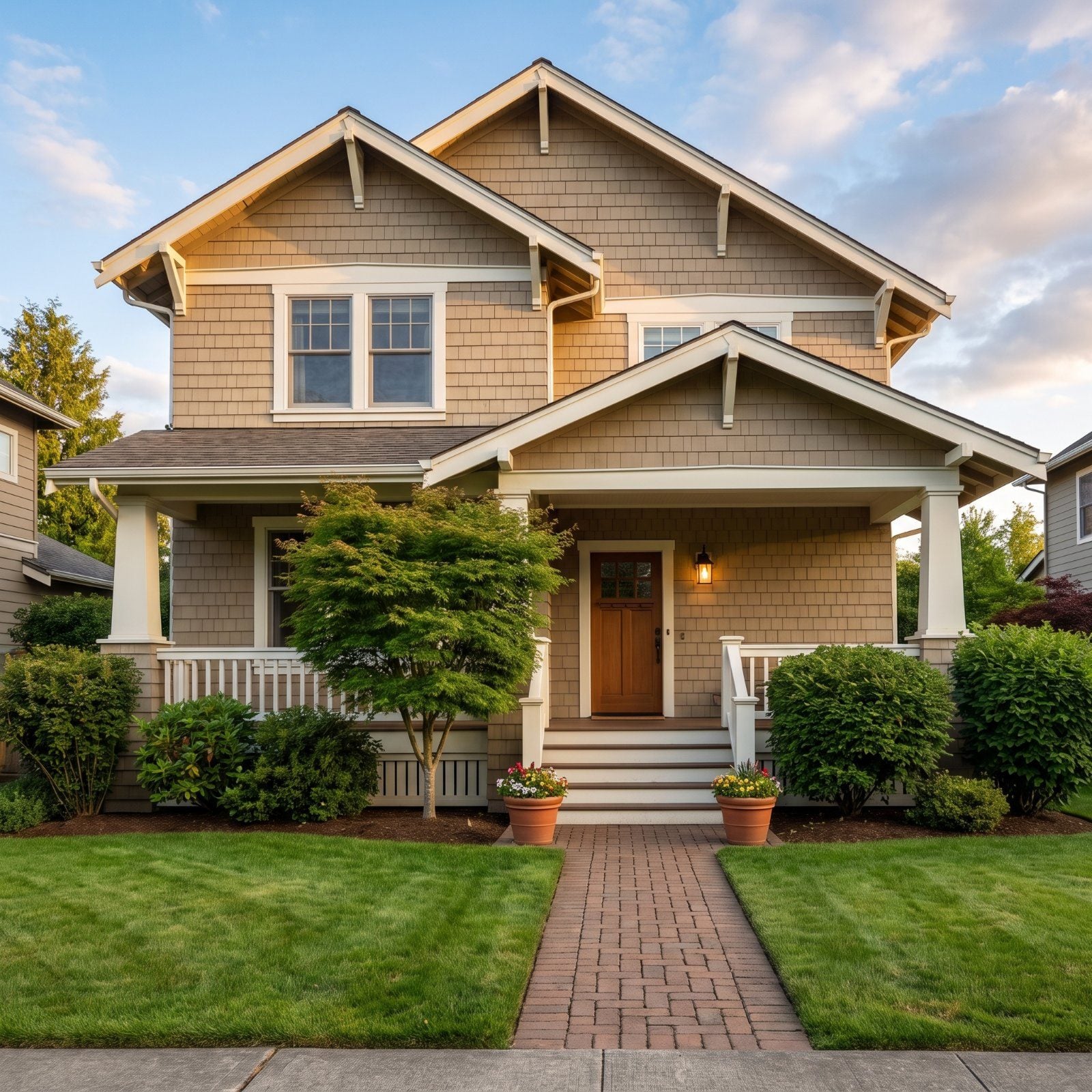
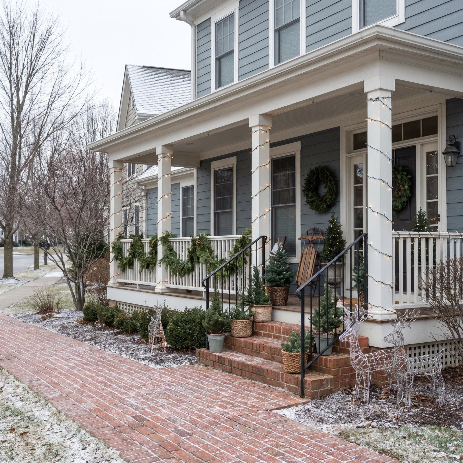
A porch tells on you from the street. Not up close, where the details forgive each other, but from the sidewalk where the whole thing reads in one glance. That’s the view the neighbors get, the mail carrier gets, the one you get every time you pull into the driveway. Most porches don’t fail because somebody didn’t try. They fail because somebody tried in ten directions at once. Here’s what goes wrong, and how to catch it before you plug anything in.
38. Decorating Every Flat Surface Until Nothing Has Room to Breathe
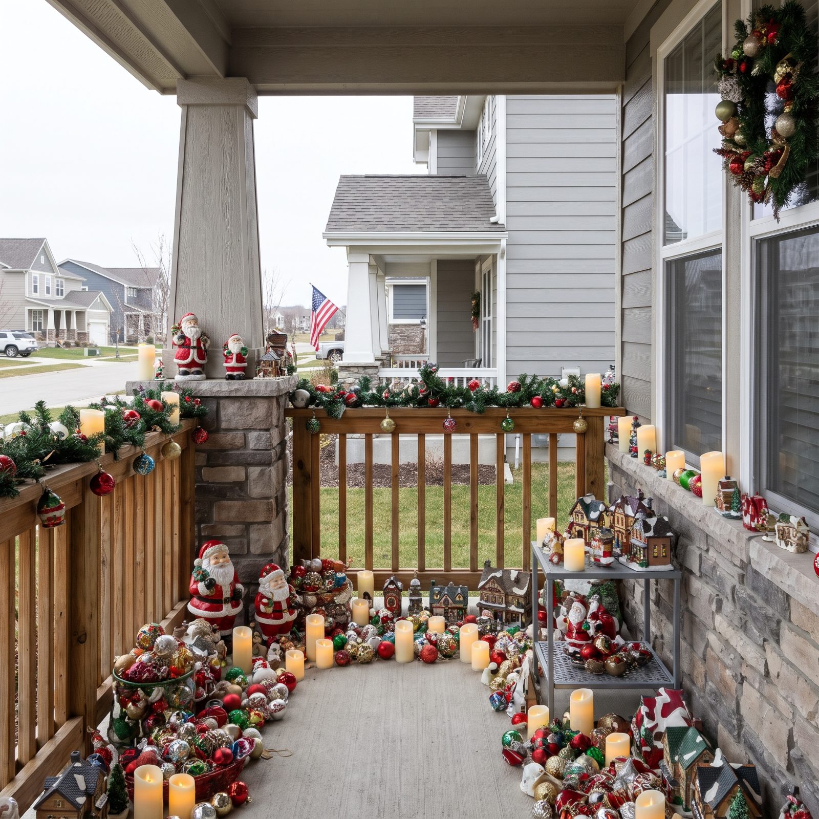
The eye needs somewhere to rest. When every ledge, table, and railing cap carries a cluster of something, there’s no rest at all, just a wall of stuff from the curb, and you stop seeing individual pieces and start seeing noise.
In order to come up with the very specific design ideas, we create most designs with the assistance of state-of-the-art AI interior design software. Also, assume links that take you off the site are affiliate links such as links to Amazon. this means we may earn a commission if you buy something.
It’s tempting to think more decorated surfaces means more festive, but it just means more to look at and less to actually see. Pick two surfaces to load up and leave the rest almost bare. The empty spots are what make the full ones read as deliberate.
What Our Readers Say
- When Home Stratosphere readers disliked a room and tapped a reason, “too busy” came up 14% of the time, right behind “not my style”, “too cold” and colour.
- Outdoor photos with brown accents earned more hearts from our readers than the other images in the same articles, 75% versus 67%.
From Home Stratosphere reader polls and votes.
37. Turning the Porch Into an Inflatable Crowd

One inflatable is a wink. Four is a parking lot. They each want to be the main character, and inflatables are loud by design, big saturated shapes that flatten everything subtle around them.
The problem gets worse during the day, when they slump into deflated lumps on the grass and the cords show. A good rule: one inflatable, placed off to the side, treated like a guest and not the host.
36. Creating Three Competing Focal Points
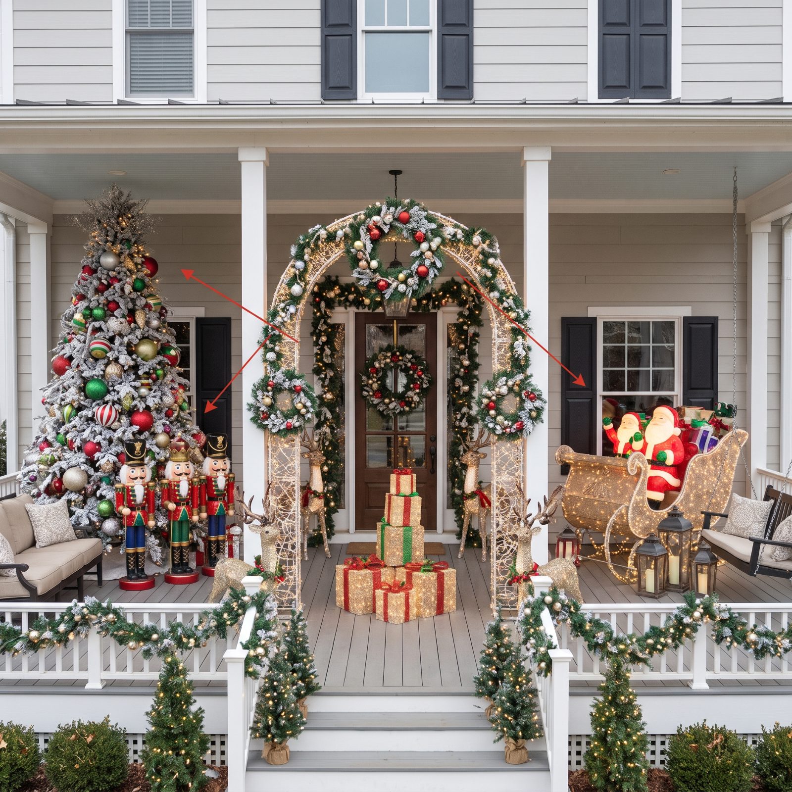
A porch can have one star. Give it three of equal weight and the eye pings between them with nowhere to land, like a room where everyone talks at the same volume.
Decide your hero before you buy a thing. The door, usually. Then everything else drops a notch in size, brightness, or both, so it supports instead of competes. Want ideas for a composed, intentional entry? A cream porch scheme makes the hierarchy easy because the pale backdrop lets one bold element own the view.
35. Wrapping Every Inch of the Railing
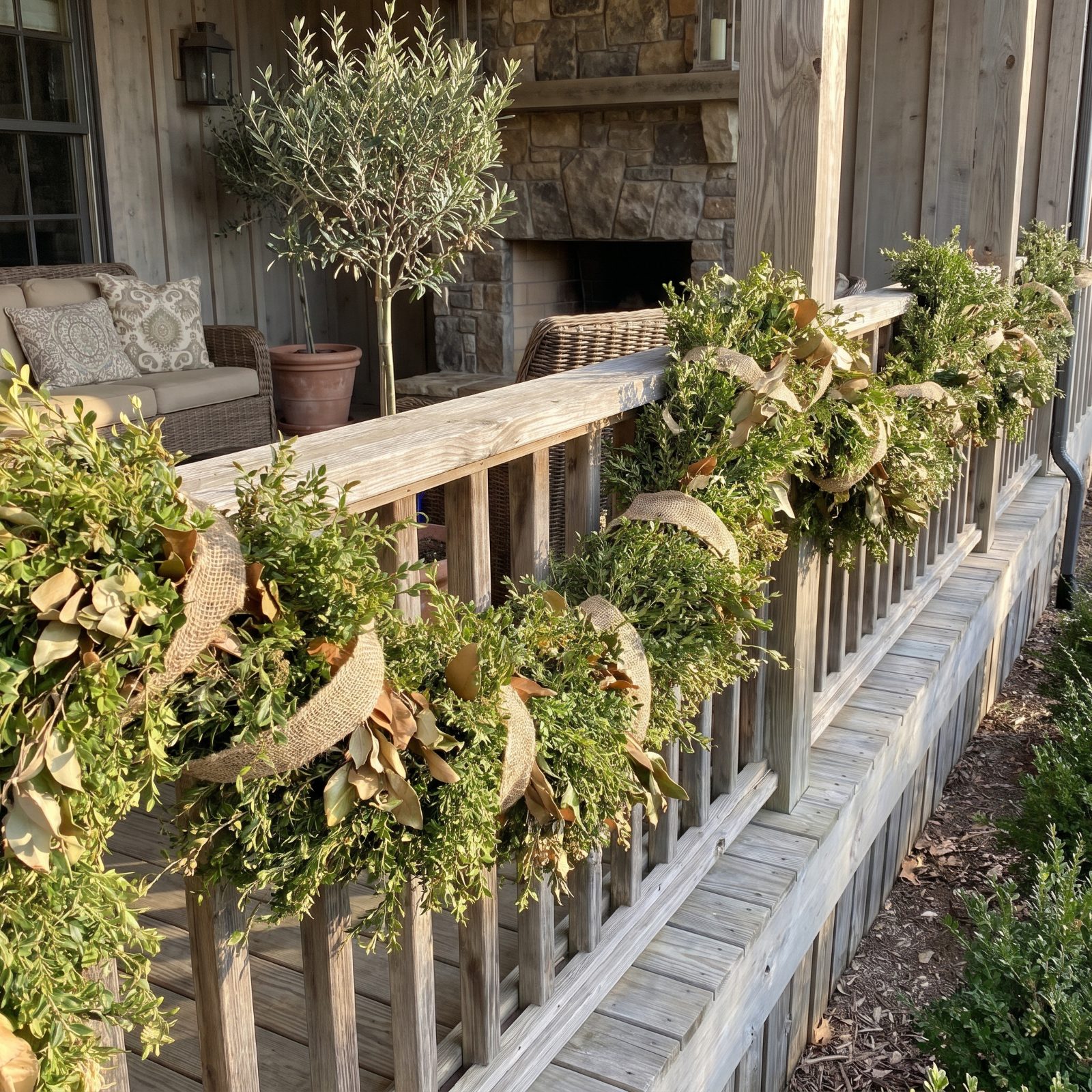
A railing fully swallowed by garland loses its shape. From the street, that clean architectural line framing your porch just vanishes into a green log with bows on it.
Leave the garland in sections. Swag it between posts so the railing still reads as a railing. The gaps aren’t unfinished. They’re what let the decoration sit on the structure instead of erasing it.
34. Packing the Steps With Mini Trees
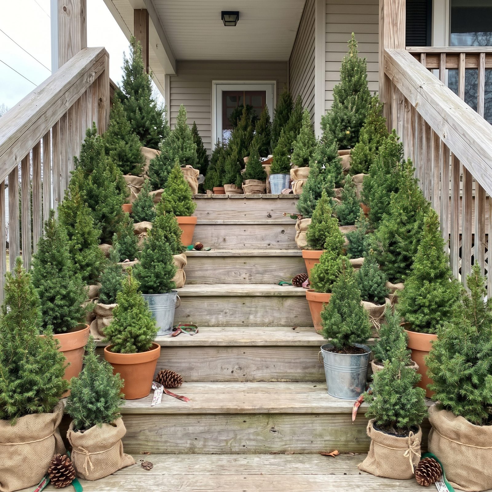
Steps are for climbing. Line both sides of every tread with little trees and you’ve built a hedge maze nobody can walk through without turning sideways.
It also looks fussy from the street, a dozen identical shapes repeating like a pattern that forgot to stop. Three trees, graduated in height, grouped at the base of the stairs, and you’ve said something clear. The flanked-staircase look turns desperate the second someone has to deliver a package.
33. Lining Up Too Many Holiday Signs
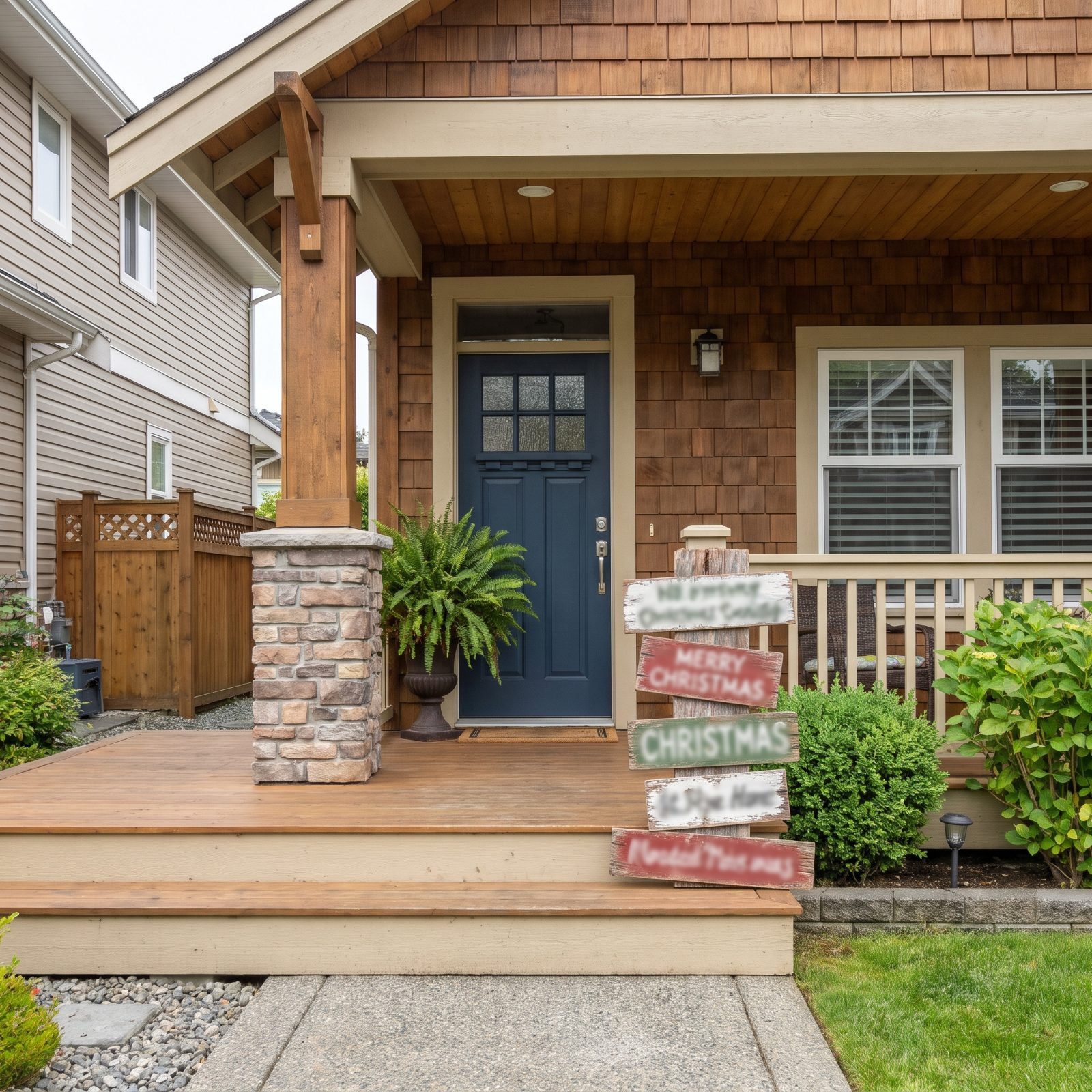
From the curb you can’t read a single one. Five signs with five fonts become a visual mumble, especially since nobody’s standing close enough to catch the clever message anyway.
One sign, propped where it has space around it, actually gets read. The rest just crowd the frame. Honestly, I’d rather a porch say nothing than shout five things at once that all cancel out. A clean red mudroom design inside can carry the cozy-message energy where people actually pause to look.
32. Hiding the Door Behind an Oversized Wreath

A wreath should sit inside the door’s frame with air around it. Go too big and it eats the door, covers the knocker, spills past the casing, and the entry you built a whole porch around is suddenly gone.
Rule of thumb: the wreath should fill the upper half to two-thirds of the door, not the whole thing. A door you can still see is an invitation. A door you can’t is a shrub.
31. Burying Porch Columns in Bulky Garland
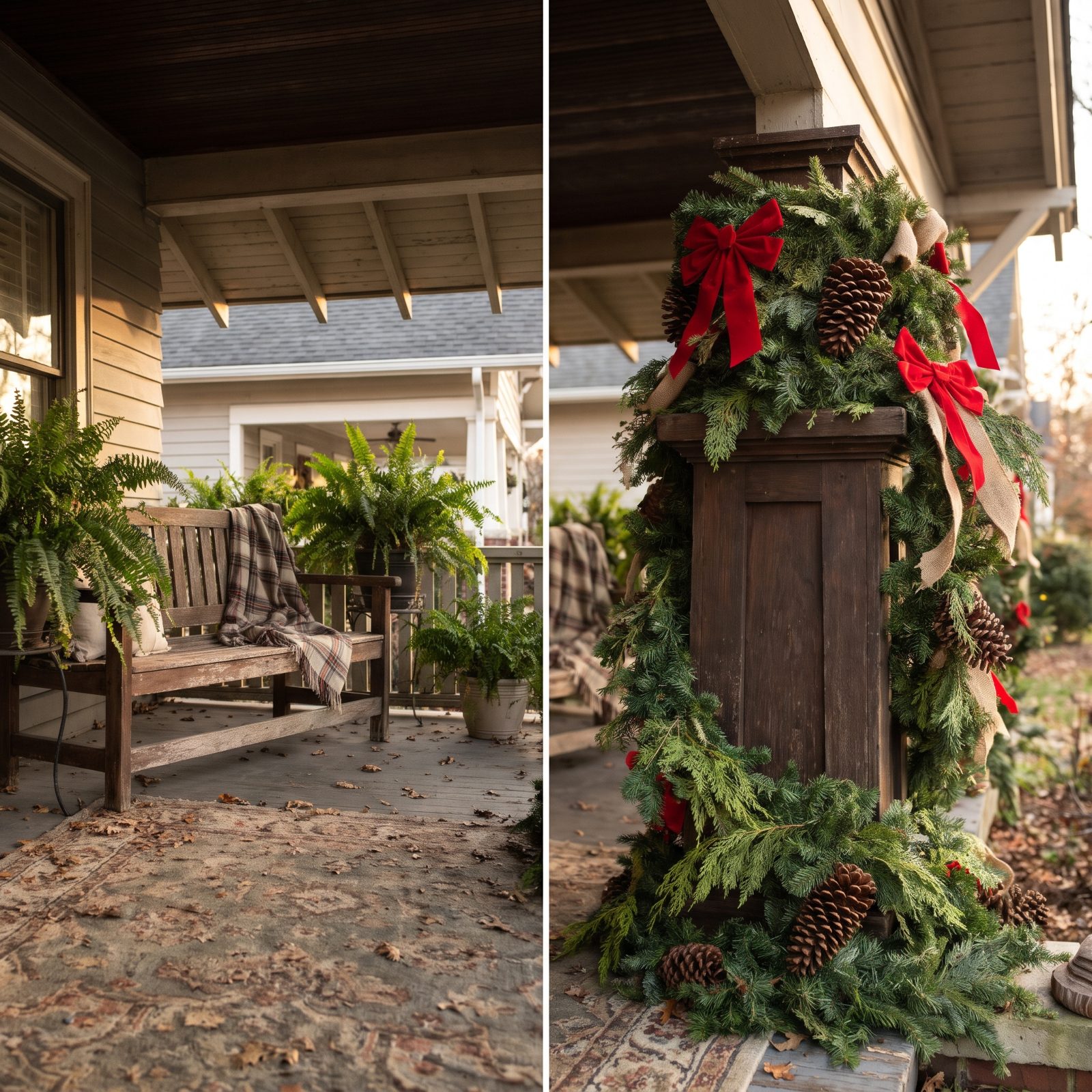
Columns are the porch’s good bones. Wrap them in fat garland and they go from tall and clean to short and lumpy, like a column wearing a coat two sizes too big.
Want greenery on them anyway? Use a thin spiral with real spacing between the loops, or skip the columns entirely and let them frame the scene bare. Proportion is the whole game here, and bulky garland loses it every time.
30. Using a Rainbow of Unrelated Christmas Colors
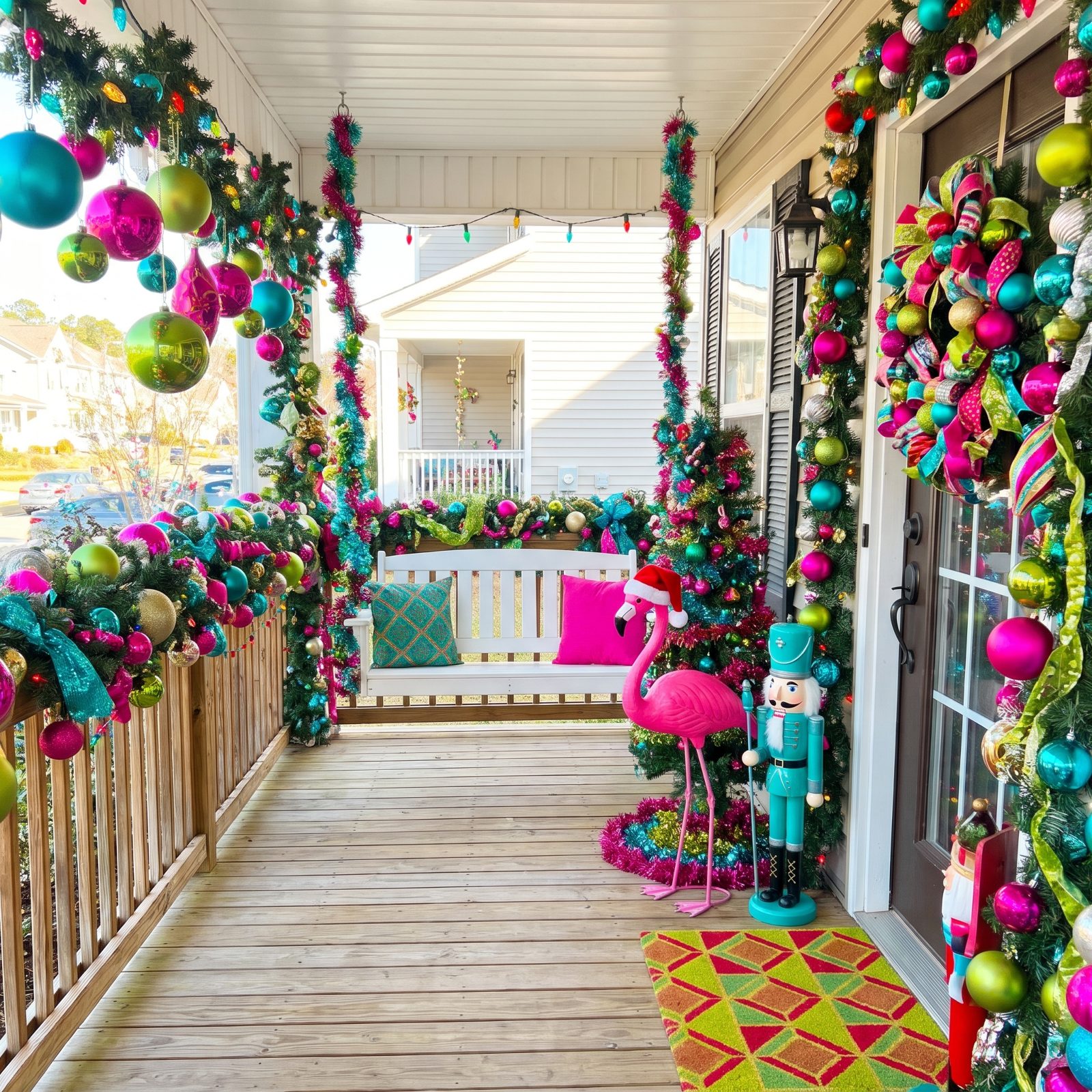
Color is where porches fall apart fastest. Teal, hot pink, lime, red, gold, silver, all in one view, and the whole thing reads as leftovers rather than a plan.
Pick two colors and one metal. That’s it. Red and green with brass. Blue and white with silver. The restraint is what makes it look designed instead of accumulated over fifteen years of clearance bins. If you lean warm and bold, a tight palette of classic reds and greenery will always read cleaner than a rainbow.
29. Mixing Icy LEDs With Warm White Lights
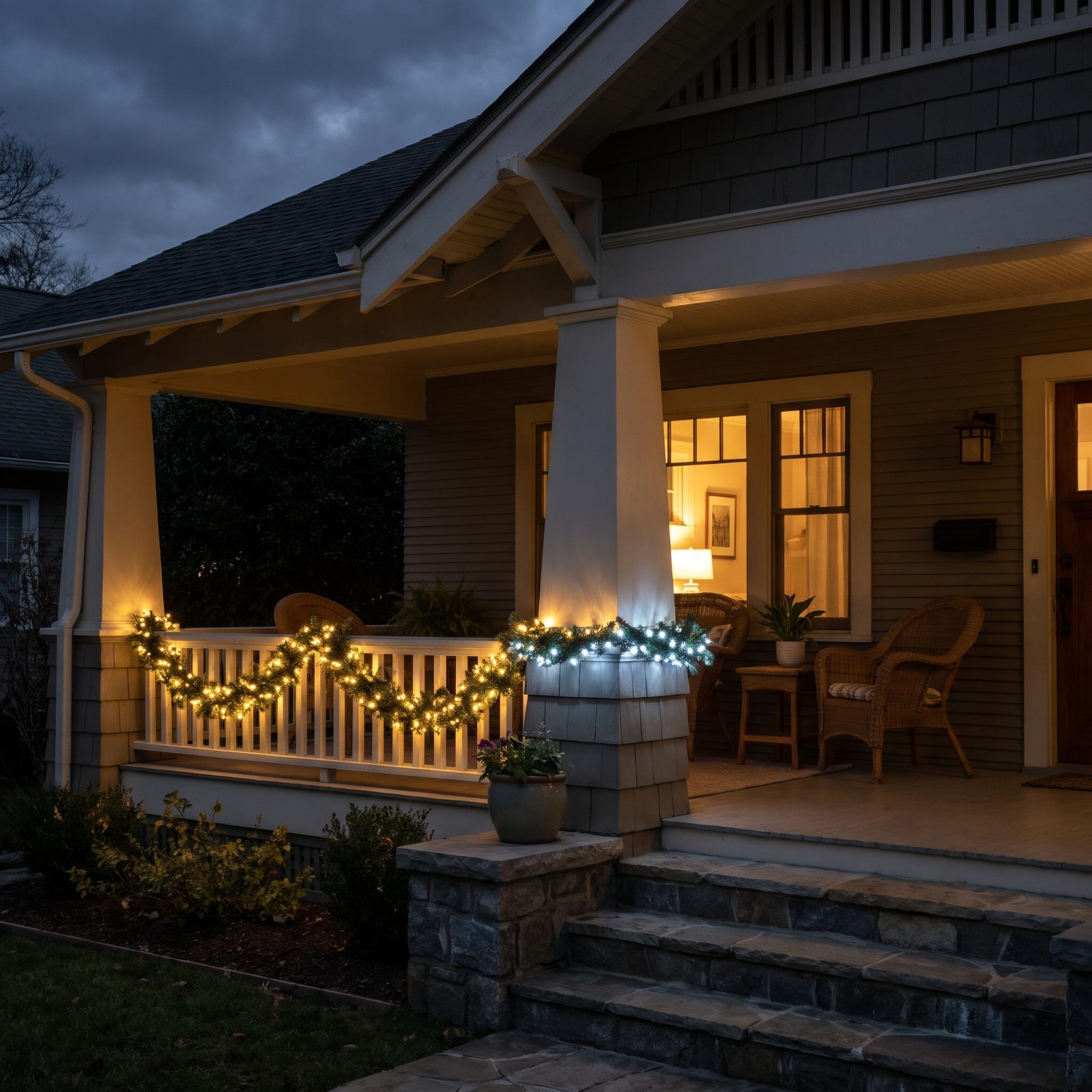
This one hides until the sun goes down, then it’s the only thing you see. Cool blue-white LEDs next to warm amber lights look like two different holidays arguing on the same porch.
Check the Kelvin rating before you buy. Warm white sits around 2700K and reads cozy. Cool white runs 5000K and up and reads like a hospital hallway. Pick one temperature and commit across the whole porch. From the street at night, matched lights look professional. Mismatched ones look like whatever was left in the garage, which, honestly, usually is exactly what happened.
28. Combining Chasing, Twinkling, and Flashing Light Patterns on One Facade
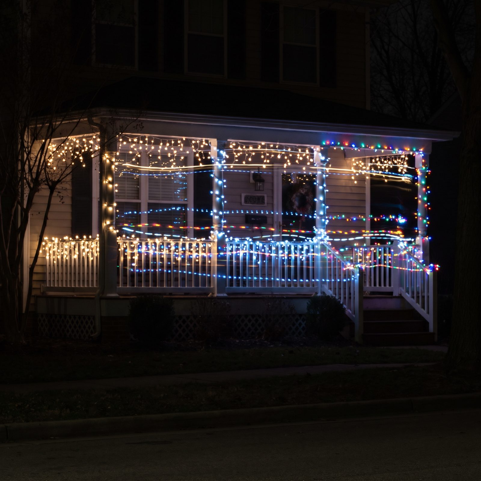
Pick one light behavior and stick with it. Run a chasing strand next to a twinkling one next to a flashing one, and your eye has nowhere to land — it bounces. The porch reads as noise instead of welcome.
Steady warm white is the safe bet, and honestly the most expensive-looking thing you can do. Want movement? Choose a single slow twinkle and let it work alone. Three competing rhythms on one small facade is three songs playing at once.
27. Letting One Ultra-Bright Decoration Overpower Everything Else
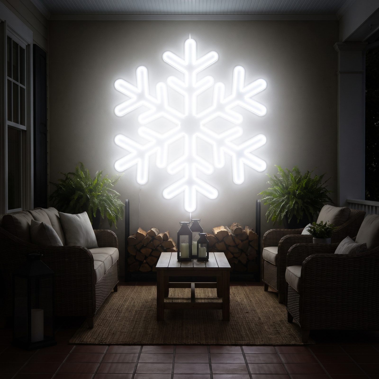
One decoration cranked to eleven makes everything around it look like an afterthought. The eye goes straight to the brightest object and skips the rest, so all that effort you put into the wreath and the potted greens may as well not exist.
Brightness needs a pecking order. Let the entry be the star, keep supporting pieces dimmer, and step down gently from there. A warm white string light strand reads far more polished than one blinding hero piece drowning out its neighbors. I’ve killed a few porch displays this way myself, so I say it with love.
26. Outlining Every Architectural Edge With Lights
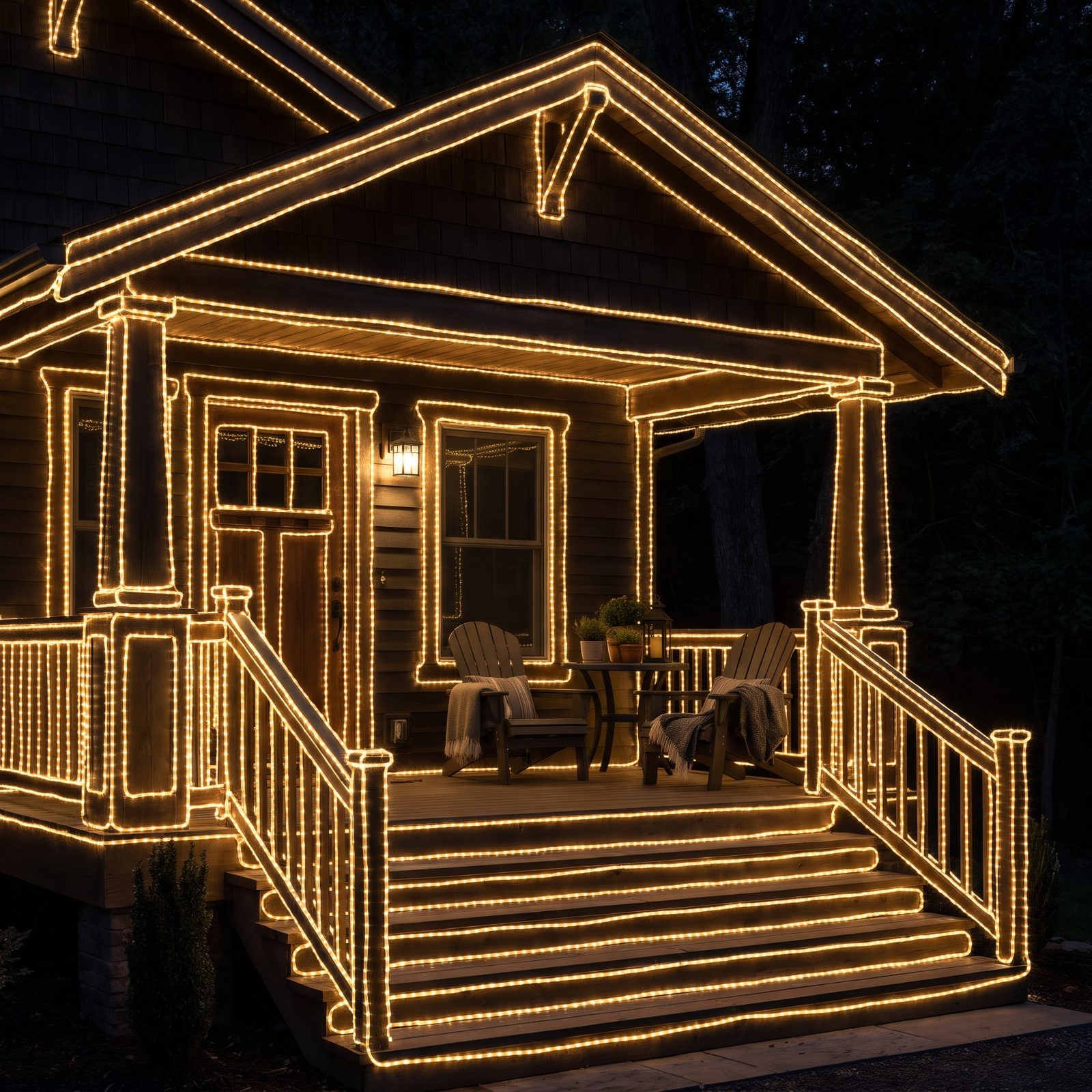
Not every edge needs a light on it. Trace the roofline, the windows, the posts, the door, the railing, and the whole house turns into a glowing diagram of itself. Busy. A little frantic, like someone couldn’t decide where to stop.
The fix is restraint. Pick the lines that matter — usually the roofline and the entry — and leave the rest dark. Negative space is doing real work here. A cream porch looks far more composed when two strong lit lines carry the whole look instead of forty weak ones.
25. Leaving Net-Light Grids Obvious in Daylight
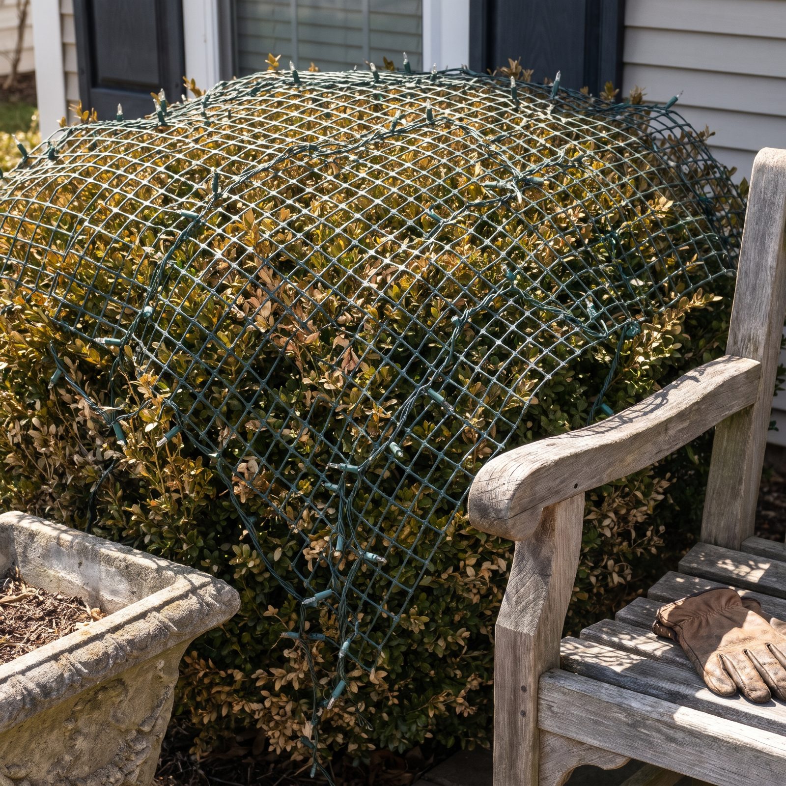
Net lights are a nighttime illusion. In the dark they read as scattered glow, but by daylight they’re a grid of plastic wire draped over your bushes, and that square pattern never matches the shape of a shrub underneath it.
If you use nets, tuck them deep into the foliage so the grid disappears — or accept an eleven-hour daytime shift where the porch looks half-decent at best. Honestly? Wrapping a few strands loosely by hand almost always beats a net thrown on top.
24. Showing Tangled Wires Across the Facade
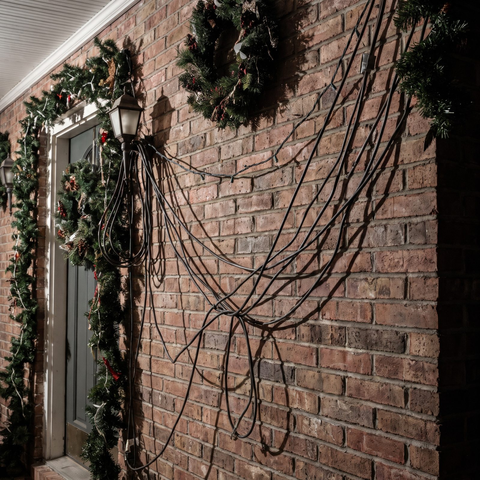
The lights can be perfect and the wiring still wrecks the whole thing. Slack cord looping across brick, drooping from the ceiling, pooling at the base of a post — your eye finds the mess before it finds the glow.
Wire management is the unglamorous half of porch lighting, and nobody wants to talk about it. Run cords along edges, hide the slack behind posts, keep extension runs tight to the ground. A black cord clip set costs almost nothing and does more for the finished look than another strand ever will.
23. Exposing Plastic Clips, Zip Ties, and Tape
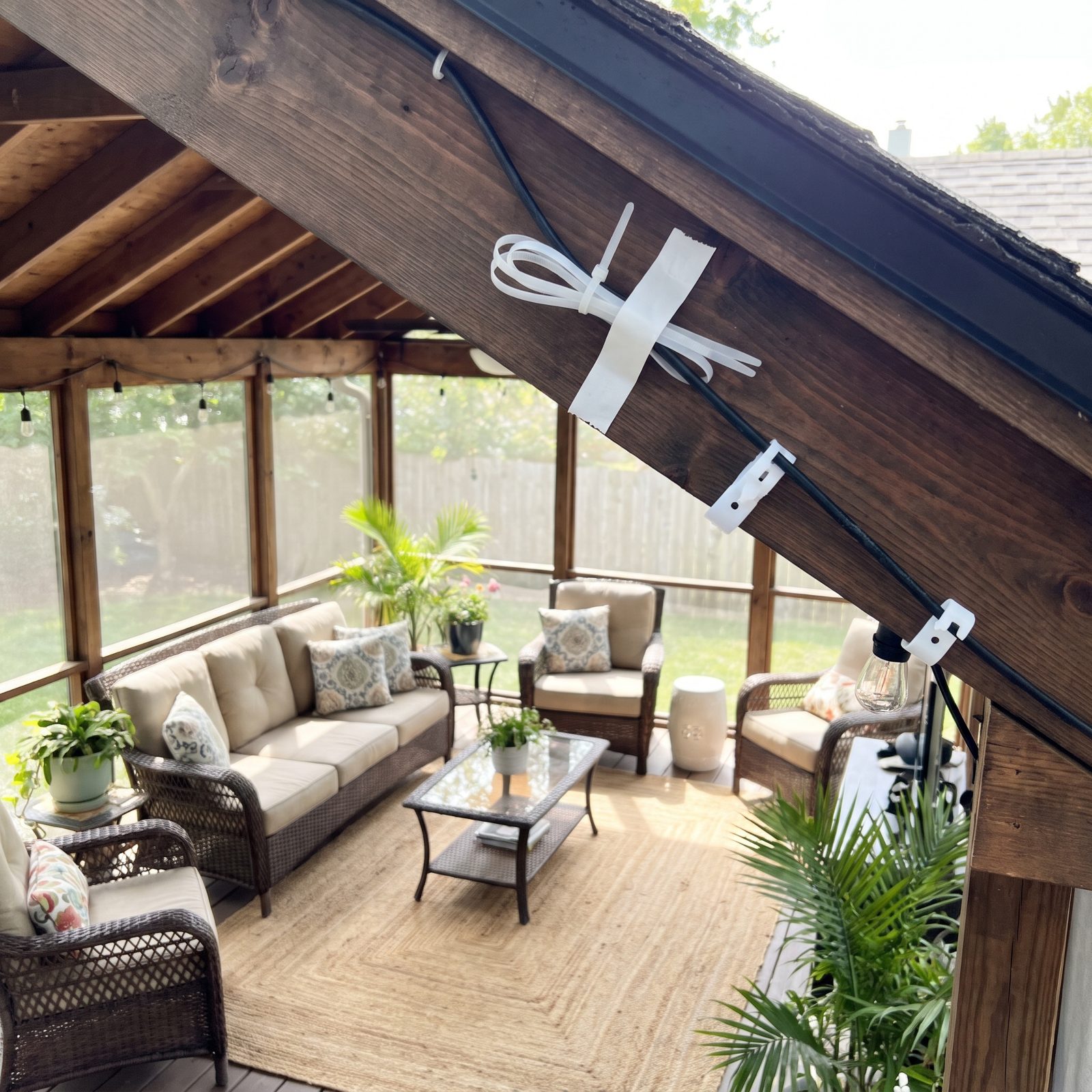
The decorations are supposed to show. The hardware holding them up is not. Bright white clips marching along the roofline, zip ties strangling a post, a strip of packing tape glinting on the window trim — all of it quietly announces the display was slapped together in a hurry.
Match your hardware to its surface, or hide it entirely. Green clips vanish into garland, dark clips disappear on dark trim, and nothing should ever be held up with visible tape. Ever. This is the detail nobody notices consciously and everybody feels.
22. Letting Garland Sag Between Attachment Points
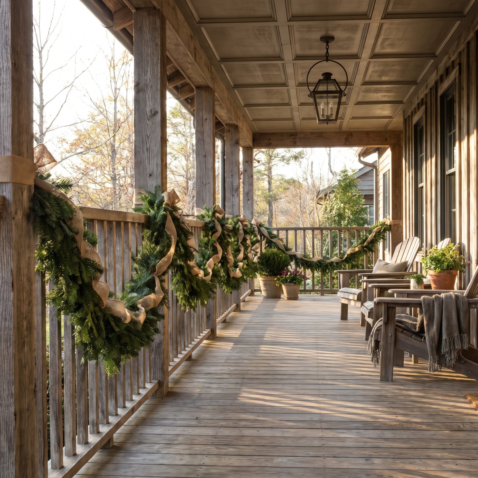
Garland lives or dies by its line. When it droops between attachment points, each swag dipping deeper than the last, the whole porch looks tired before the season even starts. One side hanging lower than the other makes it worse.
The trick is support. Secure the garland at closer intervals and run a hidden wire or floral tape along its back to hold the shape you want. A controlled swag looks deliberate. A random sag looks like gravity won. And if you’d rather chase the relaxed, layered look, lean all the way into a bohemian front porch where the looseness reads as a choice rather than an accident.
21. Hanging the Main Wreath Noticeably Crooked
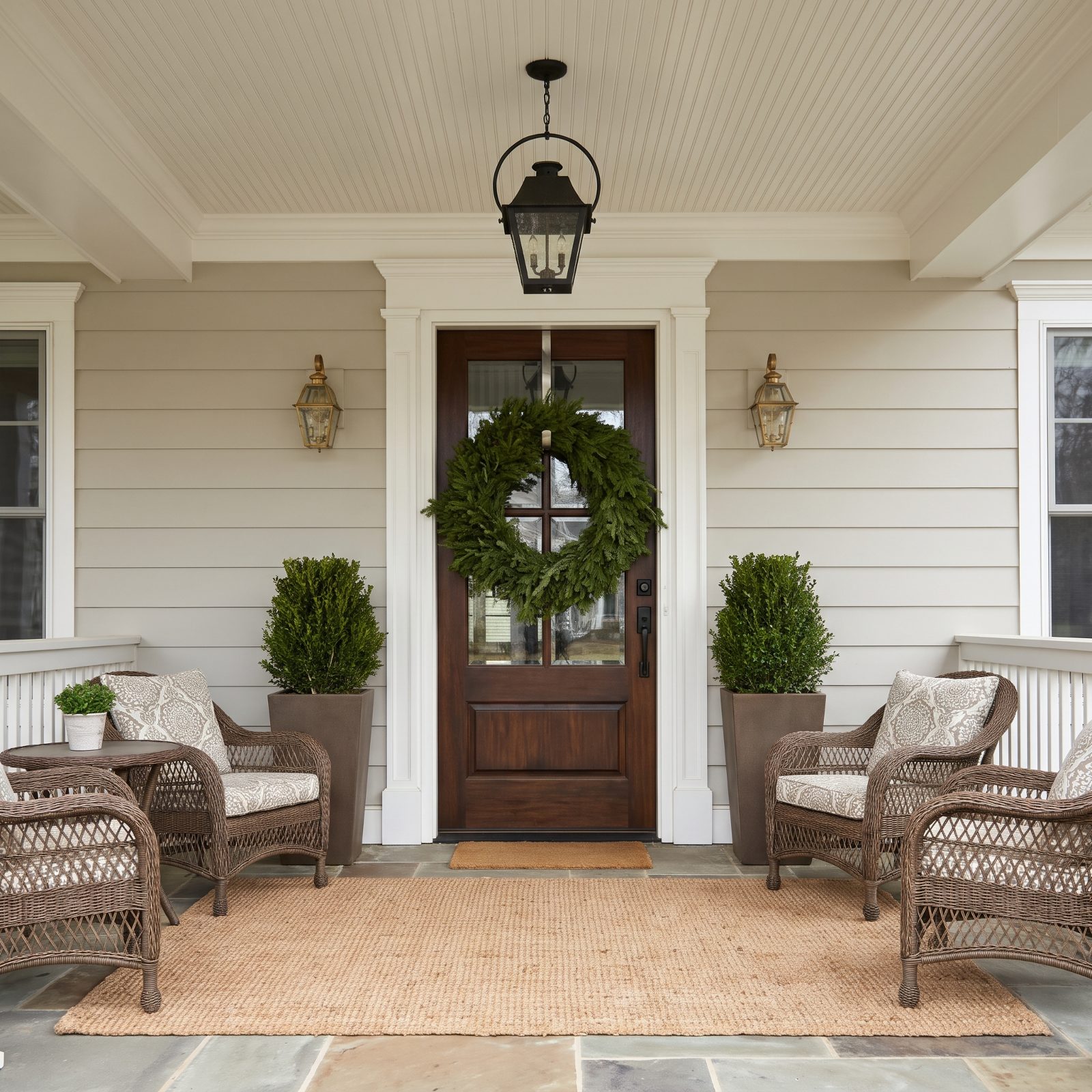
A crooked wreath is a tiny crime, and your eye catches it every single time. Everything else can be flawless — the symmetrical lanterns, the level doormat, the matched cypress. One tilted wreath and the whole entry looks careless.
Hang it, then walk to the street and check. An over-the-door wreath hanger loves to swing, so add a dab of museum putty or a second anchor point to lock it straight. The wreath sits dead center. I will die on this hill.
20. Pairing Mismatched Decorations as Though They Were Symmetrical
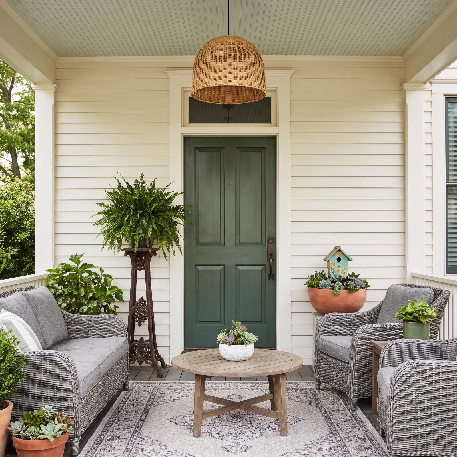
Symmetry is a promise. The moment you flank a door with a pair, the eye expects the two sides to echo each other — and when a tall slim spruce sits opposite a short wide urn, that promise breaks. One brass lantern beside one black lantern does the same thing.
So commit to true symmetry with genuinely matched pieces, or go fully asymmetrical and stack heights on purpose so nobody’s expecting a mirror. The in-between is where it looks unplanned. Matched planters and black outdoor lantern pairs earn their keep when you’re going for the formal flanking look.
19. Making the Upper Half Visually Heavier Than the Entry

Load up the roofline and gable, leave the entry bare, and the whole porch tips over. Your eye gets yanked up to the busy top half and slides right past the door — the one thing a front entry is supposed to pull you toward.
Weight belongs at human eye level. Anchor the display at the door with full planters, a generous wreath, and lit steps, then let the upper decoration back it up instead of stealing the show. The entry is the destination, so decorate it like one and build up from there rather than piling everything at the peak.
18. Displaying Tiny Ornaments That Read as Specks From the Street
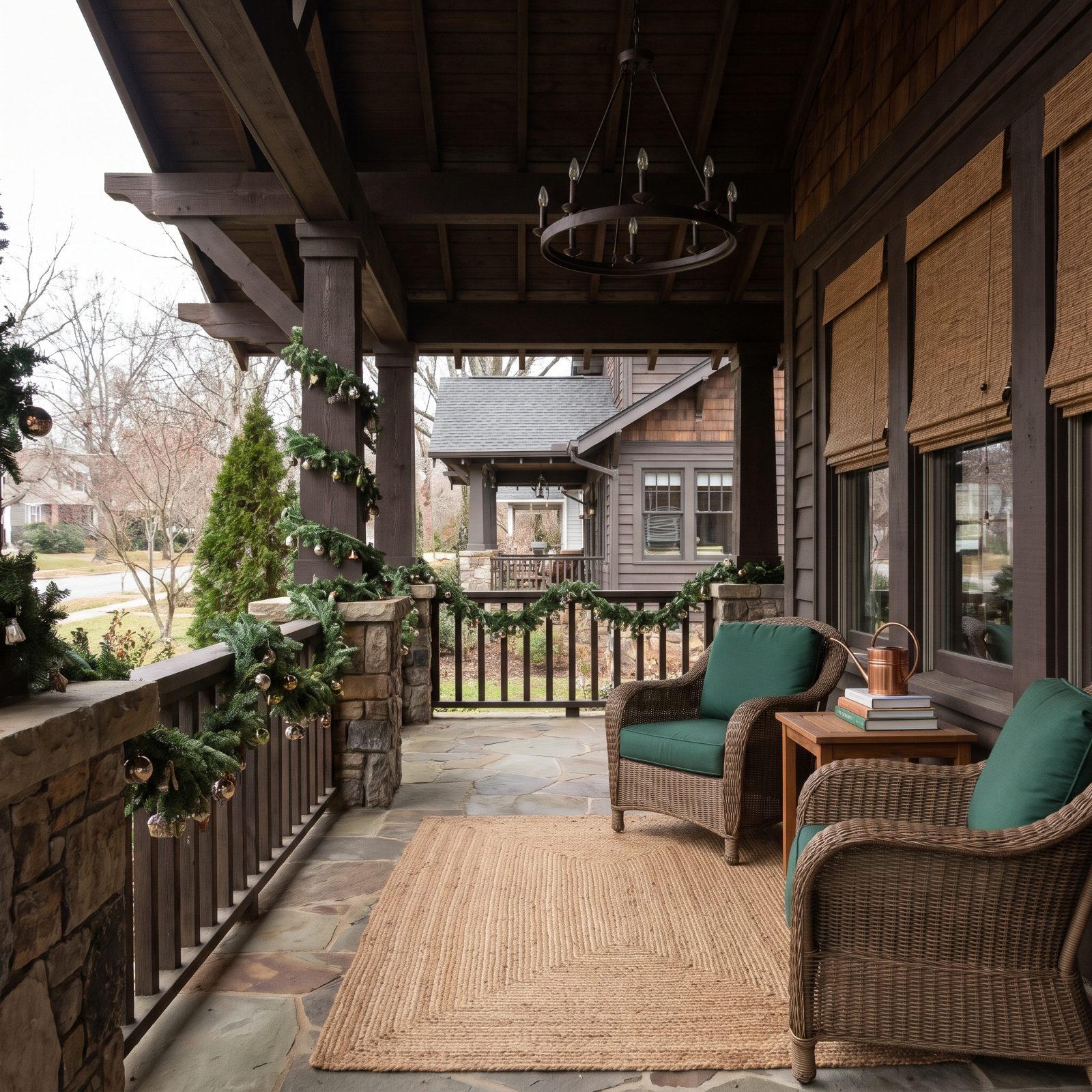
Small ornaments are a trap. They look charming in your hands on the kitchen table, then vanish the second you step back to the mailbox because scale is the whole game outdoors — from thirty feet, a quarter-inch ball is just a speck of color nobody registers.
Go big on fewer pieces instead. One oversized red outdoor ornament cluster lands instantly where a hundred tiny ones amount to nothing at all. I learned this the hard way after an afternoon spent wiring micro-baubles to a wreath that, from the curb, looked like I’d done absolutely zero.
17. Letting Giant Props Dwarf a Small Porch

A giant prop on a tight porch doesn’t look festive. It looks like the porch lost a fight. When one blow-up figure crams its entire body under the porch overhang, wedged between the posts with its head pressed against the beam and a boot spilling off the floorboards, the scale is broken and everyone walking past clocks it in a glance.
Match the prop to the footprint. A four-foot porch wants a tabletop-sized accent and a vertical garland, not something that belongs out on a front lawn where it can actually spread out. Love a big statement? Put it where it has room to breathe. Browse the tighter, smarter layouts on this cream porch roundup for proportions that fit.
16. Stacking Too Many Doormats and Rugs
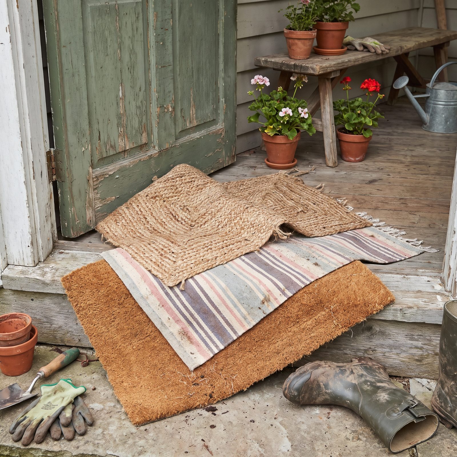
Layered rugs became a trend indoors, so people hauled it onto the porch — where it reads completely differently. Three mats stacked at the threshold curl at the corners, collect wet leaves underneath, and broadcast that the entry got decorated in stages without a plan.
One mat. Pick the right size, center it, done. If you want pattern over a plain coir layer, use a single flatweave underneath sized two inches larger on every side so the edge frames it rather than fights it. Everything else is a tripping hazard pretending to be festive.
Not everyone agrees on layering: when our readers picked a doormat they would buy, rubber led with 35%, but a layered set was close behind at 31%.
15. Piling Pillows and Throws Until Chairs Are Unusable
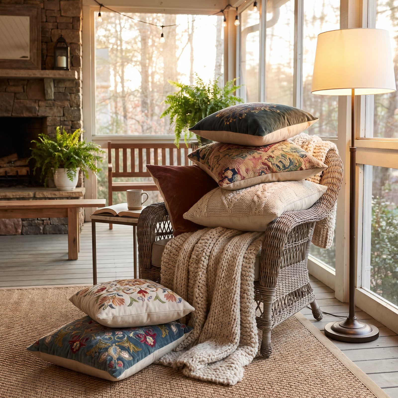
A porch chair nobody can sit in reads as staging, not living. Seven pillows and a throw per seat looks like you emptied the linen closet, and from the street the chairs disappear into one lumpy heap of plaid.
Two pillows and one throw per chair is plenty. Leave the seat clear enough that the chair still looks like furniture somebody uses. A couple of plaid outdoor pillows and a draped knit throw signal cozy without burying the thing you’re meant to use. Hold back here — it’s the step people skip most.
14. Filling Every Windowsill With Figurines
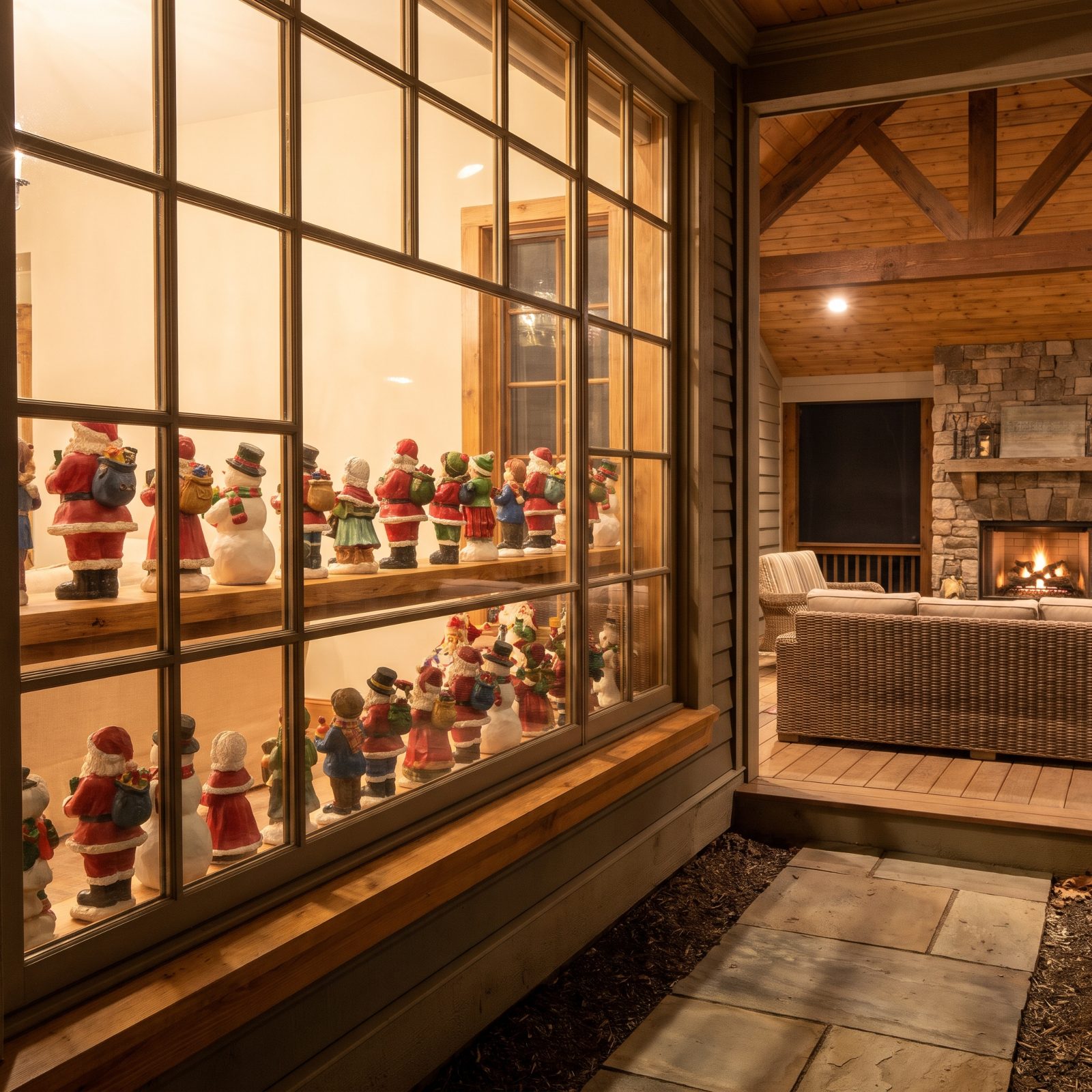
Windowsill figurines face the wrong way. You arranged them to be admired from inside, but the street sees their backs, lined up like a yard sale behind glass. A dozen per sill turns a clean window into static.
Edit hard. Three pieces per window, spaced, facing out — that’s the ceiling. Better still, hang a single candle or a small wreath in the pane and let the glass stay mostly clear. A packed sill is clutter from the curb, and the eye bounces off it instead of landing anywhere.
13. Overstuffing Planters With Picks, Bows, and Ornaments
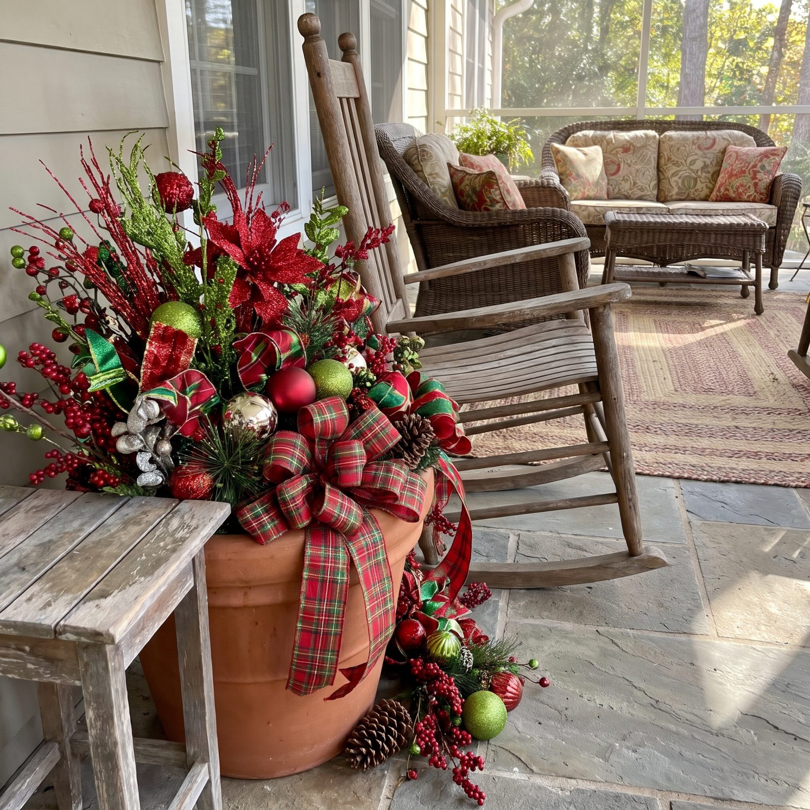
There’s a moment when a planter tips from full to frantic, and most people blow right past it. Once you’ve crammed in fifteen picks, four bows, beads, and a dozen ornaments, the evergreen base vanishes and the eye has nowhere to rest.
Pick a formula and stop. Greenery, one ribbon treatment, one accent color repeated — three things, not nine. And make the pair actually match, because a mismatched duo at the door is the first thing a passerby notices. These red-accent kitchens show how a single repeated accent beats a pile of competing ones.
If you’re choosing the planter itself, ceramic was the clear pick in our reader polls, with 65% saying they would buy it, mostly for its looks.
12. Leaving Dead Fall Plants Beneath Christmas Decorations
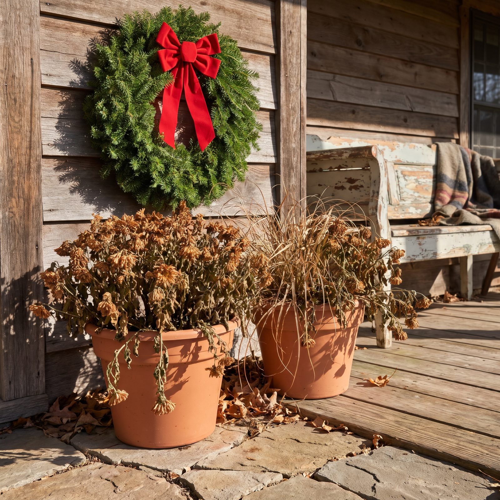
This one undoes everything else you did. A fresh wreath and a new bow mean nothing sitting on top of two pots of brown, collapsed mums left over from October. The dead plant is the loudest thing in the frame.
Pull the summer and fall casualties first, every single time, and replace them with winter greens, cut branches, or even bare birch poles. A clean evergreen in the pot costs little and resets the whole entry. Decorating around a dead fern is like vacuuming one corner of a filthy room. Nobody’s fooled.
11. Letting Packages, Shoes, and Garden Tools Join the Display
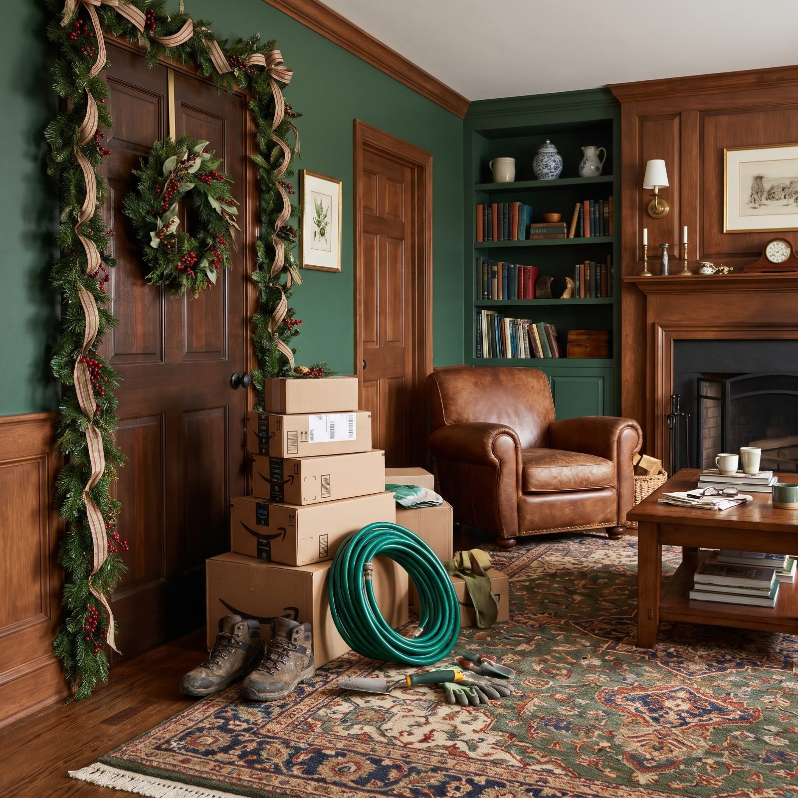
You styled the door beautifully and then parked real life right next to it. A tower of delivery boxes, muddy boots, a coiled hose, hand trowels and gloves. From the street, nobody can separate your decor from your to-do pile, so the whole thing reads as one big mess.
Give the functional stuff a home out of sight. A lidded storage bench or a bin tucked behind a planter hides boots, ice-melt, and packages while keeping them handy. A red mudroom design inside the door does even more of the work, catching the clutter before it ever lands on the porch.
10. Spilling Random Decorations Onto the Lawn
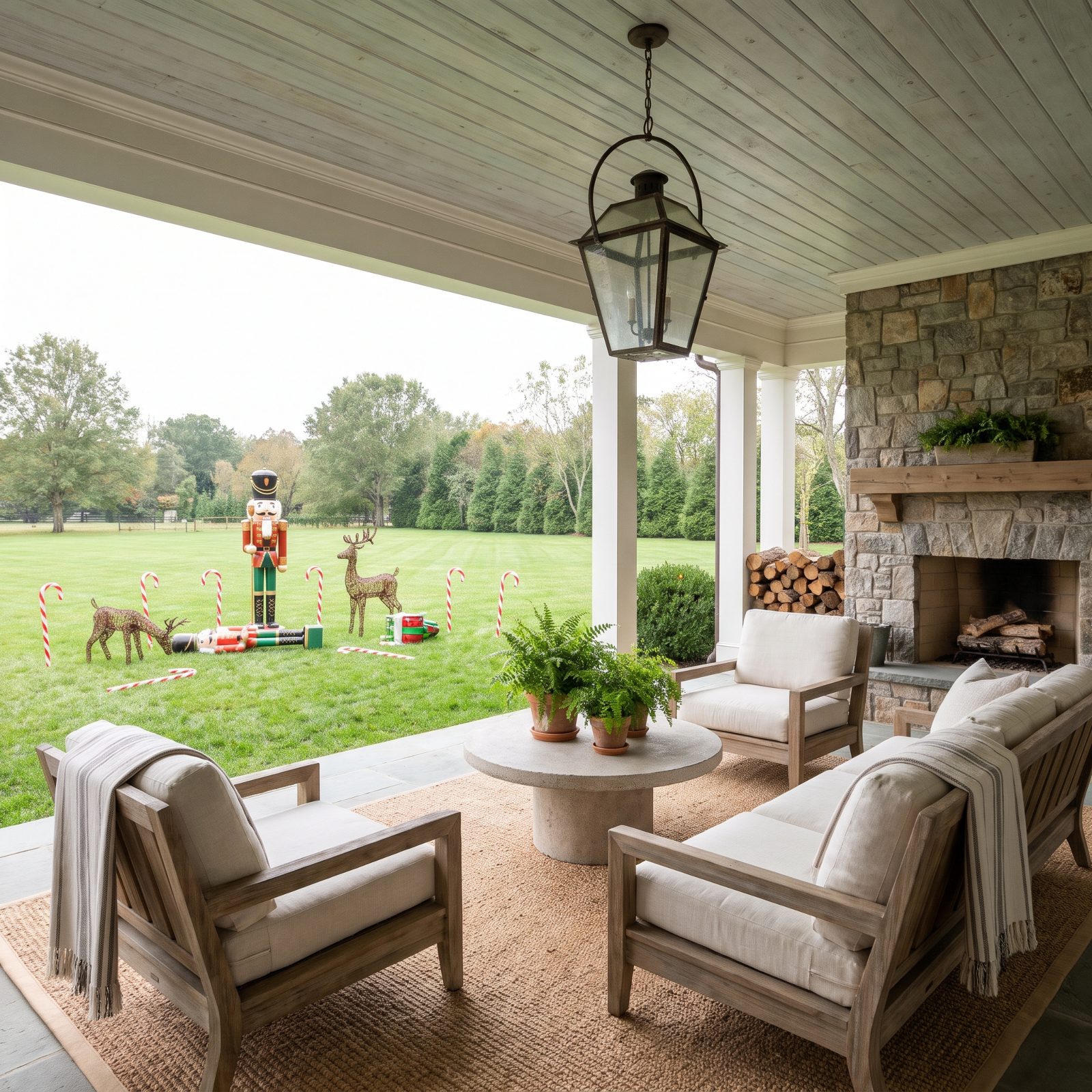
Lawn decor fails when it’s sprinkled. A nutcracker here, two reindeer there, candy canes tilting at five different angles. With no grouping and no line to follow, the yard looks like the decorations broke loose from the porch and bolted.
Cluster and align. Group pieces in tight vignettes near the walkway, repeat the spacing on path lights, and leave open lawn between zones so each moment reads clearly. Empty space isn’t wasted yard — it’s a tool. The eye needs somewhere to breathe between the things you actually want it to see.
9. Putting Decals on Every Door and Windowpane
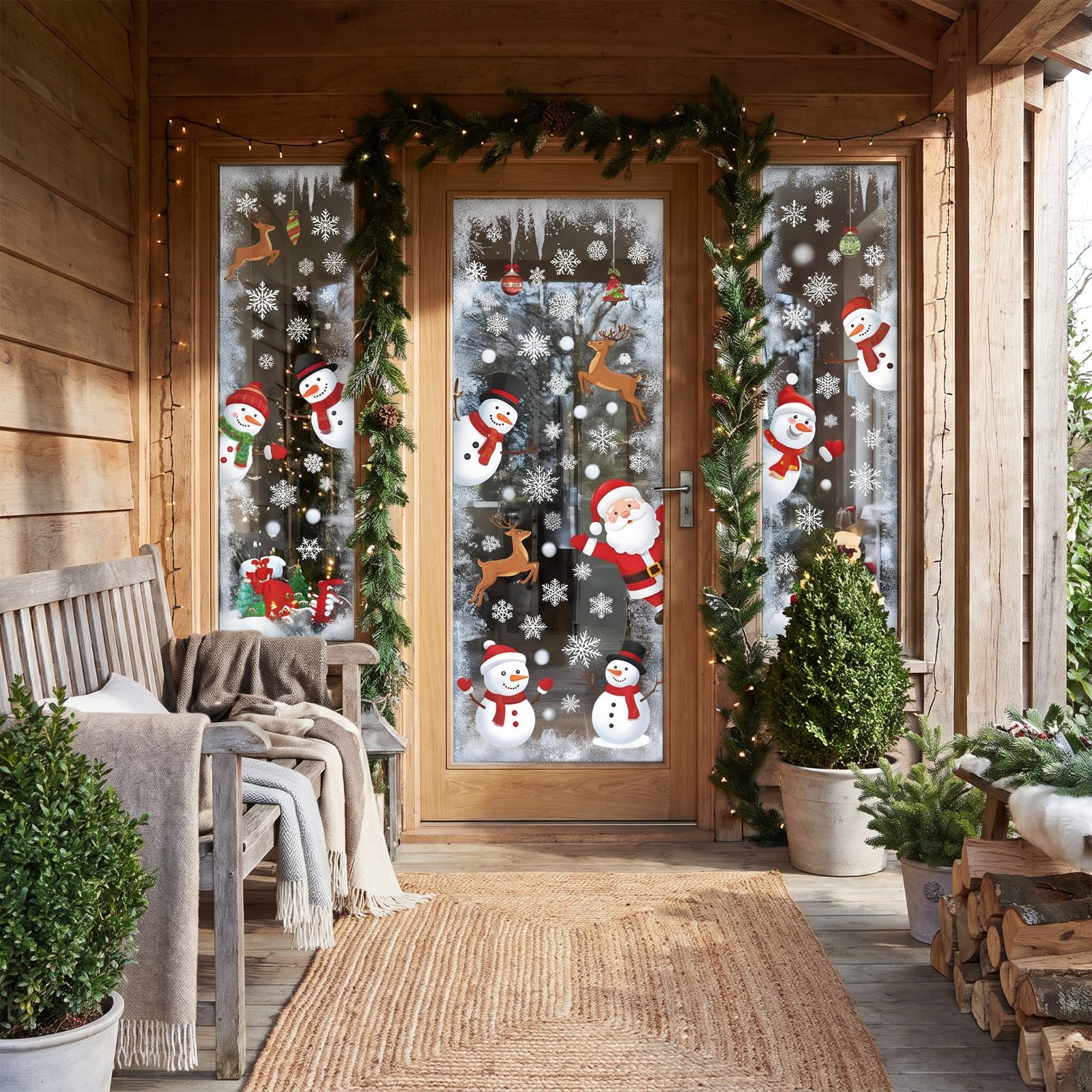
Window decals multiply fast. One snowflake looks sweet. Then it’s a snowman, Santa, candy canes, and faux frost until the glass is a sticker collage and your clean sidelight is gone. From the curb it just reads busy.
Treat glass like a frame, not a canvas. A couple of decals in the corners, or one centered cling per pane, keeps the architecture visible and the look deliberate. On a modern-style entry especially, less on the glass lets the lines of the door show. Clear glass is a feature. Smother it and you’ve thrown that away.
8. Spraying Patchy Fake Snow on Glass and Greenery
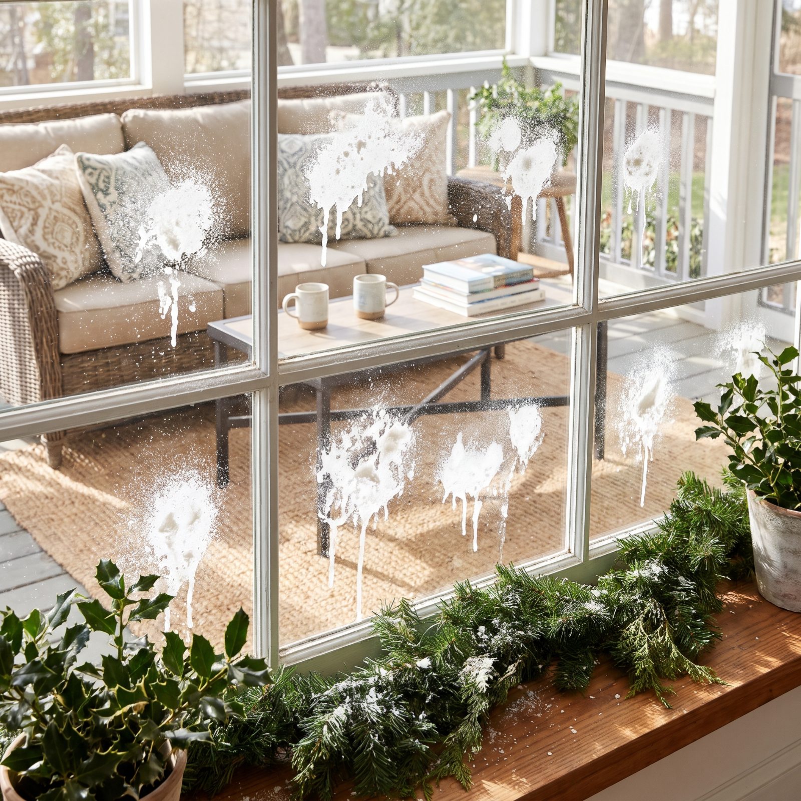
Canned snow photographs like a mistake even when it looks fine from four feet away. The problem is the patchiness. Real snow settles by physics, even and soft, catching only on upward surfaces, while the spray-can version lands wherever your wrist happened to point. Thick corners, thin middles, bare glass in between. From the curb it reads as a smear, not a storm.
Your eye wants a believable system, and this breaks it. Wreaths get flocked in one spot and left green an inch over. Windows catch glare where the coating thinned out. The whole thing looks half-finished because, visually, it is.
7. Using Shiny Tinsel That Glares in Daylight
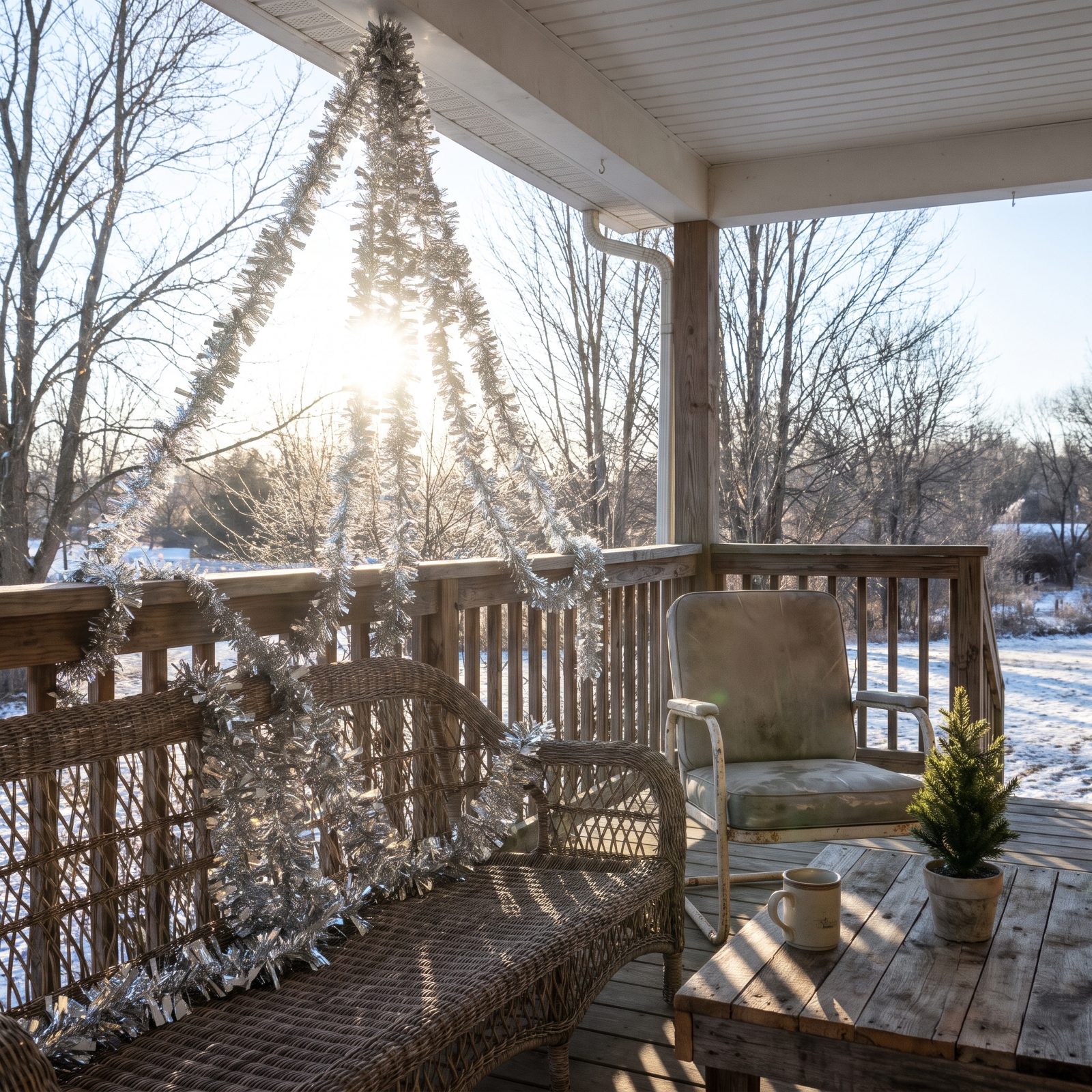
Tinsel was invented for a tree lit by a lamp at night. Drag it into winter sun and it does the opposite of what you want. Instead of a soft shimmer you get hard flashing glare, the kind that shifts as clouds pass and makes the whole rail look cheap and restless.
Daylight is unforgiving to anything mirror-finish. Matte materials read as expensive outdoors. Glossy plastic reads as the dollar bin. Swap in a plain cedar garland and that same rail holds its color all day without throwing a single ugly highlight.
6. Leaving Sandbags, Bricks, and Stakes Exposed

Every outdoor display needs ballast. Wind is real, and a toppled topiary is worse than a bare porch. But the weights are plumbing, not decor, and the eye snaps straight to them the second it crosses the sidewalk.
A grey sandbag at the foot of a lit tree cancels the tree. So does a loose brick, a black stake, a loop of orange cord. The display climbs toward something graceful at eye level, then your gaze drops to the base and finds the hardware aisle.
5. Adding a Bow to Nearly Every Object
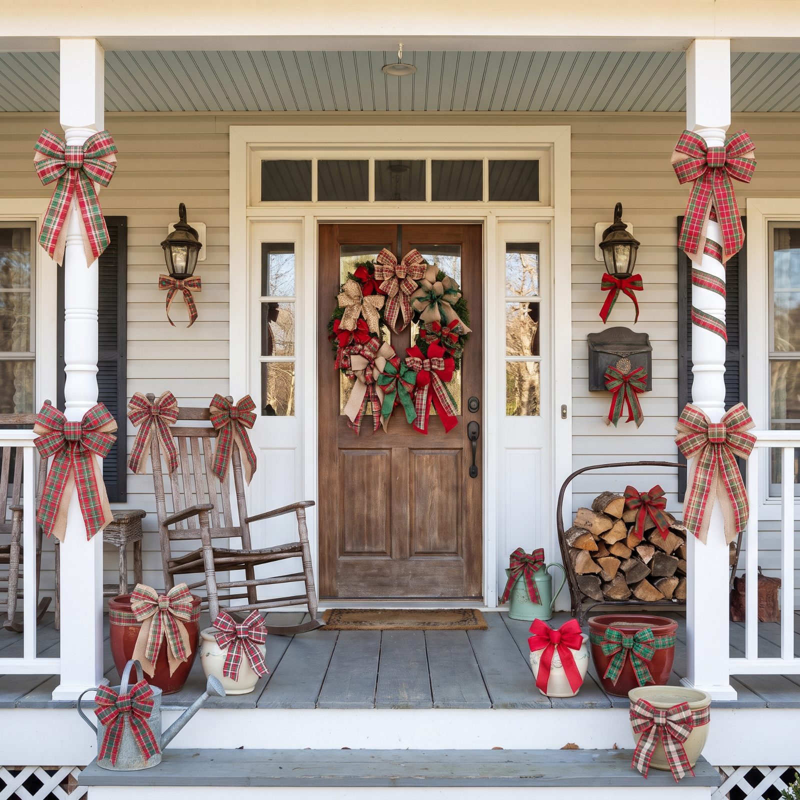
A bow is punctuation. The moment every object wears one, the sentence has no end and your eye has nowhere to rest. Nine red bows don’t read as nine times the cheer — they read as noise.
Repetition kills the accent. The first bow on the wreath says look here. The ninth says nothing, because by then your brain has filed them all under background. One generous bow in the right spot carries more weight than a dozen scattered ones.
Pick your hero: the door wreath, or the central lantern. Give that one a proper, oversized bow and let everything else stay quiet.
4. Mixing Too Many Obviously Different Faux Greenery Types
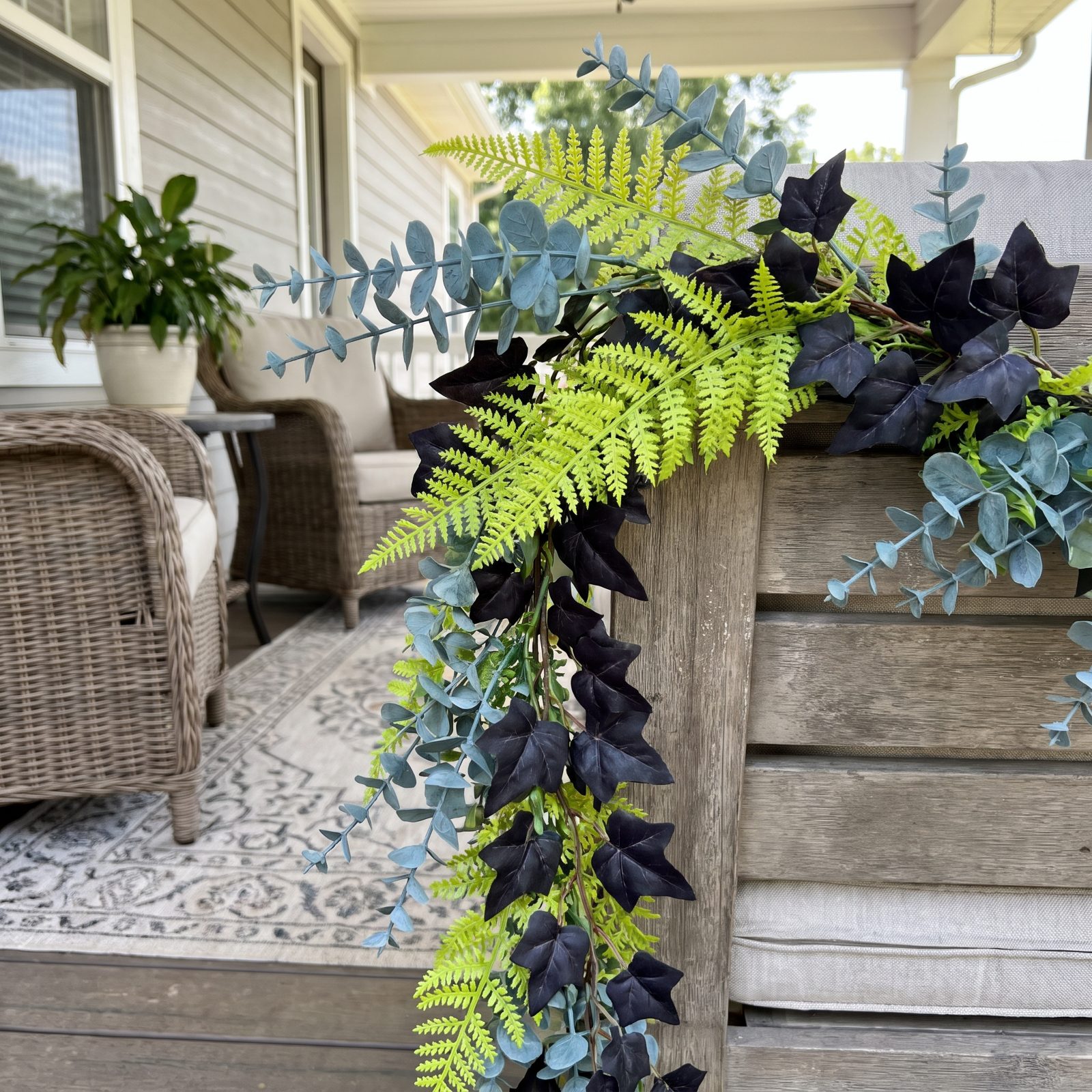
Faux greens come in wildly different greens. One box leans blue-grey, the next leans acid-lime, a third is almost black. Shop across three seasons and three stores and you’ll end up with a patchwork that no amount of lights can rescue.
Real gardens vary in tone too, but it’s close variation. Your eye accepts a cedar beside a fir because they live in the same color family. It rejects a cheap plastic pine butting against a flocked spruce, because the seam where they meet announces itself.
Commit to one greenery line, or at least one tone, and the whole porch pulls together.
3. Spacing Decorations at Random Along the Rail and Steps
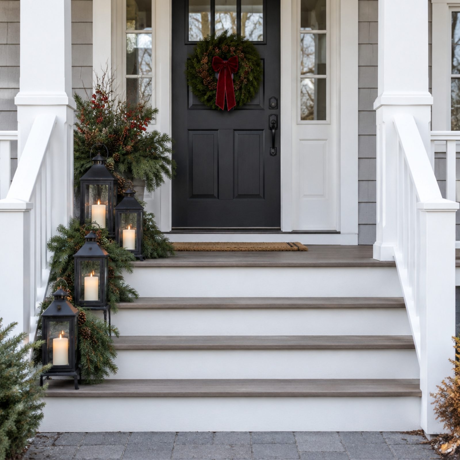
Symmetry is the easiest win in porch decorating and the most often ignored. Four lanterns, a tall berry-and-evergreen planter and trailing pine boughs bunched on the left side while the right side of the steps sits completely empty doesn’t read as casual — it reads as leftover.
Most people instinctively want the front of a house balanced, because the door is a face and faces are symmetrical. Pile everything on one side and something feels subtly off, even to people who can’t name why.
So mirror your groupings. Match the left step to the right, space your rail elements on an even beat, and the whole entry calms down.
2. Letting Decorations Project Beyond the Porch Footprint

A porch has a footprint, and good decor respects it. The second a topiary wanders two feet onto the walkway or an inflatable flops over the rail into the hedge, the display stops looking designed and starts looking like it’s trying to escape.
Boundaries give the eye a frame. Inside the lines, even a busy porch reads as intentional. Cross them and the whole thing feels like it outgrew the space, which from the curb just looks like nobody measured.
Keep porch pieces inside the deck line and the stair swags high enough to walk under. Contained is the whole trick.
1. Mixing Santa, Nutcracker, Woodland, and Coastal Themes
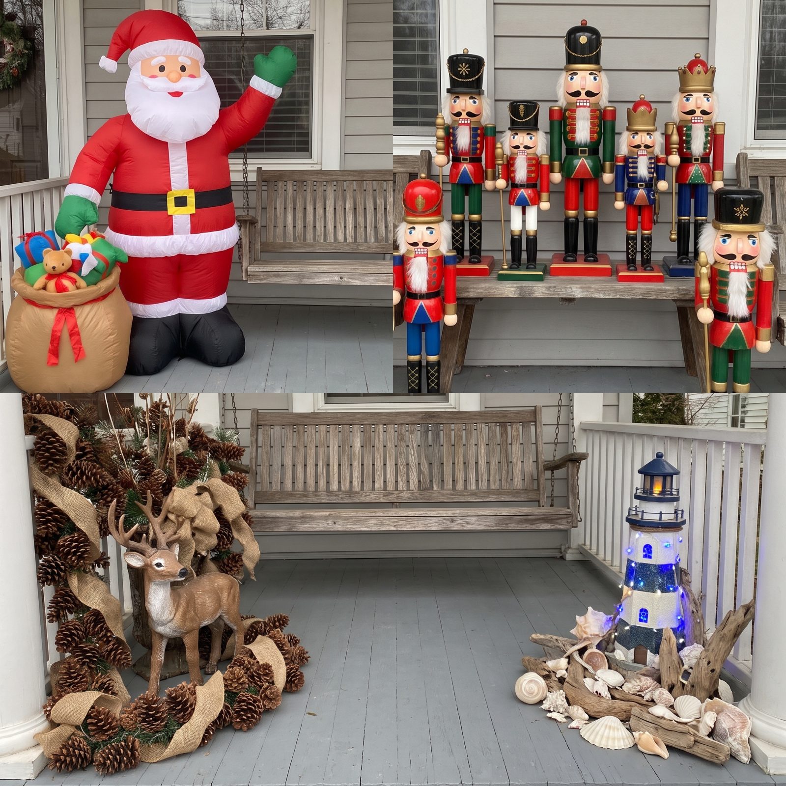
Four good themes do not make one good porch. Santa belongs to a red-and-gold storybook world. The nutcracker is formal and theatrical, woodland is rustic and brown, coastal is bleached and breezy. Stack them on one entry and each one quietly sabotages the others.
The front of your house is a single statement, not an anthology. Mix palettes, materials, and moods in the same ten feet and you force the eye to keep switching mental gears, and that low-grade friction is what reads as cluttered even when everything sits arranged neatly.
Pick one story and tell it well. A clean, single-theme front porch beats one with four competing themes every single time.