
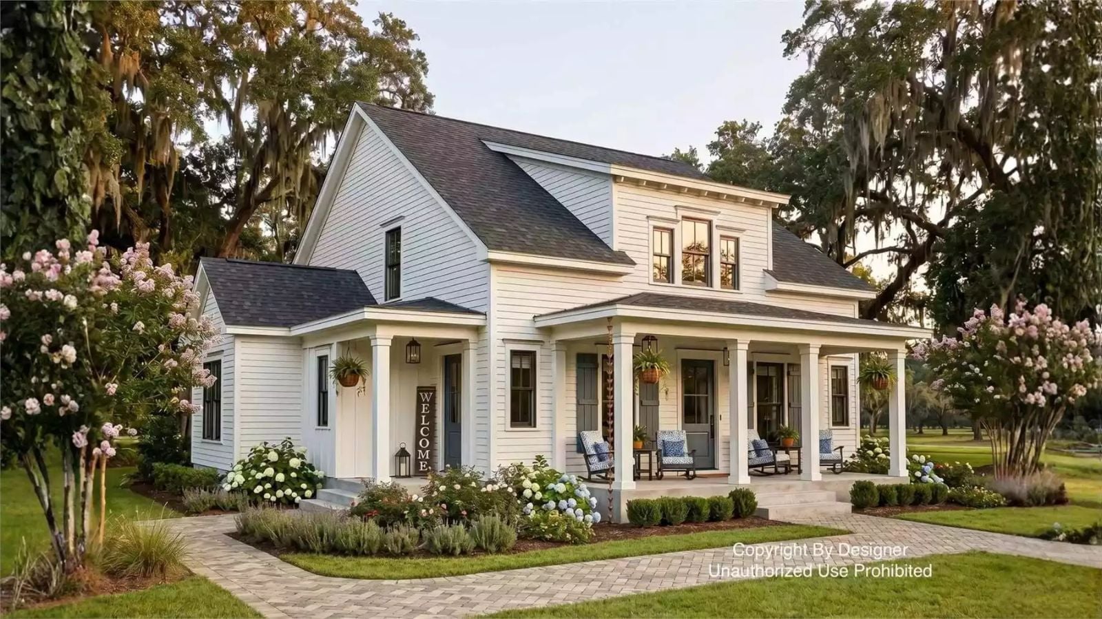
Multiple porches tell you exactly who this house is built for: dinner that spills outside after dessert, the first cup of coffee before anyone else is awake, cousins running laps from the front steps to the back. The Cypress Way answers all of it with a wraparound porch that circles the whole perimeter, an open main living area, a farmhouse kitchen sized for actual cooking, and covered outdoor space that quietly doubles the room count on a good weekend.
Specifications
- Sq. Ft.: 2,788
- Bedrooms: 4
- Bathrooms: 3.5
Floor Plan – Main Floor
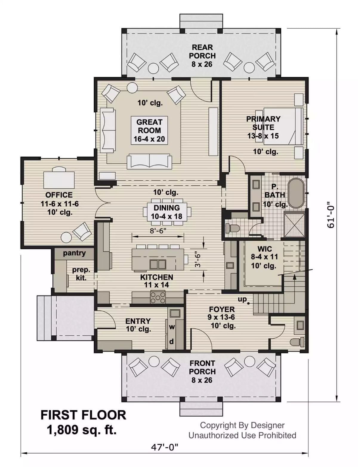
The first floor puts the great room and dining area at the center, with the kitchen and prep kitchen tucked to one side and a primary suite with walk-in closet and private bath anchoring the right. An office sits off the entry. Both front and rear porches span 26 feet wide.
Floor Plan – Second Floor
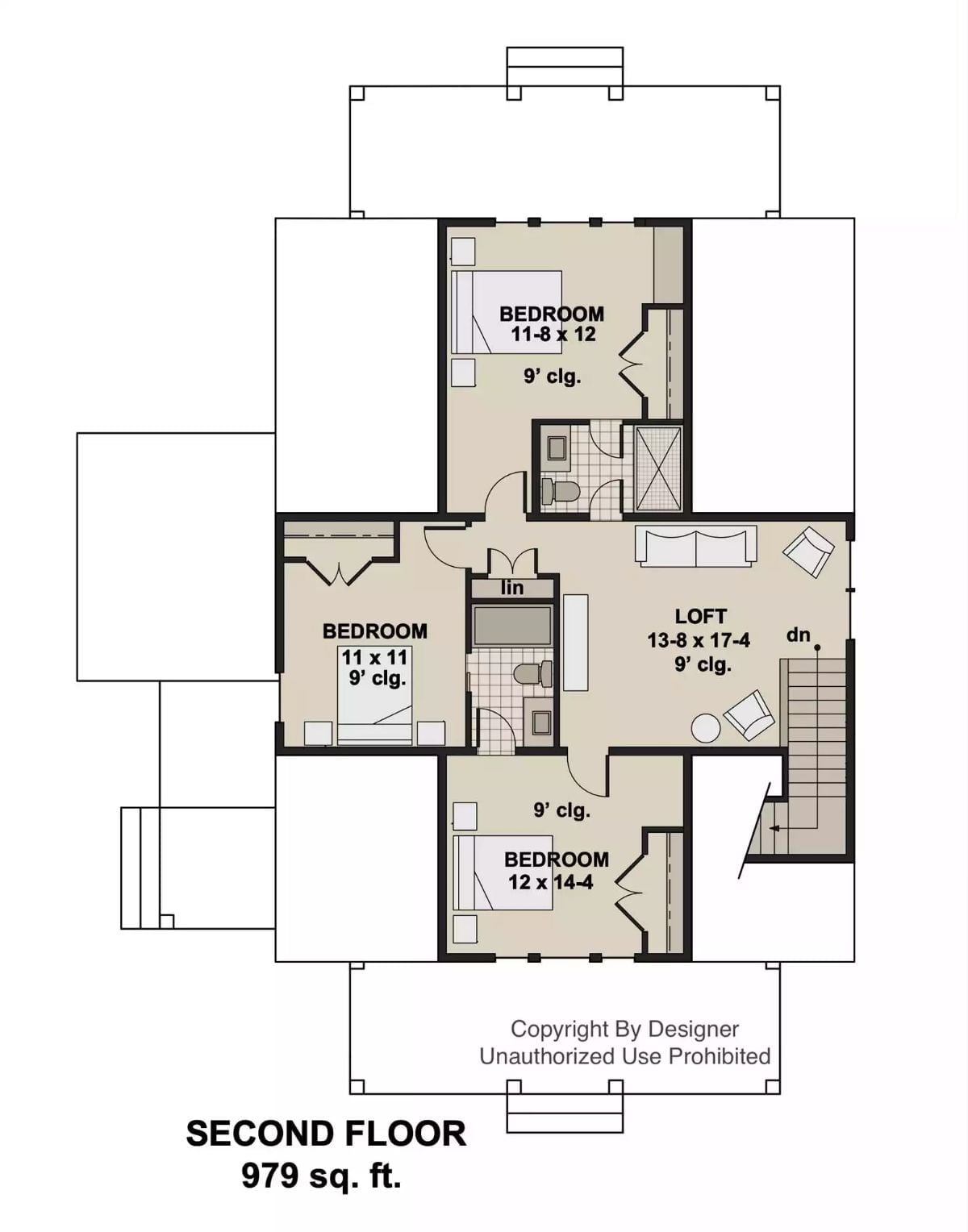
The second floor spreads three bedrooms, a loft, and two full baths across 979 square feet, all with nine-foot ceilings. Stairs land directly into the open loft, which connects to each bedroom without a separate hallway threading through the middle.
Gray Sofas, Black Frames, and a View Worth Leaving the TV For
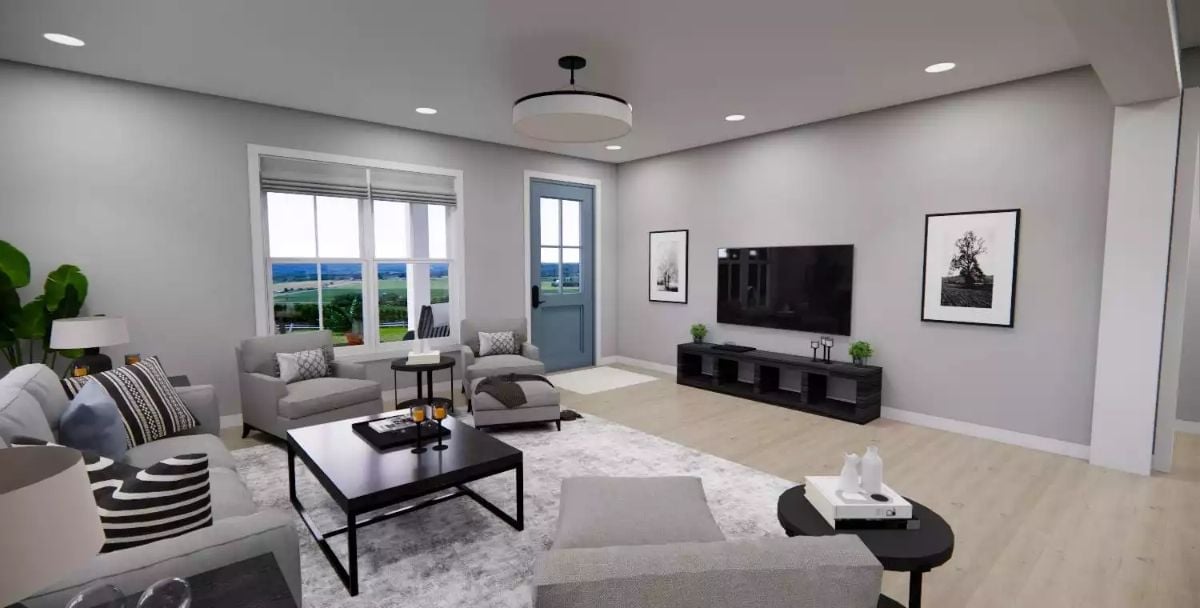
Warm wood flooring anchors a room that could easily feel cold but doesn’t. Gray upholstery, dark coffee tables, and black-framed artwork keep things cohesive without straining for it. But the real detail worth noticing is that blue door — it pulls your eye clean across the room and hints at outdoor space beyond, which is exactly the kind of thing that makes a floor plan feel larger than its square footage.
Budget Tip: Flat-front media consoles like the dark wood unit here are often cheaper than built-ins and a lot easier to swap out as your layout changes. Cube-style shelving from big-box stores does the same job — open compartments pull double duty as display and storage without a custom quote. And painting one door an accent color costs almost nothing for the visual return it delivers.
Dark Island, White Counters, and a Mudroom That Actually Has Its Act Together
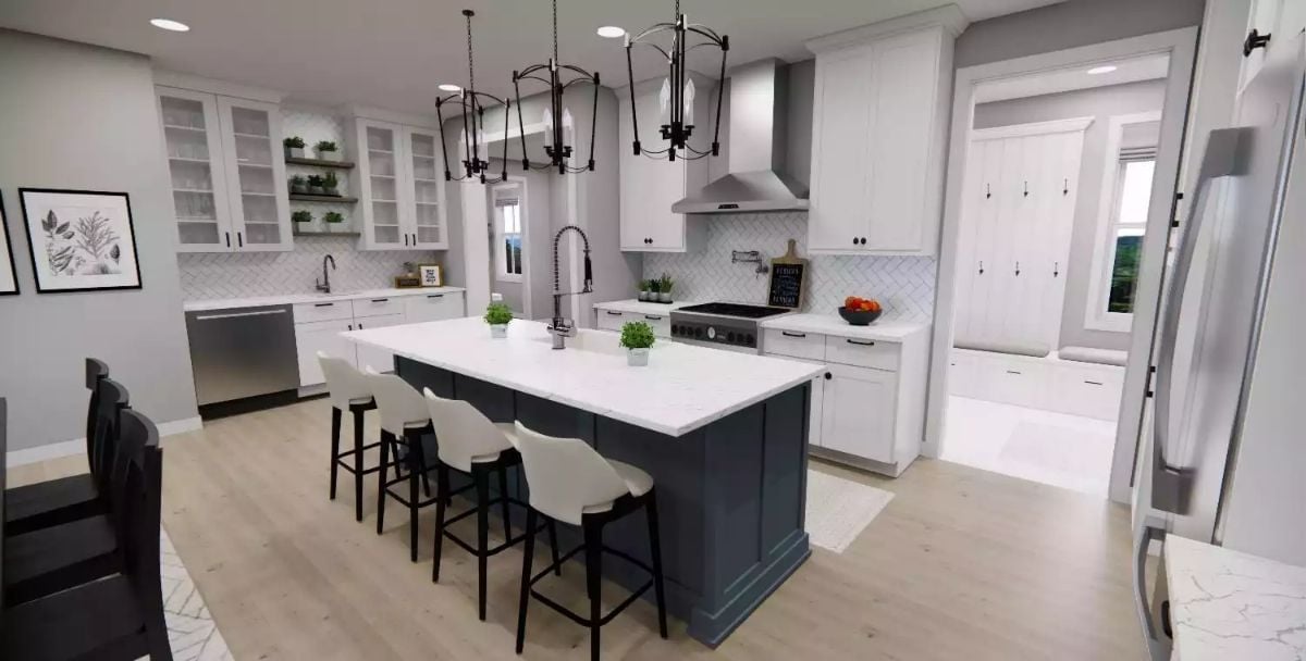
A slate-blue island base pushes against white quartz countertops, and wrought-iron chandeliers overhead keep the whole thing from reading as too clean. Through the doorway, mudroom cubbies are doing their job — visible enough to be useful, tucked enough not to advertise the chaos.
Why It Works: Painting an island a contrasting color while keeping perimeter cabinets white is one of the lowest-cost ways to add visual depth to a kitchen. It draws the eye to the work zone without touching the cabinetry. Renting or working with a tight budget? Peel-and-stick cabinet wraps can pull off a similar effect for a fraction of the cost.
Open-Plan Living Where the Dining Table Does Most of the Work
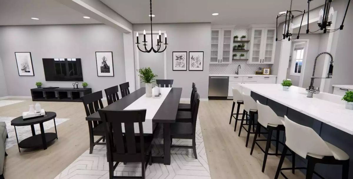
Dark wood chairs against a white tabletop runner, light hardwood floors, a kitchen island long enough to seat four — the dining and kitchen zones share the same sight line without bleeding into each other. Candle-style chandeliers in both spaces do the work of tying it together without matching too perfectly.
Common Mistake: Choosing matching chandelier styles for your dining area and kitchen island looks intentional, but builders and designers often quote these as separate line items. Price them as a pair upfront so you don’t end up with mismatched fixtures because budgets got trimmed mid-project.
Charcoal Walls and Floating Shelves That Actually Earn Their Wall Space
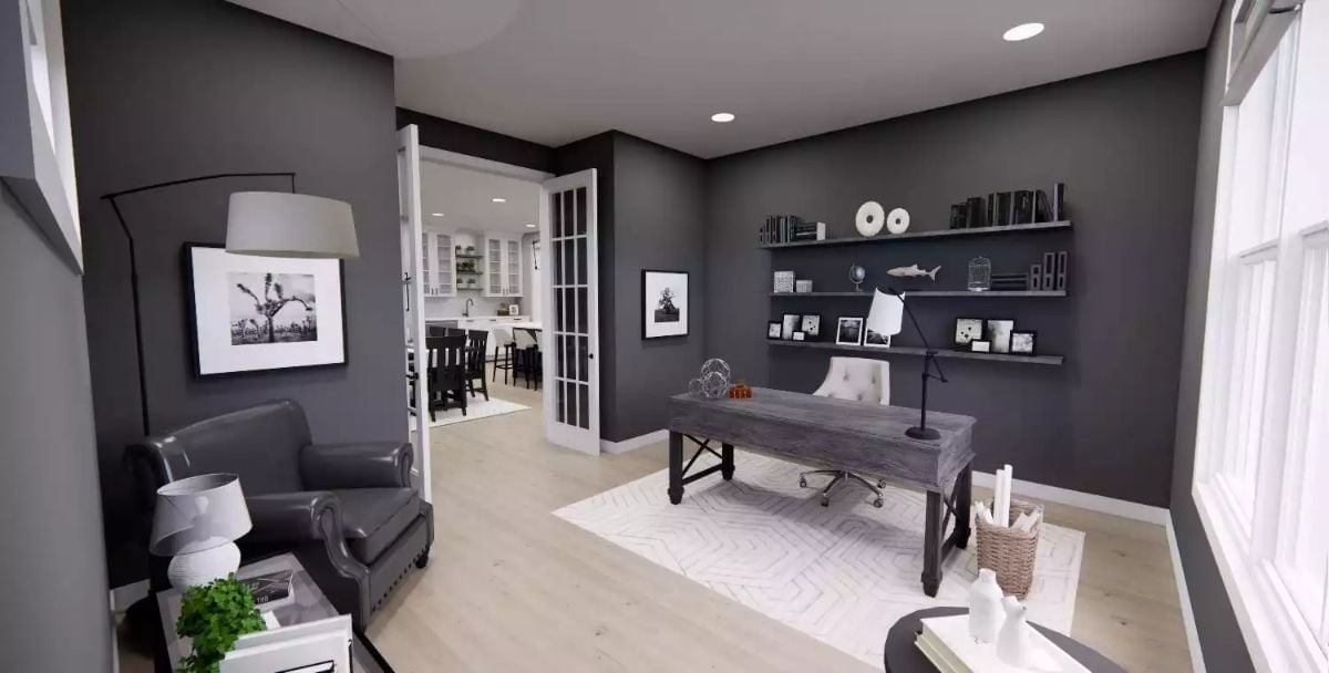
Charcoal walls in a home office tend to absorb light, but the recessed ceiling fixtures here push back hard.
Floating shelves keep books and objects off the desk without demanding a built-in budget. The weathered wood desk works against those dark walls precisely because it doesn’t try to match them — contrast does the heavy lifting. A leather chair in the corner signals that this room gets used for more than Zoom calls. French doors open to the kitchen, which keeps the space from feeling sealed off and, honestly, makes the whole layout feel less like a dedicated office and more like a room that happens to have a desk in it.
Gray Linen, Black Frames, and a Bedroom That Knows When to Quit
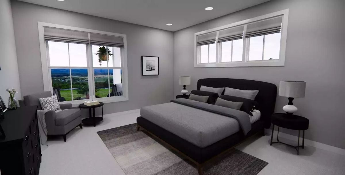
Roman shades do a lot of quiet work here, softening two windows without competing with the upholstered headboard. Gray walls and bedding keep the palette tight, so the black nightstands and dresser read as deliberate choices rather than coincidence. A gray armchair near the large window anchors a small seating area, and the low platform bed makes the ceiling feel higher than it probably measures.
Roman shades do a lot of quiet work here, softening two windows without competing with the upholstered headboard.
Marble Tile, Matte Black Fixtures, and a Soaking Tub That Earns Its Square Footage
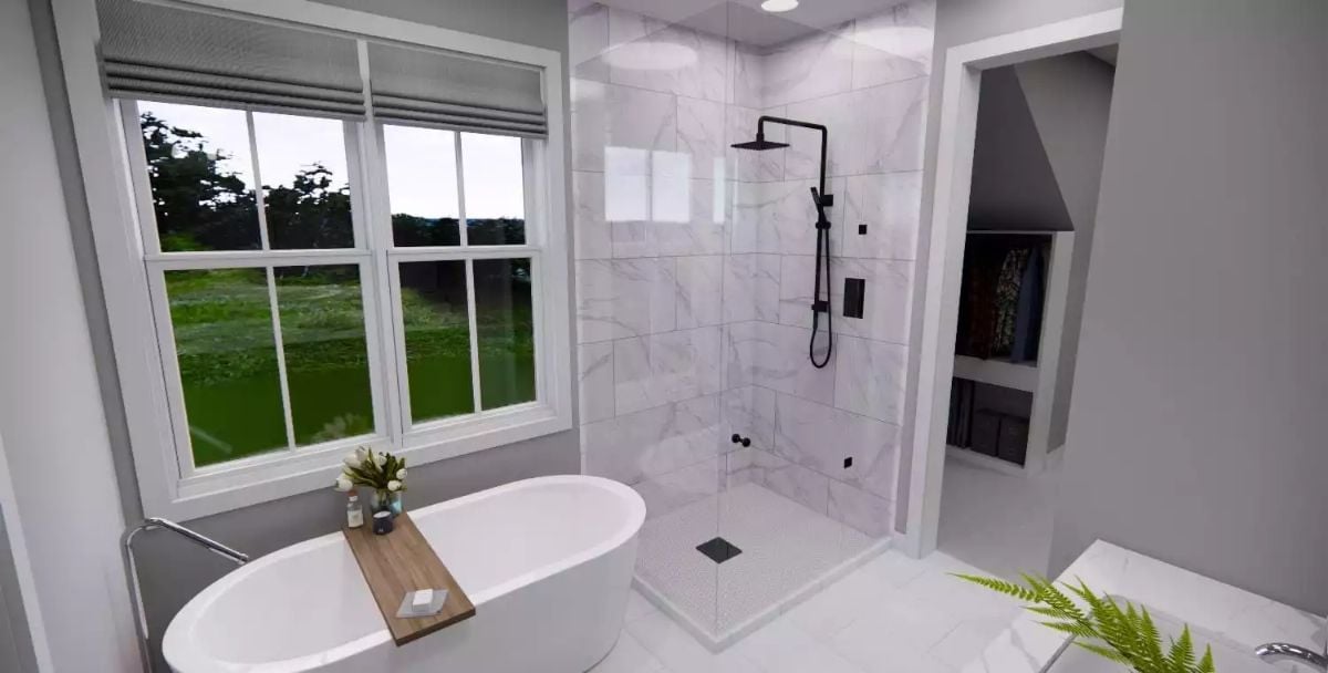
A freestanding soaking tub sits alongside a glass-enclosed shower clad in large-format marble tile with matte black rain fixtures overhead. Simple layout, high material quality — the bathroom isn’t doing anything complicated, which is part of why it works.
Try This: Rain showerheads look best when the ceiling height can accommodate them without the spray angle feeling cramped. If your ceiling sits below eight feet, a standard wall-mount with a long arm gets you much closer to the same overhead feel without sacrificing clearance — a small swap that makes daily use noticeably more comfortable.
Bean Bag Chair, Recessed Lights, and a Media Console That Doesn’t Try Too Hard
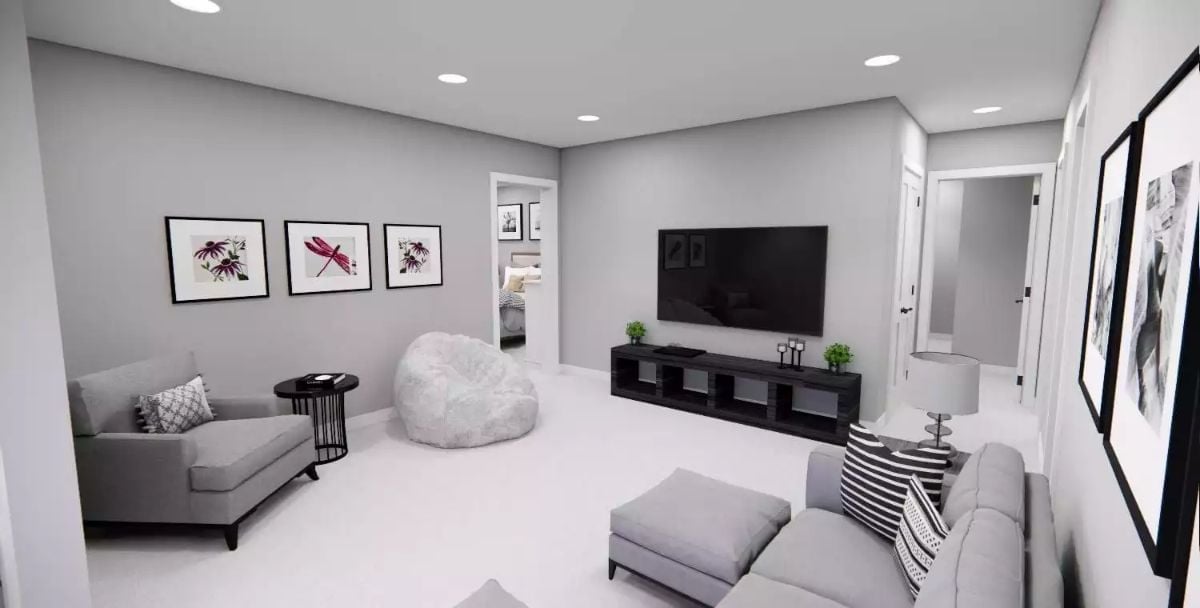
Gray walls keep things neutral without tipping cold, and that white bean bag chair breaks up what could have been a very earnest room. Three botanical prints supply the only real color. A black cube media console sits low beneath the TV, wall space above it left deliberately empty — which takes more restraint than it looks like.
Pin It

Outside, a white farmhouse with a wraparound front porch sits beneath Spanish moss-draped oaks. The first-floor plan below shows 1,809 square feet organized around a central great room, with the primary suite on one side and an office, kitchen, and rear porch filling out the rest.
