
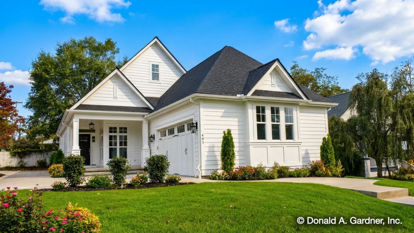
Front porches are not a feature — they are a value system, and the Currier is built for people who have already picked a side. It’s a craftsman with a proper screened porch for slow Saturday mornings, an open living area where dinner conversations stretch past dessert, and a bedroom wing that stays genuinely quiet once the evening settles.
Specifications
- Sq. Ft.: 1,583
- Bedrooms: 3
- Bathrooms: 2
Floor Plan – Main Floor
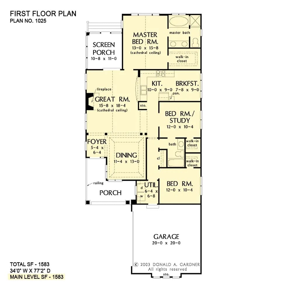
Single-level layout puts the master suite at the back left, separated from two secondary bedrooms by a shared bath. A cathedral ceiling and fireplace anchor the great room at the center, the screened porch sits off the back, and the front porch faces the street — which is the whole point.
White Siding, Dark Shingles, and a Screened Porch That Actually Gets Used
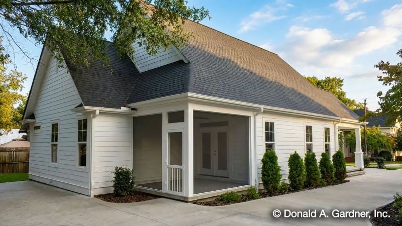
Crisp white lap siding against charcoal shingles reads traditional without tipping into dated, which is harder to pull off than it looks. The screened porch wraps the corner with enough depth to fit real furniture — not just a folding chair and a dream. Along the foundation, a tight row of arborvitaes gives the facade some structure without swallowing the windows.
Columns, Tulips, and a Dining Room You Can See From the Couch
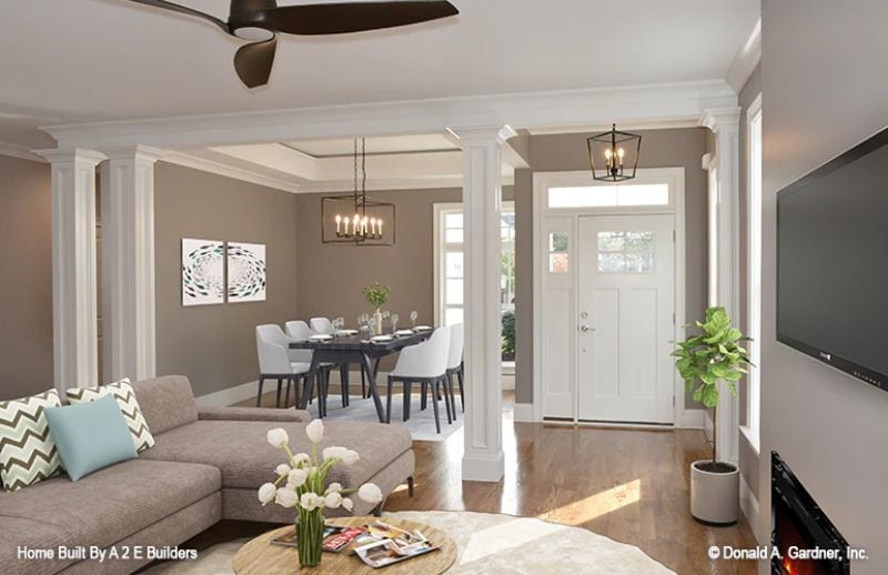
Painted columns divide the living and dining spaces without closing them off — a trick that works better than a half-wall and costs less than a full renovation. White tulips on the round coffee table, a lantern-style chandelier over the dark dining table, and matching hardware at the front entry keep the visual language consistent. Wood floors tie it together without anyone having to try too hard.
Open Plan Done Right, With a Fireplace You’ll Actually Sit In Front Of
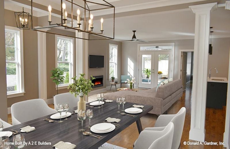
A dark wood dining table anchors the foreground while a linear electric fireplace pulls the eye toward the back wall. Natural light comes in from multiple directions, so the room never feels like it’s working against you. The iron chandelier overhead skips the farmhouse clichés entirely — a choice that ages better than it might seem right now.
Try This: Hang a chandelier lower than feels comfortable over a dining table. Eye level when seated is the target, and most people stop about eight inches too high. Drop it further, and the table instantly feels more like a destination.
Black Lowers and White Uppers, Plus a Faucet That Steals the Show
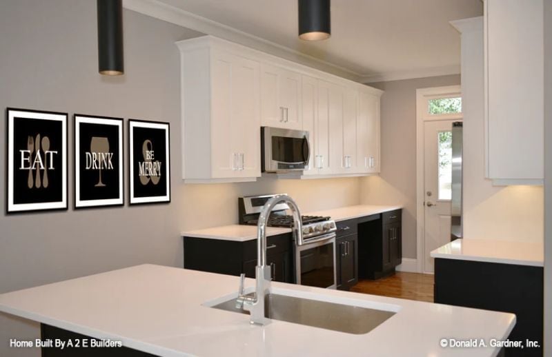
Two-tone cabinetry keeps the kitchen from going flat. Black lowers, white uppers, and a gooseneck faucet positioned slightly off-center — that faucet pulls your eye straight to the sink island before anything else in the room registers.
Style Math: Black lower cabinets read heavy on their own but disappear when white uppers carry the wall space above. If your kitchen has low ceilings, flipping the contrast puts the dark color where it claims the least visual territory.
Gray on Gray Done With Restraint, and a Tray Ceiling That Earns Its Keep
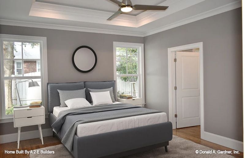
Warm wood floors rescue the gray walls and upholstered bed frame from reading cold — without them, this palette would be a lot less forgiving. The tray ceiling does genuine work: it gives the fan a proper home and draws the eye upward without competing with the round mirror below. That mirror, by the way, breaks up the rectangular geometry of the wall without needing to be oversized to do it.
- A ceiling fan hung inside a tray ceiling looks intentional rather than tacked on
- Matching your bed frame to your wall color reduces visual clutter without sacrificing depth
- A round mirror breaks up rectangular geometry on a wall and doesn’t need to be large to do it
French Doors to a Screened Porch Make Every Room Feel Bigger Than It Is
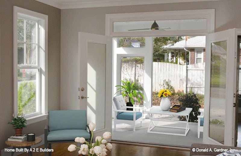
Sunlight cuts through the French doors and lands on hardwood floors that have some age to them. Out on the porch: blue chairs, a white table, sunflowers in a vase — relaxed but deliberate. Inside, a small loveseat in soft aqua sits close to a round wood side table, picking up the outdoor palette just enough to make the two spaces feel continuous.
Why French Doors Beat a Sliding Glass Door Every Time
French doors swing fully open and create a wide, unobstructed pass-through. A sliding door always leaves one panel in the way — there is no configuration where that isn’t mildly annoying. Here, the transom window above adds borrowed light without requiring you to open anything, which matters on cool mornings when you want the brightness without the breeze.
Pin It
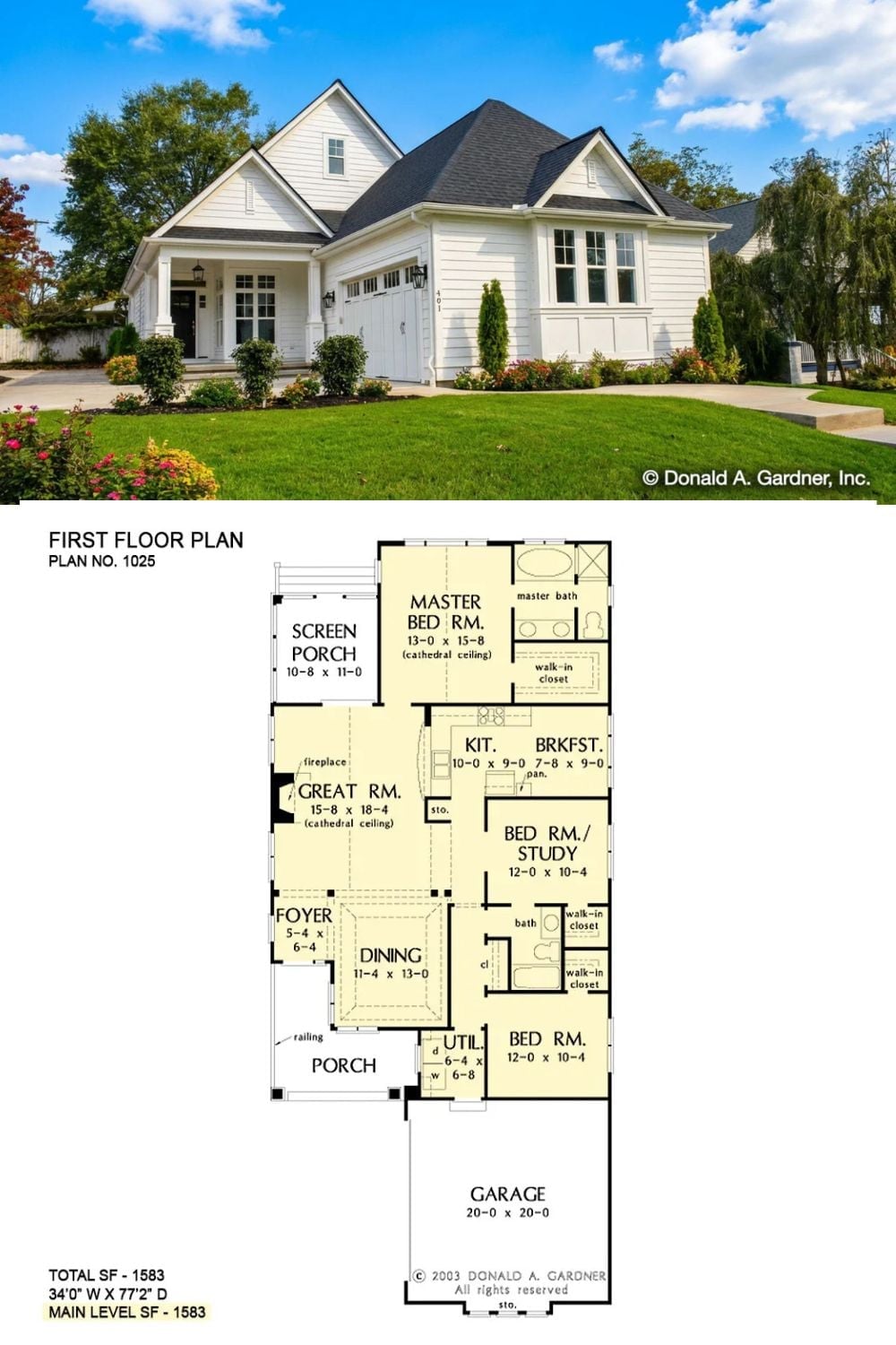
The exterior photo shows a white Craftsman with a covered front porch, board-and-batten accents, and a dark hip roof. Below it, the floor plan lays out 1,583 square feet organized around a cathedral-ceiling great room, a master suite with walk-in closet, two additional bedrooms, and that screened back porch.
Fun Fact: Screened porches add usable square footage that doesn’t count toward your home’s heated area, which can keep property taxes lower than an equivalent enclosed addition. Builders sometimes call this “bonus living” because you get the space without paying for conditioned square footage — and honestly, on a good evening in July, it’s the best room in the house anyway.
