
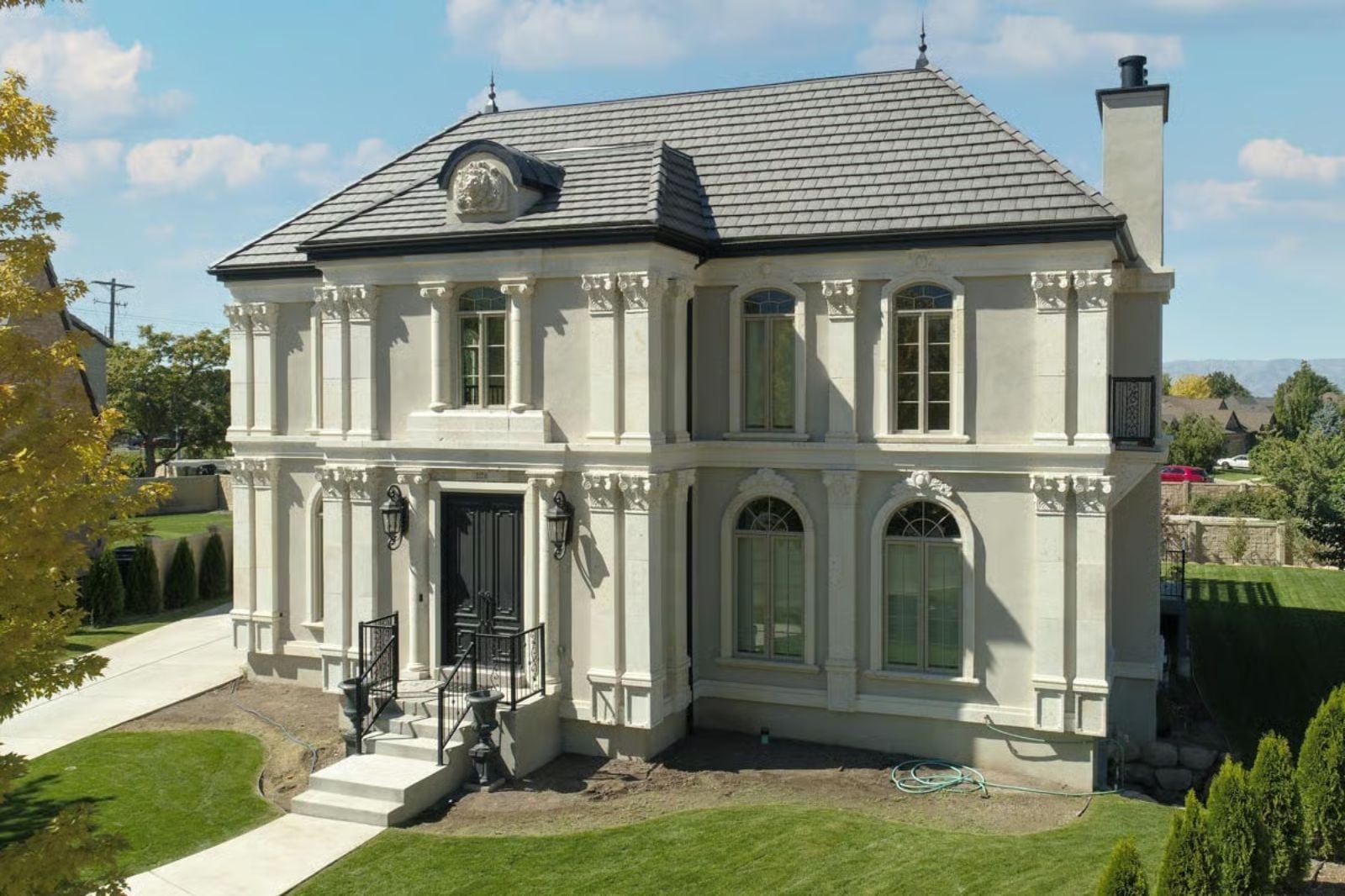
Multi-generational living has gone from cultural footnote to genuine housing need, and most floor plans still treat a second primary suite like an afterthought tacked on at the end of the design process. The Corinthian Court is built around the actual reality of two adults who each need a door that closes, grandkids sprinting between floors on a Saturday morning, two coffeemakers running at the same time, and a finished basement that absorbs whatever noise the upper floors are generating — dual primary suites on opposite ends of the second floor, a sprawling basement for overflow living, and a Georgian layout that keeps the household together without anyone feeling cornered.
Specifications
- Sq. Ft.: 3,724
- Bedrooms: 4-5
- Bathrooms: 4.5+
Floor Plan – Main Floor
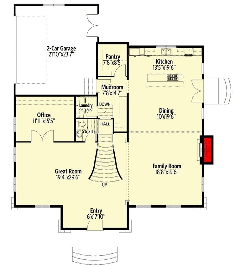
The first floor runs a central staircase flanked by a Great Room on one side and a Family Room on the other, with Kitchen, Dining, and Pantry clustered efficiently to the right. A Mudroom connects directly from the 2-car garage — which means wet boots and grocery bags have somewhere to go before they reach the kitchen.
Floor Plan – Second Floor
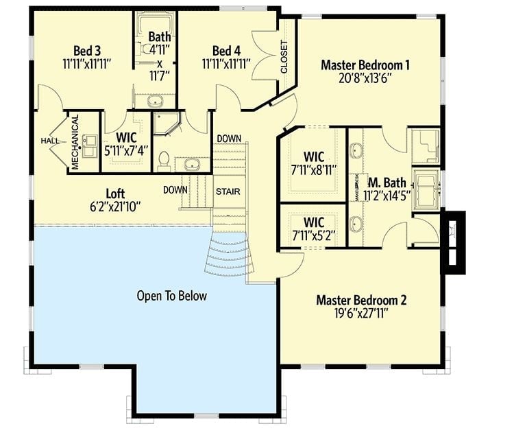
Up on the second floor, the two primary suites sit on opposite ends — each with walk-in closets and a private bath — while Beds 3 and 4, a loft, and the stair hall fill the middle zone between them. That separation is the whole point of the plan.
Floor Plan – Basement
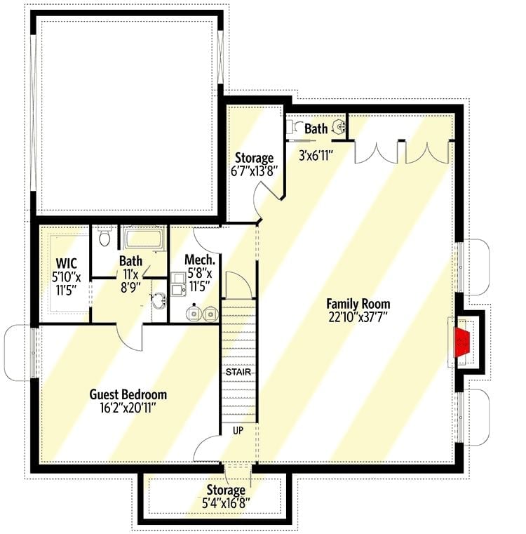
The basement does real work: a guest bedroom with walk-in closet, two baths, mechanical room, storage, and a sprawling family room anchored by a fireplace. A stair connects it to both floors above, so it functions less like a basement and more like a third living level.
Oval Windows and a Hip Roof That Earns Every Inch of Curb Appeal
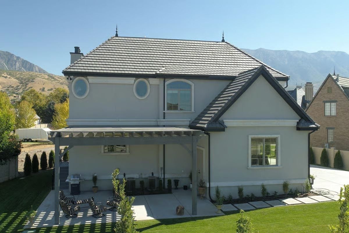
The hip roof’s steep pitch, decorative finials, and oval porthole windows on the upper story are all classic Georgian moves, and they land well here against pale stucco that reads clean rather than cold. Out back, a pergola with open rafters casts grid shadows across striped patio chairs. Mountain views handle a significant portion of the decorating work.
Designer’s Secret: Those oval oculus windows aren’t purely decorative. Set high on the second floor, they pull diffused light into upper hallways and landing spaces without eating into the wall area below — which matters in a plan where bedrooms need privacy more than panoramic glass.
Curved Staircase with Carpet That Actually Has Something to Say
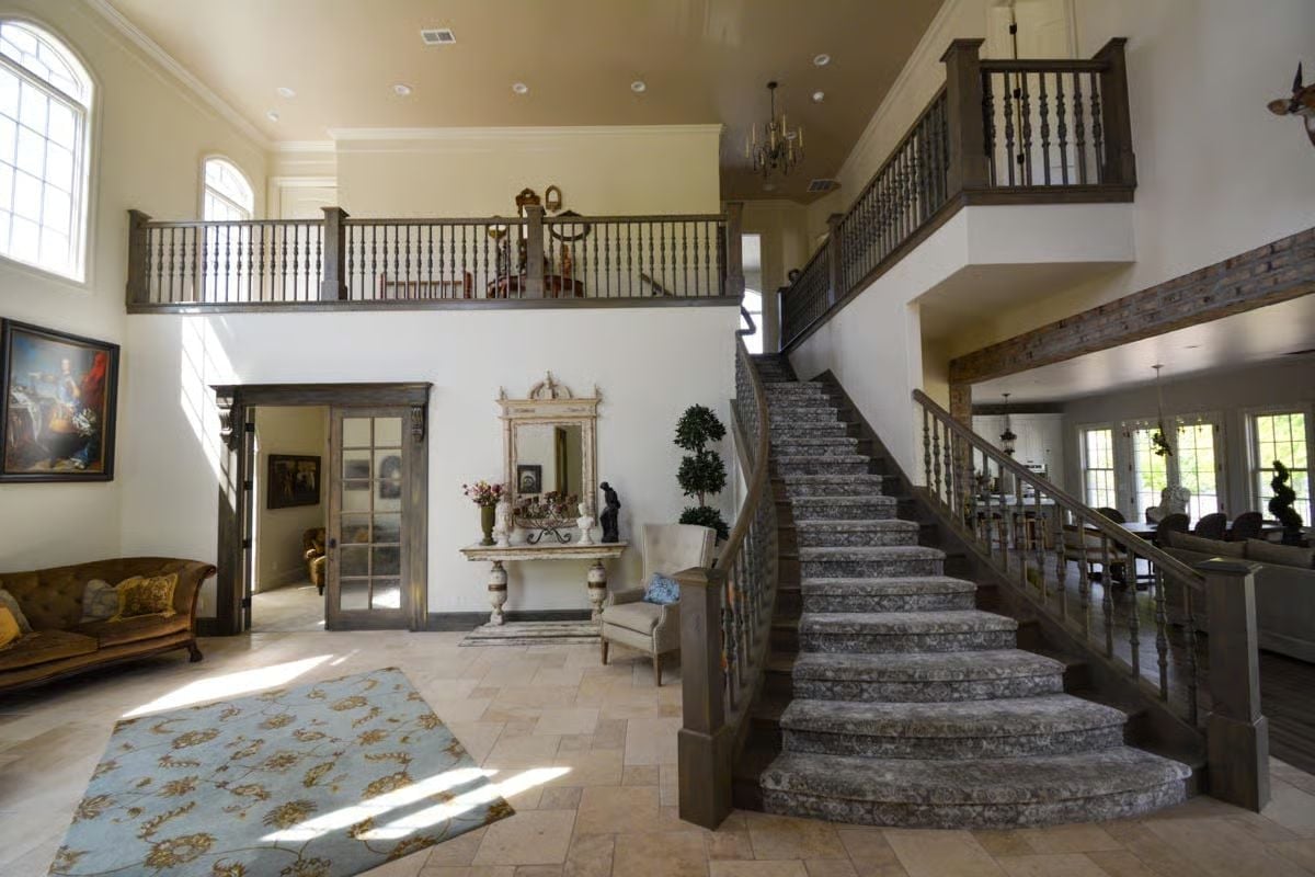
Stone-patterned carpet on the curved staircase pulls focus immediately, balanced by dark wood railings and a double-height entry where natural light pours in from above. It’s the kind of foyer that makes a first impression and knows it.
Editor’s Note: Two-story foyers create an acoustic problem most buyers don’t anticipate until move-in day — sound climbs vertically with almost nothing to absorb it, and hard surfaces on every level amplify noise from below. The area rugs and upholstered seating near the base, visible here, take the edge off without requiring any structural changes.
Ornate Fireplace Mantel Doing the Heavy Lifting in an Open-Plan Room
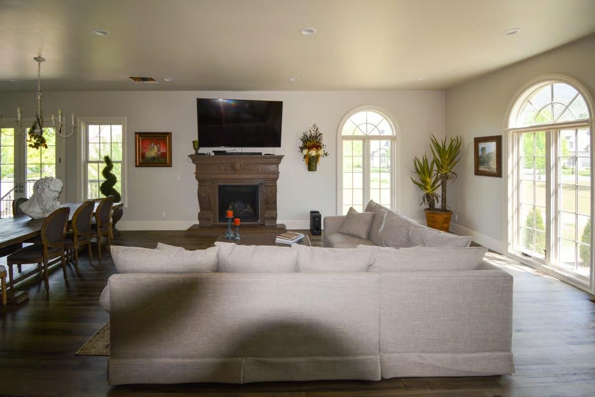
Carved wood surrounds the fireplace with the kind of millwork detail you’d expect in a much older house. The sectional is oversized, but the room earns it — arched windows along the far wall bring in enough natural light that nothing feels crowded. That classical bust on the dining table side is a conversation starter nobody requested but nobody’s removing either.
By The Numbers: Sectionals in open-plan rooms tend to work better with their backs to the main traffic path, which creates a natural boundary between living and dining zones without using walls. Rooms that mix formal architectural details — carved mantels, arched windows — with casual upholstered furniture photograph well, but they need more intentional accessory editing to keep from reading as mismatched.
Brick Wall on One Side, White Cabinetry on the Other, and It Shouldn’t Work But Does
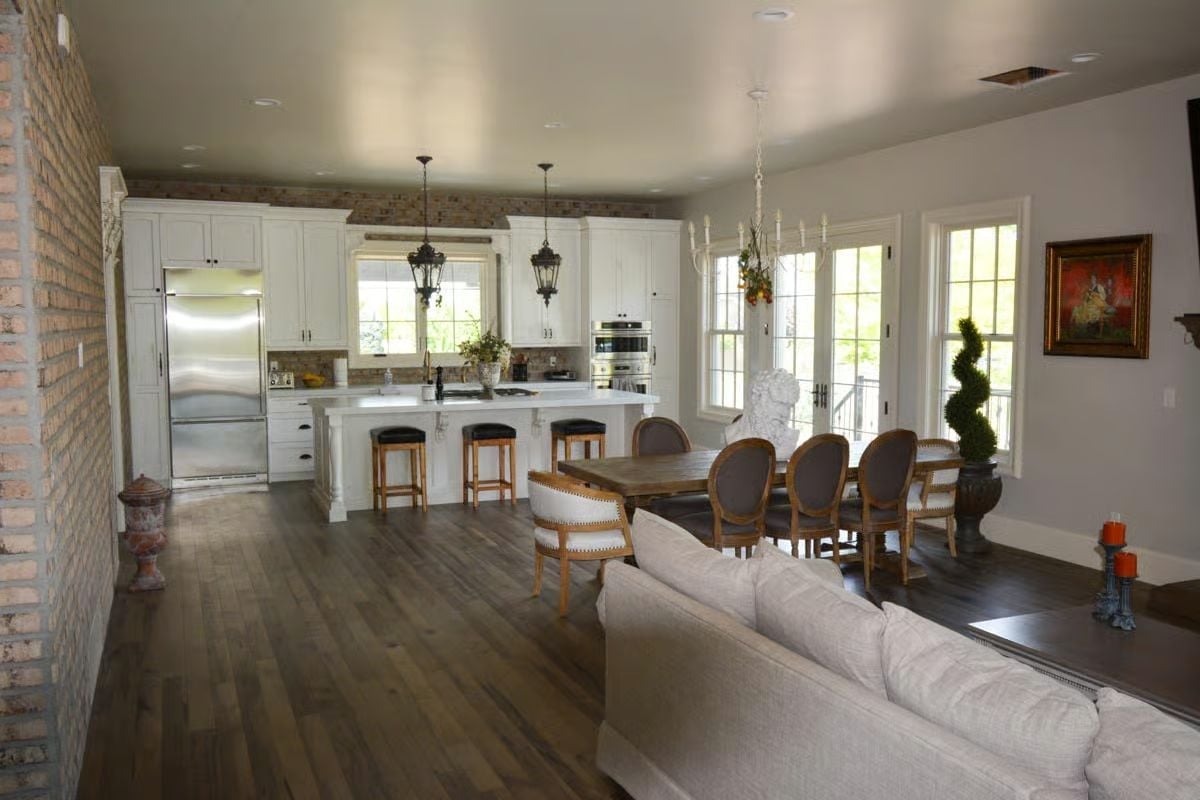
Open-plan rooms this long usually feel like a hallway with furniture in it.
Here, exposed brick anchors the left wall without competing with the white kitchen cabinetry across the room. Dark hardwood floors run the full length, pulling the kitchen, dining, and sitting areas into a single visual read instead of three separate zones that happen to share square footage. Those wrought-iron pendant lanterns over the island do real tonal work against all that bright white — without them, the contrast between the brick and cabinetry would feel less resolved.
Portrait Gallery Wall Meets Black Lacquer Desk in a Home Office Worth Closing the Door For
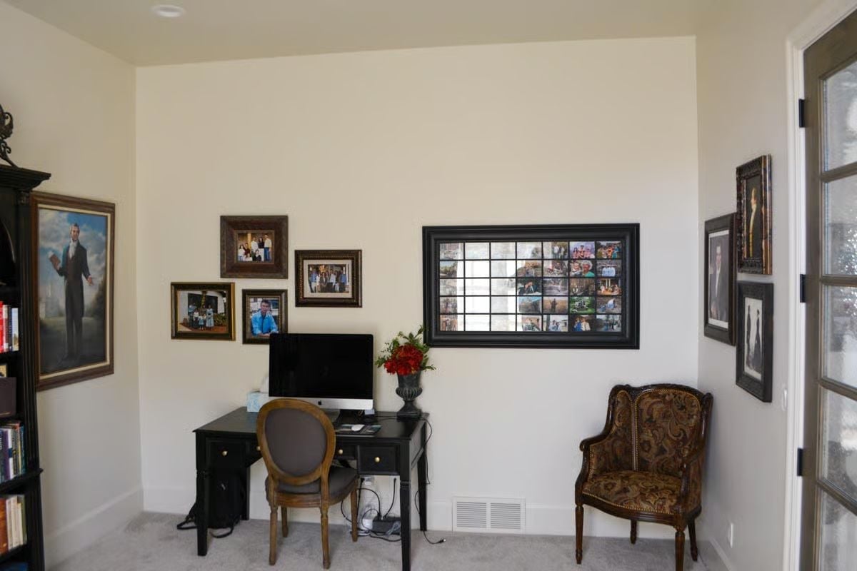
A collage frame packed with family photos fills the wall above carpet that keeps the room quiet underfoot. The ornate wingback chair pulls the formality of the space together without matching anything exactly — which is the right call.
Quick Fix: Round-back chairs like this one soften rooms dominated by rectangular furniture. If your desk setup reads as blocky and boxy, a single curved seat can shift the feel of the whole room more effectively than repainting the walls. Look for chairs with legs that clear the carpet slightly so the piece doesn’t visually sink into the floor.
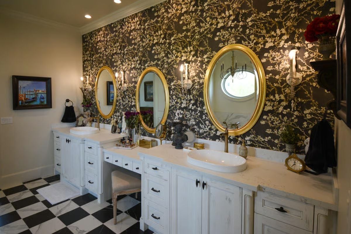
Move into the sleeping quarters and the design language shifts from grand communal spaces to something more personal and layered.
Raw Stone Wall with Arched French Doors That Pull the Outside In
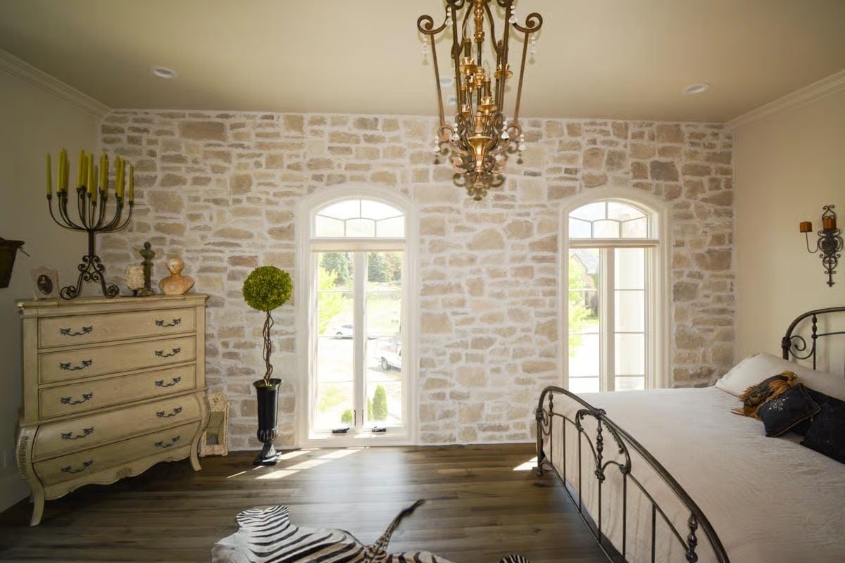
Whitewashed fieldstone covering the full exterior-facing wall gives this room its character — everything else is playing support. A wrought iron bed frame, cream-painted bombe chest, and brass chandelier with scroll arms keep the period references consistent without tipping into costume territory. The zebra hide on dark hardwood floors is doing more work than it looks like it is: pull it out and the room loses half its personality.
Ping-Pong on One Side, Sectional on the Other, and a TV Wall Doing Double Duty
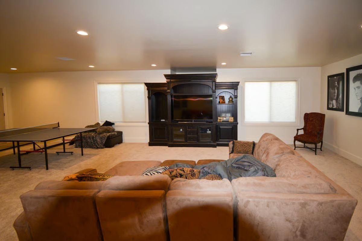
Down in the basement rec room, a large-scale entertainment center anchors the far wall while a ping-pong table claims the opposite end. The sectional seats a crowd without crowding the carpet, and black-and-white portrait photography along the right wall gives the space some personality — the kind of thing that separates a finished basement from a forgettable bonus room.
Pro Tip: Rec rooms with two distinct activity zones work best when furniture placement creates a visual boundary rather than a physical one. Orienting the sofa with its back to the game area accomplishes exactly that — no square footage lost, no awkward traffic problem, just a clear sense of where one zone ends and the other begins. Most people don’t figure this out until the room already feels chaotic.
Pin It
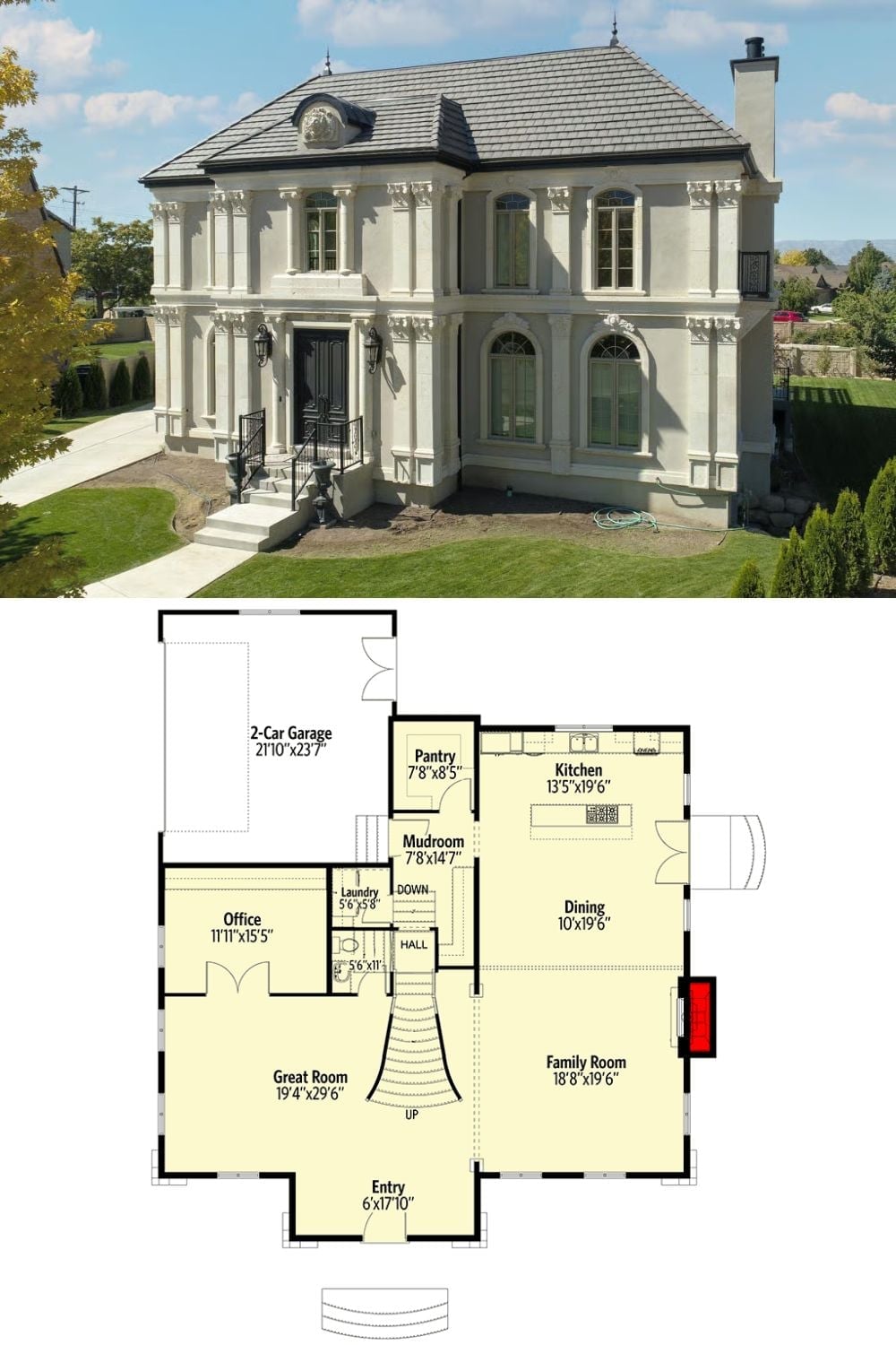
The exterior photo shows a French-influenced two-story with Corinthian pilasters, arched windows, and a hip roof. Below it, the first-floor plan lays out a practical layout anchored by a great room, open kitchen and dining zone, family room with fireplace, dedicated office, mudroom with pantry access, and an attached two-car garage.
Try This: Mudrooms positioned between the garage and kitchen — like the one shown here — collect clutter faster than any other room in the house. A floor-to-ceiling cabinet run along one wall keeps the pass-through functional without surrendering the space to a permanent pile of backpacks and sports gear. Route the laundry into that same footprint and you’ve solved two problems with one room.
