🔥 Would you like to save this?
A backsplash used to know its place. Sixteen or 18 inches of tile, a few outlets, maybe a decorative insert behind the range if somebody was feeling adventurous. Then somebody apparently handed the wall a passport, a lighting budget, and permission to misbehave.
Now stone climbs straight through the old backsplash boundary and keeps going. Onyx glows from behind. Copper arrives already oxidized. Cane cabinetry nearly swallows the backsplash altogether. Petrified wood, Venetian plaster, antique mirror, mother-of-pearl, hammered metal and pressed botanicals turn the cooking wall into something closer to architecture than protective surfacing.
In order to come up with the very specific design ideas, we create most designs with the assistance of state-of-the-art AI interior design software. Also, assume links that take you off the site are affiliate links such as links to Amazon. this means we may earn a commission if you buy something.
The interesting part is not simply that these kitchens use expensive or unusual materials. Scale changes everything. A piece of green onyx between countertop and upper cabinet is an accent; the same stone spread across a wall and concealing a bar becomes the room’s organizing idea. Herringbone tile changes character when its grout flashes gold. Even stainless steel starts behaving differently when there is nowhere for the eye to escape it.
These 33 kitchens push the backsplash far past its old job description. Some do it with stone, some with color, some with texture, and a few with enough nerve to make restraint seem terribly overrated.
32. Gold Veining Climbs to the Ceiling, and the Backsplash Refuses to Stay in Its Lane
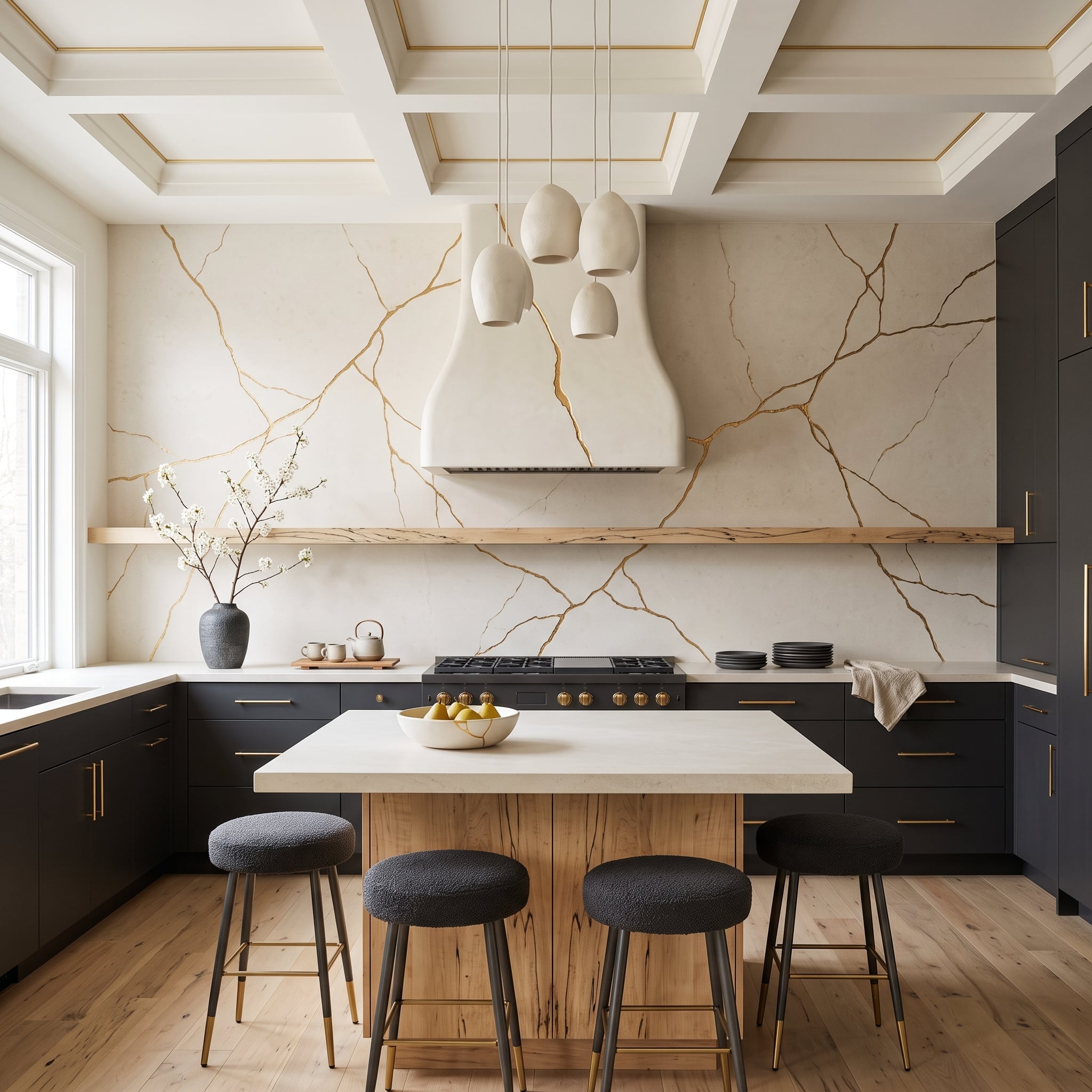
Kintsugi-inspired gold veining spreads across the wall behind the range until the usual backsplash boundary effectively disappears. Against matte charcoal cabinetry, the branching metallic lines behave more like a mural than conventional surface decoration.
The live-edge island base prevents all that gold from becoming too polished for its own good. Cream teardrop pendants soften the geometry overhead, while gold detailing in the coffered ceiling sends the eye back down to the cooking wall. Bouclé stools add one more texture without trying to outshine the main event.
31. Pressed Botanicals Behind Glass Turn the Range Wall Into an Illuminated Herbarium
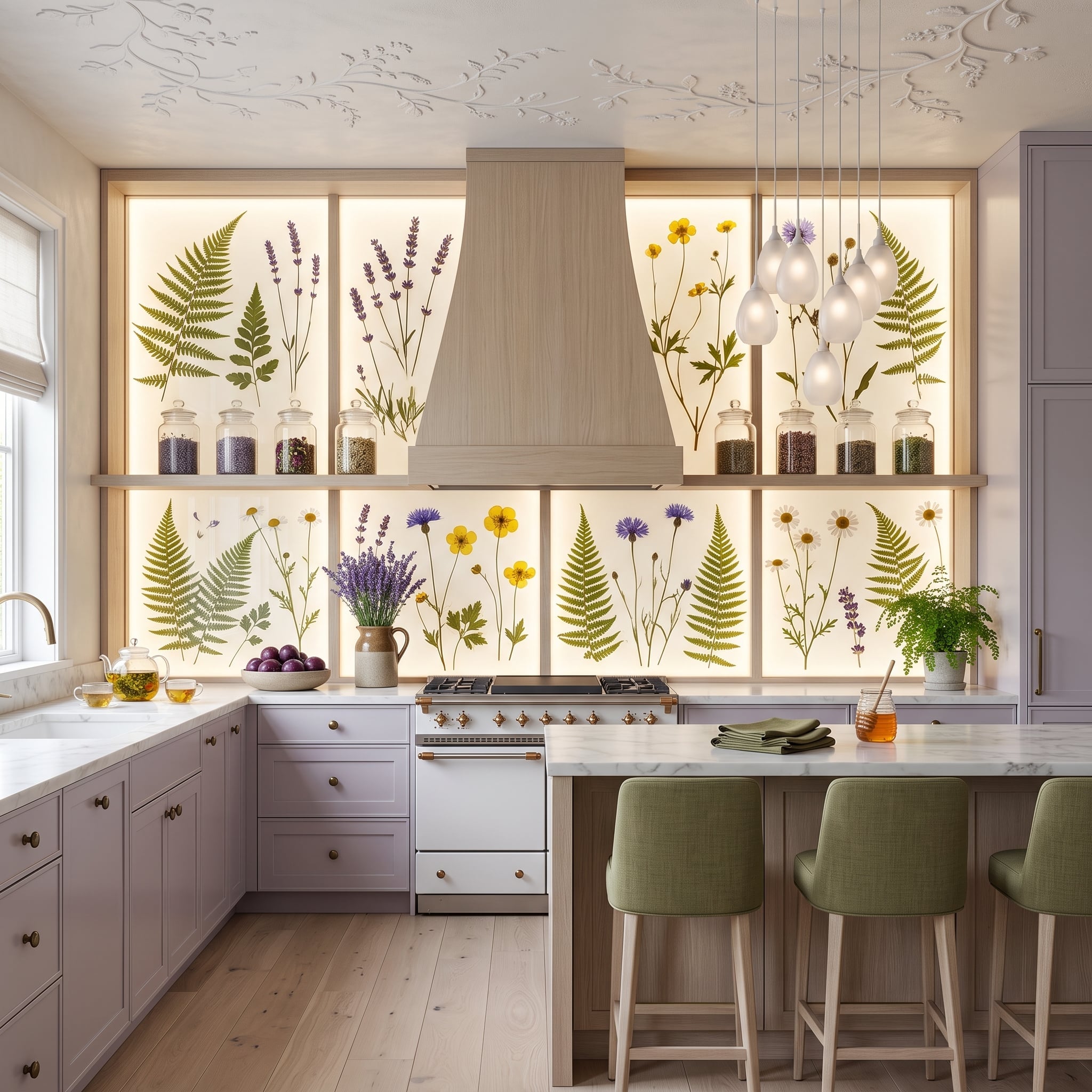
Backlit panels display ferns, lavender stems, cornflowers and buttercups across the wall behind the range as though somebody enlarged the pages of a botanical archive and gave them electricity. The hidden light source brings out the silhouettes and veins without covering the plants in visible hardware.
Lavender-gray cabinetry and sage upholstery keep the botanical colors from becoming isolated decoration. Marble counters provide a hard, pale surface beneath all that organic imagery, while the simple pyramid hood gives the eye one solid shape amid the stems and leaves.
Installation Note: Backlit glass in a kitchen needs lighting, glazing and mounting components appropriate for the location and its exposure to heat, moisture and cleaning. Real pressed botanicals may also change color with prolonged light exposure, so specimen choice and UV protection matter when the plants themselves form part of the finished panel.
30. Blackened Steel Takes the Wall While a Gold Ceiling Takes Everything Above It
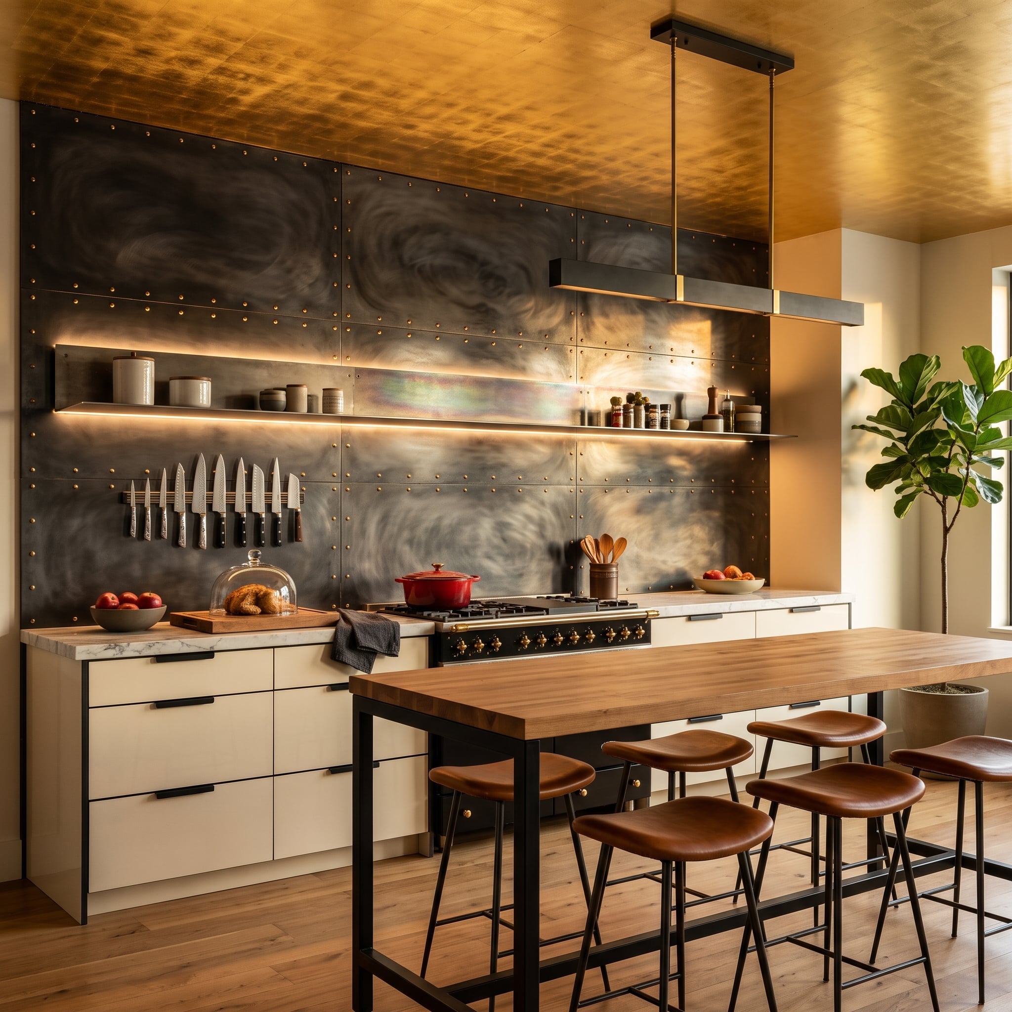
Riveted blackened-steel panels give the range wall an almost industrial scale, but their oxidized surface keeps shifting between charcoal, gray and silver as the light changes. Horizontal shelves with integrated lighting cut clean lines through the mottled metal rather than concealing it.
Then the ceiling goes gold. That could have sent the room straight into theater-set territory, yet butcher block and worn-looking leather pull the materials back toward something tactile and usable. The contrast is the point: dark metal below, reflected warmth overhead, plain wood between them.
29. Malachite Takes Over the Range Wall and Makes Subtlety Somebody Else’s Problem
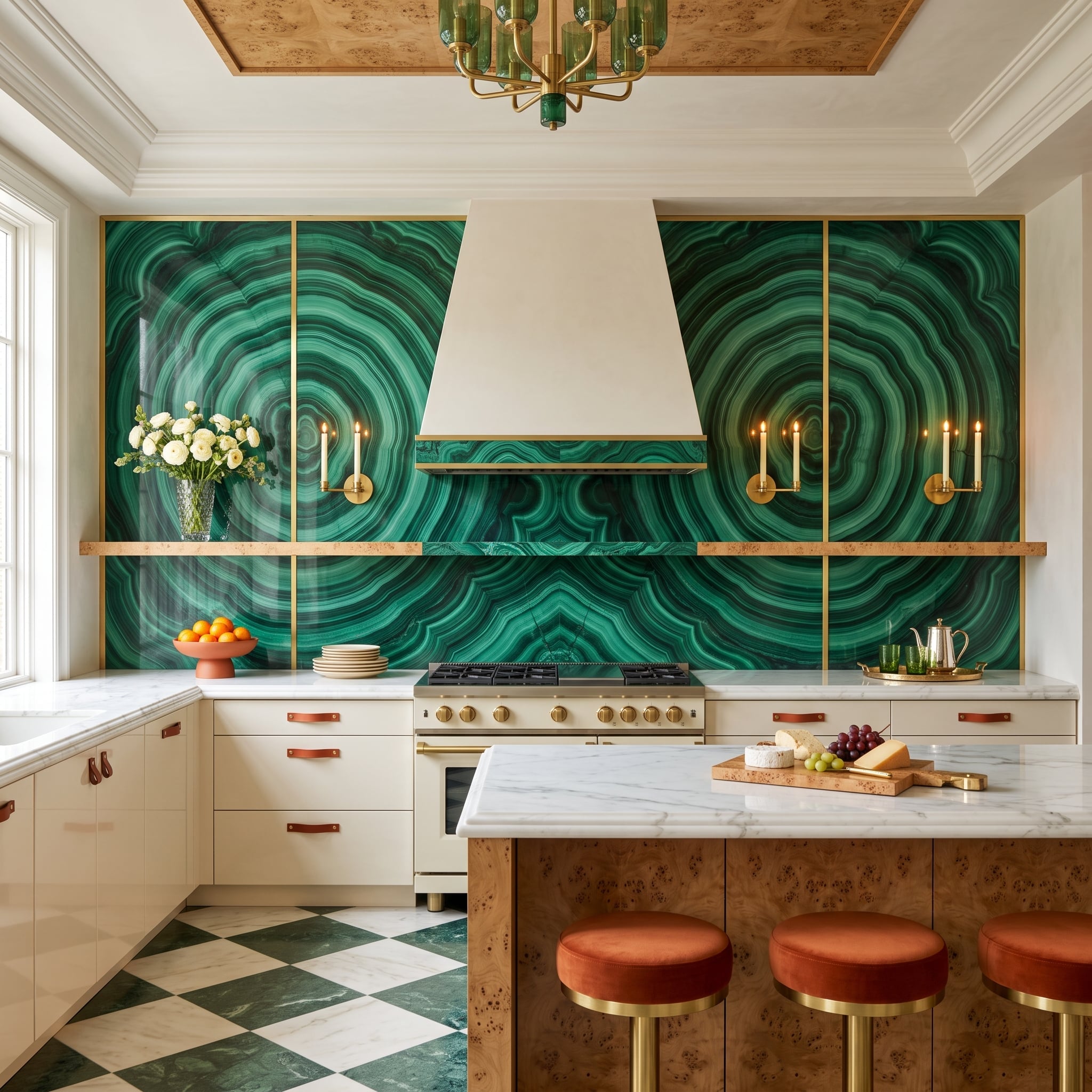
Banded greens coil across the wall in the unmistakable concentric patterns associated with malachite. Brass dividers give the highly active surface a framework, stopping the composition from becoming one enormous swirl of emerald and forest green.
The white hood is deliberately quiet. Burl wood on the island answers the stone with another irregular natural pattern, while terracotta leather pulls and rust-colored stools introduce warmth without attempting to match the green.
Material Note: Malachite is a relatively soft copper carbonate mineral and is sensitive to acids, abrasion and some cleaners. Large architectural surfaces that reproduce this appearance may therefore use malachite veneer, composite material or porcelain rather than thick pieces of solid stone. The exact maintenance requirements depend on the material actually installed.
28. Mustard Brick Meets a Rough Timber Beam and Decides Delicacy Can Wait
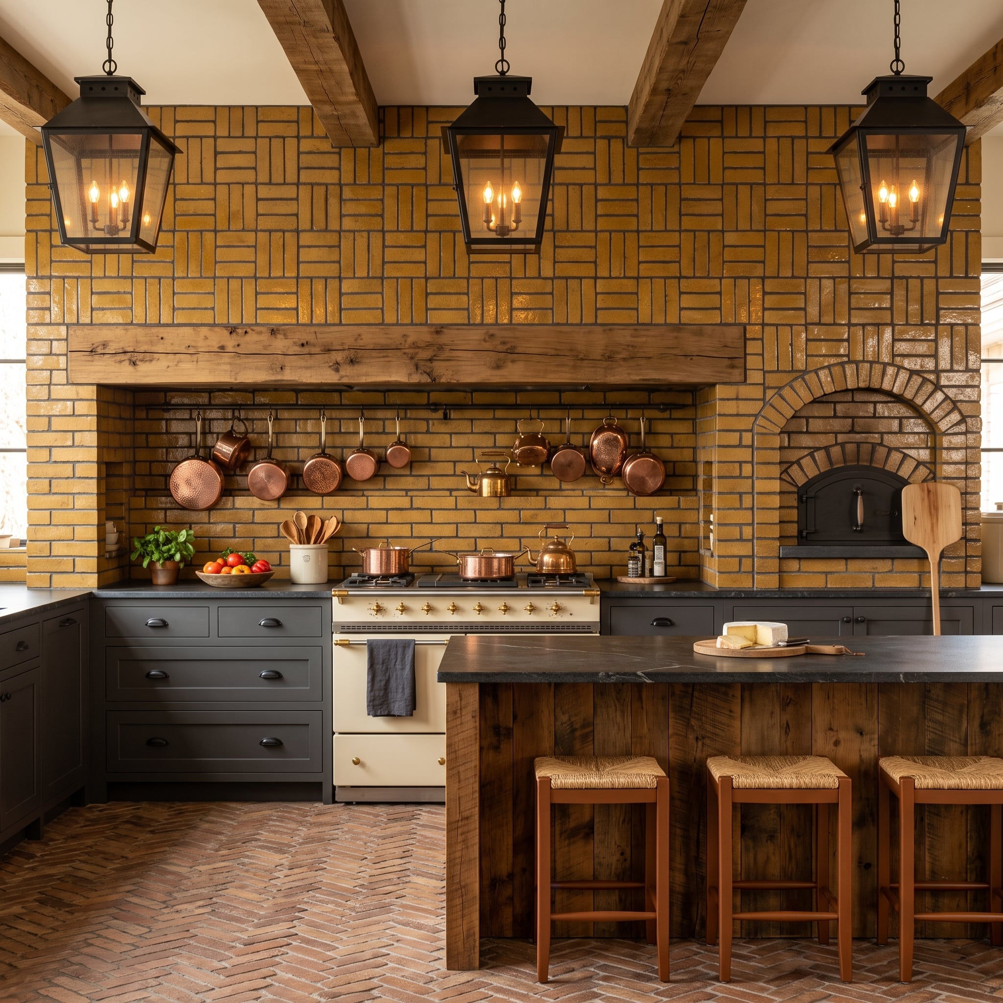
Ochre-yellow brick rises behind the range in a stacked pattern while a rough-hewn timber beam draws a heavy horizontal line across the cooking alcove. Copper pans hang directly against the masonry, adding smaller flashes of orange and brown to an already unapologetically earthy palette.
An arched brick oven on the right pushes the material beyond backsplash territory altogether. Herringbone brick underfoot doubles down on masonry but changes the pattern, while a cream range and rush-seat stools prevent the room from becoming one uninterrupted block of ochre.
Try This: A stacked bond makes brick feel more graphic than the familiar offset running bond. Where full-depth brick is impractical, thin brick veneer can provide a similar face appearance with far less weight and without the same structural depth requirements. Mortar color deserves its own sample board because it can change the wall almost as dramatically as the brick itself.
27. Fluted Glass Turns a Silver Wall Into Hundreds of Narrow Reflections
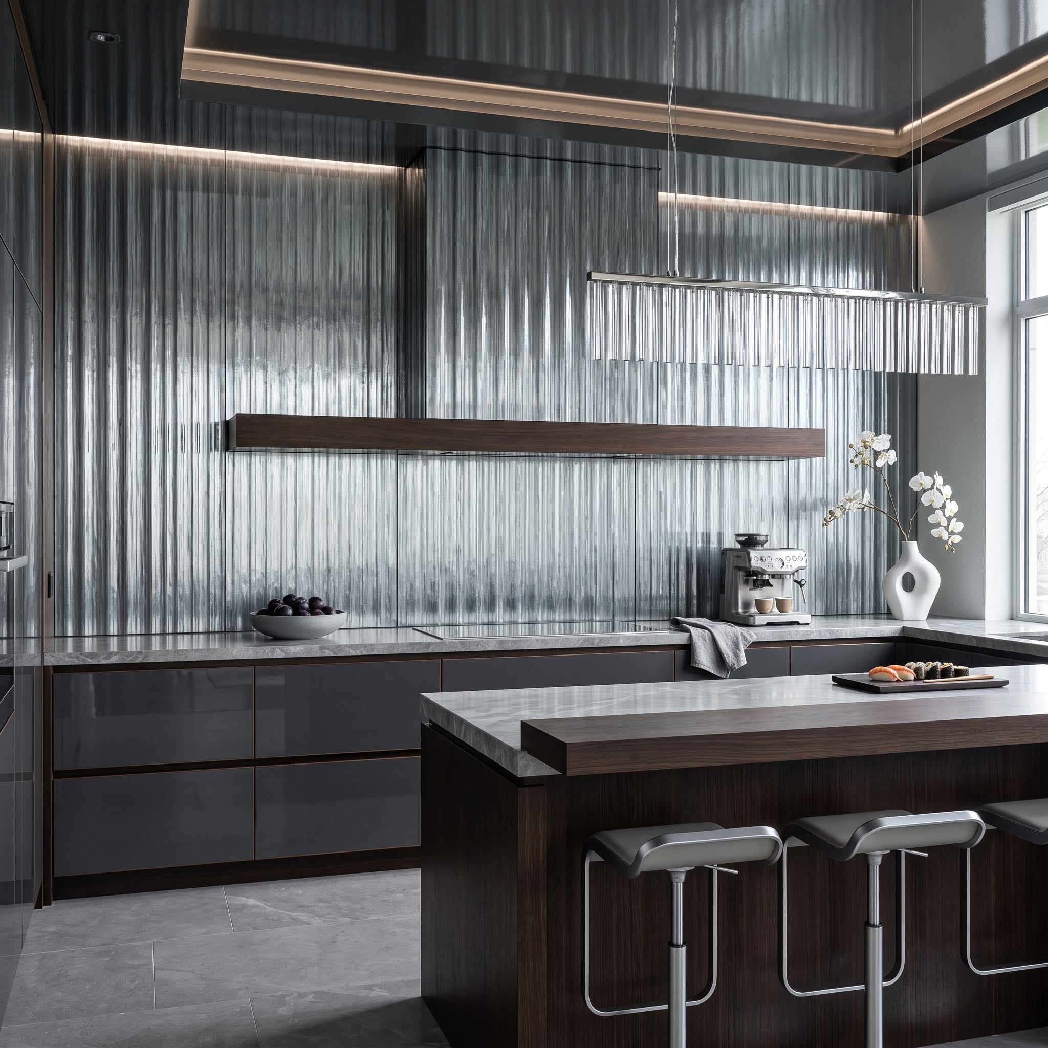
Vertical fluted glass tiles stretch upward behind the range, breaking reflections into narrow bands instead of returning one flat mirror-like image. A dark walnut hood crosses the ridged field as a strong horizontal interruption, which makes the vertical texture more obvious rather than less.
The island’s pale waterfall surface mediates between cool glass and warm wood. Nothing about the wall is visually flat, yet the limited material palette keeps the repeated ridges from becoming fussy.
Maintenance Note: Fluted and reeded glass can disguise fingerprints and splashes visually because reflections are broken across the ridges, but textured surfaces are not automatically easier to clean than flat glass. For a backsplash, grout joints, ridge depth and the manufacturer’s cleaning guidance matter as much as appearance.
26. Crimson Venetian Plaster Makes the Hood Disappear Without Making the Wall Quiet
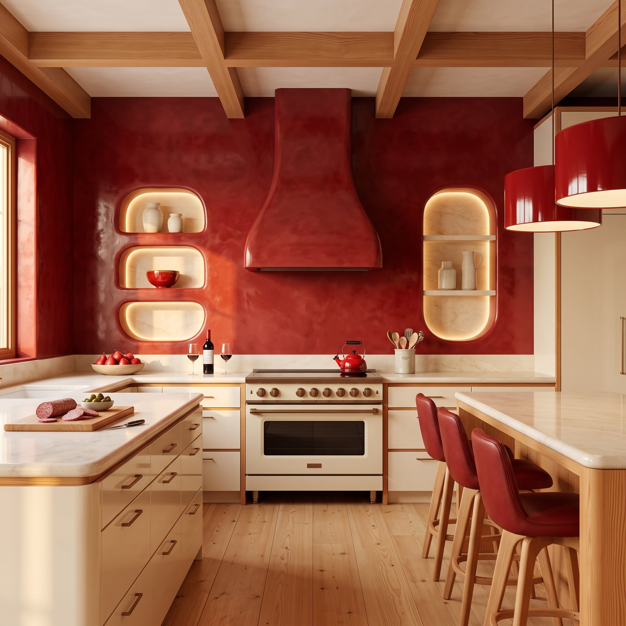
Crimson polished plaster covers the wall and continues directly over the hood, erasing the usual material break between appliance surround and backsplash. Instead of the uniform finish of ordinary paint, the plaster carries subtle tonal shifts and reflected highlights across the red surface.
Rounded niches glow amber from concealed lighting, giving the saturated wall several pockets of depth. Cream cabinetry and pale wood seating supply the visual breathing room; without those neutral surfaces, the red would have nowhere to stop.
25. Petrified Wood and Agate Turn the Backsplash Into a Geological Collage
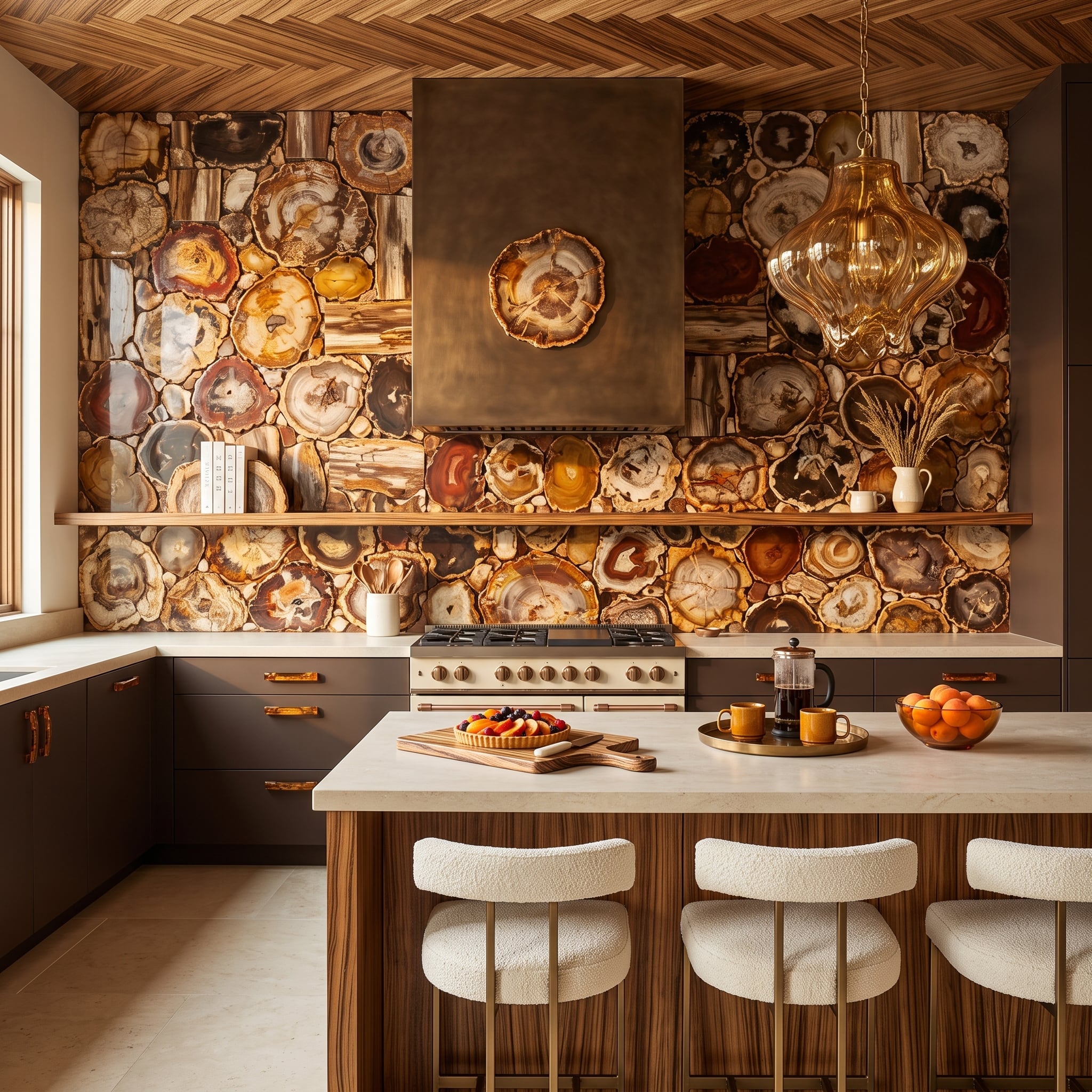
Cross-sections of petrified wood and agate pack the wall with rings, mineral bands and irregular edges in burgundy, charcoal, cream and amber. Unlike a repeating tile pattern, almost every shape asks to be inspected separately.
An aged-brass hood provides one large, calm form in front of the mosaic. Espresso cabinetry darkens the base of the composition, while wood on the island and ceiling picks up the material’s original botanical associations without pretending the stone is still timber.
Material Note: Petrified wood forms when minerals gradually replace the original organic material while preserving much of its cellular structure. Color varies with the minerals involved, which is why slices can range from pale cream to red, brown, gray and nearly black. A large installation requires careful selection, fabrication and mounting because the pieces vary naturally in shape and appearance.
24. Stainless Steel Runs Wall-to-Wall, and Copper Pans Supply the Counterargument
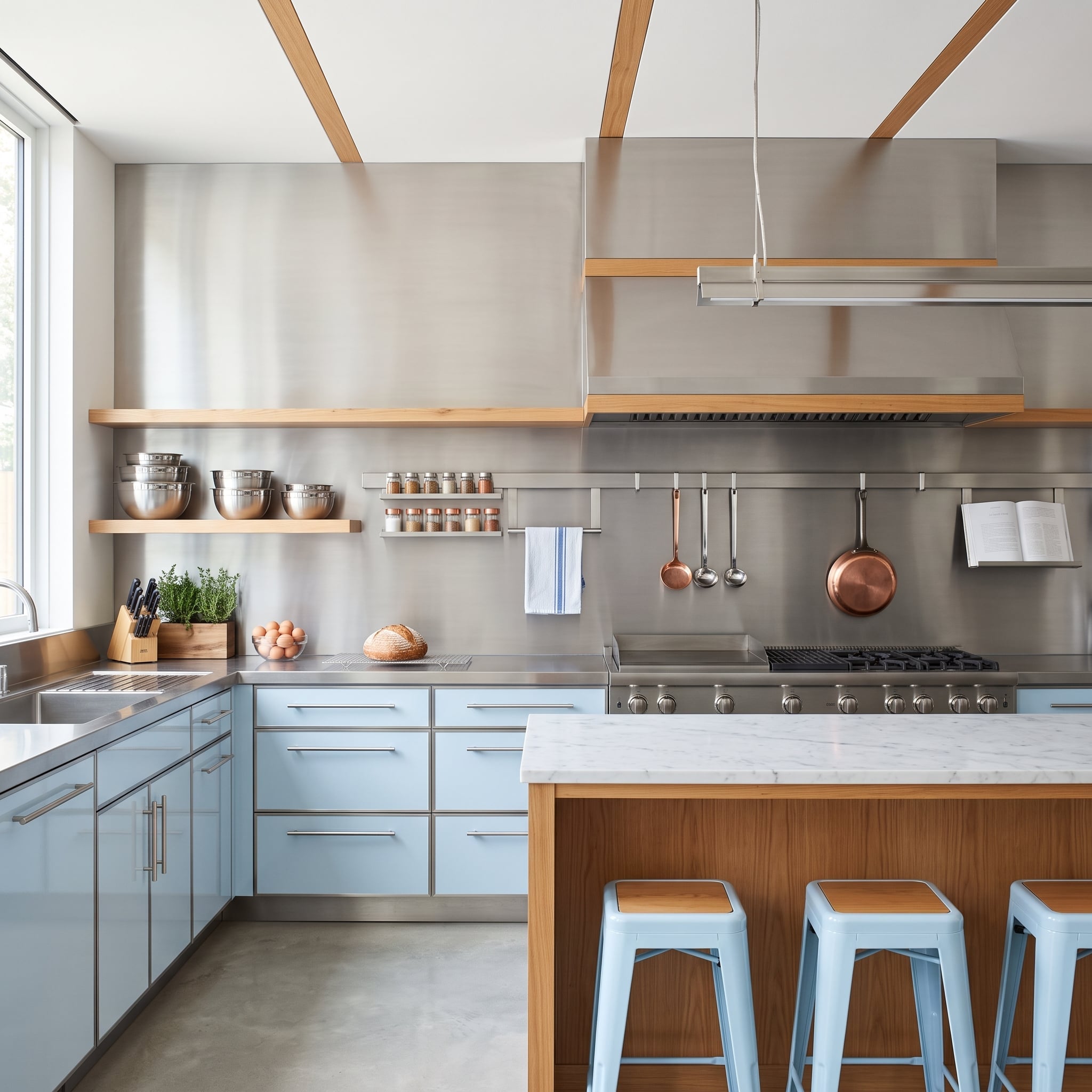
Brushed stainless steel stretches behind the entire cooking zone and wraps the hood surround, borrowing the visual language of a professional kitchen without copying one literally. Because the finish is brushed rather than mirror-polished, reflections arrive as soft streaks instead of hard duplicates of the room.
Honey-toned shelves and copper cookware puncture the cool field with warmth. Pale blue cabinetry softens the transition again, leaving the steel dominant but not isolated.
23. Hand-Painted Floral Tile Lets the Garden Climb Straight Up the Cooking Wall
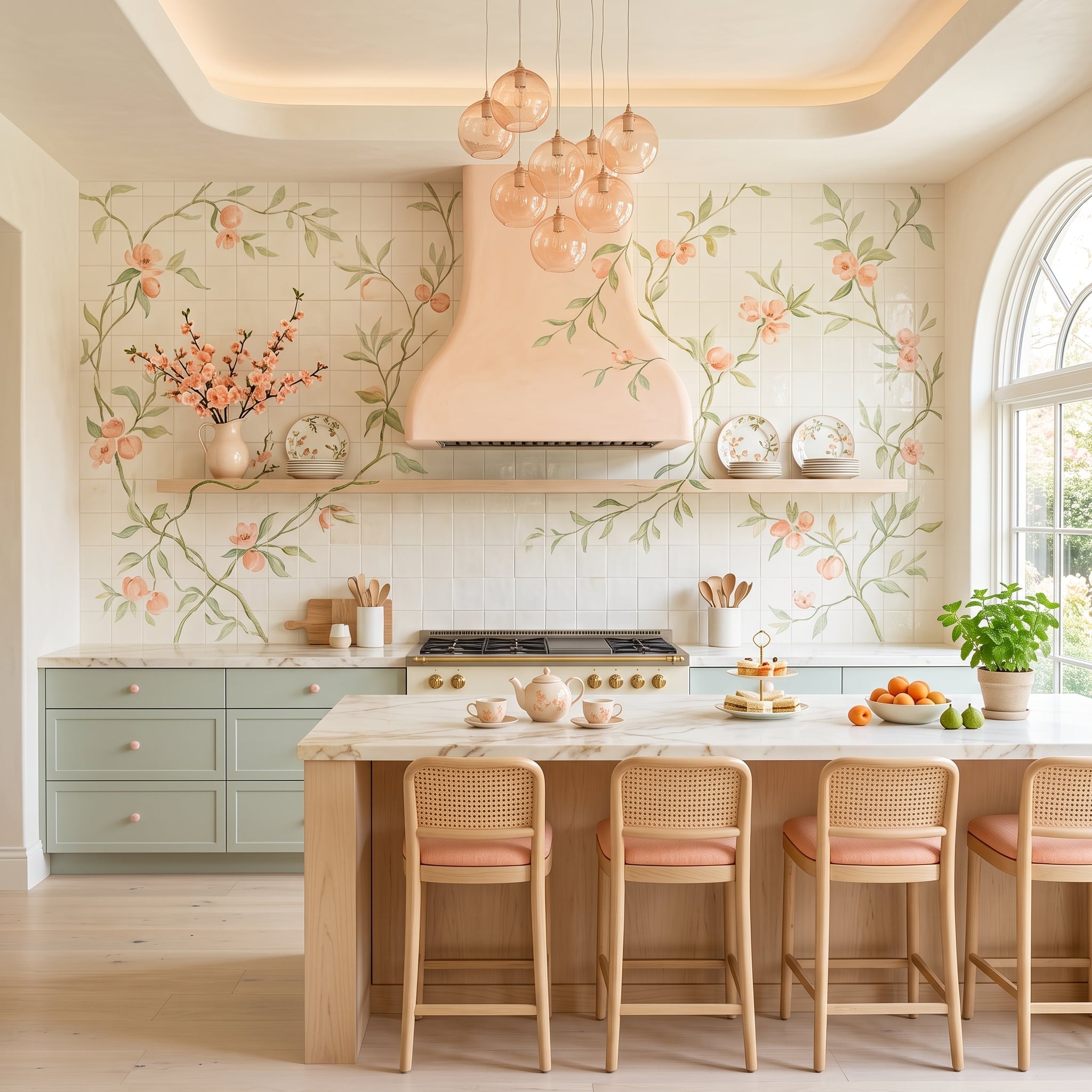
Peach blossoms and trailing vines climb across cream tile rather than repeating in tidy little modules. The blush-plastered hood picks up one of the mural’s softer colors, letting the flowers continue visually around it instead of crashing into a contrasting block.
Sage cabinetry takes the palette in the opposite direction, while rose-tinted pendants send the blossom color overhead. Cane-back stools introduce another botanical material without adding more literal flowers.
Why It Works: A tile mural can carry one image across many individual pieces, allowing the eye to follow stems, branches and flowers through the grout grid rather than encountering the same motif over and over. Hand-painted tile can be produced with several ceramic techniques and firing schedules, so durability and cleaning requirements depend on the tile and glaze system rather than on one universal firing temperature.
22. Black Soapstone Swallows the Counter Line and Gives the Coffee Station a Stage
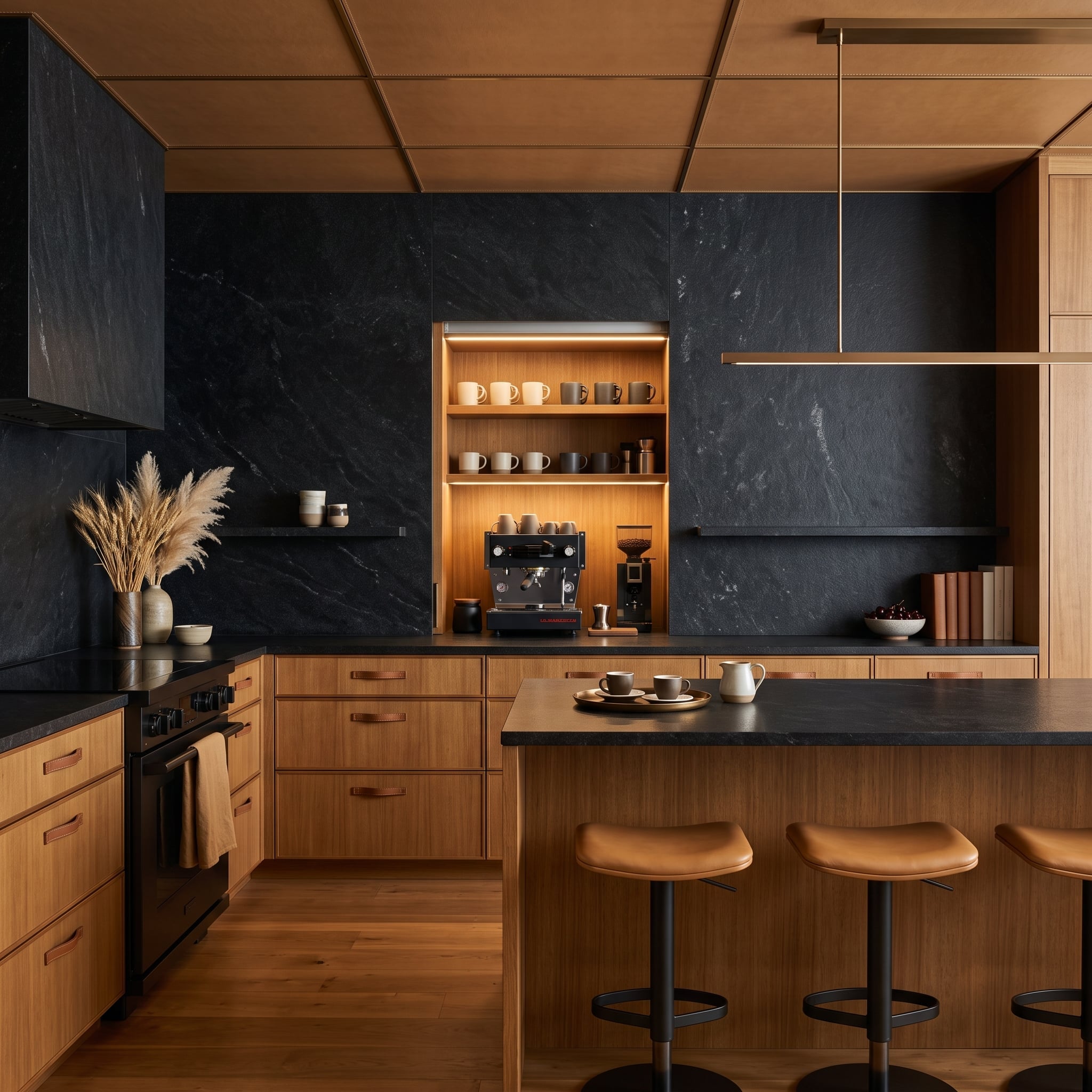
Honed black soapstone moves from countertop to vertical wall with almost no visual interruption, turning two planes into one dark continuous envelope. Warm oak cabinetry surrounds it, making the stone look deeper and softer than polished black granite would in the same position.
A wood-lined coffee alcove breaks through the dark wall with its own pool of warm light. The espresso machine, grinder and rows of earth-toned mugs become part of the architecture rather than loose equipment occupying valuable counter space.
Material Matters: Soapstone is a talc-rich metamorphic rock known for strong resistance to heat and acids. Unlike marble and many calcite-based stones, it does not etch from ordinary kitchen acids such as lemon juice or vinegar. The trade-off is relative softness: scratches and edge wear can develop more readily than on harder stones such as granite or quartzite.
21. Scallop Tile Fades from White to Teal While the Hood Learns the Same Curve
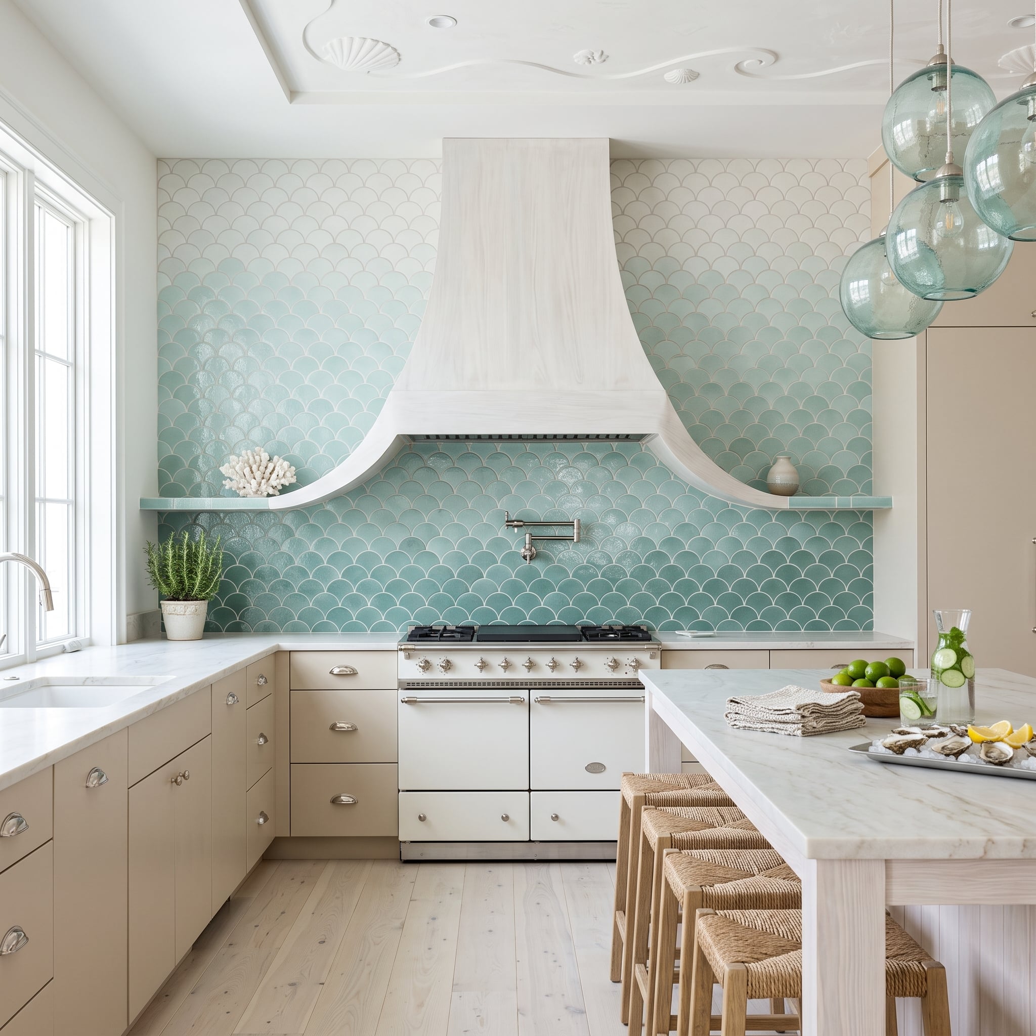
Fish-scale tile shifts from near-white high on the wall to saturated seafoam near the counter, allowing color rather than a material change to divide the surface. The gradient makes the lower part of the wall feel denser while the upper reaches seem to dissolve toward the ceiling.
The hood repeats the tile’s curved geometry in a much larger form. Bleached wood keeps that shape light, while sea-glass pendants and woven rush stools carry the coastal references into the rest of the kitchen without turning seashells into a decorating theme.
20. Bookmatched Marble Meets a Cognac Leather Hood and Somehow Neither Backs Down
🔥 Would you like to save this?
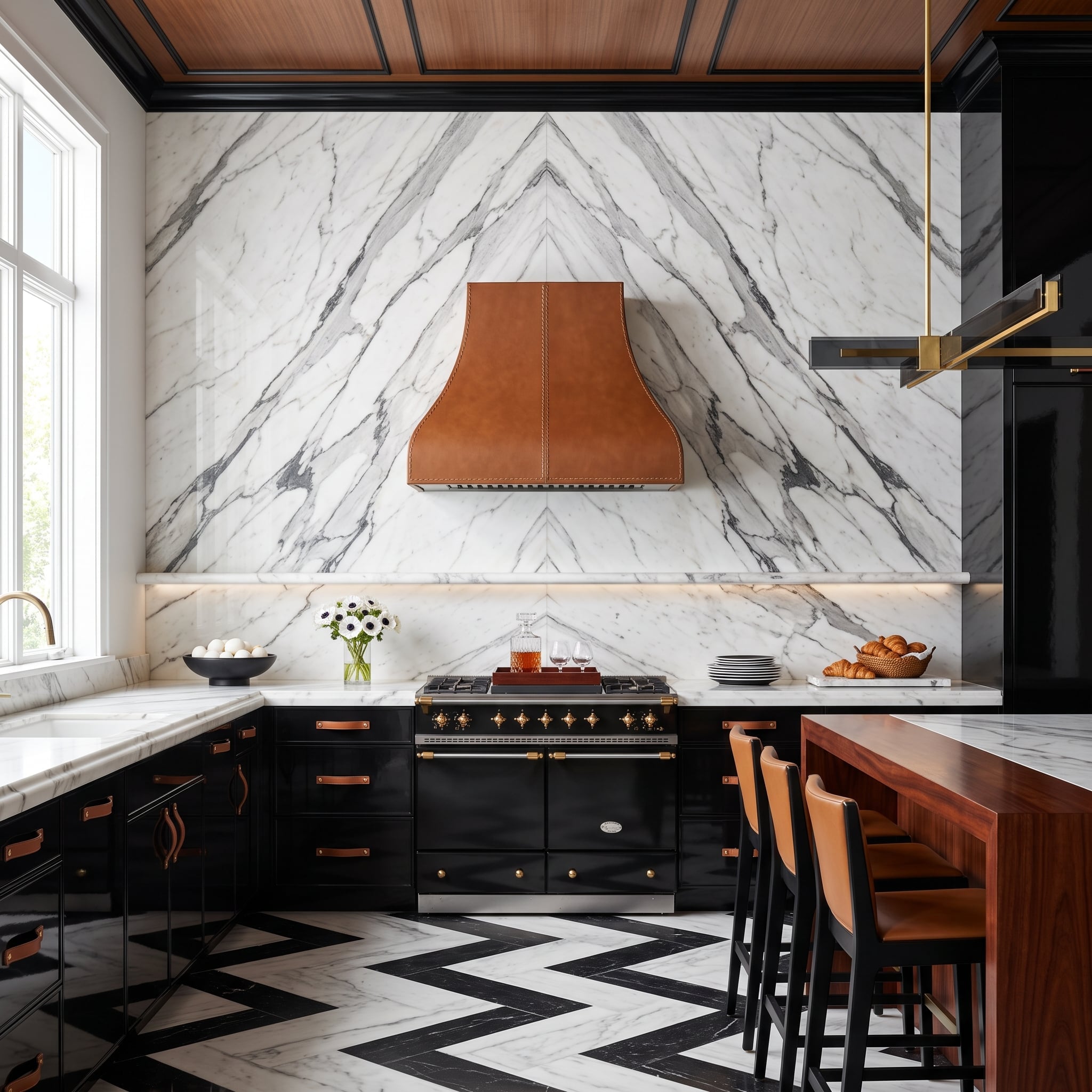
Bookmatched Calacatta marble sends mirrored veins up the cooking wall while the black-and-white floor throws another zigzag across the room below. Instead of trying to disappear against that stone, the range hood arrives wrapped in cognac leather with visible contrast stitching.
The pairing works because the materials are dramatic in completely different ways. Marble supplies veining and reflected light; leather contributes color, grain and softness. One is continuous surface, the other a single oversized object.
Stone Detail: Bookmatching uses consecutively cut slabs that are opened along adjoining faces so the natural veining mirrors across the seam, much like facing pages in a book. Achieving a convincing match requires planning the slab sequence, seam locations and cuts before fabrication.
19. Oxidized Copper Turns Teal, Rust and Brown Into One Restless Metal Wall
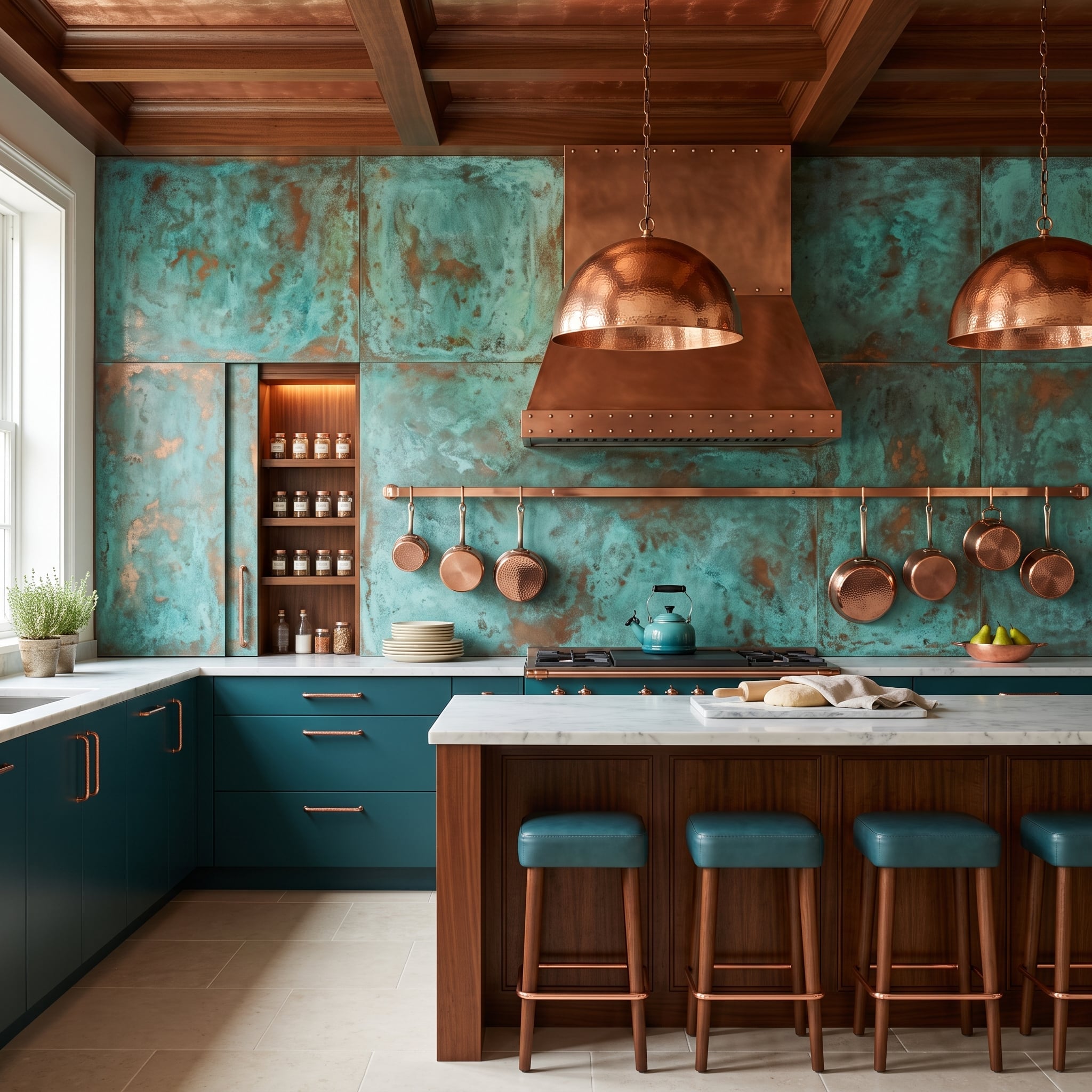
Patinated copper sheeting covers the wall in a mottled mix of teal, brown and rusty orange instead of copper’s familiar new-penny shine. The hammered hood stays within the same metal family but changes the texture, giving the center of the wall a denser, more tactile surface.
The attraction is the variation. Patination prevents a large field of copper from becoming a single flat color, and seams between panels give the shifting finish enough geometry to keep it architectural. Depending on the fabrication and protective finish, copper can continue changing over time or be sealed to preserve a more controlled appearance.
18. Cane Cabinetry Nearly Erases the Backsplash — Which Is Exactly the Point
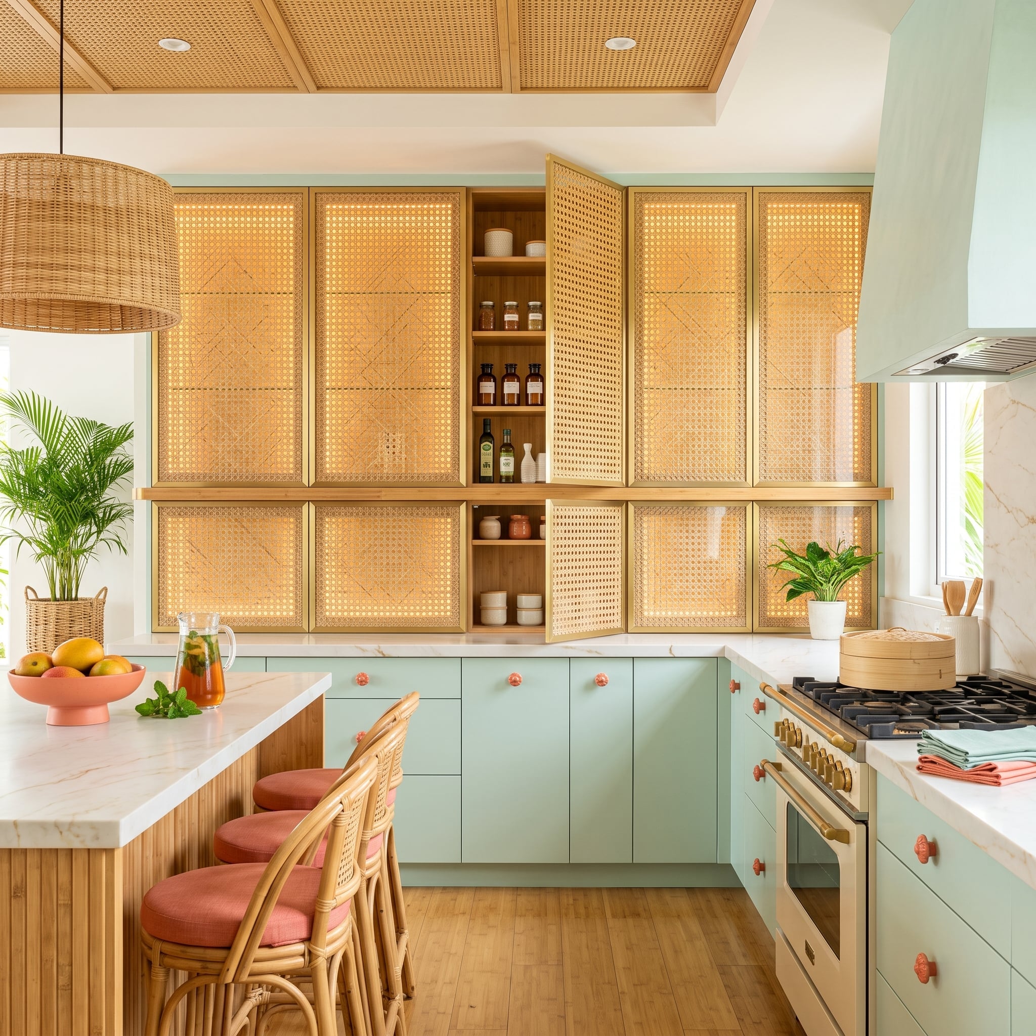
Woven cane fronts framed in brass occupy so much of the wall that the marble behind the range becomes a visual pause rather than the starring material. Mint lower cabinets and coral knobs add crisp color beneath a wall dominated by warm woven texture.
Rattan stools and a wicker pendant repeat the fibrous quality at different scales. The danger would be turning every surface into basketry; the smooth marble, painted cabinetry and metal framing prevent that from happening.
Material Note: Cane webbing has been used in furniture for centuries. Cabinet-door applications typically secure the woven material within a frame or panel assembly so it remains tensioned and supported; whether visible brass serves a structural or purely decorative role depends on the specific door construction.
17. Backlit Rosa Onyx Glows Behind the Stemware Instead of Merely Reflecting It
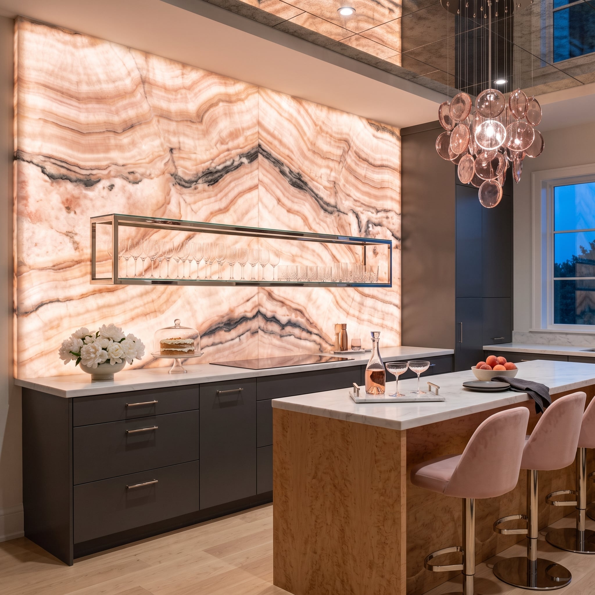
Bookmatched rosa onyx turns translucent under concealed backlighting, pushing its pink, cream and gray veining forward as though the stone itself were the light fixture. A frameless chrome shelf places rows of stemware directly in front of that glow without covering much of the slab.
Dark matte cabinetry provides a nearly black baseline beneath the luminous stone. Burl wood on the island introduces a second swirling natural pattern, but its brown coloring keeps the two materials from looking like competing versions of the same trick.
Common Mistake: Not every onyx slab transmits light equally. Color, veining, mineral density and thickness all affect translucency, and some installations use thinned or laminated stone specifically for backlighting. Test the actual selected slab with the intended lighting system before fabrication rather than assuming a particular nominal thickness will glow evenly.
16. Wavy Cobalt Tile Makes the Wall Look as Though Somebody Set It in Motion
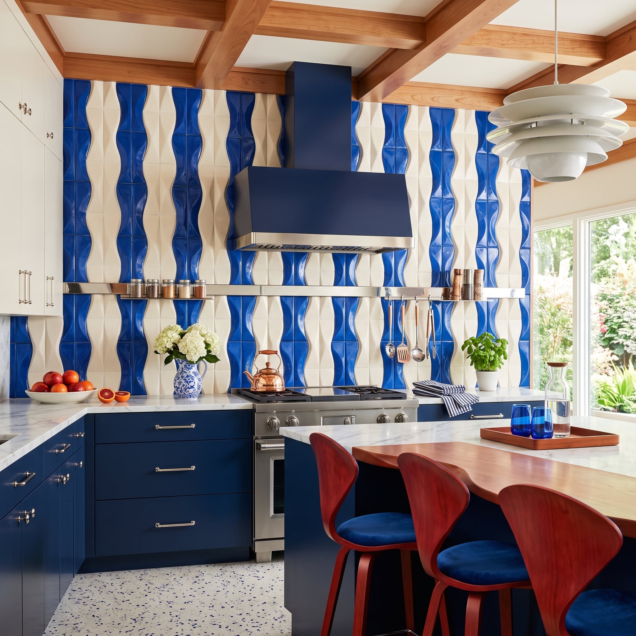
Sculptural cobalt-and-cream tiles build horizontal waves behind the range, so the backsplash changes not only in color but in depth. Highlights collect on the raised sections while shadows darken the recesses, exaggerating the rippling stripe pattern.
The navy hood and lower cabinetry give the cobalt somewhere solid to land. Walnut barstools interrupt the blue with warm wood, and the velvet upholstery brings one softer blue surface into a room otherwise dominated by hard tile and painted cabinetry.
15. Antique Mirror Turns a Bar Niche Into the Brightest Dark Corner in the Kitchen
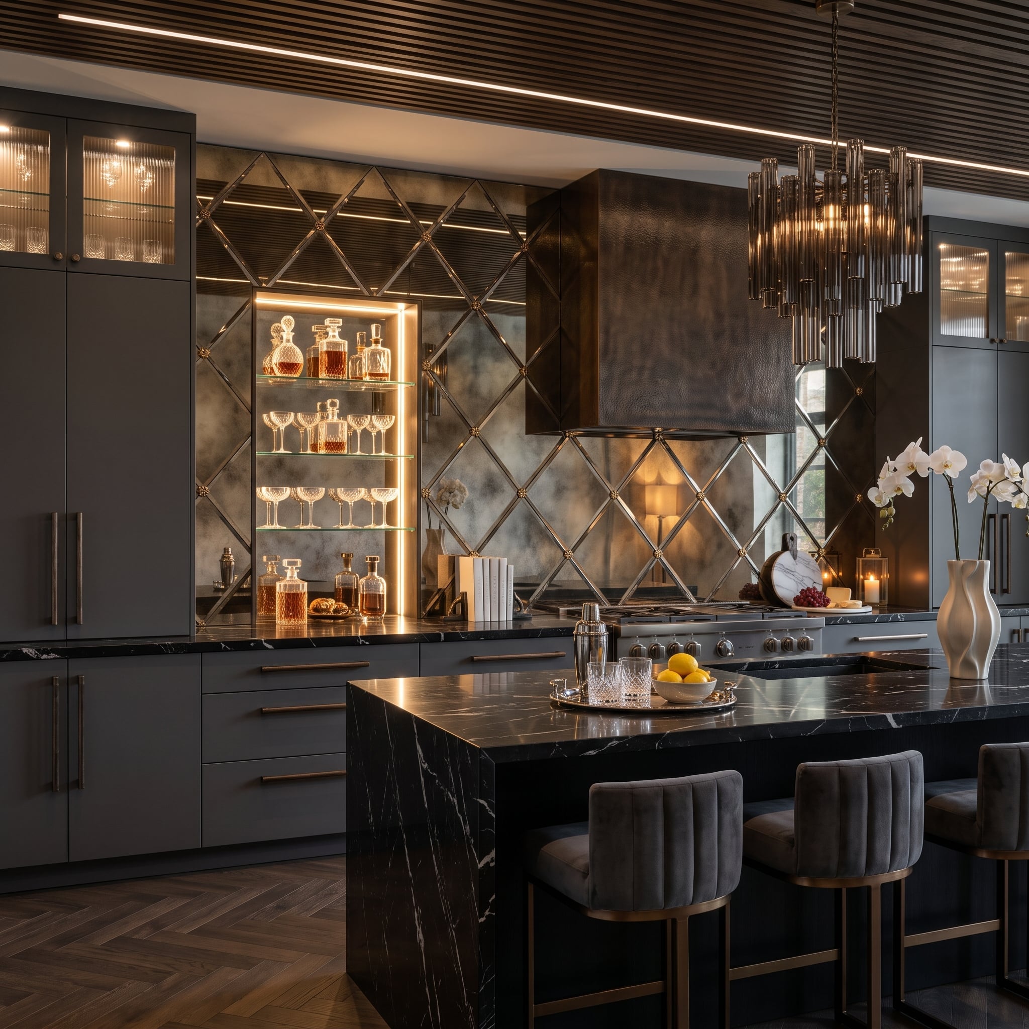
Antiqued mirror tile laid in a diamond grid sends fractured reflections across the cooking wall while brass-studded intersections give the pattern a clear rhythm. Because the mirror is deliberately mottled, the reflections arrive softened rather than showroom-sharp.
A lit niche cuts into that grid and holds crystal decanters and coupe glasses on glass shelves. The dark hammered-metal hood supplies a dense central shape, while white veining through the black marble island echoes the silvery wall without becoming another reflective surface.
14. A Slate Backsplash Grows Its Own Herb Garden
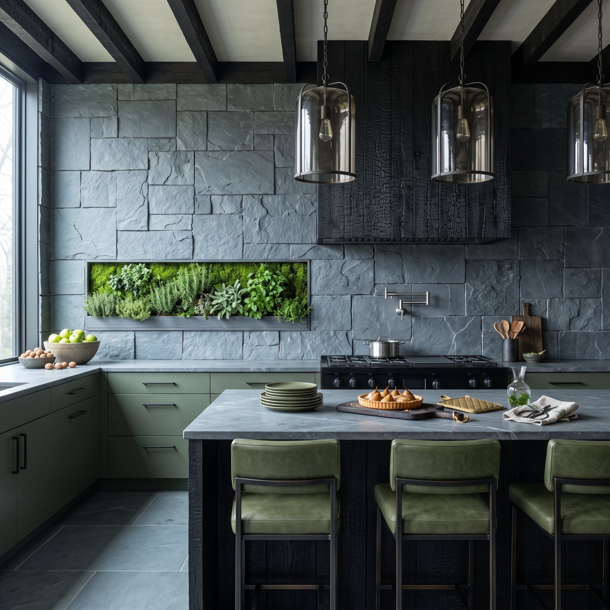
Rough-cut slate rises behind the cooking zone with a recessed garden planted directly into the wall. Rosemary, thyme, sage and moss replace the decorative object that might normally occupy that niche, while sage-green cabinetry extends the botanical palette beneath it.
Why Recessing the Garden Changes the Work Zone
Moving pots off the countertop preserves prep space and gives the plants a fixed architectural location instead of scattering containers around the sink or range. Successful planting still depends on appropriate natural or supplemental light, drainage, irrigation and species selection; the design advantage is primarily that the greenery occupies wall volume rather than work surface.
13. Gold Mosaic Starts in Bronze and Climbs Toward Liquid Light
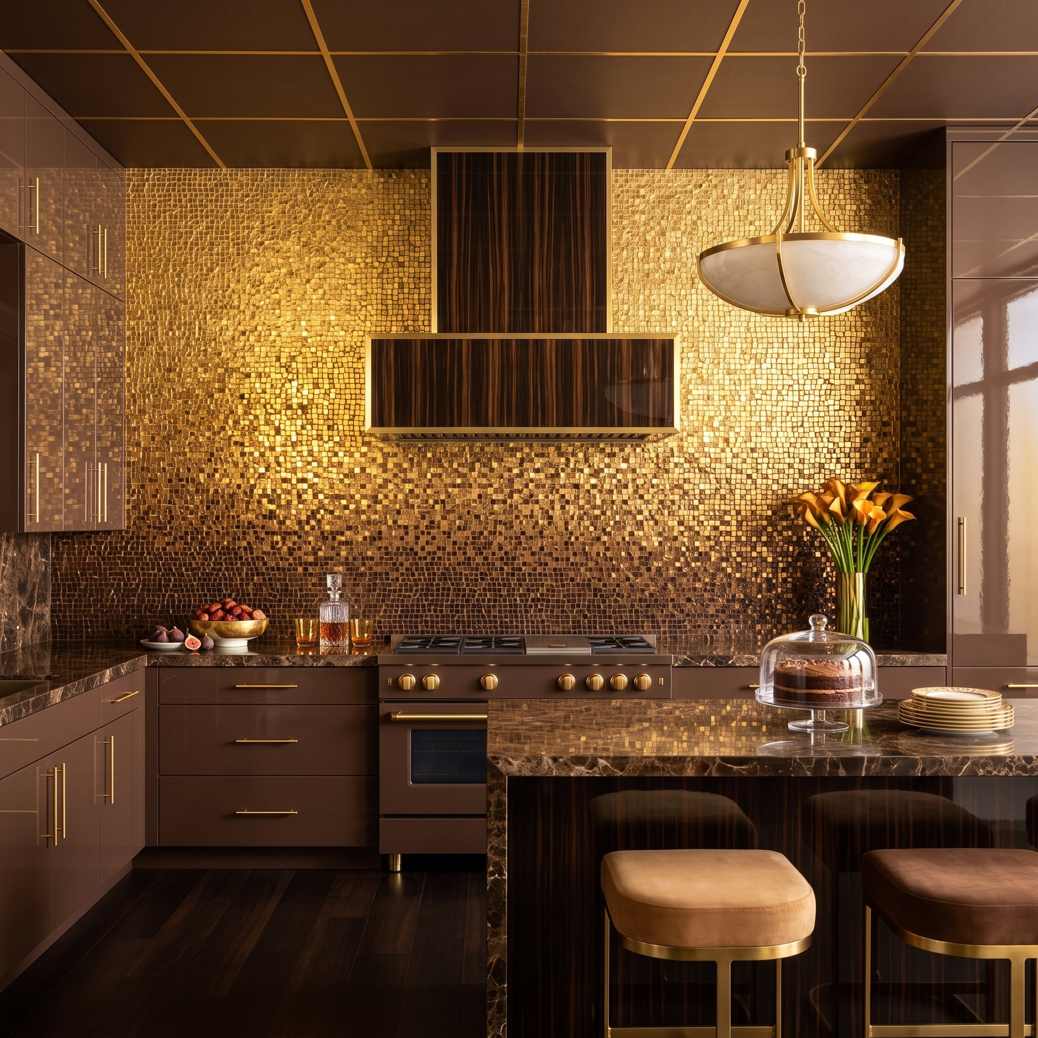
Thousands of tiny mosaic pieces shift from darker bronze near the counter toward brighter gold around the hood. The small scale means the wall never becomes one uninterrupted metallic sheet; every joint breaks the reflection into another point of light.
A striped Macassar-ebony hood with brass trim puts dark linear grain against all that shimmer. Chocolate cabinetry and Emperador marble remain within the same warm family, while velvet stools on brass bases make the island feel like part of the composition rather than a neutral object parked in front of it.
Design Detail: The wall gets much of its depth from variation within one metallic family rather than from contrasting colors. Darker bronze at the base, brighter gold around the range and the tiny interruptions of the grout keep the surface from behaving like a single flat reflective panel.
12. Fluted Travertine Makes the Range Hood Look Carved Out of the Wall
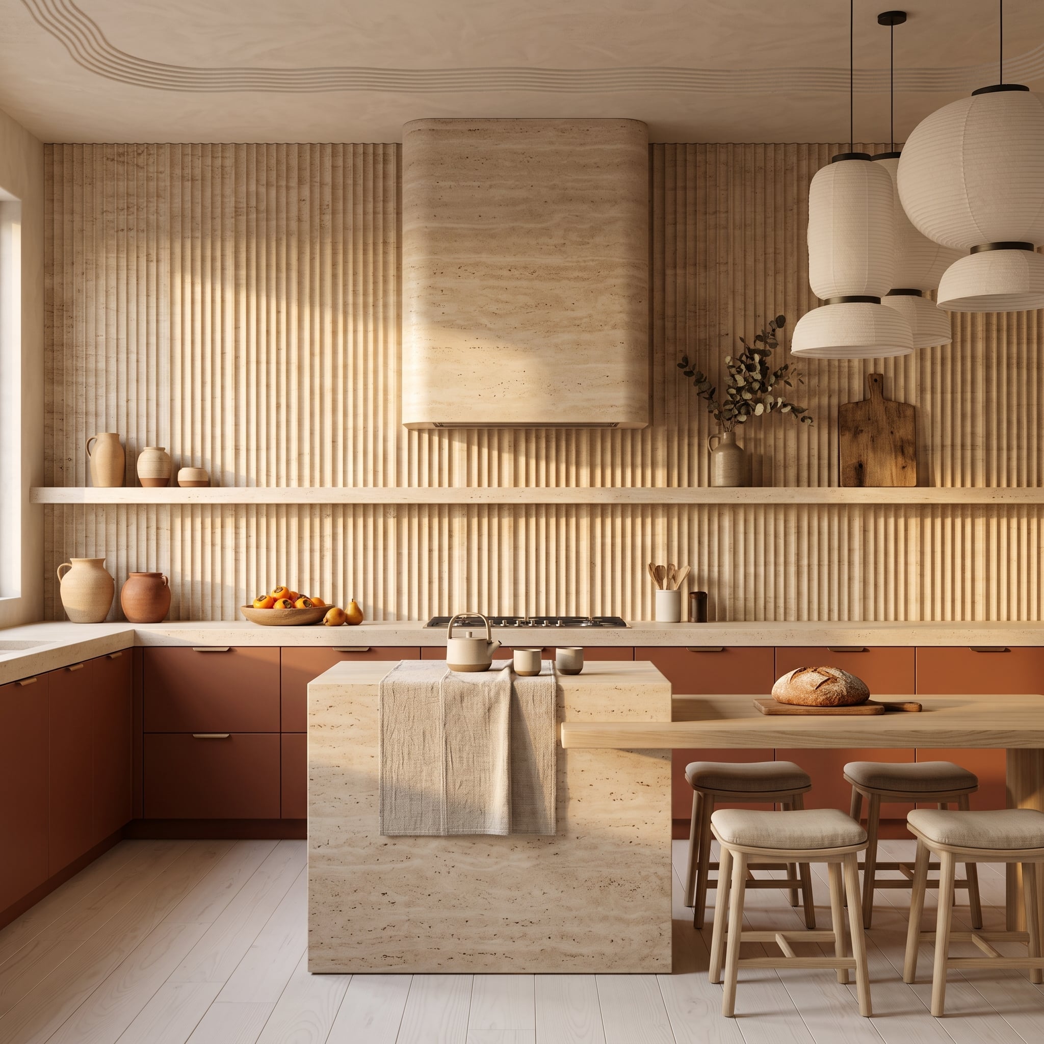
Reeded travertine rises behind the range and continues across the hood, turning both into a vertically grooved stone composition. A floating shelf cuts one thin horizontal line through the fluting, enough to interrupt the repetition without dividing the wall in half.
Terracotta cabinetry introduces saturated color below the pale stone. Whitewashed flooring and paper pendants lighten the rest of the envelope, while the travertine island base repeats the wall material as a solid block instead of another field of grooves.
11. Moroccan-Pattern Cement Tile Packs the Wall With Geometry — Then Adds an Arch
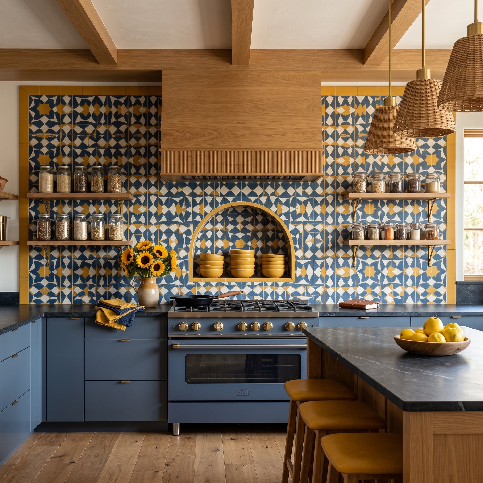
Blue, white and mustard geometric tile stretches behind the range and frames an arched niche stacked with yellow bowls. Slate-blue cabinetry pulls the dominant color out of the pattern and enlarges it into a quieter block beneath the wall.
Warm oak shelves and wicker pendants introduce materials with much less visual information. Sunflowers pick up the mustard almost shamelessly — and in a kitchen this committed to color, restraint would be the stranger choice.
Worth Knowing: Traditional cement tiles are formed without kiln firing. Pigmented cement creates a decorative face layer that is hydraulically pressed together with the tile body. Because the colored layer has meaningful depth rather than being a thin printed surface, normal wear can age differently from a glazed ceramic tile, though deep chips can still expose material beneath the decorative layer.
10. Glazed Green Tile Builds a Dark Forest Around a Glowing Onyx Hood
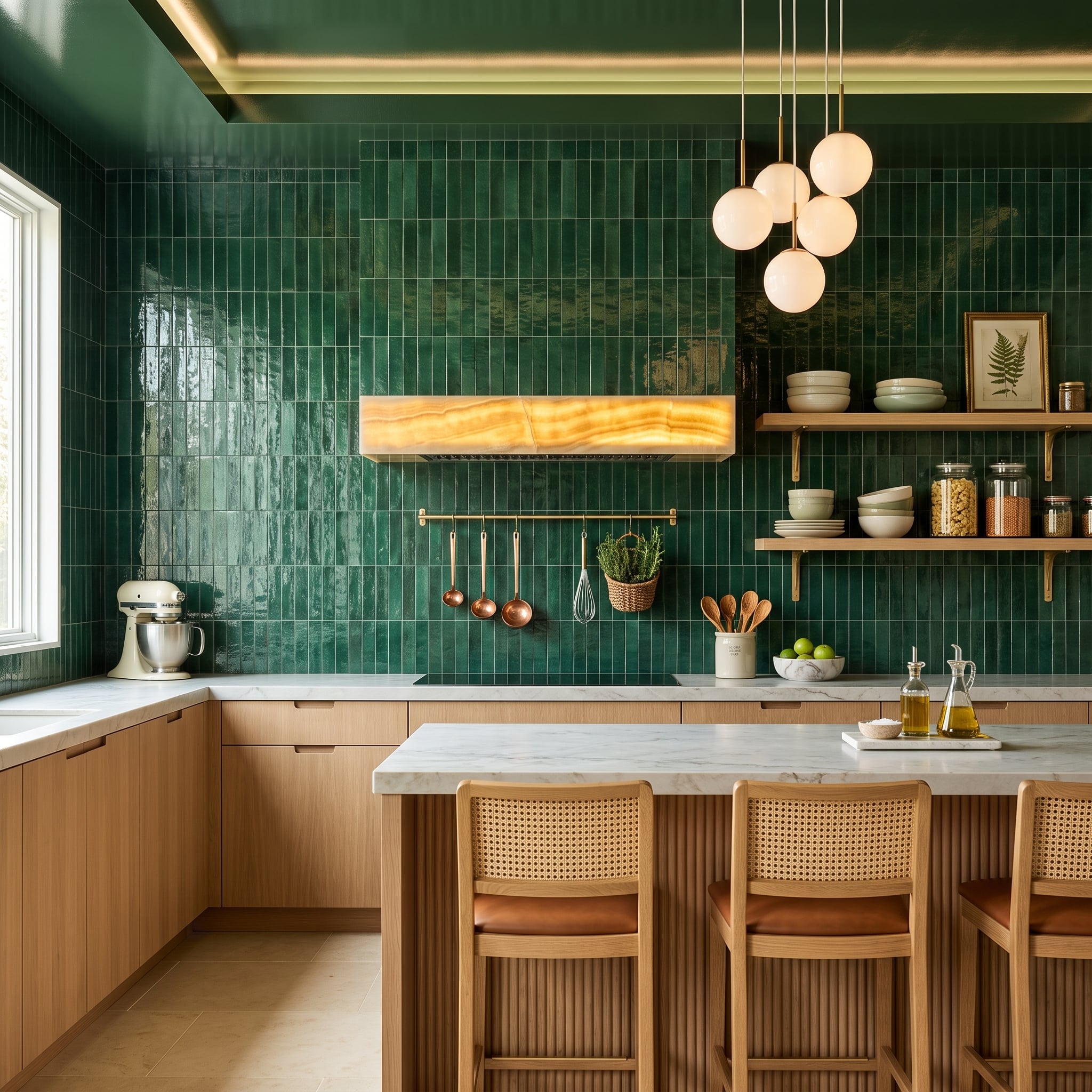
Forest-green zellige-style tile rises in a vertical stack, multiplying tiny changes in glaze and reflection across the wall. The upright orientation exaggerates the height while the dark color gives the room considerably more visual weight than a pale backsplash could.
The backlit onyx insert in the hood breaks through that green field with a concentrated amber glow. Instead of introducing another pattern across the whole wall, translucency appears in one controlled architectural element — a luminous interruption in a kitchen otherwise defined by opaque, saturated tile.
9. Leaf-Relief Silver Tile Makes a Monochrome Wall Behave Like Sculpture
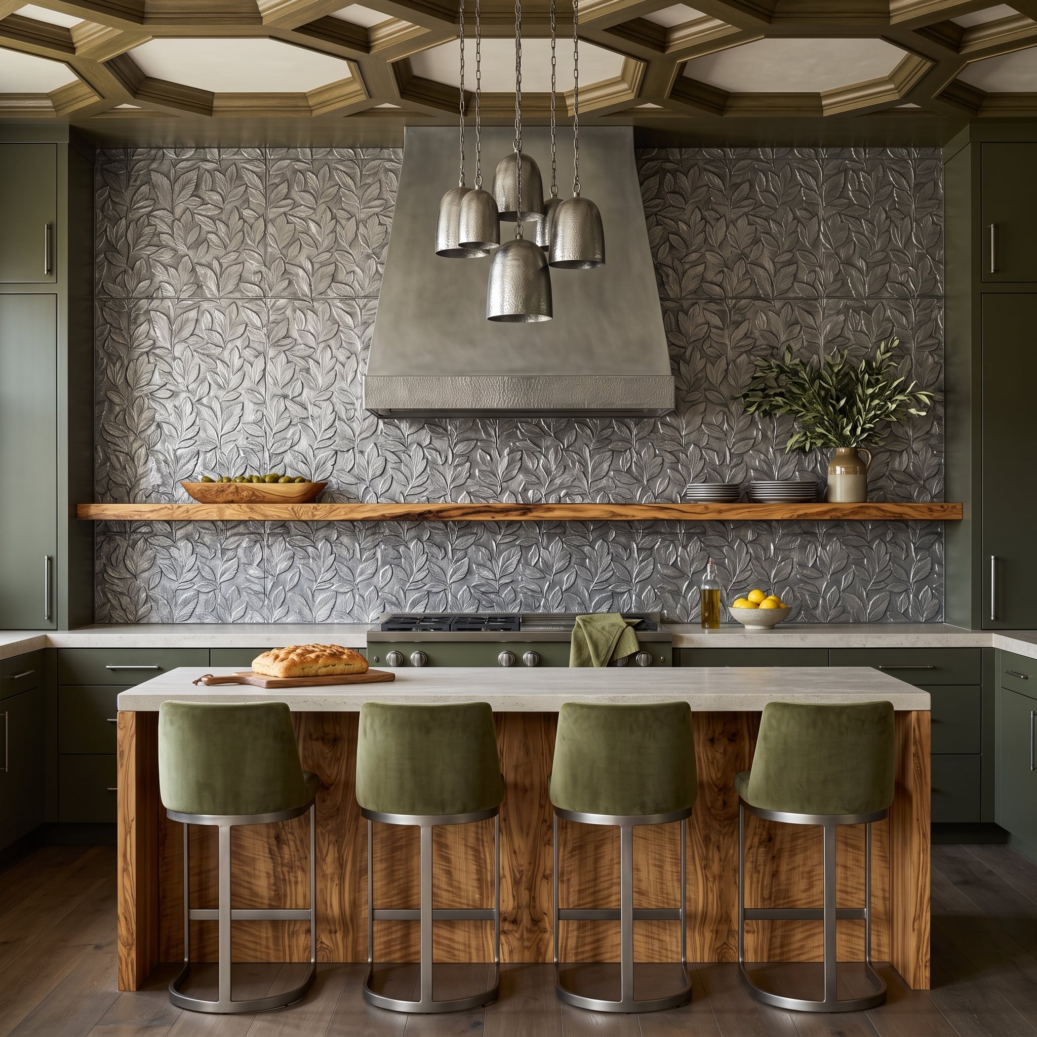
Silver-gray tile carries a raised botanical pattern from countertop to ceiling, so light creates the contrast rather than color. The hood picks up a related hammered-metal finish, allowing its bulk to merge into the same cool material story without literally repeating the leaf pattern.
A live-edge wood shelf provides the one rough horizontal line across the metallic field. Olive cabinetry and sage stools move the palette toward green, quietly reinforcing the leaves without turning the botanical relief into a theme.
Designer’s Note: Relief tile creates pattern through physical depth as well as glaze or color. Depending on the product, the surface may be pressed, molded, cast, carved or otherwise formed before finishing. Directional light exaggerates the raised portions, but even diffuse light leaves enough shadow for a monochromatic pattern to remain visible.
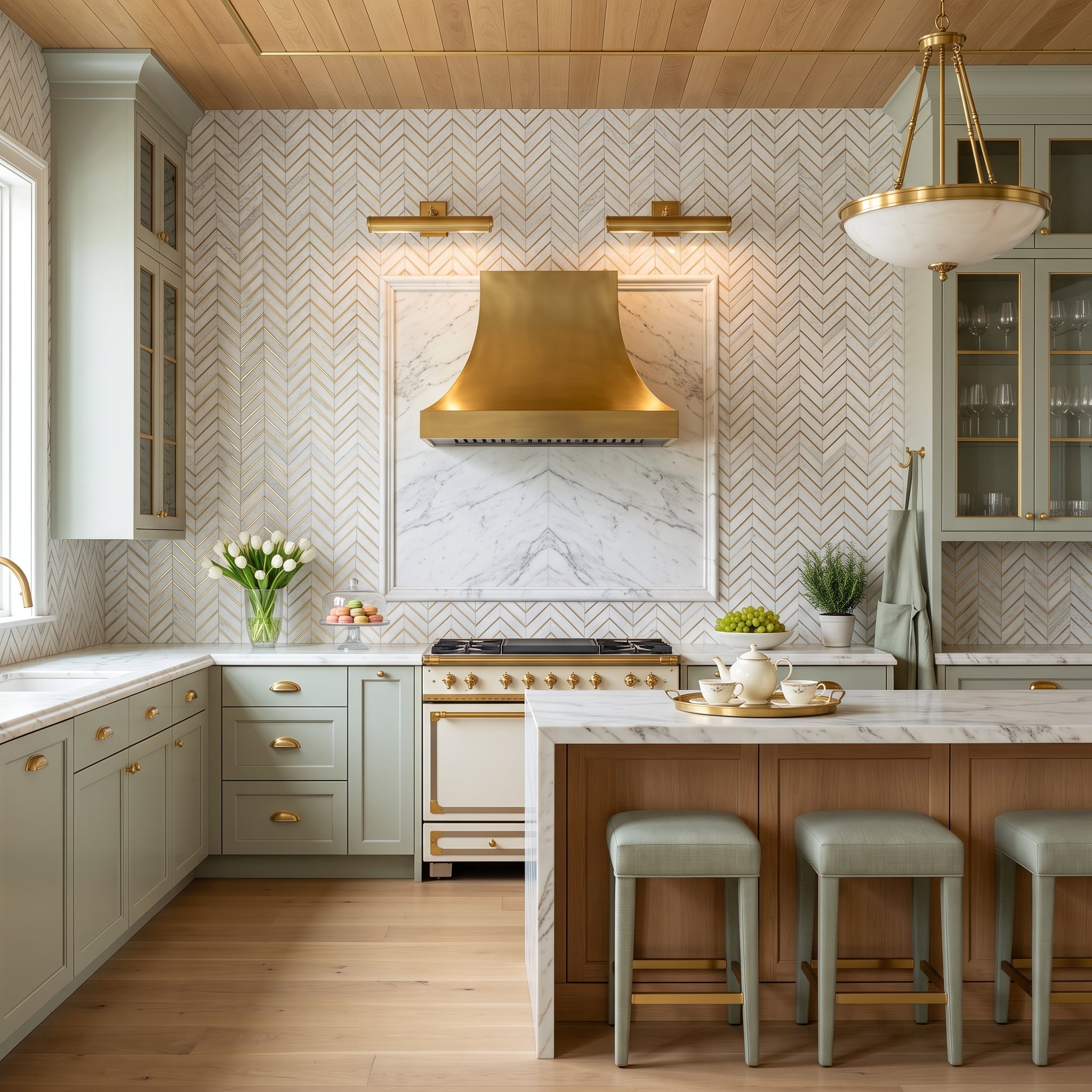
8. White Herringbone Gets Gold Grout and Suddenly Stops Acting Neutral
🔥 Would you like to save this?
Sage cabinetry and brass cup pulls begin quietly enough. Then white herringbone tile stretches across the cooking wall with gold-toned grout outlining every diagonal, turning the joints themselves into part of the pattern.
A marble-framed section behind the range gives the brass hood a defined center, while picture lights place warm highlights across the upper wall. Wood overhead and light oak underfoot keep the metallic accents from leaving the rest of the room behind.
- Herringbone creates directional movement through the repeated diagonal joints.
- Contrasting grout makes those joints part of the visible pattern instead of allowing them to recede.
- Picture lights can emphasize the tile and supplement other lighting, although adequate cooking task lighting still depends on fixture output and placement.
7. Terrazzo Covers the Floor, Wall and Island — Then Red Cabinets Join Anyway
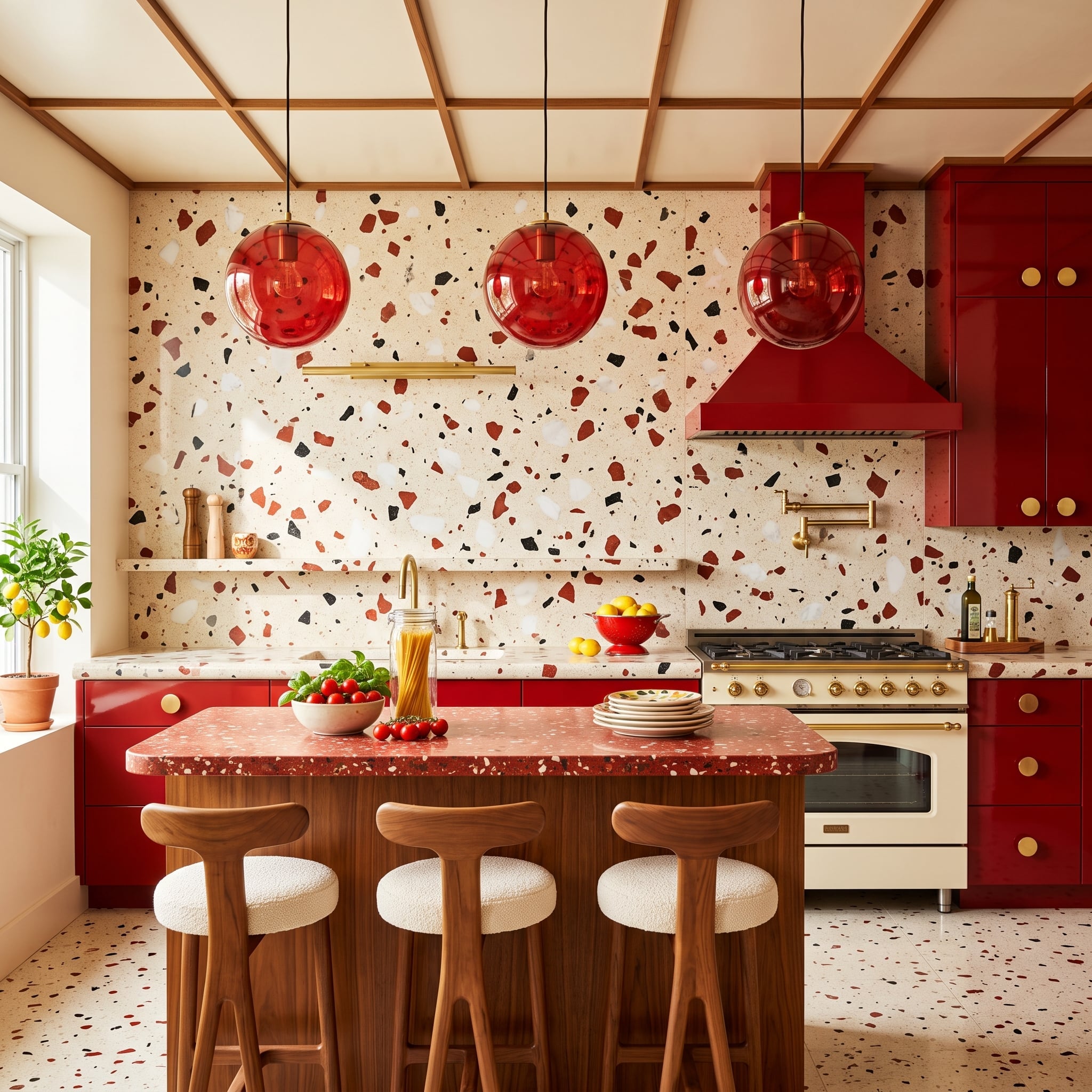
Terrazzo appears on the floor, backsplash and island top, but the aggregate changes scale from surface to surface. Large burgundy, black and white fragments scatter across the cream wall while the island shifts toward a denser, rosier mixture.
Then come the red cabinets and translucent red-glass pendants. A cream range with brass hardware interrupts the saturation, and walnut stools with bouclé seats contribute warmer, quieter materials. Nothing here is trying to calm the room down, and it doesn’t need to.
6. Mother-of-Pearl Fans Send Iridescence Across the Whole Cooking Wall
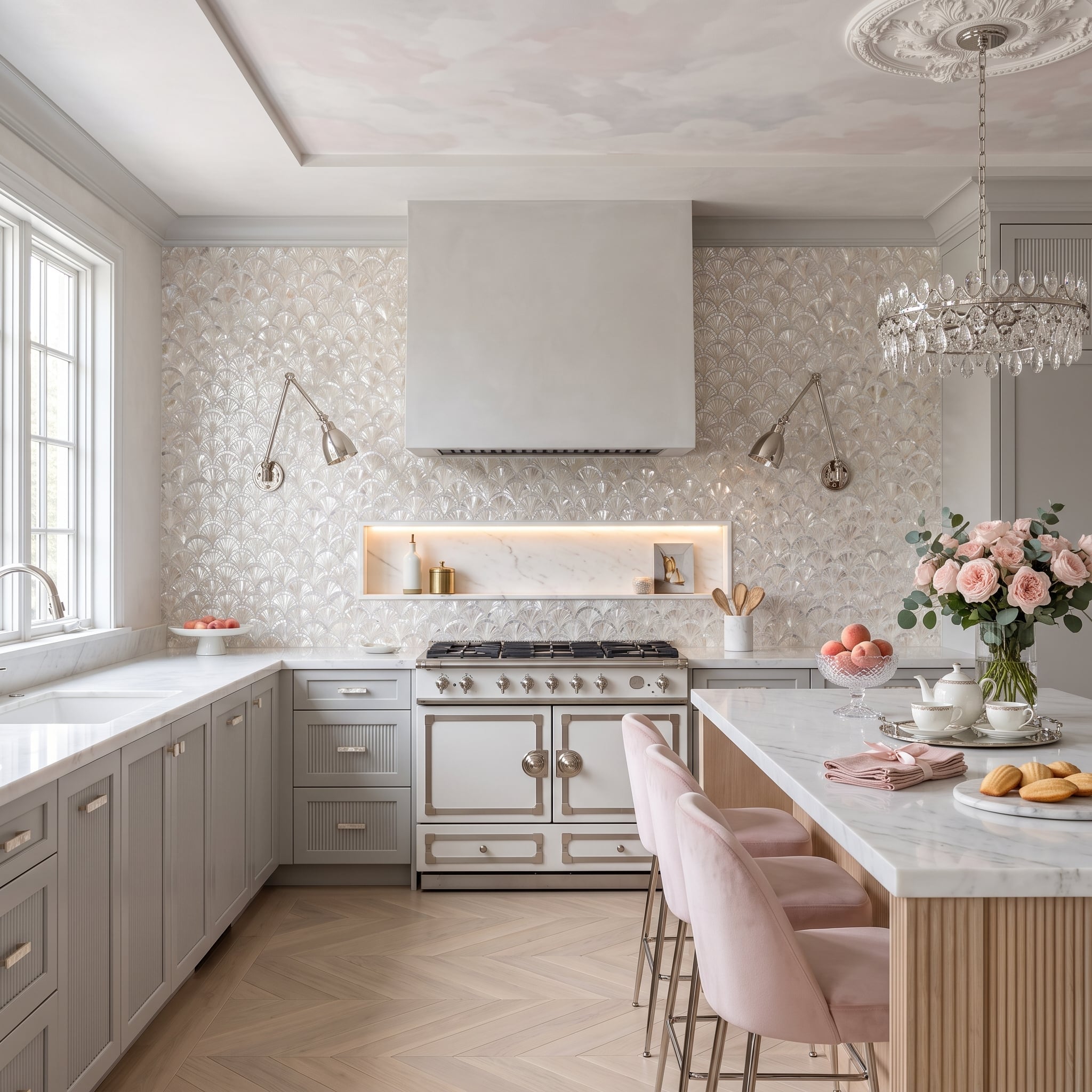
Fan-shaped mother-of-pearl tile spreads across the cooking wall, changing from silver to cream to pale pink as the viewing angle shifts. Chrome swing-arm sconces are positioned to make that changing surface even more obvious.
Gray cabinetry leaves the shell pattern plenty of visual space, while pink velvet stools at the fluted wood island pick up its warmer flashes. Unlike glitter or metallic glaze, the shimmer comes from the shell’s natural layered structure.
History Corner: Mother-of-pearl has been used for centuries in furniture, musical instruments, boxes and architectural ornament across numerous cultures. Kitchen products made with shell require care appropriate to the particular tile, backing, adhesive and finish; some manufacturers recommend sealing and avoiding acidic or abrasive cleaners.
5. Bookmatched Green Onyx Looks Like a Wall Until the Bar Opens
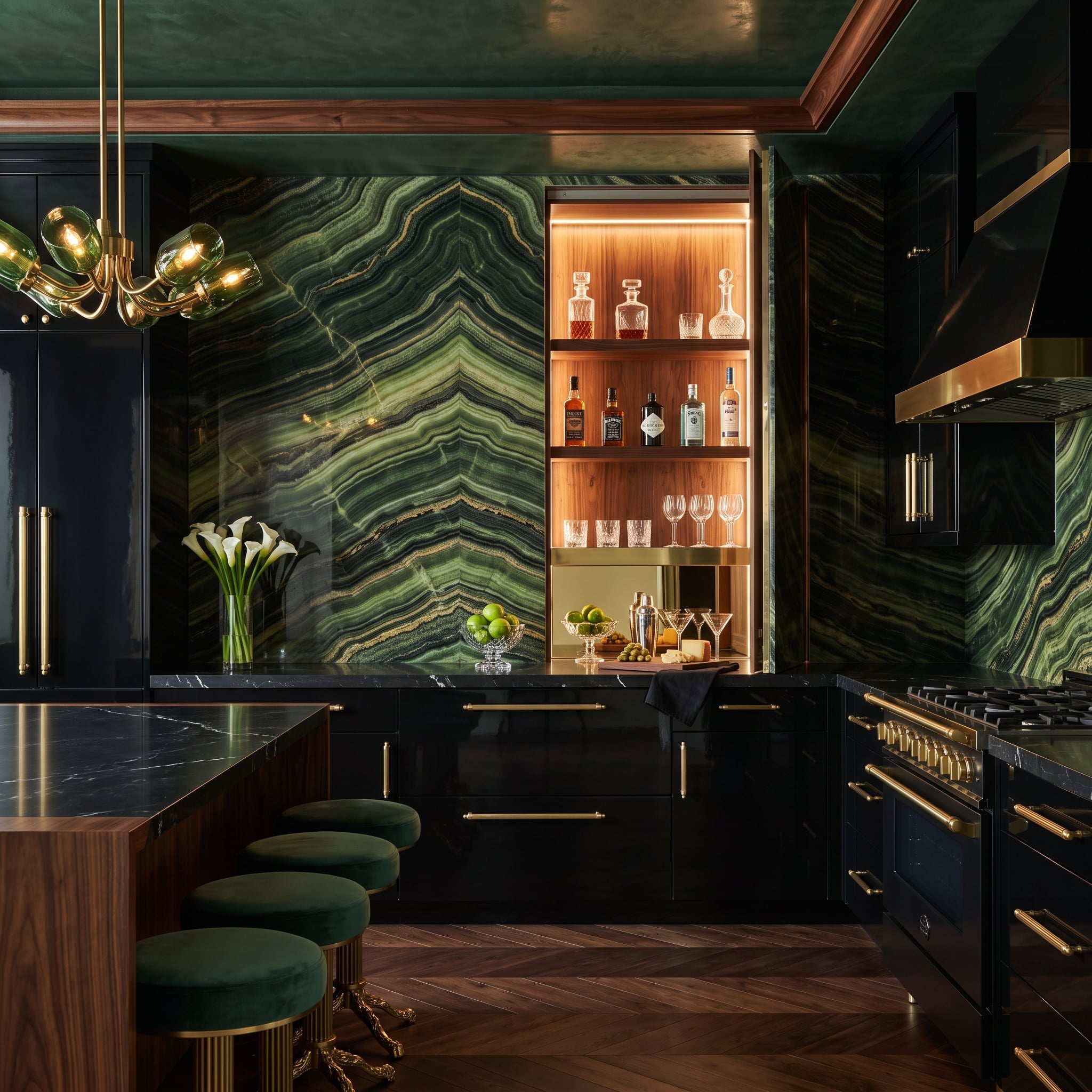
Two green onyx panels mirror one another at center, turning the natural veining into a dramatic chevron. Then the wall opens and reveals walnut shelving filled with glassware, changing what looked like monumental stone into a piece of concealed cabinetry.
Black lacquer cabinets make the green appear brighter, while herringbone walnut flooring pulls the hidden bar’s warmth out into the room. Smoked-green globe lights and velvet stools repeat the stone’s color in materials that behave completely differently under light.
4. Charcoal Hex Tile Gets Copper Lines and a Slab of Red Jasper for Good Measure
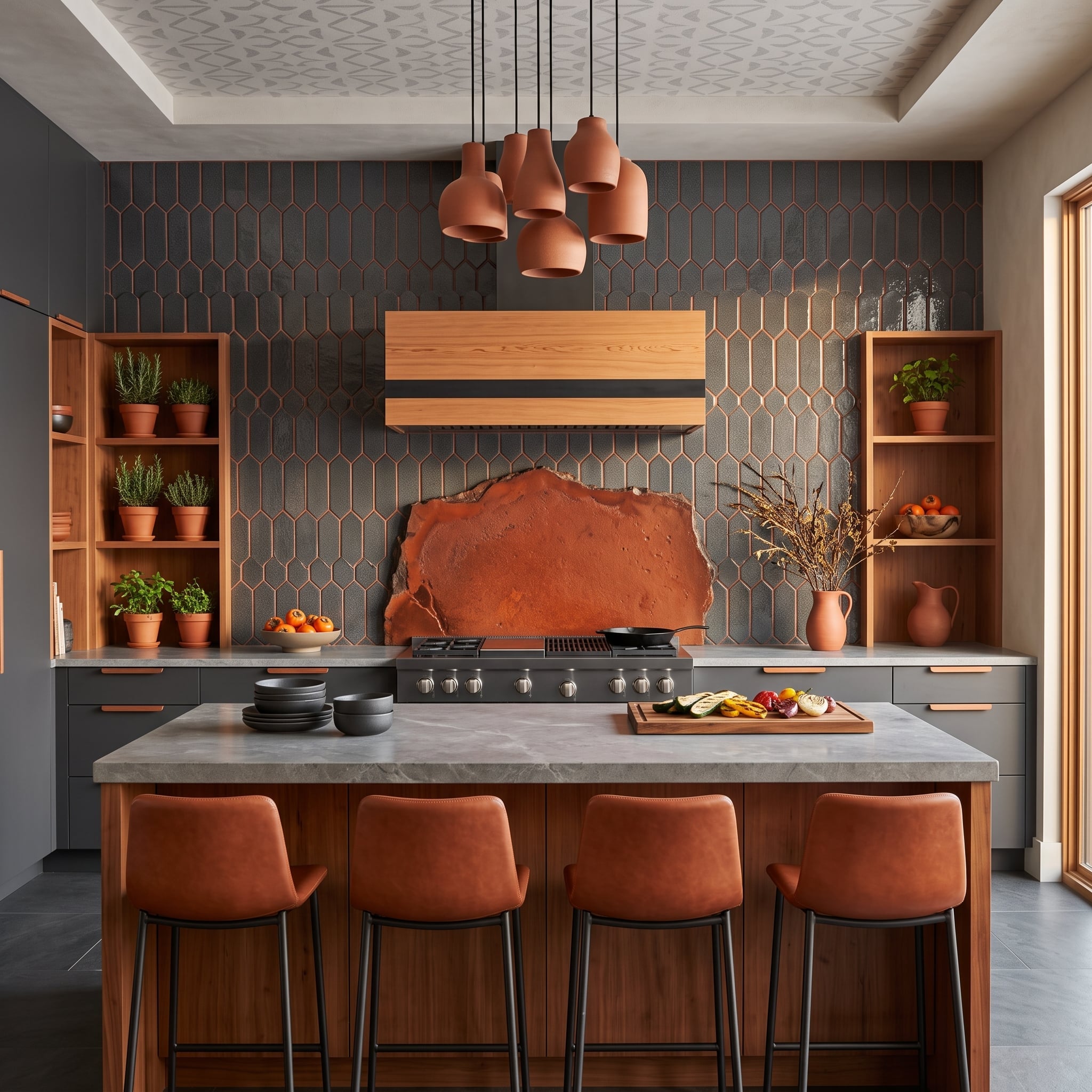
Elongated charcoal hexagons establish a dark geometric field behind the range, but copper-colored grout keeps the joints from disappearing. Every edge becomes visible, warming a surface that would otherwise be almost entirely gray.
A live-edge slab of red jasper marks the cooking zone with a completely different material language — irregular, mineral and intensely colored. Walnut shelving, terracotta vessels and dried botanicals bridge the gap between the rigid tile geometry and that raw-edged centerpiece.
Material Note: A copper appearance in grout may come from the grout’s color formulation, metallic pigments or another decorative system; products vary substantially. Sealing and maintenance should therefore follow the specific grout manufacturer’s instructions rather than assumptions based on the word “copper.”
3. Azul Macaubas Turns the Cooking Wall Into a Blue-and-White Mirror Image
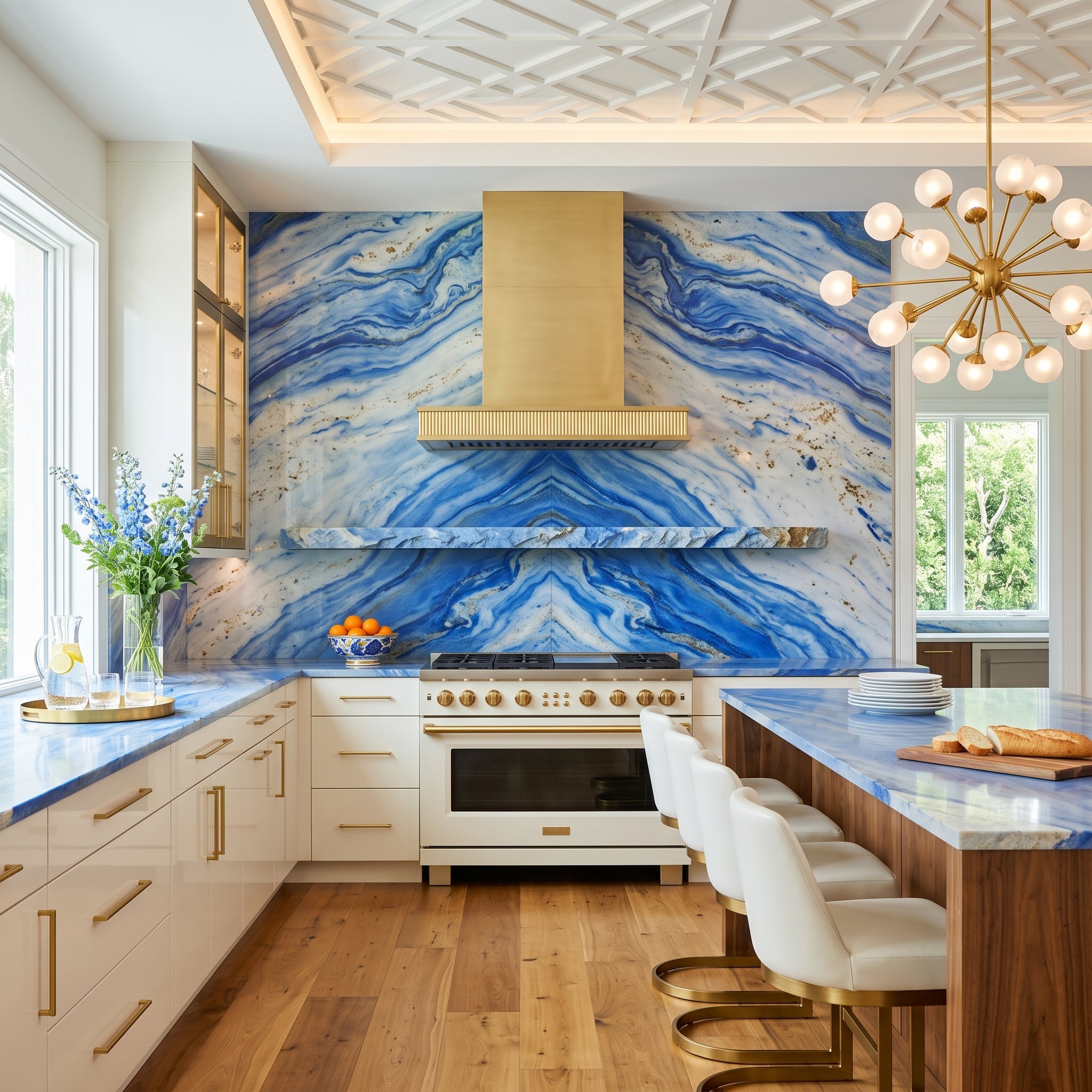
Azul Macaubas quartzite stretches across the cooking wall in mirrored slabs, sending blue-gray veins toward a central seam behind the brass hood. Warm walnut and hardwood prevent the room from becoming an entirely cool composition of blue, white and metal.
- Bookmatching depends on consecutively cut slabs being arranged so corresponding faces mirror one another across a seam.
- Azul Macaubas is a Brazilian quartzite; quartzite is generally harder and more scratch-resistant than marble, although performance varies with the individual stone.
- Unlacquered brass can darken and develop patina with age, while lacquered or otherwise coated brass may retain a more stable finish.
2. Calacatta Viola Lets Burgundy Veining Dictate the Entire Kitchen Palette
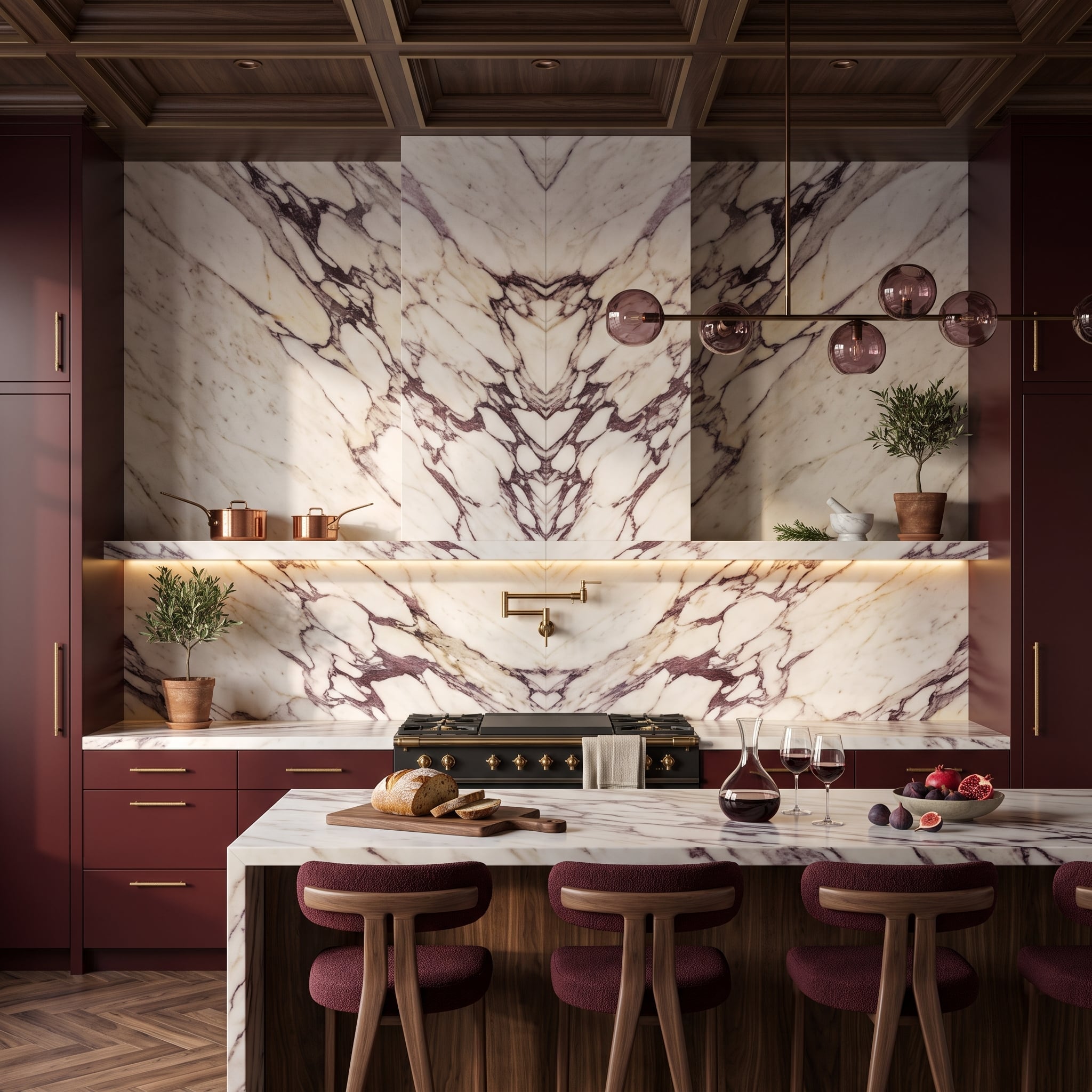
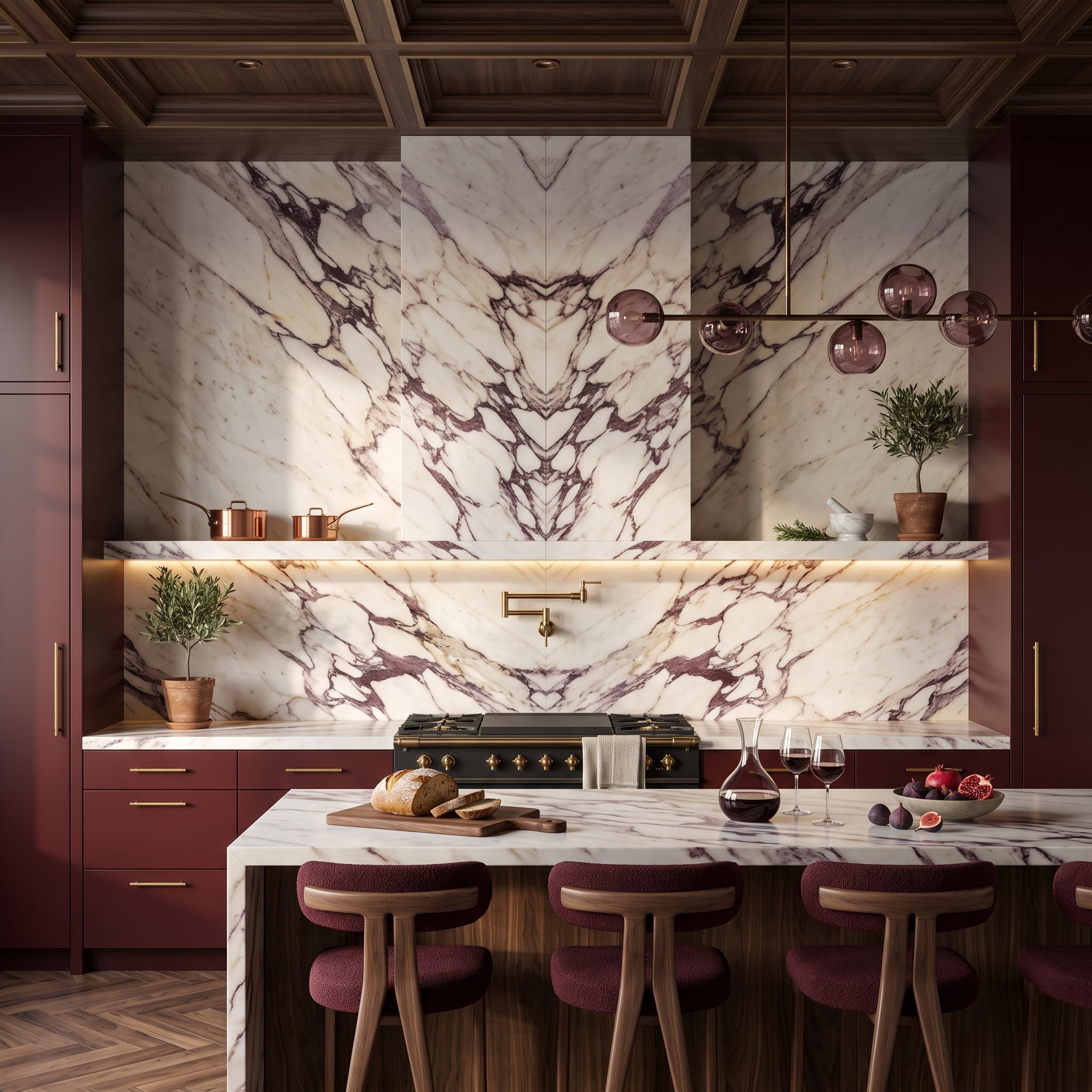
Calacatta Viola marble rises behind the range in bookmatched slabs, its burgundy-purple veining mirrored into an almost inkblot-like composition. A floating marble shelf crosses the wall at mid-height and carries copper cookware beneath its concealed lighting.
Burgundy cabinetry does not merely coordinate with the stone; it pulls one of the marble’s most dramatic colors out of the veining and enlarges it into an architectural block. The island repeats the marble as a waterfall top, while dark walnut coffers and smoked-glass pendants pull the room toward brown and black before all that wine color becomes too sweet.
1. Silver Hammered Tile Turns the Cooking Wall Into One Giant Light Catcher
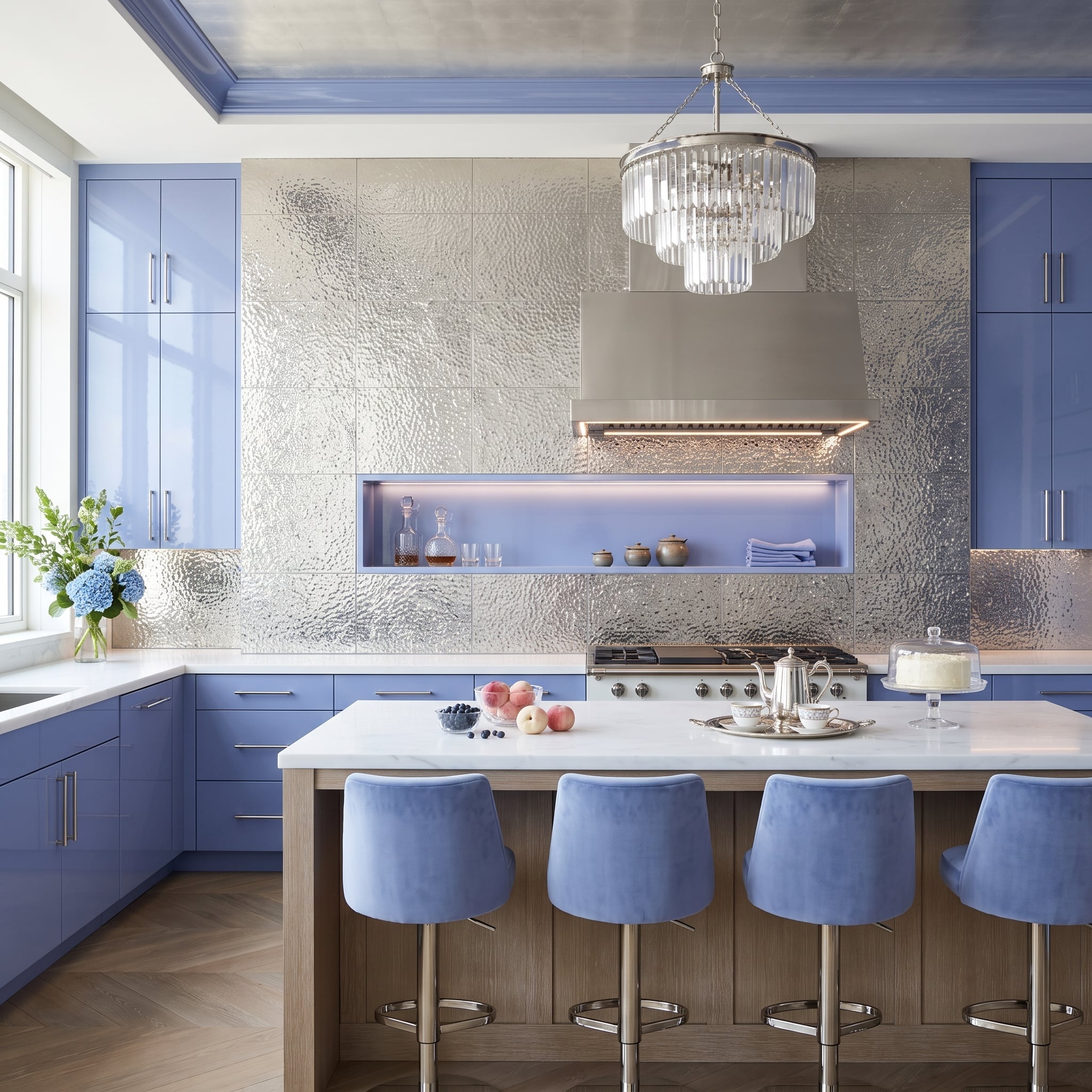
Metallic tile this reflective doesn’t share the wall — it owns it.
Hammered silver tile spreads behind the range in a textured field that changes every time the viewing angle changes. Instead of one clean reflection, the uneven surface scatters highlights across thousands of tiny planes, making the wall look almost liquid under the kitchen lighting.
High-gloss periwinkle cabinetry gives the metal a saturated counterweight. An illuminated niche cuts a quiet rectangle through the shimmer, blue velvet stools repeat the cabinetry at the island, and a tiered crystal pendant carries flashes of silver overhead. The backsplash stopped being background several dozen kitchens ago. This one makes the point impossible to miss.