Mustard velvet and lavender lacquer. Burgundy cabinetry and a butter-yellow pantry. Black marble and a vanity the color of lilacs. Certain combinations sound like the beginning of a decorating dispute, with neither side prepared to surrender. Fortunately, a room has more ways to negotiate than a paint chart suggests.
In order to come up with the very specific design ideas, we create most designs with the assistance of state-of-the-art AI interior design software. Also, assume links that take you off the site are affiliate links such as links to Amazon. this means we may earn a commission if you buy something.
Color is only half the argument. Scale determines which shade commands attention; material determines how it behaves. Velvet absorbs light, lacquer sends it bouncing across the room, and veined stone can connect two colors that appear to have nothing in common. A pale accent can become surprisingly powerful against a dark architectural shell. Even placement matters: an entire wall of cobalt makes a different statement from one cobalt cabinet tucked into a field of terracotta.
The most interesting interiors understand those distinctions. Some let two saturated colors compete at full volume. Others give one shade the architecture and the other a carefully chosen piece of furniture. A few succeed precisely because they refuse to match anything too closely. Beige remains a perfectly respectable option, of course. These rooms have other plans.
33. Cerulean Blue Takes Over Two Stories, and Walnut Refuses to Be Intimidated
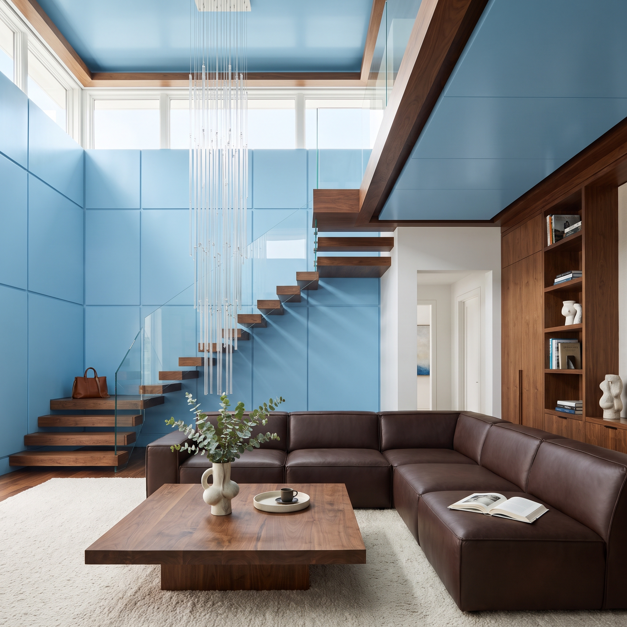
Floor-to-ceiling cerulean panels rise toward the clerestory windows, turning an entire double-height wall into a saturated blue backdrop. Floating walnut stairs cut across it, their dark grain providing an architectural counterweight to the enormous field of color.
Chocolate leather seating and built-in walnut shelving carry those brown tones through the lower level. A pale shag rug and sculptural coffee table establish a quieter center beneath the crystal chandelier. The blue is allowed to be enormous, while the wood appears in enough places to give the composition continuity.
32. Crimson Lacquer and Black Marble Give the Home Bar a Taste for Drama
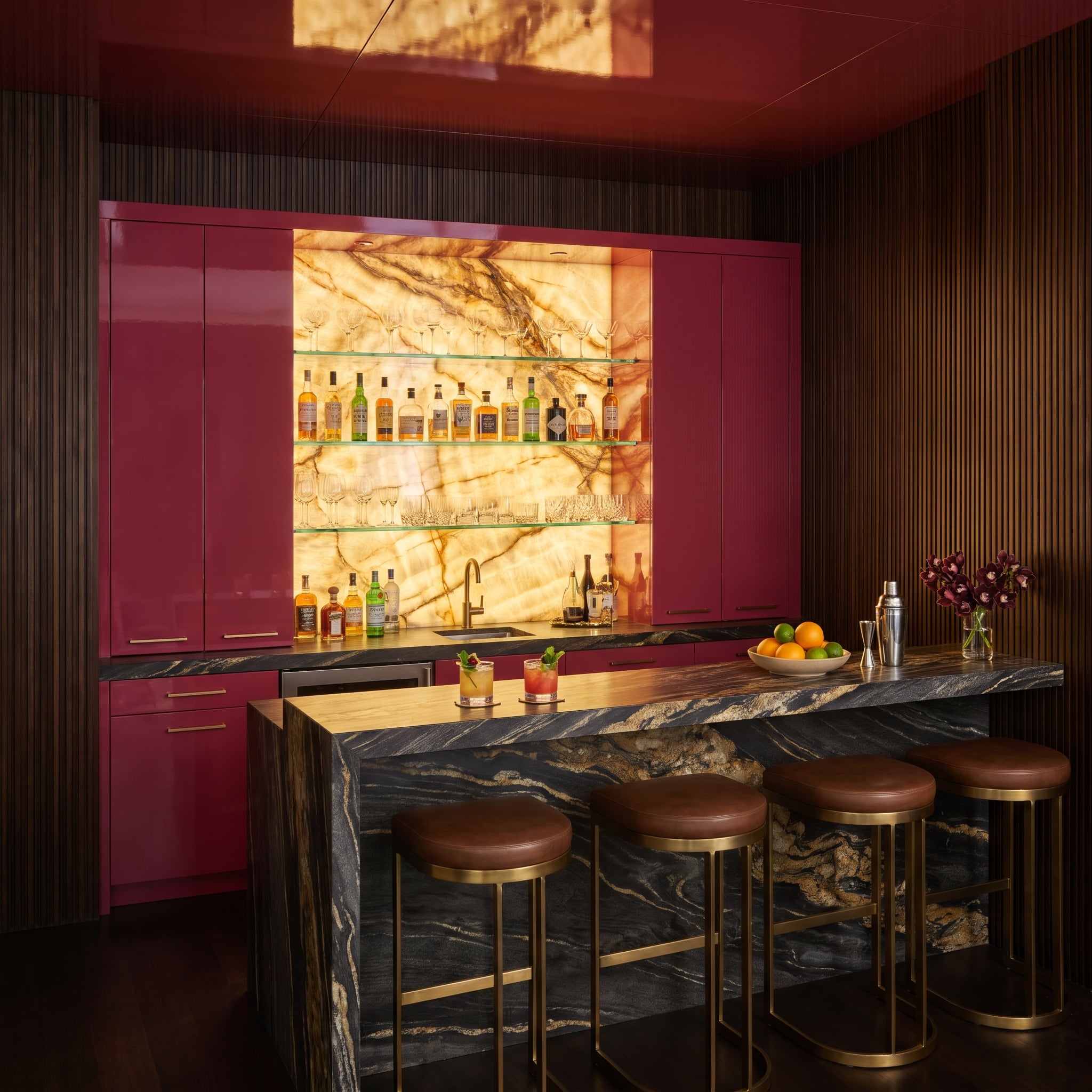
Glossy crimson cabinetry surrounds a monumental black marble bar streaked with gold and ochre. The combination is theatrical, with polished surfaces multiplying the reflections and giving the room an almost cinematic intensity.
Behind the counter, illuminated honey-toned stone adds a warm translucent glow. Glass shelving keeps the bottle display visually open, while brown leather stools and brushed brass frames introduce softer, less reflective finishes. The red and black establish the drama; the amber light makes the room inviting enough to linger.
31. Dusty Coral and Ice-Blue Tile Turn a Bathroom Into a Study in Temperature
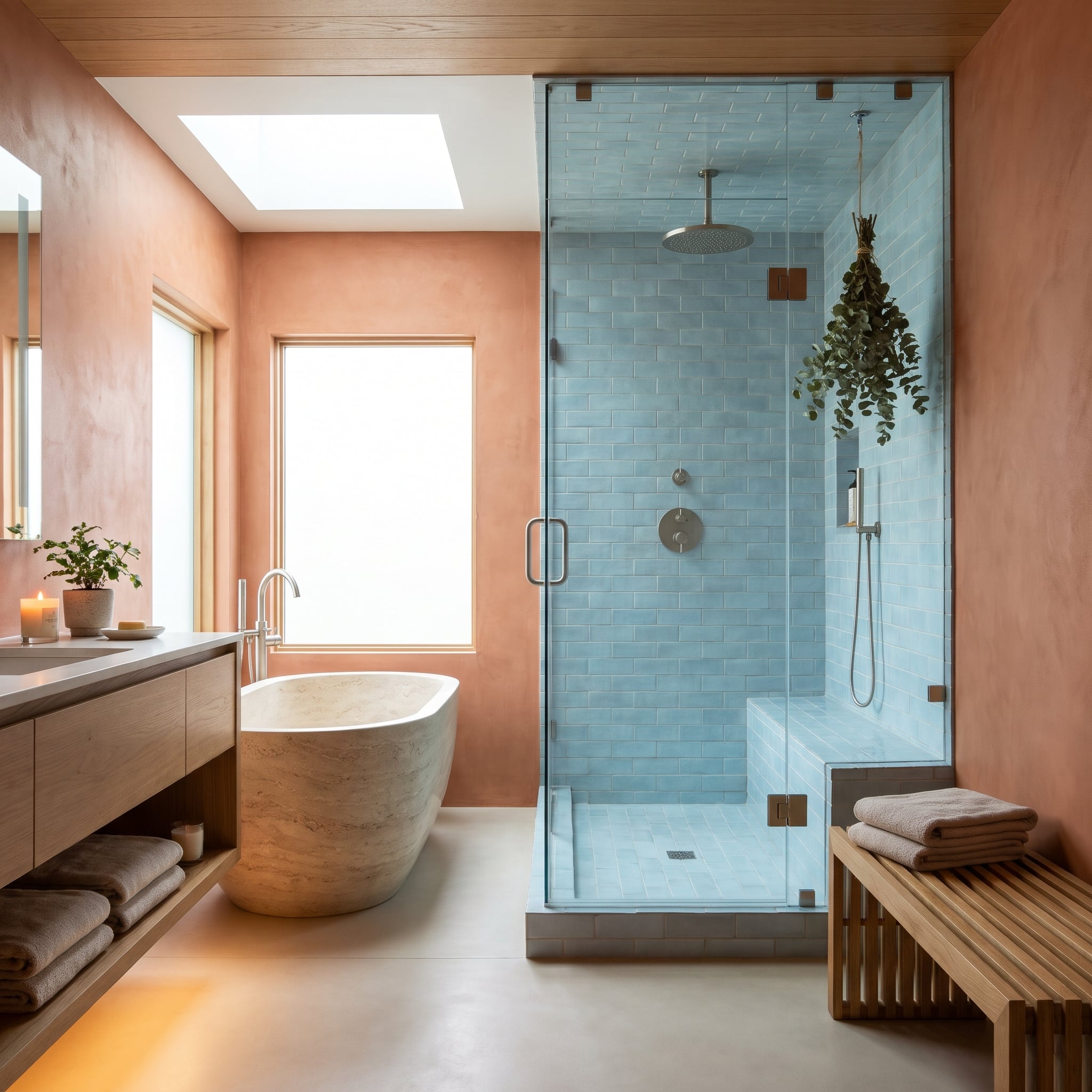
Coral-colored plaster wraps the bathroom in a sun-warmed glow, while pale blue subway tile gives the shower a distinctly cooler character. The contrast is immediate, with muted shades preventing the two surfaces from becoming excessively sharp.
A stone soaking tub and neutral-toned floor provide a visual transition between the warm walls and cool shower enclosure. Hanging eucalyptus introduces a smaller note of green without becoming another dominant color. Smooth tile, textured plaster, and substantial stone give the pastel pairing an architectural presence.
30. Mustard Velvet Meets Lavender Lacquer, and Neither Color Gives an Inch
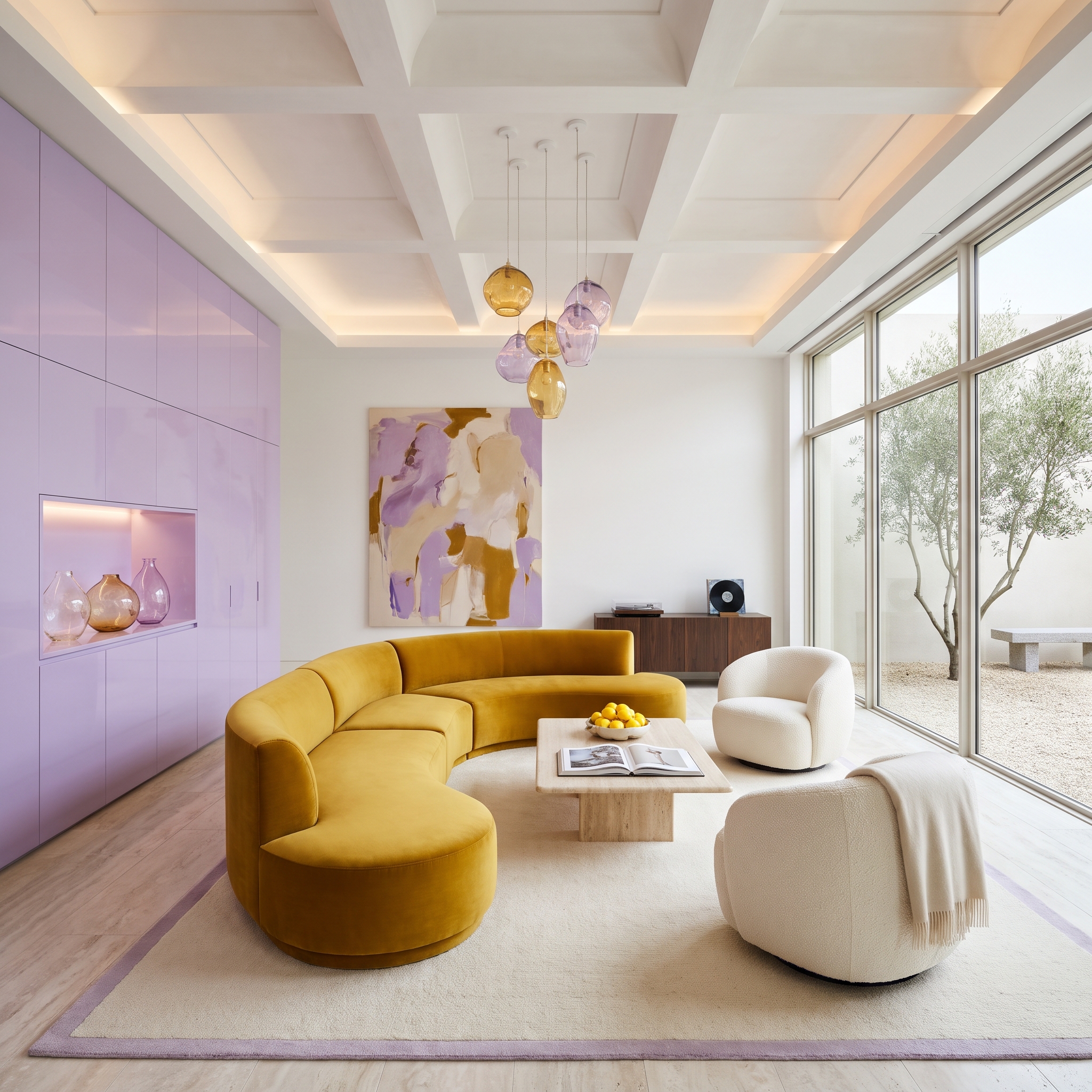
A curved mustard velvet sectional commands the foreground, while an entire wall of lavender lacquer cabinetry answers with an equally assertive performance. The two colors have almost nothing in common except their refusal to fade politely into the background.
Cream bouclé chairs and a travertine coffee table introduce a quieter middle ground, while amber and lilac pendant globes repeat the palette overhead. Velvet absorbs light that the glossy cabinetry reflects, giving each color a different visual character. Neither has to retreat for the combination to work.
29. Rust Cabinetry and Steel Blue Find Common Ground in Veined Stone
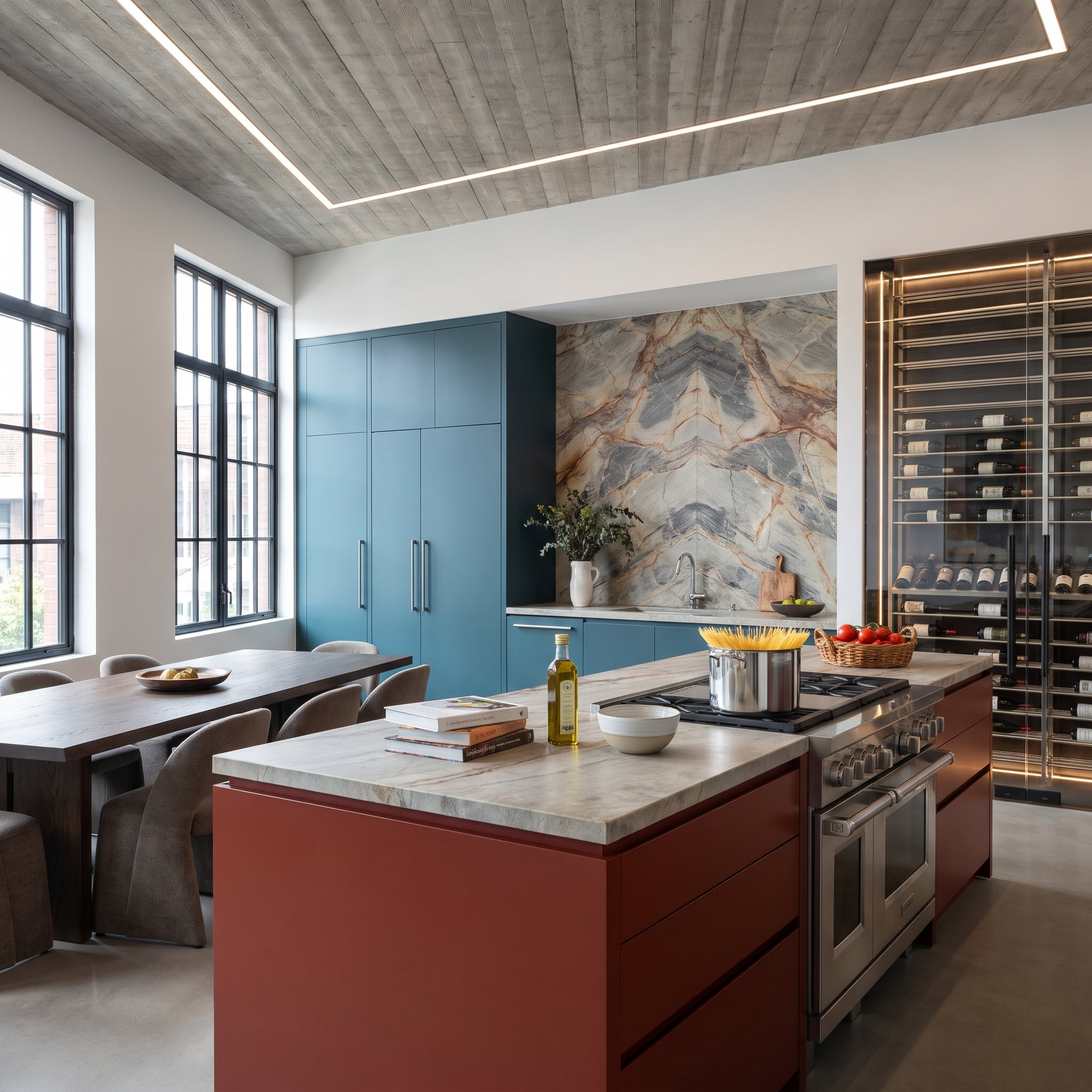
A red-oxide island faces slate-blue pantry towers in a kitchen that makes no attempt to disguise its appetite for color. The warm rust and cool blue are both substantial, with the dramatic stone backsplash providing a connection through its reddish veining.
Overhead, the exposed concrete ceiling introduces a decidedly industrial note. Its matte gray surface counters the more decorative stone and colored cabinetry, while the wine display adds a darker architectural element at the rear. The contrast is forceful, yet the composition remains disciplined.
What Our Readers Say
- Even bold palettes often keep a neutral anchor: when we asked about trim, 60% of Home Stratosphere readers picked white, 25% chose colour-matched and 15% went dark.
From Home Stratosphere reader polls and votes.
28. Powder Blue Lacquer Makes Aubergine Velvet Look Almost Regal
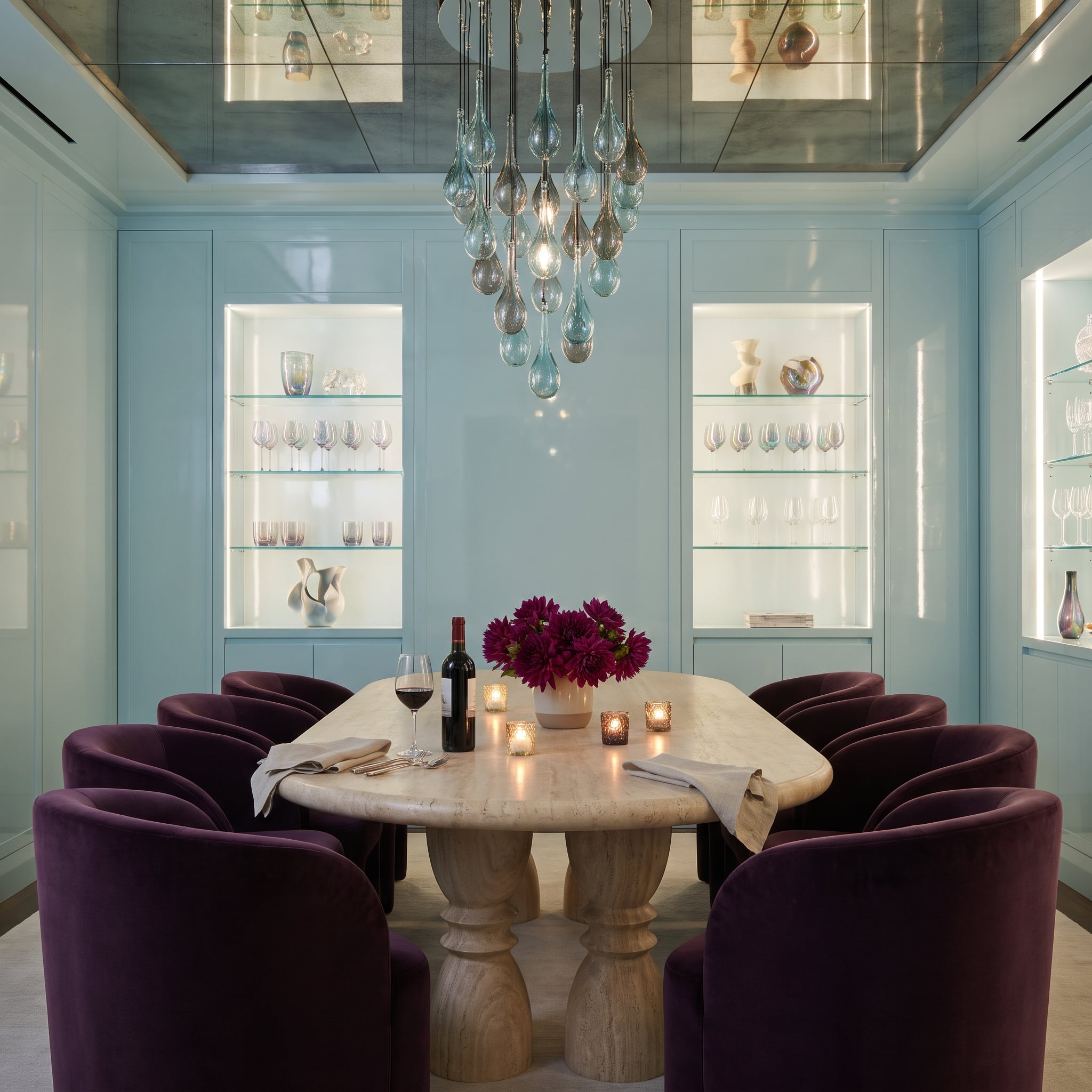
Powder blue lacquer wraps the dining room walls in a pale, reflective finish, while aubergine velvet chairs introduce a deep purple counterweight. The combination has an unexpected formality, with the blue brightening the room and the darker upholstery lending the dining area visual substance.
Glossy wall panels reflect the surrounding light, while velvet changes in appearance as its pile catches the light from different directions. One color appears crisp and almost weightless; the other gives the table a sense of gravity. Together they produce a richer dining room than either could manage alone.
27. Sage Green Tile Gives Burgundy Marble an Unexpectedly Elegant Reception
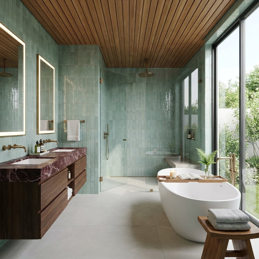
Sage zellige tile covers the walls in a soft, irregular green, interrupted by the dramatic burgundy veining of the marble vanity. The pairing draws on the tension between green and red without resorting to either color in its purest form.
Warm wood across the ceiling and cabinetry gives the cooler tile a natural companion. Brushed brass reinforces that warmth, while the pale stone floor provides a broad expanse of visual relief. The freestanding tub introduces another clean, sculptural surface. Rich materials abound, yet none needs to shout over the others.
26. Dusty Rose Cabinetry Holds Its Ground Against Charcoal Slate
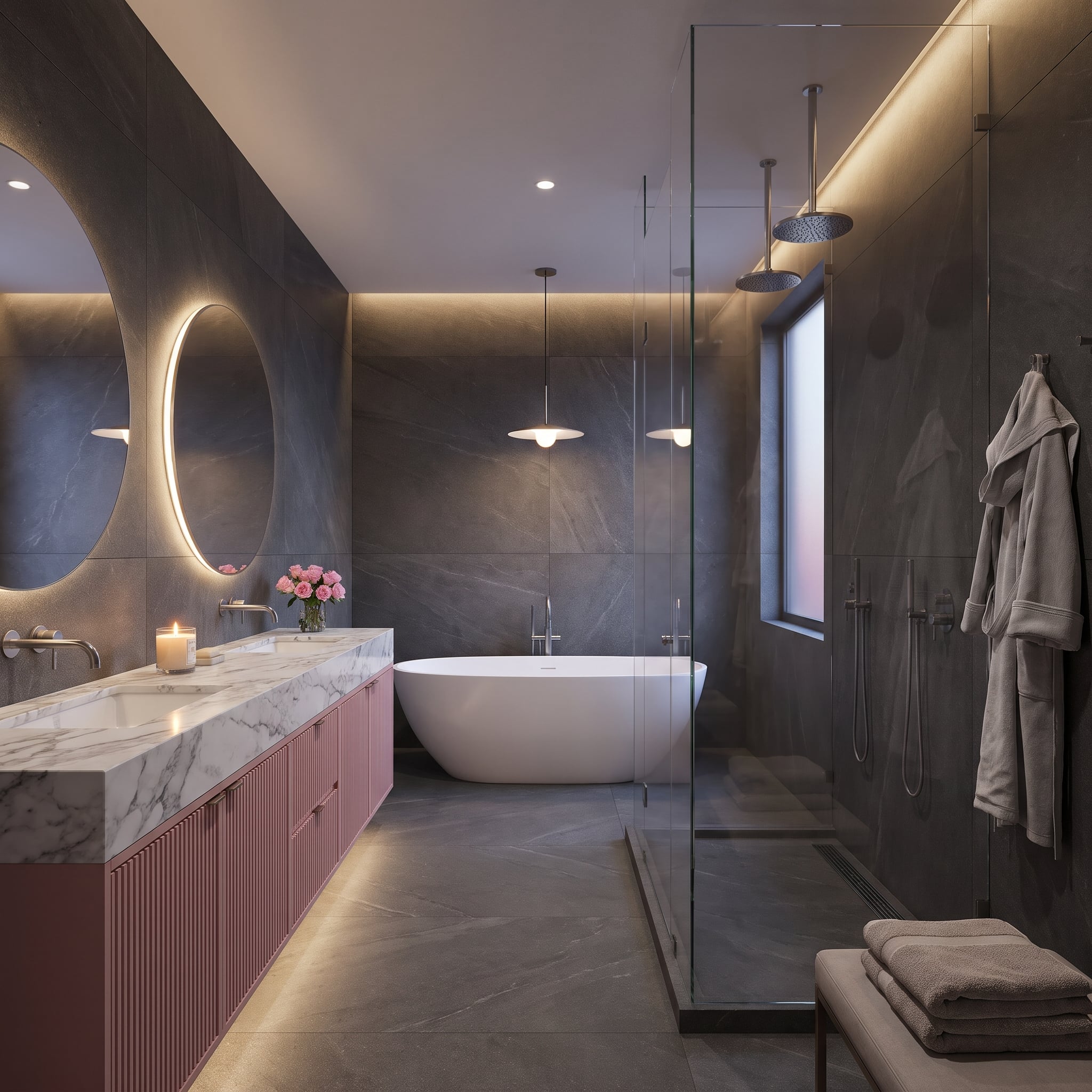
Mauve-pink fluted cabinetry sits beneath a pale marble countertop, surrounded by walls clad in charcoal slate. The pink carries enough gray in its undertone to relate to the darker stone without disappearing into it.
Backlit oval mirrors, recessed ceiling lighting, and a gentle glow beneath the cabinetry reveal the texture of the slate. A freestanding white soaking tub interrupts the darker surfaces at the far end. The room’s most effective contrast isn’t simply pink against gray; it’s the delicate rhythm of the fluting beside the broad, rugged stone.
Not everyone warms to deep grey, though: in our readers’ votes, charcoal-dominant rooms got fewer hearts than the other images in the same articles.
25. Terracotta and Turquoise Bring Desert Warmth Into a Contemporary Bedroom
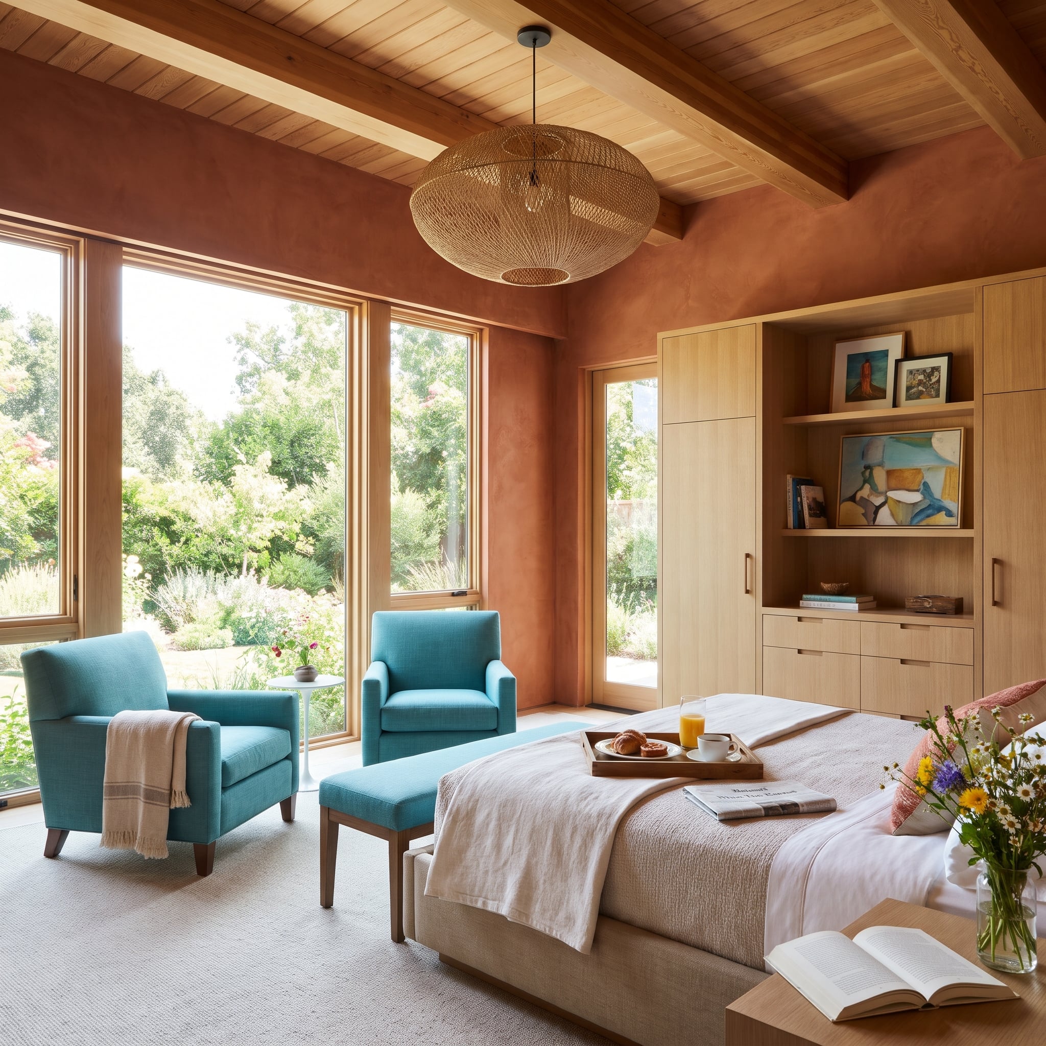
Sun-baked terracotta plaster surrounds a bedroom furnished with vivid turquoise armchairs. The earthy orange-red walls and cool blue-green upholstery create a pronounced temperature contrast, one softened by the plaster’s matte, irregular surface.
The turquoise is concentrated in the chairs rather than spread across the room, giving it a distinct role as an accent. Terracotta supplies the atmosphere; turquoise provides the interruption. The clean furniture silhouettes and broad plaster surfaces give the bedroom a contemporary character, allowing the vivid upholstery to supply the decorative energy.
24. Burgundy Cabinets and Butter Yellow Turn a Kitchen Into a Color Experiment
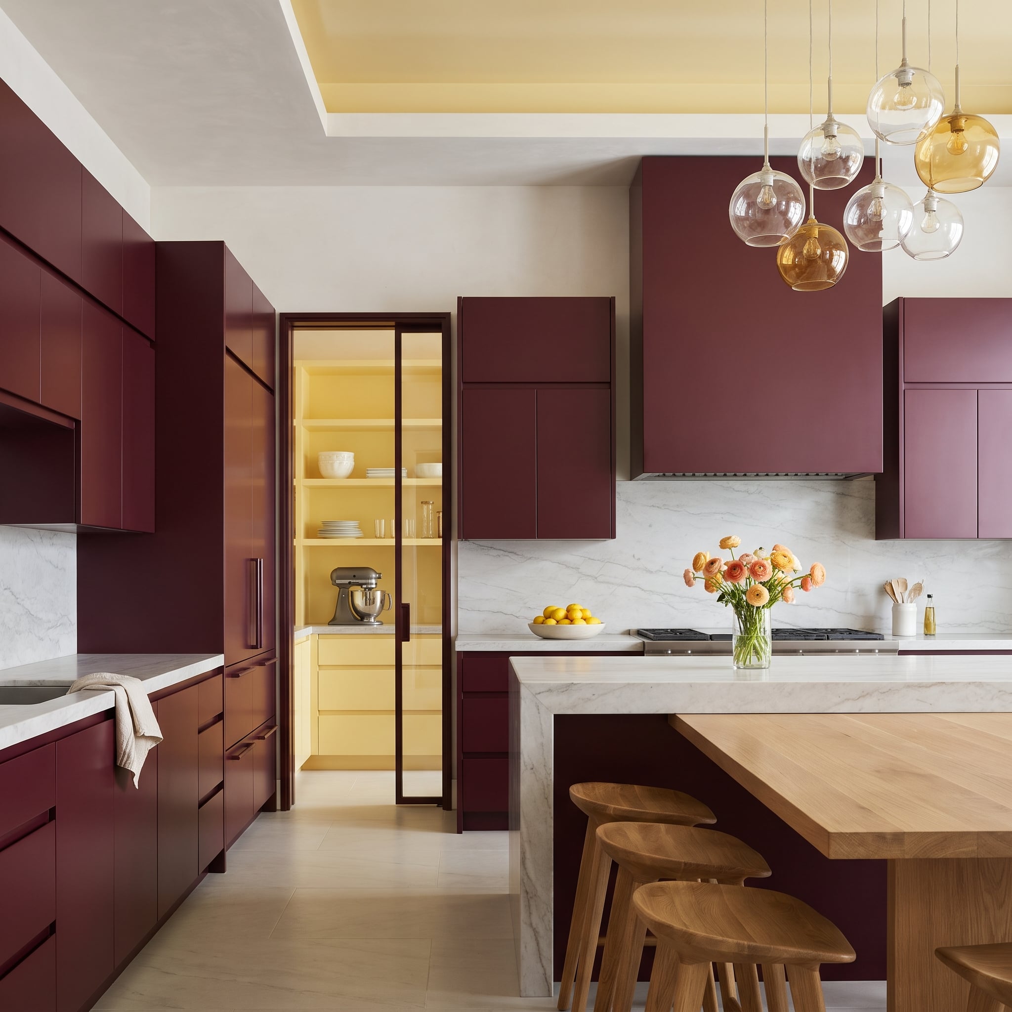
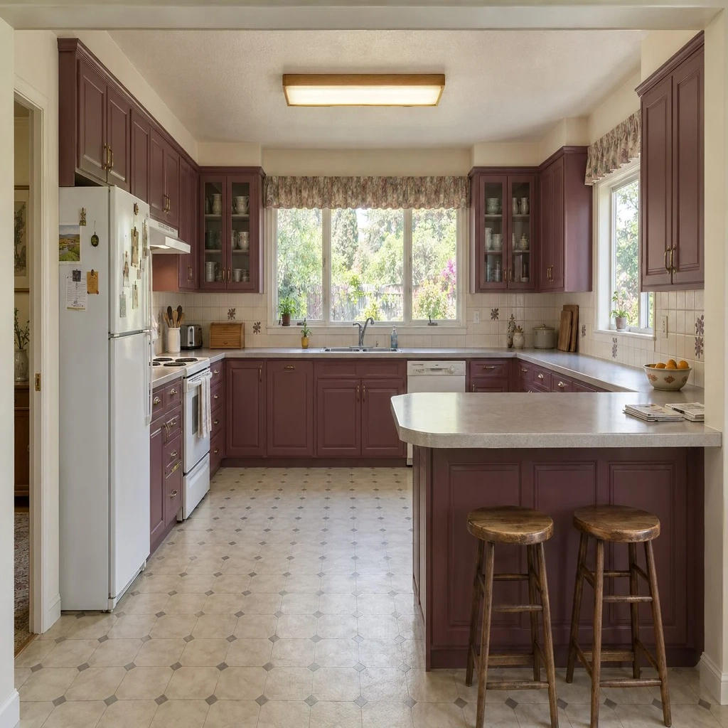
Deep burgundy cabinetry covers nearly every wall, creating a continuous, enveloping surface. Then a butter-yellow pantry appears behind a brass-framed glass door, its pale warmth cutting through the wine-dark surroundings.
The marble slab backsplash supplies a broad, nearly white interval between the stronger colors. Amber and clear glass pendants repeat the warm tones without adding another solid block of color. The yellow pantry occupies relatively little space, which makes its presence more intriguing. Sometimes the minority color gets the last word.
23. Dusty Salmon and Bottle Green Make a Case for Sophisticated Contrast
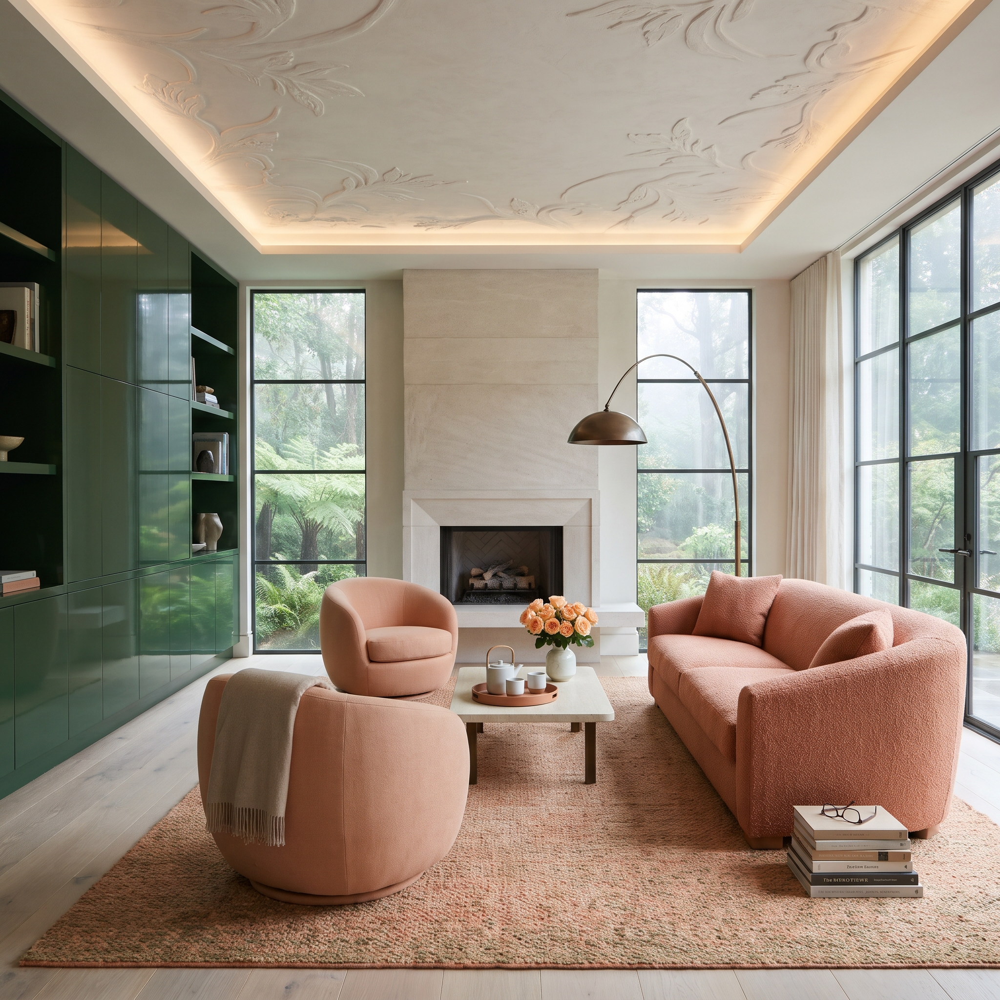
Muted salmon bouclé sofas sit beneath elaborate ceiling plasterwork, while bottle-green cabinetry provides a dark, continuous backdrop. The pink has a dusty, almost earthy character that makes it less sugary beside the green.
Steel-framed windows introduce a dense garden view, extending the green palette beyond the walls. The travertine fireplace contributes a pale, textured interval between the upholstered seating and the cabinetry. Recessed lighting emphasizes the ceiling’s ornament, while the soft bouclé and smooth cabinetry offer contrasting textures beneath it.
22. Oxblood Leather and Teal Panels Give a Music Room Its Own Rhythm
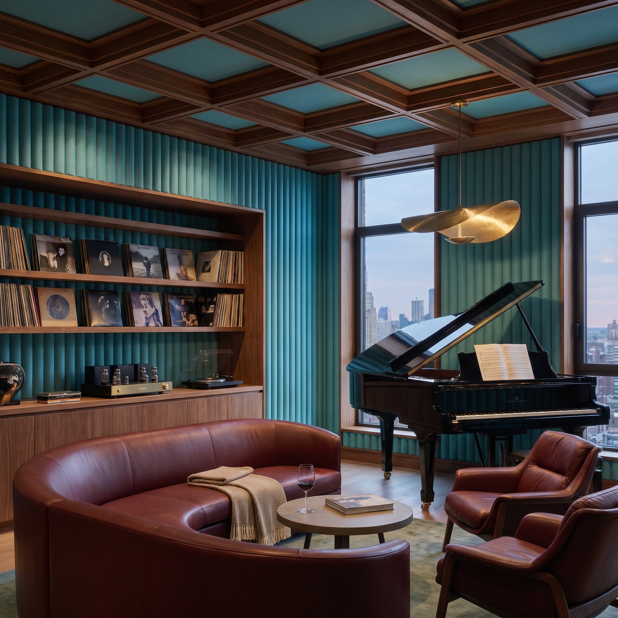
Fluted teal panels wrap the walls of this music room, their vertical grooves creating a strong architectural rhythm. Oxblood leather seating introduces a deep red-brown contrast, while the dark walnut coffered ceiling draws the upper portion of the room into the same warm palette.
A grand piano provides the focal point, its polished black surface adding another distinct finish. The wall fluting introduces texture and visual depth. Leather, timber, and saturated teal give the room a richness that extends well beyond its furniture.
21. Lavender Cabinets and Olive Upholstery Give a Study an Unusual Kind of Authority
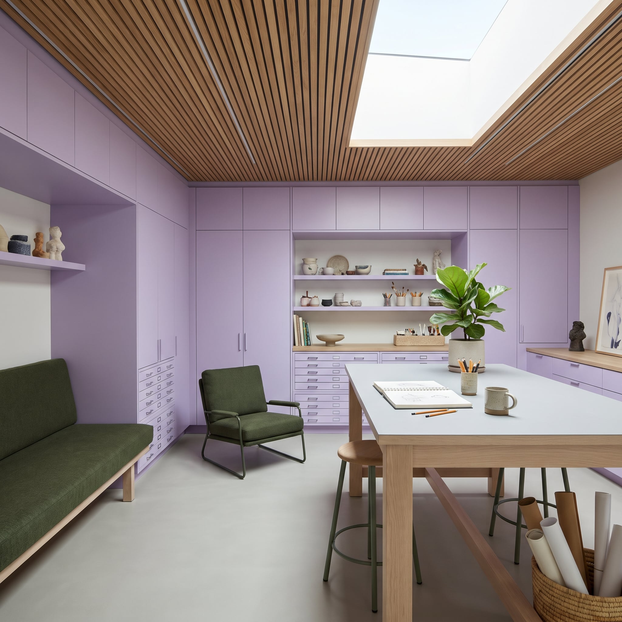
Lavender cabinetry extends from floor to ceiling, establishing a color more often associated with softness than serious workspace design. Olive upholstery on the daybed and armchair brings a deeper, earthier presence into the room.
Flat-front cabinet doors keep the lavender surfaces clean and architectural, while the slatted wood ceiling prevents the palette from feeling overly delicate. A pale oak drafting table introduces a natural finish, and its white work surface gives the eye a useful break. The room has personality without surrendering its practical purpose.
20. Emerald Lacquer and Blush Velvet Turn Dinner Into an Occasion
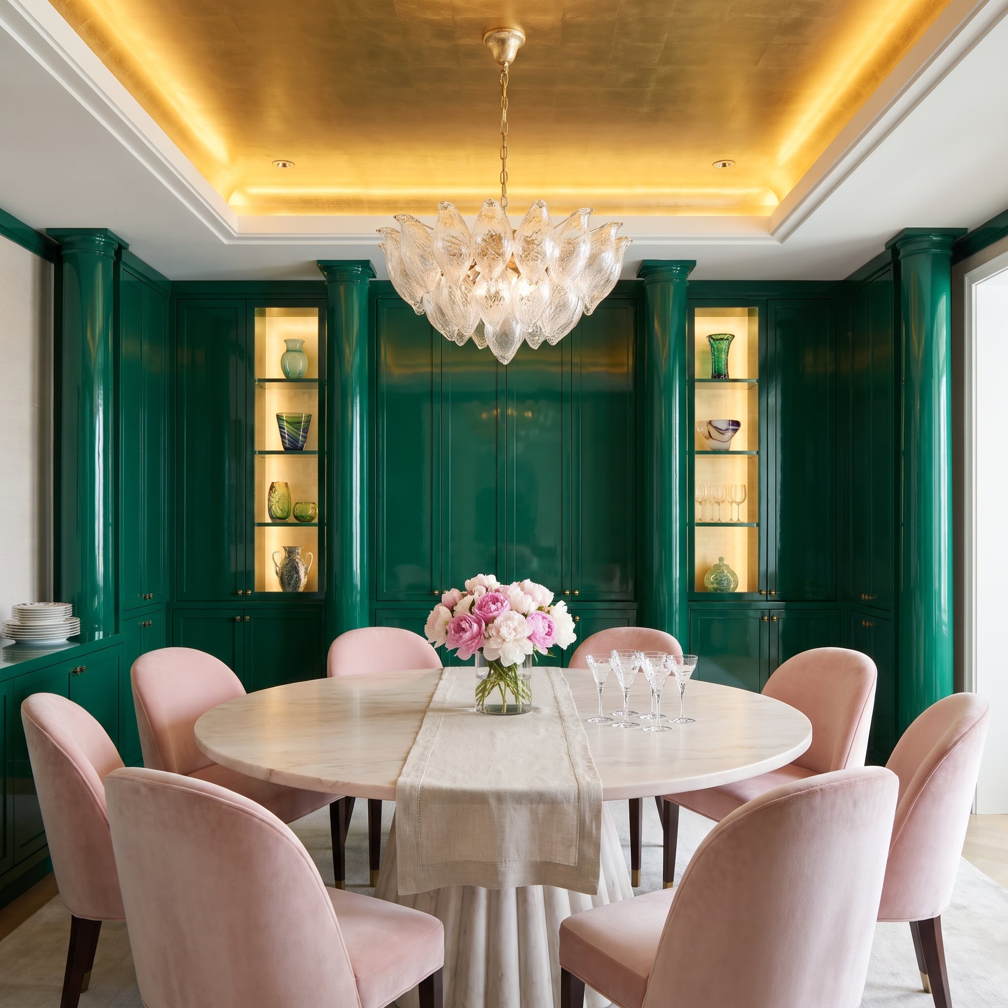
Emerald lacquer covers the floor-to-ceiling built-ins, creating a jewel-toned backdrop for eight blush velvet dining chairs. The glossy green reflects the warm interior lighting, while the pink upholstery remains comparatively soft and matte.
A gold-toned tray ceiling introduces a third strong color, its metallic finish behaving differently from the painted and upholstered surfaces below. The dining table anchors the composition, allowing the chairs to read as a cohesive group rather than eight separate accents. Saturated green, pale pink, and gold make an extravagant combination, handled with a surprisingly clear hierarchy.
19. Slate Blue Tile and Travertine Turn Opposing Temperatures Into Texture
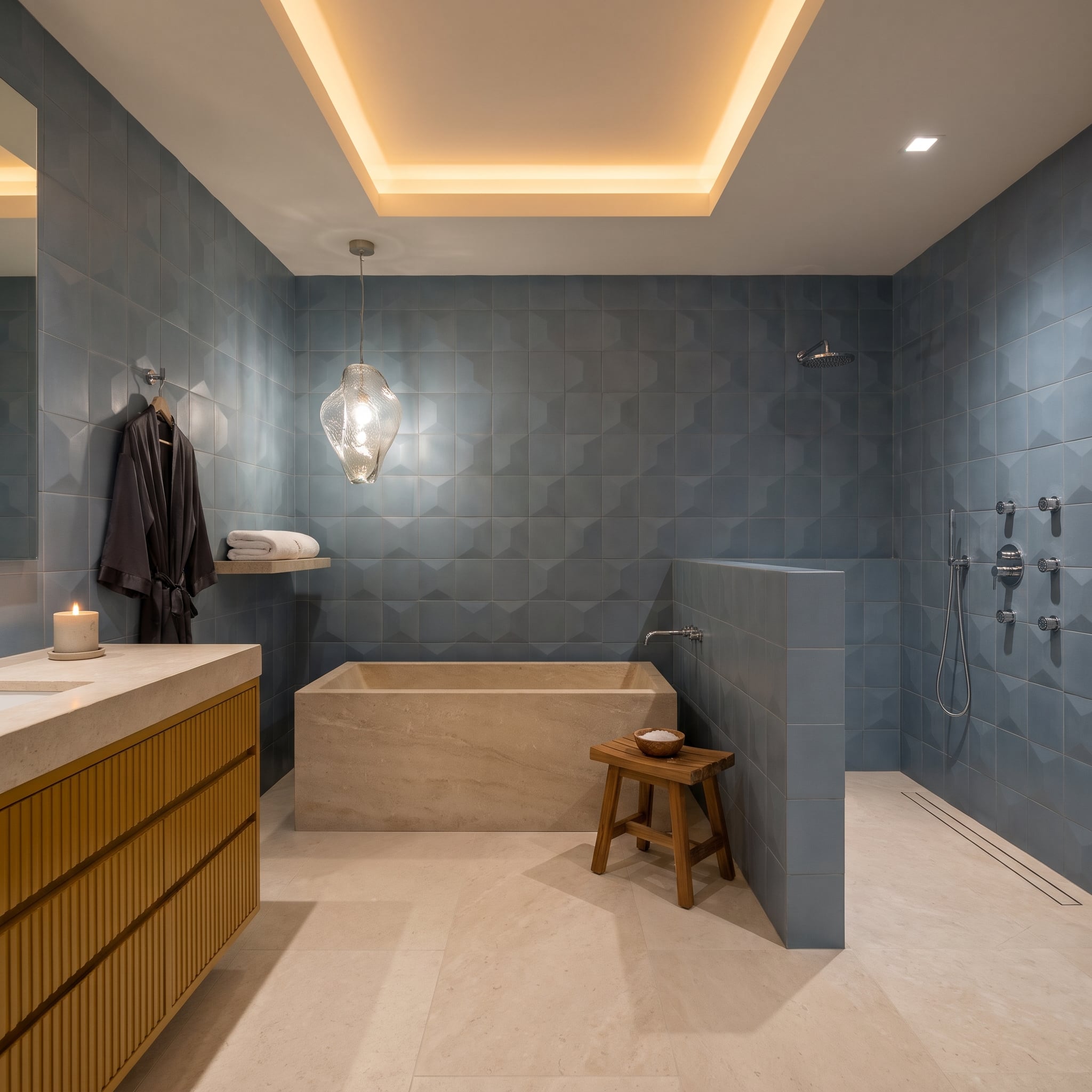
Three-dimensional slate-blue tile covers the walls in a repeating geometric pattern, creating shadows that shift across the cool surface. Against it, a freestanding travertine tub introduces warm cream tones and the irregular character of natural stone.
The fluted oak vanity connects with the travertine through its warmer color, while recessed ceiling lighting reveals the texture of the wall tile. A small wooden stool repeats the timber finish near the tub. The geometric blue wall provides a crisp, contemporary foil for the more irregular markings of the stone.
18. Cobalt Blue Shelving Gives Mustard Velvet a Place to Make Trouble
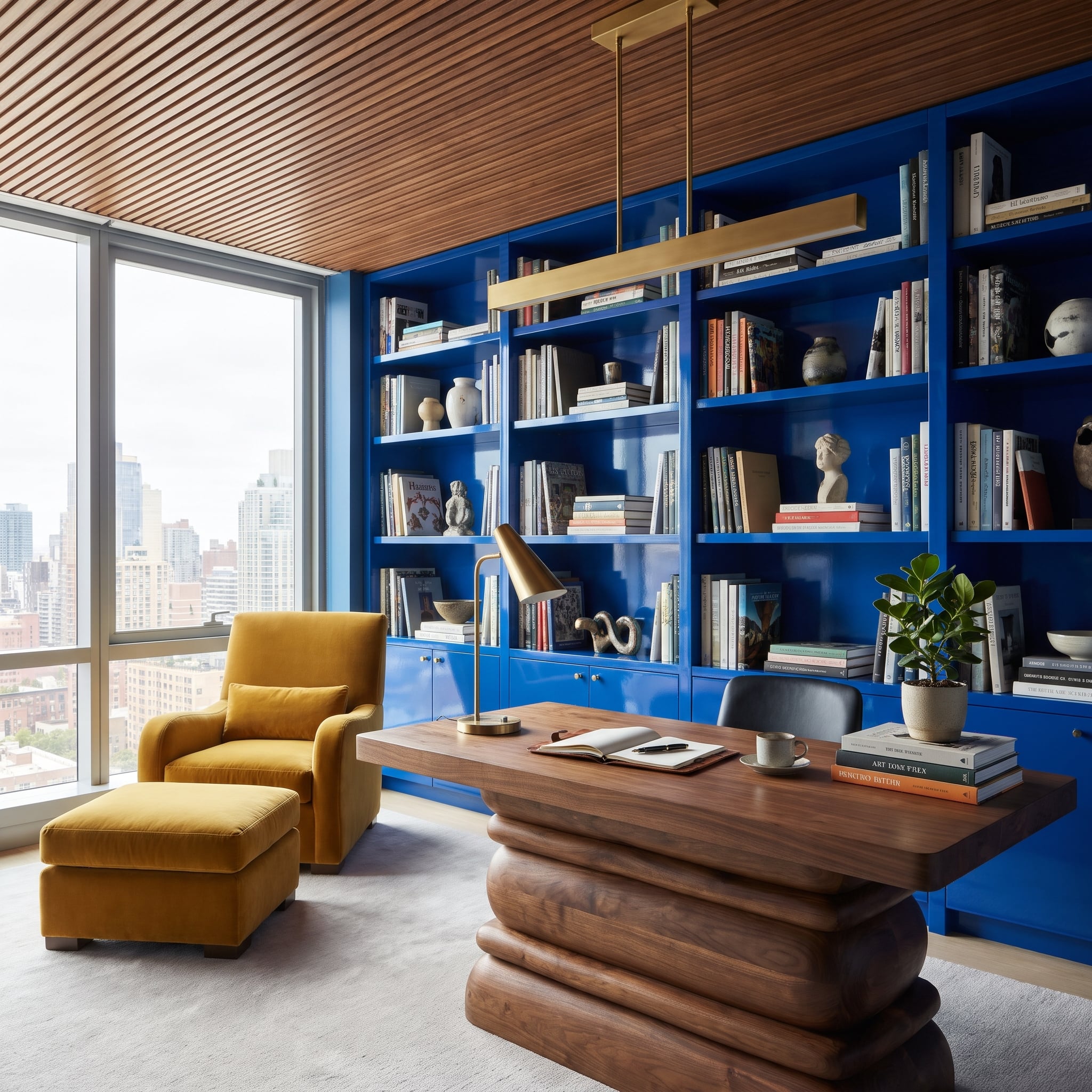
Electric cobalt blue covers the built-in shelving, while a mustard velvet armchair and ottoman establish a warm counterpoint beside the window. Neither color is particularly restrained, yet the room has a surprisingly orderly composition.
The sculptural walnut desk is the essential intermediary. Its sweeping wooden base connects with the mustard upholstery, while the slatted timber ceiling carries that warmth overhead. Brass lighting adds smaller highlights. Against so much wood, the cobalt becomes a deliberate architectural feature rather than an overwhelming backdrop.
17. Oxblood Lacquer and Amber Velvet Create a Living Room After Dark
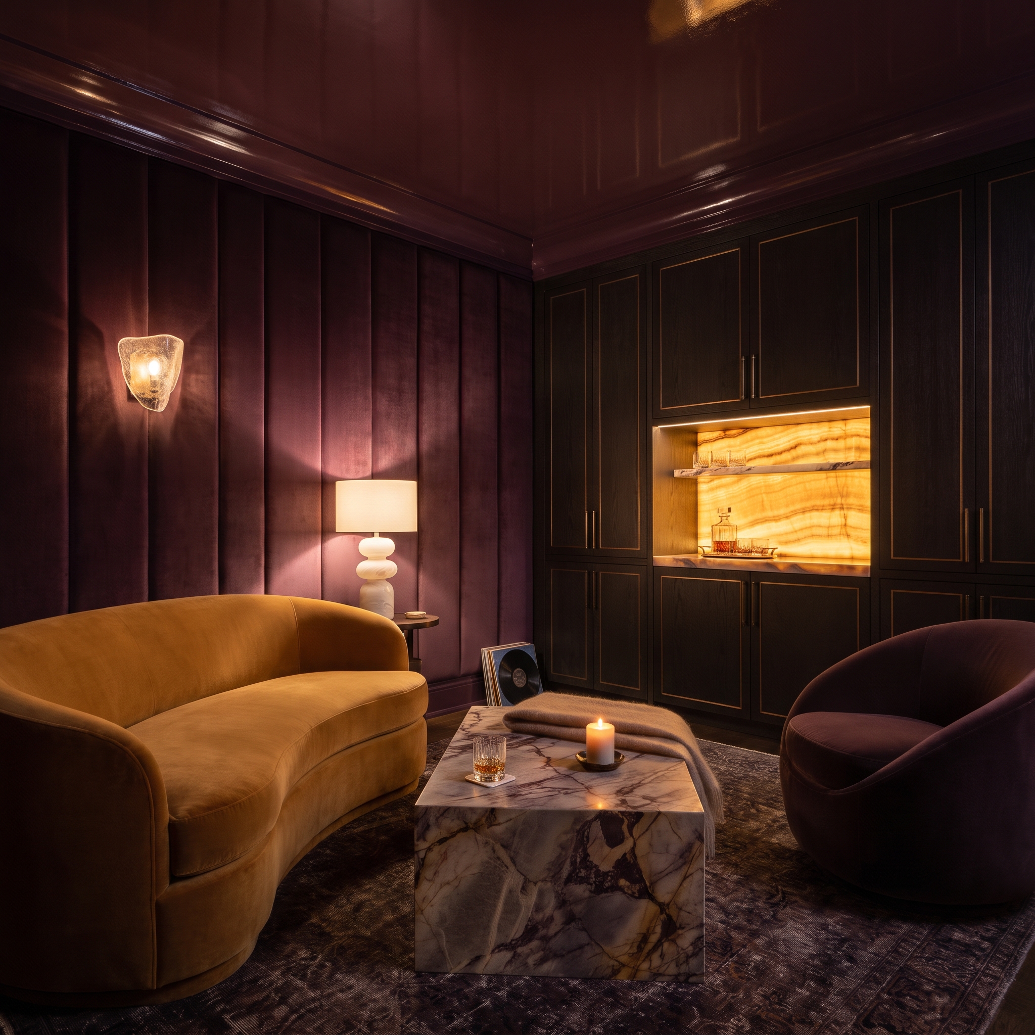
Deep burgundy lacquer stretches across the ceiling, while plum-black paneling and gold trim give the walls an enveloping richness. An amber-caramel velvet sofa interrupts the darkness with a broad band of warmth.
Backlit stone shelving introduces a translucent glow that brings definition to the darker cabinetry. The marble coffee table contributes purple and cream veining, quietly connecting the surrounding finishes. Ceramic and glass lighting fixtures add smaller sculptural details. Gloss, velvet, and illuminated stone each handle light differently, creating depth within an exceptionally dark palette.
16. Terracotta Walls and Cobalt Storage Give a Coastal Living Room an Edge
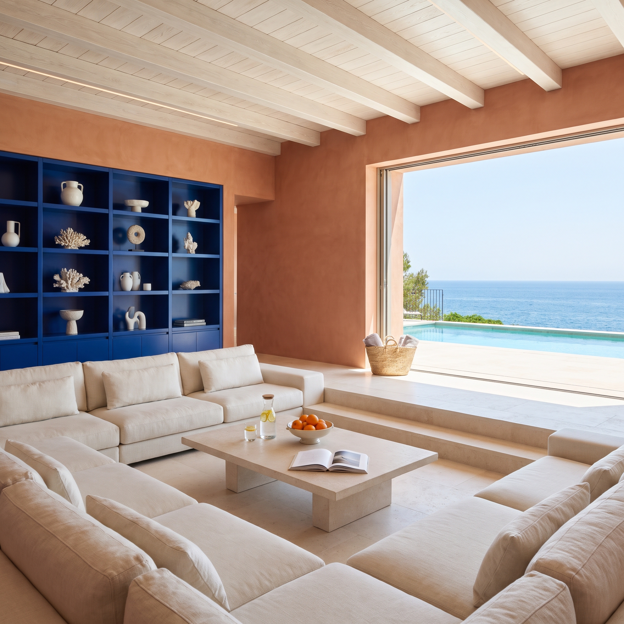
Terracotta plaster covers the walls, while cobalt-blue built-ins introduce a powerful cool accent. White ceramics and coral-like objects stand out sharply against the blue shelving, turning the display into a composition of contrasting silhouettes.
Below, a sunken conversation pit lined with pale linen seating establishes a quieter zone. A travertine coffee table and whitewashed ceiling beams contribute light natural finishes, while the opening toward the pool terrace and sea extends the sense of space. The cobalt is bold, yet its placement within the cabinetry gives it a defined architectural purpose.
15. Rust Velvet and Lavender Panels Give a Bedroom an Unexpected Glow
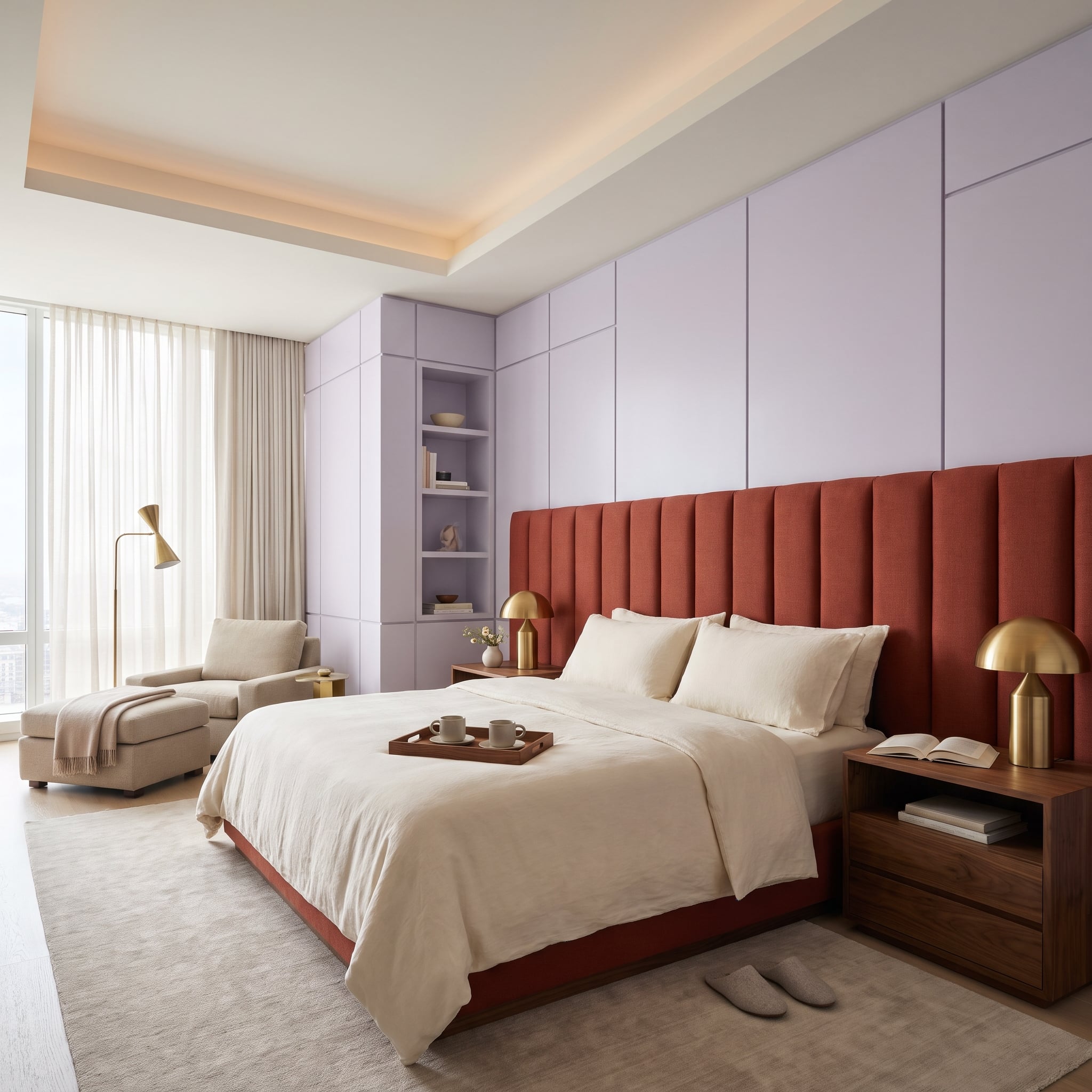
Terracotta-red velvet rises behind the bed in tall upholstered channels, creating a strong vertical pattern. Lavender paneling continues above, introducing a cooler hue that changes the mood without diminishing the warmth below.
Walnut nightstands and gold mushroom lamps connect with the rust upholstery, while cream bedding gives the central composition a necessary pause. Soft cove lighting brings out the lavender’s gentler character. The two colors are unconventional companions, with the bedroom’s simple geometry allowing the contrast to take center stage.
14. Sage Cabinets and Oxblood Leather Give a Living Room Unexpected Depth
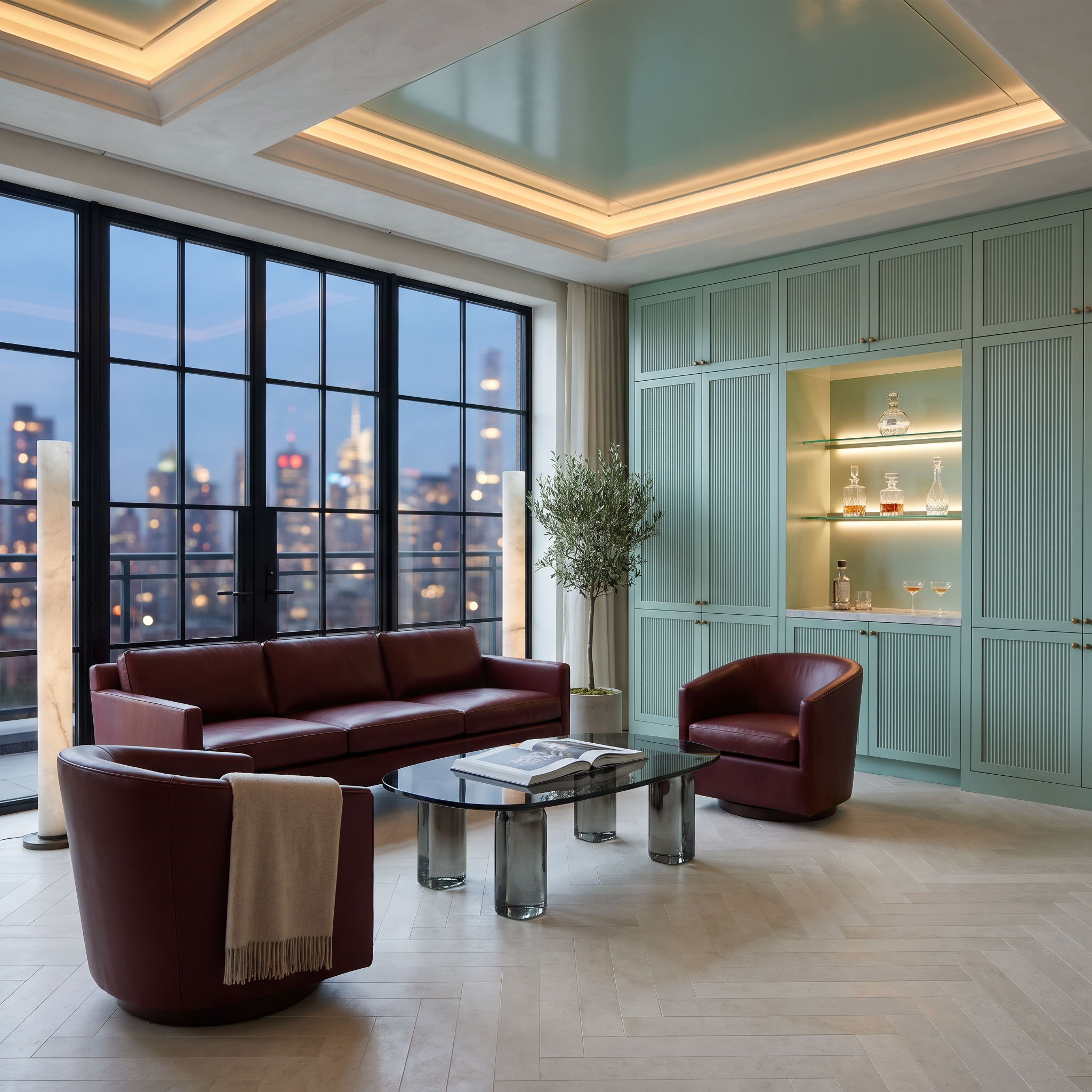
Mint-sage cabinetry with fluted doors covers the walls, creating a pale green architectural backdrop. Oxblood leather seating introduces a much darker, warmer presence, with two barrel chairs and a substantial sofa concentrating the burgundy tones around the conversation area.
Brass hardware adds small warm highlights, while a smoked-glass coffee table contributes a cooler, translucent surface. Illuminated cabinet niches break up the wall of green. The light cabinetry gives the leather room to command attention without making the interior feel dark or crowded.
13. Lavender Plaster and Cognac Leather Bring Warmth to the Dining Table
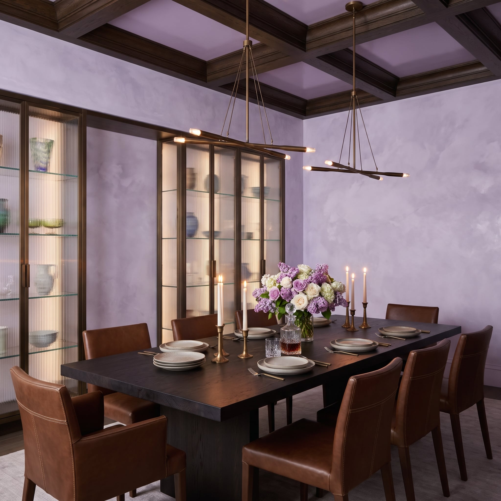
Lavender plaster walls establish a cool, muted backdrop for cognac leather dining chairs. The leather’s amber-brown warmth gives the room a substantial counterpoint to the delicate wall color.
Overhead, a dark-stained coffered ceiling introduces architectural weight and connects visually with the deeper tones of the furniture. Brass fixtures reinforce the warm side of the palette. The lavender remains distinctive, while the wood and leather prevent it from becoming the room’s only defining feature.
12. Aubergine Lacquer and Sage Velvet Turn a Dressing Room Into a Jewel Box
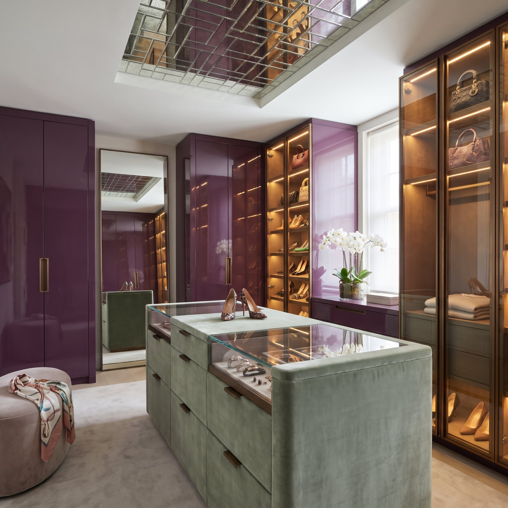
High-gloss aubergine cabinetry lines three walls, reflecting the warm light from brass-trimmed display cases. At the center, a sage velvet island introduces a cooler, softer green, with a glass display top giving the furniture a jewelry-store precision.
An antiqued mirror inset above the island reflects the display below and adds visual depth to the ceiling. Its limited placement keeps the reflective surface from overwhelming the architecture. Against the rich purple cabinetry, the sage island becomes a quiet but unmistakable focal point, bringing softness to a room dominated by glossy surfaces and illuminated displays.
11. Mustard Velvet and Slate Blue Give an Art Deco Bedroom a Modern Twist
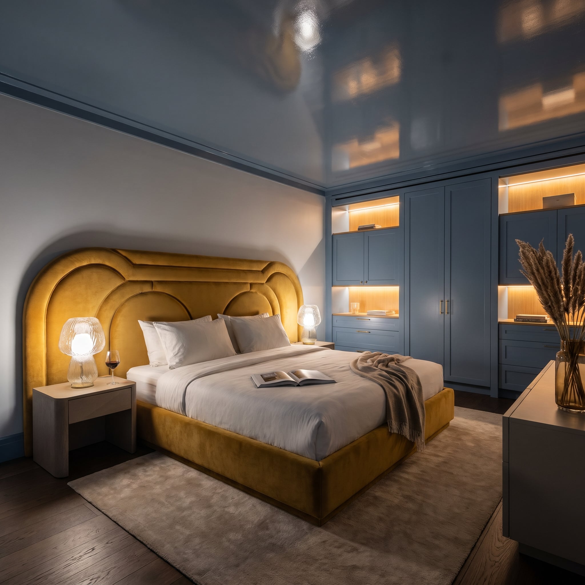
A monumental arched headboard upholstered in mustard velvet dominates this bedroom, its curved outline bringing an Art Deco influence to the composition. Slate-blue cabinetry occupies the adjacent wall, with warm illuminated niches adding depth to the cool surface.
The glossy navy ceiling reflects the light below, while white bedding and a neutral rug provide relief from the stronger colors. Simple glass lamps keep the bedside details understated. The mustard headboard is the unmistakable star, with the surrounding blues providing a dramatic setting rather than a neutral stage.
10. Sage Cabinets and Coral Tile Give a Kitchen Its Own Color Vocabulary
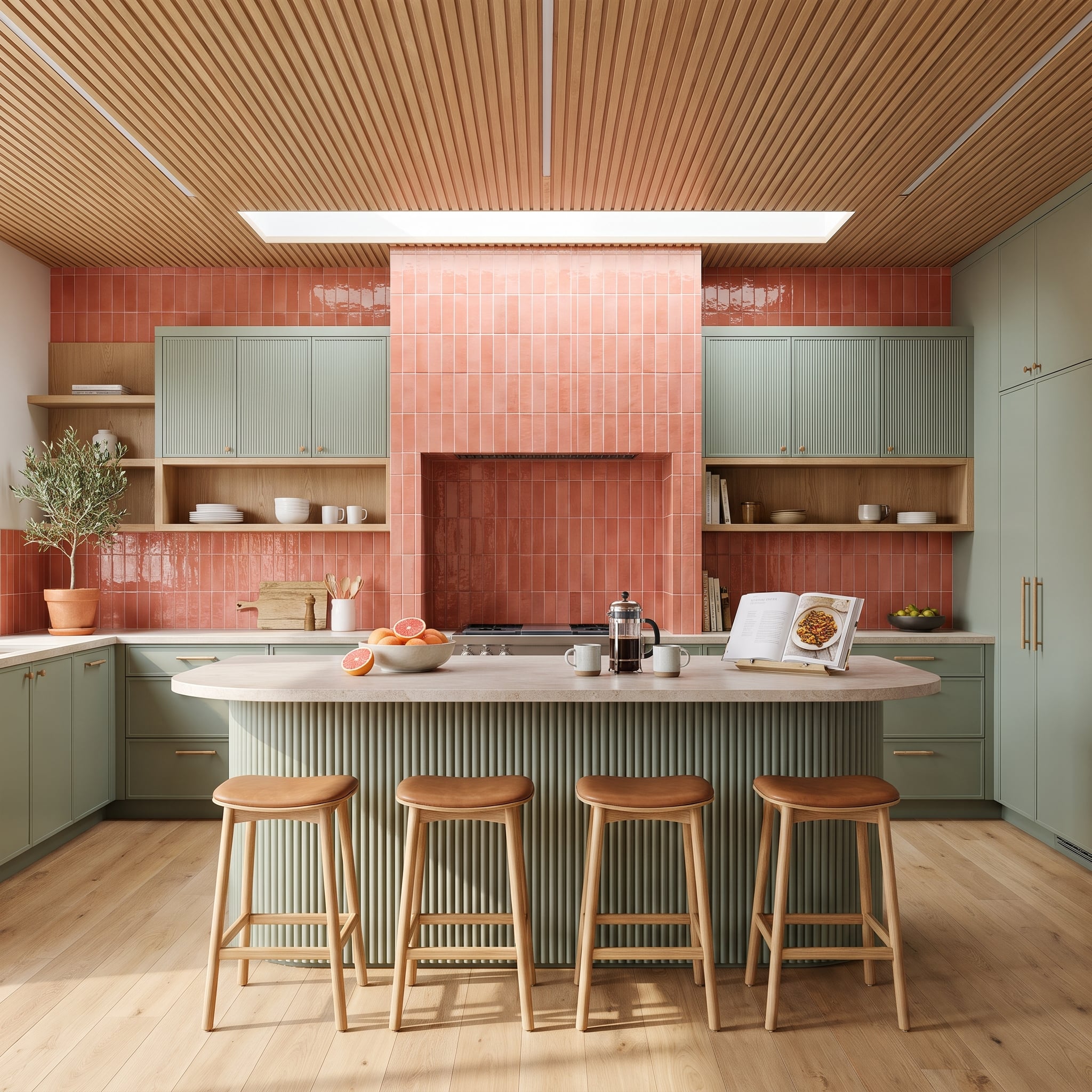
Fluted sage cabinetry establishes a continuous green perimeter, while coral zellige tiles climb the range hood surround in closely stacked vertical rows. The tiles introduce a warm, saturated interruption to the softer cabinetry.
The two surfaces also have different visual rhythms. Cabinet fluting creates fine, regular grooves; the handmade-style tile brings subtle irregularities in color and reflection. Concentrating the coral around the range makes it a clear focal point, its narrow vertical bands interrupting the kitchen’s otherwise continuous cabinetry.
9. Pistachio Green and Espresso Wood Give a Bedroom a More Grounded Kind of Luxury
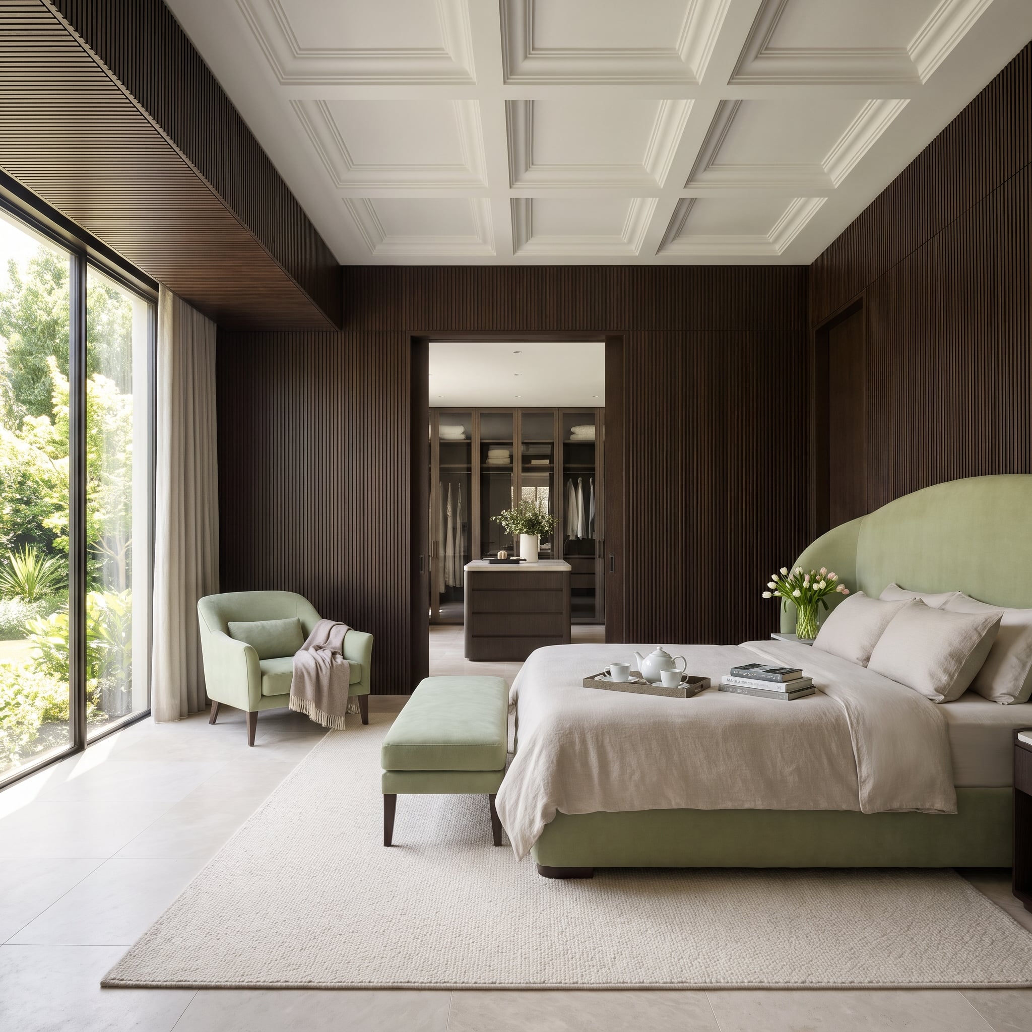
Pistachio-green velvet wraps the curved bed frame, with a matching armchair and bench repeating the fresh, pale color. Behind them, espresso-stained fluted panels introduce a deep brown backdrop that makes the upholstery appear even brighter.
Oat-colored bedding softens the transition, while the white coffered ceiling opens the room above the darker wall. Floor-to-ceiling glazing brings in the garden beyond, visually connecting the green furniture with the landscape. The contrast between pale velvet and dark wood gives this restrained palette considerable presence.
8. Navy Cabinets and Terracotta Walls Give a Kitchen Two Strong Personalities
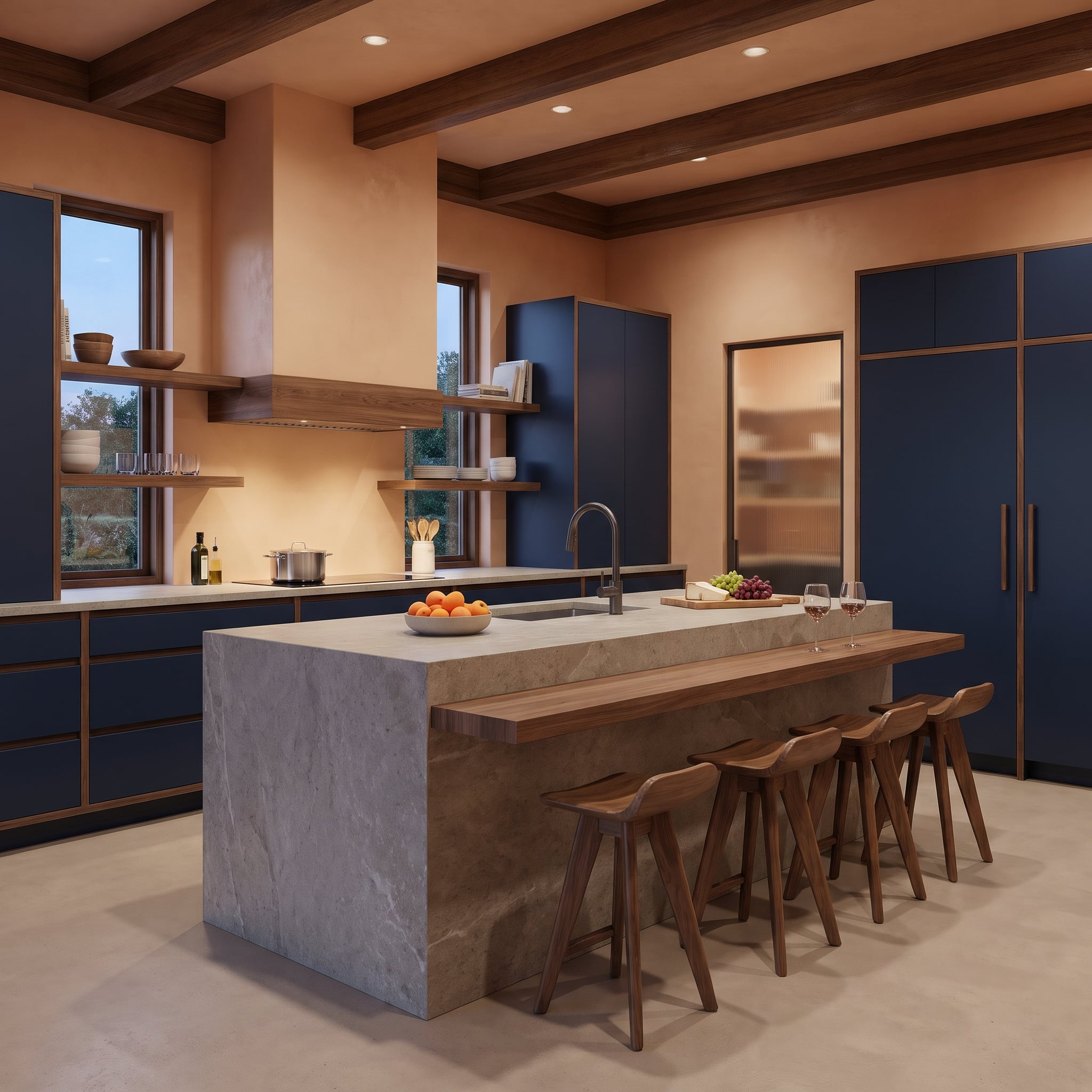
Midnight navy cabinetry meets walls the color of sun-dried clay, creating a kitchen built around the contrast between cool depth and earthy warmth. The cabinetry has a substantial presence, while the terracotta prevents the room from feeling austere.
A pale, veined stone island occupies the center, offering a neutral surface between the two saturated colors. Walnut trim and an extended wooden bar ledge introduce another warm material, linking the island to the surrounding architecture. The kitchen has a strong graphic identity, with the pale stone keeping its darker elements from closing in.
7. Olive Green Shelving and Cognac Leather Give a Library Its Own Quiet Authority
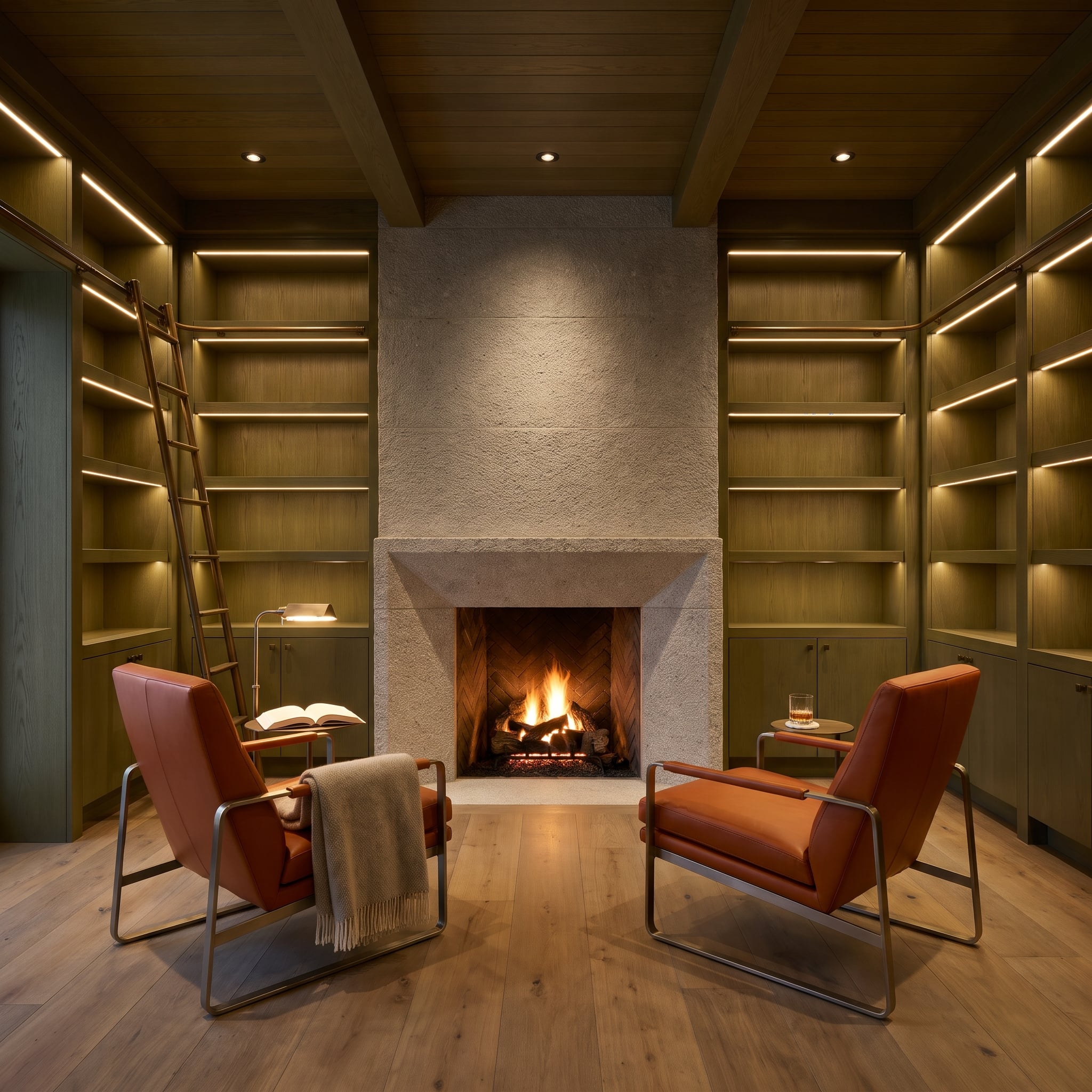
Olive-green shelving stretches across the library walls, its muted finish providing a handsome backdrop for books and decorative objects. Two cognac leather chairs face a pale limestone fireplace, introducing a warm amber tone against the cooler green.
Recessed shelf lighting emphasizes the height of the cabinetry, while a rolling ladder reinforces the room’s traditional library character. The rough-textured limestone surround provides a natural contrast to the smoother painted wood and leather. A wool throw adds another soft surface without introducing a competing color. The room’s appeal comes from the accumulated richness of its materials rather than any single dramatic gesture.
6. Teal Lacquer and Dusty Rose Make a Bedroom Feel Rich Without Going Dark
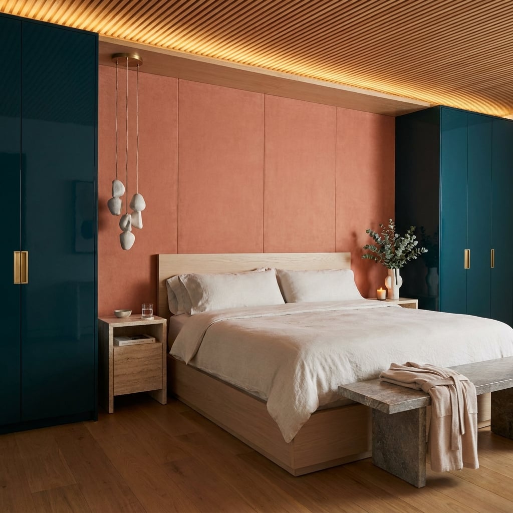
Deep teal lacquer wardrobes frame a dusty rose upholstered headboard wall, giving the bedroom a strong contrast between cool gloss and warm softness. Brass cabinet pulls add bright accents against the darker finish.
Natural oak appears in the bed frame, nightstands, and slatted ceiling, connecting the two colors through a consistent material. Cove lighting reveals the ceiling texture, while sculptural pendant lights introduce another layer of interest. A simple bench at the foot of the bed keeps the foreground comparatively restrained. The room feels richly furnished without requiring every surface to compete.
5. Dusty Rose Velvet and Olive Wood Make a Living Room Feel Unexpectedly Serene
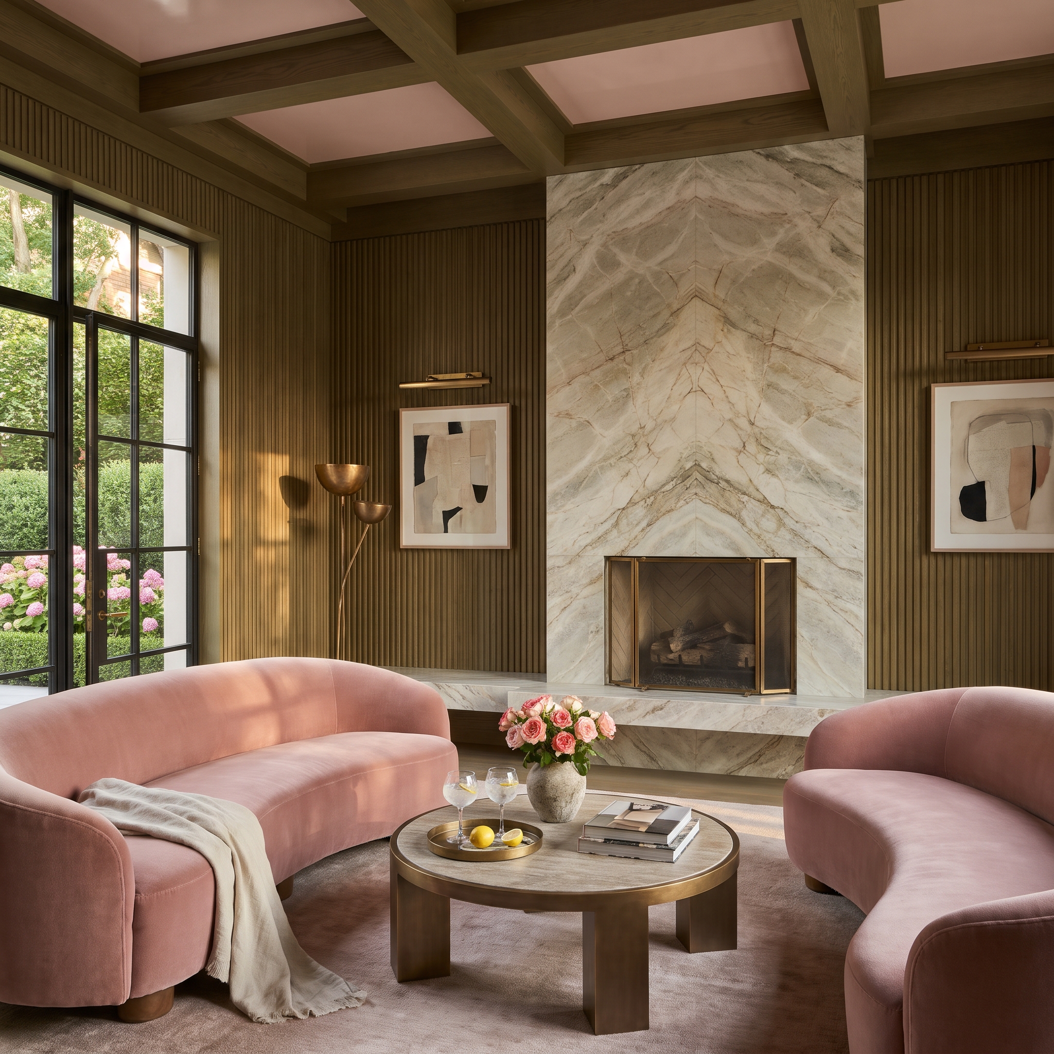
Curved dusty rose velvet sofas sit against reeded wood paneling finished in a muted olive green. The pink upholstery has a soft, powdery quality, while the green wall introduces an earthier, more architectural presence.
The reeding creates narrow shadows that vary with the light, preventing the olive surface from reading as a flat block of color. Rounded seating contrasts with the paneling’s vertical lines. Two muted colors produce a surprisingly animated room through shape and texture rather than sheer saturation.
4. Burgundy Lacquer and Blush Paneling Give a Bedroom Two Different Moods
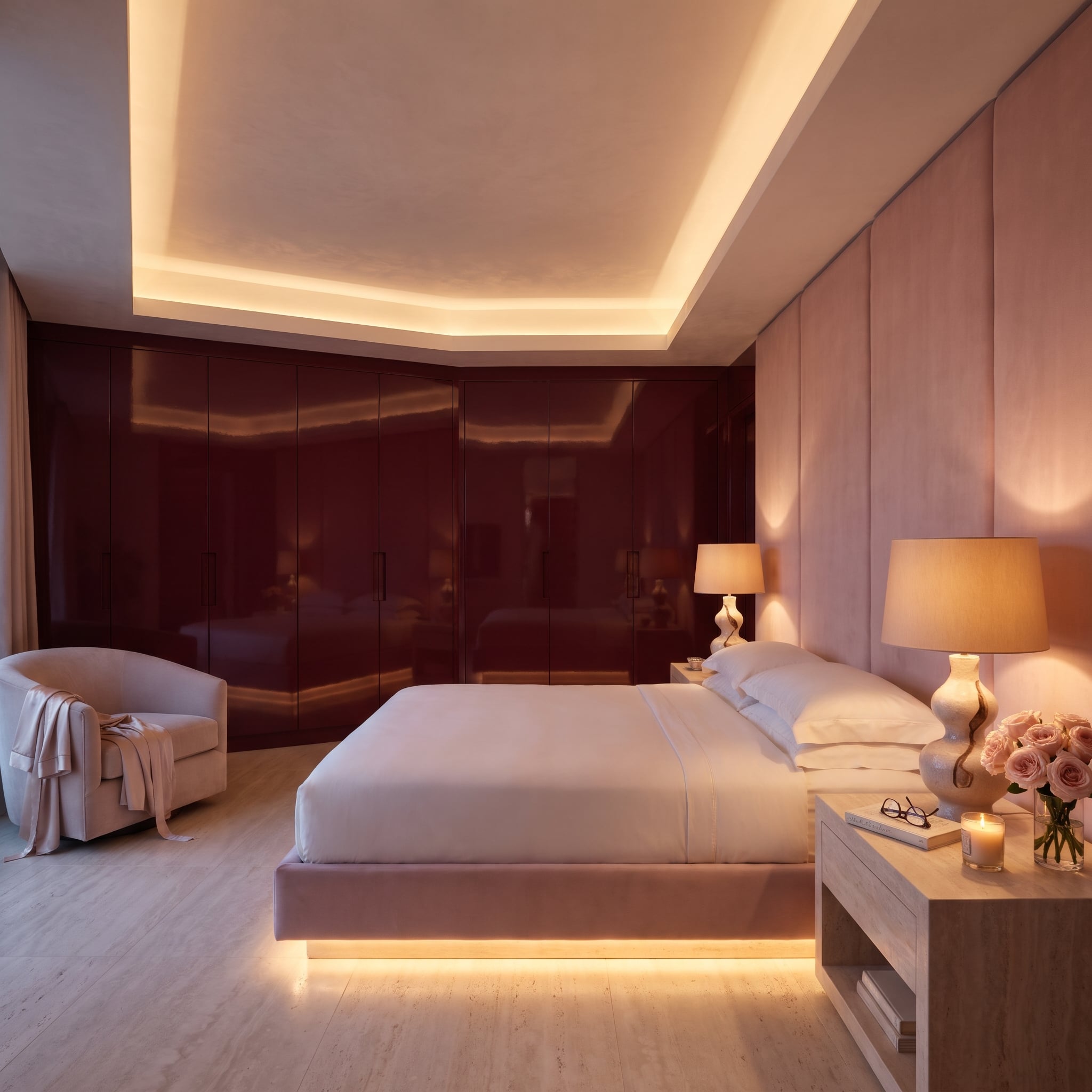
High-gloss burgundy wardrobe panels dominate the back wall, reflecting the room in dark, wine-colored surfaces. Blush fabric panels on the adjacent wall provide the opposite experience: pale, matte, and softly textured.
The contrast is as much tactile as chromatic. LED strips beneath the bed and within the ceiling recess keep the lighting low and directional, emphasizing the reflective lacquer without washing out the upholstered wall. Both colors belong to the red family, yet their difference in depth and finish makes the pairing considerably more interesting than a conventional tonal scheme.
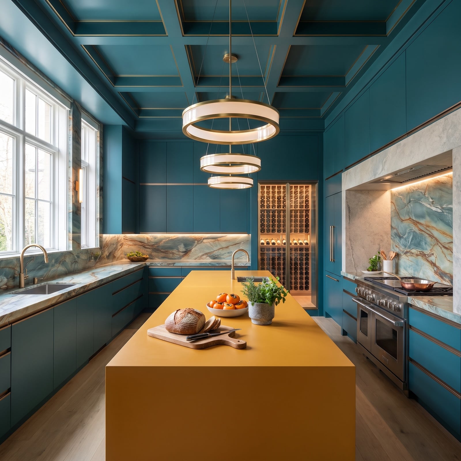
3. Teal Cabinets and a Mustard Island Give the Kitchen a New Center of Gravity
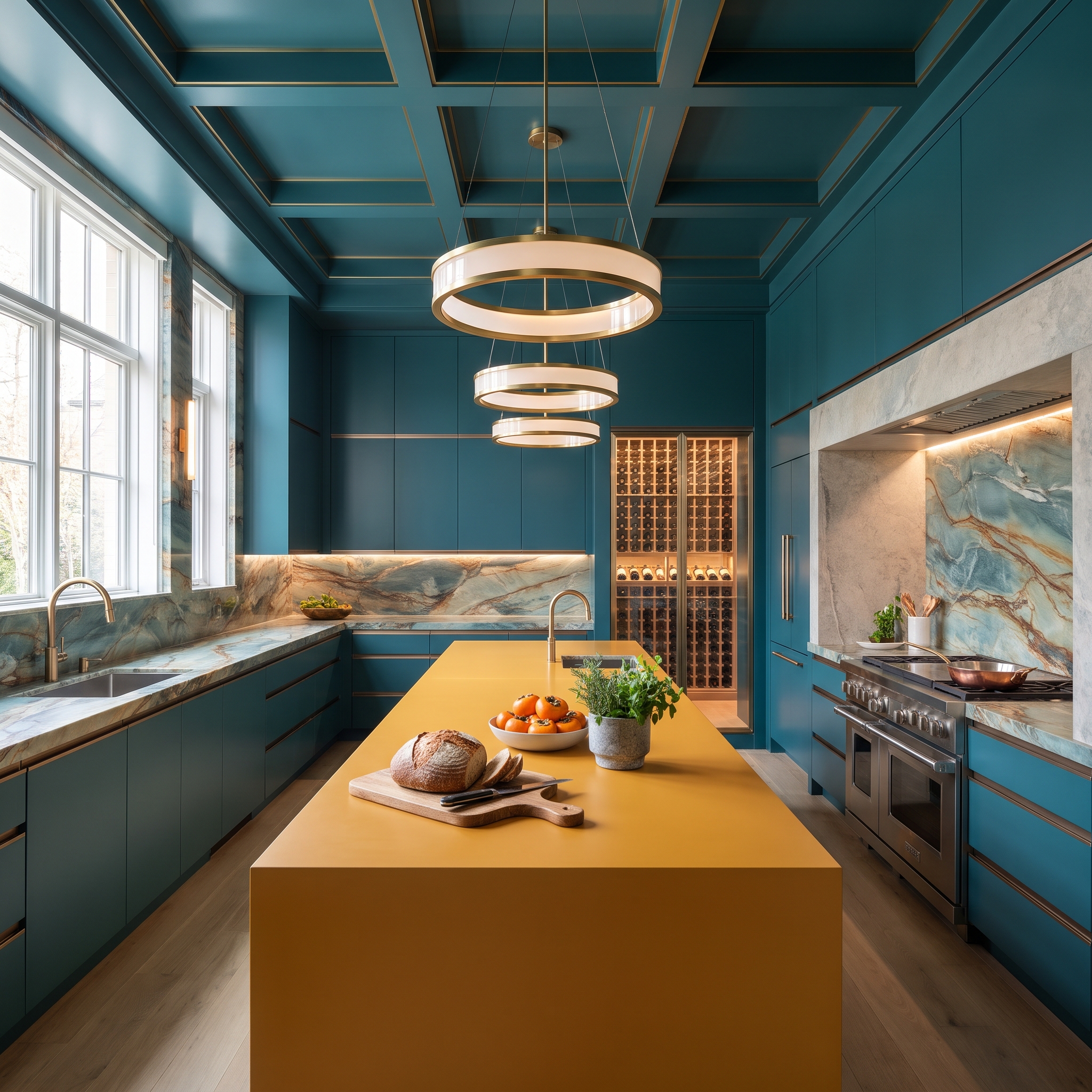
Deep teal cabinetry surrounds the kitchen, forming a continuous blue-green backdrop for a mustard-yellow island. The two hues create a lively warm-cool contrast, with the island occupying the center of the composition.
Veined marble behind the range introduces cream and amber tones that relate to the mustard, while brass inlays and ring-shaped pendants repeat the warmth overhead. Pale wood flooring prevents the saturated cabinetry from dominating every surface. The island stands out as a substantial block of color, framed by the teal cabinetry and the paler materials surrounding it.
2. Pale Lavender Makes Black Marble Look Almost Luminous
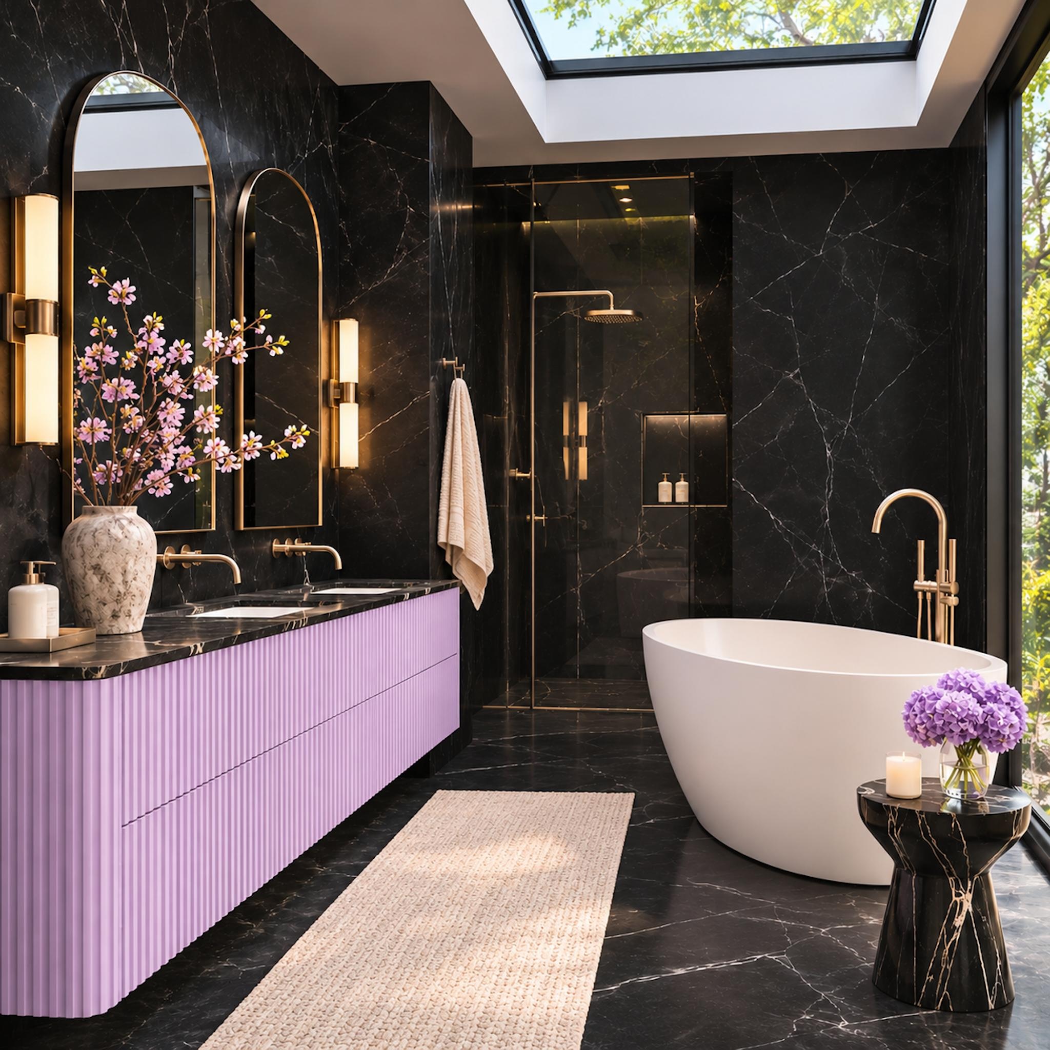
Black marble climbs the walls and continues across the floor, its fine white veining giving the dark surfaces a restless, graphic quality. Against that dramatic shell, a fluted lavender vanity introduces an unexpectedly delicate color. The pastel occupies one clearly defined architectural element, making its restraint more effective than a roomful of matching accents.
A white freestanding tub provides a sculptural break from the black stone, while an ivory runner and pale towels keep the supporting palette neutral. Tall arched mirrors, warm metallic fixtures, and a generous skylight prevent the dark enclosure from feeling oppressive. The lavender cabinetry has no need for a matching bathtub. One confident gesture is enough.
Lavender is still a bold move: when we asked readers which vanity colour they would buy, wood led with 39%, ahead of white at 32% and navy at 23%.
1. Copper-Terracotta Velvet Meets Slate Marble in a Living Room Built Around Contrast
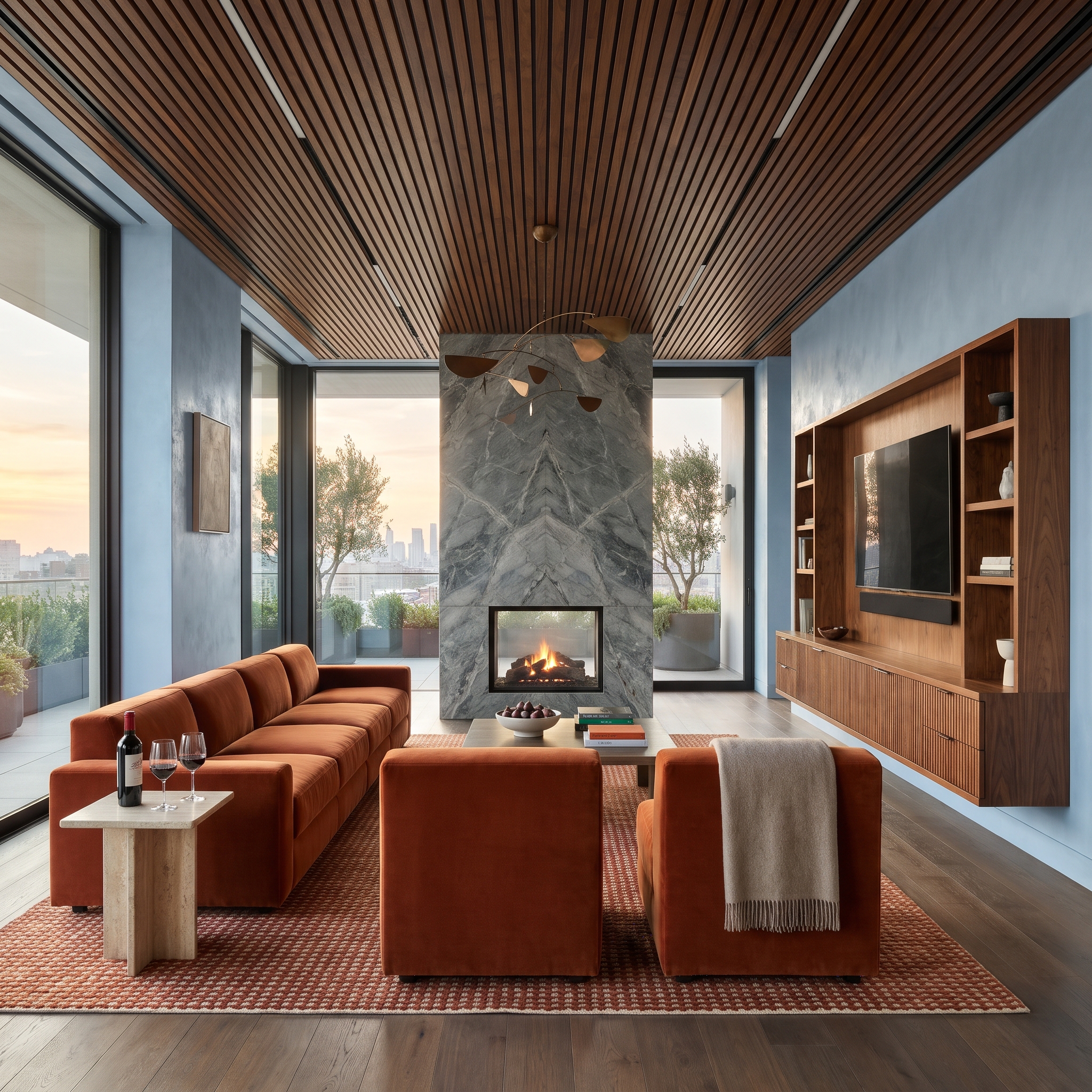
Burnt terracotta velvet sectionals bring a deep orange warmth to the seating area, while a towering blue-gray marble fireplace surround introduces a cooler, more monumental surface. The stone’s dramatic veining gives the wall movement that contrasts with the broad, soft upholstery.
A slatted walnut ceiling connects with the warmth of the seating without matching its color. The wood also introduces a regular linear pattern against the marble’s irregular markings. Velvet, stone, and timber each contribute a distinct character, making the contrast feel substantial rather than decorative.