
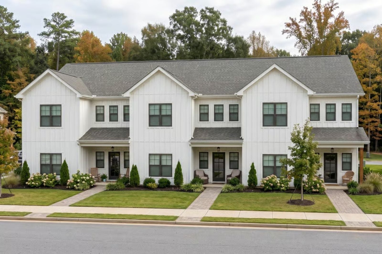
Most income properties ask you to choose between a building you’re proud of and one that actually pencils out. The Collingwood doesn’t make you choose — three separated units, a modern farmhouse exterior that stops people on the sidewalk, and private covered patios that make every lease a genuinely easier sell.
Specifications
- Sq. Ft.: 5,721
- Bedrooms: 9
- Bathrooms: 9
Floor Plan – Main Floor
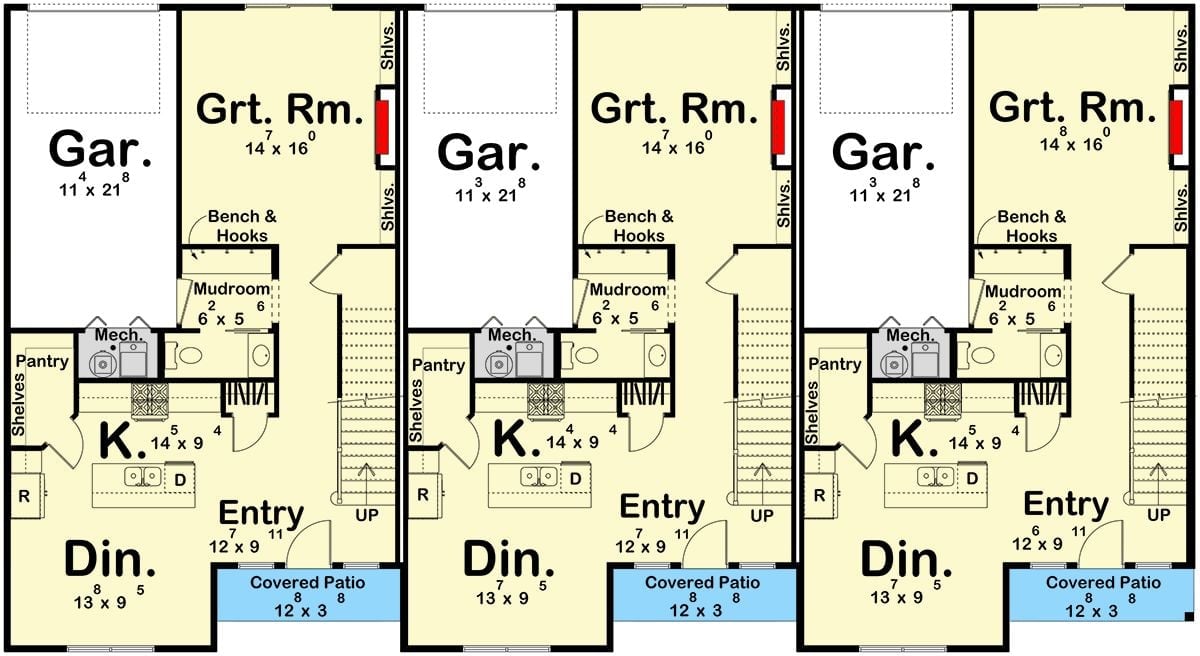
Three identical units side by side, each with a garage, great room, kitchen, dining area, mudroom, and covered patio. Stairs in each unit suggest upper-level bedrooms.
Floor Plan – Second Floor
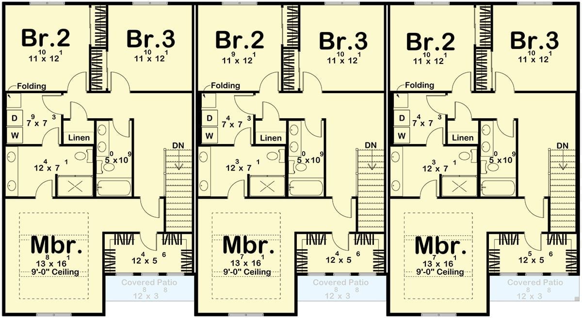
Upper level shows master bedroom, two additional bedrooms, laundry, and covered patio repeated across all units.
Designer’s Secret: The staircase in each unit is tucked against the shared wall, which clears the rear of the floor for a master suite with a 9-foot ceiling and direct patio access. Second-story bedrooms with that kind of ceiling height are genuinely uncommon, and the primary room photographs with a presence that’s hard to fake — prospective tenants notice, even if they can’t quite say why. Investors consistently underestimate how much that one detail drives retention.
Board-and-Batten White Exterior Pulls Three Units Together Without Looking Institutional
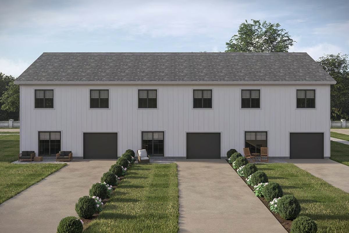
Vertical siding and matching dark garage doors give each unit its own identity while keeping the whole facade cohesive.
The Psychology Behind This: Multi-unit buildings that read as apartment blocks kill rental demand in suburban markets — investors worry about this constantly, and they’re right to. Repeating identical landscaping strips between driveways tricks the eye into reading each unit as its own distinct property, and buyers and renters respond to that sense of individual ownership even when the structure is shared.
Dark Metal Railings and Wood Treads Set the Tone from the Moment You Walk In
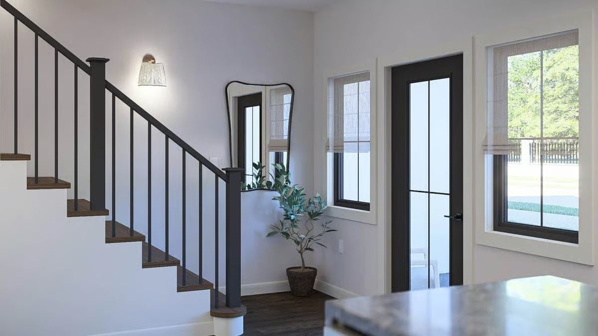
Black iron balusters against white risers hit that contrast without tipping into industrial. And the potted olive tree near the front door genuinely earns its spot — it’s doing real work softening what would otherwise be an entryway built entirely of hard materials.
The potted olive tree near the front door earns its place by softening what’s otherwise a hard-material entryway.
Warm Neutrals and Wall Sconces Make a Rental Living Room Feel Like It Was Designed for Someone
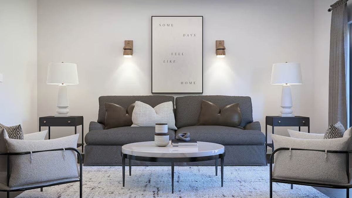
Leather lumbar pillows against a gray sofa add a layer of texture most rentals skip entirely. The wall sconces flanking the art print wash light down the wall while framing the composition above the sofa — two jobs, one fixture. That round marble-top coffee table keeps the seating arrangement from feeling boxed in.
Ask Yourself: If you’re buying this as an income property, don’t underestimate what finishes do to your asking rent. A living room that photographs well on a listing site commands more than one that’s merely functional, and wall sconces like these cost relatively little to install but read as deliberate to prospective tenants scrolling late at night.
Fluted Wall Panels and Floating Walnut Shelves Earn Their Place in a Rental
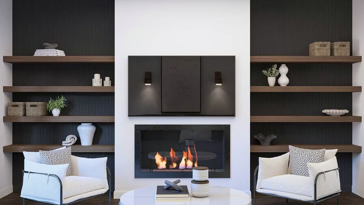
Walnut floating shelves against fluted dark panels give the fireplace wall real weight. Built-in sconces and real flames photograph better than any staging trick.
Editor’s Note: Fireplace units in rental properties tend to command higher rents than comparable units without them, and a linear gas insert like this one requires far less maintenance than a wood-burning alternative. The fluted wall panels flanking it are a surface finish that photographs dramatically but costs less per square foot than stone veneer — which makes the fireplace wall one of the better return-on-investment design decisions in this entire plan.
Dark Backsplash and Marble Counters Do the Heavy Lifting in a Compact Kitchen
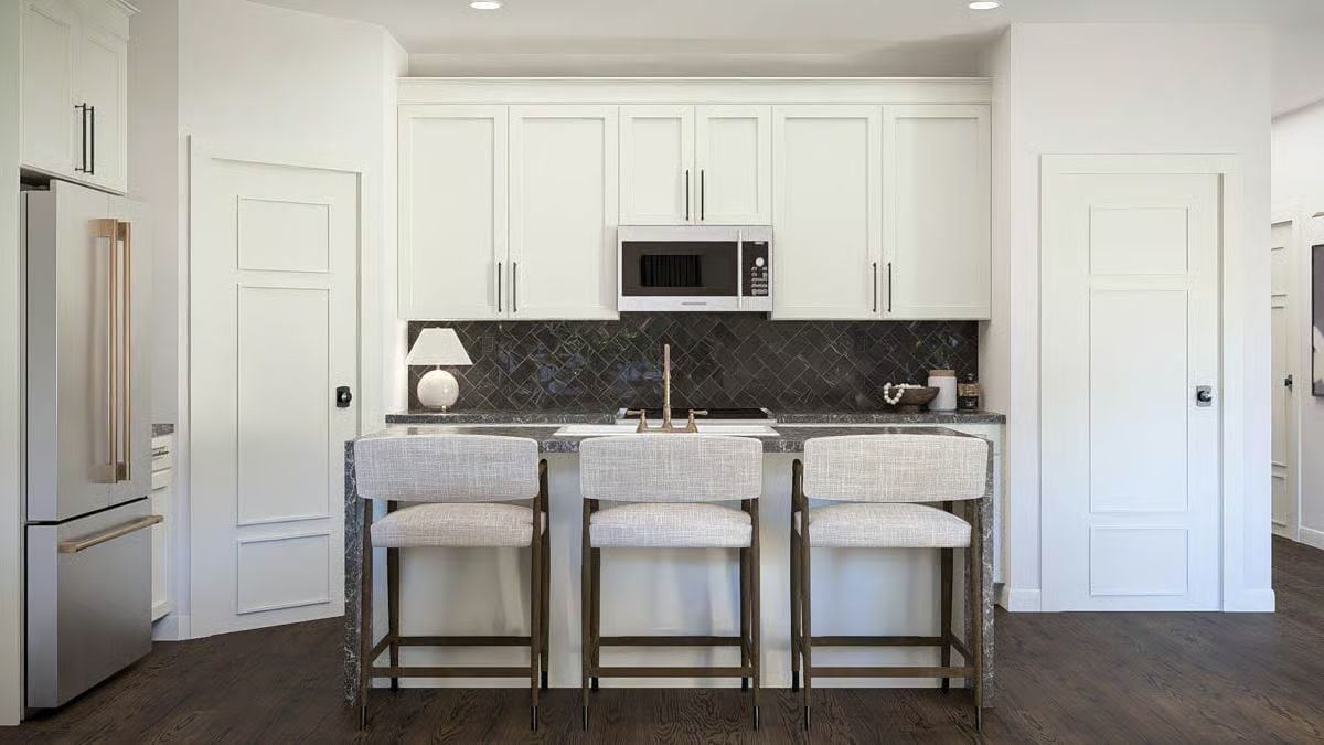
Herringbone tile in deep charcoal anchors the backsplash while the waterfall-edge counter keeps the island from feeling heavy. That brass faucet placement is noticeably off-center, and it works.
Why It Works: Compact kitchens photograph poorly when finishes are flat — light-on-light schemes especially tend to wash out and look smaller than they are. Dark backsplash tile adds the contrast that listing photos need to stop a scroll, and on short-term rental platforms, that contrast has a direct effect on click-through rates.
Marble-Top Round Table and White Slipcover Chairs Prove Rentals Don’t Have to Compromise
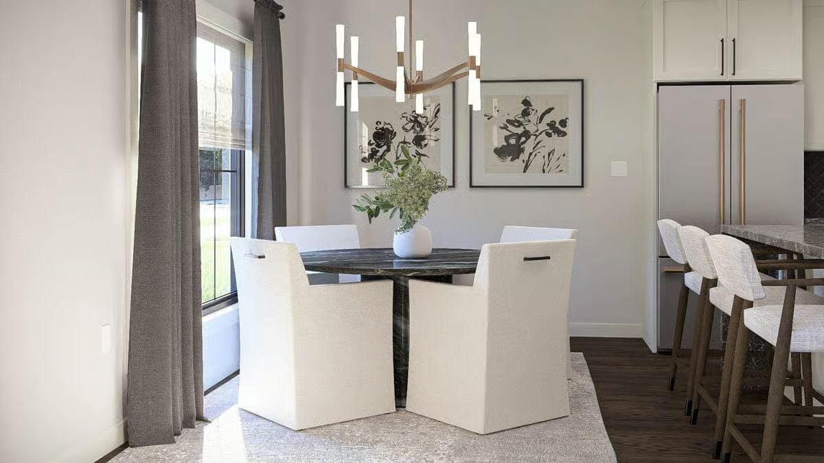
Round marble dining tables rent faster than rectangular ones. Photographers love them.
The dark veining on that tabletop gives listing photos natural contrast without needing an accent wall anywhere in sight. Slipcover chairs are a smart call in rentals — washable, replaceable, and they still read as upscale in photos.
Fluted Dark Accent Wall Pulls a Rental Bedroom Far Above Its Pay Grade
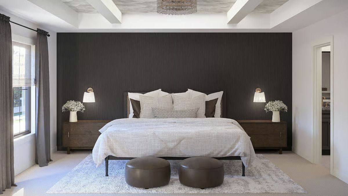
Vertical fluting on the charcoal accent wall does more visual work than most headboards could. Paired nightstands keep the layout symmetrical without feeling staged, and two round leather ottomans at the foot of the bed add warmth without crowding the floor.
Why the Fluted Panel Choice Is Smarter Than It Looks
Flat paint can’t produce shadow depth — fluted panels can, and that depth is exactly what makes a bedroom photograph with a sense of dimension rather than a sense of vacancy. They’re applied directly over drywall, so there’s no structural work involved. Better still: if a tenant damages one section, individual panels can be swapped out without touching the rest of the wall.
Scallop-Frame Mirrors and Brass Fixtures Justify Every Dollar of the Rent
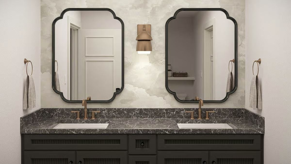
Dark marble countertop with white veining anchors the vanity. Brass faucets keep the whole thing from reading cold — a small call that makes a real difference in a room this compact.
Pin It
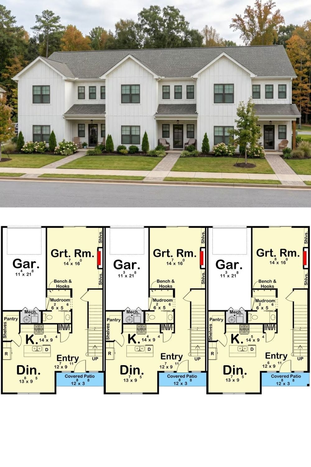
Exterior photo shows a white board-and-batten triplex with covered entries. Below, the first-floor plan reveals three mirrored units, each with a garage, great room, kitchen, dining area, and covered patio.