
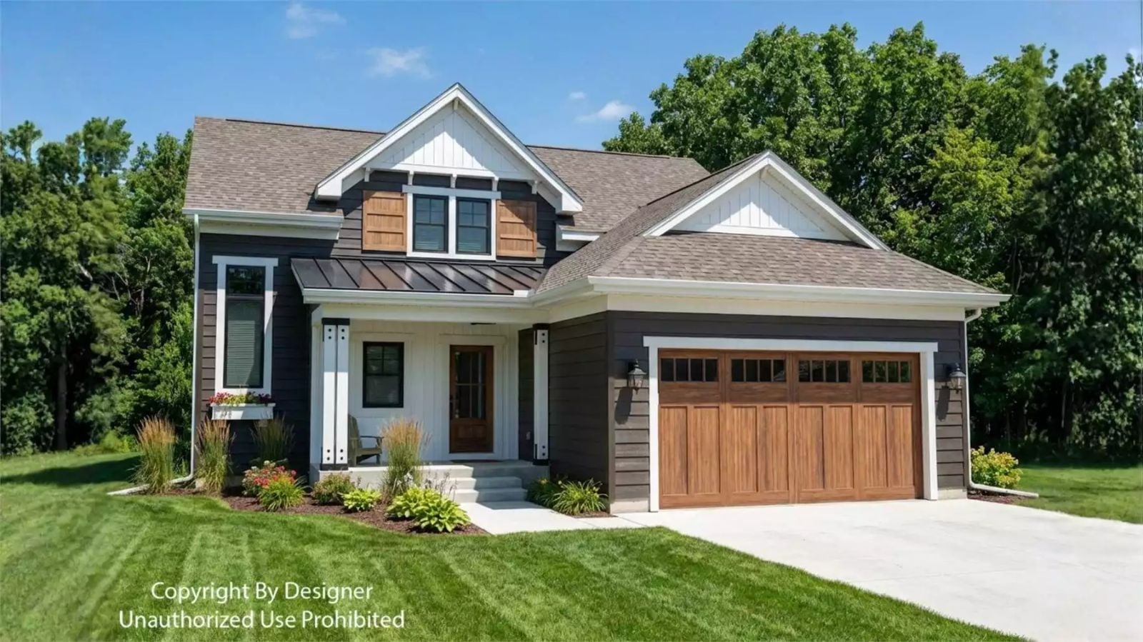
Anyone who has survived a two-story with young kids already knows what a main-floor primary is worth: dinner winds down, the kids migrate upstairs, the door closes, and the noise stays where it belongs. The Colborne Row is built around exactly that — a main-floor suite tucked away from the traffic, a loft that gives older kids somewhere to be, and a farmhouse layout generous enough to absorb the daily grind without throwing it back at you by ten o’clock.
Specifications
- Sq. Ft.: 2,124
- Bedrooms: 3
- Bathrooms: 3.5
Floor Plan – Main Floor
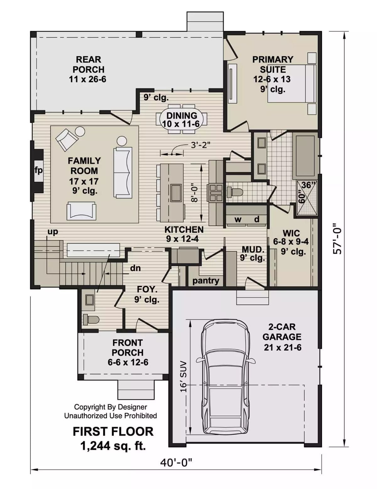
The first floor puts the primary suite well away from main traffic, with the family room, kitchen, dining area, mudroom, and a 2-car garage filling out the rest of the layout.
Floor Plan – Second Floor
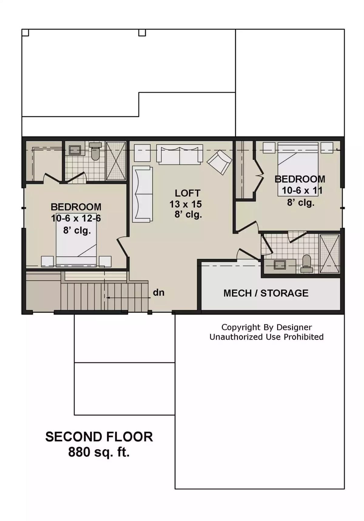
Upstairs, two bedrooms and an open loft share the second floor. The left bedroom connects directly to a full bath, while the right bedroom uses the floor’s second bath near the mech/storage room. Between them, the loft sits open and obvious — the kind of space kids naturally claim without anyone having to suggest it.
In The Details: Both bedrooms come in at nearly identical sizes, so nobody gets the obvious “bigger room” argument to make. The loft sitting between them also helps on school mornings — it breaks up the hallway so the whole floor doesn’t feel like a bottleneck. And that mech/storage room tucked beside the right bath? Genuinely useful for anyone who’s ever lost a box of holiday decorations to a garage shelf they can’t reach.
Dark Siding, White Trim, and a Porch Wide Enough to Actually Use
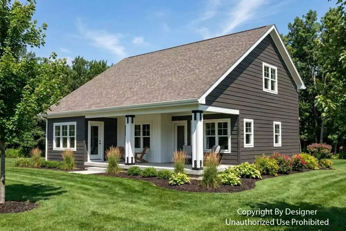
Gray lap siding against crisp white trim gives the exterior its contrast without overworking it. The covered front porch stretches nearly the full facade — wide enough to actually furnish — and the black bracket hardware on the columns keeps the whole thing from tipping into precious farmhouse territory.
The covered front porch runs nearly the full facade, with black bracket hardware on the columns that keeps it from reading as too sweet.
Step inside and the exterior’s farmhouse restraint gives way to something warmer and more lived-in.
Stone Fireplace, Autumn Views, and Two Sofas Angled Just Right
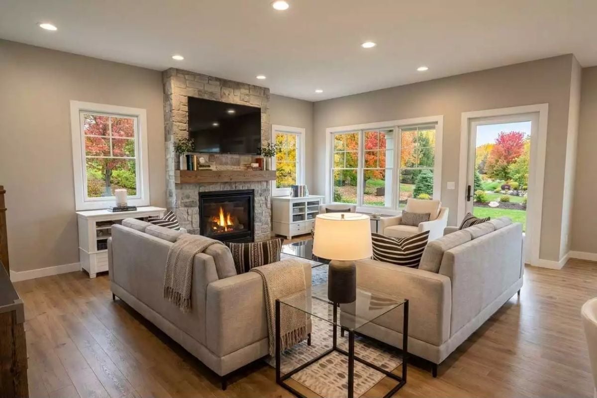
Recessed lighting keeps the ceiling clean while the stone surround handles all the focal-point work. Both sofas face the fireplace without blocking the windows, where fall color does the room’s decorating for free. Woven throws and striped pillows add texture without crowding the palette. It works because it doesn’t try too hard.
Marble Island, Dark Base, and Three Chairs That Mean Business
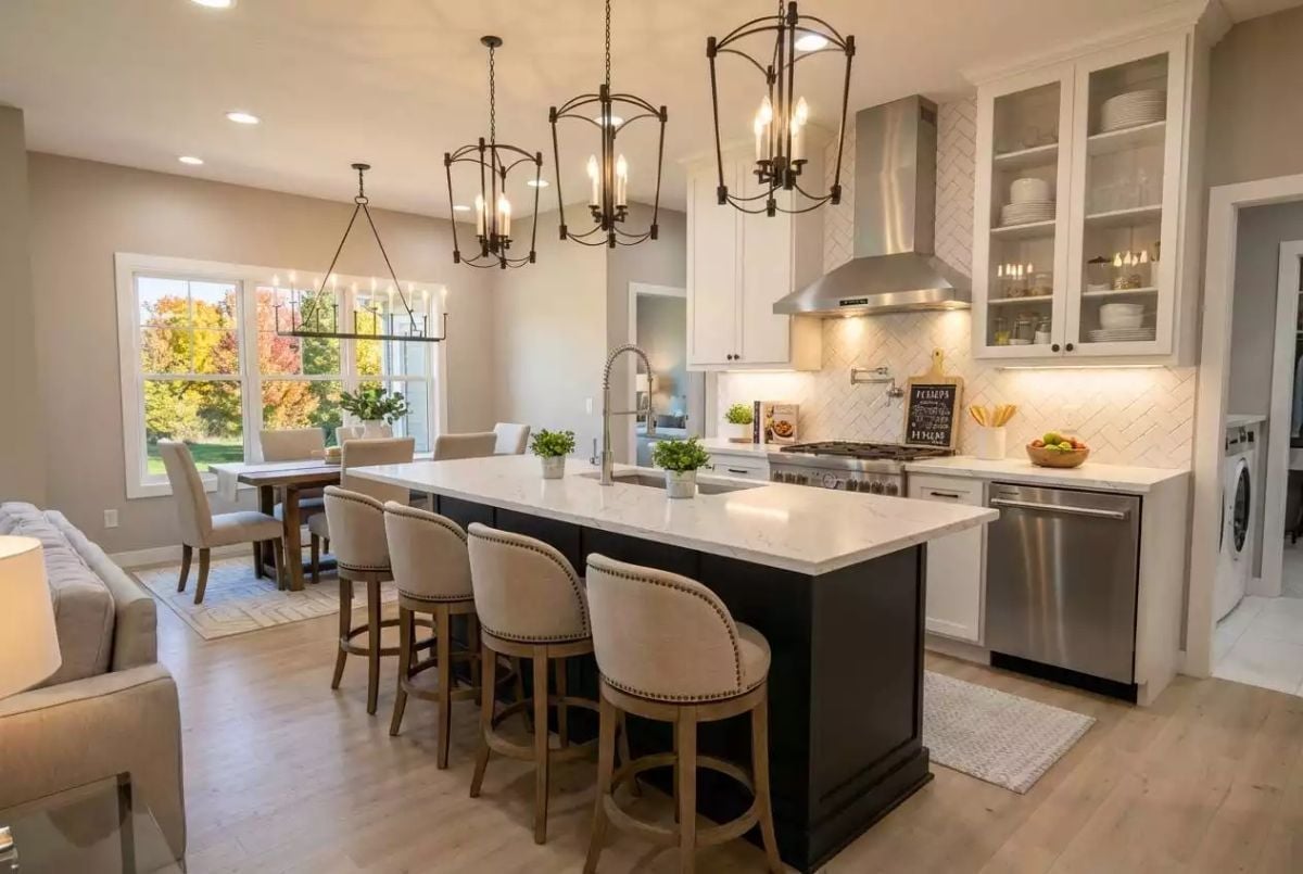
Upholstered barstools with nailhead trim line one side of the black island, and pendant lanterns pull the eye upward without competing with the stainless hood above. Small potted plants are scattered on the counter — just enough life to keep the space from feeling staged for a listing shoot.
Ask Yourself: Open-plan kitchens look polished in photos, but think about your actual cooking habits before committing. If you’d rather nobody watch you debone a chicken, a partial wall or peninsula gives you the prep space without the audience.
Candlelight Chandelier, Fall Colors Through Glass, and a Dining Room That Earns Its Keep
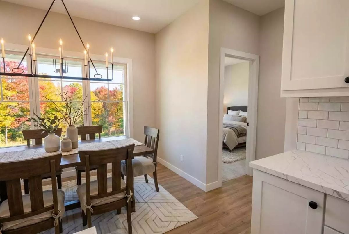
A bare-bulb black iron chandelier anchors the room above a dark wood table set for six. Fall color presses in through the windows, and white subway tile with quartz counter peek in from the kitchen next door — enough connection to feel open, not enough to kill the separation.
Try This: Positioning the dining room adjacent to the kitchen rather than bleeding into an open floor plan gives you a real boundary between cooking chaos and the table. If someone’s still finishing homework while you’re plating dinner, you’re not tripping over each other to get there.
Dark Upholstery, Layered Linens, and a Bedroom That Locks From the Inside
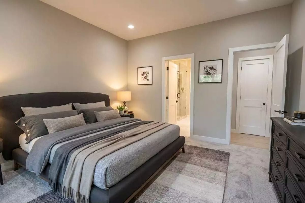
The charcoal bed frame anchors the room without overwhelming it. Gray throws and textured pillows are layered across the bed, and two framed botanical prints flank the en-suite entry — walk-in closet door just to the right. Simple arrangement. Stays out of its own way.
Designer’s Secret: Putting the closet and en-suite on the same wall contains your entire morning routine to one side of the room, so one person can get ready without disturbing the other. It’s the kind of layout detail that sounds minor right up until you’ve spent a few years living without it.
Marble Counters, a Soaking Tub by the Window, and a Closet That’s Actually Close Enough
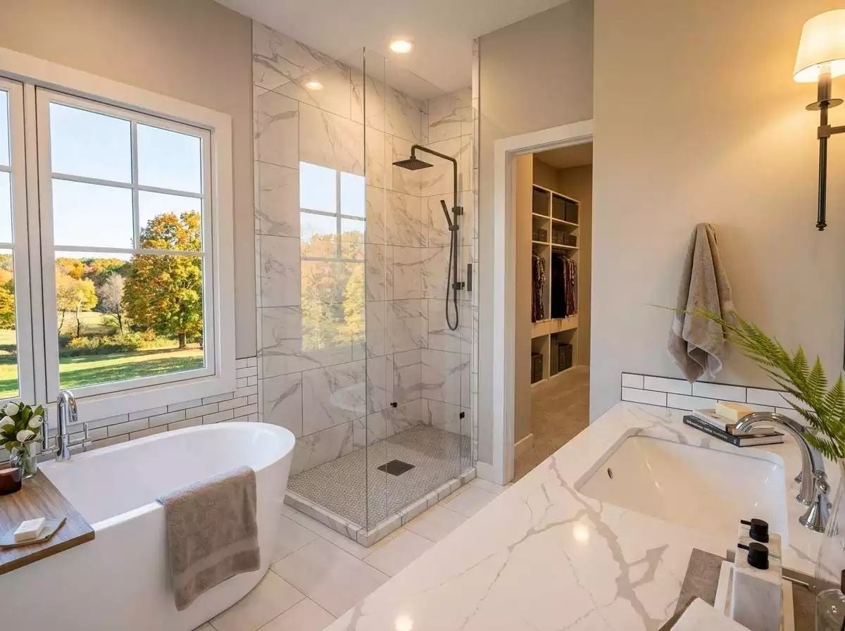
Calacatta-style marble runs across the vanity and into the shower surround, with matte black fixtures keeping the palette from going too soft. The soaking tub sits at the window, which is either a selling point or a privacy concern depending on your lot — worth knowing before you fall in love with it.
Common Mistake: Frameless glass shower enclosures look clean, but staying that way requires consistent squeegee maintenance after every use. If nobody in your household is actually going to do that, a semi-frameless door with a small threshold hides water spots far better between cleanings.
Loft Living With a Low Shelf, Carpet Underfoot, and Autumn Just Outside
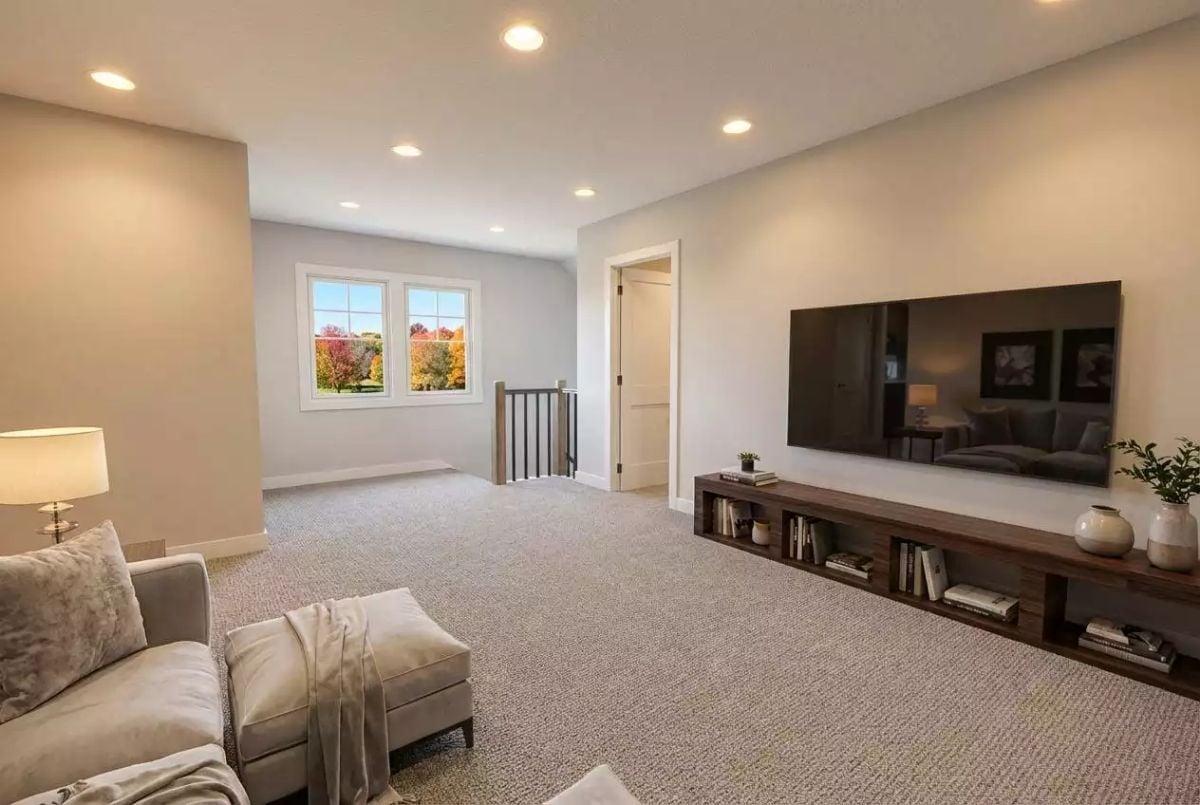
A floating TV shelf keeps cords off the floor, carpet softens what is clearly a space built for movie nights, and the fall color coming through the window is doing its part. No overthinking required up here.
Pin It
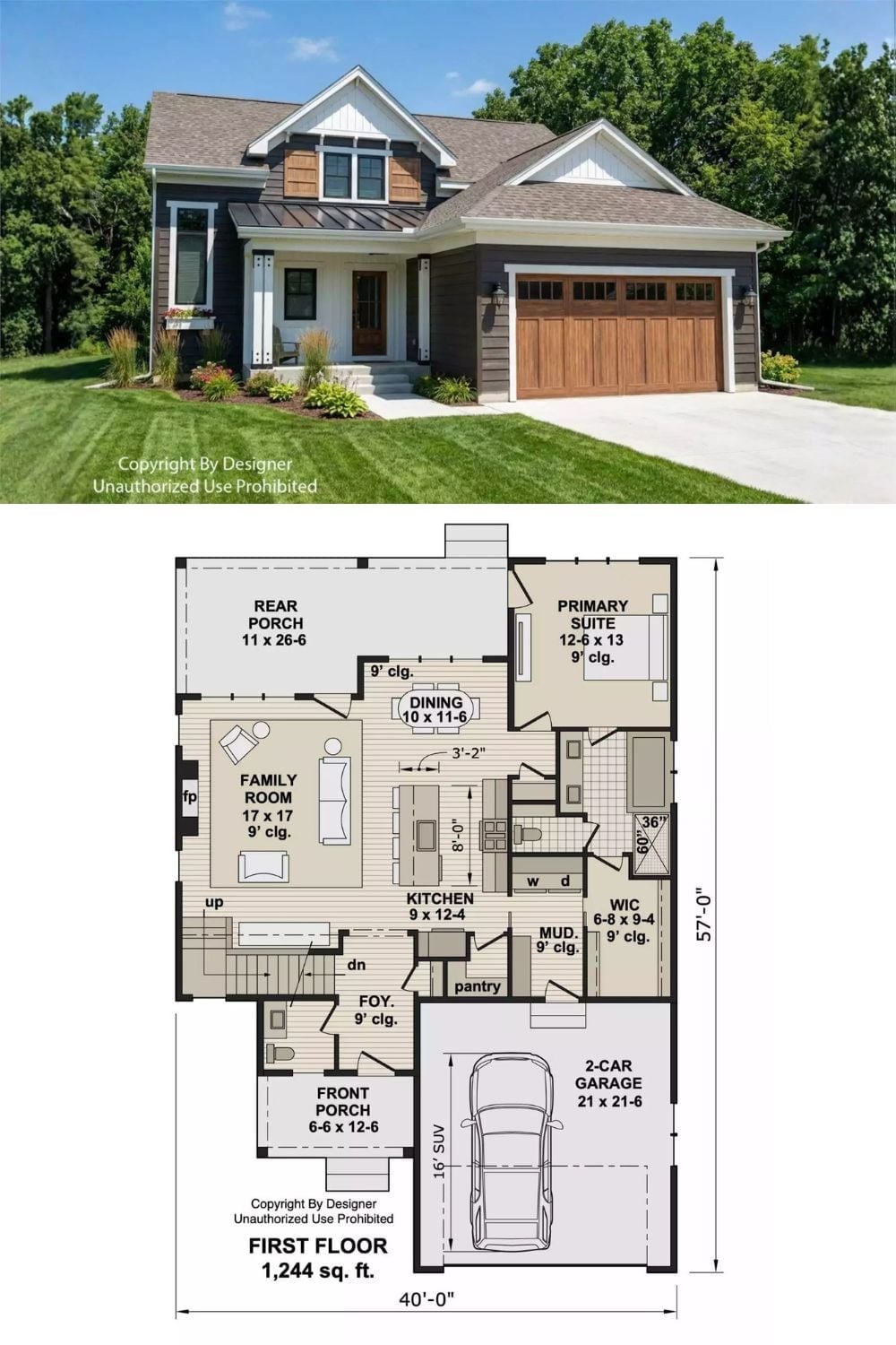
The exterior shot shows dark siding with cedar accents and the covered front porch in full. Below it, the first-floor plan lays out the main-floor primary suite, open kitchen, and two-car garage across 1,244 square feet.
