
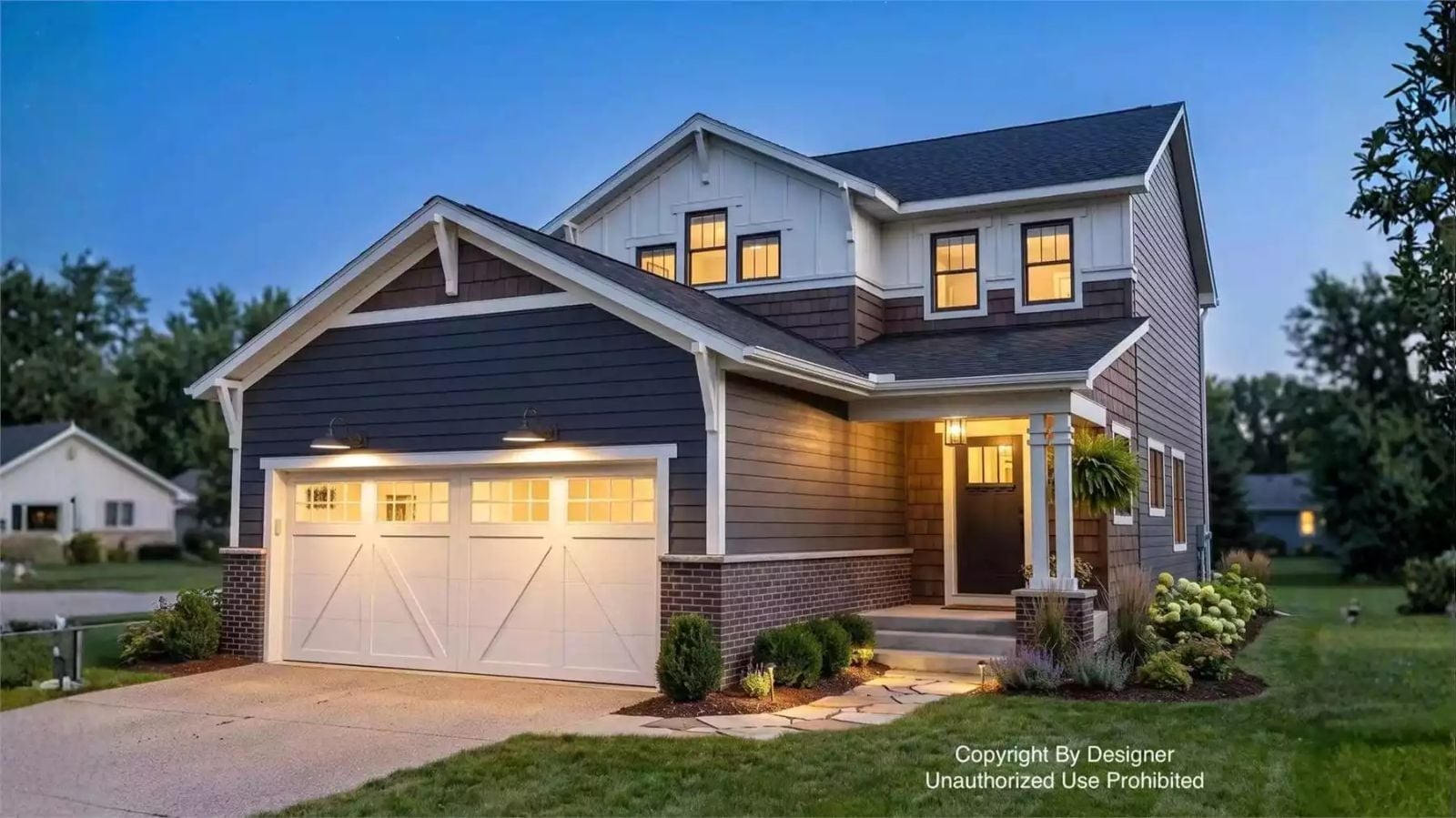
The Clarendon Row is built around the moments families actually share — kids at the kitchen island while dinner comes together, someone calling down from the loft, a Saturday morning where nobody has anywhere to be yet. An open main floor, an upstairs loft that keeps older kids close without crowding the adults, and a modern farmhouse layout that makes staying home feel like the obvious choice.
Specifications
- Sq. Ft.: 1,978
- Bedrooms: 4
- Bathrooms: 3.5
Floor Plan – Main Floor
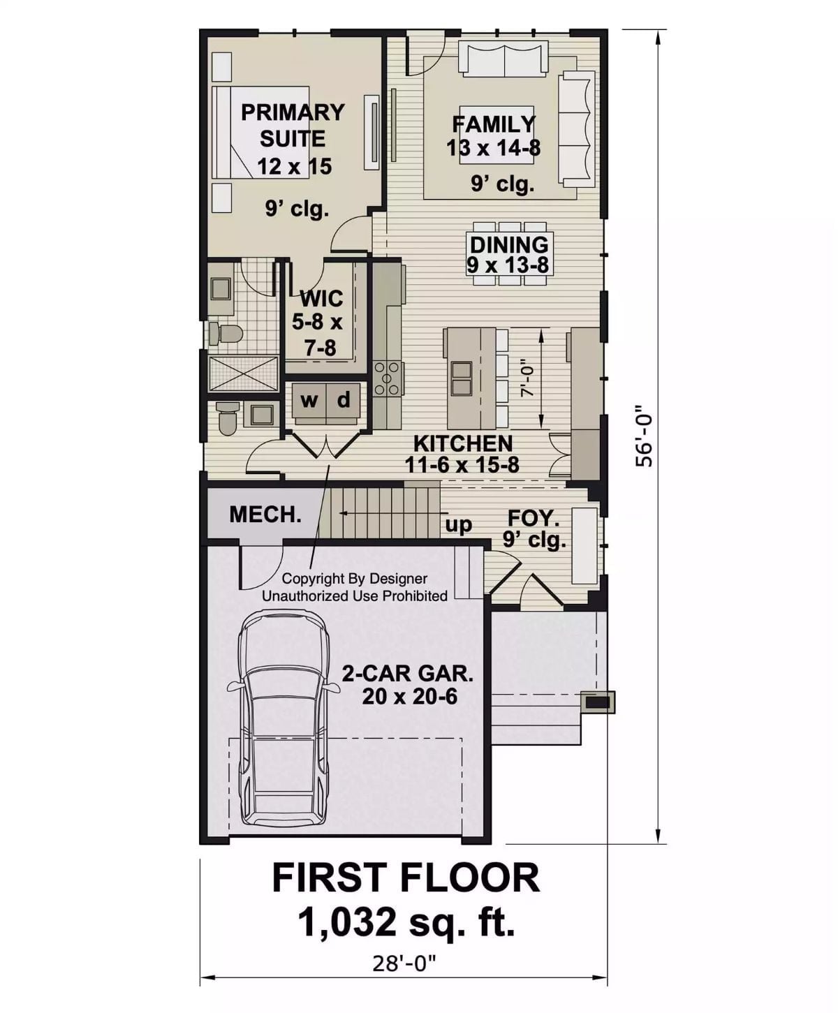
First floor shows primary suite, open kitchen-dining-family zone, garage, and stair access up.
Floor Plan – Second Floor
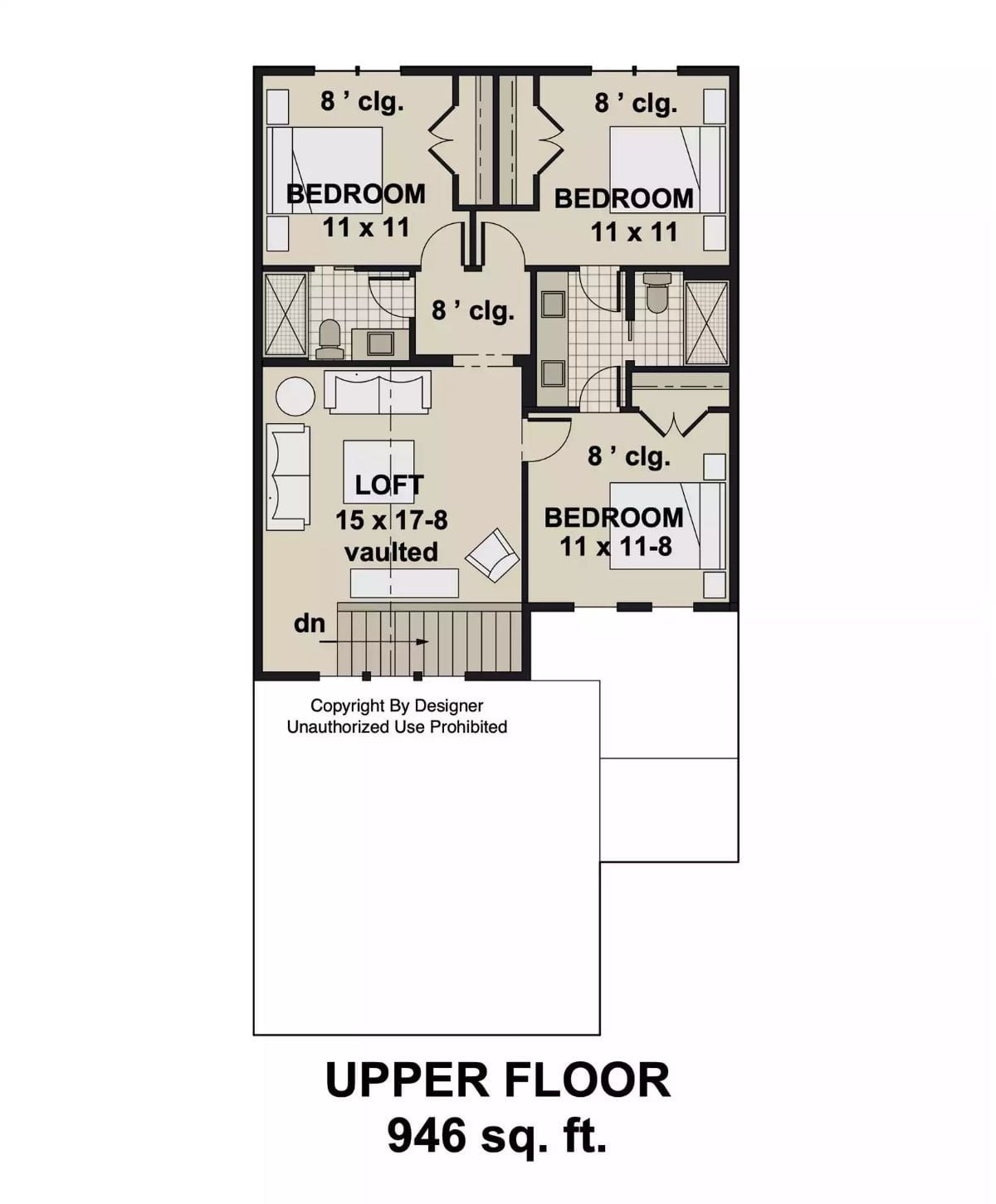
Three bedrooms cluster around a shared bath at the top of the stairs, each with an 8-foot ceiling and its own closet. The loft is the real surprise — 15 x 17-8 with a vaulted ceiling, wide enough to function as a genuine second living space rather than a glorified hallway. For busy households, that extra room upstairs does a lot of quiet work.
Dark Island, White Everything Else — Classic Black-and-White Kitchen Done Right
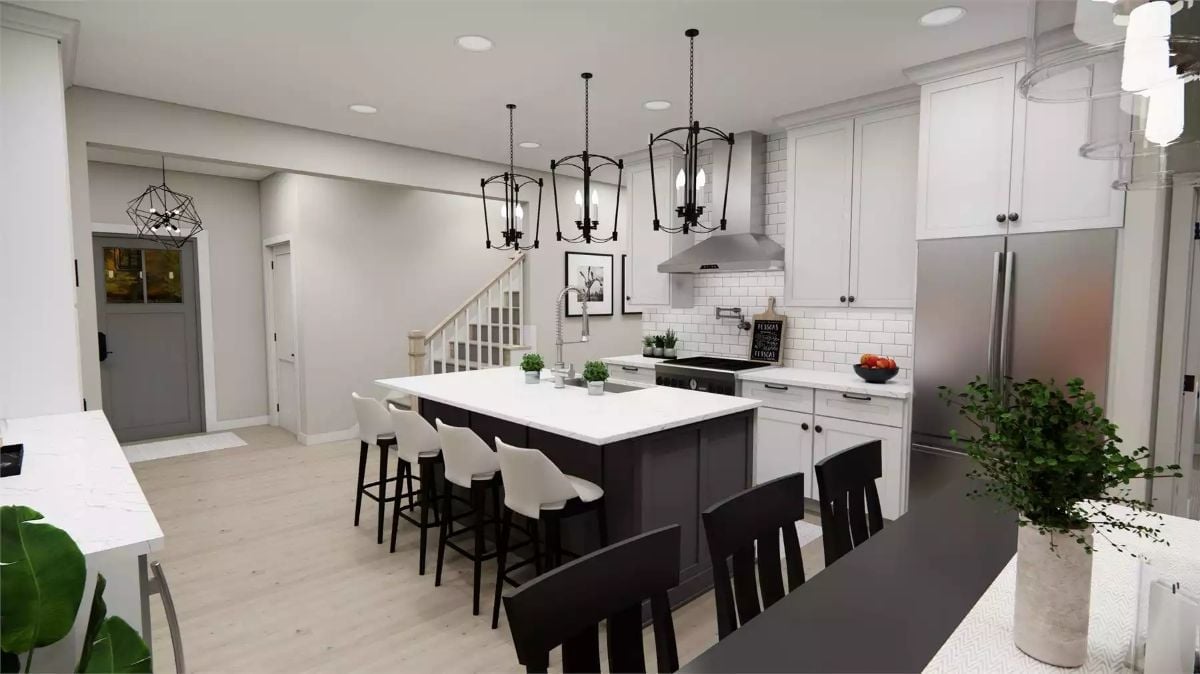
Two lantern-style pendants hang over a dark-based island with white countertop and four white barstools, and subway tile runs the full backsplash behind the range hood. The contrast is deliberate and it pays off — one dark anchor in a room that’s otherwise all white keeps the whole kitchen from going flat.
Two lantern-style pendants hang over a dark-based island with white countertop and four white barstools.
Black-and-White Living Room That Keeps Its Nerve All the Way Through
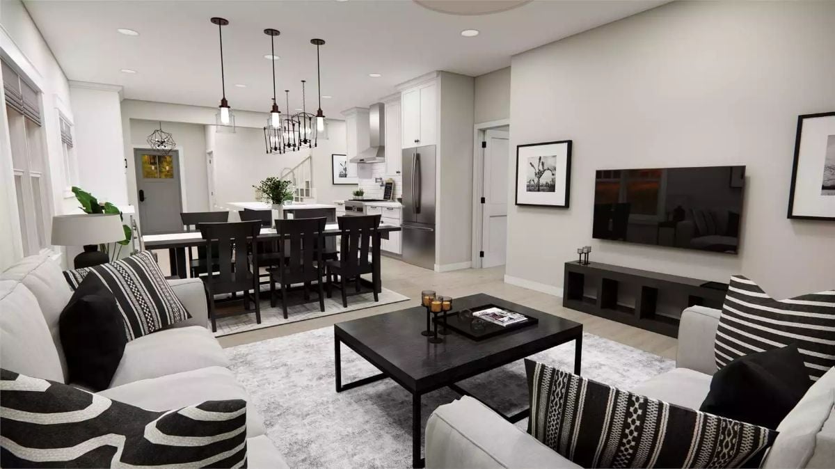
Gray sofas anchor the space while black-framed artwork, a dark coffee table, and graphic throw pillows hold the palette together without any single piece having to work too hard. Because the plan is open, the dining area and kitchen pull into the same sightline — which means the color discipline has to carry across the whole floor, not just the seating area. It does.
History Corner: Black and white interiors gained widespread popularity in the 1920s alongside the Art Deco movement, which favored bold contrast over ornamental color. The look fell out of fashion mid-century but came back hard in the 2010s as homeowners gravitated toward cleaner, more graphic palettes. Today it’s one of the few color schemes that reads as both contemporary and timeless without much effort.
Charcoal Bed Frame, Three Black-and-White Prints — Bedroom That Earns Its Calm
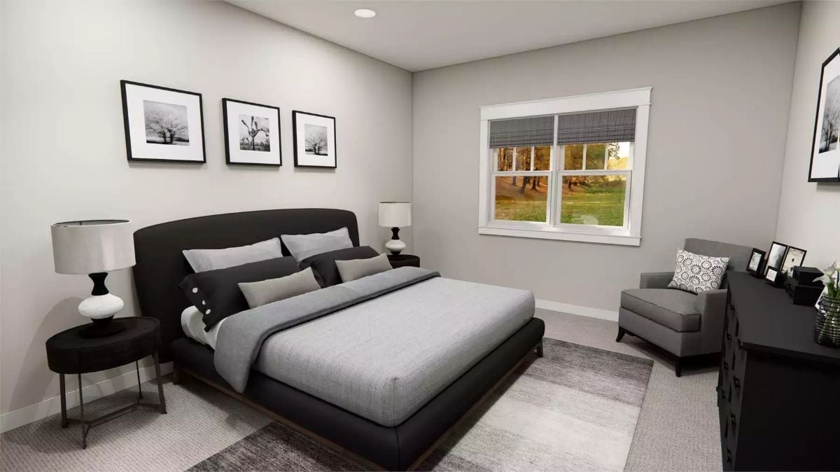
Matte black nightstands anchor both sides of a low-profile upholstered bed, and three nature photographs carry the monochrome palette up the wall. Nothing in this room is competing for attention. That’s the whole point.
Fun Fact: Darker bedroom furniture became popular in modern design partly as a pushback against the all-white bedroom trend, which many designers felt read as sterile rather than restful. Black frames and dark upholstery absorb visual noise, letting the eye settle instead of scan the room looking for something to land on.
Marble Countertop, Matte Black Fixtures — Bathroom That Knows What It’s Doing
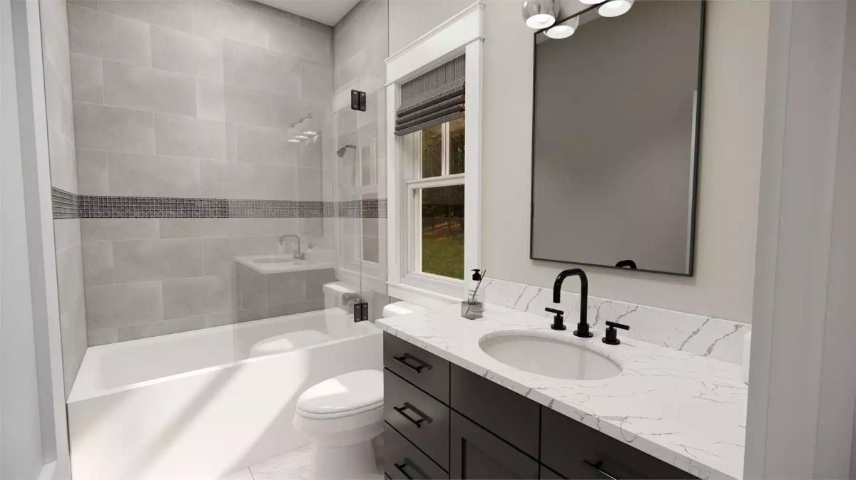
A quartz countertop with bold veining pairs with dark cabinetry and matte black faucet hardware — high contrast, no clutter. The tub surround picks up a mosaic accent strip mid-wall, and frameless glass keeps the shower feeling open without adding visual weight to a room that already has a lot going on.
Try This: Pairing dark cabinet hardware with light stone countertops is one of the easiest ways to add contrast without repainting. Buy pulls and faucets as a matching set so the finish stays consistent across the whole vanity — mixing matte black with brushed nickel by accident is the kind of thing you stop noticing until a guest points it out.
Craftsman Door, Geometric Chandelier — Entryway That Sets the Tone Early
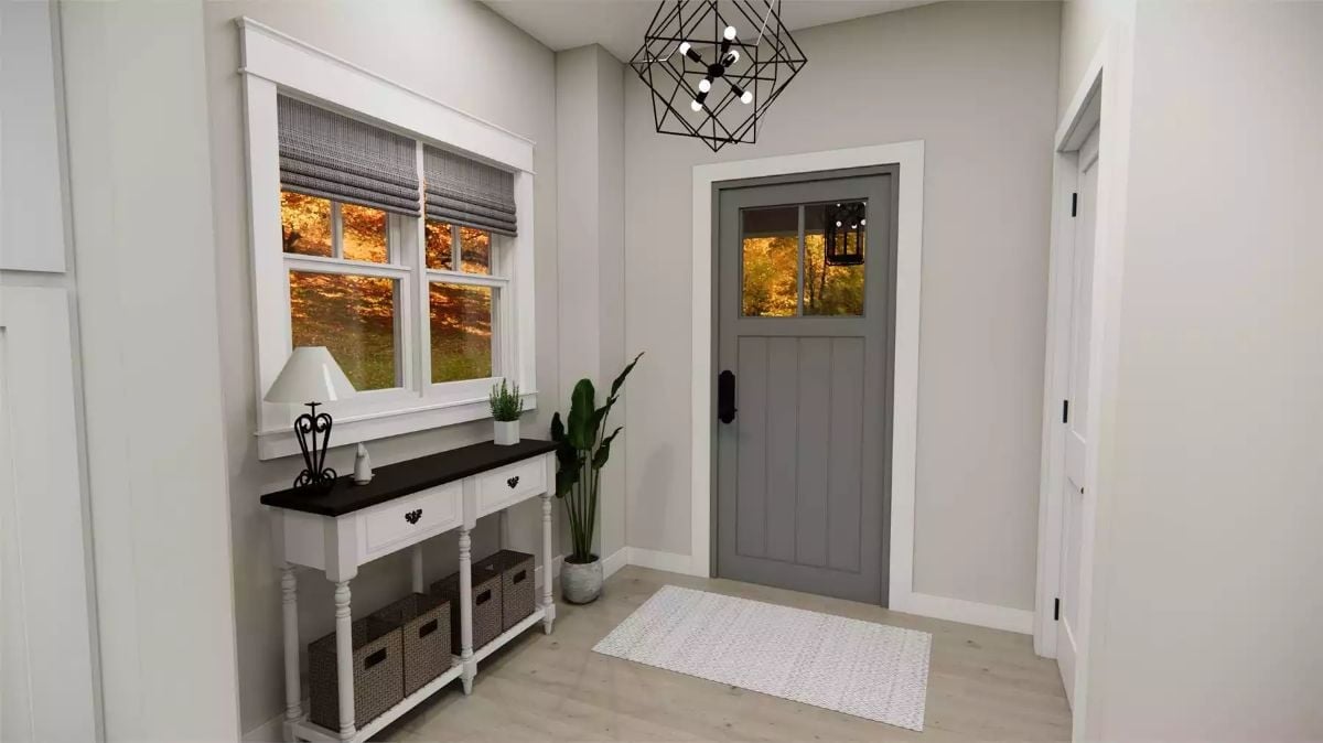
Roman shades in woven fabric take the edge off what could’ve been a stark entry. The console table does quiet contrast work — dark wood top, white painted legs — and the geometric pendant is bold enough to register without competing with the Craftsman door behind it. Good entryways do a lot with a little. This one does.
Common Mistake: Entryway rugs are almost always sized too small, leaving a gap between the rug edge and the door that makes the whole space feel unfinished. Go larger than instinct suggests. A rug that extends well past the door swing anchors the entry and gives guests somewhere to actually land.
Upstairs Loft With a Railing View and Somewhere to Actually Sit
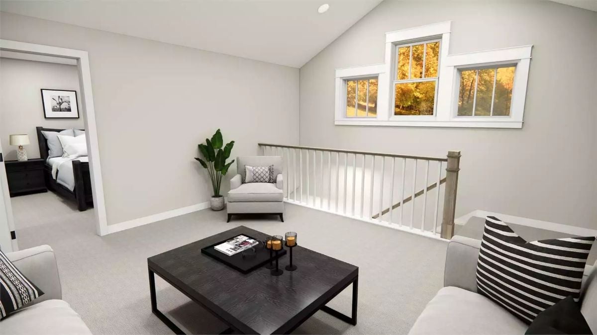
The vaulted ceiling keeps this from feeling like leftover square footage, which is the main thing a loft has to avoid. Light carpet, neutral walls, a dark coffee table — nothing fancy, but the open railing is what makes it: you can hear the house from up here without being in the middle of it. That distinction matters more than it sounds.
Pin It
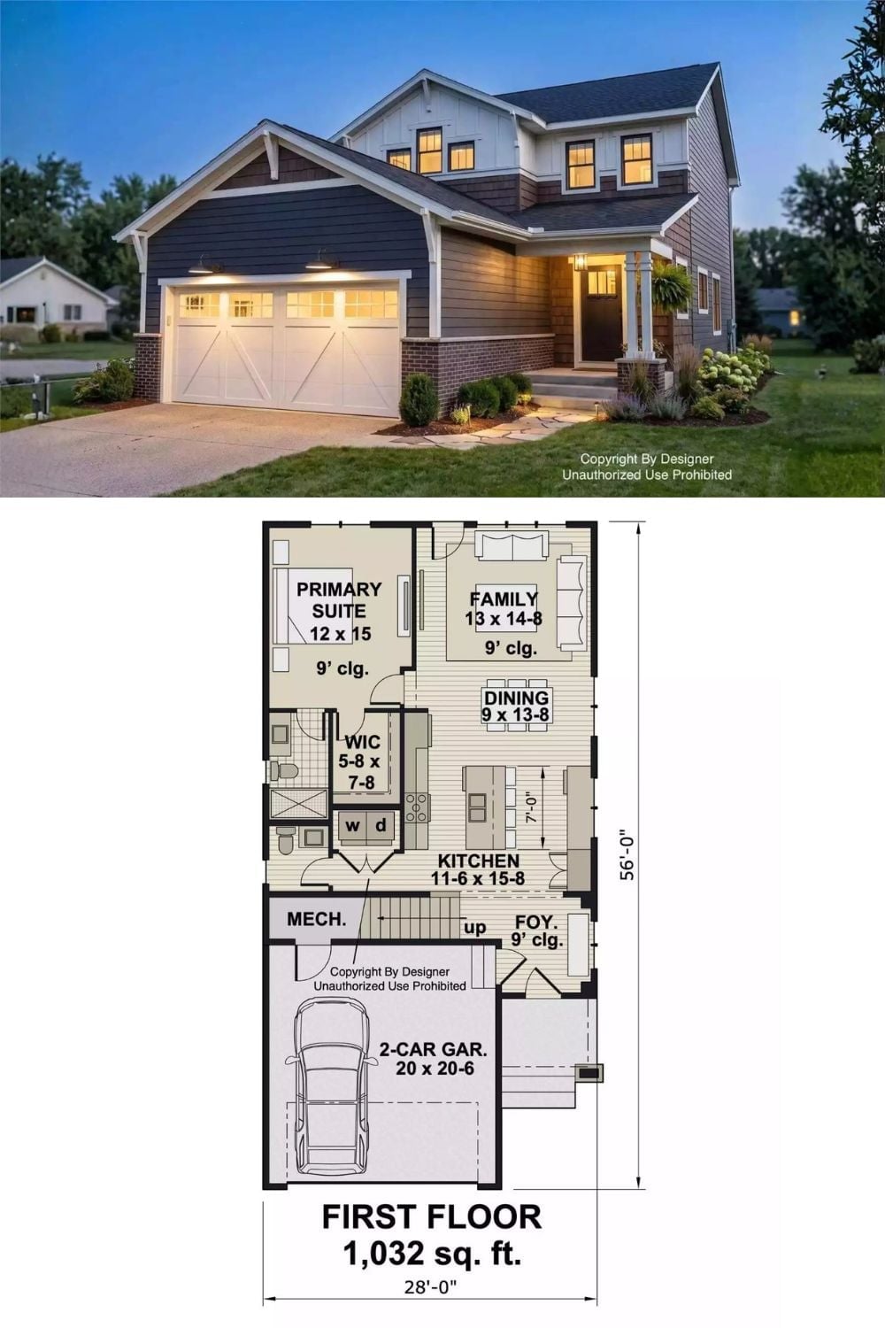
Exterior photo shows a Craftsman-style two-story with board-and-batten siding and a covered porch. Below it, the first floor plan lays out 1,032 square feet including a primary suite, open kitchen and dining, family room, and two-car garage.
