

When does a family gathering stop fitting the house it started in? The Clairemont is built around exactly that tipping point: a main-floor primary suite that keeps parents close without disappearing upstairs, a kitchen sized for two ovens and twelve opinions, a dining room that earns its leaf extensions every November, and a balcony where someone always slips away with a glass of wine when the noise peaks.
Specifications
- Sq. Ft.: 4,094
- Bedrooms: 5
- Bathrooms: 4.5
Floor Plan – Main Floor
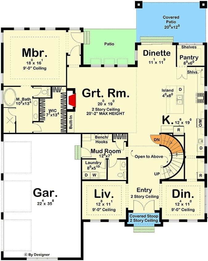
The primary suite sits off the great room on the main floor, well away from the churn of the front entry. A curved staircase anchors the hall, and the kitchen, dinette, and covered patio connect in a sequence that actually makes sense for hosting. Mud room and laundry are tucked between the garage and the living areas — where they belong.
Floor Plan – Second Floor
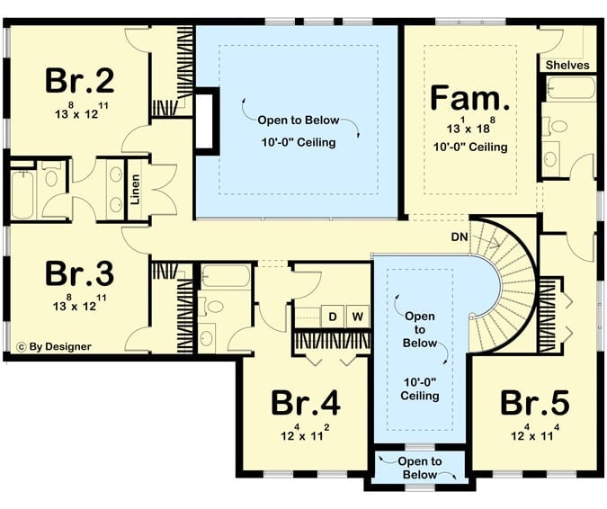
Four bedrooms and a loft fill the upper floor, with dual staircases, dedicated laundry, and 10-foot ceilings throughout.
Checkered Marble Runner Meets Herringbone Wood in a Two-Story Entry That Means Business
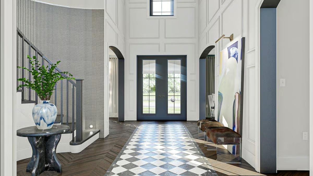
Diagonal marble tile cuts through dark herringbone hardwood, and it should not work as well as it does. A blue-and-white ceramic vase lands on a sculptural marble table across from an acrylic-legged bench tucked beneath abstract art — two pieces that buy the entry some breathing room without softening its posture.
Common Mistake: Two bold floor patterns can absolutely share a space, but only if one of them knows its lane. The checkered runner works here because it’s contained to a defined path with clear edges on both sides. Let competing patterns bleed into each other without a hard boundary and one will visually swallow the other — usually the one you spent more money on.
Forest Green Paneling and a Grand Piano Make This Music Room Unapologetically Serious
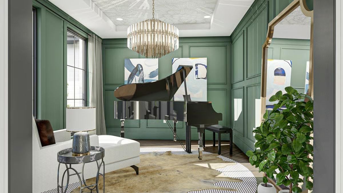
Sage-painted wainscoting runs floor to ceiling on every wall, giving the room a depth that plain paint simply can’t replicate. A gold chandelier catches light above the lacquered grand piano, abstract canvases break up the geometry without competing with it, and a cowhide rug grounds the seating without making a production of it.
Trend Alert: Deeply saturated wall paneling is having a serious moment in dedicated music and sitting rooms. Designers are favoring full-height panel treatments over chair-rail splits because they read as architectural rather than decorative — a meaningful distinction. If you’re painting paneling a dark hue, matte or eggshell keeps the grain texture visible without picking up glare from overhead fixtures.
Green Marble and Ghost Chairs Prove a Dining Room Can Go Bold Without Going Loud
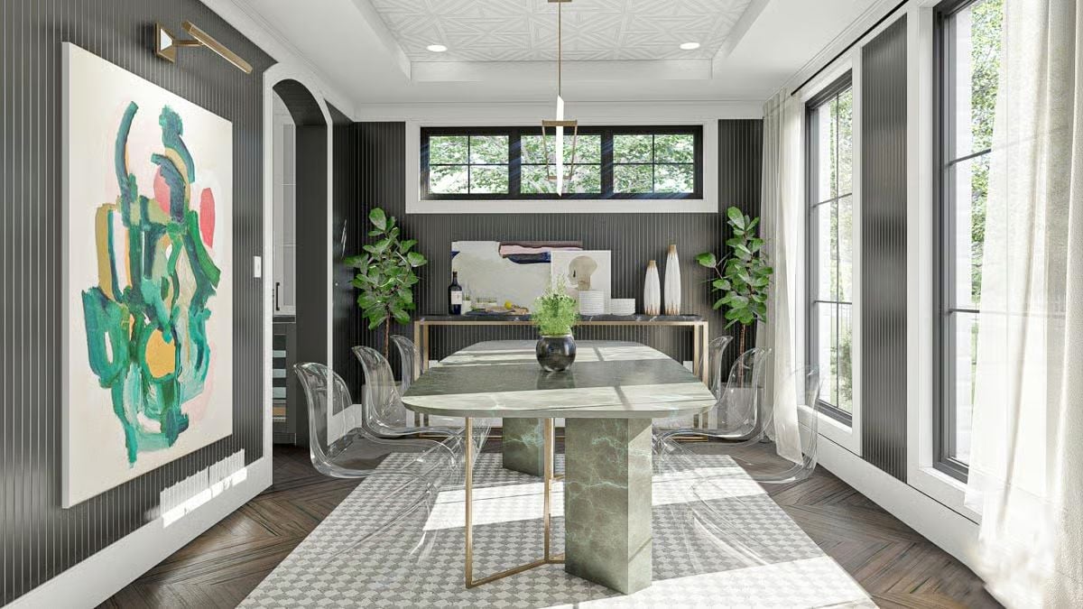
Transparent acrylic chairs pull a smart trick: they let the green marble table own the room without crowding it visually. Dark fluted wall panels recede into the background and keep all the visual weight exactly where it belongs — on that slab.
- Acrylic chairs reduce visual mass without sacrificing seating capacity
- A single centered pendant keeps sightlines clear to the art and back console
- Fluted panels add texture that reads as depth, not color, so bolder furniture stays prominent
Gold Legs, Blue Velvet, and a Fireplace That Actually Gets Used
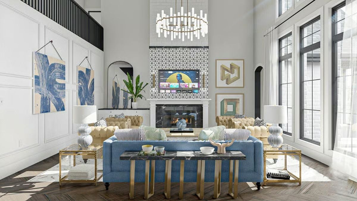
Tufted gold Chesterfields anchor the seating arrangement while a blue sofa pulls the eye forward. That patterned tile surround above the fireplace earns its drama — it’s the kind of detail that could easily tip into busy but lands just right against the quieter furnishings flanking it. Layered art, brass-framed tables, and a sculptural chandelier give the room plenty to look at without tipping into clutter.
Fun Fact: Chesterfield sofas have been in continuous production since the 18th century, originally commissioned for English gentlemen’s clubs where deep button tufting kept fabric from bunching during long evenings of sitting. Pairing them with modern brass furniture, as done here, is one of the more historically grounded ways to mix old and new in a living room — the silhouette is assertive enough to hold its own against contemporary pieces without looking like it wandered in from a period drama.
Brass Pendants and Navy Barstools Pull This White Kitchen Away From Safe
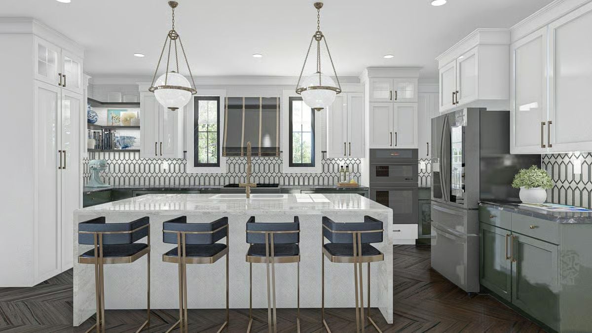
Warm brass hardware does real work here, threading through the pendant chains, barstool frames, and cabinet pulls so the whole kitchen reads as considered rather than assembled. Four navy-upholstered barstools push back against the white-and-marble island without fighting it. The geometric tile backsplash and herringbone floor layer in pattern without adding more color to manage. Sage lower cabinets keep the whole thing from feeling like a showroom.
Style Math: White uppers with a contrasting lower cabinet color is one of the more practical ways to add visual interest without committing to a full colorblock kitchen. Sage and hunter greens have been outlasting navy in cabinetry trends, partly because they read as neutral-adjacent in natural light rather than making a statement that ages. Brass hardware is the quietest way to tie both cabinet colors together without forcing them to match.
Sputnik Chandelier and Cowhide Rug Keep This Bedroom from Playing It Too Safe
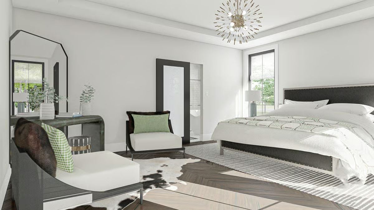
Dark nailhead upholstery on the bed frame anchors the room without heaviness. Two rugs layer underneath — a striped runner near the bed, a cowhide in front of the chaise — and green plaid pillows handle the color work without overcrowding the palette.
Why the Double-Rug Treatment Actually Works Here
Laying a cowhide over herringbone hardwood grounds a seating area without requiring a conventional area rug to carry the whole room. The irregular shape of the hide is actually the point: it keeps things from feeling too composed. It also holds the chaise lounge in place visually, giving that corner a reason to exist beyond overflow seating when the in-laws arrive.
Pin It
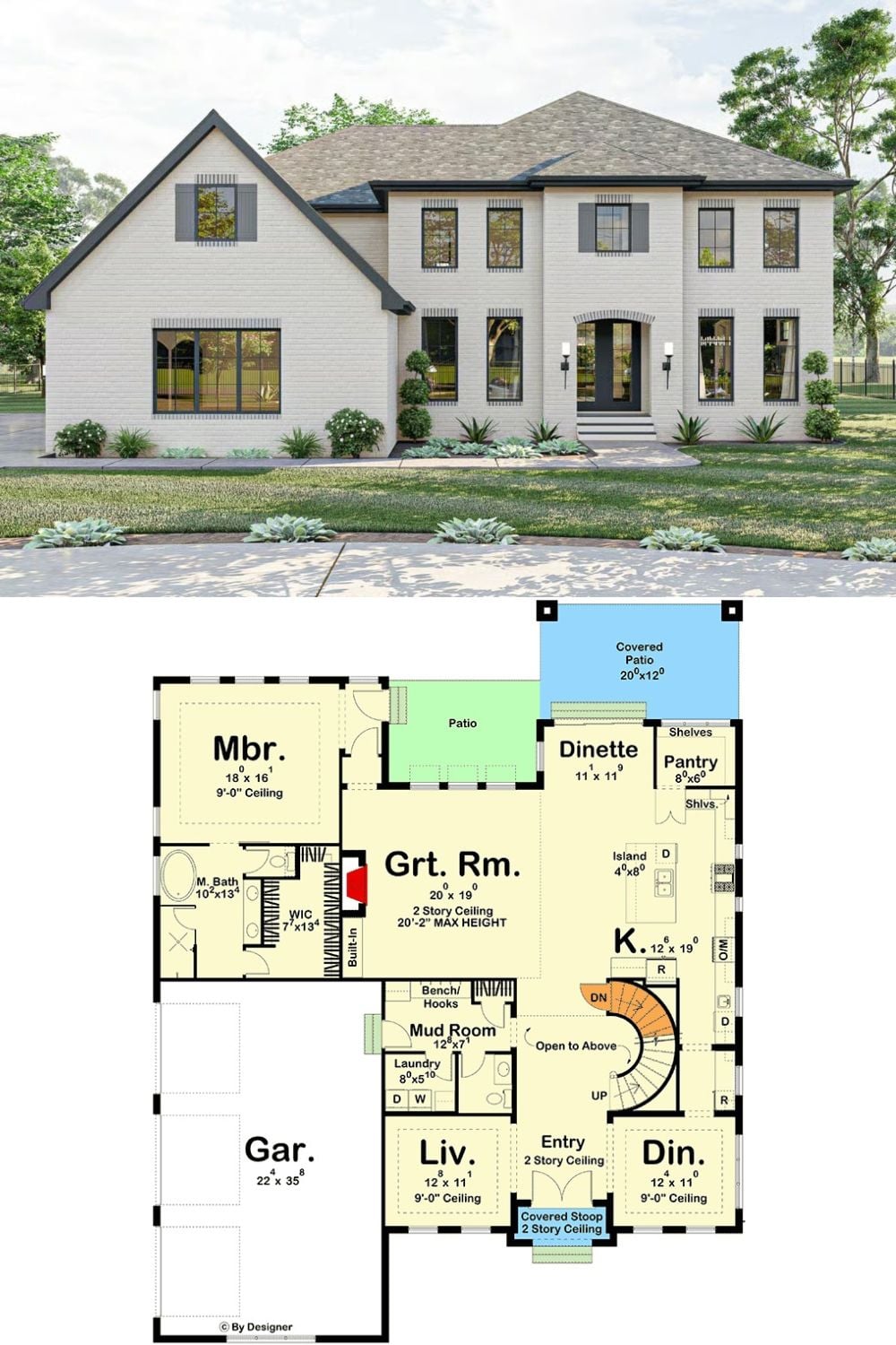
The exterior rendering shows a two-story white brick Colonial with black shutters. Below it, the first-floor plan lays out the main-floor primary suite, two-story great room, open kitchen, and three-car garage in a configuration that makes the whole hosting argument self-evident.
Try This: A main-floor primary suite is often framed as a resale or aging-in-place feature, but the real payoff is immediate — parents get separation from the kids’ rooms upstairs without giving up square footage on either level. More families are requesting this layout specifically because it changes how the house functions on an ordinary Tuesday, not just at resale.
