🔥 Would you like to save this?
The Christmas tree in your living room was never supposed to look like the one in a department store window.
In order to come up with the very specific design ideas, we create most designs with the assistance of state-of-the-art AI interior design software. Also, assume links that take you off the site are affiliate links such as links to Amazon. this means we may earn a commission if you buy something.
For generations, trees were gloriously inconsistent collections of whatever families loved, made, inherited and kept. Then somewhere along the way, “beautiful” started meaning coordinated—and a Christmas tradition quietly acquired a shopping list.
18. The Coordinated Tree Was Invented in a Department Store Window, Not a Family Living Room
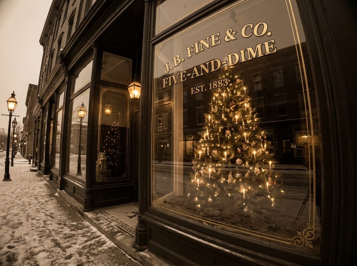
Autumn 1880. A German traveling salesman walks into Frank Woolworth’s five-and-dime in Lancaster, Pennsylvania, carrying glass baubles. Woolworth turns him down. He tells the man Americans won’t waste money on ornaments because they don’t do anything. Source
He caved and bought a single case of 144, on sale-or-return terms so he’d owe nothing if they flopped. Source They sold out in a day.
That’s the origin of the American ornament market. Not a family. A skeptical retailer hedging his bets on consignment.
Here’s the part nobody tells you. The idea that a tree should read as one clean, coordinated statement didn’t come from grandma’s parlor either. It came from the shop window. Macy’s had been staging Christmas windows in New York since 1874, and by the 1880s every department store in the country was copying the format: a single controlled scene, engineered from the sidewalk to stop you cold and pull you inside. Source
A window has to work from twenty feet away through glass. So it gets one palette, one repeated shape, one idea. That’s not decorating. That’s merchandising. A living room isn’t a window, and you don’t need to sell yourself anything when you walk into it.
The coordinated tree was a sales tool that got mistaken for taste. Once you see it as a display technique, the pressure to match everything starts to look less like good breeding and more like something you absorbed from a storefront you walked past as a kid.
17. The Real Receipt: What a By-the-Book Tree Actually Costs You Every Year

Do the arithmetic once and you’ll never look at a themed tree the same way. A 7-foot tree dressed to decorator standards wants a couple hundred filler ornaments plus a handful of statement pieces, every last one locked to two colors and a single metal. That’s not a tree. That’s a bulk order with lights on it.
Then it expires. Champagne and gold ruled one December, and by the next the magazines have anointed emerald and copper, so the set you matched so carefully now reads as a color that already had its turn.
So you restock. The rule doesn’t charge you once — it charges you on a loop, and the industry has quietly set that loop to reset every couple of seasons.
The bigger cost never shows up on the receipt, though.
There’s a box in your attic. The macaroni angel from 2011. Your grandmother’s mercury glass, gone soft and silver at the edges. A ceramic reindeer with a chipped ear from a trip you still bring up at dinner. The one-palette rule looks at all of it and, ever so gently, says none of this matches. Leave it in the box.
And you do. You trade the reindeer for eighteen matte spheres in this year’s approved neutral — boxed, identical, forgettable.
Here’s what nobody prices in. A themed tree looks expensive and remembers nothing. It could belong to anyone, could belong to a bank lobby with a revolving door. The tree you actually love is the one no store could rebuild, because half of it was never for sale in the first place.
16. Why Your Brain Actually Prefers the Cluttered Tree, the Psychology of the Attachment Ornament

Here’s the part the ornament catalogs never mention. The mismatched tree, the one holding a lopsided salt-dough star from 2003 next to a hotel-gift-shop bauble, does something to your brain that a color-coordinated tree physically cannot.
It’s called nostalgia, and psychologists stopped treating it as a weakness a while ago. Research has established that Source nostalgia reliably delivers a sense of meaning in life, self-continuity, and social connectedness, and that it buffers you against loss and adversity. A 2022 study across U.S. and Chinese samples found the mechanism runs through authenticity, a felt alignment with your true self. Source
A single ornament your kid made can trigger all of that. A glass ball from a 24-pack triggers none of it.
Now the sneaky part. There’s a body of aesthetics research on “processing fluency,” the idea that we like things our brains glide over easily. A matchy tree is fluent. Easy. It gives a quick gut-level hit of pleasure and then your eye slides right off.
But researchers found that the harder-to-process, complex, slightly disfluent object is the one that generates interest rather than a passing pleasure. Source Interest is what makes you stop and stay.
So the tree that experts told you was too busy is the one doing the emotional heavy lifting. The pretty one photographs better. The messy one is the one you’ll cry a little in front of come January.
15. How to Break the One-Color Rule Without Ending Up With a Yard-Sale Tree
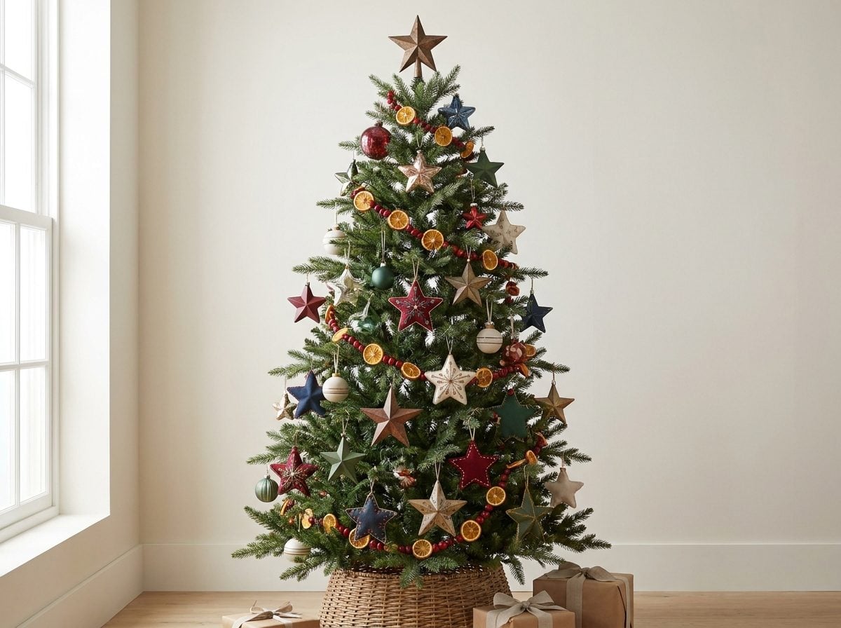
The line between a collected tree and a chaotic one isn’t the number of colors. It’s whether anything repeats.
Designers have a term for this: the rule of three. Pick three shades that show up over and over, then let everything else be a guest. A tree can hold cranberry red, deep gold, and forest green in twelve different textures and still read as one thought, because your eye keeps landing on the same three notes as it travels down the branches.
Repetition is the whole trick. A single mercury-glass ball looks like a mistake. Nine of them scattered top to bottom look like a decision. Same with ribbon, same with matte finishes, same with a scrap of tartan you cut into bows.
Vary the finish, not the palette. Matte, glossy, and glittered versions of the same red do more visual work than eight unrelated colors ever could. That contrast is why a tree looks expensive without a single new ornament.
Now the yard-sale trap. The tree goes wrong when every ornament is the same size, the same distance apart, and floating on the outer inch of the branches. Push a few deep into the interior. Let light fall behind them. Depth is the difference between a display and a wall of stuff.
And keep the sentimental ones. The lopsided clay reindeer from 2004 belongs on the tree. Cluster it near two or three ornaments that share its color and it stops looking like an orphan and starts looking intentional. Nobody remembers the perfectly coordinated tree. They remember the one with the reindeer.
14. The Coordinated Tree Belongs to a Whole Family of Trends Sold as Taste
Here’s the trick, and once you see it you can’t unsee it. An industry finds a habit people already have, ties it to a feeling, then tells you there’s a right and a wrong way to do it. The right way, conveniently, costs money.
You already know the most famous version. The diamond engagement ring. In 1938 a De Beers rep wrote to the ad agency N.W. Ayer asking whether propaganda could juice a sagging market. Source A copywriter named Frances Gerety scribbled “A Diamond Is Forever” late one night in 1947, and a preference became a law. Source
In 1940, only about 10 percent of American brides got a diamond ring. By 1990 it was 80 percent. Source Nobody legislated that. An agency in Philadelphia did it with pictures of movie stars.
Cereal did the same thing to your mornings. Before Kellogg, Americans ate leftovers and beefsteak for breakfast. Source Then a health-spa doctor in Michigan turned moldy wheat dough into corn flakes and marketing turned corn flakes into the definition of breakfast itself.
The coordinated Christmas tree is the exact same move at a smaller scale. Somebody noticed you decorate every December, attached the word taste to a matching red-and-gold set, and sold you the upgrade every year. Same trick as the diamond. Same trick as the flakes. Just wearing tinsel.
Once you spot the shape, the whole category loses its power over you. A single-hue tree isn’t tradition. It’s an ad that got old enough to feel like one.
13. There’s a Difference Between Visual Harmony and Visual Uniformity
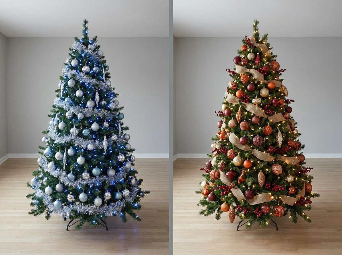
Here’s the thing catalog styling got backwards. A tree that’s all silver and blue isn’t harmonious. It’s just matched. Those are different words for a reason.
Harmony is what happens when a bunch of different things share something in common. Uniformity is when they’re the same thing repeated. Your eye reads them completely differently, and it reads uniformity as commercial.
Think about the trees you actually remember. The ones with the macaroni angel your kid made in 2009, the glass bird from your grandmother, the ticket stub tucked into a branch. Those trees have thirty different colors on them and they still feel whole. What holds them together isn’t a color palette. It’s warmth, repetition of a metal, the glow of the same lights, a rhythm you can’t quite name.
The trick, when there is one, is a thread. Not a scheme. Pick a single element that shows up everywhere and let everything else run wild. Maybe every ornament has a little gold on it somewhere. Maybe it’s all matte, no shine. Maybe warm-white lights tie forty mismatched baubles into one thing. That’s your harmony. The rest is allowed to be chaos.
Designers know this instinctively about rooms. Nobody tells you to buy a sofa, rug, lamp, and art all in the identical shade of greige, because you’d walk in and feel like you were standing inside a furniture showroom nobody told had closed. A room needs contrast to feel alive. So does a tree.
The all-one-color tree solved a photography problem in 1955. It was never solving a beauty problem. Uniformity photographs clean. Harmony feels like a home. You get to choose which one you’re decorating for.
12. Seasonal Color Trends Turn Christmas Decorations Into Fashion
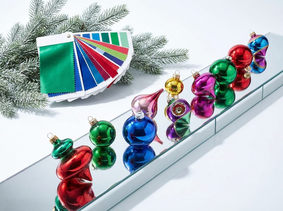
Every December, Pantone hands the holiday industry a new marching order. Source In 2022 it was Very Peri, a periwinkle purple. In 2025 it was Mocha Mousse, a warm brown that decorators immediately started spray-painting onto pinecones and clear baubles. By 2026, the story had already flipped to Cloud Dancer, a soft white, with Transformative Teal riding shotgun.
Notice the rhythm. It’s the exact cadence of a fashion season.
That’s not an accident. Pantone doesn’t just name a color anymore. Its people work in marketing and trend forecasting, building downloadable palettes with Adobe so designers everywhere land on the same shades at the same time. Source The color “of the year” is a coordination tool. It gets everyone selling the same thing in the same window, which is why your tree suddenly feels dated the moment the calendar turns.
Here’s the part they’d rather you not connect. Wholesale suppliers openly coach retailers to bundle products by color story: build a “White & Gold Christmas” landing page, a “Teal Winter” collection, sell the complete look instead of the single ornament. Source Their own words: it increases average order value and helps customers buy the whole scheme. That’s the mechanism. A color scheme isn’t a design principle. It’s a shopping cart with a theme.
And the machine runs on replacement. In the US, roughly 78% of households decorate, and around half buy new items every single year just to update their setup. Source That’s a $9-plus billion global business fed by people quietly convinced last year’s tree needs fixing. Source
The clothes-versus-costume distinction applies here too. Fashion trends expire on purpose. Your grandmother’s mismatched ornaments never did.
11. Repetition Creates Cohesion Even When the Colors Don’t Match

Here’s the secret the ornament-set marketers hoped you’d never figure out: your tree doesn’t need one color to look intentional. It needs one repeated thing. Repetition is the actual load-bearing wall of a good-looking tree, not matching.
Designers have known this forever. (Source) Source That’s the whole trick. Scatter mismatched vintage glass, hand-me-down felt birds, and a kid’s popsicle-stick reindeer across the branches, then repeat one small note (say, brass, or a specific matte red, or a single ribbon) enough times that the eye clocks the rhythm. Suddenly the chaos reads as a collection instead of an accident.
You’ve watched this work in the wild without naming it. (Source) Source Same principle, moved from the gallery wall to the fir branch.
The reframe that costs the ornament industry money: matching is the lazy version of cohesion. Anyone can buy a 60-piece set in one color and call it done. Repeating a thread through a decade of collected, gifted, and slightly ugly ornaments takes an actual eye, and it looks like a life instead of a store display.
So keep the popsicle reindeer. Keep grandma’s tarnished glass. Just find your one repeated note and let it run the length of the tree. That’s the only rule that was ever real.
The rest was packaging.
10. Warm White Lights Can Visually Unify Almost Any Collection of Ornaments

Here’s the trick nobody selling you a coordinated ornament set wants you to know. You don’t need the ornaments to match. You need the light to match.
Warm white lights sit around 2,700 to 3,000 Kelvin, which is the golden, candle-adjacent range that reads as cozy from across a room. Source That amber cast does something sneaky to a mismatched pile of ornaments. It pulls every color toward a common temperature, the way late-afternoon sun makes a junk-drawer garden look intentional.
The eye stops cataloging your ornaments one by one. It reads the whole tree as a single warm field of light with objects floating in it.
There’s a real reason this works, and it’s physics, not vibes. Warm light is heavy on amber wavelengths, and the human eye perceives those as softer and slightly dimmer than cool white at the same output. Source That softness sands the edges off contrast. Your neon 1990s glass ball and your kid’s macaroni angel stop fighting each other.
Cool white does the opposite. Sitting up around 5,000K and higher, it produces a crisp, bluish light that makes festive colors pop and stand apart. Source Great for a matched, modern, one-note tree. Terrible for the beautiful chaos of thirty years of ornaments.
So the whole premise of the “pick one color scheme” rule quietly collapses. You were told the ornaments have to agree with each other. They don’t. The lights just have to agree with the room.
9. Christmas Trees Weren’t Traditionally Color-Coordinated in the First Place
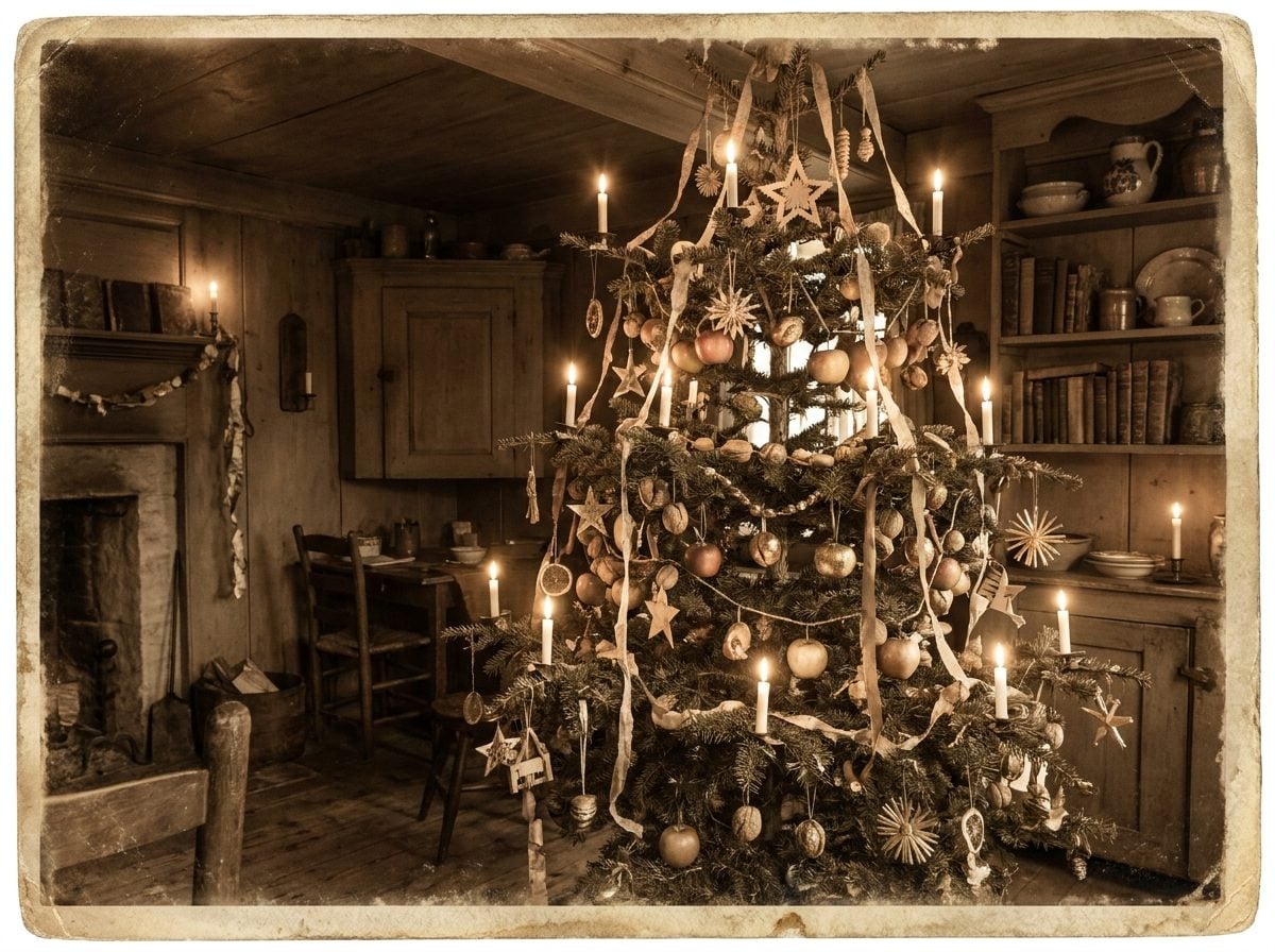
Go back far enough and the tree that started all of this was a mess. A glorious, un-coordinated mess. The oldest written record of a decorated tree, from a 1605 diary in Strasbourg, describes a fir hauled indoors and hung with paper roses, apples, wafers, nuts, and sweets. Source Nobody in that room was matching a rose to a wafer.
The pattern held for centuries. Source A tree recorded in Bremen, Germany in 1570 was decorated with apples, nuts, dates, pretzels, and paper flowers. Fruit, string, foil, whatever the pantry gave up. The look was abundance, not agreement.
In 19th-century America, the earliest trees looked less like showpieces and more like fruit stands. Source Families hung whatever was on hand: apples, popcorn strings, cranberries, paper streamers, little lace bags of treats. Then Frank Woolworth started selling German glass ornaments in his stores in 1880, and the tree slowly filled with color it never asked to justify.
Here’s the part that should reframe your whole December. The Victorians, the people who supposedly gave us the “proper” tree, decorated for the opposite of coordination. One antique collector who’s spent 14 years gathering these ornaments put the guiding principle plainly: think variety and clutter, like a Victorian parlour. Source
Variety and clutter. Not a two-tone palette. Not gold-and-white with a coordinating ribbon.
The single-scheme tree isn’t the old way returning. It’s a recent invention wearing a costume of tradition.
8. A Two-Color Palette Makes Missing Pieces More Obvious
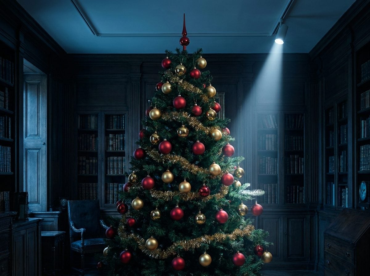
Here’s the quiet mechanic nobody at the ornament counter wants you to notice. A strict two-color tree runs on symmetry. Silver and blue, gold and red, blush and champagne. The eye reads it as a pattern, and a pattern only works when it’s complete.
So the second a glass ball shatters in January, or the dog’s tail clears the bottom branch, the gap screams. You can’t fudge it. A red-and-gold tree needs another red-and-gold ball, in that exact finish, and nothing in your bin substitutes.
That’s the trap. A matched scheme has no bench. Every ornament is a starter, and when one goes down, you’re back at the store.
A layered, mismatched tree does the opposite. Fill it with the mercury glass from your grandmother, the felt reindeer your kid made, a few thrifted brass bells, and the pattern is abundance, not precision. Lose one and the eye never registers it. There’s nothing to complete because it was never trying to match in the first place.
Retailers understand this cold. The Source figures on holiday spending climb every year, and matched-set decor is a big part of why. A collected tree grows richer as it ages. A curated one just develops holes you’re obligated to plug.
Think about the incentive for a second. The store that tells you to pick two colors is the same store that stocks those two colors in coordinated packs, every season, in slightly different shades so last year’s set won’t quite line up. The rule doesn’t protect your tree. It protects the reorder.
7. Perfectly Coordinated Store Displays Make Mixed Family Ornaments Look Messy by Comparison
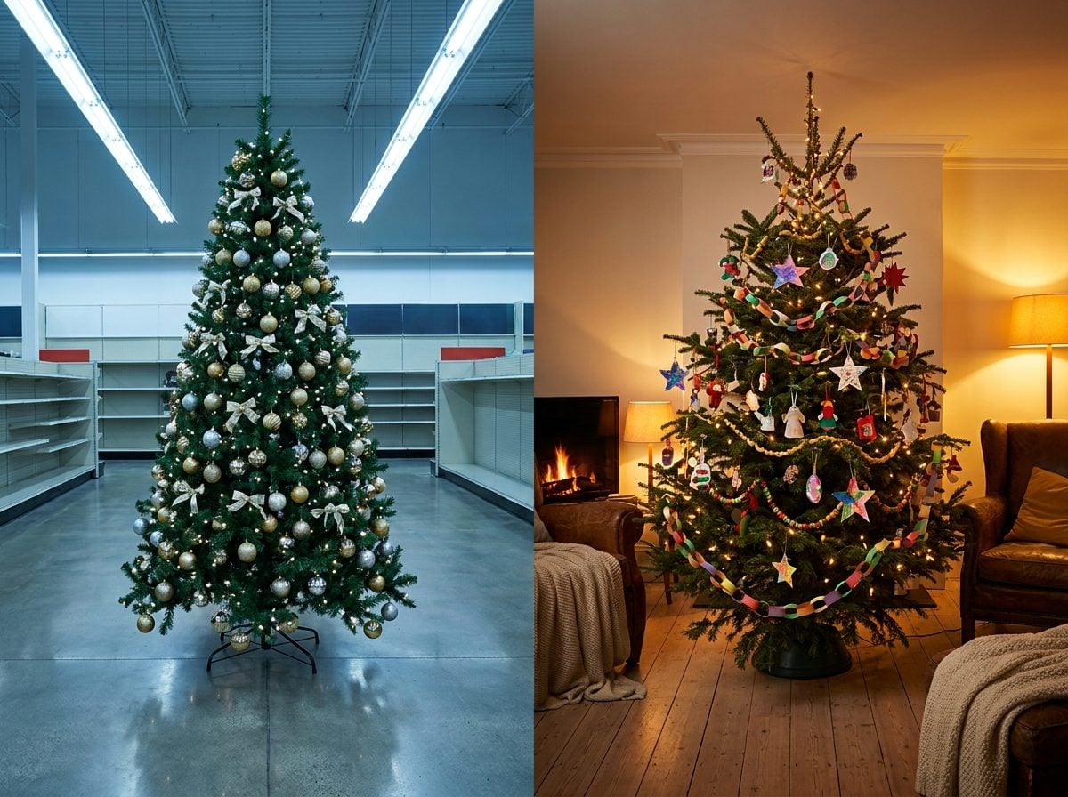
Walk into any December big-box store and you’re not looking at a Christmas tree. You’re looking at a sales floor engineered by people who study your eyeballs for a living. The blush-and-champagne tree at the end of the aisle exists to make your ragtag box of ornaments feel like a mistake.
That feeling isn’t an accident. It’s the whole point.
Retail merchandisers use a trick called color blocking, and it works on you before you’ve read a single price tag. Source One study found that 94% of first impressions are design-based (Source), meaning shoppers decide with their eyes before they even register the product name.
Group like colors together and something boring starts to sell. (Source) A pile of mismatched duvet covers is clutter. The same covers sorted by hue read as intentional, upmarket, worth reaching for.
A designer at Retail Acrylics rebuilt a struggling boutique using color-blocked stands and watched sales climb noticeably (Source). Now aim that same weapon at a family tree.
Your grandmother’s chipped glass bird, the macaroni angel your kid made in second grade, the brass bell from a trip you barely remember: those things carry stories. The store tree carries none. It’s forty identical baubles arranged to trigger the part of your brain that craves visual order.
You leave feeling like your tree is the problem. It never was. The display was built to make you feel that way, then sold you the fix on the next endcap.
6. “Champagne Christmas” Sounds More Buyable Than “Use Whatever Ornaments You Already Own”
🔥 Would you like to save this?
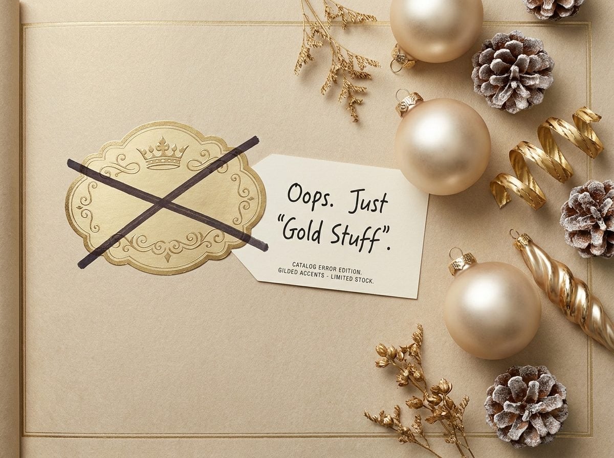
Read a holiday catalog like a linguist and the trick shows up fast. Nobody sells you “a coordinated tree.” They sell you a theme with a name. Champagne Christmas. Nordic Frost. Candyland. The name does the work, because a name is a product line, and a product line is a reason to open your wallet.
The naming turns over every twelve months on purpose. In 2018, Wayfair reported a Source 70 percent year-over-year jump in searches for black Christmas trees, and Treetopia said black had climbed to its fourth most popular color. Black trees. Then pink candyland trees showed up for 2022, with peppermint and gingerbread built into the scheme. By 2025 the same experts had pivoted hard to “Ralph Lauren” old-money red, green, and velvet gold. Same tree. New vocabulary. New shopping list.
That churn is the whole business model. If your green pine looks great with whatever ornaments you already own, you buy nothing. If “Champagne Christmas” is the look this year, you need champagne ornaments, a champagne skirt, champagne ribbon, and a matching topper, because half of them cracked in the attic anyway.
The dollars back it up. Americans spend somewhere between $147 and $269 a year on decorations depending on which survey you trust, and 42 percent planned to drop more than $150 in 2024 on decor alone. A themed reset is how that number stays fat.
Here’s the part they’d rather you skipped. One 71-year-old put it plainly in a Rocket survey: Source after enough years, you already have plenty, so you just recycle what you have. The people who spend the least on Christmas decorations aren’t the cheapest. They’re the ones who stopped believing the theme needed a new name.
5. Magazine-Perfect Trees Changed the Goal From Sentimental to Stylish

Somewhere along the way, the tree stopped being a scrapbook and started being a photo shoot. The goal shifted from remembering to matching. And you can trace the pivot to the glossy shelter magazines that taught you a tree should read as a single, cohesive design object.
For most of the 20th century, nobody expected that. HISTORY notes that the 1950s ran on Source Shiny Brite glass ornaments in cheerful clashing color, and the ’70s brought back homemade ornaments that echoed the 1940s. Trees were loud, personal, and unbothered by a scheme.
Then styling became a profession, and the profession needed a look that photographed cleanly. A tree of mismatched macaroni angels doesn’t shoot well. A tree in flawless gold-and-blush does. So the magazine ideal quietly rewrote the rulebook, and “cohesive” became code for “buy the matching set.”
Here’s the part worth screenshotting: the industry itself is now calling that bluff. Jonathan Adler, styling Christmas 2025, told designers his season is Source “less about magazine-spread worthy Christmas trees and more about macaroni-garland.”
The people who invented the perfect tree are backing away from it.
The best designers already know the trick. HGTV’s own line on it: Source you no longer have to choose between the sentimental ornaments and the well-designed tree. You lay in a base of lights and simple round baubles for cohesion, then let the kindergarten dough angel hang wherever it wants. The structure carries the mess. That’s the whole secret nobody sold you.
4. The Christmas Tree Started as a Collection of Objects, Not a Coordinated Display
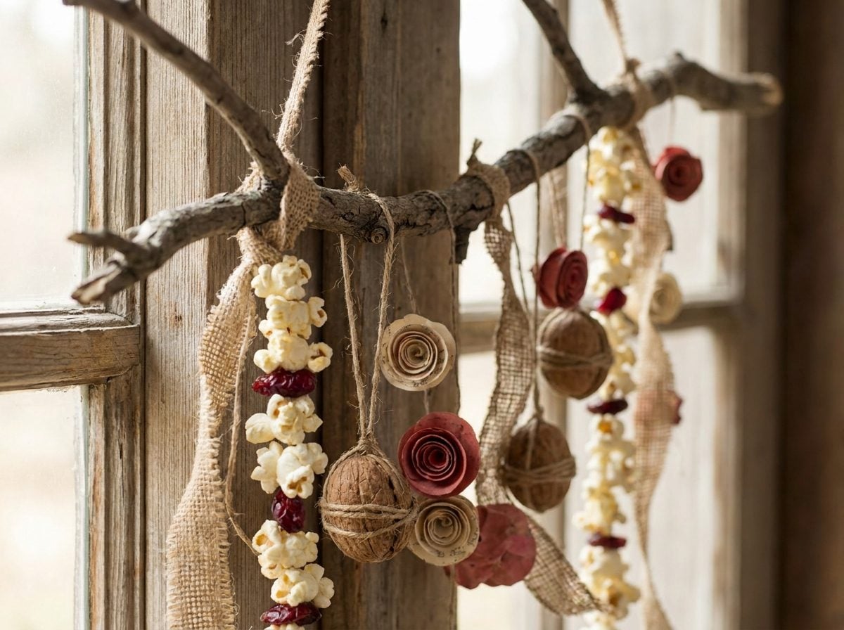
The original Christmas tree was a junk drawer with branches. Apples. Walnuts wrapped in ribbon. Strings of popcorn. Paper dolls somebody’s kid cut out after dinner. Source
A Victorian tree from 1886 was described as hung with rosy apples, oranges, bananas, grapes, popcorn, and gaily dressed paper dolls. Nothing about it matched. That was never the point.
These trees were personal to the point of being messy. Homemade ornaments came from whatever was lying around, pine cones, straw, yarn, tin, fabric, scraps of paper. Families gathered supplies in autumn and built the decorations together as a seasonal ritual. An 1887 issue of Household Words flat-out told readers that no store-bought trinket could match something you made yourself.
Then came the coordination pitch, and it came from one man. In 1880, a German salesman walked into F.W. Woolworth’s Lancaster store and talked him into stocking glass ornaments Woolworth thought were useless. Source
They sold out in an hour. The next year Woolworth sailed to Lauscha, Germany and ordered 100,000 sets. By the turn of the century he was importing 200,000 shining ornaments a year. Source
Here’s the reframe worth sitting with. The matched, uniform tree is a retail invention roughly a century old. The mismatched tree, the one holding the glass clown gifted to somebody’s father in 1920 next to a popcorn string, is the older tradition by a wide margin. You didn’t inherit the coordinated tree. You inherited the catalog.
3. Inherited Ornaments Give a Tree Something You Literally Cannot Buy

There’s a glass nut on a tree somewhere in Germany right now that traces back to a specific man in a specific year. Source In 1847, a glassblower named Hans Greiner in the Thuringian town of Lauscha started blowing molten glass into molds shaped like apples, oranges, and walnuts, then silvering the insides with a compound of silver nitrate and sugar water. Source The first ornament was never meant to match a color scheme. It was meant to fake the fruit a family couldn’t afford to hang.
That’s the whole point of an heirloom ornament. It carries a year you didn’t choose and a story you didn’t write.
The lopsided clay angel your kid made in second grade. The chipped Shiny Brite your grandmother wrapped in tissue every January. The one you bought in a city you’ll never live in again. None of those things care what accent color you picked at the store.
And here’s the part the color-scheme rule quietly erases: those ornaments are the only things on the tree that money can’t replicate. A designer can buy forty matching blush baubles in an afternoon. Nobody can buy the mismatched, slightly ugly, deeply specific collection that took your family thirty years to accumulate by accident.
A themed tree looks finished. An inherited tree looks lived in. One of those you can photograph. The other one you can remember.
2. Once You Understand Rhythm, Repetition, Scale and Spacing, the Color Rule Becomes Almost Irrelevant
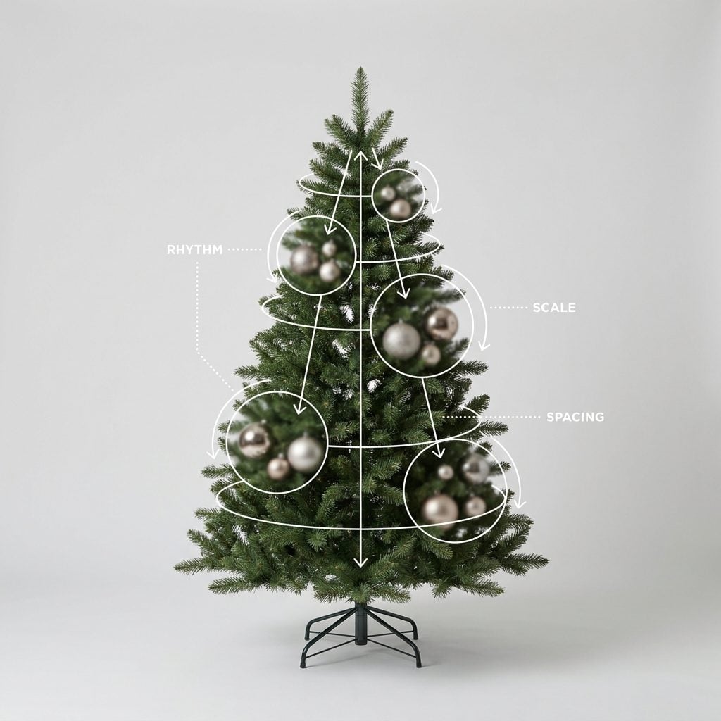
Here’s the thing nobody selling you a coordinated ornament box wants you to know. Color is the crutch. Structure is the actual skill.
Watch what professional tree stylists do, and it’s rarely about matching. It’s about rhythm. They repeat a shape or texture at regular intervals so your eye travels the tree instead of snagging on it. A frosted glass ball here, then again a foot lower, then again near the base. That repetition reads as intentional no matter how mismatched the colors are.
Then there’s scale. A tree hung entirely with same-size ornaments looks flat and busy. Pros mix a few oversized pieces (think a hand’s width or bigger) with medium and tiny fillers, so the eye has somewhere to rest and something to chase. That contrast does more heavy lifting than any single palette.
Spacing is the quiet one. Cluster ornaments deeper toward the trunk, not just on the outer branches, and the tree gains depth instead of looking like a hedge with baubles stapled on.
Nail those four and your grandmother’s gold reindeer can sit two inches from a hot-pink felt llama and the tree still looks composed. The colors stop competing because the structure is doing the organizing.
I ignored all of this for years and just bought more of one color, convinced that was the problem. It wasn’t. My spacing was garbage and every ornament was the same size.
The ornament sets sell you cohesion in a box. Rhythm, repetition, scale and spacing give it to you for free, using the mismatched hoard you already own.
1. The Ornament Your Kid Made at Seven Has Something a Box of Matching Baubles Never Will

There’s a lopsided clay star on somebody’s tree right now, painted gold that already flaked, a name and a year scratched into the back with a toothpick. It cost nothing. It matches nothing. And the person who hangs it every December would not trade it for a whole boxed set of mercury-glass ornaments from the fancy floral shop downtown.
Behavioral economists have a name for why. The IKEA effect. Harvard’s Michael Norton, along with Daniel Mochon and Dan Ariely, ran the studies and published the findings in 2012, and the punchline is blunt: Source the term itself came from a study on how making a thing yourself inflates what you think it’s worth.
Here’s the part that should stop you. In their experiments, the value people assigned to their own clumsy homemade creations matched the value they’d give an expert’s version. A seven-year-old’s popsicle-stick sleigh and a master glassblower’s ornament, priced the same in the only ledger that counts.
A matching set can’t do that. It was assembled by a machine in a factory, and you had nothing to do with it. You can love how it looks. You cannot love it, because there’s no you in it.
This is the whole con laid bare. The one-color rule quietly demotes the ornaments that carry your actual life, the concert ticket taped to a bulb, the ceramic dog from the grandmother who’s gone, because they clash. Orthodoxy tells you to box them up. Fifty years of psychology tells you they’re the only things on the tree with any weight.
Hang the flaking gold star at eye level. That’s the one people will pick up.