
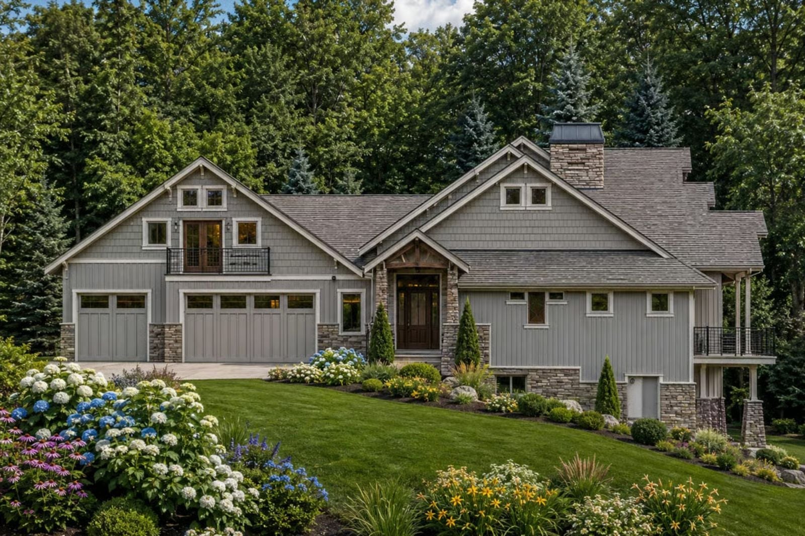
Builders who’ve been at this long enough will tell you the same thing: family members who move in rarely move back out, so the floor plan you buy today needs to work for both versions of your life. The Cedarvale is designed around exactly that reality — a bonus room that converts cleanly into a private suite, a split-bedroom layout that puts real distance between generations, a main-level primary wing, and a great room where everyone ends up at six o’clock whether you planned for it or not.
Specifications
- Sq. Ft.: 2,960
- Bedrooms: 2-5
- Bathrooms: 2.5-5.5
Floor Plan – Main Floor
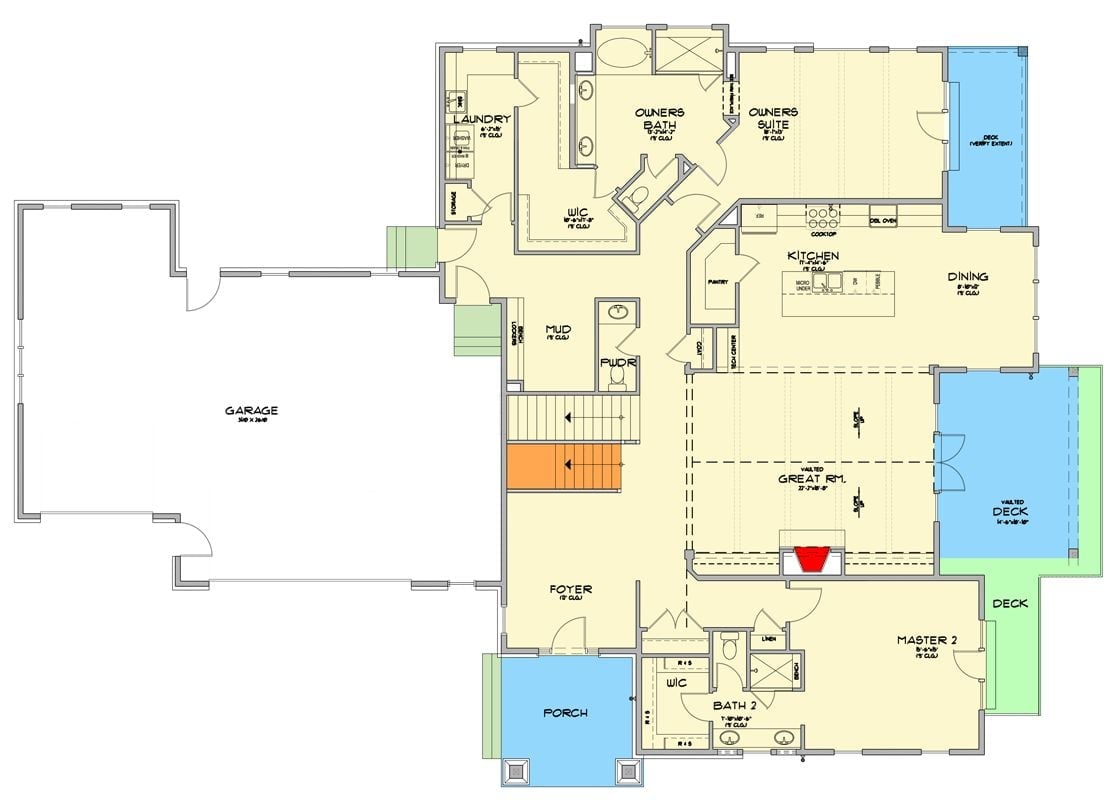
Main level shows owner’s suite, second master, great room, kitchen, and staircase to bonus room.
Floor Plan – Bonus Room
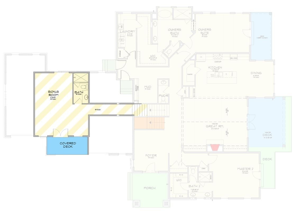
The upper level keeps the Owner’s Suite, laundry, and mud room clustered near the staircase, while the Great Room and Kitchen anchor the right wing. Off to the left, the Bonus Room gets its own bath and covered deck — enough separation that whoever moves in actually feels like they have their own place.
Floor Plan – Basement
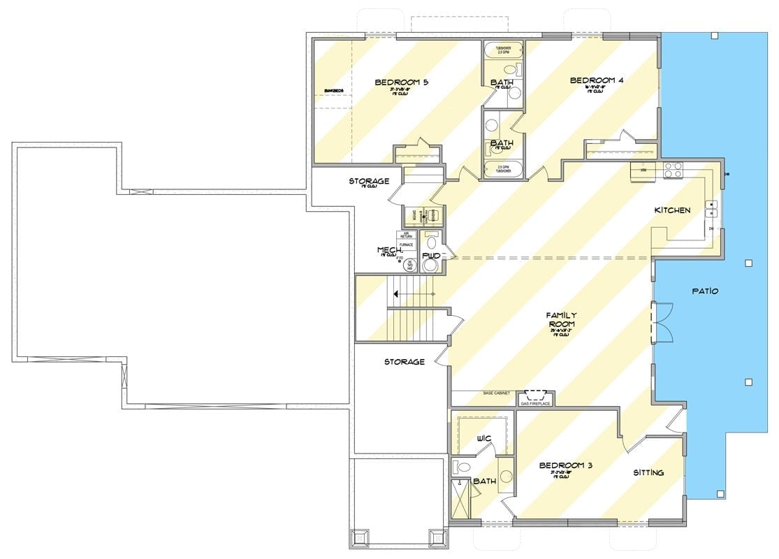
The lower level puts three bedrooms on the same floor, one of them a suite with a sitting room and gas fireplace that reads clearly as in-law territory. A kitchen and family room anchor the open side, with storage, a powder room, and mechanical tucked near the stairwell.
Orb Chandelier Over an Open Entry That Actually Delivers on the Promise
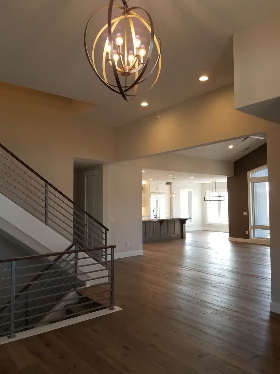
That spherical chandelier earns its spot at the top of a two-story foyer, throwing warm light down across wide-plank hardwood that runs deep into the open plan. Horizontal steel railings on the staircase keep the sight lines clean, and beyond the entry, a dark kitchen island anchors the middle distance with pendant lights hanging above it. It’s the kind of entry that actually follows through on what the exterior promises.
The Psychology Behind This: Double-height foyers trigger an instinctive sense of arrival that lower entries can’t replicate. That vertical space signals to the brain that what follows is worth exploring — a spatial cue builders have used for centuries, and it still works because it’s wired into how we read a room before we’ve taken three steps inside.
Step deeper into the living space and the fireplace wall does most of the talking.
Tile That Earns Its Place and Shelves That Don’t Overcrowd
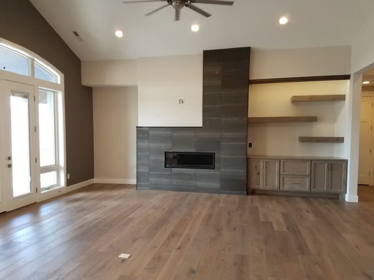
Large-format gray tile runs floor to ceiling on the fireplace surround, with the linear firebox set low enough to feel grounded rather than showy. Floating shelves on the right share the same warm wood tone as the cabinetry below. Nothing competes. That’s rarer than it sounds.
Driftwood Island Base Against White Cabinetry Is the Contrast That Holds the Room Together
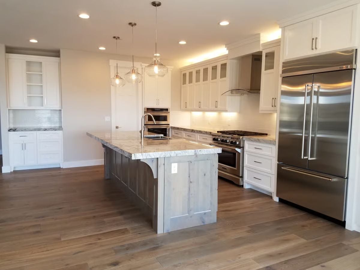
White shaker cabinets meet a gray-washed knotty wood island base topped with veined marble, three clear glass pendants hanging low over the sink. A built-in refrigerator column anchors the far wall alongside the stainless appliances. The mix works because the marble is neutral enough to sit between the two wood tones without taking sides.
Ask Yourself: Mixing cabinet finishes only holds together when the countertop material bridges both. Before committing to a contrasting island, check whether your stone or quartz reads neutral enough to connect two distinct wood tones — because if it doesn’t, the whole kitchen feels like two rooms that lost each other.
Checker Floor and Silver Machines Make This Laundry Room Refuse to Be Boring
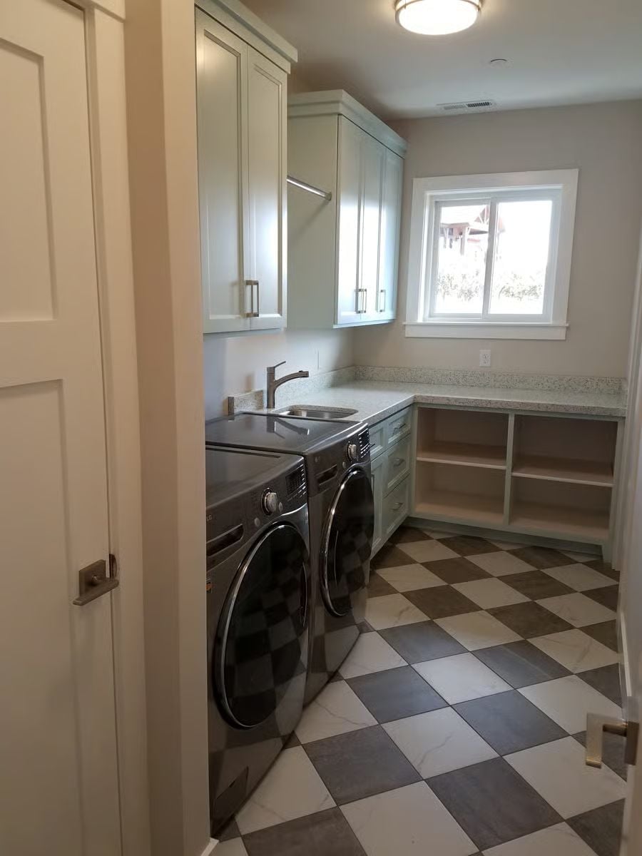
Gray-and-white checker tile pulls focus the moment you walk in. Sage green upper cabinets sit above the front-load machines, and the utility sink is positioned noticeably off-center, leaving the open shelving on the far wall completely unobstructed.
Designer’s Secret: Front-load washers installed without pedestals lose some accessibility but gain counter space above. If you’re planning a folding surface directly over the machines, skipping the pedestals recovers several inches of vertical clearance — enough to turn what would be a hunching workspace into one you can actually use.
Toe-Kick Lighting and a Drop-In Tub Tucked Against Tile Do the Heavy Lifting Here
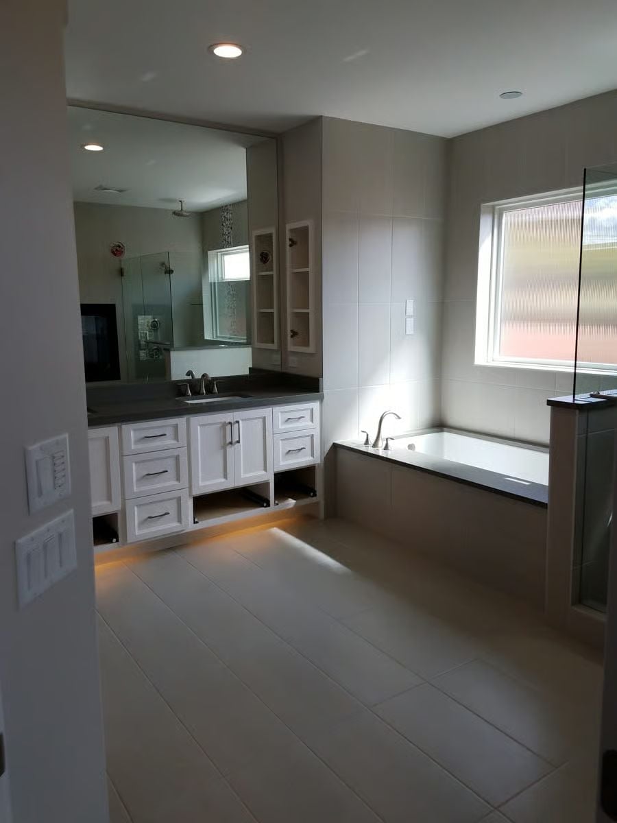
Warm LED toe-kick lighting under the vanity pulls focus to the floor at night, while dark countertops against white cabinetry hold their contrast without competing with the soaking tub’s clean surround.
Why Toe-Kick Lighting Works Harder Than You’d Expect
Toe-kick lighting isn’t decorative filler. It handles low-level orientation for nighttime bathroom visits without blasting overhead brightness — which matters more in a primary bath than most people realize until they’re fumbling for a switch at 2 a.m. Warm amber is the right call here. Cooler LEDs would fight the neutral tile palette, and that fight is one nobody wins.
Wet Bar Peninsula With a Beverage Fridge Built for Guests Who Stay Too Long
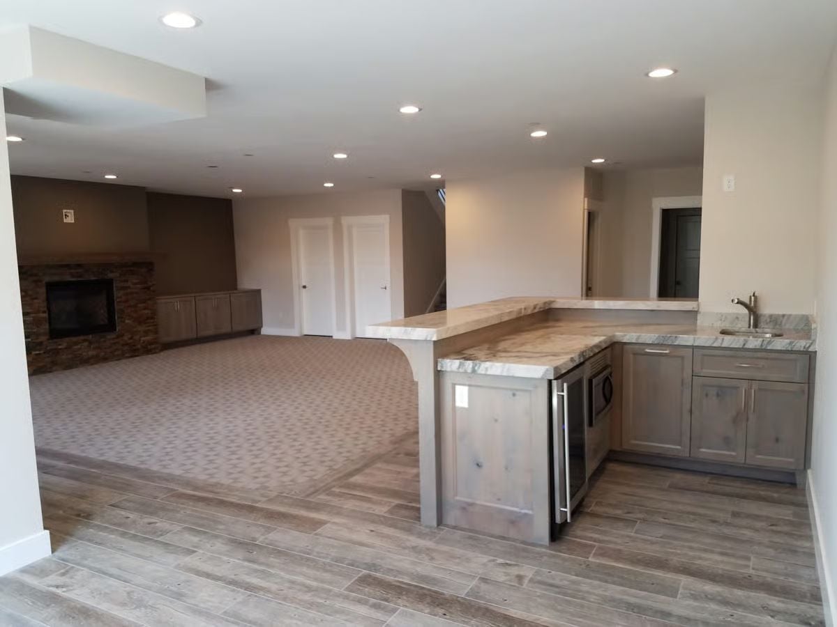
Marble-look countertops wrap an L-shaped wet bar with a peninsula overhang sized for seating. A stone fireplace surround anchors the carpeted living space just beyond the hardwood-look tile, giving the lower level two distinct zones without a wall between them.
By The Numbers: A beverage refrigerator built into a wet bar holds enough for a real gathering without requiring a full-size fridge down here. Positioning the sink near the corner keeps the prep zone contained so bar traffic doesn’t cut across movement through the rest of the space. Skip real hardwood on the floor — hardwood-look porcelain tile handles the humidity swings common in below-grade spaces without buckling.
Pin It
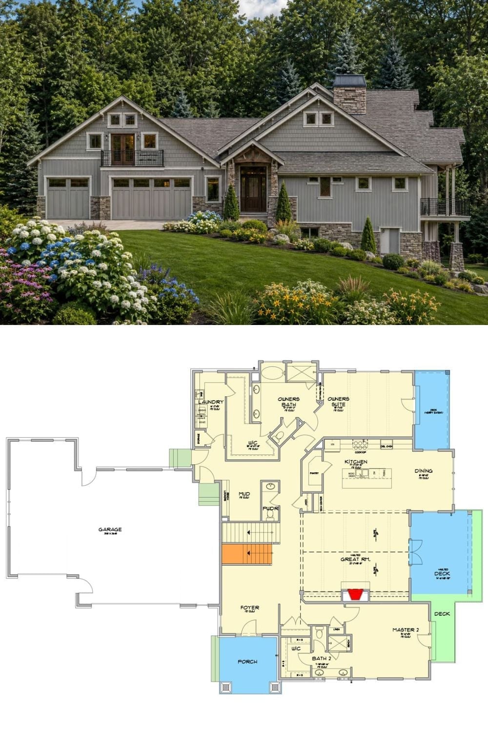
Craftsman exterior with stone accents pairs with a two-owner-suite floor plan below.
Did You Know: Two primary suites on the same floor is a relatively modern floor plan strategy, driven largely by multigenerational living demand. Builders call it a dual master layout, and it’s one of the fastest-growing requests among buyers in the under-55 demographic. The second suite typically gets its own walk-in closet and full bath — enough to feel like a real retreat rather than just a guest room with a better mattress.
