
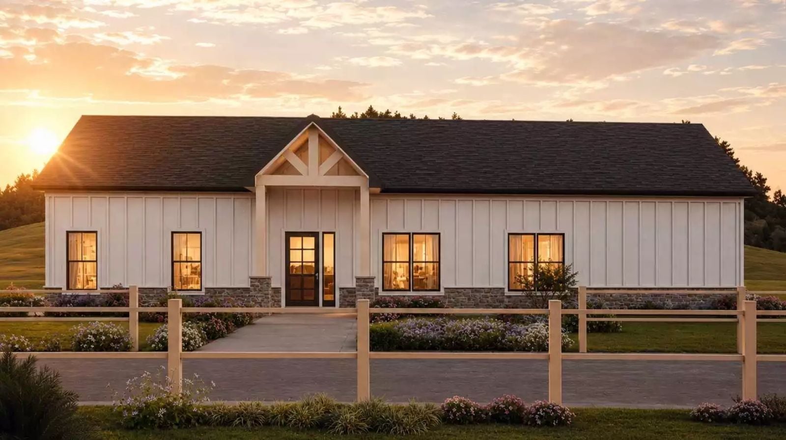
Growing into a house is not the same as growing into a layout. The Broomfield Pines is built for that distinction: an open-concept kitchen where someone can monitor homework while finishing dinner, a single story that keeps the whole family on one level instead of shouting between floors, and corridors wide enough that three people moving through at once never feel like a collision.
Specifications
- Sq. Ft.: 1,674
- Bedrooms: 3
- Bathrooms: 2
Floor Plan – Main Floor
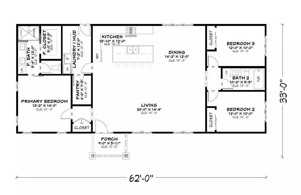
This 62-by-33-foot ranch fits three bedrooms, two full baths, and a generous open living zone onto a single level without feeling like it’s rationing space. Kitchen and dining flow directly into a 28-foot living room. The primary suite sits privately on the left wing while the two secondary bedrooms share Bath 2 on the right, and a laundry/mud room with pantry handles the daily chaos near the entry where it actually belongs.
Barndominium Energy at Sunset, None of the Gimmicks
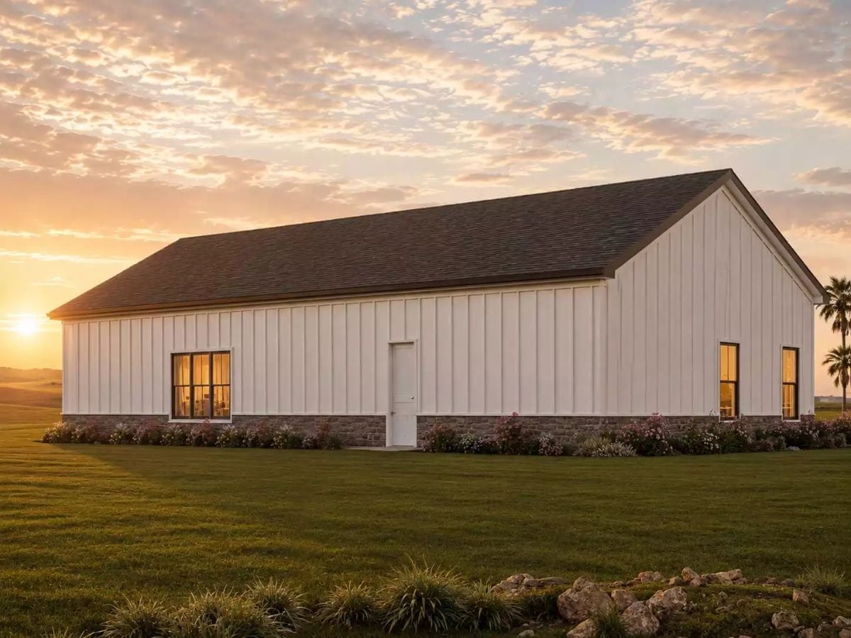
White vertical board-and-batten siding meets a stone base; warm light glows through black-trimmed windows.
Style Math: Board-and-batten over a stone foundation reads as farm-practical rather than trend-chasing, which is a harder combination to pull off than it looks. Dark window trim pulls the eye to exactly the right spots without needing shutters or decorative brackets to do the persuading. Exteriors like this age quietly — still looking right in fifteen years while the trend-forward stuff starts to date.
Cherry Blossom Panels Above a Sofa That Actually Has Enough Seats
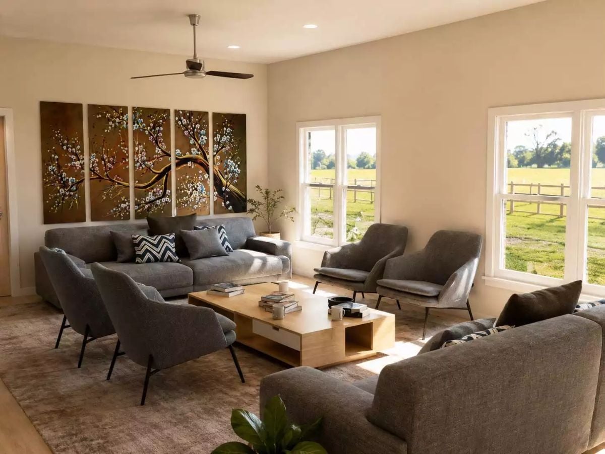
Four-panel cherry blossom artwork anchors the whole room without competing with anything else.
Gray upholstery covers every seat, but it doesn’t tip into monotony because the chairs ride on slender black legs that keep them visually light. The wood coffee table has open shelf storage built into its base — actual storage, not decorative suggestion. Windows on two walls pull in afternoon light from what looks like open pasture just outside, and that’s doing at least as much work as any of the furniture choices.
Red Barstools Against Black Granite Make a Strong Case for Contrast
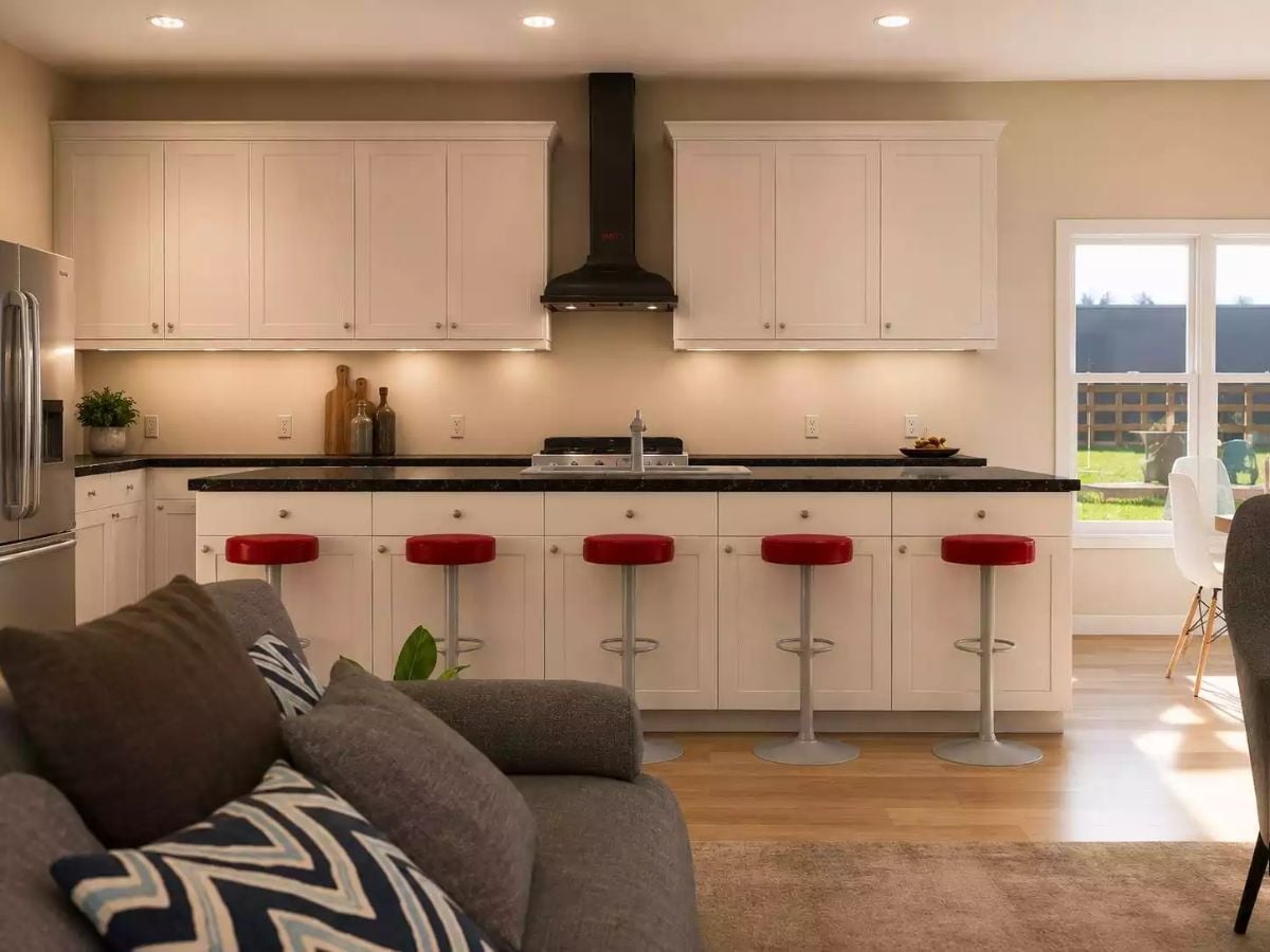
Five red barstools line a dark granite peninsula that anchors the open layout between kitchen and living room. Under-cabinet lighting warms the white shaker cabinetry without washing it out, and the black range hood carries the countertop color vertical — giving the wall something purposeful to do besides hold upper cabinets.
Color Story: Cream walls and white cabinetry keep the backdrop quiet enough that five red barstools read as deliberate rather than impulsive. The black granite connects hood to countertop without requiring a backsplash to bridge the gap. Three colors, each appearing in more than one spot — that’s what keeps a bold palette from feeling like a mood board that never got edited.
Copper Pendants Do the Heavy Lifting Above a Table Built for Eight
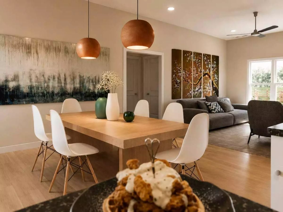
Warm wood on the table and spherical copper pendants overhead pull the dining space into its own identity without fighting the living room for attention. Eames-style chairs keep it casual. The cherry blossom panels visible from across the room tie both zones together in a way that feels accidental until you notice it isn’t.
Why Sphere Pendants Work Harder Than You’d Expect
Spherical pendants direct light downward and inward, so you get actual task lighting over the table surface rather than a vague ambient wash that illuminates nothing in particular. The wood finish absorbs some of that glow and re-emits it as warmth, making the dining area feel distinct from the living space without needing a wall or even a partition to do it. Smarter zoning than a rug alone, and considerably cheaper than a renovation.
Taupe Walls and a Portrait Above the Bed That Refuses to Be Ignored
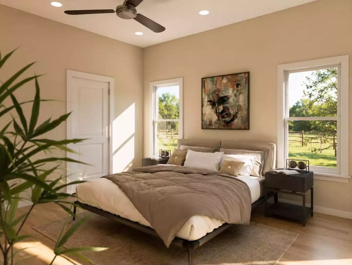
Quilted bedding in muted brown, a low platform frame, and an abstract portrait with dark gestural strokes keep the room grounded without feeling sparse. Natural light handles the rest without being asked.
The Psychology Behind This: Sleeping in a room with figurative art — a recognizable human face especially — activates social processing in a way that research suggests people find oddly settling at rest. Designers who understand this tend to place that kind of work where it’s seen last before sleep and first after waking. The portrait here earns that position.
Pin It
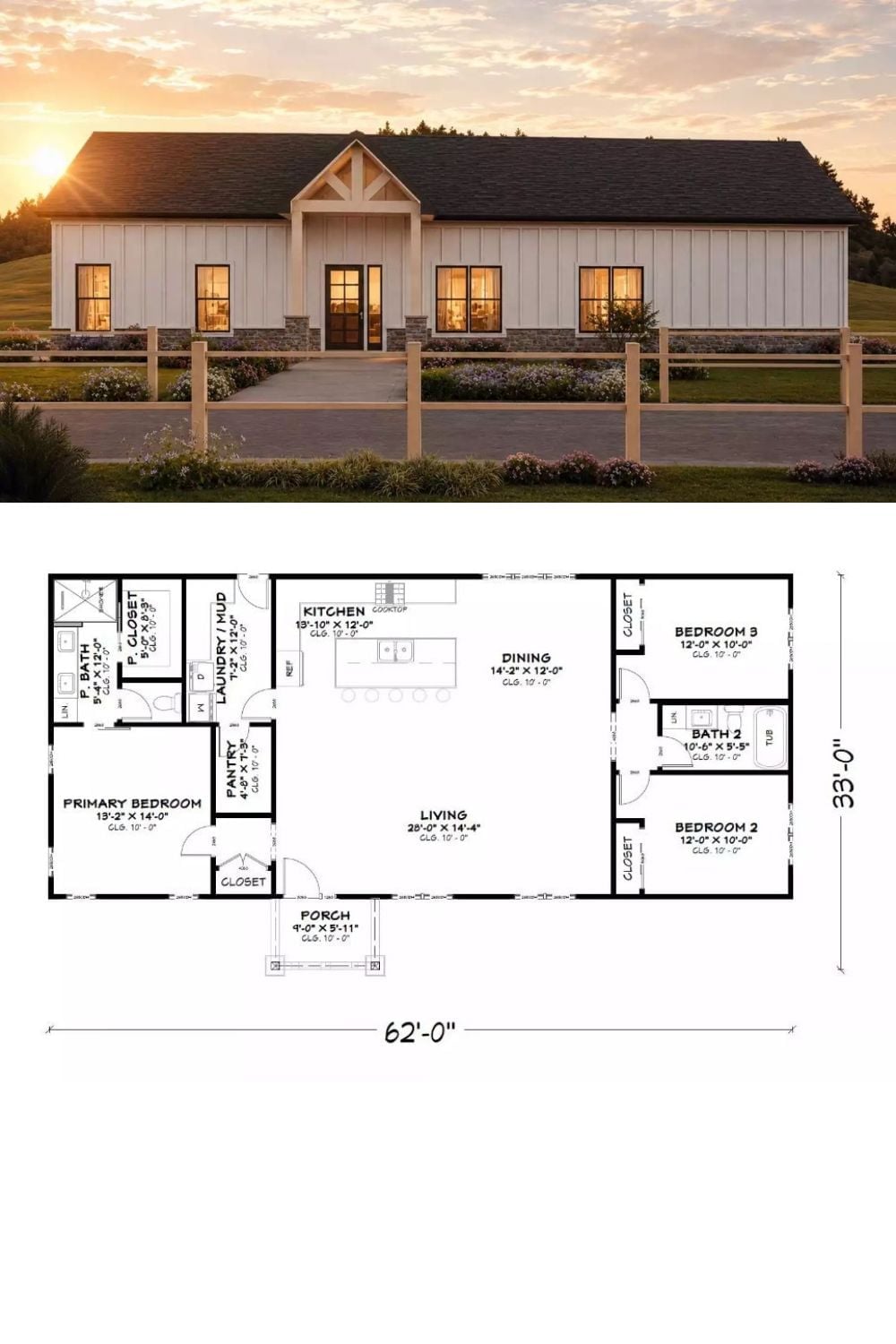
The top half shows the board-and-batten exterior at golden hour, long and low with a centered gabled entry. Below it, the floor plan lays out the full 62-by-33-foot single-story footprint: three bedrooms, two full baths, an open kitchen and dining zone, and a living room running nearly the width of the home.
Fun Fact: Ranch-style homes sit on a single foundation slab or crawlspace, which tends to make them cheaper to insure against structural wind damage than two-story builds with comparable square footage. Most first-time buyers assume a larger footprint automatically means larger premiums across the board — it doesn’t, and the difference can be worth asking your insurer about before you sign.
