
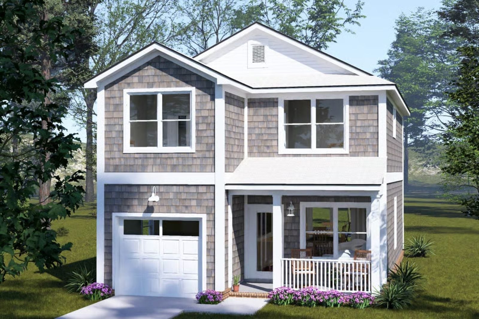
There’s a reason real estate agents say buyers decide on a house before they even reach the front door — the porch gets them first, and everything else is confirmation. The Briarwood leans into that completely, with a deep front porch built for actual sitting, an open main floor that keeps conversation moving, and a two-story layout with enough room that nobody’s living on top of each other.
Specifications
- Sq. Ft.: 1,481
- Bedrooms: 3
- Bathrooms: 2.5
Floor Plan – Main Floor
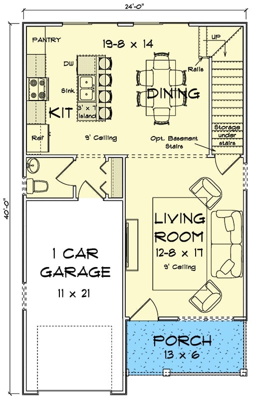
Kitchen and dining room share the back of the first floor, with the living room opening toward the front porch. A half bath sits near the garage entry — exactly where you want it. Stairs with under-stair storage run along the right wall, and the kitchen gets an island, a pantry, and roughed-in space for optional basement stairs if the lot calls for it.
Floor Plan – Second Floor
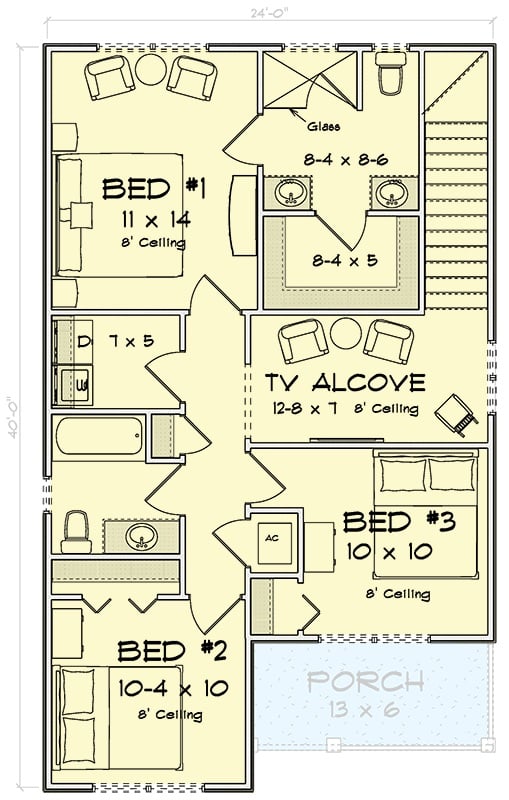
On this compact 24×40 footprint, three bedrooms wrap around a central TV alcove upstairs. Bedroom one anchors the upper left at 11×14, a shared bath sits between bedrooms two and three, and the front porch below carries its outdoor living role all the way to the roofline.
Shingle Siding and French Doors Make the Backyard Feel Like a Living Room
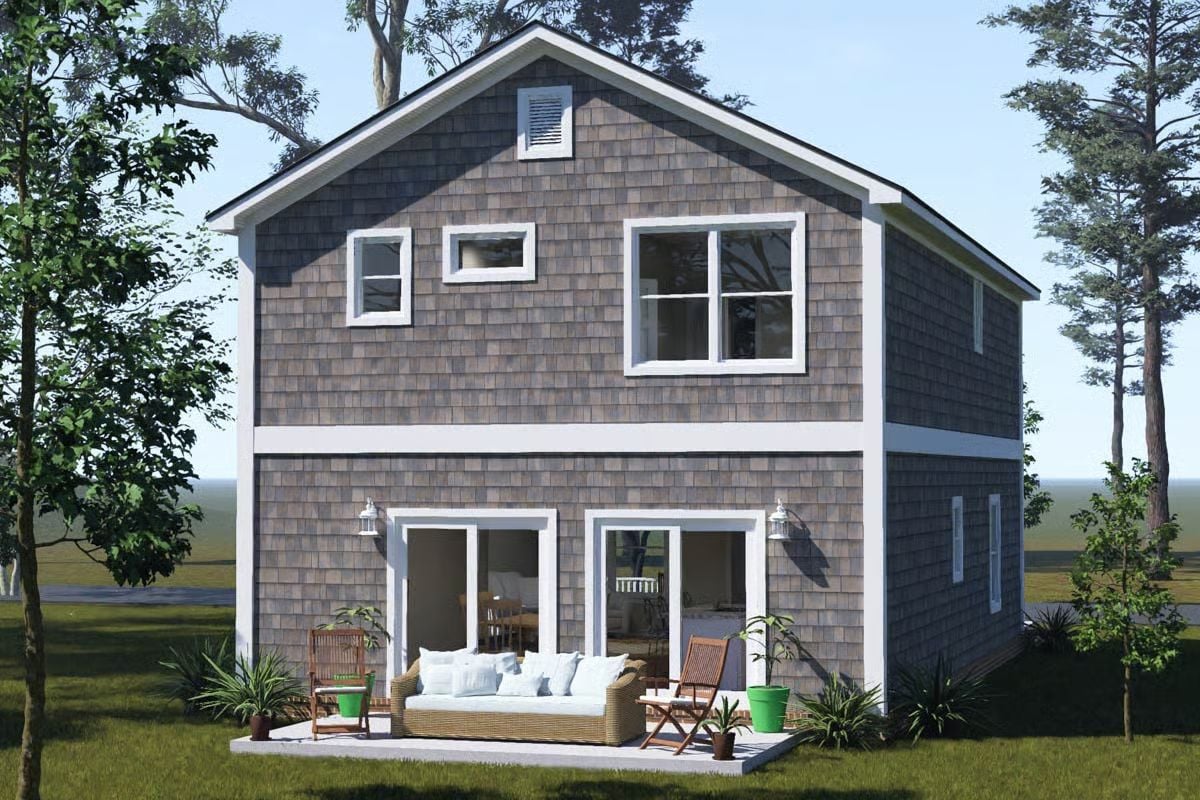
Cedar shingle siding wraps both floors, and paired French doors open directly onto a wicker sofa patio out back.
History Corner: Cedar shingle siding goes back to early American coastal settlements, where builders discovered that overlapping wood scales shed rain and shrugged off salt air better than flat boards. New England fishing villages ran with the style through the 17th century, and it stuck. Most builders today use fiber cement versions that nail the look while requiring far less upkeep.
Warm Wood Floors and a Palm-Print Rug Give This Living Room Its Laid-Back Personality
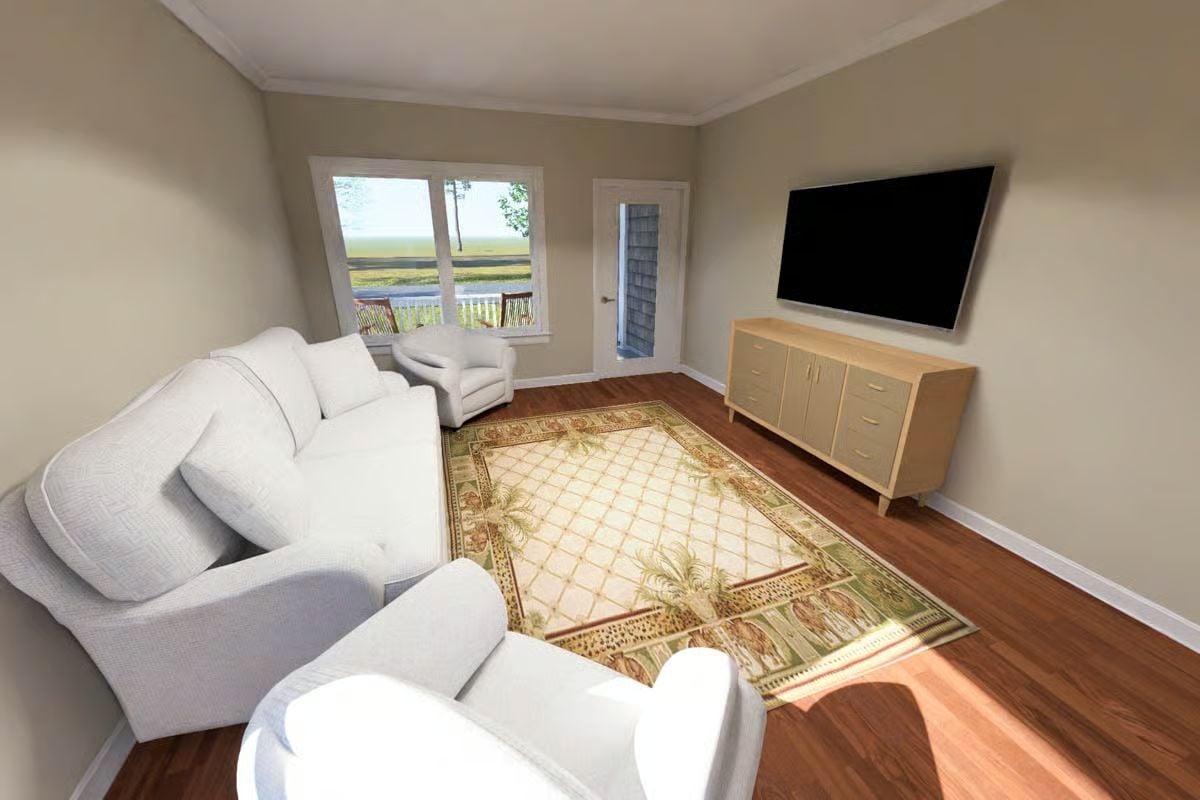
Rich walnut-tone hardwood anchors the room, with a tropical-motif area rug doing the work of pulling the seating group into a coherent arrangement. White upholstered furniture keeps things casual without looking careless. The flat screen mounts above a light maple credenza — low enough to keep the wall from feeling bare, with enough drawer storage that the room doesn’t need anything else.
By The Numbers: Wall-mounting the television clears floor space and cuts down on furniture bulk, which matters more than people expect in a room this size. Pairing the screen with a low credenza instead of a traditional TV stand keeps storage accessible while the layout stays open toward the center of the room.
Granite Counters, Bar Stools, and Sliding Doors That Erase the Back Wall
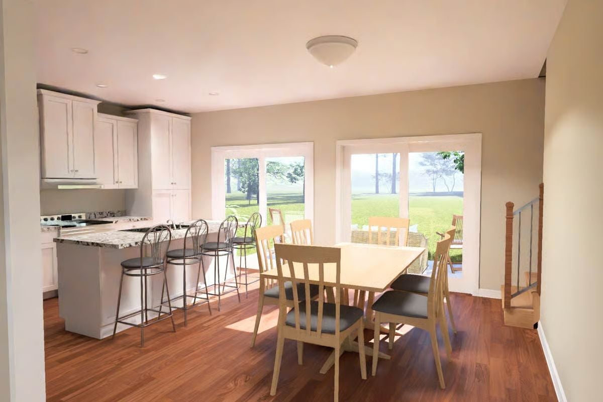
White cabinetry and granite countertops meet at the kitchen island, where four metal bar stools make casual dining the default. Sliding glass doors flood both spaces with light and blur the line between inside and out. Wood floors run continuous through the kitchen and dining area, which is the simplest trick in the book for making two rooms feel like one.
Fun Fact: Open-plan kitchens with bar-height islands caught on in American homes during the 1970s largely because they let the cook stay in the conversation instead of facing a wall. Placing the dining table near sliding doors like these pushes the same idea a step further — the backyard becomes part of the meal without anyone getting up from their seat.
Granite Island with a Cooktop Built Right Into the Counter Changes How You Cook
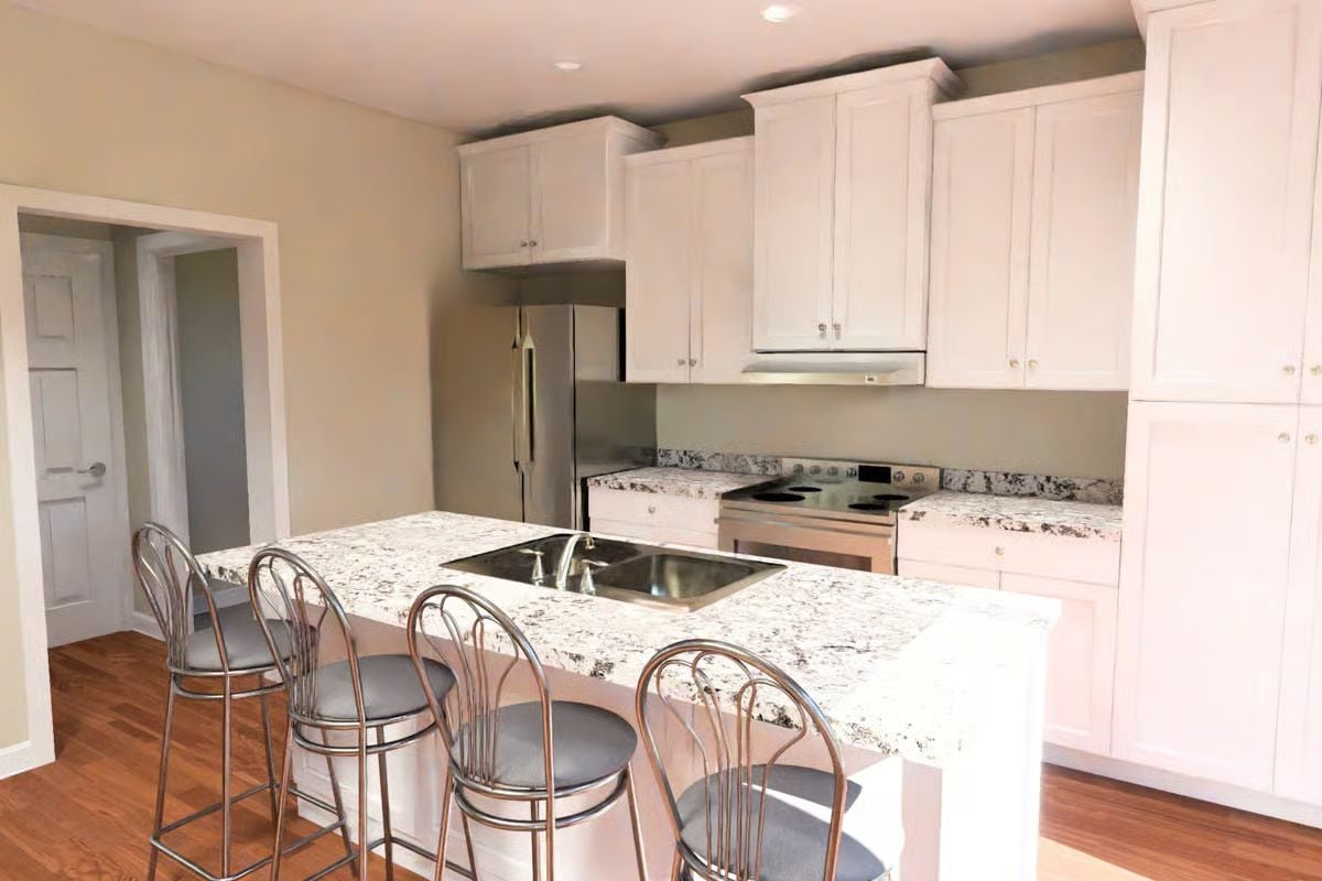
Putting the cooktop in the island means you’re facing your guests while you cook, not a wall.
Bianco Antico granite runs across both the island and the perimeter counters, tying the whole kitchen together without any deliberate effort to match.
Oak Furniture and a Patterned Coverlet Keep This Bedroom from Feeling Too Serious
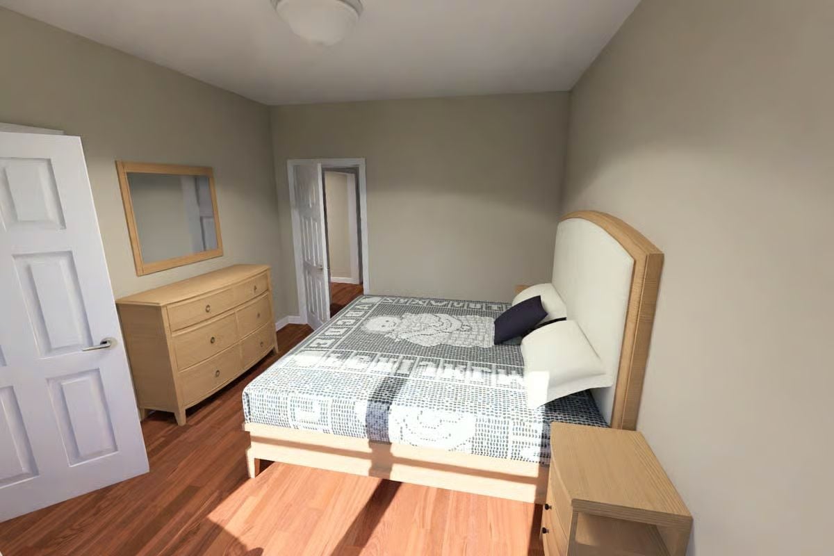
Light oak on the bed and dresser brings a quiet warmth that heavier wood tones would have killed. The patterned coverlet carries most of the visual weight in the room. Hardwood floors pick up the sunlight from what looks like a south-facing doorway — the kind of detail that makes a bedroom feel livable before you’ve hung a single thing on the walls.
Try This: Hang the bedroom mirror above the dresser rather than leaning it against the wall. At eye level it reflects more light across the room and keeps the furniture grouping from looking like it was just pushed into a corner. Small change, noticeable difference.
Dark Granite Tile and a Frameless Shower That Lets the Stone Do the Talking
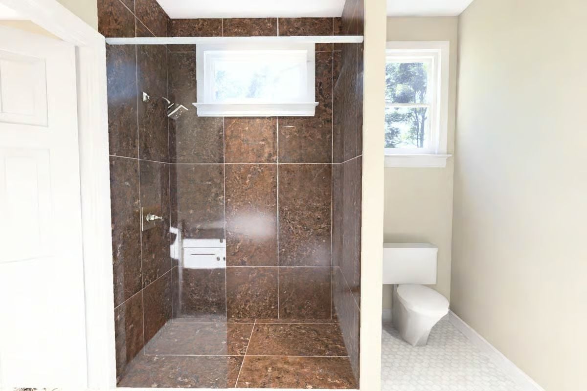
Emperador dark marble tile covers every surface of this walk-in shower — walls, floor, all of it — creating a depth that lighter materials simply can’t produce. A small window above the showerhead brings in natural light without giving anything away to the neighbors. Chrome fixtures keep the hardware straightforward. Off to the right, a wall-mounted toilet floats above a mosaic hex floor that holds its own without competing with the stone.
The Psychology Behind This: Wrapping a shower in one continuous material removes the visual breaks that make a small space read as cramped. Dark stone works differently than light tile here — instead of bouncing light back at you, it absorbs it, creating a sense of depth that makes the enclosure feel bigger than its actual dimensions.
Pin It
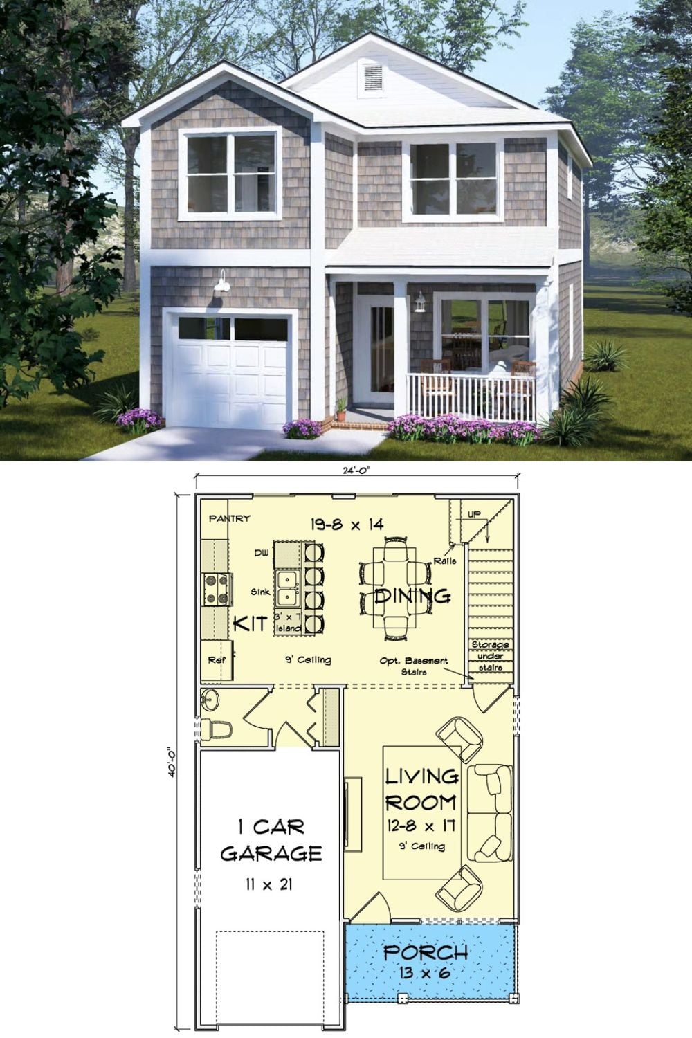
Exterior rendering shown alongside the first-floor plan: kitchen, dining room, living room, garage, and porch.
